#drawing tutotial
Note
Could you make a tutorial on how you go about making your vhs screenshots? They look awesome and I want to try to implement that style in some of my own art. Thanks so much!!!
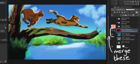
So i use clip studio and the settings i always see on other tutorials are only on photoshop (vibrance) so i baso made my own auto actions copying them and i've uploaded them. This will also be long becoz i always try make tutotials that I would want to see when looking up a tutorial.
Sketch ur scene. I don't worry about sticking to 1980s (or whatever era) framing or style choices usually. For backgrounds i can do a bigger tutorial but i basically use clips gouache or some watercolour brushes for blending. Ghibli and 1942 Bambi for the textures and don bluth etc for the colours as a rough guide. I use this blog for some references but also just searching '[film name] backgrounds' or something like 'ghibli snow/roads/grass'
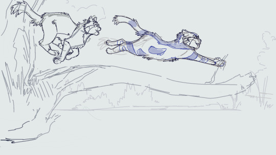
So i draw the scene. Use a dark brown for inks. Duplicate that, fill with yellow, blur 5 and 30% opacity underneath. I copy the base layer/character layer, fill with same brown and blur so its a “drop shadow”
I also duplicate the shadows, blur one about 12-18 and set both to half opacity. Same with lighting. Any rim light is the Ink layer duplicated, filled white, overlay or glow it depends on what fits best, and the bits i dont want white erased.

All text is Arial yellow with a black border. My style of drawing varies a lot by i try for a fuzzy 80s fur look- like kosperry or don bluth i guess. thats what the 'cats' layer looks like ^^^.
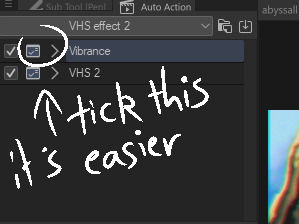
Okay onto edits. Flatten image and duplicate in case u fuck up. Auto actions are linked above (i have the box ticked/the action closed to speed things up and only adjust the important bits)
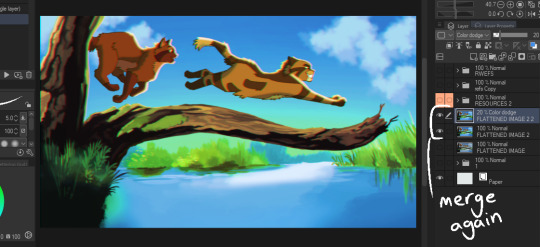
Blur - gaussian, start mild and u can build up from there.
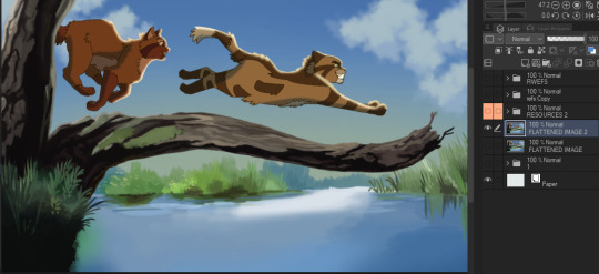
Fake vibrance- you can use saturation ig but this (to my knowledge) targets the light and shadow differently. I literally copied how the photoshop vibrance works. I use anywhere from 25-85 strength (mainly 40), it looks less saturated once u click okay so just experiment.
Chromatic abberation - I use this one. Move to liking and merge
Vhs 2 - this is the other auto action i made, it’s basically another blur, motion blur and some image adjustments.
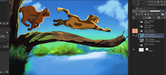
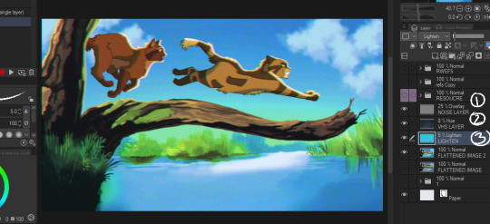
Final additions - 1 is a noise layer (clip studio perlin noise), 2 is a free VHS overlay set to hue (find one with colours u like!), 3 is a new layer filled with a bright colour/colour that fits the vibe you are going for (here i used blue for the blue background + sunny vibes) set to lighten and adjust
and thats it for me!
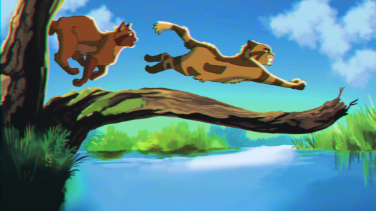
Happy VHSing!
#please let me know if these autoactions work! there shud be two in the download!!!#warrior cats#vhs#ghibli aesthetic#retro aesthetic#art tutorial#vhs tutorial
103 notes
·
View notes
Note
Hi ira, a while ago I think you made a quite helpful tutotial-esque post giving tips about how to draw sexy art? including things like working with volume in bodies, if I recall. I can't for the life of me find that post again, you wouldn't happen to have a link would you? thank you!
hi! no problem, i think you're thinking of this one — it's not actually specifically abt drawing sexy stuff, just abt how i stylize hips/thighs, but sexiness came up just bc frankly horniness informs a lot of the choices i make when drawing lol!!
46 notes
·
View notes
Text
Giff Gaff Design
During my tutotial, they suggested that I could look at giff gaff to see how they use type to interact with the illustrations. I think this may help develop my zine because it will give me an idea on how I can manipulate the visuals to convey the narrative more clearly.
Illustration

Giff Gaff only use primary colours within their imagery, as well as black and white (Giff Gaff Design, n.d.). By only using a maximum of three colours (Giff Gaff Design, n.d.), it stops the visuals from overwhelming the text by keeping them simple. This gives the visuals a simple look that draws the audiences attention because of the contrast in colour. In this image, the contrast of the red and yellow draws the readers eye from the yellow balloon to the hand. This gives me the idea that the balloon is falling into the hand because my eye moves downwards.
This method will be useful for the conversation starters I have started to incorporate throughout the zine. The current design makes them overwhelm the main text because of the large font and bright colours. However, I could only use 2-3 more muted colours this will place them lower in the hierarchy and allow them to blend into the background.

The use of the white outline makes the photos pop. This also links the photograph to the illustrations, combining the different elements into one cohesive layout. They use marker pen lines to give the illustrations a hand drawn feel (Giff Gaff Design, n.d.). This gives movement to the balloons by using expressive lines. I like how this makes the illustration 'come alive'.
This may help to link the back and frontof the zine. By using lines made by the markers I used to create the island illustrations, I can make the layout look cohesive and clear.
Typography
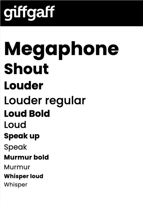
To make their typography consistent, Giff Gaff have set fronts for different tones of voice (Giff Gaff Design, n.d.b). I like how the scale and weight of the text changes how each word is read. Whisper looks soft whilst louds look confident. The varying in scale and weight allows one typeface to show a variety of tones. This creates a clear hierarchy within the type, without using multiple typefaces.
This method will be useful for my zine because this will make the conversation clearer. It will give the audience insight into how descriptions were said and why explanations have informed the illustrations.
Giff Gaff Design (n.d.). Illustration. [Online]. Available from: https://www.giffgaff.design/design-fundamentals/illustration/. [Accessed 1 December 2023]
Giff Gaff Design (n.d.b). Typography. [Online]. Available from: https://www.giffgaff.design/design-fundamentals/typography/. [Accessed 1 December 2023]
0 notes
Video
youtube
How to Draw a Tomato: Step by Step drawing for kids (very easy)
1 note
·
View note
Note
hello! do you have any tutorials? I reaaally liked how you painted the girl with the stars! If not, could you give some tips? only if you feel confortable... thank you so much and keep it up!!!!
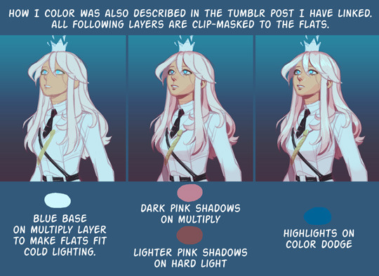
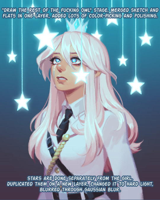
hi! i’ve described my work process in this post. for painting it’s basically the same, just skip lineart, and color the sketch instead, then polish until completion by mostly color-picking the mess that has been made. don’t think i have any general tips or tricks, but because you’ve mentionedthat picture here’s step-by-step of it, maybe it will help.

147 notes
·
View notes
Video
youtube
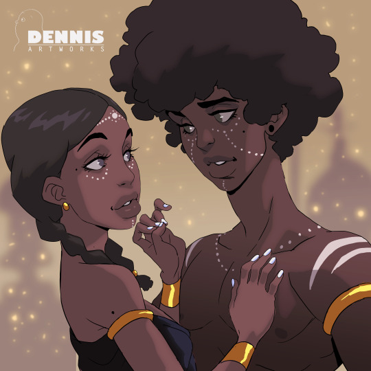
Photoshop Speedpaint: How to draw with Love
This is one of my favorite pieces. Take a look at the process. Enjoy!
You can view more videos on my Patreon.
Buy Prints Here
Instagram | Twitter
#tutotial#process#how to#speed paint#cool#anime#manga#illustration#doodle#sketch#afrocentric#africa#zimbabwe#drawing#masterpiece#digital#photoshop
508 notes
·
View notes
Photo
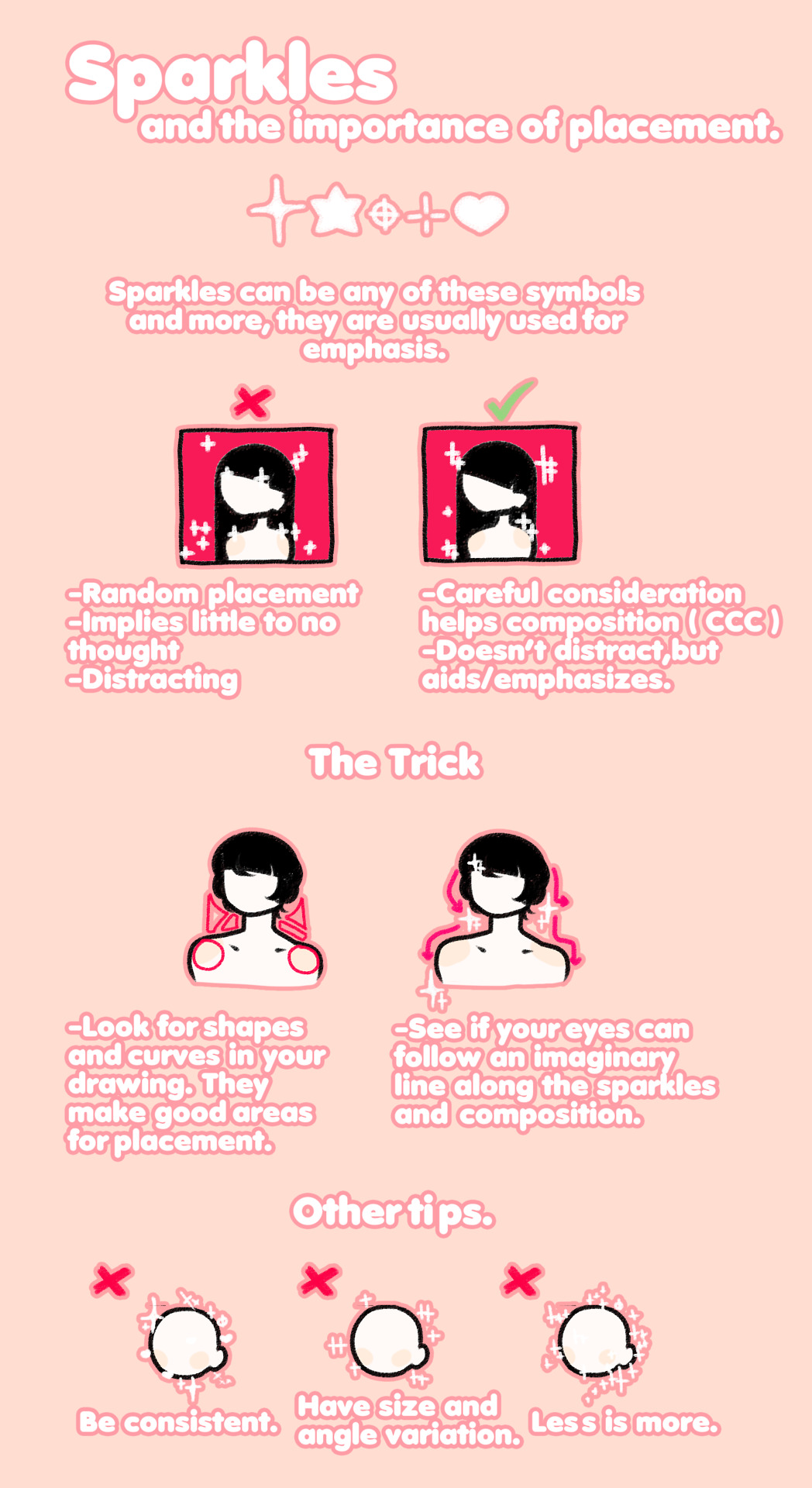
sparkle guide
#drawing tutorial#tutorial#drawing#artists on tumblr#pastel#not so much a tutotial as it is general advice
5K notes
·
View notes
Photo
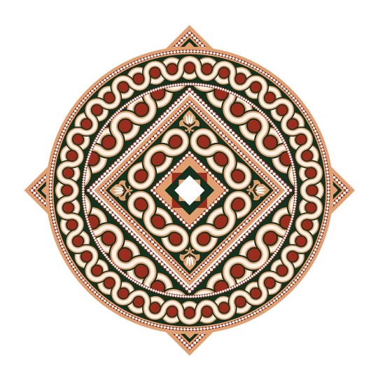
🕌Islamic Pattern Design🕌 #islamic #patternmaking #pattern #patterns #patterndesign #patternmaker #patterndesigner #muslim #islam #vector #vectorartist #adobeillustrator #illustrator #adobeillustratordraw #ramadan #ramadan2020 #drawing #tutotial #sketch #arab #arabian #saudi #uae #riyadh #jeddah #dubai #jordan #kuwait #qatar #dohaqatar https://www.instagram.com/p/B_U_SbDDM1S/?igshid=1jbgtp879co8m
#islamic#patternmaking#pattern#patterns#patterndesign#patternmaker#patterndesigner#muslim#islam#vector#vectorartist#adobeillustrator#illustrator#adobeillustratordraw#ramadan#ramadan2020#drawing#tutotial#sketch#arab#arabian#saudi#uae#riyadh#jeddah#dubai#jordan#kuwait#qatar#dohaqatar
0 notes
Note
hiiiii! how long have been doing digital art and any tips for a beginner? (no why would this be me this is hypothetical totally)
Digital art one year and like, 3 months? I was a traditional artist first and did realism (watercolor and graphite) then decided that (since I couldn't study illustration) I could still learn myself and started doing digital art by myself!
My top tip will be: WATCH VIDEOS ON YT, like, open youtube and watch videos of people drawing, with any media, if you want focus more on digital art or artist you like. But all I know is mostly from videos I watched activelly. What I mean is: do not only enjoy but scan what they are doing, how is the sketch, how many sketch they use, the brushes, the effects, how they use reference, STEAL FROM THEM. Be greedy with your eyes and mind and steal what you can. I don't mean take someone else art and repost, but looking at what artist do with a "stealing mindset" lets you learn!
For examples: some do 4 sketches and a lineart and some a base clean sketch and then paint it directly! But you can learn for both and do your thing. You don't like doing the lineart? then watch how people do a full piece without the lineart but with only the sketch! Do you like doing lineart? watch how people color the lineart and how they work with it!
Then the tip everyone says: practice! but also experiment, copy art you like, do art for yourself and HAVE FUN! Find something that gives you happines, that you find easy to draw and keep doing it. Found a safe space and learn there, do you like to draw eyes? do it! look how people do it, try tutorials and don't be afraid to say "i don't like this person tutotial" because it means you still learned something! But drawing eyes will let you understand how the digital art program works, how colors, shapes and fundamental works. Then you can move to mouths for example.
(GESTURE DRAWING and generally copying pictures and sketching is helpful, i am trash at that, I don't do it often enough because I like doing a full piece but I'm trying to focus on it sometimes because it helps)
A more focused and guided path makes you improve fast, technically, but a path you feel happy in will giving you results for sure! So find what you like to draw and just, do it!
(also join challenges you like, don't pressure yourself in finishing that but try to do challenges if you don't have ideas, prompts can be helpful!)
I wrote so much lmao I apologise, there is so much more to say but I think an hypothetical beginner artist can start from here first!
9 notes
·
View notes
Photo
First test color I used
#imaginefx#imaginefxmagazine#tutotial#illustration#digitalart#photoshopillustration#sketch#drawing#drawingtutorial#drawingsketch
0 notes
Text
Week 4 Reflection
Perspective drawings... probably one of the most basic things you learn in drawing in any form. I’ve been doing perspective drawing for years now, yet I had never “constructed” a perspecrtive drawing. I have never made proper scaled versions of perspetive drawings before, and this hit me hard in the lecutre. I was thinking that it was the same old basic thing I had been doing since year 9 of high school, so I was pretty confident at the begininning of the lecture. But couldn’t have been more wrong... as soon as Rob started talking, nothing made sense! Personally, I find myself to be a person who learns better by doing things than by listening to the theory. So I was terrified during the lecture for what I was about to do. AS the tutotial started, I was very concerned that I was going to make too many mistakes. In order to overcome this, I often I tell myself that if you’re struggling to start, then just start the work and figure it out. I know that might make sense but basically it means that the best way to clear the confusion is to put yourself through that confusion, where you will somehow find a way out, and in this situation, that saying came through once again! Soon after, I had Rob take me through the step-by-step process, which really really helped me gain a deeper understanding of the method which cleared my remaining doubts.
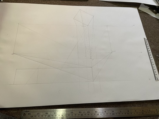
I felt that task one was very “hit or miss” based on the results my peers had in my tutorial. I saw that some needed to had to redo their sketches and some had to attach extra paper on the side. Luckily, I did not have to do any of that as the chamfered box model I made really helped me understand the space I was drawing in, resulting me to avoid those little errors. My final result I think look decent and I am pretty satisfied with it. I have also left my construction lines there to remind me the process of creating a two-point perspective for the future.
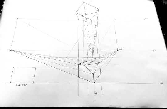
Task two was a little tricky at the beginning as I was a little confused with the diagonal lines (they looked really confusing). I wanted to attempt this without the assistance of the step-by-step guide to teach myself to do this, and it was all looking right. I had successfully added prism of the same dimensions to the bottom and the back. I hit trouble when I was trying to add my third prism to the right side. It started to look very distorted and weird. I thought I was doing wrong, even though I followed the exact same method as I used for the previous two additions. So I double checked with the step-by-step guilde and the methods that I used to create corresponded with that of the guide, so I came to the conclusion that I do not have enough space within that range to add another prism on the right. Instead, I added one to the left, and it looked right. Overall, it was a little confusing because of the distoretion issue, but I am satisfied with the result.

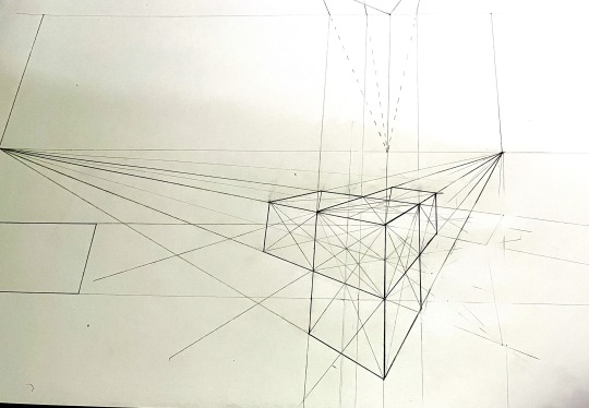
The last task, task three was relatively simplier. Constructing a cube and drawing a circle on two faces in perspective. Once again, I tried not to refer to the guide, and tried to remember what Rob said during the lecture. I was successfully able to remember everything and was able to complete the activity without much hassle. I also double checked my method with the guide after completing to make sure eveything was ok. Overall, this last task was the easiest of the three, probably because the hardest part is to create the right perspective, which had become much easier for me to do by completing tasks one and two.

In all, this week’s activies were certainly interesting, and I enjoyed myself doing these. I really like this way of constructing perspective views. I think it’s a lot cleaner and tidy, even though there A LOT of steps to remember. I am also generally satisfied with my outcomes for these tasks.
2 notes
·
View notes
Photo


For @hedgiemuffins and anyone else that has a hard time drawing Lammy!
This is my version of her and I’m still working out some kinks about what I want her to look like compared to her original design. So she may change in the future.
I know I didn’t give her “lipstick” like in her original design but sometimes it doesn’t look right with certain expressions so I removed it all together. Lol
Hope this helps!
23 notes
·
View notes
Video
youtube
(via https://www.youtube.com/watch?v=62LQl9urnT0)
#pencil drawing#pencil shading#tutotial#step by step#basic drawing#tumbler drawings tumbler art#how to draw a landscape#with pencil#pencil techniques
1 note
·
View note
Note
so glad to see all your traditional drawings! I mean I love your digital art too, but I have something for your traditional pieces TuT can you maybe do a tutorial? your process videos are awesome to watch :')
waaa, thank you so much! I’m having so much fun with traditional mediums haha I’m glad you like it c’:uuum, I mean I can do a process video or something like I’ve been doing lately, but a …tutotial?? I don’t mind, but I’m not sure there’s anything I can really teach you lol tell me what interests you in my process and I’ll try my best to explain c:
6 notes
·
View notes
Video
disney.arts -- Tag a friend who might love this tutorial! Done by @silviemahdal_art - "Basic tips for realistic drawing of eye lens:
1) find out where the light comes from and draw a light reflection on the cornea;
2) start with light shading the whole iris (to give the iris more depth) and draw structural lines;
3) fill in the pupil (use 6B-8B pencil);
4) darken the edge of the iris;
5) add shadow under the upper eyelid;
6) add a dark "ring" of spokes around the pupil (but take into account that all eyes look different);
7) add more layers until you are satisfied with the result👍P.S. It is not a full tutotial for drawing eye lenses! I just wanted to show BASIC MISTAKES when drawing eye lenses!" #disneyarts #eye#iris
3 notes
·
View notes
Video
아이패드와 프로크리에이트로 그리는 그림. a picture drawn in iPad and Procreate. 유튜브에서 “BARA studio”를 검색해주세요. 구독은 제게 힘이 됩니다. Please search bara studio on YouTube. Subscribing is a big help to me. #그림그리기 #그림 #일러스트 #캐릭터 #만화 #아이패드 #ipad #procreate #drawing #manga #character #illust #illustration #art #キャラクター #イラスト #絵 #process #tutotial https://www.instagram.com/p/B1m2LIVHT1d/?igshid=7ylwj4jdx6xt
#그림그리기#그림#일러스트#캐릭터#만화#아이패드#ipad#procreate#drawing#manga#character#illust#illustration#art#キャラクター#イラスト#絵#process#tutotial
0 notes
Last Seen Blogs

cevdetsarac1-blog-blog
cevdet saraç

floral-mysteries
Thea Oliviar

komad-komad
komad

kentv
the wiggly wave dance legacy

reckonanalytics
Reckon Analytics