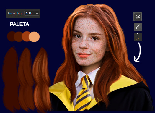
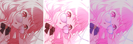
#edit tutorial
Text

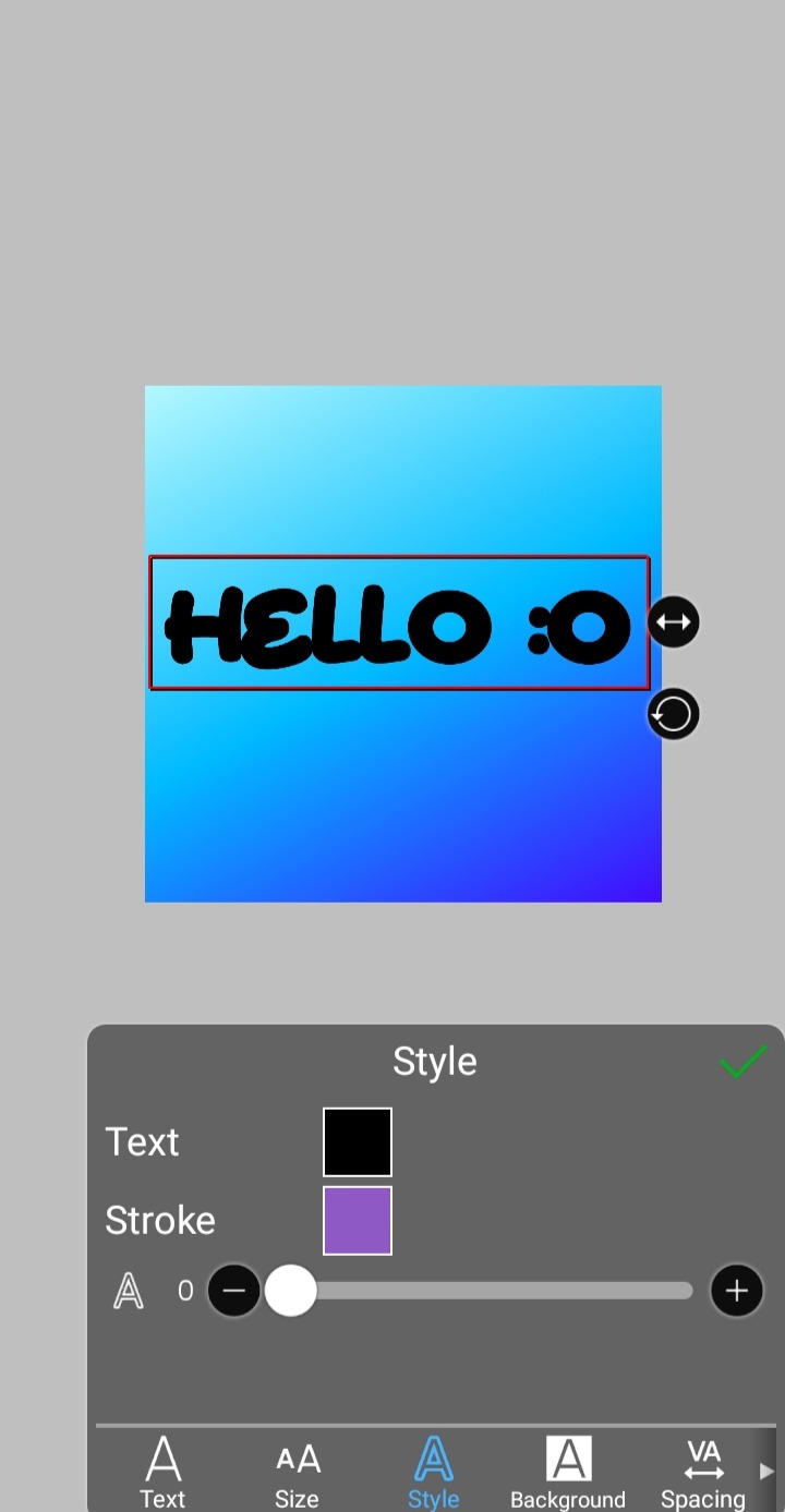
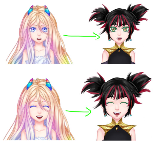
jelly text tutorial! (works with shapes as well)
what you need: ibis paint x, premium or free version doesnt matter
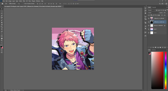
step 1: color
yes we're starting with color! I highly suggest using multiple colors for a prettier finish. I prefer parallel gradiation but as long as its blurry anything should look nice. pick analogous colors for the best result.

step 2: write the text or draw/import the shape.
as it says! if youre drawing it, make sure its on a new layer above the gradient! I suggest using rounder, bubblier fonts/shapes, one of my favorites to use is starborn on all uppercase. the color you use does not matter as it will be the background color in a short bit
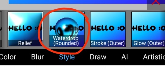
step 3, the jellificationing
this little friend called "water drop (rounded)" in effects under style is your best pal. its here to help you and make the process so much easier.
so just press it and fiddle around with it until you're happy with the result.
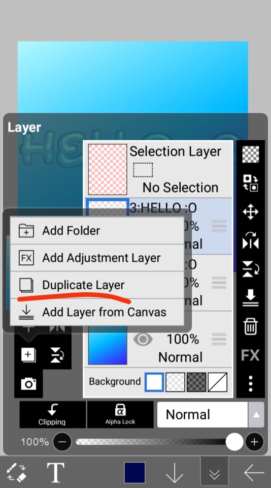
step 4 (optional): refracting
to help it make look more 'realistic' I tend to add another layer of the water drop. to do this I simply copy the previous one and go do the same effect on the top layer
step 4.5: tips
you need to make sure the refractive index for the second one is turned down all the way, or itll look weird, streaky, etc. make sure the highlight and highlight size settings are lower than the previous time you used this effect. and make sure the little sun symbol (the light source) is on the edge of the opposite direction of the previous time you used the effect. so if the first layer of jelliness had the light source coming from the top right, the second layer should br on the very edge of the bottom left.

step 5: begone, background
yeah, we're done with that, this will also be the big reveal of the final image

and then you just crop to fit and then save as a transparent
bam! heres the final thing!

I dont know how good I am at explaining but I hope this helped! if youre confused dont be afraid to ask!
#🌫️ i know what you dread | creations#rentry#rentry inspo#rentry resources#editing resources#editing#editing tutorial#edit tutorial#edit resources#rentry decor#rentry graphics#carrd resources#web graphics
342 notes
·
View notes
Text
ㅤ☆ㅤ𓈒ㅤׂㅤ Como fazer esse efeito blur no seu icon / header e etc 。 ◌ ♡🎀

⠀
Finalmente fazendo o tutorial que vocês já me pediram muuuuuito, dessa vez vou deixar salvo pra caso alguém no futuro apareça com essa dúvida novamente; espero que de pra entender, qualquer dúvida me mandem ask ou dm <3
vou mostrar de dois jeitos, como eu faço no picsart e como eu faço no ibis paint, mas isso funciona em qualquer programa de edição / desenho
⠀
primeiro de tudo, vá no pinterest ou google, procure por "overlay" + o efeito que você quer, que no meu caso foi blur (só pesquisando por overlay vc já vai achar mas btw)

⠀
. PicsArt
1. primeiro abra o picsart e abra a imagem q vc quer editar
2. seleciona a imagem

3. após abrir a imagem, vá em foto, seleciona a overlay e coloque ela por cima da imagem (não confirme nada, deixa a imagem só por cima, sem juntar as duas)

4. nessa parte eu não consegui tirar print mas na barrinha de ferramentas q aparecer você vai em "mesclar" e em seguida em "tela" . prontinho 👌🏽
⠀
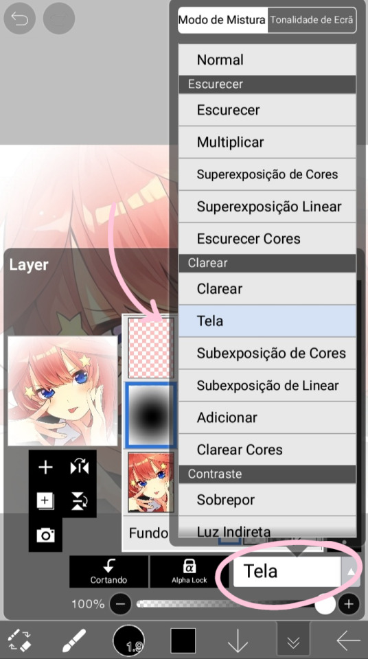
. Ibis Paint
1. abra a imagem
2. vá naquela camerazinha pra importar a overlay, importe ela e dê um ok

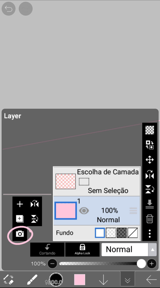
2. clique no "normal" ali embaixo, que vai abrir o "modo de mistura", e em seguida clique em "tela". prontinho 👌🏽
⠀
é isso gente, espero q tenham entendido, vou deixar também a overlay que eu uso pras headers caso vocês queram usar tbm

360 notes
·
View notes
Text

contrast - why it is important in editing
contrast is an element in any sort of design, from edits to artwork, and its importance doesn't waver regardless of what kind of design you are creating.
so why exactly is it important? it helps to not only organize the elements in your edit, but also to help distinguish the different parts. contrast helps draw your eyes to the more important aspects of the edit (typically the character). if everything blends together, then the edit stands out less.
its also important to note that contrast isn't *only* created using differing colors, however i will be explaining color contrast and how it can affect your edits in this post. contrast can also be created using size, texture, shape, etc.
the color contrast in different edits will differ depending on the theme you are going for, however no matter the theme of your edit you still want to be able to differ the focus point (your character) and your background. that tends to be harder in lower contrast edits because there is less of a difference in color values.
there is also issues when a lack of color contrast in an edit prevents visually impaired people from properly being able to see what you are creating.
so how can we go about implementing more contrast in lower contrast colorings? there are a few simple ways to do it. i'll be using kasumi as an example
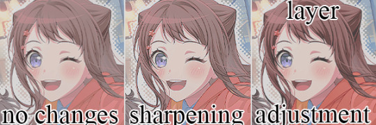
i've created a very low contrast psd and slapped it on kasumi. as you can see with the no changes version, the colors blend together very much because of the lack of color contrast.
the easiest way to fix this (and without changing the colors) would be to sharpen the image. this creates bolder lines on the character and helps kasumi stand out a bit more from the background.
another option would be to simply adjust the layers. on the third kasumi all i did was add two adjustment layers and i created a bit more contrast.
so whats the best solution to fixing the problem? well in my opinion, it'd be both sharpening *and* adjusting the layers.
it maintains that low color contrast look, while also still making it so you can see kasumi.
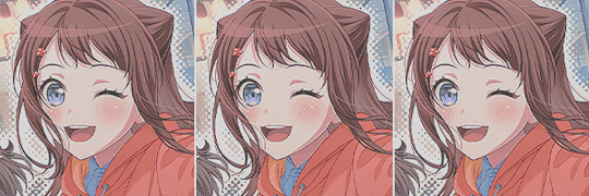
there are multiple ways to add contrast using new adjustment layers, here's an example of three i could think of off the top of my head. curves, b/c (brightness/contrast), and levels.
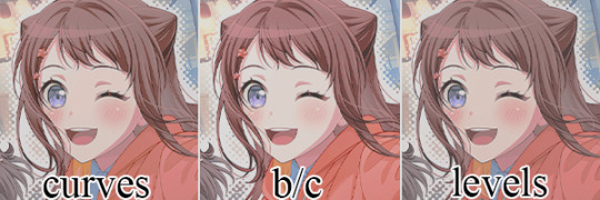
using curves can be either quite complicated or quite easy depending on your goal and understanding of it. for creating (or removing) contrast, its pretty easy!

by dragging the top pin to the left, you can easily create more contrast
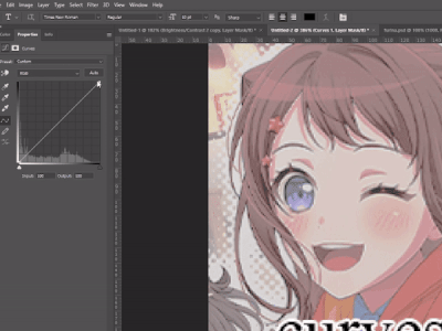
by dragging the top pin down, you can remove contrast

by doing it in the middle you can create a sort of mix of both.
brightness/contrast is pretty straightforward, just up the contrast value using the contrast bar. usually when i up the contrast i tend to turn the brightness down a little bit as well.
using levels is also relatively straightforward! by adjusting this bar you can easily add or remove color contrast.

you can use just one of these methods, a new method, or mix them! anything works! experimentation is a part of editing, it helps you to learn what works best for you. my guide is not an end-all fact book for how you *need* to do things, but rather advice and tips to help you get better and to make your designs look more appealing.
remember that it's all in good fun! if you have any questions or comments about my post, feel free to send me an ask or toss it in the reblogs and i will answer the best i can. happy creating!
31 notes
·
View notes
Note
Encontrei recentemente seu portfólio navegando nas tags do Tumblr e, desde então me apaixonei. Cada edição sua tem um capricho dos deuses! Você é extremamente versátil, e, com isso, ganhou uma admiradora.
Não consigo evitar de perguntar: qual é o seu segredo para editar os cabelos? Eu uso o iPad espelhando a tela do meu computador em conjunto com a Apple Pencil, mas, mesmo assim, sinto que os fios dos cabelos dos meus personagens não ficam tão naturais. Alguma dica?
aaaaah, meu deus, muito obrigada pelos seus elogios, xuxu!!
lançar aqui um mini tutorial do que eu faço, oki? qualquer coisa só me chamar que eu vou ter o maior prazer em explicar melhor c:
OBS.: eu uso minha mesa digitalizadora huion no pc com pressão de traço ativada, e uso um pincel pra cabelo no photoshop que é esse aqui.
vou usar a modelo da capa de 'the best night' como exemplo, acho que ela pode mostrar muito bem a técnica que eu uso, principalmente quando quero adicionar mais mechas de cabelo no edit.
às vezes eu suavizo a aparência do cabelo com alguma ferramente que borre a imagem, no caso eu uso a 'borrar' do photoshop com pincel de cabelo e intensidade alta. isso dá uma aparência mais "lisa" pro cabelo.
feito isso, eu pego o pincel duro normal, com pressão ativada, e com a cor mais escura que encontro da paleta do cabelo pra fazer a base das mechas que quero adicionar.
ainda com a cor escura, pego o pincel de cabelo e passo algumas vezes atrás do modelo pra dar a aparência mais natural dos fios, evitando que fique parecendo que o modelo tá com meio quilo de gel na cabeça pro cabelo ficar todo comportadinho AKSJSAKKAS
depois, eu pego alguma cor não tão escura e não tão clara do cabelo, que esteja aí no meio termo e que tenha em abundância na paleta, pra pincelar nas mechas e fazer os primeiros fios-base. dá pra adicionar nos arredores também.
e logo depois pego a cor mais clara e passo nas partes das mechas onde está mais iluminado. LEMBRANDO QUE, cada etapa dessas cores é em uma camada diferente porque eu sou insegura, mas você pode muito bem fazer tudo em uma camada só se souber o que tá fazendo (porque na maioria das vezes eu não sei o que tô fazendo a).

depois disso eu começo a misturar as mechas feitas com o cabelo original, e não tem segredo! eu vou desenhando os fios com o pincel de cabelo com as cores da paleta, misturando as mechas e adicionando mais cabelo pro modelo, principalmente nesses pedaços do ombro.
por último, mas não menos importante, adiciono as luzes, que são simplesmente fios que pegam a cor de iluminação do ambiente. como a luz da capa é amarela, eu coloquei fios amarelados e claros pra dar a impressão de iluminação final. é muito pouco, tome cuidado para não exagerar se a luz for muito fraca. e tenha em mente que são apenas as mechas que estão expostas à luz!! siga sua intuição!!

e pra dar um toque final, faço pinceladas com o pincel padrão rígido, no menor tamanho possível (1px) nessas partes iluminadas de amarelo, pra fazer fios singulares de cabelo que estão "esvoaçados", dando um efeito mais bonitinho e "mágico" por assim dizer.

eu também coloco um migué a mais, coloco uma luz amarela em volta do modelo pra dar o efeito final de iluminação, sabe? e mistura muuuito bem com esse efeito do cabelo. enfim, o resultado final com efeitos de cor e tal é a capa já pronta e postada no meu port!
21 notes
·
View notes
Text

Hi,
For this, I'm going to give as example the sprite I made for Nyrinn.
I also recommend looking into this tutorial as well, that's sort of the same thing, but here's a fresh one in case you wanted something like this:
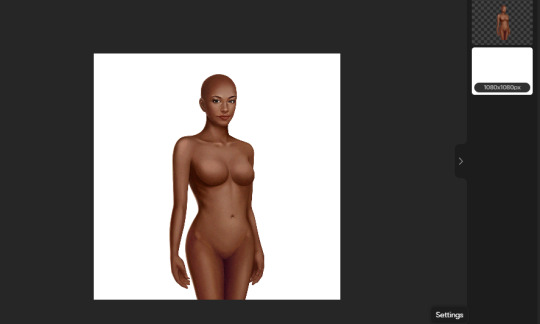
First, I chosed the character that I wanted to represent her body type, that being Ophelia and then I cleaned her.
I erased mostly everything leaving her face and body. I did some superficial covering with a pen, using these stiff colors that I can paint over. Having the basic shape first is better than overcomplicating yourself because you might change your mind about some things. If you wonder how I made the legs, it was how I imagine them. References help a lot.
After that, I began shading it.

Notice how many things changed from the first draft. I mostly used an air brush or a pen with a low opacity and density. To ensure you stay within the body perimeter, select the thing with a magic wand or whatever tool your editing program has specifically. You can shade however you consider, like, if you know some parts will stay mostly covered, you don't really need to shade that much there, only the most essential parts. In my case, I wasn't sure what clothes I'm going to give her.
Now let's get to the face specifically.
Being in portrait mode, it's much easier, you can just work on a specific half and then copy and paste it to the other. That's what I did to the eyes. Be careful with that little white dot on the eyes to be in the same direction. For that, I flipped the pupil so it matches. For the mouth, I copied some color and just drew a smile and some small fangs. I used her original mouth as a base.
For her hair and clothes, I took clothes from the game. I used gardiennemaker to make an outfit first because like I'd said, I had no idea what I wanted. It's a good way to visualize what you want instead of just searching for pieces, edit them, and then realizing that you don't like what you have and have to start over.
And I ended up making this. Still not childish enough but hey, these clothes are originally made for a grown adult so...
I took the pieces individually and edit them on her. I did the famous deconstruction of each piece and put it on my mannequin bit by bit. I did some drawing as well, especially for the top following the shading I give to her body but in rest just stretching, erasing and lining. I did change the colors of the shoes to be darker.
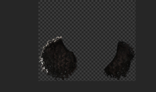
For hair, I used 2 wigs and some details for Chrome.

I also added those red parts by selecting the hair bits, adding some red on them, and putting the layer on "screen" mode.
For the other expressions I just took the ones Ophelia has and added it to her.
I mostly did the exact same thing as for her face.
And that's it. I hope it helps!
14 notes
·
View notes
Text

MATCHING ICONS TUTORIAL . . .
how you make icons line up perfectly with each other ! or at least how i do it lol
this tutorial was made in ibis paint x !
input your photo ( you can filter before or after, i just typically filter first ) . save the image after this step .

then , change your canvas width to normal ( in my case , 500 ) . make sure the origin is set to either the left or right , and not the middle . ( this way , you only have to reposition the other side )

input the image you saved earlier , and move the x / horizontal slider to where the edge of the image aligns with the edge of the canvas ( you may have to zoom in to make sure )

then simply save both icons & position them next to each other in the post editor !
#☆★ // tutorials .#also idc if you use the example icons here just rb + credit thanks#editing#edit tutorial#icon tutorial#matching icons#matching icon tutorial
40 notes
·
View notes
Note
yoooo it’s me agan! I wanted to ask if u new how to use psd and, more importantly: how to make shadows! like those shadows behind that make it look more 3d and that follow realistically the oh shap (i can kinda make square/round shaps but nothing more)! thx! oh fyi i draw and edit most things and layers on auto desk then move to photopea for filters and clipping and all! thought u might need dis info. idk bye! thx!
hey, hey, anon!!
okay, for your first question! you should open your psd in photopea, and then, copy and paste the folder it has onto your edit. then you can adjust it as needed. sorry if that doesn't help, its kinda hard to explain lol.
for the shadows, i'll go under the cut for this, because i'll do a proper tutorial. i only know how it works in photoshop/photopea, but i think this works in auto desk. if not, sorry!
~ mod gladiolus
how to do a shadow effect!
step 0: do your edit, but don't merge it down to one layer

step 1: duplicate your character layer, lock the layer + fill it black

step 2 (optional): unlock layer + gaussian blur (we use 3.0 strength)
step 3: move it slightly in whatever direction you want + put the main layer in front of it
step 4: lower opacity to your liking! (we lowered it to about 45% opacity) you can also use multiply/overlay/soft light layers depending on preference.
optional bonus (1): don't move the black layer to get this simpler effect pop out effect.
optional bonus (2): for sticker-like effect, select outside your character, use expand and a white fill on a new layer and then do the above steps!

16 notes
·
View notes
Text
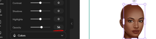
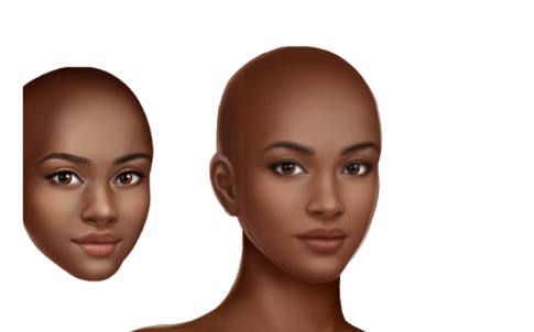
In my opinion if you have a black haired oc you should make it the darkest black when u edited it somehow I think that's going to be attractive because it looks like manga style.
Manga style are attractive okay 😳💖
#lunarthefrieschild#lunar txt.#edits#art#falling into randomness with lunar(●'▽'●)ゝ#lunar opinion#lunar suggestions on edit#edit tutorial#manga art#manga#manga edit
10 notes
·
View notes
Note
I wish you could provide a tutorial or some kind of guide on how to make these edits that I have seen from you. The only thing I know for certain is you do Photoshop layering and use the brush tool.

Okay so this is gonna be a bit a messy so apologies in advance.
I use Picsart (on PC) because I'm broke. I don't really do all that much other than what you said, but I'll try to show you as best as I can with pictures even though it probably won't tell you much more than you already know lol.
So, I'm guessing what you guys are mostly interested in is the custom face so that's what we'll be doing.
First, I like to use a base face with an already fully assembled body because it makes it easier to get the proportions correct but it's completely optional. I highly recommend @korgbelmont and @abookishcreative 's blogs for getting assets.
This shall be our base:
I wouldn't overlay too many faces because it tends to get a wee bit messy.
I like to crop the ears out of the faces I use to overlay because the ears usually overlay very poorly and 99% of the time the hair that you use will cover up any lines on the side of the face (or of course you can smooth them out like I do with some of my male edits)

Now's the fun part: Overlaying! This opacity tool right here is our best friend
The first face you apply you will want it to be the highest opacity out of all the faces you overlay because it will be at the bottom (apart from the base)
I like putting it somewhere between 40% - 50% transparency but it's really up to you, it just depends how much of the base you want to show through.
Face 2 overlayed...

and face 3 overlayed!
Add as many more faces but I'm gonna stick with just 3 for simplicity. And of course, you will more than likely have to adjust the face on top to fit the faces on the bottom but it's super easy.
I sometimes like to make new hairstyles so that's what I'm gonna do but don't feel like you have to, I don't make new hairstyles all the time either.
We're combining these two hairstyles:

We only need the bottom half of the first hair so I'm gonna erase the top half
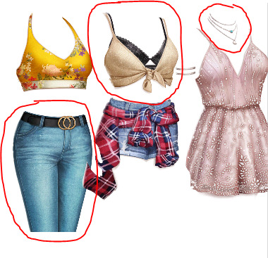
I make a lot of my own outfits by combining assets but I'm not gonna do anything too crazy. Here's an example of me picking out certain assets for one look and cutting out only what I want.
And....Done!

When I'm finished, I usually will put it into a drawing program. I didn't this time because it's a simple edit and I didn't feel like it, but most of the time there will be stuff you want to smooth out and it allows you to adjust to almost anything I don't like that you couldn't fix in Picsart. And sometimes I'll put it through a photo enhancer, sometimes I won't, it's just up to you what you prefer. I use the Remini app when I do.
I hope this was okay, I don't usually do tutorials! I tried my best :) Also may be some grammar errors, I didn't reread through it.
14 notes
·
View notes
Note
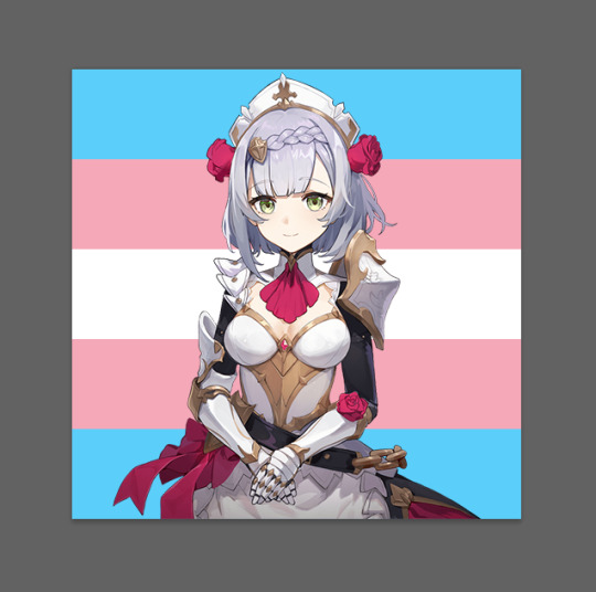
hi, I love your edits! I just had a question. how exactly do you color pick pride flags from characters? It might be super simple and I just can’t figure it out but I’m confused lol. thank you so much <3 have a great day or night!
I decided to do a mini-tutorial in response, so I hope that's okay! I hope it all makes sense!
~ mod diluc
step 1: pick your character and flag
I went for the trans flag and the character noelle from genshin! open the flag in whatever program you use (I use photoshop) and then add a transparent or render of the character you want to colour pick from.
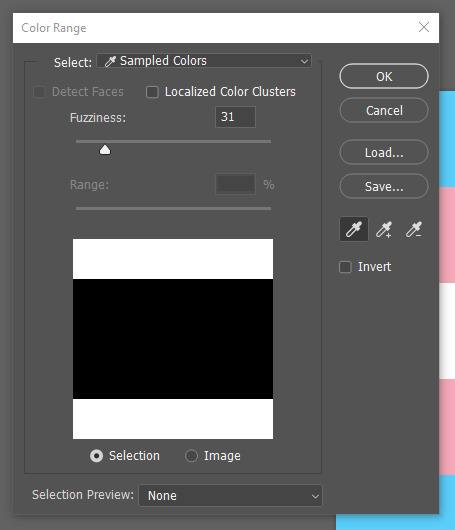
step 2: use colour range to select specific colours in the flag
this is the best way to do this, because it works with flags with more than stripes. you can also use rectangle marquee for striped flags.
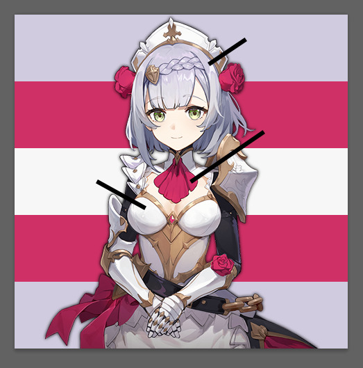
step 3: pick your colours!
I do this one at a time, so I select the colour I want to replace with colour range and then look at the transparent. I usually go for the closest colours to the flag, but you can also do the character's primary colours if you wish.
then you use either the paint tool or the fill tool! this will only replace the colour you want it to and then you can move on to the next colour.
I suggest doing these on separate layers, just in case you want to change the colours later.
step 4: save the image!
and that's it! if you have any more questions, feel free to come ask, I'm happy to help!
8 notes
·
View notes
Text

gradient maps - literally just my thoughts
if you've been on editblr at all you're bound to know em. in this post i aim to share my personal thoughts and critiques on gradient maps, as well as possible ways to utilize them in your works
disclaimer that this post is *not* targeted towards anyone in any way, shape, or form! i'm simply stating my opinion. if this is how you like to edit that's perfectly okay, and you don't have to change that
i'll begin by explaining some issues i personally see with them.
i find that a lot of edits seem to just use the gradient map itself without any other changes. this becomes an issue when people are creating gradient map edits that have very low contrast as it prevents people who are visually impaired from being able to see your edits.

something as simple as changing the blending mode you use can easily help you use a gradient map much differently. in each blending mode variation i used only *one* layer and simply just changed the mode and level of opacity.
gradient maps can be *very* useful in edits, and using different blending modes with those gradient maps opens up opportunity to more interesting colorings. below i have examples of psd colorings ive made all using gradient maps in different ways
while it is undoubtedly true that not every editor uses photoshop or photopea or a program that has the kind of adjustment layers those programs use, most do have gradient maps. so it makes sense why a lot of editors would rely a lot on them.
some of the blending modes i personally find the most useful (and used myself in the above colorings) would be: divide, soft light, multiply, luminosity, and color.

with divide you have to make some... kind of ugly gradient maps. but when you switch the blending mode to divide and set down the opacity a bit it turns out looking really nice! with divide its important to note that your gradient map will be using the *inverted* colors of the color scheme you're going for. that is why the gradient maps will look strange
soft light is much more subtle in the way it colors your image, therefor the gradient map you use may want to be very dramatic in the colors it uses. the soft change in color is perfect for when you want a more subtle change to more closely bring the different colors of the edit together. if you want a more dramatic light, its sibling hard light can do that job for you.

i find multiply works better with darker colorings, i usually lower the opacity while using it as well. i tend to use a broader range of dark to light colors in the gradient map i'm using with multiply
luminosity can either have a very dramatic, or very subtle effect depending on the colors you use. i encourage you to play with this mode a lot! it can create some interesting effects that i don't really know how to describe
color does as it says it does! it changes the colors of the image to the colors on the layer. it doesn't change the saturation of the colors, however. it's essentially like if you hue-shifted them. you can use this to create very drastic changes in color, or to establish what colors you primarily want to be in your coloring
i don't really have much else to say other than to have fun with it! i just pointed out different ways to use gradient maps as a tool for your editing, if you decide to follow my advice or not is totally up to you. if you have any questions or comments feel free to shoot me an ask or throw it in the reblogs and i'll answer to the best of my ability. happy editing!
19 notes
·
View notes
Text
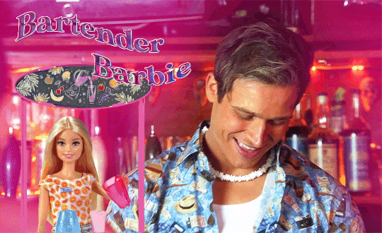
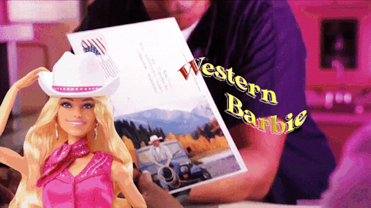


+bonus
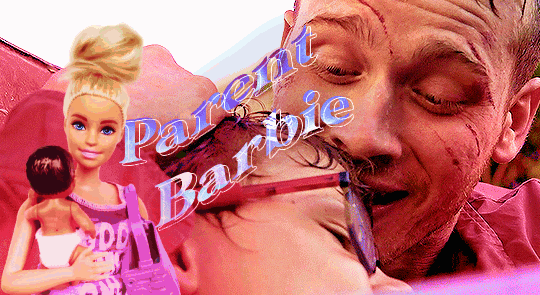
This Barbie is... Evan Buckley
#be nice this is my first gifset that i made using photopea#and i saw like three tutorials only lmao#evan buckley#evan buck buckley#christopher diaz#buck and chris#911 fox#911 on fox#911 abc#911 on abc#911 edit#911 edits#911edit#my edits#my gifs
3K notes
·
View notes
Note
Teaches how you edit mcl images ?
Hi,
You can check out these posts:
10 notes
·
View notes
Text


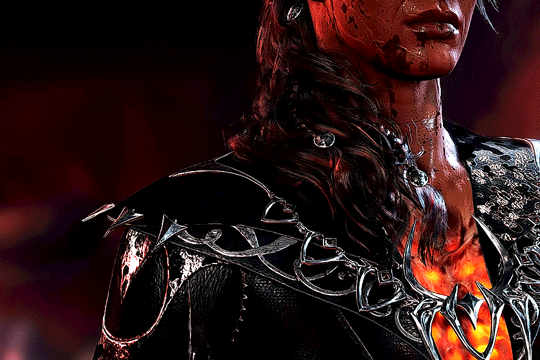
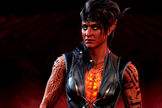
Baldur's Gate 3 - Karlach Cliffgate, The Infernal Heartthrob of the Avernus
#this is for anna and anthi my go-to karlach girlies#karlach#karlach cliffgate#bg3edit#baldur's gate 3#bg3#baldur's gate#gamingedit#videogameeedit#bg3 karlach#i cant get past the tutorial until i gif all of the companions in this good lighting#my edit
3K notes
·
View notes
Text
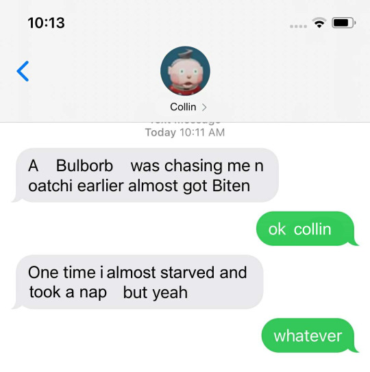
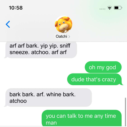
#was talking to a friend and she was talking about how she didnt like how disruptive the tutorial of the demo was#since she wanted to look at the pretty environments without the distractions#and this is what popped into my braine#ive had the gumby pokey format in my brain since the demo but i didnt know whod fit the gumby slot#sorry collin.#i personally didnt mind the tutorial (from watching a stream of the whole demo) but i can see how it could be frustrating#:) i like oatchi#edit: for further clarification im not shitting on collin. i just didnt have much other choice. collin im so so sorry.
1K notes
·
View notes
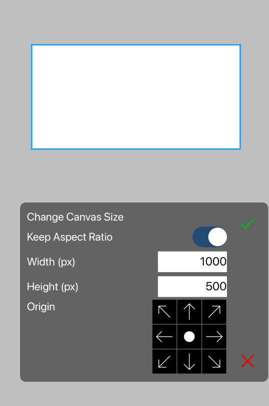
Note
Umm tutorial on dividers, if that alright? Ive really been struggling with them so...
That is totally fine, anon, we'd be happy to do this for you.
We do two styles of dividers, so we will show you how we do both. This ended up quite a short tutorial, so let us know if the info is too vague.
I hope this tutorial can help you stop struggling with them as much.
~ ozzar
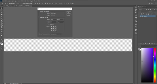
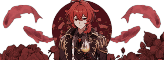
The canvas size we prefer to use is 600 x 60 px. This works pretty well for us, but you can adjust as needed depending on your personal aesthetic preferences.
Chances are, your elements won’t be very high resolution at this size. But, they don’t need to be for this kind of edit.
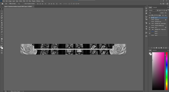
Type 1:
I used a background from pinterest of a gothic window (very pretty) and some rose transparents we have from our ‘favourite transparent’ folder.
For this style of divider, it is best left simpler, with the major elements kept to the sides and middle/bottom, depending on preference.
The line element is simple, but adds a neat little element. I just used the line tool in photoshop for it.

Type 2:
This style is transparent, and pretty fun. This is the kind we’re currently using on our blogs.
The elements aren’t much different here, with only an added middle element and a removed background as differences.
Middle elements work well in this style, and all elements look best with either a 2.5 gaussian blur behind them (duplicate the element, fill it in with black, then gaussian blur) or a white border (select, expand 1 or 2 px, new layer, fill white).
30 notes
·
View notes
Last Seen Blogs
l0litagoth-blog
My sims life
ridenourrl-blog
Picking up Patriotism
iamhumanlivinghealthy
Living Healthy=Living Happy

fcradiony-blog
Fcradiony
bi-athena
Loving My ✨Wife✨ Hours: 24/7