#editing tips
Text
Get some distance before you proofread
Never begin proofreading immediately after a first draft or edit. Your brain will read what it's expecting, not what's actually there.
Take a break, and read something from another genre as a palate cleanser. You'll be more likely to spot errors if you get some distance.
#writers#creative writing#writing#writing community#writers of tumblr#creative writers#writing inspiration#writerblr#writeblr#writing tips#writblr#editing#proofreading#editing advice#editing tips#quick tips for writers#writing quick tips#creative writing tips#advice for authors#writing advice#advice for writers#writers corner
774 notes
·
View notes
Text
How to Survive the Editing Process
Writing a first draft takes so much of your time and energy. When you finish something, celebrate your accomplishment! It’s proof of your creativity and hard work.
If you want people to read your work, then it’s time to edit.
Editing can seem scary. Daunting. Confusing.
Use these tips to get started.
1. Take a Break from Your Work
It’s so important to let your brain reset after finishing any story. Close your draft and spend the next few days or weeks doing other hobbies. When you feel ready to return with a newly energized, distanced perspective, you’ll get your best editing work done.
2. Start With Developmental Editing
Writers often think that they have to start editing line by line, looking for grammar and spelling issues. While you’re free to do that, you’re likely going to add and remove plenty of content before your final draft is done.
Instead, start with developmental editing. Read through your work and take notes about how the larger plot points are working or not working. Does each chapter move your characters through each point on your plot outline or your visualized storyline?
This step may involve adding new scenes or removing others. It can also mean reworking old scenes so they’re less wordy, more descriptive, more actionable, or whatever you feel like is missing.
Take notes about plot holes too. You don’t have to fix them on your first read-through, but note where they’re happening and why they’re holes. You can return in your second read-through to address them.
You can also break your developmental editing into questions, like:
What is my story’s theme and does each chapter support that theme?
What does every character want and do they achieve that? Why or why not?
What motivates each character? Do they retain that motivation or develop a new one to better serve the plot? (Sometimes writers forget about initial character motivations while getting lost in the writing process. This is the time to revisit that!)
Do you have a beginning, an inciting incident, building through the middle, and payoff at the end? (You can have much more than these, but these are very basic plot mechanics to look for.)
3. Save and Start a Second Draft
After reading through your manuscript and noting the things above, create a copy for your second draft and start working on your notes. It’s good to have a separate second copy in case you want to include something from the original draft later on or just want to compare where you story started/how it ended up.
Again, you’re not supposed to worry about line work at this point. Focus on bigger-picture story issues like plot mechanics, how scenes work/don’t work, plot holes, and your theme(s).
Reminder: there’s no timeline for getting these steps done. Work when you have the energy and take breaks when you don’t. Your manuscript will stay right where you save it.
4. Reread Your Work
When you’ve worked through your list of notes, make a copy of your manuscript and start Round 3. Reread your story and start a new list of bigger-picture notes as needed. This time, the list should be shorter or include new notes that you didn’t catch before. They may also include notes for new scenes you just added.
The point of this reread is to make sure that your manuscript still works. Your plot shouldn’t have any holes, it should flow smoothly, and it should be engaging.
Here’s a key concern for many writers: how do you edit your story without getting away from your original intentions?
Keep your eyes locked on why you write your original draft. If you make edits/scene removals or additions with that purpose or theme in mind, your story will stay on track. It may eventually look completely different than what you originally wrote (if that’s your editing journey), but the heart of it will remain the same.
Try posting your story’s purpose or theme on a sticky note attached to your monitor.
You could also write the theme in your document’s header so it appears on every page.
5. Save and Start a Fourth Draft
Yes, it’s time for another new copy that’s your official fourth draft.
Remember—you can still walk away and return to your work later! Burnout won’t result in the story you’ve been working so hard to create. Get some sleep, see some friends, enjoy your other hobbies. You’ll come back ready to go.
The fourth draft is another chance to read through your work and ensure that everything works. Your chapters should get your characters closer to your theme/purpose with each page. The scenes should flow, not repeat information, and keep you engaged.
When you have a small list of edits or none at all, it’s time to start line work.
The spell check feature of any word processing software is a lifesaver, but it’s also not perfect. You’re going to have sentence structures that spell check deems incorrect when it actually works for your writing style or character. You’ll have fake names you made up that spell check wants to change.
If you use spell check, proceed slowly. Read every sentence with a flagged issue to make sure it’s a good or bad suggestion.
You can double your line work by combing through it by yourself. Print your story and grab a highlighter or use the highlight feature on your computer. Note linework issues that you can fix with a quick edit when you get a chance, like:
Misspellings
Missing punctuation
Wrong punctuation marks
Missing words
Inconsistent capitalization or spelling
Formatting issues (spelling out numbers vs using numerals, etc.)
Using the wrong tense in some paragraphs or chapters
Inserting indents as needed
Extra spaces between paragraphs
6. Send Your Work to Beta Readers
Repeat the saving, making a copy, and editing as many times as you want. When you feel like you’ve got your strongest draft yet, you can send it to beta readers.
How you define beta readers depends on your specific situation. You may have a few writing friends who know the craft well and will read your work with a professional eye. You might have a family member or best friend who doesn’t know about the craft of writing but always reads your work.
There are also places like Reddit threads and Facebook groups where people volunteer as beta readers.
The primary reason to get fresh eyes on your work is to get notes from someone who hasn’t been working on the content for months or years.
Their advice might not always be usable, but it’s still an important part of editing. Your beta reader might suggest points where they lost interest because your pacing slows down or point out places where you described your protagonist as having long hair when they have short hair during the rest of the story.
You’ll know which suggestions are actionable and which aren’t based on who’s speaking and how it resonates with your story’s purpose. You’ll probably get better advice from other writers who have been through editing before, but that doesn’t mean their advice will always be correct.
Check in with your story’s purpose or theme before taking action on a beta reader’s notes.
When Should You Stop Editing?
One of the final battles during your editing experience will be recognizing when you can stop working on your manuscript.
There will always be moments where you could think of a new scene or a new way to rewrite a scene. That doesn’t mean you have to!
Ask yourself these questions to finish your editing when your story is strongest:
Question 1: Have I Worked Through the Most Essential Plot Mechanics?
A finished manuscript doesn’t need more structural work. But structural, I mean that you’ll be at peace because your manuscript:
Doesn’t have any plot holes
Addresses your theme/message from beginning to end
Showcases each character’s growth through plot developments
Has natural dialogue
Has introduced and resolved conflicts (with the exception of conflicts that will continue in a sequel or series)
Has no known typos or grammar issues
Question 2: Are My Edits Improvements or Are They Inconsequential?
You could spend a lifetime swapping character names, adjusting your world map, or revising how you describe locations. You might like your edits better, but they aren’t vital to your story’s plot or character development. If there’s no substantial improvement with your edits, you’re likely done with your manuscript.
-----
Editing can be tricky at first, but using steps like these will help you whack through the densest parts of the work. Take your time, give yourself space to rest, and you’ll create the story you’ve been working so hard to finish!
3K notes
·
View notes
Text
self editing tips (first pass)
you want your work to be awesome. i want your work to be awesome. i would love to help you make your work awesome. but sometimes, the first step is doing an initial pass over your draft before passing it off to """""professionals""""" like us. so here are some tips to get that party started...
print your book. you can print it out onto a bunch of sheets of paper and staple them together, or, if you don't mind spending $9 or so, you can get barnes and noble to print it into an actual novel for you! i highly recommend the latter. it helps you view your work as an actual book, not a mess of computer words.
set up the atmosphere. put on some nice ambient music, get yourself a nice coffee or tea or whatever drink you like, light a candle! make your editing workspace feel awesome.
don't change anything during your first pass. this is part of why i recommend printing it! i just want you to take notes, baby. highlight things in different colors if you want. jot down notes if you want. use transparent sticky notes, annotate onto the page, whatever your vibe is. but don't actually change anything right now.
compliment sandwich. after every editing session, write down one thing you think is working from what you read in that session, one thing you want to change or improve, and one more thing you're happy with.
keep a growth mindset, not a fixed mindset. this isn't a bad version that isn't up to your standards and is therefore hopeless. this is a moving part of your book's journey! this is step one. you can't get to step two without acknowledging the value of step one and thanking it for its time.
give yourself breaks to read, listen to music, or watch something with similar vibes to what you're going for. for me, this looks like reading books in the genre i'm writing in, watching shows with characters i really love, listening to music that fits the vibe, or reading poetry about the emotions relevant to my work.
log your progress. maybe write a checklist of every section/chapter so you can check parts off as you finish your first pass. this helps you feel productive, like you're really Doing Something even if you only edited six pages.
second pass tips coming soon! for now, happy writing, and please feel free to send us messages if you have any questions :)
#writing#writing tips#editing tips#self editing#indie author#writers of tumblr#editing block#editing ideas#writing advice#editing advice#self editing tips#story writing#novel editing#story editing#write it#novel writing#writeblr#creative writing#writers block#nanowrimo
1K notes
·
View notes
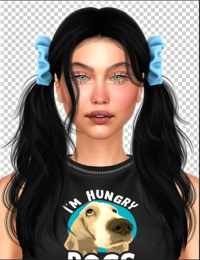
Text
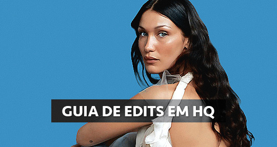
GUIA COMPLETO DE COMO EDITAR FOTOS EM ALTA QUALIDADE (HQ)!
oiê, bem vindos(as)! à pedidos, estou trazendo um tutorial bem abrangente sobre como editar fotos no geral para icons, headers, etc., em alta qualidade. neste guia/tutorial trarei dicas, truques e informações gerais sobre o que é preciso para editar em hq. lembrando que o conteúdo deste guia é sobre como eu edito, a maneira que funciona comigo e meu progresso e aprendizado ao longo de quase 12 anos editando icons, ou seja, o que contém neste guia pode — e deve — ser adaptado à sua maneira e ao software de sua preferência. aproveitem e se divirtam!
nota: este tutorial está bem longo, então, se possível, veja este guia pelo pc/notebook!
O QUE VOCÊ VAI ENCONTRAR NESTE GUIA
softwares necessários com links para download;
onde e como baixar as fotos para as edits;
métodos de edição e passo a passo;
como melhorar a qualidade de uma foto;
como salvar a foto corretamente para postar;
dicas de actions e outros resources.
clique em “continuar lendo” para ver o tutorial.
1. SOFTWARE
photoshop
eu recomendo fortemente o uso do photoshop cc na versão mais recente, ou outra versão com camera raw ou filtros neurais suportada pelo seu pc ou notebook.
você também pode usar o photopea como alternativa (eu particularmente prefiro o photoshop pois acho que as edits ficam com mais qualidade). se você preferir o photopea, algumas dicas desse guia poderão não funcionar devido à falta de algumas funcionalidades que o photopea não oferece (ex: camera raw, galeria de filtros, filtros neurais e outros).
eu uso a última versão do photoshop (atualmente, a versão 25.5.1) e uso a versão paga (obrigada adobe pelo desconto de estudante!!!!!), mas vou deixar alguns links para você baixar o photoshop gratuitamente caso você não seja estudante e/ou não tenha condições para assinar um plano.
atualmente eu uso um mac mini 2014 para editar, mas sempre usei windows, então, as dicas e os links valem para os dois sistemas operacionais.
links
macos: 1, 2 & 3.
windows: 1, 2, 3 & 4.
2. BAIXANDO AS FOTOS
galerias de fotos
muitos artistas têm fansites com galerias de fotos e você pode achar facilmente digitando no google: “nome da pessoa + gallery”.
o artista que eu quero não tem galeria própria e agora? tranquilo, ainda temos galerias de fotos de famosos variados como hqdiesel, hqsource, hq-pictures e até mesmo o theplace.
em último caso você pode usar o gettyimages e usar um removedor de marca d’água ou um site como o gettyimages downloader.
instagram
para artistas estrangeiros que tenham apenas instagram e/ou não tenham fotos em galerias de imagens, eu recomendo o instagram pessoal da pessoa.
você poderá fazer o download das fotos com extensões de navegadores como o image downloader for instagram (para firefox e google chrome), ou sites como o saveig, o snapinsta ou o igdownloader.
eu recomendo baixar pela extensão do navegador, pois ela baixa a foto direto do site do instagram no computador, diferente dos sites que você precisará ir foto por foto, copiar o link e colar no site para fazer o download.
mas, caso a extensão esteja indisponível, com algum erro ou pare de funcionar, o site é uma excelente alternativa (só precisa ter mais paciência).
nos sites para baixar fotos do instagram, geralmente eles dão a opção para você escolher o tamanho da foto. você deve sempre selecionar a resolução maior da foto (acima de 1000px é o melhor).
pinterest
em casos extremos de artistas low profile, sem instagram, sem aparições públicas, sem galerias de fotos, nadica de nada, eu recorro ao pinterest.
porém, é preciso ter muito cuidado ao fazer download de fotos do pinterest, porque são muitas fotos repetidas e muitas com baixíssima resolução e qualidade.
se você for baixar fotos do pinterest, escolha a foto com maior resolução (imagens maiores que 500px já são ok para editar icons), e depois de baixar a foto, eu recomendo fazer um tratamento na foto para melhorar a qualidade dela, como vou ensinar.
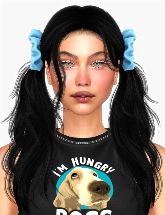
3. EDITANDO
3.1 importando a foto no photoshop
apertando ctrl+o ou cmd+o uma guia vai abrir no programa, onde você vai até a pasta onde a foto foi salva. selecione a foto e clique duas vezes nela para abrir.
3.2 cortando a foto nas dimensões desejadas
muitos tutoriais de edições de icons sugerem que você copie a imagem e cole ela em um documento novo já do tamanho da sua edit, mas eu não recomendo essa opção, pois ao redimensionar a foto com a ferramenta de transformar (ctrl+t), ela dá poucas opções para manter a qualidade da foto e se você não souber o que cada opção faz, poderá perder a qualidade da imagem. então, eu sempre faço o recorte na própria foto para não alterar muito a qualidade dela.
aperte a letra c no teclado para abrir o atalho da ferramenta de corte. (se o seu photoshop for alguma versão do cc, eu recomendo que você marque a opção para usar o modo clássico de corte, assim fica mais fácil e você tem um controle maior sobre a ferramenta!). para fazer essa alteração é simples, vá no ícone de engrenagem, clique e marque a opção “usar modo clássico”.
para fazer icons, você deverá cortá-lo usado dimensões quadradas, ou seja, 1x1, e para headers 15x5. você pode mudar as dimensões na caixinha da ferramenta de corte.
3.3 redimensionando a foto
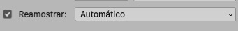
nessa parte você precisará prestar atenção, pois ao redimensionar a foto, você poderá perder ou ganhar um pouco mais de qualidade na foto, e para isso você usará uma opção chamada reamostrar (ou resample se seu photoshop estiver em inglês). deixe a opção marcada para usar as definições.
3.4 explicando as definições do reamostrar e qual definição usar de acordo com o resultado que você quer
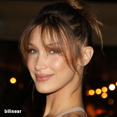


bilinear: a melhor opção para redimensionar gifs, mas para fotos não é tão bom pois dependendo da foto algumas partes ficam nítidas, outras mais suaves e se você for aplicar action de nitidez, pode ficar com um aspecto de “craquelado” com as bordas granuladas, o que eu pessoalmente acho que fica um pouco estranho.
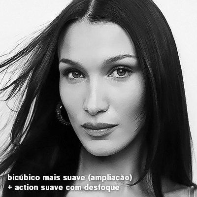
bicúbico mais suave (ampliação): como o nome já diz, ele deixa a foto mais suave, ou seja, os pixels “craquelados” e granulados da foto ficarão mais suaves. é uma ótima opção tanto se você for aplicar actions de nitidez ou actions mais desfocadas e mais suaves.
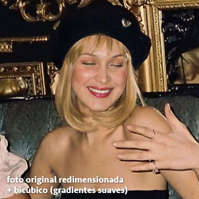
bicúbico (gradientes suaves): pode parecer a mesma coisa do bicúbico mais suave, mas esta opção além de suavizar a imagem, cria um “desfoque iluminado” nas transições das cores da foto. é a melhor opção para fotos sem muita qualidade e principalmente se você for usar actions suaves e desfocadas, sem muita nitidez.
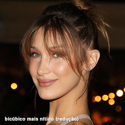
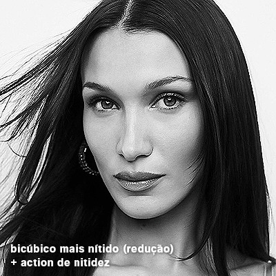
bicúbico mais nítido (redução): acentua os pixels e as arestas nítidas da foto, ou seja, essa definição redimensiona a imagem mas preserva a nitidez da foto. se você usa actions de nitidez que não tem desfoque nas configurações, essa é a melhor opção de reamostra. (mas cuidado, se sua imagem ficar muito nítida com essa definição, você precisará usar outra opção. caso contrário, quando você aplicar a action, a edit poderá ficar muito exagerada e/ou com aspecto áspero.)
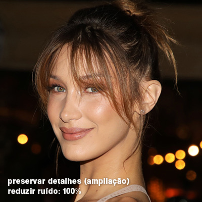
preservar detalhes (ampliação) com redução de ruído: esse em especial é ótimo para quando você precisar redimensionar uma foto para deixá-la maior sem distorcer tanto a imagem. você pode ajustar a redução de ruído para deixar a foto mais suave, sem perder muita qualidade. (obs.: essa opção não deve ser usada para redimensionar imagens muito pequenas, por exemplo de 200x200 para 400x400, ou a imagem vai ficar muito distorcida. ela deve ser usada quando a diferença de pixels não é muito grande, por exemplo, você cortou a foto e ela ficou no tamanho 370x370, aí sim você pode redimensionar para maior sem perder muito da qualidade. então você pode ir ajustando a qualidade com a porcentagem da redução de ruído).
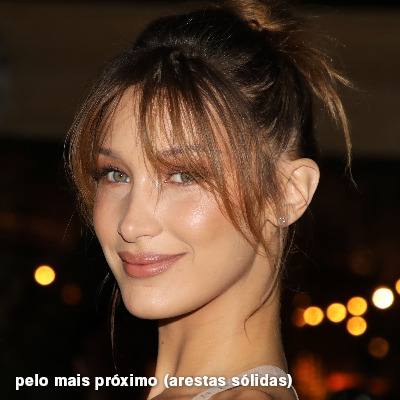
pelo mais próximo (arestas sólidas): essa é uma opção traiçoeira, pois não fica bem em quase nenhuma imagem (a menos que seja um pixel art). essa definição redimensiona a imagem e mantém os pixels nítidos, ou seja, a foto fica menor mas tudo nela que tem aspereza vai prevalecer. é muito usada para redimensionar pixel art, pois preserva as bordas ásperas. pode ocorrer de ficar boa em uma foto aleatória mas não será possível aplicar action, ou a imagem ficará exagerada.
3.5 aplicando a nitidez depois de redimensionar
depois de escolher a foto, baixar, redimensionar de acordo com o estilo da action da sua escolha, está na hora de aplicar.
eu fiz duas versões para mostrar como fica com cada tipo de action:
assim, os dois icons tem uma alta qualidade usando actions diferentes, graças a remostragem ideal para cada tipo de action :)
4. TRATAMENTO DE IMAGEM PARA MELHORAR A QUALIDADE
nesta parte, é muito importante que você tenha baixado uma versão do photoshop com neural filters e/ou com o camera raw, mas caso você não tenha, tudo bem também, vou ensinar como fazer uma melhoria na foto de três jeitos: com camera raw, com neural filters e com desfoques. a melhor forma vai depender de quão ruim está a qualidade da sua foto. em geral, apenas fazendo ajustes no camera raw você já tem um ótimo resultado na maioria das fotos.
camera raw
se seu photoshop tem o filtro do camera raw, ele vai estar em filtro > filtro do camera raw...
tudo que iremos fazer será na aba de “detalhe”, ali você deve dar mais atenção ao ajuste de redução de ruído, pois é ele que vai remover o ruído da imagem e melhorar a qualidade dela.
vá mexendo nas configurações de redução de ruído até que a foto fique mais suave. ajuste também o detalhe e o contraste da redução de ruído.
essa parte será mais no olhômetro mesmo, pois as configurações vão variar de foto para foto, mas eu recomendo muito você mexer também na nitidez para não deixar a foto tão desfocada, mas nada muito intenso para não interferir na action que você irá usar.
eu mexo também na redução de ruído de cores, porque dependendo da foto, algumas cores estarão saturadas ou com muito ruído. só cuidado para não colocar um número muito alto, pois esse ajuste pode tirar a saturação da sua foto e deixá-la apagada.
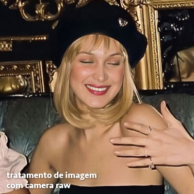
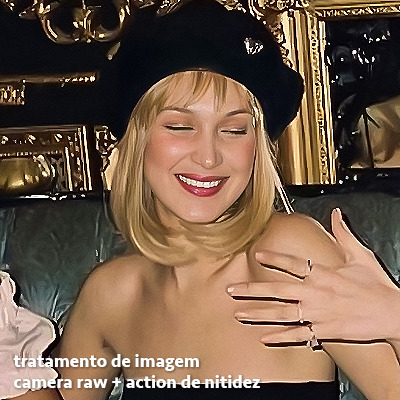
enfim, aqui está uma comparação da foto original com o tratamento feito com o filtro do camera raw e depois já com a action de nitidez aplicada:
e essas foram as configurações que usei nessa foto em específico:
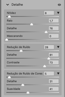
como eu disse antes, as configurações irão variar de foto para foto, a depender da qualidade de cada uma e de quão ruim a foto está, mas com essa configuração básica, você já vai conseguir melhorar algumas fotos.
neural filters
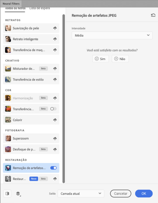
se a versão do seu photoshop vem com neural filters (ou filtros neurais), ele estará em filtro > neural filters...
irá abrir uma janela com vários filtros mas o que a gente irá usar vai estar em “restauração”, com o nome “remover artefatos jpeg”. se precisar, faça o download do filtro.
eu recomendo usar a intensidade sempre média, a menos que a foto esteja muito ruim, aí você usa a intensidade alta. mas em geral, a intensidade média ou baixa já dá conta do recado.
a saída deve sempre estar na camada atual, ou seja, na camada da foto selecionada.
assim:
e aqui está uma comparação da foto original com o tratamento feito com o neural filter e depois já com a action suave com desfoque aplicada:


a opção do neural filter é uma ótima alternativa ao camera raw, o único contra é que ele deixa a foto com uma textura áspera, e quando você usa uma action de nitidez eles ficam muito visíveis e acaba não ficando muito legal.
porém, um bom jeito de contornar isso é adicionando ruído na foto. eu uso o efeito de granulação do camera raw para adicionar ruído no icon (você também pode adicionar o ruído em filtro > ruído > adicionar ruído..., mas eu prefiro o camera raw pois ele dá mais opções para ajustar o granulado do jeito que eu preferir).
no primeiro icon abaixo, dá para perceber a textura áspera que o neural filter deixa depois de melhorar a foto e adicionar nitidez; já no segundo icon eu mostro como eu adicionei o ruído e contornei esse defeito.

as configurações de ruído que usei no camera raw foi 12 de granulado, 35 de tamanho e 20 de aspereza.
lembrando que, se você for usar uma action de desfoque e/ou remoção de ruído, não será necessário adicionar a granulação, pois a própria action já vai suavizar a textura do neural filter (a menos que você queira adicionar o ruído, claro).
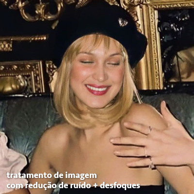
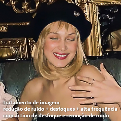
redução de ruído + desfoque
caso a sua versão do photoshop não tenha nenhuma das opções de camera raw ou neural filter, caso você use um photoshop mais antigo, photoshop portable ou prefira usar o photopea, essas alternativas podem ser úteis.
mais uma vez, irei me basear no olhômetro, de acordo com a foto e irei ajustando as configurações de acordo com o que eu quero e acho necessário.
vamos começar com a redução de ruído! ele está em filtro > ruído > reduzir ruído...
na janela de redução de ruídos você verá alguns ajustes que são: intensidade, preservar detalhes, reduzir ruído de cores e tornar detalhes nítidos e vou explicar cada um para que você possa saber ajustar eles de acordo com sua foto:
intensidade: o número de 1 a 10 irá definir a intensidade da luminescência, a intensidade do filtro e o quanto da imagem você quer preservar ou extinguir, sendo 1 o mínimo da intensidade do filtro e 10 o máximo;
preservar detalhes: o número digitado irá definir a porcentagem de detalhes a serem preservados. quanto maior o número, maiores serão os detalhes mantidos na foto, como ruídos, manchas e outras aberrações da foto;
reduzir ruído de cores: o número digitado irá definir a intensidade e reduzir o ruído cromático, ou seja, vai reduzir as aberrações cromáticas, como por exemplo, fotos que distorcem as cores. preste atenção na porcentagem inserida, pois quanto maior o número, menos saturação sua foto terá e poderá ficar com aspecto de foto envelhecida;
tornar detalhes nítidos: o número digitado vai definir a porcentagem de nitidez para restaurar pequenos detalhes da foto. quanto maior a porcentagem, maior vai ser a intensidade dos detalhes da foto. preste atenção na porcentagem inserida, pois se a intensidade da nitidez for muito alto, vai afetar a sua action, seja ela de nitidez ou de desfoque.
sendo assim, para a foto usada eu fiz estes ajustes:
obs.: se você for um usuário mais avançado do photoshop, poderá explorar a opção avançado, que possui as configurações básicas para melhorar a foto e também as configurações para remover ruído das cores primárias (vermelho, amarelo e azul) individualmente. mas, mesmo se você não for um usuário expert, eu recomendo você dar uma olhada nessa opção e explorá-la, mexendo nas configurações e ir ajustando e aprendendo, pois o resultado poderá ficar ainda melhor nos ajustes avançados.
aplicado a redução de ruído, vamos partir para o desfoque! eu estarei usando o desfoque inteligente antes do desfoque de caixa. você vai achá-lo em filtro > desfoque > desfoque inteligente...
na janela que abrirá, você verá os ajustes: raio, limiar, qualidade e modo. vou explicar eles:
raio: vai determinar o tamanho da área que será considerada para o desfoque. quanto maior o número, mais detalhe serão preservados;
limiar: vai determinar a diferença dos pixels entre si antes de serem alterados pelo desfoque.quanto maior o número, maior será a área em que o desfoque será aplicado;
qualidade: vai determinar a qualidade e intensidade do desfoque. ao escolher a opção mais alta, mais partes da foto o desfoque atingirá;
modo: vai determinar o traçado das linhas de bordas que o filtro identificar. o modo normal aqui é o ideal, pois os outros modos “somente arestas” e “sobrepor arestas” irão identificar somente as bordas da imagem.
sendo assim, esses foram os ajustes:
após o desfoque inteligente, partiremos para o desfoque de caixa! ele está em filtro > desfoque > desfoque de caixa...
(você também poderá usar o desfoque gaussiano a depender da foto, mas para esta em questão, o desfoque de caixa funcionou perfeitamente)
a intensidade do desfoque de caixa, assim como do desfoque gaussiano, é medida em pixels e o mínimo é 1 pixel, e para icons é uma intensidade forte, então eu coloco o número mínimo (1, no caso) e depois de clicar em OK e aplicar o desfoque, vou em editar > atenuar desfoque de caixa... e ajusto a porcentagem de acordo com a foto. nessa foto deixei a porcentagem em 33% e ficou ótimo.
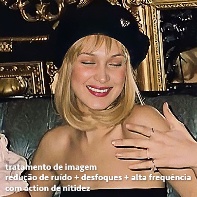
no entanto, infelizmente, por não ser o melhor método para melhorar a qualidade de uma imagem, ela ficará um pouco desfocada demais. mas podemos contornar isso usando o filtro alta frequência para devolver um pouco da nitidez e detalhes na foto. você encontrará esse filtro em filtro > outros > alta frequência...
o filtro de alta frequência, assim como os desfoques, é medido através de pixels e quanto maior o número, mais detalhes passarão despercebidos, ou seja, menos detalhes e menos nitidez sua foto terá. eu recomendo em torno de 2px se você quiser mais detalhes e em torno de 5px se você quer mais suavidade.
a primeira vista esse filtro parecerá estranho e distorcido, mas dará tudo certo, você só precisará mudar o modo de mesclagem. para isso vá em editar > atenuar alta frequência e mudar o modo de mesclagem para “sobrepor” ou “luz indireta” se você quiser que fique mais suave. se preferir, poderá também ajustar a opacidade para os detalhes ficarem mais ou menos intensos.
assim:
assim fica o resultado sem o filtro de alta frequência e com o filtro:

sendo assim, fica a seu critério usar o filtro ou não.
aqui está a comparação das fotos com o tratamento de redução de ruído + desfoque com e sem o uso das duas actions:
5. SALVANDO A EDIÇÃO
e chegou a melhor parte: salvar a edição para postar!
seja a edição um icon, uma header, ou qualquer outro gráfico estático (edições não animadas), a melhor opção é sempre, sempre, SEMPRE, salvar no formato PNG!
o formato jpg ou jpeg não preserva a qualidade original como o formato png preserva. então, sempre escolha esse formato ao salvar suas edições estáticas!
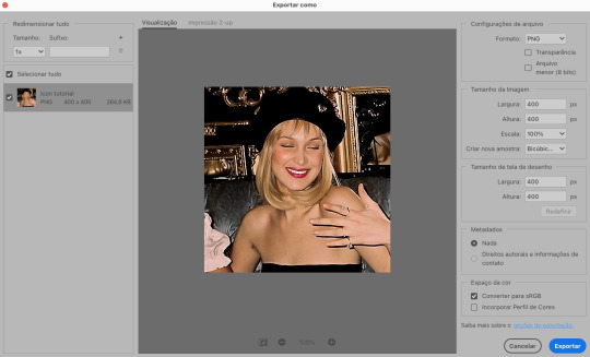
a melhor forma de salvar uma edição em alta qualidade é exportando ela. sendo assim, vá em arquivo > exportar > exportar como...
em “configuração de arquivo”, selecione o formato PNG e desmarque a opção “transparência” se sua foto não é uma imagem com fundo transparente; em “tamanho da imagem” deixe como a altura, a largura e a escola como estão, apenas mude a opção em “criar nova amostra” para BICÚBICO AUTOMÁTICO; e em “espaço da cor” marque a opção CONVERTER PARA SRGB, porque assim, independente da calibração do seu monitor, a foto ficará com as cores originais e não sofrerá alteração.
assim:
no entanto, se você tiver um pc ou notebook lento, ou apenas não tiver paciência para salvar sua edit em exportar, você pode salvar no modo normal, indo em arquivo > salvar como... OU arquivo > salvar uma cópia..., no entanto, se você for usar essa opção, não esqueça de marcar a caixinha para “incorporar o perfil de cores srbg”, essa opção geralmente fica na parte de baixo da janela que abre quando você vai salvar a edição.
6. ACTIONS & RESOURCES
para facilitar pra vocês, todos as configurações de filtros usados neste guia, estarão disponíveis para download em uma pasta de action. para fazer o download é só clicar aqui: ★. já a dupla de actions usadas (a de nitidez & a de desfoque suave) estarão disponíveis para download na lista de dicas abaixo.
dicas de actions de nitidez
– premium & gratuitas (free)
lovie potion by @loviestudio [premium]
action #26 by @harupsds [premium]
action #25 by @harupsds [free]
01 action by @harupsds [free]
cherrie by @loviestudio [free]
action #11 by @miniepsds [premium]
face action by @miniepsds [premium]
crispy by @nebulies [free]
scarlett by @l-agallerrie [free]
eight action by @peachcoloring [premium]
bubblegum by @hisources [free]
kendall by @hisources [premium]
hekate by @hisources [premium]
sharpen by @l-agallerrie [free]
#01 action by @buntterflies [free]
dicas de actions “suaves”
– premium & gratuitas (free)
teddy bear by @loviestudio [free]
action ten by @peachcoloring [premium]
caelestis by @miniepsds [premium]
fleuriste by @hisources [free]
angel by @loviestudio [free]
action #13 by @harupsds [premium]
action #12 by @harupsds [premium]
wild action by @hisources [free]
outras actions
– premium & gratuitas (free)
denoise action effect — remove o ruído das fotos sem perder muita qualidade by @loviestudio [premium]
photopea quality action — action para melhorar a qualidade da foto no photopea by @loviestudio [free]
exclusive hq actions — um conjunto com as actions que foram usadas neste tutorial by @girasois, @loviestudio [free]
denoise and sharpen actions — conjunto de actions para melhorar a qualidade da foto automativamente by heavnsent
7. BÔNUS: DICAS EXTRAS
a adobe cc learn tem muitos tutoriais que você pode dar uma olhada e aprender muito mais sobre o photoshop e outros programas da adobe!
o youtube é outra fonte incrível para você aprender edição no photoshop, lá você encontra tutorial para quase tudo de edição de fotos e muito mais! se você entende inglês, eu recomendo muito os canais piximperfect e brendan williams tutorials.
para fonte de inspirações, o tumblr é o lugar certo! se jogue nas tags para se inspirar e nos blogs de photoshop para ver muito mais tutoriais e muito mais resources.
o blog @looksgreat infelizmente não é mais atualizado, mas você ainda pode encontrar muitos tutoriais sobre quase tudo de edição, e o melhor, todos os tutoriais são em português!!
ainda recomendo outros tumblr brasileiros de resources e tutoriais: @miniepsds, @harupsds, @peachcoloring, @gmfioart, @colour-source, @l-agallerrie, @wasirauhlpsds, @hisources, @opulenceps, @sunshinepsds, e @loviestudio; e no deviantart: jungrainsoul, rockjealous, heavnsent, aureangels e rohdossantos.
8. CRÉDITOS E INFORMAÇÕES
crédito colorings
off hearts + whimsy by @miniepsds ♡
informações
antes de tudo eu gostaria de pedir desculpas pelo tamanho deste guia, mas eu quis abranger o máximo de dicas possíveis para vocês e deixar o tutorial super completinho.
em segundo lugar eu gostaria de agradecer todo o carinho de vocês, isso me motiva muito a continuar. obrigada, de coração!
enfim, é isso! minha ask estará sempre aberta para dúvidas, sugestões, pedidos e mensagens fofas (sempre com educação e respeito, claro)!
#tutorial#photoshop tutorial#tutoriais#tutorials#resources#hq tutorial#tips#useful#ptbr#adobe photoshop#photopea tutorial#tutorial tips#dicas#dicas de edição#dicas de actions#guia completo#guia#guia de edição#guia de edits#edits tutorial#edit tag#masterpost#long post#editing tips#icon tutorial#header tutorial#hq edits
63 notes
·
View notes
Text
oh yes, Dan, they are "wrestling" in pinof, just as Phil was giving you "editing tips"
99 notes
·
View notes
Text
HUH
#dan and phil#amazingphil#dnp#phil lester#daniel howell#philip lester#dan howell#danisnotonfire#dan and phil renaissance#dnpgames#editing tips
43 notes
·
View notes
Note
Your photos are always so bright and HD! What graphics card do you use and what are your in game settings if you don’t mind me asking?? Could you also give some tips for somebody starting out to take photos in the sims 4 🪐😚
Thank you ♡
I have a low end laptop lol. But i use few tools and tips that help me take some good quality photos. I’ll share them in details so this is going to be a long read !! Sorry ahead and bear with me please 🥰
Let’s start with few things to enhance your in game quality first :
If you don't use HQ mod i recommend you check it out HERE !
Here are pictures without and with HQ mod ( click for better quality )

Do you notice the HUGE improvement in details like eyebrows, skin, eyes and clothes, pretty much everything lol!!
I use HQ Mod Switch to turn HQ mod on and off as i wish. Be aware that HQ mod slows your game !! you can simply turn it on just when you need to take screenshots.
I use This Gentle Cas Lighting ( IT’S A MUST!!)
Now, there are two ways to take good quality pictures that i know of and use :
OPTION 1 :
If you want something quick but does the job then this is your go to :
- SRWE :
Download the zip file and unzip it.
Run The Sims 4 game.
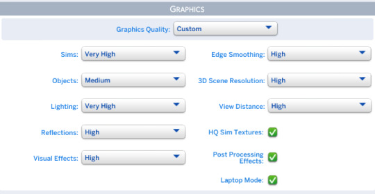
when you are ready to take screenshots whether in cas or in game ( i take mine in cas ) go to settings and change display type to windowed. Here are my in game settings.
Open the SRWE file you downloaded earlier and run the app. ( Make sure you unzipped it 1st )
Click on Select running Application and choose TS4 game then Click open.
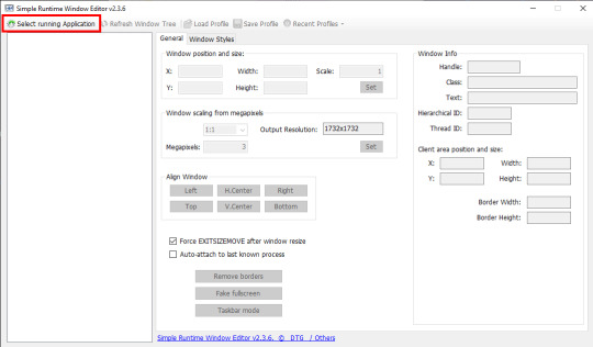
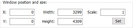
in the Window position and size you adjust the width and height to your liking. Be experimental with it till you are satisfied. These are my settings :
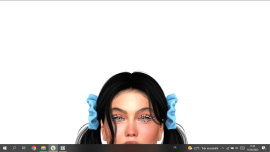
When you go to the game you will notice the change in resolution. Here it’s tricky a little because if you make the resolution too big, you might not be able to see everything on the screen, here is an example
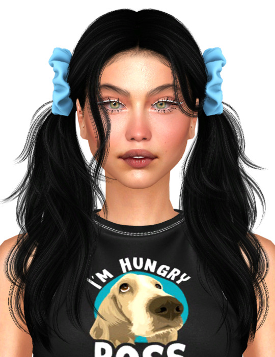
You can move around by clicking on the options in Align Window.
It helps you navigate around the screen. I always go for Left + Top which displays this as a result :

When it's set this way i get to see Traits properly to pose my sims before i take a screenshot .
Please bear in mind that my screen resolution is 1366x768. If your screen resolution is higher you dont have to use same settings as mine !!
FINALLY, you hit C on your keyboard to take screenshots. And you are done.
Tip : If you liked your SRWE settings and want to save them, click on Save Profile then name it so you can load it the next time you use SRWE, without having to type everything all over again. As you can save many profiles with different settings !! feel free
Ps : As you noticed from the previous last two pictures, using SRWE will display part of the screen and not all of it because the resolution is bigger now!! in this case i recommend you go to the screenshots folder of your game and check how the screenshots turned out while you are still running the game so you can decide if you like them enough or not before closing the game!
Here are pictures taken without and with SRWE ( using HQ mod in both )
OPTION 2 :
If you have the patience and time, you should try rendering in Blender.
There are so many tutorials on youtube that can help you learn how to render. I’ll link you the one i liked best HERE !
TIPS :
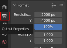
This is my resolution settings for pictures in blender ( you click on Output Properties to set it )
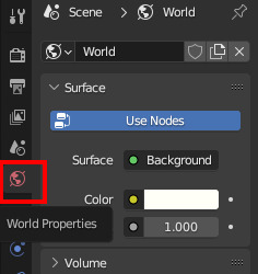
I dont use any lightning in blender, i use World Properties instead by clicking on color then setting the value to 1.000. If you want some cool effects you can have fun trying some lightning options ( watch the video to see how to do it ! )

You can add a background in blender and change its color to your liking. I use transparent background beacuse it's easier to edit the image that way. To get an image with transparent background in Blender go to Render Properties>Film>Transparent

I use Eevee to render my images. It is recommended to use Cycles for better/higher quality but it takes longer time and it can crash if your PC doesn’t support it ! So be aware please!!
HOW I EDIT MY PHOTOS TO LOOK BRIGHT!
I use Photoshop to edit my photos. I don't do much to be honest. i resize images when it's needed and adjust brightness/contrast, tone and color ( 70% of the time i just go for Auto Tone ) which you will find in Image.
Tips : you have some cool options in PS that can give you that bright effect, such as :
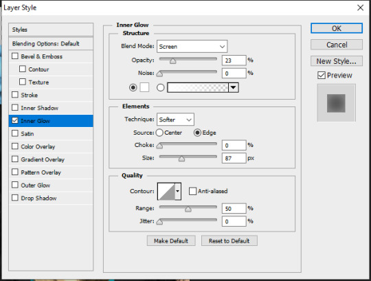
Inner Glow : You can find it in Layer>Layer Style. And here are the settings i use ( they are still adjustable depending on the clothes, hair and skin color of my sims ) :
Outer Glow : you can find it in Layer Style as well. I dont have specific settings for this one. It totally depends on the picture and type of edit i’m going for. I dont always use it unless i want some really bright effect around my sims like In my Fairy post HERE.
You can get creative with other options in Blending Options, which you can find in Layer Style.
For the Glow effect to work properly you have to have a transparent background, or delete the background yourself ! it should look like this !
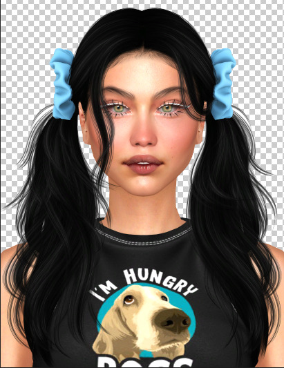
after adding the Inner Glow + Outer Glow effect it will give you this !
When i add a background (in a new layer) i dont make it 100% white! i go for this color to make the Glow effect pop a little !! and these are the color settings :

ET VOILÀ LE RÉSULTAT.
Lastly, if you made it till here thank you for taking the time to read all that ♡
I hope it was helpful a little. If my explanation was ambiguous or you have any more other questions, don’t hesitate to ask please!
#THIS WAS LONGER THAN IT NEEDEDTO BE!!!#but totally worth it if you are new to this!!#ts4 edit#ts4 cas#the sims 4#ts4 simblr#asks#editing tips#sims 4#simblr#ts4 render#ts4 screenshot
148 notes
·
View notes
Text
morning! thought i’d share a couple tips and tricks for the bonus round. (these are just a few things i personally do when i’m trying to figure out what to cut, so obviously feel free to follow all or none of this advice)
contractions are your friend.
sentence fragments are also your friend. a two word sentence can pack a big punch.
try cutting indefinite articles out (a/an) and see if the flow still works.
replace conjunctions with punctuation.
show don’t tell. sentences where a character is just mulling over how they feel about a given scenario can usually go.
switch up the verb. “is walking” > “walked” or “made out” > “kissed”
repeated words can usually go unless they’re imperative for the emotion of the scene.
try rephrasing a description in a way that reduces the word count without changing the meaning. eg: “the corners of his mouth lifted into a smirk, showing off his dimples” > “he smirked, dimples on display”
read your story out loud to yourself. it’ll give you a better feel for the rhythm of your sentences and help you identify clunky spots.
-
let’s try it out with a scene from my microfic as an example.
here’s the original (52 words):
Tonight Steve rips the monster’s throat out with his teeth, and Eddie steps over the carcass like he’s doing a little jig.
“You’re shaking,” he frowns, cupping Steve’s face.
“Just tired.”
“Of missin’ me?” A rugged smirk, scar splitting through his dimple. Eddie rubs their mouths together. “Just miss me that much?”
and a reduced version (43 words):
Tonight Steve tears the monster’s throat with his teeth.
Eddie dances over the carcass. “You’re shaking,” he frowns, cupping Steve’s face.
“Just tired.”
“Of missin’ me?” Rugged smirk, scar splitting through his dimple. Eddie rubs their mouths together. “Just miss me that much?”
-
i hope that helps! happy editing 😊 -wyn
37 notes
·
View notes
Text
Be your own editor/critic. Sympathetic but merciless!
– Joyce Carol Oates
#fiction#fiction writing#editing tips#editing advice#joyce carol oates#quotes#kcawf original#writeblr
11 notes
·
View notes
Text
I can't just keep adding subplots
... or can i?
#writer#writer life#writing#writing stuff#writing a book#writing problems#editing#book editing#editing tips#editing advice#subplot#romantic subplot#new author#booktok
256 notes
·
View notes
Text
i reallllly want to edit swann arlaud but i have no experience and no idea where to start but im ITCHING to edit him its so bad… specifically pierre perdrix i have a vision in my brain
8 notes
·
View notes
Text
"A crutch word is a filler word we unconsciously use because we haven’t thought the sentence through enough. They’re words that are easy — they flow naturally into the space that could easily be occupied by a slight reworking of a sentence, or a different word choice."
#writing tips#writing help#writing advice#writeblr#writing resources#creative writing#writing references#writerblr#writer blog#writing#writing community#writers of tumblr#editing#editing advice#crutch words#editing tips#editing resources#writers#creative writers#learn to write#learn to edit#novlr
227 notes
·
View notes
Text
Stage Direction in Narration
"He walked into the room." <> "She sat on the bench." <> "They left the car."
We all use stage direction. It's unavoidable; readers need to know where our characters are in the space we've created for them. And sometimes a simple statement of movement is needed. But most of the time, it can be improved upon.
🙟🙝
If it wasn't clear from the above examples, "stage direction" is when a character's movement is narrated like one might write in a play or film script: straightforward and unembellished statements indicating a character's direction.
This is great for scripts, where concise and clear instructions are preferable when a director and actor needs to follow them.
Not so great in a novel, where the author's goal is to keep a reader's interest and immersion. Let's take a look at how you might improve these sentences by adding intent, context, or grounding description.
Some of the examples below were taken from manuscripts I’ve betaread. The original authors gave me permission to use them.
Improving Stage Direction
Adding intent might be the easiest solution. You should know why your character is conducting an action; that's probably the reason you're writing the action in the first place. Instead of separating action and intent, combine them. Is your character walking towards the table to take a seat? Grab something off it? Talk to someone?
He walked towards the table. > Why? > He walked to the table and pulled out a chair to slump into.
🙟🙝
Obviously not every action has a purpose beyond itself, sometimes a character is moving in order to… well, get to where they're going. In that case, rounding it out with more context and emotionally-charged description can help create a more compelling sentence. Is there a specific way the character is conducting the action? Is there an underlying feeling within the movement that could add emotional charge?
Take the entire scene into consideration and determine your character's place in the scene and how they might be feeling. If she is one of two friends being reunited, she might move with excitement and eagerness. If he's a bystander watching the reunion, he might be more hesitant.
Paul walked up to them. > How? > Paul walked up as inconspicuously as he could so as not to disturb the reunion.
🙟🙝
Grounding means adding description to an action in order to make it tangible, to "ground" it to the world it's happening in. In the absence of purpose, this adds immersion and substance to your world, which is never a bad thing.
David sat down. > Where's the world? > David sat down and looked up at the stars glinting in the dark night sky.
Sometimes you already have the description and it's simply a matter of shuffling things around. Such as in the above example, where the original was actually:
"The stars glinted on the dark night sky and David sat down then took a deep breath. The contrast of the fresh air to the heat inside made him feel the buzzing in his body from the many glasses he had been drinking all evening."
I simply rearranged what was already there, while also combining the end of the sentence with the next to add context to him taking a deep breath: "David sat down and looked up at the stars glinting in the dark night sky. He took a deep breath and the contrast of fresh air to the heat inside […]"
🙟🙝
Other Solutions
If none of the above work, you could try eliminating or rewording.
If the surrounding sentences already imply or show the direction, you might be able to eliminate the stage direction all together.
The two of them walked out of the store. Jacob and Sam left the marketplace behind and headed north-west for Beringia. > Are both sentences needed? > Jacob and Sam left the marketplace behind and headed north-west for Beringia.
That first sentence is entirely redundant. Getting rid of it still gives every bit of information and context the reader requires. By indicating that Jacob and Sam left the marketplace, it is perfectly sensible to assume that they walked out of the store beforehand.
This often shows up in other areas of narration as well, namely, I’ve noticed, in descriptions from a character’s pov. “He looked at it” or “She stared at him” is often followed by description that perfectly indicates that the character is looking at the object.
Tarrin regarded him. The light from the torches in the gardens illuminated his dark hair and the exquisite curves of his shoulders.
By the description that follows, it is obvious that Tarrin (MC) is looking at the described character. “Tarrin regarded him” is unnecessary and taking it out only strengthens the narration.
“Is this the library?” he asked, hovering a finger over the first map. Pearl looked at it.
“Yes.” The circular nothing in the middle and the lines splayed out in every direction noting shelves and offices said it was.
Again, “Pearl looked at it” followed immediately by a description of the thing she is looking at, is redundant. If the story is from a limited perspective, a description is already telling the readers what the MC is seeing, and thus stating that it is being seen is completely unnecessary.
🙟🙝
If the sentence still definitely, absolutely, without a doubt needs to remain then a simple rewording can still be an improvement.
Instead of "She ran across the street," you could write "She sprinted across the street." Instead of "He walked up to the table," write "He ambled up to the table."
Yes, I know that's elementary writing tips 101 stuff but hey, there's a reason it's part of the bedrock of writing advice. Some words are just better than others.
Something as simple as an adverb can do the job, too: instead of "He walked towards him," write "He walked hesitantly towards him." Adding even basic emotion gives the sentence more purpose in the narration than simple stage direction.
Of course, all of this should be done during the editing process. Stage direction is actually super helpful in drafts, in my opinion, because it's an easy way to keep the narrative going while giving your future self a roadmap to follow and work with. If it moves the scene along for YOU initially and keeps you writing, that's all that matters. So don't fret about this while you're drafting.
🙟🙝
Wow, that was a lot! Are you done? Good, because this is definitely the end, I promise.
Effectively Using Stage Direction
...Okay, yes, there's more, but this is the last thing! I just feel it's necessary to lay out the exception to all this, because straightforward stage direction can actually be utilized as an effective narrative tool. Indicating a character's direction of movement can invoke emotional symbolism or build intrigue.
A character moving closer to someone or something can show emotional closeness (or desire for emotional closeness), vulnerability, security (or the desire/need for security), fondness, attraction, etc. Obviously in the opposite way, a character moving back or away can indicate emotional distance, revulsion, anger, fear, etc.
Take these two examples:
"I still love you." Her mother opened her arms. Anna stepped forward. She stopped herself, breath catching in her throat.
"But you love yourself more," she whispered.
"I still love you." Her mother opened her arms. Anna stepped back. She stopped herself, breath catching in her throat.
"But you love yourself more," she whispered.
Exact same scene, but the direction of Anna's movement completely changes the underlying emotion.
🙟🙝
In a similar sense, a character moving closer to a specific location or object can be used as a plot device: a character inching closer to a table, for example, is a miniature plot breadcrumb. It creates a small intrigue in the reader. A page later, when the character uses their proximity to the table to snatch a knife from it and defend themselves, that breadcrumb is answered and the intrigue is rewarded.
🙟🙝
In Closing
Like all writing tools, stage direction is not inherently bad. Use it strategically and it can be an effective device. Otherwise, I hope the tips here can help you strengthen your narration. As always, you are the master of your own story, and if you disagree with anything in this post, then don't implement it!
Thanks for reading~ Don’t forget to write a sentence of your story today!
#writing#editing#editing tips#writing tips#writing help#writing problems#writing advice#long post#writerblr#writing resources#writing reference#writing guide#stage direction#stage direction in narration#at what point do I give in and become a professional editor#idk guys#the BEST compliment I have ever received#was that having me as a betareader/editor was like 'writing with cheat codes on'#this is the kind of inane detailed stuff I catch and suggest how to fix
297 notes
·
View notes
Text
write EVERY DAY. here's how.
where inspiration fails, habit will always have your back. this is why it's important to build writing into your life as a habit, if you ever want to finish a project or improve your skills.
back in 2018, i (nat) was a college student without much going for me. i was feeling creatively stifled and insecure and like i didn't have TIME to write good. and i was right. i didn't have time to write GOOD. but i did have time to write SOMETHING. so that january, i built the habit. i wrote every single day in 2018, and almost every single day since.
because once you establish the habit, it becomes safer to skip a day (or three days) here and there. you will at least THINK about writing every day, even if you go straight from work to social plans to bed, or you're on vacation, or you're too sick to write. and that thinking is part of the habit!
here are the tips i followed to make this happen.
-pick a reasonable goal. starting off, mine was 300 words. now, i don't follow a goal, because the habit is so solid i don't need to. but 300 words is easy and quick. and if you give a pig a pancake, they'll probably have days where they write 500, 1000, even 3k words.
-log your word count. this is interesting to look back on every new year's eve, and it provides accountability. do this however you like; a spreadsheet, a physical notebook, a note in your phone, each day's section in your planner, whatever works for you. i have a channel in my personal discord server where i log mine.
-do NOT edit as you go. just write write write. if you feel like something you wrote needs work, yeah, it probably does-- everything needs to be edited, but that's a problem for later. highlight sentences you can't get right or make note of them to edit LATER. but do not edit as you go!
-write self-indulgent crap. fanfiction, shitty poetry, manifestos, rants, self insert fantasy romance, whatever floats your boat. having a shitty self-indulgent backup story to work on when i didn't feel like writing for the projects i cared about really helped get me in the habit. write for an audience of one!
-journal if you can't write. this may not necessarily build your skill as much as writing regular prose would, but it does help you maintain the habit and it can be useful in lots of other ways.
-think outside the box. write trivia questions. write a list of your favorite childhood toys. write a review of the book you're reading. i'm writing this post, that's going toward my word count for the day. again, this is still writing, and it helps maintain the habit.
-get comfortable writing on your phone. this took me a long time, but making it over this hurdle has saved my habit so many times.
you'll be surprised at the cool shit you end up writing on those days when you swore you weren't inspired enough. and you'll be delighted with how much progress you will make honing your craft!
happy writing! if you have any questions about how to implement any of these tips, our ask box is always open.
#WRITERS ON TUMBLR#WRITING#WRITEBLR#OUTLINING#WRITING TIPS#EDITING TIPS#WRITING ADVICE#INDIE PUBLISHING#INDIE WRITING#WRITING COMMUNITY#NOVEL EDITING#NOVEL EDITING SERVICE#NANOWRIMO#WRITE IT#WRITERS BLOCK#WRITING WARM UP#NOVEL WRITING#WRITING PROMPTS#WRITER THINGS#CREATIVE WRITING#WRITERS#WRITING TOOLS#PUBLISHING#EDITING#BOOKS AND NOVELS#YA NOVELS#FICTION#LITERARY FICTION#SHORT STORIES
1K notes
·
View notes
Text
Before and Afters Cosplay Editing Tips (Dawn)
Sharing some tips for editing cosplay photos on JUST your phone! I really only use 2 apps "magic eraser" and "meitu" honestly meitu is my go to app for any small edits on my phone. If your just starting out I recommend it.
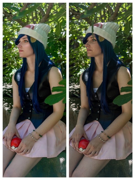
Key Edits
1) Leaf in front of my face, I also erased the tattoo on my arm (magic eraser)
2) Frizzy corner of hairline. This is a pain because of the hat, slow and easy. (magic eraser & meitu - acne tool)
3) Saturation and colour brightening. Adding a bit of colour to photos adds so much. Even with dark photos having some colour can add depth and attract interest to the photo. (meitu)
4) Skin face texture and highlight. For this I focus on the heavy bags under my eyes and acne/scarring on my face and chest. (meitu)
5) Evening leg colour. Using the blur or soften tool. Along with editing out all scratches and bruises I had. (meitu)
This photo was all edited on my phone, which is way some quality is lacking. But honestly I was happy enough with the results to post them.
Photo editing is huge, and you definitely can't escape it in the world of cosplay. These photos we're taken by one of my friends in the UVIC Cosplay Club. Now me being me, I edit all of my photos. 1) because I find joy and creativity in photo editing. 2) it gives me a bit of a confidence boost. Having had horrible skin issues since I was 3, I have always had insecurities about my skin, editing it makes me feel a lot better and gives me the courage and motivation to keep cosplaying.
My edits aren't meant to hurt or body shame anyone, I'm simply making edits to help make my photos look more like the character. I really wish we won't judge people who edit their photos so harshly in the cosplay community. Unless your doing something that could be considered offencive, I think photo editing is a great tool that can push your photos to the next level!
23 notes
·
View notes
Text
"i gave myself the editing tips" sounds sooo bad and soooo funny
11 notes
·
View notes
Last Seen Blogs