#epoxi resine
Text
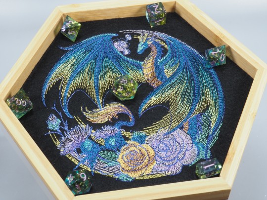
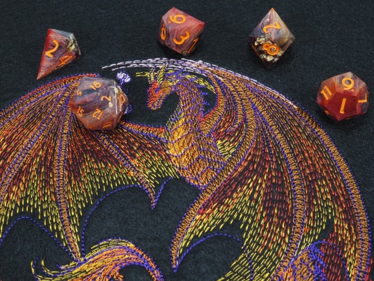
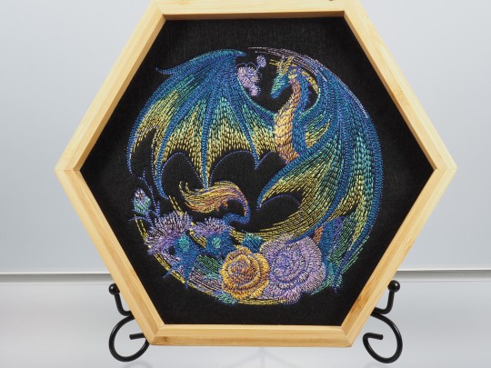
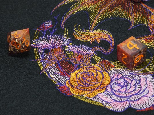
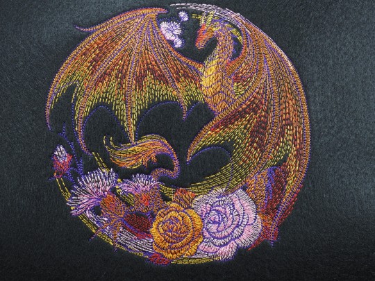

Here I have a variation of the "Thistel Dragon" dicetray design. For this one I made the dragon in red-brown colors, so this is now a copper dragon! The last fotos are of the original color. Which one do you prefer?
(Advertisement)
#embroidelicious#embroidery#dragon#thistel#flower#dice#dnd#dnd5e#rpg#ttrpg#catinthedicebag#epoxy#handmade#resin#würfel#diceset#dungeonsanddragons#polyhedraldice
1K notes
·
View notes
Text


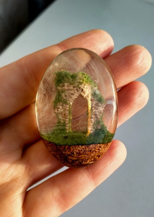


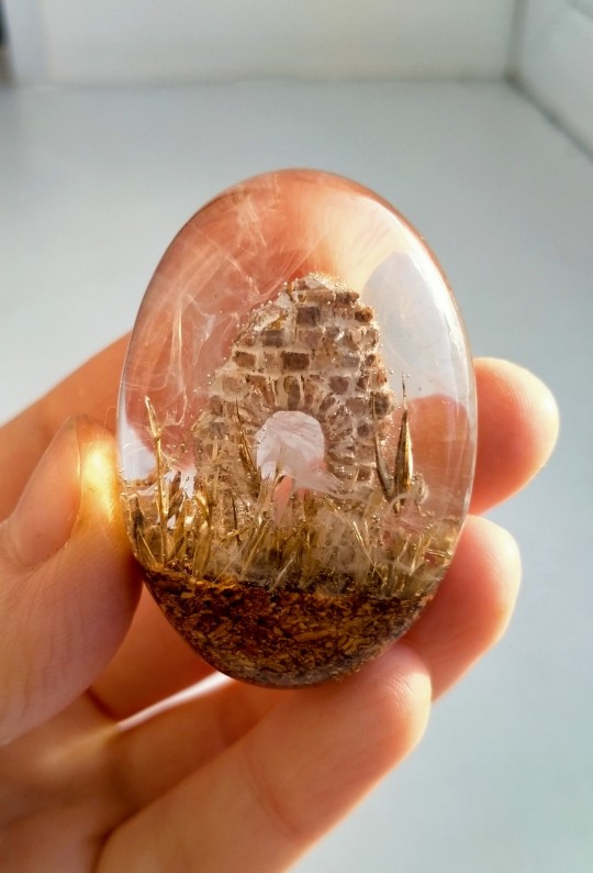
Two archways in the fog, wood, resin, sand and dry grass. Both available as pendants
#miniature#epoxy resin art#resincraft#archway#gothic ruins#gothic architecture#ruins#dry grass#moss#fog#wood carving#crafts#handmade#carved miniature#diorama#sculpture#my art
670 notes
·
View notes
Text
A burial fit for a legend
438 notes
·
View notes
Text


Aquarium toilets 🪼
#frutiger aero#aero#aesthetic#y2kcore#y2k#frutiger aero moodboard#y2k aesthetic#y2k moodboard#blue#frutiger metro#skeuomorphism#blue frutiger aero#aquarium#ocean aesthetic#ocean life#resin art#resin#epoxy resin#bathroom
283 notes
·
View notes
Text
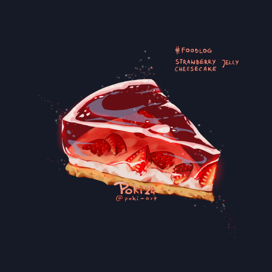
foodlog: strawberry jelly cheesecake ♥
#my art#retake on art i did in 2020 !!1#i drew this cake so many times on shrink plastic when doing epoxy resin charms...#now we doing an upgrade#i hope you like it#people told me they want to eat it#pls reblog if you like it ♥#art merch#cheesecake#strawberry cheesecake#food art
132 notes
·
View notes
Text

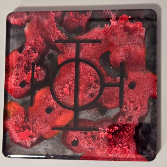


Since my keychain & charms were so well received, here's some other Sleep Token inspired resin work I've done! Coasters based on Aqua Regia, Blood Sport, Dark Signs, and Levitate 🫶 I pulled a lot of inspiration from the visualizers for Dark Signs & Levitate, and they were really fun to plan out and make!
83 notes
·
View notes
Text
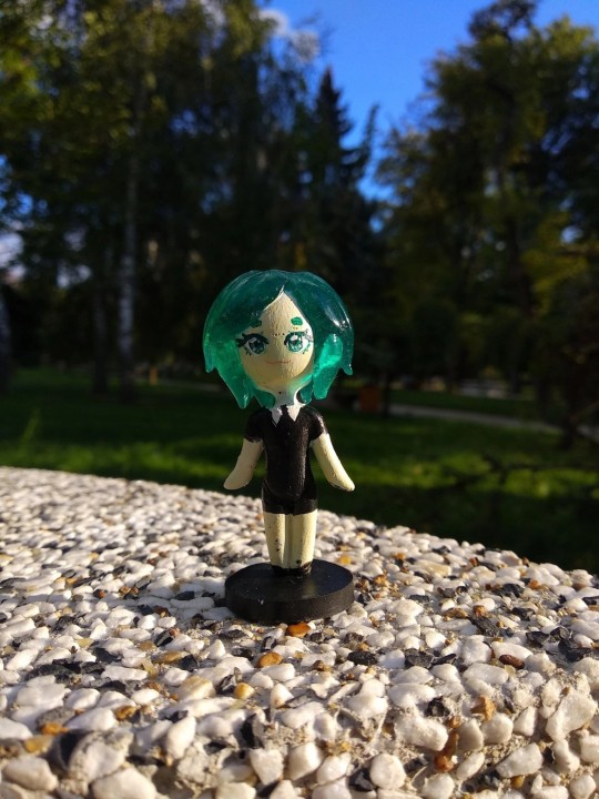
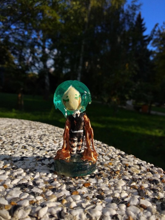
Epoxy Phos
#houseki no kuni#land of the lustrous#hnk phos#hnk#houseki no kuni phos#phosphophyllite#anime figure#cute chibi#chibi#anime#epoxy resin#handmade
107 notes
·
View notes
Text
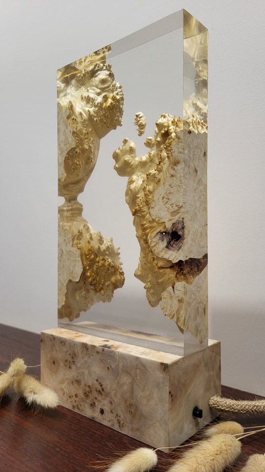
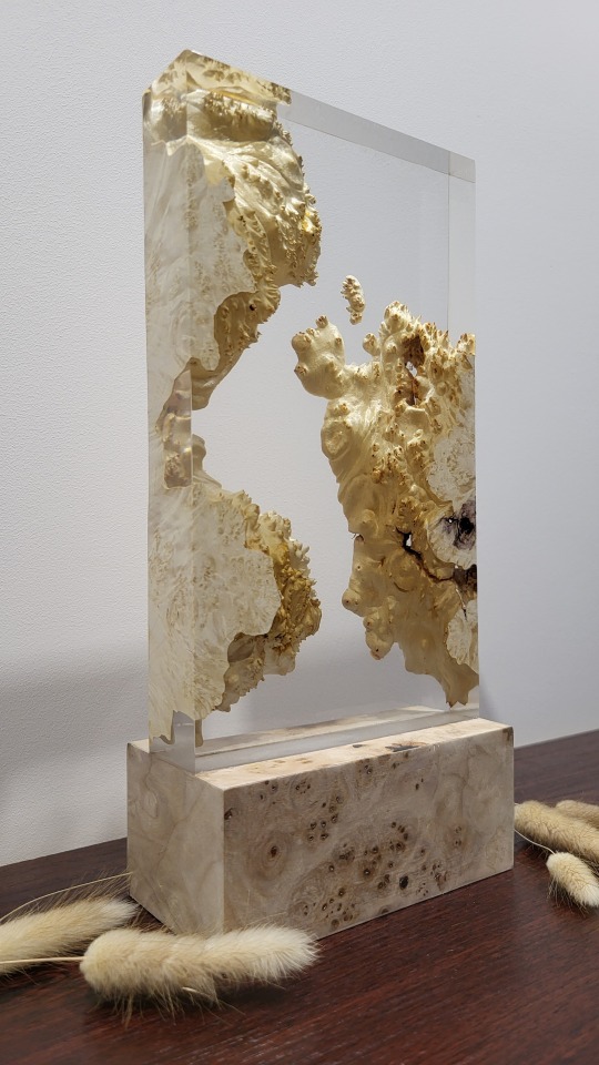
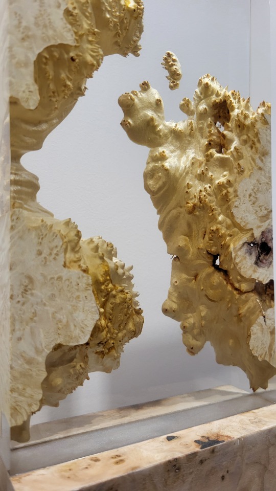


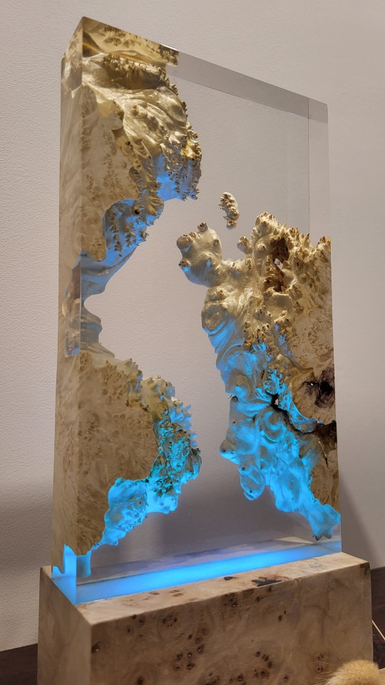
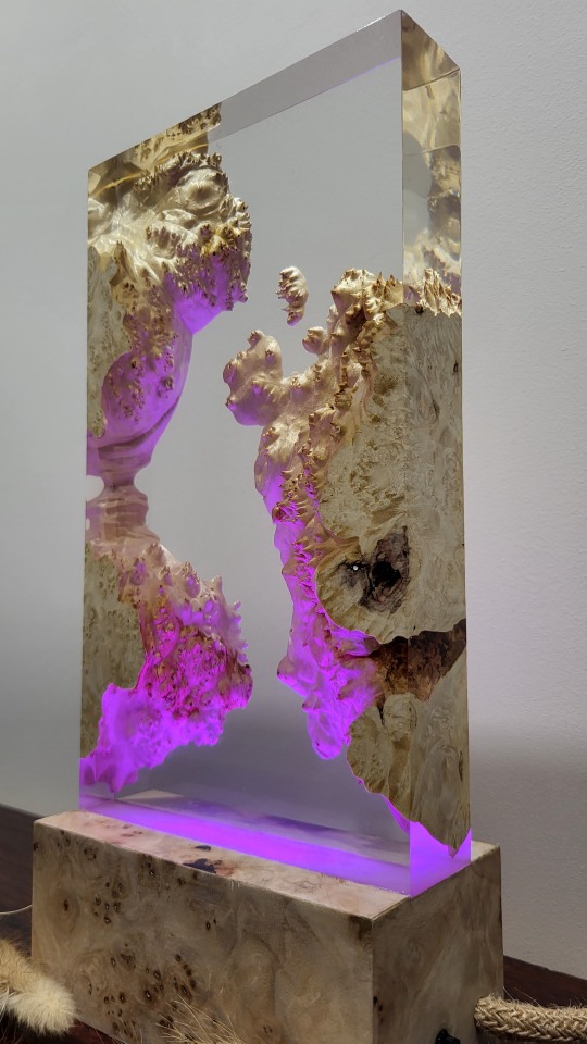


https://www.etsy.com/pl/listing/1681429480/lampka-z-ywicy-i-drewna-topola-czeczot?click_key=0970fe51cc8d03232836e4dbedfdd4702e76ba7b%3A1681429480&click_sum=bf6a0796&ref=shop_home_active_1&frs=1
60 notes
·
View notes
Text
unbothered. moisturized. happy. in my sump. focused. flourishing.
Resin success! Well, probably... we'll see how it cures in a few days!
It was super windy today and I was filming in one hand and holding the resin in the other, so this is all I could film really. Looks super cool, I understand now why people like those slime stim videos!
#maniakminis#resin#resin art#epoxy resin#miniature painting#miniature terrain#crocodile#alligator#warhammer#necromunda
55 notes
·
View notes
Text
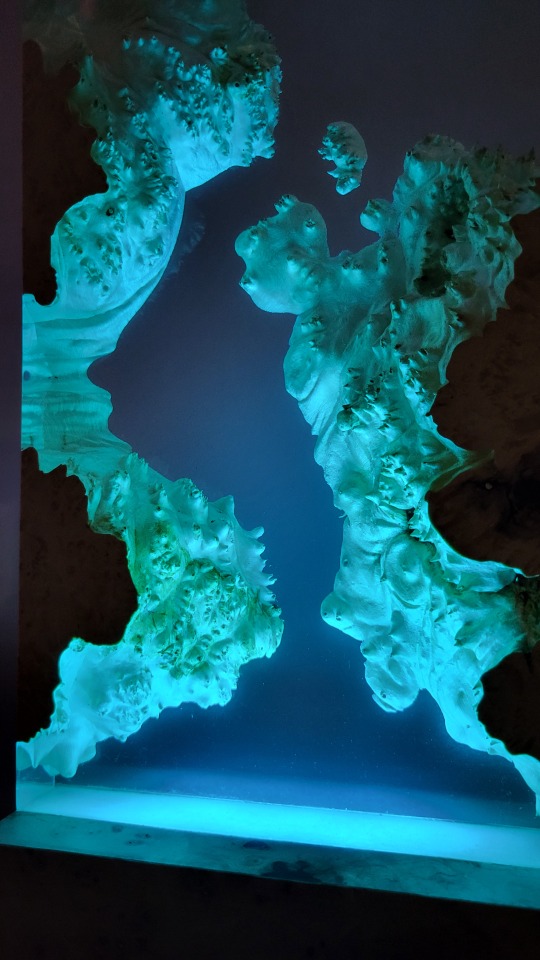
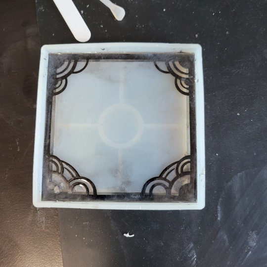
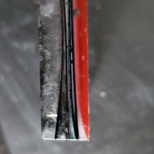
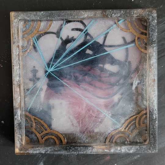
Mistborn Shadow Box Master Post
Recently, I began working on a Shadow Box concept using paper, resin, and various mix-ins in a 4" square coaster mold.
Mistborn has such a dynamic and bold aesthetic that it felt like a wonderful place to start. It was also my first Cosmere book.
At least if it's Ruined, it's still perfectly in setting.
I started by drawing out a high-contrast, dynamic silhouette of Best Girl Vin above Luthadel.
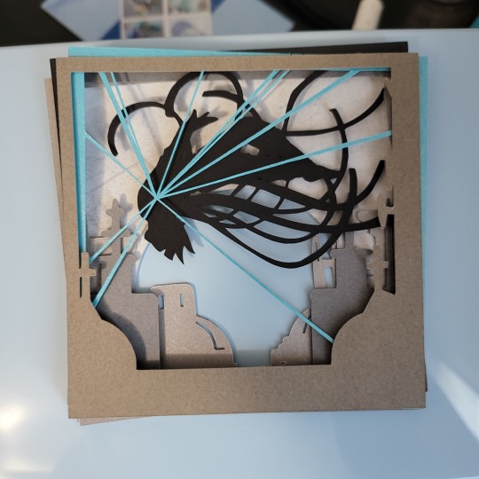

Each layer was cut out of card stock. I picked a shimmery metallic for the skyline but it doesn't read through the resin so I'll skip next time.
I poured a layer of resin mixed with gray and black mica powder for ash into the channels around the rim of the coaster.
I alternated resin and paper to space the pieces out, swirling white ink between the rooftops for Mist.
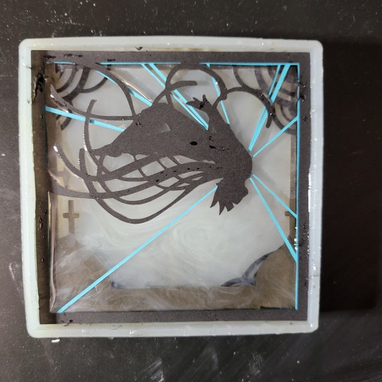


A quick peek through the bottom of the mold shows nothing shifted out of position...


The last layer has a lot of red and Garnet ink swirled in. I deliberately under-blended it to get some variety in the pockets of color.

Something I didn't anticipate is the difference in density between the paper and resin. Thin spots tried really hard to float leading to some odd curling in the corners, but nothing deal-breaking.
And the big reveal!
... kinda underwhelming. I went too hard on the mists, and a lot of that ash escaped containment making the whole effect muddied and hard to see ...
BUT WHAT IF WE BURN TIN!?
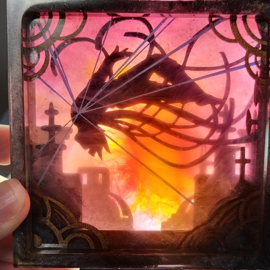
Awww yeeeah, there's our girl. The red background being transparent and irregular really let's that fiery red sun POP.
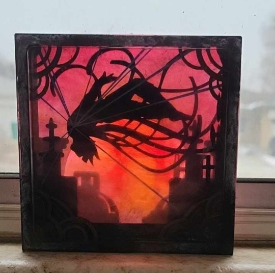
A softer background mutes those lovely Allomancy lines but the effect is just too pretty to fault it.
I learned a lot from this project and already have some exciting ideas for more!
Stay tuned for the next one in progress right now
Sneak Peek:
81 notes
·
View notes
Text
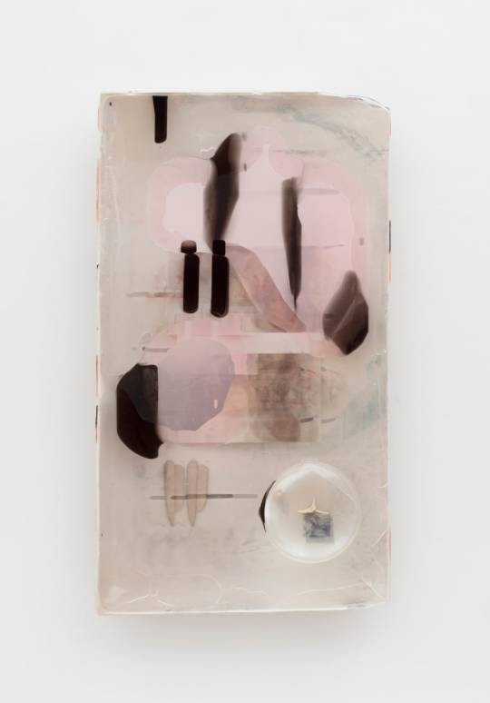
Josh Tonsfeldt
Untitled
2022
Fiberglass reinforced gypsum, fiberglass cloth, epoxy resin, pigments, inkjet dyes, UV cured pigment print, silver gelatin print, dye sublimation print on polyester bed sheet, wood, bone, television components
27.75 x 49.25 x 3.25 in.
#Josh Tonsfeldt#sculpture#fiberglass reinforced gypsum#fiberglass cloth#epoxy resin#pigments#inkjet dyes#UV cured pigment print#silver gelatin print#dye sublimation#print#polyester bed sheet#wood#bone#television components#beige#pink
134 notes
·
View notes
Text


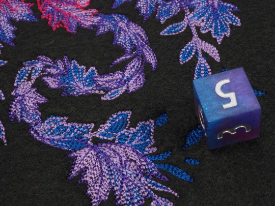
Here is a first version of the "Bi Pride Dragon". I need your feedback, please. How do you like it and do you think I got the colors right? Depending on your feedback I make more of these! Its not in a tray yet, but that will follow soon. I arranged some of the "Bi Galaxy" dice around it.
The pattern is from urbanthreads .com
(Advertisement)
#bi#galaxy#pride#lgbtq#lgbtqia#dice#dnd#embroidelicious#embroidery#dnd5e#rpg#ttrpg#catinthedicebag#epoxy#handmade#resin#würfel#diceset#dungeonanddragons#polyhedraldice#dicetray
829 notes
·
View notes
Text
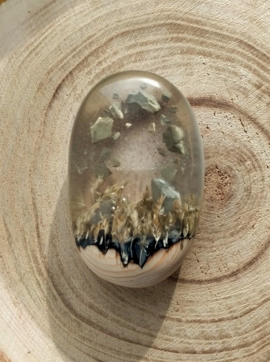


Another experiment with resin, dry grass and shattered pebbles. Something is definitely up with these megaliths in a field
#epoxy resin art#resin art#miniature#surreal#dry grass#grassy field#megalith#standing stones#magic#epoxy resin#my art
1K notes
·
View notes
Text
Making of the Fly
336 notes
·
View notes
Text
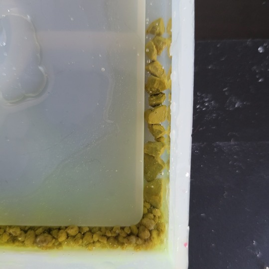
Trying to be patient and wait for resin to cure before adding more colors is actually torture to me I’m going to mcfucking die actually
#i LOVE doing resin#but also im gnawing my own leg off like a fox in a trap#‘you can use uv resin’#it is both more expensive to use uv resin for the molds im working with and also my molds aren’t clear so it won’t cure#epoxy resin is my best bet#it just takes sooooo long
56 notes
·
View notes
Last Seen Blogs

nbodvd-blog
NBO Entertainment

lacikaszep
Lacka

carterthornecarpets
Carpets & Flooring Services
nbodvd-blog
NBO Entertainment

crying-pup
“N-no!”