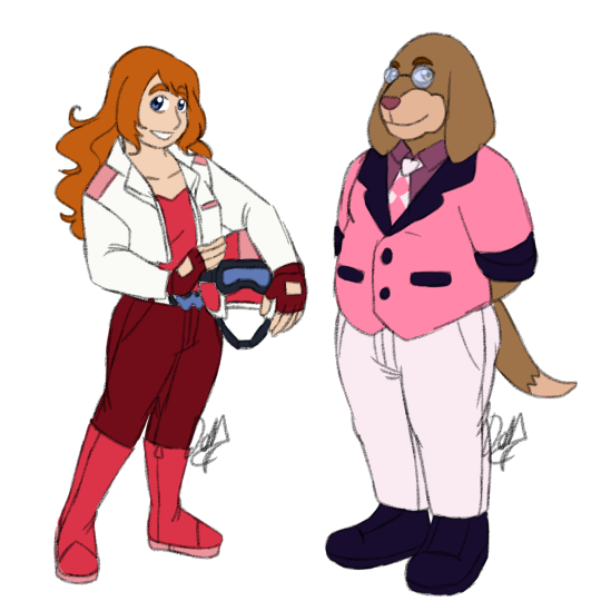
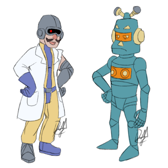
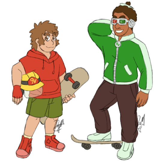
#everyone got redesigns lol
Text

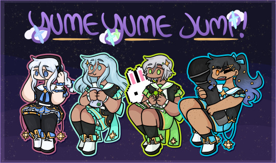
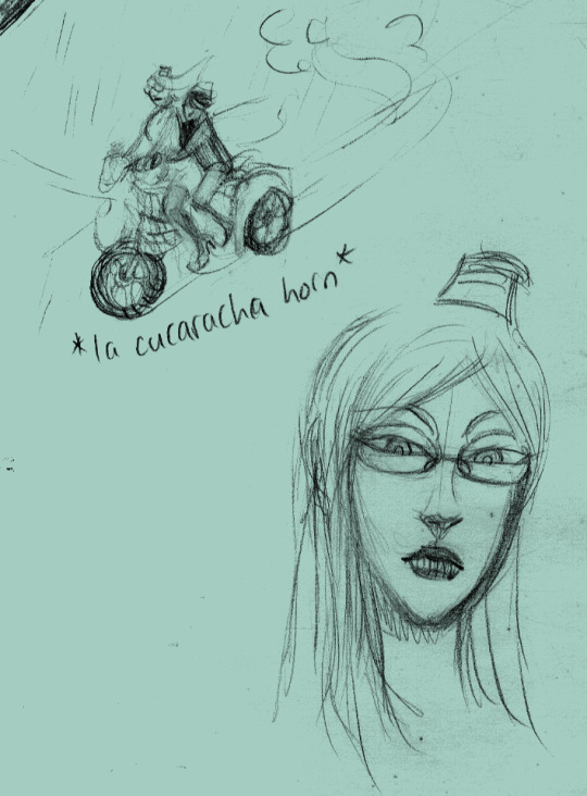
hfr indulgence weekend
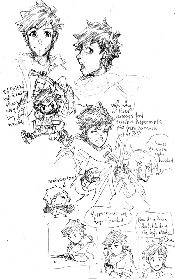
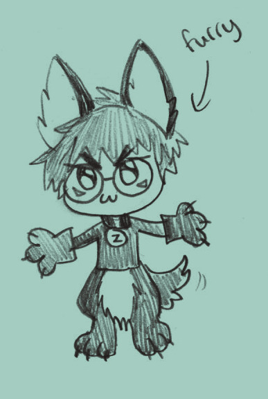
#hi-fi rush#hfr chai#hfr peppermint#hfr korsica#hfr macaron#hfr cnmn#gods cnmn's tag is so fucking funny. yeah those are letters#the ink comms are! finished! I just gotta go scan them#I dont trust my phone scanner rn tbh its. u can see right here lmao#gonna try and scan it at a photocopy shop to compare the difference#anyways yes of course I tried my hand at redesigning the suit stuff lmao. like whats in the game is cute. but. clenches fists#they dont understand women in suit like I do!! they dont understand.... they dont underst#I enjoy the Idea of putting chai in formal wear bc that dude is straight up a rectangle. literally needed to fake a waist for him#but yeah. tbh also kind of a surprise how much I enjoyed drawing chai's face. like he's straight up just. :-D <- thats him#everyone else slaps obvs but chai is like. I think I just enjoy translating that specific eye shape lol#also maybe its just decoration but I choose to believe that sleeve on his left hand is a compression sleeve#it was the load bearing arm. nobody comes into my inbox about that sentence ok#alright. alright#got some Plan Thing coming up at the end of june-start of july mark. hope that goes well#but otherwise! scan ink comms tomorrow! then that will be open again on. monday I'll say#so! stay tuned for that? aye#also actually Ive been enjoying doing those chibi things like in the first page up there. its fun to try and figure out what to include#this is genuinely new to me lmao. before the sk8 stuff I havent drawn that kinda thing for literal years#this year is the year of art thing resurfacing huh. ink and now this... well! its fun to see#okay. alright. I go sleep now. or I go get snack actually. and Then sleep#have a good night lads! keep ur wrists safe for me please
137 notes
·
View notes
Text
So. Remember that sketch I made and teased a possible new damn au that's idwg1 based, with a character that manages to best the DJD?
I'm looking through my list of spinocons, to see which would fit best this And hasn't been revamped in a while. My best contender? Spectre, technically the exact first spinocon I made that had a solid name and general design. Their backstory is very... sparce, as I made them in freshman year and wow was that a Year™️.
Anyways, the reason I'm coming to tumblr with this, is that originally this character was a sort of pale cyan color thanks to being the Cybertronian equivalent of albino— obviously made for the aligned continuity because yeah that was what i was familiar with. So, now since I'm reworking them into IDW, and well idw has pink energon instead of blue, I'm completely changing the color palette to a dusty pink and red with well brighter pink optics I suppose.
#spinocon#aaaand now that I realize it this adds some Very interesting psychological consequences as this would be goddamn terrifying#i mean hey that's how they got the name Spectre (well originally it was ghost but i thought spectre was more poetic)#bc everyone thought they were a goddamn ghost or terrorcon or whatever. Which... they aren't. they aren't even that big lol#back then I didn't really record most of my stories and a lot of them were lost#oc talk#plus i was lagging on their redesign anyways which provides us with an excellent opportunity!#fun fact through their second iteration sketch I've decided that Spectre unlike the other spinocons was to be based more on suchomimus#i call them spinocons because they're loosely based on spinosaurus and that's my Exact Favorite dinosaur so ofc all my sonas had to be them#i was an odd kid and now I'm an odd adult#riot rambles
2 notes
·
View notes
Text
Summary: A rare moment of peace allows Dinobot to speak to someone he lost and the advice he is given is tested by Optimus.
Rated: T
Words: 3,354
If you like that one, please do follow up by reading the second part, Sentiment. It's linked as part of the Connections Series on Ao3. :) (Or Right Here, if you prefer.)
#Nah he wouldn't be phased too much by that shit leave him the same#Beast Wars#Transformers#Dinobot#Optimus Primal#just some self-indulgent babbling#felt like watching some Beast Wars#and my muses are having a fucking ball with it lol#also came across that War for Cybertron series on Netflix#I do love the Beast Warriors redesigns#just wish they had more time to expand their characters#and I SWEAR those making it shipped Dinobot/Optimus hard lol#that's totally awesome#was a bit weird how everyone EXCEPT Rattrap essentially got new voices/characters for War#that was fine and made total sense for that specific change#but Rattrap got the haha#I will shut up now
6 notes
·
View notes
Text

my nikki x genshin au design
class doodles + notes! i have thought about this deeply and extensively (the hour and half that is my programming lecture)
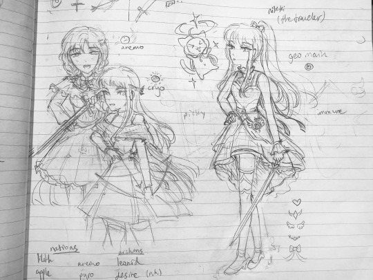
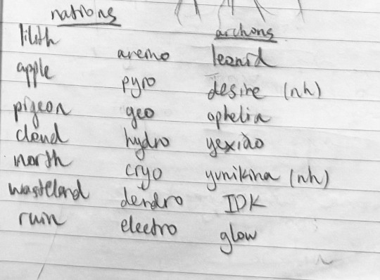
the og design and a low detail bobo and kimi + my attempt at crossover worldbuilding (i am not a writer. i don’t think this makes any sense story wise. like i picked aeon as the archon for apple at first but he is so blue and water themed and i refuse to NOT make cloud the hydro nation but he is not from cloud. guess who’s not blue? desire. i think there are better fits for most of the archons i picked i just don’t know who.)
- everyone’s visions are based on vibes and colors
- nikki’s vision is fake because she’s the traveler it’s a fashion thing
- i have not played genshin impact since inazuma came out
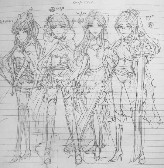
highly critical important footnote:
((characters whose appearances already translate well))
(into Genshin…)
((& that I remember))
aka i drew favs that i have committed to memory and gave them a vision that i think makes sense, doesn’t take a lot of thought bc they have sprites that are super ornamental compared to like nikki and kimi who def need redesigns lol
here is my list of characters + visions because sorting is fun, i might update this periodically
anemo: bobo, noah, royce, mercury, shade, bai yongxi
geo: nikki, yvette, orlando, loen
pyro: zoey, zhu yuxian, mela, ozeca, lilith, qin yi, cesare
cryo: agata, louie, neva, kimi
hydro: lunar, aeon, marina, ming shuiyuan, vulture, chloris
dendro: nanari, grey raven
electro: ace, elle, ai, caprico, sofia
- pretty much all the elves fall under anemo or dendro, except for Evil Vampire Flame Sword Cesare, who is an outlier and should not be counted
- nidhogg reads geo to me but ozeca is pyro obviously and they could serve such overload slay he could be an electro wielder i see it. i just can’t pick <\3
- shade got his vision when he was flynn. hc that it doesn’t respond to him since he’s changed he just uses guns now. non magic ppl with a gun in magic universe are my favorite thing
- lilith qin yi and zhu yuxian need to stop burning down buildings
- a lot of characters are omitted actually because i can’t pick an element for them. but reid doesn’t get a vision he’s just some guy
some guys: reid, hiber, toto timi aron etc all the citizen npcs
#thank u liza for the lore dump 🫶#could not have done it without u#love nikki#shining nikki#genshin impact#love nikki fanart#shining nikki fanart#ln#sn#lnduq#my art#sketchbook#my amazing bloom poetry/heart chaser suit mashup. paper needs to hire me for infinity nikki#nikki#bobo#kimi#lunar#agata#ace#zoey#momo
126 notes
·
View notes
Text

Winx, The Roxy Chronicles
I realized that I've never shown my girliepops side by side with their canon designs. Oops!
Some of y'all probs don't even know they're redesigns, since they're based on obscure characters from post S3 era. So trash basically.
(Well except for Roxy and Selina)
Everyone got a little visual update and refresh, hopefully I'll keep them this way for a while loL. Who am I kidding, imma change em all next week XD
In all seriousness I am very proud of these designs, to the point where I think I CAN leave them alone now. I'm proud of how far they've come.
Everyone's bios need a little update. Namely stuff like titles and powers being changed (namely Selina and Lindsay being changed to the Witches of Creativity and Sands respectively)
YES I KNOW I FORGOT TO ADD SOME SPARKLES LEAVE ME ALONE
Again, thank you so much @parola-di-winx and @witch-ix for being so patient and kind and helpful with this endeavor. Love you guys
#winx club#winx the roxy chronicles#winx club redesign#winx club rewrite#winx club roxy#winx club selina#winx club krystal#magic winx#winx club rachel#winx club mifty#winx club lindsay#winx club yomi#winx club kyral#winx club kelli
155 notes
·
View notes
Text
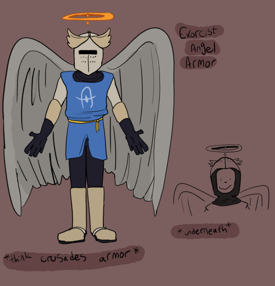
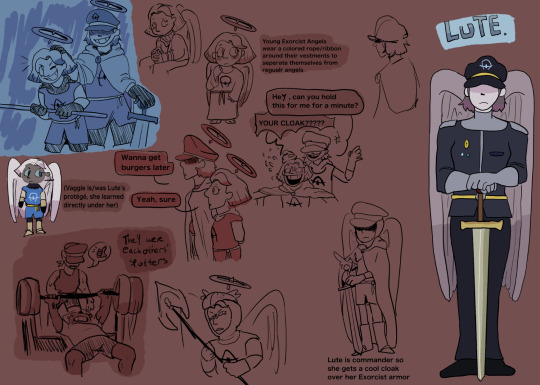

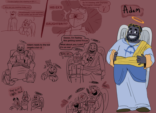
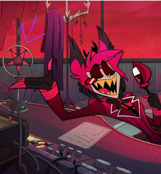
THE HEAVEN CAST!!!!! WHOOOOOOO!!!!!
So first off, we got a redesign for the Exorcist Angel armor. I wanted to keep the colors light so they stand out when in Hell. I was also hugely inspired by Crusades armor, since the Crusades fought for religious territory, I thought taking inspo from there made sense.
Then we have Lute, Emily, Sera and Adam's designs. I'll explain it all under the cut if you're interested!!!
LUTE!!!!!!!!!! Sorry guys but she's basically a different character with the same name at this point
So I think that Lute was like a mentor figure to Vaggie, she was the closest thing Vaggie had to a (sorta) mom but it's defiantly like a student-master relationship.
I think that Vaggie trusted and cared for Lute deeply, she devoted all her time and energy into training in order to make not only Heaven better, but to make Lute proud. Lute was a HUGE driving force Vaggie's martyr complex.
But they were close!!!! The care wasn't just once sided, I think Lute did love Vaggie. I think they both care for each other SO much, that's why it will hurt SO MUCH when it's LUTE as the one to de-wing and banish Vaggie. She LOVED her, she TRUSTED HER!!!!!
Trust that I will be delving deeper into this in the future ✊✊✊
So Emily and Sera's designs and roles in the story are pretty much the same, I liked them in canon! They were fun and offered an interesting addition to the show!!!!
The main thing I chose to change was basically their hair and skin color tbh. I understand what the show was TRYING to do, w the fact that they're supposed to be black (and apparently those are supposed to be dreads in Sera????) but.......... It wasn't good.
With their canon skin color, I know a lot of angels have gray skin but to me, it looked like the designers didn't know whether to make Sera and Emily (especially Sera) gray or flesh colored, which then resulted in them trying to meet it in the middle and left us with this,,,, really ashy looking black skin in some shots which I didn't like.
I decided to just make them a darker gray so they can both be seen as black and also keep consistent with angels having gray skin :)
ALSO THAT ONE DOODLE WITH EMILY LOOKING AT CHAGGIE, I PROMISEEEEEE THAT SHE DOESN'T LIKE EITHER OF THEM LIKE THAT, I JUST DID IT TO BE FUNNY!!!!!!!!!!!!
(I think the ship is cute but personally, it's not for me ^^)
And finally..... ADAM!!!!!!!!!!!
So like Lute, Adam is basically a completely different character with that same name just slapped on.
I REALLY didn't like him in the show to be honest. I think we was an enjoyable character at times but he's totally like my second to last fav character (with my LEAST favorite being Lucifer LOL). I think it was an interesting take on Adam definitely!! To see him so cocky and full of himself bc of his title but....... It was just very...... Viziepop with the whole "original dick" thing......
Adam is the literal FATHER of humanity!!!? He is EVERYONE'S FATHER!!!!!! I don't understand the point of making him mean aside from the fact that he's supposed to be an opposing force in the show, but even then, just because he's the opposing force, doesn't mean he's gotta be a huge jerk!!!!!
I think it could be more interesting and add more nuisance to the story is Adam WAS this sweet, caring guy who, like the protagonists, is only doing what he thinks is right!
I'll delve more into Adam in my next post BUT everything he does is out of his trust in God and the Seraphims, he trusts them wholeheartedly and despite the fact that the Sinners of Hell were once his children too, he does what he must because his flaw isn't that he's egotistical or an asshole, it's that he cares and trusts with his entire being.
He's also best friends with Kris Kringle
#my art#hazbin hotel#lute hazbin hotel#hazbin hotel redesigns#hazbin hotel sera#hazbin hotel emily#hazbin hotel adam#tw hazbin hotel#hazbin hotel exorcists#hazbin hotel rewrite
73 notes
·
View notes
Text

that charlie redesign wanted me to redesign some others so here are some others, i was going to do husk, nifty, and sir pentious but i didnt feel like doing that
are these designs easier to animate? probably not
am i claiming to be a better character designer than viziepop? yes
i might do the others but probably not i dont want to be know for this
individual characters and design notes below

i wanted to give her this soft color palette, making her stick out from the rest of hell, like an "angel" in hell
gave her a pink suit like her pilot design
gave her gold accents to give that royalty feel
her hair is now more curly/swirly to giver her a sheep look, along with the ears, kind of like how lucifer is associated with goats charlie has sheep
i also gave her ears to maker her not look like just a human
the darker pink-red color is supposed to contrast with her softer colors but not that much, it's supposed to convey that she is still a demon, the horns were also added to give that feel
bigger cheek makeup (?) and those gold "chains" were added to giver her a circus clown/ring leader look because hell is supposed to be like a circus
gave her tap shoes to convey shes likes music or someshit
darker color to contrast with charlies, a sun and moon thing going on
made her more moth like by making her hair look like moth wings, fuzzy leg warmers, and antennas (are those even antennas do moths even have antennas)
added a silver like color in her design to match with charlies gold
gave back her stocking from her pilot design and made her hand warmers mirror them
wanted to giver her a hot topic employee look
made her more look like she died in 2014 by giving her the red and black stocking + hand warmer, leg warmers, and making her x asymmetrical
her worm out shorts are suppose to give a 2014 feel but also are like that because moths just eat clothes sometimes
gave her the ribbon on her waist to mimic one of her old designs
her red is the same red in charlies pallet, they match +]

made him purple because i think limiting the main colors to each character is nice also because i think purple is a much more lust full color and to look similar to his old design
made him more spider like by adding an extra pair of eyes, fangs, two more legs and a spider butt lol
made him more fluffy and rounder to giver him a more effeminate/gnc look
gave him eyelashes for the same reason above
gave him a scar on the side that he has the golden tooth and different eyes because i think it would be cool is that was from an injury he had when he was alive
the coat was added so that it looks similar to his suit but still different enough so that not everyone is wearing one
the design on his pider butt and coat are suppose to look like a stylized spiders web
the hearts at the end of his heels are suppose to replicate the end of spiders feet
still kept him relatively skinny because i think he would have one of those arcs were a character starts off skinny but gets fatter to show that they're happy with life
still kept his suit because its such an important part to his character tbh and also so he can mirror charlies pink soft light pink suit with his dark dulled down red suit
gave him a tie so he looks more professional compared to charlies cutie bow tie
dulled down his colors so make him see older and stuck in an era
made him looked aged by giving him grey hairs, stubble, and eye bags
made his deer features more obvious by making his antlers bigger, more deer like ears, giving him a nose pike charlie, and giving him hooves
why alastor got socks on in the pool those are his hooves you bitch
actually made him black
still kept him skinny to give off that sickly skinny look
#🚬.dei.art#hazbin hotel#hazbin hotel critical#hazbin hotel redesign#charlie morningstar#vaggie hazbin hotel#angel dust#alastor#anti vivziepop#viziepop critical#im probably never going to this again dont worry folks#im going to bed#i think hazbin would be better if is was an early 2000s newground flash series
120 notes
·
View notes
Text
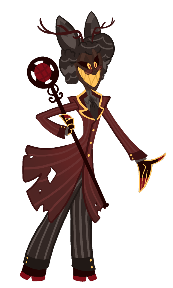
Hazbin Hotel redesign ideas p. 2
I am a bit of fashion, especially men's, history nerd, and I'm also a bit of radio nerd, so here I go, biblically accurate Alastor.
ALASTOR:
Alastor was a radio host (a radio star?) who lived and died in Louisiana. He was shot during a hunting accident, in the head, somewhere in the 1933, during radio's golden era. He cares greatly about his image and always smiles to show no weaknesses. He hates modern technology and doesn't allow his face to be captured by video recording or non black and white camera. His is mixed-race Creole.
Nothing about Alastor design make sense and it pisses me off. Not only it doesn't fit the time, it also doesn't fit his character! Besides, he is too red. He disappears into the background, especially walls of the Hotel.
Alastor cares about his image greatly, yet his clothes are torn. He is supposed to be like Hannibal, yet he looks like an edgelord wannabe. It's awful. I learned nothing about him from his design, other than "he's and old-time radio deer guy", and that's really bad.

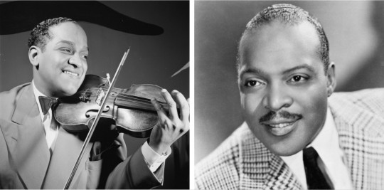
Fashion in 30s was inspired by Hollywood, and sport and movies celebrities.
Back and white fashion in this period wasn't that different, at least for men, as long as you weren't poor, but here are some photos of specifically black fashion in 30s. In general I recommend that website if you want to look more into the fashion of this period.
His hair is completely wrong. And it's also really ugly lol. For richer black men a shiny straightening hairstyle was the go to since 1920s. One such style was "the conk" where one would chemically straighten their hair. It left hair shiny, but the process was painful and expensive. It literally could burn your scalp.
Another popular style was the brush wave. It's creating narrow waves rolling on top of head with the sides cut short and smooth. This hairstyle is still present to this day, but nowadays it's done on the whole head.
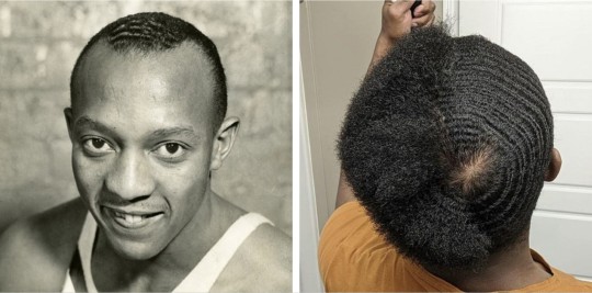
Other than that, men just wore their hair naturally, but short.
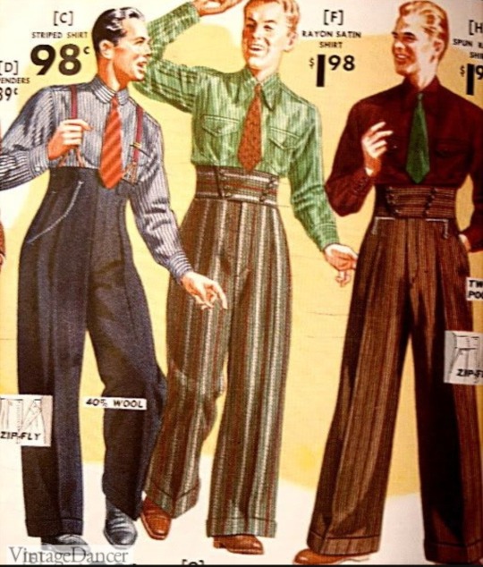
There is no focus on trousers or vest in Alastor's outfit. (Which is wild considering zipper fly was introduced in the early 30s, but was got popular by the mid ’30s). This was time of experimenting a bit with vests. If you wanted to look fancy and/or formal, you would wear a vest. Pants were wide legged, had a high waist and a single pressed line down the center of the leg. Some trouser waistbands were unique in the 1930s, for example a Hollywood waistband trouser. It had an extra wide band with a double row of buttons. They fit very high, overlapping the ribs. they often had netal ring tabs on the sides to tighten the pant to the correct fit without the need for belts or suspenders.
Also, monocle? Really? …Really? Here you go, read this if you're curious. Lots of pictures of glasses included. Glasses stayed essentially the same in 30s as they were in 20s. They were "round with a center bridge in the early years and an upper bridge in the later years. Frames could be tortoiseshell, black plastic, or thin metal."
Moving on from fashion, because I could never shut up, microphones!
The most probabale one that everyone who is redesigning Al is drawing is a good old classic Carbon mic. It looks like a ring with a metal star and the microphone inside. It can be hand held or a staff.
But, if you wanna draw something different!
Other than Carbon mic there is also a Ribbon microphone (first row) and Moving Coil mic (second row). Unfortunately, they killed Alastor in the best part of the radio golden age, so the mics are still a bit ugly, not gonna lie.

How would I design him:
First things firsts, either he is mixed or he is white, because right now it just feels like a cheep excuse to have an "evil voodoo" character without getting too much backlash. Let's be honest, nobody thought he was a POC and that white face doesn't help. Again, just like I mentioned with Vel, when you're drawing a character with human like skin tone you have to be careful and think how it ties to their race.
Second - fashion. His outfit and hairstyle is a disaster. He has always tried to 'dress to impress', so obviously I would give him well maintained clothing and that 'high quality', formal style. I would give him the dark brown Hollywood trouser with buttons and dark crimson shirt, like dried blood almost. Under a coat or jacket he would have a brow vest, both the same colour as the pants. Highlights would be golden and green or purple. I for one would love to see him start out with a jacket/coat which he stops wearing inside the hotel after he bonds with the people inside it more, but he would still wear it outside and in the finale would put it on again, after his breakdown in the tower. This would show he began to trust the hotel residents a bit before he 'realises his mistake' after the battle. I would give him short haircut, because not even white people wore hair like that. (What in the Karen-core is it supposed to be?). Say goodbye to that monocle. Why is it even there there? Because he is old-timely? What is he, a children's cartoon villain? His design doesn't need more soulless clutter. Give me something that tells me about him as a character. I've seen people give him old radio as teeth or chest and I love it! When it's not too detailed, it's a great idea to make Alastor less like a living human but also less of… just a deer. He just looks like a deer demon. I would keep his shoes, hands and antlers, and give him ears that would fit the hairstyle I would go with.
[Edit: I forgot to mention, I would give him a time accurate hat or a free wavy lock of hair to cover the mark on his forehead where he was shot]
Thirdly, the microphone! My love. I remember the microphone used to be able to talk, but now it doesn't, unless I'm wrong, but I'm pretty sure. Now it's just a weird look staff microphone with an eye and that's about it. But imagine something like a moving coil with the metal sign on top of it were the letters on it change. It could be a way it's communicating, in a simple way. This was it could still have a unique shape. That would have been fun to see. I can certainly imagine it being something of an 'unfiltered voice' of Alastor, where it would change it's writing into "Shut up", "Die" or something like that and he would hit it in a reprimanding way to reverse it to "Smile!". I'm just saying, that's a cool idea.
Well, this took forever to make, I actually forgot about this, so it just sat in my drafts. Anyway, if you want to see brilliant use of costumes and detailed, accurate depiction of fashion (especially black and queer) through history in New Orleans I recommend "Interview With The Vampire" (2022). It's also a great show.
#hazbin hotel#alastor#hazbin hotel alastor#hazbin alastor#hazbin hotel redesign#hazbin hotel fanart#redesign#hazbin hotel criticism#hh#hazbin hotel critical#hazbin hotel critique#men's fashion#men's style#menswear#mensfashion#fashion#fashion history
68 notes
·
View notes
Text


Next with the redesigns we get to the WarioWare cast! which oh god there's so many people here what the fuck! anyways! Here we have basically the cast of the og with two from later games. The Warioware cast designs are peak so not a lot is changed, but hey, I still changed some things, so let's get to them! (shoutout to the official WarioWare website it was so useful!)
Mona and Joe are the easiest since they keep themselves more or less the same - still the deliverywoman extraordinaire and her lovable boss. Mona here like everyone else is a bit older - a college student, majoring in archaeology, and has upgraded from a scooter to a motorcycle (quite literally upgraded, Crygor took her scooter and turned it into a bike). Joe keeps himself more or less the same, except a bit afraid of losing the best employee he ever had.
The man with the beat Jimmy T and the silly lil alien, Orbulon! With the former I just added some stars on his pants and also gave him melanin, because frankly the bright colors work better with darker skintones and the Mario cast is pale as milk, some variety is nice. for Orbulon I just put him in his human disguise's cute little minidress, because we stan a gender-non-conforming king. Fun trivia: Jimmy has beef with Waluigi over who has the better dance moves. They get along otherwise but if there's dancing happening it is ON. SIGHT.
Diamond Taxi's speed demons, Dribble and Spitz! I similarly didn't change much, just more detail on shoes, Dribble wearing his coveralls differently, and their earrings, which are actually their wedding rings, because look at me in the eyes and tell me these two aren't fucking. that's right you can't. Spitz finally got to publish his novel! It's doing better than Dribble expected.
Mad Scientist and Beleaguered Karaoke Robot Assistant Duo, Crygor and Mike! The levels at which Crygor is a cyborg vary SO OFTEN I just gave him the full helmet, a robotic left hand and a robotic foot. Mike I only changed up a smidge and changing his face to an LED display for better emoting. Still Penny's loving grandfather, he's gently trying to steer her towards a focus on the mechanics rather than chemistry, believing that she can achiever her idol dreams without having to rely on questionable homemade beverages. Mike on the other hand encourages to focus more on chemistry out of the selfish desire she can make a drink that will give HIM a perfect singing voice lol.
Nintendo Fanatics 9-Volt and 18-Volt! For fun I gave them the real names of Nikola and Edison. Now middle schoolers, they still enjoy skating and Nintendo games. I did the same with 18-Volt as what I did with Jimmy T. 9-Volt's helmet is more clearly a firefighter helmet - it's his dad's old model that he gifted to him.
And to finish it off, Kat and Ana! I wanted both of them to have more unique color palletes, and as a further distinction Kat has freckles. Like the rest they're a bit older, now elementary-school kids, and while he's not in this post they also get along a LITTLE better with Leo.
#Drops's Art#Drops's Super Mario#WarioWare#Mona#Joe#Jimmy T#Orbulon#Dribble#Spitz#Dr. Crygor#Mike (WarioWare)#9-Volt#18-Volt#Kat (WarioWare)#Ana (WarioWare)
67 notes
·
View notes
Note
I swear I dont wanna be mean but why does everyone keep making stella fat. Why is it that the most attractive character, whom everyone finds beautiful inside the show, is the one who is always turned fat. Like... No one would find her attractive if her canon design was like that. I promise im not being mean but I feel like the artists are always projecting themselves onto Stella and wanting to be loved like she is, cause usually the ones making her fat are fat too, like I saw your selfies and you're a bit curvy. I promise im not being mean im just curious.
For starters, send me more fat Stella’s if you can I haven’t seen that many made and would love to see more varied takes on her appearances in redesigns.
Secondly, I made her fat because I think it’s nice to have the character that’s canonically considered to be the most beautiful girl in all of magix, a fashion icon in the magical dimension, a very celebrated trendsetter, be something other than the stereotypical concept of socially acceptable fashion tropes. She isn’t an hourglass, she has cellulite and stretch marks, she’s super pear shaped, and that can be and should be considered something to be normal, since they are, and shouldn’t be seen as things that need to be hidden. Having that put on a loud and proud fashion girly seems good imo and it can only really contribute to good stuff for body image stuff and representation. I did it so people like you could reconsider that beauty is something that comes in multiple forms and shouldn’t have to fit one type of standard. If we wanna get super technical too those standards also very from culture to culture and I image that’s extended even further in Winx club.
The girls are all aliens from different worlds. There’s bug people. There’s a lady in the miss magix episode that has tentacle hair, a blue body, and tentacle hands and feet. I highly doubt beauty standards in canon would be the same as what you’re saying, ie that no one would consider her beautiful. As if people who look like her irl also would inherently be considered not beautiful too. I know lots of people who have people that think they’re the hottest thing ever and they have all sorts of different body types and traits. Lets just call it realism lol
I’m not really projecting any of my physical stuff on her also, outside of I guess stretch marks and cellulite?? But I put those on other characters too so I don’t really think that holds up. I actually put my old body type on Flora since she’s my favorite, but now I’m way more midsized, like a slightly thinner Bloom from my stuff (love this unit of measurement gonna start using the gorls as a reference point for my appearance going forward lol). I’ve always had the “socially acceptable” fat type of body, ie hourglass with even proportions and a super snatched waist. I just think it’s tired and trite to constantly reenforce the idea that “the hot fashion one” needs to be tall and thin all the time, and if she is made fatter, that she needs to look like I did ie not much of a tummy with super equal proportions, big boobs, and a big ass.
Kinda related to that also, I made a post about a lot of character design “rules” too that I think are kinda outdated and annoying, at least to me, since I’ve seen them a million times. We all have. So I decided to do something different that I think would be good for normalizing traits outside of what we consider typically acceptable for that kind of character.
I’m already very loved also and don’t need to project anything on Stella lmaooo
I got multiple partners, great friends, do modeling, and am slaying with my own fashion and appearance stuff outside of that too. That’s all independent of whatever I’m doing with her physical body type when I draw her.
Gonna level with you also, you going “I’m not trying to be mean” doesn’t erase how weird this ask is. Sounds like you have your own gripes that you need to work through. Like, if you consider those traits on Stella ugly, that means you definitely have some internalized hatred for fatness, skin blemishes, scarring, and other peoples’ general appearances if they don’t fit some specific molds that aren’t realistic for the majority of people. Even if it is just genuine curiosity, being aware of this stuff going forwards and reevaluating how you view beauty standards and bodies in general would do you a great benefit imo.
Thanks for going through my old selfies tho it was pretty weird of you but at least make sure to leave a like on them. I looked hot when I was fatter and I look hot now too sharing this with the world is the least I can do💕✨💕✨
#winx club#winx#asks#normalize other body types being considered hot because that’s just how it is irl too outside of what magazines and movies might tell you#people fall in love with all kinds of people or think all sorts of people that aren’t models are hot#and they’ve got bodies like hers#it’s just realistic if you wanna get technical lol
44 notes
·
View notes
Text


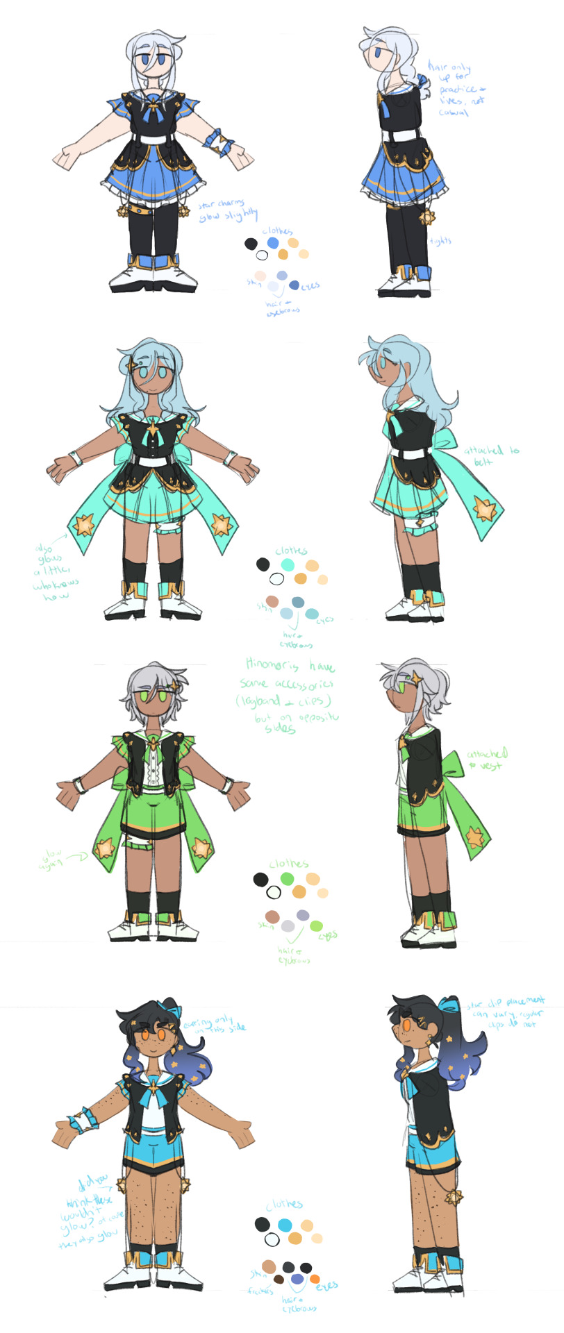
so i like the april fools shuffle units a normal amount. i have done redesigns for almost all of them and i draw them A Lot.
rambling additional notes on all of the redesigns below
a couple notes if you ever want to draw any of these redesigns for yourself at any point: i'd appreciate being credited for these redesigns (obviously anyone not redesigned i don't need credit for lol) and you don't need to follow my specific skin tone + hair/eye color schemes i have laid out. those are how i personally like to draw the characters and i've included them for anyone who might want to stay completely accurate to my redesigns, but you're welcome to use your own preferred color schemes for the cast when drawing them with these outfits!
now onto the fun(?) stuff
aoharu is pretty straightforward with redesigns, its basically just leoni but with a sun theme instead of stars. adding the image for the color palettes for the unchanged designs just because it has the notes for ichisaki too (their changes were too minor to completely redraw them, in my opinion).
ichika remains entirely unchanged design-wise other than adding a sun pin to her suspenders. saki stays mostly the same too, other than changing the design on her armband and switching her pigtails for a ponytail (in an attempt to seem a little more mature/imitate airi's hairstyle/move on from her childhood self since she's started to believe that honami and shiho want nothing to do with her and ichika anymore).
not too much to say about airi and ena's outfits either, i wanted to go a little more cute with airi and cool with ena, but there's minor changes with both of their hairstyles, with airi switching her pigtails for a ponytail as well (moving on from her idol days but still maintaining her usual sort of style) and ena's hair being a bit longer/messier.

yyj is definitely the most drastic, they're the only unit where i changed every single character... i have a lot of trouble drawing the mmj outfits, but also the lighter color scheme and clover theme just didn't really make sense for yyj to me? so instead i went with a mainly black and character color combo for their color schemes, alongside gold and white to accent it and a more spacey/dreamlike theme. everyone's black and white are slightly tinted with their character colors too!
they're split into pairs for matching accessories, but it doesn't mean much otherwise. kanade and an both have the dangling star charms and a single larger wristband (with those being on opposite sides from each other) as well as no buttons on the front of their outfits, while both hinomoris have the large bows on the backs of their outfits, smaller wristbands on both arms, a legband, and star shaped clips (like the other pair, the clips and legbands are on opposite sides from each other) and they do have buttons. they're split differently for the same style outfits though, with kanade/shizuku and shiho/an being the matching pairs this way.
kanade has the most obvious design changes. i swapped her character color to a medium-light blue rather than red, because tbh she kind of stood out too much if she was still red. she's not meant to be the leader of the unit, she doesn't want to stand out. her hair is a lot shorter than canon and she usually keeps it braided for practice and performances (and leaves it loose otherwise) (both the haircut and style were initially suggestions from shizuku). shes the only member of the unit to wear tights and to lack any star shaped hair accessories.
shizuku i don't have that much to say about, i had designed kanade first and then shizuku to match. its pretty straight forward i think? she's got the tallest socks not counting kanade's tights though.
for both an and shiho i wanted to go a slightly cooler/less feminine direction, while still sticking to the general theme i had going. which lead to the shorts and vest combo! otherwise the only notable change with either of them is that an's changed her clips to two regular gold ones and she's got a ponytail now when they practice/perform, much like kanade's braid.
fts was both very fun and an absolute pain to redesign because on one hand, i can do whatever i want, on the other hand, it's like vbs there's really no consistent theme to carry through everything. except a lot of layers i guess. so my goal was to kind of merge their casual aesthetics with something more vbs-like.
tsukasa wearing his jacket incorrectly was inspired by my own tendency to do so whenever i get too warm. i think he just does it because he thinks it looks cool though (its a little silly and a pain to keep it on but he's committed to the look). also leaving his middle layer as his fish jacket from his casual sprite was a funny little thing i thought worked for him.
with rui my goal was just pockets. lots of pockets. they're probably hiding little robots and tools in those pockets. i should have put more pockets on their pants too but oh well. combine that with wanting some obnoxious bright greens and blues and at least one item that kind of clashed color-wise with the rest (their pants in this case) and this is the result. the sketch doesn't convey it well but their black jacket and pants are both kind of loose, while the green hoodie and tshirt underneath fit okay. also their hair is kind of long if they ever untied it, but no one ever sees that.
hapisen for the most part sticks to their canon sprites, just simplified slightly for my sanity. mafuyu's costume still drives me insane to draw though, that's so many layers to think about.
other than questioning my sanity every time i draw mafuyu, there's only one change from her sprite, which is making her hairtie one decorated with pompoms much like a lot of other parts of her costume. i just thought it tied things together a little more.
the upper half of haruka's outfit is more or less completely unchanged (other than making it fit in a way that looks slightly more masculine), but then i replaced his skirt with pants and gave him boots (wxs meiko, who is the sprite haruka's outfit is originally just a recolor of, wears heels). i figured if i was going for a more princely sort of design for haruka then changing those felt fitting. beyond that he's obviously got shorter hair (a choice he makes after seeing kohane decide to change herself, wanting to embrace the genuine person he wants to be beyond the idol people knew him as) and that's about it. hits this guy with the transgender beam.
kohane's outfit is really just a bit simplified from the original with sizing/proportions of elements adjusted to (in my opinion) suit her better. the ribbons in her hair felt like a cute addition (and i like to give kohane ribbons in general), while her hair length is an in between of her two standard canon ones, longer than the usual one we see but shorter than pre-canon/early mainstory. her glasses are optional, she changes between them and contacts with how she's feeling for the day and what kind of shows hapisen is planning. the more intense the show, the less likely she is to wear her glasses.
kyushumi was kind of intended as niigo but without one member in a mostly white outfit since they don't have someone like kanade who is intentionally trying to save people. although they're also a little happier off anyway, so they don't need someone like that. they're my most drawn shuffle unit, so also probably my most thought-through redesigns.
each design takes slight inspiration from a member of niigo (nene/kanade, minori/ena, honami/mafuyu), but that was just kind of as a personal guide for what kind of vibes to go with for the outfits. they've all got personal touches to them.
nene's hoodie is very loose on her body and arms, but a normal fit in the length, and her shorts are actually long enough to be seen. she just wants to be comfy, she's tired a lot, very low energy girl. glasses because i think nene should wear glasses anyway, so as opposed to canon nene who i like to believe just favors contacts, this nene does not.
minori is pretty obviously similar to ena's outfit, but there's a few nods to mmj in here. she's got clover shaped earrings, the pattern along the bottom of her dress is meant to resemble the tips of the clover leaves from mmj's symbol, and her shoes are just the mmj unit outfit shoes in different colors.
the goal with honami's outfit was simply "how little skin can she have exposed" because i imagine her being more worried about that than usual here. so long sleeves, long skirt, high collar, etc. her hair is longer (for no particular reason tbh, i simply liked how it looks) but still styled the same, and she's got a solid red scrunchie now. the four buttons on her outfit are all meant to look like the moon, two full moons and two opposite facing crescents. also i will never stop joking about the fact that she's naturally the second tallest girl in the cast (not counting vs, then she's third tallest) and i gave her tall heels on top of that. she is towering over all of her unitmates here.

while you're welcome to use these designs for any (non-incest) ships you'd like, i do have a personal list of ships that are canon to my own au with the shuffle units, which is what i originally designed these for. the "canon" ships are
ichika/saki
ena/airi
honami/kanade
akito/touya
mafuyu/rui (qpr)
haruka/kohane
mizuki/nene
however you are not by any means required to follow these specific ships! i have no desire to enforce the ships that go with these, so draw whatever ships you might prefer with these designs. i'm happy to see anything!
anyway if you made it this far congrats on surviving i know this is a lot of text o7 i hope you've enjoy my silly little character design insanities ^^;
#you guys have no idea how much these live rent free in my head#the chibis were a fun little project#and then it turned into the full sketch references for everyone once i realized i needed a better way to share my designs#project sekai#prsk art#project sekai fanart#prsk fa#w1f1 draws#saki tenma#ichika hoshino#airi momoi#ena shinonome#kanade yoisaki#shizuku hinomori#shiho hinomori#an shiraishi#akito shinonome#touya aoyagi#tsukasa tenma#rui kamishiro#emu ootori#mafuyu asahina#haruka kiritani#kohane azusawa#mizuki akiyama#nene kusanagi#minori hanasato#honami mochizuki#april fools shuffle units
157 notes
·
View notes
Text
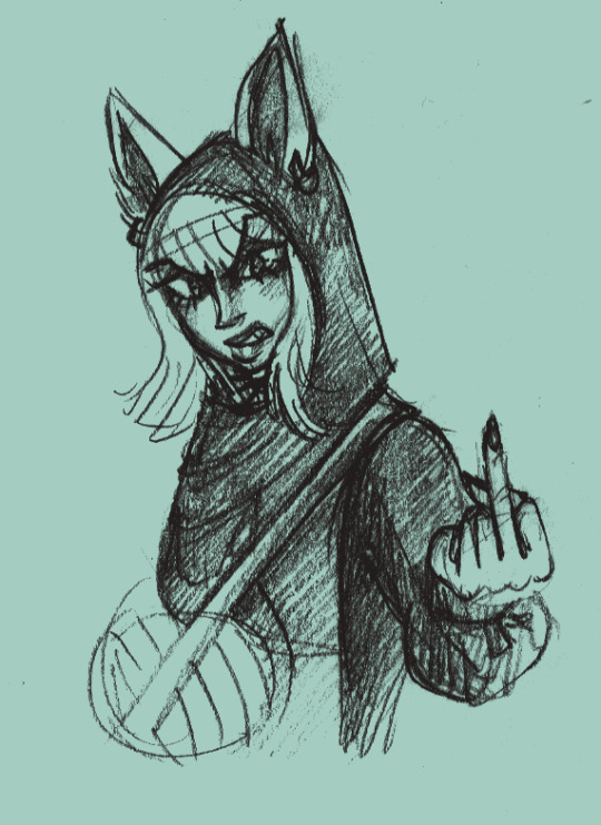
BOBA AU - CHAPTER 1 EXTRAS
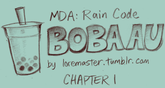
I had actually drawn a few more things than could fit within the 30-image-per-post limit. Here are the ones that didn't make the cut, with commentary!
(tw: mild animal abuse, n*zi mention, suggestive themes)
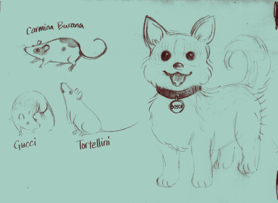
Zilch's animal companions. I named Carmina Burana and Tortellini, Gucci and Bosch were named by my friends - though Bosch was supposed to be called Hieronymus, it just didn't fit on the nametag lol
I wanted to illustrate some examples of Zilch casually mistreating/neglecting the animals but this was as far as I got. I don't think he would be a full on animal abuser, just... the type of person who likes having a bunch of pets to show off but doesn't really think about properly caring for them. He likes the aesthetics of animals much more than the logistics.
This was gonna be the chapter cover and I forgot. Oops.
This was just practice drawing the church characters from their sprites.
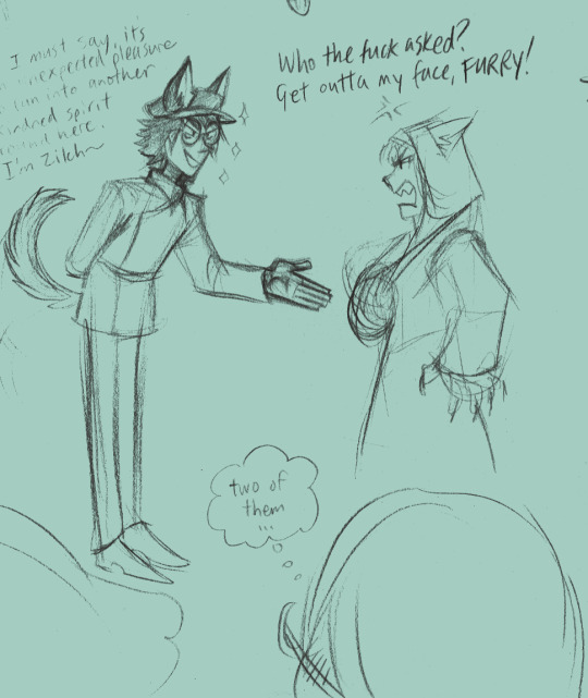
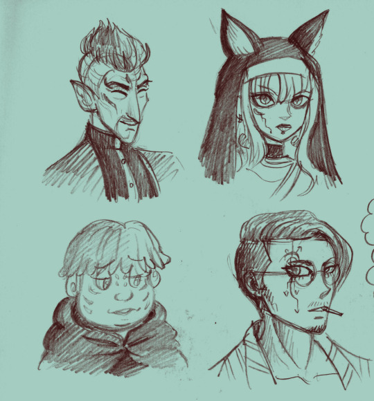
Zilch: I must say, it's an unexpected pleasure to run into another kindred spirit around here. I'm Zilch~
This scene was actually cut deliberately. I drew it before I decided exactly what the Nun's issue with Zilch would be and then once I did, I felt like it didn't fit anymore. Zilch is still excited to see someone else with ears and tail like him, but in the final version, he's a lot more derisive about it.
I imagine the Nun is, like, an actual animal-human hybrid whereas Zilch is a furry with a wallet that can afford bioengineered bodymods. (One day, my friends... one day...)
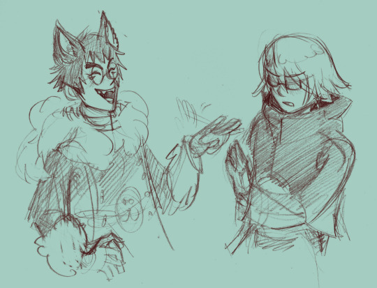
Zilch being flippant and Halara being dismissive/tsundere. Couldn't really find a place to put it but I still like the drawing - even if I did accidentally give Zilch human ears.
By the way, you might notice Zilch hasn't been wearing his cap. There are two reasons. One is to show off that his ears aren't actually connected to it. If I had the time to go back and redraw the prologue with him wearing it - so Halara's "holy fuck" reaction makes more sense here - I would. (Not really worth trying to fix though, not until the rest of the story is done.)
But the other reason is that upon looking closer at Zilch's original design, I thought it was a little too evocative of Nazi imagery and wasn't really comfortable with it. It's not really the same style of hat, sure, but combined with the swastikas in his eyes??? yeah no way is that not intentional. (I redesigned his eye symbols to be catlike slit pupils instead.)
I get he (or, the hitman, I guess) is supposed to be a villain, and a minor one, in the original game... but here I'm gonna flesh him out a bit more. So I guess in that sense the removal of the hat symbolizes his growth as a character beyond his terrible awful fascist upbringing lol (more on that in the Gumshoe Gabs soon)
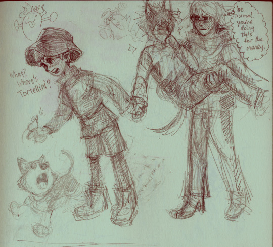
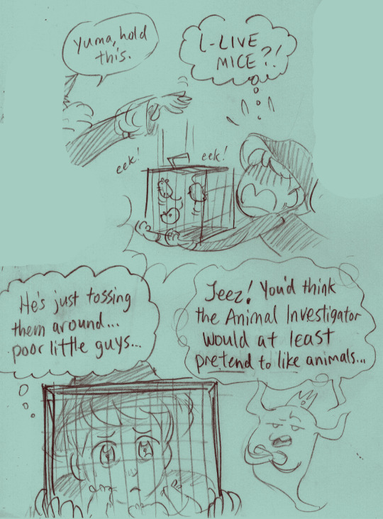
If I were making this an actual game it would be fun to have Yuma get a fun little added gameplay element of using Zilch's Forte like he does with Halara's. He gets some little animal friends!!!
I imagined Zilch would ask to be carried, but Halara won't do it without getting paid an exorbitant amount. And then Zilch forks over the cash on the spot. Yuma screams internally. If he had that the whole time why were they even trying to negotiate over the coat???!? Why does he still have his own debt to pay if Zilch could just cover the whole thing up front????
Halara has to pretend not to be enthusiastic about this opportunity.
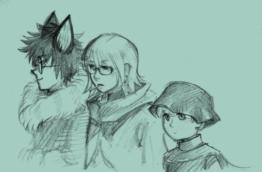
Shinigami is... there, I guess.
Martina my wife driving around her little parasite of a boyfriend. Ms Electro please call me
Was originally gonna have Seth say that out loud but then I remembered he doesn't want to lose his job. (It's okay, he loses it anyway.)
(Also yes this is pre-Vivia-DLC.)
And then the mystery is solved!
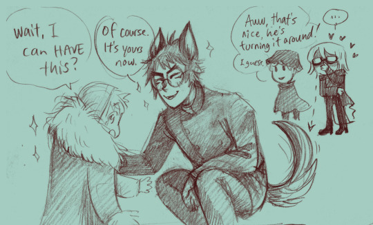
Zilch feels indebted to Halara for saving him from the Nail Man, and wants to follow their example, turn it around, treat his animals better... his act of goodwill here is extremely performative, though. But, hey, everyone's gotta start somewhere!
Ultimately I cut this scene after coming up with the cat bed idea. (Was very tempted to have Halara cruelly taking the coat from the boy, but just decided to skip it instead.)
So Zilch kinda idolizes Halara now... which is fine... but then the morning after he really lets his simp flag fly.
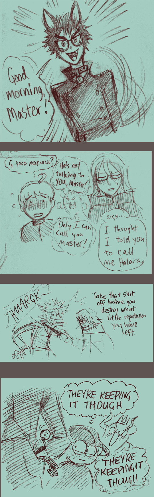
Congrats on your furry boyfriend, I guess?????
A doodle from the margins of this comic way back when.... which finally has a place to belong! \o/
Zilch's fursona. His "zursona," if you will.
Thanks again for reading! I love everyone's comments in the tags and I'm so glad you all like my version of Zilch especially. Excited to develop him some more in future chapters >:)
#rain code#master detective archives#mdarc#boba au#abcd art#zilch alexander#yuma kokohead#halara nightmare#martina electro#zilara
81 notes
·
View notes
Text
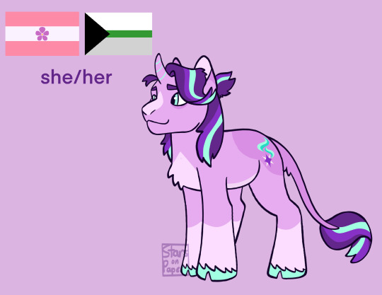
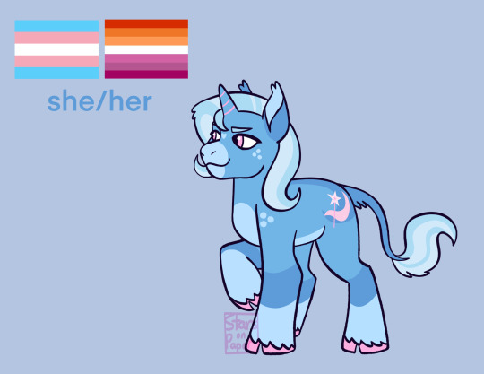
mlp redesigns part 2 startrix edition :D
headcanons below the cut
Starlight
crippling anxiety lol
once she was reformed she started putting on recovery weight <3
got her cutie mark later than normal and was pissed when she did get one
she feels most comfortable being in control, a big part of why she resented cutie marks is bc they were something she had no power over and it made her scared
ran away from home
rlly likes baking!
is not very good at baking!
special talent is magic but more specifically altering spells and creating new ones
i have soooo many thoughts on this horse if u want to know more tell me i will write a 5 paragraph essay
Trixie
i forgot to put it but shes definitely autistic and so is starlight actually
small and short but surprisingly strong
rlly good with kids! this surprises literally everyone
has a pet chicken named Miss Daisy who she spoils rotten
went to Celestias school but dropped out lol
her dad wasnt in her life, she knows about him but he doesnt know about her
decedent of starswirl and has no clue
knows how to dance!
i have more that r locked behind a paywall (the paywall is just being asked if u ask me i will rant)
#my art#mlp#my little pony#mlp fim#mlp redesign#mlp trixie#trixie lulamoon#mlp starlight glimmer#starlight glimmer#starlight x trixie#startrix#mlp headcanons
43 notes
·
View notes
Text
Vaggie Redesign🦋
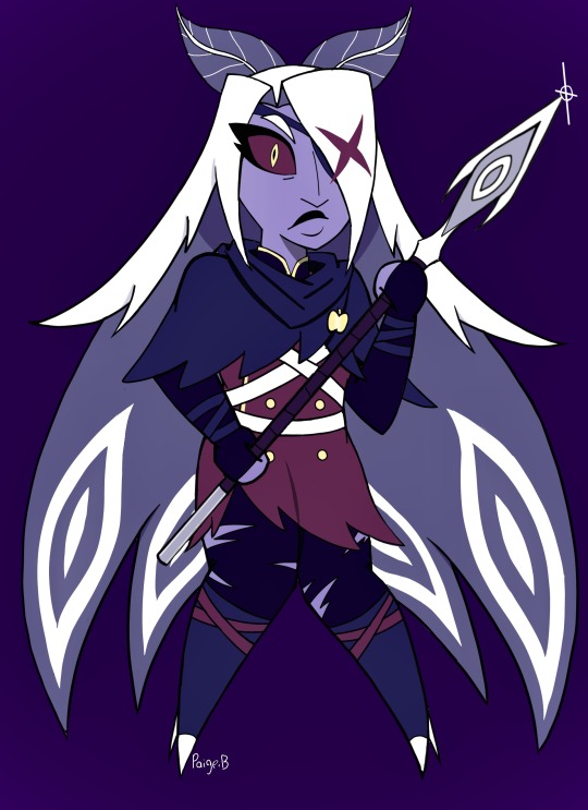
Made my own version of Vaggie for fun! Out of everyone so far, redesigning her was the funnest to play around with. There was a lot to consider!!! Spoiler alert for those who haven’t watched the show!
One big thing I had to consider about was her moth motif🦋. I redesigned her hair to be more moth like, the type that have eye patterns like the emperor moth! I think it’s super cool but also…Angels and Eyes👁️(I can imagine the eyes react with her main one) Plus Eyes in general have always been a big motif for her. I also made her feet more stubby, to give off how they were changed becoming a sinner. I def wanted to give off her coming off as unintentionally unsettling as moths can be lowkey scary lol, but also show a struggle of hers is being more down to earth and approachable to others.
Made her hair SUPER longer for the patterns but also give off how if makes up a lot of her, moths got big wings. I read sinners forms have a sorta punishment to them and I imagine for Vaggie, her hair can’t be cut. It can but it would grow back to the same length soon. So it’s def been a struggle for her along with her new feet to figure out how to deal with, especially for combat. Also replaced the bow with actual antennae and made her eyebrows have more hair too! At first I was gonna add the bow to show her using it some way to put up her hair but with how big it is and adding antennae I just got rid of it, making those allude to a bow instead 🎀

For my HH Gang, I’m going for a Rainbow Motif(I think we all know why), for Vaggie she’s more Indigo. Blue(color close to Heaven) but also a little mix of Red(Charlie & Hell). Also has a lot of different symbolisms that I think work well for Vaggie!!!!!!! And in her old looks she had a lot of blues(many such as navy blue belong in the indigo territory) that I decided to re-incorporate into her look. She’s the blue to Charlie’s Red❤️💙Also has a dark purplish red to show the uniforms she’s wearing is older but still connect her to the Hotel and Charlie❤️🌈.
Made her skin more purplish. I can imagine….back then it used to be gray or grayish blue but time in Hell added more color💜💜💜💜💜

ANOTHER really big thing was her fashion. For my Vaggie, she’s basically wearing an old Bellhop uniform from the Hotel’s past(moths may have done some damage prior, lol) hence the tatters, she likes it as it shows she’s part of the Hotel and protective enough but also not too stuffy to stop her from being active. I def was leaning into her being the Hotel’s security. She’s also wearing straps for putting her spear away, a hooded shawl, which I was inspired from one of her concept looks with ripped tights and boots. Def kept the long fingerless gloves with some protective wrap!!!!!!!!!
She’s also wearing a golden apple(HUGE motif with Charlie🍎) and also a huge symbol shown a lot through the hotel to show she’s part of it!…also added more hidden ❌ symbols.
I was def leaning towards business/subtle military/action girl for her. Talked about this with @a-sterling-rose that during development, she plays around with her look more, finding her identity more. I also wanted to give off a little mystery with the cloak. Show she’s someone with secrets…like being a former Top Exorcist. I REALLY WANT HER TO GET HER OWN PAIR OF ANGELIC BALLET SHOES FROM CAMILLE!!!!!🩰🩰🩰🩰🩰🩰
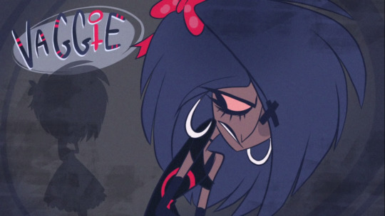
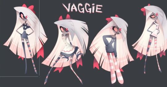
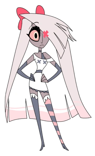
Gave her bigger lips 👄
Made her X sharper, make it look more wing like. Made her lashes more wing like too🦋
Put more weight & muscle on her💪💪💪💪💪💪💪💪💪💪💪💪💪 show she’s got muscle and fun fact, moths got stout builds!!!!!!
Also redesigned her staff a bit to look more Eye like and added a wrap for grip(and that it may have been broken in the past).
Gave her a line under her eye, show she’s someone who works herself too hard ant time… and also give off she’s bit on edge about something…
Also I know there’s been discussions about her name, just wanted to say, if I was to change her name, I’d make it Polilla! Spanish for Moth🦋 I like the idea of exorcists being once humans who became Angels! So Vaggie’s def still got her Salvadoran roots! 🇸🇻 I can imagine she HATES when people call her “Polly” for short.
Also done designs for Charlie & Angel🍎🕷️
What do u think? I’d love to know!💖
#Hazbin hotel#vaggie#vaggie redesign#hazbin hotel redesign#hazbin hotel redesigns#hh redesign#hh redesigns#my art#my redesigns#hazbin vaggie#vaggie fanart#Hazbin hotel fanart#hazbinhotel#hellaverse#Hazbin hotel vaggie#Vaggie redesign#vaggie hazbin hotel#hazbin hotel rewrite
48 notes
·
View notes
Text

i forgot it was april fools lol. i definitly did not end up sprinkling in a bunch of memes in there, nope, not at all.
I havent checked my dashboard until a few minutes earlier, but now im booping everyone i find in there, its just so damm fun! its kinda sad that its just for april fools, i wish the booping stayed forever like its way too silly i love it.
Oh yeah the drawing yep aight. So uh, i had the idea yesterday and this looks NOTHING like what i had planned, it was just going to be a plain white backgroung, and i was trying to make it look like a pencil sketch (kinda). and simple coloring. but i had a lot of problems and drawing this ended up being really frustrating but im kinda happy with the result even if it difers so much from the og idea.
also here is a clean version (aka no memes)
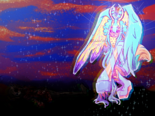
i tend to change my idea as im drawing so after i realized this was not going to look like i thought, i tried some effects and i came up with the idea of making it look...off.
Backgrounf with saturated colors consisting of red and blue and a fecto elfilis who looks rather dreamy, wich is totally not kinda inspired by isolated isles and high school musical 2 believe it or not (im confused as to how that was present in my mind as inspiration but i guess anything works as a reference) and contrasting with the darker background from how light and glowy i made him.
Fun fact: when i drew elfilis here, they were reminding me of a bunny, so you could kinda count this as a bit of an easter post since im probably going to forget to do something for that.
fun fact 2: this image is based on a fanfic im writing right now, i havent posted it yet, and when i do im pretty sure i'll put it into the Anonymous collection, since what im writing is very different from my usual, i tend to write about my splatoon ocs or sometimes about kirby characters, most of these fics tend to be general with not a lot of archieve warnings and stuff (save for one but that one was very very tame and just had an implication of a character dying at the end) and they're oneshots, most of them, this one is also a oneshot. i just enjoy writing that, but its a little bit....how to say it? bloody, i just have like the start made and its probably going to take me a while to finish, im also thinking of reading it multiple times since most of my works are usually just the first draft. but uh since its quite different and has that im quite scared of the reception it might have when i post it, in fact a lot of times i dont post stuff since even tho i know i shouldnt worry about others, i still do like an idiot, i just cant help caring about what other people think of me. and yeah basically its just not like the usual fluff i write.
next post might be splatoon related since im redesigning some ocs i had, or it might be princess peach showtime because my father got me the game and im loving it
Thank you for listening to my unnecesarily long rambles and Jambuhbye!
#art#fanart#kirby#kirby fanart#kirby gijinka#digital art#firealpaca#fecto elfilis#fecto elfilis gijinka#no one is in the bottom left corner i swear#if you squint this is pretty much the Grant Gustin Next To Oliver Queen's Grave meme#i said nothing no one is there#my lil sis says elfilis is a 10/10 girboss and im proud of her for us to finally agree on something#gikabi#april fool's day
26 notes
·
View notes
Text
Y'all might be wondering where I've been. Well, I've been drawing!

These are Juhren and Sunflower, my oldest g/t ocs (they're from 2018!) I'm very fond of these two and I was thinking about them a lot, not to mention redesigning them, and before I knew it, I've drawn a whole portrait aushshs
Although the only stories I've posted about these two were fluffy (here and here) their bond wasn't like this at first!
More about them under the cut~
Basically, Juhren and Sunflower are childhood friends in a fantasy world where each sentient being has a magical power inside them, which made the world full of different species of creatures. Humans like Sunflower, however, do not have this power and in the land she lives in they're being killed and harvested for a unknown purpose. So Sunflower pretends to be a magical species that's related to nature and plants (hence her name) and it was during this undercover period that she met Juhren. He's from a species of giants called the nordem, a barbaric, violent and powerful kind that's currently on war with the leaders of the country. However, when they met, Juhren was a child and nordem children are just a little taller than human size.
After a falling out, they've been separated until adulthood. Sunflower is discovered and has to flee her village and the country altogether in order to survive, hiding from basically everyone, since humans can be captured for a very high reward. In this world where she can trust no one, she needs allies in order to escape, and meeting Juhren again, now a powerful and (apparently) ruthless giant like the others, he might prove to be just the person she needs.
Sorry that got long lmaoo anyway I have their first meeting planned out (I've written it a few times as well) and, although I have a lot on my plate rn lol, I want to write it one day and show it to you guys! I've only been showing Juhren's soft side so far, but truth is he rarely makes the face he's making at the drawing ausush So anyway I love them
#art#oc: sunflower#oc: juhren#g/t#giant/tiny#sfw g/t#g/t art#coffeh draws#I'm very happy at the giant species I've created and the world of these two chars in general#one day I'll show more about it all <3
45 notes
·
View notes
Last Seen Blogs
mocnsings
B ❀ A T E M
rabbitmilk
lovingrot's art blog
viajarporroma
Vivir Roma

samantha-k-fresh
A Fresh Start
busot-blog
LucKy I'm inLovE wiTh mY bEsTfRiend