#exterior photograph of moma
Text
MG Housing, Córdoba
MG Housing, South American Residence, Córdoba House, Argentinian Real Estate, Architecture Photography
MG Housing in Córdoba
6 Apr 2021
MG Housing
Architecture: MoMa Arquitectas
Location: Córdoba, Argentina
The MG House is embedded in an extensive plot of lush tree species located in the southern area of the Córdoba City, Argentina.
The project is made up of two pure volumes which are perpendicular to each other. The lower one, lodging the “social” space of the house, is arranged across the land, closed towards the street and open towards the landscape. The upper one, more private, is oriented to the central garden, privileging the visuals and lighting.
The ground floor is presented as a solid volume, with two stone bases at each end plus a perimeter beam of exposed concrete that links them. The upper floor rests on a light metal structure, generating a lower void in which the gallery is arranged.
Inside the social space, two large wooden cubes were raised, containing mobile enclosures, with the intention of generating fluidity and spatial integrity. The continuity with the outside is achieved directly through large translucent cloths in all rooms. Same effect, but in a more controlled manner, is in the bedrooms , with metal parasols.
The staircase is the connection point for both volumes, where two skylights illuminate the simplicity of its pieces.
House’s materials (resolved with stone, exposed concrete, metal and wood), accompanies the simplicity of its geometry.
The exterior space design consists of contrasting and complementing the strongly rational orthogonal (morphology of the architecture and the environment that still has peculiarities of a semi-rural type) with organic forms provided by the layout and by the existing and proposed structuring vegetation. This formal decision tries to establish a link with images of elements from the natural landscape of the characteristic mountainous area of Córdoba.
The proposed counterpoint gives rise to the generating idea: Natural-Artificial. Thus, it is sought to link the inside with the outside, by contrast and complementarity plus the organic with the geometric, also defining in this way the transitions as a connecting link.
From the functional and morphological characteristics of the proposal, three large sectors are defined: Entrance garden – Gallery / Pool – Meadow / Grove.
The first one, assumes the transitional role between the public and the private areas, while the second one is the social area provided by two main elements: the gallery and the pool. Finally, the third one, orientated to the south, is made up of two big areas: the meadow and the forest.
MG Housing in Córdoba, Argentina – Building Information
Architecture Office: MoMa Arquitectas
Construction completion year: 2019
Constructed area: 410 sqm
Location: Córdoba, Argentina
Photographer: Architect Gonzalo Viramonte
MG Housing, Córdoba images / information received 060421
Location: Córdoba, Argentina, South America
Architecture in Argentina
Contemporary Argentina Architectural Projects
Argentina Architecture Designs – chronological list
Argentina Architecture News
Argentina Houses
Casa Rampa, Patagonia
Design: Andrés Remy Arquitectos
photo : Alejandro Peral
Ramp House in Patagonia
Nordelta Tigre Yacht Club House, Buenos Aires
Design: Estudio Ramos, architects
photograph : Daniela Mac Adden
Nordelta Tigre Yacht Club House
Córdoba Architecture
New Café Building in Córdoba
Bicentennial Civic Center in Córdoba Building
Architects: GGMPU Arquitectos + Lucio Morini
photograph : Claudio Manzoni
Bicentennial Civic Center Córdoba Argentina
Contemporary House in Cordoba
Argentina Architect Studios
Argentine Buildings
New House Designs
Casa Nagus Manantiales
Casa MC2 Córdoba
Comments / photos for the MG Housing, Córdoba page welcome
Argentina
The post MG Housing, Córdoba appeared first on e-architect.
0 notes
Text
How the Master Became the Master
Matisse: Radical Invention, 1913–1917 is the kind of show the Museum of Modern Art (MoMA) does best: take a specific period of an artist’s career and demonstrate the development and breadth of that aesthetic vision. Co-curated with the Art Institute of Chicago, it is a big show about a brief time in the great artist’s long life. It is both a revolutionary and revelationary approach that is breathtaking in its concentration on five important and yet often overlooked years in the artist’s career.
Matisse: Radical Invention, 1913–1917 is the art exhibition to see in New York – and more than once. Before anyone quibbles about yet another Matisse show, consider that MoMA and Chicago have taken out of storage and from many public and private collections rarely seen works to play off one another in this mammoth undertaking. Although it contains over 100 works, the display is never oppressive. It never feels padded. One eagerly races from one gallery to the next to take it all in. This art all seems still so vigorous and fresh, as radical as ever. The selection reflects the full range of the artist’s vast invention through paintings, sculptures, prints and drawings. Nothing could be more thrilling and satisfying. Matisse: Radical Invention, 1913–1917 defines what a blockbuster should be.
This title, of course, is not only misleading but nonsense. A large number of the works belong to years other than the designated five. They commence with the aggressive Blue Nude (Souvenir de Biskra) of 1907 and continue as late as 1931 when the artist completed the fourth and final “Back” relief. What does “Radical Invention” mean as far as Matisse’s career is concerned? Would not that apply to every phase of it? Naturally MoMA and Chicago rely on their own rich holdings, but the exhibit would have been enhanced in places with pertinent examples from the Hermitage in St. Petersburg and the Barnes Foundation on Philadelphia’s Main Line. The Russian Sergei Shchukin was the great early collector of Matisse, but the dreadful economy may have prohibited any loans. Perhaps it was pointless to try to borrow anything once owned by the idiosyncratic Alfred C. Barnes. Though the masterpieces Dance I (1909) and The Red Studio (1911) too are conspicuously absent, both can be found on another floor of MoMA in the permanent collection.
If Picasso had his Blue and Pink Periods, then 1913 to 1917 might be called Matisse’s Gray Period. The understated palette he now employed drew on subtle shades of gray, blue and rose, some brown and green, all held together by thick black. Some paintings look almost monochromatic or like hand-coloured photographs. There is nothing naturalistic about the hues he chooses. As in the work of Cézanne and many of Matisse’s Cubist contemporaries, the underlying drawing was of greater importance to his paintings than any brilliant colour effects, even though the use of light continued to play a significant part in these pictures. Matisse found radical new ways of applying paint to canvas. He layered, slathered, splashed, slashed, smeared and scratched it. The raw textures invigorate the subdued colours. Matisse, like the revered Cézanne before him, audaciously allowed the bare white of the canvas to show through as another colour.
The numerous paintings of bathers in the MoMA show perhaps too conveniently refer back to Cézanne's Three Bathers (1879–1882) that Matisse owned and then look forward to Matisse’s monumental Bathers by the River (1917) from Chicago, the kingpin that closes the exhibit. La Luxe II (1907–1908) looks less like late stolid Cézanne than limp vintage Vallotin; and the coy expression of horror (or is it wonder?) on the central figure in Bathers with a Turtle (1908) wrecks this absurd picture. Yet Bather (1908), a young nude male from the back, is one of the most powerful pictures Matisse ever painted. It is the only one of these swimming paintings comparable in quality to Bathers by a River, one of the master’s masterpieces. Bather embodied everything that Matisse was attempting as an artist at the time.
The African influence is still evident in many of these pictures, particularly the portraits. Like the pencil drawing of Shchukin and the famous Portrait of Madame Matisse (1913) in the Hermitage, Portrait of Sarah Stein (1916) wears a mask instead of a face. So too do The Italian Woman (1916) and Portrait of Auguste Pellerin (II) (1917). The latter sitter rejected an earlier version of the picture, but Matisse was not really interested in capturing exact likenesses. The Italian Woman fades in and out of the background in a composition that fuses Cubist conventions with Matisse’s own concepts of construction. The artist was more concerned with the colours and patterns in The Manila Shawl (1911) than in the woman who wore it. The rather smug Nude with a White Scarf (1909) is just as blunt as any of Picasso’s African-inspired pictures of Parisian prostitutes.
The show really does take off as it progresses from 1913 when the painter returned to Paris from Morocco until his departure for Nice in 1917. Picasso as always was Matisse’s bête noir. Les Demoiselles d'Avignon (1907) forced everyone to entirely rethink art. (Ironically, Matisse was the one who introduced the Spaniard to African art.) Fellow Fauves like Georges Braque and André Derain deserted Matisse for Cubism. No matter how much he might have wanted to, Matisse could not ignore Picasso. Theirs was a heated rivalry that greatly fuelled Modern Art as each artist tried to outdo the other. Not surprisingly, Matisse once compared their relationship to a prizefight. “No one has ever looked at Matisse's paintings more carefully than I,” Picasso confessed and then added with some irony, “and no one has looked at mine more carefully than he”. The show at MoMA proves that Matisse was as revolutionary as Picasso.
Be warned that the Matisse of the current show is not the popular painter of the postcards and posters, the beloved old sensualist obsessed with colour, line and the female form. This is the thinking man’s Matisse, struggling with the precepts of the Cubist Revolution to develop what he called “methods of modern construction”. Most importantly, he shifted from concerns of colour to questions of form as he developed his own distinctive visual shorthand for figure and landscape. Despite his familiarity with Picasso’s efforts, Matisse did not follow anyone. The French poet and critic Guillaume Apollinaire shrewdly observed at the time, “Matisse’s art is eminently reasonable”. Yet the artist himself insisted that he relied only on his instincts.
Working almost solely within his studio, Matisse seemed disengaged from the world outside him. Many of the paintings of this period deal with windows and the play of sunlight streaming through them. Despite the inconveniences the war inflicted on the artist, these pictures and sculptures are entirely divorced from the mayhem then raging around him. Like Bonnard, Matisse was a master of bourgeois domesticity. He sought “an art of balance, of purity and serenity, devoid of troubling or depressing subject matter” that should be “a calming influence on the mind, something like a good armchair which provides relaxation from physical fatigue”. He tried to enlist in the French army but was turned down because he was 44 years old. He continued to busy himself throughout the war with portraits, nudes, interiors, exteriors and still lives just as he had during peacetime. There are no soldiers in uniform, no battle scenes, no reference to or residue of the devastation just beyond his studio. Matisse preferred to draw the precise contours of a piece of fruit on a plate to depicting the violence then destroying the rest of the country. Viewing Matisse’s work done during those turbulent times is as if the First World War never happened. Although he did produce a series of prints to aid the prisoners in Bohain-en-Vermandois in 1914 and 1915, Matisse was not a political artist. Pleasure and the pursuit of happiness alone defined his art.
Not wishing to draw attention to himself with the rest of the world at war, Matisse chose not to exhibit these works as they were being produced. Consequently, critics and scholars have largely neglected this crucial period in his life, until MoMA’s exhibition. Other painters must have been familiar with individual pictures. Portrait of Auguste Pellerin (II) with its predominant black lines suggests Max Beckman’s German Expressionist paintings and Composition (1915) finds echoes in the American Milton Avery’s later art while Branch of Lilacs (1914) and The Rose Marble Table (1916) must have inspired the Russian David Shterenberg.
Particularly fascinating is Matisse’s 1915 deconstruction of his own 1893 student copy of Still Life After Jan Davidsz. de Heem’s “La Desserte” decades before Picasso re-imagined works by Velasquez, Cranach and other Old Masters. Matisse had come across the old picture while going through things he had moved to Issy-les-Moulineaux after the French army requisitioned his home in Paris. Here was a typical painting of the Dutch school relying on heavy chiaroscuro that Matisse discarded when he brightened it up “by adding everything I’ve seen since”. The new work looks like a collage of little still lives done in a variety of manners and yet they all fit together to form a surprisingly integrated composition. It is like a Mini-Master Class in Modernism.
No matter how commonplace may be his subjects, there is nothing conventional about their rendering. The simple but monumental Apples (1916) and A Vase with Oranges (1916) purify the genre and nearly outdo the grandiose Dutch Masters. The Blue Window (1913) looks back to The Red Studio by displaying some objects, including one of the artist’s sculptures, against a single colour that dominates the room and the rhythmic landscape beyond the pane. The sunlight cuts up Goldfish and Palette (1914–1915) into odd angles. A wide band of black shadow behind the fishbowl gives it and the goldfish a haunting luminosity. Matisse had originally painted himself into the picture on the right; only his thumb in the palette remains. Matisse, much as Cézanne did on his trips to Provence, redefines the very nature of the landscape itself in the colliding slashes of colour in Shaft of Sunlight, the Woods of Trivaux (1917) and the flat geometric shapes of Garden at Issy (1917).
Matisse never entirely embraced pure painting, but he came damn close to it during this highly exploratory period. Although never completed, French Window at Collioure (1914) summarises all Matisse was thinking at the time. No more than a view through window into the darkness, it is arguably the most abstract of his works. It is almost a Colour Field painting as a large swatch of black is squeezed between the wide blue-gray stripe of the opened window on the left and the other gray half of it and the green wall on the right. Equally extraordinary is View of Notre Dame (1914), a brash, concise architectural rendering of the famed landmark against a blotchy blue ground. Many people once believed the painter had left it unfinished. Its stark simplicity is not what one expects of Matisse, yet the skeleton of the cathedral is powerful as such. Though few others have realised it, Matisse always insisted that he provided a specific subject in Composition (1915). It is another view from his window with the floral curtain evident on the left. However, the landscape outside has been reduced flat areas of pure colour, a swirl of bright yellow against light blue and green.
The little known and rarely seen prints of this period are the real revelation of this show. The graceful pencil-thin etchings seem to be fighting to break free of the confines of the edge of the plates. The modest monotypes of white lines against velvety black ground sore in their simplicity and clarity. Matisse full realised these often-overlooked still lives in as few strokes as possible.
Matisse took risks. Consequently, not all of his experiments were successful. One obvious dud is Head, White and Rose (1914) that is no more than a lame parody of Cubism. It does not even look like a Matisse. The Portrait of Yvonne Landesberg (1914) too is less than stellar, being more Larionov than Matisse. The rays seem arbitrarily imposed upon the sitter rather than radiating from her, as do the black lines that define the figure of Portrait of Olga Merson (1911). Matisse scraped them apparently with the end of his brush after completing the rest of the Landesberg picture.
The juxtaposition of all these different kinds of art in a single exhibition is often brilliantly done. Nothing seems to clash. It is a pleasure to compare the zaftig Blue Nude with two small 1907 sculptures of another reclining nude nearby; and the bronze heads of Jeanette are conveniently placed beside each other for easy study. Oddly the four muscular bronze Back (1907–1931) reliefs are displayed chronologically, rather than lined up back to back like soldiers as in their usual place in MoMA’s garden. Having to run back and forth in this exhibition to trace their artistic development greatly diminishes their impact.
Modernism often teeters on caricature and Matisse’s work is no exception. Mme. Derain could not have been flattered much by the 1914 etching nor Jeanne Vaderin by his series of brawny bronzes. The rough, rugged, raw Blue Nude seems a parody of the smooth sleek boudoir paintings of the period. Aggressively un-erotic, it still shocks. Not surprisingly Picasso did not care for it. “If he wants to make a woman, let him make a woman,” the Cubist complained when he encountered it in Gertrude Stein’s apartment. “If he wants to make a design, let him make a design.”
These works are often difficult, sometimes frustrating and always fascinating. They beg the viewer to take risks too. One of the most Cubistic of the paintings in form and hue, Woman on a High Stool (Germaine Raynal)” (1914), is a stunning picture and surprisingly reminiscent of Giacometti. The black line gives mass to the figure and the limited colour pushes it forward off the flat canvas. Another major painting in the show, The Moroccans (1915–1916), reduces the Near Eastern scene to its stark geometry against the black background. The clump of green Cubist bushes turns out to be men kneeling in prayer.
Everything comes together in The Music Lesson (1916). The painter’s little boy plays the piano amidst his father’s art while the sunlight through the picture window plays tricks on the living room and upon his young face. A small sculpture from 1908 nestles in the lower left corner with Woman on a High Stool on the wall to the right, suggesting the music teacher as she listens to the child’s fingers exercises behind him or reflected in a mirror. Matisse does not merely copy that earlier painting: he re-conceives it as a distinctive new picture.
If any of this art fails to awe the viewer, it is the drawings. They seem more the means to the end rather than concise, distinctive works done entirely on their own terms. The charcoal and pencil studies of women are more about erasing than drawing. Some sketches from Morocco are no more than doodles lacking the master’s touch. As another artist said in a different context, it is like looking at Matisse in his underwear. Not a pretty sight.
Matisse often reworked his canvases, radically transforming them into almost entirely different works of art. This was particularly true of Bathers by a River. The artist himself called it one of the five most important pictures of his entire career. It is hard to argue with him. It went through a long gestation of six distinct states all carefully documented in the exhibition, a digital survey and the catalogue. The Art Institute of Chicago recently bombarded the picture with a series of scientific investigations to determine exactly its aesthetic evolution. Begun in 1909 originally as a mural for Shchukin’s stairway in his Moscow home, Matisse returned to the picture again and again and ended up with one of the great works of the 20th century. Although likely not his initial intent, the sculpted nudes, now pared down to their simplest forms, could be different views of the same model on four separate panels. Each is rendered slightly differently from every other one. The artist likewise rethought Back in four distinct forms between 1908 and 1931, producing among the most influential sculptures of the modern era. Unlike his pictures that he painted over, Matisse wisely preserved each state of this sculpture.
Now the bad news. The curators have been so caught up in the latest technology that they seem to have lost sight of the art in their exhibition. They are so busy studying the trees that they do not quite see the forest. They have taken X-rays of the pictures and digitally reconstructed the various stages of their development and eagerly put their research on the walls. Doggedly applying modern science to these works drains them of their magic, their mystery, their poetry. “Hast thou not dragged Diana from her car?” wondered Edgar Allan Poe in his Sonnet To Science. The oversized supplemental panels mounted between the pictures are crammed with lots of text and many tiny snapshots. Some discuss paintings missing from the show. Such gratuitous minutiae are more appropriate for an academic dissertation than an art exhibition. All this scholarly stuff encourages unnecessary congestion as patrons plant their feet before the paintings to diligently listen to the banality of the commentary on their headphones as they strain to study the panels. Some may even glance from time to time at the art. There is so much to read and so many little reproductions to look at that it all distracts from the major thrust of the organisers’ fine argument. Better, in fact, to buy the weighty catalogue and study the scholarship at leisure.
~
Michael Patrick Hearn · 23 Sep 2010.
#matisse#art article#exibition review#review#studio international#painting#fauvism#Bathers by a River#the moroccans#the piano lesson#ww1
1 note
·
View note
Text
Independent Study
Reading Notes
1. Stewart, Susan. “Objects of Desire.” On Longing: Narratives of the Miniature, the Gigantic, the Souvenir, the Collection. Duke University Press, 1993, pp.132-169.
We might say that this capacity of objects to serve as traces of authentic experience is, in fact, exemplified by the souvenir (Stewart 135).
We do not need or desire souvenirs of events that are repeatable. Rather we need and desire souvenirs of events that are reportable, events whose materiality has escaped us, events that thereby exist only through the invention of narrative (Stewart 135).
The souvenir speaks to a context of origin through a language of longing, for it is not an object arising out of need or use value; it is an object arising out of the necessarily insatiable demands of nostalgia (Stewart 135).
The souvenir reduces the public, the monumental, and the three-dimensional into the miniature, that which can be enveloped by the body, or into the two-dimensional representation, that which can be appropriated within the privatized view of the individual subject (Stewart 137-138).
Such souvenirs are rarely kept singly; instead they form a compendium which is an autobiography (Stewart 139).
Scrapbooks, memory quilts, photo albums, and baby books all serve as examples.
It is significant that such souvenirs often appropriate certain aspects of the book in general; we might note especially the way in which an exterior of little material value envelops a great “interior significance,” and the way both souvenir and book transcend their particular contexts (Stewart 139).
Because of its connection to biography and its place in constituting the notion of the individual life, the momento becomes emblematic of the worth of that life and of self’s capacity to generate worthiness (Stewart 139).
Although a book may hold little significance to others, it holds great value to the possessor who spent time, money and effort creating it. This is what makes objects sentimental to individuals. Souvenirs move history into private time; once we take the souvenir, we as the individual decide what we do with it. Display it, store it or share it.
The double function of the souvenir is to authenticate a past or otherwise remote experience and, at the same time, to discredit the present (Stewart 139).
The nostalgia of the souvenir plays in the distance between the present and an imagined, prelapsarian experience, experience as it might be “directly lived.” The location of authenticity becomes whatever is distant to the present time and space; hence we can see the souvenir as attached to the antique and the exotic (Stewart 140).
Souvenirs of the mortal body are not so much a nostalgic celebration of the past as they are an erasure of the significance of history (Stewart 140).
Tourism work
Less common tourist items - dish towels/dust cloths
Not intended to serve their original purpose but are fixed to the wall
“Spurious”
The photograph as souvenir is a logical extension of the pressed flower - the preservation of an instant in time through a reduction of physical dimensions
The narration of the photograph will itself become an object of nostalgia
Souvenir moves history into private time
2. Açalya Allmer
Storytelling and memory
Personifying the objects in the museum
Unlike a typical collector; to be proud of the collection he possesses (3)
A catalogue of notional objects which represent Kemal’s love for Fusun
Embed the objects into a narrative
Sensities the reader to the museum’s collection (4)
The museum of innocence is in fact not just a novel, but also a symbol of Pamuk’s passion for collecting
‘Accomplish the renewal of existence through the whole range of childlike modes of acquisitions from touching things to giving them names (5)
‘Tempered mode of sexual perversion’
Collecting objects because they make us remember our good moments
‘For a true collector the whole background of an item adds up to a magic encyclopedia whose quintessence is the fate of his object
The Museum of Innocence should not be considered as an architectural adaptation of the story. (6)
Pamuk wants the objects to represent the story in their own way. If you take these everyday objects at the practical level, the visitor to the museum will be disappointed (6)
The Museum of Innocence is a project that arises not only from Kemal’s commitment to Füsun and his collection of objects, but also from Pamuk’s commitment to his novel. Pamuk, in an interview, calls himself a ‘museum person’ and it seems that there is a lot of Kemal in Pamuk
Wunderkammer - cabinet of curiosities
The Museum of Innocence exemplifies how invented worlds can orient and organise our lives. If we visit Istanbul and go to the Museum of Innocence on a Saturday afternoon to see the objects that ‘Kemal’ collected over the years, we realise how Pamuk is tied to Kemal’s actions and emotions (7)
3. Anthropologist James Clifford offers a critique of a 1984 show at the Museum of Modern Art (MOMA), called '"Primitivism' in 20th Century Art: Affinity of the Tribal and the Modern."
One could encounter tribal objects in a number of locations
MOMA - Primitivism, 20th century art; Affinity of the Tribal and the Modern
Ethnographic specimens
Modernism is thus presented as a search for “informing principles” that transcend culture, politics, and history
Modernist primitivism, with its claims to deeper humanist sympathies and a wider aesthetic sense, goes hand-in-hand with a developed market in tribal art and with definitions of artistic and cultural authenticity that are now widely contested (8)
“We are offered treasures saved from a destructive history, relics of a vanishing world” (9)
In terms of the aesthetic code. Art is art in any museum (12)
Achebe’s image of a “ruin” suggests not the modernist allegory of redemption (a yearning to make things whole, to think archaeologically) (12)
The Maori have allowed their tradition to be exploited as “art” by Western cultural institutions and their corporate sponsors in order to enhance their own international prestige and thus contribute to their current resurgence in New Zealand society (13-14)
They were quickly integrated, recognised as masterpieces, given homes within an anthropological-aesthetic object system (15)
That question the boundaries of art and the art world, an influx of truly indigestible “outside” artifacts (15)
0 notes
Photo
(2) PRINT SOURCE
SHIFT: SANAA AND THE NEW MUSEUM
This text essentially gives us the entire process behind the building of the New Museum. There is first some context behind “the new museum” and why they needed a new museum space. A history of Bowery Street also is included which involves a timeline that dates back to the 1650s and 60s. Next, there is an interview with the cofounders of SANAA who talk about the building. Lastly, it comes with some of the crucial architectural drawings as well as section views and photographs of both the interior and the exterior.
Grima, Joseph, Wong, Karen, et al., Shift: SAANA and The New Museum. Switzerland: Lars Müller Publishers, 2008. Print.
NYC’s New Museum Is the Latest Art Institution Feeling the Pressure to Expand
The New Museum is expanding to double its size. The article states that the new building serves multiple purposes. For one, it provides a permanent home for NEW INC, which is an incubator space which has been working in conjunction with The New Museum, right next door since 2008. However, the new building also helps solve some of the main buildings issues which include: a crowded lobby, poor circulation, and a lack of natural light. This new building will also double the museum’s gallery space. The rest of the article goes in depth about the politics behind expanding museum spaces.
Fernandez, Mariana. “NYC's New Museum Is the Latest Art Institution Feeling the Pressure to Expand.” Observer, Observer, 27 June 2019, https://observer.com/2019/06/new-museum-expansion-redesign-oma-moma-frick/.
0 notes
Text
Seeing Manhattan Without Uber Or Subway – GoNOMAD Travel
Exploring Lower and Mid-town Manhattan on Foot
By Supriya Pant
Put on a pair of walking shoes, carry some water, and just set out to discover the island of Manhattan, NYC.
My personal journey on foot started with the idea of taking the New York City’s subway system to reach any particular area and promising myself that once I get off, I would only get back with sore feet that are ready to collapse.
A quick disclaimer, I am skipping some usual suspects, like Central Park and China Town because a day in Central Park or China Town is a different theme altogether. To those who feel you have seen it all, I say walk again and discover Manhattan like never before.
NYC is made up of five boroughs, Manhattan is the most famous. You can start your exploration from any place, but I suggest have the area mapped out.
Day 1: Exploring Greenwich Village
My day one started at the west side of lower Manhattan, better known as Greenwich Village. O. Henry paid a memorable ode to West Greenwich village in the opening lines of his haunting short story ‘The Last Leaf’.
In a little district west of Washington Square, the streets have run crazy and broken themselves into small strips called “places.” These “places” make strange angles and curves. One street crosses itself a time or two.
Then the Village was used to house struggling artists and musicians. The famous Hotel Albert here hosted everyone from Walt Whitman to Andy Warhol.
In the ’90s it became popular as the dwelling of the sitcom Friends. Though the show was shot in LA, the characters lived here. You can spot plenty of the famous fire exits everywhere in the Village area and the exterior shot of the building shown in the show can be found in 90 Bedford Street.
Chess in the Park
There are plenty of other things to do here like just sit around Washington Square Park. The impressive Washington Square Arch presides over a large fountain and a dazzling array of street performers.
Checkmate a buddy on the north-west corner of the park with its built-in chess tables or watch some furry friends play catch in the dog park.
The area around Washington Square Park also houses the famous New York University, to add to its vibrant young exuberance.
If you get hungry MacDougal Street is around the corner and makes global food fest a single street affair.
You can hop skip jump between the Ethiopian Injera, Vietnamese Pho, and Spanish Tapas. MacDougal Street is also home to The Comedy Cellar, which hosts both amateur and famous comedians in the New York stand-up scene.
For a change, try skipping Starbucks for a quaint Greenwich Village cafe. There are Reggio and Dante among others. You get cozy wooden interiors and a cup of old-fashioned cappuccino. If you want something stronger to drink, then have plenty of options for booze too.
Reggio’s 1902 Coffeemaker
Not taking sides, but my personal favorite is Reggio, with walls adorned with Italian renaissance paintings and the giant coffee machine from 1902. Take a book along or get a window seat and watch the buzzing street outside.
The village has taken center stage in many historic movements. If you decide to walk ahead there is Christopher Street. It has Christopher park with the famous George Segal sculpture honoring the gay rights movement and commemorating the events of the Stone Wall Inn that stands opposite the park.
The village has introduced the world to Beatniks and Bohemians. Bob Dylan, Jimi Hendrix, and John Lennon have called it home at different times. Every street here has a hidden corner deeply drenched in rich history and trust me walking around is the only way to sink into them.
Day 2: Explore-Midtown Manhattan
This area is the heart of Manhattan’s activity. In the heart of it is Times Square. Placed at 42nd and Broadway, Times Square is filled with a dazzling display of billboards, lights, and Broadway musicals.
It’s always brimming with tourists, buzzing with activity. Fun fact, Times Square got its name when the New York Times moved here in 1904. Before that, the area was known as Longacre Square. The already crowded hub gets almost 2 million people when the ball-drop happens, ringing in the New Year.
Through the years, it has served as a popular backdrop to many celebrated pieces of art from the iconic V-J Day kiss photograph to the masterful ‘Birdman’. So, it is likely at first look it gives a vibe of “been here” but if you can be a little patient, sit on the red bleacher stairs at northern Duffy Square and soak in the mood, it will turn up as a worthy pit-stop.
Watch a Broadway Show
You can watch a Broadway musical or take a five to six-minute walk to Bryant Park. Adjacent to the New York Public library this park was a no-go area in 1970s, due to its notorious association with drugs and drug dealers. The park got restored to its current status due to the efforts of prominent and common New Yorkers. Google even installed free Wi-Fi.
It’s now an all-weather park, with Empire State watching over it. I especially love it in winter. The Winter Village kiosks serve everything from hot chocolates to hand-knitted mittens. Then there is the ice-skating rink and if you are really lucky you even get to witness the frozen Bryant Park fountain in all its glory.
Also walk over next door to the New York Public Library, to witness its magnificent ceilings and reading rooms and also drop by at the children’s section in the basement to see the original Christopher Robin’s toys that made the world of hundred-acre wood.
Skating at the Rock
A little ahead in the walk is the Rockefeller Center with its famous Ice-skating rink and the even more famous Christmas tree. Even on a non-wintery day, its observatory deck offers a great view of Manhattan or you can just enjoy walking around and marvel at the Art Deco construction that includes the famous Radio City buildings.
A short distance away is the Metropolitan Museum of Modern Art (MoMA). On Fridays, they even offer free tickets between 4 and 8 pm. It’s a great place to get absorbed in Manet, Monet, and Picasso. It houses some of the world’s most famous artworks including Van Gogh’s Starry Nights and Monet’s Waterlilies among others. MoMA’s modern and pop art collection includes the not-to-be-missed works of Andy Warhol and Roy Lichtenstein.
If the “Campbell’s soup cans” manage to stimulate your hunger, it is time to head out for Halal guys on 53rd street. Their killer red sauce on chicken over rice is well worth the long queue and wait. Cart food is another delight in the gastronomical landscape of New York City.
Even if you skip the Halal guys, head over to any of the zillion carts around the city and get yourself anything from gyro to falafel with a healthy dose of red and white sauce. You haven’t tasted New York if you haven’t tasted its cart food.
A good way to end this midtown marathon would be to head to Grand Central Station. You wi
ll need to backtrack a few steps from MoMA but Grand Central in just fifteen minutes away. Apart from being a transport hub, the station is also a shopping and dining hub. It has a cathedral-like exterior and is most famous for the astronomical ceiling in its main concourse.
Look out for the average commuters in a hurry while being the star gazing tourist! Experts may doubt the accuracy of the constellations, but this backward universe and the four-faced opal grand clock is definitely worth a watch. It’s a famous place to meet!
Day 3: Explore-Wall Street and the Financial District
At the southern end of NYC, the New York Subway greets you with Oculus. If Grand Center takes you into the grandeur of the past, Oculus is futuristic spaceship-like. During rush hours you can spot all the banking stereotypes here. Suited men and women, juggling mobile phones along with morning coffee after all Oculus belong to the busiest business district of all, Wall Street.
You can get into the observatory of one world trade center and enjoy the birds-eye view of Hudson and Jersey City skyline. The elevator to the observatory also plays an interesting graphic history of the city as it zooms you into its top floors.
Just south of the center you will be in the sobering presence of the National September 11 Memorial and Museum.
From here you can charge through streets and reach the charging bull statue in about 15 minutes. You will walk past imposing building of the wall street area, cross Trinity church, and then might have to battle a queue of selfie stick holders before you get your turn with the bull.
At a short distance from the charging bull, you will reach the southern tip of Manhattan. It’s the sight of the historic Battery Park.
There is much to be appreciated here if you are history buff, but other than that it also offers a path along the Hudson to stroll, bike, or run and a stunning view of the freedom tower and Statue of liberty. Ticketed ferries are available for Ellis Island and Statue of Liberty from here.
Alternatively, a little ahead you can take a free ride on the Staten Island Ferry at Whitehall Street and feel the Hudson breeze as you experience sailing across the majestic lady liberty.
If you are still up for a longish walk after the ferry ride, the Brooklyn Bridge is around forty minutes away. In 1884, 21 elephants and 17 camels had to walk across it to prove to the public that the suspension bridge was steady.
Today we have no such problems as both pedestrians and bikers share busy narrow lanes across it. This great feat of engineering is always a very busy tourist attraction.
Ideally, end this day with a walk fifteen minutes away to South Street Seaport. Did I mention it’s one of the oldest and most picturesque neighborhoods of Manhattan?
Take a sneak peek at the South Street Seaport Museum, stop for a drink at the cobbler stone street, or just feel the ocean from the pier and watch the sun go down.
All this my friend is just Manhattan! The city of endless possibilities never disappoints steady feet. So, ladies and gentlemen next time you are in the Big Apple, skip the cab, and don’t forget those sneakers.
from TAXI NEAR ME https://taxi.nearme.host/seeing-manhattan-without-uber-or-subway-gonomad-travel/
0 notes
Text
Gregory Crewdson
Gregory Crewdson was born in Brooklyn, NY in 1962. Growing up, Crewdson was interested in multiple forms of art. He played in a punk rock band as a teenager. He was inspired by works in literature, painting, and film that involved themes of typical American life. His first exposure to photography was at the age of ten; a Diane Arbus retrospective at the Museum of Modern Art. While photography was still seen as a hobby to him earlier on, he carried it into his education and received a bachelor’s and master’s degree in photography from SUNY-Purchase College and Yale University, respectively. From there, his career quickly took off with his Natural Wonder series (1992-1997) being featured in a 1991 exhibition at the MoMA. Crewdson’s work is often in the form of tableaus, and showcases moments in ordinary, American, middle-class neighborhoods. Artists such as Edward Hopper or Alfred Hitchcock can be seen as influences on his work, as the elaborate lighting setups and precise blocking resemble that of a painting or shot in a film.


One of Crewdson’s most famous bodies of work is “Beneath the Roses.” The collection includes 20 digital chromogenic large-scale prints, and is a good representation of his artistic style, as well as his process. The pictures were taken across multiple years ranging from 2001 to 2005. The scope of the project was quite large, as is the case with most of his projects. He worked with a full production team with some photos taken in a studio soundstage and others on location in anonymous towns or forests. In post-production, Crewdson pushes the photo even further with state-of-the-art digital composting and special effects. What results are still images that can be quite cinematic in a sense. Take Untitled (2004) for example. A man in a suit stands outside of his car with his hand out as heavy downpour fills the shot. The rain glows as it is illuminated by street lamps. Knowing Crewdson’s production-styled process, we can infer some technical aspects about the photo. It was most likely taken on location, as many of Crewdson’s exterior shots are, but the lights and rain are surely manufactured. In production stills, Crewdson’s crew can be seen using large lights mounted on cranes. Furthermore, his production budget is known to be comparable to that of a small movie production. Aside from the technical, Crewdson is able to culminate all of those elements to capture unique, storytelling moments. The man stands there stunned with his briefcase outside of his opened car, yet his facial expression is suppressed, the town is anonymous, the time period is unknown. To me, Crewdson creates these fictional frames to start a story, but never go further than that. They remain mysterious, which ironically creates a sense of reality to them. This fictional realism is one of many paradoxes that Crewdson implements in his work. Another being the dramatic in the mundane. Untitled (2001) features a naked woman standing in the middle of her bedroom.She stares at the floor, her body cast with harsh shadows. Another person’s feet rest on the bed behind her. The mirror reveals her solemn facial expression. Again, there is an ambiguity to the moment. What is she thinking about? What’s the state of the relationship between her and the person on the bed? These questions are begged from Crewdson’s intentions. The subtle tilt of her head, her spotlight-like shadow that strangely illuminates her, her straight, stiff posture. It adds much more to the otherwise non-noteworthy moment. When I view this image, I feel scared for this woman. She seems trapped; a hostage of some sort. When looking for a reason why, my eye naturally trails to the feet on the bed. Every intention of Crewdson’s creates a visual filled with fantasy and fiction, yet it shows a moment that feels hauntingly real.
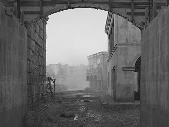

“Sanctuary” was Crewdson’s first project produced outside the United States. He described the project as a means of challenging the established traditions in his photography style, and that is prevalent in the technical aspects alone. The project consists of forty-one black and white digitally taken photographs with minimal reworking. Additionally, the scope of the project was much smaller. The images are without human presence, rather they feature abandoned outdoor film sets. At first glance, it seems like the complete opposite of his past work and especially “Beneath the Roses.” Untitled (08), 2009 shows an abandoned Rome film set. The structures in the background are deteriorating, revealing the scaffolding. The foreground frames the image within two walls and the back of an arching sign. The walls look roughened up, the vegetation on the floor overgrown, and the overwhelming mist creates an eerie mood. In contrast to Crewdson’s past work, there is very little control Crewdson has over this photo aside from the camera settings. It feels more so documentary than anything else. Yet, it does not stray away entirely from “Beneath the Roses.” Still, Crewdson works with “reality and fiction, nature and artifice, and beauty and decay” (Crewdson). Rather than instill fiction in real moments, in “Sanctuary” he is capturing real images of film sets, a location based in fiction. It speaks to his mastery and skill that he is able to apply such themes and paradoxes to a wide variety of subjects and styles. In Untitled (17), 2009, Crewdson captures an alleyway framed beautifully with a dramatic beam of light running through the center. It feels very much abandoned and without human life. The umbrella and ropes droop down, the walls are peeling. From a visual standpoint, it does not resemble Crewdson’s work at all. Still, Crewdson is able to find some sort of beauty in the decaying state of this location. Personally, it does not excite me as much as a typical Crewdson photo might that was taken in an anonymous town or suburb. Alone, it feels too simple, and as a body of work, it feels monotonous.
Gregory Crewdson has proven his wide range of styles, but his strengths lie in his storytelling. His ability to create an inkling of narrative, enough to draw an audience, while still creating a moment that feels vividly real is one that allows for his style to work and more importantly elevate his photos.
Bibliography:
https://gagosian.com/exhibitions/2010/gregory-crewdson-sanctuary/
https://gagosian.com/exhibitions/2005/gregory-crewdson-beneath-the-roses/
https://www.thebroad.org/art/gregory-crewdson
https://www.guggenheim.org/artwork/artist/gregory-crewdson
https://www.icp.org/browse/archive/constituents/gregory-crewdson?all/all/all/all/0
Billy
0 notes
Text
Journal - 50 Women Rocking the World of Architecture
The A+Awards is the world’s largest awards program celebrating architecture and building-products. Enter your project or product before the final entry deadline on March 27th!
Julia Gamolina is on a mission.
The founder and editor of Madame Architect is determined to increase the visibility of women in architecture, and is getting pretty fed up with major media outlets missing the point when it comes to this issue. As Gamolina rightly pointed out in a recent article, there is a tendency in the media to speak about the absence of women at the top of the architectural field, rather than speaking to the many who are already there.
As well as founding Madame Architect, Julia Gamolina is business developer at FXCollaborative
Gamolina — who is also business developer at FXCollaborative — expressed frustration at the New York Times’ feature “Where Are All the Female Architects?”, which reflected at length on the symptoms of workplace inequality but not much on those breaking the status quo. Architects like Amale Andraos and Jeanne Gang get brief mentions, but for Gamolina, it’s still not enough. “I no longer want to hear people asking, ‘Where are all the women architects?’” she argues. “Instead of asking ‘Where are these women?’, start writing about them and telling their unique stories.”
Gamolina is looking for constructive narratives and real advocacy for women in the profession. It is well known that discrimination exists in architecture and the wider construction industry — this is a longstanding problem that needs to be addressed. But media publications should stop treating workplace inequality as if it is some kind of unending mystery, and begin throwing a spotlight on the women who have succeeded in spite of the fact. This will do more to advocate for women in architecture than any speculative op-ed.
The A+Awards gala, from left to right: Juliet Gore and Nupur Chaudhury; Rita Rawashdeh, Meisa Batayneh and Lama Maani; Jennifer Lewin and Emily Tuteur; images courtesy Samantha Nandez/BFA.com
This is why Architizer’s A+Awards — the world’s largest awards program for architecture and building-products — aims to celebrate the work of talented architects, no matter the size or location of firm, nor the age, gender or race of their designers. By using a truly democratic selection process — the public is encouraged to vote online, for free — those that bring the best buildings to reality are guaranteed the spotlight.
Among the architects that have scooped A+Awards over the past 5 years, there are dozens of women, each of whom has brought unique qualities to the built environment. Many of them are featured in the following gallery, along with other trailblazers in the profession. These women have proven that, while often faced with marginalization, it is possible to rise to the top and get extraordinary things built. As you decide which project to submit for this year’s A+Awards, take an ample dose of inspiration from some of architecture’s most talented women:
Left: Las Vegas Medical District, image via SmithGroup; right: Michelle Acosta, image via AIA
Michelle Acosta
Michelle Acosta is a showcase for the value of specializing in architecture. She currently works as a healthcare project manager for SmithGroup in Phoenix, Arizona, providing unique expertise that help create better environments for large medical complexes. Acosta was a 2018 Young Architects Award recipient, having played a key role in nurturing multiple local AIA chapters and offering a fresh perspective as a young female architect in a highly technical sector.
Right: Public Farm 1, a 2008 installation on the grounds of Long Island City’s MoMA PS1 by Amale Andraos’s firm, WORKac; the museum described the installation as “a living structure made from inexpensive and sustainable materials recyclable after its use at PS1”; images via MoMA PS1 and Archinect.
Amale Andraos
Over the past two decades, Amale Andraos has distinguished herself as an architect, educator and urban theorist. The dean of Columbia University’s Graduate School of Architecture, Planning and Preservation, Andraos is also a founding partner of WORKac, a firm dedicated to “positing architecture at the intersection of the urban, the rural and the natural.” Her publications include the books 49 Cities and Above the Pavement—the Farm!, both of which seek to redefine the relationship between cities, farms and nature.
Raha Ashrafi
One could spend hours thumbing through the renderings of United Design Architects, or UDA, the Tehran and Portland based architecture firm co-founded by Iranian architect Raha Ashrafi. The firm’s designs for the Hamedan Chamber of Commerce, slated to be built in 2027, took home both a Popular and a Jury A+Award in the category for unbuilt structures. It’s not hard to see why: with a design built on mathematical principles inspired by the legacy of Persian geometric theory, this complex exudes rationality and order.
Left: Square House; right: Stella Betts; images courtesy LEVENBETTS
Stella Betts
We love a good portmanteau. David Leven and Stella Betts, the partners of the Manhattan based firm LEVENBETTS, seem to feel the same way judging by their playfully constructed name. This willingness to put things together in an unorthodox way is reflected in the firm’s 2017 project Square House, a 2018 Jury Winner in the A+Awards in the Private House Category.
Square House is best described as subtly deconstructive. From the outside, the elegant New York Home seems clean and modernist, with glazed walls that seem to nod to iconic 20th century buildings like the Farnsworth House. Yet the layout of Square House is completely new, designed purposefully without a front door, a detail that completely re-configures the hierarchy of the spaces. “The house is conceived as a series of rooms that can be accessed directly from outside creating a fluid relationship between interior and exterior,” the firm explains.
Left: Tatiana Bilbao at the A+Awards Gala, image by Sam Deitch/BFA.com; right: sustainable housing prototype
Tatiana Bilbao
Mexican architect Tatiana Bilbao was a special honoree at the 2017 A+Awards, winning the Impact Award for her work designing affordable and sustainable housing. Indeed, in the field of social housing, Bilbao is creating new paradigms. Her Sustainable Housing Model would allow people to construct a highly modifiable house for as little as $8,000. And these buildings are not only efficient and affordable, they are quite beautiful, retaining the clean lines and dramatic angles that characterize her work for wealthy clients.
Left: Phoenix Heights Housing Complex; images via ArchiTeam and Twitter
Angela Brady
Angela Brady is an Irish-born British architect who served as the chairperson for the U.K.’s Royal Institute of British Architects from 2011 to 2013. In this capacity, she tried to spark a nationwide conversation about whether the profession was meeting the needs of the public or not. Her view was that the mass-produced houses dotting the British landscape — structures she nicknamed “Noddy Boxes” — were cramped and poorly designed. These issues were not addressed, she believed, because architects did not play a prominent-enough role in the public discourse.
“We need to really re-examine the way we live and play, and we need to seek better models for the next 20 years,” she told the Guardian. “We’ve got huge constraints, if you look at the pressure on the environment, and I believe we are the custodians of [that]. People are relying on architects, planners, to come up with the right answers — how to make the green deal, make homes more zero carbon. As architects, we’ve got so much to offer. Governments ignore that at their peril.”
Left: The Smile; right: Alison Brooks, image via Azure
Alison Brooks
Alison Brooks’ The Smile — a 2017 A+Award Jury Winner in the Pavilions category — is one of those projects that seems to be everywhere, its image proliferating in both print and social media years after its construction. Conceived as a “habitable arc poised on the horizon,” the engineered wood structure was created as a pavilion for the 2016 London Design Festival. The building quickly garnered international attention, and has been viewed online — by one estimate — over 290 million times, a testament to the fact that great design still has the power to make an impact.
Left: Gabriela Carillo, image via spabusiness; right: Iturbide Studio
Gabriela Carillo
Gabriela Carillo is the co-principal of TALLER Mauricio Rocha + Gabriela Carrillo, a Mexico based firm committed to the expressive use of simple materials. In 2017, she was named Architect of the Year in the Women in Architecture Awards, a joint venture between The Architectural Review and The Architects’ Journal. Readers of Architizer have recently celebrated Carillo’s work as well, selecting her 2016 project Iturbide Studio as a Popular Winner in the 2018 A+Awards.
Iturbide Studio is the kind of project architects dream about. Built on a site that is just 7×14 meters in Mexico City, the clay tower showcases Carillo’s dynamic handling of shadow, which the judges for the Women in Architecture Award mentioned as a key reason for her 2017 award. The best part of the project might be the small back garden, enclosed with a wall of latticed brick, that both retains privacy and lets in the Mexican sunlight. The building is used as a workplace by a renowned photographer, and though small in size it retains many spaces that are ideal for contemplation.
Left: Women’s Opportunity Center, Rwanda; right: Sharon Davis, image via Curbed
Sharon Davis
Sharon Davis’s Women’s Opportunity Center in Rwanda won both the Popular and Jury A+Award for Architecture +Community in 2015 and it isn’t hard to see why: the complex is one of the most inspiring community-oriented projects in recent memory. This was Davis’s first major project and it was a challenging undertaking.
As Architizer reporter Emily Nonko explained, this women’s center “had to address more than the lack of a safe gathering place for Rwandan women — it also had to create economic opportunity and a solid social infrastructure.” To ensure the building met the needs of the community, David worked closely alongside local women, in the end developing a center that includes numerous gathering spaces along with tiered gardens, guest residences and more.
Left: “Phantom Restaurant, Opera Garnier,” Paris, France; images via Studio Odile Decq and dezeen
Odile Decq
Odile Decq is an architect whose work speaks to the imagination. Her “Phantom Restaurant” in Paris’s celebrated Opera Garnier is a study in colliding temporalities, with red and white biomorphic forms challenging the opera house’s vaulted beaux arts ceiling. As any good opera fan knows, however, a conflict can be made harmonious. At the “Phantom Restaurant,” old and new styles partake in a kind of dance that heightens the drama of each. Indeed, boldness is a cornerstone of Decq’s entire body of work, which offers a sharp rebuke to the idea that elegance is defined by restraint.
Left: Zaryadye Park; right: Liz Diller, image via TIME/Getty
Elizabeth Diller
Few living architects have had as large of an impact on the field as Liz Diller, a founding partner of Diller Scofidio + Renfro, the firm that — in collaboration with others — created New York City’s High Line among many other iconic projects. In 2018, Diller was the only architect named on Time Magazine’s Most Influential List.
The A+Awards has also recognized the achievements of DS+R, giving a Jury Prize to the High Line in 2014 and shortlisting Zaryadye Park in Moscow in 2018. The latter project is just as dramatic addition to Moscow as the High Line was to New York: at 35 acres, it is the first large scale park to be built in the Russian capital in 50 years. Like the High Line, the park includes an elevated pedestrian walkway that helps give city dwellers reprieve from the crowded streets.
Left: urban oasis in a renovated Mexico City townhouse; images via Dezeen and World Architecture Community
Gabriela Etchegaray
Gabriela Etchegaray, partner of the Mexican firm Ambrosi Etchegaray, is a problem-solver. When Mexico City heritage regulators prevented Etchegary’s firm from demolishing a historic townhouse to make way for their planned residential project, they got to work renovating the original structure in a way that preserved the historic façade while partitioning the building into four separate dwellings, each featuring a secure, private courtyard. The firm integrated pink-hued granite blocks into their design, connecting their rigorously contemporary design with the structure’s history.
Right: University of Limerick; images via Dezeen and Elle Decor
Yvonne Farrell and Shelley McNamara (Grafton Architects)
Nearly 40 years ago, two Irish architects named Yvonne Farrell and Shelley McNamara got together to found a firm, which they named Grafton Architects. Since that time, the team has worked on numerous, celebrated projects and played a major role in rejuvenating the Temple Bar neighborhood of Dublin.
In 2008, Grafton Architects won the coveted World Building of the Year Award for the stunning Economics center they designed for Boccocini University in Milan. 10 years later, they were the artistic directors for the 2018 Venice Architecture Biennale. Fast forward to 2020, and the two architects have added RIBA Gold Medal and the Pritzker Prize to their list of accolades. The coming decade promises to be a stellar one for this influential duo.
Left: Jeanne Gang, image via CLAD Global; right: Writers Theatre
Jeanne Gang
Jeanne Gang’s firm, Studio Gang, has produced some of the most striking architecture in America over the past decade, included Chicago’s Aqua Tower — a wonderful addition to a skyline that already includes many important skyscrapers. When it comes to innovative textural façades that add movement — even rhythm —to the urban environment, Gang truly is a leader in the field.
In 2017, Gang picked up both a Popular and Jury A+Award for her Writers Theatre in Glencoe, Illinois. This elegant complex includes rehearsal spaces and public zones in addition to a central performance area, celebrating the sense in which theatre is a community.
Left: Ana Gatoo, image via ResearchGate; right:
Ana Gatóo
Ana Gatóo is a partner in Light Earth Designs LLP, a British firm that gained international attention last year with the construction of the Rwanda Cricket Stadium in Kigali, Rwanda, a 2018 A+Awards Popular Winner in the Stadium category. The charming, minimal stadium was constructed by local builders using local materials. The core of the project is just three simple parabolic vaults that protect onlookers from the sunlight, yet the form of these vaults is sculptural and expressive, reflecting the path of the bouncing ball. The cement tiles were built from locally excavated soil — perhaps the most sustainable material imaginable.
Right: the Origami building in Paris; images via e-architect and ArchDaily
Manuelle Gautrand
“Manuelle Gautrand’s poetics are characterized by a combination of color with formal invention aimed at arousing empathy and marvel.” So says Floornature.com in their profile of the great French architect, and far be it from us to try to top a sentence like that, which perfectly captures the kinds of buildings Gautrand creates. Each plays with scale, shape and colors in ways that stop visitors in their tracks.
Take the Origami office building in Paris. The geometric façade of this building is at once totally modern, yet totally in keeping with the tenor of the luxurious setting, just blocks from the Arc d’Triomphe. The intersecting diagonal lines refer to Art Deco motifs as well as to stained glass paneling, while the opaque, ivory glaze blends in perfectly with the façades of the surrounding buildings.
Right: House on a Cliff, Stockholm, Sweden; images via ArchDaily and Petra Gipp arkitektur
Petra Gipp
Sweden is a cold place, a fact that is reflected in the nation’s literature as well as its architecture. Petra Gipp’s work, with its clean lines and preference for raw surfaces, is certainly part of this tradition. Her work shows us how, when done right, coldness can be comforting.
Left: Beach House designed by Hariri + Hariri; images via Pinterest and the Daily News
Gisue Hariri and Mojgan Hariri
The Hariri sisters moved to the United States from Iran in the 1970s to study architecture at Cornell University and founded their own firm in 1986. Since that time, Gisue and Mojgan Hariri have crafted a unique aesthetic that combines the glamor of mid-century, International design with a flair that is all their own. Their bold designs are not contained by any formula.
“Growing up in the desert, the environment tends to strip everything down to the essential without diminishing its extraordinary presence and beauty,” said Gisue Hariri on the influence of the Iranian landscape on her work. “While outwardly harsh, one intimate with its nature finds sensual lines and magnificent vistas that embolden the senses and a void that is constantly being tested and carved by the fierce winds.”
Left: Willem II Passage; right: Ingrid van der Heijden, image via Architizer
Ingrid van der Heijden
In 2018, Ingrid van der Heijden’s firm CIVIC Architects was shortlisted for an A+Award in the Transportation-Infrastructure category. The project, Willem II Passage, is a great example of how architects can use ingenuity to revitalize aspects of the urban environment that too often appear dull and uninspiring. The sequence of spaces, which include several covered passageways, connects the old and new sections of Tilburg, Netherlands for pedestrians and cyclists.The colored, glazed bricks tie into surrounding architecture while remaining contemporary.
Right: Vocational School, Rudrapur, Bangladesh; images via #LivingCircular and Blogspot
Anna Heringer
Many of the architects who get written up in Architizerare praised for their originality and willingness to challenge convention. Anna Heringer is a different kind of architect: For the past decade, she has made strides in countries like Bangladesh by encouraging local builders and craftsmen to make use of their traditional building practices and materials.
Heringer’s most celebrated project, METI Handmade School in Bangladesh, is a primary school in Bangladesh built using local, sustainable materials, including bamboo and loam. Heringer drew on local craftsmen building practices but improved them when needed, such as in the construction of a brick foundation and damp-proof walls. “Rammed earth and bamboo are not materials of the past,” as she succinctly put it in a recent interview.
Left: Palace of Justice, Córdoba; right: Francine Houbin, image via Dezeen
Francine Houben
Francine Houben is the creative director and founding partner of Mecanoo, a Dutch firm founded in 1984 that takes a playful approach both to their own projects and to architectural history. The firm’s unusual name is actually a combination of three different words: the British model construction kit Meccano, Modernist theorist Theo van Doesburg’s former magazine Mécano, and the motto “Ozoo,” which Houben and some associates adopted before entering a design competition in the early 80s.
The firm’s ouevre is quite vast and their buildings have had a transformative impact on a number of cities. In 2018, the firm won an A+Award for their Palace of Justice in Córdoba Spain, which contains gorgeous patterning on the facade that nods to the city’s rich medieval architecture.
Left: Rosanna Hu, image via San Pellegrino; right: Sulwhasoo Flagship Store
Rossana Hu
Rossana Hu is one half of Neri & Hu, the firm behind a number of amazing recently constructed commercial spaces that seems to continually win A+ awards. The Sulwhasoo Flagship Store, the 2017 A+Awards Jury Winner for Showrooms, is a truly inspired design, featuring a brass, three-dimensional grid that spans both the interior and entranceway and defines the visitors experience of the space. Despite its contemporary appearance, this sculptural feature is deeply tied to Asian history and the notion of a space that is constructed as a journey, with each section meaningfully connected to the next.
Left: Vault House, Oxnard, Calif.; images via ArchDaily and @slj_lee on Twitter
Sharon Johnston
One of the chief joys of reading architecture blogs like this one is imagining yourself inhabiting fantastical, otherworldly houses. Sharon Johnston and her firm, Johnston Marklee, are keenly aware of this relationship between architecture and fantasy. Time and again, they create structures such as Vault House in Oxnard, California: buildings that are playful, elegant and seem to belong more to the future than the present.
Right: split level residence in Tokyo by Atelier Bow-Wow; images via designboom
Momoyo Kaijima
A founding partner of Atelier Bow-Wow, Momoyo Kaijima is among a handful of elite architects who is as capable a theorist as she is a designer. Readers interested in learning more about her firm’s sensibility should check out Made in Tokyo, a guidebook for Kaijima’s native city that focuses on, as Amazon puts it, “the architecture that architects would like to forget.”
In this and other projects, Kaijima and the rest of her team at Atelier Bow-Wow are unflagging in their attempt to understand how spaces are actually utilized in the trenches of daily life. Indeed, the firm’s empirical ethos can be summed up by Kaijima’s personal motto: “Passion without knowledge is a runaway horse.”
Left: Heartland 66; right: Christine Lam, image via Aedas
Christine Lam
Christine Lam is a global design principal at Aedas, a firm known for its global reach. Lam was leading designer for Center 66 in Wuxi, China, a mixed use development that ties together a contemporary shopping plaza with a historic, Ming Dynasty era building. She is also one of the directors for the under-construction Heartland 66, a Chinese knot tie-inspired mixed-use development with a super high-rise tower in Wuhan, China.
While Lam was not on the design team for Aedas’s A+Award-winning building Lè Architecture, the project deserves a mention for a unique form that is symptomatic of Aedas’ willingness to break with convention. The new office building in Taipei completely upends the rectangular orientation of the surrounding skyline, with coiling bands running vertically across the curved structure. The architects note the building was inspired by the “shape of river pebbles.”
Left: Elisabeth Lee; right: Dabao Primary School and Community Cultural Centre
Elisabeth Lee
Dabao Primary School and Community Center is a project designed by architect Elisabeth Lee in collaboration with Project Minde, an initiative of the University of Hong Kong. It made a massive impact at the 2018 A+Awards, becoming a popular winner in the competitive Architecture+Humanitarianism category. The school was built in a remote and impoverished mountainous region in the Guangxi Province of China and was created through an active dialogue with the Dabao villagers. More than anything, the project illustrates the versatility of bamboo tubes, which were used to create an outer wall that protects the school while allowing for the circulation of light and air.
Left: Binke Lenhardt, image via BAU 2019; right: Chaoyang Future School
Binke Lenhardt
Binke Lenhardt is a partner at Crossboundaries, an innovative firm based in Frankfurt and Beijing that believes in process oriented design, aiming ultimately for buildings that operate in a functional manner. This doesn’t, however, mean their buildings aren’t fun or inspired! Chaoyang Future School won the A+Award jury vote in 2018 in the Architecture +Color category — the building’s bold combination of reds, yellows and whites is stimulating to the eye. Inside, the layout is quite innovative too, reflecting the school’s liberal pedagogy which eschews “teacher-centric” features like podiums and blackboards.
Right: Vietnam Veterans Memorial, Washington, D.C.; images via Makers and Blackbutterfly7
Maya Lin
An architect, sculptor and land artist, Maya Lin’s career has been marked by achievement in diverse fields. However, she is best known for a project she conceived while still a student: the Vietnam Veterans Memorial in Washington, D.C. A two-acre plot framed by a wall displaying the names of all the American soldiers lost in the conflict, this monument was considered controversial at the time due to its minimalism.
Today it is widely seen as a masterpiece, an unsentimental, clear-eyed tribute to a conflict that left a deep and lasting scar on the nation. “The definition of a modern approach to war,” she said, “is the acknowledgment of individual lives lost.”
Right: Center for Excellence, Syracuse University; images via Harvard University and Azure Magazine
Toshiko Mori
As an architect, Toshiko Mori has created stunning houses and commercial and public buildings noted for their efficiency and elegance. As an academic at Harvard’s Graduate School of Design, Mori has concerned herself with questions of sustainability. She looks at the architecture of both the developed and developing world and tries to find ways architects could create more livable towns and cities.
Everything about her career has followed this solutions-oriented mind-set. “The intention is to make something very simple, which is very difficult to achieve,” explained Mori. “I like to tackle complex issues by coming up with simple solutions.”
Left: London School of Economics Saw Swee Hock Student Centre; images via Floornature.com and Arnolfini
Sheila O’Donnell
Sheila O’Donnell is among those architects to have made a distinctive mark on their home city. The warm, brick façades of the buildings she has designed with her firm O’Donnell + Toumey have had a major impact on the visual identity of Dublin, mixing a touch of nostalgia in designs that are otherwise rigorously modern.
“At some point before we started working abroad we began to realise that it wasn’t just about ‘Irishness,’ but more about believing that you need to absorb all of the ‘contextual imperatives’ of a place,” explained O’Donnell in an interview. “We now transport that method of working — we start each project by immersing ourselves in understanding the physical material (and immaterial) culture of a place. I think that this is something that has driven our practice from the very beginning, and it’s liberating to know that you can apply that all over the world.”
Left: Neri Oxman’s silk pavilion, constructed by letting silkworms loose on a carefully designed steel frame; images via Wikipedia and Architizer
Neri Oxman
Some architects strive to speak to the present moment; others keep their eyes fixed on the future. Neri Oxman is this latter type. An Israeli-American architect, designer and academic, Oxman is well known for her interest in applying findings from biology and computer science to architecture, a field that she believes will be radically upturned in the coming years. “I believe in the near future, we will 3D-print our buildings and houses,” she once said.
Right: Linear House; images via ArchiTravel and ArchDaily
Patricia Patkau
Patricia Patkau is a founding partner of Patkau Architects, which has operated out of Vancouver for over 30 years. The firm’s style combines a modern sensibility with a sensitivity to the landscapes of the Pacific Northwest. The architectural historian Kenneth Frampton described their work as “very close to what I attempted to define in 1983 as Critical Regionalism.”
Take a project like Tula House, a cantilevered structure in British Columbia that fits so seamlessly into its site, it almost becomes invisible. To live here would be to truly live with the landscape, even if one never ventured out on a hike.
Right: Seaside, Fla.; images via Pinterest and Starr Sanford Design
Elizabeth Plater-Zyberk
Elizabeth Plater-Zyberk is a founding partner of DPZ, a firm associated with the New Urbanism movement known for retro-fitting sprawling suburbs into livable downtowns. If America has been plagued by poor urban planning, Plater-Zyberk is devoted to repairing the damage. One of her best-known projects is the planned community Seaside, Florida, a picturesque town made famous as the main filming location for the film “The Truman Show”(1998).
Left: Casa Larrain; images via Nevada Museum of Art and Flickr
Cecilia Puga
One could spend hours thumbing through photographs of Cecilia Puga’s buildings, many of which are located in her native Chile. Set in wild landscapes and featuring raw surfaces, Puga’s houses speak to the integrity of good design, which needs no adornment.
Left: OSU South Campus Chiller; images via Beverly Willis Architecture Foundation and Creative Mornings
Carol Ross Barney
Carol Ross Barney is a founding partner and principal designer at Ross Barney Architects, one of the premier firms in America’s first city of architecture, Chicago. A recent project, the OSU South Campus Chiller Plant, embodies Barney’s firm’s commitment to designing beautiful structures that meet pressing needs.
The rectangular building, bejeweled with glass plates that reflect colored sunlight onto the building’s façade, provides a “long-term, sustainable solution” for the local medical community’s need for chilled water, according to a statement by the firm. The structure includes glazed openings, allowing passersby opportunities to look into the chilling mechanisms.
Left: Pascal Sablan, image via AIA; left: Museum of the Built Environment by FXCollaborative Architects, Riyadh, Saudi Arabia; image courtesy FXCollaborative Architects.
Pascale Sablan
Now a senior associate at S9 Architecture, Pascale Sablan was previously an associate at FXFOWLE Architects (recently rebranded as FXCollaborative Architects). She played a crucial role in the realization of 888 Boylston Street, a LEED Platinum office building that is an exemplar for sustainable design. Pascale is the Founder & Executive Director of Beyond the Built Environment, an organization focused on engaging community through architecture to advocate equitable, reflectively diverse environments.
Sablan has won multiple awards for her work, including being named National Organization of Minority Architects (NOMA) member of the year in 2015. AIA Young Architects award Winner 2018. Indeed, Sablan is a leading voice for architects of color, curating a series of SAY IT LOUD exhibitions originated at the AIANY Center for Architecture focused on elevating the contributions of women and diverse designers. SAY IT LOUD has been exhibited at the United Nations Visitors Centre, A’18, NOMA Unbounded and SXSW.
Left: Kazuyo Sejima, image via Phaidon; right: Grace Farms
Kazuyo Sejima
Pritzker Prize Winner Kazuyo Sejima, founding partner of the Tokyo based firm SANAA, is an architect with a clear vision, favoring smooth and modern surfaces. This can be seen in projects such as New York’s New Museum, a series of stacked metallic boxes that presides over the Bowery as if from a future century. SANAA’s greatest project in recent years, however, might just be Grace Farms, a 2015 A+Award Jury Winner for Architecture +Engineering. The stunning cultural complex follows a snaking path that corresponds to the rolling hills on the grounds, which had previously been used as farmland.
Right: 200 Eleventh Avenue, a new residential project in New York City; images via Selldorf Architects
Annabelle Selldorf
With Annabelle Selldorf, it’s all in the details. Paul Goldberger, former architecture critic for the New Yorker, described her style as “ … a kind of gentle modernism of utter precision, with perfect proportions.” For her part, Selldorf describes her praxis as follows: “I seek a certain kind of logic that allows you to move in space and perceive it as beautiful and rational.”
Left: Corie Sharples, image courtesy SHoP Architects; right: Uber Headquarters (rendering)
Corie Sharples
For years, SHoP Architects has been a major force in the world of architecture, and especially in their home city in New York, due to their willingness to approach projects from an unconventional perspective. One only needs to look at 325 Kent, the new square apartment tower on the Williamsburg waterfront, or the unbuilt Uber Headquarters to see how willing SHoP is to break with expectations. This latter project was the 2016 A+Awards Jury winner for an unbuilt commercial space. Corie Sharples founded the firm along with her husband, Bill, and three others in 1996.
Left: Chris-Annmarie Spencer, image via AIA; right: Inspiration Kitchens adaptive reuse project, image via Rudy Bruner Award
Chris-Annmarie Spencer
A project architect at Wheeler Kearns Architects, Chris-Annmarie Spencer is a talented Chicago designer with a keen interest in public interest design. Her collaboration with nonprofit Inspiration Kitchens is particularly notable — the architect transformed a 1906 building in Chicago to create a 7,800-square-foot, 80-seat restaurant serving both affordable and market-rate meals for working-poor families and the general public respectively. That project netted nine design awards, and Spencer’s incredible social impact work was recognized with a AIA Young Architects Award in 2017.
Left: Farm to Table; Kate Stickley and Gretchen Whittier, images via Arterra Landscape Architecture
Kate Stickley and Gretchen Whittier
Kate Stickley is a founder of Arterra Landscape Architects, a landscape architecture firm that places sustainability at the very core of their practice. Stickley and partner Gretchen Whittier aim to create landscapes that work with built spaces in visual harmony, echoing the pair’s ethical commitment to a lifestyle that causes minimal disruption to the environment. In Farm to Table, a 2018 A+Awards Jury Winner in Landscape Design, Arterra conceived a private estate as a series of “outdoor rooms” that integrate living and lounging areas with agriculture. “Edible plantings” can be encountered throughout the complex.
Left: ARE Sketches Volume I; right: Lora Teagarden, image via AIA
Lora Teagarden
Lora Teagarden was a 2017 Young Architects Award recipient for her significant contributions to the profession. A LEED certified project architect at RATIO Architects and the Founder of L2 Design, Teagarden has also been published — her ARE Sketches series forms an insightful visual guide to the Architect Registration Exams. Teagarden was recently elected Chair of the AIA National Young Architects Forum, reflecting her growing influence in the industry — both in terms of design and thought leadership.
Right: Barnes Foundation, Philadelphia; images via Yale School of Architecture and ANTIQUES
Billie Tsien
The husband and wife duo behind Tod Williams Billie Tsien Architects is one of the most prolific pairs around. Since the 1970s, the pair has been behind numerous museum projects. This reporter is especially taken with the space they created to house the historic Barnes collection of Impressionist and Post-Impressionist Art in Philadelphia. The museum is spare yet warm and highly conducive to contemplation. It is a careful balance that the firm seems to strike time and again. Architizerlooks forward to their forthcoming plans for the Obama Library.
Left: Capela de Nossa Senhora de Fátima; right: Helena Lucas Vieira and Pedro Miguel Ferreira, images via Plano Humano Arquitectos
Helena Lucas Vieira
Helena Lucas Vieira is one half of Plano Humano Arquitectos, a creative Lisbon-based architecture firm that envisioned Capela de Nossa Senhora de Fátima. This striking chapel won a grand total of three 2018 A+Awards in the Architecture +Wood and Religious Buildings and Monuments categories, its elegant pitched roof canopy captivating the jury and the public alike.
Left: Straw Bale House; images via The Architectural Review and Building Design
Sarah Wigglesworth
Sarah Wigglesworth’s practice is devoted to designing buildings on a human scale, with an eye toward sustainability. The architect’s 2002 project, Straw Bale House, showcases her sensibility perfectly. This modern residence — which serves as the architect’s home and office — is “swaddled in straw bales” for sustainable insulation.
Sandbags constitute one of the building’s walls, which faces a a railway yard, one of the building’s many witty details. Hattie Hartman, in an article that asks whether Straw Bale House was “the most influential house in a generation,” writes that she is continually “struck by the sheer number of ideas in this house,” which she claims “spawned a new green aesthetic.”
Right: August Wilson Center for African American Culture, Pittsburgh, Pa.; images via Cultural District and The Khooll
Allison Williams
Over the course of her decades-long career, Allison Williams has worked on many major projects at some of the world’s most high-profile firms, including San Francisco’s Perkins+Will and AECOM, where she currently serves as the Design Director.
Her best-known buildings, including the August Wilson Center for African American Culture in Pittsburgh, illustrate her commitment to maximizing the potential of the site. The August Wilson Center, for instance, is spacious, open and luminous despite the fact that it is situated on a tight street corner.
Now it’s your turn: Be the next A+Award winner, get published internationally and gain global recognition for your work! Submit your project before the final entry deadline on March 27th.
Enter the 2020 A+Awards
Editorial contributions by Paul Keskeys and Pat Finn.
The post 50 Women Rocking the World of Architecture appeared first on Journal.
from Journal https://architizer.com/blog/inspiration/industry/women-architects-to-watch/
Originally published on ARCHITIZER
RSS Feed: https://architizer.com/blog
#Journal#architect#architecture#architects#architectural#design#designer#designers#building#buildings
0 notes
Photo


Does Dora Maar Deserve Credit for ‘Guernica’? A New Show Says Her Art Inspired Picasso’s Breakthrough Work
The upcoming exhibition at Paris's Picasso Museum also showcases the giant stretcher Picasso used to make the painting.
Javier Pes, March 15, 2018
The fascination with Picasso, it seems, is bottomless. New exhibitions in London and Paris throw new light on unexplored corners of his legacy.
“Picasso 1932,” the blockbuster exhibition now on view at London’s Tate Modern, vividly chronicles how one of the Spanish artist’s 1930s paramours, Marie-Thérèse Walter, inspired the artist’s mid-career “year of wonders.” The exhibition began at the Musée Picasso-Paris last fall, and now that Paris institution is following it up with another show that rethinks Picasso’s legacy, this one about his most famous painting, Guernica.
In the new exhibition focusing on the great antiwar canvas, Dora Maar, the mistress who superseded Walter in Picasso’s life and imagination by 1937, will be revealed as far more than just a talented muse.
Emilie Bouvard, a curator at the Musée Picasso-Paris who has organized the “Guernica” show, tells artnet News that Maar did not simply document Picasso painting the great mural. In fact, her Surrealist photography influenced the work itself.
“She was melding the studio and the work of art, which is typical of Dora Maar’s photographs,” Bouvard says. “You never know where you are.” Picasso also melded interiors and exteriors as he channeled his outrage at the aerial bombing of the Spanish town in the Basque region by Franco’s Nazi German ally during the Spanish Civil War.
The Paris exhibition, which opens on March 27 (and is on view through July 29), has been organized in partnership with Madrid’s Museo Nacional Centro de Arte Reina Sofía. The Madrid museum has lent many preparatory sketches Picasso made for Guernica (1937)—though not, of course, the finished work. (Its condition is more closely checked in the Reina Sofía than the Mona Lisa is in the Louvre.)
Despite this absence, the Musée Picasso-Paris has pulled off a coup: For the first time ever, it is showing the surviving parts of the original oak wood stretcher that Picasso ordered for Guernica.
The presence of the stretcher will convey a sense of the work’s scale and hint at its many travels. When it was rediscovered three years ago by the Museum of Modern Art in New York in its storage facility, the American institution sent it to the Reina Sofía, which has yet to show it.
The exhibition tells the story of Guernica’s epic tour of Europe (but not Spain) and the US after the 1937 Paris Exposition to raise money for the Spanish Refugee Relief Campaign. Picasso’s ongoing support of Spanish refugees is revealed in the exhibition. He helped artists get out of detention camps in the South of France, explains Bouvard.
Yet the curator was disappointed to find that the stretcher only has one sticker from its many travels. The torn label, which helped MoMA identify and then piece together the 11 mysterious pieces of oak, says “San Francisco Museum of Art” and “Picasso.”
Works by contemporary artists also help give a sense of the influence of Picasso’s enormous work, as well as its artistic legacy. These include Robert Longo’s charcoal drawing, Picasso Redacted (After Picasso’s Guernica, 1937) (2015), as well as works by Art & Language and Damien Deroubaix, among others.
After “Picasso 1932” and “Guernica,” what’s next for the Musée Picasso-Paris, which has been reinvigorated under director Laurent Le Bon’s leadership? Bouvard says that following this experimental show centered on an absent painting, the museum is going to borrow a selection of Picasso masterpieces and devote a room to each.
“Guernica” is at the Musée Picasso-Paris March 27 through July 29, 2018.
“Picasso 1932: Love, Fame, Tragedy” is at Tate Modern, London, until September 8, 2018.
Follow artnet News on Facebook:
Want to stay ahead of the art world? Subscribe to our newsletter to get the breaking news, eye-opening interviews, and incisive critical takes that drive the conversation forward.
https://news.artnet.com/exhibitions/dora-maar-revealed-picassos-muse-guernica-show-1244849
0 notes
Link
Artist: Matthew Lutz-Kinoy
Venue: Mendes Wood DM, New York
Exhibition Title: Hudson Bathers
Date: April 30 – June 15, 2019
Click here to view slideshow
Full gallery of images, press release, and link available after the jump.
Images:
Images courtesy of Mendes Wood DM, New York
Press Release:
Mendes Wood DM is pleased to announce Hudson Bathers, an exhibition of new work by Matthew Lutz-Kinoy.
For his first show at Mendes Wood DM in New York, Matthew Lutz-Kinoy fills the gallery with canvases that line the walls and ceiling like the boiseries (painted wooden wall panels) that adorn the Boucher and Fragonard cabinets several blocks away at the Frick. These rooms have served as inspiration for the artist before: the performative figures in his large-scale canvases seem, like Boucher’s infants and Fragonard’s lovers, to inhabit landscapes of diaphanous and luminous colors that spill forth from centers with no horizons, where they act out playful narratives of suggestive content. At Mendes Wood DM, these landscapes are infiltrated by wild beasts that appear to have wandered into the painted panels as if they were invading garden plots and trampling them into threatening forests (think boiseries: the woods behind the wooden wainscoting). Drawing the animals from the nineteenth-century exotic and from imperialist fantasies of artists like Horace Vernet or Delacroix, Lutz-Kinoy couples them here with limpid human figures whose distinct lack of individual expression finds a projective foil in the externalized expression of their mammal partners. A bather of ambiguous gender clutches at a white cloth while a tiger ferociously slurps the water from which they emerge. Their bodies intertwine, the tiger’s tail mimicking the form of the bather’s peshtemal – or vice-versa – yet there appears to be no active emotional connection between the two. A distance separates the human from the animal, such that the expressive jolt of the animal content becomes diffused and revealed as a screen of emotional projection.
Two paintings take up Fragonard’s so-called La Gimblette explicitly in ways that highlight this affected distancing of subject through repetition. In one (La Gimblette Double), the figure “playing” with a lap dog in a lap-like canopy bed repeats one on top of the other, as if to emphasize the blank artificiality of the scene rather than its primal caress. Likewise, in another painting (Financier) of a human penetrating a lion in missionary position (the pun may well be intentional, pointing to the colonial “mission civilatrice” undergirding certain strands of French exoticism), the human figure is silhouetted, back to front in blank expression. Yet its predatory force seems strangely diffused in spite of the depiction of interspecies copulation: The lion’s tail extends limply from underneath the human’s ass, like an extended tassel pointing out of the image; empire short circuit.
Stranded in front of a gaping, uterine cave (Fragonard’s cavernous lit à la Polonaise reappears), the lion and the human pairing thereby point indirectly to ways in which the pictorial use of animals as ciphers for human emotion hints at a dependence on others to externalize a desire for affective reassurance that the world is indeed ordered in ways that are familiar in ideological terms. This is the allegorical function that animal painting traditionally served in the west, be it in popular eighteenth-century animal painters like Jean-Baptiste Oudry, or Frans Snyders’ monumental seventeenth-century Flemish still lives where narratives of political economy stage transpose themselves into scenes of animal interaction that offer themselves to the viewer like natural commodities to be plucked and enjoyed. These scenes of vulnerable externalization dominate the first room of the exhibition. The figures – made with drawn stencils that have been hosed with colors on the ground with a liberated industrial gardening sprayer (!) – inhabit rectangles like French parterres (flower beds) gone wild with color field staining, their geometric patterned sections guiding the landscape admirers inside and outside of the paintings.
Proceeding into the exhibition’s second room, the meaning shifts subtly as a threshold is crossed from exclamatory exteriorization to a more interior tone. In a long, frieze-like take on the Swiss symbolist Ferdinand Hodler’s Love (1907-1908), Lutz-Kinoy pairs more figures in ambiguous embraces. The animals have departed and Hodler’s heterosexual pairs find themselves stranded in a space from which the horizon has been removed, and gender rendered more fluid: as the work’s title proclaims Love with other people. The couples here, beached with no distance point, inhabit a space of no escape. They will not swim to metaphysical horizons, like Hodler’s lovers on the banks of Lake Geneva, but instead slumber, grappling with one another in the pleasure of dreaming in pink sand. Above them, on the ceiling, hangs a suggestive set of orchids that resemble the genitals of bees (Orchids lure bees with promise of sex with strangers). In the rococo period, the bees would have immediately been recognizable as related to Bernard Mandeville’s Fable of the Bees (1714), in which the collective hive serves as an economic model, embodying the virtues of the division of labor and the prosperity enabled by individual consumption. The faith that the poem placed in the construction of a robust interior persona through the mechanisms of a promiscuous marketplace (legible as so many exteriors that flaunted consumer acuity) laid the basis for a cult of performative “personality” as a form of social and civic engagement.
In Lutz-Kinoy’s show the personalities of the paintings’ protagonists appear, however, to develop only through a fittingly performative dialogue with their animal interlocutors. Or with their shadows and other doubles: in a further work (Six bathers with shadows) grey monochrome figures repose on a pink rectangular ground that spreads beneath them like a giant blanket, or delineated field of action. Between this ground and the figures are white shapes that bring the ground of the canvas to the surface. These shapes are also shadows, intertwined with the posing bodies, although the bodies appear to emerge from these blank forms as much as they seem to cast them. These particular figures are, like Hodler’s lovers, ghostly bathers. They may have wandered out of the Hudson River and, specifically, Alvin Baltrop’s 1970s and 80s black and white photographs of cruising along Manhattan’s Piers. As Glenn O’Brien notes in his text on Baltrop’s images, there were 99 piers then, composed of crumbling metal and concrete that became a stage-like ground where passengers of ships-no- longer-sailing could satisfy their still illegal desire for company, gathering on the jetties and industrial debris of a waning maritime empire (one may be reminded of the Hudson School painter Thomas Coles’ painting cycle of inevitable decline, The Course of Empire, designed for and still hanging in Manhattan). Rather than offering introspective depth, Lutz-Kinoy’s enmeshed doubles of figure and ground highlight the sense of the works as painterly, theatrical backdrops across which both the images’ protagonists and the viewer (all bathers) follow potential paths of interaction together on grounds that are both delicately playful and threatening. Curtains on New York.
– Sasha Rossman
Matthew Lutz-Kinoy (b. 1984, New York) lives and works in Paris.
His recent solo shows exhibitions include: Sea Stray, Vleeshal, Middelburg (2018); The Meadow, The Centre d’édition Contemporaine, Geneve (2018);Southern Garden of the Château Bellevue,Le Consortium, Dijon (2018); SONG AND LOVE, Matthew Lutz-Kinoy & Ola Vasiljeva, Indipendenza, Rome (2018); Matthew Lutz-Kinoy, Mendes Wood DM, São Paulo (2017); Rotten Wood, the Dripping Word: Shuji Terayama‘s Kegawa no Mar (with Tobias Madison, MoMA PS1, New York (2016); To Satisy the Rose, Freedman Fitzpatrick, Los Angeles (2016).
His work has been also featured at the group shows such as; Eckhaus Latta: Possessed, Whitney Museum of American Art, New York (2018); Welt ohne Außen. Immersive Spaces since the 1960s, Berliner Festspiele, Berlin (2018); Seasick in Paradise, Depart Foundation, Los Angeles (2017); Neither., Mendes Wood DM, Brussels (2017); The Discovery of a Leak in the Roof of Marcel Breuer’s Wellfleet Summer Cottage on the Morning of September 16, 1984, Off Vendome, New York (2016).
Link: Matthew Lutz-Kinoy at Mendes Wood DM
Contemporary Art Daily is produced by Contemporary Art Group, a not-for-profit organization. We rely on our audience to help fund the publication of exhibitions that show up in this RSS feed. Please consider supporting us by making a donation today.
from Contemporary Art Daily http://bit.ly/2IwBG52
0 notes
Text
Bayeux Media Library Normandy
Bayeux Media Library Normandy Building, Serero Architectes France, French Architecture Images
Bayeux Media Library in Normandy
4 June 2021
Bayeux Media Library Normandy Building News
Design: Serero Architectes
Location: Bayeux, Calvados department, Normandy, northwestern France
Photos © Didier Boy de la Tour
Landscape-building and urban showcase
Standing beside the beltway surrounding the dense center of Bayeux with its winding narrow streets, the new Bayeux Media Library is thoughtfully integrated into the rich historical context of the town. The project rises on an open plot connecting the historic center with the town’s future development zones, creating splendid views of the cathedral.
This exceptional situation required very careful treatment, with the architect choosing to propose a transparent, landscape-building to serve as a genuine urban vitrine. The project design expresses an open relation between the interior and exterior with the patio and outdoor reading terraces on the south side open to the media library’s various uses and users.
Each space has its own light sources – skylights, light entering from central patio, light softened by a metal mesh skin on the north side – ensuring clear, legible interiors. The result is a highly transparent library with easy access to the works available for consultation. The entrance, placed in the northeast corner of the building, opens on a forecourt set back from the urban intersection.
Historical references and minimalist design
The history of the town and of the Bayeux Tapestry are indissociable. Also known as the Queen Mathilde Tapestry, it was woven and embroidered in the 11th century. It inspired the design of the media library’s north façade. Stitch by stitch and thread by thread, embroidery was applied to the fabric to form the tapestry’s semiotic elements.
The Boulevard Ware façade of the library is entirely glazed and protected by a “filtering skin” composed of tubes tinted in the natural colors of the woolen yarns in the famous Bayeux Tapestry: beige, brown, bronze green, blue-black and deep blue with yellow highlights. This feature filters the views between the reading areas and regulates the luminous ambiance inside the library.
“Embroidered Architecture” filtering the views of the north façade
The “embroidered” filtering skin works in tandem with the overhanging roof on the south façade to regulate the visual and luminous ambiances inside the library and is also integrated with the method used for heating the building in winter and keeping it cool in summer. The skin is open with glazed bays on the east, south and west façades, which are equipped with roller blinds. The green roof, conceived of as a fifth façade, integrates skylights that ensure interior lighting and natural mid-season building ventilation.
Bayeux Media Library Normandy, France – Building Information
Address: 1 boulevard Fabien Ware, Bayeux, France
Program: Bayeux Media Library
Client: Bayeux Intercom
Project management: Serero Architectes Urbanistes (lead architect, furnishing assignment, interior design), Pasquini (acoustics)
Surface Area: 2 550 m² (27448 sq ft)
Calendar: 2016 – 2019
Delivery: 2019
Cost: €5,020,000 excl. VAT
Photographs © Didier Boy de la Tour
David Serero
David Serero was born in Grenoble, France, in 1974. Graduate in architecture and urbanism of Columbia University in New York and of the École d’Architecture Paris-Villemin, Prix de Rome 2004, he lived in New York prior to returning to settle in Paris in 2006.
His work is characterized by unique and personal research on materials and geometry applied to architectural skins. His project for the Bayeux Media Library attests to his thinking about the use of materials and structure.
Here he has employed it to create a highly porous space with ideal conditions of lighting for readers and for experiencing multimedia works. His projects have been featured in exhibitions in France and abroad and include the Frac d’Orléans, the Pavillon de l’Arsenal, the MOMA, the Architectural League de New York, the Villa Medici in Rome and the Mori Museum in Tokyo.
David Serero also teaches and conducts research at several schools, notably the École d’Architecture Paris Val de Seine where he is an associate professor. He is particularly interested in issues regarding structural morphology and high-performance architectural envelopes. He has also taught at Pratt Institute in New York, Columbia University and has many architecture and research workshops in France, Italy, Austria and the United States.
Serero Architectes
Bayeux Media Library Normandy, France images / information received 040621 from Serero Architectes
Location: 1 boulevard Fabien Ware, Bayeux, Normandy, northern France
New Buildings in Normandy
Normandy Architectural Projects
Garden Tennis Club of Cabourg
Design: lemoal lemoal architectes
photo © Javier Callejas
Garden Tennis Club of Cabourg
Business incubator, Training centre
Design: h2o architectes
photo : Julien Attard
Business Incubator Training Centre in Normandy
La Luciole France, Alençon, Normandy, France
Design: Moussafir Architectes
La Luciole Normandy Auditorium
Rehabilitation and Extension of the Music School Louviers
Design: Opus 5
photograph : Luc Boegly
Music School Louviers
New Buildings in France
French Architectural Projects
French Architecture Design – chronological list
French Architecture News
French Architect Offices – design firm listings
Rouen Masterplan: Saint Sever – Ile Lacroix
Design: Sane Architecture
image courtesy of architects
Rouen Masterplan
French Architecture
Comments / photos for the Bayeux Media Library Normandy, France design by Serero Architectes page welcome
The post Bayeux Media Library Normandy appeared first on e-architect.
0 notes
Text
Toward a Concrete Utopia: Yugoslavian Brutalism at MoMA
We at CatSynth are admirers of brutalism, as anyone who follows us on Twitter can attest. We love the geometric forms, how it screams “modern”, and how it makes such an intense break with tradition. And I will admit, I also have a little fun using it to poke fun at the architectural conservatism prevalent in places like San Francisco. But above all, it provides a singular beauty to built spaces.
Brutalism perhaps reached its zenith in the former Yugoslavia during the period between the end of World War II and 1980, a period that is highlighted in a current exhibition at the MoMA, Toward a Concrete Utopia: Architecture in Yugoslavia, 1948–1980. It highlights the work of several Yugoslavian architects in the period and pieces ranging from prosaic apartments to public arenas to monuments. The buildings themselves are, of course, not on display in the museum, but their stories are told through models, photographs, and examples of interior objects.
Installation view of Toward a Concrete Utopia: Architecture in Yugoslavia, 1948–1980, The Museum of Modern Art, New York, July 15, 2018–January 13, 2019. © 2018 The Museum of Modern Art. Photo: Martin Seck
A convergence of factors came together which allowed these modernist experiments to flourish. Yugoslavia broke away from the Soviet bloc in 1948 and began to forge its own socialist path and identity. It constituted itself as six republics in a federation in which traditional regional identities were subordinate to a new and modern whole. At the same time, the country was devastated by World War II and needed massive rebuilding. Finally, new ideas in architecture were emerging along with new materials, notably advances in concrete, steel, and glass allowed a new built environment to take shape.
var quads_screen_width = document.body.clientWidth; if ( quads_screen_width >= 1140 ) { /* desktop monitors */ document.write('<ins class="adsbygoogle" style="display:inline-block;width:600px;height:100px;" data-ad-client="pub-5176416568130778" data-ad-slot="2974773354" >'); (adsbygoogle = window.adsbygoogle || []).push({}); }if ( quads_screen_width >= 1024 && quads_screen_width < 1140 ) { /* tablet landscape */ document.write('<ins class="adsbygoogle" style="display:inline-block;width:600px;height:100px;" data-ad-client="pub-5176416568130778" data-ad-slot="2974773354" >'); (adsbygoogle = window.adsbygoogle || []).push({}); }if ( quads_screen_width >= 768 && quads_screen_width < 1024 ) { /* tablet portrait */ document.write('<ins class="adsbygoogle" style="display:inline-block;width:600px;height:100px;" data-ad-client="pub-5176416568130778" data-ad-slot="2974773354" >'); (adsbygoogle = window.adsbygoogle || []).push({}); }if ( quads_screen_width < 768 ) { /* phone */ document.write('<ins class="adsbygoogle" style="display:inline-block;width:600px;height:100px;" data-ad-client="pub-5176416568130778" data-ad-slot="2974773354" >'); (adsbygoogle = window.adsbygoogle || []).push({}); }
The simple forms and surfaces were used for everyday buildings, such as apartment complexes, schools, and medical facilities. But rather than just one-offs, they become part of a unified cityscape, a grand plan. This was perhaps no more so than in Skopje, the capital of Macedonia, which was devasted by an earthquake in 1963 and largely rebuild using modernist design and principals.
Janko Konstantinov. Telecommunications Center. 1968–81. Skopje, Macedonia. View of the Southwestern Block façade. Photo: Valentin Jeck, commissioned by The Museum of Modern Art, 2016
MARKO MUŠIČ. Photograph by VALENTIN JECK
Ss. Cyril and Methodius University Campus, Skopje, Macedonia 1967–1974. (Gotta love an architect named “Music”)
There are, of course, numerous rectilinear designs, sometimes in steel and glass, and sometimes dominated by concrete. But concrete also allowed for the exploration of curved structures and organic shapes. We see this in many of the large civic arenas, but also in the brutalist monuments built in the post-war period. This “cell-like” structure in Macedonia takes it to the extreme, looking at once like an organic organism and a spaceship.
Wandering through the exhibition, one cannot help but imagine being the real spaces. For me, the modernist, severe style brings a sense of calm and welcome that more traditional styles don’t always provide. Ornament can be beautiful, but it is rarely ever calming in the way that simple texture and geometry is. The calming nature of simple forms can extend to the interior spaces as well as the exterior, and the exhibition includes examples of everyday objects and furnishings.
Installation view of Toward a Concrete Utopia: Architecture in Yugoslavia, 1948–1980, The Museum of Modern Art, New York, July 15, 2018–January 13, 2019. © 2018 The Museum of Modern Art. Photo: Martin Seck
Sadly, the Yugoslavian experiment ultimately failed, with country breaking apart and the entire region plunging into extreme nationalism and devastating wars in the 1990s. This is a cautionary tale as we watch the plague of nationalism rising around the world, including in the United States. Many of the architectural works in this exhibition did survive the wars. But they do face continued challenges to their survival, including maintenance and a push to return to more “traditional” forms. The “Skopje 2014” initiative, for example, is both farcical and tragic. Despite these challenges, I hope the countries of the region will recognize and preserve the legacy of their modernist period for years to come.
This article only scratches the rough, hardened surface of the wealth in this exhibition. It was truly a wonderful experience, even if so much was in my imagination through the artifacts. Toward a Concrete Utopia: Architecture in Yugoslavia, 1948–1980 will be on display at the Museum of Modern Art in New York through January 13, 2019.
Toward a Concrete Utopia: Yugoslavian Brutalism at MoMA was originally published on CatSynth
0 notes
Photo

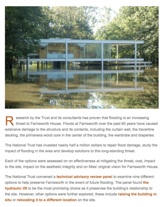

Researching the house:
A timeline and info:
58 miles south of Chicago
The original site was a 9-acre floodplain and prairie parcel bounded by River Road to the north, Plano-Millbrook Road to the west and the Fox River as the southern boundary.
Set 10ft behind a black dug maple tree
Part of a long series of house projects- housing projects enabled Mies to do things impossible with large buildings like Seagram (eg due to fireproof cladding)
First thought up in 1945 as a country retreat for Dr Edith Farnsworth
Her desire was to use the house during time off of work to pursue her personal interests – her dogs, enjoying nature, playing the violin and translating Italian poetry.
designed between 1946-49
build between 1949-51
During construction, there were cost overruns and Farnsworth was late to pay one thus Mies sued. Farnsworth countersued for damages- the legal dispute settled but the two never spoke again. Mies never saw his work completed.
Farnsworth was bitterly disappointed with the result due to its abstract minimalism.
The Farnsworth House has been flooded by the river numerous times because the calculations done by Mies based on the information available at the time, proved to be inaccurate. Each flood, even those that do not enter the house damage elements of the building. The more serious ones destroy parts of the fabric of the building as well. Due to continuing urbanization of the Fox River watershed, hydrologists who have modeled the river have concluded that the frequency and intensity of flooding will increase over time, inundating the house on average every 7 years.
Mies never got round to designing any furniture for this building- instead Farnsworth used her own.
until 2003 it was private residence however now its a public museum you can visit!
The design:
1947 Model made in MOMA NY
5ft 3 inches above the ground
white I-beams contrast the brown trunks of trees around
huge glass panes allow the exterior and outside to come inside
“viewer’s awareness between the thrill of exposure to the raw elements of nature and the comforting stability of architectonic enclosure”
“It is composed of three strong, horizontal steel forms – the terrace, the floor of the house, and the roof – attached to attenuated, steel flange columns.”
The design of the columns lead to the floor panels and roof between glass having the impression of floating and hovering into the environment.
one of the most photographed pieces of architecture in the 20th century and claimed to be Mies “residential masterpiece”
The Farnsworth House was the first architecture sold by an arts auction house
Seen as a structure of ‘platonic perfection’ against a landscape.
https://farnsworthhouse.org
http://www.acsa-arch.org/programs-events/competitions/competition-archives/2015-2016-preservation-as-provocation/farnsworth-house-history
https://architectureau.com/articles/rumoured-mies-van-der-rohe-farnsworth-house-movie-captivates-architects/
1 note
·
View note
Text
Book Review: Obra Architects Logic
Obra Architects Logic: Selected Projects, 2003 - 2016 by Jennifer Lee, Pablo Castro
B Architecture Publisher, 2016
Distributed by Idea Books
Hardcover, 416 pages
Like many others, I'm guessing, I first heard about Obra Architects, the duo of Jennifer Lee and Pablo Castro, in 2006, when they won MoMA PS1's Young Architects Program (YAP) and realized BEATFUSE! in the museum's Long Island City courtyard. Writing about it that summer (without having seen it in person, unfortunately), I described the wood and mesh construction as "more substantial coverage" than previous YAP installations and "a happy medium" between more open structures and blobby forms, the two evident poles at the time. More than other YAP winners before and since, Obra took the shade consideration of the competition to heart and produced something that actually looks like a respite from the summer heat.
[BEATFUSE!, Long Island City, Queens, NY | Spread from Obra Architects Logic]
Close to ten years later I got reacquainted with the work of Castro and Lee when they contributed Casa Osa in Costa Rica as a Building of the Week (BotW) at World-Architects. After two years of doing state-by-state BotWs, I opened up the feature outside of the US for 2015, highlighting American firms producing buildings overseas. Casa Osa was the first in that series and a promising start. The New York-based architects exploited the benign climate of Costa Rica by designing the vacation home with outdoor living spaces covered with generous roofs and connected by exterior walkways. Only the bedrooms, bathrooms, and a few other spaces are enclosed.
[Casa Osa, Cerro Osa, Costa Rica | Spread from Obra Architects Logic]
Obra was one of the many firms included in OfficeUS, the exhibition in the US Pavilion during the 2014 Venice Architecture Biennale (yes, the one curated by Rem Koolhaas), which prompted me to expand the scope of the 2015 BotW. Although US firms working overseas seems like a recipe for corporate offices like SOM and KPF, Obra fits right in for a couple reasons: young firms today are adept at working across physical boundaries, and the duo has roots that stretch well beyond the United States. Casa Osa is one example of Obra working overseas, but almost all of the selected projects in Obra Architects Logic are located outside of the US: Argentina, China, Costa Rica, Italy, and South Africa.
[SanHe Kindergarten, Beijing, China | Spread from Obra Architects Logic]
Nine projects – a handful of them built or under construction – are featured in Obra Architects Logic. Just like their design for the SanHe Kindergarten is arranged in triads, the nine projects are separated into three groups of three, accompanied by three essays (by Peter Lynch, Nader Tehrani, and Jean Louis Cohen) plus an interview with Zhou Yi and an essay by Castro. With a linen cover, heavyweight off-white paper, and a simple design of words and images, the book is a handsome object that elevates the importance of the images, be they photographs, drawings, watercolors, or scans from Obra's sketchbooks. Thankfully the words that accompany them are intelligent, insightful, and a necessary part of a lovely monograph.
[Acoli nuovissimo, Ascoli Piceno, Italy | Spread from Obra Architects Logic]
from A Daily Dose of Architecture http://ift.tt/2zo2CiD
0 notes
Text
Gregory Crewdson O Homem Que Faz Cinema Através De Uma única Fotografia
Tem a insólita virtude de fazer cinema com uma câmera de fotos. Em seus mais de 20 anos de profissão como fotógrafo, Gregory Crewdson (Nova Iorque, 1962) já há quem o considere um Alfred Hitchcock, que filma em um único quadro. Um incondicional de David Lynch, que vive obcecado com suspensão a essência de seu filme Veludo azul em uma parede, uma e outra vez. A influência de ambos, ao lado de outros grandes cineastas, levou-o a preencher a sua obra de inúmeros códigos cinematográficos. Assim se inspira para retratar cenas suburbanas calado surreal; como uma seqüência em pause, de Twin Peaks, em que, entre os bairros idílicos, o espectador parece obrigado a fazer do célebre agente Cooper para interpretar o que acontece em suas obras.
Crewdson vira a fotografia, as histórias que o cinema não pode sintetizar. Diz que não tira fotos. As constrói. Ele o faz com a parafernália da sétima arte. Ao seu redor, uma vasta equipa que, desde o início dos anos 80, ajudou-o a criar a sua particular Hollywood nos bairros residenciais de seu estado-membro de acolhimento, Massachusetts. Trabalha entre um olhar de designers, operadores de câmera, iluminadores, diretores de arte, assistentes de fotografia, de pirotecnia, maquilhadores, carpinteiros e operários; dezenas de pessoas, invadindo as ruas com guindastes e máquinas de fumaça, enquanto ele controla a todos, movido por seu perfeccionismo.
Em 2013 e 2014, os bosques frondosos de Beckett foram testemunhas de seu último trabalho. Esta área do condado de Berkshire, próxima dos Apalaches, acolheu a produção de sua série mais recente, Cathedral of the Pines, que aterrou o verão no continente europeu, e que se expõe, atualmente, na Photographers' Gallery de Londres (até 8 de outubro) e no FRAC Auvergne de Clermont-Ferrand, em França (até o dia 17 de setembro).
O artista descreve-a como "a mais pessoal de todas as que já realizados até à data, longe do desenvolvimento técnico realizado anos atrás, embora tenha sido, provavelmente, a mais complicada de iniciar. Uma profunda crise provocada pelo seu divórcio, ele teve dois anos sem tirar uma única foto. Detidos em Great Barrington, uma cidade onde comprou e restaurou uma igreja para fazer dela a sua nova casa e, ao lado, uma estação de bombeiros, que tornou-se o seu estudo. Depois de longas caminhadas durante meses pelos arredores, ele se inspirou em um caminho cujo nome deu título a esta obra. "Eu estava andando um dia de neve, quando me deparei com um sinal em um caminho chamado Cathedral of the Pines. A ressonância do nome me parou. Sabia que tinha que usá-lo", explica.
A obra é o reflexo de um sonho recorrente. Uma fixação do artista por mostrar distopías domésticas da classe média em um ambiente de tensão doméstica ou dramas íntimos de pessoas à deriva, que escondem algo tão sinistro como melancólico. São mistérios suburbanos sem argumento, tal como ele mesmo reconhece: "Não há um antes nem um depois desse momento congelado. Nem quero que tenha uma narrativa literal. Deve ser o público que projete sua própria narrativa".
Está convencido de que "todo artista tem uma história única para contar e não deixa de contá-la uma e outra vez". A história de pessoas à beira do colapso; de mulheres nuas com olhares abismáticas, perdidas em salas forradas de algum motel com reminiscências do cinema clássico, acurrucadas em sofás de tecido sintético, de pé sobre uma alcatifa, em um sombrio galpão ou junto a um Chevrolet, vivaqueando a céu aberto. Cada imagem soma a estética e a estranheza de Lynch, o realismo do pintor Edward Hopper, ou o paisagismo do século XIX, artistas como Thomas Cole e Albert Bierstadt.
Para obter esse resultado, o time teve que enfrentar duros reveses. Entre eles, um membro do conjunto quase morre afogado devido a uma inundação e outro perdeu a sensibilidade dos pés sobre a neve. Isso marcou o nível de dificuldade de uma produção que chegou a se formar a 15 graus abaixo de zero em um terreno arborizado de complicado acesso.
Crewdson trabalhava, pela primeira vez, rodeado por família e amigos. Nunca antes, em outras séries, se tinha dignado a conhecer a quem posaban para ele. Nem sequer sabia como denominá-los: como Atores, modelos, sujeitos? Tem sido assim ao Cathedral of the pines. Algo mudou nesta obra, que passou de fotografar figuras anônimas, muitas classe operária, a sua atual esposa (e produtora criativa), Juliane Hiam, e sua filha, Lily, que têm exercido de protagonistas em algumas das imagens. Luzem como ele sonha seus personagens. Como seres disfuncionais que o romancista John Cheever tivesse descrito no papel.
Cada uma de suas caras imagens é fruto de produções faraônicos que se dilatam durante dias, semanas e até meses, até que um clique plasma o resultado final. São imagens com orçamentos de milhares de dólares investidos em espaços interiores e exteriores, que se atreveu a plasmar sem limites, desde que se consolidou no final dos anos 90, como artista em grande escala; a partir de incendiar casas para comprar um prédio para poder derrumbarlo ou humear avenidas. Tudo para dar com a atmosfera ideal. Ou o "momento perfeito" que sempre busca, conforme relata no documentário, "Brief Encounters", cujo diretor, Ben Shapiro, dedicou quase uma década de sua vida, ao gravar como Crewdson criava sua série mais famosa, "Beneath the roses".
Infância pitoresca
Desde a tenra idade, a sua vida ficou condicionada por grandes epifanías. O porão de sua casa em Park Slope, Brooklyn, é a origem de sua obra. Era lá onde seu pai, um psicanalista com esposa e três filhos, tinha a consulta. Empurrado pela curiosidade, após a porta daquele despacho subterrâneo, Gregory costumava colar o ouvido no chão para tentar conhecer as confidências dos pacientes que por ali passavam. De tudo quanto ouvia (e o que não é), nas sessões das pessoas, Crewdson começou a desenvolver um certo desejo pelo o que é secreto e proibido. Mas acima de tudo, o estranho e o paranormal, uma fixação que aquele menino foi reforçado, pouco a pouco, e que, décadas mais tarde, plasmaría em algumas de suas fotos mais icônicas.
Anos mais tarde soube que era disléxicos. E, desde então, manteve-se agarrado a uma imagem fixa como via de expressão, dada a dificuldade que tinha para ler e escrever. Aconteceu depois que, em 1972, seu pai vai levá-lo a uma exposição sobre a artista Diane Arbus no MoMa de Nova York. Absorveu sua infância dos personagens perturbados e marginais de americana, assim como de outros artistas como William Eggleston, Walker Evans, Stephen Shore ou Joel Sternfeld; Fotógrafos que durante aquela década puseram de moda crônica de seu país, retratando mundanos paisagens rurais e suburbanos que sofreram a ação do homem.
Colocou tanto empenho na fotografia como na música, a que ponto estava de dedicar-se quando apenas contava com a maioria de idade. Então tinha um grupo pop chamado The Speedies. Ao final, tudo foi um sucesso só casualmente chamado "Let me take your photo" que, 20 anos mais tarde, foi usado para divulgar impressoras da conhecida marca Hewlett Packard.
A fita de Veludo Azul de seu diretor fetiche, David Lynch, mudou sua vida para sempre, ao descobri-lo, em 1987: "Lembro que me senti profundamente ligado com a forma que usa a língua vernácula americana e como revelou algo mais obscuro e sinistro por debaixo dela. Entrei completamente com o uso da luz e da escuridão. Não estou dizendo que seja o melhor filme da história, mas é a que melhor me define". Por isso, se obcecó em pregar o seu universo, em cada uma de suas fotos. No exterior, panorâmica florestais que misturam elementos industriais com edificações ruinosa. No interior, iluminações lúgubres, espelhos e portas entreabiertas em espaços arcanos com figuras irregulares que parecem tirados da filmografia do diretor surreal.
Gregory Crewdson escolheu a cabana de seus pais, em Lee, uma pequena cidade de Massachusetts, para iniciar sua trajetória depois de terminar os seus estudos superiores na Universidade de Yale, que hoje é professor. Nesse município, surgiram muitas de suas babélicas fantasias, que tantos milhares de dólares foram movidos.
em Breve ultrapassar a barreira de fotógrafo convencional para se tornar uma espécie de arquiteto que escenificaba tudo quanto lhe sobrecogía, não fossem as influências cinematográficas, como literárias. E assim foi como surgiu sua primeira foto em grande escala, fazendo uma homenagem à Ofélia de Hamlet que o britânico John Everett Millais imortalizou em uma pintura: "Durante muitos anos, tive em minha mente a imagem de uma mulher mergulhada em sua sala de estar. Quando me foi possível trabalhar em um estúdio de som, eu soube que era o primeiro que ia tentar. Construímos uma sala de estar separada e um tanque à sua volta para a inundar. Então olhei através da câmera, vi a expressão dela e me dei conta de que aquilo era o que procurava. Foi assustador".
0 notes
Text
Jean Nouvel's 53W53 "MoMA tower" progress shown in photographs
Construction photos, released along with new renderings, show that French architect Jean Nouvel's supertall skyscraper in Manhattan has reached the 58th floor.
Rising above New York's Museum of Modern Art (MoMA) at 53 West 53rd Street, the 53W53 residential tower is due to reach 1,050 feet tall once complete.
Pritzker Prize-winning architect Nouvel's design has a tapered shape and a criss-crossing structural frame, which can be seen in the construction photos released this week.
"53W53's sculptural form, progressive yet reminiscent of classic Manhattan skyscrapers, incorporates an innovative exposed structural system, which Nouvel refers to as the diagrid," said a statement released with the images.
At its base, the building will incorporate three levels of gallery spaces for MoMA, as part of the museum's expansion overseen by New York firm Diller Scofidio + Renfro. Future residents will receive MoMA membership as part of their amenities package.
Above, 145 high-end residences will range from one- to five-bedroom condominiums, including full-floor apartments and duplex penthouses.
"Because of the building's tapering design and the diagrid, the layout of each condominium residence is unique," said the statement.
Interiors for 53W53 are designed by New York-based interior architect Thierry Despont, and shown in a set of renderings that also includes updated views of the building's exterior.
A 17,000-square-foot (1,580-square-metre) Wellness Center will feature a 65-foot (20-metre) swimming pool, a fitness centre, sauna and steam rooms, a golf simulator and a squash court.
Other communal facilities for residents include a library, a theatre, a children's playroom, private storage and temperature-controlled wine vaults.
On the 46th and 47th floors, a double-height lounge will provide views across the city and a private dining room will overlook Central Park.
The skyscraper is one of several residential towers rising or recently completed in Midtown Manhattan that are categorised as supertall – measuring between 980 and 2,000 feet (300 and 600 metres). Rafael Viñoly's 432 Park Avenue, Christian de Portzamparc's One57 and Adrian Smith + Gordon Gill Architecture's Central Park Tower are among the others.
Nouvel won the prestigious Pritzker Prize in 2008. His best-known buildings in the Institut du Monde Arabe and Philharmonie de Paris in the French capital, and the Torre Agbar in Barcelona.
Work is almost complete on his Louvre Abu Dhabi museum, which is topped with a giant metal dome.
Related story
Jean Nouvel's first New York skyscraper will include three floors of MoMA gallery space
The post Jean Nouvel's 53W53 "MoMA tower" progress shown in photographs appeared first on Dezeen.
from ifttt-furniture https://www.dezeen.com/2017/09/08/jean-nouvel-53w53-moma-tower-progress-construction-photographs-new-york-architecture/
0 notes
Last Seen Blogs

cleanvictoria1-blog
Clean Victoria

tingotango
Tango

ladynior
vivant pour le chaton

lionsampan94
제목 없음
ladynior
vivant pour le chaton