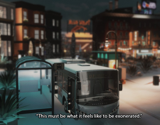
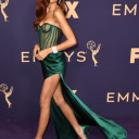
#eyeballs emoji
Text
*deer in headlights stare*
23 notes
·
View notes
Text
steddie kiss in vol two or i kill myself in front of the makers of stranger things to alter the course of their lives forever
133 notes
·
View notes
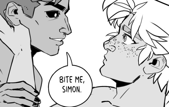
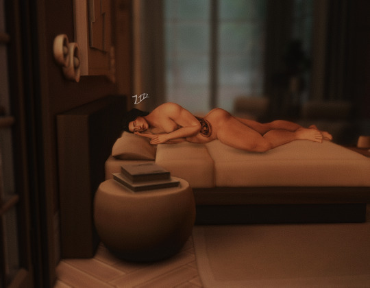
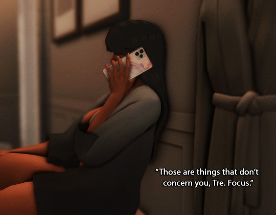
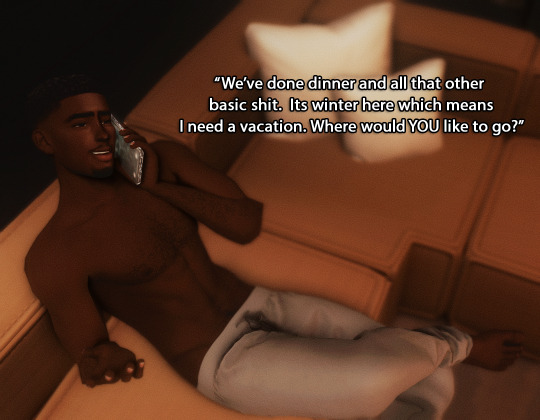
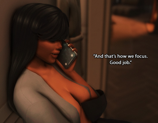
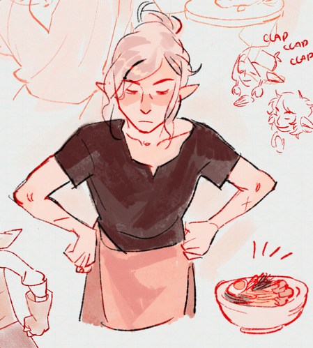
Text
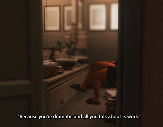
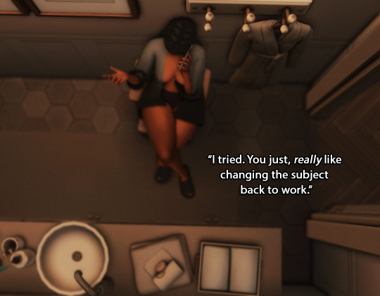
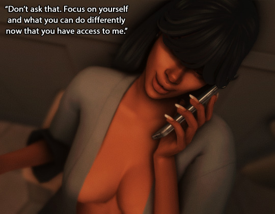
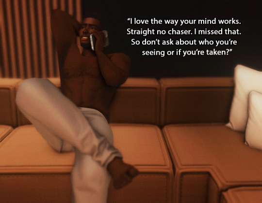
I'm fucking unwell lads.
Ed got a single taste of domestic life and was literally ready to throw everything away. Stede almost died ONCE and he was like "you know, lets not ever do that again."
We're being fed. We're being so fed.
#cooking up some meta about the sex scene and the regret and all of it#its not much#but#eyeballs emoji#ofmd s2 spoilers
12 notes
·
View notes
Text
WHERE DID YALL COME FROM I DONT CHECK THE TAG FOR LIKE ONE OR TWO DAYS SND SUDDENLY THERES SO MUCH FANART SNBSBD
2 notes
·
View notes
Note
Re: the AKOM anon in your recent post- I am fascinated by the extremely ironic apparent break up of the hosts of the break up series, and recently saw this comment from AKOM in a post on AKOM's Facebook group (post is from Jan 2023):
"You should contact the OSD podcast about that. Although Phoebe co-wrote, co-hosted (and edited) the breakup series, AKOM has nothing to do with it anymore. good luck!"
HMMMMMMMMMMMMMMMMM
#Eyeballs Emoji#remember when that article about female-led beatle podcasts featuring ak*m came out and *sd pitched a minor twitter fit abt it? yeah#i am lying on the bed chin propped in my hands kicking my feet idly in the air chatting with you about this on Juno's hamburger phone#anonymous#podcast blues
3 notes
·
View notes
Text
The thing I keep obnoxiously vague posting about because I’m not allowed to tell you? I get to tell you sometime next month and I am BEYOND HYPE
#sorry to keep vague posting on main#but also not because I am fizzing like a shaken soda#eyeballs emoji
7 notes
·
View notes
Text

first appearance of this other loser
3 notes
·
View notes
Text
He had missed Frankie abominably these last few days.
2 notes
·
View notes
Text
something feels a bit callous about planning your rpg character's successor after their inevitable untimely death way before said death has occurred but consider this. sororitas with tgirl swag <3
0 notes
Text
Hey I mad a blog to post my actual writing that isn’t making anime women kiss. you should follow it @fernetic maybe
0 notes
Text


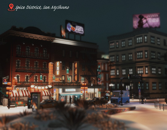


Previous | Next
Brownstones by @summerrplays
#ts4#indya#black simblr#a quick trip to Tomarang#we'll be back in San Sequoia soon enough#sorry for the whiplash#anyway..... Indira tho#*eyeball emoji*#sims spice#kinda#ts4 story#sims 4 story#simblr#ch24
312 notes
·
View notes
Text
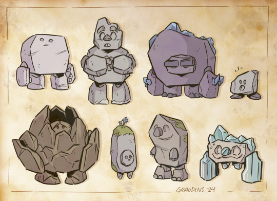

finally slapped some colors on a bunch of rock kids I drew last week ✨ no real story or names here, but the file folders were called the Pebble Pack and the Bully Boulders, so make of that what you will!
#clip studio paint#concept art#character design#stone elemental#rock kids#earth elemental#if you look close enough one should feel realllll familiar -eyeball emoji-#also whoops guess this is my first post of 2024#hey yall
70 notes
·
View notes
Text
emily flavoring the spell as sunlight is so hmmmm
#crunchyposts#eyeball emoji#d20#fh#fhjy#fhjy spoilers#fantasy high spoilers#fantasy high junior year spoilers#emily axford youre such a great player shout out shout out shout out no matter how bad you roll youre incredible at rolEPLAYING
23 notes
·
View notes
Text
Thinking about the fact that A.B.A's creator (I wanna call him Dr. Paracelsus to differentiate him from key Paracelsus) could very well still be alive out there somewhere, cause he wasn't said to have been killed, he was just taken by a military organization (?!) for his skills-
And while I don't think they ever confirmed a connection, it feels like almost too obvious that he'd be in some way tied to the creation of Frasco II, given that it's called Frasco II


I need to know more
#guilty gear#a.b.a guilty gear#aba guilty gear#paracelsus guilty gear#technically :^Ic#also I have yet to listen to NoK cause I kinda wanna wait till proper translations are done for all 3 parts#I could prolly go by ear but itd be exhausting#plus time hasnt worked out for it yet#in any case I think the names mentioned here are from NoK so for all I know Frasco II could come up in there too#but I actually do not know#but still I'm going eyeball emoji#Frasco II being tied to the Opuses and Cyprus project which are relevant for Xrd's plot is like mmm#ABA stuff has been called unconnected to the main plot but bits and pieces possibly related to her are lurking in the bg#also cameo of our GG wiki haha check it out idk#who said that
25 notes
·
View notes
Note
how do you get your colors to look so nice and your lineart so red and vibrant? i love it
omg anon thank you!! 😭 im going 2 be honest I am Not Great with color theory... but i like having my sketch pages look cohesive to me...
BUCKLE UP this is going to need a readmore bc i like talking.
I always sketch in neon colors it's a habit i picked up from an old teacher but I'll think of a color usually on a whim and draw with that. and then if i want to draw something else ill pick another color that i think goes well with the page. usually most of my color schemes r analogous (colors right next to each other on the wheel)

yanked this from recent dunmesh post; i kept most of my colors within the pink/red/orange range.
i wouldn't recommend doing everything in monochrome or analogous palettes though because it's sort of a guilty crutch of mine XD.
sometimes when im coloring ill change the layer mode of the sketch. color burn gets you either very very bright or very very deep colors depending on the color of the flats underneath. multiply and linear burn do the same thing but they're a lot tamer and generally always return darker colors. im sure there's some technical bits behind this though. ill either color my lineart afterward to compliment the color of the flats, leave it as is, or mess with layer modes if i feel like it. my favorite trick is color burn + linear burn + some combination of two lineart layers and just fiddling until i get a nice burn effect.
mithrun was done with crimson red on color burn.
coloring... like 999% of this is relative color which is like. kind of the idea that colors look different when placed next to each other. if you eyeball it a bit it's pretty noticeable.

what i used to do a bit ago was i would fill in the area i wanted to color with one big mask of color, make a new layer that has a clipping mask down to the flat layer of color, and then draw my actual flat colors. the color of the mask helped me pick my flat colors bc if I picked a color i think stood out too much next to the mask i could kind of just adjust it until it looked a little more cohesive.

old ish drawing next 2 a canon reference. i ignore local color a lot...mea culpa....but my overall color palette here was a light pink, so the shirt here is actually a desaturated pink? or violet i believe. if you shift sort of that purple color far enough into the gray area of your color wheel it can take on a blueish or even greenish hue. it being next to a lot of warm pinks/fuschias helps.
a neat thing that kind of helps is that if you desaturate or saturate certain colors they can kind of take on a certain hue? not sure if this makes sense. sort of how orange here turns tealish blue the grayer it gets. so if im drawing something that's predominantly orange and i have a blue color i can just take an orange color and desaturate it until i get a color that sort of looks like blue. and that way it kind of looks more harmonious? at least to me XD
shading. i don't apply serious lighting to a lot of my drawings, but a helpful bit is that the shadows tend to be the opposite of whatever color the lighting is? i try to think first about the "mood" or the main color i want to go for in the drawing and then i pick a shadow color opposite of that. so for here, i wanted the lighting to be a coolish magenta so the shadows r lime green. if there's anything off i fiddle around until i get something i like. the shadows on the skin here were too green initially so i shifted them a little more orange.
there's a "band" of color going on between the transition of the shadows to the light. generally this could be for a lot of reasons and i tend to use it differently (core shadow? overexposure? etc etc). but this is a color post so ill try not to go too off track.
but generally digital doesn't "mix" colors the same way traditional colors do if you use RGB (cmyk is a bit better with this but is kind of a pain to get used to), so to make blending a little less muddy, i sometimes add an intermediate color to smooth things out a little. for example, mixing digitally blue n yellow tends to get you gray, but generally, blue + yellow makes green, so if im making a blue->yellow transition ill slap some green color in the middle so it flows a little better.
I do a lot more cel shading nowadays. if you've been on here for a while earlier this year i have another style of coloring but it's not really accurate to how shadows really work so i wouldn't recommend looking at it. it's mostly to add zest and texture to the underlying flat colors.
coloring your lineart does a TON to helping your colors look vibrant, though its like the garnish on a dish to me (same with shadows). i think it's good to try and play with your flat colors and try to make sure those look in order first before adding flourishes. usually ill leave it a dark, saturated color that again matches my overall palette but sometimes i go in and color them by alpha locking my lineart layer and picking a color that matches the flat colors underneath? not sure how to explain it properly.

i used a darkish purple for shuro's ponytail to match the dull red of the flat colors (more relative color! trying to simulate a black/brown while keeping the pink palette there) but a lighter crimson for laios's blond. the light was this super intense like blush pink so i thought it might be cool to add this neon salmon red in the areas of that light to really give off that vibe of a very bright intense rim light.
sometimes you could also tweak with gradient maps or color balance, which adjusts hue based on how light or dark a color is. these r fun to mess with as a final touch but i need to watch using them because they can become crutches real fast XD but those are also just tools to help you. in the end just developing a good sense of how color works and how you want to use it is the best place to start.
LONGASS ramble but yeah. tldr just kind of train ur eye for color and look at what you like best. which is unhelpful and a little sucky but it really is just observation and practice and maybe some personal zest.
happy drawing!
#SORRY THIS IS THE SIZE OF CANADA I YAP A LOT#i like being thorough when explaining myself a lot XD but i think the easiest way to get good with this is just repeat practice n observing#and figuring out how stuff behaves in certain situations and what you like to do and blahblahblah#if you have artists u like that do this well looking at how they use color might be cool#...i feel this entire post is just putting my entire thought process on blast LOLLL.#“eyeball it out” -> study some actual fundamental stuff and or intake new info or art -> apply it back to just eyeballing it out#i dont think i have a natural sense for some basics#but i dont think im naturally one of those people who grind out studies all the time and breakdowns either#i guess i just kind of like knowing the mechanations behind why to do a certain thing or how stuff works and then figuring out#how that translates into what i know nerd emoji#james gurney has a good book on color and light#if you like reading. but its very informative!#quirinahscreams#ask#anon#this is mostly just me talking about how i draw i dont think this is meant to be educational or informative XD um
9 notes
·
View notes
Text

When your bodyguard is so!!! Y'know!!!
Saidi the bodyguard (she/her) and Rani the village priest (they/them)
145 notes
·
View notes
Last Seen Blogs
fancyschmancyopinions
Fancy Schmancy
alunasky-blog
Alunasky
letssaveourselves-blog
Lets create a more equitable Queer Community
lunaxlaverde
olokun luna
shoker2008
My art here: http://shoker2008.deviantart.com/