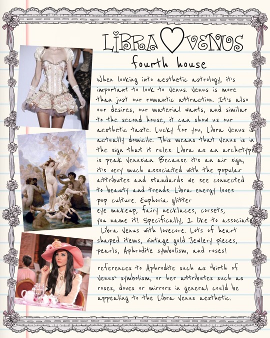
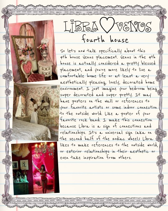
#fashion analysis
Text
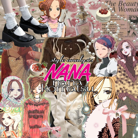
🍓 style analysis: nana komatsu / hachi (NANA)
welcome to the first entry in my style analysis series- where i take a different fictional character for each entry and take a look at their fashion sense, as an exploration on how fashion plays a role in forming a character's personality & overall identity. in other words, it's a deep dive into the intersection of story & style. today we're starting off with nana komatsu (who we'll be affectionately referring to as hachi from here on out) from NANA, my favourite character from my favourite manga of all time.
NANA is a manga very near and dear to my heart. i could spend all day talking about why, but i'd say one of the biggest reasons is for how ai yazawa (the creator of NANA) uses fashion as a means of storytelling. in NANA, clothes are not just a typical character design element, but are instead a visual narrative tool used to convey a characters' personality, as well as to express their traits and feelings. today i've chosen hachi for the style analysis because i'm fascinated by the subtle changes to her style syncing with her character development over the course of the story. also, i think her style is just super cute. so let's get into it! (⚠ anime & manga spoilers ahead)
🍓
overview

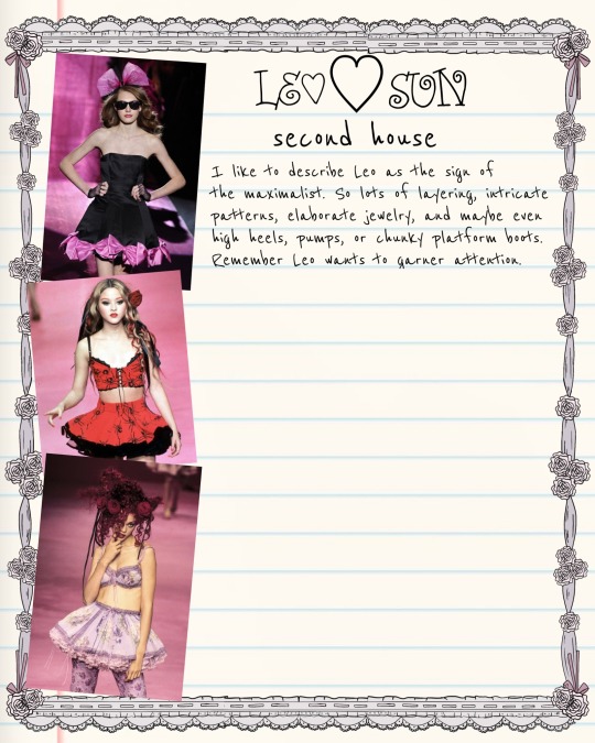
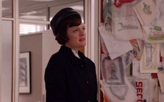
if i only had one word to describe hachi's style, i'd say feminine- think frills and lace details. she's all about babydoll silhouettes, pleated skirts, knit cardigans, ballet flats, and generally embodying shoujo fashion from the early 2000s with a good balance of cute and classy. hachi's fashion sensibilities lean more towards the modest side, as her dresses and skirts are usually around midi-length, and mini skirts are often paired with extra layers like tights or leggings underneath. it's a very good girl chic look, which fittingly leans in to her innocent personality. hachi is very stylish and clearly puts a lot of thought into picking her outfits everyday, as she's not afraid to occasionally experiment with different styles every & to use fashion as a key means of expressing herself.
in terms of colour palettes, hachi's wardrobe has a bit of everything- warm hues, earth tones, soft pastels, which all work together to capture the warmth and sweetness of her character. she's definitely more attuned to light colours than dark. this suits her personality better too, as light coloured clothing is said to convey feelings of friendship, fun, compassion, and approachability. fabric-wise, hachi likes to keep it light and airy with materials like chiffon and tulle; switching to warmer fabrics like cashmere and wool for cold weather, giving her outfits a vintage feel.
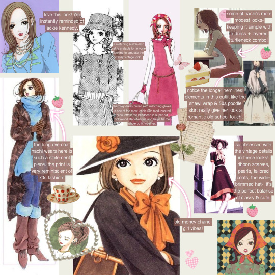
we can see that hachi pulls fashion inspiration from various aesthetics and fashion trends across different decades. she definitely incorporates her love for vintage fashion in her style, particularly with elements we've seen her wear before like mod dresses, neckerchiefs, pearl necklaces, long fleece trim coats, and brown platform boots. you can also see it in how some of the pieces she wears feels so unique, like a surprise gem you would find in a vintage boutique while thrifting. in dressier looks, hachi's girlish charm and allure is slightly reminiscient of 1960s it girls, like twiggy and sharon tate. she draws from a lot of 60s-inspired elements- the romantic parisienne style, and a bit of vintage preppy chic.
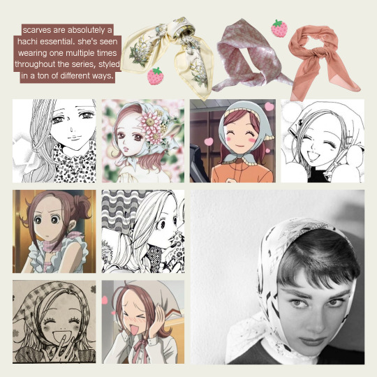
scarves and bandanas are a vintage essential as well as one of hachi's signature accessories. they have tons of versatile styling options, plus the potential to be dressed up or down. we've seen her wearing one scarf (exhibit A) multiple times over the series. the babushka scarf version has to be my favourite, it's very hepburn-esque, who i 100% i could picture hachi having a poster of in her childhood bedroom. i also think that having characters re-wear pieces we've seen before is generally just a cool subtle styling detail, which adds to the realism of NANA's 10/10 worldbuilding. the scarf's many appearances styled in different ways also goes to show how hachi enjoys being creative with her outfits, loves the pieces she owns and wants to get as much use out of them as possible.
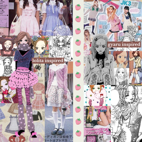
hachi's style also incorporates a touch of influence from the kawaii lolita subculture, particularly modern offshoots like larme-kei. lolita is french rococco-inspired with a focus on cuteness, and has its origins in early 2000s harajuku street style- which is also where mori/kogyaru fashion originates from; hachi's go-to style during her high school years (see: her modified school uniform, miniskirts, fuzzy legwarmers). both of these movements were heavily pioneered by j-fashion magazines of the time like FRUITS, Olive, Larme & CUTiE, which were mainly popular with teenage girls and young women, and hachi is no exception. her fashion sense is also heavily inspired by famous japanese celebrities and style icons like risa nakamura.
if we had to really narrow it down, i think hachi's style can be best described by otome (lit: maiden) fashion. known as one of the predecessors of lolita fashion, this style was very popular among young girls in the 70s-80s and is heavily centered around embodying all things traditionally feminine. sweet, cute, girly, and romantic are all common descriptors of the style, which pulls influence from 60s mod fashion (which, as we've seen, has prevalent elements in hachi's style). think tons of layering, pattern mixing, longer hemlines, and mary janes/flats, all of which we frequently see in hachi's outfits. we also see that she takes elements from modern lolita fashion like frills, bows, ribbons, lace, tights & stockings, and incorporates them into her own personal style as more understated outfit details; making it more wearable on a daily basis while still being a tribute to one of her sources of style inspiration.
now that we've explored what makes hachi's personal style unique to her character, let's dig into how her style is influenced in relation to how the story progresses and how her character develops. and just for funsies, i'll also be styling a casual everyday outfit that i could picture hachi wearing for each story arc. let's go!
🍓
i. art school
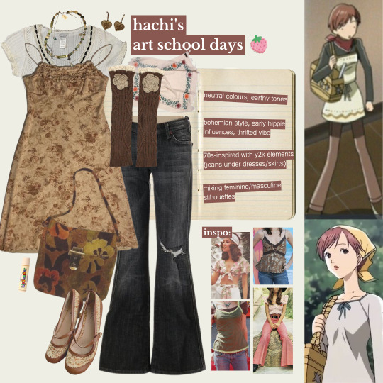
i'd describe hachi's style here as the most youthful, which makes sense considering she's freshly moved to tokyo to study at an art school. we see her sporting a face-framing pixie cut, which gives her look a bit of edge, but not too much as she still retains her signature soft girl style to balance it out. also, can i just say: super farmer's daughter vibes when paired with a bandana! jeans were having a moment too- during this era, hachi was often seen wearing a pair of bellbottom flares or baggy jeans, creating a casual and easygoing look which really leaned into the artsy college student fashion. this would also mesh well with her then-best friend junko's more bohemian/indie, woodstock-inspired hippie style. the short hair paired with her experimentation on androgynous silhouettes definitely accentuates her gamine facial features, lending to a cute boyish look.
all these style elements are in direct contrast with the hyperfeminine looks of her high school years, back when she'd opt for skirts over jeans and long, styled hair; showing how hachi underwent a pretty drastic style change whilst adapting to the new environment in tokyo. at the same time, it could also hint at hachi's approach to self-expression & using fashion as a coping mechanism to deal with major life changes. dressing more casually to blend in with the college crowd is one of many indicators on how easily influenced hachi can get, which is pretty on-brand behaviour for someone with a tendency to seek validation from others instead of oneself.
so let's get into the first look i've picked out for her: layers on layers on layers baby! for this outfit, i took a lot of inspiration from hachi's first day of class outfit. i tried to be consistent with her theme of 70s-inspired prints and silhouettes during this phase, but also wanted to incorporate a modern y2k touch since we know that younger hachi (before fully developing her unique & personal sense of style) is more of a trend chaser, and what could be more early 2000s than a blouse + dress + jeans combo? accessories-wise, i wanted to pick out unique-looking pieces that had a lot of charm, as i was really going for that 'flea market finds' vibe since she obviously wouldn't have been able to afford any designer yet on a college student budget. also please notice the gorgeous vintage floral print ballet flats- i was so excited when i found it, i thought it screamed hachi!! they look so comfortable to walk in on top of being cute, it's the perfect shoe to slip on for a long day of classes without sacrificing style.
🍓
ii. apartment 707
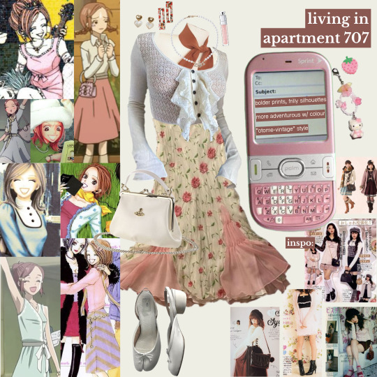
during this time, we see hachi start to embrace feminine styles again. she lets her hair grow out and we see her back in skirts, dresses, and all things girly, which is why her otome fashion influences shine through most here. she wears tons of pieces in floral and polkadot print, as well as flowy babydoll tops which are very y2k-girl-next-door-reminiscient. we also see her starting to wear vivienne jewelry (the pearl choker, the dainty silver orb earrings), likely as a result of nana's influence (who she heavily admires and looks up to) & wanting to emulate her style. hachi's outfits here seem to have more colour and print, which i believe is reflective of her mental state here; happy, confident, and surrounded by support. good vibes all around, her environment at this time encourages her to take more risks in not just decision-making but also in her fashion choices.
in general, this era is where hachi seems to be getting a better hold on growing into her own personal style. she's still open to trying out different styles every now and then, but we can see there are some style elements that really stick and appear most often in her outfits. she's also seen here experimenting with all kinds of different hairstyles- french braids, pigtails, twin buns, the half-updo. to me, i think all of this signifies how hachi's style development runs parallel to her identity formation and how she grows as a person. at this point of the story, hachi believes she's finally found a place where she fits- within this ragtag but loving cast of unique characters.
so the second look was a little more of a challenge to work with- that's because hachi's style during this era doesn't subscribe to any one specific aesthetic or subculture, but more like a bit of everything, and her outfits can differ a lot between episodes. the goal here was to go for a casual daytime outfit, and i ended up super proud of the colour coordination in this one! i've styled hachi in a frilly vintage floral print chiffon slip dress that's almost reminiscent of the strawberry dress of 2020, but with unique details that give it much more character. i gave hachi a cream-toned vivienne crossbody purse, a scarf to balance out the salmon pink of the dress accents, styled as a neckerchief, some strawberry hair clips to match, and of course i had to include her much-spotted pearl orb necklace too. the highlight of this look are definitely the shoes, which are maison margiela tabi ballet flats- something i could 100% picture hachi wearing if NANA were set in the context of modern day fashion trends.
🍓
iii. motherhood
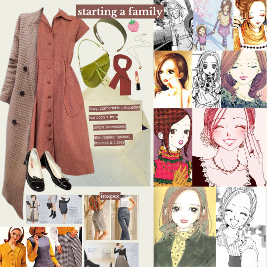
as time passes, we also see how hachi's fashion sense has slightly evolved into a classier, more refined version. more adult, if you will. this occurs when hachi decides to move out from apartment 707 and starts getting serious with takumi. not only did her living situation change, but as did her lifestyle, and with that, her fashion sense too. her style here simplified and took on a more mature look. she started prioritizing function over form as she cut down on layering and accessorizing. she would also opt for longer, flowier silhouettes and comfortable styles, often wearing simple dresses or aprons over a basic shirt-skirt combo. i really like how the change in style here - which pulls a lot from the 50s-suburbia housewife trope (think frilly aprons, puffy dresses, flared skirts, modest hemlines) - feels like a sublte detail to show how hachi settles into her new role of motherhood, expressed via clothing choices.
as a whole, this period of her life signifies the drastic 180° change from spending carefree days of young adulthood, to taking on the role of mother/wife in a nuclear family unit. it's the most major life change she's ever had to experience at this point, and it's expected that her style evolves alongside this. she's seen wearing noticeably less patterns or colour during this time, which could hint at possibly representing her inner feelings- the bleakness of spending her days in a mostly-empty home, and the isolation of being separated from the friendships she once surrounded herself with daily. thankfully, we do eventually see her return to dressing fashionably again after the timeskip. however, it's extremely important not to gloss over this period of her life as it portrays how she must have felt having most of her agency taken away overnight, with her style being all she had left as a form of control.
so last but not least is the final outfit, which was tough styling as there was comparably less material to go off, but i based it on the few going-out looks we get to see hachi wear post-takumi. rolling with the 50s-inspired looks, i've styled her in a coral short-sleeve button down dress. for the outerwear i picked a long checkered overcoat, which nicely complements the dress in addition to being a going-out staple for classy ladies everywhere. since the outfit is mostly harsher silhouettes, i decided to keep the colour scheme light to balance it out. while i was going for 'stylish mature woman', i still wanted some youthful elements in there to maintain hachi's signature girlish look. i balanced it out by accessorizing with a headband (a prep chic essential) and dior saddle bag, both lime green for a pop of colour and contrast. and of course, i had to incorporate the iconic neckerchief too as it doesn't get any more vintage-looking than this. the final piece to tie it all together are a pair of classic miu miu ballet flats- chic and comfortable!
🍓
final thoughts
all in all, hachi's fashion sense is super girly and sweet, which i'd say directly reflects on her character's personality. hachi is an outgoing girl who wears her heart on her sleeve and has a lot of love to give. she's warm and approachable, which she expresses through her clothing choices by embodying the cheerful, down-to-earth girl next door look. her bubbly style is youthful and fresh, which personality-wise is in character with hachi's innocence and willingness to trust others. this is shown through how much hachi cares deeply about her loved ones & often (unhealthily) prioritizes their feelings over her own. however, this naïveté unfortunately leaves her a lot more vulnerable to others seeking to exploit her emotional attention.
hachi's fashion evolution over the series shows how she uses fashion as a coping tool to help adjust to life changes, capturing her emotional growth and how she matures over the course of the story. the way that hachi's sense of style develops alongside her character is so realistic. her style development tells the story of a girl who finds herself and loses herself over and over again, frequently changing jobs and wardrobes in a constant struggle to find an identity to latch onto- until she does. hachi's style story is one of self-expression & identity formation; a story that speaks to all the young, unsure girls out there who see a bit of themselves in her, trying to figure out their place in a world in a world that often decides for them.
#oc#nana#nana manga#nana anime#nana komatsu#nana hachi#ai yazawa#collage#collage art#digital collage#fashion collage#fashion moodboard#style analysis#fashion analysis#character analysis#anime style analysis#essay#fashion essay#coquette#jfashion#harajuku#kawaii#pastel
1K notes
·
View notes
Text
something about janine taking the district position and her wardrobe becoming more muted in color than its ever been more refined yes more professional yes but just missing a lil something and how janine takes that and adds her broches as a pop of janine thats so 🥺 and something about how janine is her most authentic colorful self when shes teaching versus muting her colors for the district
#shes growing as a person and figuring herself out but i just hope she doesnt lose her shine along the way (she wont shes janine teagues)#janine teagues#fashion analysis#abbott elementary
58 notes
·
View notes
Text
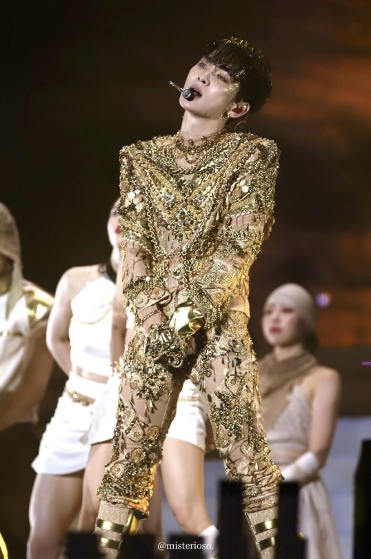
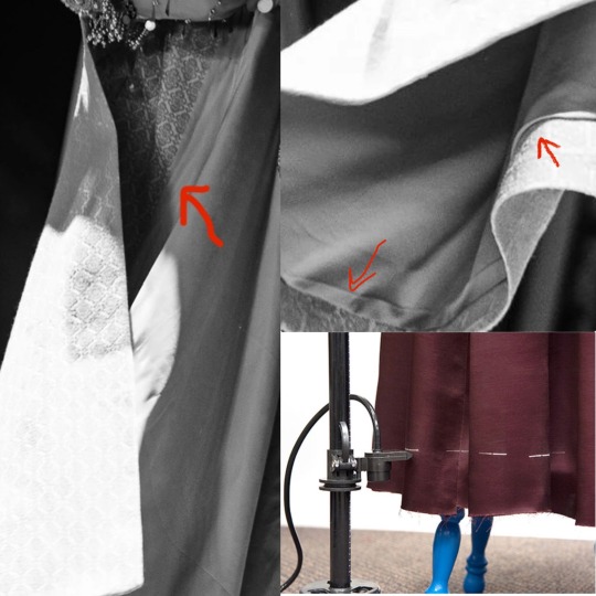
Isn't it glorious?
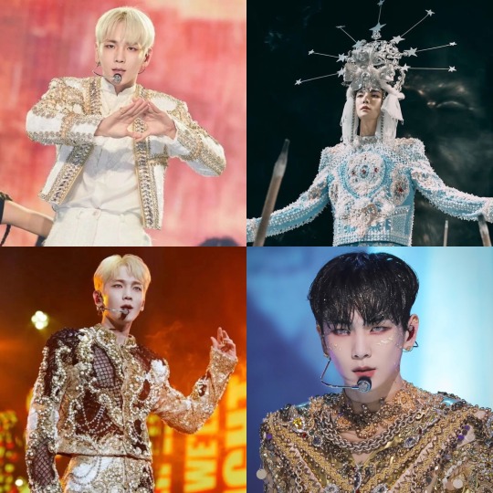
It’s here! I finally tackled my analysis of Key’s gold Gasoline era costume, worn in his music video for the song, photoshoots, a stage performance at the Inkigayo show, and a live performance at SM Town 2022. I’ll discuss everything from the fabrics used, the gloves, the shoes, complain about the zipper, talk about whatever the heck jumps are, break down all of the tiny little types of ornamentation (including the things I don’t actually know the name for) and more.
It’s scary in the best way. Buckle up. Grab some coffee or tea or vodka and a blanket.
I want to preface this by saying that this is going to be VERY long. I’ve polled my followers and nearly everyone said they want me to get as granular as I want. So I’m doing that. If that’s not your thing, here’s your exit ramp now. I get it. This is absurd.
You can also read it on my Twitter here. It actually has a LOT of bonus photos because they only allow me to have 30 on here, if you’re interested in seeing more. It may help clarify some things, as well.
Now then. Welcome to those who are left. Let’s begin!
Costumes by Dénicheur by Seo Seung Yeon
For his Gasoline era, Key has had four costumes designed and made by Dénicheur by Seo Seung Yeon, a Haute Couture Designer House that, among other things, makes elaborate costumes for Kpop performers. They’ve got an amazing Instagram portfolio to check out. They made him a gold and black costume for his G.O.A.T in the Keyland concert, the blue and white one for the Gasoline MV, this gold one, and a cream and gold beaded jacket for the 2023 SM Town Concert.
This fashion house’s trademark is intricately beaded, appliquéd…encrusted…costumes. I was able to get some high quality photos from some of you (thanks so much!) And the more I looked, the more I discovered.
If this were a piece of art (well, it is, but not in the same way) “Mixed Media” is what I’d call it. There are literally over twenty different types of beading techniques, appliqués, various types of sequins, trims, braids, rhinestones, chains, and more.
First, I’ll do an overview of the garments themselves, and then I’ll move on to the ornamentation.
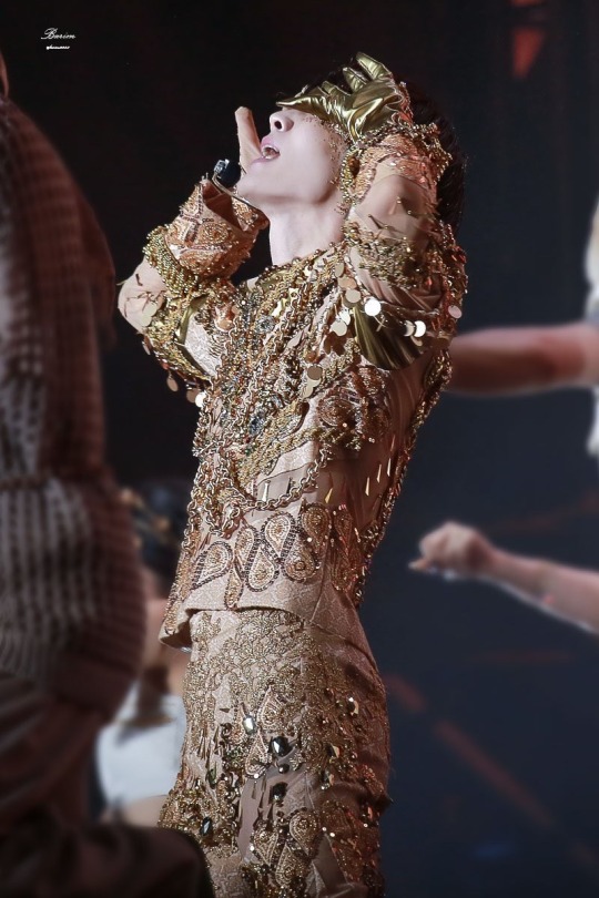
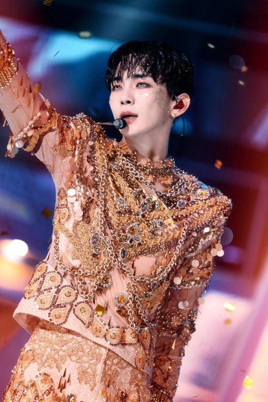
The top (it’s not a jacket, it’s not really a shirt, it’s not a tunic. So I’m going with “top”) has a very boxy torso with exaggerated wide, padded shoulders. They’re completely squared. There are straight sleeves—not too slim, not too bulky. There’s a heavily ornamented oversleeve that reaches down to about his elbows and a “nude” colored full length under sleeve. It also has heavily ornamented cuffs at the bottom the sleeve. It has an exposed zipper up the center back that goes up into a short turtleneck collar. The collar and a portion of the lower neck back region are sheer with some beading and appliqués. There are sheer spirals around his arms and in chevrons on his front and scooping around to his back.
Just LOOK AT that masterpiece
The trousers are closely cut through the waist, hips, and thighs but become a bit wider at the knee. It looks like they were made full length but are always worn bunched up over knee high boots. They close at the center front with a very beautifully set fly zipper and flat trouser hook and bar. It’s so low profile that it wasn’t until I got some 4K images that I was even sure of where they closed. It was like he had been sewn in. I wrote a whole thread about it on Twitter that reads like a mystery novel, though I already spoiled the ending for you. Sorry.
The top is made of what is probably a “nude” (aka specially dyed to his skin tone) base fabric to hold the structure, with the ornamentation stitched over top. The external stabilizing fabric is what appears to be some sort of jacquard, possibly silk.
Jacquard is a type of weave, where the fabric is made of long and short “up and down” stitches of sorts, to make a pattern. Because some of the time it uses longer “stitches” on top, it becomes more vulnerable to the fiber breaking and makes it become kind of “fuzzy” looking. This can be especially true if it’s a natural fiber that usually has less structural integrity than a synthetic one. I initially thought this had started to happen on Key’s rear, but after a very close zoom in, I think that’s just a bit of appliqué edge pulling up. I think maybe one of his mic packs is down there too, but I’m really not an expert in that. I did the research so you don’t have to, folks.
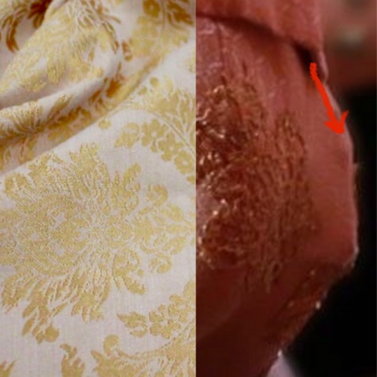
Left: A type of jacquard fabric. The shine comes from the longer top threads, contrasting with details of shorter threads. Right: Is it an applique or is it some snagged fibers? Ultimately, I think it's an applique edge.
Perhaps the most interestingly nerdy thing about jacquard is that it was originally made on a loom that led to the creation of computer programming by utilizing a sort of “binary code.” There were punchcards that showed the strands of fibers when to go up and down. Like “holes and not holes” in which to weave.
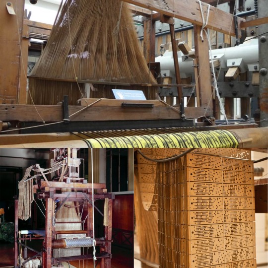
A Jacquard Machine Loom with punchcards that create the desired design on the fabric
It’s important to note that this fabric needs to have some stretch because it is also used to make his very tight fitting trousers. If it were not a stretch fabric, he wouldn’t be able to do this like THIS or…most things, really.
Even though the jacquard is stretchy, it has some structure to it. It’s used as a stabilizer in between the “flesh mesh” on the outer layer. (aka power net, stretch mesh... There are many names!) It forms the base on which the majority of the ornamentation is stitched.
Flesh mesh is a stretchy mesh fabric dyed to the performer’s skin color and is used to give the illusion that you’re seeing their skin, but it gives much more strength than just a cutout. I wrote a thread about flesh mesh and the importance of taking into consideration the performer’s actual skin tone when building them a costume here
In this case, flesh mesh allows for adornment of these areas, as well. It’s important to note that, even though it’s a separate layer over the base, it is “tacked” through all layers in a regular fashion so it doesn’t droop with the weight of all of the ornamentation.
There are also some parts that have metallic gold applied pieces. This was probably made of a beefy metallic spandex applied on top of the base rather than some solid pleather, due to way it behaves on the body. The latter would have been way too rigid in comparison to the rest of the fabrics.
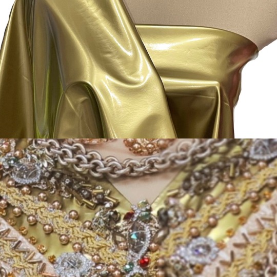
Heavy gold stretch spandex, forming a chevron on which to affix beads and other trims
Okay. Range of movement time. You know how I love discussing this. That’s because it’s the single most important aspect of costumes for dancers.
Let’s talk armpit gussets. They’re an American football shaped piece of fabric that is stitched in the armpit partially to the sleeve underarm, and partially to the torso underarm. It’s often made of a stretch fabric, but sometimes it’s out of the original “fashion fabric,” which is what we call the main garment fabric.

Gussets out of different fabrics under each underarm. You can see the gold bunch under his arm when it's at his side
It allows the performer to more easily move their arms above their chest and head to help keep the top from riding up. You can see in this photo, though, that it does bunch up a little when his arm is down, because of the extra fabric. It has to go somewhere when it’s not taut.
With this particular top, it’s interesting to note that, due to the asymmetrical decoration of his arms, one gusset is the gold stretch fabric and the other is the jacquard. That means that, either both fabrics have the exact same stretch, or his arms may be SLIGHTLY more limited on one side than the other. That’s fun! I really geeked out about this observation.
Often with jackets for dancers, they’ll have what are called “commodity pleats” around the center back shoulder area. They’re a sort of sneaky hidden accordion-like bit of fabric that stretches out during movement that may otherwise split the back open. Taemin uses them a LOT. But, since this top is so boxy, Key doesn’t need them in this instance. He already had the room he needed without any other accommodations.
They put commodity pleats in the back of most of Taemin's closer fitting jackets. I wish they'd make them the same color as his jackets, though!
With Key’s trousers, we’ve already established that they’re made of a fabric with a decent amount of stretch. But since I can’t find many good photos of his bottom half, I’m unsure about if he also has “crotch gussets.”
By this point, I’m kind of notorious as being the “crotch gusset person.”
The following posts explain them in much more detail, but basically, they’re long triangular wedges that start in the trouser crotch and taper down to nothing in the inseam. These are often put in trousers of dancers when people need a better range of movement.
I wrote about this in detail regarding Taemin’s pleather pants he wore in his Metamorph concert, as well as all of SHINee in the Your Number dance video. You can find my posts on the subject here:(Metamorph) (Your Number)
Jinki rocking a black crotch gusset in SHINee's "Your Number" Performance Video (Black Version)
Gussets allow for extra room and movement when one is trying to do extreme leg movements like squatting. Unfortunately, I don’t have many good photos of his inseam. There’s so much going on with appliqués and piecing of mesh vs jacquard, it’s hard to tell. Part of the front half of his trousers is flesh mesh, swirling around them. The other parts are the jacquard, whereas the back is all jacquard.
I saw one photo which made me begin to wonder if the inseam is a little further forward than it could be, though. That could mean there IS a gusset. I’m really not sure...I don't have official visual confirmation, but now you know more about crotch gussets either way. You’re welcome.
That seam line is up a bit more forward than usual. It really has me wondering, because that would happen if there was a gusset installed. Hmmmm.
Okay. Zipper education time. I apologize in advance. Things get spicy but I tried to tamp it down. The center back (abbreviated as “CB” in the industry) of the top has an exposed zipper. This means exactly what it sounds like: it’s exposed. You look at it, and it looks like there’s a zipper right there. It’s not hidden. Sometimes it’s a perfect match, and sometimes it’s “featured.” Exposed zippers actually become a trend every once in a while in everyday fashion.
I thought it was extremely interesting that, on this elaborate costume, they chose to use a zipper with metallic teeth on white “tape.” (The fabric on the sides of the teeth.) It was a huge disappointment for me, actually. I would have loved to have seen the zipper more carefully hidden like his fly was.
Hello, zipper. I see you loud and clear!
I have to comment a bit on what I view as the one flaw in this otherwise perfect costume. I will preface this by saying that I was not in the fitting room where this was conceived, and I don’t know about any extenuating circumstances and the reasoning behind this decision. But there a few things that I would have done differently regarding the zipper and back collar of this top if were to have made it.
But first: some zipper education. Besides exposed, there are center lapped, as well as regular lapped zippers. With the center lap, it’s like the fabric covers your zipper but you can pull the zipper down through it. Your hoodie probably has one. The regular lap zipper is more like your trouser fly in that there is one flap of fabric that covers the whole zipper, hiding it.
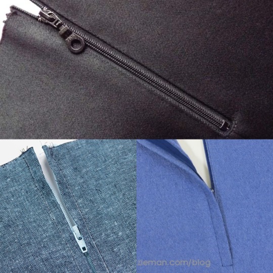
Top: Exposed. (Though it has a matching zipper and zipper tape.) Bottom Left: Center Lapped. Right: Regular Lapped.
Either of those types could have been used to make the zipper more discreet. I personally would have chosen to use a regular lapped zipper, which is less likely to get snagged than a center lapped zipper.
People have defended the exposed zipper by asking if it’s because it’s less likely to get caught. I very much get this argument, and, technically it’s right.
But, in my extensive experience, I don’t think I can recall a case of an exposed zipper in the back of a costume, quick change or no. It’s unattractive. (Not to mention a dead giveaway in a period garment!)
If it’s sewn well and tested, with the correct size lap and no loose fabric, it will work just fine. There should be a hook and eye at the top to make sure that it stays secure while dancing.
Part of being a good dresser is being methodical and purposeful, not frantically zipping something up in a way that is more prone to snagging. They keep their cool, perhaps taking a couple more seconds but ensuring that they pull it up smoothly. They use their fingers to block the overlap as they guide the zipper up.
(Random side note: I met a dresser once who preferred zippers be installed upside down for their quick changes. Hey, whatever works best for them! I wonder how they discovered that…)
I will also note that, as far as I’m aware, the only times he’s worn this costume, he didn’t need to get in or out of it quickly. I know that he wore it in the MV, the Inkigayo performance, and the photoshoot. He also performed at SM Town Tokyo 2022, though he had 11 songs during which to change between Bad Love and this. He never wore this look at his G.O.A.T. in the Keyland concert. Oh, and the collab with the Jinro frog. I’ll talk about that later.
So ultimately, all of the zipper quick change talk is for nothing. There COULD have been a chance that this was going to be worn during his concert, I suppose. But if not, in the end, I can find no reason that there needed to be an exposed zipper other than: they wanted it that way.
Sorry for that rant. I know that it was intense. I just…wish it were pretty. That’s all. I know it wouldn’t have bothered most people, but I personally think that the costume deserved better!
Well then. They arranged the symmetrical beaded appliqué motifs so they didn’t interfere with the center back line, so it wasn’t an issue being all chonky around the zipper.
Unfortunately, since the zipper was built into the neck with just the “stretch mesh,” it moves very differently than the rest of the top. It has a substantially weaker structural makeup and it can’t support itself the same, so it stretched at a different rate than the zipper on the solid fabric on the bottom. It kind of “bubbled” when he moved and it rode up.
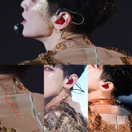
Showing the neck bubbling, and, on the bottom left photo, you can see that there is some sheer stabilizer to ensure that the zipper doesn't just tear out of the sheer net.
It couldn’t have been helped unless that whole back neck area had been backed with the solid nude base fabric. That’s what I would have done, personally. But using the stabilizer helped a bit. Without it, it may have not lasted a performance.
I don’t know why they did it that way, but the result was rather disappointing to me, especially considering the care that was taken with the rest of the garment.
Okay. End rant. The rest of the costume is EXQUISITE.
One more thing to note is that the zipper terminates about 4” above the top’s bottom hem. It is right around where his waist is. It was built that way to ensure that he was able to move his legs and hips comfortably without getting hung up anywhere.
His knee high boots were covered with the same peach jacquard as his top, as well as utilizing the gold fabric to serve as ornamental buckled straps.
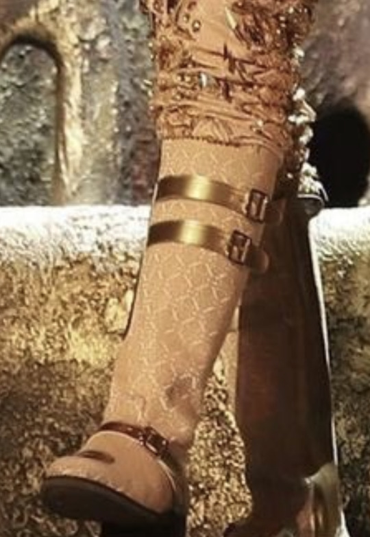
The stretch element of the jacquard is further showcased by the fact that it pulls over the boot toe smoothly, with little issue. A completely stable fabric wouldn’t be able to do that.
Now for the ornamentation. Oooooh boy. There are around twenty types of various adornments on this costume, and I thought I’d highlight some of them.
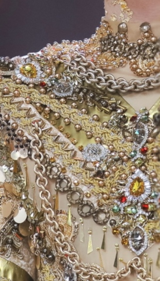
I can spy about 15 different types of ornamentation here alone.
Beaded appliques at the neckline
Heavy chains
Rhinestone appliques and/or individual rhinestone pieces
Bugle bead chevrons
Gold round beads
Yellow individual small rhinestones
Grey beads in between bugle beads
Gold and silver flat braid trim
Gold stretch fabric
Round flat decorative chain
Hanging paillettes
Dark seed beads with some of the paillettes
Gold dangling lil dudes
A sequined applique peeking out from behind a chain
Utilizing the main fabric as a chevon stabilizer as a design detail
About paillettes: these might actually be my favorites. They’re like “floppy sequins” that only have one hole at an edge. They’re made of a very lightweight plastic, so they’re virtually silent. If you wear a dress completely covered in paillettes, you’ll just hear a little rustle. In this case, his were mainly attached via dangly wires as fringe around the upper sleeves. There are a few other random instances throughout the garment where they’re stitched on individually. You can read more about paillettes in my post here.
Appliqués: There are at least three different types of appliqués in this costume:
Beaded
Lace
Sequined
Rhinestone
Appliqués are premade decorative pieces. It looks like someone hand beaded everything on the costume, but they were able to take a shortcut by using these. So no, contrary to what you might believe, there wasn't someone laboriously hand beading every single thing on to this costume.
It still takes FOREVER to invisibly stitch each motif on to the costume as well as, in this case, sometimes layer upon layer. A lot of them are attached to a net base, and in closeups, I saw how they trimmed the net away closely around the motifs.
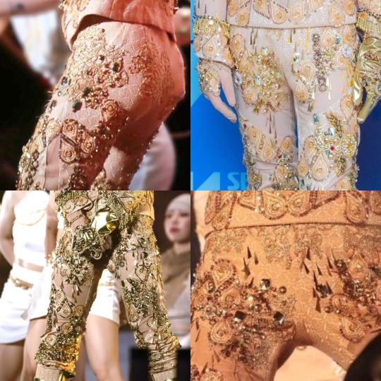
On the top, we have the gold paisley sequined appliques. On his trousers, you can see the low profile lurex embroidered lace appliques. Bottom left, you can see the beaded and rhinestone applique. And on the right, beaded appliques. You can see that they're over flesh mesh so, when it's on Key, it just looks like he has a beaded collar.
The sequined, beaded paisley motifs are the most prominent and plentiful form of appliqués, focusing around the top’s cuffs and lower edge. They’re also heavily featured spiraling around the trousers. There are even some appliqués stitched across the seams of the trousers and top.
There are some huge, gorgeous bead and rhinestone appliqués, like this one on his right bicep that you can see in the photo above.
There’s also the Lurex lace (metallic threaded) embroidered appliqués that concentrate mostly on his trousers' waist and hips. It’s low profile without any bits that might snag the top while moving. They added a few jewels to it further down once it was no longer posing any danger to snags. There are also a few flat appliqués on his rear, so as to not make sitting uncomfortable but still be adorned.
Beads and gemstones: There are also individual beads and jewels both sewn and what appears to be discreetly glued on as accents. A popular adhesive we use for that sort of application is called E6000. It bonds pretty much everything from plastic, leather, metal, rubber, and wood. It’s like a slower acting super glue, but is more flexible.
You definitely need to use this in a ventilated area or, ideally, with a respirator. The fumes are no joke! There are little chevrons made out of long tubular metallic bugle beads that were probably glued instead of stitched on. There are also round bronze beads and gold rhinestones glued to the edges of the metallic fabric.
There are little dangling gold dudes, though I don’t know what they’re officially called. There are individual sew on rhinestones. There are circular decorative flat chains. There is gold beaded fringe at the wrists of the sleeves.
Top left: gold braid, beads and chains are heavily featured. Top right: the dangling gold dudes. I don't know what to call them. Bottom left: Paillettes, hanging on gold wires on the upper sleeve hem. Bottom right: Gemstones highlighting the center of the chest, with a whole organized, beautiful mess of braid, beads, etc.
There’s gold flat “braid” trim that also looks like it has a bit of silver in it to add dimension. It’s basically like a braided ribbon, often in metallic colors. It’s used a lot in military uniforms.
And there are a few other various random beads and trims that show up amongst the circus of adornment.
The layout of the overall design is asymmetrical, with left and right arms and legs that don’t match. However, the front of the top is completely symmetrical (which is extremely impressive) except for a few rampant rhinestones that intentionally deviate a bit. Here’s an abomination I made of the sleeves next to each other to see the asymmetry more clearly.
I THINK (not based on this photo but others that aren't Frankensteined together with different perspectives) that the sleeves are actually different lengths as well.
Something that I should cover is that with garments made out of a stretch fabric, like Key’s trousers in this case, stitching on something non-stretchy (like some appliqués) can be fraught. The appliqué can keep the fabric from stretching as much as it needs to accommodate a body in it, and it might tear off.
Sometimes, we need to stretch the fabric a bit as we sew on the motif so it will look normal when a leg is in it. It may look a bit puckered when it’s not being worn. The good news is that it appears that most of the motifs in this costume are on what is most likely a mesh backing, so they probably didn’t have to deal with that headache here!
Since the motif on the Jacquard fabric is pretty small, as well as the fact that some of the appliqués wrapped across the side seams, “pattern matching” wasn’t a big priority on this. However, it’s always preferable to keep the motifs at the same horizontal height. This is a REALLY small pattern, so it wouldn't matter terribly, plus the fact that it was so covered it can hardly be seen. There WAS a point on the right side seam where the pattern did match, but the fabric slightly torqued on the left so it didn’t. All in all, it wasn’t a big deal whatsoever. If it were a bigger print though, it could have been. I made a thread about pattern matching here. It's a subject I'm pretty passionate about!
This side seam was cut so that, at a fixed point, the motif was all at the same level horizonatally at there was a part where the motif perfectly matched up to create one complete one. Because there are curves in the seam, it can't do that everywhere.
Now for a bit of a departure: SHINee and its members have done a few collabs over the years, dancing with the frog mascot from Jinro soju. SHINee did one for Don’t Call Me, Taemin did one for Move, and Key did one for Gasoline.
They dressed the frog up like Key, complete with jewels and chains! It was precious. SO GOOD. Watch it now. I also bring this up because that video was the resource I used to figure out where the gold chains on Key’s top were “tacked” (AKA stitched to keep it held down strategically.) It was a nice close-up view. Thanks, Jinro frog!
(Side note: I have made mascots before and it's ironic because they freak me out. I also refurbished a hot dog mascot that had gotten too gross after public appearances over a decade. My life is weird.)
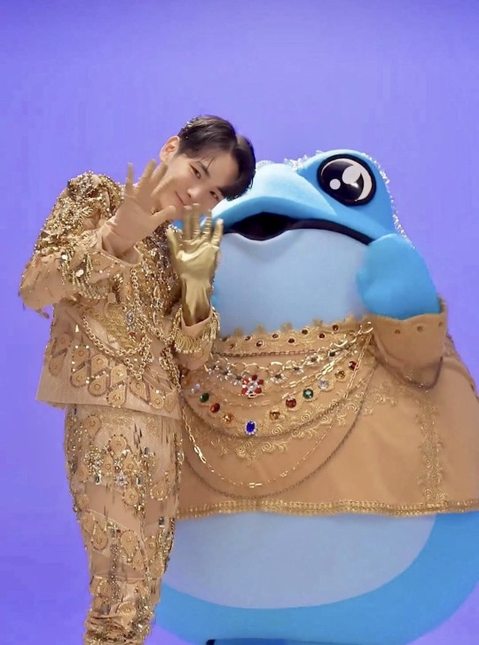
I love how scaled-back but accurate the frog's costume was.
Through the magic of the Jinro frog, I found the answer to the question “where were the chains tacked?” Here. Enough that they still have independent swing and look natural, but frequent enough to keep them from smacking him in the face. Based on the way they move, I think that is metallic coated plastic and not actual metal. Also, for safety's/comfortability's sake! You don't want to be thumped in the chest with every move.
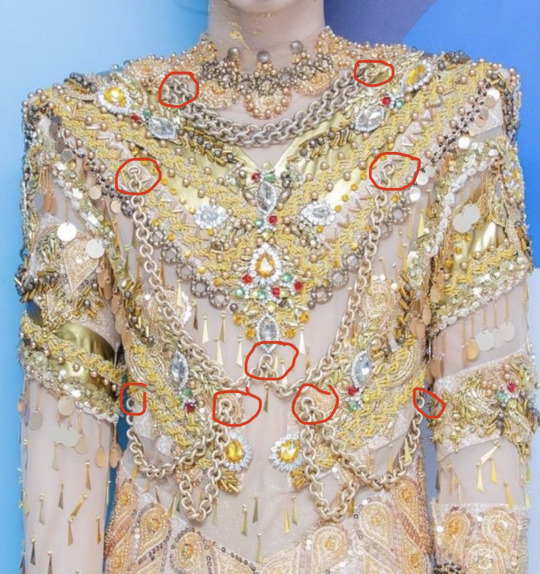
Here's where the chains were tacked
Someone asked me how much they thought this costume weighed. My answer?
I really have no idea…but probably not NEARLY as much as it looks? I'm like 99.9% sure the chains aren't actual metal. I’m not sure if the “jewels” are glass or plastic. The tiiiiiny “seed beads” and "bugle beads" are glass, but there aren’t enough that they would weigh a significant amount. There's a lot of gold braid on there that's very lightweight. A lot of what you see are layered appliqués with sequins and seed beads, which weigh nearly nothing. The dangling paillettes are just a light plastic.
For the garments themselves, as we’ve established, the are a few layers of fabric and mesh, which aren’t very heavy. Because of the “encrusted” nature of the ornamentation, of course, it still weighs a bit more than just a regular top, and is probably kind of rigid on the front. However, it’s not like he’s dancing around in chainmail.
Lastly, there are his gloves. His left one is made out of that heavy gold stretch fabric that was incorporated into the rest of his costume, and his right was also made out of a flesh mesh. From the way it behaves in this photo, it appears to be a much heavier mesh than the top and trousers.
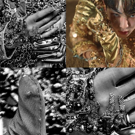
The right glove has thicker mesh that almost appears to have a natural fiber content that is getting snagged. It doesn't completely conform to the skin like a tight flesh mesh would.
The gloves are heavily ornamented with appliqués and beads. I’m going to guess that these were actually custom made for him, which is a big deal. I know very little about glove making, except it involves a TON of pieces to be done right. Gussets in between the fingers to make them slim and elegant and such. No Mickey Mouse hands here.
Stitching the ornamentation on to gloves is pretty difficult work. You either need a hand form and a curved needle or a very brave stitcher who uses their own hand as a form (palm up.) I haven’t done that for gloves, specifically, but I have been a “sacrificial hand” for other situations. I’m so calloused in most places, I don’t really feel much anymore!
There’s one more aspect to this costume that was seen in the intro for his Gasoline Inkigayo performance: the cloak. He didn’t wear it for very long, but it appears to button across his chest to the other shoulder with snaps underneath. The snaps keep the underlap from peeking out from…under the lap.
It looks like they might have had a wardrobe emergency here, because you can see that two of the three snaps were hastily stitched on with red thread. The ornamentation is asymmetrical, mostly focused on his right side. On his left shoulder, there is a decorative beaded “epaulette.” Those are the ornamental shoulder pieces you often see on military dress uniforms.
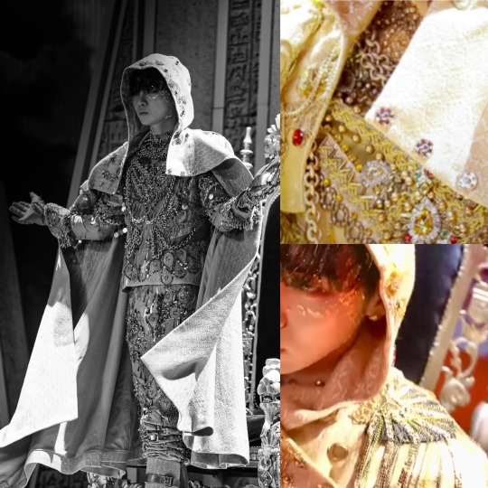
Left: The full cloak. You can see the facing on the inside edges, made of the same fabric as the outside. I'll write about that in a bit, and I'll show you a closer view later. Top right: The red thread holding on the upper snaps. Bottom right: Metallic epaulette.
It’s hooded and made out of the same jacquard fabric as the rest of his costume, and it has a satin lining the same color as the “fashion fabric.” It appears to be about calf length. One of the photos I found actually has a shot that shows the facing, the lining, and how the hem is done. Of course, I nerded out. It’s “self faced,” which means that there’s the same fabric that’s on the outside making up the “facing.” The facing is the first ten inches or so of the inside edge of the cloak. It makes a pretty transition from the outside to the inside, without a harsh switch to lining.
Then, there’s the hem.
While attached at the top, the hem of the lining and the outer fashion fabrics are allowed to “hang out” separately while on a dress form. Because fabrics stretch out at different rates (and it also changes by the direction they’re cut from the fabric, but that’s a whole different lesson…) it’s ideal for something like this to hang on a dress form and do its thing for a day or so.
In an ideal world, you’d have a fitting with your performer and you would mark a “level line” on them while they’re wearing the cloak (and also the shoes they will be wearing. Different shoes can change a lot!)
There are several different ways you can mark a hem. You can safety pin it up the way you want it, using a ruler measuring up from the floor to keep it even. But this can be awkward and clunky.
Or you can safety pin a “level line” and say that it’s, for instance, 18” off the ground, and you’d like the hem to be 16” off the ground. You’d draw a new hemline 2” down from the pins. It's the easiest way to know what's level and then decide exactly what you want to do later.
OR you can use what I call “the poofer” which is a little measuring stick on a tripod with chalk and a rubber squeezy ball that poofs chalk into a line at a set height, instead of dealing with pins. But sometimes the chalk doesn’t like to brush away, so that’s a bit of a risk in exchange for convenience.
First, let’s talk about hemming the outside cloak fabric. Because it may have stretched out unevenly, you may have wildly different hems lengths now that they’ve been “leveled.” Let’s say we’ll leave 6” of “hem allowance” to fold up into the garment so it can be lengthened later if we need to. You’ll trim the rest of it away. I can’t tell you how many times I’ve altered hem lengths on cloaks over the years! I'm always grateful to have extra.
You may want to finish the hem with a “serger” or “overlock” machine, which is the sewing machine that uses 3-4 threads to sew things, often stretch, together and kind of seals off the edges. It’s probably what stitches together the side seams of your t-shirt or hoodie or lounge pants or basically anything stretchy. It’s used to keep hems and the edges of fabrics inside garments from fraying. Sometimes people don’t do it, especially since it's inside, but it’s nice if you’re planning on altering it or if the fabric is really prone to fraying.
The cloak fabric is then thoroughly pinned and hand stitched up. There are many different sneaky stitches which grab a few threads at a time from the front of the fabric and are virtually invisible. Everyone has their favorites. My personal favorite is the “vertical hemming stitch” or “vertical blind hem.” I like it because it holds the inner hem and the outside of the cloak more tightly together than a lot of other styles. The “cross stitch” which is called the “blind catch stitch” here in this diagram is one of the most popular methods. However, I feel it can be a bit too loose some times and is more likely to be caught on something. The one downside of the vertical blind hem is that, if you pull it too tight, it’s more likely to show from the outside. It takes a very sensitive hand to get it right. The lining is usually slip-stitched to the cloak hem.

Once you’ve got your level line of your fashion fabric, it goes back on the dress form. I’m…not entirely sure I’ll do a good job explaining this because I work best with showing things with points and grunts. My apologies.
You mark the lining to match the level where the hem of the fashion fabric ends. You decide how far up from the bottom of the hem you want the lining to end (in this case, 4”.) So normally, you think you'd fold it up 4", right? Ha! You subtract two inches from that number. This means you’ll be folding up only two inches of lining. But, since we will be stitching it 4” up from the hem, that means there’s a floppy extra two inches. (Cue Advice.) What’s that for? Now I have to tell you about “jumps.”
Jumps are a sneaky trick. This method is used in suit coat hems and sleeve linings as well. Basically, they’re a way to give a little bit of wiggle room with the length of the lining to hem interaction.
After the fashion fabric is hemmed, you hand stitch the lining 4” up from the hem. You have two extra inches of lining. One extra inch of lining is pressed down so there’s an extra inch of “underlap". This photo (top right) showed me that they had done this to Key’s cloak. You can see it stretched out with the pressed line on the left, and it is folded over on the right.
Left: The "self fabric facing" at the center front inside of the cloak. Top right: The cloak hem showing the underside of the "jump" (left) and it down in its "resting" position (right). Bottom right: the "poofer." They're marking a level line.
If you want to get even MORE granular, that is considered a “soft press”, which means that the iron steams and very lightly rests on the fabric. A “hard press” is what it sounds like. Squish that lil dude and steam the heck out of it. That line is never gonna come out.
Okay. Enough of that. I can’t believe myself.
I could literally discuss this costume inch by inch, but I think I’ve covered it enough that you can peruse it yourself if you’d like and kind of know what you’re looking at.
I deeply admire and respect the, perhaps, 100+ hours of craftspersonship that it took to make this stunning costume. Don’t even ask me what it cost to make!
Do check out the Instagram of @denicheur.official where you can see other costumes they’ve worked on for groups like IVE, Enhypen, Stray Kids and more. They’ve got an amazing portfolio to drool over.
I hope you’ve gained an even greater appreciation for this gorgeous look, and the knowledge you’ve gained here can go forward with you as you enjoy future costumes! And thanks so much for sticking with me. I hope it was worth it!
#Shinee key#Key shinee#kpop#kpop costume#kpop costumes#Key#shinee#costume design#costume construction#costumes#gold costume#costume analysis#fashion analysis
50 notes
·
View notes
Text
Kibbe Observations
Theatrical Romantics often have distinct husky voices. Morgan Fairchild, Jane Seymour, Salma Hayek, Mila Kunis (if you watch Black Swan you can listen to her speak at a lower pitch, people who have husky voices sound shrill when they speak at a higher pitch which is how Mila usually speaks)
I feel like every Kibbe type has a few celebs who intuitively always dress for their type and a bunch of others who absolutely never do lol.
Sofia Vergara, Kelly Brook, Ava Gardner, Christina Hendricks etc are Soft Dramatics who almost always wear their lines.
Salma Hayek, Joan Collins are TRs who pretty much embody TR glam most of the time.
3. Kibbe is based on vibes someone gives off, more than you would think. There are certain criteria that has to be met for each type but there are exceptions, always!!
Audrey Hepburn was 5'7 but she's a true Gamine. It's rare to see a tall Gamine but it's not impossible
Beyonce is also 5'7 but she's a Romantic even though most Romantics are short.
4. Kibbe is about image identity. That means the image you project. You can analyse the length & breadth of someone's shoulders & calves all you like but your image identity is MORE than that. I'll use an example. Mila Kunis & Sarah Hyland, pretty much look like sisters yet the vibes they give off are different.

Mila Kunis has a very sultry, sensuous "femme fatale" essence (she's verified TR) but Sarah Hyland has a more innocent but kind of mischievous, more youthful vibe. You can easily see that Mila has a more "dark feminine" energy whereas although Sarah has similar coloring and features, she still feels more light feminine.
Here she is in a very TR-esque outfit but something feels off
This outfit would look really weird on a lot of people (a tutu skirt for God's sake 😭) but she looks good in it

in this dress however, she looks like a kid who wore a grown up dress. her youthful vibe contrasts the heavy romantic vibes of this dress

However, here she looks like a complete doll. again, this look seems to suit her in a way it wouldn't suit most people.
This dress is a little too intense for her.
However she looks great here!!
I would say she's Soft Gamine
She has Gamine essence and it's the kind of styling that looks best on her
Let's compare her to Mila Kunis now
Mila, kinda looks like she's wearing a costume here. It looks very off.

Here she's in a very Romantic outfit with a dash of glamour and she looks greattt
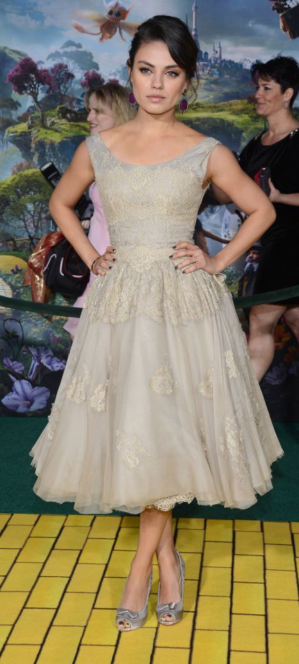
Tea length dresses only look good on Gamines imo and here Mila looks very out of place
despite being very short, tea length dresses, even in a more Dramatic style, does not seem to suit Mila

Here she is, in a very TR look and it really harmonizes all her features and attributes.
this dress would be more flattering on a Natural type but Mila does not look like herself here
aside from the fact that this dress needed some ironing, this is probably the most TR look Mila has ever worn and it really makes her shine
5. In order to be SD, you need to have a T shaped silhouette. Broad shoulders, small waist and proportionately small hips. SDs are not "tall TRs".
6. Sofia Vergara & Joe Manganiello are my SD power couple

its sooo easy to tell that they both have similar essences and project a similar image
however, here she is with her former fiancee Nick Loeb. Sofia's overpowering Dramatic essence makes her stand out and she almost looks out of place next to Nick, who is FN. Their essences clash with each other and make them kind of awkward looking together.
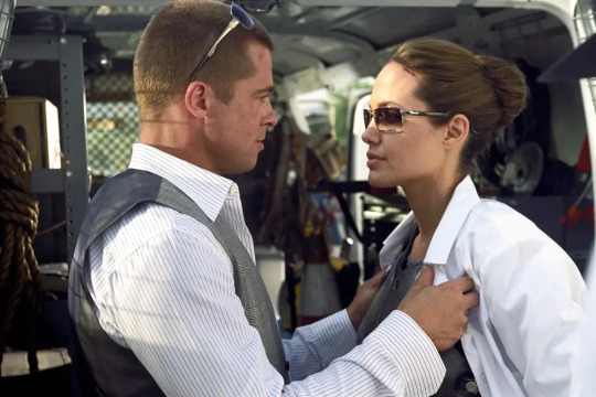
There is a meme about how Brad Pitt imitates the women he's with. Let's see how he channels his different essences with different women.
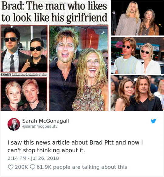
Angelina Jolie & Brad Pitt are both Naturals (FN & SN) with Dramatic/Romantic essence
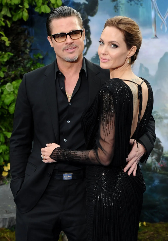
Together they project a very larger than life, powerful, strong and intense vibe

Here he is, with Jennifer Aniston. as a couple, they project a more grounded, couple-next door, warm vibe. they're like the cool couple on a college campus, two hot people who look good together but in a very earthy, grounded way. Jennifer Aniston is also a Natural (SN)
Brad has Dramatic essence however Jen is pure Natural. so while Brad can pull off a more intense styling, Jen would look kinda out of place in it.
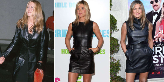
The dress and leather in general is too overpowering on her

However, she really shines in outfits like these that let her true essence be reflected. everybody, especially in the last couple of years, has been imitating Rachel Green (and 90s style in general) but imo, its most flattering on Naturals because of the way clothes were designed in that decade.
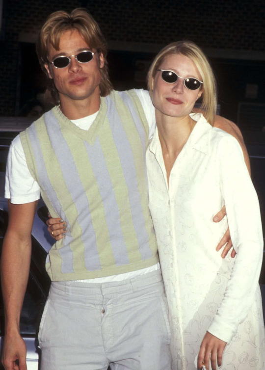
Here he is with Gwyneth Paltrow. Gwyneth is yet another Natural (FN) but she has Classic essence. The thing about possessing Classic essence is that you have a perfect yin-yang balance, so nothing stands out individually since everything blends together perfectly. Brad & Gwyneth together sort of bleed into each other, their essences don't contrast each other in anyway, they almost look like siblings😭😭😭 , there is no visible polarity at play.
Brad was with 3 different Natural women yet they all projected a very distinct vibe because of their very different essences.
7. kibbe is about image and how other perceive you. its futile to obsess over width and breadth and circumference and what not. dont miss the forest for the trees. also, there is a lot of variety within each type, not all Soft Classics look the same and not every Gamine is going to look great in tea length dresses. every individual is unique.

Amy Adams is FN but she's only 5'2. imo, she has a blend of Natural+Classic essence.

IMO, she was horribly miscast in Enchantment. She does not possess the wide-eyed, gullible "ingenue" essence necessary to play a lost princess. i just wasn't convinced that she's this naive, innocent princess because Amy exhibits a more world-wise, mature and "no-nonsense" vibe.
be it in American Hustle, Arrival or Sharp Objects, she plays characters that seem to fit her like a glove. She's just very convincing in these type of roles because she seems like a grown up who knows what to do and how to get things done. She does not have the air of a ditzy, confused damsel in distress
here's Isla Fisher. i specifically chose Isla because her & Amy kind of look alike but their essences are vastly different from each other.
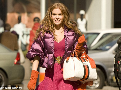
Isla is a verified Romantic and has Romantic + Ingenue essence and she's perfect in films like Confessions of a Shopaholic because she's convincing as a ditzy airhead who is slightly naive and very confused. (this being one manifestation of the ingenue essence) if you look at her career, she's by and large done a lot of romcoms. It's hard to imagine her in a show like Sharp Objects or a movie like Arrival because the image she projects is far more youthful and sweet.
8. there is a reason why kibbe has its roots in old hollywood. old hollywood studio system manufactured stars the way kpop companies manufacture idols today. the were assigned an image to project and each star managed by the company had their own unique appeal that set them apart from the rest. lauren bacall projects an aura thats entirely different from audrey hepburn or marilyn monroe. liz taylor is completely different from gene tierney. most big stars in those days possessed Dramatic essence, simply because Dramatic essence makes people stand out easily. its a very large, strong, intense essence and gives the individual an edge. but the market created space for all kind of stars, there were actors who had a more boy/girl next door aura, femme/homme fatale aura, a quirky,funny aura and more. these days, cinema in general lacks big stars. imo there hasn't been a truly big star in maybe the last 20 years or so of cinema because no one's projecting an image that appropriately fits them.
however, pop music has had many icons and a huge part of their success is their image. be it taylor swift or nicki minaj or even BTS. people connect to them because they have a stable image identity for others to connect to. they have lore, they switch things up and keep things interesting but there's a bedrock that is unchanging and thats what makes them "stars".
#kibbe#kibbe observations#kitchener#david kibbe#essence theory#style essences#fashion analysis#style analysis#fashion#discussion
132 notes
·
View notes
Text
The issues (and non-issues) of bimbocore
This little discussion is coming off the back of a thought (rant) I shared on another blog a few weeks ago, largely where reinvented bimbo started compared to where it is now and why is everyone blaming Chrissy Chlapecka?
the resurgence of the 'bimbo' aesthetic in the early 2020s embarked as a movement of reclamation, a way to assert that there was actually nothing demeaning about a barbie-esque appearance and to remove the power from stereotypes used against us, essentially centring the Bimbo in a queer, left-wing ideology.
If you were to ask a modern Bimbo why hot pink? Why bedazzled? Why perform this exaggerated caricature of femininity? You might end up in a seemingly unrelated discussion about the modern Western political landscape. Bimbo culture has essentially emerged upon the heels of the controversies surrounding feminine experiences and bodily autonomy across the United States- women feeling that they are being confined to a specific performance of femininity, that the government is regulating their femininity, may tell you that the idea of bimbo culture is a satirical backlash to the ideas of what a modern Western woman should be and what she is expected to be. She is nothing more than a doll to the culture that surrounds her and her response is to take what is expected of her and make it a performance a juxtaposition of what she is expected to be and what she is and make them hate her for the femininity she is presenting. And thats exactly what Lauren Pantin said in her short update newsletter - ' If you’re going to punish me for being a woman anyway, I’m going to be the silliest, brattiest, potty-mouthed no-no of a woman you’ve ever seen. I’ll be the dumbest bitch on earth! Where’s my crown!"
Ask another bimbo and she'll tell you that her bimboism stems from the movement to satirise consumerist culture and misogyny, aiming to remove the stigmas around hyper-femininity. Essentially, allowing women to empower themselves through their femininity (rather than the popular idea of in spite of their femininity cough cough inlog cough) and giving women ownership over their sexuality and their body in ways that actively combat the misogynistic standards held against them- oftentimes gearing it towards queer people. It's a new-wave feminist movement designed to avert the male gaze through women appearing as these caricatures of traditional femininity whilst emphasising their own dominance and independence as support for women's right movements.
So it's a kind of sartorial rebellion against oppressive politics and culture? Well, it was at first. And to many it still is, however, as with all trends rooted in a sartorial culture the meaning tends to get lost in the shares and reposts as it expands across social media. Those who just happen across the culture or see nothing but images of it scattered across the internet arent likely to understand that this aesthetic is also a political performance, it will become a bimbo resurgence!... but not effectively hold the same weight and meaning that the movement was intended to hold.
One way to look at this is the trend of " girl [activity]" . Trends like girl maths, girl dinner, explaining things to the girlies. Now let me get it straight theres nothing wrong in finding a little fun in these trends- girl dinner was cute, as someone who loves cooking I loved seeing what everyone was making for their dinner until it got overrun by the 'I only had iced coffee today' brigade. Sometimes I'll see a girl maths video about how if I pay in cash its basically free since the number on my bank account didn't change and I laugh because thats logic I have applied to purchases before. There's little funny things and behaviours that people will have in common, and they're being labelled as 'girl [blank]' because it is predominantly groups of women discussing them and finding a little fun in it. But again, as trends reach a wider audience their initial intention becomes lost along the way and generalisations start to set in. TV shows and radio hosts have entire segments explaining girl maths, it has become cute and quirky to explain political landscapes in terms of shopping and makeup, and bimbo culture has become less of a satirical performance and instead commonly assumed as a Karen Smith- esque personality reminiscent of the 'dumb blondes' of the early 2000s.
Removing this sartorial protest from its context can be seem as damaging, especially in the way that social media currently presents aesthetics surrounding sexuality to young people. As bimbo culture reaches a wider audience it's likely to fall into the hands of young people who are, let's face it, not going to care about the deeper meaning. Young people are likely to see celebrities, tiktok personalities, attractive people in general donning their hot pink promiscuous outfits and feel inclined to join in on what is presented to them as nothing more than the newest fashion trend.
One of the key movements of bimboisim is to embrace feminine sexuality and overcome the stigmas about women expressing their sex and sexuality and sartorially this is represented by the micro mini skirt and the skimpy shirt. Society has had no difficulty pushing teenage girls to grow up rather quickly by presenting them with teen magazines in the y2k era talking about how to get a bigger bust or butt, social media promoting the attractive body type the attractive face the attractive makeup the attractive style of clothing that will settle their pubescent insecurities and validate them in the eyes of a society run by men. Young women are ridiculed for their bodies not being developed enough at 15, for not being sexually active at 16, must have lived the life experiences of drugs and alcohol and sex and heartbreak at 17 and are then turned into high school girl fucks random guy porn at 18. Removed-bimboism has become part of the problem in which young girls not only feel the need to dress promiscuously and express a sexuality that they still haven't fully explored in order to feel validated as an active part of society but also have to present themselves as stupid in order to seem funny cute and quirky. The idea that women are only able to understand complex theories if they are presented in terms of fashion and shopping and makeup is a stereotype enforced by tv and movie comedy that women have worked endlessly to overcome, and the reclamation of bimbo culture should not actively counteract the progress of feminist activity. You don't have to be smart to be a modern bimbo by any means, in terms of intelligence the movement is centred around a more relaxed approach to success that counters the ideology of the girl boss movement- you don't HAVE to be a huge success or overwork yourself to hell and back to validate who you are as a woman.
Modern bimboism set out with the comfort of knowing there is no pressure to understand everything, you might need something explained in your own terms, you might just be a little fucking stupid sometimes but there is no active harm in not always understanding. That, however, has been twisted through these trends discussed prior to make it seem like all bimbos (and by misogynistic extension, all women) are just not as smart as men. Which, as we know, is likely to be emulated by young people as it reaches a wider audience.
So it's understandable why there is concern over bimboism. But at what point does critique of bimboism begin to drift into the right wing? Blaming women who dress provocatively simply for being women who dress provocatively is not the answer, in my opinion, to the issues with the bimbo culture. There is (to the chagrin of many) nothing wrong with an adult women expressing the ownership of the sexuality that she was granted the right to express through the liberation of women, sex and queerness.
Tensions have been rising within more radical groups, or groups who are of the tendency to reject feminine presentation in regard to what they perceive as an active threat to the reputation of women. There has been a desire expressed across social media sites by these women that 'all women' should refrain from direct expressions of femininity and reject all social norms expected of women under the assertion that it 'makes us all look bad'. There is a lot to be said about the ways in which misogyny utilises stereotypes and generalisations of what is considered 'feminine behaviour' to degrade women, however, it is highly pretentious and internally misogynistic a notion that the very idea of feminine expression is to be at fault. The ideology begins to attack individual women, expressing that their online content is to blame for the ways in which men treat women, or that children have become so oversexualised.
In a way this reflects the puritan standards of online censorship frequently weaponised by the right wing in order to oppress further marginalised groups. 'Think of the Children' has been used time and time again as a way to bastardise protests of queerness, of sexual liberation of racial equity and it is being weaponised now again just as it was across the 70s against women who dare to be 'immodest' . It goes without saying that people who create content online are not responsible for the actions of teenagers who in the midst of discovering their sexuality, may seek out more mature content- not just for sexual gratification, but a newfound interest into how adults express their sexuality as a way to help them navigate expression themselves. To place limits on how women are allowed to dress or express sexuality is to revert to the ideas of puritanism that existed prior to the (well, partial) liberation of the marginalised people.
Is bimbo culture perfect? No, it's been washed out as a mimicry of early 2000s internalised misogyny. Is it worth hating on random women? No, there issue is more centred to how misgyny is so deeply rooted in our society that we are happier to blame women for the stereotypes forced upon them than to actually comment on how society cultivates these ideas.
#bimbo culture#bimbocore#fashion commentary#fashion blog#fashion style#tiktok trend#fashion analysis
41 notes
·
View notes
Text
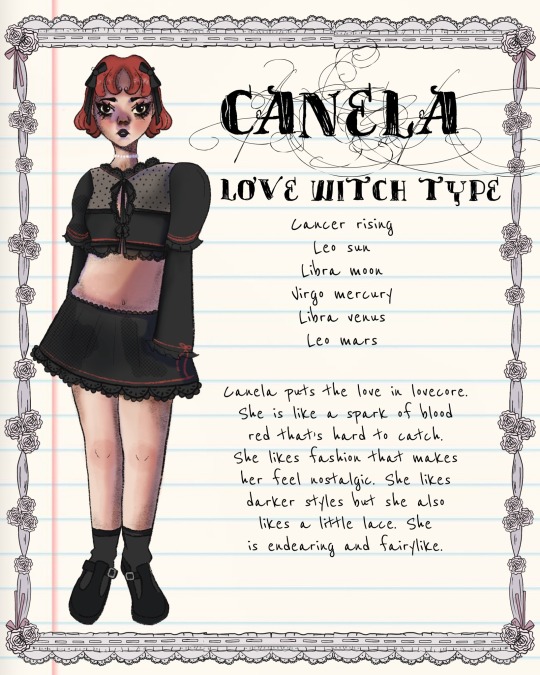


i got this commission as a birthday present last year from a friend!
it was made by @grimreapergal on ig
#zodiac chart#zodiac#chart analysis#leo#cancer#libra#love core#fashion#coquette#cancer rising#libra venus#leo sun#fashion analysis#betsey johnson#satin and lace#rococo#leo aesthetic#libra aesthetic#cancer aesthetic#i’ve wanted to post this forever#it’s so cool#very accurate
27 notes
·
View notes
Text
VADD Fashion Analysis 5: OG Penelope's dress(again)
Link to Part 2, which was also about this topic
im backk!!
Alright so, we can all still agree that her dress is pretty... uh, ugly
(Screenshots from Chapter 101 btw)
The dark purple bodice extends too far down to her mid-thighs. It also isn't doing her body any favors, as well as being EXCEEDINGLY PLAIN.
I mean, come on. This is OG Penelope we're talking about. She's the one showered in jewels, who goes out shopping on the daily like a maniac. Do you really think she'd wear this dress multiple times, enough for the game devs to think "Ah yes, this dress is perfect for the luxurious villainess"??
It, again, doesn't suit her. To be honest, I've tried redesigning it a couple of times, and I always start by taking off the ribbons and changing the skirt somehow. The sleeves, as well. All of them work "fine" alone but together it looks gaudy, which is not in line with the "mature beauty" she's supposed to be.
We know from a panel of her that the flower-patterned skirt isn't structured, so right now it looks like someone tried to pin it closer to her body to make a mermaid skirt, but failed.

(Chapter 75)
Now, consider this: We've seen a similar concept in another manhwa before, but executed perfectly. That's right, ladies and gentlefolk, I'm talking about... Roxana Agrece.(Sidenote, I like "Agriche" more tbh but I'll be using the official spelling T-T)
(Roxana, Chapter 33)
At first glance, most things check out.
Sleeves with a shoulder puff but flare out at the elbow, a dark/monochrome skirt that flares out, and a purple bodice/overlayer with ruffles around the shoulders, and even an additional layer poking out from the ruffles. The bodice on Roxana's dress technically reaches her mid-thigh as well.
(Roxana Chapter 34, VADD Chapter 4)
Additionally, Roxana wears an elaborate choker, while Penelope's is a simple leather band with a turquoise gem dangling from it. Roxana's dress is also studded with jewels and pearls. It also has a pattern with the seams reversed and highlighted with black.
Let's be honest, I've been looking more at Roxana's dresses while writing my own fic, Shrike, for inspiration(one of Penelope's dresses is an unintentional twin to one of Roxana's, discord moots iykyk), and the extravagance and maturity of Roxana's style suits what was described of OG Penelope, but something we don't see in the manhwa.
I love SUOL-nim's dress designs, but sometimes I think they're lacking in the extravagance that they're supposed to have. Either that or Siyeon has been having Emily pick out the least flashy clothes(which why would you even have that if you could be dressed in extravagance).
In my opinion, I think OG Penelope would wear gloves, especially given that Emily continuously stabbed her arms with needles. Long sleeves as well— it makes no sense that no one noticed when Penelope wasn't doing much to cover up her wounds.
Even Siyeon used gloves to cover up the needle marks.
Long sleeves as well, using the same logic. In particular, I also really like how the pattern for Roxana's dress was on the bodice while the skirt was left minimal(with rose embroidery and the emphasized seams of the gored panels), which drew more attention to her upper body.
On the other hand, the busyness of Penelope's skirt draws attention downwards, to the awkward, curtain-drape-esque quality of her bodice T-T.
This feeling of maturity is also why I wrote about og!Penelope parting her hair in a side part in Shrike(I swear I'm not lifting everything from Roxana pls)
#lysia's posts#scrutinies#fashion analysis#villains are destined to die#vadd#death is the only ending for a villainess#death is the only ending for the villainess#ditoeftv#penelope eckhart#original penelope eckhart#og penelope eckhart#og! penelope eckhart#og penelope#roxana#roxana agrece
75 notes
·
View notes
Text
Logan costume make brain go 'BRRR'

Not even gonna lie, this is like, one of my fav looks for Logan ever. It really captures him. As a skirt-over-pants enjoyer myself it really works for him, like the preppy vibes of the skirt mixed with the comfort & familiarity of pants. The navy sneakers that are just *slightly* unfashionable, like he gets his fashion inspo from a magazine that takes a few months to print and release- opposed to the Hot New Trend Cycle on social media. The sweater vest is Incredibly Logan core- the Navy matching the shoes, once again the Preppy/ private school sort of feel that really matches Logan's vibes.
This outfit is an absolute 10/10, not just as an outfit, but as an Expression of Logan !! I honestly loved costume design so much in Uni, and like !! The thing I love about this is that it isn't asthetically as 'clean' and therefore appealing as this outfit COULD hypothetically be, BUT that it represents the character so, fricking WELL is what I enjoy about it~!
14 notes
·
View notes
Text

Comparing them looks like two separate tones
#The 2nd one looks like she's more comfortable with her style while the first is her trying to fit in#my fyp#rugrats#all grown up#kimi finister#kimi watanabe#kimi finster#outfits#fashion analysis#2000s cartoons
16 notes
·
View notes
Text
Someone PLEASE do a moderngurlz style analysis of the outfits in Bryce
3 notes
·
View notes
Text
My Style Analysis: The Woma(e)n in Black (and White)

Okay we are going to go there. This kilt and color scheme and aesthetic has a lot of history as Devi joins her sisters in in prep and B&W and let's just say they'd all agree with Devi: being a woman in this society is a fucking trial.
Let's meet her sisters across space and time:
The #girlboss trying to start a group for women in tennis and fighting to get them to be taken seriously.
The Copy Chief who is dealing with her drunk ass boss, her relationship with another boss, the death and funeral of another boss, her colleague/friend coming on to her when he's high and in deep mourning, and catching him in a compromising position.
The long-suffering wife who sacrificed her career...and had to work in a department store all for the ego and whims of her King Baby (thank you Melanie Hamlett for this term) comes back to her old workplace to help them steal their own property and start a new agency.
The young former intern being assured by her boss/lover that nothing bad will happen to her and her life will go on like nothing happened...famous last words

The girlfriend of the BMOC who is ambivalent about her relationship with him and still mourning her friend's death and gets drunk at a high school party while dressed as the sex worker in Risky Business
The young girl who was disturbed by a robber claiming to be her father's childhood nanny and believed her almost, because the woman figured some things out and because the girl knows nothing about her father.

The high schooler who is aiding her friends in investigating a real cold case in their town and finding that her affections for the young man next to her are being reciprocated but not in the way she wants.

The Princess who is in the middle of a messy separation from her Prince (who will surely weaponize his affairs against her) and makes a statement by breaking protocol and wearing a body-hugging, cleavage-y, off the shoulder black dress with a dramatic sash at a public event and becoming a fashion icon.
Let's get back to Devi, with bullet points because everything is...
After a summer where she is ghosted by the boy she lost her virginity to...
She is prepared to kiss the ass of a totally male-identified woman who likely was whooping and hollering when she heard Roe V. Wade was struck down just so she can go to the traditionally patriarchal institution of Princeton (which started letting female undergrads in 1969, not 1869).
After buttering her up with her mixed up prints (likely a reflection of her moods) and modest neckline/hemline combination (her armor to avoid getting pierced by this society), she finds that boy (who she really loves) with another girl.
She and this girl get into it and we become witness to a sad fact: fabulous ass women fighting over some piece of man.
Keyes (the male-identified older woman) faints hearing this news that the student she put on a purity pedestal actually lost her virginity and named the details of the boy's family jewels and Devi gets blamed for the fainting
Joan? Peggy?

After being made to feel like, to quote our fabulous redhead "a helpless, stupid little girl" by her mother and the school principal and Keyes and piece of man, she runs to her therapist who actually gives her sage wisdom after Devi reveals that the ghosting made her feel like something is wrong with her, like she isn't enough for him (same here girl *crying and screaming*). Hence the conservative preppy look was armor not only to impress a sexually repressed woman, but also to protect her body after she bared it for him, it made sure to hide her pin-up (another woman Keyes looks down on) worthy curves.
Dr. Ryan tells her nothing is wrong that she is an extraordinary young woman with real beauty and to vent in a journal about this girl (which end up getting read by said girl and earns the label of "too much" from said piece of man). Maybe some rare wisdom is needed for Devi from Don Draper

Time to mentally give that boy (who will eventually man up and own his feelings to you again) a good kick in the pants like the soldier you are Devi, because you have joined a legion of women fighting for their lives and dignity under the patriarchy, after all:
"They shouldn't have given us uniforms if they didn't want an army." June Osborne, The Handmaid's Tale
#women in media#never have i ever#costume analysis#fashion analysis#black and white#patriarchy#devi vishwakumar#sally draper#jasmine flores#joan holloway#peggy olson#princess diana#nancy wheeler#gladys heldman#sarah silverman#maitreyi ramakrishnan#kiernan shipka#natalia dyer#elisabeth moss#elizabeth debicki#chirstina hendricks#jessica marie garcia#monica lewinsky#beanie feldstein#1960s fashion#1970s fashion#1980s fashion#1990s fashion#2020s fashion#the handmaids tale
6 notes
·
View notes
Text


i think about clothing waaaayyyy too much so heres a mini fashion analysis! ava is wearing black with white accents janine is wearing white with black and red accents demonstrating them being on opposing sides ie district vs school principal but not being quite on the same page yet still complimenting eachother visually
#im sorry im literally so crazy about clothing and colora#i hope they were as intentional about this as i think LOL#ava coleman#janine teagues#analysis#fashion analysis
19 notes
·
View notes
Text
Quick little ramble about Sylvie’s season 2 appearance
.
.
.
.
I find it interesting how Sylvie’s outfits in season 2 reflected her character. Keep in mind, this is my personal interpretation of her costuming and will therefore include personal thoughts on her character in season 2 overall.
In the post credits scene of episode 1, we see Sylvie all ragged and brushing off her injuries after the whole HWR situation, complete with messy hair and an eyebrow injury. Despite her appearance standing out quite well in an 1980’s McDonald’s, Sylvie is ready to try everything; new food, new opportunities, a new life.
Episode 2, we see her in the standard 80’s McD’s uniform, looking happier than ever (complete with an amazing new hairstyle). But it’s not until she has her jacket on and after she finds out what Dox is doing does she shed the “skin” of her new life, akin to a snake. Underneath the uniform, she’s still wearing her outfit from season 1, just polished up. It serves as a reminder to Sylvie that at the end of the day, even if she changes her name, she’s still a Loki variant. She’s inevitably gonna have people come after her due to what she has done. In a way, her jacket is like the cloak she lost on Lamentis-1.
Episode 5 is when she changes appearance again when we see her get sent back to her timeline. Her top from season 1 is gone, replaced with a grey shirt. She’s no longer attached to the “Loki variant” name the TVA branded her with. She’s now Sylvie who works at McD’s, and is a regular at a bar and relatively quiet record shop. (This grey shirt can also be used to represent her as a “gray character”; yes, she killed HWR and doomed everyone, but she did it for a cause, a mission she intended to complete from the start to ensure variants like her wouldn’t lose their lives and homes as well.)
And this is carried on to her in the final scene of the show; she’s not wearing the season 1 top when talking with Mobius, she’s keeping the gray shirt. She’s finally free from her life as a Loki variant, and is now her own person free to wander the multiverse.
But hey. That’s just a theory. A fashion theory.
#ramble#rant#sylvie laufeydottir#sylvie loki#fashion analysis#clothing analysis#I honestly don’t know what I wrote 😭#I’ve been wanting to ramble about her wardrobe for a while#Sylvie defender
4 notes
·
View notes
Text
hey….wait a minute….
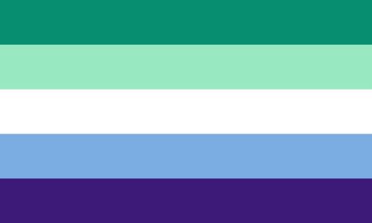
#excuse me?#mike wheeler#gay#mike wheeler is gay#mike queerler#byler#fashion analysis#mike wheeler analysis#This has been brought up before I just felt like putting it into order in one photo
23 notes
·
View notes
Text
Victoria's Secret Rebrand and the Selkie example
This is something thats been in the works for over a year now- a lot of commentary surrounding the VS rebrand has focused on largely fatphobic and body exclusive critique which is not the perspective I believe should be taken towards criticism of the rebrand. This discussion will focus on the idea of the 'angel', why people are upset with the rebrand and why people SHOULD be able to critique it
The popularity of Victorias Secret has been declining to the point of near irrelevancy in the early 2020s after years and years of criticism for culturally offensive runways, fatphobia, problems with sizing, and pushing their models into severely disordered eating habits in fear of being dropped as ambassadors over half an inch of fat. Things got so bad for the brand that in 2021 they announced plans to change their concept entirely to a more subdued, low-key, neutral collection showcasing their new ambassadors and shifting focus onto the success of these women as opposed to their body type.
The brand of Victorias Secret has been predominantly centred around the fantasy of the angel- women so ethereally beautiful that brings a developed sense of elegance, seduction and glamour to their shows. Part of this desire to rebrand was to escape this idea of the male gaze and this male centred fantasy created by their runway shows in that these women were designed to be the 'perfect' woman oftentimes forgoing the actual opinions of what women wanted to see from the brand. This is where the critique of the new-wave VS collection begins.
Thousands of people have taken to tiktok to spread the entirely fatphobic rhetoric that the reason there has been such little support for VS even into their rebranding because they have abandoned the original idea of the angel.

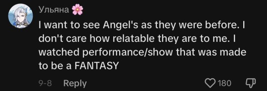


This mindset that models for VS must adhere to a specific image of femininity is not only disrespectful to the women currently involved as brand ambassadors but to the very Angels they claim to defend as hoards of familiar VS Angels including Adriana Lima, Erin Heatherton and Bridget Malcolm have all come out and discussed the ways in which their modelling careers have affected their eating habits and body image, with Lima commenting (same article) that she would refrain from eating solid foods for nine days prior to a VS runway show.
To wish for Victorias Secret to be this unattainable display of the peak of feminine beauty and sexuality is to push the women involved to unhealthy extremes, damaging their bodies to the extent of chronic exhaustion and missing periods due to extreme weight loss . The push for body inclusivity was a desire to see beautiful women represented by all body types but also a movement to protect the women already involved in the agency and allow them to be and feel healthy and glamorous.
so what happened to the glamour? The recent 'my wings my way' campaign has received a lot of flack for its sense of casualness, embracing a new kind of natural beauty reminiscent of the pages from a 90s magazine as opposed to the high feminine glamour of the 2010s era. Similarly, the new VS collective underwear release has focused on more neutral, subtle styles with a large range of nude colours to appeal to all skin tones almost identical to the Dove body inclusivity campaigns from 2017.
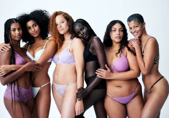

These concepts are both beautiful in design, but the 180 degree turn from the original concept has left fans wondering if the iconic Look of the brand has been entirely abandoned upon its movement to become more inclusive to age and body type. It's a decision that has subsequently prompted more criticism, this time focusing on the ideas of 'why cant my body be glamorous?".
Why did body and age inclusivity mean that the ideas of femininity, glamour and angelic beauty had to be forgotten? Is VS sending the message that plus sized bodies are not sexy? Is this an attempt to cater to 'what women want' without actually acknowledging what women want (again)?
Natural beauty is a wondrous thing, it's something that everyone possesses and that needs to be celebrated- but thats not the point of Victoria's Secret. Brands are allowed to adhere to a certain aesthetic. Brands are allowed to have a target audience based on selling a specific type or style of clothing. Women appreciated VS garments for feeling glamorous and hyper feminine- what needed to change was the ranges of sizes they carried and the way in which the shows were run (and their intrusive in store measuring lets be real) to ensure that all women of all sizes and ages had the opportunity to experience that high feminine fantasy.
That's where Selkie comes into play. For the past two years selfie has presented absolutely phenomenal spring/summer collections at NYFW with models of differing shapes and sizes- and their 2024 collection featuring their first disabled model (whose name I have not been able see featured in any articles on the runway).

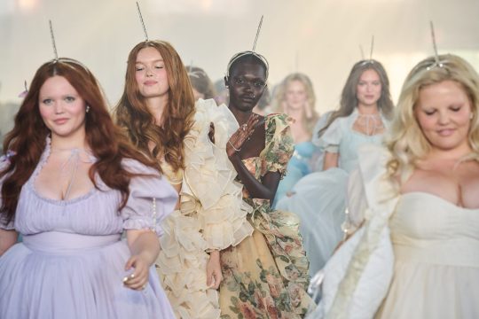
Selkie embodies what people wanted to see of a VS rebrand. Maintaining the essence of who the brand is- for VS as a hyperfeminine, classy and sexy underwear brand- and feeling that fantasy within inclusivity. The strive towards appreciating that all bodies are beautiful should not have to sacrifice the aesthetic of the garments and in such sacrificing the core audience who appreciated and anticipated their designs.
Selkie's work proves that all bodies are mystical and goddess-like and ethereal and embody the fantasy that their audience are attracted to. The angel can be fat or disabled or old and still be angelic. The fantasy of the angel is not held in body type or skin colour or age or ability but in the women who feel it. What was needed of VS was to allow women to feel their angelic fantasy instead of marketing it towards a male gaze through an unrealistic standard of the ideal woman. What was needed was allowing their models to feel beautiful instead of pushing themselves on strict food exclusionary diets to obsessively maintain their weight. Victorias secret needed a rebrand in conduct that didn't sacrifice the identity of the brand. Because let's face it, there was nothing wrong with a glitzy thong.
#fashion blog#fashion commentary#selkie#victorias secet model#Victorias secret#fashion essay#fashion analysis
14 notes
·
View notes
Text
The Cool Economy- An Analysis of Cosplaying as Poor
I wrote an essay about this concept and it got 100% My teacher gave me the ultimate compliment by asking if she could use it as an example paper in future classes. Sooo I've never posted any of my own lengthier writings on fb before but here goes! I'd love to hear what any of yall think!
TLDR is that these are the new major trends in aesthetics and advertisements. We are a culture that is bombarded with advertisements and this compass presents a sort of new visual shorthand. FFO fashion, pop culture, cultural analysis, media literacy, celebrity culture, etc
When celebrity figures do something noteworthy, not only are there tens of thousands of recreation looks and how-to videos that sweep across social media, but there are also tens of thousands of commentary videos picking apart the content with the kind of scalpel sociologists would approve of. One of my favorite TikTok creators in this genre goes by the name of CozyAkili aka Akili Moree. His videos center around concepts of fashion and design that exist along an axis from high to low cost and discuss where they intersect with the concepts of private pleasure versus public display. Within this framework, he evaluates celebrity culture through social media with a special focus on what facets of the celebrity lifestyle they are selling back to us at any given moment and how that lands on this scale. This is important to understand because since we are integrated and inundated we are with visual messages as a society, having a quick metric to make sense of what we are seeing has never been more crucial. This evaluation system is a tool to dissect the subliminal so that we can continue to maintain a watchful eye on the ever growing discrepancy between the wealthy and the working class, or more specifically, how the wealthy use symbols from the working class to blur the line between performing wealth and performing poverty.
The four quadrants of this evaluation system pull from a variety of sources, both cultural and sociological and are each named to encapsulate the spirit of the intersections. On the low cost side of things, we have the concept of Domestic Cozy, reminiscent of the Danish concept of Hygge. Domestic Cozy rejects discomfort, danger, ceremony and deprivation and embraces things soft, luxurious and effortless. This concept was coined by writer Venkatesh Rao alongside its sister concept of Premium Mediocre in his blog RibbonFarm in 2019. Rao writes that these phrases are stylistic fingerprints of the world that act as a sort of instant classification system– a combination of visual symbols where a simple glance tells you how much something is trying to fit in with or eschew the norm (Rao). Within this dichotomy, Premium Mediocre is like bedazzling the norms, whereas Domestic Cozy is indifferent to the norms altogether. Premium Mediocre is the finest bottle of wine at Olive Garden whereas Domestic Cozy is more like a hot cup of tea in your favorite mug. At its heart, the former style is mediocre with a superfluous touch of premium but not enough to ruin the delicious essential mediocrity (Rao). Because these two concepts are rooted in the medium, the remaining quadrants represent the extremes.
High Peasant and Thrift Store Realness both exemplify the other end of this stylistic spectrum. Thrift Store Realness is at the intersection of public display and low cost, covering the bulk of people living to look hot and get by without pretense of fanciness, just casual and classic at low cost. In terms of larger social themes, Thrift Store Realness makes practicality look good but not so flashy that it takes away from its functionality. Things can even be cluttered and a little grimy aesthetically but not in a way that inhibits its undeniable edge– it's the spirit of finding (or being) a diamond in the rough. Think Macklemore’s 2012 hit– “I wear your GrandDad’s clothes. I look incredible.” High Peasant, on the other hand takes a more direct style over substance approach, but one that intentionally grounds itself by marrying the fantastical to the established in an attempt to blur the lines between wealthy and working people.
High Peasant is maximalist and artistic in a way that appears more original than Premium Mediocre but equally lofty. For instance, if Domestic Cozy is a grocery store bag salad eaten out of the bag and Premium Mediocre is eating salads from the “fresh” menu at fast food place in between side hustles, High Peasant is doing a pop up, high concept, high fashion photoshoot inside a McDonalds and salad is the concept. It visually ties the trappings of the working class with the access and privilege of the wealthy. This puts emphasis on the grunge amidst the pastoral to act as a shared language between class lines. Though I am a fan of fashion, there are things about this aesthetic concept specifically that are worthwhile to examine.
High Peasant presentations are ultimately still a fiction. The artistry of this aesthetic lies in making recognizable symbols feel alien and otherworldly in levels of cool but outside of that constructed reality, it also touches on the bitter truth that an ultra wealthy life for most of us is truly an alien concept. Otherworldly is also apt because the wealthy play with visual cues that don’t exist in their world. By playing with trappings of normalcy, in some cases they actually reinforce their otherworldliness– cementing their celebrity in this extremely visual and social world with almost nostalgia-like bait. This explains why some attempts at High Peasant as an aesthetic fall flat to their audiences because their artistic rendering highlights the differences between us instead of unifying us through intention.
While celebrities use aspects of working class culture to make themselves seem approachable, it is crucial to remember that they are not and do not want to be working class– and though the fiction they construct might look similar to something you lived through, at the end of the day your compassion and recognition of these shared symbols is really a way to make you forget how large the inequality gap has grown– to feel familiar and forget the debt that separates us. There is a supreme irony to me in the idea that the best way for brands and celebrities to see and sell themselves or package products to appeal to the masses is by looking poor or by taking ideas from people who are poor or exist within the Thrift Store Realness category.
The contradiction of new things manufactured to look old and articles of clothing priced out of the range of the people who it's modeled after comes off darkly comedic because as Akili points out, “instead of wealthy people lifting other people out of poverty, wealthy people try to make themselves feel better about being so wealthy by acting like they’re poor” (Moree). For wealthy people, the reality of being poor does not exist and maybe hasn’t existed for generations in your family due to the prevalence of nepotism in celebrity culture. Therefore it is a novelty to eat cup noodles when you’ve never had to wonder where your next meal would come from. It is boundary pushing to pose in a dingy house with a busted couch and 70s brown vertical paneling if you are worth $2.1 Billion dollars (Forbes). Moree calls High Peasant cosplaying as poor– cosplay, as in fantasy characters, comic book conventions or some other halloween-esque costume that one can put on and play or act as the character they're dressed as. In these scenarios, their positive gain is the freedom that comes with donning a costume and the spirit of camaraderie that grows naturally between avid fans of the same thing.
Translating this to wealthy celebrities, the gain is similar but often pointed in the direction of commerce. The end result differs on what the purpose of the post is– as so much marketing happens via brand endorsements on social media. The concepts explored by Akili Moree and Venkatesh Rao and other theorists represent the newest pop culture metric to evaluate how social media is used to evoke responses from its audience and what symbols it uses. This evolving framework of media literacy is an important step in being cognizant of the world around us as we become increasingly digital. The commerce piece of the puzzle is one of our current economy’s most obvious ticking time bombs and social media makes it possible to not only see this happen but also to track how its sold back to us.
We are in an era unlike any before. The interconnectedness of the internet and the growing reliance/addiction to social media has opened up a game of uncertainty. In this world, all interested players take advantage of aesthetics to drive participation and compete for our attention– all tracked and monetized down to the millisecond. Shadow marketing practices have existed since the 1980s, where the creators of the advertisement try to sell you something all while making it a secret that you are being sold something at all (Barbaro). Substantial deregulation of advertising that took place in the Reagan Era, as well as the rise of product placement as an overall film trend, and commercialization of two of the primary social media platforms (facebook adding the marketplace feature in 2016 and instagram replacing the home button with the shop button in 2020) has led us to this moment– the ultimate fusion between being marketed to and being entertained (Barbaro). This is the beauty of the chart at this moment in time and the wisdom in listening to those who are young enough to see the veil as it grows alongside them.
With supreme wealth inequality growing exponentially each year it is important every day, every hour, every flick of the thumb to be aware of what you’re being sold and who is doing the selling. The gen-Z/tiktok generation and creators like Akilli Moree are especially unique and valuable to listen to about matters like these because they are the test generation of interconnectedness in society on the level that we live now. They are the first truly cradle to grave internet generation, as they were coming up after most of the large technological advances had already been made. In addition to the technology, they grew up after all the deregulation of advertising practices in the 80s led to the full commercialization and study of child spending habits as a system to control spending habits of Americans on a larger scale (Barbaro). The children, who grew up in the 24 hr ad cycle have grown into young adults unphased by the prevalence of advertisements and sponsored posts in their hunt for authenticity. They came up in it so they are less fooled by it.
If Premium Mediocre is extended legroom on an airplane and Domestic Cozy is bringing your own pillow and blanket to the flight, High Peasant would be buying out your whole row or section but maybe not your whole flight. Thrift Store Realness represents road tripping or communal transit such as bus or train. These concepts can function bigger theoretically than the world of celebrity culture but they are the easiest examples to see since they tend to range into the cartoonish. Some try for art and land amongst the tacky. Some embrace tacky to the point of camp and it feels effortlessly cool, while others try to be effortlessly cool and it just doesn’t land at all. In all scenarios, this compass of private pleasure to public display vs the money factor helps us evaluate how this game of aesthetics is being used to market people and trends to the masses. This is important to think about because these are the new major trends in aesthetics and advertisements. Being a culture that is bombarded with advertisements has major downsides, so adapting a new shorthand to categorize will help individuals have an easier time navigating authenticity in this new economy of cool.
/////end pls clap//////
Works Cited
Barbaro, Adriana. “Consuming Kids: The Commercialization of Childhood.” Jeremy Earp. 2008. Uploaded to Youtube in 2017. youtube.com/watch?v=tMaRsR7orTk
Facebook Business. “Reach People Where They’re Already Shopping with Ads in Marketplace.” June 4, 2018. facebook.com/business/news/reach-people-where-theyre-already-shopping-with-ads-in-marketplace
Forbes. “Inside the 21 billion dollar Kim Kardashian-Kanye West Divorce.” Stories. 2022. www.forbes.com/stories/billionaires/inside-the-21-billion-kim-kardashiankanye-west-divorce/
Jennings, Rebecca. “Why Are So Many Brands Pivoting To Coziness?” Vox.com. Jan 15, 2020. www.vox.com/the-goods/2020/1/15/21063670/hygge-self-care-domestic-cozy-marketing-brands-haus
Lorenz, Taylor. “The Instagram Aesthetic is Over.” The Atlantic. April 2019. www.theatlantic.com/technology/archive/2019/04/influencers-are-abandoning-instagram-look/587803/
Macklemore. “Thrift Shop.” Ryan Lewis. The Heist. 2012. Lyrics accessed via genius.com. /genius.com/Macklemore-and-ryan-lewis-thrift-shop-lyrics
Mahamba, Joy Anelisiwe. “Aesthetics of Today: ‘High Peasant’ Fashion and What it Means.” Bubblegum Club. February 2022. bubblegumclub.co.za/discourse/aesthetics-of-today-high-peasant-fashion-and-what-it-means/
Moree, Akili. “Cosplaying as Poor” Tik Tok. 2/14/2022. www.tiktok.com/t/ZTR53Fm54/
Moree, Akili. “Kim Kardashian’s Sink” Tik Tok. 10/8/2021 tiktok.com/t/ZTR53BtEn/
Rao, Venkatesh. “Domestic Cozy.” RibbonFarm Blog. Volumes 1-7. 2019. ribbonfarm.com/series/domestic-cozy/
Rao, Venkatesh. “The Premium Mediocre Life of Maya Millennial.” RibbonFarm Blog. August 2017. ribbonfarm.com/2017/08/17/the-premium-mediocre-life-of-maya-millennial/
Stanton, Liz. “Instagram is phasing out the Shop tab” Hootsuite Blog. September 2022. blog.hootsuite.com/social-media-updates/instagram/instagram-is-phasing-out-the-shop-tab
Stanton, Liz. “Instagram Reels in 2022: A Simple Guide for Businesses” Hootsuite Blog. August 2022.
#pop culture#cultural analysis#media studies#media literacy#rhetorical analysis#akilimoree#ribbonfarm#domestic cozy#premium mediocre#high peasant#thrift store#fashion analysis
18 notes
·
View notes
Last Seen Blogs
abookblog
Living That Strange Mom Life

bubblepaints
Yuli's Art Blog

photogiraffe77
Autumn🍁

frenchsoccer1
Yealink T53W IP Phone (SIP-T53W)

saimota-week
Saimota Week 2024!