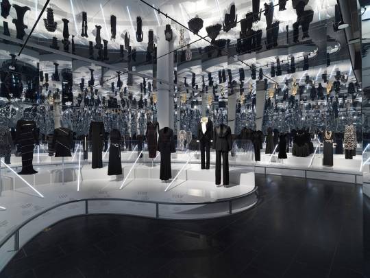
#fashion trends as a linear timeline
Text
KH OC Short Story: "I'll Never Do It"
I wanted to share this story I wrote last night. It's an imagination of if I featured in the KH Novel. Unfortunately, short stories are not my forte, and as my mum said, I do tend to struggle with conveying the emotions of characters. My writing is more 'recap' like; likely due to the millions of dreams I've recapped in my life.
I may try and re-write this story to practice conveying emotion, but it won't be a 'short' story lol.
The timeline of this story is based on what has happened in my waking life; my dreams; and energy communications that Riku and Terra have given me to continue our bond, including how they reference their cannon timeline.
Enjoy reading :3
-------------------------------------
To really think I would be a keyblade wielder at the start of it all. I thought there were certain rules that you just HAD to follow, at least by the precedent of certain keyblade masters. I always insisted to myself, and consequently to those around me, that this wasn’t for me.
I never saw Namine fighting within the group, but then I thought she was powerful enough in her own right; a witch with power over people’s memories.
I never followed trends, but what if I could be a trendsetter?
My favourite colour is blue. The first keyblade wielder I formed a connection with, to link to their world, was Riku. And guess what; Riku is a keyblade master… After everything I’ve said. Maybe I’m to blame, as I remained with my assumptions for quite a while, but I saw Riku as one angry man. No matter the amount of letters I wrote in an attempt to explain myself, he always seemed to complain that I was too needy for him.
And then his mentor came, or who was at least supposed to be his mentor if he wasn’t stuck in limbo for ten years. Terra seemed to watch me carefully.
I never heard the boys speaking seriously to each other, but then what were Riku and Terra conversing about behind the scenes?
This led Terra to start subtly taking over the roles that I had set for Riku, and that perhaps Riku was trying to palm me off to him. But then I thought to myself, “Is Terra going to get me past the tax exam?”. It seems I have a one-track mind. It had to be Riku.
Now in hindsight I think, was it right to push Terra away? To see a grown man cry from something I’d done, when it was never my intention to make him feel that way. And in turn, Riku grew more cross.
My intentions were being misconstrued, and so were theirs.
It seemed near impossible to convey my truth to Kingdom Hearts. But then impossible is made up of I’m possible, right?
After my dad’s best friend had passed away, I saw a different side to Riku. He seemed to take a step back and just observe the emotions of my family during a seemingly tumultuous time. One night, in my room, I heard Riku whispering a phrase from behind the open door.
“Because somebody needs me”.
I don’t know who or what he was talking to, but this seemed like Riku’s promise to finally try and help me rather than hiding.
It was still rigid for a while, but each day got lighter and brighter as Riku tried to understand me further, and we connected more. We taught each other the art of compromise in subtle ways. Riku did his best to reserve initial judgements of me and learn more about my special needs, and I had begun to think that not all keyblade masters were grumpy, old-fashioned, and I guess linear.
Riku embraced being my first connection to Kingdom Hearts and admitted that he felt lucky. And then he broke the most significant message by far.
He thought of me as his first de-facto student.
He told me I could take all the time I needed and that he would never apply pressure for me to use a keyblade. My life lessons would show me the way and would determine when I’d be ready.
With all the guardians of light flocking to watch me in Riku’s time, it would be easy to get to know the others.
Times seemed to be getting harder and harder for my family and the world in general. I decided that for the first time, I’d let two connections at once take the driver’s seat in watching over me.
With many options to choose from, making the choice seemed harder than I thought. No matter how seemingly fairly and equally I assessed each guardian, I was always being drawn to Terra. I couldn’t not choose him after how I had hurt him in Riku’s early days. And then there were also many more deciding factors. In-fact too many to list… All roads lead to Terra.
But now that I had given Terra the role he seemingly wanted in the first place, I couldn’t understand why he looked like he now didn’t want the role. Or was this simply the insecurities of his past setting in? The whisperings of his enemies that he wasn’t good enough.
Just like with Riku, there was a day where Terra suddenly changed. Like something had finally pushed him into his role.
In this world, Riku and Terra could be together and share many smiles and laughs.
Weeks later, I ended up summoning a keyblade in my hand, but it wasn’t my own. It was Riku’s Braveheart, and then I subsequently summoned Terra’s Ends of the Earth keyblade. The boys were impressed with each one taking turns to talk when I had summoned their keyblade. However, a thought worth noting is that I had summoned Terra’s ending keyblade, rather than his starting one.
Was this a foresight to the special bond I’d create with Terra?
It seems the boys knew me better than I did, or so I thought. There was always this pull towards Terra. Sadness and insecurity from him when I resisted, but a new and unrecognisable person when I responded to Terra, and we exchanged our needs and comforting words and gestures to meet them.
Whenever I’m in trouble, my Kingdom Hearts dream guides are always there to help, whether it’s in person or lending me their keyblades.
And I’m starting to have an affinity for the colour purple.
INFJs are quiet and mysterious, but powerful people after all.
#kingdom hearts#riku#terra#karla#dream guide#dreamer#riku kh#terra kh#oc#story#oc story#fiction#timeline of events#timeline#fan writing
0 notes
Text

Because I joined CM fandom late in the game, I forget how long this show ran...
Until I see Shemar wearing a wallet chain and Matthew doing the Tony Manero deep-v button down.
#shemar moore#matthew gray gubler#shematthew#mgg#wallet chain#that white shirt though#saturday night fever#fashion trends as a linear timeline#they look sofaking hot#criminal minds#my oc#shemars fedora
77 notes
·
View notes
Text
According To The Met’s New Exhibit, The Clock Is Ticking For The Fashion Industry
For a fashion exhibit whose theme is time, it’s ironic that the Metropolitan Museum of Art Costume Institute’s “About Time: Fashion and Duration” is, as a result of the pandemic, opening almost six months later than anticipated. Yet, during a year that feels both frozen in time and flying by faster than any before it, the show, which looks at the relationship between fashion and time through designer ensembles, feels perfectly punctual. “Fashion is indelibly connected to time. It not only reflects and represents the spirit of the times, but it also changes and develops with the times, serving as an especially sensitive and accurate timepiece,” said Andrew Bolton, the Wendy Yu Curator in Charge of The Costume Institute, in the press release. “The exhibition uses the concept of duration to analyse the temporal twists and turns of fashion history.”
Made up of two main rooms, that are designed as oversized clock faces, “About Time” explores this theme through two timelines: chronological — tracing 150 years of fashion, from 1870 to the present, in honour of the Met’s 150th anniversary — and cyclical — exploring the past and present by linking trends and styles in a more abstract way. Within each “minute” of the clock setup, two garments are featured side-by-side.
Featuring mostly black pieces — to “make the comparisons between the pairings immediately,” according to Bolton — the brands selected range from heritage (Chanel, Yves Saint Laurent, Dior, Givenchy) to avant-garde (Comme des Garçons, Issey Miyake, Alexander McQueen, Martin Margiela) and unabashedly modern (Libertine, Off-White, Hood by Air, Rick Owens). The theme of time is further expanded using concepts from philosopher Henri Bergson and writing from Virginia Woolf. (The exhibit opens with a quote from Woolf’s Orlando, and quotations in the exhibit are read aloud by Nicole Kidman, Meryl Streep, and Julianne Moore, who all starred in the 2002 movie The Hours, based on the Michael Cunningham novel that was inspired by Woolf’s Mrs Dalloway.)

The first room sees 60 looks in a barely lit, round room with a black backdrop, with a swinging, ticking pendulum at its centre. Pairings, arranged in chronological order, focus on the evolution of fashion and the influence of the past on modern designers. An 1895 double-breasted wool-twill coat is juxtaposed against a 2020 JW Anderson coat with an oversized leg-of-mutton sleeve that could be confused for its older counterpart; a 1902 Morin Blossier riding jacket, embroidered with gold silk-and-metal thread floral motif, is presented next to a waistcoat of jacquard woven silk that Nicolas Ghesquière, who looked to the Met’s fashion archives in the past for inspiration, created for Louis Vuitton in 2018; and a 1938 Elsa Schiaparelli evening jacket featuring mirror-like, Versailles-inspired designs on the front is shown next to Yves Saint Laurent’s 1978 “broken mirrors” jacket (latter is pictured below).

The second room — a winding, mirrored space that sends all senses into overdrive after the darker section — features an additional 60 ensembles that are matched up using less-clear parallels ranging from silhouettes and motifs to materials and techniques. As such, it sees the sculptural 2012 Iris van Herpen masterpiece that Solange wore to the 2018 Met Gala alongside an ivory 1951 Charles James silk satin ballgown (pictured below); a 1983 Karl Lagerfeld Chanel silk crepe dress, layered with trompe l’oeil necklaces and bracelets and belts of pearls, next to Sarah Burton’s 2019 Alexander McQueen crystal-embroidered tunic; and the 1994 Gianni Versace safety-pin embellished dress, famously worn by Elizabeth Hurley, with a 1977 Sandra Rhodes mini with safety pin detailing. While the museum notes refer to these less linear pairings as “disruptions,” today, they feel less like anomalies and more representative of the modern fashion industry — one that, at some point, abandoned looking at the outdated ideals of the past and has begun to find inspiration in the world and the people around them.

According to Vogue, having time to revisit the “About Time” exhibit, allowed Bolton to respond to the Black Lives Matter movement, and “include more Black, indigenous, people-of-colour designers.” In a delightfully ironic pairing, Off-White’s dress, that reads “Little Black Dress,” stands next to, what else but, the Chanel dress that popularized the timeless fashion staple. A vest look from Shayne Oliver’s Hood By Air, the cult-favorite brand that just announced a comeback after a hiatus, likewise makes a clever pairing with a Helmut Lang (where Oliver was a designer in residence) harness ensemble. Patrick Kelly, Olivier Rousteing, Stephen Burrows, and Xuly.Bët’s Lamine Kouyaté round out the exhibit’s roster — starting what Bolton said will become Costume Institute’s “lifelong commitment” of featuring pieces informed by race, ethnicity, gender, and sexuality, rather than just aesthetics. (This may prompt many to say, “About time.”)
The exhibit tackles another topic that has become very timely as a result of COVID-19. With factories and warehouses forced to close down during lockdown in the spring, the pandemic has forced fashion to take a hard pause, as it was unable to complete collections. This prompted many brands to re-evaluate the constant churning of collections, that not only has a detrimental effect on the environment but also on the designers’ creativity, and look into other solutions, like upcycling. This seems to be the conclusion that “About Time” wants you to arrive at, with the exhibition ending with one of the few non-black looks in the exhibit: a white patchwork gown from Victor&Rolf’s spring/summer 2020 haute couture collection. Made from leftover fabric swatches, the strapless gown — shown suspended above ground in its own mini-room — is, according to the museum notes, a metaphor for the future of fashion, one that includes collaboration and sustainability.

This leaves viewers with a definitive conclusion, which isn’t always a given when it comes to art: The fashion industry needs to continue to embrace sustainability, as well as collaboration and diversity, if it wants to stay relevant and thrive. It’s easy to say that only time will tell if it will; many have over the years. It’s much harder to ignore the clock that has definitively started ticking.
The Costume Institute’s exhibition “About Time: Fashion and Duration” will be on view until February 7, 2021.
Like what you see? How about some more R29 goodness, right here?
According To The Met’s New Exhibit, The Clock Is Ticking For The Fashion Industry published first on https://mariakistler.tumblr.com/
0 notes
Link
2020-05-19T11:30:00+00:002020-05-19T13:07:31+00:00
It can be tough to prioritize the mobile experience when it often feels like a compromise. Don’t include as much text. Remove some of your images. Stay away from features that get in the mobile visitor’s way. It’s kind of like a parent who tells you, “Go out and have a good time, but don’t do X, Y or Z!”
It’s not necessarily that a mobile visitor needs a shorter page, less text or fewer images to more easily consume content on a smartphone. They just need the content you give them to not feel like so much work.
If you look more closely at your pages, you may find that some of the written content can be converted into data visualizations. So, today we’re going to look at some things you can do to start converting more of your content into graphics and enhance mobile visitors’ experiences in the process.
Quantitative Data Tools
Many UX designers are somewhat afraid of data, believing it requires deep knowledge of statistics and math. Although that may be true for advanced data science, it is not true for the basic research data analysis required by most UX designers. Read more →
1. Go Beyond Traditional Data Visualization Formats
When you think about displaying data in a graphical format, what do you envision? Probably graphs and charts like this:
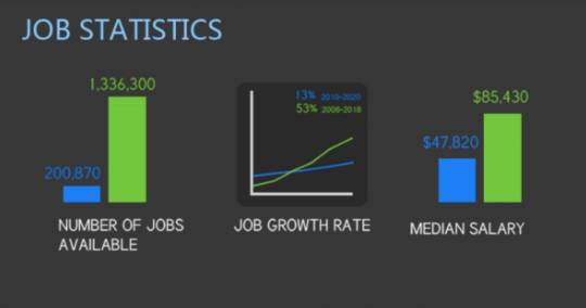
A snapshot of an infographic from Visual.ly that displays web designer vs. web developer job statistics. (Image source: Visual.ly) (Large preview)
This screenshot comes from a Visual.ly infographic comparing web designers and developers. This particular piece of it deals with jobs-related statistical data, so it makes sense that it would be translated into bar graph and line chart formats.
As a writer, I’m a huge fan of this kind of data visualization because having to write out stats can be a major bummer. Like I know there’s a significant difference between the data points, but I can only use bold fonts and bulletpoints so many times before readers start to look for the next new interesting thing to focus on.
When strong data sets are designed rather than written, readers are less likely to skip over and unintentionally miss critical information. But it’s not just data that can be visualized. Take this other segment from the infographic, for example:
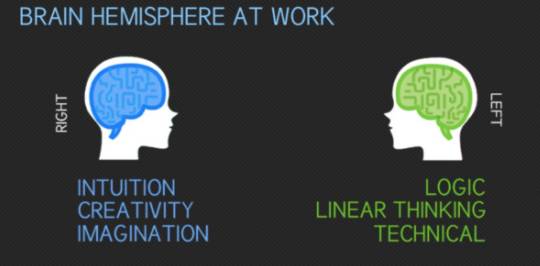
A snapshot of an infographic from Visual.ly that displays web designer vs. web developer right vs. left brain thinking. (Image source: Visual.ly) (Large preview)
This could’ve been written as a paragraph (e.g. “_In general, web designers are right brain thinkers, leveraging intuition, creativity, blah blah blah…_”). It could’ve also been displayed as a table:
Web Designer Web Developer Brain Hemisphere Right Left Driven By Intuition Logic Approach Creativity Linear Thinking Strength Imagination Technical
While this would’ve perhaps been easier to read than a wall of text, it’s not nearly as interesting as the graphic above.
In order to identify different kinds of data worth turning into graphics, it’s going to require web designers to do some thinking outside the box. I’d recommend you start by acquainting yourself with the different kinds of data visualizations that exist. You can use The Duke University Library for that. It has an entire page that shows how different kinds of information can be translated into graphics, like this example of a scatter plot:
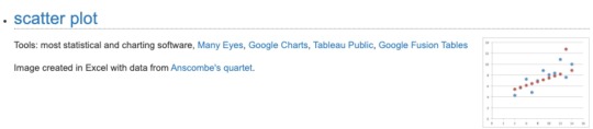
The Duke University Library provides an example of a scatter plot visualization. (Image source: Duke University Library) (Large preview)
The Pudding took this basic concept of charting data points over time and turned it into something unique in its “Colorism in High Fashion” article.
This is a graphic that represents the spectrum of skin tones that have been represented on the cover of Vogue:

The Pudding depicts trends in the skin tones of Vogue cover models in its article “Colorism in High Fashion”. (Image source: The Pudding) (Large preview)
This is a much more effective and eye-catching way to relay this information than to have a writer say, “Over the magazine’s 200-plus issues, 75% of Vogue’s cover models tend more towards fairer skin tones.”
That said, this graphic on its own isn’t a scatter plot as it only depicts quantity and trends. However, scrolling does eventually turn it into a scatter plot:

The Pudding uses a scatter plot to display how Vogue cover model skin tones have changed over time. (Image source: The Pudding) (Large preview)
Notice how each of the orbs has been pulled out onto a timeline, representing the faces of the models on the magazine covers. This is not the traditional way to use a scatter plot chart, but, in this case, it works really well. And, again, it does a much more effective job in getting the point across on mobile than a wall of text.
As you look for ways to do this in your own work, hone in on the following elements:
Statistical data,
Short bulleted lists,
Highly complex topics,
Step-by-step explainers,
Page or topic summaries.
These present the best opportunities for turning essential data or topics into visualizations.
2. Design Your Data Visualizations To Be Filterable
Of course, you don’t want to overdo it. In your mission to preserve your website’s message on mobile, you don’t want to create so many graphics that it compromises page speed or that they start to feel overwhelming.
One solution to data visualization overload is to create a single graphic, but use filters to control which data sets are displayed. Not only does this enable you to deliver a ton of visual information in a smaller amount of space, but it can become a competitive edge, too. Let me show you an example.
The reason why a CDN is useful is because it puts your website geographically closer to your target audience. If the CDN doesn’t have the reach to do that, then it’s not worth the trouble. That’s why, of all the considerations people have to make when finding a provider, they have to look at where their points of presences actually are.
This is how Google Cloud displays this information for its content delivery network:
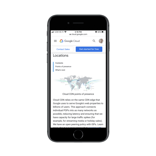
Google Cloud uses a static map to display its CDN PoP locations to prospective users. (Image source: Google Cloud) (Large preview)
This is a great graphic as it shows where its cache locations are and how broad of an area the network covers. However, this is a static image, so what you see is what you get. Google has to use the rest of the page to list off all the major cities where it has a CDN presence:
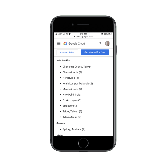
Google Cloud publishes a list of all its CDN cache locations around the world. (Image source: Google Cloud) (Large preview)
But this is what I’m talking about. This list should be part of the visualization.
Akamai, a competitor to Google Cloud CDN, has designed its media network map this way:

Akamai’s media delivery network map shows all its media and storage point of presences. (Image source: Akamai) (Large preview)
On this map, you can see Akamai’s media delivery network (in orange) and its media and storage locations (in pink).
Prospective users interested in going deeper into the data can use the filters at the top of the page. For instance, this is what the map looks like when someone searches the Asia region:

Akamai’s media delivery network map with a focus on the Asia region. (Image source: Akamai) (Large preview)
And this is what they see when they choose to view Akamai’s storage network against its competitors:
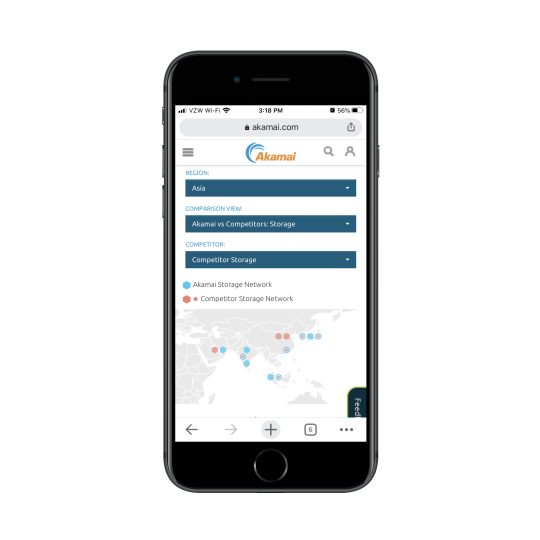
Akamai’s media delivery network map set to view Akamai’s Asian storage network against its competitors. (Image source: Akamai) (Large preview)
Not only does this data visualization design let visitors closely survey the data that’s most relevant to them, but it aids in their decision-making process, too.
This approach is really useful if you want to turn a whole bunch of data into a data visualization without having to overwhelm the page with it. And with this particular model of filtering, you can spare your visitors the trouble of having to pinch to zoom in and out of the graphic. They can customize the view on their own and get to the most relevant bits with ease.
3. Make Your Data Visualizations Interactive
Another thing you can do to pack a ton of information into a single graphic is to make your data visualizations interactive. Not only will this declutter your mobile UI, but it’ll get your visitors to pause and really take time to understand the information they’re being shown.
This is a recent post from Emojipedia. The article shares the results of a study they conducted on emoji usage during the coronavirus. It’s a fantastic read and it’s chock-full of data visualizations like this one:

An Emojipedia article on coronavirus emoji usage includes data visualizations throughout. (Image source: Emojipedia) (Large preview)
The design is certainly attractive, but it’s not easy to see all the details within the graphic on mobile. This is where interactivity would come in handy.
By making each of the bars in the graph clickable, people could get more information about the emoji, see the percentage increases clearly, and so on.
Something I didn’t show you in the last point is that the Akamai CDN map is interactive:

Akamai’s media delivery network map is interactive. (Image source: Akamai) (Large preview)
This is the exact approach I would suggest for the Emojipedia bar graph. By turning each data point into a clickable element, users don’t have to struggle to gain all the information they need nor do you have to overwhelm them with too much data within a single graphic.
What’s nice about interactivity is that you can apply it to a wide array of data visualizations, too.
Here’s an example of a bubble chart from Information Is Beautiful:
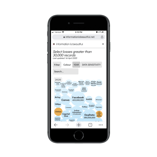
A graphic from Information Is Beautiful that depicts the most serious data breaches around the world in bubble chart format. (Image source: Information Is Beautiful) (Large preview)
When visitors click on any of the bubbles, more information is revealed about the security breach:
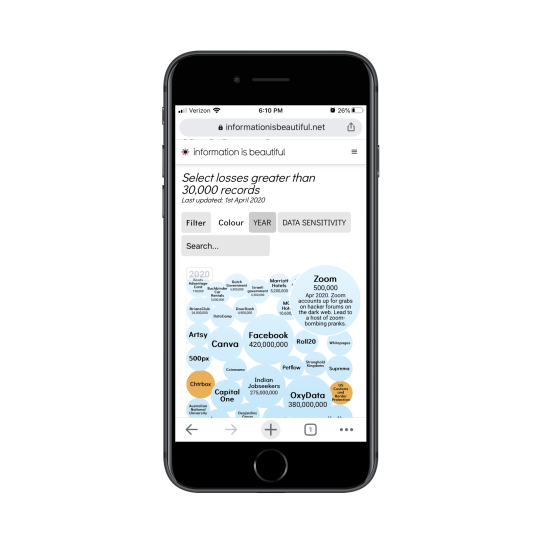
A graphic from Information Is Beautiful with information on a major Zoom security breach and data loss. (Image source: Information Is Beautiful) (Large preview)
One of the great things about prioritizing the mobile experience is that it allows us to find creative solutions to designing minimally. And interactions are a really good way to pull that off as the UI remains clear and easy to navigate, but tucked within it are juicy little nuggets waiting to be discovered.
Is Data Visualization The Key To A Better Mobile Experience?
There are a lot of things we can do to improve the mobile user’s experience. If you haven’t considered data visualization part of that strategy, now would be a good time to as it enables you to:
Condense the amount of space and time it takes to get your point across,
Design your pages to be more visually engaging,
Preserve the full integrity of your copy for mobile and desktop visitors.
That, of course, doesn’t mean that you should stop looking for ways to reduce content on mobile. If it’s unnecessary or doesn’t add value, it should go. What remains can then be evaluated for a data visualization makeover.
0 notes
Text
Week Six - IXD104
Infographics
Since infographics exploded onto the graphic design scene about ten years ago, they’ve become a staple for communication in classrooms, in the workplace, and across the web.
According to the Oxford English Dictionary, an infographic (or information graphic) is “a visual representation of information or data”, however it can also be looked at as a collection of imagery, charts, and minimal text that gives an easy-to-understand overview of a topic.
Infographics use striking, engaging visuals to communicate information quickly and clearly. The most visually unique, creative infographics are often the most effective, because they grab our attention and don’t let go. But it’s crucial to remember that the visuals in an infographic must do more than excite and engage. They must help us understand and remember the content of the infographic.

Why use an infographic?
When you need to give someone a really quick rundown on something that can be hard to explain in words alone, an infographic is a good way to go.
They can be helpful anytime you want to:
Provide a quick overview of a topic
Explain a complex process
Display research findings or survey data
Summarise a long blog post or report
Compare and contrast multiple options
Raise awareness about an issue or cause
Marketers use infographics to build brand awareness and boost engagement.
Consultants use infographics to visualise project timelines and to simplify new/industry-specific topics to their clients.
Governments use infographics to share statistics and census data.
Educators use infographics to make content more memorable for students.
And nonprofits use infographics to promote events and raise awareness for their causes.

Social media sites such as Facebook and Twitter have also allowed for individual infographics to be spread among many people around the world. Infographics are widely used in the age of short attention span.
In his 1983 "landmark book" The Visual Display of Quantitative Information, Edward Tufte defines "graphical displays" in the following passage:
Graphical displays should
show the data
induce the viewer to think about the substance rather than about methodology, graphic design, the technology of graphic production, or something else
avoid distorting what the data has to say
present many numbers in a small space
make large data sets coherent
encourage the eye to compare different pieces of data
reveal the data at several levels of detail, from a broad overview to the fine structure
serve a reasonably clear purpose: description, exploration, tabulation, or decoration
be closely integrated with the statistical and verbal descriptions of a data set.
Graphics reveal data. Indeed graphics can be more precise and revealing than conventional statistical computations.
While contemporary infographics often deal with "qualitative" or soft subjects, generally speaking Tufte's 1983 definition still speaks, in a broad sense, to what infographics are, and what they do—which is to condense large amounts of information into a form where it will be more easily absorbed by the reader.
The three parts of all infographics are the visual, the content, and the knowledge. The visual consists of colours and graphics. There are two different types of graphics – theme, and reference. Theme graphics are included in all infographics and represent the underlying visual representation of the data. Reference graphics are generally icons that can be used to point to certain data, although they are not always found in infographics.
Statistics and facts usually serve as the content for infographics and can be obtained from any number of sources, including census data and news reports. One of the most important aspects of infographics is that they contain some sort of insight into the data that they are presenting – this is the knowledge.
Infographics are effective because of their visual element. Humans receive input from all five of their senses (sight, touch, hearing, smell, taste), but they receive significantly more information from vision than any of the other four. Fifty percent of the human brain is dedicated to visual functions, and images are processed faster than text. The brain processes pictures all at once, but processes text in a linear fashion, meaning it takes much longer to obtain information from text.
Entire business processes or industry sectors can be made relevant to a new audience through a guidance design technique that leads the eye. The page may link to a complete report, but the infographic primes the reader making the subject-matter more accessible. Online trends, such as the increasingly short attention span of Internet users, has also contributed to the increasing popularity and effectiveness of infographics.
There are also three basic provisions of communication that need to be assessed when designing an infographic – appeal, comprehension, and retention. "Appeal" is the idea that the communication needs to engage its audience. Comprehension implies that the viewer should be able to easily understand the information that is presented to them. And finally, "retention" means that the viewer should remember the data presented by the infographic. The order of importance of these provisions depends on the purpose of the infographic.
Infographic Examples:
http://www.distancetomars.com/
Sources:
https://venngage.com/blog/what-is-an-infographic/
https://en.wikipedia.org/wiki/Infographic
https://www.creativebloq.com/graphic-design-tips/information-graphics-1232836/4
0 notes
Text
Week 01| Tuesday 9am | 26/02/19
Today was our first studio class of the final year of our degree. For the first part of our morning we were challenged to look introspectively and write down what we hope to gain from Advertising and Branding before we finish our studies.
Having had an insightful summer period, and being in a constant state of changing and adapting my mindset, I took this time to really focus on the points that I believe will help me to grow as a person, designer, and ultimately lead me to succeed through growth.
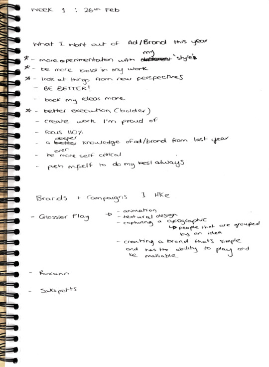


My most notable ones (starred in my book) were the following:
More experimentation with my “style” — ultimately I do believe that I don’t really have a set style yet as I am still new to design and do not want to place myself in a box yet (or probably ever), however I would like to simply play with the look and feel of my design, which does have its similarities project to project. This will ultimately, I believe, to allow me to be more versatile and add my own spin onto existing or usual ways I or others set out to design
Be more bold in my work — Although I can be bold in my words I am often not so in actually going for it when I bring ideas to life. Last year I remember being told that if you go way out with and idea you can always reel it back in, so I believe that if I can be bold in both idea and execution I will see a greater self reward, because I will know that I’m challenging myself to be unique. If you don’t try you’ll never know. And some of the best stuff I see, has always been a bold move. Bold doesn’t need to mean “loud” or “bright” or anything like that, it simply means to me that it’s an idea that might go against the grain, be controversial or be different to the norm.
Look at things from new perspectives — after an enlightening and highly introspective summer, I am really passionate about looking at things from new perspectives and this is not only in my design but as a person, as what I am will definitely show through my work. Seeing something from a counter, or one of many alternative perspectives, will allow me to think outside of the box and offer new ideas, lead me to find new solutions, lead me to create something new, lead me to do something different. And I am very passionate about approaching my work differently, and approaching the world with compassion. I just want to make great work that speaks to others and speaks to me, and I also just want to be a good person.
Better execution — I would like to get better at my execution, because it’s usually pretty messy. And I think that I can achieve this by analyzing my timeline and adjusting my work flow. After these past 2 years I have a better idea of the time I need to do tasks that I’m stronger at like ideation and creating ideas, and things that I’m not as strong at like bringing to life a physical project. Ideas are important, but if in practice they are not as amazing as they could be then I just feel let down by myself. And, as above, I want to make great stuff, so I need to allow myself to by understanding what I need and giving myself the chance to actually do it.
There were many many other things that I found to be incredibly important this year, but they all focus on my personal growth as a designer and as a human being. Because I believe that is how I can start to achieve my dreams and goals that I have in my my love and passions, which is my career.
When we were discussing all of the collective wants our class wanted out of our year, I noted down some advice given to us that really spoke to me.
“Creativity requires discipline”
“By doing we are learning and by failing we are trying”
“You’re good but you have to go a little bit crazy”
“Look for the egg - don’t recook the already fried one”
I also noted the following advice to myself from what was being discussed...
- Research is fundamental, it’s the foundation, and it needs to be done before creating. Mood boards, academic, physical, anything that will give me a better insight and more information about a topic that I am designing in and for. Design is the middle ground between all of those who will see a product/brand/idea/service, from any angle they may be looking at it from i.e the company, the consumer, the non consumer, the hater, the fan, the by passer. You’re never talking to one person.
- My creative process will never be linear, and I shouldn’t expect it to be. Creativity, I believe, is the fundamental of many things, of the whole world if I may be so bold to say. No one that came up with the idea to create AI, iPhone, systems that run our society, ever got to the solution because it was their first idea. It look them years, some people it took a life time, and some had to pass on the job to someone else because it was that big. So I shouldn’t expect that I’ll just find an answer. Because there’s not really a correct one, just one that might be correct at the time for a set of reasons, or instinct, or literally whatever!
- There is time so I need to use it! I have a lot of time to do my projects, if the project required more time then we’d be given more. But we aren’t, so that must be ample. So I should use it ALL as well as I can to be kind to myself and give myself the best opportunity to create and do things I’m passionate about and proud of, and give myself time to test, fail, and try again and make my comeback stronger.
- Trends. Always have struggled with these, because part of me wants to do something bold and against the grain, but sometimes I feel I like something that’s currently popular! However, I should know that there might be a time for using a trend, there might be no time for using a trend, or it might be variable. Using a trend isn’t bad, and not using a trend isn’t good. It depends on the audience, or the message. Nothing determines that but the intent of the company, or audience, or designer. It’s my decision at the end of the day and it’s just a factor that evolves. I shouldn’t get to caught up in the ‘stigma’ of either or. But similarly, I should perhaps push myself to cook the egg in a new way, instead of trying to reheat the one that’s already been cooked.
- Collaboration is also hard for me but I need to learn that my ideas aren’t always good, other people might be stronger than me in certain areas, and that it’s about collaborating together rather than simply talking at someone and not letting them talk back - giving them information. If working with a team I should save us all the possible future hassle and be open and honest about how we work as individuals, our strengths and weaknesses and what if scenarios so that there is always a back up plan and a mutual understanding. Like most things, the clearer the better. And the more backup plans the better.
- Time management is important and is apart of my work flow. I can refine this workflow to suit my strengths and weaknesses so I give myself the best chance at success - however success might look for me. This flows into criticism, I need to be open and accepting of that because it’s a chance to grow and be better!
- Curiosity is my biggest asset! I need to use it to my advantage. Everything can be better or different or changed so how could I do that? How could I make a positive influence? I need to wear all of the different glasses to gain a better perspective.
- Network more. I want to stop being awkward and go for it more! I should utilise my contacts, my friends, my class peers and get forward thinking.
- Personal style shouldn’t weigh to much on my mind right now. It should be about experimenting and learning. Because I don’t know a lot yet, there is always more to learn and explore. This is the same with having a niche for myself.
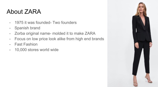
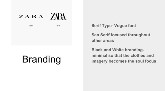
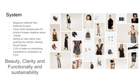
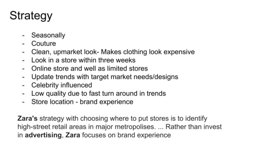
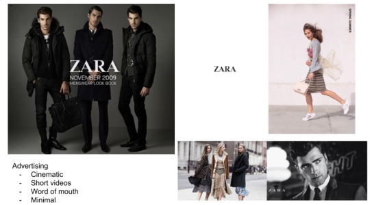
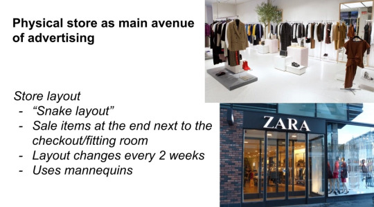
Following this we went on to do a analysis exercise looking at a brand, which we chose Zara. Seeing the way in this brand is quite simplistic with the fact that their brand identity is largely held through the feeling, vibe, perceived lifestyle that is associated with their brand rather than their design and graphic presence this was interesting. But photography is a form of design, and their photography style is the main drawcard to reel people in and sell that lifestyle that keeps Them coming back. Similarly the psychology of their store layouts was very interesting. So their brand was different from what I usual look at I suppose, similar to that of which they’re trying to emulate, a high fashion label. It was also interesting to just ourselves on how we did as a group. Zara wasn’t much of a “risk” by some standards so we gave ourselves a 5, but similarly, is their lack of identity a risk for us to try to discover the meaning of? Perhaps. Team work was great through, so we gave that a 10, and our depth was about as deep as a shallow fast fashion label can get! A 7. But I think Zara would be lucky if they even appeared to be as deep of a brand as a 7. Overall though these exercises are great for teaching me to recognise branding choices, patterns, and strategy’s fast which is a great research tool once I can do this quickly and effectively I.e make correct statements about what they’re doing and why.


Overall today I found my favourite part of the lesson to be the introspective part. But maybe that’s just because I’m trying to hold myself more accountable this year. There’s no time like the present, and you don’t get anywhere without hard work.
0 notes
Photo
Design Profile: The Art Deco Era
You’ll often hear the word “Gatsby” — as in The Great Gatsby — used to describe the Art Deco era. While it’s true that this definitive work of American fiction was born of the same cultural iconoclasm and financial excess that influenced Art Deco style, the end goal of the novel was much different than that of the numerous artworks, furniture pieces, and fashion items that arose in the 1920s.
Today, Art Deco is associated with glamour and excess, and while the movement certainly did feature plenty of luxe, gilded extravagance, it was ultimately a style dedicated to angular simplicity, clean lines, and refined elegance.
An Oblique History
F. Scott Fitzgerald intended to critique materialism and the amoral behavior of jazz-age wealth, so while Gatsby certainly did feature its fair share of on-trend aesthetic from its contemporary era, it wasn’t exactly a celebration of the best that Art Deco has to offer. The term “Art Deco” didn’t even emerge until the 1960s, and it referred to the works featured in a contemporary art and design show at the Parisian museum Le Musee des Arts Decoratifs in 1925. This exhibition occurred the same year Gatsby was published and three years after Fitzgerald wrote his masterwork.
The Social Context for Art Deco
Born out of the Roaring ‘20s, Art Deco represents the dynamic forward progress of a society that was recovering from the first World War and enjoying all the technological advances born out of that conflict. Skyscrapers, automobiles, airplanes, and trains became more prominent than ever before, and these emblems of mechanized modernity had a huge influence on Art Deco artists and craftsmen. While gilding and glitz were often a factor, the focus of the movement was more on societal development and the introduction of machinery in daily life.
Women are also a major focus for Art Deco, and while there are some stylish nude figures to be found among the art and design of the era, many of the women depicted are clothed, strong, and independent. Tamara de Lempicka is a great example of a woman artist working within the structure of the Art Deco movement and showcasing the many ways women’s roles in society were changing. One of her own self-portraits features the artist driving a car. She’s glamorously dressed, but her eyes are forward and her hand is firmly on the wheel.
Defining Aesthetic Characteristics
Art Deco was used to design everything from high-art sculptures and mass-media advertisements to fine jewelry and everyday household objects like toasters. While the style focused heavily on technological innovation and the rise of machines, motifs from the natural world are often featured, especially in the form of highly stylized and even abstracted animals, plants, flowers, and fruits.
Strong linear compositions are also characteristic, but these can be accompanied by curved accents. Think of the Chrysler Building; its curved forms provide framing and support for strong lines and angular geometrics. The finish is a gorgeous balance between lush ornamentation and sleek, smooth refinement. That’s what Art Deco is all about. It’s not extravagance for its own sake, but a balance of the lavish and the precise.
Art Deco: Real or Fake?
Identifying authentic Art Deco pieces is fairly straightforward. The style is distinctive, but it isn’t limited to a specific product or idea. Paintings, jewelry, buildings, decorative objects, and even household items can all be rightfully described as Art Deco. This makes it easy to slap the “Art Deco” label on anything that’s sleekly modern and linear, but doing so is often misleading. It also does a disservice to the many adjacent art movements of the early and mid-20th century that respond to similar ideas in a different way, including Minimalism, De Stijl, and Futurism.
As with all art movements, it’s difficult to pinpoint an exact timeline for when the official style began and ended. The 1925 Paris exhibition at Le Musee des Arts Decoratifs was merely the first time these kinds of works had been collected together in a single high-profile venue; artists and designers had been creating works in this style for years before the show. Art Deco style continued to be influential into the 1940s, so you might even find some authentic pieces made after 1939.
In general, though, genuine Art Deco items will date back to the 1920s and 30s, beginning around 1925. Some fashion, art, and technology from later years, including the 1960s and 1980s, may have borrowed heavily from movement’s aesthetic, but if the item in question doesn’t date back to the 20s, 30s, or early 40s, it’s not authentic Art Deco.
If you’re ready to start searching for some Art Deco decor to call your own, check out our online auctions. Everything But The House puts the best of history and the design world right at your fingertips.
#EBTH Profiles#EBTH Design Profiles#Art Deco#Art Deco Design#The Art Deco Movement#ebth#everything but the house
32 notes
·
View notes
Text
BLACK LIVES MATTER
They mattered before the trend and they’ll keep mattering once the trend ends. We have to educate ourselves in order to do better - we need to do better. Be better. We may stumble, we may make mistakes along the way, but that’s okay, we’re learning. Learning isn’t linear. As long as you’re learning, evolving and fighting to make the world a safe space for everyone, you’re on the right path.
Here are a bunch of links to Petitions, Donations, Hot Lines, Books, Podcasts, etc... anything and everything so you can support the movement and educate yourself too:
Petitions:
If you are international and are unable to sign any of these, here are some zip codes you can use
90015 - Los Angeles, California
10001 - New York City, New York
75001 - Dallas, Texas
When it comes to petitions keep in mind that if you have more than one email you can sign more than once; also, white house petitions don’t do much. They were only effective under Obama’s administration, but aren’t so much under Trump’s as they aren’t obligated to give a statement after 100k signature.
#DefundThePolice
Defund MPD
Fire Racist Criminal from the NYPD
Get the Officers Charged
Charge All Four Officers
Life Sentence For Police Brutality
Censorship of Police Brutality in France
Pass the Goergia Hate Crime Bill
Hands Up Act
National Action Agaisnt Police Brutality
Abolish Prison Labor
Stand with #BLM
Movement for Black Lives
Mandatory Racial Bias Test
Junk Terror Bill
Get Schools to Speak Up
Police De-Escalation Training
Immigrants Being Poisoned by ICE
The Trayvon Martin Law
Working Conditions for Black People in Italy
Defund Police in Dallas
Enact Civilian Oversight of RPD
Require Dash/Body Cams in King County
Defund the Police
Classify White Supremacists as Terrorists
Defung SDPD
Washington State Police Accountability
Illegal Export of Riot Equipment
Ban/Restrict Tear Gas
Knock Down Slave Market Center
Black Trans Women UK
Reject Trump’s Violence Towards Protesters
Make Police Brutality Illegal
Teach Black History In UK
Migrant Domestic Workers in Lebanon
End Systemic Racism
Make KKK Illegal
Donations:
Do not donate to Shaun King, or change.org (on the latter, the money is kept by change.org, it does not go to the causes, however the petitions work wonderfully). The following list contains only places were international payment is accepted.
BLM Fund
BLM LA Fund
Black Trans Women Fund
Reclaim the Block
North Star Health Collective
ACLU
The Marshall Project
NAACP Legal Defense Fund
Loveland Therapy Fund
Lake Street Cleanup
Rebuild Native American Youth Center
Cambodia Town Relief Fund
National Bail Fund Network
Unicorn Riot Fund
Black Owned Businesses Atlanta
Black Mental Health Matters:
Black Emotional and Mental Health Crisis Hotline
The Association of Black Psychologists
Crisis Text Line
The Love Land Foundation
The Boris Henson Foundation
Sista Afya Community Mental Wellness
Black Mental Wellness
LGBTQ+ Psychologists of Color
Melanin & Mental Health
Family Paths
Nami
The Safe Place App
National Queer and Trans Therapists of Color Network
Ethal’s Club
Black Mental Health Alliance
The Unplug Collective
Dive In Well
YouTube Videos, Film & Television:
A BLM Documentary
A debate that puts things in perspective
breakdown of all lives matter
background info of BLM
a little girl gives a speech on BLM
Systemic Racism Explained
YouTube video of Robin DiAngelo discussing White Fragility
“Dear White Friend: You Need to Take a Side”
TED Talk: What My Coloring Book Taught Me About Racism
Rachel Cargle’s TED Talk: Coming to Terms With Racism’s Inertia
Why Rioting Makes Sense
Why White People Need to Use Their Bodies to Defend Black People
Just Mercy
When They See Us
Dear White People
Beasts of the Southern Wild
Selma
Mudbound
12 Years a Salve
Moonlight
The Hate You Give
I Am Not Your Negro
The Blood of Jesus
Within Out Gates
Harriet
Do the Right Thing
Daughters of the Dust
Killer of Sheep
The Learning Tree
Boyz n the Hood
Sidewalk Stories
Fruitvale Station
Hidden Figures
Fences
13th
The Great Debaters
Miracle at St. Anna
Straight Outta Compton
Pariah
Antwone Fisher
Dreamgirls
Black Panther
Blackish
Insecure
Empire
Scandal
All American
Atlanta
Marshall
Monsters and Men
Middle of Nowhere
Mississippi Burning
A Time to Kill
To Kill a Mockingbird
Corrina Corrina
Burning Cane
The Black Power Mixtape
The Black Panthers
Time: the Kalief Browder Story
Rest in Power: The Trayvon Martin Story
Stranger Fruit
POSE
Read a Little… or a LOT:
In Defense of Looting - Vicky Osterweil
White Witness and the Contemporary Lynching - Zoé Samudzi
Black is Crime: Notes on Blaqillegalism - Dubian Ade
A Guide to Allyship
There’s No Such Think as a Pretty Protest - Tirhakah Love
7 Ways We Know Systemic Racism Is Real
How White Feminists Oppress Black Women: When Feminism Functions as White Supremacy
Guide by Rachel Cargle explaining the relationship between white feminism and black women
How to Talk to Kids About Racial Violence and Police Brutality
We Need More White Parents to Talk to Their Kids About Race. Especially Now.
Resources from The Conscious Kid
Are Your Kids Too Young to Talk About Race?
Not My Idea: A Book About Whiteness - Anastasia Higginbotham
How to Tell Someone You Love They’re Being Racist
How to Communicate With Racist Family Members
How to Talk to Your Family About Racism
Here’s What to Say to Racist Family Members During the Holidays
What Exactly is a Microaggression?
Microaggressions don’t just ‘hurt your feelings’
Crook County: Racism and Injustice in America’s Largest Criminal Court - Nicole Gonzalez Van Cleve
Justy Mercy - Bryan Stevenson
The Hate U Give - Angie Thomas
The New Jim Crow: Mass Incarceration in the Age of Colorblindness - Michelle Alexander
The Autobiography of Malcolm X
Their Eyes Were Watching God - Zora Neale Hurston
The Color Purple - Alice Walker
Women, Race and Class - Angela Yvonne Davis
Policing the Planet: Why the Policing Crisis Led to Black Lives Matter - Multiple
Tears We Cannot Stop - Michael Eric Dyson
Between the World and Me - Ta-Nehisi Coates
The Origin of Others - Toni Morrison
Heavy - Kiese Laymon
Brown Boy - Daphnie Glenn
75 Things White People Can Do for Racial Justice - Corinne Shutack
How White Womens’ Tears Threaten Black Existence - Cameron Glover
When Feminism is White Supremacy in Heels - Rachel Cargle
The Souls of White Folk - Stephen Jamal Leeper
What do we do with white folks? - Anthony James William
White People Have No Culture - Lorena Wallace
White Fragility - The Conscious Kid
Trump Defends White-Nationalist Protesters: ‘Some Very Fine
People on Both Sides’ - Rosie Gray
Discourse & Debate: Is performative activism inherently bad? - Kayla Abrams
Amy Cooper, White Spaces, and the Political Projection of Whiteness - Wear Your Voice Magazine
The White Space - Elijah Anderson
This Is What Black Burnout Feels Like - Tiana Clark
Amy Cooper Knew Exactly What She Was Doing - Zeba Blay
Why I’m no longer talking to white people about race - Renni Eddo-Lodge
Black Lives Matter & COVID-19: An Activist Roundtable - Aislinn Pulley, brian bean, Frank Chapman, Damon Williams, Alyx Goodwin, Todd St. Hill, Khury Petersen-Smith, Haley Pessin
We’re Sick of Racism, Literally - Douglas Jacobs
Letter From a Birmingham Jail - Martin Luther King, Jr.
If Beale Street Could Talk and the Urgency of Black Love - Hannah Giorgis
Embracing Sadness When Joy & Rage Are the Only Options the
World Offers to Black People - Zhailon Levingston
How White People Can Hold Each Other Accountable to Stop
Institutional Racism - Elly Belle
What the Prison-Abolition Movement Wants - Kim Kelly
I’m Not Black, I’m Kanye - Ta-Nehisi Coates
1619 Project - New York Times compilation on the lasting legacy of slavery in the US
The Black Family in the Age of Mass Incarceration - Ta-Nehisi Coates
The Case for Reparations - Ta-Nehisi Coates
Where is the outrage for Breonna Taylor? - Renee Nishawn Scott
Forget “Looting.” Capitalism is the Real Robbery - William C. Anderson
A Timeline of the Events That Led to the 2020 Uprising - Michael Harriot
Why Protest? (Zine) - Chicago Prison Industrial Complex (PIC) Teaching Collective
America, This is Your Chance - Michelle Alexander
How Do We Change America? - Keeanga Yamahtta-Taylor
44 Mental Health Resources for Black People Trying to Survive in This Country - Zahra Barnes
What Kind of Society Values Property Over Black Lives? - Robin Kelly
Business of Fashion 500 is now 499. - Kerby Jean-Raymond
What It’s Really Like to Be Black and Work in Fashion - Lindsay Peoples Wagner
Model Minority’ Myth Again Used as a Racial Wedge Between
Asians and Blacks - Kat Chow
20+ Allyship Actions for Asians to Show Up for the Black Community
Right Now - Michelle Kim
6 Ways Asian Americans Can Tackle Anti-Black Racism in Their
Families - Kim Tran
The Asian American Reply to Pandemic-Era Racism Must Be Cross-Racial Solidarity - Kelsey Liu and Monica Hahn
Mariame Kaba: Everything Worthwhile Is Done with Other People - Eve L. Ewing interviewing Mariame Kaba
Free Us All - Mariame Kaba
The Wretched of the Earth - Frantz Fanon
Pedagogy of the Oppressed - Paulo Freire
Assata: An Autobiography - Assata Shakur
#8ToAbolition - Site with 8 demands for abolition
Abolition Cannot Wait: Visions for Transformation and Radical World-Building - K. Agbebiyi, Sarah T. Hamid, Rachel Kuo and Mon Mohapatra
By the end of his life, Martin Luther King realized the validity of violence - Hanif Abdurraqib
Yes, We Literally Mean Abolish the Police - Mariame Kaba
How Videos of Police Brutality Traumatize African-Americans and
Undermine the Search for Justice - Kia Gregory
What to Do Instead of Calling the Police - Aaron Rose
The Case for Delegitimizing the Police - William C. Anderson
Abolish the Police? - Maya Dukmasova
Alternatives to the Police - Evan Dent, Molly Korab, Farid Rener
Calling Someone Other Than the Cops - Conor Friedersdorf
finding ways not to call the police
Twitter Flags Trump, White House for ‘glorifying violence’ in
George Floyd protest tweets - Travis Pittman
Desert Sun ‘looting’ quote source
Abolish the Police (Part 1 and Part 2) - brian bean
How to Safely and Ethically Film Police Misconduct - Palika Makam
11 Things You Can Do to Help Black Lives Matter End Police Violence - Lincoln Anthony Blades
Abolish the Police. Instead, Let’s Have Full Social, Economic, and
Political Equality. - Mychal Denzel Smith
The Myth of Police Reform - Ta-Nehisi Coates
Community Safety Looks Like…
Project NIA
Summer Heat - Mariame Kaba
Check in on Your Black Employees, Now - Tonya Russell
Rebellions Get Results: A List So Far - brian bean
Where Bail Funds Go From Here - Jia Tolentino
How The Police Could Be Defunded - Alexis Okeowo
Curriculum for White Americans to Educate Themselves on
Race and Racism - Jon Greenberg
Anti-Oppression: Anti-Racism Guide - Simmons University
SURJ (Showing Up for Racial Justice)
Whiteaccomplices.org Resources
Taking a Stand Against Police Violence
Antiracism resources for white people
JusticeforBreonna
Abolitionist Resources
Critical Resistance
Antiracism Resources
GoodGoodGood
Resource Guide: Prisons, Policing, and Punishment - Micah Herskind
Transform Harm - Mariame Kaba
Fumbling Towards Repair: A Workbook for Community Accountability Facilitators - Mariame Kaba and Shira Hassan
The Fire Next Time - James Baldwin
Indigenous Peoples’ History of the United States - Roxanne Dunbar-Ortiz
How to be an Antiracist - Ibram X. Kendi
Pushout: the Criminalization of Black Girls in Schools - Monique W. Morris
From #BlackLivesMatter to Black Liberation - Keeanga Yamahtta-Taylor
As Black as Resistance - Zoe Samudzi
When Affirmative Action was White - Ira Katznelson
So You Want to Talk About Race - Ijeoma Oluo
White Fragility: Why It’s So Hard for White People to Talk About
Racism - Robin DiAngelo
The New Jim Crow - Michelle Alexander
Freedom is a Constant Struggle - Angela Davis
Women, Race and Class - Angela Davis
Sister Outsider - Audre Lorde
Your Silence Will Not Protect You - Audre Lorde
Beloved - Toni Morrison
The Bluest Eye - Toni Morrison
Song of Soloman - Toni Morrison
Who do you serve? Who do you protect? - Alicia Garza, Joe Macaré, Maya Schenwar, and Alana Yu-lan Price
Captive Genders: Trans Embodiment and the Prison Industrial Complex - Eric A. Stanley
Race Matters - Cornel West
How We Get Free: Black Feminism and the Combahee River Collective - Keeanga Yamahtta-Taylor
Crunk Feminist Collection - Brittney Cooper, Susana M. Morris and Robin M. Boylorn, Crunk Feminist Collective
They Can’t Kill Us All - Wesley Lowry
Racism Without Racists - Eduardo Bonilla-Silva
This Bridge Called My Back - Compilation, edited by Cherrie Moraga and Gloria Anzaldua
I Know Why the Caged Bird Sings - Maya Angelou
Redefining Realness - Janet Mock
Their Eyes Were Watching God - Zora Neale Hurston
The Warmth of Other Suns - Isabel Wilkerson
Black Against Empire: The History and Politics of the Black Panther Party - Joshua Bloom
Just Mercy - Bryan Stevenson
Invisible No More: Police Violence Against Black Women and Women of Color - Andrea Ritchie
Jackson Rising: The Struggle for Economic Democracy and Black Self-Determination in Jackson, Mississippi - Kali Akuno and Ajamu Nangwaya
The End of Policing - Alex Vitale
On Being White - James Baldwin
The Invisible Weight of Whiteness: the Racial Grammar of
Everyday Life in Contemporary America - Eduardo Bonilla-Silva
Race, Power & Policy: Dismantling Structural Racism - the Grassroots Policy Project
Words Matter: Thoughts on Language and Abolition - Critical Resistance Abolition Toolkit Workgroup
White Privilege: Unpacking the Invisible Knapsack - Peggy McIntosh
Anti-Racist Lesson Plans & Resources for Educators - Compilation
Here Are 21 Free Resources for Teaching Social Justice in the
Classroom - Megan DeMatteo
Children’s books that discuss race and racism - @wanderingbritt_ (twitter thread)
Your Kids Aren’t Too Young to Talk About Race: Resource Roundup - Katrina Michie
Racial Equity Tools Glossary - Racial Equity Tools (key terms in discussing racism)
Where Do I Begin?: A 28-day reading plan for white and non-black POC (people of color) aspiring allies - Amy Sanchez
How to be a better ally to Black people, reading guide by level - Victoria Alexander (Facebook Post)
Anti-Racism For Kids 101: Starting To Talk About Race
Here’s How W. Kamau Bell Talks About Race With His Kids
100 Race-Conscious things you can say to your child to advance racial justice
Article on Raising Race-Conscious Children
4 Things We Should All Teach Kids About Racism Right Now
Teaching Tolerance: Race & Ethnicity
No White Saviors: Kids Books About Black Women in US History
How Kids Learn Prejudice
Even Babies Discriminate: A Natureshock Excerpt
Podcasts:
About Race
Code Switch
The Nod
The Stakes
Scene on Radio: Seeing White Series
The Heart: Race Traitor Series
United States of Anxiety
Shine Brighter Together
Listen to the movement on spotify: “WE’LL REST WHEN WE’RE FREE”
#spotify#playlist#mental health#activism#anti racism#black lives matter#blm#defund the police#books#podcasts#masterpost#long post#resources#film recommendations#black gay lives matter#black lesbian lives matter#black trans lives matter#black women matter#say her name#black kids matter#education#politics#reference#how you can help#educate yourself#black mental health matters
0 notes
Text
Can Data Visualization Improve The Mobile Web Experience?
About The Author
Suzanne Scacca is a former WordPress implementer, trainer and agency manager who now works as a freelance copywriter. She specializes in crafting marketing agency, web …
More about
Suzanne
Scacca
…
Since more and more web traffic comes from mobile users, our websites need to be in the best position to serve them. The easiest thing to do would be to remove unnecessary content from the site. However, it may not always be the best solution. In this article, Suzanne Scacca proposes some ways to turn essential content into graphics to conserve space, create a more engaging UI and preserve the overall integrity of your content on mobile.
It can be tough to prioritize the mobile experience when it often feels like a compromise. Don’t include as much text. Remove some of your images. Stay away from features that get in the mobile visitor’s way. It’s kind of like a parent who tells you, “Go out and have a good time, but don’t do X, Y or Z!”
It’s not necessarily that a mobile visitor needs a shorter page, less text or fewer images to more easily consume content on a smartphone. They just need the content you give them to not feel like so much work.
If you look more closely at your pages, you may find that some of the written content can be converted into data visualizations. So, today we’re going to look at some things you can do to start converting more of your content into graphics and enhance mobile visitors’ experiences in the process.
Quantitative Data Tools
Many UX designers are somewhat afraid of data, believing it requires deep knowledge of statistics and math. Although that may be true for advanced data science, it is not true for the basic research data analysis required by most UX designers. Read more →
1. Go Beyond Traditional Data Visualization Formats
When you think about displaying data in a graphical format, what do you envision? Probably graphs and charts like this:
A snapshot of an infographic from Visual.ly that displays web designer vs. web developer job statistics. (Image source: Visual.ly) (Large preview)
This screenshot comes from a Visual.ly infographic comparing web designers and developers. This particular piece of it deals with jobs-related statistical data, so it makes sense that it would be translated into bar graph and line chart formats.
As a writer, I’m a huge fan of this kind of data visualization because having to write out stats can be a major bummer. Like I know there’s a significant difference between the data points, but I can only use bold fonts and bulletpoints so many times before readers start to look for the next new interesting thing to focus on.
When strong data sets are designed rather than written, readers are less likely to skip over and unintentionally miss critical information. But it’s not just data that can be visualized. Take this other segment from the infographic, for example:
A snapshot of an infographic from Visual.ly that displays web designer vs. web developer right vs. left brain thinking. (Image source: Visual.ly) (Large preview)
This could’ve been written as a paragraph (e.g. “_In general, web designers are right brain thinkers, leveraging intuition, creativity, blah blah blah…_”). It could’ve also been displayed as a table:
Web DesignerWeb DeveloperBrain HemisphereRightLeftDriven ByIntuitionLogicApproachCreativityLinear ThinkingStrengthImaginationTechnical
While this would’ve perhaps been easier to read than a wall of text, it’s not nearly as interesting as the graphic above.
In order to identify different kinds of data worth turning into graphics, it’s going to require web designers to do some thinking outside the box. I’d recommend you start by acquainting yourself with the different kinds of data visualizations that exist. You can use The Duke University Library for that. It has an entire page that shows how different kinds of information can be translated into graphics, like this example of a scatter plot:
The Duke University Library provides an example of a scatter plot visualization. (Image source: Duke University Library) (Large preview)
The Pudding took this basic concept of charting data points over time and turned it into something unique in its “Colorism in High Fashion” article.
This is a graphic that represents the spectrum of skin tones that have been presented on the cover of Vogue:
The Pudding depicts trends in the skin tones of Vogue cover models in its article “Colorism in High Fashion”. (Image source: The Pudding) (Large preview)
This is a much more effective and eye-catching way to relay this information than to have a writer say, “Over the magazine’s 200-plus issues, 75% of Vogue’s cover models tend more towards fairer skin tones.”
That said, this graphic on its own isn’t a scatter plot as it only depicts quantity and trends. However, scrolling does eventually turn it into a scatter plot:
The Pudding uses a scatter plot to display how Vogue cover model skin tones have changed over time. (Image source: The Pudding) (Large preview)
Notice how each of the orbs has been pulled out onto a timeline, representing the faces of the models on the magazine covers. This is not the traditional way to use a scatter plot chart, but, in this case, it works really well. And, again, it does a much more effective job in getting the point across on mobile than a wall of text.
As you look for ways to do this in your own work, hone in on the following elements:
Statistical data,
Short bulleted lists,
Highly complex topics,
Step-by-step explainers,
Page or topic summaries.
These present the best opportunities for turning essential data or topics into visualizations.
2. Design Your Data Visualizations To Be Filterable
Of course, you don’t want to overdo it. In your mission to preserve your website’s message on mobile, you don’t want to create so many graphics that it compromises page speed or that they start to feel overwhelming.
One solution to data visualization overload is to create a single graphic, but use filters to control which data sets are displayed. Not only does this enable you to deliver a ton of visual information in a smaller amount of space, but it can become a competitive edge, too. Let me show you an example.
The reason why a CDN is useful is because it puts your website geographically closer to your target audience. If the CDN doesn’t have the reach to do that, then it’s not worth the trouble. That’s why, of all the considerations people have to make when finding a provider, they have to look at where their points of presences actually are.
This is how Google Cloud displays this information for its content delivery network:
Google Cloud uses a static map to display its CDN PoP locations to prospective users. (Image source: Google Cloud) (Large preview)
This is a great graphic as it shows where its cache locations are and how broad of an area the network covers. However, this is a static image, so what you see is what you get. Google has to use the rest of the page to list off all the major cities where it has a CDN presence:
Google Cloud publishes a list of all its CDN cache locations around the world. (Image source: Google Cloud) (Large preview)
But this is what I’m talking about. This list should be part of the visualization.
Akamai, a competitor to Google Cloud CDN, has designed its media network map this way:
Akamai’s media delivery network map shows all its media and storage point of presences. (Image source: Akamai) (Large preview)
On this map, you can see Akamai’s media delivery network (in orange) and its media and storage locations (in pink).
Prospective users interested in going deeper into the data can use the filters at the top of the page. For instance, this is what the map looks like when someone searches the Asia region:
Akamai’s media delivery network map with a focus on the Asia region. (Image source: Akamai) (Large preview)
And this is what they see when they choose to view Akamai’s storage network against its competitors:
Akamai’s media delivery network map set to view Akamai’s Asian storage network against its competitors. (Image source: Akamai) (Large preview)
Not only does this data visualization design let visitors closely survey the data that’s most relevant to them, but it aids in their decision-making process, too.
This approach is really useful if you want to turn a whole bunch of data into a data visualization without having to overwhelm the page with it. And with this particular model of filtering, you can spare your visitors the trouble of having to pinch to zoom in and out of the graphic. They can customize the view on their own and get to the most relevant bits with ease.
3. Make Your Data Visualizations Interactive
Another thing you can do to pack a ton of information into a single graphic is to make your data visualizations interactive. Not only will this declutter your mobile UI, but it’ll get your visitors to pause and really take time to understand the information they’re being shown.
This is a recent post from Emojipedia. The article shares the results of a study they conducted on emoji usage during the coronavirus. It’s a fantastic read and it’s chock-full of data visualizations like this one:
An Emojipedia article on coronavirus emoji usage includes data visualizations throughout. (Image source: Emojipedia) (Large preview)
The design is certainly attractive, but it’s not easy to see all the details within the graphic on mobile. This is where interactivity would come in handy.
By making each of the bars in the graph clickable, people could get more information about the emoji, see the percentage increases clearly, and so on.
Something I didn’t show you in the last point is that the Akamai CDN map is interactive:
Akamai’s media delivery network map is interactive. (Image source: Akamai) (Large preview)
This is the exact approach I would suggest for the Emojipedia bar graph. By turning each data point into a clickable element, users don’t have to struggle to gain all the information they need nor do you have to overwhelm them with too much data within a single graphic.
What’s nice about interactivity is that you can apply it to a wide array of data visualizations, too.
Here’s an example of a bubble chart from Information Is Beautiful:
A graphic from Information Is Beautiful that depicts the most serious data breaches around the world in bubble chart format. (Image source: Information Is Beautiful) (Large preview)
When visitors click on any of the bubbles, more information is revealed about the security breach:
A graphic from Information Is Beautiful with information on a major Zoom security breach and data loss. (Image source: Information Is Beautiful) (Large preview)
One of the great things about prioritizing the mobile experience is that it allows us to find creative solutions to designing minimally. And interactions are a really good way to pull that off as the UI remains clear and easy to navigate, but tucked within it are juicy little nuggets waiting to be discovered.
Is Data Visualization The Key To A Better Mobile Experience?
There are a lot of things we can do to improve the mobile user’s experience. If you haven’t considered data visualization part of that strategy, now would be a good time to as it enables you to:
Condense the amount of space and time it takes to get your point across,
Design your pages to be more visually engaging,
Preserve the full integrity of your copy for mobile and desktop visitors.
That, of course, doesn’t mean that you should stop looking for ways to reduce content on mobile. If it’s unnecessary or doesn’t add value, it should go. What remains can then be evaluated for a data visualization makeover.
(ra, il)
Website Design & SEO Delray Beach by DBL07.co
Delray Beach SEO
source http://www.scpie.org/can-data-visualization-improve-the-mobile-web-experience/
source https://scpie1.blogspot.com/2020/05/can-data-visualization-improve-mobile.html
0 notes
Text
Can Data Visualization Improve The Mobile Web Experience?
About The Author
Suzanne Scacca is a former WordPress implementer, trainer and agency manager who now works as a freelance copywriter. She specializes in crafting marketing agency, web …
More about
Suzanne
Scacca
…
Since more and more web traffic comes from mobile users, our websites need to be in the best position to serve them. The easiest thing to do would be to remove unnecessary content from the site. However, it may not always be the best solution. In this article, Suzanne Scacca proposes some ways to turn essential content into graphics to conserve space, create a more engaging UI and preserve the overall integrity of your content on mobile.
It can be tough to prioritize the mobile experience when it often feels like a compromise. Don’t include as much text. Remove some of your images. Stay away from features that get in the mobile visitor’s way. It’s kind of like a parent who tells you, “Go out and have a good time, but don’t do X, Y or Z!”
It’s not necessarily that a mobile visitor needs a shorter page, less text or fewer images to more easily consume content on a smartphone. They just need the content you give them to not feel like so much work.
If you look more closely at your pages, you may find that some of the written content can be converted into data visualizations. So, today we’re going to look at some things you can do to start converting more of your content into graphics and enhance mobile visitors’ experiences in the process.
Quantitative Data Tools
Many UX designers are somewhat afraid of data, believing it requires deep knowledge of statistics and math. Although that may be true for advanced data science, it is not true for the basic research data analysis required by most UX designers. Read more →
1. Go Beyond Traditional Data Visualization Formats
When you think about displaying data in a graphical format, what do you envision? Probably graphs and charts like this:
A snapshot of an infographic from Visual.ly that displays web designer vs. web developer job statistics. (Image source: Visual.ly) (Large preview)
This screenshot comes from a Visual.ly infographic comparing web designers and developers. This particular piece of it deals with jobs-related statistical data, so it makes sense that it would be translated into bar graph and line chart formats.
As a writer, I’m a huge fan of this kind of data visualization because having to write out stats can be a major bummer. Like I know there’s a significant difference between the data points, but I can only use bold fonts and bulletpoints so many times before readers start to look for the next new interesting thing to focus on.
When strong data sets are designed rather than written, readers are less likely to skip over and unintentionally miss critical information. But it’s not just data that can be visualized. Take this other segment from the infographic, for example:
A snapshot of an infographic from Visual.ly that displays web designer vs. web developer right vs. left brain thinking. (Image source: Visual.ly) (Large preview)
This could’ve been written as a paragraph (e.g. “_In general, web designers are right brain thinkers, leveraging intuition, creativity, blah blah blah…_”). It could’ve also been displayed as a table:
Web Designer Web Developer Brain Hemisphere Right Left Driven By Intuition Logic Approach Creativity Linear Thinking Strength Imagination Technical
While this would’ve perhaps been easier to read than a wall of text, it’s not nearly as interesting as the graphic above.
In order to identify different kinds of data worth turning into graphics, it’s going to require web designers to do some thinking outside the box. I’d recommend you start by acquainting yourself with the different kinds of data visualizations that exist. You can use The Duke University Library for that. It has an entire page that shows how different kinds of information can be translated into graphics, like this example of a scatter plot:
The Duke University Library provides an example of a scatter plot visualization. (Image source: Duke University Library) (Large preview)
The Pudding took this basic concept of charting data points over time and turned it into something unique in its “Colorism in High Fashion” article.
This is a graphic that represents the spectrum of skin tones that have been presented on the cover of Vogue:
The Pudding depicts trends in the skin tones of Vogue cover models in its article “Colorism in High Fashion”. (Image source: The Pudding) (Large preview)
This is a much more effective and eye-catching way to relay this information than to have a writer say, “Over the magazine’s 200-plus issues, 75% of Vogue’s cover models tend more towards fairer skin tones.”
That said, this graphic on its own isn’t a scatter plot as it only depicts quantity and trends. However, scrolling does eventually turn it into a scatter plot:
The Pudding uses a scatter plot to display how Vogue cover model skin tones have changed over time. (Image source: The Pudding) (Large preview)
Notice how each of the orbs has been pulled out onto a timeline, representing the faces of the models on the magazine covers. This is not the traditional way to use a scatter plot chart, but, in this case, it works really well. And, again, it does a much more effective job in getting the point across on mobile than a wall of text.
As you look for ways to do this in your own work, hone in on the following elements:
Statistical data,
Short bulleted lists,
Highly complex topics,
Step-by-step explainers,
Page or topic summaries.
These present the best opportunities for turning essential data or topics into visualizations.
2. Design Your Data Visualizations To Be Filterable
Of course, you don’t want to overdo it. In your mission to preserve your website’s message on mobile, you don’t want to create so many graphics that it compromises page speed or that they start to feel overwhelming.
One solution to data visualization overload is to create a single graphic, but use filters to control which data sets are displayed. Not only does this enable you to deliver a ton of visual information in a smaller amount of space, but it can become a competitive edge, too. Let me show you an example.
The reason why a CDN is useful is because it puts your website geographically closer to your target audience. If the CDN doesn’t have the reach to do that, then it’s not worth the trouble. That’s why, of all the considerations people have to make when finding a provider, they have to look at where their points of presences actually are.
This is how Google Cloud displays this information for its content delivery network:
Google Cloud uses a static map to display its CDN PoP locations to prospective users. (Image source: Google Cloud) (Large preview)
This is a great graphic as it shows where its cache locations are and how broad of an area the network covers. However, this is a static image, so what you see is what you get. Google has to use the rest of the page to list off all the major cities where it has a CDN presence:
Google Cloud publishes a list of all its CDN cache locations around the world. (Image source: Google Cloud) (Large preview)
But this is what I’m talking about. This list should be part of the visualization.
Akamai, a competitor to Google Cloud CDN, has designed its media network map this way:
Akamai’s media delivery network map shows all its media and storage point of presences. (Image source: Akamai) (Large preview)
On this map, you can see Akamai’s media delivery network (in orange) and its media and storage locations (in pink).
Prospective users interested in going deeper into the data can use the filters at the top of the page. For instance, this is what the map looks like when someone searches the Asia region:
Akamai’s media delivery network map with a focus on the Asia region. (Image source: Akamai) (Large preview)
And this is what they see when they choose to view Akamai’s storage network against its competitors:
Akamai’s media delivery network map set to view Akamai’s Asian storage network against its competitors. (Image source: Akamai) (Large preview)
Not only does this data visualization design let visitors closely survey the data that’s most relevant to them, but it aids in their decision-making process, too.
This approach is really useful if you want to turn a whole bunch of data into a data visualization without having to overwhelm the page with it. And with this particular model of filtering, you can spare your visitors the trouble of having to pinch to zoom in and out of the graphic. They can customize the view on their own and get to the most relevant bits with ease.
3. Make Your Data Visualizations Interactive
Another thing you can do to pack a ton of information into a single graphic is to make your data visualizations interactive. Not only will this declutter your mobile UI, but it’ll get your visitors to pause and really take time to understand the information they’re being shown.
This is a recent post from Emojipedia. The article shares the results of a study they conducted on emoji usage during the coronavirus. It’s a fantastic read and it’s chock-full of data visualizations like this one:
An Emojipedia article on coronavirus emoji usage includes data visualizations throughout. (Image source: Emojipedia) (Large preview)
The design is certainly attractive, but it’s not easy to see all the details within the graphic on mobile. This is where interactivity would come in handy.
By making each of the bars in the graph clickable, people could get more information about the emoji, see the percentage increases clearly, and so on.
Something I didn’t show you in the last point is that the Akamai CDN map is interactive:
Akamai’s media delivery network map is interactive. (Image source: Akamai) (Large preview)
This is the exact approach I would suggest for the Emojipedia bar graph. By turning each data point into a clickable element, users don’t have to struggle to gain all the information they need nor do you have to overwhelm them with too much data within a single graphic.
What’s nice about interactivity is that you can apply it to a wide array of data visualizations, too.
Here’s an example of a bubble chart from Information Is Beautiful:
A graphic from Information Is Beautiful that depicts the most serious data breaches around the world in bubble chart format. (Image source: Information Is Beautiful) (Large preview)
When visitors click on any of the bubbles, more information is revealed about the security breach:
A graphic from Information Is Beautiful with information on a major Zoom security breach and data loss. (Image source: Information Is Beautiful) (Large preview)
One of the great things about prioritizing the mobile experience is that it allows us to find creative solutions to designing minimally. And interactions are a really good way to pull that off as the UI remains clear and easy to navigate, but tucked within it are juicy little nuggets waiting to be discovered.
Is Data Visualization The Key To A Better Mobile Experience?
There are a lot of things we can do to improve the mobile user’s experience. If you haven’t considered data visualization part of that strategy, now would be a good time to as it enables you to:
Condense the amount of space and time it takes to get your point across,
Design your pages to be more visually engaging,
Preserve the full integrity of your copy for mobile and desktop visitors.
That, of course, doesn’t mean that you should stop looking for ways to reduce content on mobile. If it’s unnecessary or doesn’t add value, it should go. What remains can then be evaluated for a data visualization makeover.
(ra, il)
Website Design & SEO Delray Beach by DBL07.co
Delray Beach SEO
source http://www.scpie.org/can-data-visualization-improve-the-mobile-web-experience/
source https://scpie.tumblr.com/post/618648097094057984
0 notes
Text
Can Data Visualization Improve The Mobile Web Experience?
About The Author
Suzanne Scacca is a former WordPress implementer, trainer and agency manager who now works as a freelance copywriter. She specializes in crafting marketing agency, web …
More about
Suzanne
Scacca
…
Since more and more web traffic comes from mobile users, our websites need to be in the best position to serve them. The easiest thing to do would be to remove unnecessary content from the site. However, it may not always be the best solution. In this article, Suzanne Scacca proposes some ways to turn essential content into graphics to conserve space, create a more engaging UI and preserve the overall integrity of your content on mobile.
It can be tough to prioritize the mobile experience when it often feels like a compromise. Don’t include as much text. Remove some of your images. Stay away from features that get in the mobile visitor’s way. It’s kind of like a parent who tells you, “Go out and have a good time, but don’t do X, Y or Z!”
It’s not necessarily that a mobile visitor needs a shorter page, less text or fewer images to more easily consume content on a smartphone. They just need the content you give them to not feel like so much work.
If you look more closely at your pages, you may find that some of the written content can be converted into data visualizations. So, today we’re going to look at some things you can do to start converting more of your content into graphics and enhance mobile visitors’ experiences in the process.
Quantitative Data Tools
Many UX designers are somewhat afraid of data, believing it requires deep knowledge of statistics and math. Although that may be true for advanced data science, it is not true for the basic research data analysis required by most UX designers. Read more →
1. Go Beyond Traditional Data Visualization Formats
When you think about displaying data in a graphical format, what do you envision? Probably graphs and charts like this:
A snapshot of an infographic from Visual.ly that displays web designer vs. web developer job statistics. (Image source: Visual.ly) (Large preview)
This screenshot comes from a Visual.ly infographic comparing web designers and developers. This particular piece of it deals with jobs-related statistical data, so it makes sense that it would be translated into bar graph and line chart formats.
As a writer, I’m a huge fan of this kind of data visualization because having to write out stats can be a major bummer. Like I know there’s a significant difference between the data points, but I can only use bold fonts and bulletpoints so many times before readers start to look for the next new interesting thing to focus on.
When strong data sets are designed rather than written, readers are less likely to skip over and unintentionally miss critical information. But it’s not just data that can be visualized. Take this other segment from the infographic, for example:
A snapshot of an infographic from Visual.ly that displays web designer vs. web developer right vs. left brain thinking. (Image source: Visual.ly) (Large preview)
This could’ve been written as a paragraph (e.g. “_In general, web designers are right brain thinkers, leveraging intuition, creativity, blah blah blah…_”). It could’ve also been displayed as a table:
Web DesignerWeb DeveloperBrain HemisphereRightLeftDriven ByIntuitionLogicApproachCreativityLinear ThinkingStrengthImaginationTechnical
While this would’ve perhaps been easier to read than a wall of text, it’s not nearly as interesting as the graphic above.
In order to identify different kinds of data worth turning into graphics, it’s going to require web designers to do some thinking outside the box. I’d recommend you start by acquainting yourself with the different kinds of data visualizations that exist. You can use The Duke University Library for that. It has an entire page that shows how different kinds of information can be translated into graphics, like this example of a scatter plot:
The Duke University Library provides an example of a scatter plot visualization. (Image source: Duke University Library) (Large preview)
The Pudding took this basic concept of charting data points over time and turned it into something unique in its “Colorism in High Fashion” article.
This is a graphic that represents the spectrum of skin tones that have been presented on the cover of Vogue:
The Pudding depicts trends in the skin tones of Vogue cover models in its article “Colorism in High Fashion”. (Image source: The Pudding) (Large preview)
This is a much more effective and eye-catching way to relay this information than to have a writer say, “Over the magazine’s 200-plus issues, 75% of Vogue’s cover models tend more towards fairer skin tones.”
That said, this graphic on its own isn’t a scatter plot as it only depicts quantity and trends. However, scrolling does eventually turn it into a scatter plot:
The Pudding uses a scatter plot to display how Vogue cover model skin tones have changed over time. (Image source: The Pudding) (Large preview)
Notice how each of the orbs has been pulled out onto a timeline, representing the faces of the models on the magazine covers. This is not the traditional way to use a scatter plot chart, but, in this case, it works really well. And, again, it does a much more effective job in getting the point across on mobile than a wall of text.
As you look for ways to do this in your own work, hone in on the following elements:
Statistical data,
Short bulleted lists,
Highly complex topics,
Step-by-step explainers,
Page or topic summaries.
These present the best opportunities for turning essential data or topics into visualizations.
2. Design Your Data Visualizations To Be Filterable
Of course, you don’t want to overdo it. In your mission to preserve your website’s message on mobile, you don’t want to create so many graphics that it compromises page speed or that they start to feel overwhelming.
One solution to data visualization overload is to create a single graphic, but use filters to control which data sets are displayed. Not only does this enable you to deliver a ton of visual information in a smaller amount of space, but it can become a competitive edge, too. Let me show you an example.
The reason why a CDN is useful is because it puts your website geographically closer to your target audience. If the CDN doesn’t have the reach to do that, then it’s not worth the trouble. That’s why, of all the considerations people have to make when finding a provider, they have to look at where their points of presences actually are.
This is how Google Cloud displays this information for its content delivery network:
Google Cloud uses a static map to display its CDN PoP locations to prospective users. (Image source: Google Cloud) (Large preview)
This is a great graphic as it shows where its cache locations are and how broad of an area the network covers. However, this is a static image, so what you see is what you get. Google has to use the rest of the page to list off all the major cities where it has a CDN presence:
Google Cloud publishes a list of all its CDN cache locations around the world. (Image source: Google Cloud) (Large preview)
But this is what I’m talking about. This list should be part of the visualization.
Akamai, a competitor to Google Cloud CDN, has designed its media network map this way:
Akamai’s media delivery network map shows all its media and storage point of presences. (Image source: Akamai) (Large preview)
On this map, you can see Akamai’s media delivery network (in orange) and its media and storage locations (in pink).
Prospective users interested in going deeper into the data can use the filters at the top of the page. For instance, this is what the map looks like when someone searches the Asia region:
Akamai’s media delivery network map with a focus on the Asia region. (Image source: Akamai) (Large preview)
And this is what they see when they choose to view Akamai’s storage network against its competitors:
Akamai’s media delivery network map set to view Akamai’s Asian storage network against its competitors. (Image source: Akamai) (Large preview)
Not only does this data visualization design let visitors closely survey the data that’s most relevant to them, but it aids in their decision-making process, too.
This approach is really useful if you want to turn a whole bunch of data into a data visualization without having to overwhelm the page with it. And with this particular model of filtering, you can spare your visitors the trouble of having to pinch to zoom in and out of the graphic. They can customize the view on their own and get to the most relevant bits with ease.
3. Make Your Data Visualizations Interactive
Another thing you can do to pack a ton of information into a single graphic is to make your data visualizations interactive. Not only will this declutter your mobile UI, but it’ll get your visitors to pause and really take time to understand the information they’re being shown.
This is a recent post from Emojipedia. The article shares the results of a study they conducted on emoji usage during the coronavirus. It’s a fantastic read and it’s chock-full of data visualizations like this one:
An Emojipedia article on coronavirus emoji usage includes data visualizations throughout. (Image source: Emojipedia) (Large preview)
The design is certainly attractive, but it’s not easy to see all the details within the graphic on mobile. This is where interactivity would come in handy.
By making each of the bars in the graph clickable, people could get more information about the emoji, see the percentage increases clearly, and so on.
Something I didn’t show you in the last point is that the Akamai CDN map is interactive:
Akamai’s media delivery network map is interactive. (Image source: Akamai) (Large preview)
This is the exact approach I would suggest for the Emojipedia bar graph. By turning each data point into a clickable element, users don’t have to struggle to gain all the information they need nor do you have to overwhelm them with too much data within a single graphic.
What’s nice about interactivity is that you can apply it to a wide array of data visualizations, too.
Here’s an example of a bubble chart from Information Is Beautiful:
A graphic from Information Is Beautiful that depicts the most serious data breaches around the world in bubble chart format. (Image source: Information Is Beautiful) (Large preview)
When visitors click on any of the bubbles, more information is revealed about the security breach:
A graphic from Information Is Beautiful with information on a major Zoom security breach and data loss. (Image source: Information Is Beautiful) (Large preview)
One of the great things about prioritizing the mobile experience is that it allows us to find creative solutions to designing minimally. And interactions are a really good way to pull that off as the UI remains clear and easy to navigate, but tucked within it are juicy little nuggets waiting to be discovered.
Is Data Visualization The Key To A Better Mobile Experience?
There are a lot of things we can do to improve the mobile user’s experience. If you haven’t considered data visualization part of that strategy, now would be a good time to as it enables you to:
Condense the amount of space and time it takes to get your point across,
Design your pages to be more visually engaging,
Preserve the full integrity of your copy for mobile and desktop visitors.
That, of course, doesn’t mean that you should stop looking for ways to reduce content on mobile. If it’s unnecessary or doesn’t add value, it should go. What remains can then be evaluated for a data visualization makeover.
(ra, il)
Website Design & SEO Delray Beach by DBL07.co
Delray Beach SEO
Via http://www.scpie.org/can-data-visualization-improve-the-mobile-web-experience/
source https://scpie.weebly.com/blog/can-data-visualization-improve-the-mobile-web-experience
0 notes
Text
Can Data Visualization Improve The Mobile Web Experience?
About The Author
Suzanne Scacca is a former WordPress implementer, trainer and agency manager who now works as a freelance copywriter. She specializes in crafting marketing agency, web …
More about
Suzanne
Scacca
…
Since more and more web traffic comes from mobile users, our websites need to be in the best position to serve them. The easiest thing to do would be to remove unnecessary content from the site. However, it may not always be the best solution. In this article, Suzanne Scacca proposes some ways to turn essential content into graphics to conserve space, create a more engaging UI and preserve the overall integrity of your content on mobile.
It can be tough to prioritize the mobile experience when it often feels like a compromise. Don’t include as much text. Remove some of your images. Stay away from features that get in the mobile visitor’s way. It’s kind of like a parent who tells you, “Go out and have a good time, but don’t do X, Y or Z!”
It’s not necessarily that a mobile visitor needs a shorter page, less text or fewer images to more easily consume content on a smartphone. They just need the content you give them to not feel like so much work.
If you look more closely at your pages, you may find that some of the written content can be converted into data visualizations. So, today we’re going to look at some things you can do to start converting more of your content into graphics and enhance mobile visitors’ experiences in the process.
Quantitative Data Tools
Many UX designers are somewhat afraid of data, believing it requires deep knowledge of statistics and math. Although that may be true for advanced data science, it is not true for the basic research data analysis required by most UX designers. Read more →
1. Go Beyond Traditional Data Visualization Formats
When you think about displaying data in a graphical format, what do you envision? Probably graphs and charts like this:
A snapshot of an infographic from Visual.ly that displays web designer vs. web developer job statistics. (Image source: Visual.ly) (Large preview)
This screenshot comes from a Visual.ly infographic comparing web designers and developers. This particular piece of it deals with jobs-related statistical data, so it makes sense that it would be translated into bar graph and line chart formats.
As a writer, I’m a huge fan of this kind of data visualization because having to write out stats can be a major bummer. Like I know there’s a significant difference between the data points, but I can only use bold fonts and bulletpoints so many times before readers start to look for the next new interesting thing to focus on.
When strong data sets are designed rather than written, readers are less likely to skip over and unintentionally miss critical information. But it’s not just data that can be visualized. Take this other segment from the infographic, for example:
A snapshot of an infographic from Visual.ly that displays web designer vs. web developer right vs. left brain thinking. (Image source: Visual.ly) (Large preview)
This could’ve been written as a paragraph (e.g. “_In general, web designers are right brain thinkers, leveraging intuition, creativity, blah blah blah…_”). It could’ve also been displayed as a table:
Web Designer Web Developer Brain Hemisphere Right Left Driven By Intuition Logic Approach Creativity Linear Thinking Strength Imagination Technical
While this would’ve perhaps been easier to read than a wall of text, it’s not nearly as interesting as the graphic above.
In order to identify different kinds of data worth turning into graphics, it’s going to require web designers to do some thinking outside the box. I’d recommend you start by acquainting yourself with the different kinds of data visualizations that exist. You can use The Duke University Library for that. It has an entire page that shows how different kinds of information can be translated into graphics, like this example of a scatter plot:
The Duke University Library provides an example of a scatter plot visualization. (Image source: Duke University Library) (Large preview)
The Pudding took this basic concept of charting data points over time and turned it into something unique in its “Colorism in High Fashion” article.
This is a graphic that represents the spectrum of skin tones that have been presented on the cover of Vogue:
The Pudding depicts trends in the skin tones of Vogue cover models in its article “Colorism in High Fashion”. (Image source: The Pudding) (Large preview)
This is a much more effective and eye-catching way to relay this information than to have a writer say, “Over the magazine’s 200-plus issues, 75% of Vogue’s cover models tend more towards fairer skin tones.”
That said, this graphic on its own isn’t a scatter plot as it only depicts quantity and trends. However, scrolling does eventually turn it into a scatter plot:
The Pudding uses a scatter plot to display how Vogue cover model skin tones have changed over time. (Image source: The Pudding) (Large preview)
Notice how each of the orbs has been pulled out onto a timeline, representing the faces of the models on the magazine covers. This is not the traditional way to use a scatter plot chart, but, in this case, it works really well. And, again, it does a much more effective job in getting the point across on mobile than a wall of text.
As you look for ways to do this in your own work, hone in on the following elements:
Statistical data,
Short bulleted lists,
Highly complex topics,
Step-by-step explainers,
Page or topic summaries.
These present the best opportunities for turning essential data or topics into visualizations.
2. Design Your Data Visualizations To Be Filterable
Of course, you don’t want to overdo it. In your mission to preserve your website’s message on mobile, you don’t want to create so many graphics that it compromises page speed or that they start to feel overwhelming.
One solution to data visualization overload is to create a single graphic, but use filters to control which data sets are displayed. Not only does this enable you to deliver a ton of visual information in a smaller amount of space, but it can become a competitive edge, too. Let me show you an example.
The reason why a CDN is useful is because it puts your website geographically closer to your target audience. If the CDN doesn’t have the reach to do that, then it’s not worth the trouble. That’s why, of all the considerations people have to make when finding a provider, they have to look at where their points of presences actually are.
This is how Google Cloud displays this information for its content delivery network:
Google Cloud uses a static map to display its CDN PoP locations to prospective users. (Image source: Google Cloud) (Large preview)
This is a great graphic as it shows where its cache locations are and how broad of an area the network covers. However, this is a static image, so what you see is what you get. Google has to use the rest of the page to list off all the major cities where it has a CDN presence:
Google Cloud publishes a list of all its CDN cache locations around the world. (Image source: Google Cloud) (Large preview)
But this is what I’m talking about. This list should be part of the visualization.
Akamai, a competitor to Google Cloud CDN, has designed its media network map this way:
Akamai’s media delivery network map shows all its media and storage point of presences. (Image source: Akamai) (Large preview)
On this map, you can see Akamai’s media delivery network (in orange) and its media and storage locations (in pink).
Prospective users interested in going deeper into the data can use the filters at the top of the page. For instance, this is what the map looks like when someone searches the Asia region:
Akamai’s media delivery network map with a focus on the Asia region. (Image source: Akamai) (Large preview)
And this is what they see when they choose to view Akamai’s storage network against its competitors:
Akamai’s media delivery network map set to view Akamai’s Asian storage network against its competitors. (Image source: Akamai) (Large preview)
Not only does this data visualization design let visitors closely survey the data that’s most relevant to them, but it aids in their decision-making process, too.
This approach is really useful if you want to turn a whole bunch of data into a data visualization without having to overwhelm the page with it. And with this particular model of filtering, you can spare your visitors the trouble of having to pinch to zoom in and out of the graphic. They can customize the view on their own and get to the most relevant bits with ease.
3. Make Your Data Visualizations Interactive
Another thing you can do to pack a ton of information into a single graphic is to make your data visualizations interactive. Not only will this declutter your mobile UI, but it’ll get your visitors to pause and really take time to understand the information they’re being shown.
This is a recent post from Emojipedia. The article shares the results of a study they conducted on emoji usage during the coronavirus. It’s a fantastic read and it’s chock-full of data visualizations like this one:
An Emojipedia article on coronavirus emoji usage includes data visualizations throughout. (Image source: Emojipedia) (Large preview)
The design is certainly attractive, but it’s not easy to see all the details within the graphic on mobile. This is where interactivity would come in handy.
By making each of the bars in the graph clickable, people could get more information about the emoji, see the percentage increases clearly, and so on.
Something I didn’t show you in the last point is that the Akamai CDN map is interactive:
Akamai’s media delivery network map is interactive. (Image source: Akamai) (Large preview)
This is the exact approach I would suggest for the Emojipedia bar graph. By turning each data point into a clickable element, users don’t have to struggle to gain all the information they need nor do you have to overwhelm them with too much data within a single graphic.
What’s nice about interactivity is that you can apply it to a wide array of data visualizations, too.
Here’s an example of a bubble chart from Information Is Beautiful:
A graphic from Information Is Beautiful that depicts the most serious data breaches around the world in bubble chart format. (Image source: Information Is Beautiful) (Large preview)
When visitors click on any of the bubbles, more information is revealed about the security breach:
A graphic from Information Is Beautiful with information on a major Zoom security breach and data loss. (Image source: Information Is Beautiful) (Large preview)
One of the great things about prioritizing the mobile experience is that it allows us to find creative solutions to designing minimally. And interactions are a really good way to pull that off as the UI remains clear and easy to navigate, but tucked within it are juicy little nuggets waiting to be discovered.
Is Data Visualization The Key To A Better Mobile Experience?
There are a lot of things we can do to improve the mobile user’s experience. If you haven’t considered data visualization part of that strategy, now would be a good time to as it enables you to:
Condense the amount of space and time it takes to get your point across,
Design your pages to be more visually engaging,
Preserve the full integrity of your copy for mobile and desktop visitors.
That, of course, doesn’t mean that you should stop looking for ways to reduce content on mobile. If it’s unnecessary or doesn’t add value, it should go. What remains can then be evaluated for a data visualization makeover.
(ra, il)
Website Design & SEO Delray Beach by DBL07.co
Delray Beach SEO
source http://www.scpie.org/can-data-visualization-improve-the-mobile-web-experience/
0 notes
Text
Tapestry Diary 22. März 2016 Terror attacks Brussels: Disarming a pomeGRANATE: Opening GRANATapfel entschärfen: öffnen. dyeing cotton wool Baumwolle färben Cooking pomegranate jam Granatapfel Marmelade kochen Trauerbrot essen
Grenade comes from Pomegranate (see comment)
Granate kommt von Granatapfel (siehe Kommentar)
Part of "Weaving Diary Tapestry Aktion Tagebuch Teppich Tapisserie Tagebuch weben 365 days project 2: 2015 2016" 22. März 2016 Anschläge Brüssel Granatapfel entschärfen Baumwolle färben nicht Schafwolle Marmelade kochen Trauer Brot essen zum Gedenken – Karwoche – timeline zeitliche Abfolge golden thread goldener Faden: 1. 1. – 17. 1.. red thread roter Faden 18. 1. – 9. 2., led lichterkette: ab 10. 2. Fastenbeginn – Esoterik Entlarvung Lichtnahrungsprozess, ab 2. 3. transparenter Faden: Fortsetzung Licht-Fasten // Stillleben in der Küche still life in the kitchen
Fotobearbeitung Diptychon 22. März 2016 #öffnen #aufmachen #open #opening #innen #inside #insight #einsicht #innenansicht #innenseite #innerei #potenz #paradiesfrucht #trend #trendfrucht #trendfood #trendnahrungsmittel #mode #mode #fashion #anti-aging #jungbrunnen #obst #frucht #fruit #zubereiten #vorbereiten #vorbereitung #preparation #granate #grenade #is #isis #terror #attack #memory #erinnerung #memoriam #natur #bio #licht #keramik #fliese #light #schatten #shadow #spiegel #mirror #spiegelung #mirroring #rorschach #symmetrie #asymmetrie #eat #eating #kochen #cook #food #essen #dinner #meal #kohlenhydrate #stillleben #frühling #spring #fasten #audiotape #color #colour #farbe #pink #rosa #red #rot #yellow #gelb #green #grün #maigrün #bunt #white #weiß #leiermann #leier #line #linie #lineatur #warp #kette #tonband #problem #stille #silence #improvisation #raster #handwerk #weben #inhalt #form #aufzeichnen #öffentlich #rede #einblick #anblick #work #arbeit #schaubild #linear #idee #konzept #überlegung #gedanke #unterlegung #envelope #umschlag #kuvert #private #privat #privateness #metapher #symbol #analogie #bilderzyklus #tapis #tapiz #tapistura #wandteppich #bildwirkerei #bildteppich #textilkunst #assemblage #weben #gewebt #werkstatt #werkstätte #webatelier #küche #kitchen #carpet #teppich #rug #szene #scene #review #preview #beobachtung #view #blick #parapsychologie #parawisschenschaft #grenzwissenschaft #konkret #abstrakt #CMWD_red
Posted by hedbavny on 2017-12-19 10:22:42
Tagged: , brussels , brüssel , deactivate , defuse , disarm , färben , dye , wolle , wool , baumwolle , cotton , granate , entschärfen , pomegranate , grenadine , granatapfel , punica granatum , isis , anschlag , terror , kochen , cook , tile , fliese , marmelade , jelly , jam , fruchtaufstrich , obst , fruit , frucht , food , essen , eat , tot , tod , death , stillleben , still life , natur , nature , bio , weben , trauer , mourning , memory , erinnerung , passion week , holy week , karwoche , ostern , frühling , spring , fasten , breatharians , lichtnahrung , rot , red , white , weiß , licht , diary , tapestry , tagebuch , tapisserie , teppich , weber , weaver , teppichweber , wien , vienna , austria , österreich , hedbavny
The post Tapestry Diary 22. März 2016 Terror attacks Brussels: Disarming a pomeGRANATE: Opening GRANATapfel entschärfen: öffnen. dyeing cotton wool Baumwolle färben Cooking pomegranate jam Granatapfel Marmelade kochen Trauerbrot essen appeared first on Good Info.
0 notes
Link
THE LONG AND VARIED career of Robert Silverberg can almost be viewed as a microcosm of the SF genre’s development over the past six decades. Starting out in the world of fandom, Silverberg edited a popular zine in the early 1950s, then turned to professional writing during the SF boom of the mid-’50s, producing hundreds of stories — under his own name and numerous pseudonyms — for the pulp and digest magazines of that time. Most of this material was clearly apprentice work, though estimable enough to earn him a 1956 Hugo Award for Most Promising New Author. When the boom went bust in the late ’50s, and most of the magazine markets folded or retrenched, Silverberg, like many of the decade’s authors, moved on to other literary endeavors — mostly young adult nonfiction and soft-core pornography, two disparate fields in which he produced well over 100 titles during the early 1960s.
The mid-1960s paperback boom, coinciding with the advent of the New Wave, lured the author back into the genre full-time, and soon he was producing some of the most ambitious SF of the period — novels like Thorns (1967) and The Book of Skulls (1972), stories like “Sundance” (1969) and “Born with the Dead” (1974) — as well as editing a major anthology series, New Dimensions (1971–’81). When the serial novel with quest-fantasy elements became popular in the late 1970s and early 1980s, Silverberg emerged from a brief hiatus with his Majipoor series. For two decades thereafter, he continued to publish steadily, producing roughly one book per year, up until his retirement from novel-writing in the mid-2000s. His work during this period often reflected, even while complicating, contemporary trends, such as an emphasis on mythic intertexts (e.g., 1984’s Gilgamesh the King), evolutionary speculation (e.g., 1988’s At Winter’s End), and religious allegory (e.g., 1992’s Kingdoms of the Wall).
But throughout his career, Silverberg returned obsessively to one of the genre’s key motifs — time travel — upon which he spun elaborate and strikingly original variations. During his New Wave heyday, when he was one of the preeminent American SF writers, he produced six novels dealing centrally with themes of temporal transit or displacement — The Time Hoppers (1967), Hawksbill Station (1968), The Masks of Time (1968), Up the Line (1969), Son of Man (1971), and The Stochastic Man (1975) — his treatment of the topic ranging from straightforward adventure stories to heady philosophical disquisitions. The new collection Time and Time Again: Sixteen Trips in Time (Three Rooms Press, 2018), which gathers 16 stories published between 1956 and 2007, provides a robust — and very welcome — conspectus of Silverberg’s short fiction on the subject. (This is the third book Silverberg has edited for Three Rooms Press, all thematically organized, following 2016’s This Way to the End Times, an anthology of apocalyptic fiction, and 2017’s First Person Singularities, a collection of the author’s most innovative first-person narratives.)
As this collection makes abundantly clear, Silverberg is a master of virtually every subgenre of the time travel story, his mastery increasing as his career developed and he became confident enough to depart from ready formulas. Take, for example, the “time loop” narrative, in which a character becomes stuck in a recursive temporal coil, doomed to repeat the same cycle of events. The first story in Time and Time Again, “Absolutely Inflexible” (1956), is a clever but unambitious treatment, in which a bureaucrat whose job involves exiling time-travelers to the moon winds up, by some technological sleight-of-hand, confronting and banishing himself. By contrast with this tale’s easy ironies, the later “Many Mansions” (1973) — written during the zenith of Silverberg’s New Wave renaissance — is a delirious, multiply forking mind-fuck of a story, which begins with a fairly standard premise (traveling into the past to have sex with and/or kill an ancestor) but quickly morphs into a puzzle box of circular paradoxes impossible to resolve into linear coherence. In his introduction to the story, Silverberg reveals that he modeled his approach on Robert Coover’s “The Babysitter” (1969), “in which a narrative situation is dissected and refracted in an almost Cubist fashion.” The result is brilliantly metafictional, the time-loop story as cut-up farce.
Another New Wave–era story, “Breckenridge and the Continuum” (1973), is an even more wildly experimental variant. Silverberg’s inspiration this time was structuralist theory, in particular the mythological schemas of Claude Lévi-Strauss, which are applied to the experiences of the eponymous stockbroker as he shifts back and forth between a mundane present of business meetings and cocktail parties and a chimerical far future, where he has become a nomadic bard dispensing garbled versions of classic myths. As he travels over the blighted landscape, Breckinridge develops “structural hypotheses” to account for his predicament, “the outlines of a master myth” of cyclical degeneration and rebirth. Here, the time loop functions as a potent metaphor for midlife crisis, loss of faith, and striving for renewal — a theme Silverberg suggests was central to his own life at the time. Having just moved to California,
[e]verything was still an experiment for me […] so it was not surprising that my fiction would take an experimental turn […] The early 1970s were, as you may have heard, a pretty freaky time in Western culture, especially in California, and when I wasn’t writing I was investigating a lot of odd corners of intellectual life.
The ethos of the California counterculture hovers over several of these stories, none more so than the haunting (and significantly titled) “Trips,” from 1974. While narratively similar, this is not a time-loop tale but rather one of parallel time-tracks, “alternative universe[s]” — as the author explains — that “tak[e] the voyager sidewise in time to other possible contemporary worlds.” The sojourner here is a San Francisco hipster on the run from a marriage grown stale, tracking his familiar partner through unfamiliar worlds — worlds that “have undergone a slight shift along the spectrum of events” and in which it might be possible to re-experience “that jolting gift of novelty which his Elizabeth can never again offer him.” With its psychedelic scene-shifting, its restless eroticism, and its deliquescent sense of personal identity — not to mention its portentous epigraph by Carlos Castaneda — this is at once a classic example of counterculture fiction and a brilliant satire of countercultural mores, of a lifestyle driven by an urgent, almost pathological quest for change. The passages narrated in the second person implicate the reader uneasily in the amorphous yearnings of the rather feckless protagonist: “It’s all trips, this universe. What else is there? There isn’t anything but trips. Just trips. So here you are, friend. New frameworks! New patterns! New!”
Silverberg always had a somewhat distanced, ironic appreciation for the experimental impulses of the 1960s, even as he pursued them himself, at least in his fiction. His most overtly countercultural novel, Son of Man, propels a 20th-century man into an unhinged far future where the endless possibilities of self-invention available to its denizens subject his philosophical and sexual certitudes to a hallucinatory, mind-expanding deconstruction. As Silverberg comments in his introduction to “Dancers in the Time-Flux” (1983), a story set in the same universe as Son of Man, his goal was “to reproduce in prose form some of the visionary aspects of life in that heady era [the 1960s] and pass off the result as a portrait of the far, far future.” The novel is a phantasmagoric masterpiece, but the story is a more mundane affair, a rather plodding sequel that attempts to recapture the unearthly radicalism of the counterculture but only manages to show that sometimes, even if you have a time machine, you can’t get there from here. (“Dancers” is the only sequel in Time and Time Again, though the volume also contains the novella that seeded Silverberg’s 1968 novel Hawksbill Station, about a penal colony in the primordial past where the political prisoners of a future dystopia are temporally exiled.)
Another key theme of “Trips” is the brittle contingency of intimate relationships, as revealed by alternative timelines in which lovers never met, or just missed meeting, or met in some ambivalent or rancorous way. “Jennifer’s Lover” (1982), in which a man loses his wife to an incestuous, time-tripping descendant, and “The Far Side of the Bell-Shaped Curve” (1982), whose protagonist seeks to eliminate an erotic rival by temporally out-maneuvering him, are entertaining if lightweight variants on the theme, but “Needle in the Timestack” (1983) is considerably more substantial and affecting. The plot is similar to “Bell-Shaped Curve” — a loving couple finds their marriage under siege at the hands of a jilted ex who, by traveling to and selectively editing the past, hopes to “phase” their relationship out of existence — but the treatment is much richer and more satisfying. “Needle” is both a thoughtfully worked-out SF scenario — as Silverberg extrapolates the psychological nuances of having one’s memories involuntarily reordered — and a compelling human story, as the couple struggle to hold on to an emotional bond that is being retroactively erased out from under them. Stories like this — and “Trips” and “Breckenridge” — display Silverberg’s admirable ability to take a hallowed SF premise in provocative new directions.
Most of the remaining stories can be grouped into two other subgenres of the time travel narrative: tales of “time tourism,” in which voyagers leisurely sample different epochs of history, and tales of anachronism, in which a person or artifact from the past or future arrives and disrupts the present day. In the latter category, the most effective example is “What We Learned from this Morning’s Newspaper” (1972), wherein neighbors on a suburban block are first puzzled, then excited, and finally undone by the bizarre appearance on their doorsteps of next week’s newspaper. Their scheme to game the stock market based on this lucky preview of future prices is undermined by an “entropic creep” that blurs out the paper’s pages and, eventually, everyday life itself. “Gianni” (1982) is a more predictable, though quite funny, story in which an 18th-century composer, time-slipped into near-future Los Angeles, decides to join a pop band.
Silverberg’s classic treatment of time tourism is his 1969 novel Up the Line, where guides ferry paying customers into the past, nimbly dodging paradoxes and the multiplying versions of their future selves. The weakest effort in the collection fits into this category — “Hunters in the Forest” (1991), a pedestrian tale (despite the clever final twist) of sportsmen stalking dinosaurs — but so too does the strongest: the gorgeously elegiac, Nebula-winning novella Sailing to Byzantium (1985). Set in a decadent far future, where simulacra of historical metropolises are built and then demolished for the pleasure of jaded immortals, the story focuses on the geographic and erotic wanderings of a 20th-century man inexplicably awakened there. This is a New Wave story in the filmic sense: the narrative has the mesmerizing pace and dreamlike intensity of Alain Resnais or Michelangelo Antonioni, and the characters are straight out of La Dolce Vita: a languidly beautiful jet set, “wandering with the wind, moving from city to city as the whim took them,” alternately bemused and irritated by the protagonist’s archaic stabs of conscience and angsty self-questioning.
In Up the Line, Silverberg featured ancient Byzantium — a seemingly timeless city, in which the Roman Empire survived for a millennium after its demise in the West — as the main site of touristic jaunts, reconstructing the city’s famous events and monuments via meticulous historical research. (Silverberg has written some important works of history that remain classic studies of their topics — e.g., The Golden Dream: Seekers of El Dorado [1967] and The Realm of Prester John [1972].) But the city of Sailing to Byzantium is, as its allusive title suggests, closer to the beguiling Empyrean of Yeats, a promise of ageless beauty and wonder that Silverberg, at the end, translates into pure science fiction: “[I]t isn’t necessary to be mortal […] [W]e can allow ourselves to be gathered into the artifice of eternity, […] we can be transformed, […] we can move beyond the flesh” — quite literally. It is a moving and unforgettable story.
But it is a well-known — indeed, as noted, a highly celebrated — work, and one that I had read before. The real revelation of the book, for me, was its capstone, the most recently published tale, “Against the Current” (2007). One of the most prolific authors in SF history, who at the height of his powers could generate a million words of publishable prose annually, Silverberg has, during the last two decades, produced only around two dozen stories. He frankly admits that he is financially comfortable and creatively content with his career, but “even an aging writer who feels he has said just about all he wants to say […] still does occasionally feel the irresistible pull of a story that demands to be written.” The idea for “Against the Current,” he says, just popped into his head and wouldn’t let go until he set it down on paper. As readers, we can only be grateful, because the story is astonishingly good — polished, ingenious, and heartbreaking.
The premise is simple: a Bay Area used-car dealer, after experiencing a sudden bout of dizziness, decides to leave work early; as he drives from his Oakland lot to his San Francisco home, it slowly dawns on him that he is moving steadily into his own past. Architectural landmarks shift and disappear, newspaper headlines scroll backward, years melt away in hours, yet he still seems to be traveling at normal pace from event to event. His wife, after a time, is no longer (or not yet?) his wife, not even someone he can identify or locate. He does track down his college roommate, a Berkeley hippie who listens goggle-eyed to his incredible story, while the protagonist gapes at an era reborn:
It all was like a movie set, a careful, loving reconstruction of [the 1960s] […] He had lost Jenny, he had lost his nice condominium, he had lost his car dealership, but other things that he thought were lost, like this Day-Glo tie-dyed world of his youth, were coming back to him. Only they weren’t coming for long, he knew. One by one they would present themselves, tantalizing flashes of a returning past, and then they’d go streaming onward, lost to him like everything else, lost for a second and terribly final time.
The affective charge is a kind of reverse nostalgia, literally restoring the past and then consigning it to oblivion. Silverberg makes no attempt to explain — to rationalize in science-fictional terms — this temporal turnabout; like his protagonist, he just goes with the flow. The tale reminds me a bit of John Cheever’s classic 1964 story “The Swimmer,” a similarly arresting mix of surrealism and mundanity, wherein the protagonist bleakly regresses through a palimpsest of past selves. But whereas Cheever’s hero was oblivious, in denial, Silverberg’s is serenely accepting, having “entered some realm beyond all possibility of surprise.” At the end (in a deliberate Gatsby-esque echo evoked by the story’s title), he seems prepared to “just go endlessly onward […] a perpetual journey backward, backward, ever backward.” “Against the Current” was published in a SF magazine, but it is, as Silverberg acknowledges, an “out-of-genre” story — one that could, I think, have fit comfortably into the pages of Harper’s or The New Yorker.
This leads me to my final point — Silverberg’s scandalous lack of crossover success in the literary mainstream. Other New Wave–era writers — J. G. Ballard, Ursula K. Le Guin, Philip K. Dick, Samuel R. Delany — have enjoyed such success (in Dick’s case, posthumously): they are, in essence, now viewed as major contemporary novelists who happen to deploy the themes and forms of science fiction. Yet Silverberg was (and is) at least their equal, and novels like Dying Inside (1972), The Book of Skulls, and The Stochastic Man are so ideationally and emotionally rich that there is no reason that discerning non-genre readers shouldn’t warmly embrace them. Happily, most of the author’s major novels are available cheaply on Kindle, as is a nine-volume compendium of his “Collected Stories,” with illuminating headnotes. In the meantime, Time and Time Again serves as a solid and engaging introduction.
¤
Rob Latham is a LARB senior editor. His most recent book is Science Fiction Criticism: An Anthology of Essential Writings (Bloomsbury, 2017).
The post Temporal Turmoil: The Time Travel Stories of Robert Silverberg appeared first on Los Angeles Review of Books.
from Los Angeles Review of Books https://ift.tt/2FuPLjb
0 notes
Last Seen Blogs

arebelnow
» 𝑠𝑡𝑎𝑟𝑐𝑢𝑡𝑡𝑒𝑟

kaels
Sem título

snerving
casey

eliothebeast
Eliothebeast

ultrablackmarketus-blog
Tanpa judul