#female illustrator
Text
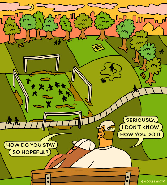

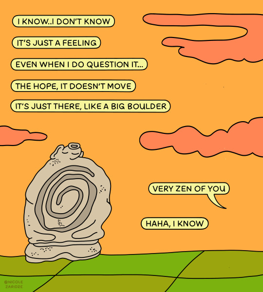
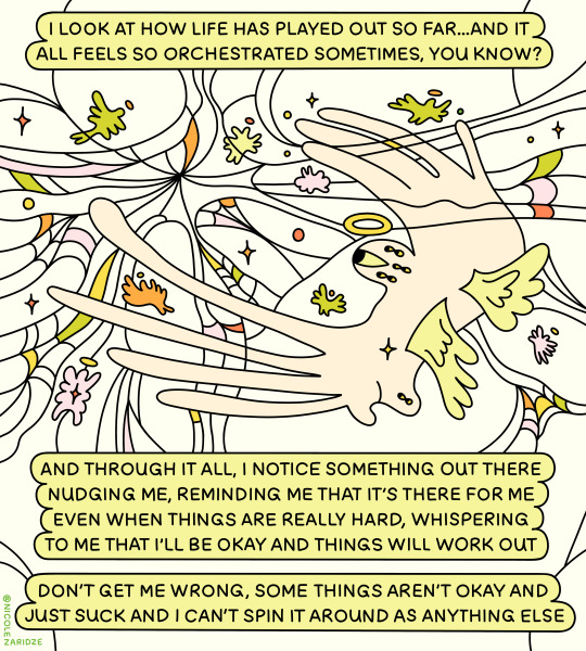
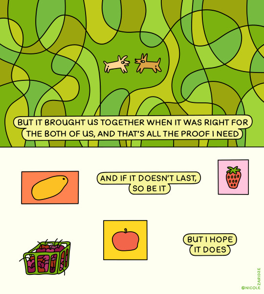

hiii 🧡 it's been a while
i brought you a bouquet
#illustration#artists on tumblr#female artists on tumblr#illustrator#art#book illustrator#female illustrator#comics#comic artist#comic art#female artists on instagram#artists on instagram#procreate#digital artwork#digital artist#art blog#artist blog#artist on tumblr#web comics#tumblr plz#tumblr art#tumblr pls#tumblr art blog#art on tumblr
705 notes
·
View notes
Text

#illustration art#illustrations#digital illustration#female illustrator#illustration#procreate illustration#critical role fandom#critical role#exu#crit role calamity#calamity exu#exandria unllimited calamity#critical role calamity#exu calamity fanart#critical role exu#the ring of brass#crit role#critical role fan art#critical role fanart
156 notes
·
View notes
Text
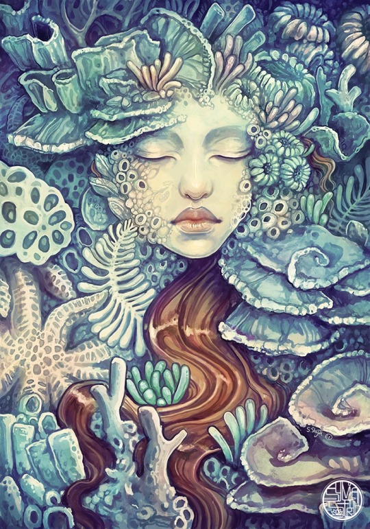
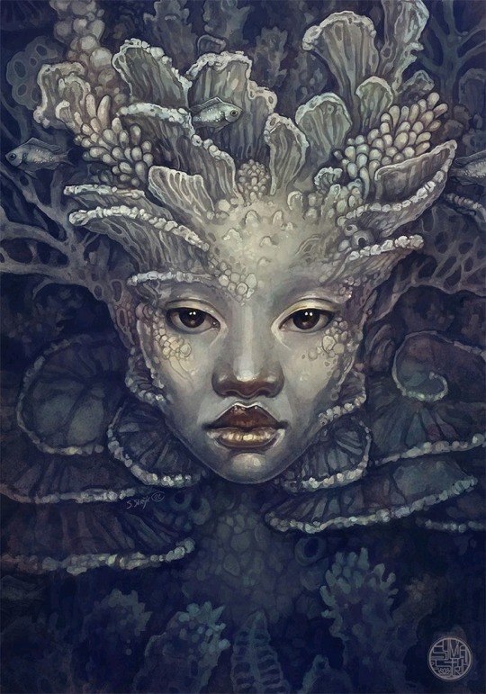
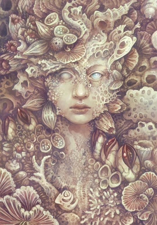
I love imagining mermaids as beings that don't age like humans, but instead gradually transform into coral and sea shells, merging with the ocean. It's a concept inspired by the original ending of Hans Christian Andersen's "The Little Mermaid" fairy tale. In that version, she becomes sea foam after refusing to harm the prince she loves.
This theme of metamorphosis, of becoming a part of nature, of finding solace in the embrace of the sea, resonates deeply with me. The acceptance of life's cycles, even the dance with death as a natural partner, is utterly captivating.
I've expressed this concept through several mermaid paintings over the years, and I wanted to take a moment to put these three pieces together. Despite creating them with years in between, they feel like they belong together
Find them as print and merch in my shops!
#sylvia strijk#artists on tumblr#illustration#my art#fantasy art#digital painting#mermaid#merfolk#siren#Coral#nautical#fairy tale#female illustrator
487 notes
·
View notes
Text
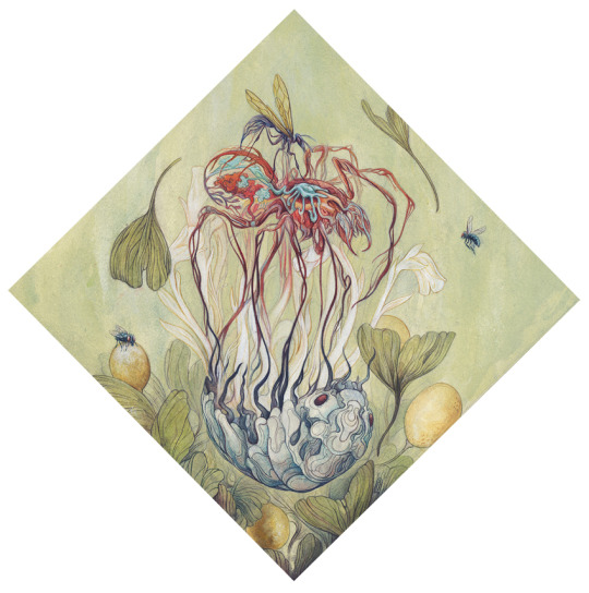
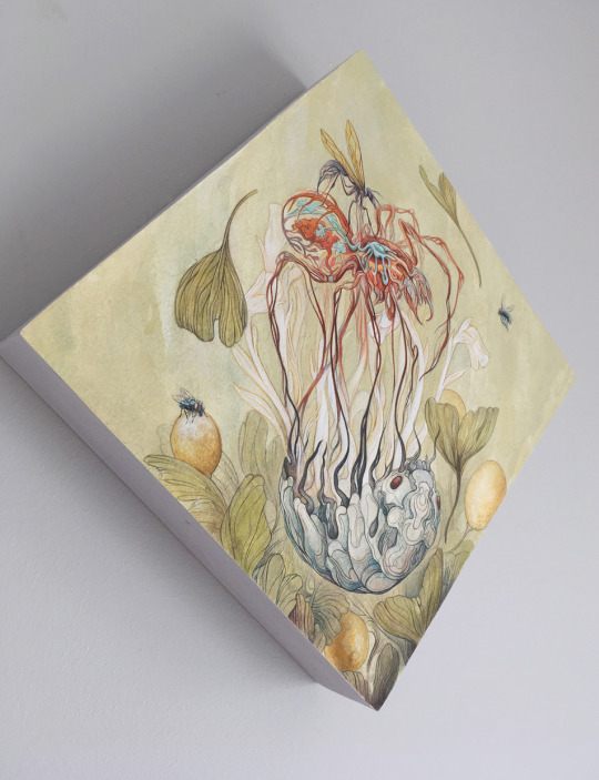


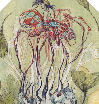
One Dies, One Grows | Mixed Media
Pulling inspiration from the earth below our feet, this piece portrays the cycle of energy dispersal. Trapped in a repetitious and unending sequence, the death of one gives life to another. Detritus gives way to scavengers, giving way to hunters. Hunters become the hunted, and their bodies dissipate back into the earth. Tethered to their roles through the thirst of survival, such order promotes the wealth of life as it exists today. When one dies, one grows strong.
#illustration#female artists#artistsontumblr#female illustrator#art#artists on tumblr#corinne reid#acrylic painting#insect art#arachnids#spider art#biology#zoology#painting#fine art#for sale#mixed media#gouache#mixed media art
129 notes
·
View notes
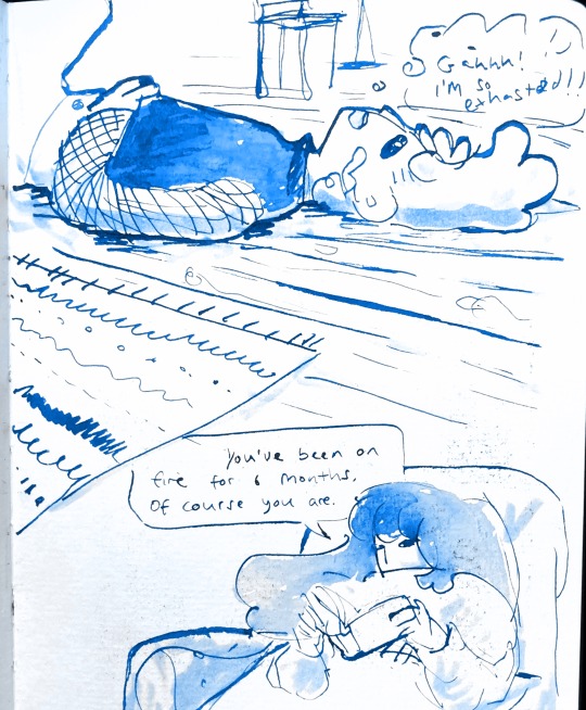
Text
9th feb '24 - [arch] characters, interactions and emotion - making a mini webcomic
Gahhhh Shri this has been an absolutely crazy couple of weeks!!!! Hope you are doing well :)) First of all, WOW! You have a lot of goals, and I’m sure you’ll get them done! I’ve worked a lot on my graphic design during the process of making Winter Wellbeing. If you wanna see a blog post dedicated just to that, I can do so! It would be cool to compare notes on the approaches we take for graphic layouts. If you wanna share your knowledge of camera skills when you build that up that would be awesome 😭😭
It’s been a tough few weeks, art wise. I have been reflecting on my process, motivations to create, the ego and all the baggage that’s lumped into the creative process for me. It turns out there’s a lot. I took some space from my illustration practise (literally for a weekend!) and began to realise how dysfunctional it is. I’ve been writing a lot about that so there may be a larger piece of writing coming about that at some point (no promises!!)
But for now, let's talk about little successes!
I’ve been playing with some characters for a while but I’d hit a bit of a block with the plot. I realised the expectation of having a finished project of high quality soon is unrealistic, and an unhealthy expectation to put on myself. I rarely give myself time to play with concepts for a long time and let the characters, plot and interactions evolve naturally. Maybe this in part came from sticking to the short university module turnaround. I noticed that that short turnaround was causing a lot of block, so I have decided to bench it as a comic for now and focus on using it as a playground - falling in love with the characters, creating stories and drawing them for fun. Maybe years down the line I’ll make them into a comic - we shall see!
I *tried* to do hourly comics day this year and it didn’t quite work for me. I think I made 3 comics? And then got distracted with a bigger project that ended up taking a week or so to complete. Let’s have a look at it, shall we?
[you can find the full version here]
First of all, it’s based on an unfinished fanfiction I started a couple of months ago, which was mostly bad, but there was one nice scene that I liked and wanted to expand on. I started by having a look at the script I wrote and thumbnailing on the iPad. I’m away from home at the mo and usually would prefer to do most of my artwork traditionally, but because I don’t have access to a scanner, the whole process was digital this time. A lot of the pages got scrapped because the dialogue wasn’t necessary, and I’m not drawing pages that aren’t necessary.

some more development screenshots

I thought a lot about posing during the process, acting the scenes out in my mind and sometimes physically, really understanding the emotions of the characters, why they’re saying what they’re saying, their tone and how to convey that though their body language and expression (i find grian really annoying normally [affectionate] but I want this grian to step on me).

Pearl was hard with this because she’s quite erratic and unpredictable in this series, so I wanted her to switch from raw explodey anger to playful jabs at Grian. I’m hoping this comes across as somewhat insane, rather than tonally off and inconsistent. I did super enjoy drawing her and her explosive nature though, especially in comparison to Grian’s coldness.


I played with levels and monotone colour too - I’m not working with multiple colours much at the moment so I’m able to focus on things like values composition, characters and backgrounds. My skills limit the kind of stories I can tell currently, so I’m working to improve those foundations. Maybe when I’m back in the riso studio I can play with colours a little more.
Colours - despite the simple pallete it gets a bit nerdy here.I stuck to specific flat percentages for most of it - Pearl’s hair and Grians jumper are 60%, Grian’s hair and Pearl’s cloak are 20%. Then I added a 14% layer for shadows, using a ahrd blend eraser tool for highlights, making the images quite dark. I fill a layer with texture from Forystr’s riso brush for procreate, and turn it into a 40% opacity colour dodge layer. This gives it some much needed texture and makes the lighting feel low and nighttimecore. It also pushes the values to look really nice - I tend to be too scared to push them by myself.
I tried a few different colour layers to get a *vibe* but settled on a low percentage riso blue in a colour layer. All layers besides the riso blue are in a riso black, colour picked from a riso colour pallete.
I learnt these tools - using percentages to get good values - from working with risograph. I really recommend having a look at these techniques and doing some monotone work. It's really improved by character designs, page layouts and compositions.


That's all from me today, though I have had MANY other thoughts over the past two weeks about creating, but perhaps we'll dive into them another time. If you (or anyone else) has any questions, hit me up with a reblog or an ask and I will get right to it.
Lovely to hear from you! Hope your art is going great too :))
Arch :)
#archillustrates#arch is learning#project development#art#art process#art resource#process#artists on tumblr#illustration#comic#picture book#small art blog#art blog#illustration blog#female artists on tumblr#queer artists on tumblr#illustrator#book illustrator#female illustrator#queer illustrator#comic artist#comic art#female artists on instagram#artists on instagram#procreate#digital artwork#digital artist#artist blog#artist on tumblr#web comics
24 notes
·
View notes
Photo
Dance fever - Florence and the machine / Gouache Illustration 2022
#fineart#dance fever#florence welch#florence and the machine#florence + the machine#fanart#mythical#mystical#gouache#holbein#holbeingouache#traditionalart#traditional art#gold paint#f+tm#female illustrator#prettyart#florence
148 notes
·
View notes
Text
Women's History Month
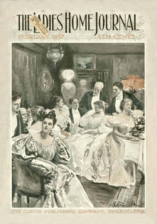
Alice Barber Stephens (American, 1858-1932) • Ladies Home Journal Cover • February, 1897
#art#illustrator#artwork#illustration#woman artist#female illustrator#alice barber stephens#vintage magazine covers#magazine cover illustration#vintage illustration#victorian women's magazine#late 19th century illustration#american women#sassafras and moonshine blog#american illustrator
8 notes
·
View notes
Text

bunny
#artists on tumblr#female artists#my art#illustration#female artists on tumblr#drawing#sketch#line art#illustrators#female illustrators on tumblr#female illustrator#women who draw#women artists#bunny#cute
34 notes
·
View notes
Text
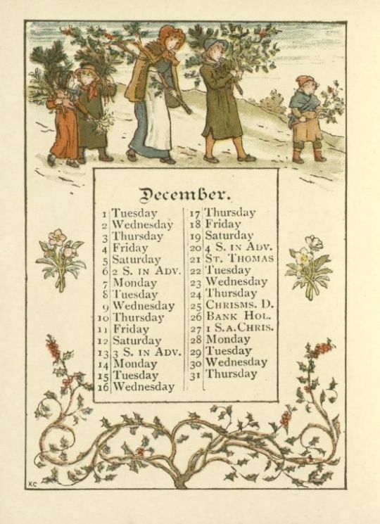
"December" from Almanack for 1891, illustrated by Kate Greenaway
via digitalcollections.nypl.org
#kate greenaway#illustration#art#illustration art#british art#british artist#british illustration#female artist#female illustrator#19th century art#19th century illustration#vintage aesthetic#vintage illustration#victorian art#victorian aesthetic#victorian illustration#1890s#1890s art#december#december aesthetic#winter#seasonal#e
15 notes
·
View notes
Text

Fuschias by English natural history illustrator, Augusta Withers, published in Illustrated Bouquet, 1857 ♀️
#women artists#women's art#english artist#english natural history illustrator#female illustrator#augusta withers#illustrated bouquet#1857
31 notes
·
View notes
Text


Ok, I usually don't publish content like this but in this case I've moved a lot away from my xD comfort zone. Not everyone knows that I have a strong passion in shipping the Fremione in the Harry Potter world, but I'm very satisfied with how the drawing came out so here we are xD
P.S - There is also a Fred with curly hair 👀
#Fremione#drawing#digital art#my fan art#fred weasley#hermione x fred#hermione granger#hogwarts#granger x weasley#the right weasley#fred and george#weasley twins#George weasley#draw#common room#illustrations#illustrator#female illustrator#Harry Potter couple#Fred x Hermione#harry potter fan art#fanart
211 notes
·
View notes
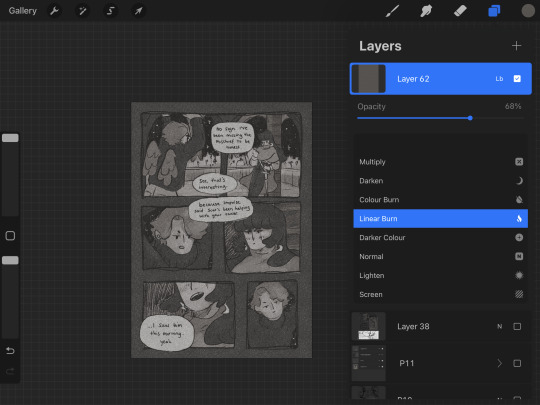
Text
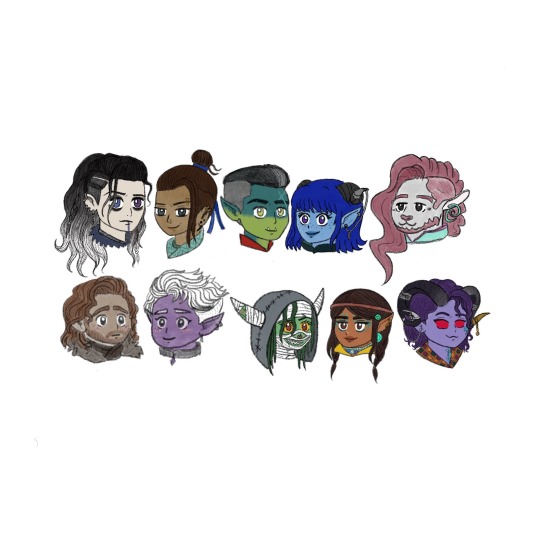
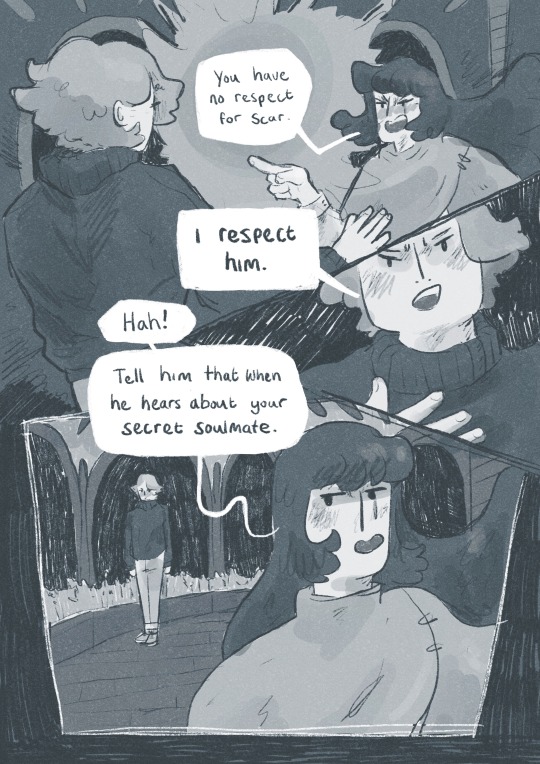
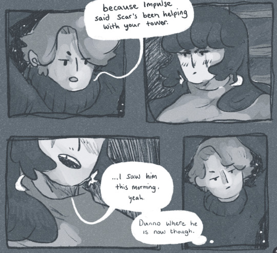
The Mighty Nein
#illustration art#illustrations#digital illustration#female illustrator#illustration#drawing#procreate illustration#ttrpg#critical role fan art#critical role art#crit role fan art#crit role#critical role fandom#crit role art#mighty nein fanart#the mighty nein#mighty nein#jester lavorre#fjord stone#caduceus clay#nott the brave#caleb widogast#essek theyless#yasha nydoorin#beauregard lionett#mollymauk tealeaf#cr2 fanart
59 notes
·
View notes
Text
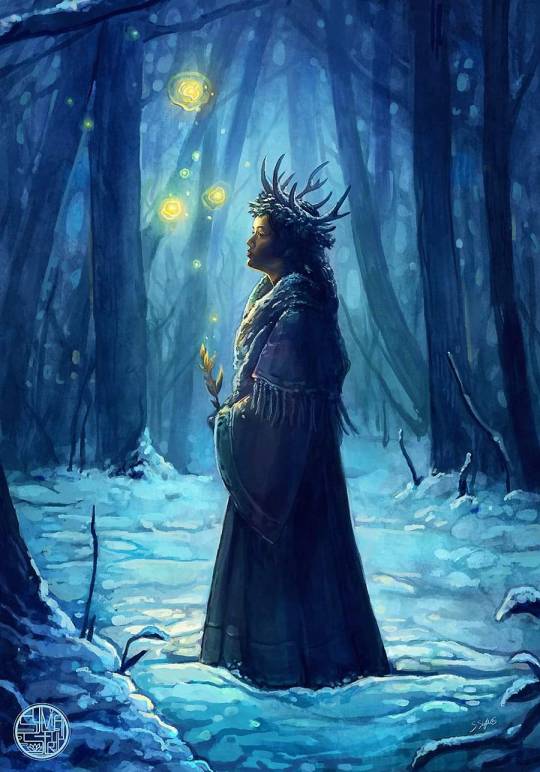
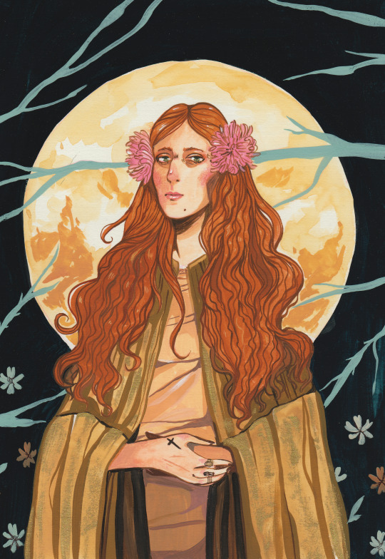
"Winter lights "
I took a little break from my socials after the holidays. Now I'll be back to my regular schedule. During my break I dedicated some of my time to the #WondrousWinterTales art challenge. Although I am a bit behind in sharing them, I would like to share my painting inspired by the first prompt, "Antler Crown & Winterlight." I aimed to evoke a fairy tale atmosphere and experimented with different rendering techniques.
#sylviastrijk#myart#digital painting#artists on tumblr#digital artist#fantasy artist#fairytale#procreate art#wonderouswintertales2024#winter wonderland#female illustrator#Illustration#fantasy art#fairytale core#winter nights
157 notes
·
View notes
Photo

Two characters from Kat Dunn’s Bitterthorn. Endpaper illustrations for a special edition copy produced by Illumicrate.
#artistsontumblr#female artists#lbgt love#lesbian#happy pride 🌈#Illustration#female illustrator#lgbt fiction
53 notes
·
View notes
Text
23rd Feb '24 - [arch] OH RISO my beloved!!!!!! ft. cyberpunk hermitcraft soup group
A cliffhanger!!!! And now I have to wait a month for you to upload the second half?? How will I cope :’’0
For real, it’s so awesome to see your process and the sheer amount of inspiration you take! In particular, I thought ‘Sit on Two Chairs’ and ‘This Was Our Pact’ were particularly yummy.
I think book covers are really hard. You have to sum up a book’s energy in one image, make it stand out and show just enough so people want more. Exploring the narrative through those full pages is really interesting - though this is something you did for fun, it could be a really useful technique for getting to know a narrative. When I’m designing my comic covers, I always do it last - that way I’ve had practice with the visual style and I’m thoroughly familiar with the themes, so I guess spending a bit of time with the characters and narrative in this way helps for standalone book covers too. Of course, it helps if you have the time for that XD
Okay!! Onto what I've been up to!!! [warning this is a beefy post I'm sorry for your poor reading brain]
The past two weeks have been really enjoyable! I’ve been playing a lot with slow world-building, in sketchbooks, google documents, and voice notes to friends. Letting myself really sit with concepts, think about the characters, let them play in my head with no expectations. With this relaxation and lack of pressure, some beautiful narratives and interactions have been developing. I’m starting to need a name for a world/ the story. I’m not quite ready to give them a full introduction to the internet - I know it doesn’t but it feels like there’s some accountability to *produce something* and this slow development is really important for the quality and my skill building.
It’s really hard to take on, but we actually don’t have to make the perfect thing now! In fact, it’s impossible. Pressure on ourselves makes it so hard to make something good if we’re always grasping at the final result.
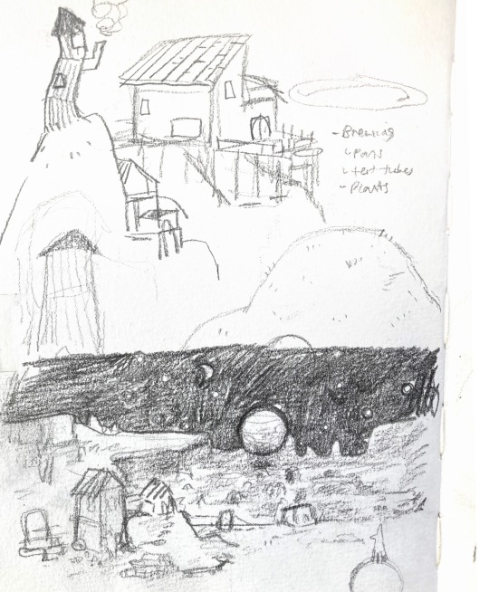
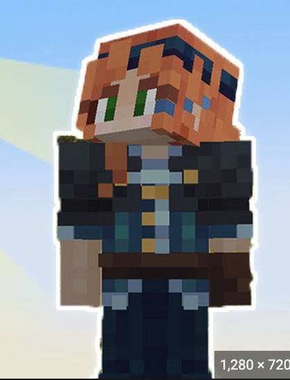
In the meantime, while those characters develop, I have been working hard on my basic skills. I wrote about characterization last post, but this week I focused on setting and colour. I was inspired (once again) by Hermitcraft. I’ve seen some really incredible illustrations of Minecraft builds in the fandom, and it seems like a great exercise.
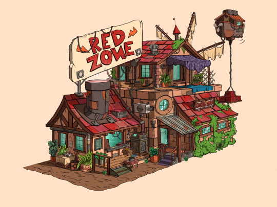
Bdouble0's Season 10 Base illustrated by @applestruda [source] and The Red Zone, built and illustrated by Bdouble0 [source]
One of the creators on Hermitcraft, ImpulseSV, created this build in a recent episode. It takes inspiration from the last season of Hermitcraft, where he was part of the ‘soup group’ with two other players, and his current base concept - a cyberpunk city. I also LOVE his new character design, so I wanted to place him in the scene.
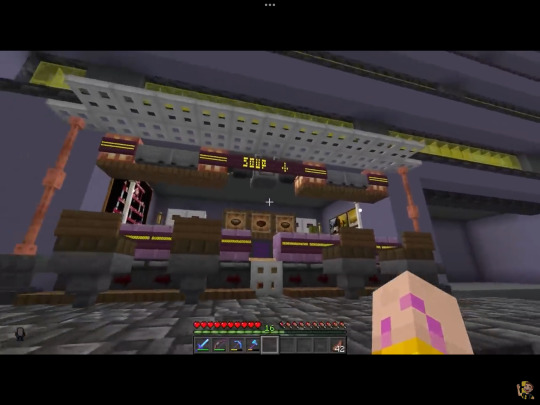
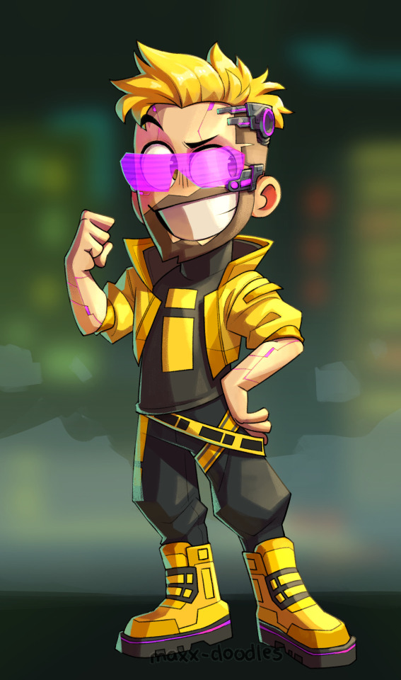
Screenshot from Impulse's video and new impulse design by @maxx-doodles
Here are some initial thumbnails I did, trying to figure out the composition. I wasn’t sure of the vibe yet, so I tried some rough thumbnailing, and drawing on an isometric grid and other perspective techniques. I’m going a bit mad for characters at the mo, so I wanted to place some in the scene. I found the angle of the isometric grid steep to place characters comfortably, so decided against that.
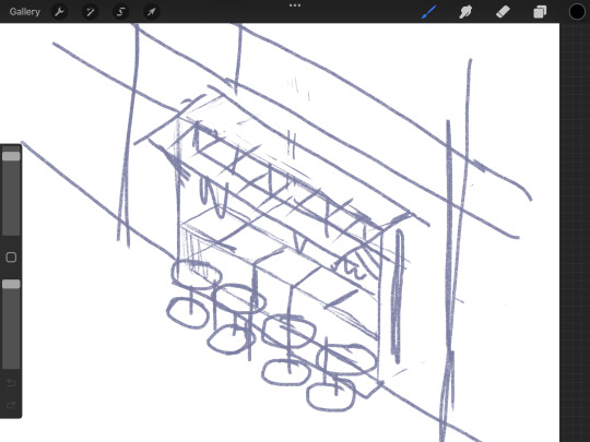
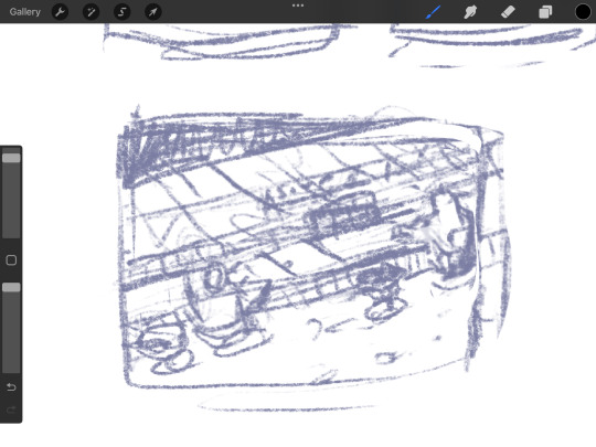
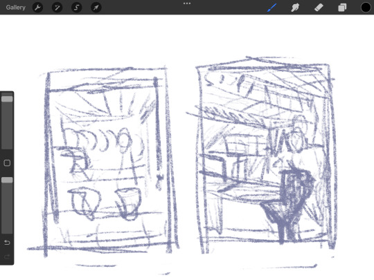
Looking back at it, I love the second! But I believe I was struggling with the perspective. I decided on the last one eventually.
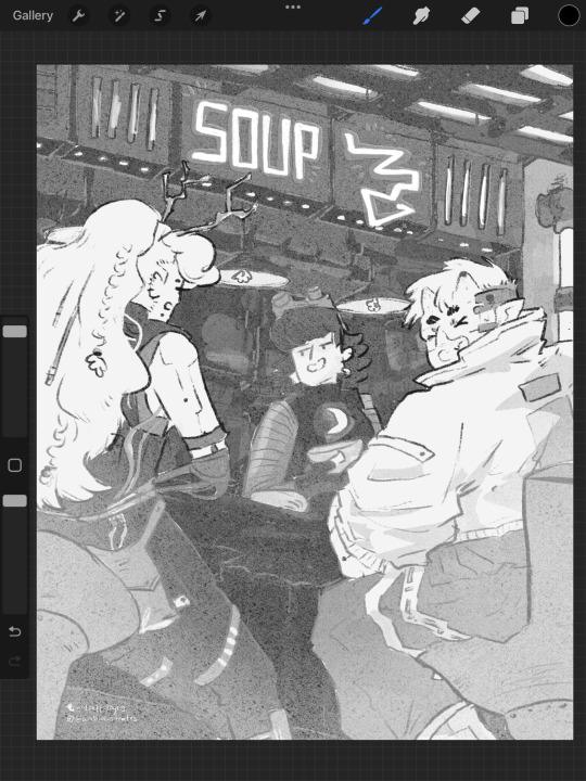
Now, I absolutely adore all of the players in the Soup Group, and I am BIG fan of redesigning their notable characteristics to suit different settings. So yes, I decided to put all of the soup group in the image.
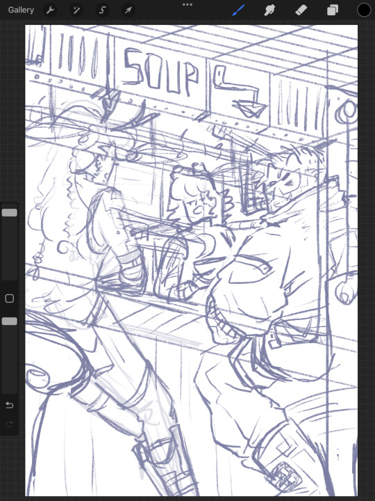
PearlescentMoon (left) from my comic and GeminiTay's Hermitcraft Season 10 design [from this thumbnail] (right)
Here's the sketch of the final image. I really enjoyed coming up with cyberpunk versions of them all. I used the impulse design almost exactly, with a few extra interesting details since he's mostly viewed from the back. For PearlescentMoon (middle) I kept her fringe, dark hair and gave her a glowing moon symbol on her top. For GeminiTay, I kept her long ginger hair, antlers (but glowing!) and took inspiration from her new season 10 design - a dark blue jumpsuit to match her dark blue clothes in her new design, and the braids she is often drawn with. I also gave them edgy new hairstyles. And a robot arm. I don't have lore for that.
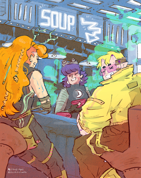
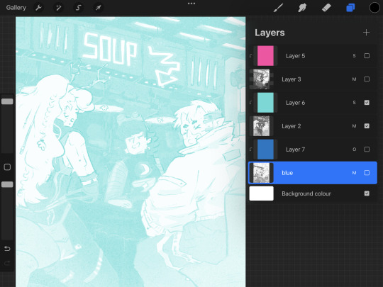
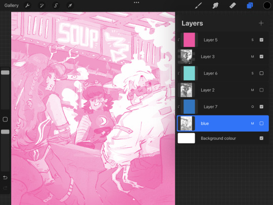
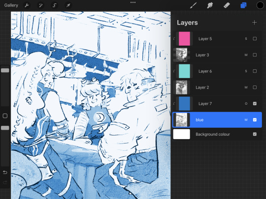
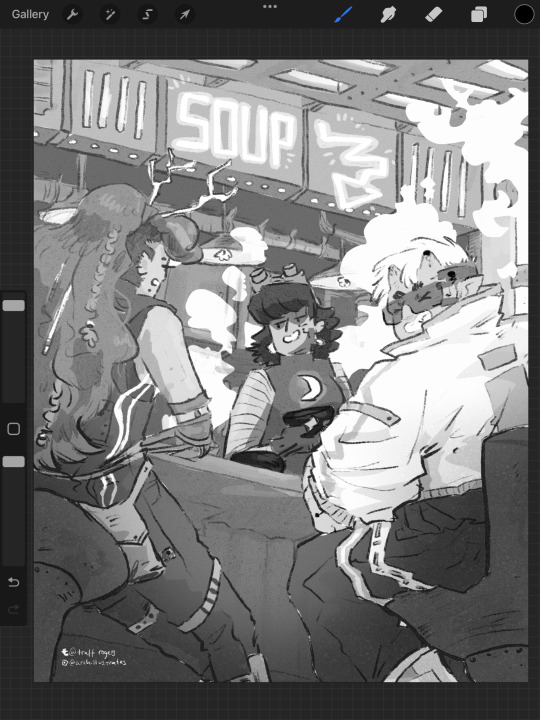
As usual, I filled each flat colour-to-be with black and lowered the opacity to play with the values. Then I added colours one at a time, aware might be riso printing it. Originally I stuck to trying to make it printable (making the colours out of ones I could make my layering 2-3 colours at different opacities), but as I went on, I decided to drop that and focus on the quality of the image in a digital format alone. I did keep the grayscale version above with all the separate layers in case I needed that if/when I came to riso printing it. Below are the main two digital colour schemes I tried out.
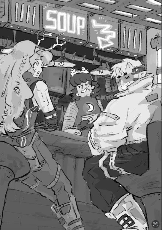
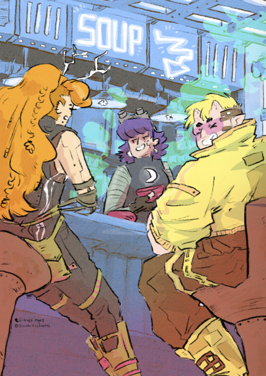
I settled on the one on the left, with the blue tones - the foreground characters really pop. I put a few details in Gem's hair, colour variations etc, and cropped it for Instagram. I actually much prefer the cropped version - it sits better in a rule of thirds.
Now the moment we've all been waiting for :'')
RISO!!!!!!!!!!!
I returned to Cardiff after a couple of months away and was delighted to spend my first day back at The Printhaus, an awesome shared print studio where I have basically made my home. A few of my awesome friends happened to be there, so I spent the day playing around with this image with their help! (please check them out they're very cool - Gavin helped me a lot (we hung out at Thought Bubble, remember? and Rhi gave good crits too!!)
For those who don't know, risograph is basically a shitty photocopier that can only print one colour at a time. However, you can play with gradients and opacities, and layer colours really nicely to combine. I've done a lot of single-colour tonal work with riso but this is my first go really layering.
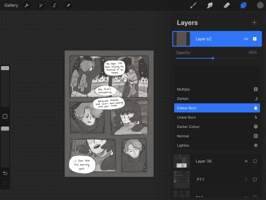
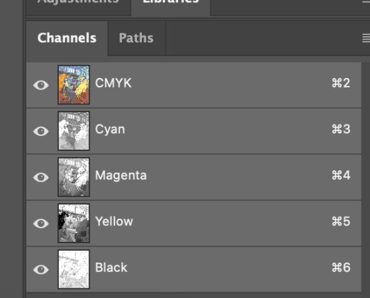
First, Gavin showed me how to separate the channels in Photoshop, using the flat image uploaded to the 'gram. We copied and pasted these layers in grayscale and added blending modes to each layer to replicate what they might look like when printed.
With blending modes, the digital mockup looked like this!!
This bit goes into technical details for replicating what the print might look like for those who might want it - feel free to skip :)))
I copied and pasted the Cyan, Black and Magenta layers as greyscale (as you can see above)
I made all of the greyscale layers multiply layers since risograph ink is transparent and we wanted to see how it layers. The ink usually comes out a bit lighter than you think, so it's good to bear that in mind. I used a clipping mask over each greyscale layer and a blending mode. WHEN YOU PRINT, PRINT IN GREYSCALE, NOT COLOUR.
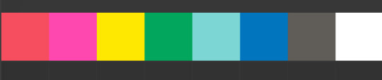
Here's how I split the colours from CMYK to the riso colours, their hex codes and the blending mode I used to replicate the colours:
Cyan - Mint [HEX#82D8D5] Screen
Magenta - Fluorescent Pink [HEX#FF48B0] Screen
Black - Blue [HEX#0078BF] Overlay
Yellow - scrapped for colour scheme purposes
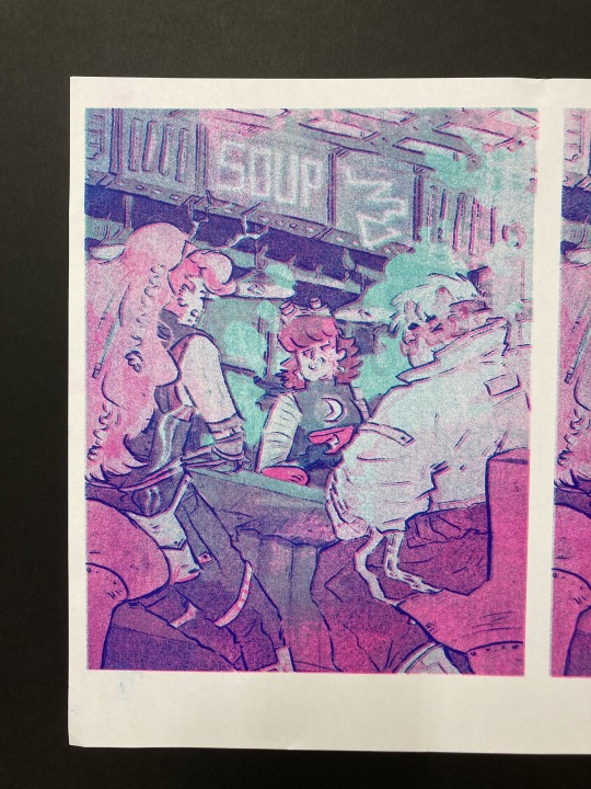
Blue, Mint and Florencent Pink layers in greyscale in Procreate.
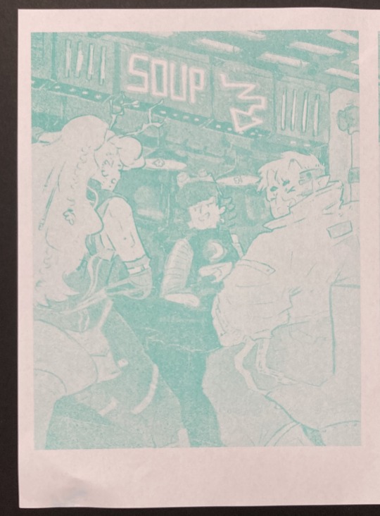
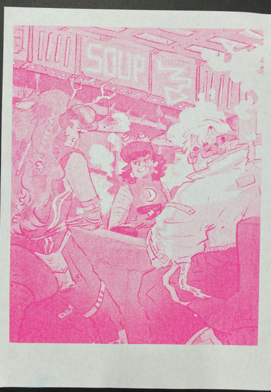
Riso printed Mint and Florescent Pink layers on separate paper, followed by the two layered together.
We always start with the lighter colour inks first, because sometimes the rollers can pick up the ink and cause extra marks where you don't want them. The first two colours came out great!
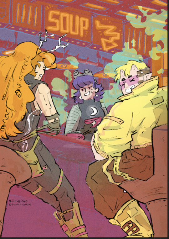
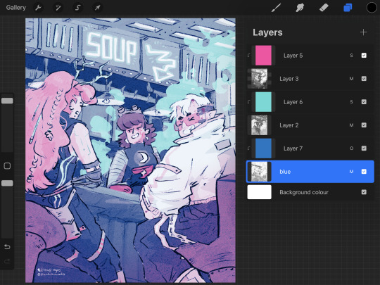
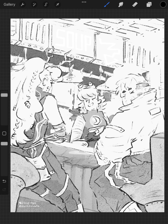
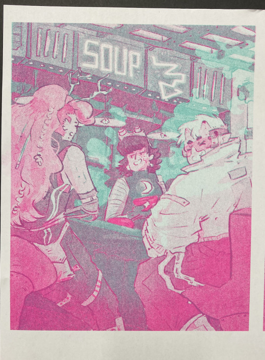
The first time we printed the blue, it came out very dark (left, first image). I have had this issue before - my last book, Winter Wellbeing, came out much darker than I wanted. Now I realise that the blue ink is super sensitive. All the 'white space' that is covered by a low-opacity blue on the left is only 2%, and yet it has come out pretty strong. We tried printing it on one of the misaligned images just to see, but it took all of the brightness out of the neon soup sign at the top of the image (second image). So I changed the values and pushed them way lighter, so it just pushed the values of the darker bits slightly, and brightened some of the lineart (right, first image)
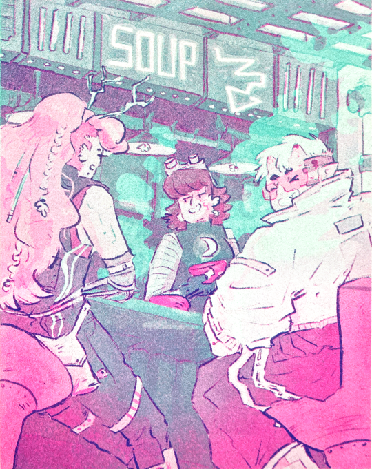
And this is the final riso printed version!! I'm so so happy with how this came out. It's so different from the original digital version, and I actually love that.
I didn't create new colours in the way that I intended to - I wanted to play with overlaying purposefully to create specific colours eg. orange for the hair etc. But!!! I'm really happy with how it came out. That will have to be a project for next time.
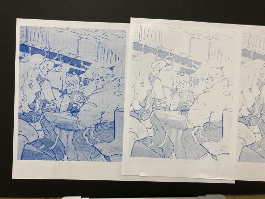
Also, many copies are slightly misaligned, so in future I think I'd do flat layers for the colours a more blobby style with the linework on one layer only so there's less of a chance for obvious misalignment. design for the riso, rather than riso the design.
Overall though, this feels like a super cool step up and a milestone for me. Super happy with how it came out!! And I'm excited to play with colour some more.
Can't wait to see the rest of the Lionheart brothers! Enjoy your weekend :)))
Archie 🕺🕺🕺🕺🕺🕺🕺🕺🕺🕺🕺🕺 <3
#archillustrates#arch is learning#smileyshri#project development#art#art process#art resource#process#artists on tumblr#illustration#comic#picture book#small art blog#art blog#illustration blog#female artists on tumblr#queer artists on tumblr#illustrator#book illustrator#female illustrator#queer illustrator#comic artist#comic art#female artists on instagram#artists on instagram#procreate#digital artwork#digital artist#artist blog#artist on tumblr
18 notes
·
View notes
Last Seen Blogs
sweetlittlegingy
The H_ngm_n’s Comin’
sephiraa
✩‧₊* Sephira Astro & Tarot *₊‧✩
wolfmanjacksonpollack
Pathological Eclectic Accretion of Rubbish

pipicacaculotte
Sans titre