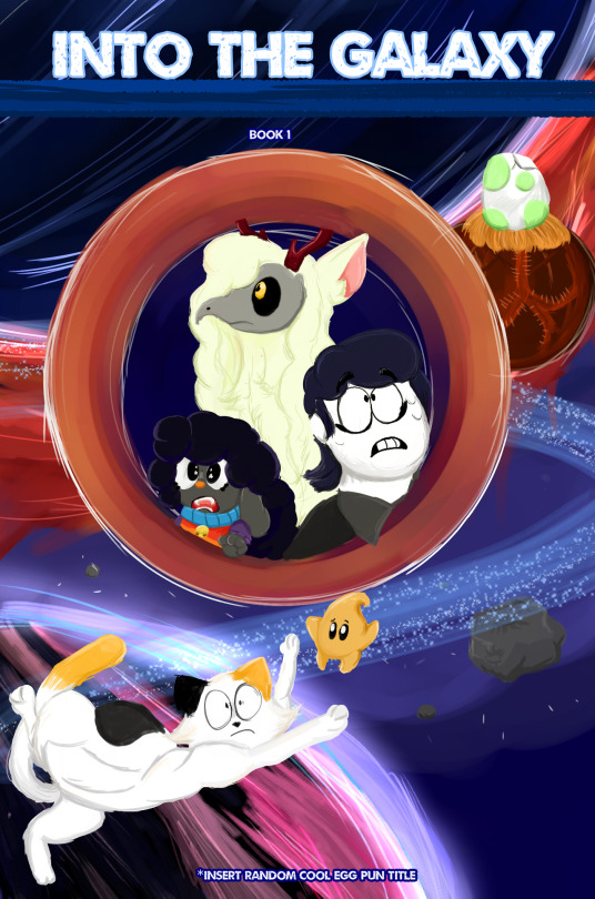
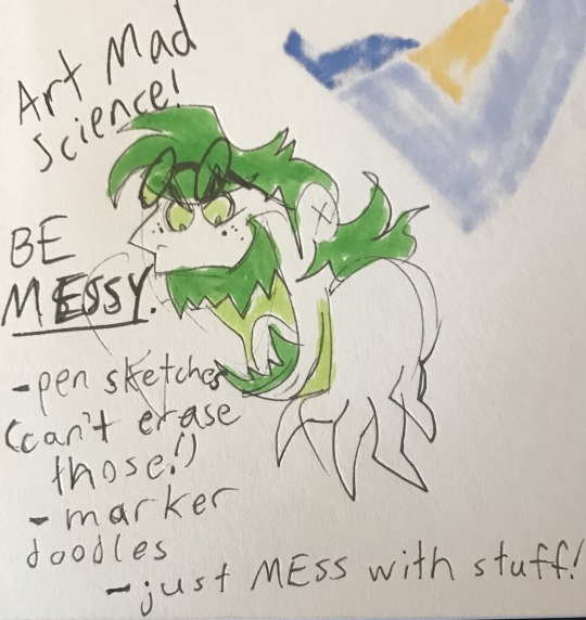
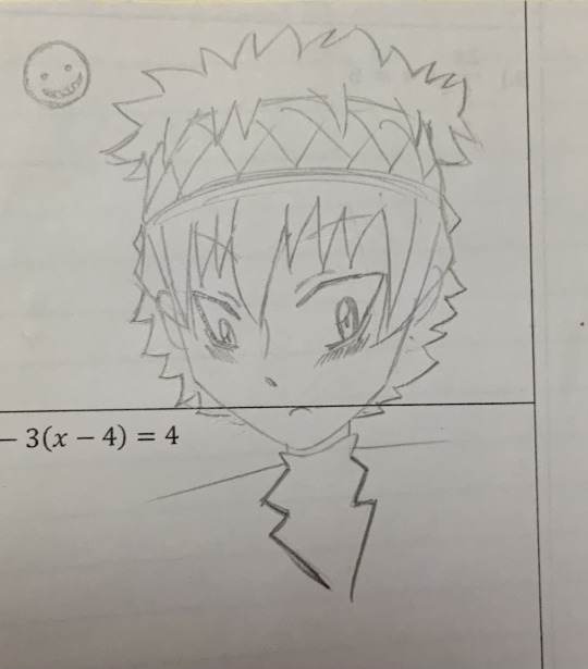
#first time happy with messy lineart and messy coloring
Text

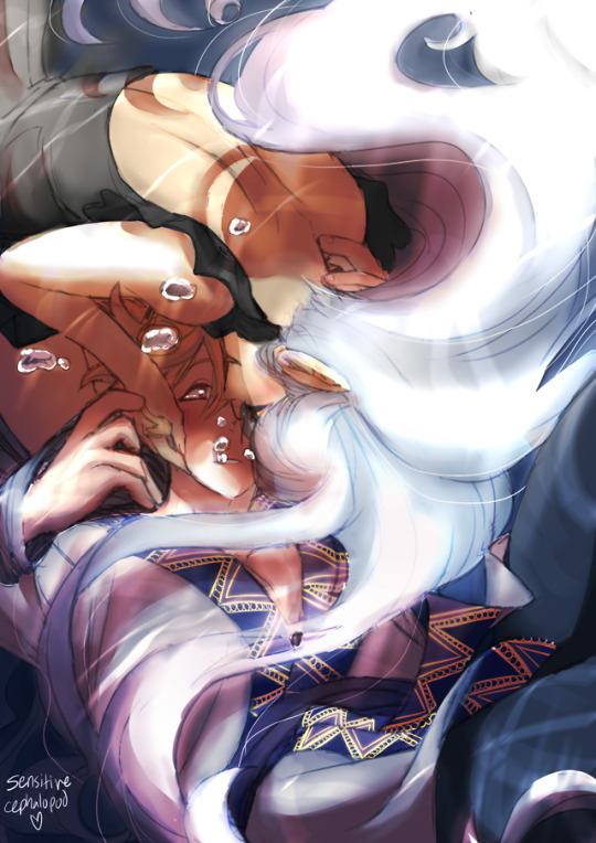
I've been juggling a lot of things at the moment but!!!! Just wanted to drop this here to show I am indeed still alive and making UWE fanart as promised! This is a little peek at a slightly bigger (?) animation I've been working on whenever I get the chance to amid everything else I'm doing! Animating his ear flicking back like a cat's ear was honestly my favorite part of this next to another little section not shown here
#unicorn warriors eternal#unicorn: warriors eternal#uwe#uwe aelwulf#aelwulf#fanart#animation#fan animation#uwe animation#artists on tumblr#unicornal wips#This is the second rough pass of this so apologies for it being a little on the messy side KJDJKSGJKLDS#I'm planning to have it cleaned up a little before I dive into finalizing everything via rendering lineart colors and whatnot#but for now I'm in the rough pass phase where I'm messing around and tweaking little bits and bobs here and there until I'm happy#This is definitely my favorite animation I've done so far; not to mention it's a first for me in terms of everything it entails#I've been really wanting to challenge myself BUT I've also had so many animation and fanart ideas bouncing around in my head#for the entire time I was away so needless to say I'll have a lot to share and even more coming soon hopefully!#I'm really excited about this one it's something that's been on my mind for Weeks so hehe KJDKLJSJGKLJSKL
32 notes
·
View notes
Text
Okay can I talk?
eric belonging to @night-light-artz
Patches @eve-pie
Okay for the image above I was doing a “mock” warrior cat book. I miss the old covers but anyway
I kinda feel my art is…boring. I mean it just feels that way. Sometimes I feel I rush myself to get things done, and to be honest I hate having to rush myself. I look back at my recent post and they just fall FLAT. Flat as in the colors are just boring as heck. Lineart? I don’t really like. Not only that but everything feels so unpolished
My anatomy/details
I hate the fact I miss crucial details of my chat starts or even other people characters. I mean, HAVE YOU SEEN HOW I DONT EVEN ADD SILKY’s ANTLERS 99% of the time? That bothers me. And I see other people add them and I’m just “well damn I’m so lazy I can’t even add antlers on my own fucking character”.
Not to mention the poses. Everything feels so stiff with me. So dang stiff that you may as well call my art wood and use it as a support beam. I hate how I don’t use references for my art. Maybe If I used them more and actually took my time stuff wouldn't look like your average horrific Netflix Original cartoon of some movie.
Backgrounds/minor objects.
Do not get me started. I hate all of them. They look so low effort. I mean, I know I can do better with them! But it seems like I worry about the main characters so much. In fact, I feel the background just falls flat or blends in too much with the characters that it looks. Messy. If I draw a cup, i'll skip over details and it will look awful! Which isnt good, as it shows im lacking severly.
Time
And for time I rush. I feel like I have to literally push things out by day’s end and well…it affects my art. Lately o just been so focus on the hour and time it just makes the art suffer. Even if no one else sees it I do. I love my painted style, but it takes quite some time. And forgive me but I hate just doing sketches to and posting it. I prefer my art to be colored in and all the way. Now im not saying i dont like it when other people sketch. That would be a dick-head move of me.
Some days I fear if I don’t post or read inboxes everyone is going to think I purely abandoned them. I try to focus on my page. but just giving them a sketch at the end well...it makes me feel as if I just dissapointed them. I think to myself and say "I could have done better than that. Why did you even do that in the first place {Name}. "
I have like so much on my agenda and plans and then i realize I can’t do it all in one day. Hell sometimes I just make one day spefically on one subject.
If that day was animation day; I focus on an animatic.
If a certain day is art day and I want to set up my commission page (which is so messy I deleted it) then that’s the settled day. But I feel like I’m going so slow. It's like I am running out of time, and time is just passing by as I look at my clock.
And I'm not blaming anyone it's just my stupid head that makes me feel this way. I know no one is trying to rush me. But head is like "Oh but what if- and why not-". It bothers me. It clouds my vision and i don't realize in reality...no one is saying the things my brain is saying. Sometimes I feel like I'm bothering people when i draw their charcaters so much and tag them. I fear they just say 'Aw great it's this one person again."Sometimes I feel I need to be MORE original. And some days i feel i just need to give up entirely. Some days I think posting everyday will aggervate folks. Sometimes I envy the attention of others, and when I see what they gain or what following I have i look back at myself and say "Well maybe if you did this better than MAYBE you people will be interested in ya". And damn do i slam my head in a wall. Everyone just seems so happy, and yet here I am fretting over if this fucking dog I drew looks remotely interesting. And I just feel it...blends in. Like what is there so special about my art?
MY BLOG
And for this blog, I don't know if I truly have an identity for myself. There's Silky, there is Minty and Syrup, there is Simon and there is Shrimpy. But who do they belong to? What roles do they even serve in this blog? I want them to be my identity. I don't want them being just some sort of character leech. They lack story, they lack purpose, they are thrown in tropes and gag. But what do they relate to? Nothing. Nothing at all. And yeah yeah I know im thinking to DEEP into this. But it's been on my mind so much. And hell call me crazy for talking about them if they are real, but they mean a lot to me. A LOT.
So I tried to make my art interesting here like, i tried referencing images space. I tried adding more anatomy to Snowy since I am tired of doing the usual standing up pose. I even wanted to make the background feel more detailed. I feel a bit better, but I still fear everything is too...eh...bland. Maybe it is just me.
Sorry for the ungodly word of text. I know I shouldn't vent here.
#vent post#artist on tumblr#super mario galaxy#eric velseb#patches bashful#silky silksong#welcome home#mario
30 notes
·
View notes
Text
Messy colorings of Kin and Kiku.
I love them both so much
BIG WANO ACT 3 SPOILERS UNDER THE CUT CUZ IM ACTIVELY WATCHING IT AND WANNA SCREAM ABT THINGS REAL QUICK
Also spoilers for Zou if you haven’t gotten there, and spoilers in the tags a little bit
Ok
So I did the lineart, yea?
And then I put it down to watch a few episodes with my sister.
And then IMMEDIATELY the DAY I DREW THEM for the FIRST TIME
OUR FIRST EPISODE OF THE NIGHT WAS NUMBER 1,036
😭
WHAT THE FUUUUCCCVMMMKKKKKKKK
LITERALLY FUCK YOU ODA WHAT THE HELL
And to add insult to injury, the night before my sister and I had had a talk about “ohh yea I think some of the Akazaya 9 will probably die. I think Ashura Doji is actually dead, and some of the others will probably die too”
So, we were sad, but we also agreed that “Kin’emon is like definitely safe.” “He’s been with us for like half the series now, hey can’t just kill him.” “He just HAS to see the land of Wano opened up, his life has been pretty much nothing but tragedy.” “He’s the best and we love him. He deserves a happy ending”
But no. Then they hit me with the father-son feelings he had developed towards Momo!?!??? WHAT!?!! YOU CANNOT DO THAT TO ME ISTG!!!
And Kiku, too! My sister is trans and she was very upset cuz she loooves Kiku and gets very happy whenever we see her fight and-
Ouch.
#one piece#one piece fanart#my art#one piece spoilers#wano arc#wano spoilers#one piece wano#wano kuni#kinemon#foxfire kinemon#kin’emon#foxfire kin’emon#Kin’emon fanart#one piece kiku#kikunojo of the fallen snow#kikunojo#kiku one piece#wano country#land of wano#nine red scabbards#akazaya nine
22 notes
·
View notes
Text
It took me a minute to finally get my notes straight so I could answer this— I hope it was worth the wait! I’ll give some bullet points of tips I use to help boost my production speed in addition to the strategies I use to try to keep characters consistent. Let’s get into it!

First up: How I draw faster!
Note that these mostly apply to digital art, as that’s my preferred medium.
If your art program has them, experiment with brush stabilization levels. My hands shake really bad, especially while I’m drawing, so I put a lot of effort into finding a stabilizer level that works with my need to control lines while also smoothing out the tremors in my hands. It’s made it so much easier to draw lines like I want to, and therefore lets me move on instead of redrawing the same line over and over again.
Creating templates for your art helps so much— setting up things like canvas size, color profile, DPI, background colors and images like the paper texture PNGs that I love to use ahead of time helps me get drawing faster, while I’m excited and inspired! Similarly, having a naming system for your art files is useful for speed as well as finding and organizing old pieces easier.
Having premade color palettes of local colors for characters is also super helpful for speed, as well as keeping characters on model :>
Personally, I use a single brush for lineart and rely on the selection tool and bucket fill for coloring when I actually bother to color things in. My lines are pretty loose nowadays, and the same goes for when I color things— I don't abide exactly by the lineart I draw, and get pretty messy with the selection tool and bucket fill!
I simplify character designs as much as possible— the standard design of a sigilyph, for example, is pretty complex. But I made Sen a lot simpler (and also forgot the spikes on her torso in this panel. Oops)
As for keeping characters on-model…
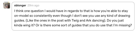
I’m very flattered that you feel otherwise, but I actually don't keep characters very on-model between different drawings— just look at the different ways I've drawn Ark below— however, I'm improving over time as I become more familiar with how I want to draw the characters! A big part of my process of keeping characters on model is drawing characters over and over to familiarize myself with how they should look through trial and error.

Learning common angles and poses I will draw characters in is very helpful for making sure they look consistent. As a bit of a downside, though, it makes wonkier angles stick out like a sore thumb! Drawing Ark with his head slightly angled downward was really hard, and I don't think I communicated it that well here:
I try to have the characters broken down into as many simple shapes that fit into each other as I possibly can, like Twig’s head (circle + rectangle snout + angled rectangle horn) Ark's hair (that weird bangs shape) and Dusknoir's upper body (beanbag shape / slightly elongated circle torso, arms coming out of his frill that comes in a very particular arcing line). This makes it way easier to draw characters quickly and consistently, because I can learn those lines and shapes and get the motion of drawing them into muscle memory.

Also, knowing the ways characters emote is like knowing cheat codes. Giving characters things like a signature comedic expression of shock or grin that they make when they're happy are very helpful!
The biggest tip I can give on the topic of keeping characters on-model (at least without model sheets— model sheets are THE way to go. Don’t be like Sofie and neglect those pieces of gold) is really just to practice. Build up familiarity with the shapes and proportions of characters, get a feel for how your hand and wrist moves to get the lines right.

#creativity tips with sofie#art tips#drawing tips#drawing advice#art advice#stuff by sofie#sofie answers asks#(kinda)
19 notes
·
View notes
Note
Hey what's it like being so swag? The people wanna know! (It's me, I'm people)
I just wanted to drop by and say something silly since I've been lurking following you for a while and your art is such a delight! You've been a huge source of motivation for me to work on improving my own art and keeping up with your fan continuity has been super fun! (I love all of your trans headcanons so much, it's really nice to see people like me)
I was wondering if you had any advice on how to build up confidence with physical art work? I'd like to try and go beyond just pencil sketches but using pens for line art or adding color to a piece can feel so intimidating since that's a lot harder to undo than pencil lines... Part of me knows it'll just take some time and practice but the rest of me can't seem to work up the courage to start anyway (^~^;)ゞ
Regardless, you're very cool and I hope you continue to feel better! Have a nice day/night! :D
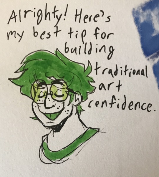
First of all, thank you so so much for the kind words! I'm so glad you enjoy all my art and trans headcanons! And I'm so so happy to hear my work has been inspiring you! That makes me so glad to hear. I am very passionate about encouraging other artists to explore and develop their own process and work.
And second, here is my hot tip for building traditional art confidence. And it is...make stuff in mediums you have been hesitating to use. Non-erasable mediums work best for building up confidence. Pens. Markers. Even paint if you prefer. You can find and watch traditional process videos if you want as you do. However, the best way to figure out your favorite way to use art supplies and to figure out how to make it look the way you want is just to experiment.
You may notice that the lines on my traditional pieces are sketchy and not polished lineart. With practice, I figured out how to do that my way and make it visually clear and appealing like I wanted. Sometimes, it really does help to just move out of your comfort zone and say "no pencils and no erasers I gotta be a little messy for a bit". I hope this helps!
And thank you for the well wishes! I hope you have a good day/night too!
56 notes
·
View notes
Photo

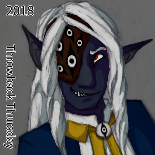


A very special throwback Thursday! Again!
This time a walk through Asim’s character design and how it changed over time and my journey through colorizing traditional pencil drawings.
Breakdown under the readmore.
(note: when I say “my DM”, he is also my partner who I have been building a DnD setting with, I wasn’t bullying a random DM into what I wanted, I was working with my partner to build a new setting while he was really stuck in Standard DnD and was letting that inform pretty much all the worldbuilding decisions.)
2017: The first color picture of Asim, and an attempt to colorize a messy pen sketch that I had been close to giving up on. The filter modes I used on the inking made the shadows harsh and dramatic, and while good for the piece, did not give me much control over the color. He was a basic drow with a color scheme picked out by my DM - my DM also insisted on shorter elf ears that didn’t emote and an overall human-like appearance aside from skintone.
2018: The DM had noted in an expression sheet I had distinctly drawn Asim’s canines - he said it made him look part orc but it was really just a stylistic choice I was playing around with. I leaned into it and suggested his father was half orc for a chance to give him more monstery traits and made his tusks a bit more prominent. I also used large emotive elf ears in the sheet to show the DM how it was a fun trait to allow. He agreed. I did some semi clean line art of a new expression sheet and experimented with coloring that. the line art gave me a lot more control with coloring, but I wasn’t entirely happy with it. The DM had given me a halfmask/eyepatch with a design I wasn’t too keen on but used it in the design anyway.
2019: Fully leaning into his orcish heritage, Asim as his stage persona Balam Yunuen. It was a expression sketch that got out of hand and I ended up fully shading it in pencil I loved it so much. Some more playing around with filters, having remembered a tutorial I saw on digital artists tinting their lineart, and I hit gold. My painting skills were still a little shaky but I learned a lot and he gained +1 Iridescent Skin.
2019 part 2: Another 2019 because I learned a lot that year and his design gained another tweak - a small snout and hints at the animal-like nose he would soon have. I found my stride with shading hair and have been going ham on it ever since.
2021: His sideburns! His finalized snoot! His resting crooked ears! Redesigning his eyepatch because dammit it’s my character he’ll look how I want him to look! At this point I had really settled into my style of colorizing my pencil drawings.
2022: Return of the chin tattoo! Redesigned and simplified into a sun-eye motif. Playing around with his cultural braid, the Makhiorya, a braid that you put beads on for everyone you invite into your family. Magical neck scar where his neck was torn out! I was beyond settled in my colorizing, I was getting bold with colors and lighting, constantly trying new things and learning from it.
2023:???? my kofi supporters are in the know on what’s coming ;)
Comms | Shop | Tips
#dnd art#dungeons and dragons#drow art#drow#half drow#half orc#dnd#dark elf#half elf#dnd paladin#monster art#monster boy#dnd character#dnd character art#throwback thursday#art throwback thursday#fantasy art
37 notes
·
View notes
Note
I absolutely love following along with your art and the process behind it! I'm curious about more behind the scenes stuff, as I have picked up digital art after not having drawn regularly in 10+ years.
When you do your drawings, what steps do you take? Do you use real references? Skeleton sketches? I'd love to know more about how you approach things digitally!
Oooh, first of all, thank you so much @emeraldzephyr! It is such a lovely thing that you decided to pick it up again!
As for how do I organize myself for drawing, every person works with a different procedures and it is important to know what works for you. For me is organization and inspiration.
For me, the most important thing is having references. It is more important than experience, more important than skill and even than inspiration. When you start messing with a blank canvas you need to know first hand where you want to go, or at least, have an idea. I won't likely start drawing without some references pictures. I learnt this when I took classes last year and this is probably the only thing that actually fully stuck.
My main resource for them is Pinterest, and I navigate through it with intent. I also have multiple packs of pictures of models and references that I have purchased in Artstation. Either way, references, to me, are essential and necessary. In Pint for example I have different boards, some for poses or compositions, some other for finishing, some other for colors palettes, or effects, or styles. I may have (and it is likely to be that way) multiple references for a single illustration ("I like the composition of this one, but the color palette of this other one, but the light works incredible in here, and wait, how was exactly the curvature of the nose of Joe Quinn in this perspective...? Shit! Keery's moles!! How were them distributed in the right side of his face? asdfadfs").
So you see, this is the first and the main thing I do. And I am also fattening with pins all my boards anytime I've got the chance (on my way to work, in public transport, waiting in lines, etc.), so I don't run out of ideas.
When it comes to actually drawing, I always make my canvas extra large and fit the main reference there so I don't get it out of sight (probably the one I'm using for composition) and make a first sketch than I later proceed to fix because it is often that I get wrong the proportions or the perspective, and that's okay. I can do five or six layers of sketches and then I do a first lineart that is messy, but it compiles everything that I have from different references. I spend a lot of time with this. Before shit gets serious and you start with colors, it is important for me to be happy with the sketch, or I may work a lot of hours on this particular illustration and you will end up hating it because "fucking shit, that ear is too small, how didn't I see it before!!!! [yes, I have no shame in showing what I think I failed miserably, the next piece was better, and so on. I keep learning everytime. I trust the process in broader aspects of art, not only in piece by piece]).
I create folders for the color process and try to organize the layers in it, first painting them with plain colors in separate layers and then adding layers once the whole illustration is fully coloured, first starting with shading, and then to light.
For me it is really important to play with the different effects of layers, play with opacity, gradients, brushes, tools, etc etc. I always find some effects that I wasn't expecting and the quality of my work will rise up just because I just found something interesting that weren't expecting at all, so, yeah. I play a lot with my software. All the time.
And finally when I am happy with it as a whole, I add a few filters (noise, blurs, etc.) If I want a very specific effect and I don't know how to do it, I have no doubt in stopping for a minute and finding a tutorial that teaches me how to do it (like the flare in this illustration, or the video effect moving color channels in this one). I always keep in mind that I should not get frustrated when I don't know how to do anything because I can always google it and it is a great opportunity to learn something new.
I am so so so sorry if this was too long, and probably it wasn't interesting enough, but that's what I do. And again, I want to make myself clear when I say that there is not a correct way to do things when it comes to art, this is just what works for me. I am no expert, I had to try and fail many many times to find the right approach for me without getting sad or frustrated. I, myself, have reconnected with art not that long ago after a decade, too.
I wish you the best of luck with your reunion with digital art!! Looking forward to seeing your pieces <3
13 notes
·
View notes
Note
how do you approach your art style?? they’re so glossy and vibrant!! my lines always feel too imperfect and my colour palettes too muddy :(
I think the biggest thing that helps me when it comes to doing lineart is having REALLY high pen tool stabilization because I feel like without it my lines would be way too messy I have a bit of trouble without it 😆 Also going slow with lining helps me to keep things smooth too!
When it comes to coloring I fill in everything with a base color first before I even do any rendering. I don’t always get the look of my base colors right the first time and sometimes with my first attempt the colors might look a little too muted for me so I’d just go back and change different base colors to a more vibrant tone. I like to think of the base colors as the foundation of the rest of the rendering I think my best color work comes from pieces where I was already happy with how it looked without any rendering.
With shading, I really like using shades with some warm undertones to it. So for example if I’m shading something that’s yellow I might go for shades that might have orange or red undertones and I think it helps give it that warm feel. If I’m shading with cooler colors I might go for colors with purple or blue undertones to it too to.
With highlights I like to choose colors that compliments the base color well too but isn’t TOO bright to take away from it. Like if I’m highlighting something purple I might go with a light yet warm pink to go over it.
I hope this gives a good idea about my general process but if there’s anything I should explain more of please feel free to ask! I hope you’ll keep creating stuff because you will get better with every piece you make, my art has changed ALOT over the years and even I feel like I still have alot to learn and improve on. This is all stuff that works for me but try to experiment where you can, I like to think of my art style as this culmination of things that I figured out over time that I realized I like after trying out different stuff.
Thanks for the question! 💛
2 notes
·
View notes
Text
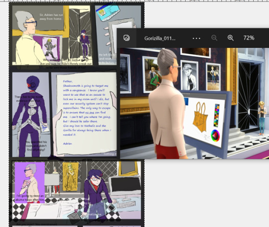
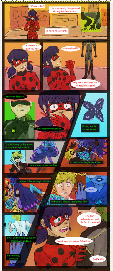
My current art process (July 2022)
Thought it might be fun to show off some of my (still developing) artistic process since some of the other Miraculous Ladybug comic creators I’m a fan of have done so recently (and I need to work on being my own hype person).
[note: this is all in reference to my ML fan comic Runaway Catwalker, which updates at @runawaycatwalker ]
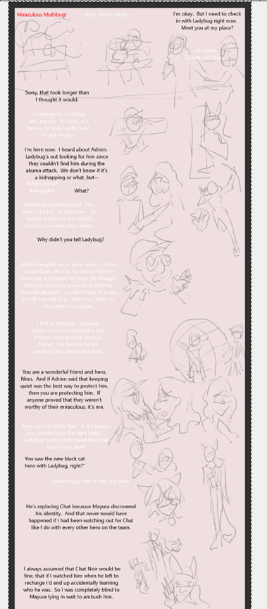
Before I do anything, I write the script. Since words are cheap, I might write out the same scene/beats out several times coming from various angles to give myself fodder for what I eventually will use in-comic (at least a third of my 43k draft document right now is stuff I’ve already thrown out, and much more of it will be cut as I transition the words to the comic page). For example, here’s an alternate version of the interaction that takes place on Page 10:
When I’m ready to start working on the next installment, I pull up my comic template and start making sketches to get a feel for the layout.
Earlier on, my sketching process was more deliberately messy, with handwritten text and a larger line weight. I soon stopped doing this since I realized that I was investing in a version of the comic that wouldn’t exist, so it’s better to just use all the same basic tools regardless of what phase of the process I was in.

This is more how I do my sketches now:
Once I’ve sketched out the full comic page, I start working on the lineart, using the sketch layer as a mostly-transparent guide. If anything is in the background (or otherwise is complicated), I’ll use multiple lineart layers to keep things separate if I so I can easily adjust things later.
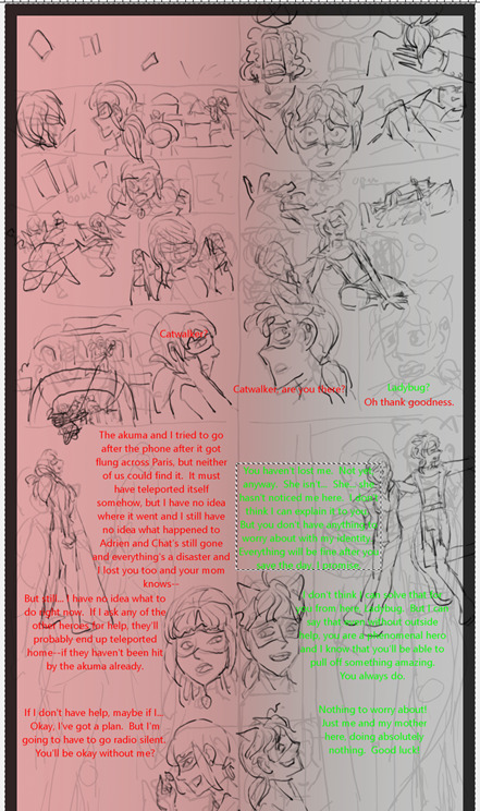
Then I start adding colors. By now, I’ve got a dedicated color palette for all the reoccurring characters (plus some other colors that come in handy) and any variations in shade just come from the fact that my main color layer is at 80% opacity. In cases where colors might seem complicated (such as Ladybug’s spots, Alya’s shirt, or things with fading colors), I’ll often ink in oversimplified colors for the character that I’ll add details to later. If the colors are for magic powers or tears, those get their own color layer.
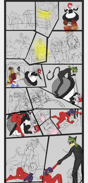
On the occasions when I actually put effort into my backgrounds, I’ll pull up a reference from the Miraculous Ladybug Wiki to use. Otherwise, I’m usually content to let page’s overall color and/or some vaguely colored blobs do the trick.
At some point, I’ll start adding ovals/rectangles to my Speech Bubbles layer and panel divisions to my Front Panels layer and realize that--no matter how much I tried to account for the room available--I will be covering up something I didn’t mean to and therefore I will have to start moving pictures around and/or figure out how to convey things in fewer words. I’m usually not entirely happy with the final layout, but I think it’ll be easier to live with now that I’ve decided to now include the version without text bubbles in the Read More of my posts.

Back when I first started making this comic, blissfully unaware that it was about to take over my life, I put additional effort into adding shading. That was abandoned by page 3. I’m not even a quarter of the way through what I want to do yet and I’ve been at it since February, so as far as I’m concerned, avoiding shading means I’m saving my sanity in the long run.
The final step (besides actually posting it) is creating the image description for the page. This usually consists of me copying all the text boxes into a document, fixing any typos, and then trying to describe what I see in each panel. It’s an interesting exercise for me, as a writer who seldom describes anything in prose, to try to reverse engineer visual storytelling, but I hope it helps people get a better read on what’s going on in the comic.
And that’s it! Hopefully that was interesting to you, let me know if you have any questions.
4 notes
·
View notes
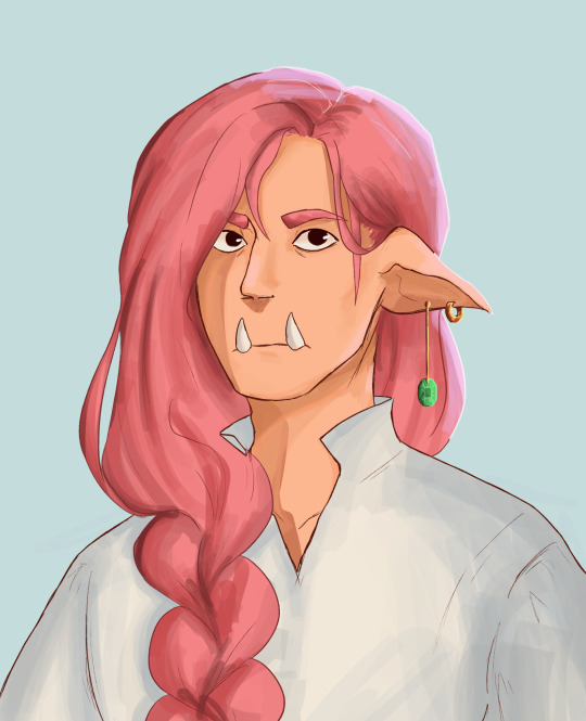
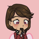
Photo
drowning in love
#my art#fe leo#fe corrin#f!corrin#leorrin#leoxcorrin#leo x corrin#fire emblem if#fire emblem fates#fire emblem leo#fire emblem corrin#first time happy with messy lineart and messy coloring#i feel happy~#leokamu#kamuleo
259 notes
·
View notes
Text
seeing a cool artist like my tf art: oh wow!!!
seeing that the same artist liked my off art that didnt even reach 100 notes: O_O!!??? Huh what
#bro im actually happy abt that bc the art was more. well#artistically interesting than the bee stuck in foot one#like i was experimenting with strokes and shit#though i guess the bee foot stuck was some nice colors and weird cast shadows? but i know ppl are mostly there for the funny#whats more fucked up is that artist rb'ed the off post and commented on the caption#which was abt me making vore jokes abt japhet in a twitch chat so#welp thats their first impression of me forever if they even remember me#rando thoughtz#hang on im gonna add on one more thing i dont love abt bee stuck#it improves on the problem that i had before with seinfeld bee by me actually taking the time to draw something that looks nicer overall#and i avoided drawing bees face bc he still seems to frustrate me to draw sometimes#tho i dont like how messy the lineart is but its fine for what it is#what i rlly dont like is i shouldve added pupils to ratchets face bc i realized too late ppl would prob misinterpret the expression#he looks like -_-#its actually supposed to be a half lidded frown but stylized#which i do all the time for little sketches#but thats fine there bc those are jsut for me#it does not translate well for ppl who dont see it like i do#so whoops#shouldve just added some strokes to represent his eyes so they look open
4 notes
·
View notes
Text
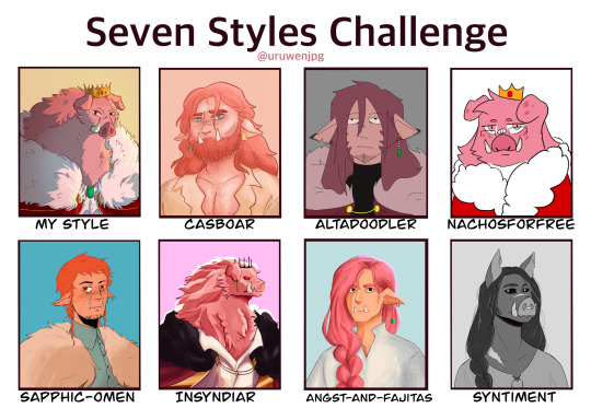
I challenged myself to try and mimic the style and designs of seven different artists. And what better subject to draw than technoblade who has some of the most varied designs.
Each artist's style proved to have its own challenges and I've learned a lot of new techniques while I studied them, some which I might even start incorporating into my own art moving forward.
This was very fun to do, thank you to the artists who volunteered (and to those who got selected out of the blue). Please go check out everyone here, they are all extremely skilled and cool people.
Artists featured:
@casboar
@altadoodler
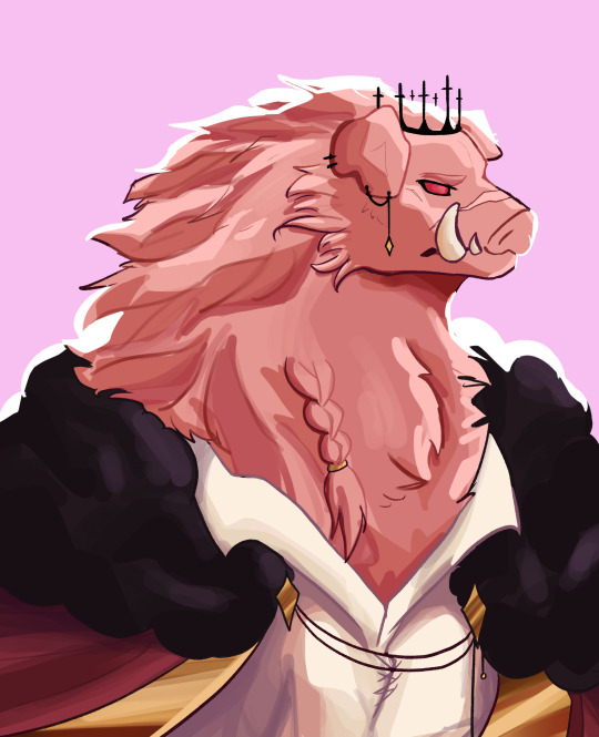
@nachosforfree
@sapphic-omen
@insyndiar
@angst-and-fajitas
@syntiment
↓ Close ups of each and added commentary below the cut ↓

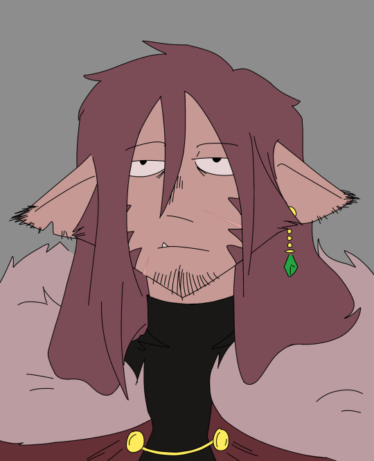
Casboar was the first one I tackled and I may or may not have had a mild breakdown having to remember how to digitally paint people. But being able to keep in some of my construction lines helped in figuring stuff out. Their Techno design is very fun to draw, big fan of the dad bod.
Alta's style intimated me a lot going in due to the more stylized 'cartoonish' feel and the fact that I had to use a brush I'm not as familiar with. But after I finished the sketch I knocked out the lineart in a few minutes and it was easy sailing from there. His stye was actually really fun to draw in once I got comfortable, good shapes there.

Going into this I was the most anxious to draw in this style, I was extremely worried I'd butcher the lineart. But similar to Alta, after I doodled for a bit I was able to get into a good flow and knock this one out pretty quickly. I also had to improvise on the brush since I don't actually have any pixely brushes.

This was the first style to be really challenging. I couldn't find a brush that fit right and all of my sketches were too similar to how I normally draw. So I ended up sitting on their blog and staring at their art for a few hours until I finally pushed myself to start. I probably stayed a little too close to the original sketch since there's definitely some messy parts.
This is the one I procrastinated on. Syn's way of shading/lighting is so cool looking but also terrifying when I remembered I had to do it. I had to alter the sketch several times and marked out where the highlights and shades were going to go. I definitely could have pushed the colors more for better contrast but I got to the point where I was too scared to keep working on it in fear of messing something up.
Realism has never been my strong suit and this is the one I'm the least happy with. Emma's art style kind of reminds me of d&d art and I tried to channel that when drawing but the sketch was too close to how I normally draw and the lineart got messy as a result of that. I should have pushed the value in the shading too but same with Syn's it just got to a point where I was too scared to keep messing with it.

I decided to go monochrome for Syntiment. It looked better that the colored version I did and also I think it just makes stand out more there were also a lot more references to work with. Unfortunately long hair is my enemy, I struggle a lot in drawing it and I had like three layers of sketches just for the hair. I also drew this and Emma's back to back so if they look similar no they don't
407 notes
·
View notes
Note
what brushes do you use?? if you don't mind sharing
depends! it depends so much!!
if i'm using this brush, it's usually because i decided to sketch with it. i'll do my sketch and then i'll erase the messier parts and that will be my "lineart." from there i'll color but i never shade with it i don't like how it looks. i tend to think of it as my messy doodling brush :) if i bust this one out at any point, i'm probably not going to make a fully rendered piece (i totally have though)
i use this one for a little bit of everything! sketches, lines, coloring, and i'll occasionally block in basic shadows and light sources with it, but as far as that kind of thing goes i prefer to useeeeeeeeeee
my favorite brush <3... i do all my coloring business on one layer, and that's how i get the blending to look the way it does. you could probably get the same effect by shading on a separate layer from your base colors, but it wouldn't be as easy :/ and we like art to be easy in this house. but if you're shading a heavily patterned character and you don't want to end up blending all of that work away, what i sometimes do is make a copy of my color layer and i'll shade on that instead. this way, you get the easy blending effect and you won't have to redraw anything because the og will still be underneath
with these settings the blending will be pretty much automatic. you might feel like tweaking them a bit, but all you gotta do is just scribble a bunch until it looks good (stellar advice i know). i usually like a not-quite-perfectly-blended look, but if i'm not happy with it for whatever reason i'll use...

this! for Smoothness. OR
i'll use this ^^ it's nice for hair and such! other than these i only use two other brushes
(ralsei likes being held like that)
this one tends to not look too much different from like, the g-pen at first glance but it's just kinda fun to use. it's my other Messy Doodle brush
this brush has one purpose and it's clouds.
if i've ever used anything else it was one time to experiment with and it didn't stick so i forgot about it forever (these are all default brushes in csp btw! nothing downloaded because i don't know how to download brushes)
#basically i have 500 gazillion ways of completing any given art piece and this is the closest you'll ever get to me explaining my process#because i usually don't know what it is either <3#doodles#mailbox#the little drawings to showcase the brushes were my warm ups today... i draw noelle so much she comprises 90% of my warm up doodles
23 notes
·
View notes
Text
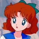
Review and compare of my arts
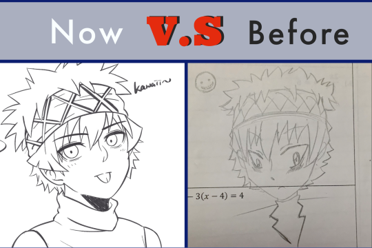
Little BG of my anime drawing history :
I started drawing anime when I was Junior 3 (Grade 9). That was after Assassination Classroom finished airing. It’s not my first anime I feel in love to watch, but it is the one to push me to learn how to draw anime. Also the origin of my name I.T.N (Itona). I’m not a long term fan, but I am very passionate if I do say so myself lol when I’m in it and I would keep drawing non-stop. With that being say, these are the one I drew in the first/ second year FanArt, except the last one where I drew on last week.
.
.
1) The Super Angles Boy 🔻🔻
Yep, you’re right. I named the title as Angle not Angel👼 . It’s pretty clear that very lines in here are too straight, no nature curves. This makes the character too sharp.
Also, the proportion of the face, especially the eyes 👁👁, it was unnatural. You can see the right eye is too small compared to the left one, they’re not on the same level too. The eyes can hv some more curves around the end, smaller, instead of going up. That goes the same for the forehead.
On the other hand, the neck, mouth, ears and nose can be bigger. The bang could go wider too, for now it all leading the same direction—down. Like a lifeless seaweed, especially when Itona’s hair are kinda like porcupine.
Koro-sensei got 100000/10 ✔️✔️✔️

2) The Cute BIG Eyes boy
The face shape has gone better now, but only on the left side on the cheek. The eyes shapes are also getting better and natural too. The pupils are round, so cute! However, they are way too big for this face proportion. Plus, the eyebrows could longer and thicker.
The nose has grown longer, which is good. The little dot seems like a bear nose though ><><. The mouth is small and cute, but too small 😣😣. Which is the same for the neck!
I started to draw upper body at that time. I can see the shoulders could hv more curves instead of a strange like. The shoulders shouldn’t be in a rectangle shape ❌ 🔲
The cloth in here is a symmetrical shape, this isn’t natural looking. It should be less cloth wrinkles on it as it hanging down on a body.
3) The BIG Head and small Body boy

It’s really common the make such mistake. But what’s got me gone crazy when I was looking back, it the really long and sharp face🤯😳. The face is out of proportion, the forehead is too long and large, which make the hair and bandanna like some extra parts instead part of him.
Bc the large head, the body in term look so small and thin.
4) The Naked Boy
I probably drew this 4 or 5 years ago, it was abt the time I moved to another fandom, so you may say it’s the last time I drew Itona years ago.
You can see I was starting to get a hand of the body and face proportion. It looks much better than the previous one, though the shoulders were still in a strange line, a bit too wide, and the chest too big too. Hey! At least I got the neck right ^^
However, the hair look like a pile of grass and the eyebrows are too high 🙄. The face is a bit round but cute no matter 😌
5) Final Review and all together
The most noticeable changes I hv made since the last one, is the facial features and detail though it’s not really so much detail lol, the hair look less messy and natural. The body has more curves too.
In all meaning, it’s look much natural than my old sketches, which it was an improvement. But tbh….I don’t feel there are any extreme changes between the last one and the recent one. Probably bc I don’t hv any color comparison only lineart hhh…
If you ask me do I feel disappointed? Yes, but only abt the small amount improvements. However, I am happy with my stage of skill, despite it isn’t much hhh😂
#itona horibe#assassination classroom#before vs after#sketch#fanart#improvment#review#some random stuff I type#probably no one seeing this lol#I wasn’t much different from years ago hhh#horibe itona
21 notes
·
View notes
Note
How do you paint so flawlessly digitally (at least I hope it's digital, and I'm not making a fool of myself here...)? I like to draw and I like how my art looks with lineart, but I always end up hating what I make when I go painterly in my digital art, even tho I go with a painterly style in traditional? What's your secret?
of course, feel free to give me a short/non-answer. This all sums up to say that I think your art kicks ass and it's always a joy to see, even tho idk what Metro 2033 is 😌
Hello!!
First of all, thank you so much for your kind words, it really makes me happy to read messages like this :·))
Then, sorry for the delay of the answer, I figured it would be more efficient to actually draw a little tutorial on how I paint digitally, because for me visual representation is key for learning art (I see and I reproduce to build my skills).
So, here we go for a little explanation! (I use Photoshop but it can be applied to most art softwares of course!)
First of all, I’d like to point out that I stopped doing clean lineart to paint, because it restricted the workflow more than anything, so a basic sketch is more than sufficient!
To add the color base, I usually start with a dark and desaturated (but it can be any color really) background layer.
Then between the sketch and the background layer, I lay the colors I want, in a semi-flat, semi-gradient way : I use a brush that has pressure opacity (mine has a little texture and grain but a basic round one works just as well) so all the colors mix well with the background color. Never hesitate to use the color picker tool to get harmonious colors overall!
I finalise this step by tweaking the shadows, some color details I want...
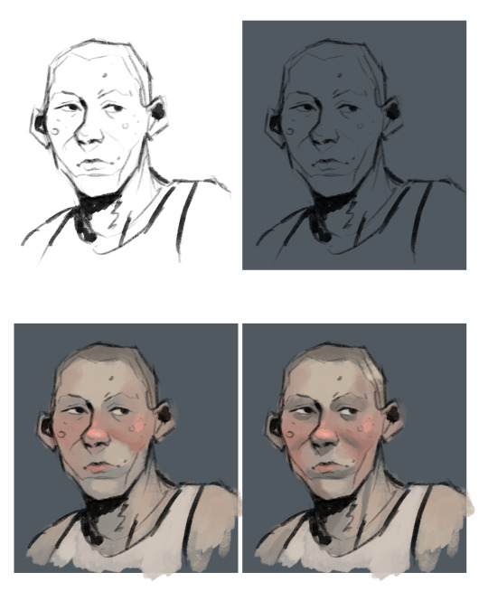
Then starts the rendering process : I create a new layer on top of everything and then I use mostly that pressure opacity brush coupled with the color picker tool. The key is to keep the shapes and volumes of your drawing while very slowly (but not entirely) getting rid of the messy lineart.
What I love to do is draw on top of the lineart with a slightly lighter shade of it that I get by painting a bit transparently over it (you can see it on the bridge of the nose, the underside of the jaw, the strong shadow under the chin...). I always try to keep similar colors if I bring new ones on the drawing (redder nose or cheeks are just a tad more dark and sturated already existant reddish tone).
When I feel like I’m happy with the level of rendering, I add then the details : little lines for the hair, skin texture (scars, spots, facial hair...), eye color, and then like the interior of the ears and stuff, cloth texture... whatever!
And then it’s the magical process of tweaking with the adjustments!! I usually go kinda heavy with them because photoshop has really nice ones, but I’ll show you the ones I use all the time.
Brightness/Contrast : lowering the brightness and boosting the contrast de-flattens your picture
Vibrance and Saturation : makes those greyish colors more alive
Levels : I use them instead of the color balance but both are good for adjusting the colors!
And then I like to add a creamy background on another layer on top of it all to delimit where the subject stands. But if a whole background is already part of the illustration skip this step haha!
And there you go, now you know all my secrets for paintings!! Hope it was useful to you and to everyone who reads this :·))
Thank you again for the ask <3
(ps : Metro 2033 is a franchise based on a really good book (the one i base my art on) that i recommend you to read :•))
324 notes
·
View notes
Text
Art Block tips that helped me
I’ve recently experienced art block after 3 or so months of overcoming my last one. Thankfully this block only lasted a few days thanks to some things I’ve observed and noted down from the previous time. So I’m sharing these few tips in hopes that it might help someone get unstuck :D!
First and foremost if you’re tired, sad or anxious don’t be surprised that you can’t make art, go and take care of yourself by treating yourself with kindness and patience, the sketchbooks and canvases will wait for you :)
The tips are under here:
Separate art studies from the creative time: When you do art studies you’re there to focus on specific things, learn and understand how things work so you can apply them later in your art. Studies take a lot of energy and focus and are the opposite of the creative "flow” of making your own pieces. If you combine the two the results are either unfocused studies or stiff drawings. When you sit down at your desk ask yourself “Do I want to learn something new or do I want to create something of my own?”
When you have an idea don’t be afraid of being messy: Let’s say you want to make a picture of several cats kolo dancing in the moonlight. How do you go about doing this? Well since you came up with the idea you already have a vague image in your mind, sketch it out with simple shapes, stick figures, circle and spheres etc Don’t worry about cat anatomy, or the dancer’s moves, sketch out the essence of it. This method removes the need to be perfect or accurate.
Ok after the messy sketch then what? Well now that you have sketched out the essence of your idea (and hopefully had fun doing so) now you go on to look for references! You put the creative process on pause and you can do a few brief studies if you need to: anatomy, color schemes, values, poses. Pick out a few of your favorites but don't obsess over them, they are a guide, a tool.
You know much more than you think. You’ve probably been drawing for a few years now. You’ve probably done some studies and drawn more than one type of subject. Then you have already internalized some of that information. I used to be obsessed with capturing the minute detail of the subject, and not be able to draw ANYTHING without reference. Instead of a useful tool, references became another obstacle to my creativity. That’s perfectionism my friend, and that’s no good. Here is an exercise a good friend of mine offered: Draw a few characters, animals and objects from imagination. Make sure that the subjects have no personal value to you (no ocs for example) so that if you make a mistake you won’t feel bad about it. Make the process relaxed and comfortable, pour a nice cup of joe, listen to your favorite music ... You will notice that you do indeed know how to draw some things without reference, and it’ll help with your confidence.
The more you do studies the more you understand This seems evident but the more you understand your subject the freer you can be and the easier it’ll be to draw it from imagination in the future. If you really struggle with something to the point of frustration (as in you can’t get it right even with reference) It means you have to study it. Have a study list, for example: hands, perspective, color theory etc. And one of those days you want to study pick something from the list, and look for videos on youtube or useful sites like line of action etc. Only study one thing at the time. You can go from studying hands to studying arms since they’re more immediately connected, but you can’t study hands and then jump to learning perspective right after. Trust me you can learn perfectly fine with the resources online, and I’m sure you’re clever enough to do it :D
Mistakes don’t mean you “suck” I’ve noticed that the two most common causes for art block are perfectionism and lack of self-confidence. The two can often go in tandem which is worse :’D But let me remind you of something, you can fix your piece along the whole process. Use erasers, lasso tools, liquify , select, paint it all over etc If something looks off to you then you also know deep inside how to fix it. Useful ways to see what clunks: flip canvas horizontally (helps with placement, proportions), turn the image to grayscale (helps to check values and where your eye tends to look), look at your image in thumbnail size and ask yourself if it’s clear, see the pose’s silhouette and ask yourself if you can tell what the character is doing etc. Don’t fret, everything can always be fixed :)
Perfectionism, sometimes it stops you before you begin Perfectionism causes you to overwork a piece, it makes you draw less, it makes art stressful, it brings insecurity. Let’s remove it with a simple exercise. It can be combined with the “draw things from imagination” once you’ve drawn something you like: dont do line art, don’t shade it, keep it as simple and crude as possible and then...post it. Yes, post it. You’re not at your best? You’re only human, this will help you embrace that very human side of you. You make mistakes. So what? The more mistakes you make the more you know what you need to study and the better at art you become. Mistakes are there to show us what we need to learn. See them as another tool and not a sign of failure.
Make the process as enjoyable as possible: You like art. You love drawing. Never forget this. Otherwise why are you drawing if you don’t enjoy it? It’s easy to fall prey to the mentality of those relatable memes that “art= suffering” or “I can’t even draw the other eye”. No no no my friends, these messages are fueling your insecurities instead of overcoming them. Let me tell you what, art is fun. It is. Art is fun, because I decided to make it fun again. And you should decide on that too. Personally I adore lineart but my hand-eye coordination is lacking to do it digitally, so....I just skipped it. Yes. I skipped it. I do the sketch, I clean it up a bit and then jump onto color which I adore. It allowed me to draw more and more freely. When I draw I listen to music, make strokes with the rhythm, I take breaks often and I drink my favorite iced teas. If you don’t like coloring do it in grayscale, if you love lineart then do that etc It doesn’t mean you won’t learn your weak points in the future with studies and practice, but you won’t let your weaknesses prevent you from drawing at all. No no, you won’t let them. You draw because you want to, despite of them.
Don’t wait for inspiration, provoke it Inspiration is not a divine and capricious muse. You make inspiration. It’s easy just collect all the things you like, music, artists, objects, characters, animals, patterns, plants etc Make boards on pinterest or similar sites, combine things you like. You like suits? You like birds? You can draw a bird in a suit, or a bird-inspired suit design, there is frankly a lot of ideas that can spring up from little things like these.
When a project stops being enjoyable either pause it for now or move on to the next thing. Pieces aren’t precious. They’re not “the one time I got x right” they are one of many. This advice goes mainly to hobbyists who can afford the luxury of passing to a new project. I have a WIP of a character who is overly complicated (I enjoy a challenge from time to time) sitting for half a month. I sometimes come back to it and add something... but as soon as it starts to create discomfort and insecurity instead of enjoyment I move onto something else. In the meantime I created 3 or 4 new pieces. If I had waited on finishing that piece I would have been severely creatively and physically exhausted. The art comes from you, not inspiration. The more art you make the better you become.
That’s about it :D I know it’s long but I prefer to be thorough and cover all the possibilities. If you have read of this: Thank you so much I hope this helps you at least a bit, if it helps only 1 other person I’d still be very happy. Have a nice one, and kick art block’s butt!
#art block#art block tips#art block advice#art advice#art help#BloggityDiary#art reference#I hope this will help someone out#This will also help me remember my own advice sksksk
200 notes
·
View notes
Last Seen Blogs
teutophile
am höchsten Punkt
holiv
I'am a little crazy
strawbsj
StrawbsJ
pottedfairies
🦩🕊💫🇵🇸

romertheartist-blog
Romer the Artist