#flag of Netherlands
Text
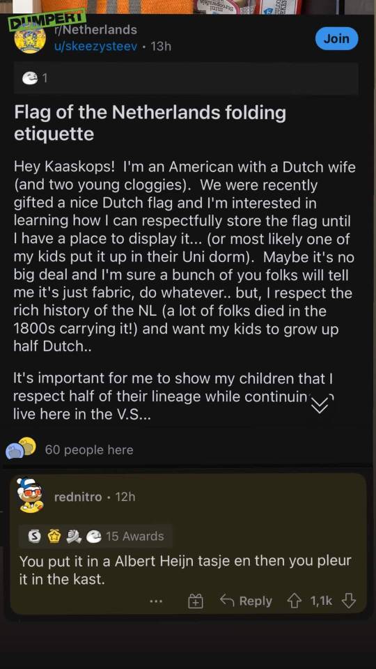
#*you put it in a shopping bag and you throw it in the closet#OP was so cringe in this reddit post#Young cloggies 🤢#Kaaskops 🤢#Respectfully store a flag?#nah we don't do that here#The Netherlands#Dutch#Nedermemes#Dutchcore#Nederland
646 notes
·
View notes
Text

The Guardhouse by David Teniers the Younger
#guardhouse#guardroom#art#david teniers the younger#flemish#thirty years war#history#europe#european#military#soldiers#cards#games#armour#weapons#flag#soldier#belgium#netherlands#baroque#drums#drum#musket#sword#helmet#gauntlet#powder horn
78 notes
·
View notes
Text
* Important note that the crests are sometimes like... optional. The Serbian flag, for instance, comes in a variation both with and without the crest, so that isn't actually something you can rely on consistently:
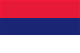

#flags#europe#countries#russia#netherlands#france#serbia#croatia#paraguay#phoenix polls#I'm Serbian so I SHOULD know them but I am very easily confused
101 notes
·
View notes
Note
I had a vision.


78 notes
·
View notes
Text

THE VOLUME 39 COVER OH MY FUCKING GOODNESS GUYS
#Horikoshi saw people debating on who was gonna be on the cover#and said fuck it put ‘em all on#wondering about the flag in the back though#some say Netherlands#some say French#others have speculated that it’s the Filipino flag when in battle mode#bnha#boku no hero academia#boku no hero manga#todoroki shouto#shouto todoroki#mha#my hero academia#bnha shouto#yagi toshinori#bnha all might#all might#toshinori yagi#urakara ochako#ochako uraraka#bnha ochako#uravity#bnha uravity#bnha volume 39#bnha volume 39 cover#horikoshi kohei#kohei horikoshi#horikoshi art
54 notes
·
View notes
Text
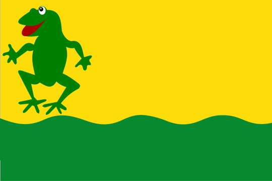
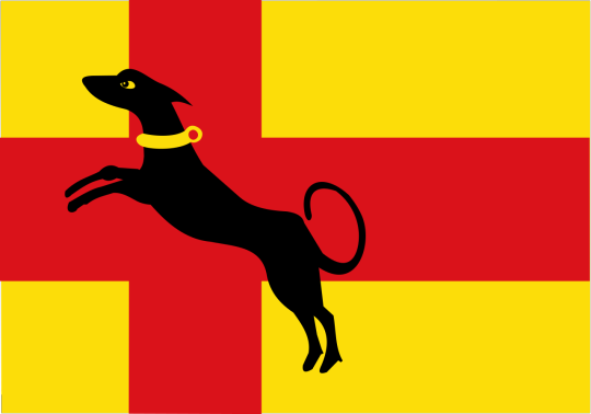
Flag Wars Bonus Round
14 notes
·
View notes
Text
No. 42 - KLM Royal Dutch Airlines

Oh, don't worry. I think probably at least a third of the planes in the world are blue. I knew what I was getting into. And blue might be ubiquitous now, but it's hard to hold that against KLM. They're the oldest airline in the world, after all. I think they more or less get dibs.

That said, they also fall into a particular trend in blue planes which merits further examination. I mentioned it the first time in my Vietnam Airlines post - although each does it distinctly differently and they're difficult to mistake for each other, airlines keep deciding to make the bottom half of their plane white and the top half some sort of blue. Another example is Korean Air. I plan to cover several more of these in the near future, but I find the phenomenon fascinating. I have yet to coin a catchy name for it, and would appreciate suggestions, but it just keeps happening!
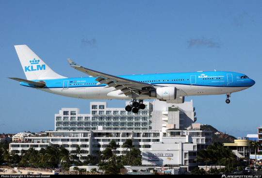
Well, okay. How does KLM distinguish itself among its blue counterparts? How well-designed is its livery in general? Does it live up to the gravitas its name tends to command? Is that crown earned? I think we can all agree that I am objectively the arbiter of these questions, so read on to see my answers.
It's not an exaggeration to say that KLM Royal Dutch Airlines (Koninklijke Luchtvaart Maatschappij) is one of the most noteworthy airlines in existence. At 103 years old, it is the oldest continuously operating airline in the world. Its first flight was operated in 1920 by a four-seater Airco DH.16, like the one below.

Today it operates a fleet of over 100 jets to 145 destinations, and that isn't even counting its subsidiaries.
KLM is the flag carrier of the Netherlands, a country I sometimes forget is still technically a monarchy! In fact, King of the Netherlands Willem-Alexander sometimes flies for subsidiary KLM Cityhopper. (As a first officer, no less. Can you imagine being a regular Fokker 70 captain at a regional airline and suddenly the king of your country shows up and says tell me what to do, boss?)
I did, in my questionnaire, ask people their opinions of KLM. My reasons for doing this, as with the other airlines mentioned, are mainly to judge if I'm correct or not in various assumptions of mine, because you know what they say about assumptions...they make you look like a complete tool if you're wrong! I was right, though, most responses spoke fairly highly or at least better-than-averagely of KLM's service, which I've always found exceptionally good for a European carrier. Two people stopped to state their distaste for the monarchy; four people said that they like that the planes are blue; one person said the state shouldn't be spending so much on them (good news for you-they're a private company with the Dutch government holding less than a 10% stake); the lowest opinion I got was one person who said 'meh'; and an entire five people said one of their main associations was the Tenerife disaster, which I was surprised by. I think this is a function of me being fairly young; in my experience people in my age bracket tend to not know about it.

For those (potentially in my age bracket) unaware of the Tenerife disaster, just know it happened in 1977 and KLM has been fatality-free since. They've got it out of their system, if you will. Even if aviation weren't generally as safe as it is, KLM is a very safe airline.
So, yeah! This all chimes with the general perception of KLM and also my own, which is that they're a pretty darn good airline if you can afford them. I have a KLM trivia post coming up later, but they have quite the history and it's worth putting your feelers onto a few books or articles if you like civil aviation history, because unfortunately I don't have the space to go into a lot of their little Dutch activities in this post. This post is about one thing only.
I'm not going to give discrete ratings to historical KLM liveries, because none of them are super out there (we aren't looking at dramatic overhauls like SAS's), but I will spend the majority of the post on them. You'll see what I mean by this later, but KLM really only has something like two and a half liveries. They've been around 100 years, mind.
One thing does, first, bear interrogation. Why blue? After all, orange is sort of the de facto national color of the Netherlands despite not being in the flag, as it's associated with the royal family. That's why basically every Dutch sports team has orange kit. I cannot find an answer to this question. The best I can figure is they just liked it, because KLM has always been blue and never any other colour. Focus group testing (my survey with 50 respondents) suggests that this is a well-received choice.
Well, anyway!
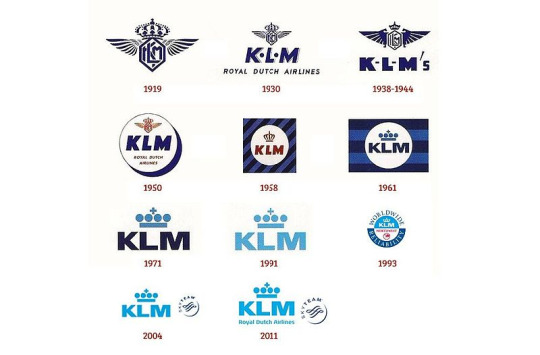
Here is a chart showing the evolution of KLM's iconography over time. I have to say that I was fine with the KLM logo before but now I'm sort of miffed that they ever got rid of the 1930 one. It's by far the best-looking of the bunch and I don't even think it really looks dated. Minimalism is a curse upon the airline industry. I will admit the lighter blue is definitely more distinctive, but I just prefer the darker blue (and I think the 1930 logo would be fine in their new chosen shade).
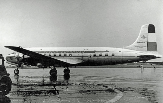
image: RuthAS
Another thing I'm furious left their branding was their very early habit of writing 'THE FLYING DUTCHMAN' on their planes. I had wondered to myself why they don't do that before learning that they used to and later stopped. I am furious that they stopped. It is so obvious, so perfectly created for them, and they let it pass right by. Shame!!!

The stripes on the rudder, by the way, are the Dutch tricolor. I do say that I'm more okay with the overdone red-white-and-blue colourscheme when it's done by flag carriers of nations with flags coloured such, but that doesn't mean I'm not relieved that they didn't.

image: RuthAS.
The description of the above photograph on wikimedia mentions that her name was 'Pallas'. KLM names their planes to this day, though there is no one consistent scheme. Airplanes are generally named according to model, but each type gets a different inspiration - these range from birds and insects to city squares and rivers. Here's a list of the names of their planes as of 2015!

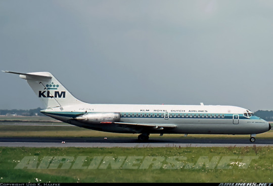
As you can see, these early KLM liveries featured cheatlines, one light and one dark blue, a white top half, a bare metal lower half, a painted black radome, and the 'KLM ROYAL DUTCH AIRLINES' name written in obnoxiously small text. This was all very standard for the time. The only really recognizable feature is the striped blue tail (see, condor? Horizontal stripes look so much better). This was their scheme for a very long time. The above image was taken in 1969, right at the end of its lifetime.
This is the same model of airplane wearing a new scheme, taken in 1972. The livery was introduced in 1971 when KLM received their first 747, which wore it.
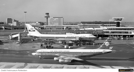
This was the era before Eurowhite caught on, when liveries mostly made up of bare metal were only just beginning to fall out of ubiquity. I'm sure, given the context, and given the size of the 747, this was a startling vision of elegance towering over its surroundings. However, I was born closer to when KLM retired the 747 than when they introduced it, and the world is different now.

I can't deny that even now it looks impressive watching this giant roll on by. It's difficult to see from here, but one of the cheatlines still says 'The Flying Dutchman'. It's difficult to come up with better slogans than the one KLM was given literally for free and has let slip through their grasp for reasons beyond me.

I truly wish I hated this more than I do, but I think as a limited-edition or commemorative livery, or one reserved for the 747s, it would look fantastic. As a brand, I'm not thrilled, but as a variant of the brand, I like it. Keep in mind the 747 was the first wide-body airplane introduced to service and was an order of magnitude larger than anything which had existed previously. These planes are huge by modern standards, but at the time they would have been almost unbelievably gargantuan. I've always thought that while the 747 wears a lot of liveries very well the plane by itself is a bit distractingly goofy-looking, but in white and surrounded by buildings that are shorter than it they have an august grace, quietly elegant, easily charismatic, and never thinking twice about their glorious size.
(It looks pretty bad on the DC-9, though. That's not a plane which really commands awe.)

Even compared to this DC-10, the 747 is massive. But do take note of the DC-10! Around the same time as the white-top livery (I've seen both 1971 and 1972 given as dates of introduction) we saw the introduction of today's blue-top KLM livery! That's right - they did it first, as far as I can tell! Earlier than Korean Air's 1985, and definitely older than Vietnam Airlines' 2002.
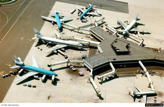
For a few years they operated this fleet of half-white-top, half-blue-top. And then they made the right decision and realized this white livery would lose all its gravitas the moment it stopped being something new and special and clean and splendid that the world had never seen before.
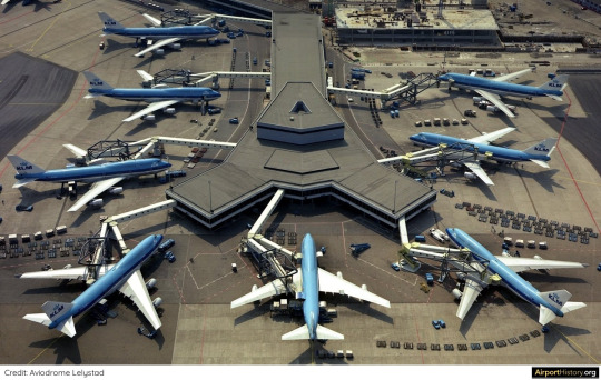
By the close of 1977 this was the KLM livery-full stop.
I actually find this pretty incredible. KLM's livery has changed over the years, and that's what I'm about to talk about, but I wouldn't say it's ever become a different livery - just different takes on the same one. KLM is over 100 years old, and their livery is over 50. Most airlines aren't that old. KLM's livery is over twice as old as Kosovo. That is one hell of a way to stick to a consistent, recognizable brand. I admire that and I wish more airlines would commit instead of jumping between short-lived mediocre liveries.
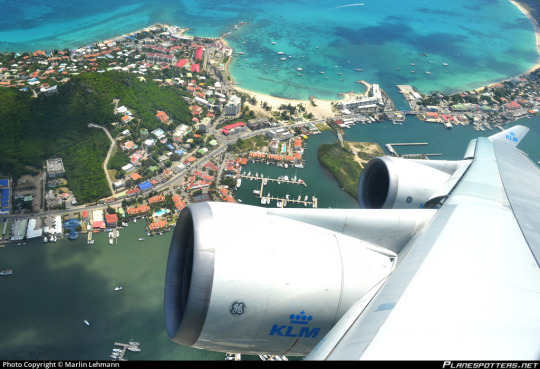
The crown really does set the tone for KLM. It's an airline that carries itself with elegance and refuses to be stingy. These engines are clean, shiny, well-maintained, and wearing their logo. It's all executed so perfectly.

Unfortunately, I do not like their livery. It doesn't look fantastic. This is a rare situation where the 747 actually wears it worse than the more conventional tube-with-a-fin models, but that miniaturized logo replacing the wordmark just looks so tiny and weirdly placed. I hate when airlines just use the same logo twice instead of putting an image logo on the tail and a wordmark on the main body. It instantly lowers my opinion of any livery. Reoccurring elements and a consistent design are one thing and repetition is another; it's the reusing-the-same-shot-in-a-film of airplane livery design. The uninterrupted blue just makes me want to pick up a breeze-block and tear it in two with my hands. Something about the cheatline being placed so high makes me want to take a wooden dowel and beat the nearest wall with it until I have a gaping hole in the wall of my bedroom. Like, it's fine. It's not that bad. But I am going to go chew on a towel until I calm down.

Hey. Don't cry. Air Canada's first A320 delivered wearing scarf and ear warmers ok? I'm doing alright now. And while I was getting done crying KLM apparently came to my same conclusions. I'm not sure exactly when the change was made, but I imagine this livery was phased out sometime in the mid-late 80s or early 90s. It doesn't seem to be instantaneous - rather, the cheatlines have almost bled off over time, and you can find a handful of strange in-betweens.
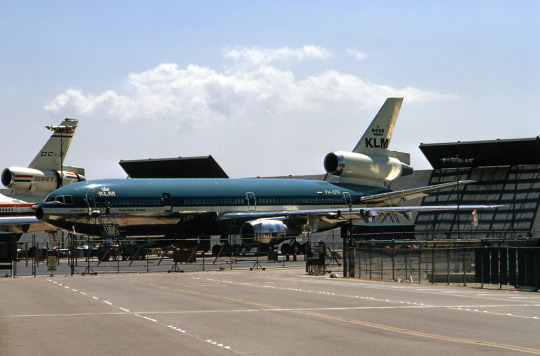
image: Ron Monroe
It wasn't all that bad before. I was being dramatic for a bit. I mean, it looked a lot better on the DC-10, even though it still wasn't exactly fantastic. But it was never, you know, hideous.
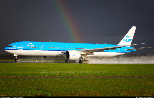
While this gay plane may be mistaken for having landed, she is actually in the process of beginning to rotate for take-off.
I like the modernized version a lot more. I love cheatlines, this is widely apparent, but sometimes liveries just look better without them. Cheatline liveries can't really afford to be minimalist - having a big detail like a cheatline makes any attempt at this sort of cleanliness seem quite cluttered and cramped. When the blue is allowed to expand to a proper half of the fuselage it really makes the whole thing feel a lot better proportioned, and I like that they still kept a thin dividing line (though I think it would have been fine if they hadn't, too). All of a sudden this is far from glorious but it at least looks clean. I can say, with confidence, that I think this is acceptable. Not...pretty, maybe. Doesn't fill me with awe. But nothing about it bothers me except the lack of wordmark. I can live with it.

The one thing I feel obliged to point out - and I am far from the first person to say this; it even feels cheap - is that this livery looks like an amount of toothpaste. I am not bothered by this. I am a big fan of oral hygiene. Taking care of your teeth is important! And I do think it's a very nice shade of blue.
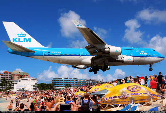
Sure, it may not be the most elegant livery in the world. It's certainly not the most detailed, but it maintains all the iconography necessary at bare minimum. It feels like a revision or evolution of the 1971 livery rather than a new one altogether, and it is impossible to mistake for another airline, and that's my minimum, really - be iconic (in the literal sense), don't be repulsive to look at. Goals met. And the white belly really adds to the whale-like appearance large planes already have, which is always a plus. Maybe it's a form of countershading?
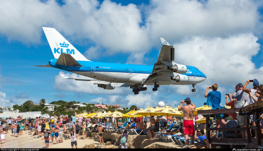
And this would be where the story ends, but in 2014 KLM did a classic airline thing. A bunch of absurdly wealthy individuals sat down in a conference room and decided they were going to make things worse.
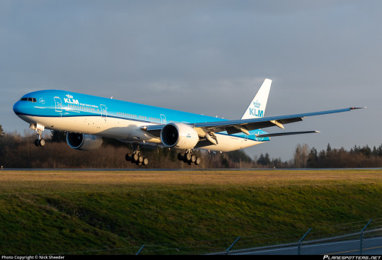
Now, 'ruined' is a strong word, and in this case it doesn't apply. The original livery wasn't really good enough to ruin, and the change is very very minor. But I am simply not a fan of this new iteration of the livery.
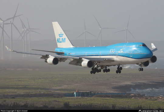
It just looks sloppy. It doesn't look intentional. It looks like a mistake.
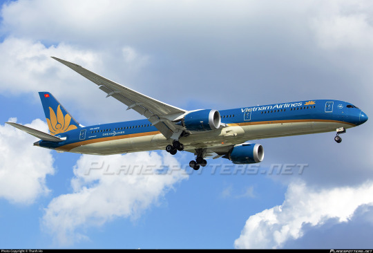
Compare it to Vietnam Airlines, which is in the same blue-and-white-halves category and also features a curved line. I gave this livery an A and one of the reasons for that is that its minimalism is deceptive. Each detail of this livery is very deliberate, and the consistent, smooth angle of the curve, the thickness of the separating line tapering with it - these all work together to create something extremely elegant, despite the fact that if you described these liveries with words alone they might sound quite alike.
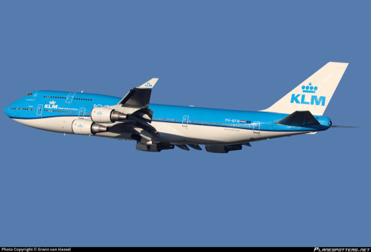
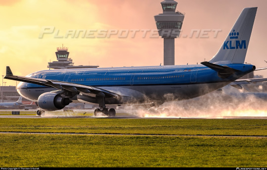
There is something so fundamentally sloppy about this localised droop. And it doesn't help that this is KLM, the same airline with those crisp white titans. I don't see what it adds, to create the appearance that your airplane's coat has stretched like an old sock until it doesn't quite fit properly. How far we've come, and how little has changed. But those changes can sometimes be tragic in their simplicity. This small adjustment has disrupted the equilibrium that had me feeling fairly neutral about KLM's livery for so long.
I have to leave it with a D+.
I fought myself for quite some time about this. There's nothing truly offensive about this livery despite the things that make me dislike it, but I just couldn't bump myself up to a C- because, above all else, I'm let down. KLM has the budget, the brand, the acumen - and they had a decent livery, too! One of the most recognizable in the world! It didn't need this change!
A lot of airlines update their livery every decade or two. I wonder if KLM felt pressured not to stagnate, if they were ashamed of keeping their livery the same year after year. But, look...if you're going to be parading the fact that you're sanctioned by the royal family of the Netherlands around you shouldn't be afraid of not looking modern.
And I'm not a fan of monarchies, but not all old things are bad. You don't need to feel pressure to change just because other people are doing it. One of the industry's biggest names shouldn't feel pressured by the trend cycle. You've taken a jacket from a thrift store and cropped it, and it looks worse now. It was fine the way it was. You don't need to touch a classic. It's a bit oversaid, maybe, but...if it's not broken, there's no reason to try and fix it.
#tarmac fashion week#grade: d+#region: europe#region: west/central europe#region: the netherlands#klm royal dutch airlines#era: 1960s#era: 1970s#era: 1980s#era: 1990s#era: 2000s#era: 2010s#era: 2020s#blue side up#flag carriers#double sunrise#air france-klm#requests#long haul
32 notes
·
View notes
Text

"Drying off in the garage. ☔️🌧️" - august 27, 2023
📷 @.mercedesamgf1 / twitter
#lewis hamilton#f1#formula 1#dutch gp 2023#fic ref#fic ref 2023#netherlands#netherlands 2023#netherlands 2023 sunday#(note to self: during red flag)
34 notes
·
View notes
Text

Femke Bol 🇳🇱
🥇 400 Metres Hurdles
2023 World Athletics Championships (Budapest)
#femke bol#team netherlands#dutch flag#female athletes#athlete#celebration#world champion#athletics#track and field#budapest 2023
26 notes
·
View notes
Text
wait... hmm... somethings not quite right.....
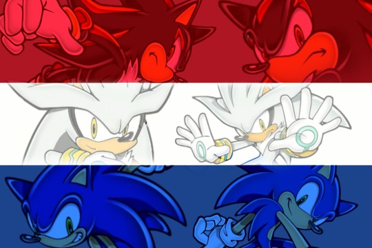
YES!!!!! BETTER
#which pride flag is this#i live in sonicshadowsilver country#sonic the hedgehog#silver the hedgehog#shadowposting#shadow the hedgehog#the netherlands does not exist
8 notes
·
View notes
Text

An American Patriot 🇺🇸⚔️🛡️
I also stand united with other countries who are also freedom fighting deplorables🇳🇱⚔️🛡️
#pay attention#educate yourself#educate yourselves#reeducate yourself#knowledge is power#reeducate yourselves#american patriot#freedom fighters#freedoom#united we stand#wake up america#united states#u.s. flag#deplorable#netherlands#allies
119 notes
·
View notes
Text
i teared up watching kate middleton's video statement ngl. it's obvious she's scared and still processing the whole thing but is forced to make a statement because of the insane conspiracy theories
#kate middleton#fuck cancer#i've said this before but i wish the general public were this nasty to other royal families too#you guys japan still has an emperor and has no qualms about flying the rising sun flag#and idk... the netherlands? belgium?
9 notes
·
View notes
Text

"Drying off in the garage. ☔️🌧️" - august 27, 2023
📷 @.mercedesamgf1 / twitter
#george russell#f1#formula 1#dutch gp 2023#fic ref#fic ref 2023#netherlands#netherlands 2023#netherlands 2023 sunday#(note to self: during red flag)
18 notes
·
View notes
Text
Semi final results: Eurovision 2023
Semi 1: Semi2:
1) 🇫🇮 - 177pts 1) 🇦🇺 - 149pts
2) 🇸🇪 - 135pts 2) 🇦🇹 - 137pts
3) 🇮🇱 - 127pts 3) 🇵🇱 - 124pts
4) 🇨🇿 - 110pts 4) 🇱🇹 - 110pts
5) 🇲🇩 - 109pts 5) 🇸🇮 - 103pts
6) 🇳🇴 - 102pts 6) 🇦🇲 - 99pts
7) 🇨🇭 - 97pts 7) 🇨🇾 - 94pts
8) 🇭🇷 - 78pts 8) 🇧🇪 - 90pts
9) 🇵🇹 - 74pts 9) 🇦🇱 - 83pts
10) 🇷🇸 - 37pts 10) 🇪🇪 - 74pts
11) 🇱🇻 - 34pts 11) 🇮🇸 - 44pts
12) 🇮🇪 - 10pts 12) 🇬🇪 - 33pts
13) 🇳🇱 - 7pts 13) 🇬🇷 - 14pts
14) 🇦🇿 - 4pts 14) 🇩🇰 - 6pts
15) 🇲🇹 - 3pts 15) 🇸🇲 - 0pts
16) 🇷🇴 - 0pts
Note: Semi finals were decided on televote only vote, there was no jury vote. In the case of a draw, it's displayed like in the website.
#for who isn't sure about flags:#S1: Finland Sweden Israel Czechia Moldova Norway Switzerland. Croatia Portugal Serbia / Latvia. Ireland The Netherlands Azerbaijan Malta#S2: Australia Austria Poland Lithuania Slovenia Armenia Cyprus Belgium Albania Estonia / Iceland Georgia Greece Denmark SanMarino Romania#hope it's helpful to those that want to see how their fav did in the semi#eurovision
24 notes
·
View notes
Text
The wild thing is I was already being haunted by La Vie en Rose this past week (heard it, okay, like, twice in public places so already had it stuck in my head)
#what does it mean?!?#our flag means death#ofmd spoilers#izzy hands#la vie en rose#apparently it’s popular in the Netherlands 🤷♀️
16 notes
·
View notes

