#flat graphic
Text
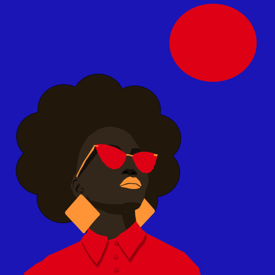
2023 @soulofherkarmaart
IG @soul_of_her_karma
#digital#digital portrait#minimal#minimalistic#flat graphic#graphic design#art#art now#tumbler#black women#blackart#black out
36 notes
·
View notes
Text
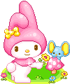
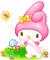
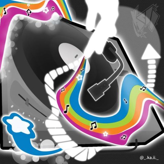
🧃🍰(ㅅ´ ˘ `)♡ 朋友。 ⊹˚.⋆ ⊹ ☽ ✮ 🌈🎀
#アニメ#⊹ ⋆꒰ఎ ♡ ໒꒱ ⋆゚⊹#かわいい#🎀。゚・。゚ᐠ( ᐢ ᵕ ᐢ )ᐟ。゚・。゚🎀#kawaii#anime#gif#aesthetic#animecore#otakucore#webcore#neetcore#moecore#my melody#onegai my melody#フラット#flat#pixel graphics#pinkcore#00s#2000s#2000s core#nostalgiacore#おねがいマイメロディ#nostalgia#childhood#nostaligiacore#マイメロディ#マイメロ
1K notes
·
View notes
Text
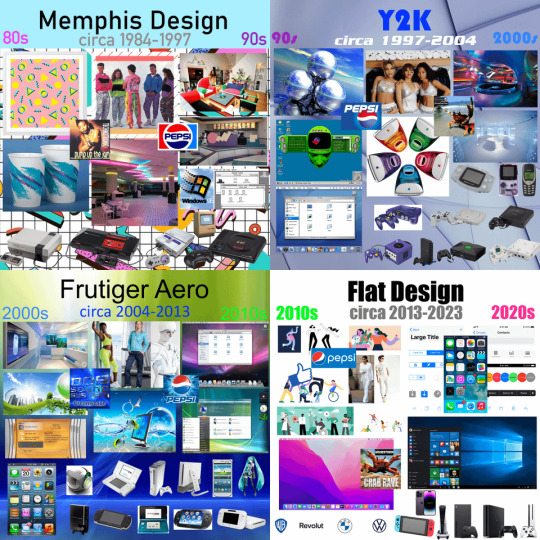
Eras of Aesthetics
#art#design#fashion#flat design#frutiger aero#history#graphic design#graphics#illustration#memphis design#photography#technology#timeline#y2k
699 notes
·
View notes
Text
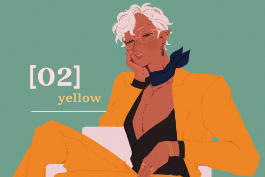
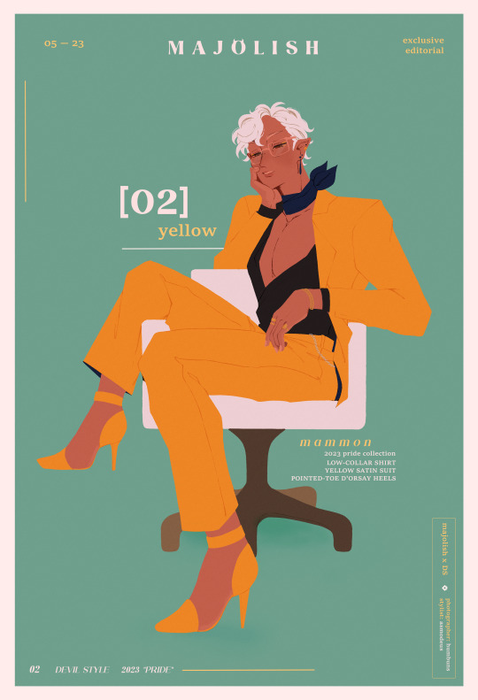
pretty in yellow
#obey me!#obey me mammon#obey me shall we date#obey me nightbringer#how is there a list of devildom flora + stores but not a list of fake brand names the game has??? i needed info to fill orz#anyway this was mostly a fun experiment on graphics + an idea in which i always wanted to draw mammon in heels ever since i started playing#shoutout to the b-52s for their album cover telling me go with a flat style instead of a detail one lol#art tag
1K notes
·
View notes
Text

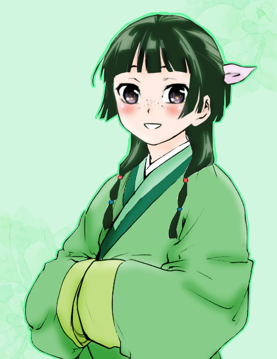


@animangacreators Challenge #26:
↳ Favorite Animanga in Fall 2023 || Kusuriya No Hitorigoto (featuring MaoMao)
#Kusuriya No Hitorigoto#The Apothecary Diaries#knhedit#maomao#anisource#animangahive#himawaari#userroh#usermoh#usergojoana#userkyaa#userzuura#userinahochi#usermoonz#tuserashes#myedits#coloring#coloring: knh#animangacreators#ahhhhh didnt have time to do an actual graphic and havent colored in so long it looks so flat argggg
486 notes
·
View notes
Text

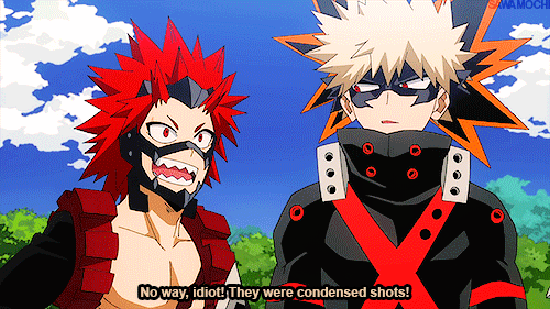
「S05 E25」 The High Deep Blue Sky
#bnha#boku no hero academia#mha#my hero academia#kirishima eijirou#bakugou katsuki#bnhaedit#bnhagraphics#mha edit#mha gif#kiribaku save me#< bc i see them and i black and a gifset happens#mine*#bnha*#graphic*#i hate working with gradient bgs#the sky is ugh and not as flat as i wanted it
176 notes
·
View notes
Text
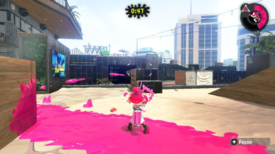
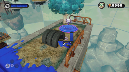
probably an unpopular opinion but i still think Splatoon 1 has the best graphics style in the series
the graphics were so much moodier and darker, shadows were really prominent giving it a much more gritty and realistic feel
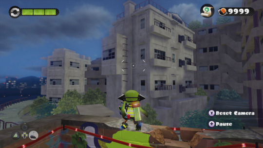
The far-off environmental elements had a nice blur that gives them a bit of a dreamlike quality IMO.

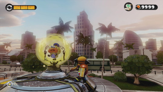
I know the top picture is a sunset level, but; seriously is it just me? Why is everything in Splatoon 2 SO CRISP AND BRIGHT AND NEON? I talked about (probably 2 years ago at this point) how Splatoon 2 feels like it's an evolution and commercialization of Turf Wars into a product and a brand rather than how in Splatoon 1 they had a much more backstreet, discreet, shady feeling. And I feel like the graphics carry that over weirdly enough.
But most importantly, the ink and the Inklings themselves; ever since Splatoon 2 came out and people started going "omg the ink looks so good now!" i. literally never agreed with that. even with Splatoon 3 i STILL THINK the ink looks the best in Splatoon 1. In Splatoon 2 and 3, they have really been leaning into making the ink extremely neon and super saturated, and I don't think it looks great. I can't really even pinpoint the difference here (especially not with the Inklings themselves, but).

(Splatoon 1 above, Splatoon 2 under)
The Inklings in humanoid form don't stray away from having dull or dark colored tentacles in different lighting conditions, and even the ink itself is nowhere near as saturated as it is, leaning more into quieter or pastel tones. Again, it makes it look nice paired with the darker graphics of the game, and somehow it feels really at home and pretty natural? The difference in the model of the Inkling itself is also a mystery of me, it might be a case of less shading or less specular making it look flatter and that's more pleasing to the eye than how shiny they are nowadays, ESPECIALLY in Splatoon 2. The ink is notably flatter than it is in newer games, and if it wasn't obvious I definitely think it still just, looks the best? Don't ask me how. (The squids also look amazing. Like gummy.)
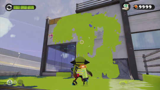


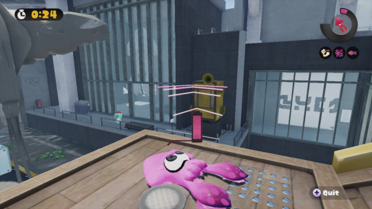
just thought about putting that out there. Anyone else's thoughts on the games' graphics?
#rambles#i definitely think splatoon 3 has nicer graphics compared to 2 because i didnt like how glossy and shiny everything was in 2 AT ALL#but splatoon 3 also has extremely flat shading and that still puts it below S1 in my books#i think splatoon works REALLY WELL with duller darker graphics paired with colorful but not over the top ink
319 notes
·
View notes
Text
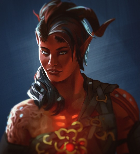
Portrait 7/7 ~2.2hrs
Final portrait study is my favorite girl Karlach!
#art#digital art#Karlach#bg3 fanart#bg3#teifling#portrait study#I kept forgetting to post this but I did this last week with my other studies#wanted to end on something fun but I would not recommend trying to study someone made out of game graphics#the hair skin and eyes are all a bit off#def not good for textures and lighting is kinda flat#I mostly did this for design and practice fast and cheap rendering#and for the funzies of course#love Karlach
182 notes
·
View notes
Photo

Frozen in Time (by drxgonfly)
instagram | etsy
#artists on tumblr#landscape#environment art#forest#lake#sunrise#sunset#digital art#flat design#graphic design#blue#up#mine#my art#nature#scenery#night sky#stars
1K notes
·
View notes
Text
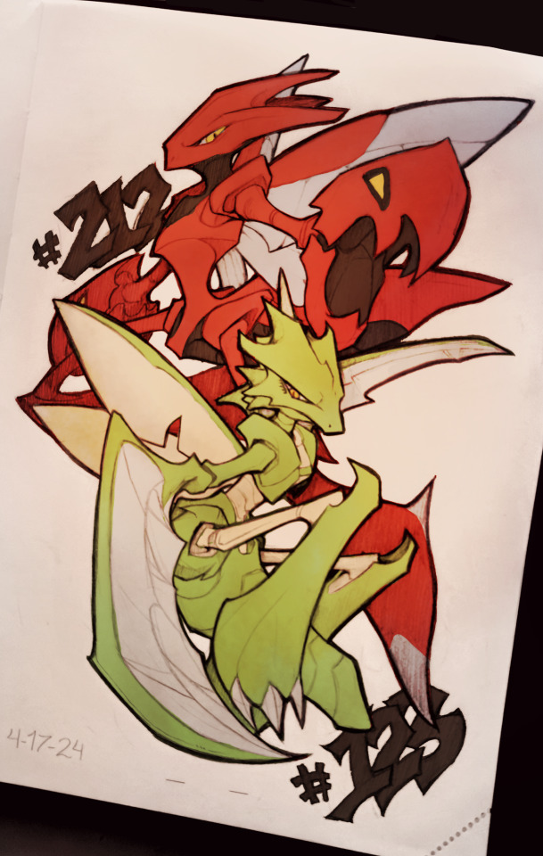
Feeling a little sick today, so figured I'd do some self-indulgent art of some of my favorite older pokemon designs. Contemplating setting up a Patreon or something similar to a room a project of sketching every single Pokemon, but maybe not too soon.
Pencil sketch, having a lot of fun working with pencils again!
#a little sick today so taking it easier#always loved their designs#but wished their execution was slightly different#very fun to mess with shape language in pokemon designs#also just feeling a little more confident trying stronger shape language in sketching#sketch#art#traditional#furry#sketches#furry art#small artist#pokemon#pokemon fanart#scyther#scizor#scyther fanart#scizor fanart#fanart#pencil sketch#color on phone#flat color#graphic design#shape language#shape language design#small art account#small art blog#small blog
52 notes
·
View notes
Text
youtube
Beautiful solarpunk visuals in this short animation from the Gobelins School of Animation. The rest of their catalogue of short, creative, and diverse animations on Youtube are well worth checking out.
#solarpunk#environmental#hopepunk#animation#graphic design#flat design#tropical#ocean#seapunk#sustainability#bright colours#Youtube
62 notes
·
View notes
Text
it's one guy, how long could it take to draw? ten hours?
#my gwen & art fanart is coming along! slowly.#despite the inspo art being a flat graphic style with minimum shading and me having no experience with digital painting#I just haaad to make things complicated for myself#pretty sure the dimensions are fucked but I'm not changing it now#bbc merlin fanart#merthur fanart#< at least. it will be#eventually
36 notes
·
View notes
Text

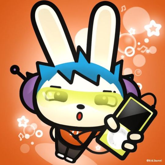
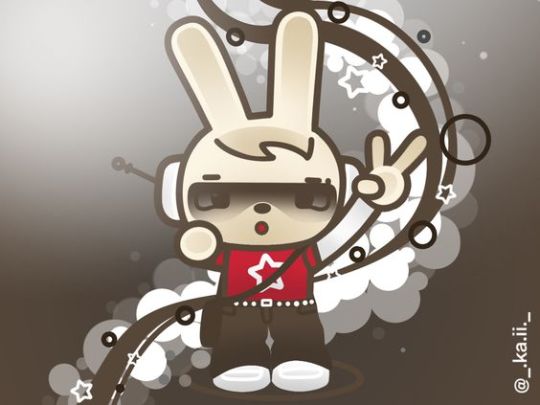


From Kaii
#art#colorful#colourful#design#digital art#frutiger aero#frutiger metro#funky metro#graphic design#graphics#illustration#kaii#super flat pop#vector
230 notes
·
View notes
Text

"Rabbit Bear Fox" © Greg Abbott. V 2024-02-11
#illustration#bear#animal#rabbit#fox#cute#children's#minimal#flat#graphic#vector#print#symmetry#clean#friendly#bright#orange#greg abbott#greg#abbott
18 notes
·
View notes
Text

Some art I made earlier this month based on an AUpril discussion in the muderbot discord! We were talking about how Murderbot's visualization of itself in the feed might have changed over time. @elexuscal suggested the circle-within-a-circle to evoke a helmeted SecUnit as its original feedsona, and that Murderbot might have removed the company branding and gone from red to black when it hacked its governor module. These were also inspired by @broken-risk-assessment-module's super cool module feedsonas (for risk assessment, threat assessment, education, and governor). I tried to simplify her designs into shapes that would evoke the more personified versions that they might evolve into over time. (It would be fun to explore more of the steps in between, as murderbot slowly begins to visualize itself more and more like a person! But these drawings took longer than I expected and I didn't get to it. Maybe someday I'll come back to them!)
#stars art#for real this time!! actually posting something I drew that isn't a silly doodle!!#this is way more flat and graphic than I usually draw but I wanted it to match the simplified shapes in the feed#gave myself emotions with the second one#murderbot#the murderbot diaries#tmbd#murderbot fanart#feedsonas#AUpril#described in alt text
110 notes
·
View notes
Photo
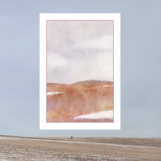
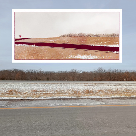


Took some shots of the Kansas landscape when I was home this winter-- here they are with the opening pages of THE GOLDEN HOUR. Gray and flat and stretching on forever.
72 notes
·
View notes
Last Seen Blogs
nervous-constelation
Just another freak
lykaonimagines
Lost In A Strange Hell

tokeslot
Tanpa judul

nikolaitheprickolai
Ghoul fuckers anonymous

inouken
(ノ◕ヮ◕)ノ*:・゚✧