#frog draws stuff
Text
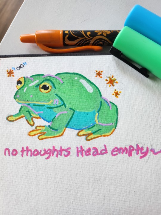
I heard tumblr likes frögs
#frog#🐸#my art#poscaart#painting#traditional art#traditonal drawing#frogs#hes my favorite drawing so far#frög#pen drawing#idk how to tag stuff on tumblr i just be rambling#drawing#green#a boi!#no thoughts head empty#look at his shine#art#need to make more art ive been slaking
6K notes
·
View notes
Text
You got booped by Panini the wanderer frog
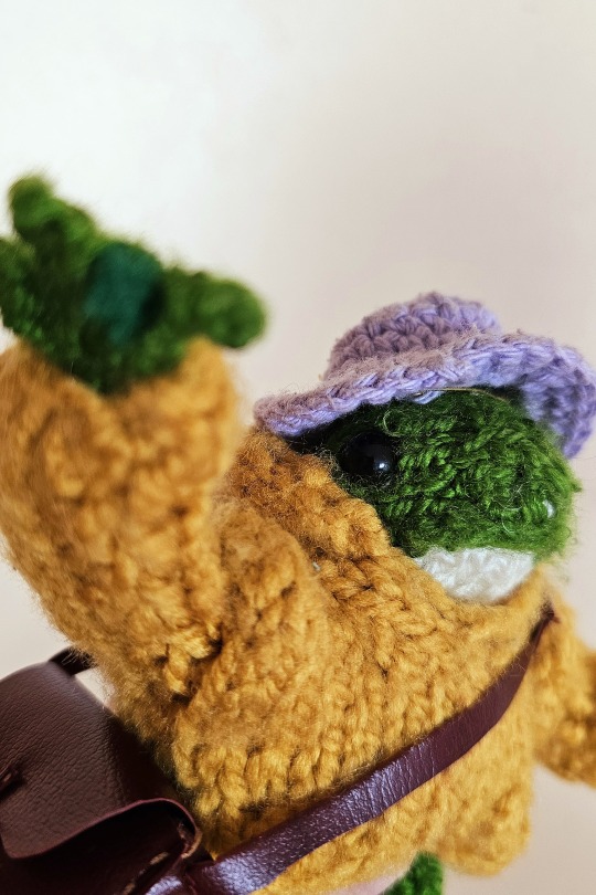
He likes you very much and wishes you good booping day
(or only day if you aren't into booping)
He also documented it on his little journal
#Boop#April fools#frog#knitblr#knitting#My non art#My photo#Archive log#Oc: panini#Described#This little guy and his clothes were bought from local ladies who sell hand knitted stuff!#I don't even know how to knit but admire a lot who does it. Everything is just so cool dhdh#The bag and journal were made by me tho! Recicled unused paper and plastic card holder#The other accessories are bought. Those are part of sylvanian families thingies!#I tagged him as oc but as I don't draw him too much is mostly my favorite little companion when I go out#But as I like him very much he may well become an Oc too#Also he likes adventures
430 notes
·
View notes
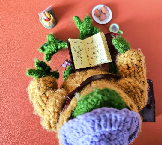
Text

day 1522
#amphibian#frog#frogsona#tip: dont become self employed you have to do so much taxes related stuff all. the. time#(in my country. who knows about america based on what ive heard about your taxes its probably worse)#i dont neeed help btw im just complaning because i had to look at The Spreadsheets#didnt do my bookkeeping correctly for 2 months but i fixed it👍#its not even THAT bad i just needed to draw like. corporate vent art i guess
443 notes
·
View notes
Text
I feel like ? I gotta remind people it’s ok to unfollow a blog when it upsets you in any way >> like if I ever do that sure, you can let me know if it was anything I did personally I’d appreciate it but if you just don’t enjoy something it’s ok to unfollow ;w; can’t stress enough how important it is to put your mental health first 👌
#pix habla#fnaf#✨💖 even if you don’t like frogs and I post about frogs does that make sense#i see some yall not liking some of the stuff I draw and just kinda wonder ? why you still follow lol#i won’t take it personally#even if it’s a mutual heck I’ve even told my friends to unfollow if they ever need a break from my blog =w=👌#because It’s nothing personal >>#i used to ok so funny story xD I used to follow a friend in middle school on social media#and we were good friends but had nothing in common in what we posted about =w=#like she loved Beatles fanfics (don’t ask do not ask idk I didn’t read past the titles)#and i loved sonic :v#and like#thats aigh ? you don’t gotta ? follow a blog that doesn’t bring joy no matter if you’re close or not#i would honestly hate it if I’m making anyone upset or unhappy#so yeyeyeye I’ve said this before in other fandoms but like >>)✨✨💖 put 👏 your mental health 👏👏👏 FIRST ALWAYS👏#Stay safe y’all ✨👌 have fun be free#we’re all just… sitting here… online 😔 ain’t nothing to it
371 notes
·
View notes
Text
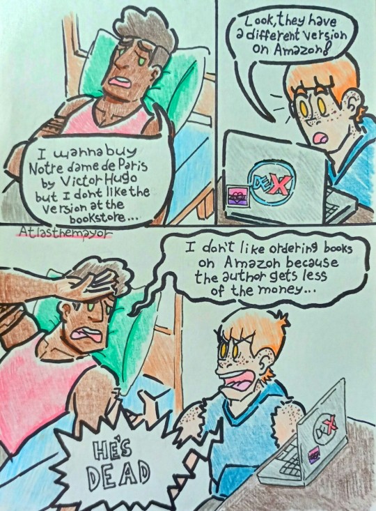
(I may have to make a specific tag for these frogs comics later)
The dialogue is from a convo a friend's friend had with their bf
My friend told me it was peak nurseydex, and tbh she was RIGHT
#omgcp#fanart#atlas art#nurseydex#polyfrogs#(always assume there's background polyfrogs when I'M the one drawing)#will poindexter#derek nurse#omgcp dex#omgcp nursey#the frogs#meme#polyam#bisexual#check please#omgcp fanart#i should do more of these but I've got stuff to do for now 😭😭😭
196 notes
·
View notes
Text

frog that is made of lime jello probably (a glass frog, my favorite type of frog)
[ID: a digital drawing of a bright green frog sitting on some bright green leaves. the frog has a jelly-like appearance as it is asleep and curled up, and its body is slightly translucent. there’s some light shading in rainbow colored pencil on the frog and the edges of the leaves, and the background is a pale variegated blue]
171 notes
·
View notes
Text
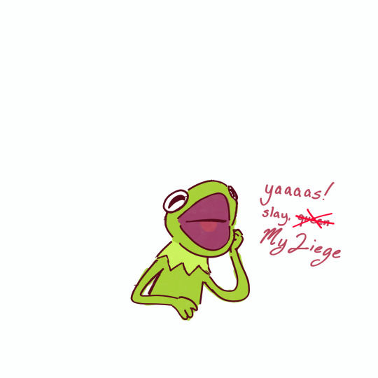
here’s some art y’all will actually like
#since you never seem to enjoy my usual stuff have a kermie#kermit the frog#kermit fanart#kermit#the muppets#meh the art i make is already dead anyways#EW I SOUND LIKE I WANT PITY EW#im sorry i just get rlly upset about this stuff#i take a minute to do this and it blows up#but i spend hours on an actual drawing and no one gives half a shit#ugh im sorry im just a bit upset over it#so im posting this as a test#anyways on with you#art
86 notes
·
View notes
Text

Legolas and a froggy friend 🐸
#art#drawing#lord of the rings#lotr#watercolor#lotr fanart#legolas#legolas greenleaf#frog#look ok I feel like it could be ✨more dynamic✨ or something but I’m really just gonna try to post the stuff without overthinking it
64 notes
·
View notes
Text
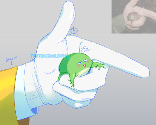
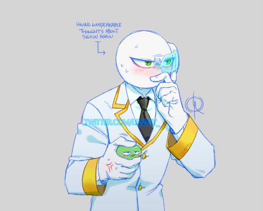
Jeraldy & Sigma Frog 👔Σ🐸
#marikinonline4#mo4#jeraldy mazaingo#sigma frog#sigfrog#linas art n stuff#fanart#digital art#they're fun to draw together#the lil guy is ok btw he likes being held like that
52 notes
·
View notes
Text

Frog is worried you haven’t taken a break to drink something nice and love yourself
-Mommabean (you wouldn’t believe how many times I had to redraw the stupid cup)
#mommabean#my drawings#my stuff#my art#doodles#frog#frog drawing#frog art#ok to interact#ok to reblog#ok to comment
63 notes
·
View notes
Text

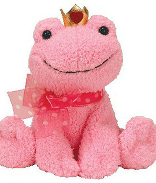
it's Kissable the frog's birthday today! 🐸💗
#beanie baby of the day#beanie babies#cute frogs#frog art#cute animals#wholesome memes#wholesome art#cute drawing#cute stuff#cute art#kawaii art#kawaii#froggy#my art
436 notes
·
View notes
Text
Really not safe for kids stuff below

POV you are a frog and convinced the hawk and dog to stop trying to kill each other , but they struggle with sharing so you tried to spend time with them both however it got out of hand
#captain laserhawk#laserfrog#Rayfrog#rayhawk kinda?#What is the ship name for the three of them?#not safe for kids#anyone else see my vision?#Not quite confident to post this on main lmao#I will draw other characters and non ship stuff I just really like the French frog getting smooched (mainly by Dolph)
76 notes
·
View notes
Text
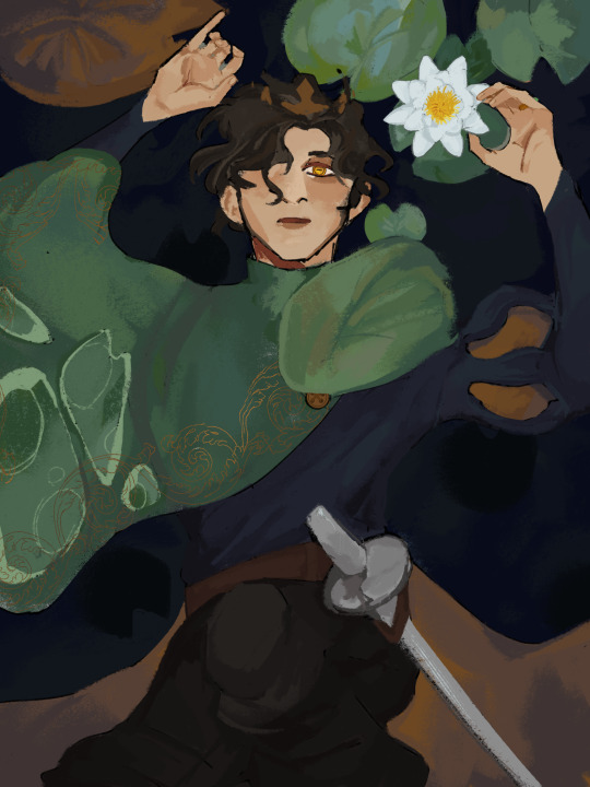
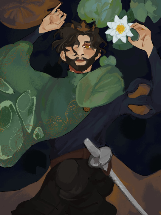
prince consort gerard of greenleigh, formerly a frog, and soon to be a frog again
#d20#d20 neverafter#prince gerard of greenleigh#prince gerard#neverafter#frog man#divorcee#as i said in my wip post#I’m a total sucker for romance and I really hope he and his wife reconcile as he realizes his errors in being a supportive#selfless husband#even better I hope that Elody kills the snow queen and goes back to look for her husband#bc she genuinely cares and still loves him#but he wasn’t made for war and now they can have a candid conversation without the war in the way#anyway she sees him and what his doubt and buried self loathing and selfishness has had him become again#they talk and make up#yknow#the stuff of healthy relationship fairytales#I saw someone tag my post about them thinking Gerard would look like murph and i agree but a) let me draw this twunk in peace#and b) I will not make murph fanart. yet. maybe.
477 notes
·
View notes
Note
Hello I would like to request your favourite little freak(amphibian) for day 1432
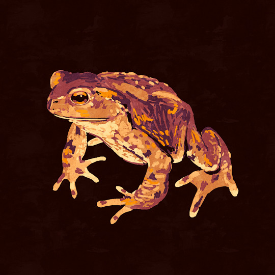
day 1432
#amphibian#frog#toad#european common toad#i had to look up what 1432 means but i think its cute#i interpret this as just my favorite amphibian which is the common toad#i think you can tell from my art that its one of the amphibians i instinctually go for when i have no specific species to draw#i know its a boring answer but its a good frog. plain and simple#and its the one i've actually interracted with the most irl :)#and more specifically we had a toad that lived in the drain in the cellar in a previous house#its where we had all the laundry stuff. so we called him laundry frog. he is like the patron saint of laundry. to me#laundry frog specifically is my favorite little freak#laundry frog#oops i think i forgot to save the alt text#it should be fixed now but i have no idea how that works in relobgs
600 notes
·
View notes
Text


MORE
#keroroposting#keroro gunso#sgt frog#zeroro#dororo#dororo's mother#keroro#i luuuv drawing chibikero stuff. because somehow i get to project childhood AND pet experiences with them#having cats is awesome (my bed is covered in scratches
43 notes
·
View notes
Note
I love how you do color! Do you have some tips you could share?
I have some tips here that I still think apply! It's probably best to have a look at those first, but here are some others also, with our friends the frog and red panda as my model,
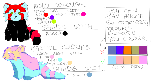
Personally I prefer pastel colours, but sometimes bolder colours work better on things like posters, and it works better on artwork representing anger and high energy whereas pastel colours make things seem peaceful and calm.

Pinterest is a really good place to look for colour references and I have a colour board you can check out here that I'm always adding to! Using photos taken from life and photography is usually OK, but never copy or steal anyones work.
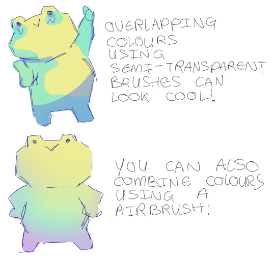
You can combine colours using different pens! This works best with pastel colours and looks nice with drawings with sunsets in the background. And lastly,
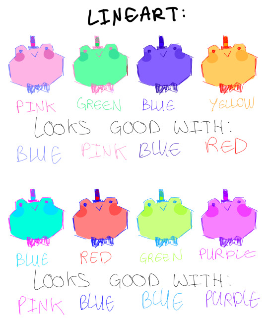
Changing the colour of the lineart can look good too! There's nothing wrong with the classic black line art, but sometimes adding colour to your lineart can be nice and create a unique look to your work. I found it looks best when you use the colour opposite to the colour you've been using or the same colour you've been using but darker. It's worth noting that different colour combos look good to different people so be sure to experiment with what colours look good to you!
#i like pastel colours best but that isnt for everyone#maybe you like working in yellow and thats ok too#maybe you want to add every colour at once to your work in one big rainbow and thats also cool#cause its all about having fun#anyways i hoped some of this helped!#im always up for trying to give tips cause its fun to explain stuff with drawings and is a excuse to draw frogs#ask#art tips
156 notes
·
View notes
Last Seen Blogs

crescentpaws
kotlc art???
salochkin
🍄Salochkin🍄

serco
SercanAkhanlı

stancesyndicate
StanceSyndicate - Automotive Photojournalism

familcide
Rough Sex