#from dafont
Note
Hi! I’m new to your blog and just want to say I LOVE your art style and everything, it’s so pretty! I wanted to ask, what program do you use? Additionally, brush and font (unless you just have super neat handwriting ajsjajdjsj)

TYSM! :D <3
The program I use is Firealpaca, started drawing properly in 2019 and it was what was easy and free for me at the time, just never felt the need to swap to anything else XD
#i WISH my writing was that neat! :'D#I got the font on a site called DaFont#as a graphic designer id never recommend it for finding fronts for professional use cause of like copywrite and stuff#but for your own personal art it has a ton of great ones to chose from :D#ty for the kind words!!#hope this helps!#asks#tribbletalks#<3
39 notes
·
View notes
Text
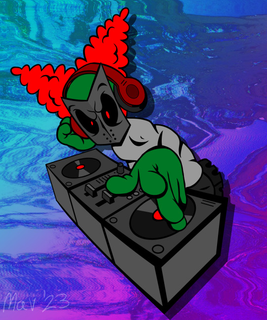
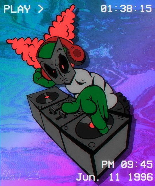
GIVE IT UP FOR DJ TRICKY
Got in the mood to draw Tricky in that "90s happy hardcore/gabber cartoon album cover" style again, this time on da set!!
Here's some music that goes with this!
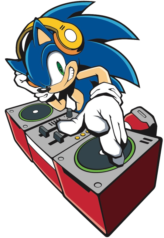
Image ref under cut :)
#My art#Madness Combat#Tricky The Clown#MadCom#Tricky#Happy Hardcore#Gabber#Old school#90s#1990s#90's#1990's#I freaking love Clip Studio Paint so much#I got this VHS filter from their ''Assets'' site and it was FREE#I had to get the vhs font from dafont tho#Also I would've drawn his claws but it didn't look right#ANYWAY HOPE YA LIKE
106 notes
·
View notes
Photo
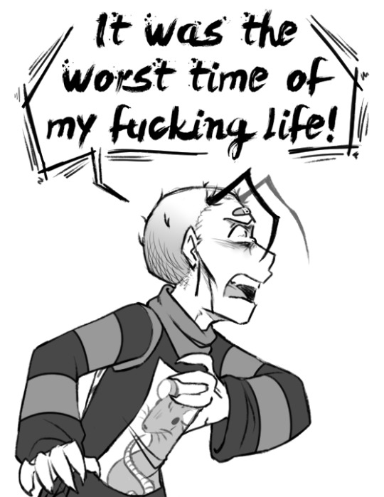
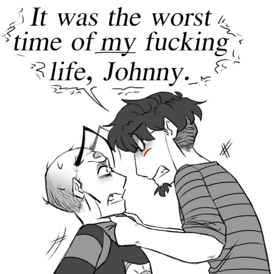
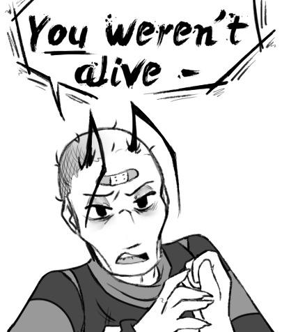

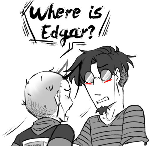
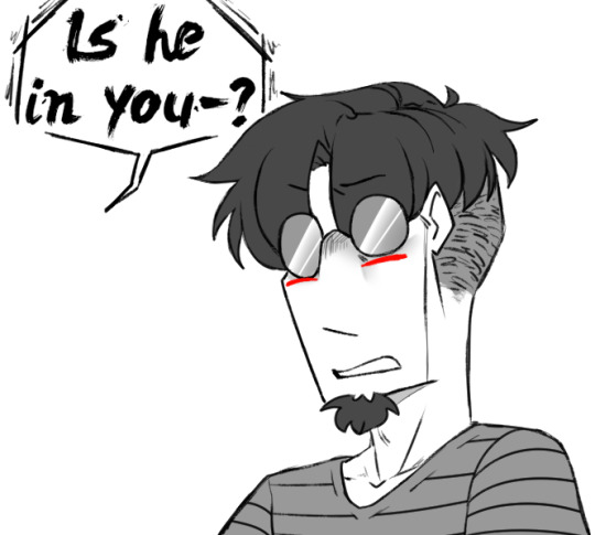
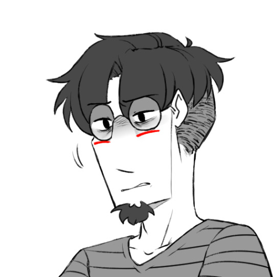
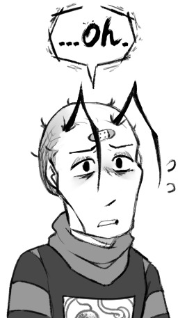

Incoming, Outgoing
#💟#Digital art#Art#Nny#Scriabin#I never know if Edgar counts in situations like these lol#Edgar#*drags in another crossover kicking and screaming*#And yet more DSMP lol I am incorrigible#As soon as I saw that animatic and Will's glasses going from reflection to his eyes showing I was like ''ScrIABIN'' lol#I wasn't really thinking through the implication but I guess this would be a split where after the world resets#Nny and Scriabin make it back to their respective bodies but Edgar doesn't - Replacement Complete very suddenly#Although honestly I was thinking Edgar would still be there just buried a lot deeper than normal - something closer to Convalescence#Well it's always an imperfect fit when borrowing lines haha ♪#It's funny 'cause I've kicked around a couple different AUs to do with Edgar and Scriabin's separation but this is neither of them lol#On the art side it was shockingly fun to do Nny's word bubbles ahh ♫ Normally I find them a little tedious but that was really enjoyable#Also not me scrolling DAFonts for like 45 minutes looking for a decent spooky font since the best I had previously was GoodDog lol#I'm a fan of the splatters hehe#I also forgot how fun those hair-antennae actually are to draw??? Damn what a good time#I wish I could draw his face better to justify doodling those more often lol#Also thanks to the stream for inspiring the rat shirt haha ♪ Have fun trying to decipher the rest
211 notes
·
View notes
Text
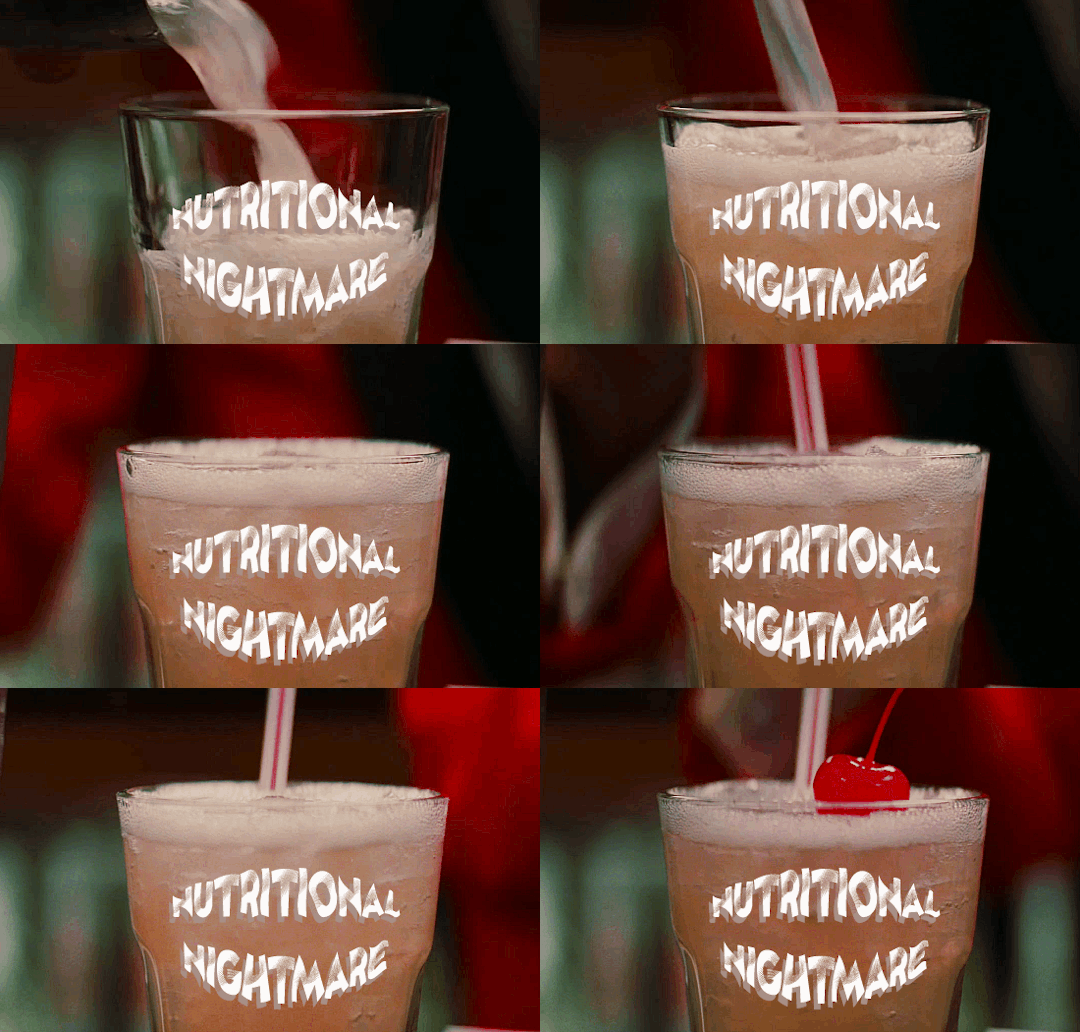
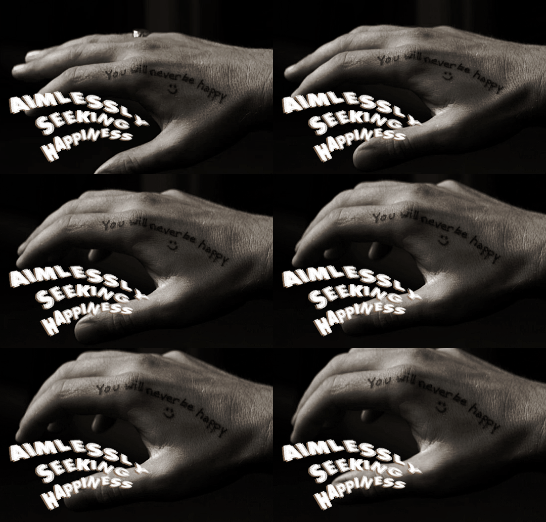
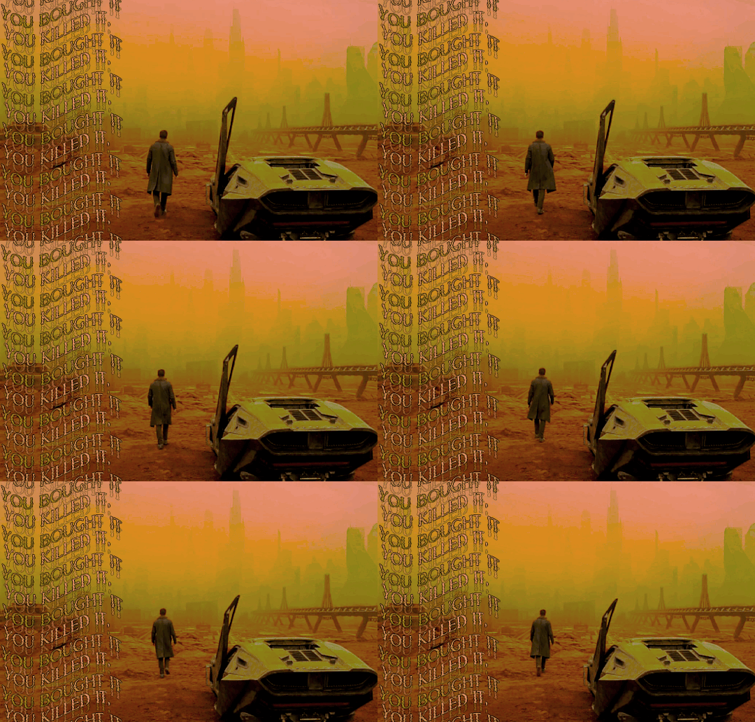

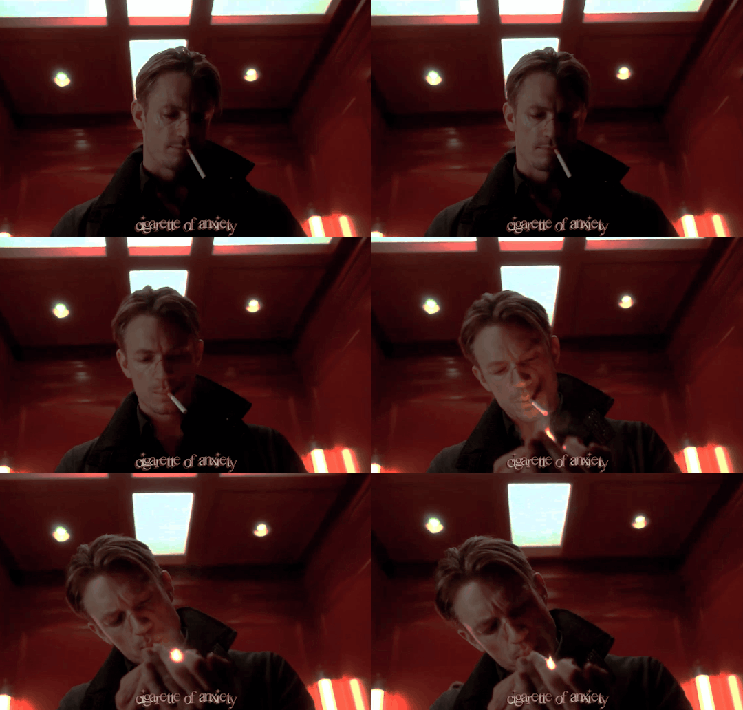
ocs & character tropes
the outer worlds - captain raylan grace hawthorne
nutritional nightmare: all the colony food is shit, and ray doesn't trust any of it :-) nutrition means basically nothing to him and barely survives on bites here and there
aimlessly seeking happiness: put a finger down if you signed up for a chance at a new life amongst the stars and are now trying to save an entire colony and fix everyone else's personal problems while holding on by a thread
you killed it, you bough it: tfw when you accidentally crush a dude to death and then steal his name & ship & entire life
the insomniac: 500 years of cryogenic sleep'll cause a bit of nerves of passing out again
cigarette of anxiety: raylan picks up a previous habit of smoking, leaning more heavily on them during the events of tow
#this was a fun (but time consuming) lil practice w fonts and coloring styles :-)#i really like the way the coloring of the b-la-de runner one looks#tho not sure i like the how i did the font#myocs*#mygifs*#oc: capt hawthorne#if anyone is interested in any of the fonts i downloaded them off dafont#and can send you a link if you want lol#also the image description is the source material if anyone wants to see what media it originally came from
12 notes
·
View notes
Text
So I made this pin design as a tester for my graphic design skills, and I like it!

[ID: a circular pin design on a transparent background. It has the background of a blue nebula with orange accents, and wavy text that says “Alien in disguise.” The text is curved so it forms an arch, and is placed over a gold infinity symbol. /End ID]
#There’s a second version I made with more effects on the infinity symbol but it seemed like it made contrast worse#The nebula picture was uploaded on Unsplash by Aldebaran S#I got the font from dafont#and the infinity symbol was a free-to-use png that I added color to#my art#actuallyautistic#autistic pride#actually autistic#autism pride#autistic artist
23 notes
·
View notes
Text
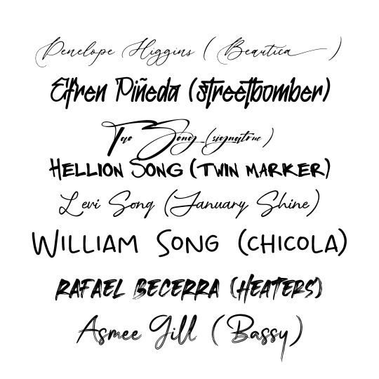
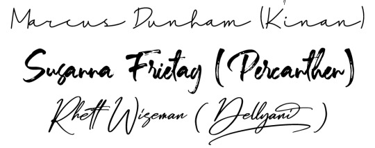
im using my freetime wisely
6 notes
·
View notes
Note
Hello! Could you please tell me what fonts are you using in that pink Nina Zenik gifset? Thank you!
this gifset
first gif: LEMON MILK and NT Josefine
second gif: ARIAL BLACK
third gif: LEMON MILK, BEAUTY, and ARIAL BLACK
#ask#pshelp#some of these i downloaded from dafont#like lemon milk and beauty#some are already pre-installed! :)
3 notes
·
View notes
Text
Me rediscovering font and Zalgo text and just going batshit with them in my draft.

I stopped using fonts to maybe sell ebooks one day and I'm still too scared to publish. So fuck it. Time to have fun.
#writing#i know everything has to be times new roman for editing#but#LISTEN#low craziness zalgo text works for the artificial intelligence villain#using slightly different font for chapters to indicate false memories is just *chef's kiss*#i haven't done this kinda stuff since high school and i missed it#dafont and zalgo generator my beloveds#just smear that shit all over lyrics from mnqn for dramatic effect
0 notes
Note
hi !! i just wanted to know what font you used on the hatsune miku directory? thank you ^__^

hi! its the porkys font! i love using it a lot , its so pretty... heres a few others i use a lot

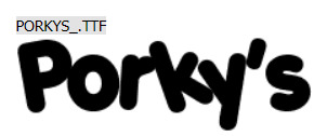


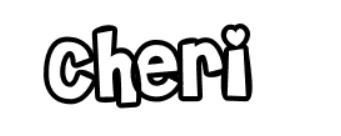
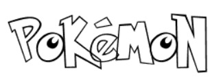
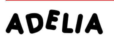


I got all of these from DaFont! You can also install them in IbisPaint & your PC !

#rentry#rentry inspo#rentry graphics#rentry resources#rentry template#♡ ; talking#fonts#free fonts#best fotns#rentry fonts
2K notes
·
View notes
Text

HOW TO: Make an iPhone Layout
+ Downloadable Template
Hi! I've gotten a few messages asking for a tutorial on my iPhone gifsets — but instead of only doing a tutorial (that would probably be triple the length this one already is), I decided to turn my layout into a template with all the bits and bobs! In the "tutorial" under the cut, I'll share everything you'll need, a free template download, and quickly go over how to use this template. :)
Disclaimer: This template uses Video Timeline and this tutorial assumes you have a basic to intermediate understanding of Photoshop.

PHASE 1: THE ASSETS
1.1 – Download fonts. These are the fonts used for all assets I've included in my template:
– SF Pro or SF Pro Display (Regular, Medium, Bold): Either version works, they look nearly identical. You can download directly from https://developer.apple.com/fonts/ or easily find it via Google
– Bebas Neue: Free on Google Fonts, Adobe Fonts, and dafont
– Times New Roman (Bold): Should be a default font in Photoshop

Make sure to download and install any of the fonts you don't already have before opening my template. That way, once you open the template file, all the settings (font size, weight, spacing, color, opacity, etc.) are as intended.
1.2 – Download my template.
Before you use my template, all I ask is that you don't claim or redistribute it as your own and that you give me proper credit in the caption of your post. Making these iPhone gifsets takes me a longgg time and turning this layout into a template took several hours too.
DOWNLOAD TEMPLATE VIA KO-FI ← This template is completely free to download (just enter $0), but if you feel inclined to tip me, I appreciate you! 💖
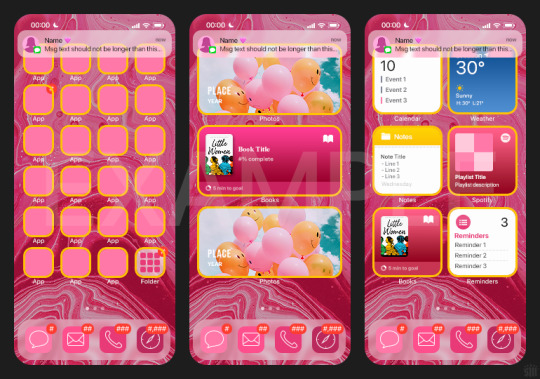

BTW this template also includes some of my frequently used icons!
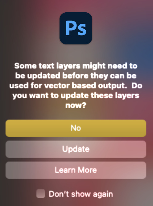
NOTE: If, for some reason, you open the template and see the pop-up shown below, click "NO" — otherwise, the fonts will be all messed up:
And if you see this triangle with an exclamation point by a text layer, don't double-click it — it'll mess up the font as well:

PHASE 2: THE GIFS
I'm just going to briefly go over gif sizes and my recommendations. Also, keep in mind when grabbing your scenes, you'll want all of these gifs to be the same amount of frames.
2.1 – Background Gif: 540 x 540 px.
I recommend this size so you have a good amount of visibility for the gif behind the iPhone wallpaper. I also recommend making this black and white (or in my case, black and white with a slight blue tint — idk I just like the way it looks) so the wallpaper coloring can stand out.
2.2 – Wallpaper Gif: 230 (w) x 500 (h) px.
Keep in mind the very narrow dimensions of the wallpaper! And also keep in mind that you'll have a bunch of apps and widgets covering the image. I try to use wide shots (or layer my clips into looking like wide shots). Also, keep in mind your color scheme for your set and your character's aesthetic! I tend to focus on one or two colors for the wallpaper.
I usually position the wallpaper to the side with 20px bumpers, so there's lots of space to see the background:
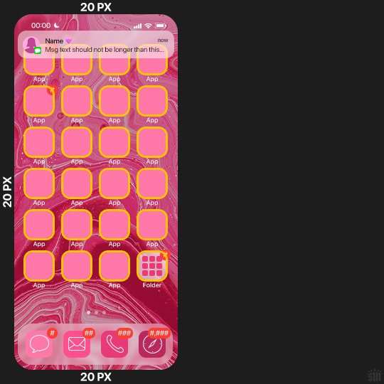
2.3 – Large Photo Widget Gif: 201 (w) x 96 (h) px.
2.4 – Small Photo Widget Gif: 94 x 94 px.
PHASE 3: THE TEMPLATE – "IPHONE" FOLDER
In this section, I'll try to quickly walk you through how to use this template and some bits that may require extra instructions. I'll be going through each folder from top to bottom.
3.1 – Status Bar.
Time, Service, and WiFi are pretty self-explanatory. In the Battery folder, you can use the shape tool to adjust the shape layers labeled "Fill (Adjustable Shape!)" to customize the battery level.
3.2 – Message Notification.
Again, these are pretty self-explanatory. I've already masked the circle for the contact photo, so you can simply import any photo and use the transform tool to shrink it down. The circle is 24x24 px. If you don't want to use a photo, there's another folder called Default Initials.
If your message text can't fit the text box, the message should end with ellipses which is how iOS caps off long texts.
3.3 – Blurred Banner (IMPORTANT)
This folder is easy to miss because there's only one placeholder layer in there. On iPhones, the area behind a banner notification and the dock get blurred (including the wallpaper and any apps).
What to do: Make a duplicate of the apps in Row 1 and/or widgets that intersect the message banner, convert them all into one smart object, apply a Gaussian Blur filter (Radius: 3.0 pixels) on the smart object, and move the smart object into this masked folder!
(There's another masked folder in the Wallpaper folder for the dock which I'll go over in that section.)
3.4 – Apps
Turn off the yellow guide if you don't need it to keep things aligned and turn off layers you don't need by clicking the eye icon. Replace the "App" placeholder text with your app name, change the color or gradient of the square to compliment your color scheme, and add your custom app icon overlay!
If you can't find an app icon you need from the ones I provided, flaticon.com is a great resource. Also, if you can only find the filled version of an icon, check out this tutorial for how to make any text or shape into an outline.
Also, each app folder has 4 notification bubble options (1-4 digits). Again, you can toggle these on and off as you need!
3.5 – Big Widgets
I like using these when my wallpaper has A LOT of negative space to fill. I included the Photos and Books widgets in my template, but there are lots of widgets available on iPhones. You can check some of the other ones I've done here, or if you have an iPhone, simply try adding some widgets to your phone!
There are also widgets bigger than these, but they would take up half of the phone screen which is why I don't use them for these edits.
3.6 – Small Widgets
The only thing I'll say about these — because they're pretty straight forward — is there are a lot more weather themes than I included in my template. Also, if you set your character's phone to evening, the weather widget will show a dark background (sometimes with stars), so keep that in mind.
Speaking of, I've included Light Modes and Dark Modes for, I think, every applicable widget.
3.7 – Page Dots
These barely perceptible dots indicate that your character has more pages of apps than shown in your gifset (so if an anon tries to come at you, you can just say "it's on the next page of apps" /j /lh)
3.8 – Dock
Again, the dock has notification bubble options and I've included the default app designs, custom filled designs, and custom outlined designs for iMessage, Phone, Email, and Safari (there's also a FaceTime alternative if that's how your character rolls). These are usually the apps people keep in their Dock, but this is fully customizable too. So, if your character is, like, super obsessed with Candy Crush or something and needs it in thumb's reach — you can put it in the dock.
3.9 – Wallpaper
This whole folder is masked already to a 230x500 px rounded rectangle.
Inside, you'll find another "Blurred Portion" folder for the area behind the message banner notification and the dock.
What to do: Duplicate your gif layer and place it in this folder, remove any sharpening filters, and apply a Gaussian Blur filter (Radius: 3.0 px). Be sure to add any coloring/adjustment layers ABOVE this folder and your original sharpened gif layer.
PHASE 4: EXPORT
We made it!
I hope this template makes it super easy for you to recreate this layout! If you decide to try it out, feel free to tag me with #usernik.
If you notice anything wonky about the template, kindly let me know so I can fix it! And if you have any questions about how to use this template, please don't hesitate to send me a message! I just ask that you try to be specific in your question so I'm able to answer you the best I can!
#gif tutorial#completeresources#userpickles#usersmia#userabs#usertreena#alielook#userkosmos#usershreyu#userzaynab#tuserabbie#useryoshi#usersalty#tuserlucie#usernanda#userelio#userhella#usercats#gfx*#resource*
752 notes
·
View notes
Text
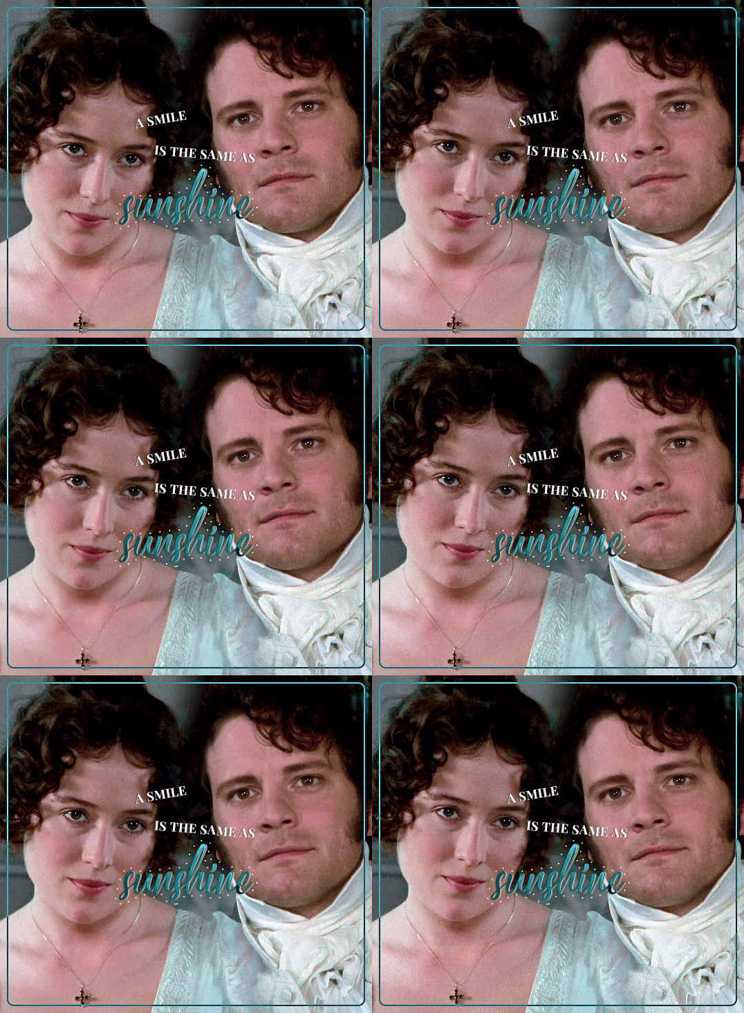

@usergif new year, new fonts: day 5 | FAVORITE FONT(S)
A smile is the same as sunshine; it banishes winter from the human countenance.
– Victor Hugo, Les Misérables
fonts used:
1: Neothic (Dafont) | Marksville (Dafont)
2: Neothic (Dafont) | Indigo Forest (Dafont)
#usergifNYNF#pride and prejudice#papedit#perioddramaedit#austenedit#gifshistorical#adaptationsdaily#weloveperioddrama#perioddramasource#minee#crowleyanthonys#userbuckleys#tuserheidi#userrobin#singinprincess#userrin#userabs#useraish#usertina#userbunneis#super late but i wanted to finish this challenge
243 notes
·
View notes
Text
Book Of Shadows
。・:*:・゚★,。・:*:・゚☆
I've been editing my Book of Shadows for a few days now and I think it's time to share some of it here. These are just a few excerpts from it. I purposely made it black&white so it looks Victorian and uses less ink when printed on parchment paper.
1. History of Paganism
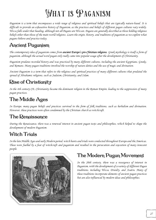


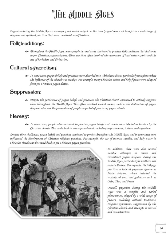
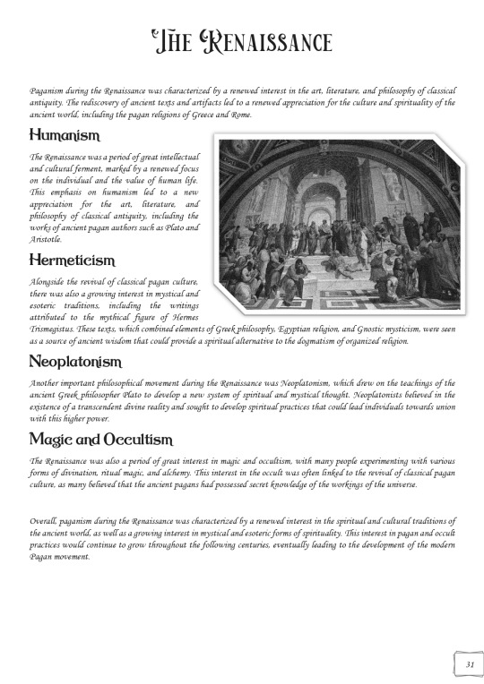
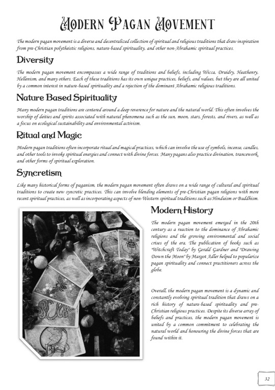
2. Satanic Panic

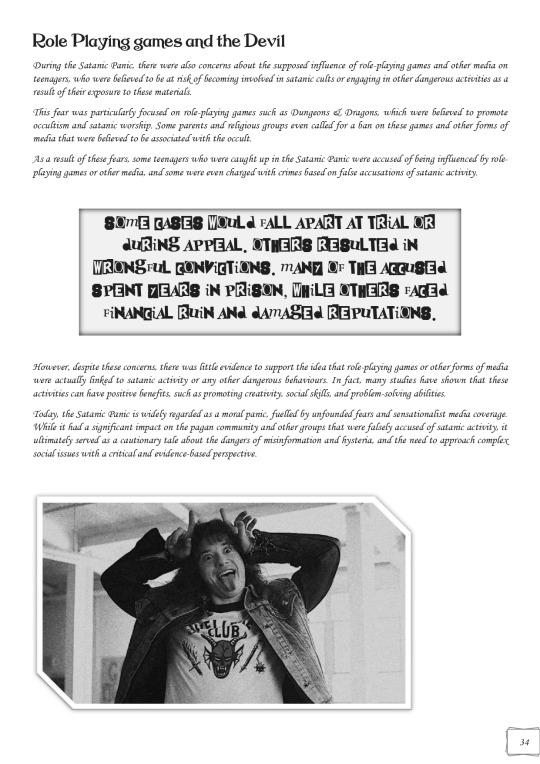
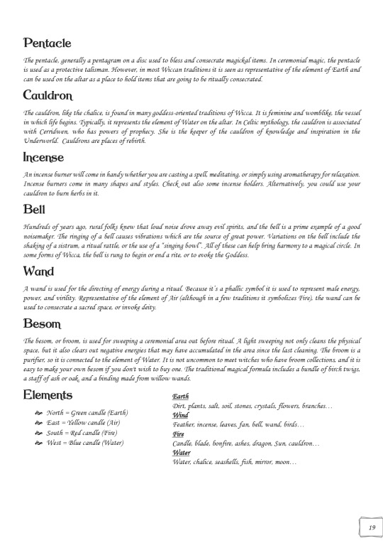
3. The Sacred Circle & Altar



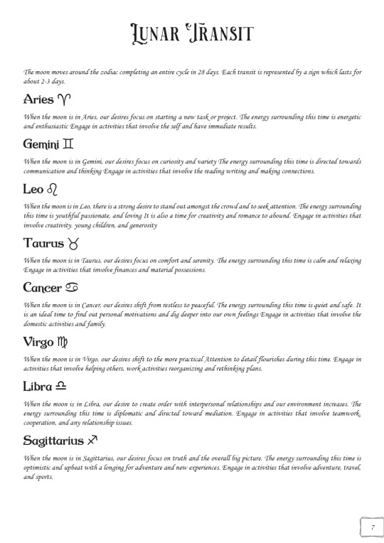
4. Lunar Transit
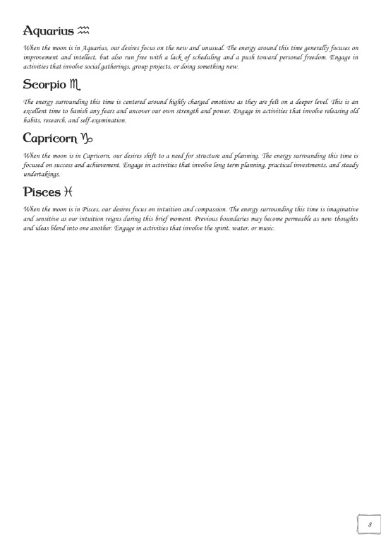
5. Moon Phases


6. Wheel of the Year + Imbolc
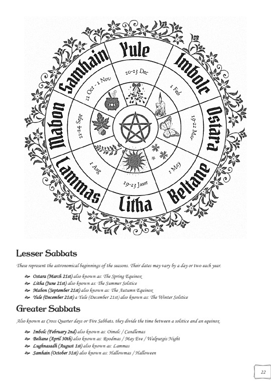

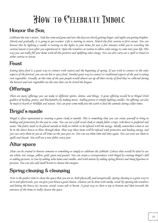
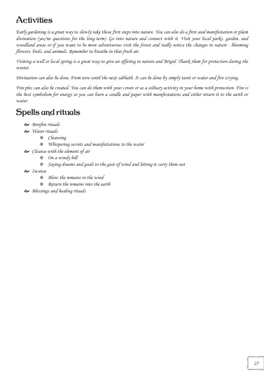
Keep in mind that these are just some of the random pages I picked so it's unorganized. I'll be sharing my Table of Contents next time to show you how I organized it all.
P.S. Almost all of the fonts are free to download from Dafont. So if you want any font from these pages let me know :) We do not gatekeep here!
#grimoire#book of shadows#wicca#baby witch#beginner witch#witchcraft 101#hellenic pagan#paganism#hellenism#pagan#witchbrl#wheel of the year#ibolc#history of paganism#satanic panic#altar#sacred circle#magick#magic#magic circle
895 notes
·
View notes
Text





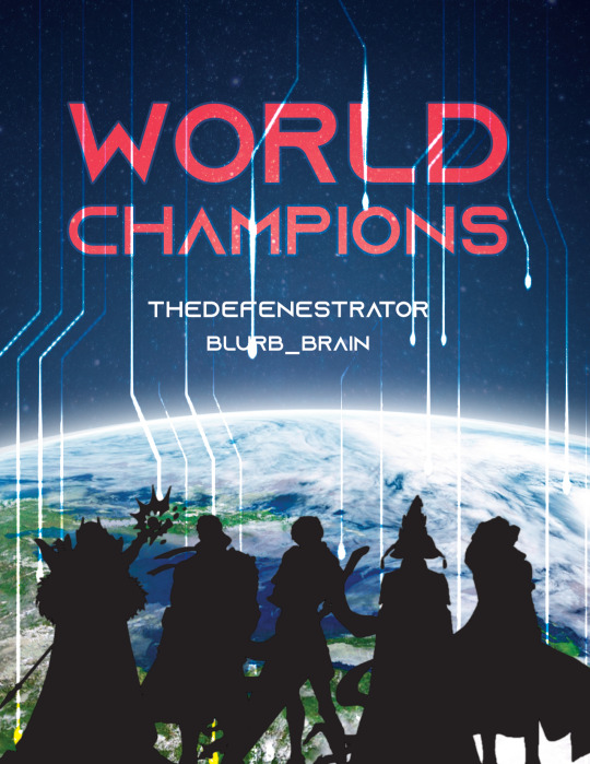
World Champions | Artwork for World Champions by TheDefenestrator by TheDefenestrator, art by Blurb_brain
Fandom: The King's Avatar | 全职高手
Rating: Teen And Up Audiences
Category: Gen
Words: 71 944
At the end of season 4 of the Glory Pro Alliance, the government finally receives the information it has been waiting for: The other players have caught up. Or, In which Glory has been a government recruitment ploy for remote-piloted mecha operators all along.
About the Book
FONTS: Mundo Serif, Azonix [dafont], Segoe UI Symbol
IMAGES: Illustration by Blurb_brain [AO3]; cover image by NASA ID: 440611 [Rawpixel]; Planet Earth background ID: 6331593 [Rawpixel]; Circuit lines background ID: 3117935 [Rawpixel]; endpapers' image by Eric Eastman [Unsplash]; Swoksaar, Desert Dust, Lord Grim, Vaccaria, and Cloud Piercer [The King's Avatar Wikia]
MATERIALS: regular printer paper (8.5"x11", 96 bright, 20lb), 80pt bookboard, Iris Bookcloth (colour: Black Pearl), Neenah cardstock (8.5"x11", bright white, 65lb), waxed linen thread (white, 30/3 size), embroidery floss (shades 3750, 350, 3845, 370), leather cording (1.9mm diameter), Reeves’ acrylic paint (Mars Black, Phthalo Blue, Titanum White), Americana acrylic paint (glow in the dark), ph neutral pva glue (Books by Hand)
PROGRAMS USED: Typeset in Affinity Publisher, cover/title page/endpapers designed in Affinity Designer/Photo, QR codes generated with LibreOffice Writer, PDF arranged for printing with Bookbinder-JS
BINDING STYLE: quarto, case bound (slightly rounded, with oxford hollow, forgot to use tapes)
.
Fenes' "Glory's tech isn't handwaved" AU. This was great! Funny and creative, and I'm both amazed and full of admiration for Fenes' ability to juggle so many characters.
I was feeling excited and ambitious with this one. Tried some new fun things (double core endbands, painted edges) and used some new equipment (a lying press).
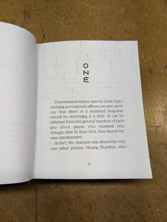
The Text
TITLE/HEADINGS FONT: Azonix says 'SciFi' to me, it's a bold, non-serif, sleek font.
BODY FONT: Mundo Serif, it's a decent serif body font I haven't used before. Felt like it worked with Azonix.
SCENE BREAKS: a special character in Segoe UI Symbol of a black & white icon of Earth, the globe showing Asia.
TYPESETTING: Finished typesetting the fic, left document open on my laptop, laptop's battery failed, file now crashes immediately upon reopening, issue persists with copied versions of file (; ̄Д ̄) . Thankfully I had a backup file for the typeset with the barebones of the text, so I didn't have to restart from scratch...
Title Page
My thinking: it takes place in space, the world's at stake, and it's the dawn of a new horizon for Earth. Glory and the titular champions are represented by Swoksaar, Desert Dust, Lord Grim, Vaccaria, and Cloud Piercer – the captains of what I'd call the 'big 5' teams. A circuitry board background element hints at the tech/mecha nature of the story's competition. It may not match Blurb's art, but I hope I was able to convey some of what the story is about.
The circuitry image is used as decoration throughout the book.
I only used the avatars of the top five teams' captains because too many silhouettes would lessen their impact and readability. (Removing the backgrounds was tedious, but worth it.)
Here's what it should have looked like. The test prints for this and the BB art were fine, but I think my inkjet started running out of ink just when I printed the final copies and I didn't reprint them. (Too impatient, really wanted to finish up and read the book)
The Cover
World Champions is another Big Bang fic, and once again I based some of my design choices off of the accompanying artwork. The dominant colours of Blurb_brain's illustration are red and blue-green.
COVER PAPER: For the decorative cover material I used NASA's ASTER image of Poyang Lake. NASA has some really interesting photography some of which remind me of marbled paper, thought it could be interesting. I chose this image of Poyang Lake because 1) it's in China, 2) the colours were similar to Blurb's awesome illustration (fate strikes again, dropping matching images and artwork into my lap!), and 3) NASA is tangentially relevant to the fic, which takes place in space.
BOOKCLOTH: Verona bookcloth in the shade Black Pearl, a lovely dark navy blue colour. Thought it suited the cover paper and title page. (Bought it for this fic specifically, but the colour goes well with almost all of my decorative papers so it should see a lot of use in the future!)
Endpapers
The final decision that held this project at a standstill for two months.
In the end I drew inspiration from the matchups against the final opponent in the story. The image I used is a little chaotic and a little too unrelated to identify why I picked it without an explanation, but this book is for me and I know why, so there. (Note that I played around with the colours and cropped the photo.)
Endpaper inspiration: the maps for the matches against the Infilhites
"a long bridge through an enormous tube-like hall, where light seem to come from every side through stained glass windows. It was visually confusing, limited lateral motion"
"a warehouse, crates stacked on and beside metal racks that went all the way to the ceiling."
"a house of mirrors, fully enclosed to be sure the Infhillte couldn’t fly out of it."
"like a volcano, rivers of lava moving sluggishly down a slope, occasional vents of overheated air nearby."
"a series of overlapping bridges between halls and stairways, level after level layered over an open abyss."
Trimming & Painting the Edges
Going all out, a 2-for1 deal: the opportunity to use my lying press for the first time and learn a new technique!
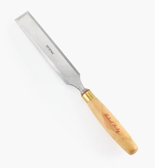
TRIMMING: Used a paring chisel and lying press.
CHISEL: The 1.25" wide paring chisel I used was form a modern manufacturer. (Vintage paring chisels are very thin, enough so that you can bend/flex the blade. But don't do that.) It's long and wide blade made it easier to register against the surface of the press for consistent cuts. Looks like this one below from Lee Valley.
LYING PRESS: My dad's project. Solid black walnut, hand carved screws and internal threads — he even made the tools to make the threads too! The jaws of the press are each 3 7/8" wide. It's big and heavy (though much smaller than full-sized professional ones omg), but there's enough of a flat surface to register the chisel against. A thicc boi, much like this one below from Bookbinding Supplies.

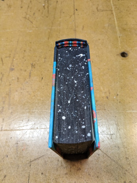
PAINTED EDGES: The idea was to have dark navy edges, speckled with white stars. I used acrylic from a tube to paint the edges — tutorials recommended it over liquid bottled acrylic, and I had an old set hanging around. Had to water it down because otherwise the paint just flaked off.
My test of trimming and painting went well. Then the trimmed book itself came out slightly crooked, the paint required significantly more watering-down than before, and the white paint did not want to be both opaque and speckle-able. Unfortunate, but still book-shaped! And now I have an idea of what to do differently next time.
Also, did not like the glow-in-the-dark paint. Looked too translucent in the light when compared to the white acrylic, and needed a thicker coat to be visible in the dark. (The thickness combined with the translucence and base colour kinda reminded me of boogers... Ended up scrapping most of it off, so there's not much left to glow.)
Endbands
Still in the mood to have fun and go all-out, I attempted double-core endbands for the first time.
TUTORIAL: YouTube @ BookbindersChronicle: Bookbinding 101 Sewing Headbands Session 2. Also watched @ DAS Bookbinding's Double-Core Endband // Adventures in Bookbinding, but I personally found Chronicle's closeup video easier to follow.
I used embroidery floss from a 100pk of assorted colours off Amazon, wrapped around a core of 1.9mm leather cording from Michaels. I drew from Blurb_brain's art for the general colours, choosing a dark base, with red, blue-green, and gold. The specific shades were picked to go with the cover.
#World Champions#TheDefenestrator#Blurb_brain#qzgs#tka#the king's avatar#fanfiction#bookbinding#fanbinding
82 notes
·
View notes
Text

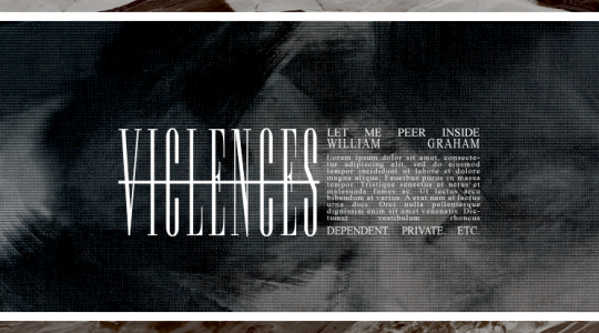


♞ / 𝐓𝐄𝐌𝐏𝐋𝐀𝐓𝐄 𝟎𝟕 ……………............... [ 𝐆𝐎𝐔𝐀𝐂𝐇𝐄 ] 𝘣𝘺 𝐀𝐒𝐌𝐎𝐃𝐄𝐔𝐒 — 𝐅𝐑𝐄𝐄 !
SO i think i've officially gotten all the cool new features i've learned out of my system lmfao which means something a lot more aesthetic! this is a pinned post / blog graphic featuring two versions, both with notes of gold and deep and dark blues! please be sure to like/comment/reblog or credit me if you use this template!
FEATURES:
2 smart psds - version one and version two, respectively
font used - if you'd like to download it from dafont you can do so here!
terms of use
2 sample photos (version one and version two)

DOWNLOAD: DEVIANTART (FREE) or GOOGLE DOCS (NO ZIP) x VIEW MORE TEMPLATES
#rph#rpc#rpt#indie rp#pinned template#graphic template#rp resources#dearindies#supportcontentcreators#rp psd#rp#free resources#free psd#psds.#mine: pinned temp.#mine.psd#collections.#templates.
37 notes
·
View notes
Text


Dividers made by me using online image editor, and phonto. Dingbats downloaded from dafont and fontspace. Free to use, all I ask is that you don’t claim them as yours.
205 notes
·
View notes
Text
Just made the “android in disguise” version, because I liked that version too

[ID: a circular pin design on a transparent background. It has the background of dozens of old-fashioned heart monitor screens, arranged in rows, with various heartbeats displayed on them. The screens are all various shades of dark teal, and the pattern has accents of purple and pink. The design has wavy yellow text that says “Android in disguise.” The text is curved so it forms an arch, and is placed over a gold infinity symbol. /End ID]
#The background was uploaded by Mingwei Lim on Unsplash and then slightly edited by me so it’s just a little darker#I got the font from dafont#and the infinity symbol was a free-to-use png that I added color to#my art#actuallyautistic#autistic pride#actually autistic#autism pride#autistic artist
14 notes
·
View notes