#get up you have class
Text
I think there's no greater indication that disco elysium is sympathetic towards communism when it literally says "communism is failure" and then the literal gameplay itself rewards trying and failing. The most obvious one being the Shivers check at the FELD mural, which is an Impossible 20 check BUT opens itself up again and again the longer you spend in the world doing things, but even just looking at sheer probabilities, for any given white check, rolling first and THEN putting a point into that skill upon failure is more likely to grant you success than putting a point first and then rolling, but that would require failing first.
Other things too: Precarious world saying you'll 100% fail red checks no matter what (not necessarily a bad thing, btw!! throwing the boule into the sea is a success but like. in some other ways one would want a perfect petanque throw instead. but people wouldn't typically assume that failure is desirable sometimes from the start) persuading you to accept that you'll fail some things that is irrevocable, for a world where everything is just a tiny bit easier.
The faux game over screen when you faint after reading Dora's letter— emulating a sense of failure on the scale of the entire game. When it rolls up most people go "What?? Game over?? No way, what did I do wrong!!" and waking up after that, with no huge or lasting impact on Harry's health or morale really tells the player, "Sometimes things will seem so bad that it all seems like it's coming to an end, but it's not the end, it's really not the end, go drink so water, you can still go on despite this failure"
I'm sure there are other things as well that are eluding me but like. The literal gameplay rewards failing and succeeding far more so than simply succeeding every single time, and I think you get a fuller experience of Elysium that way too
#just thinking thoughts...#disco elysium#idk man when did we get so scared of failing!!#people never want to speak in class because 'what if I'm wrong :((('#well then you are wrong... that is okay... it's normal to fail... sometimes saying the wrong thing is a great way to jumpstart a topic...#'getting a good grade in X is both normal to want and possible to achieve'#okay sure but have you made peace with the fact that getting a BAD grade in X isn't a bad thing?#a bad grade in being friends... okay... so you didn't check up on someone in 3 months... you failed... that's fine...#you can learn from it!! you can learn how to keep in touch with people. how to take care of them when they're sick.#how to resolve a dispute. how to communicate and compromise. these are all things you are not born with#and will fail first before succeeding at#Like yes I get that in the age of surveillance your failures may be recorded and preserved forever and that's not great#but if we don't normalize failure I really think we'll just suffocate and die
3K notes
·
View notes
Text
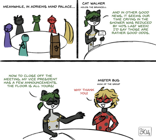
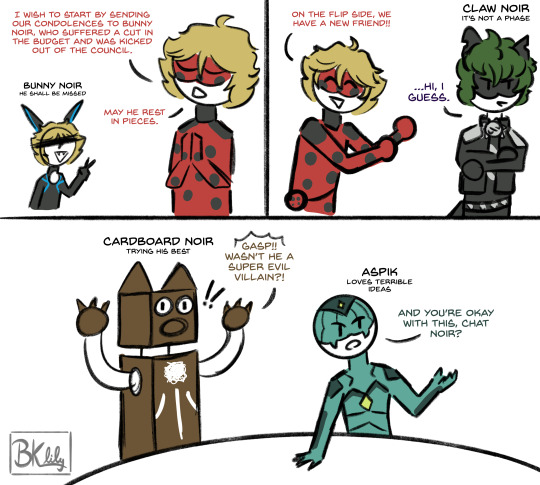
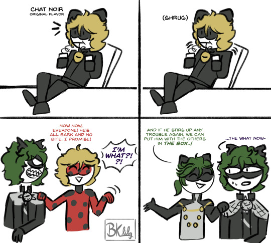

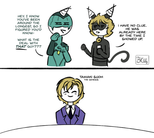
Inside Out but its all the multiple variations of Adrichat
Bonus:
What a weird guy, huh!
Part Two Here!!
#you ever get a sketch idea that gets away from you#this was it#i just started doodling this in class for fun#and hours later i was having to look up cardboad noir on google#Mind Palace AU#anyway this is hilarious to me because we keep getting more catboys!!#you can't have enough catboys!!#shoutout to the bunny noir cameo because i had completely forgotten about him until i was coloring oops#sorry bunny noir#also yes tamaki easter egg because ive been loving the fandom reviving this headcannon lmao#miraculous ladybug#ml spoilers#mlb#my art#ml#lily doodles#chat noir#chat blanc#cat walker#claw noir#aspik#ephemeral#mister bug#ml paris special#ml paris#tamaki suoh#so many catboys!! and one tamaki#mlb fanart#mlb shitpost#adrien agreste
5K notes
·
View notes
Text
listen I expected literally Nothing from the D&D movie okay, like I can't make it clear enough that I expected the most soulless money grab with a good cgi budget imaginable, I went in having already gone through every stage of grief and landed on acceptance and LISTEN
I fucking CRIED during this dumb RPG movie. it wasn't just "not terrible" it was objectively good with a clever plot and compelling characters and sincere emotional beats. this movie loves D&D so fucking much and it NAILS the "a bunch of goobers try to be cool and accidentally discover The Power Of Friendship And Also Great Violence" classic D&D party vibe. their barbarian's last name is fucking Kilgore and my entire family cried in the theater.
I hope they make twelve of these motherfuckers.
#honor among thieves#dnd#dungeons and dragons: honor among thieves#holga kilgore#she is a BARBARIAN whose name is KILL GORE like who among us has not been in a party with this exact character#some new player who picked whatever they were told was the easiest class and gave them a name that is 98% a joke#and just piggybacked their backstory onto the most experienced player's as like rp training wheels#and then smash cut 60 sessions later and we're all getting choked up over john dingus or whatever#do you motherfuckers know how rarely i cry????? about ANYTHING?????#god it was so good#i am going to watch this an unhealthy amount#i want a separate movie for every red wizard and also one about xenk's backstory#his name is X E N K with an X these writers have played some fucking DUNGEONS AND DRAGONS#do i have to buy dead in thay now?????? i think i have to buy dead in thay now#i literally ran dnd on friday and this movie put me in WITHDRAWAL i want to play some dnd Now
13K notes
·
View notes
Text
WHEEEEEE
#project sekai#pjsk#prsk#emu otori#i drew this insteabd of payong attention to class. Sorry.#And am posting it while i wait for the bus. I ha e sleey disease#SLEEPY.#emu otori from um . fortntie#Rhebusihesjehr THE BUS IS HERE BYYE#edit ok im back waiting for my transfer BROTHER. THE ANNIVIERYUAEYH it got me so fucked up prsk you crazy son of a gun#I THINK THE NEW OUTFITS ARE RLLY CUTE MIKU SOOOO KITTY#im almost done with all of my commsni dont think i will open them again this semester. or next. summer. Im sho tired#my assignments r fun but theyre like big. Theyrbe large#my prof said he was gonna make us make fur/sonas for an assignment hut didnt want to get fired. dont be a coward#proseka autism is killinng me i cant lie WHY IS DARKNESS FESTA TIERING SO FUCKING CRAZY#IVE NEVER EVER SEEN THE 10K CUTOFF REACH A MILLION POINTS ON EN. USUALLY WE SLACK SO HARD. COME ON#im so sleepy and have things to do please sotp it AND CURTAINCALL IM GONNA BE SICK I CANT TRHJNK ABOUT IT
2K notes
·
View notes
Text

04/10/2024
life is all about getting your work done and (badly) pursuing your hobbies !!
#im sorry this study pic is from april 6th but you get the point....#these are my ugly earthen pottery babies i threw and glazed this past semester#i still have to wait for two more bc i glazed them today#but i signed up for another pottery class that'll take me til the end of my time here </3 :')#tea-tuesday#mine#studyspo#studyblr#study inspiration#studying#study motivation#study#pottery
231 notes
·
View notes
Text
Prompt 209
Now Jason was planning on, well, a lot of things, when he came back to Gotham. He had a lot of plans, several of which had to do with the old man and even more that had to do with cleaning up Crime Alley, making it safer and all that.
What he was not planning on was to find some sort of lab in the basement of where he was planning on setting up a safehouse. Nor was he planning on finding several literal children in cages inside said lab. Oh and Lazarus Waters- but children! With muzzles! Being experimented on!
Now he’d like to say he had a plan in what happened next, but if he’s honest everything had gone Green and he didn’t remember what happened next, only that he’s back home with said children and covered in blood. Oh and everything smells of smoke.
… And apparently there’s more of these things dotted around Crime Alley with the rest of these kids, er, siblings? Family? Fright does mean family? Okay kids, he’s not turning into Bruce but you can stay here while he deals with this… however long that takes.
He better not be turning into Bruce he swears-
#DCxDP#DPxDC#Prompts#Liminal Class#Ghosts are Dragons#Halfa Jason Todd#Not that he knows that#The kids are sticking with him because he registers as Safe#And look they WERE teens but they’re not anymore and they’re TINY and in an UNKNOWN space with only like half their memories#They’re taking what they can get#Jason is very concerned the first time he witnesses them going partially dragon (even if they can’t do a full transformation yet)#He is freaking out way more when he Does fully transform in one of the later labs with no warning thx to one of the scientists shooting#something at him#Now the Bats are scrambling to find out about Hood because this no longer looks like crime lord bullshit#and more like a non-human entity whose offspring has been stolen and is attacking to get them back#Well from what can be seen from the Ecto spikes messing with tech#Jason has no clue how he ended up taking care of 13+ (why do you have so many shadow clones Kwan) children#Jason: Oh god my hoard is children I can never let anyone know#His Merry Men: Okay this is the safest person to leave our kids with and work for he would very much kill for any child#New Goon: Okay but are we gonna talk about the-#Merry Men: No we don't talk about the fact that he turns into a giant dragon and if anyone asks No He Doesn't
385 notes
·
View notes
Text
click for better quality!
it's this way! / squirrelpaw and leafpaw
#my art#do not copy trace or steal#squirrelflight#leafpool#warriors#warrior cats#wc#waca#wc art#IM SORRY THIS TOOK A WHILE sufferer of the stardew valley fixation and college u_u#IM GETTING MORE COMFORTABLE RENDERING which is cool but im still testing the limits of what works and what doesnt so .#REGARDLESS I AM SUPER DUPER STINKIN HAPPY WITH HOW THIS TURNED OUT#you are not immune to me constantly drawing leaf and squilf#i belieeeve theres one more coming and then ill be back to regular schedule#and that will mean either silly little/medium to low effort things or radio silence#did i tell yall i have an exam next week for algebra and i have no clue whats going on. its cobwebs in my brain#but other than that classes are going very well and i am enjoying second semester very much. i got to look at daphnia thru a microscope#today which is super fun :-) microbiology is so cool#one day ill plan my posts better since its midnight but i have a feeling yall are gonna eat this up#WHICH SPEAKING OF you guys have been so kind to me :'-) i read all of the nice things yall leave in the notes and it makes me so happy#i always get so nervous before i post and idk why#tomorrow i will put this up on my redbubble if i remember . i would do it now but it takes a while and i gotta get up#at six to study for a quiz at 8 </3 crying sobbing#anyway if the erins want to sponsor me my email is m- * sound of metal chair wham *#thats a joke unless they want to ANJHKFDGB
2K notes
·
View notes
Text
sometimes supernatural homophobia is so absurd it becomes funny like they literally called dean gay for basically having a wife and a kid???? like is it gay to live in the suburbs with your girlfriend and her son????
#like it's the ultimate dream to leave hunting and settle into the white middle class family life but then when you actually get the thing#they've been praising and idolising so much suddenly you're gay and unmanly for not being a hunter#putting the actual meat of this post in the tags as always but saw a s6 gif where they hold up the women's magazine and laugh at dean for#having it in his house where he lives. with a woman#da.post#spn
1K notes
·
View notes
Text
There was one line in that last volume right before where the pages had been torn out. It was something the protagonist said to the assassin. “People live to save themselves. It’s something they realize right before they die.”
- Oda Sakunosuke, Dazai Osamu and the Dark Era


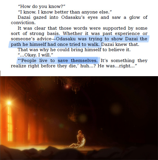
He had told me his name the first time we met. I had forgotten it for so long, but it was only just recently that I remembered.
His name was Souseki Natsume.
The same name as the name of the author on the cover of that novel.
- Oda Sakunosuke, Dazai Osamu and the Dark Era
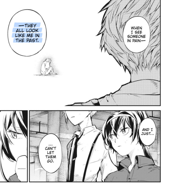
#trying to give others what you think you needed. what you think saved you. what you think made you better.#surely that will work for them too? that will keep them safe and alive? helping them will make you good in the end?#THEMES#ponder think contemplate#i'm sure there's more we could fit in here but this thing is getting really long really quickly and you get the point right? right?#part meta part theory i'd say. what's up natsume. what do you have to share with the class.#bsd#bungou stray dogs#bungo stray dogs#bsd meta#apparently i talk sometimes
243 notes
·
View notes
Text
"[high pitched and tinny] Let’s dive in. Let’s dive in. It’s time to dive in. Get ready to [audio distorts and slows] dive. Diiive. Diiiiie…"
(The Road to PALISADE 20: City Planning Department)
so that's what i've been working on for the past 2 weeks!
i wanted to draw something for this intro ever since i first listened to it (as a companion piece to my other gur drawing, though it of course ended up being way bigger in scale), but it only really gripped me about halfway through PALISADE ep 18.
the next morning after that i listened to this narration on repeat for about 45 minutes and then made a big sketch on 4 sheets of paper at my desk at work.
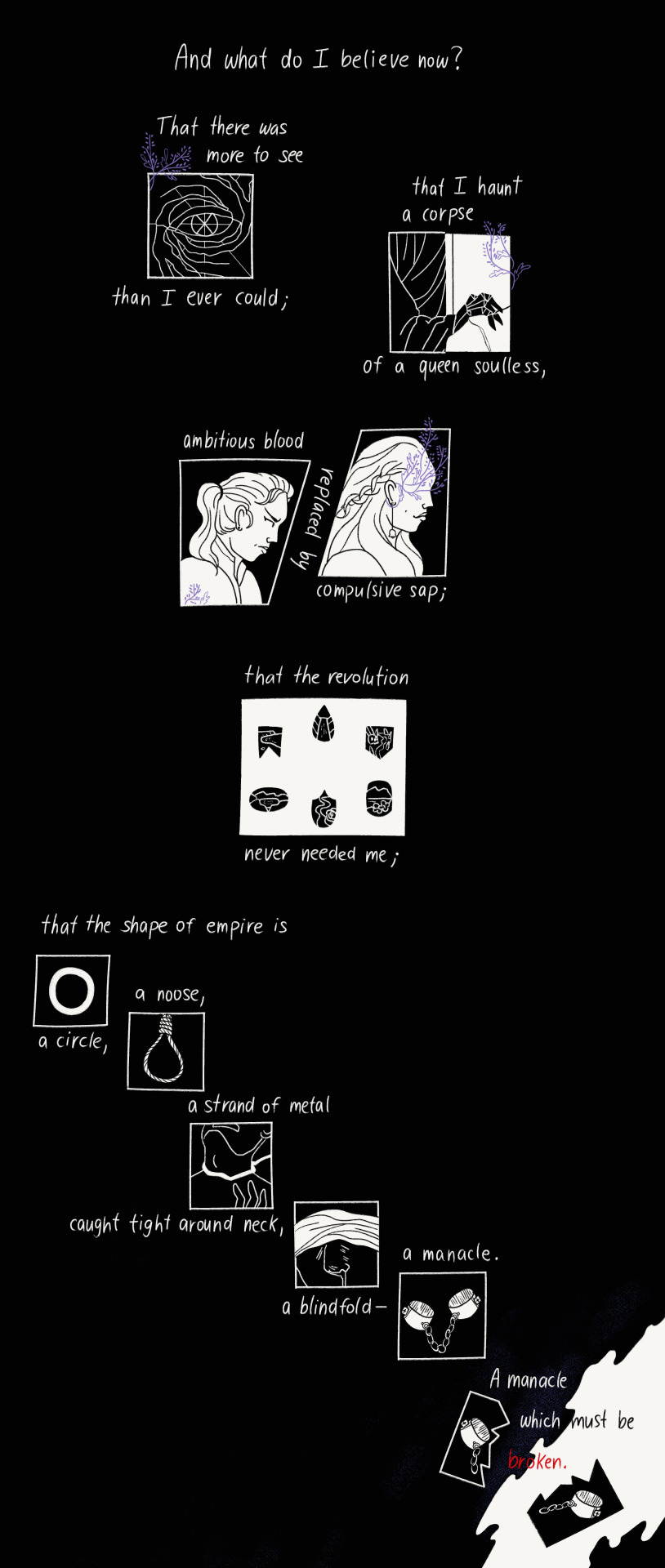
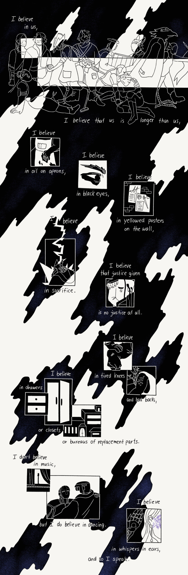
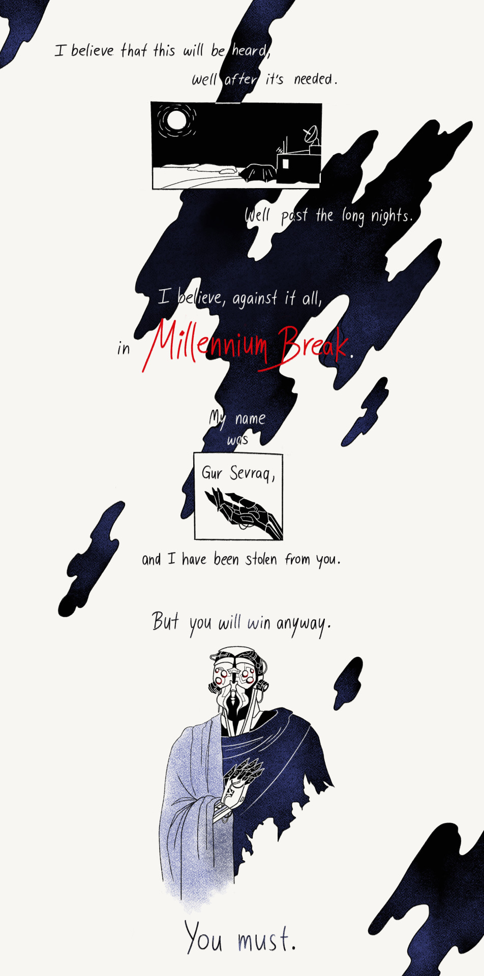
anyways, i haven't listened to the new episode yet but i think i'm probably ready for whatever they're gonna throw at us with the next sortie. i'm gonna believe, against it all, in millennium break. for gur
(i recommend listening along while scrolling!
+ transcript btw. if anything is hard to read)
#road to palisade#road to palisade spoilers#palisade#fatt#friends at the table#gur sevraq#<- yuore everything btw.#long post#and good god. it sure as fuck is#rosa art#the full file for this? that i had to split up? its 30000 pixel tall. thats 218cm#im so proud of this & it was a ton of fun. ooohhh my free floating panels i love them#i posted about my progress (theres some earlier sketches n lineart too) on cohost to be like well.#maybe i wont talk so fucking much on the actual post but noooo i cant shut up#love that for me.shoutout if you read all this#if you find a typo please. dont even mention it#a fun thing about this is that i almost know the intro by heart now. theres like 3 lines i get stuck on but mostly. its all there#ill link the cohost if i reblog this again. personally i think its interesting stuff but i love to hear myself talk abt shit i make soooo#anyways i have art class tomorrow & should sleep soon : ) but im happy im finally able to show this off. it rules sooo much
428 notes
·
View notes
Text

day 41: sonic wachowski attends SCHOOL (it goes poorly)
#movie sonic is the only sonic i want to see peter parker-ified#because. Walk with me. ur a blue alien loser who has never TOUCHED a school before. and then u get legally adopted and suddenly#the government pulls up and is like Educate ur baby or u r going 2 court. and suddenly#not only r u a little blue freak who saves the world constantly you also now have 30 pages of homework per class#sth#daily hedgehogs#sonic the hedgehog#sth fanart#fanart#sonic#sonic fanart#digital art#movie sonic#sonic wachowski
146 notes
·
View notes
Text
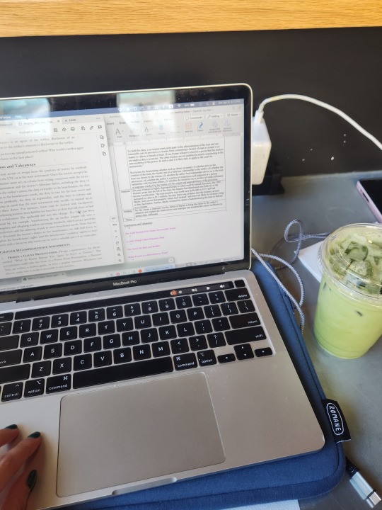
you get ta college and realize that everybody here is just Some Guy™ and has been Some Guy™ for their whole lives. the veteran seniors are having breakdowns right next ta the freshmen in the library, our final essays for the semester are started and finished two days b4 its supposed ta b turned in and all our rough drafts look like somebody rubbed 3 braincells on a google doc and then puked on it
#spacie spoinks#you think that all the adults have it tagether and they dont is what im tryna say#i dont have it all figured out you dont have it all figured out#he she we they dont have it all figured out#hell some of my profs are talking about how they're on their last leg here#dont even get me started on the graduate students#you think that the people in schooling change depending on age? oh buddy we're all so fucked up.#its like highschool but more stressful but also more fun b/c im taking classes i like and studying what i like#so its worth it#anyways bye im writing an essay#thats due tomorrow#lol
2K notes
·
View notes
Text

revstar emu save me
#please watch revue starlight#project sekai#pjsk#prsk#emu otori#proseka#Im so mad i wrote 8 million tags stream of consciousness style and then aposted this to the weong account#im not rewriting all that. you get NOTHING.#actually i will say again i have no idea why this kind of blee up on twit please WATCH TEVUE STAKRIGHTBTNGL#i KNOW 4 thiusand of you did not watch it Watch revue starlight Do not speak of yuri unless you partske in the revue#sorry. anyways#the jist of it was ahh the assignments -> making cosplay -> might post it here if i can take a bice photo for once in my life#because im proud of it. as mortifying as it is.#my best friend is cosplaying an im the clown Two lesbians walk into the metro convention centre(is that where toronto comicon is????)#Oh right i was thinking of making little drswings of pjsk charas or at least exs and printing them out in bulk on a dheet of paper#and coloring them in w markers and giving them to people at the pjsk meetup or vendors i get merch from..#i thought itd be fun. Also i swear to god i have a sheet of like MAGNET paper somewhere i want to make people emu magnets#Ok i fucking for real have to go to sleep i have to get up for class in 5 hours. wuit your college join my emo(daily affirmations)
677 notes
·
View notes
Text

#pic#story#Checking Courage#The Royal Pibling’s Plight#father time#Hi!#class is over!#So a little author update#The next couple of quarters are looking to be my absolute busiest#which is fitting since they are my LAST two quarters in college#And you know what that means#yep I'm gonna have to get a jobbbb#what does this mean for aluw? it means that I'm gonna have to switch up the way I do things#basically I'm probably gonna have to stock up on posts in advance? idk#we'll figure it out
172 notes
·
View notes
Text

tutorial contents:
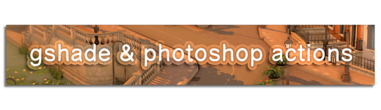
1 ‣ gshade & photoshop actions
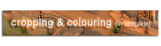
2 ‣ template or cropping & colouring
3 ‣ notifs & pop-ups
okay hi! i have a really old editing tutorial from back in january that i've been linking people to, but it's pretty outdated by now. i also keep getting anons asking about the same things, which is fine, but i always have to go searching for the post explaining it, so having it all in one place will be a lot more convenient lol
i use a ☠ copy of photoshop cc 2017 to edit my screenshots, however the majority of everything i'm doing also works on photopea
photopea is an online version of photoshop that's 100% free and works very well! i can't recommend it enough, it's fantastic
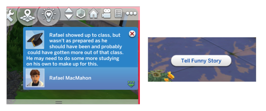
first things first, you're going to need some screenshots to edit. for the sake of this tutorial i'll be working with this one of raffy:

in all honesty, gshade will do most of the work for you. of course it's not needed, but i definitely don't think i could live without it! in this screenshot i used sunset n' vinyl by nesurii
when opening the screenshot, the first thing i do is run it through 2 photoshop actions:
butter action by early-grape
smooth sharp (no topaz) by poolbrop
to add actions in photoshop go:
windows > actions > the 4 lines at the upper right corner of the newly opened window > load actions > your downloads folder > open up the .atn files!
if you're using photopea, as far as i'm aware you can't use photoshop actions, but i've found that 'filter > stylize > oil paint' and 'filter > sharpen > smart sharpen' have a very similar effect when using the right settings. try these:
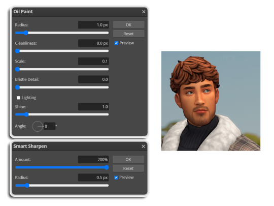
i like these two actions because they smooth everything out nicely, but keep it sharp at the same time! i always run butter before i run smooth sharp, however butter may leave you with 2 layers. make sure to merge these layers before running smooth sharp to achieve the full effect.
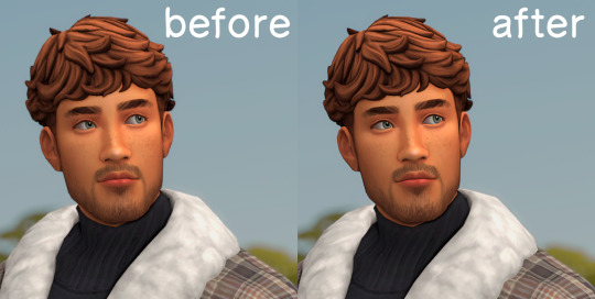
here's a before and after (of the photoshop action):
from here you can move on to step 2
before anything else i want to share the template that i use to make editing a lot faster. you don't need to use it but it's definitely made things a lot easier for me! it's a .psd file and will work perfectly in photopea
download (simfileshare)
if you're using the template you can skip right on to the next section, as it's already cropped to the right size and has the colouring folder included. just drag your screenshot into it and resize to fit the height.
if you're not using it, crop your edited screenshot to:
1707 width x 1280 height
then adjust the colours to your liking. it always varies slightly depending on the picture but my regular process for each screenshot would be:
up the saturation by 8%
up the lightness by 3%
up the contrast by 12%
all of this can be done by looking in the 'images > adjustments' tab

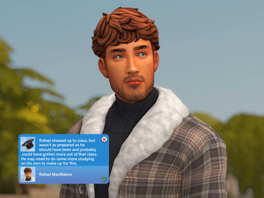
you should end up with something similar to this!

if you want to add a moodlet or social interaction or anything similar, it's all the same process. what you'll need is a screenshot of it straight from the game. i just press the 'c' key to capture them! i'll be working with these two:
for the blue notification i'm going to select it using the box select tool. try to get it as exact as possible. one you have it selected
for photoshop users:
click on the 'select and mask...' option located at the top
adjust the global refinements at the side as follows:
smooth: 70
feather: 0.0px
contrast: 50%
shift edge: 0%
for photopea users:
go to select > modify > smooth
set it to 15
select 'ok' and press 'ctrl + c' to copy it, then 'ctrl + v' to paste it into your screenshot. adjust the size and position and you should end up with something like this:
next you want to add the transparent border around the notification. if you're using my editing template, right click on the reference notif in the layers tab and select 'copy layer style' (photopea > 'layer style > copy'). from there you can paste that layer style onto your own notif through the layers tab.
if you're not using the template, here's how to set it up on photoshop:
right click your notification layer and select 'blending options'
under styles, tick the checkboxes for stroke and drop shadow
input these settings:
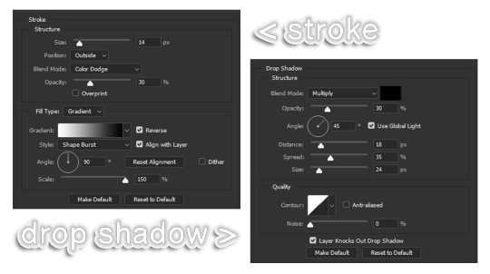
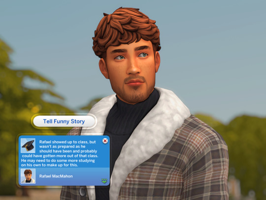
on photopea, it should be more or less the same. repeat the exact same process with the social menu option, but instead of selecting it with the box select tool, use the magic select tool. in the end you should end out with this!
from here you're finished! thanks for reading! go to file and export as png
if you've got questions never hesitate to ask, just make sure to read the faq in my pinned. i might edit this post soon to include the gen intro traits and aspirations bit, but this is all for now. hope it helps, my editing process post has been in need of a revamp for a very long time. i haven't proof-read this so apologies for any mistakes!
#ts4#sims 4#ts4 tutorial#5 anons in my inbox asking the same question after not reading my faq#this ones for you#3 anons in my inbox asking about cas pics#ones coming for you soon#okay maybe not soon but sometime#all my free time has been eaten up#i signed up for extra saturday morning classes and not having a lie in is sucking the life out of me lmao#when i'm busy i just wanna play video games and when i get the chance#to play games i just wanna sleep#its a vicious cycle#i'm currently playing resident evil biohazard tho#enjoying it very very much#i've only got 2 and 3 left to play and i've played every mainstream re game 💪💪#it was a very fun journey! i played them all within this year#long post
1K notes
·
View notes
Text
Prompt 63
Danny is honestly having fun. Sure his friends and him have gotten thrown into this world with a bunch of monsters and giant creatures, but it’s fun! He’s going to make friends with all of them- even if they do try to eat him in human form most of the time. They all seem pretty confused by them when they smell like ecto though, which uh, wow wasn’t how they wanted to learn the whole class has become liminal. Oh well, it’s just them and Mr Lancer on an entire island to themselves!
And he can’t be the only one to want to pet and befriend a dragon, like, c’mon! It’s a dragon! And Star is already eyeing a giant lightning unicorn so he definitely isn’t the only one down to go feral! Hey, at least there’s no GIW here or ghost attacks, and seeing as he doesn’t know how to make portals like Wulf, it’ll take a while to make a ghost portal to the zone.
So feral island children it is!
Bonus DCxDP crossover is if a hero of group of heroes also get thrown into the world onto the island. To them it’s almost like a peter pan situation only the children have a single adult whose given up on controlling the chaos. Oh yeah, they also all have powers and ride giant mythical beasts. Did they mention none of the group trusts any of them either? Yeaaah, this is going to be a long trip home…
#dpxmh#danny phantom#monster hunter#prompts#danny phantom crossover#monster hunter crossover#the class is all absolutely feral#Honestly Paulina would definitely have a felyne#They all have a couple of creachur friends#the ecto makes the class hard for the monsters to really get a grasp on#Smells dead but not?? Smells sort of like them and surroundings but also not??#Ends up going full circle from wtf is this to is this strange baby??#That's not starting on when their liminal/ghost abilities start coming through#dcxdp#dpxdc#the heroes or whoever else are so stressed#Where are your parents strange feral children?!#Oh there's a single adult and 20something kids#alright cool cool#hey can you control the kids- oh shit oh shit something is on fire now oh no#dragons#mythical creatures#dc crossover
171 notes
·
View notes
Last Seen Blogs
foxes-stim
enjoyer of canids

annoysims
✨howdy✨

sukafantasyremajamelayu
pussyhunter

thesportssoundoff
The Sports Sound Off 2.0

ayatherandom
Aya The Random