#gif size tutorial
Note
Advice for basic poses/anatomy I’m really struggling with them. What’s ur process?

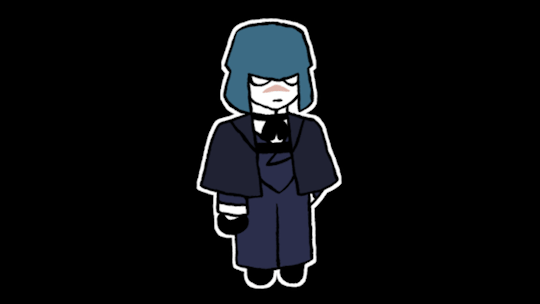
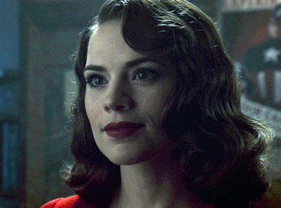
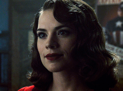
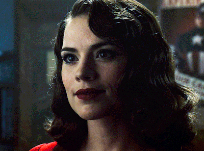
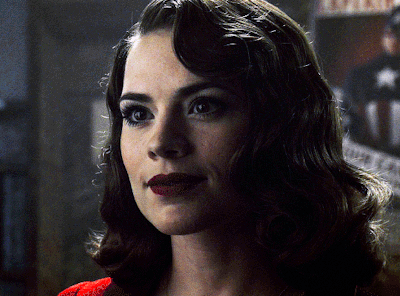
#zu art#ask#tutorial#cross!sans#rock band#undertale#undertale au#utmv#gif#tutoriel#zutorial#ha!!#bold of you to assume that I'm not struggling— xp#it's all just about trying different poses; sizes; angles <3#to draw 'perfect' from the very first attempt is hard and pointless#but you can /make/ it perfect! ☆#just make the first step╰(*´︶`*)╯#no naked bones this time sorry ;)#also thank you guys so much for 15 200+!! (*゚∀゚*)
414 notes
·
View notes
Note
your harrow drawing gives me LIFE
AJSFJSKJDF; THANK YOU!! 😭✨ all of the positive reception on my harrow drawing (and my tangle tower stuff in general) has really warmed my heart, i really appreciate all the kind words everyone have left on it...
to properly show my appreciation, please enjoy this harrow microorganism inspired by the game's map sprites!
— credit to @whisperingrockers for harrow's design again. pls go check out her tangle tower stuff, it's all extremely good.
#i love the game's lil map sprites so i had to make one for harrow#if anyone wants a tutorial on how i did the boil effect just let me know and i'll try to explain it in another post#applying the effect itself wasn't too hard but i had some trouble w/ the file size (which was mostly my fault bc the gif was way too long)#i also couldn't get the transparency to not look weird so that's why she's just. standing in the void#BUT YEAH. thank you again to everyone for being so kind it really means a lot!!#detective grimoire#tangle tower#harrow hawkshaw#🎨 : mj draws#asks#tw gif warning
58 notes
·
View notes
Text

i like her cloak
#elden ring#melina#melina adoring hours again#my gifs#tempted to replay the game and just gather gif footage#i also wanted to see how using an actual gif tutorial would be#it certainly helped with sizing and i even found some shortcuts i didn't know#so that was pretty neat#wdym my plan for the day was to sit down and finally finish a fic#lies
23 notes
·
View notes
Text
how to make gifs for free*
*okay, for $5. which is far less than what you would pay for photoshop!
this is my tutorial for people who want to make gifs but do not want to pay the steep monthly fee for photoshop. i feel especially qualified to make this tutorial because i did pay for the monthly photoshop fee a few months ago and honestly, i hated the process of making gifs on photoshop. it was extremely onerous and also cost a lot of money? no thanks! now, are gifs made on photoshop typically better quality than gifs made through free services? yes, but only marginally. and, to me, the slightly-higher quality gifs do not make up for: (a) the cost of photoshop, and (b) the ease of the free-gif making process. it will seem like there are a lot of steps below, but i promise it will all become like second nature soon enough.
BEFORE WE PROCEED: this tutorial is tailored towards the apple ecosystem. however, i’m sure most of the steps in here also apply to windows computers; i’m just not totally sure since i don’t have one.
without further ado, click below to follow the tutorial!
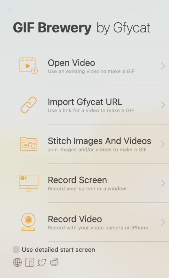
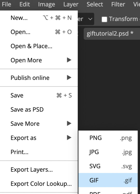
STEP 1: purchase gif brewery 3
this is the only stage where you will need to spend money - this app is integral to the process of creating gifs for free. i have tried out many different giffing apps, and this one is by far the best. it’s called “gif brewery 3 by gyfcat” and you can get it on the app store:

STEP 2: download or screen record your video
now that you’ve got your giffing software downloaded, you’re going to download your video in an .mp4 format.
downloading: i typically download from youtube or vimeo. for youtube downloads, you simply copy the link and paste it into a “youtube to mp4″ converter, which you can find through a simple google search of “youtube to mp4″ (a lot of these sites often get taken down and new ones pop up, so don’t get attached to a specific site because it’ll probably be gone like, 4 days later lmfao). for vimeo, i typically google “vimeo video downloader” and a few websites will pop up.
screen recording: there are a few different screen recording extensions you can add to google chrome, and i’ve tinkered with those in the past. however, recently i’ve been using the built-in macbook screen record function, which can be brought up by pressing command + shift + 5. once that’s brought up, you can change the size of your recording area, click record, and then save the video to your desktop. note that there IS a screen record option built into gif brewery, but i have never used it so i can’t speak to its functionality.
STEP 3: add your video to gif brewery
now that you’ve either: (a) downloaded your video from youtube/vimeo or (b) screen recorded your video and saved it on your computer; you’re now going to add the video to gif brewery and get giffing! this is where the fun part starts.
1. open up gif brewery and select “open video”
2. head into your computer and find the video you have downloaded/recorded, and select “open”
3. drag the green and red bars to the areas of your video where you want your gif to start and end. i’m using a video i giffed last week as an example:

4. click on “settings” in the top righthand corner to bring up this panel:
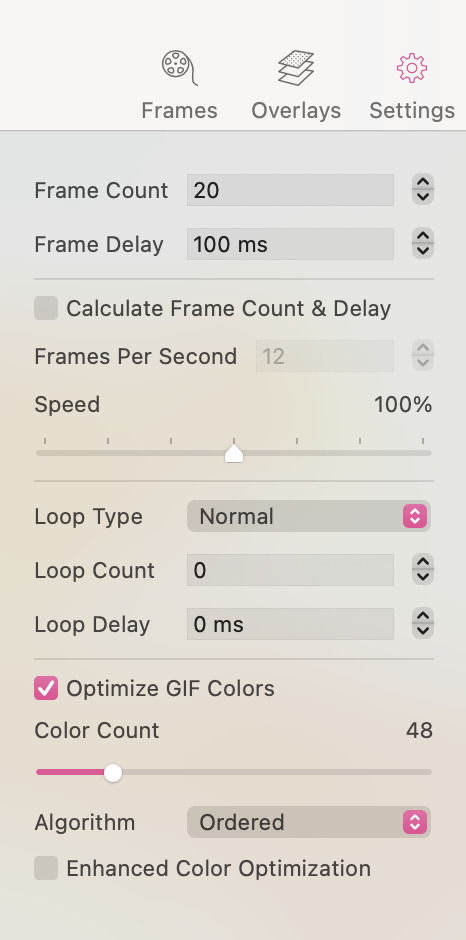
5. this is a VERY important step to ensure that your gifs turn out all right. you’ll want to change the settings in the above panel to something like this:

as you can see, i typically use 25 fps as this helps the gifs flow and not look choppy. some videos, though, work better with 20 fps (this is something you’ll get a sense for when you make a lot of gifs). i typically bring the speed down to between 70-90%, as 100% speed always feels too fast to me. and then i ALWAYS optimize the gif colours to 256. yes, even for black and white gifs.
an interlude about gif sizes: you’ll note that in the above picture, the frame count says “79″. if your gif is larger than say, 600px wide, 79 fps will probably have you producing a decently large gif. keep in mind that tumblr does not allow gifs to be over 10mb, so you’ll need to adjust accordingly. you can apply these settings and then go back and re-adjust those green and red lines from before to shorten your gif to ensure that it adheres to the size requirements of tumblr. also keep in mind that the editing process will add (sometimes significantly) to the size of your gif. so you want to aim for your gif to be well under 10mb at this stage. for small gifs, i don’t limit my fps too much, but for bigger gifs (i.e. ones that are over 600px wide), i will try to limit my fps to under 50. just keep that in mind as a barometer.
6. once you’re happy with your settings, click “create”
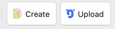
7. clicking “create” will bring up a window which will showcase your gif, as well as your gif size (see red circle):

at this stage, i’ll often click the “cancel” button in the lower lefthand corner and fiddle with the gif, as my gif sizes at this stage are typically enormous. this is actually a rare example where the gif is well under 10mb. however, for this gif i would crop the black edges out and probably re-size it down a bit to have it further below 5 mb (this video is far too low quality to produce a gif that’s as high as 5mb. this will vary, though, depending on the quality/size of the video).
8. so, clicking “cancel” above, i am going to crop and resize the gif:
- when you click on “crop”, this window will come up where you can adjust the size of your crop:

when you crop it to where you’re happy with it (if you need to crop your gif, that is), you’ll likely want to resize your gif:
when you click the “resize” button, the dimensions of your gif will pop up:
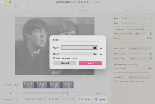
a second interlude about gif sizes: okay. here’s the thing about using a software that isn’t photoshop to make gifs. the quality of your gifs will likely suffer, compared to gifs processed through photoshop. through trial and error, i have learned that i have to make my gifs slightly bigger than the standard tumblr sizes in order for their quality to hold up. it has something to do with pixel compression, which i don’t need to go into right now. i have also learned that low resolution videos (like the one i’m using in this example, which frankly looks like it was filmed using a toaster) should almost never be used for full-sized gifs. instead, the quality of these gifs from a low-resolution video will look much better as half-sized, side-by-side gifs in a two, four, six, or eight-gif pattern (god, does that make sense? message me if it doesn’t). standard tumblr sizes are, i think, 540px wide for a full-sized gif, and 270px wide for a half-sized gif. AS SUCH, i typically make my full-sized gifs around 700px wide, to enhance the quality of them once they’re put into tumblr. yes, this means your gifs will have a higher MB output, which means your gifs will need to be shorter than those that could be made through photoshop. these are the struggles we face as Free Gif Makers, however it is worth it to me.
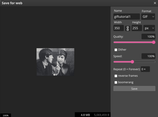
alright, as you can see above, after i’ve cropped the black edges out, this gif is 493x360px. so, it’s under the 540px requirement for a tumblr full-sized gif. the GOLDEN rule of gif-making is to NEVER use a gif that is under 540px wide as a full-sized gif. the gif will be stretched and will lose a lot of quality in the process. however, 493px wide is still well-above the 270px wide standard size for a side-by-side gif. i am going to size this down slightly to 350px wide (remember, we want to be well above the 270px wide standard size, as described above) so my total MBs will be smaller.
9. now that i’ve cropped and resized, my gif is now only 2.7mb:
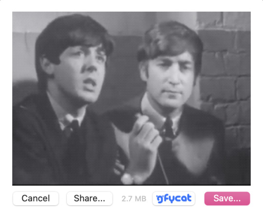
i like this a lot better than the 5mb before, as it gives me more wiggle room in the editing process. i’m happy with it now, so i will click “save...” and save it to my desktop for editing now.
STEP 4: repeat step 3 for all the gifs you want to make for that specific gifset
i am going to make two gifs to demonstrate to you the side-by-side gif thing i was talking about above. these are the gifs at this stage, pre-editing:

STEP 5: add your gifs to photopea to begin the editing process
once you’ve created all your gifs in gif brewery 3, you can close the app. for editing the gifs, i use photopea desktop. photopea is basically a walmart photoshop, and i think it works really well considering it’s free.
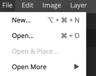
1. click file > open
2. locate your gifs that you save from gif brewery
3. now is the actually fun part. this is where you can fiddle with the brightness, exposure, temperature, etc., and/or you can add a psd or two to your gif. i almost exclusively use PSDs and then will fiddle with the brightness/contrast/levels/curves/temperature/sharpening/grain on my own after i’ve applied the PSD. i’ve found all the PSDs i use here. that blog should also have tutorials on how to download a PSD. a PSD is basically a file folder with elements in it which will enhance the colouring/lighting of your gif. PSDs are EXTREMELY trial and error when it comes to working with a certain gif or not, so be patient as you try out PSDs on your gifs. when you download a PSD, you will add the file to photopea (file > open > find the PSD and add it), and then drag it on top of all the layers of your gif, like so:

a note on manually adding brightness/contrast/temperature/sharpening/grain, etc.: you must select all the layers in your gif for these edits to apply these changes, so they all must be highlighted like the below:

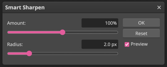
a note on sharpening/grain: adding sharpening/grain to a gif without being careful will HUGELY add to the size of the gif, and will often push it well over tumblr’s 10mb size limit. sharpening can also make your gifs look very bad if you go overboard. i often either don’t sharpen my gifs at all, or am very careful when i do. i always choose smart sharpen (as opposed to “sharpen”, which just adds a shitload of sharpening without you being able to adjust the amount), as i can adjust the sharpening elements with smart sharpen. to find the sharpen tool, go to filter > sharpen > smart sharpen:

these are the properties i sometimes choose for sharpening. however remember that most of the time i don’t even sharpen my gifs, OR i will do 50% instead of 100%. but i am going to use these properties for the gifs i’m making for this tutorial. you can typically be a bit more liberal with sharpening when you’re making smaller side-by-side gifs, as there is more room for the extra MBs added from sharpening:
the properties you choose for sharpening will ultimately totally depend on the gifs you’re making, so don’t be afraid to fiddle around with them! i wouldn’t recommend going over 150%, though.
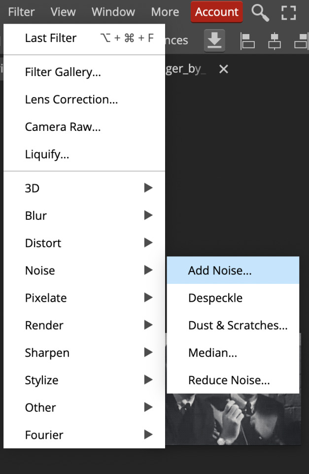
now, grain is something i hardly use in my gifs, as grain adds even MORE to the file size of a gif than sharpening does. however, sometimes it’s cool to have a bit of grain in your gif, so this is what i would do.
locate grain, which is found in filer > noise > add noise:
use this percentage:
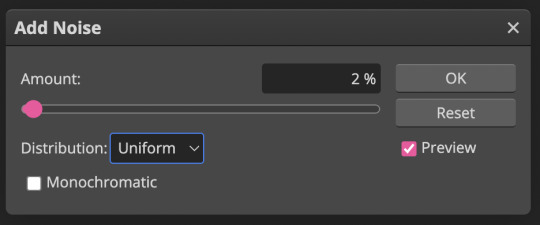
unless your gif is super tiny, anything above 2-3% grain will make your file size extremely massive. use grain with caution!
STEP 5.1: adding text to your gifs
if you want to add text to your gifs, read this step. if you don’t, skip to step 6.
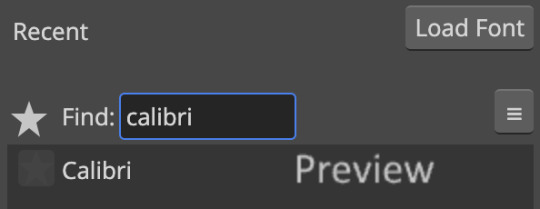
the most common font used with gifs on tumblr is calibri bold italic. photopea does not have calibri built in, so you will need to download it from an external source like here and then add the font into photopea. you will likely have to add it in every single time you make a gif, which is mildly annoying, but yet another tribulation of making Gifs For Free:
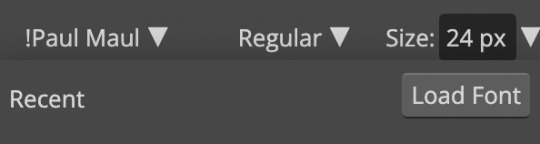
1. select the “T” icon on the left sidebar:

2.select the font bar which will appear up top, and then click “load font”
3. locate the calibri font file that you’ve downloaded in your computer and add it in. i suggest adding it in via zip file, because the zip file will include all of the different versions of calibri (i.e. bold/italic/bold italic, etc.). once you’ve loaded it in, search for it in the photopea font list and select it:
4. select bold italic

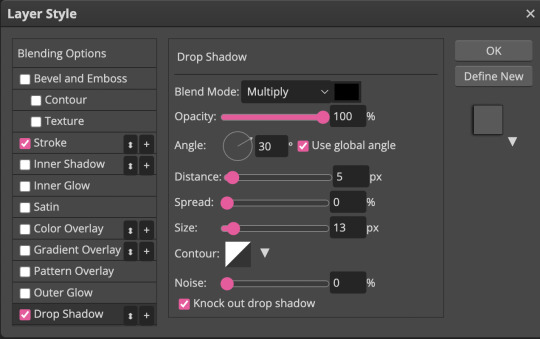
5. use these properties for the stroke (the outline of the font) and drop shadow (these are the only two elements i add to my fonts):

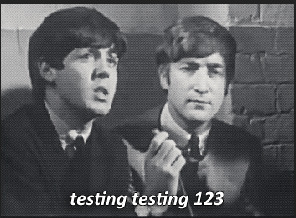
this is what your text should look like (sorry, it’s all pixelated because i had to zoom in):
you can adjust the size of the font as necessary and drag the text around to make sure it aligns with the centre of your gif (i’m not actually going to be using text for these gifs, but i wanted to show you because it does add a handful of extra steps)
STEP 6: save your gifs
once you’re done adding your PSDs/manually editing your gifs, you’re going to save them by going file > export as > gif:
here, you will see a preview of your gif, as well as the MB total in the bottom right hand corner:
note how our gif went up to 4.8mb from 2.7mb after we originally saved it from gif brewery? that is almost entirely from the sharpening we added to the gif, and that is actually a pretty small increase; typically file size increases are much greater than that if you’ve sharpened your gif, especially with coloured gifs (black and white gifs inherently have smaller file sizes due to the lack of colour).
also note the “speed” bar - sometimes if i feel like my gif is still too fast, i’ll reduce that 100% to 80-90%.
if your file size limit is under 10mb and you’re pleased with your gif, click “save”
STEP 7: upload to tumblr
click photo > upload photos > and add your gifs. now, this is what i meant by the “half-size, side-by-side” gifs:

now, to add a caption with smaller font and smaller spaces between lines, you need to go into the HTML of your caption, which can be done by clicking the gear icon in the top right corner of your gifset and selecting HTML:

this is a sample HTML caption code. you can learn the principles of HTML by googling it, or just deducing it from the below:
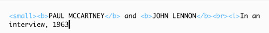
and this is what that code looks like:

you can also add colour to your captions by adding a code into your HTML from this website
STEP 8: click post!
congrats! if you’ve made it to the end of this tutorial, you’ve successfully created a gif for *almost* free. i really do promise that this all becomes really fast and like second nature once you get the hang of it!
please feel free to shoot me a message if you have any questions at all! 🤍
- xoxo, caro, aka pennie
#holy mother this was a lot more work than anticipated#but it was fun!#please message me if you have any questions#i mean it!#i feel like this got very convoluted at times - especially discussing gif sizes - so plz message me if you need anything cleared up#gif tutorial#mine#giffing#gifs#tutorial
130 notes
·
View notes
Text
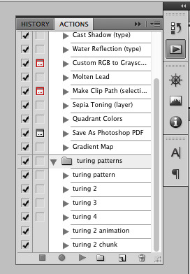
how to make cool blobby turing patterns in photoshop
i'll preface with i learned the basic loop from skimming a tutorial on youtube, but as someone who prefers written tutorials i'm sure many would appreciate one! also, the second part of this is some of the visual effects i figured out on my own using blending modes and stuff.
i'm using photoshop CS4 on a mac so some buttons and stuff might be in different places on windows and newer photoshop versions but all the actions are the same. my canvas is 1000x1000 pixels.
UPDATES (i'm hoping these'll show up whenever you open the readmore?)
it's possible to do something similar in krita using this plugin, made by the love @arcaedex
it's also possible to do this in photopea, a free browser alternative to photoshop! the results are pretty much identical.
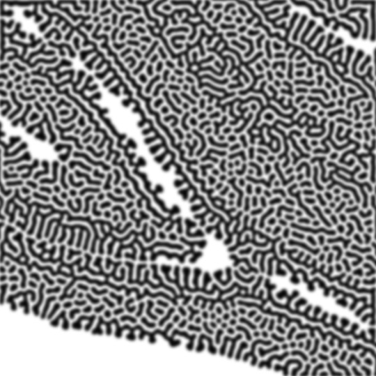
FIRST off you wanna get or make a black and white image of some kind. it has to be one layer. can be noise, a photo, a bunch of lines, whatever. here's mine, just some quick airbrush lines:

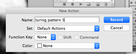
now find the actions tab. idk what it looks like in newer versions of photoshop but you probably won't need to dig!
hit the little page thingy to make a new pattern. once you hit 'record', it'll record everything you do. the little square 'stop' icon will end it.
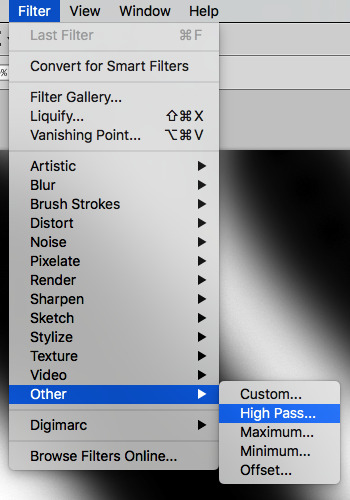
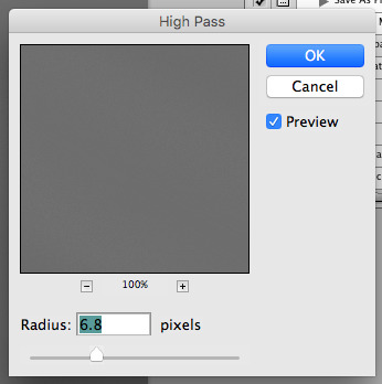
now you want to do a high pass filter. you can mess around with the radius to change the size of your squiggles, but the tutorial had it set to 6. experiment!
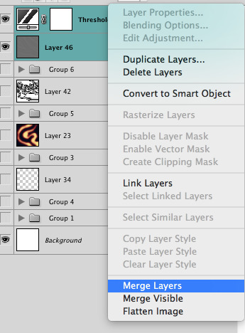
now add the 'threshold' adjustment layer. i use the adjustments tab but i think there's also a dropdown menu somewhere. keep it at the default, 128. merge it down. (control or command + E or you can right click it like some kind of weirdo)
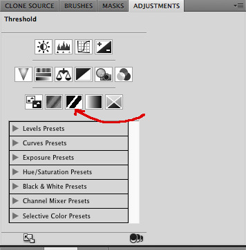
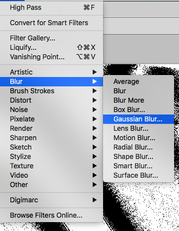
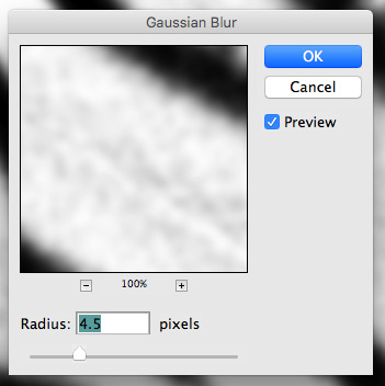
and finally, the gaussian blur! the radius of this affects the shape and size of your squiggles as well. i like to keep it around 4.5 but you can mess around with that too.
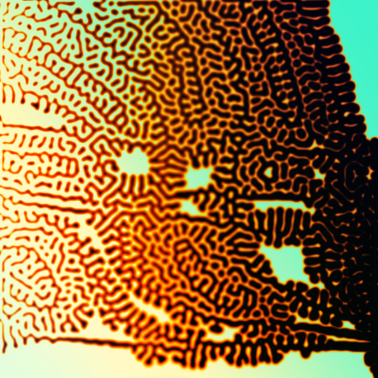
after that, hit 'stop' on the action you're recording, and then repeat it a bunch of times using the 'play' button, until you have something you like, like this:
WOW!! that was fun!! and only a little tedious thanks to the power of macros. anyway, here's some fun layer blending stuff i like to do. it's with a different pattern cause i made this bit first.
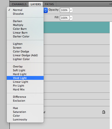
anyway, using a black and white gradient (or a grey base that you do black and white airbrush on), make a layer with the vivid light. this will make the blobs look thicker or thinner.
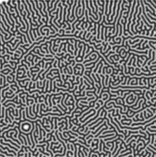


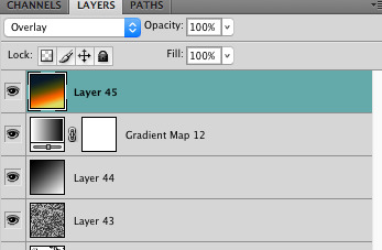
then, for cool colors, do a gradient map adjustment layer over that:

and finally, my best friend, the overlay layer. just using a gradient here bc i'm lazy, but feel free to experiment with brushes, colors, and blending modes!

NOW GO. MAKE COOL SHIT WITH THE POWER OF MATH. AND SEND IT TO ME
also these are not hard and fast rules PLEASE mess around with them to see what kind of weird shit you can make. here's a gif. as you can see i added some random airblush blobs in the middle of it, for fun.
924 notes
·
View notes
Text
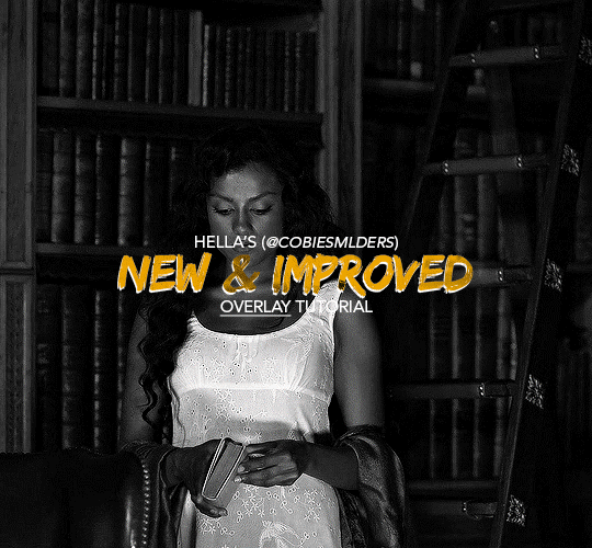
Hello!! A couple years ago I posted this tutorial for making gifs with a moving overlay effect. In the two and a half years since I made that tutorial, I've learned some new tricks for this gif effect but most importantly I've learned how to explain things better.
For that reason, I've created this new and improved tutorial for my overlay gif effect. The basics are the same but it's simpler, I go into more detail, give better explanations, and have more comprehensive instructions.
The easiest way to do this effect with this method is to use smart objects and work in timeline. For this tutorial, I’m assuming you know the basics of giffing like cropping, resizing, colouring, etc. If you need help with this I’d suggest you look at some other tutorials and guides!!
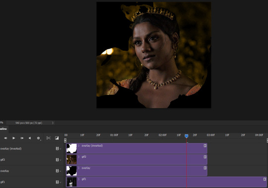
First, we’re going to start off with three things.
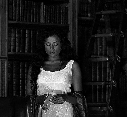
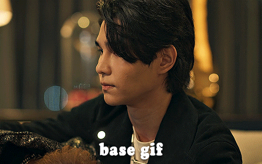
1. A completed gif converted into a smart object that is going to be the base gif. I'm going to call this "gif1". You’ll want this gif to be at least 3 seconds because it needs to last as long as the overlay plus a little bit of extra time in the beginning.
This is the base gif I’ll be using in the example (except I trimmed it so that I could meet the size limit).
2. A second completed gif converted into a smart object that is going to go over the base gif. We’re going to call this "gif2". This gif should be at least 2 seconds but I’ve made it work with shorter. Gif2 needs to be the same dimensions or bigger than gif1.
This is the gif I'll be using in the example (except I trimmed it so that I could meet the size limit).

3. An overlay in video form. These can be found on tumblr and youtube by search for overlay or transition packs. For this example, I'll be using an ink drop overlay I found on youtube.
Step 1: Turning the overlay video into an overlay gif
Most overlays aren’t going to instantly fit the gif effect you’re trying to achieve right away. This is the overlay I got from youtube and as you can see it’s too slow and needs a crop/resize to be usable.

To fix it, I sped the frame rate up, cropped the overlay, and resized the overlay so it fits over my base gif. I also sharpened the overlay (500% amount, 0.3px radius) so that the edges were smooth. This is the new overlay gif and the one I’ll be using for the gif effect.

A tip: I also like to add a brightness/contrast layer to get rid of the grey on the overlay gif. Because we’re working with blending modes to achieve this effect, any parts of the overlay that are grey will be a blended mix of gif1 and gif2. If you think this will look good for your gif effect then don't worry about it!
Another tip: try to get the entire overlay movement to fit into a 2-3 second window. Anything longer than that will likely be cut off when you have to trim your gif to meet the upload size limit and it would suck to only have half of the overlay.
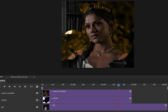
Step 2: Creating the gif effect
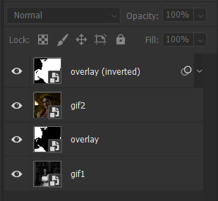
Drag a copy of gif2 and a copy of the overlay gif onto the gif1 canvas. I like to use Ctrl+Shift+V so that the layers are pasted in the same position as they were on the previous canvas. MAKE SURE that both overlay layers are in the same position on the canvas. If one of the overlay layers is higher/lower/etc. than the other then the effect won't work properly.
Then, make a second copy of the overlay and invert it (Ctrl+i). These are the layers you should have:

Before you go any further, trim gif2 and both overlay layers so they are all the same length.
Now, we need to rearrange the layers and set blending modes. The top layer should be whichever overlay goes from black to white. This is because when we change the blending modes, the white part of this layer will disappear and look like its being replaced by gif2. In this case, that is the overlay (inverted) layer. Then we want gif2, the other overlay layer, and then gif1.
A tip: this process can be done the other way where the top layer is the overlay that goes from white > black however, you are much more likely to have an error where there is a grey/black line around the overlay effect in your final gif. In order to avoid that, I always use the black > white layer on top.
Next, set the top overlay layer to darken. You should only see the black part from the overlay and gif2 should fill in the white part. Here’s how that looks in my example.
Next, select the top overlay layer and gif2 and convert both layers into one smart object. Your layers tab should look like this now.

Now, set the new layer’s blending mode to lighten and the overlay layer’s blending mode to darken. Once you do this, you should be able to see gif1 as well as the overlay gif.
Step 3: Timeline and exporting
At the moment, gif1 is still significantly longer than the overlay gifs. Since this gif is just over 10 mb (which is pretty small for this effect) I’m going to trim about 1/4 of a second off the end of gif1 and then drag the overlay layers so they all end at the same time.

Now you’re free to export the gif! This is the finished effect for the example gif!

A tip: sometimes, when I convert to from timeline to frames, the gif becomes a little longer and slower. It has to do with different frame rates across the videos and photoshop but I'm not smart enough to understand it. If that happens, just set all the frames with the overlay layers to 0.04 speed instead of 0.05.
And we're finished! I hope that was helpful and made sense. If you have any questions feel free to drop them in my inbox or send me a message!! <3
#gif tutorial#allresources#completeresources#dailyresources#chaoticresources#ps tutorial#photoshop tutorial#usertreena#tuserssam#usernik#tuserabbie#tuserace#userk8#usershreyu#uservalentina#useryoshi#userannalise#userrobin#usersalty#uservivaldi
1K notes
·
View notes
Text

COLORING + SHARPENING TUTORIAL
someone asked for a coloring tutorial and my sharpening settings, so here it is! there are also a few tips to achieve more HQ gifs. :)
tutorial under the cut!
FOR HIGH-QUALITY GIFS
FILE SIZES
it doesn’t matter what your sharpening settings are if the file you’re using to gif is too low quality, so i tend to look for the best that i can get when downloading stuff.
usually, movies (+2h) look better if they’re 5GB or more, while an episode (40 min/1h) can look good with even 1GB. the minimum definition i try to find is 1080p, but i gif with 2160p (4k) when available. unfortunately, not every computer can handle 4k, but don’t worry, you can gif with 1080p files just fine if they are big enough. contrary to popular belief, size does matter! which means sometimes a bigger 1080p file is better than a smaller 2160p one, for example.
SCREENCAPPING METHOD
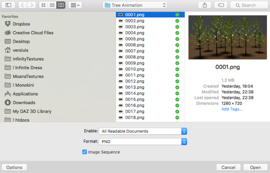
this can too influence the quality of your gifs. as a gifmaker, i’ve tried it all: video frames to layers, directly opening video clips, loading files into stack, and i’ve finally settled down with opening screencaps as an image sequence. with bigger files, it doesn’t matter much what technique you use, but i’ve noticed with smaller files you can do wonders if you screencap (either by loading files into stack or opening as an image sequence) instead of using video clips. for example, this gif’s original video file was only 4GB (so smaller than i’ve usually go for), if you can believe it!
here’s a tutorial for setting up and screencapping with MPV, the media player i use to screencap. again, you can keep using video clips for bigger files, but you’ll find this useful when dealing with dire causes. i don't file loads into stack, though, like the video does. i open as an image sequence (open > screencap folder > select any image > click the image sequence button). just select OK for the speed. this will open your screencaps as a video clip (blue bar) in timeline mode (i'm a timeline gifmaker, i don't know about you). you will need this action pack to convert the clip into frames if you're a frames gifmaker. i suggest you convert them into frames even if you're a timeline gifmaker, just convert them into a timeline again at the end. that way you can delete the screencaps right away, otherwise you will delete the screencaps and get a static image as a "gif".
ATTENTION if you’re a Mac Sonoma user, MPV won’t be an option for you unless you downgrade your system. that is, if you have an Intel chip. if you have M1 Max chip (or even a better one), here’s a fix for MPV you can try while keeping that MacOS, because nowadays MPV is skipping frames in its latest build. or you can use MPlayer instead for less hassle. here are two tutorials for setting and using MPlayer. Windows users are fine, you can use MPV without trouble.
FOR EVEN MORE QUALITY
ADD NOISE
here’s a tutorial for adding noise as a way to achieve more HQ gifs if your original material is too low quality.
REDUCE NOISE WITH CAMERA RAW
instead of adding noise, you can reduce it, especially if your gif is very noisy as it is.
the path is filter > camera raw > detail > nose reduction. i do this before sharpening, but only my video file isn't great to begin with. because it’s a smart filter, you can reduce or increase its opacity by clicking the bars next to its name in the layers panel.
TOPAZ AI
i use Topaz Photo AI to increase the quality of my screencaps when i need to. it’s paid software, but there are… ways to find it for free, usually on t0rrent websites. if someone’s interested, i can make a tutorial solely about it in the future.
SHARPENING SETTINGS
here are my sharpening settings (filter > sharpen > smart sharpen). i sharpen things twice: 500% 0.4px + 10% 10px. here's an action for it, for more convenience. here's a tutorial on how to use Photoshop actions. for animated stuff, i use this action pack.

COLORING
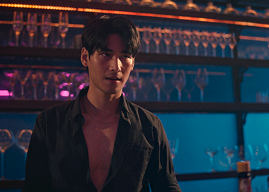
here’s the gif i'm gonna use as a base. it’s already sharpened like the way i always do it.

LIGHTNING THE SHOTS
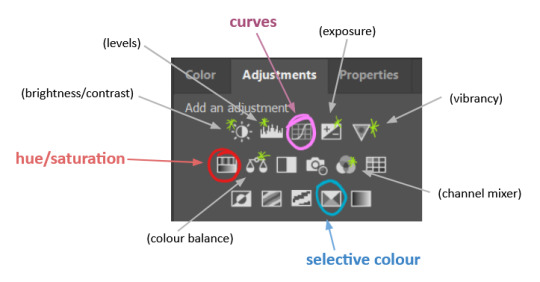
half of the secret of a good coloring is good lightning. i always useCurves (layers > new adjustment layer > curves) and Brightness & Contrast (layers > new adjustment layer > brightness & contrast). the settings depend on the scene you’re giffing, but i always try make my gifs bright and with high contrast to make the colors pop.
CURVES
besides lighting your scene, the Curves adjustment layer has four automatic options that will color-correct it for you. it’s not always perfect and it doesn’t mean you won’t need to do further coloring, but it’s a great start. it’s a lifesaver for most ridiculously yellow scenes. look at the difference! this gif uses the 3rd automatic option (the screenshot below isn't mine btw so that's why the fourth option is the chosen one), from top to bottom. what automatic option you need to choose depends on the gif.

sometimes i like to tweak my Curves layer. not everybody does that, it’s not that necessary and if you’re not careful, it can screw your gif up. to modify your layer by hand, you will need to click and drag points of that straight line in the position you desire. this is the concept behind it:

basically, the lower part of the line handles the shadows, while the upper part handles the highlights of the image. if you pull a highlight point up, the image’s highlights will be brighter. if you pull it down, it will make them darker. same thing for the shadow points. you should play with it to get a grasp of it, that’s what i did when i first started giffing.
BRIGHTNESS & CONTRAST
then i added a bit of brightness and contrast.

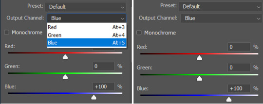
CHANNEL MIXER
the scene looked a bit too yellow, so i used the Channel Mixer (layer > new adjustment layer > channel mixer) adjustment layer. here’s a tutorial of how it works. not every scene needs the Channel Mixer layer though, i mostly use it to remove heavy overall tints. in this particular case, the Curves layer got rid of most of the yellow, but i wanted the gif to be just a bit more blue so the Channel Mixer tweaks are very minimal.

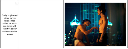
SELECTIVE COLOR
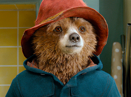
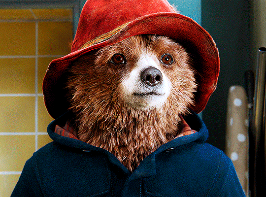
now, this adjustment layer i always use: Selective Color (layer > new adjustment layer > selective color). this is THE adjustment layer to me, alongside the Curves one. this is how it works:

ie, you can separately edit a color this way, giving it tints. for this gif, i wanted to make the colors more vibrant. to achieve that, i edited the selected colors this way:
for the reds, i added even more red in them by moving the first slider to the right, making the color more vibrant. for his hat to have a more warm tint, i added yellow to the reds (third slider, moving it to the right). finally, to make the reds stronger, i moved the last slider to the right (more black).
for the yellows, i made them brighter by adding white to them, thus making the tile wall and Paddington more bright as well.
for the cyans and the blues, i just added the maximum (+100) of black that i could.
i wanted for Paddington's nose to be brighter, so i added more white to the whites.
lastly, i added depth to the blacks by increasing their own blackness.
you should always play with the Selective Colors sliders for a bit, before deciding what you want or need. with time, you will automatically know what to change to correct the color grading. it all takes practice!
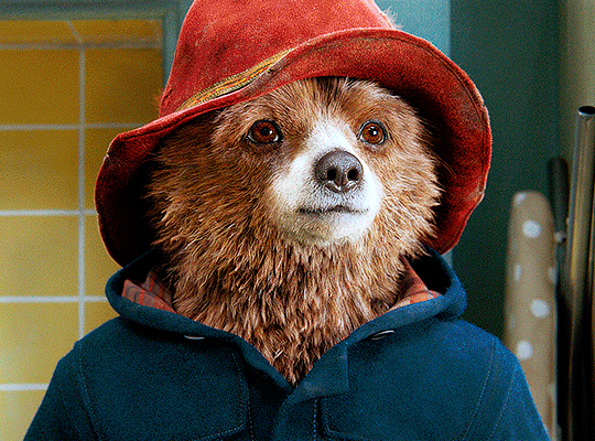
HUE/SATURATION
i don’t know if you noticed, but there are some green spots on the blue wall behind Paddington. to correct that, i added a Hue/Saturation adjustment layer (layer > new adjustment layer > hue/saturation) and made the saturation of the greens 0%, making that unwanted green disappear from the background.

while the green spots on the wall are specific for this gif, i use hue/saturation a lot to tweak, well, hue and saturation. sometimes someone’s skin is too yellow, i made it redder by tweaking the reds and the yellows, or vice-versa. the hue bar follows the rainbow bar, so the maximum settings (+100 and -100) give the selected color to change its hue to something more red or pink (the rainbow extremities). changing hue can give pretty whacky results, like turning someone’s skin tone to green, so you will need to play with it to get the hang of it. you can also tweak the opacity of your hue/saturation layer to further improve your gif’s coloring. i didn’t do it in this case, the opacity is still 100%. the reds and the blues had their saturation increased to make them pop just a bit more, without affecting the other colors.
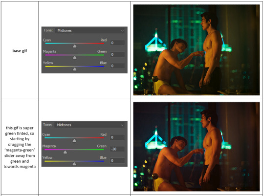
COLOR BALANCE
the highlights of the gif still had a green tint to it due to the automatic correction of the Curves layer, so i used Color Balance. this is how it works: instead of giving specific colors some tints, you can give them to the shadows, highlights, and mid-tones. if your shadows are too blue, you counterbalance them with the opposite color, yellow. same thing with the cyan-red and magenta-green pairings. in my case, i added a bit of magenta.


B&W GRADIENT MAP
now, if this gif was a dish, it’s time for the salt and pepper. i always add a Gradient Map (layer > new adjustment layer > gradient map) (black to white gradient) with the Soft Light blending mode, thus giving my shadows more depth without messing with the mid-tones and highlights. it also doesn’t “deep fry” (you know those memes?) the gif too much by adding even more contrast. usually, the opacity of the layer is between 30% to 70%, it all depends on the gif. it always does wonders, though!
COLOR FILTER
finally, i like to add Color Filters (layer > new adjustment layer > color filter) to my gifs. it’s very handy when giving different scenes for the same minimalistic set because it makes them kind of match despite having completely different colors. in this gif’s case, i added a “deep blue” filter, opacity 50% density 25. you can change the density and the opacity of the layer for further editing, again, it all depends on the gif.

VIBRANCE
if i feel like it, i add a vibrance layer (layer > new adjustment layer > vibrance) to make the colors pop. this can ruin your coloring sometimes, especially when regarding skin color, so be careful. i didn't do it in this gif because i felt i didn't need it.
TA-DA! 🥳
AN OTHER EXAMPLE
the color grading of the original scene it’s pretty good as it is, to be honest. let’s see a worse scenario, a VERY yellow one:
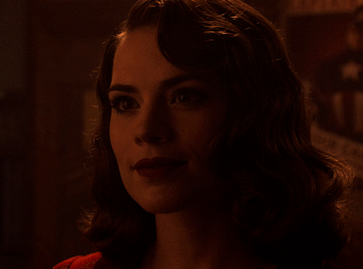
no channel mixer this time because the automatic curves option dealt with the yellowness, but you can see it made the gif too green. i needed to correct that with the following adjustment layers:
curves (automatic option) (gif 2) >> same curves layer (tweaks) (gif 3) >> brightness & contrast (gif 4) >> hue/saturation (tweaked cyan+blue+green) >> selective color >> color balance (gif 5) >> b&w gradient map >> (sepia) filter >> vibrance (gif 6)
i added a hue/saturation layer to remove the blues & greens before my selective color layer because i thought that was more urgent than tweaking the tint of all colors. color balance (gif 4) was the real hero here, though, by removing the green tint. the selective color layer was meant to make the red pop more than anything else, because the rest looked pretty good, especially her skin tone (despite the green tint). you can notice that tweaking the curves layer (small gif 3) also helped A LOT with the green problem.
tl;dr 😵💫😵💫😵💫
here's a list of my go-to's while coloring and lightning gifs. it's not a rule, just a guide. there are gifs in which i don't use all these adjustment layers, or use them in a different order. it all depends!
1. curves (automatic option + tweaks)
2. brightness & contrast
3. channel mixer
4. selective color
5. hue/saturation
6. color balance
7. b&w gradient map
8. color filter
9. vibrance
i'll suggest that you study each adjustment layer listed for more info, either with other Tumblr tutorials or YouTube ones. the YouTube ones focus on images, but you can translate what they teach to gif making very easily. you can ask me to further explain any adjustment layer, too! i was brief to keep this short (which i kinda failed lol).
feel free to ask me for clarification or something else about gifmaking wise, i always like to help. ❤️
#*#*tutorial#gifmaker tag#resources#resource: tutorials#ps help#uservivaldi#tuserjen#userrin#userelio#useralien#userzaynab#userchibi#userbuckleys#usertj#userbess#tuserlucie#useraljoscha#userdavid#usershreyu#usernolan#userhallie#userisaiah#tusergio#tusergeo#userjesslynn
263 notes
·
View notes
Text

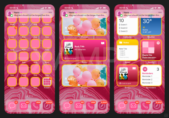
HOW TO: Make an iPhone Layout
+ Downloadable Template
Hi! I've gotten a few messages asking for a tutorial on my iPhone gifsets — but instead of only doing a tutorial (that would probably be triple the length this one already is), I decided to turn my layout into a template with all the bits and bobs! In the "tutorial" under the cut, I'll share everything you'll need, a free template download, and quickly go over how to use this template. :)
Disclaimer: This template uses Video Timeline and this tutorial assumes you have a basic to intermediate understanding of Photoshop.

PHASE 1: THE ASSETS
1.1 – Download fonts. These are the fonts used for all assets I've included in my template:
– SF Pro or SF Pro Display (Regular, Medium, Bold): Either version works, they look nearly identical. You can download directly from https://developer.apple.com/fonts/ or easily find it via Google
– Bebas Neue: Free on Google Fonts, Adobe Fonts, and dafont
– Times New Roman (Bold): Should be a default font in Photoshop

Make sure to download and install any of the fonts you don't already have before opening my template. That way, once you open the template file, all the settings (font size, weight, spacing, color, opacity, etc.) are as intended.
1.2 – Download my template.
Before you use my template, all I ask is that you don't claim or redistribute it as your own and that you give me proper credit in the caption of your post. Making these iPhone gifsets takes me a longgg time and turning this layout into a template took several hours too.
DOWNLOAD TEMPLATE VIA KO-FI ← This template is completely free to download (just enter $0), but if you feel inclined to tip me, I appreciate you! 💖
BTW this template also includes some of my frequently used icons!
NOTE: If, for some reason, you open the template and see the pop-up shown below, click "NO" — otherwise, the fonts will be all messed up:
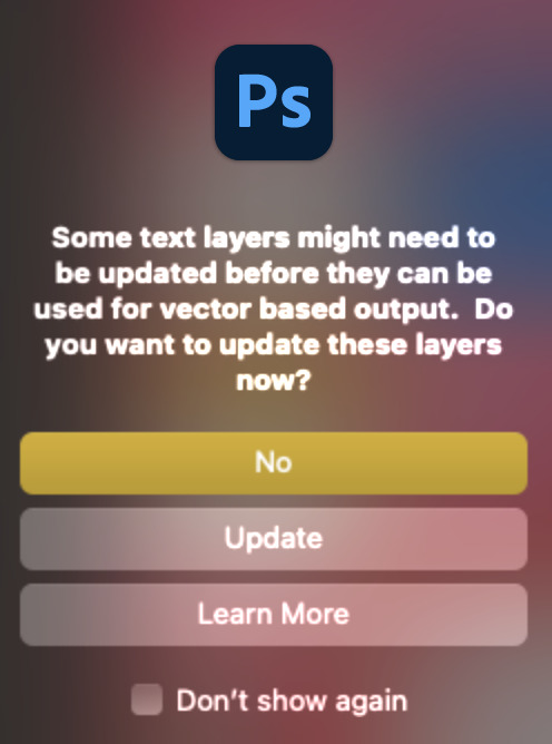
And if you see this triangle with an exclamation point by a text layer, don't double-click it — it'll mess up the font as well:

PHASE 2: THE GIFS
I'm just going to briefly go over gif sizes and my recommendations. Also, keep in mind when grabbing your scenes, you'll want all of these gifs to be the same amount of frames.
2.1 – Background Gif: 540 x 540 px.
I recommend this size so you have a good amount of visibility for the gif behind the iPhone wallpaper. I also recommend making this black and white (or in my case, black and white with a slight blue tint — idk I just like the way it looks) so the wallpaper coloring can stand out.
2.2 – Wallpaper Gif: 230 (w) x 500 (h) px.
Keep in mind the very narrow dimensions of the wallpaper! And also keep in mind that you'll have a bunch of apps and widgets covering the image. I try to use wide shots (or layer my clips into looking like wide shots). Also, keep in mind your color scheme for your set and your character's aesthetic! I tend to focus on one or two colors for the wallpaper.
I usually position the wallpaper to the side with 20px bumpers, so there's lots of space to see the background:
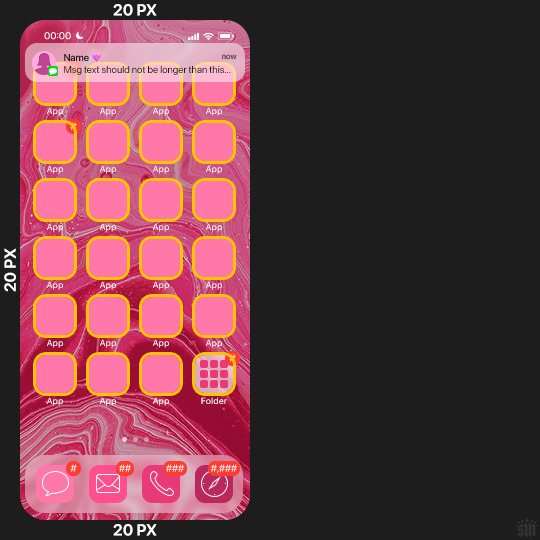
2.3 – Large Photo Widget Gif: 201 (w) x 96 (h) px.
2.4 – Small Photo Widget Gif: 94 x 94 px.
PHASE 3: THE TEMPLATE – "IPHONE" FOLDER
In this section, I'll try to quickly walk you through how to use this template and some bits that may require extra instructions. I'll be going through each folder from top to bottom.
3.1 – Status Bar.
Time, Service, and WiFi are pretty self-explanatory. In the Battery folder, you can use the shape tool to adjust the shape layers labeled "Fill (Adjustable Shape!)" to customize the battery level.
3.2 – Message Notification.
Again, these are pretty self-explanatory. I've already masked the circle for the contact photo, so you can simply import any photo and use the transform tool to shrink it down. The circle is 24x24 px. If you don't want to use a photo, there's another folder called Default Initials.
If your message text can't fit the text box, the message should end with ellipses which is how iOS caps off long texts.
3.3 – Blurred Banner (IMPORTANT)
This folder is easy to miss because there's only one placeholder layer in there. On iPhones, the area behind a banner notification and the dock get blurred (including the wallpaper and any apps).
What to do: Make a duplicate of the apps in Row 1 and/or widgets that intersect the message banner, convert them all into one smart object, apply a Gaussian Blur filter (Radius: 3.0 pixels) on the smart object, and move the smart object into this masked folder!
(There's another masked folder in the Wallpaper folder for the dock which I'll go over in that section.)
3.4 – Apps
Turn off the yellow guide if you don't need it to keep things aligned and turn off layers you don't need by clicking the eye icon. Replace the "App" placeholder text with your app name, change the color or gradient of the square to compliment your color scheme, and add your custom app icon overlay!
If you can't find an app icon you need from the ones I provided, flaticon.com is a great resource. Also, if you can only find the filled version of an icon, check out this tutorial for how to make any text or shape into an outline.
Also, each app folder has 4 notification bubble options (1-4 digits). Again, you can toggle these on and off as you need!
3.5 – Big Widgets
I like using these when my wallpaper has A LOT of negative space to fill. I included the Photos and Books widgets in my template, but there are lots of widgets available on iPhones. You can check some of the other ones I've done here, or if you have an iPhone, simply try adding some widgets to your phone!
There are also widgets bigger than these, but they would take up half of the phone screen which is why I don't use them for these edits.
3.6 – Small Widgets
The only thing I'll say about these — because they're pretty straight forward — is there are a lot more weather themes than I included in my template. Also, if you set your character's phone to evening, the weather widget will show a dark background (sometimes with stars), so keep that in mind.
Speaking of, I've included Light Modes and Dark Modes for, I think, every applicable widget.
3.7 – Page Dots
These barely perceptible dots indicate that your character has more pages of apps than shown in your gifset (so if an anon tries to come at you, you can just say "it's on the next page of apps" /j /lh)
3.8 – Dock
Again, the dock has notification bubble options and I've included the default app designs, custom filled designs, and custom outlined designs for iMessage, Phone, Email, and Safari (there's also a FaceTime alternative if that's how your character rolls). These are usually the apps people keep in their Dock, but this is fully customizable too. So, if your character is, like, super obsessed with Candy Crush or something and needs it in thumb's reach — you can put it in the dock.
3.9 – Wallpaper
This whole folder is masked already to a 230x500 px rounded rectangle.
Inside, you'll find another "Blurred Portion" folder for the area behind the message banner notification and the dock.
What to do: Duplicate your gif layer and place it in this folder, remove any sharpening filters, and apply a Gaussian Blur filter (Radius: 3.0 px). Be sure to add any coloring/adjustment layers ABOVE this folder and your original sharpened gif layer.
PHASE 4: EXPORT
We made it!
I hope this template makes it super easy for you to recreate this layout! If you decide to try it out, feel free to tag me with #usernik.
If you notice anything wonky about the template, kindly let me know so I can fix it! And if you have any questions about how to use this template, please don't hesitate to send me a message! I just ask that you try to be specific in your question so I'm able to answer you the best I can!
#gif tutorial#completeresources#userpickles#usersmia#userabs#usertreena#alielook#userkosmos#usershreyu#userzaynab#tuserabbie#useryoshi#usersalty#tuserlucie#usernanda#userelio#userhella#usercats#gfx*#resource*
752 notes
·
View notes
Text
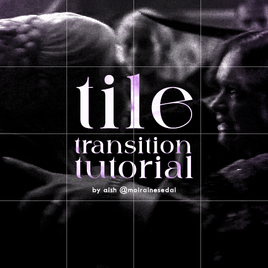
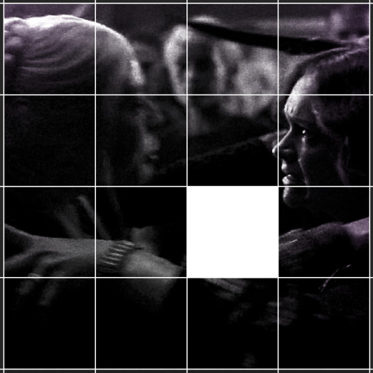
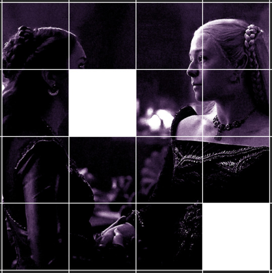
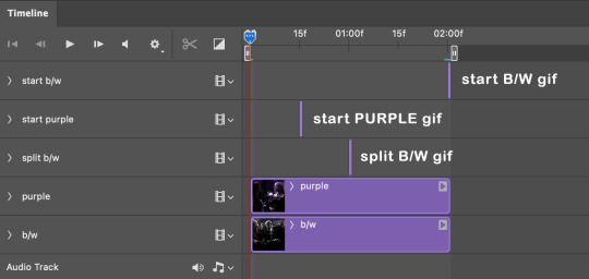
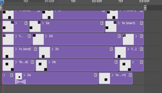
TILE TRANSITION TUTORIAL
a couple of people have asked me for a tutorial on how I did the penultimate gif in this set, so here goes! this is my first tutorial, so please feel free to reach out with further questions if anything's unclear.
note: this tutorial assumes you know the basics of gifmaking, can create the base gifs, and are familiar with timeline mode.
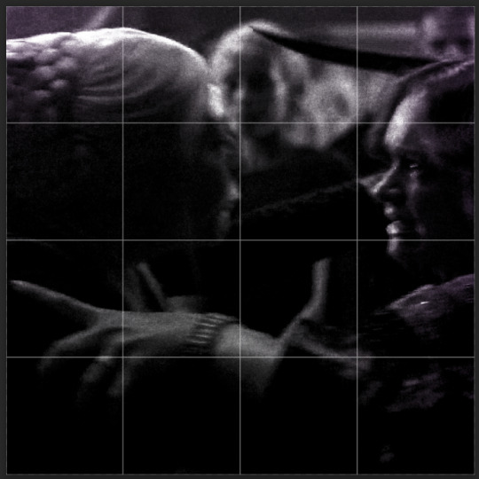
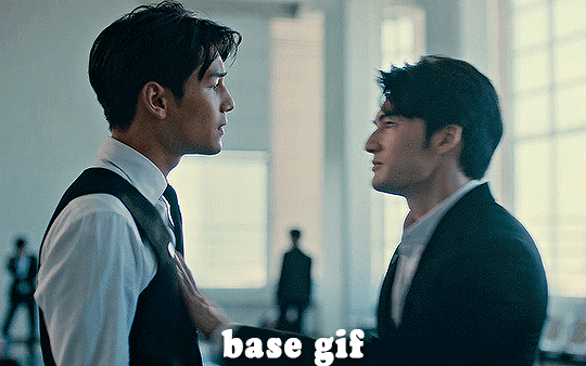
STEP ONE: create the base gifs! I'd recommend staying between 25-40 frames for each gif, since the transitions we'll use later tend to increase gif sizes. these are the ones I'll be using for this tutorial:


STEP TWO: create the guide layouts for both base gifs. for this panel, I chose a 4x4 grid — I would recommend keeping the number of "tiles" low because it can get tedious, but have a minimum of 9 (3x3 grid).

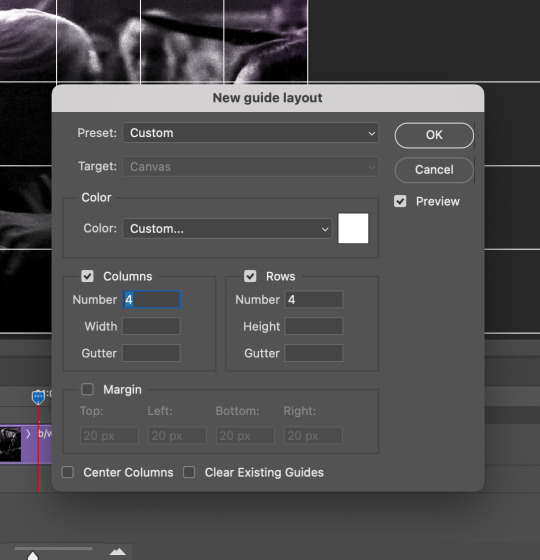
now your canvas should look like this:
STEP THREE: create the tiles. this is where the going gets rough; there might be easier ways to do this that I couldn't think of 😭 if there are any please send me an ask!
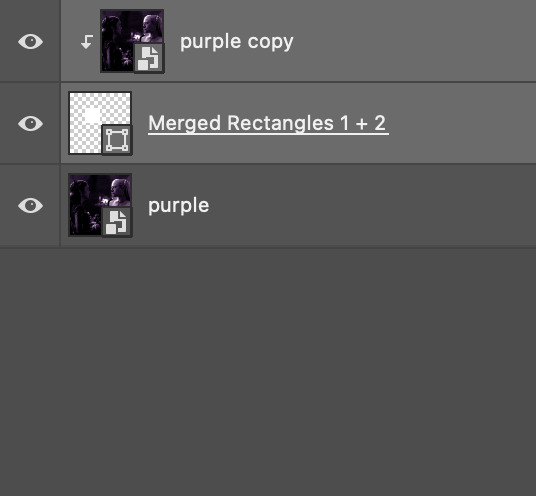
essentially, in this step we'll cut up the base gifs into smaller squares so that each tile can be manipulated separately when we put both gifs together. to do this, first create a square using the rectangle tool and the guides. then duplicate the base gif, move it above the square, apply a clipping mask, and then convert the clipped gif and square (selected in the image below) into one smart object.

ALTERNATELY: you could duplicate the original base gif and use layer masks to isolate tiles. create a layer mask for the duplicated gif layer and, with the layer mask selected, drag your mouse over a square (using the guide layout) and press delete. then press ctrl/cmd + i to invert the layer mask so that the gif only shows in the square of your choosing.
now repeat until you've got the entire gif in tiles, and do the same for the other gif!
since the transition effect is achieved by staggering the crossfades for each tile of the final gif, you can cheat by having multiple tiles "flip" at a time, ideally no more than four. this means you need to cut the base gif up into fewer pieces. to do this, simply draw multiple squares instead of one and then merge the shapes, before duplicating and clipping the gif onto them.
if you do this, it's essential to remember that you have to divide both gifs up in the exact same way. each piece of the b/w gif has to correspond to a piece of the purple gif!
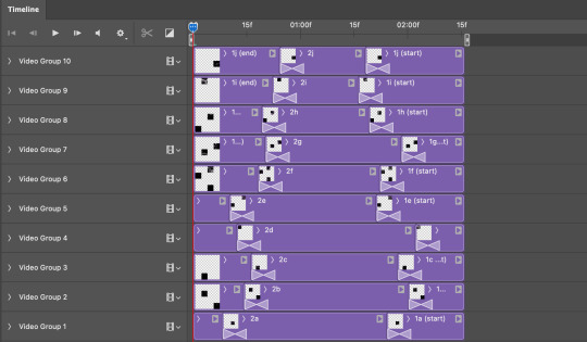
this is what the layers look like for each gif once I'm done:

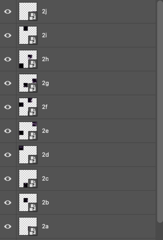
I have them lettered so that it'll be easier to match them up in the next step.
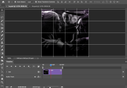
STEP FOUR: this is the complicated bit that took me two days to figure out. I'll do my best to explain but don't hesitate to reach out if something isn't clear!
to begin, open up a new psd and import both base gifs into it. (remember to click "create video timeline" and ensure that your gifs are all in order before proceeding.)
now, the trickiest part about this transition is ensuring that all the little tiles sync up so that the larger gif is coherent. so first we'll create some markers (just empty layers) to ensure that everything lines up as it should.
— marker 1: at about halfway through the first gif (b/w in this case)
— marker 2: at about a quarter of the gif length
— marker 3: close to the end of the gifs
at this point we're ready to start bringing in the tiles. I'm going to delete the base gifs from this new psd just to keep things cleaner!
first thing to do is import my b/w tile. move the timeline slider over to marker 1 and split the first gif. (if it helps, rename the split gifs and add (start) and (end) to the two halves.) then, move the (end) half to the beginning of the timeline, and the (start) half to line up with marker 3.
the purple tile is easier to manage. simply import it into the psd and line it up with marker 2.
your timeline should now look like this:
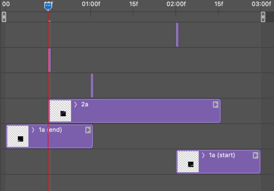
notice the overlap between the gifs at their beginnings and ends — this is where you'll be able to cascade the tiles flipping, so it helps to have a significant amount of overlap.
crop the three gifs for this tile as you see fit! since this is the first tile I want to flip from b/w to purple, I'll crop gif 1a (end) all the way to the current position of the timeline slider (red line with blue tip) and leave the beginning of gif 2a uncropped. for the flip from purple to b/w, I'll crop both gifs a bit.
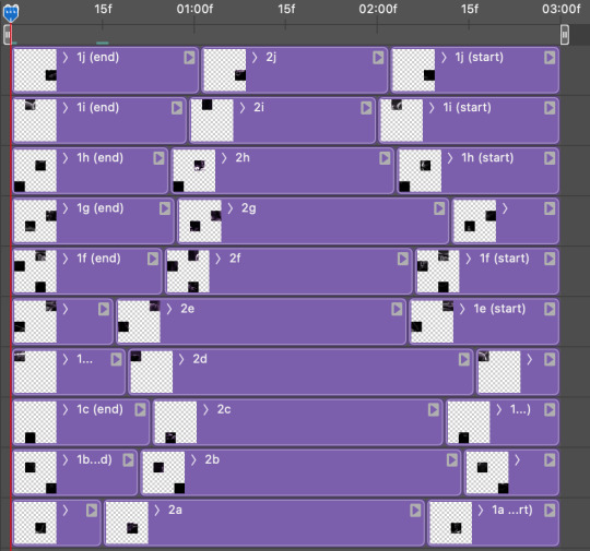
once that's done, drag all three gifs onto the same level in timeline so they form a video group. your timeline should look something like this:

now you just repeat the process for all the other tiles! as long as you made sure that all the tiles in one gif correspond with tiles in the other gif in step three, this should be a fairly painless process. make sure to crop the starts/ends of the gifs separately so that they don't all flip together.
this is what my layers look once I've done all the tiles:
and the gif!
STEP FIVE: transitions! click on the half-white square (top right of the left column in the timeline, beside the scissors) and select the crossfade transition, then drag it between two gifs in a video group. it should create a two-triangle symbol and shorten the overall length of the video group.

apply the transition to all the tile flips, ensuring that the duration of all transitions is constant. this can sometimes be tricky because ps likes to change the duration of each transition, so right click on the transition symbol and manually change all your transition durations to be the same.
your layers should now look something like this:
STEP SIX: draw the grid. bring back the guide layout from step two and using the line tool (I like 2px thickness), trace the grid. adjust opacity as you see fit (50-80% is usually a good idea), so that the canvas looks like this:
STEP SEVEN: export and celebrate! you're done!
I hope this tutorial made sense and was easy to follow, and happy giffing! my inbox is always open for any questions <3
#tutorial#ps help#ps tutorial#userace#alielook#userabs#usercats#userhella#userfaiths#tuserabbie#usershreyu#usertreena#tuserlucie#uservivaldi#usertj#usergiu#userroza
610 notes
·
View notes
Text
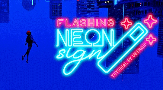
HOW TO: Make Animated Neon Text
Hi! No one asked for this tutorial, but this is one of my favorite typography effects as of late — so I thought I'd share how I do it. You can see this effect in the first gif of this *NSYNC Celebrity set and the last gif of this Anthony Bridgerton set. Disclaimer: This tutorial assumes you have a basic understanding of gif-making in Photoshop. It's also exclusively in Timeline and uses keyframes for the fading effect seen on the blue text.

PHASE 1: PREP YOUR BASE GIF
1.1 – Choose a dark scene.
This effect looks best contrasted against a dark background. You can definitely do it with a bright background, but just like a neon sign irl, you only turn it on in the dark/at night — so keep that in mind!
1.2 – Determine the length of your clip.
Depending on how much you want your text to flash or fade in, you'll want to make sure you have a scene long enough to also allow the text not to flash — reducing the strain it takes to actually read the text. For reference, my gif is 48 frames.
1.3 – Crop, color, etc. as you would.
New to gif-making? Check out my basic tutorial here!
PHASE 2: FORMAT YOUR TEXT
Before we animate anything, get your text and any vectors laid out and formatted exactly as you want them!
2.1 – Finding neon sign fonts.
It's easy as going to dafont.com and typing "neon" into the search bar!
2.2 – Fonts I used.
Neon Glow by weknow | Neon by Fenotype | Neon Bines by Eknoji Studio
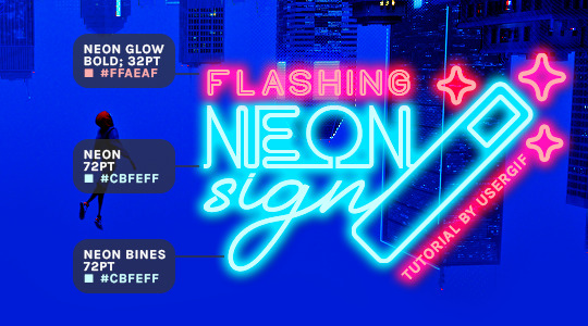
And to not leave my fellow font hoarders hanging, the font for "tutorial by usergif" is Karla (it's a Google font) 🥰
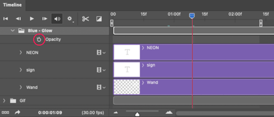
2.3 – Group your text layers. (Conditional)
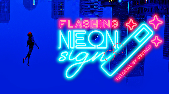
If you plan on having multiple text layers like I did and you want them to appear connected (like how the last letters of "NEON" and "sign" intersect with the wand icon), I suggest putting the layers into groups according to color (the shortcut to group layers is Command+G). If you don't group your text and just apply the outer glow settings to each individual layer, you'll end up with something like this:
—where you can see the glow overlap with the line, instead of the smooth connection you see in my final example gif. I'm using 2 colors for my text, so I made a group for red and a group for blue.
2.4 – Apply Outer Glow.
Right-click your text layer (or your group if you have several layers) and select "Blending Options" to open the Layer Style menu. Check "Outer Glow" and feel free to play around with the settings until you like the way your text looks!
Your outer glow color should be darker and more vibrant than the color of the text itself. The text should be within the same color family but much brighter and, sometimes, almost white (see Step 2.2 again for my text colors).
Here are the settings for the Red Glow (the glow color is #FF3966) and Blue Glow (#00F0FF):
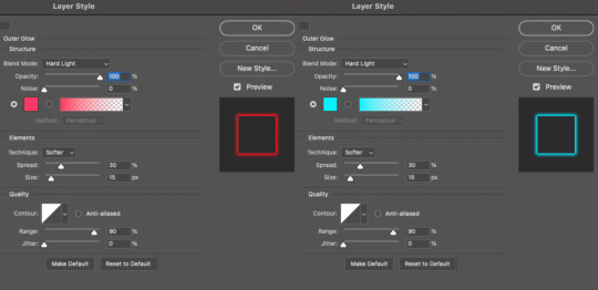
These aren't always my exact settings but they're pretty close to my standard. I always set the blend mode to Hard Light and usually have the opacity at 100%.
For every gif I use this effect on, I like to play around with Spread and Size. Spread will make the glow look denser and "expand the boundaries" (source: Adobe) and Size will diffuse the glow and blow it out so it covers a larger area (Adobe says it "Specifies the radius and size of blur").
2.5 – Duplicate your text layer/groups and remove glow.
We're only going to be animating the glow on our text, and since doing this affects its opacity/visibility, we want to preserve the base text by creating a duplicate.
I just hit the Command+J shortcut to duplicate my groups and delete the Outer Glow effects, making sure that the "No Glow" version is above the "Glow" version:
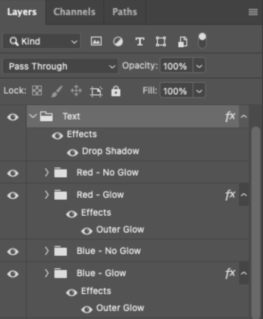
I also put all these groups into one group called "Text" for organization and so I could apply a drop shadow to all the elements for better visibility.
PHASE 3: CREATE THE FLASHING EFFECT
This is for the effect you see on the RED text in my gif!
3.1 – The 0.03-Second Rule
If you've read any of my animation tutorials before, you're probably already familiar with this rule. In my experience (and for reasons I can't explain), Video Timeline pauses every 0.03 seconds (try clicking the forward button a few times, you'll probably find a "duplicate" or paused frame). So, keep all your layers a duration of 0.03-second increments (e.g. 0.06 or 0.09 seconds can also work) and align them on the Timeline at 0.03-second intervals. If you don't follow this rule, you'll get duplicate frames when you export, resulting in a choppy final gif.
3.2 – Trim and arrange your text layers.
Only on the layers/groups WITH the Outer Glow effect, trim them into several segments of varying lengths where the glow will be "on" (visible) and leaving spaces where the glow should be "off."
Typically, I'll have a mixture of 0.06 and 0.03-second text. That's when the glow will be visible. Between each "flash" of visibility, I've got a 0.03-second blank space, baby *pen clicks* and I'll write your name:
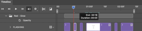
The layers shown above are arranged with a few flashes and two long segments of no flashing. This is the order and duration of each segment shown above (purple = visible segments):
0.06 blank, 0.06 visible, 0.03 blank, 0.03 visible, 0.03 blank, 0.03 visible, 0.03 blank, 0.24 visible (the long bit where "FLASHING" doesn't flash at all), 0.03 blank, 0.03 visible, 0.03 blank, 0.12 visible
(I only did this for the text that says "FLASHING" to give it a glitching effect. The other red text keeps the glow visible starting at the first long segment.)
PHASE 4: CREATE THE FADE-IN EFFECT
This is for the effect you see on the BLUE text in my gif!
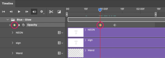
4.1 – Animate using the Opacity Keyframe.
Again, we're only touching the layers/groups WITH the glow effect. If you only have one layer of text, you'll find the Opacity Keyframe by clicking the film reel icon:
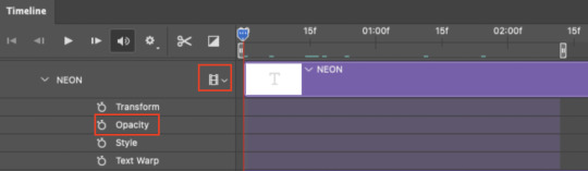
If you're working with groups like me, you'll find it in the Timeline panel under the group when it's expanded:
As you can see, I already added my keyframes (lil diamond babies). And luckily, it's super easy to do!
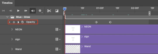
4.2 – Add the ending Keyframe first.
We're starting at the end because our layers/groups are already at 100% opacity. Drag the playhead (the blue arrow attached to the red vertical line) to a spot where you want the glow to be 100% opaque — this is where the glow will be fully "on" or visible. [Again, follow the 0.03-Second Rule. You will get duplicate frames regardless when using keyframes (this will be explained in the note in Phase 5), but abiding to the rule will mitigate the amount of dupes you get.]
Then, click the clock icon by "Opacity" to place a keyframe:
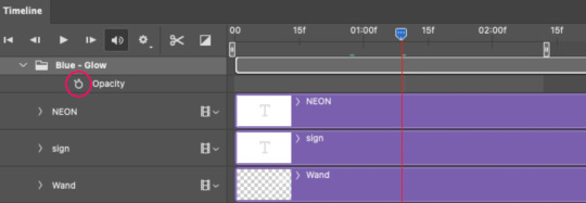
4.3 – Add the starting Keyframe.
Go backward from the ending Keyframe you just placed (I went back 0.12 seconds — but you can play around with the duration of the fade, just keep it a multiple of 0.03):
And drop another keyframe, this time by clicking the diamond icon by "Opacity":
4.4 – Reduce the opacity on the starting Keyframe.
Keeping that keyframe you just placed selected, go to the layers panel and reduce your layer's/group's opacity to 0%:
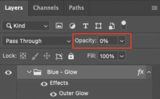
Now, this Outer Glow will slowly fade from 0% to 100% opacity.
And just for a visual aid, here's where my fade-in keyframes are in relation to my flashing segments:
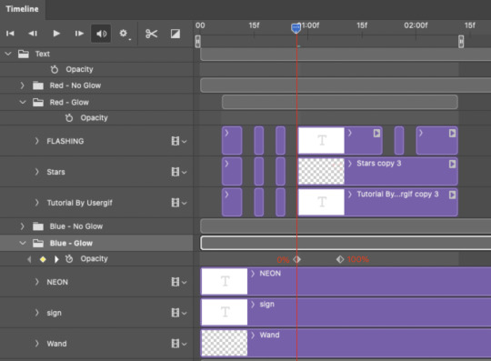
To refresh your mind, the 0% Opacity Keyframe starts when "FLASHING" is visible for 0.24 seconds (the first long segment of visibility).
With these keyframes, you'll get a smooth fade-in à la ✨light switch with a dimmer✨
PHASE 5: EXPORT
Yay, we're finished! Convert from Timeline back to Frames and export your gif!
NOTE: If you only did the flashing effect and followed my 0.03-Second Rule, you shouldn't have any duplicate gifs.
BUT if you included the fade-in effect using keyframes, you WILL have duplicate frames. 'Tis the nature of keyframes. 🤷♀️ I had 4 extra frames where the fade-in starts, which I deleted. So, as always, I recommend checking your frames when you convert from Video Timeline back to Frame Animation — and manually delete any duplicate frames.
Sorry this tutorial is so long 🙈 I over-explain so you're not just mechanically copying steps, but understanding the WHY behind each step! Thanks for bearing with me
If you have specific questions about this tutorial, feel free to send a message to usergif and I'll try my best to help! :)
More USERGIF tutorials • More resources by Nik • USERGIF Resource Directory
#typography#gif tutorial#completeresources#usershreyu#useryoshi#userelio#userzaynab#userives#usertreena#usercim#userrobin#userkosmos#usersalty#userhella#alielook#uservalentina#uservivaldi#*usergif#*tutorial#by nik#flashing gif
735 notes
·
View notes
Text
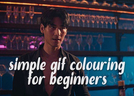
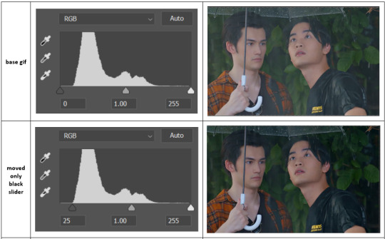
✨ Simple Gif Colouring for Beginners ✨
I wrote up my basic gif colouring process for a friend recently, but a couple of people here mentioned they'd also find it helpful! so, as requested, this is a beginner-friendly walkthrough of the way I colour my gifs :) it's aimed at brand new gif makers with no prior experience with photoshop or photo editing.
when I first started gif making I found colouring and photoshop in general suuuper daunting, so I've tried to simplify everything here as much as possible. hopefully this will be relatively easy to follow and not too intimidating!
a couple of things to begin with:
I'm only talking about colouring here - this is not a full gif making tutorial. I've linked to some of my favourites of those here!
I personally like to make bright, 'clean' looking gifs with vibrant but natural colours, so that is the style of colouring this tutorial is geared towards. most of gif colouring is subjective and about personal taste - the only thing that I'd say is possible to get wrong is skin tones, which I talk about a lot in this guide.
as I mostly gif Thai dramas, most of the advice is geared towards colouring for East Asian/South East Asian skin tones - but the techniques should be fairly universally applicable (and here are some tutorials that talk about gif colouring for other skin tones).
I'm not an expert! I'm not claiming this is the best or the only way to colour gifs - it's just how I do it.
this post is very image-heavy. if the images aren't loading (or the gifs are running slowly or cutting/looping weirdly), then try viewing the post in its own tab (rather than on the your dash or someone's blog) and refreshing the page.
okay, full walkthrough beneath the cut!
contents:
1. intro
a. natural gif colouring goals
b. very very basic colour theory
2. super simple colouring (the essentials)
a. curves
b. selective colour (and skin tone correction)
c. hue/saturation
d. saving and reusing colouring
e. another simple colouring example
3. other adjustment layers
a. brightness/contrast
b. levels
c. vibrance
d. colour balance
e. channel mixer
4. troubleshooting
a. curves
b. saturation
5. fin!
1. intro
the colouring part of gif making can be super overwhelming, especially if (like me when I first started!) you're completely new to photoshop and/or have no experience with colour theory or photo/video editing.
if you're opening photoshop and making gifs for the first time, I highly recommend getting used to making a few basic, uncoloured gifs to begin with. just to practice, rather than post anywhere (though you can always come back and colour them later if you want) - but it'll make the rest of the process much easier if you're already beginning to get used to working in timeline mode of photoshop. give yourself a bit of time to practice and get a feel for things like how many frames you tend to like in a gif, where you like to crop them for the best loop, what kind of aspect ratio you like etc* - so that you're not trying to navigate all of that for the first time on top of everything else!
* frames: for me between 60-90 frames is ideal, but 40-120 frames is the absolute min-max I'd personally use in a normal gifset
loops: for the smoothest loops, try to avoid cutting someone off mid-movement or mid-word if possible.
aspect ratio: for full-size (540px) gifs, I tend to go for either 8:5 (slightly 'skinnier' gifs), 7:5, or 5:4 (particularly big, thick gifs lmao)
✨ natural gif colouring goals
part of what can be so daunting about starting gif making is not knowing where to start or what you want to achieve. this is definitely something that gets easier with practice - the more gifs you make, the more you'll get a feel for what kind of look you like and the more instinctively you'll know how to get there. it also helps to see if any gif makers you like have made "before and after colouring" posts - these can help with getting a sense of the kinds of changes made through gif colouring. here's one I made!
in general, I like to make my gifs bright and 'clean' looking, with vibrant but natural colours. these are the things I'm usually hoping to achieve with colouring:
brighten dark scenes
remove muddy, yellowish lighting or filters
saturate colours
correct any skin lightening filters or overexposure
make lighting and colours as consistent as possible between gifs within a single gifset, especially gifsets featuring gifs from multiple scenes/episodes/videos
this guide is focusing on natural colouring, but of course there are many cool ways to make stylised/unnaturally coloured gifs. imo you'll need to master these basics first, but if you want to learn how to do things like change the background colour of gifs or use gradients or other cool effects, then @usergif's resource directory has loads of super helpful tutorials!
✨ very very basic colour theory
[disclaimer! I don't know shit about fuck. I do not study light or art. this is just an explanation that makes sense to me exclusively for the purposes of gif making.]
the primary colours for light/digital screens are red, blue, and green. having all three colours in equal measures neutralises them (represented by the white section in the middle of the diagram).
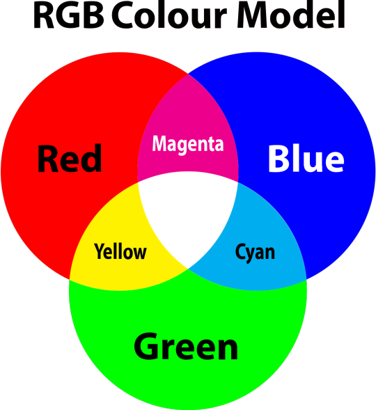
so to neutralise a colour within a gif, you need to add more of the colour(s) that are lacking.
in practice this usually means: the scene you want to gif is very yellow! yellow is made of red and green light, so to neutralise it you need to add more blue into your gif.
it can also mean the reverse: if you desaturate the yellow tones in a gif, it will look much more blue.
looking at the colour balance sliders on photoshop can make it easier to visualise:
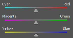
so making a gif more red also means making it less cyan.
removing green from a gif means adding magenta.
taking yellow out of a gif will make it more blue.
tl;dr:
neutralise yellows by adding blue (and vice versa)
neutralise reds by adding cyan (and vice versa)
neutralise green by adding magenta (and vice versa)
2. super simple colouring (the essentials)
starting with a nice sharpened gif in photoshop in timeline mode. (these are the sharpening settings I use!)
some scenes are much harder to colour than others - it helps to start out practising with scenes that are bright/well-lit and that don't have harsh unnaturally coloured lights/filters on. scenes with a lot of brown/orange also tend to be harder.
I usually save a base copy of my gif before I start colouring just in case I end up hating it, or find out later that it doesn't quite fit right into a set and need to redo it etc.
so here is my base gif!

it's an okay gif, but it has a bit of a yellow tint to it that I want to reduce.
colouring is easiest to do in adjustment layers, which can be found under layer -> new adjustment layer - or for me they are here:
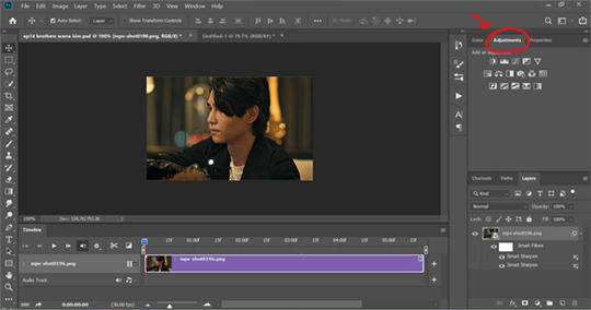
there are lots of different types of adjustment layers that do lots of different things - but for me the absolute essentials for colouring are curves, selective colour, and hue/saturation.
I also use brightness/contrast, levels, exposure, vibrance, colour balance, and channel mixer sometimes, depending on the gif - but I use curves, selective colour, and hue/saturation on every single gif.
✨ curves layer
the first thing I always do is a curves layer. when you first open one it will look like this:
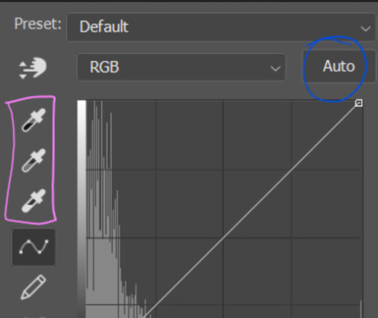
first I usually click the ‘auto’ button, just to see what happens. sometimes it makes a big difference (it usually brightens the gif a lot) - but on this gif it didn’t do much.
if it had made the gif look nicer then I would have kept it and added a second curves layer on top to do the rest of these steps.
the next step is selecting the white and black points with the little eyedropper tools.
the bottom eyedropper lets you pick a white point for the gif. click somewhere super light on the gif to see what happens - for this gif, I clicked on the lampshade on the left. if it looks weird, I just undo it and try somewhere else - it usually takes a few goes to find something that looks good.
here's what that did to the gif:

then I pick the top eyedropper and use it to pick a black point by clicking somewhere really dark, again playing around until I find a black point that looks good.
here's what the gif looks like after picking the white and black points:

this can take some experimenting, but you can make super easy drastic changes to your gif just with this. in this case, the curves layer took out a lot of that yellowy tint.
and this is what the curves graph looks like now:
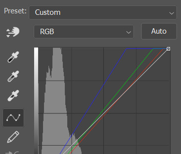
you can click and drag those lines to make further changes if you want - I usually leave them alone though. the colours of the lines indicate which colours have been changed in the gif - for example, you can see from that steep blue line on the graph that blue has been added to neutralise those yellows.
next I usually do another curves layer and just press the ‘auto’ button again to see what happens. usually it brightens the gif a bit more, which I like.
‼️if nothing is working: usually with a bit of fucking about a curves layer works well - but sometimes you can’t find a good white and black point anywhere, and instead your gif turns wacky colours and nothing looks good. this happens more often with very heavily colour tinted scenes :( the troubleshooting section at the end goes over some options, including starting with a levels layer instead.
✨ selective colour (and skin tone correction)
skin tones are made up of a mixture of yellow and red.
removing yellow (or adding blue or red) to a gif will make the skin-tones too red - and removing red (or adding cyan or yellow) to a gif will make the skin-tones too yellow.
adding blue to this gif with the curves layer took out the yellowy tint, which I wanted - but it also took the yellows out of Kim's skin tone, which I don’t want. so I need to put yellow back into the skin tones specifically - without putting it back into the rest of the gif.
selective colour layers let you select an individual colour and adjust the levels of other colours within that colour. you can change how yellow the green shades are, or how much cyan is in the blues, for example.
I need to add yellow back into the red tones to correct the skin tones on this gif. this is the case for most gifs in my experience - the vast majority of the time, unless a scene is very heavily tinted in another colour, a curves layer will add blue/remove yellow.
in the 'colors' dropdown, select the 'reds' section and drag the 'yellow' slider higher - this will add more yellow into just the red shades within the gif.

the amount of yellow you need to add back into the reds depends on how much yellow was taken out of the gif initially - I just play around with the slider until it looks right. if you're not sure, it helps to have some neutrally-coloured (not white-washed!) reference photos of the people in your gif to compare to.
here's the result. Kim's skin is a lot less pink toned and much more natural looking:
✨ hue/saturation
this adjustment layer lets you adjust the hue and saturation of the gif as a whole, and also of each colour individually.
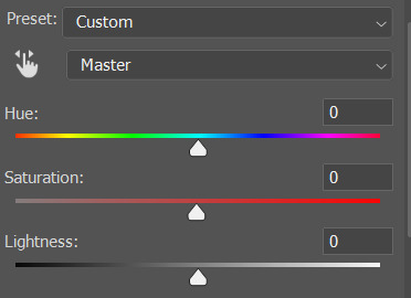
I don't use the hue or lightness sliders unless I'm trying to do something more complicated with the colouring.
clicking the dropdown menu that says 'master' lets you edit the saturation of each colour individually. this is useful if your gif is still super tinted in one colour.
I thought the yellows on this gif were still slightly too bright, so I switched to the yellow channel and desaturated them slightly. (remember if you do this then you need to go back to selective colour and add more yellow into the red skin tones to balance out the desaturation!)
then I increased the 'master' saturation of all the colours to +5:
I usually find the right amount of saturation is somewhere between +5 and +12, but it depends on the gif.
‼️if the gif feels undersaturated, but the saturation slider isn't helping/is making the colours worse, try a vibrance layer instead.
done!
✨ saving and reusing colouring
you can copy and paste adjustment layers between gifs to make your colouring even across each of your gifs for one scene - so if you're making a set of multiple gifs of the same scene, or you think you might want to gif the same scene again in the future, you can save it as a psd so you can reuse the colouring again later.
each gif's colouring will then still need tweaking - different cameras/angles/shots of the same scene can still start out with slightly different colouring.
I recommend uploading the gifs as a draft post on tumblr so you can see what they all look like next to each other and catch any inconsistencies.
✨ another one! (speedrun!)
HI KEN!
the white point for the curves layer was in the window behind them.
the curves layer removes the muddy yellow tint, but again it makes their skin tones (especially Ken's) very red toned, which is adjusted by the selective colour layer.
3. other adjustment layers
imo many many gifs can be coloured really nicely with just those three adjustment layers, but some need different adjustments.
✨ brightness/contrast
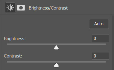
pretty self explanatory!
I personally usually avoid using the 'brightness' slider because I rarely like the effect - I only tend to use the 'contrast' one.
the 'auto' button is sometimes useful though, especially if you’re struggling with the curves layer.
✨ levels

levels alters the white and black points of the gif, like curves - but unlike curves it doesn't also alter other colours.
use the sliders beneath the graph to alter how dark/light the gif is. you can slide the black slider further to the right to make the blacks darker, and the white slider to the left to make the whites lighter.
levels is a good place to start if your curves layer isn't working.
(I'm going to hit the image limit for this post lol so here are some screenshots of a table I made to demonstrate this rather than actual gifs. sorry!)

on both sides, I dragged the sliders up to where the big jumps are on the graph - this is usually a good place to start!
✨ vibrance
vibrance... makes the colours more vibrant. it's more subtle than saturation.
it's really helpful for gifs that feel grey. sometimes adjusting saturation just makes the greys kind of weirdly tinted, but a vibrance layer can fix that.
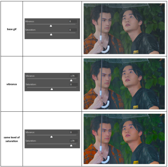
vibrance is much more subtle!
✨ colour balance
colour balance affects the overall balance of colours within a gif.
it's good for scenes with heavy tints.
I tend to stick to the 'midtones' dropdown, but you can also alter the colour balance within the shadows and highlights if you want.

✨ channel mixer
I avoided channel mixer for such a long time because it scared me. but it's great for scenes that are very heavily tinted in one colour.
basically, it works with the levels of red, green, and blue within a gif. you select an output colour and then play around with the levels of the colour you selected within each other colour.
kind of the reverse of selective colour?
so in the 'blue' channel, the levels of blue are at 100%, and the levels of red and green are at 0% - but you can impact how much blue is in the reds and greens and blues.
this tutorial explains it well - but imo the best way to get to grips with channel mixer is just to play around with it a bit (sorry)
(when I made this guide for my friend, I also made a slightly more complicated gif colouring walk-through that included using channel mixer. there isn't space to include it within this post, but if anyone is interested I could always upload it as an 'intermediate' gif colouring tutorial - lmk!)
4. troubleshooting
‼️curves
usually with a bit of fucking about a curves layer works well - but sometimes you can’t find a good white and black point anywhere, and instead your gif turns wacky colours and nothing looks good. this happens more often with very heavily colour tinted scenes :(
for example, with this base gif:
using many of the brightest points as a white point turn it wacky colours, like this:

yikes :(
some options for these cases:
try brightening the gif first with the 'auto' button on the curves layer or with a levels layer. having a brighter gif to start with can give you better options for picking a white point.
try finding an alternate, whiter/brighter white point. look for places the light reflects - on this gif, using the light on Porsche's cheekbone works well as the white point. it also helps to find places that would be white if the scene wasn't tinted - the lightest part of a white shirt is often a good place to start, for example.
skip the curves layer, and instead use a levels layer to alter your white/black points, and colour balance or channel mixer to balance the colours.
‼️over/undersaturation
if your gif (especially the skintones) is looking a little washed out or lifeless, it might be undersaturated. boost that saturation - or if that's not working, try a vibrance layer.
oversaturation is often easiest to spot in the mouths and ears of any people in a gif. if the mouths are looking unnaturally, vibrantly red, then you've gone too far with the saturation.
5. fin!
and done! I hope this was coherent helpful to somebody.
if there's anything that I've missed or that doesn't make sense pls feel free to shoot me an ask or a message and I'll do my best to help! I've also collated a bunch of additional reading/resources below.
happy gifmaking 🥰
✨ some links!
photoshop basics by @selenapastel
gifmaking for beginners by @hayaosmiyazaki
gifmaking guide for beginners by @saw-x
dreamy's gif tutorial by @scoupsy-remade (includes instructions on how to blur out burned-on subtitles or annoying video graphics)
beginner's guide to channel mixer by @aubrey-plaza
how to fix orange-washed characters by aubrey-plaza
colour correcting and fixing dark scenes by @kylos
does resampling matter? by usergif
how to put multiple gifs on one canvas by @fictionalheroine
watermarking using actions by @wonwooridul
resource directory by @usergif
#i got a couple of asks about this so i figured i'd type it up as a post#it's been sitting in my drafts for a while now though i'm so sorry omg.#i had to replace my laptop and it took me a while to get round to downloading photoshop on the new one#but i hope this is helpful!!#gif making#tutorial#photoshop tutorial#colouring tutorial#coloring tutorial#gif colouring#gif coloring#photoshop resources#gif tutorial#gif resources#userbunn#uservik#darcey.txt#darcey.gif#usergif
313 notes
·
View notes
Note
i love the style of that 3d render of your character! may i ask how you animated the outline and made the whole thing pixel-y? :0
Very glad you asked!
There isn't many tutorials on how to make this kind of stuff so I am totally glad to be the first one.
BLENDER 2.5D TUTORIAL
First of all

Get your model ready and steady, that part is what I ain't explaing, however if you want it to have these colors, you will have to put this nodes in your texture shader
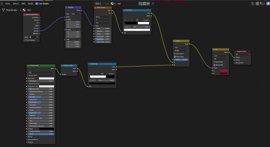
`[ This is for her red jacket, the lower nodes is for her primary colour and the upper nodes are for her shadows, which also has some extra nodes to give it a comic texture. ]
Quick reminder to give the model some lineart yourself to the parts that don't form its sihlouette, for example her shoes.
Now for the lineart, first of all make sure you have created a black Emissive material and that it has Backface Culling activated

After that go to the Modifier Properties and add a Solidify modifier

Make sure to Flip the Normals, set the Material Offset to where the Lineart material is, and adjust a little bit the Thickness of the mesh, then you will get some natural good-looking lineart like hers.

Now, you could easily be satisfied like this, but now we are going to make it feel like each frame is a new drawing by making her model lineart jiggly
First of all create a Displacement Modifier and give it a cloud texture

Make sure to lower the strenght and midlevel, otherwise it will look like this


Now, create an Empty Plain Axes and go to the Displace modifier, change the coordinates from Local to Object and focus the object on the Empty


And thanks to this adjustments, if you move the empty around, it will create a slight jiggle
Now what we want is for this empty to automatically move around without you having to do anything
Create a new screen and go to the Graph Editor section
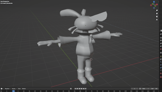
In here we will be making the empty move with a modifier
Select the empty and press "I" of Italy and select Location, this will create a keyframe for the empty that we will be able to manipulate

Go to the Editor and ONLY SELECT THE Z POSITION, and then go to the Modifiers tab and add a Noise modifier
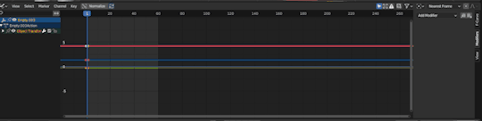
Make sure to adjust the Scale and the Strength so that it looks more proper for the jiggle effect, make it look like a rollercoaster!

And now, if you did everything right, your empty will be moving up and down and all around by its own
WHICH also means, the model displacement will follow the path of the empty to create that jiggly effect we crave so so much
However...

The model is indeed jiggling, but it's doing it the wrong way, we are trying to make it look like a cartoon not a gosh darnit gelatin
So to make it jiggle the right way we are going to make its noise feel more STEPPED
Go back to the modifiers of the Graph Editor and add a Stepped Interpolation, and make sure it has a Step Size of 5
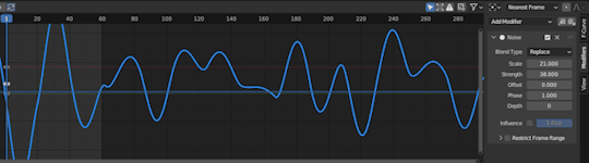
And now we finally get the choppy jiggle effect!!
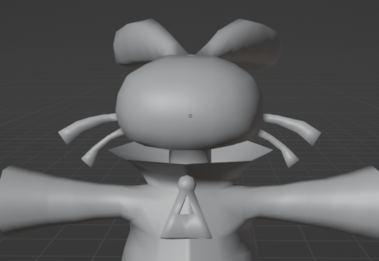
Now you can play around the Displace and the Noise to make it more or less jiggly
But nonetheless, if you followed the tutorial right, you will be gifted with the perfect looking 2.5D effect!!!
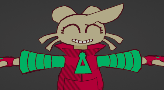
Now you can go ahead and try to fool everyone into thinking a 3D animation is 2D
And before we wrap up, one more extra for the one who asked how this is made,
We are going to make the render feel pixel-y!
Go to Render Properties, make sure you are using Eevee, and in Sampling put the Render on 1 and the Viewport on 0
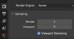
Then go to Output Properties and you can do two things:
1) Change the X n Y to a size lower than 1000 px
2) Change the Resolution % to these numbers (8, 16, 32, 64) This way if you wanna do pixel art you are more accurate
For this render I used the 1st option
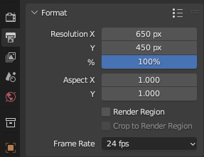
And last but not least, in the Output Properties make sure you save your files in the right way with these settings

THen render animation, make an image sequence with all the pngs, and TA-DAH
You get a pixel-y 2.5D animation!!!
Thank you so much for checking, I hope this is useful for anyone who wants to do this stuff, if anyone has any questions don't be afraid to ask, I may have explained some stuff badly.
Anyways have a very jolly day
Tsuyo OUT
#blender#blender 3d#blender tutorial#tutorial#3d modelling#3d tutorial#art#model#3d model#my art#tsuyo art
1K notes
·
View notes
Text

Hey guys!! Here's a tutorial on how to create those little animated doodles for your gifs so that you don't have to look for the exact overlay you want for hours 👍 This tutorial was requested by @fabines :) It's a long process but it's not too difficult, you just need to know the very basics of gif making! The steps are below the cut :)
1.
First we're going to have our gif ready, and make sure you know how many frames it is!! It should preferrably be an even number! (or a divisible number)
2.
Now we're going to make another gif, which will be the lil animated doodle. Go to file > new or press ctrl+n. Create a new document that's going to be 300x300 px, and we'll make the background black:
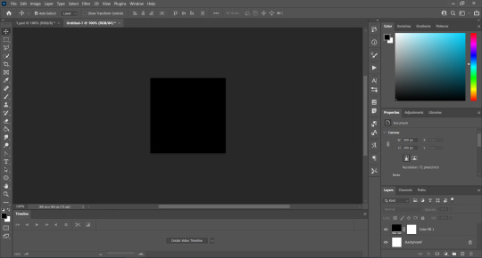
3.
Now we're going to use a brush to paint the doodle! We're gonna set the size to 4px-7px depending on how thick you want it to be (here i used a 4px brush) and the hardness to 100%, and we're going to trace our doodle on a new layer:
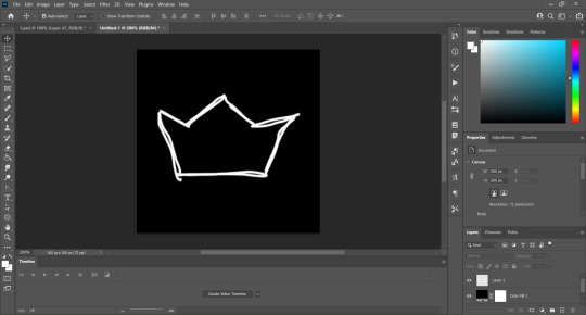
It does not have to be perfect!! It took me a while to get that crown and it looks half assed 😭 if you can use something other than your mouse like a tablet or something i definitely recommend you do it :)
Now we're going to click on "Create Video Timeline":
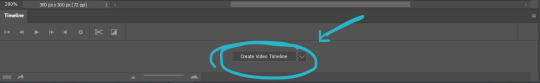
Now the bottom of our workspace is gonna look like this:

We're going to click on those three little boxes on the bottom left to convert to frame animation:
And there's that! Now for the slightly tricky part.
4.
We're going to set the layer where we drew the doodle to 40% opacity:
And on a new layer, we're going to trace the same doodle:
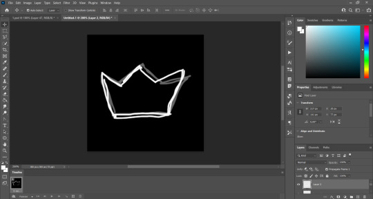
As you can see it doesn't look the same and it's because it doesnt have to be, that's how we're going to make it look animated!
We're going to repeat that process a few times! What i do to not get confused is that for examples when i'm going to draw layer 3 i first make layer 2 invisble, and then for layer 4 i also make layer 3 invisible and so on
My gif here:
is 40 frames, which means i can make 8 different variations of my doodle and duplicate each 4 times. This is why it's important that you know how many frames your gif is! And it's even much easier if it's an even number.
But what are we going to do to make it look animated? Well, it's all about using the timeline! First, make sure that the frame delay is set to the same as your base gif. I usually set it to 0,05:
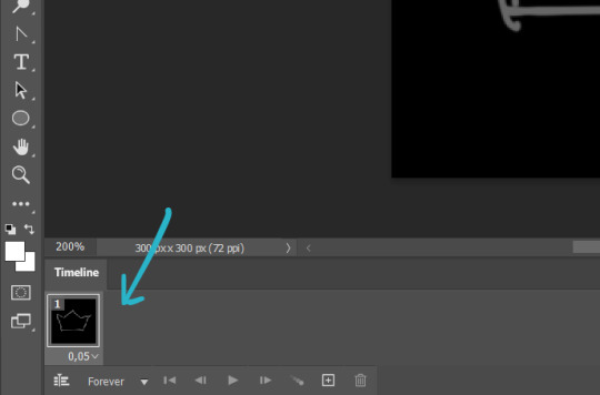
Now our first layer can go back to 100% opacity, since we're going to use it too:

So this is what we have so far:
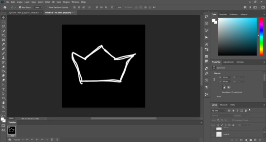
Only layer 1 is visible. So what we're gonna do is click this little plus icon:
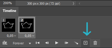
It duplicates our frame. And on our layer section we're going to make layer 1 invisible and instead make layer 2 visible, and you'll notice that now our first two frames correspond to our first two layers:
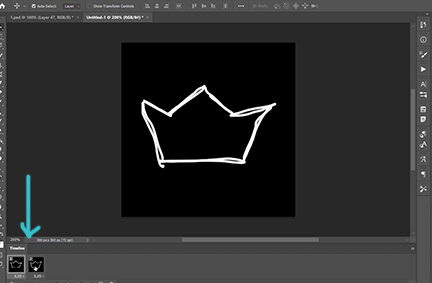
And we're going to do the same thing for each layer! Add a new frame, make layer a invisible, make layer b visible, and so on! Here's what my crown looks like after doing this process with my 8 layers:
As you can see it's too fast, so that's why i'm going to duplicate each frame 4 times, so each variation has 5 frames on the timeline, and that's how we're going to get the same amount of frames as our base gif:
So once we have our animated doodle it's very easy from here! We're going to click on the bottom left again to convert our frame animation to a video timeline:
And we're going to select all of our layers (ctrl+alt+a in windows or just go to select > all layers) and convert them to a smart object (right click > convert to smart object):
So we're going to select our doodle and copy + paste it on top of your base gif, and we're going to set it to lighten or screen, whichever you prefer:
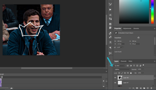
So now we place our doodle where we want it, make it whatever size we want, rotate it... and we're freaking done!
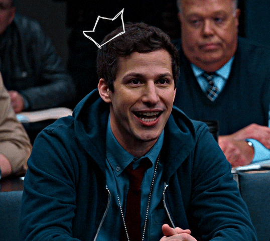
I hope at least half of this made sense akdhsk if you have any questions feel free to send an ask! 💙
#i kinda regret using a 4px brush aksjdhfk#uservivaldi#usernik#userelio#usershreyu#userng#userace#userrobin#userriel#userabs#userraffa#tuserheidi#tuservaleria#usercats#userpegs
561 notes
·
View notes
Text
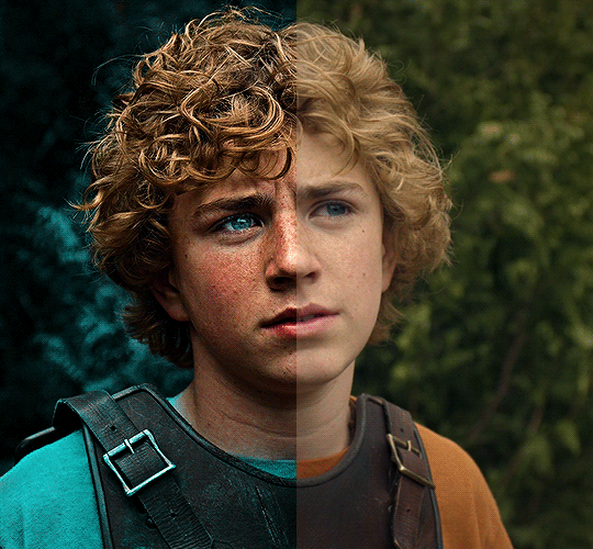
The silent art of gif making
The gif above has 32 layers plus 6 that aren't shown because this is part of a larger edit. I wanted to share it to give everyone a glimpse of the art of gif making and how long it usually takes for me to make something like this. This one took me about an hour and a half but only because I couldn't get the shade of blue right.
I use Adobe Photoshop 2021 and my computer doesn't have a large memory space (I don't know what to call it) so usually most of psds get deleted because I'm too lazy to get a hard drive. It doesn't really bother me that much because I like the art so when it's done, it's done. Off to somewhere else it goes.
Here are the layers:

Everything is neat and organized in folders because I like it that way. I prefer to edit it in timeline but others edit each frame. There's a layer not shown (Layer 4 is not visible) and it's the vector art. Here it is:
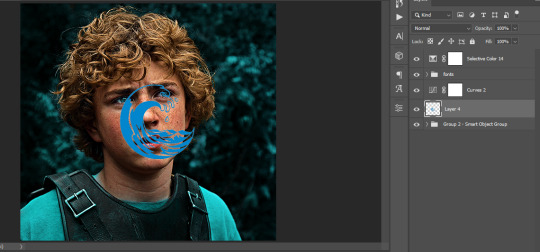
Now it is visible. I don't plan to make this a tutorial, but if you're interested I'd love to share a few tricks about it. I'm pretty new to the colors in gifmaking but the rest is simple to understand. Here, I just want to show how much work it takes to make it.
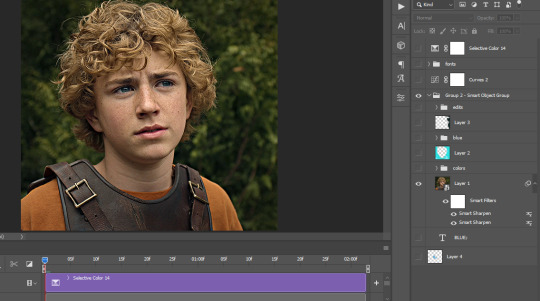
I opened Group 2 and here's the base gif. I already sharpened and sized it correctly but that's about it. Let's open the base coloring next.
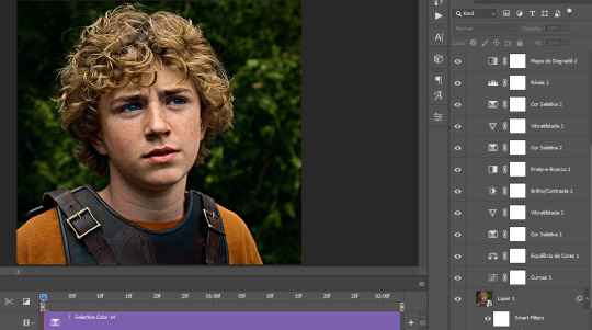
Yay! Now it looks pretty! The edits are in Portuguese but it doesn't matter. There's a silent art of adding layers depending on how you want the gif to look but you get used to it. The order matters and you can add multiple layers of the same thing (for eg. multiple layers of levels or curves or exposure).
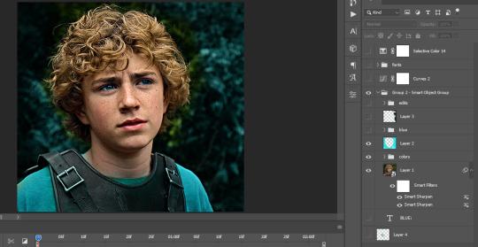
This was pretty much my first experiment with coloring so I don't know what I'm doing (this happens a lot with any art form but gifmaking exceeds in DIYing your way to the finished product) but I didn't want to mess up his hair, that's why the blue color is like that. Blue is easy to work with because there's little on the skin (different from red and yellow but that's color theory). I painted the layers like that and put it on screen, now let's correct how the rest looks.
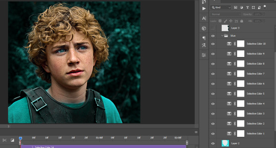
I was stuck trying to get the right teal shade of blue so yes, those are 10 layers of selective color mostly on cyan blue. We fixed his hair (yay!) we could've probably fixed the blue on his neck too but I was lazy. This is close to what I wanted so let's roll with that.
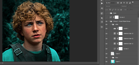
BUT I wanted his freckles to show, so let's edit a little bit more. Now his hair is more vibrant and his skin has red tones, which accentuates the blues and his eyes (exactly what I wanted!). That lost Layer 2 was me trying to fix some shadows in the background but in the end, it didn't make such a difference.
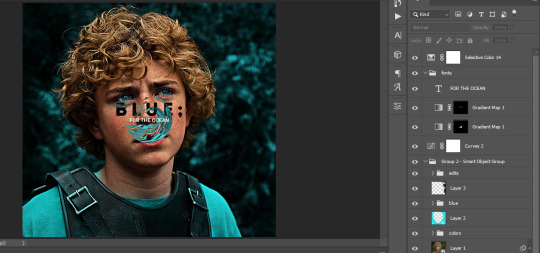
This was part of an edit, so let's add the graphics and also edit them so they're the right shade of blue and the correct size. A few gradient maps and a dozen font tests later, it appears to be done! Here it is:
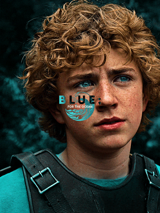
Please reblog gifsets on tumblr. We gifmakers really enjoy doing what we do (otherwise we wouldn't be here) but it takes so long, you wouldn't imagine. Tumblr is the main website used for gif making and honestly, we have nowhere to go but share our art here. This was only to show how long it takes but if you're new and want to get into the art of gif making, there are a lot of really cool resource blogs in here. And my ask box is always open! Sending gifmakers all my love.
#gif making#gif tutorial#resources#completeresources#y'know what that post yesterday got me into this#i love creativity so i send all my love to gifmakers#this is HARD#my tutorials#tutorials
251 notes
·
View notes
Text
How To: Auto Height for Shoes
Haiii! As promised, here is the tutorial to make it so your custom shoes no longer require a shoe slider!
Thank you to the bestie who took the time to pick through Madlen's package file to figure out how it worked. And of course, thank you to Madlen who did the majority of the work figuring out how to make this possible in the first place!
♥ Tut below cut ♥
~~~
Set Up Your Blend File:
We're going to add a plane that will act as the mesh for the SlotRay which will allow for you to adjust the height of your shoes!
Open your blend file that contains the shoes your wish to adjust.
In the 3D View, press Shift + S and in the menu, select “Cursor to Center” In the 3D View, press Shift + A and in the menu, hover over “Mesh” then add a plane.
Now size this plane down as small as you can get it. You don’t want this plane visible in game.
Double check to make sure the plane has not moved from the center!! Your sim won't be centered in game if it has! If you see that it's moved:
Press "Shift + S" and click "Cursor to Center".
Then Select your plane and press "Ctrl + Shift + Alt + C", click "Origin to 3D Cursor".
Press "Ctrl + Shift + Alt + C" again and click "Geometry to Origin".
Navigate to the “Object data” tab and under “UV Maps” add a new one then name it “uv_0”.
Next, navigate to the “Scene” tab and under “S4Studio CAS Tools” set the cut number.
Depending on how many cuts your shoes have, you’ll want to adjust this number. For example, if your shoe has 3 cuts (0000, 0001, 0002) then this plane would have a cut number of 0003.
Since my boots only have one cut, I will put the number as 0001.
Now select your shoes and enter Edit mode. Select a face/vertice/edge on the very bottom of your shoes. Look to the panel on the left side of the screen (if it’s not open, press “N”). Under “Transform”, note down the number next to “Z”
After that, save your blend file under another name so you can distinguish which is which. I’ll name mine “Boots_3_Height Cut”
youtube
~~~
Add a New Cut to your Package File:
We're going to add an additional cut in your package file for the new plane!
Open Sims 4 Studio, make a new package file for your shoes and import them.
Go to the Warehouse tab and select your LOD 0, it will be the geometry with the largest file size. Sometimes you have to close then reopen the package to see the geometry.
Duplicate this geometry and in the box that pops up, change the last character of the “Group”. It can be any number or letter as long as it’s not the same as the duplicated geometry. On the duplicated geometry, note down the Group, Instance & Type values.
Find the “Region Map” and next to “Entries” click “Edit Items”. Add a new entry and in the “Layer” box, type the number you used for your cut. Since I used the cut number 0001, I will type 1.
Keep the “Region Type” as “Base” and move to “Models” then click “Edit Items”. Add a new Model entry and paste the Group, Instance & Type values you noted down before. Save and close each box.
Find your “CAS Part”, this is your swatch.
If you have additional swatches, it is a good idea to remove them and add them back once you are finished with this process.
Scroll down until you find the “Lods”.
Click “Level: 0” and next to "LOD Models", click “Edit Items”. Add a new entry and paste the Group, Instance & Type values again.
Save & close each window and return to the Warehouse.
youtube
~~~
Adjusting SlotRays:
We are now going to edit the SlotRays for the new cut which will adjust the height of the sim for your shoes!
Return to the new duplicated Geometry and in the “Data” tab, find the “SlotRay Intersections” and click “Edit Items”. Add a new entry and find the “OffsetFromIntersectionsOs” box.
You'll want to change ONLY the middle coordinate number. That will be the height of the sim.
You want to take the “Z” coordinate that you noted down from blender and replace middle coordinate number. If the number you wrote down is negative (i.e -0.01234) make it positive (i.e 0.01234).
In the “SlotHash” box, change the value from “00000000” to “FEAE6981”. This is the hash for the b__ROOT__ bone in the Sim's Rig.
Save and close the dialogs then return to the warehouse. Next, reimport your mesh and save your package file. You can now test your shoes in game!
youtube
Please keep in mind:
You have to do this for every LOD of your mesh
You can freely replace the mesh of your shoes and adjust the height since the cut with the plane has the SlotRay data
Animations may be off since EA hasn't made the game to support taller sims
CAS windows may move slightly if your sim is using poses/animations where they are leaning to the side. This won't affect gameplay
I recommend using Helgatisha's Stand Still in CAS mod to make sure your sim is absolutely centered
Hope this helped :)
1K notes
·
View notes
Note
hi!! would you mind doing a tutorial on how you add subtitles to your gifs?
hey, sure! :)
with the text tool selected, i will draw a box that is as wide as the gif and type my text. i created an action that selects all the right settings for me so it's faster and my subtitles always look the same.
arial rounded bold is a very popular choice for subtitles, and it looks awesome, but i' always've been using the font calibri bold italic for years now. here are my usual settings for a 540px wide gif:

i usually keep the font size and leading value the same, if i change it from 18 pt. and sometimes i'll play around with the anti-aliasing method, whatever looks best for this particular gif. this will help make your text look less crispy or soft, depending on which filtering method you use. the other settings i pretty much always leave like that for subtitles.
as for colors, i always go with white first, and if there's another character talking, i will give their subtitles a different color. i usually try to pick a bright pastel color found in the gif, or even on the character's clothing (just because i like to match things haha).
it's also important to leave a bit of a gap on the sides and bottom, so the text doesn't go all the way to the edges (as shown in the next example). it's definitely harder to read text if it's too close together, or goes from edge to edge. you can push words on another line if it becomes too close to the edge, and you can nudge the text from the bottom with the arrow keys.
as for the layer style, i'm adding a black stroke and black drop shadow (by double clicking the text layer). the stroke almost never changes, but i'll edit the drop shadow accordingly with the gif. if it's a very busy gif, the drop shadow should be thicker to help with visibility.
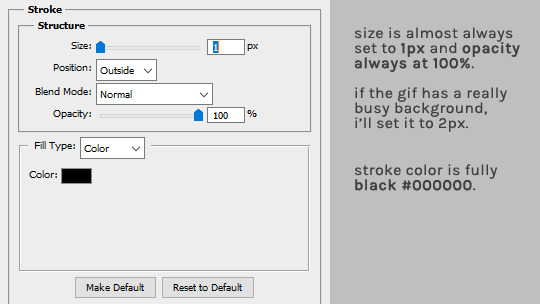
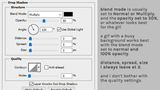
and that's it! :D
#alie replies#Anonymous#tutorial#photoshop#resource#*ps help#subtitles#giffing#resourcemarket#completeresources#allresources#usercats#userabs#idk who else to tag
265 notes
·
View notes
Last Seen Blogs
ladbrokegaseng
Ladbrokegrove Gas Engineers
stephystripes
Horizon

spicemlove
• 🎹🎤🎷 •

cagarito
Sin título
tillytillytilda
TillyTillyTilda