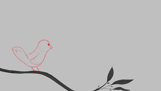
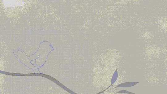
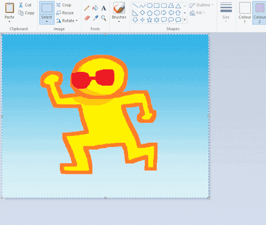
#gif tutorial*
Text
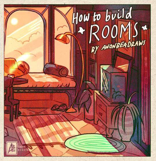
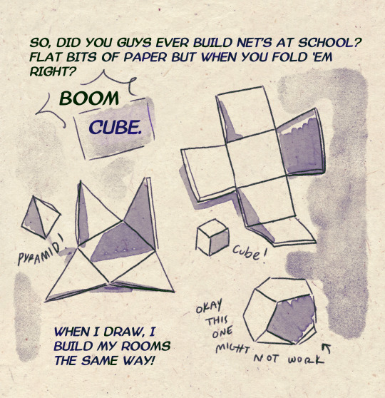
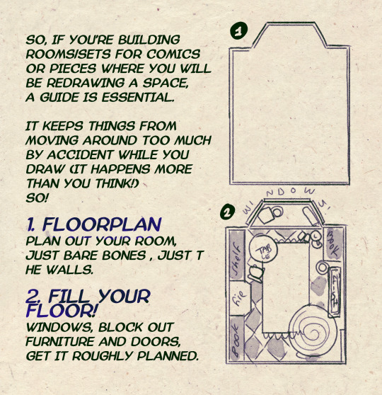
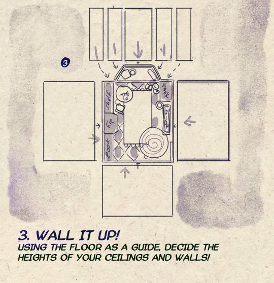
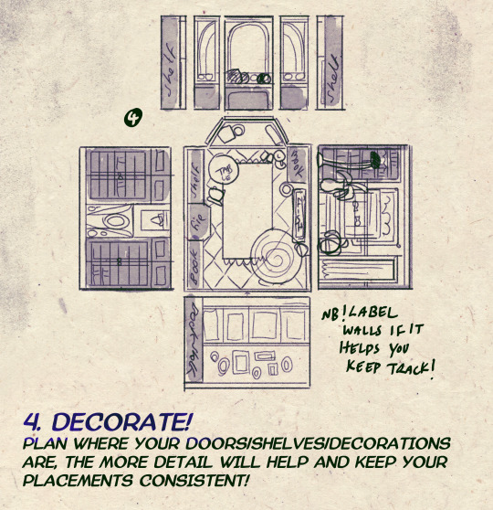
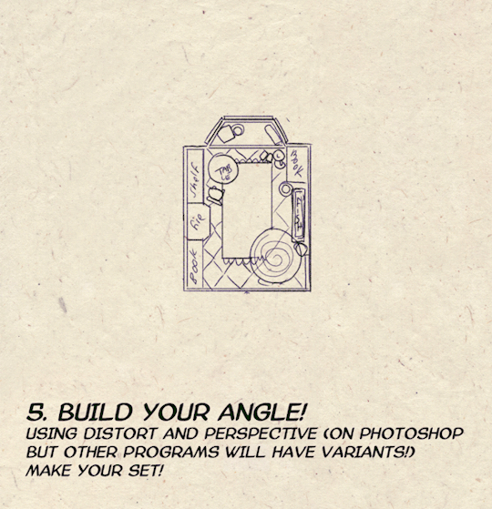
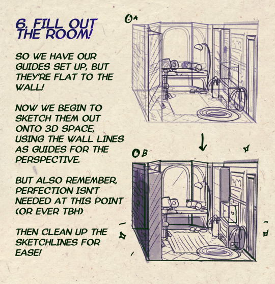

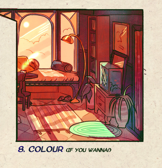
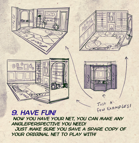
I made a Room Building tutorial! Lemme know if it helps! 🧡
Tip me here| Commission info here!
#anonbeadraws#digital#art tutorial#tutorial#room building#room design#illustration#gif#digital art#digital tutorial#art help#art resource#let me know if it helps!#tried to make it as simple as I could
35K notes
·
View notes
Text
🎮 HEY I WANNA MAKE A GAME! 🎮
Yeah I getcha. I was once like you. Pure and naive. Great news. I AM STILL PURE AND NAIVE, GAME DEV IS FUN! But where to start?
To start, here are a couple of entry level softwares you can use! source: I just made a game called In Stars and Time and people are asking me how to start making vidy gaems. Now, without further ado:
SOFTWARES AND ENGINES FOR PEOPLE WHO DON'T KNOW HOW TO CODE!!!
Ren'py (and also a link to it if you click here do it):
THE visual novel software. Comic artists, look no further
✨Pros: It's free! It's simple! It has great documentation! It has a bunch of plugins and UI stuff and assets for you to buy! It can be used even if you have LITERALLY no programming experience! (You'll just need to read the doc a bunch) You can also port your game to a BUNCH of consoles!
✨Cons: None really <3
Some games to look at: Doki Doki Literature Club, Bad End Theater, Butterfly Soup
Twine:
Great for text-based games! GREAT FOR WRITERS WHO DONT WANNA DRAW!!!!!!!!! (but you can draw if you want)
✨Pros: It's free! It's simple! It's versatile! It has great documentation! It can be used even if you have LITERALLY no programming experience! (You'll just need to read the doc a bunch)
✨Cons: You can add pictures, but it's a pain.
Some games to look at: The Uncle Who Works For Nintendo, Queers In love At The End of The World, Escape Velocity

Bitsy:
Little topdown games!
✨Pros: It's free! It's simple! It's (somewhat) intuitive! It has great documentation! It can be used even if you have LITERALLY no programming experience! You can make everything in it, from text to sprites to code! Those games sure are small!
✨Cons: Those games sure are small. This is to make THE simplest game. Barely any animation for your sprites, can barely fit a line of text in there. But honestly, the restrictions are refreshing!
Some games to look at: honestly I haven't played that many bitsy games because i am a fake gamer. The picture above is from Under A Star Called Sun though and that looks so pretty
RPGMaker:
To make RPGs! LIKE ME!!!!!
NOTE: I recommend getting the latest version if you can, but all have their pros and cons. You can get a better idea by looking at this post.
✨Pros: Literally everything you need to make an RPG. Has a tutorial inside the software itself that will teach you the basics. Pretty simple to understand, even if you have no coding experience! Also I made a post helping you out with RPGMaker right here!
✨Cons: Some stuff can be hard to figure out. Also, the latest version is expensive. Get it on sale!
Some games to look at: Yume Nikki, Hylics, In Stars and Time (hehe. I made it)
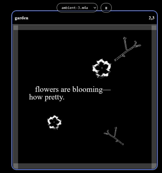
engine.lol:
collage worlds! it is relatively new so I don't know much about it, but it seems fascinating. picture is from Garden!
NOTE: There's a bunch of smaller engines to find out there. Just yesterday I found out there's an Idle Game Maker made by the Cookie Clicker creator. Isn't life wonderful?
✨more advice under the cut. this is Long ok✨
ENGINES I KNOW NOTHING ABOUT AND THEY SEEM HARD BUT ALSO GIVE IT A TRY I GUESS!!!! :
Unity and Unreal: I don't know anything about those! That looks hard to learn! But indie devs use them! It seems expensive! Follow your dreams though! Don't ask me how!
GameMaker: Wuh I just don't know anything about it either! I just know it's now free if your game is non-commercial (aka, you're not selling it), and Undertale was made on it! It seems good! You probably need some coding experience though!!!
Godot: Man I know even less about this one. Heard good things though!
BUNCHA RANDOM ADVICE!!!!
-Make something small first! Try making simple: a character is in a room, and exits the room. The character can look around, decide to take an item with them, can leave, and maybe the door is locked and you have to find the key. Figuring out how to code something like that, whether it is as a fully text-based game or as an RPGMaker map, should be a good start to figure out how your software of choice works!
-After that, if you have an idea, try first to make the simplest version of that idea. For my timeloop RPG, my simplest version was two rooms: first room you can walk in, second room with the King, where a cutscene automatically plays and the battle starts, you immediately die, and loop back to the first room, with the text from this point on reflecting this change. I think I also added a loop counter. This helped me figure out the most important thing: Can This Game Be Made? After that, the rest is just fun stuff.
So if you want to make a dating sim, try and figure out how to add choices, and how to have affection points go up and down depending on your choices! If you want to make a platformer, figure out how to make your character move and jump and how to create a simple level! If you just want to make a kinetic visual novel with no choices, figure out how to add text, and how to add portraits! You'll be surprised at how powerful you'll feel after having figured even those simple things out.
-If you have a programming problem or just get confused, never underestimate the power of asking Google! You most likely won't be the only person asking this question, and you will learn some useful tips! If you are powerful enough, you can even… Ask people??? On forums??? Not me though.
-Yeah I know you probably want to make Your Big Idea RIGHT NOW but please. Make a smaller prototype first. You need to get that experience. Trust me.
-If you are not a womanthing of many skills like me, you might realize you need help. Maybe you need an artist, or a programmer. So! Game jams on itch.io are a great way to get to work and meet other game devs that have different strengths! Or ask around! Maybe your artist friend secretly always wanted to draw for a game. Ask! Collaborate! Have fun!!!
I hope that was useful! If it was. Maybe. You'd like to buy me a coffee. Or maybe you could check out my comics and games. Or just my new critically acclaimed game In Stars and Time. If you want. Ok bye
#reference#gamedev#indie dev#game dev#tutorial#video game#ACTUAL GAME DEVS DO NOT INTERACT!!!1!!!!!#this is for people who are afraid of coding. do not come at me and say 'actually godot is easy if you just--' I JUST WILL NOT.#long post
27K notes
·
View notes
Photo

A little tutorial about how to draw pecs!
Many asked me in the past so I hope it can help many!
32K notes
·
View notes
Text

how 2 cloud
1K notes
·
View notes
Text

Process for fem-drow!
A lot of people ask for stuff like this, but the issue is that I change up my coloring a lot depending on necessity since I'm still figuring out what I like :v This one was fairly straightforward though, and so a perfect candidate for that.
Shadows are some de-saturated shade in multiply mode that I usually tweak the hue of until arriving at whatever looks nicer for the final piece. I always put a layer of solid color over the whole thing in either hard-light or overlay mode to "harmonize" everything and add a highlight of a similar shade. For DU drow specifically, his skin's reflective color (usually blue) is done in overlay mode most of the time.
I went straight from rough-sketch to linework in this one but I usually do two sketches.
705 notes
·
View notes
Note
Hii I saw your bertie and jeeves portraits and I was wondering how you made your colors not look "blocky" or patchy even if you layer/use opaque paint? I guess, how do you know what transition colors to use? Sorry, I'm self taught and still learning! Thanks in advance and I love your art 💕
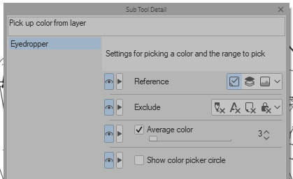
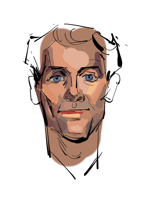
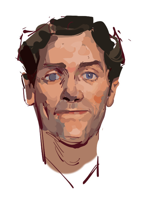
Ah You're lucky i actually have the progress shots of one of those heads. The only real thing i do is have "Average colour" selected on my colour picker tool so after i lay down all the rough blocks i can just select between them and start to create the faux gradient

you can also see how i still add colours throughout the process like the red to bertie's cheek but after a point it just becomes refinement. i try not to use small brushes to shape the gradients until im close to the end which is where most of the "blending" happens.
2K notes
·
View notes
Text
Tutorial: How to Embed Gifs (and get the one you actually want from the set)
There have probably been posts about this before, but since reposting is still a (deeply unfortunate) thing, I figured I'd give this a shot in case it's not a well known trick.
The tumblr Gif tool will allow you to embed gifs directly into your post without saving and re-uploading (reposting) someone else's work.
When you're building your post, just use the yellow GIF icon in the post builder:

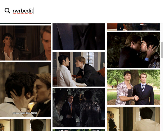
You can search here by tag or keyword. If you happen to know one of the tags used on the original post you're looking for, that can narrow things down:
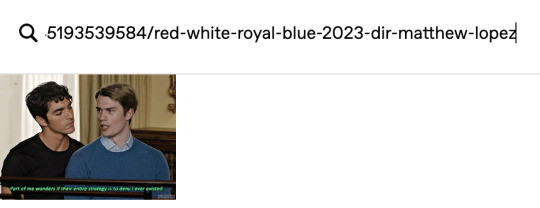
To narrow down to a SPECIFIC post, you can also paste the URL into the search field. This will pull up the very first gif in that set:
If you select that gif, it will pop into your post with a credit and link back to the OP (specifically back to the OPs post with that gif in it):
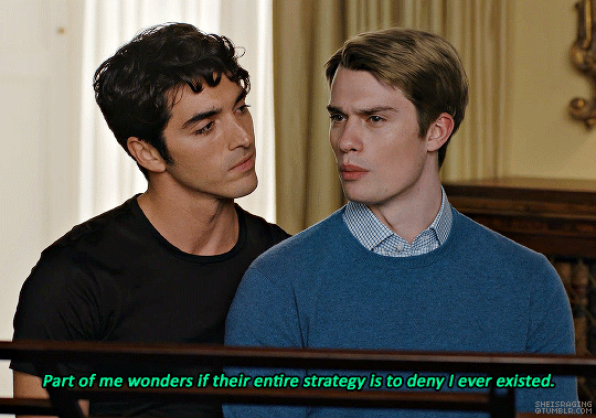
This is a properly attributed gif embed. The credit on the bottom right points back to the original post:*
Often, the first gif is not actually the one you want to embed, but there is a way to swap the image out for the one you want without losing the source attribution.
*It's helpful to put some reference text near your initial embed so you're able to swap the right image out later on. For this post, I'm going to use that short block right above the embedded gif as a reference.
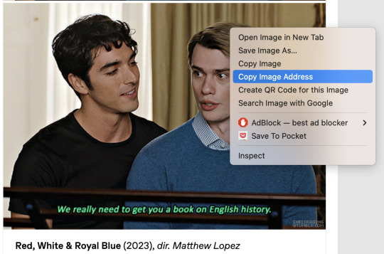
In another tab/window, go to the OPs post and find the actual gif you want to embed from their set. Right click the image and Copy Image Address:
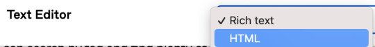
Once you have the URL copied, go back to your post and scroll to the gear icon at the top:

Open that menu and in the dropdown, where it says Text Editor, swap Rich Text to HTML:
Your post will turn into a bunch of code once you do this. Don't worry, we will change it back.
For this post, I put reference text above that first embedded gif so I could easily find the URLs I need once it becomes HTML. This is super helpful if you're embedding more than one gif. The reference text is highlighted below. This indicated the block that my currently embedded gif lives in:
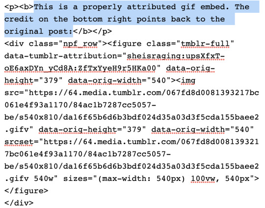
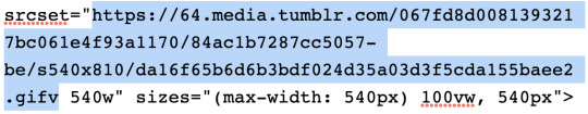
In order to swap the first gif out for one that's later in the set, you just need to replace the SRC gifv and SRCSET gifv URLs with the image address you copied:
Once you've pasted the image address into these spots, you can go back to the gear icon and switch the Text Editor back to Rich Text:
Your post should return to it's previous, glorious state, but instead of the first gif embedded, you should now see the one you actually want from the set. The credit and source attribution back to the OPs post should remain intact on the bottom right:

This might seem super complicated at first, but it's pretty straightforward once you've tried it, and also a lot less frustrating for gif makers to see this than seeing our stuff just get reposted.
Anyway... If you found the gifs outside of tumblr or you didn't make them yourself, don't save and re-upload (aka. repost) them to tumblr, 'cause someone probably stole them from here to begin with and that's not cool. Search the tags and find the ones you want. Reblog from gif makers. If you want to embed a single gif from a set, try to do it this way, or minimally, credit the person you took it from.
#tutorial#how to properly embed gifs#support gif makers#credit gif makers#rogerhealey#userbess#userhallie#userlolli
2K notes
·
View notes
Text

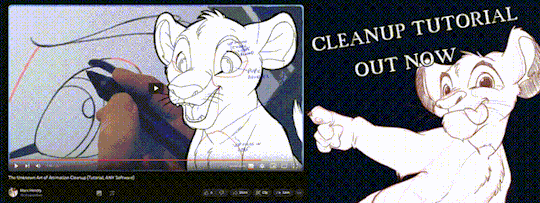
'ello folks, my Cleanup tutorial is finally done and out!
hope you find it useful
#Animation#Tutorial#Advice#Lesson#The Lion King#simba#animation#Disney#character design#how to#2D#traditional animation#frame by frame#Adobe#Photoshop#Animate#Flash#After Effects#Premiere#Video#Film#Drawing#Tips#Gestures#cleanup#lines#krita#toon boom#procreate#tvpaint
1K notes
·
View notes
Text

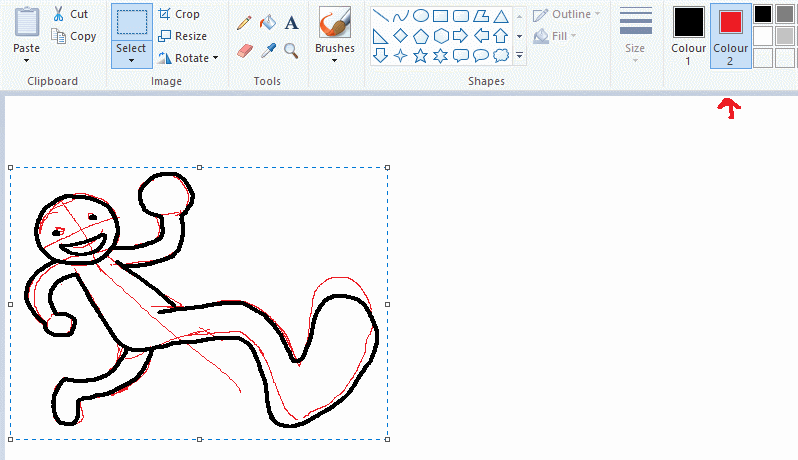
ms paint. you know her. u used her age 8 to make loads of rainbow ovals all over the canvas and then scramble it with selection tool. now u will know her true powers with my handyrandy tips under the readmore. some will be pretty basic and others are very special.
this post has 8 cool trix to learn for you. enjoy and i may do another in the future if i remember/learn more stuff
some of it might be common knowledge. but its got some deep cuts. all tips have gifs to show process easily.
🙂 enjoy and i hope this encourages you to fuck around in mspaint more
soundtrack for this post (loop it while you learn for advanced learning experience)
TIP 1) the right click trick
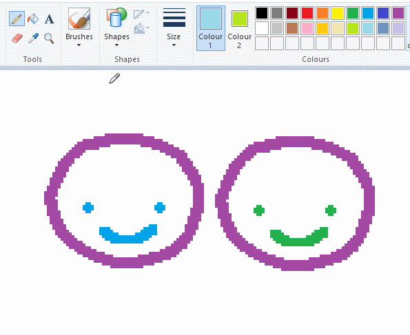
left and right mouse click correspond to col1 and col2 respectively, which u can see in the top bar. this applies to all brushes and the fill tool like above. when using shapes col2 will be the fill colour (if you have solid fill selected). right clicking with shape maker will reverse the colours use on the shape.
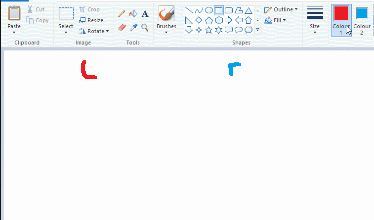
TIP 2) right click eraser
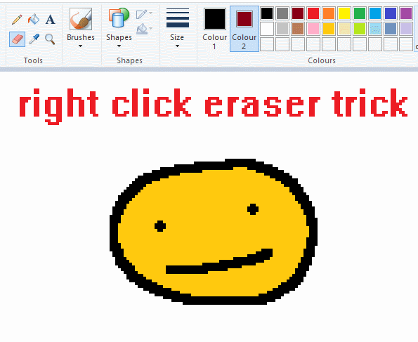
this one is extremely helpful for lineart or add shading. the eraser always uses col2. so your eraser can technically be any colour. but here's where you get powers: right clicking with eraser will only erase onto col1, with col2.
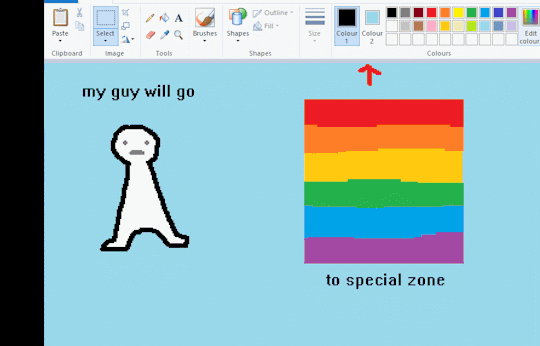
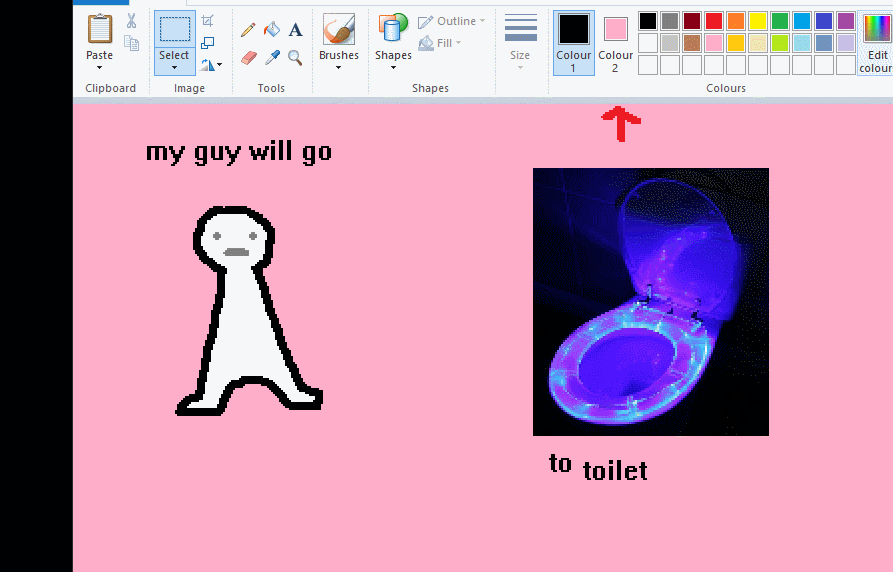
TIP 3) transparent selection change a guy destination
the beloved transparent selection tool works based on what is selected as col2. so long as you have the correct colour as col2 you can make any image transparent and put it on top of anything else. and yes this works with photo bg as you can see.
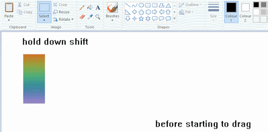
TIP 4) the gradience
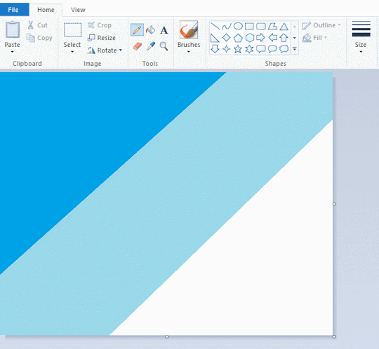
this one is a little more complex. you want to start off with any canvas size, and make as many diagonal coloured bands as you want. (protip: holding down shift makes a perfectly diagonal line with line tool)
then you need to resize the canvas to a width of 1px (make sure you resize by pixels, and do not maintain aspect ratio). then resize again back to its original width (or a different width i cant stop you). you will have your lovely gradience.
TIP 5) superimposter

so. you got a cool gradient and wanna put a guy on it. heres what i do:
i open a 2nd mspaint with same canvas size and draw whatever i want on there. i then pick a completely unrelated colour to my entire piece, and set that as the bg. you could use white, pink, geen, whatever you want as long as it doesnt appear somewhere else in ur drawing. copy the guy.
go back to your gradient tab. ensure that col2 is set as that bg colour you picked (lilac for me). have "transparent selection" enabled. paste your guy in. cue fanfare
TIP 6) advanced superimposter
the great thing about this method is u can put multiple gradients in multiple areas of the image. this is where it gets all japanese printmaking type of shit. ukiyo-esque
all you need to do is make another canvas with a new gradient, ensure col2 is set as the colour you want to replace, then paste your original piece onto the new gradient. now my guy has a soft fade. you can do this as much as you want. (you could even make a canvas with a texture or photo and paste your drawing onto there)
TIP 7) "sketch layer"
so as you now know, col2 is what is removed when you click "transparent selection". which means you can also remove any instance of a colour from ur drawing. which means you can have a unique colour for sketch layer and remove it from the drawing later. i admittedly dont do this but it is a great trick to have.
now combine this with lowering your dpi for smoother lines. may seem obvious but it helps. its like a free stabiliser whenever u want.
TIP 8) rainbow art
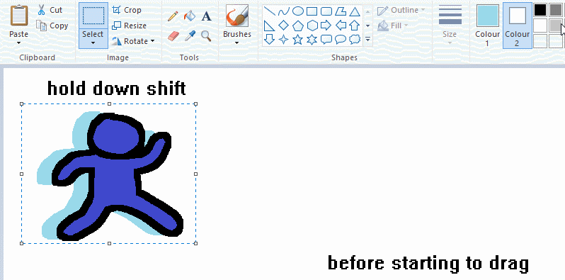
now this is where you can get dizzee rascal "bonkers". check out my small and shitty rainbow trick. you can select anything and hold down shift, then drag with left mouse, to turn that selection into its own brush. i even did it with a guy. and you can of course do this with a photo as well.
🙂well that it for now. hope you liked it thanks for reading now back to your regularly scheduled tgcg programming
2K notes
·
View notes
Note
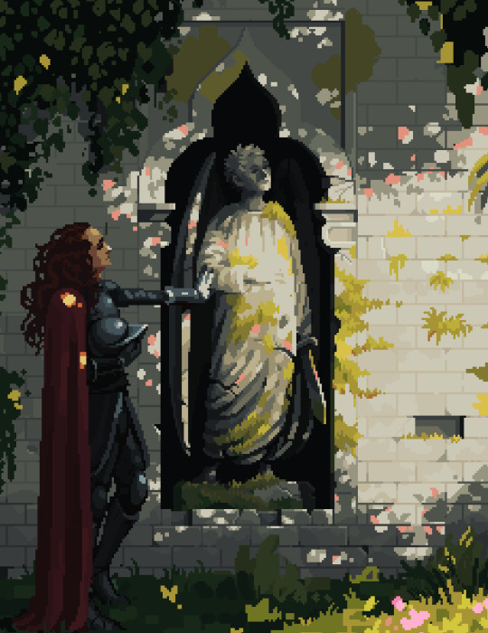
Do you have any advice on how to get into pixeling larger scenes, or how you go about the process? I dabble in pixel art occasionally and am interested in pursuing it more, but whenever I try large scenes I always tend to fall flat
Love your art, by the way!
thank you!
my first step i always go get a ton of references. i think if you are struggling with pixel scenes it can help you to get some pixel art references too. for example if you arent sure how to render a tree, look it up on pixeljoint hall of fame im sure you can find something that inspires you.

this is the moodboard for my current knight crowley/statue azi piece im working on (software is called pureref btw. i have a dedicated monitor just for this but you can do transparency and overlay it if you lack space)
i think this is mostly preference but i always begin working with large areas of value/colour rather than an actual line sketch
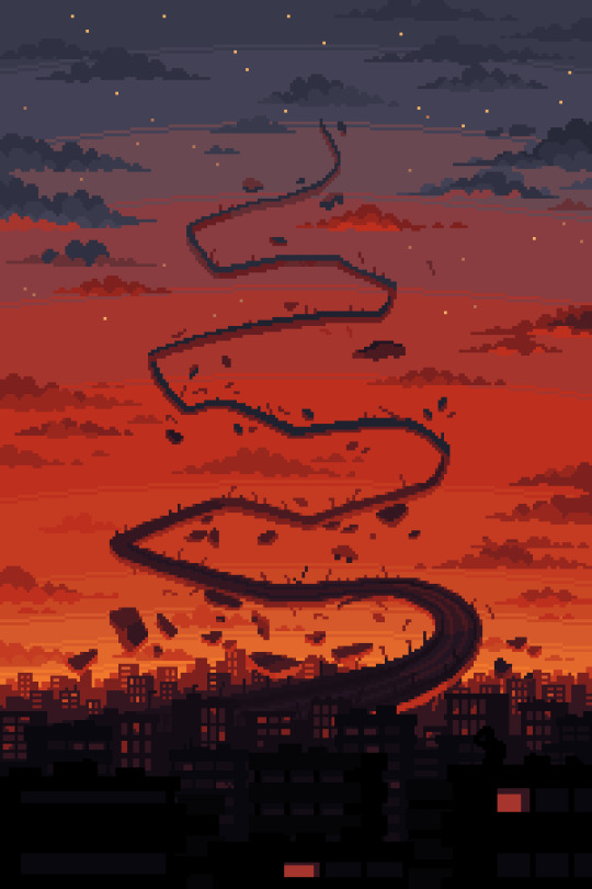
i usually only save the wip process if im sending it to clients, so here is an example of how i worked through a commission

at this point im just going for the vibes. colour is more important and shape/size and having random pixels everywhere doesnt matter cos u can just remove them later !!
its kind of an anomaly/doomsday thing so i wanted the red sky and chaos all over
i work really quickly at this point and try for energy

just beginning to work my way through and detail things up. im still changing things around and adding more stuff in different places. its digital art so you can change things however you like, just keep moving forward
final ver sent to client after some revisions. pixel art is 99% rendering so you just need to keep pushing forward
i also want to say i did like 3+ years of sporadic studies. mostly studio ghibli and shishkin. if you have someone who inspires you you can study their work and figure out how they do it.
it cant be overstated how many of these i have done lol and im still not even close to where i want to be (its a process)
anyway sorry for the long post but you really should go for it. ive done the same concept like 3 times over my career (so far) cos i enjoyed it and want to come back to it now that im a little better. so u dont have to make it perfect the first time but doing it is better than not doing it!
sorry for the long post but i kinda got carried away anyway lmk if u want more specific tips i like talking about pixel art :--3 GL with your art
411 notes
·
View notes
Text
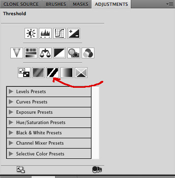
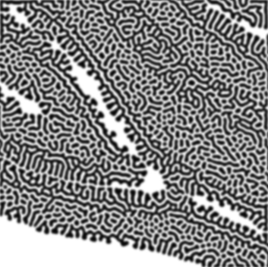
how to make cool blobby turing patterns in photoshop
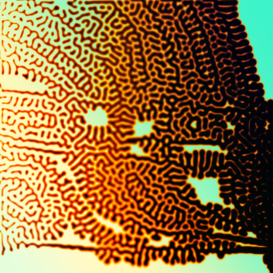
i'll preface with i learned the basic loop from skimming a tutorial on youtube, but as someone who prefers written tutorials i'm sure many would appreciate one! also, the second part of this is some of the visual effects i figured out on my own using blending modes and stuff.
i'm using photoshop CS4 on a mac so some buttons and stuff might be in different places on windows and newer photoshop versions but all the actions are the same. my canvas is 1000x1000 pixels.
UPDATES (i'm hoping these'll show up whenever you open the readmore?)
it's possible to do something similar in krita using this plugin, made by the love @arcaedex
it's also possible to do this in photopea, a free browser alternative to photoshop! the results are pretty much identical.
FIRST off you wanna get or make a black and white image of some kind. it has to be one layer. can be noise, a photo, a bunch of lines, whatever. here's mine, just some quick airbrush lines:

now find the actions tab. idk what it looks like in newer versions of photoshop but you probably won't need to dig!
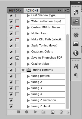
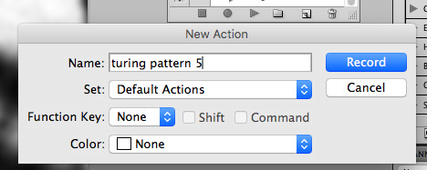
hit the little page thingy to make a new pattern. once you hit 'record', it'll record everything you do. the little square 'stop' icon will end it.
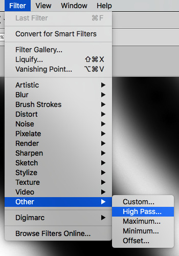
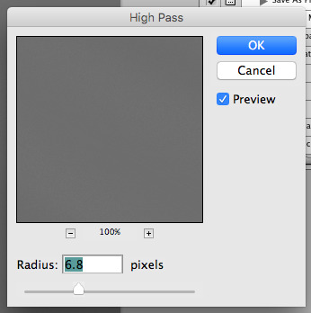
now you want to do a high pass filter. you can mess around with the radius to change the size of your squiggles, but the tutorial had it set to 6. experiment!
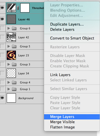
now add the 'threshold' adjustment layer. i use the adjustments tab but i think there's also a dropdown menu somewhere. keep it at the default, 128. merge it down. (control or command + E or you can right click it like some kind of weirdo)
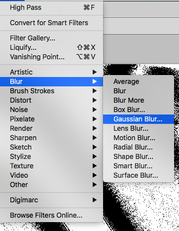
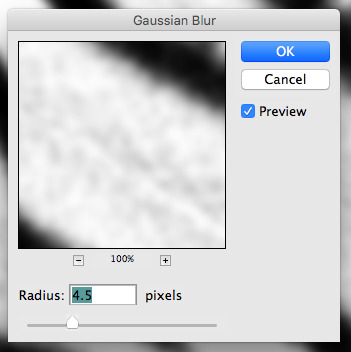
and finally, the gaussian blur! the radius of this affects the shape and size of your squiggles as well. i like to keep it around 4.5 but you can mess around with that too.
after that, hit 'stop' on the action you're recording, and then repeat it a bunch of times using the 'play' button, until you have something you like, like this:
WOW!! that was fun!! and only a little tedious thanks to the power of macros. anyway, here's some fun layer blending stuff i like to do. it's with a different pattern cause i made this bit first.
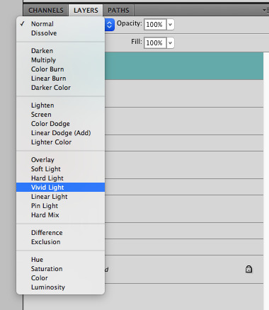
anyway, using a black and white gradient (or a grey base that you do black and white airbrush on), make a layer with the vivid light. this will make the blobs look thicker or thinner.
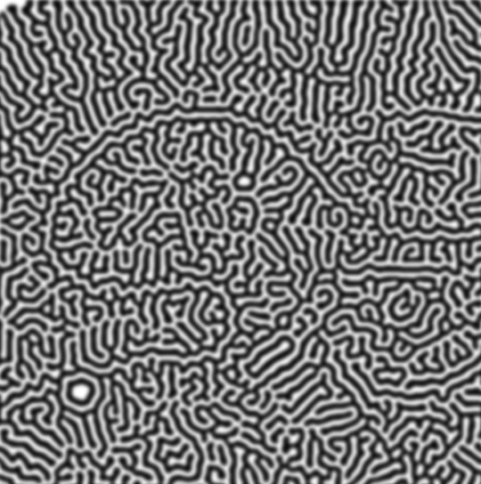


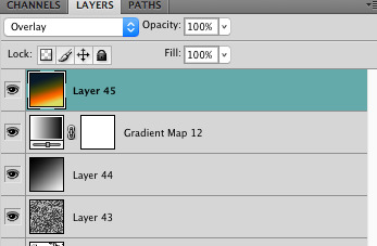
then, for cool colors, do a gradient map adjustment layer over that:

and finally, my best friend, the overlay layer. just using a gradient here bc i'm lazy, but feel free to experiment with brushes, colors, and blending modes!

NOW GO. MAKE COOL SHIT WITH THE POWER OF MATH. AND SEND IT TO ME
also these are not hard and fast rules PLEASE mess around with them to see what kind of weird shit you can make. here's a gif. as you can see i added some random airblush blobs in the middle of it, for fun.
924 notes
·
View notes
Note
I just wanted to say I think your art style is awesome! I was wondering if you had any tutorials on how you draw anatomy in your style (hips and legs especially)? Sorry if there's already one posted and I just didn't see it 🥲. Happy New Year :>
thanks for the kind words. i tend to draw people pretty stylized and then some so a good bit of artistic licence gets used. these tips are just what i use so feel free to take them with a grain of salt. with anatomy in particular you can kind of talk in circles because human/animal bodies are that complex so ill just zone in on the points you specified. here's a little image with a bunch of pointers:

the above image condenses a lot of the points I'd make, but basically the key parts are to start with the bare essentials and build up that complexity. using a line of action is a good way to get a quick, rough start. you draw a line out in the general direction of the pose and do your best to adhere to it to give the pose a sense of flow.
you can also draw smaller, thumbnail versions that throw a lot of caution to the wind but capture the basic energy of what you're going for. even having a tiny little stick figure version of your idea can make for a good guideline of where to take it forward.
when it comes to actual limbs, you wanna consider how they integrate and work together, kind of like how chains do. you can see on some of the parts of pear i've drawn out these wireframes to kind of portray how the mass of her legs works in a three dimensional space. for aspects like the waist/hips, i use that X technique i highlight above a lot, particularly for the lower torso. a lot of the times, even when drawing a character totally naked, imagining them wearing things like skintight underwear can help a lot to guide you in the right direction.
its also a good idea to consider things like gravity and weight to a degree. humans are essentially big meat sacks and gravity is always pulling down on that, but theres all kinds of aspects that effect that, such as character build or clothing. pear technically isn't naked in this, but i've tried to imagine her as such and take that into account.
if you are drawing digitally, don't be afraid to take advantage of the convenience you get with that workflow. you can retry and iterate on things a lot faster that pen and paper, and do things that aren't really feasible at all when it comes to editing and modifying your existing work. things like resizing certain bodyparts, instantly flipping the canvas, or using selection tools to completely adjust the positions of parts of your drawing. to give you an example heres a timelapse with all the little edits i made just to this demo drawing:

you don't have to use these techniques linearly, either. sometimes ill have a really solid idea for a piece in my head, and go back to basics with certain elements if they’re not coming out right or i just want to brush them up a bit more. some of the tutorial-y parts i added in i didn't actually use during the drawing but often do use so they're there just for demonstration. not every drawing i do starts as building blocks or a really basic version, often ill just start with a face and build it out from there.
i always encourage liberally using references (this can include yourself) and trying out stuff like life drawing or looking at things like existing photographs of real people/places/things if you can, the more you use learning material the better you'll draw up a mental inventory in your head that you can rely on more and more. some of these tips are things i've learned from other artists over the years (the chin one especially i remember seeing a tutorial about lol), so this is a lot of knowledge i've amassed from other sources over time myself. there are plenty of times ill use all sorts of reference material and its all in service of arriving at the final destination as smoothly as possible. learn by doing, as they say. hope this helps!
540 notes
·
View notes
Note
Hi! Can I ask how you did the double exposure gifs for your merlin set? They're beautiful btw!
heyy, thank you!! of course!
it's actually not very hard, the trick is to find the right shots for this. here's how i did it (reference gifset), under the cut.

for this tutorial i will be:
— using photoshop cs5 on windows
— assuming you know how to make gifs using the timeline
— have basic coloring, sharpening, groups, and layer masks knowledge
I. CHOOSING THE RIGHT SHOTS
the ultimate trick to pull this off is to choose the right image. in order to do the double exposure, you need a silhouette shot that has these:
a defined and dark silhouette with a background that is not too busy
enough contrast between the silhouette and the background
the silhouette should take at least 50% of the space
not too much movement
here are a few examples of why they work and why they won't:
gwen: perfect example since this shot is already quite contrasted with a defined silhouette. there won't be a lot of work needed to make this one work.
merlin: not a great example because even tho there's a somewhat good contrast between him and the background, the silhouette is just too bright, not dark enough.
arthur: another good example, even if there are some bright spots on his face and armor. since he's not moving too much, you can definitely brush some black over him to make his silhouette darker (i'll explain/show later)
morgana: this one could work because the contrast is great, but of course her skintone is very bright against the black clothing. that being said, since the movement is not too bad, it could be possible to brush some black over her and move these layers with keyframes (as mentioned for arthur's example). i haven't tried it tho, but i think it would work well enough.
once you have your silhouette shot, you need another gif for the double exposure. what works best, in my opinion, are:
wide, large shots
shots with no to little camera movement (no pan, zoom, etc), but the subjects in the shot can have little movement of course
pretty cinematography/scenery shots
i find these are easier to find and make it work, it's not as "precise" as with silhouette shots. it's mostly just trial and error to see what works best with the silhouettes.
II. PREPPING THE SILHOUETTE
for the effect to work, we want a silhouette that's dark as possible. i'm gonna use the gwen and arthur shots as examples.
for the gwen gif, i started by sharpening, and then upped the contrast by quite a lot so her silhouette is mostly black, while retaining some nice details. i've used only 3 layers here:

selective color layer: in the blacks tab, playing with the black slider (value: +10)
brightness/contrast layer: added a lot of contrast (+61) and a bit of brightness (+10)
black and white layer: on top, its blending mode set to soft light and at 20% opacity. gives a bit more depth and contrast

then for the arthur example, i've also sharpened it first, and added contrast layers in this order (the skintone looks horrible, but it won't matter soon lol):
levels layer: black slider at 0, grey slider at 0.76, white slider at 104
selective color layer: in the blacks tab, black slider at +10
brightness/contrast layer: brightness at +1-, contrast at +47
black and white layer: on top, its blending mode set to soft light and at 20% opacity. gives a bit more depth and contrast
as you can see, half of his face is still quite bright. to correct that, create a new empty layer and put it between the gif and the coloring layers.
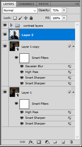
using a really soft brush and the black color, brush some black over his face and body on that new empty layer. you can edit the layer's opacity if you want, i've set mine to 71%. since arthur doesn't move much here, there's no need to keyframe this layer's position. for the morgana example, this is where you'd need to play with keyframes to make it work. here's where i'm at now after this:
you can always edit this layer later if you need, after doing the double exposure blending.
once the silhouette is all ready, you can put all layers in a group and rename it (i've renamed mine silhouette).
III. BLENDING
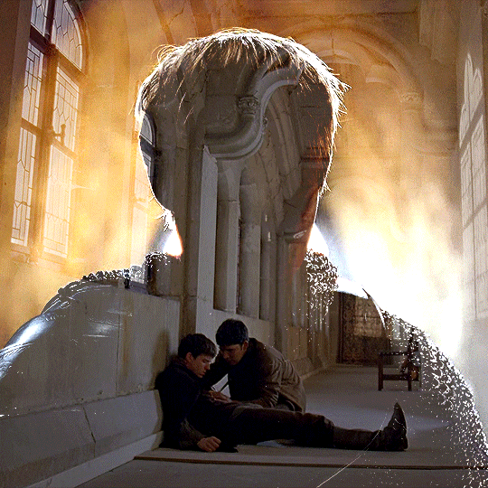
now the fun part! import the wide/scenery shot in photoshop, then resize it to the same height of your silhouette gif. make sure the gif is a smart object layer, and sharpen it. finally, bring this gif onto the silhouette canvas (by right clicking the smart object > duplicate layer). once you have both gifs onto your canvas, put the wide shot gif layer in a group, and set this group's blending option to screen.

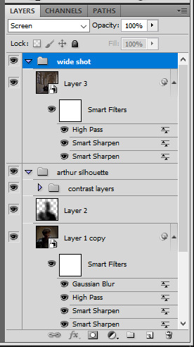
you can then position the wide/scenery gif the way you like it in the canvas. this is how it looks for both examples after i've done that:

if the blending mode screen doesn't give you the best result, so you can play around with other blending modes (such as lighten and linear dodge in these particular cases), but generally speaking, screen is the real mvp here haha.
IV. COLORING
now that the double exposure effect is done, we need to color the gifs to bring them together. i went with simple coloring here, simply enhancing the colors that were already there. just make sure that the coloring layers for each gif are in their respective groups. here's how i've colored both examples:
gwen silhouette group: i added a gradient map layer on top of the contrast layers in black to green and set the blending mode to color
scenery shot group: multiple coloring layers, with a green color fill layer (blending mode set to color), with a layer mask so it only affects the top half of the gif
for the arthur gif, i did something very similar but with warmer colors. i didn't use a gradient map for arthur though:
arthur silhouette group: i made the yellow warmer, closer to orange/red, with a hue/saturation layer, and added more vibrance. didn't feel like it needed a gradient map layer here though.
wide shot group: basic coloring layers to enhance colors from the merlin & daegal shot, and an orange color fill layer set to the color blending mode.
at this point you're pretty much done. just need to add some final touches and typography (if you want).
V. FINAL TOUCHES
a small and completely optional detail, but i wanted to soften the edges of the wide gifs. to do so i've duplicated the smart object gif layer and removed the sharpening filters (right click on smart filter > clear smart filters). put this layer on top of the other smart object layers (but still below the coloring).
then with this same layer still selected, go to filter > blur > gaussian blur... > 10px. this will give you a very blurry gif, but we only want the edges of the canvas to be softer. so add a layer mask to this layer. with a very large and soft brush (mine was at 0% hardness and about 800px size), brush some black onto the layer mask to remove the blur in the middle of the gif.

you can play with this layer's opacity or gaussian blur amount if you want (by double clicking on the gaussian blur smart layer filter). here how both examples look with this gaussian blur layer:

you can also mask some of wide/scenery gifs if you'd prefer, so it shows less outside of the silhouette. just put a layer mask on that whole wide shot group and brush some black or grey on the layer mask. it's what i did for the gwen gif, with a very soft brush and i set the mask density to 72% (i kept the arthur one as is tho):

and that's how i did it! hopefully that was clear enough :)
#alie replies#*ps help#resource#tutorial#allresources#*gfx#usercats#usersmia#userrobin#userfaiths#usertina#usermoonchild#userchibi#uservivaldi#usertreena#userraffa#userriel#userelio#usermadita#usersmblmn
968 notes
·
View notes
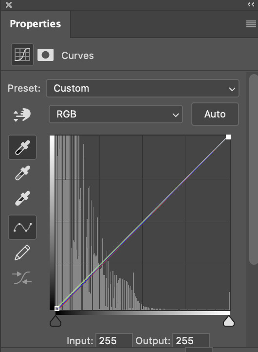
Note
hi i'm sorry to bother you but do you have any tips on giffing dark indoor scenes? yours always look so good!
hi there! not a bother at all :) i can definitely try to explain the steps i usually take under the cut!
this tutorial will assume that you already know the basic steps of gif-making — if you don't, there are lots of great tutorials floating around on this site that can help you out! :)
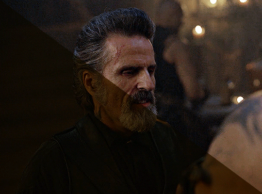
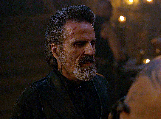
here's the gif i'll work with to explain my steps, the bottom being the original and the top being the coloured/brightened version.
before we start, a general tip i recommend keeping in mind: if you want to brighten a dark scene, you'll want to get your hands on the highest quality download you can find. 1080p is decent, but if your laptop can handle 2160p 4k hdr files* without sounding like it's about to explode, that'll get you even better results!
(*colouring hdr 4k files requires a different set of steps — the scene will appear washed-out on photoshop, so you need to make sure that you don't end up whitewashing anyone if you do choose to work with this type of file.)
since most of my downloads are 1080p, i'll use this type of file in this tutorial.
the first step of my gifmaking process with 1080p files is almost always the same no matter what scene i'm giffing. i make a brightness/contrast layer and set the blending mode to screen:
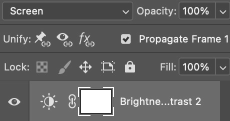
now my gif looks like this:
depending on the scene and how washed out it looks after this layer, i'll play around with the opacity. for this gif, i didn't touch the opacity at all. use your best judgement for this, because every scene is different!
i find that dark indoor scenes are usually tinted in yellow or green. one of my first goals is to try to fix the undertone of this scene before focusing on brightening it any further. i go to colour balance for this, and play around with the midtones, shadows, and highlights.
again, every scene is different, so the amount to which you use colour balance will differ, but for this specific scene, my goal was to neutralize the yellow. i focused particularly on the midtones and shadows of the colour balance layer, moving the scales to the opposite of the reds.
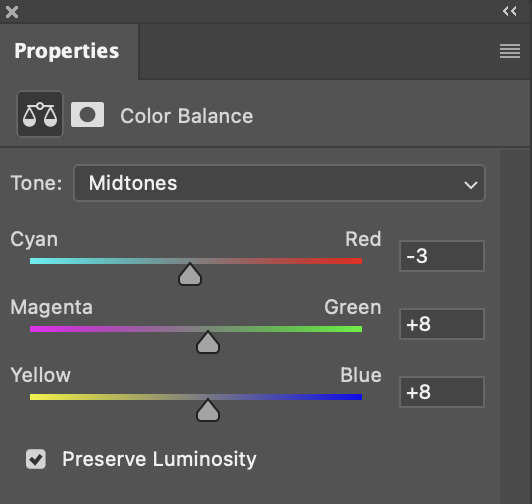
doing so will help with neutralizing the yellow. the only reason i moved the scales towards magenta and blue (therefore making it a bit more red than less) rather than green and yellow in shadows was because i wanted a darker contrast in the blacks. moving them to green and yellow made the overall scene more yellow since there were so many dark spots that shadows affected. (you'll see what i mean when you start experimenting with your own gif — this part of the process really just depends on your preferences!)
our gif might not look that much better yet, but it will soon! our best friend channel mixer is gonna help us out. for an in-depth post about how to use this adjustment layer, i recommend checking out this tutorial.
i'm someone who prefers to make more than one layer for the same adjustment layer for a reason i can't even explain (i just find that it helps me stay more organized). so don't think of this process like i can only use this layer once so i MUST fix it NOW. you can create multiple layers of the same adjustment layer, because every layer on top will affect the ones underneath it.
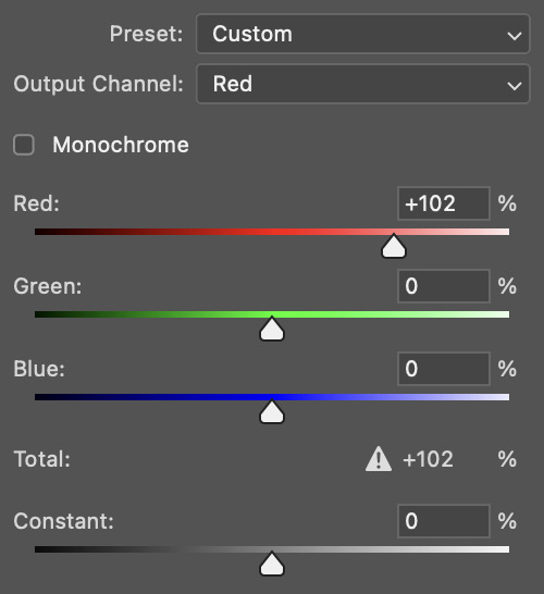
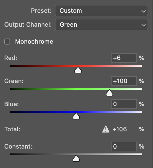
since my priority is getting rid of the yellow tint, i went to the Blue section of the channel mixer and increased it in all of the scales:
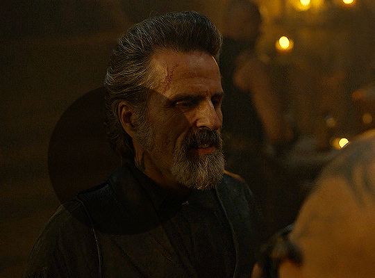
this step alone has helped us out so much, because look at our gif now!
not only does the background look less yellow, but so does izzy's skintone.
now i'm going to focus on trying to brighten the scene even more without destroying the quality. the levels layer can actually help out a lot with this.
the amount to which i move each toggle differs per scene, and i think experimenting depending on your gif works best for this layer.
side note: i prefer not to use the ink droppers on the side because the contrast in the result usually ends up feeling too strong for my preferences, but if you find that this works better for you, then go for it! basically, the first dropper with the black ink should be clicked before you select the darkest part of the scene that you can find, and vice versa for the third dropper with the white ink — click it, and then select the brightest part of your scene.
curves is the next layer that does fantastic work! unlike the levels layer, i do actually use the ink droppers for this. it's the same concept, with the first dropper being used on the darkest part of the scene, and the third dropper on the brightest.
try to think of curves as something that not only further brightens your scene, but also helps with the colour neutralizing process.
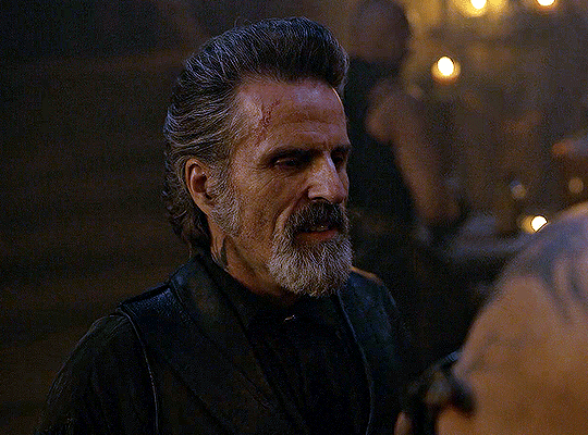
i grab the first dropper, then click the darkest parts of the gif that i can see. depending on the undertone of the blacks that you're clicking on, the tint of your gif might actually change significantly. this is why i prefer to click once, then undo the action if i don't like what it gives me. izzy's leather jacket was the sweet spot for this gif.
when i'm satisfied, i make another curves layer and use the third dropper to click the bright/white parts of the scene. for this gif in particular, the lights in the background were a good fit because they carried a yellow undertone — this meant that my curves layer actually helped to further neutralize the yellows in the scene as a whole!
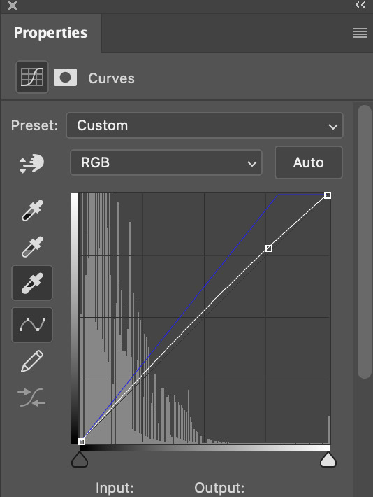
(i manually dragged the curves graph upwards for the third dropper to make it brighter. i don't need to do this if the dropper does this for me automatically, but since the lights were pretty bright, it only changed the tone of the scene and didn't increase the brightness — hence the manual step.)
pat yourself on the back, because this is what our gif looks like now!
this is good, but it's not great — there's still just a bit too much yellow in the scene for my liking (sorry, i'm picky! :P)
i created another channel mixer layer and played with the toggles until i was satisfied:
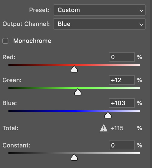
ta-da! the gif as a whole is much less red/yellow now:
this is when i start fixing the colouring now — namely, his skin tone. selective colour will be your best friend here. i wanted to make his face just a tad brighter and less of a yellow-ish magenta shade, so i focused on the reds and yellows.
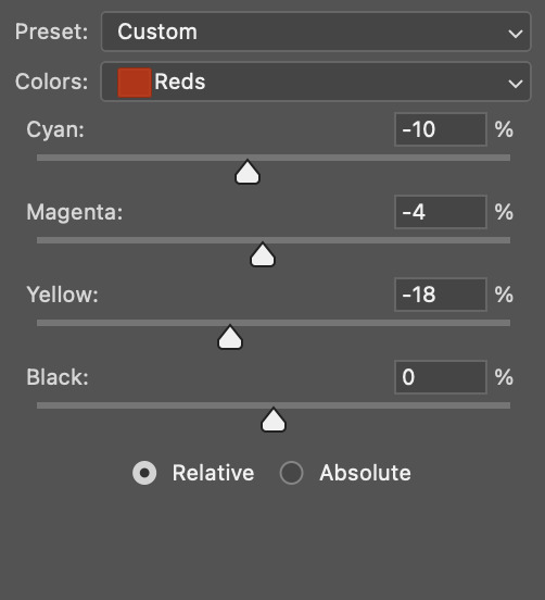
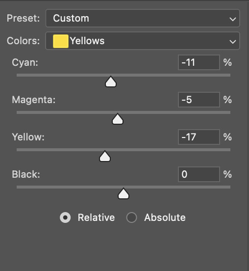
then, out of habit, i created another selective colour layer and took out more of the "yellow" in the whites to make them whiter, and increased the black (just by +1, since the contrast is pretty good enough already).
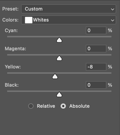
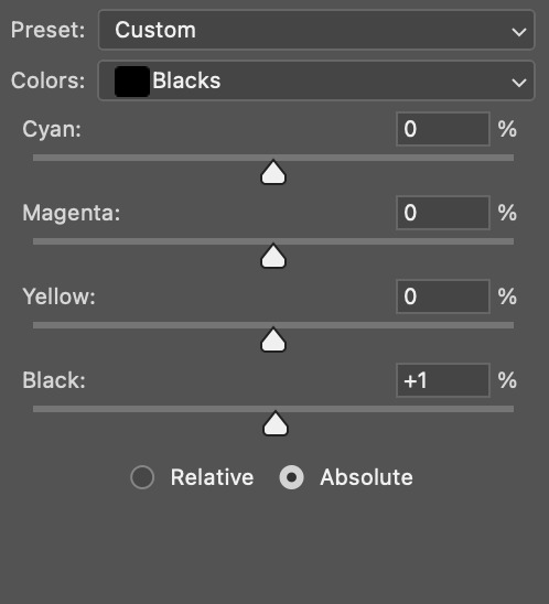
note: i switched to "absolute" for these two colours. basically, relative = less vibrant colour manipulation, and absolute = more vibrant/stronger colour manipulation. i prefer to stick to "relative" for fixing skin-tone since "absolute" can be a bit too strong for that.
our gif looks like this now!

his face looks brighter and much less yellow, so i'm satisfied!
this next step is not mandatory at all — again, i'm just picky and despise yellow-tinted scenes. i personally believe that indoor scenes that are yellow/green tinted make them look more dark than they actually are, so i do my best to get rid of these colours.
i also don't always do this, but for this gif, i just simply went to hue/saturation, selected the yellows from the drop-down menu and decreased its saturation.
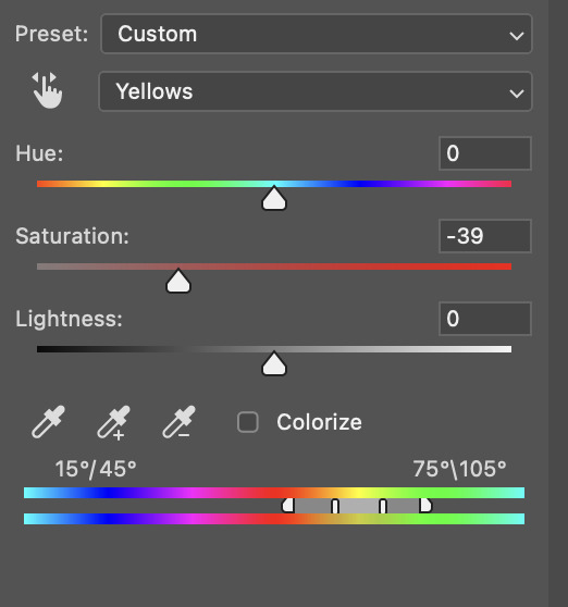
be careful not to do this too much. depending on the quality of your download, this can significantly decrease your gif quality. i tend to worry less about this when i'm working with 2160p files, but again, those files require an entirely different set of steps when it comes to brightening/colouring.
since this was a 1080p file download (and one that was actually less than 1GB, oops, don't do that), i played it safe and decreased it by -39 only.
note: you also want to be cautious of colour-washing skintone when it comes to this step. i find that another selective colour layer can help perfect the skintone in case the yellow drains out of it too much, but skip the hue/saturation step if it's too difficult to work with — better to be safe than sorry.
anyway, this is the final gif!
that's usually what i do when it comes to colouring dark indoor scenes! i hope this tutorial makes sense, and if you have any further questions, don't hesitate to reach out! :)
#tutorial#gif tutorial#resources#completeresources#coloring tutorial#allresources#dailyresources#userraffa#userdean#uservivaldi#alielook#usercats#usermoonchild#usernaureen#userbarrow#userabs#useraish#useralison#userisaiah#*mytutorials#i am so sorry if this is incoherent#it’s so hard to explain things coherently 😫
610 notes
·
View notes
Text
hmm... im sure someones made a good guide out there somewhere, but i personally havent used any
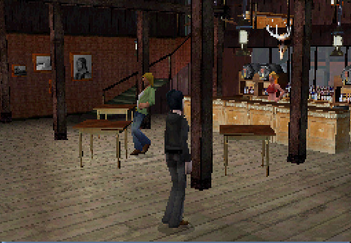
but thats not a good answer, so another place to start is to use a real game as a ref! this is the sims 2 ds:

most of the detailed textures are only used for the player sims hair/face/clothing
you can see by the jagged edges of this sims vest that its still a little lower than the faces texture (this is probably because the body has more clothing variations than the face and they needed to save memory)
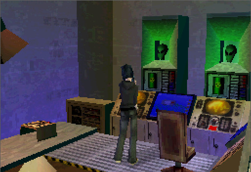
static parts of the environment have a higher res, because they can tile/repeat the textures. this game has a million variations on bed/chair textures, so they're notably lower res
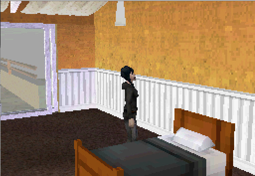
this is a ripped texture of most(?) of the things used to make an area in the game (image credit) :
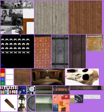
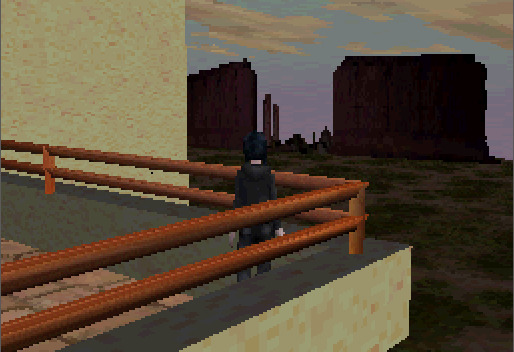
the desert background here is just a 2d image, relatively low res because the player will never be able to reach it
i guess this is just a long winded way of saying "things that arent that important or the player will generally be lower poly + less detailed" but i hope it helps a little
#its hard to explain bc its difficult to set rules unless you try to set the entire environment to the same style rules //#i mostly went into textures here bc ds games are much lower textured than psx or similar most of the time //#i need to actually learn more abt ds stuff sdkfhsdjh im mostly just eyeballing this instead of knowing much abt it //#long post#scopophobia#gif#not my art#sims 2 ds#tutorial#...ok not really but how do i tag this//#newbiealliance#image heavy
658 notes
·
View notes
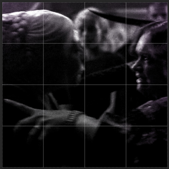
Text
TILE TRANSITION TUTORIAL
a couple of people have asked me for a tutorial on how I did the penultimate gif in this set, so here goes! this is my first tutorial, so please feel free to reach out with further questions if anything's unclear.
note: this tutorial assumes you know the basics of gifmaking, can create the base gifs, and are familiar with timeline mode.
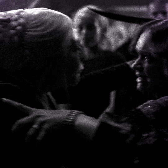
STEP ONE: create the base gifs! I'd recommend staying between 25-40 frames for each gif, since the transitions we'll use later tend to increase gif sizes. these are the ones I'll be using for this tutorial:


STEP TWO: create the guide layouts for both base gifs. for this panel, I chose a 4x4 grid — I would recommend keeping the number of "tiles" low because it can get tedious, but have a minimum of 9 (3x3 grid).

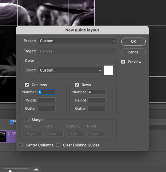
now your canvas should look like this:
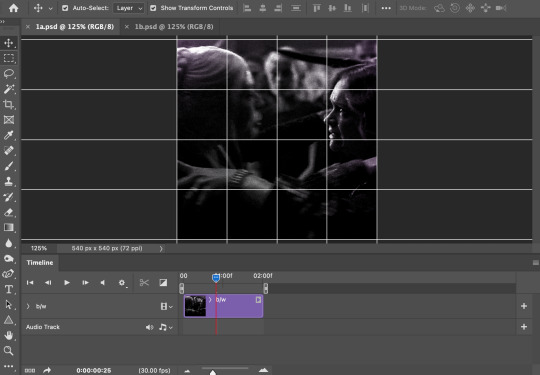
STEP THREE: create the tiles. this is where the going gets rough; there might be easier ways to do this that I couldn't think of 😭 if there are any please send me an ask!
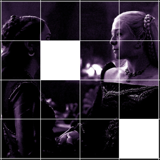
essentially, in this step we'll cut up the base gifs into smaller squares so that each tile can be manipulated separately when we put both gifs together. to do this, first create a square using the rectangle tool and the guides. then duplicate the base gif, move it above the square, apply a clipping mask, and then convert the clipped gif and square (selected in the image below) into one smart object.
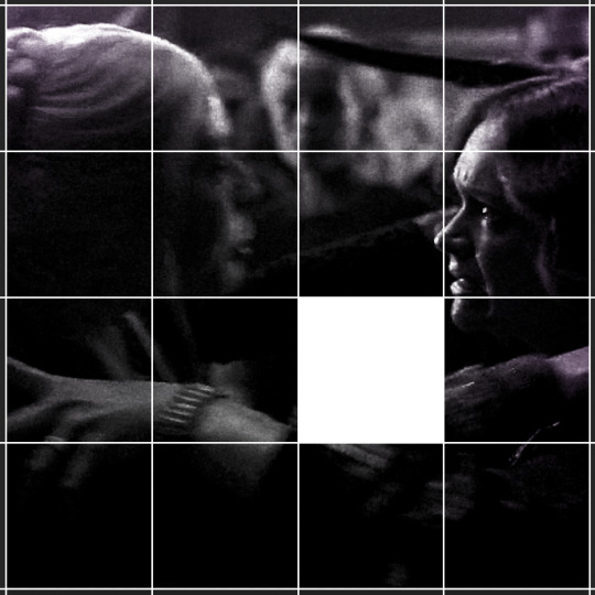

ALTERNATELY: you could duplicate the original base gif and use layer masks to isolate tiles. create a layer mask for the duplicated gif layer and, with the layer mask selected, drag your mouse over a square (using the guide layout) and press delete. then press ctrl/cmd + i to invert the layer mask so that the gif only shows in the square of your choosing.
now repeat until you've got the entire gif in tiles, and do the same for the other gif!
since the transition effect is achieved by staggering the crossfades for each tile of the final gif, you can cheat by having multiple tiles "flip" at a time, ideally no more than four. this means you need to cut the base gif up into fewer pieces. to do this, simply draw multiple squares instead of one and then merge the shapes, before duplicating and clipping the gif onto them.
if you do this, it's essential to remember that you have to divide both gifs up in the exact same way. each piece of the b/w gif has to correspond to a piece of the purple gif!
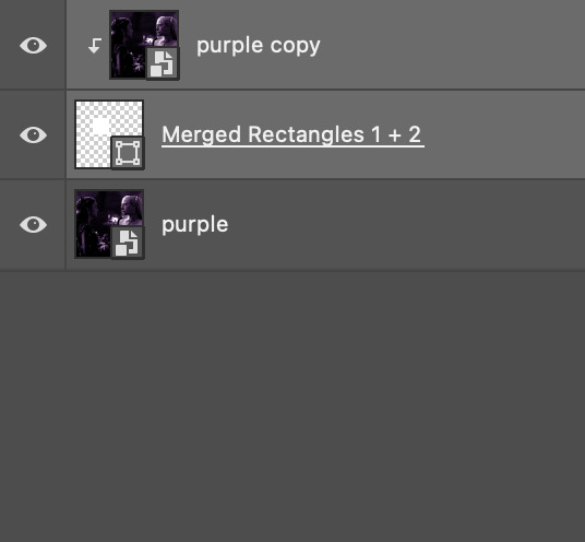
this is what the layers look like for each gif once I'm done:

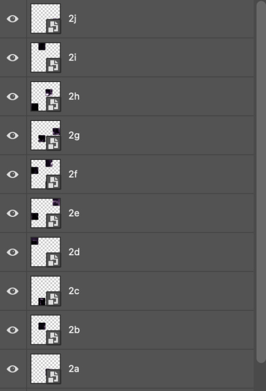
I have them lettered so that it'll be easier to match them up in the next step.
STEP FOUR: this is the complicated bit that took me two days to figure out. I'll do my best to explain but don't hesitate to reach out if something isn't clear!
to begin, open up a new psd and import both base gifs into it. (remember to click "create video timeline" and ensure that your gifs are all in order before proceeding.)
now, the trickiest part about this transition is ensuring that all the little tiles sync up so that the larger gif is coherent. so first we'll create some markers (just empty layers) to ensure that everything lines up as it should.
— marker 1: at about halfway through the first gif (b/w in this case)
— marker 2: at about a quarter of the gif length
— marker 3: close to the end of the gifs
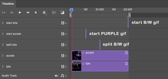
at this point we're ready to start bringing in the tiles. I'm going to delete the base gifs from this new psd just to keep things cleaner!
first thing to do is import my b/w tile. move the timeline slider over to marker 1 and split the first gif. (if it helps, rename the split gifs and add (start) and (end) to the two halves.) then, move the (end) half to the beginning of the timeline, and the (start) half to line up with marker 3.
the purple tile is easier to manage. simply import it into the psd and line it up with marker 2.
your timeline should now look like this:
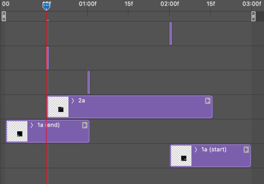
notice the overlap between the gifs at their beginnings and ends — this is where you'll be able to cascade the tiles flipping, so it helps to have a significant amount of overlap.
crop the three gifs for this tile as you see fit! since this is the first tile I want to flip from b/w to purple, I'll crop gif 1a (end) all the way to the current position of the timeline slider (red line with blue tip) and leave the beginning of gif 2a uncropped. for the flip from purple to b/w, I'll crop both gifs a bit.
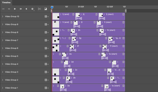
once that's done, drag all three gifs onto the same level in timeline so they form a video group. your timeline should look something like this:

now you just repeat the process for all the other tiles! as long as you made sure that all the tiles in one gif correspond with tiles in the other gif in step three, this should be a fairly painless process. make sure to crop the starts/ends of the gifs separately so that they don't all flip together.
this is what my layers look once I've done all the tiles:
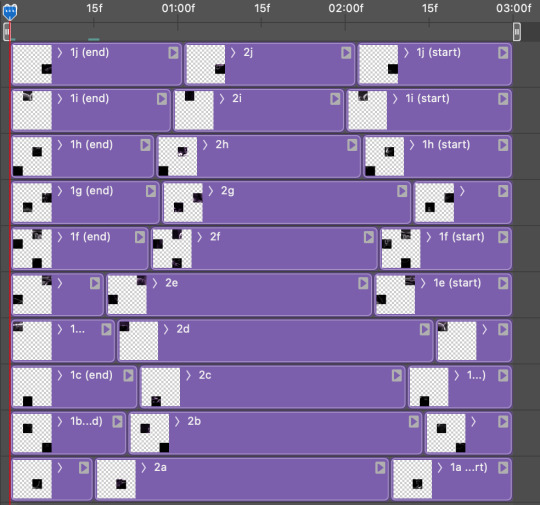
and the gif!
STEP FIVE: transitions! click on the half-white square (top right of the left column in the timeline, beside the scissors) and select the crossfade transition, then drag it between two gifs in a video group. it should create a two-triangle symbol and shorten the overall length of the video group.

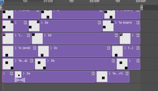
apply the transition to all the tile flips, ensuring that the duration of all transitions is constant. this can sometimes be tricky because ps likes to change the duration of each transition, so right click on the transition symbol and manually change all your transition durations to be the same.
your layers should now look something like this:
STEP SIX: draw the grid. bring back the guide layout from step two and using the line tool (I like 2px thickness), trace the grid. adjust opacity as you see fit (50-80% is usually a good idea), so that the canvas looks like this:
STEP SEVEN: export and celebrate! you're done!
I hope this tutorial made sense and was easy to follow, and happy giffing! my inbox is always open for any questions <3
#tutorial#ps help#ps tutorial#userace#alielook#userabs#usercats#userhella#userfaiths#tuserabbie#usershreyu#usertreena#tuserlucie#uservivaldi#usertj#usergiu#userroza
610 notes
·
View notes
Last Seen Blogs

theanalytiq
Latest Tech Updates
everythingsupsidedown
here for the gay shit
chandarchandar
CHANDARCHANDAR
overwatchabit
soff
prettypinkpunk
Pretty Pink Punk