#glass designer
Photo
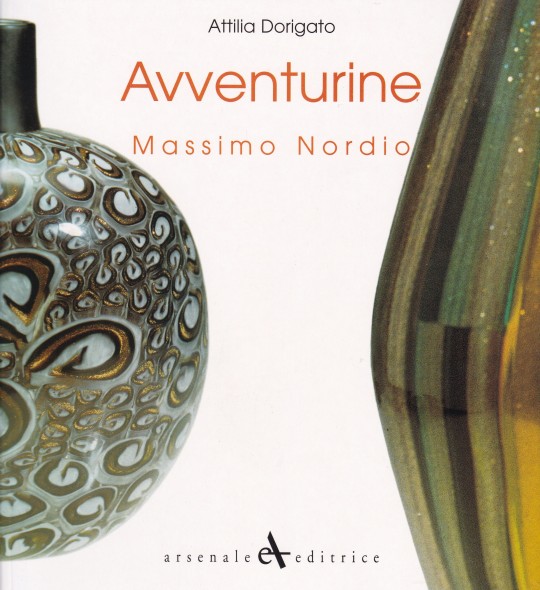


Avventurine Massimo Nordio
Attilia Dorigato
Catalogo Mostra Galleria Rossella Junck, Venezia 1999
Arsenale Editrice, San Giovanni Lupatolo 1999, ristampa 2003, 80 pagine, 23,2 x 21,5 cm, Ediz. italiana e inglese, ISBN 88-7743-258-6
euro 13,00
email if you want to buy :[email protected]
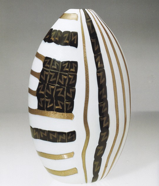
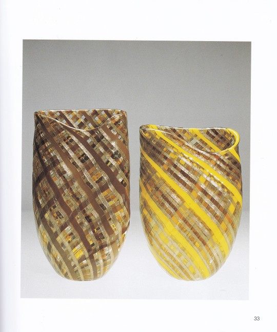
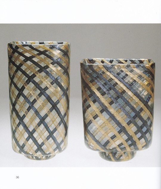
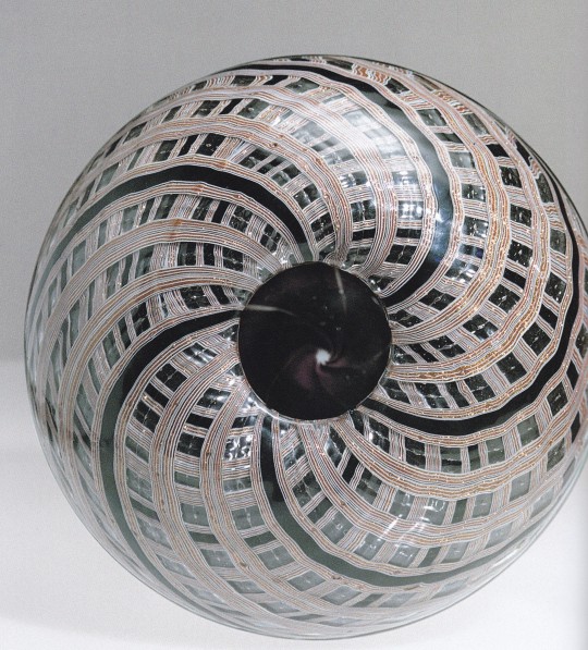
Over the last few years, glass designer and collector Massimo Nordio 's attention has gradually turned almost exclusively to a historically fascinating type of glass with an ancient tradition on Murano: the so-called avventurina. Avventurine is a glass paste of brown or reddish colour, studded with a myriad of small yellow-golden sparkling specks which are nothing other than suspended copper crystals. For this reason it is also called "astrals". Presented in this book are more than 60 photographs of Nordio's stunning designs. Undoubtedly, the high quality of these glass works is also due to the renowned skill of the maestro who blew them, Vittorio Ferro . Massimo Nordio and Vittorio Ferro have worked in perfect harmony - it is, perhaps, correct to state that the success of this collection has been due to their sound artistic relationship.
19/01/23
orders to: [email protected]
ordini a: [email protected]
twitter: @fashionbooksmi
instagram: fashionbooksmilano, designbooksmilano tumblr: fashionbooksmilano, designbooksmilano
#Avventurine#Massimo Nordio#catalogo mostra#Galleria Rossella Junck Venezia 1999#glass designer#vetro Murano#artistic relashionship#Vittorio Ferro#glass design books#designbooksmilano#fashionbooksmilano
4 notes
·
View notes
Text


murano art glass pendant designed by carlo nason for mazzega, 1970s italy
9K notes
·
View notes
Text


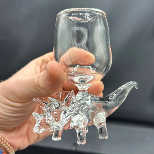
Dinosaur Glasses // David White Glass
11K notes
·
View notes
Text
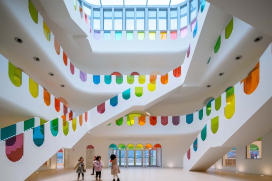
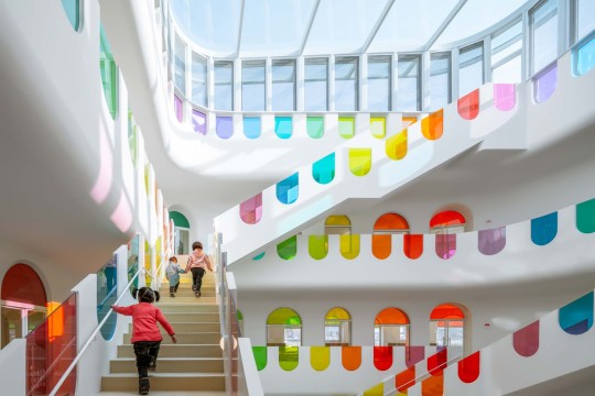

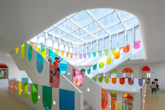


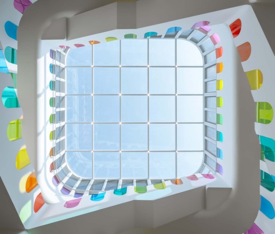
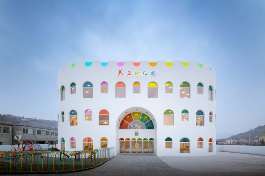
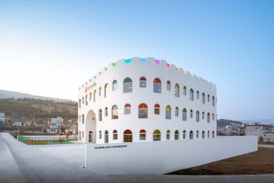
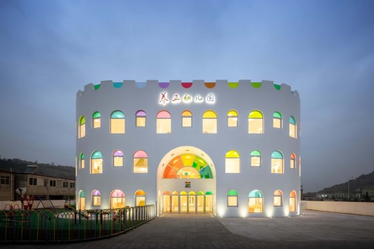
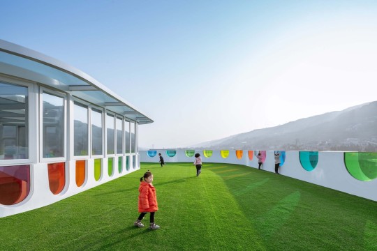
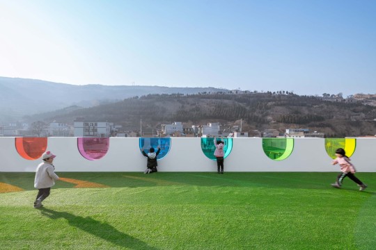
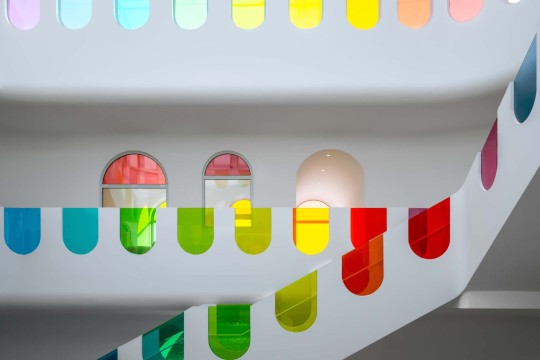
Kaleidoscope Kindergarten (Tanshui Kindergarten), Tianshui, China,
Designed by SAKO Architects
#art#design#stairwell#architecture#stairway#staircase#interiors#stairs#staircases#kindergarden#playroom#stained glass#china#tianshui#tianshui kindergarten#sakoarchitects#glassart#fun#colors#kaleidoscope
14K notes
·
View notes
Text
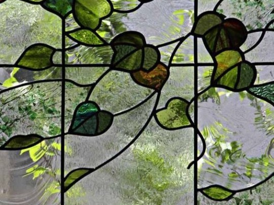
#stained glass#leaves#foliage#greenery#green#green aesthetic#window pane#plants#plantcore#interior design#interiors#decor#interior decor#lighting#home decor#decoration#interior#cottagecore#cottage aesthetic#cozy cottage#fairy cottage#cottage vibes#nature#naturecore#beautiful#vines#fairycore#fairy aesthetic
14K notes
·
View notes
Text

These are like the same type of guy to me
10K notes
·
View notes
Text
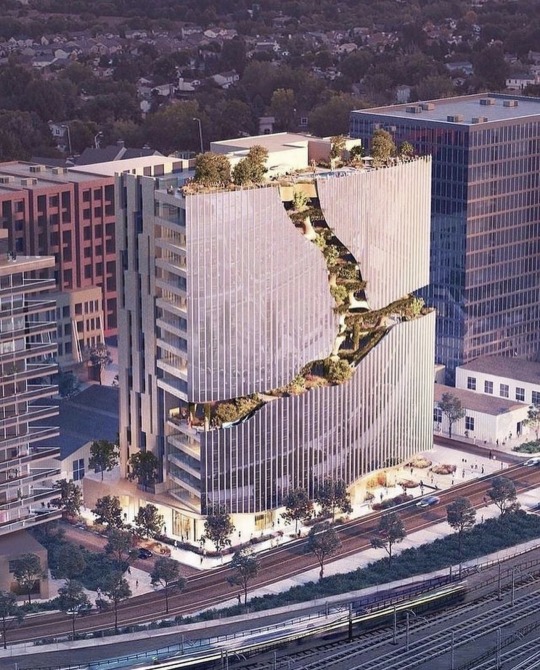
'One River North' Colorado that includes a descending nature trail on its façade.
22K notes
·
View notes
Text
I’m not breaking any new ground here, but it’s obvious that the peak of novelty New Year’s Eve numerical eyewear was 2000-2009
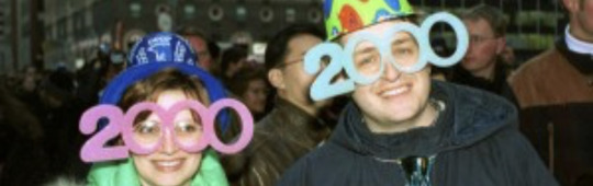
10/10 for legibility, visibility, and typography
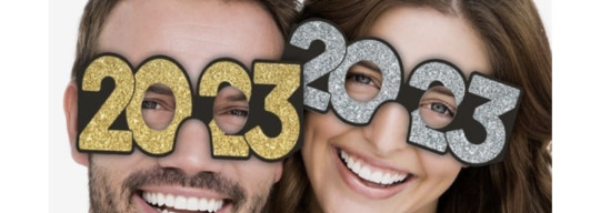
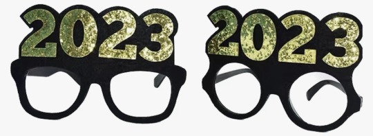
for years now, this industry has been stubbornly clinging to an idea that has become too cumbersome. if you will indulge me, I will now rate 2023’s new designs:


5/10 best I can say is “it gets the job done.” it does clearly read as 2023, but the typography is bad & the visibility leaves much to be desired.
2/10 happy 20?3, i guess. they started with a decent font, but these are illegible and everything about the eyehole placement sucks.
6/10 hear me out: this is an okay compromise. it’s a cop out, sure, but it’s a viable alternative. it satisfies the basic requirements of legibility, visibility, and typographical acceptability, yet it lacks all whimsy. this feels like when you don’t do a project the way the teacher intended but you pass anyway on a technicality. this isn’t school, though, so i’m failing this design.
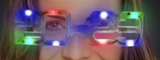
1/10 come on, guys. if you’re going to use the top of the 2 as an eyehole, at least use a font with a more open design, perhaps something art deco. at least when you look in the mirror with those LEDs directly in your line of sight, you won’t notice how bad the glasses look.

7/10 now we’re getting somewhere. like the first design, it uses the 3 as the second eyehole but it does so without compromising the shape of the number. unfortunately, the lack of outlines does negatively affect legibility and there may be some visibility issues for the left eye.
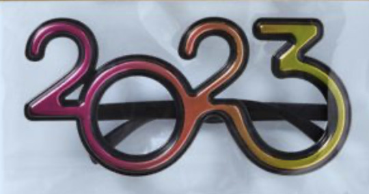
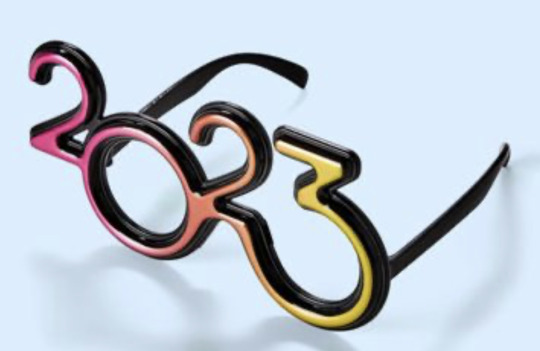
9/10 this is as good as it’s gonna get, folks. an actual graphic designer was clearly involved here. the typography is appealing, the color works, visibility looks good. nicely done.
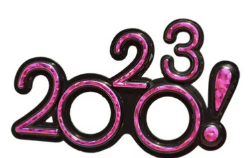
-1000000000000000/10 :(
30K notes
·
View notes
Text
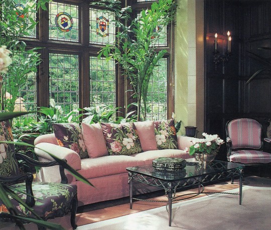
Lois E. Lugonjac, ASID, Lois Lugonja Interior Design
100 Designers' Favorite Rooms, 1994
#vintage#vintage interior#1990s#90s#interior design#home decor#living room#stained glass#Tudor#wood paneling#pink#furniture#antique#crest#English#style#home#architecture
4K notes
·
View notes
Text
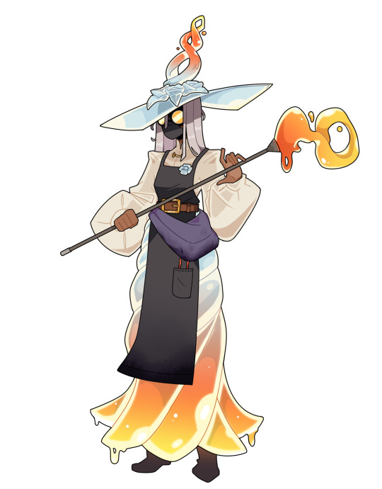
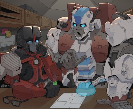
design comm for a glassblower mage
4K notes
·
View notes
Text
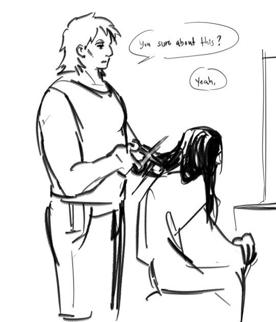

Haircut,,
#he looks so different without the glasses LMAO#anyways mmm buried not good for long hair#art#sketch#tma#the magnus archives#jonathan sims#daisy tonner#i dont like how it turned out but i do like the design if that makes sense#first passes are always the worst alas
2K notes
·
View notes
Text
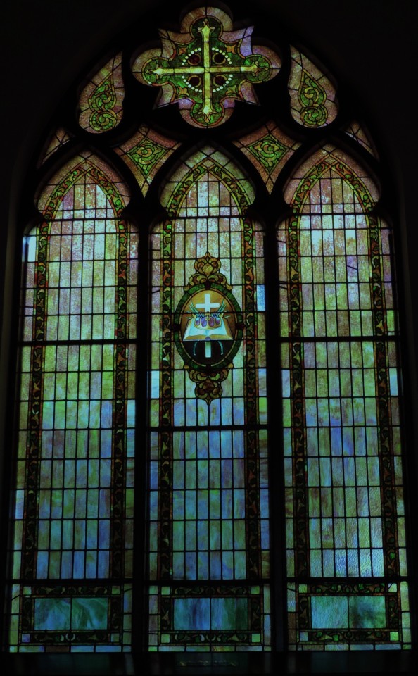
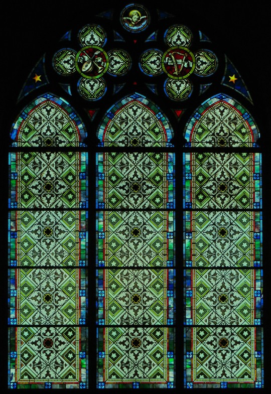
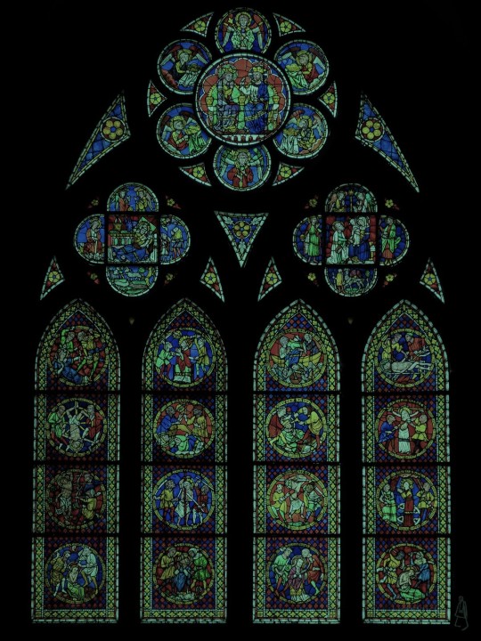
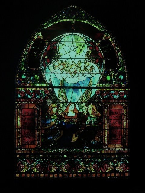
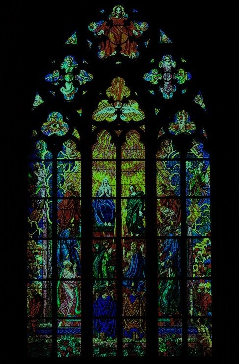
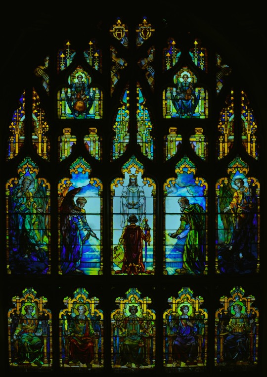
Stained Glass Window
Saint Teresa of Avila Parish
Freiburg Minster
Smith Museum of Stained Glass Windows, Chicago
Prague : Stained glass / St. Vitus Cathedral
Tiffany Stained Glass
#edited#architecture#interior#goth architecture#gothic architecture#gothic#goth#gothic aesthetic#romantic goth#goth aesthetic#gothique#gothic design#stained glass#gothic cathedral#cathedral#whimsigoth#whimsigothic#window#stained glass window#church#church window#stained glass art#pictures not mine
3K notes
·
View notes
Text
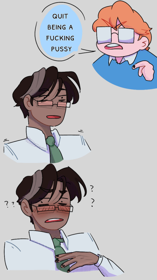
this was funnier in my head
#the magnus archives#tma#jonathan sims#martin k blackwood#jmart#jonmartin#art#my art#phone doodles#ibis paint#i do not follow along these designs anymore LOL#ive changed#explored new possibilities#gave jon obnoxious little glasses#repostober
3K notes
·
View notes
Text
love love love when ppl doodle kim kitsuragi like this
bc like, somehow that's still identifiably kim. you broke him down to his bare essentials
#you can even just draw the glasses and the little tache. design of all time#disco elysium#kim kitsuragi
9K notes
·
View notes
Text
Starscream and Skyfire's young years
#did you know Starscream wears glasses he just feels insecure about it so he rarely wears them?#digitalart#art#photoshop#character design#au#transformers#decepticons#autobots#redesign#original design#alternate universe#comic art#starscream#skystar#skyfire#here Starscream's about mid 20s or early 30s (in robot years) and Skyfire's around the same age just a tiny bit younger#Starscream's way older now hes around 50 now#i tried drawing backgrounds... never again lmfao
2K notes
·
View notes
Last Seen Blogs
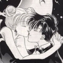
sailormoondoujinshi-blog
Tea Party Planet: Sailor Moon Doujinshi

reijude
it’s ride or die all the way long
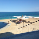
cabobeachresort-blog
Eco Resort Mexico

sporadicpenguinwitch-blog
Mastery Journal 1
miss-meade
we're different