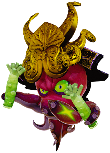
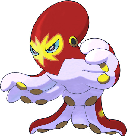
#grapploct
Text

#grapploct#punchy octopus evolves into grabby octopus. which in my opinion is a little bit more boring#i feel like octopuses can already grab stuff pretty good. which makes this just a normal octopus. i like the punching one better#it's reminiscent of splatoon. looks like some kinda splatoon-esque creature#clobbopus‚ i mean. not this
48 notes
·
View notes
Text
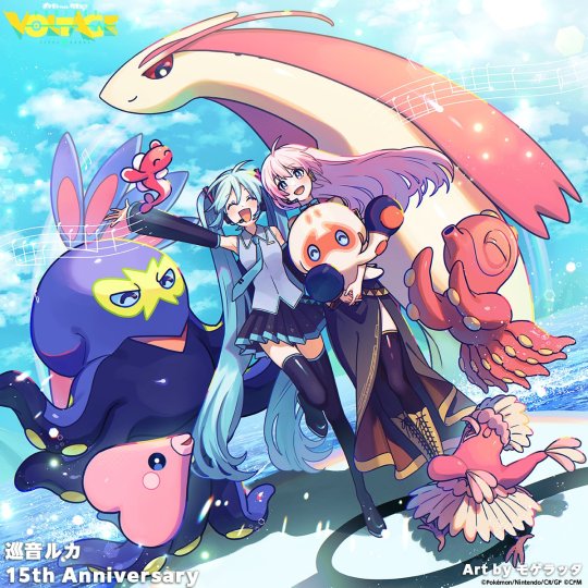
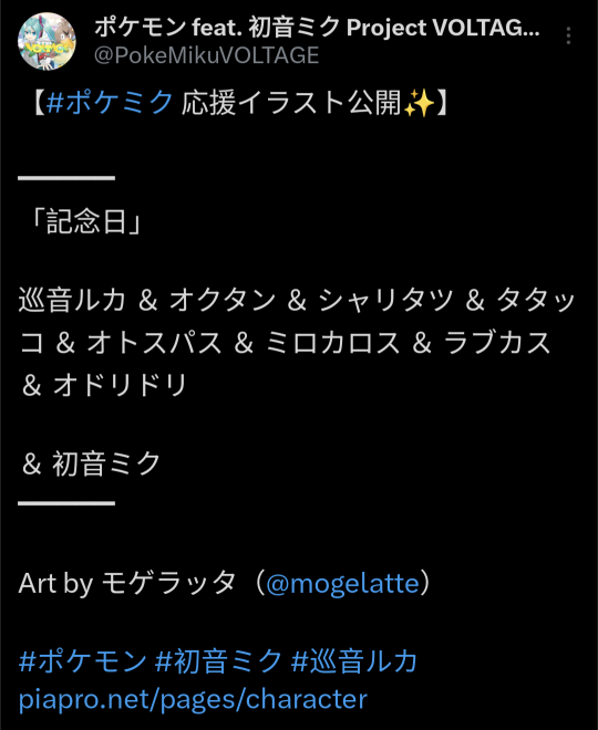
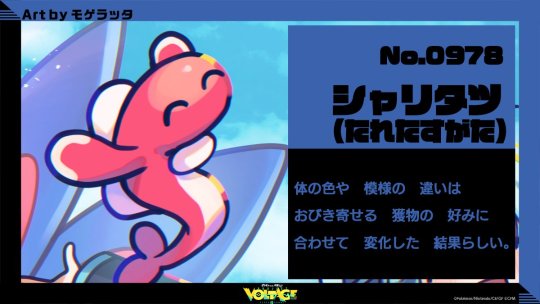

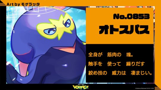
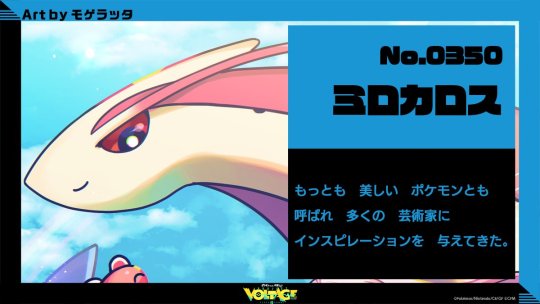
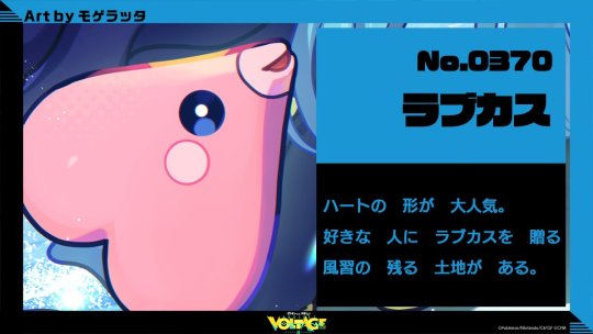

Our Project Voltage illustration today is for the anniversary of Megurine Luka's release! It's been 15yrs!
The art is by Mogelatte!
#project voltage#hatsune miku#vocaloid#luka megurine#megurine luka#milotic#clobbopus#grapploct#tatsugiri#luvdisc#oricorio#octillery#pokemon art
640 notes
·
View notes
Text
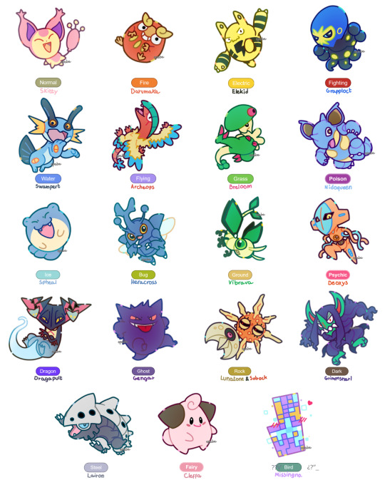
Is any of my favorite pokemon your favorite too?
#pokemon#skitty#darumaka#elekid#grapploct#swampert#archeops#breloom#nidoqueen#spheal#heracross#vibrava#deoxys#dragapult#gengar#lunatone#solrock#grimmsnarl#lairon#cleffa#missingno
2K notes
·
View notes
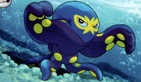
Text

Grapploct -- Shin Nagasawa
96 notes
·
View notes
Text

105 notes
·
View notes
Text

(Another day, another cluttered meme...)
"Misleading" designs like this are a lot of fun, in my opinion! It's great that while the vast majority of Pokemon are Water-types, there's a healthy amount of variation in the shapes they take.
#pokemon#pokeposting#grapploct#malamar#eelektross#anorith#pincurchin#nihilego#dragalge#crustle#clodsire#stunfisk#gible#meme
181 notes
·
View notes
Text
Ultimate Pokemon Tournament!
Generation 8 - Round 1 - Match 2
★ This poll is part of a project to determine Tumblr's favorite Pokemon! ★
Our Contestants:


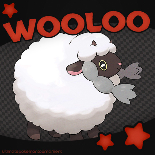

★ Follow if you want to see new polls as they're made! ★
★ Go here for more info about the project! ★
★ Consider reblogging so that others can vote too! ★
★ Don't forget to have fun, be kind, and have a wonderful day! ★
230 notes
·
View notes
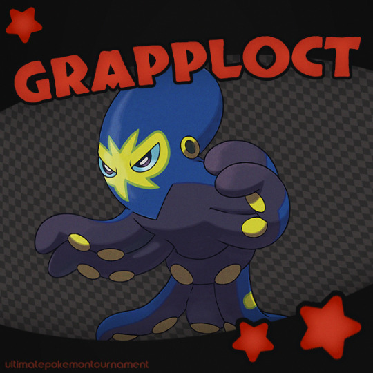
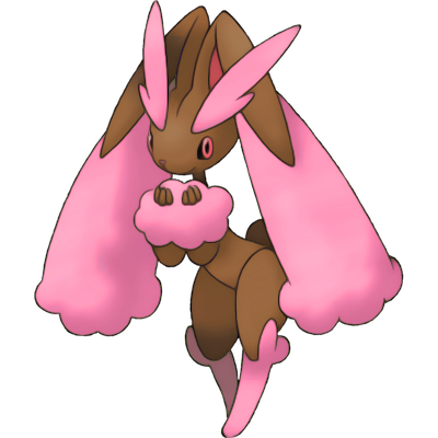
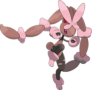
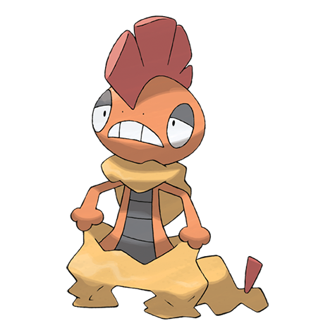
Note
Have you reviewed the Grapploct line? Thanks as always for your thoughts!

I actually really like Clobbopus here. I feel like a fighting-type octopus that uses its tentacles for punching, while a fairly obvious concept, is a good one, and Clobbopus does a good job of representing that with its dark-colored "boxing gloves" and markings that make a wrestling mask of sorts.
I also just like the general aesthetics here. The off-white and orange are a lovely combo, and the blue eyes work well with it. The "gloves" being a dark gray helps them pop out against the rest of the design, with just a small fringe of the same color at the bottom to carry it through without distracting from the tentacles. The blue eyes and their rectangular shape are also super cute.
However, I'm not really that big on Grapploct. It's one of those evos that looses most of the best attributes of the first stage.
To start, I really don't care for the sudden color change. There's no actual reason it couldn't be the off-white with orange, and making the entire body dark gray means you lose any emphasis on the tentacles that the original had. Using navy on this dark color also means that the design blurs together, making it hard to read save for the yellow mask and suckers. Ironically, the shiny keeps a closer palette to Clobbopus (not exact, but closer), and frankly I think it's much better:

On top of that, they also changed the eye shape again for no reason, and it seems to have completely lost the boxing theme. It still has a wrestling motif with the mask, and I guess it's gone from boxing to jujutsu given the "belt" around its waist, but I don't think that reads very clearly conceptually compared to the simplicity of the boxing gloves, thus making the design feel less coherent.
On the plus side, it is at least identifiable as belonging to the same line, and I do think it standing up on two tentacles is interesting, but otherwise it's just pretty "eh".

Overall, Clobbopus is great. Grapploct isn't terrible, but it's not half as good as Clobbopus either due to a muddled color palette and less identifiable theme.
43 notes
·
View notes
Text

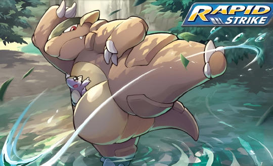
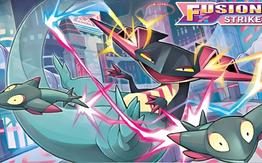
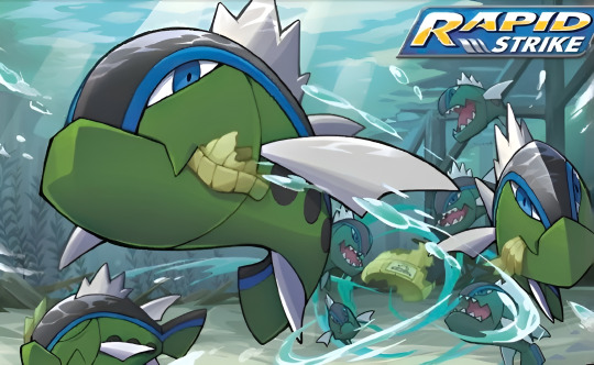

Pokémon TCG SWSH Evolving Skies & Fusion Strike illustrations by Souichirou Gunjima 👏🏼👏🏼
#pokémon#official art#card art#pokémon trading card game#tcg#pokemon#pokémon sword and shield#souichirou gunjima#evolving skies#fusion strike#kyurem#zoroark#kangaskhan#grapploct#dragapult#basculin#dreepy
63 notes
·
View notes
Text
So I was having a chat with moots on Discord about what Pokemon Splatoon characters might own, and I had a couple of fun realizations.
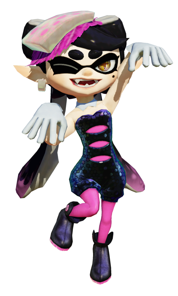

#splatoon#pokemon#callie#octo callie#dj octavio#beika#c side#squid sisters#lopunny#mega lopunny#grapploct#scrafty#Nintendo#videogames#my stuff
76 notes
·
View notes
Photo
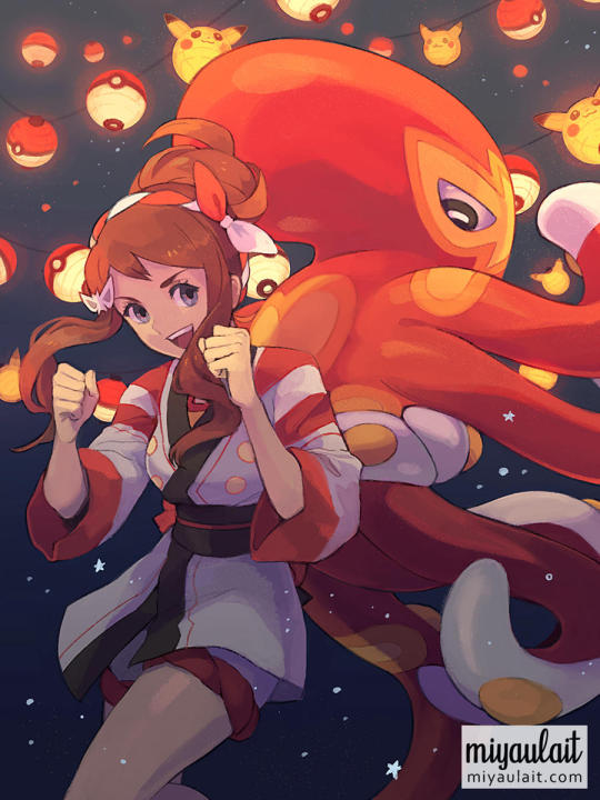
summer hilda + grapploct - 2022
259 notes
·
View notes
Text

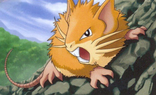
If you vote please reblog to help us get as wide a net as possible. Propaganda is highly encouraged. Round 42 Masterlist
#Grapploct#Raticate#kantonian Raticate#round 42#our pokemon team tournament#pokemon tournament#pokemon#poll#polls#vote#voting#pokemon poll
16 notes
·
View notes
Text

Bea commission for her English VA Laura Stahl in Pokémon Twilight Wings
303 notes
·
View notes
Text
Grapploct -- Hitoshi Ariga
110 notes
·
View notes
Text

I might make more Pokemon memes like this, I might not. All I know is that Falinks has my heart surrounded in a six-pronged ambush, and Grapploct isn't far behind it.
#pokemon#pokeposting#falinks#sirfetch'd#grapploct#kubfu#zamazenta#galarian zapdos#hisuian decidueye#hisuian lilligant#sneasler
119 notes
·
View notes
Last Seen Blogs
hadafresita
Fresita
brassrobot
James P. Helms
myownprivatelife
My own private life

askniallerweyhey
Niall
they-bite
in space, no one can hear you cream