#handdrawn aesthetic
Text
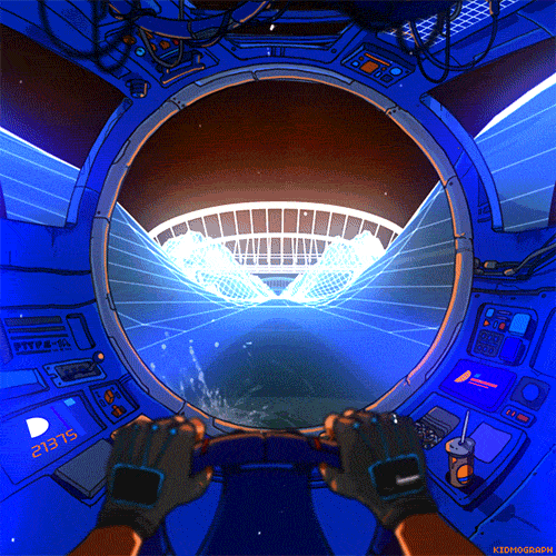
DRIVE NIGHT (2019)
2K notes
·
View notes
Text
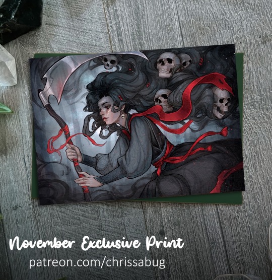
Ready for November with this eerie exclusive print! 🖤
https://www.patreon.com/posts/art-pack-75-and-91929767
Join on of the mail tiers in November to grab yours
✨access the MASSIVE collection of digital rewards, and tutorial and video library as well!
#fantasy#dark art#gothic art#gothic aesthetic#folklore#grim#limited edition#art print#original art#dark academia#supportartists#handdrawn
20 notes
·
View notes
Text

SOON🍂🍁
#art#illustration#drawing#draw#wild#arte#vintage#handdrawn#fairytale#watercolorpainting#handmade#fantasy#fineart#fantasyart#autumn#fall aesthetic#fall#dark#priestess#druid#druidry#dormouse#aquarelle#artists on tumblr#paperdrawing#art on paper#green
20 notes
·
View notes
Text

Hell awaits .
#ink#skulls#illustration#sketch#skull#art#fantasy#handdrawn#gouache#creepy#hail satan#satan#lucifer#dark aesthetic#gouashe#watercolourpainting#handpainted#nightmare#horrorart#horrorfan#macabre#zembraced_by_death_art
4 notes
·
View notes
Text

Finished my little witch sketch, I might be making them into stickers and sell them on my etsy shop soon!
#handdrawn#illustration#cottage vibes#forest cottage#cottage aesthetic#cottagecore#fashionillustration#drawing#naturecore#sketch#cottagecoreastheic#art#artists on tumblr#artistsoninstagram
10 notes
·
View notes
Text
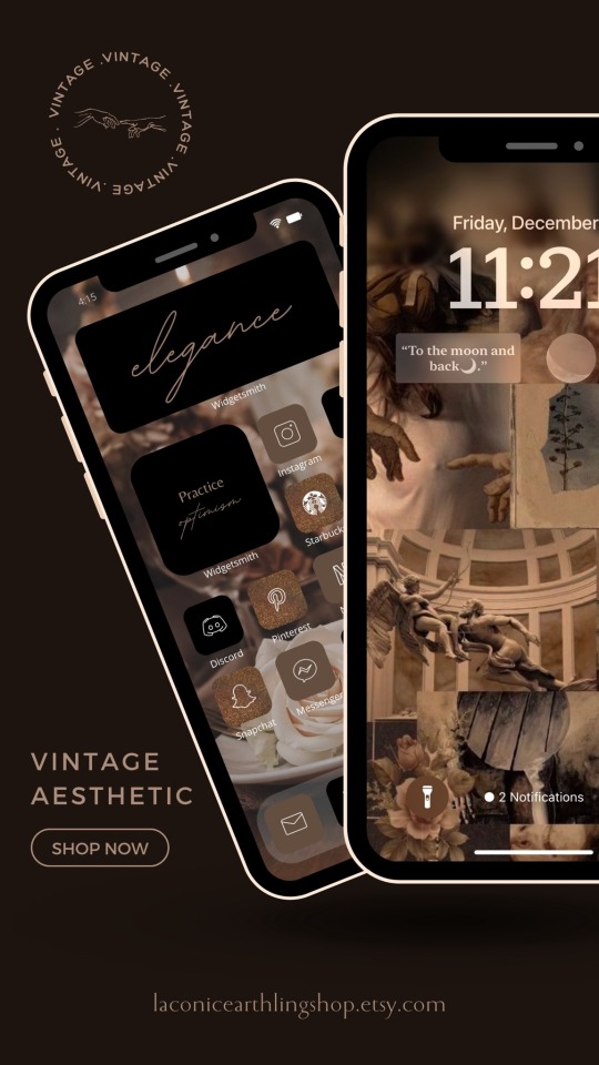
https://laconicearthlingshop.etsy.com
Relive the beauty and elegance of the past with the new iOS 17 Vintage App icons pack brought to you by LaconicEarthlingShop.
With every glance at your home screen filled with the colors black, brown, and gold, you will instantly feel the magical atmosphere of a glorious life filled with wondrous moments that can capture a thousand smiles worth a million jewels.
#vintage#vinyl#vincent van gogh#vinyl records#vinylcollection#vinylcommunity#digital#etsy#handmade#aesthetic#ios17#appicon#design#beige#art#women#happyholidays#homescreen#handdrawn#her#him#holiday#health#humor#smile#support small creators#small business#small artist#small streamer#monochrome
1 note
·
View note
Text
#medieval#medievalart#illuminatedtext#artwork#medievalillustration#handmade#handdrawn#lettering#letteringart#historicalart#fairyart#fairy#feeflox#greenfairy#fairycore#medievalcore#aesthetics
0 notes
Photo
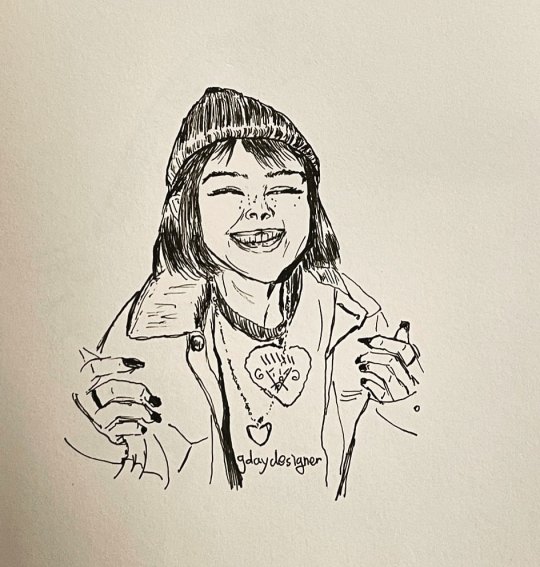
PERSISTENCE -dont skip it today. #penillustration #handdrawn #nosketch #aesthetic #illustration (at Calgary, Alberta) https://www.instagram.com/p/CeiAg0cOPlp/?igshid=NGJjMDIxMWI=
0 notes
Text
hiii ik everyones saying this but i absolutely LOVE the new style that animation has been taking recently
i LOVE how unsmooth and blocky and liney the art is its SO aesthetically pleasing to me
like nimona, the bad guys, puss in boots, mitchells vs the machines, the new tmnt movie and ofc the one that started it all, the spiderverse
and even better they all turned out to be amazing heartfelt movies
bc you can tell just with the amount of work that goes into that type of animation that the artists and storyboarders (and whoever else is needed to make a movie idk) actually care about what theyre making
instead of the souless tired copy paste format disney has been doing.
im not a huge fan of cgi animation in general but i like this kind because it still feels like it has some elements of 2D handdrawn animation if that makes sense
i get so happy when i see a new animated movie and it has this sort of ‘messy’ (affectionate) style to it it makes it look so much more alive and interesting and real (and like actual art) and im so happy more studios are following in that direction
#heres me raving about the movie industry youll never see it again bc i rarely talk about it anyway lol#this isnt just a new thing to me tho like i never liked that disney went cgi even when i was little#the bad guys#into the spider verse#across the spiderverse#puss in boots#nimona#tmnt mutant mayhem#mitchells vs the machines
72 notes
·
View notes
Text
my opinion on machine-learning-generated images has shifted around a lot in the past couple of years but currently the way I think about it is surprisingly similar to what I think about “””real””” art which is that if you’re making something for the love of it even if its imperfect I respect that and I think that has value even if just personal value to you. But if you have no love for art and you’re just cynically churning out ‘beautiful’ slop that appeals to the lowest common denominator because its easy money then your work is shit and its incredibly visible to me when its the latter
both a handdrawn shitty vent comic and a wonky machine rendering of blobby tech someone made for their personal aesthetic blog have infinitely more value to me than someone who only draws hyperrendered sameface waifus for patreon bux or an elon musk dickrider posting about how paying for premium generators to make more pictures of astronauts is a Business Investment
11 notes
·
View notes
Text


Pre gg strive Article i gave up trying to translate. but anyway it was great to test out the old printer.
Draft of what i did translate under the cut. Bc fuck it. In red is my commentary because i'm annoying
The prettiest and most complex
GUILTY GEAR
You don't have to be ashamed if you've never heard of the guilty gear franchise.
Because if you don't live in japan or south-korea, it's really only a thing in competitive spheres.
But that's going to change next year, is the opinion of fan samuel. (Samuel is the writer)
The guilty gear series has existed since 1998 when the first game released on the playstation.
It provided a breath of fresh air for the typically one-note fighting game genre with it's over the top anime energy, in depth story, iconic soundtrack and heavy metal aesthetic.
With it's impressive debut the game has had uncountable sequels with increaslingly prettier graphics and (rock) music.
(Uncountable sequels? Mans can't count to ten?)
This caused guilty gear to become an important and constant player in the world of competitive fighting games.
Next to this it also has a type of unique charm, partially helped by the loveably crazed characters.
Milla can turn her blond hair into weapons,
Zappa is possesed by the ghost girl from the ring, I-no is a sexy witch whose gituar solo's cause physical damage.
Why you've heard of street fighter and tekken, but probably never heard of guilty gear?
Well probably because when it comes to gameplay it's also the most complex series in it's genre. So it's Not really fit for the mainstream
ROMAN CANCELS
Next year the fifth generation of guilty gear will appear, and creator daisuke ishiwatari
Has promised to completely overhaul the gameplay. In a letter to the community he writes the following: "the new guilty gear has one goal: satisfying both old and new players. This game won't be an evolution or return to it's roots. But a new composition of the most important elements which make the series unique."
Translation: the new guilty gear is an over the top deepgoing violent axtravagance with a downloadworthy metalsoundtrack, but the many complex mechanics will be streamlined.
Paraphrased: difficult systems will get accsesible versions, like the preforming of auto-combo's,
And that will work like a train, because developer arc system works has already succesfully experimented with this. In the amazing dragon ball fighterz the autocombo's looked awesome (everyone could play), but experts were not disadvantaged (tougher manual combo's where still better).
That the rich guilty gear is getting the same treatment is a smart long term plan.
HANDDRAWN
Thought, there is another important reason why the upcoming guilty gear is going to demand a lot of attention: it could become the prettiest videogame up until now. And there isn't a word hyperbolic about that.
Fighting games have always tried to look like tightly animated movie.
(Their spelling mistake or at least i think it's one?)
And thats something the previous generation guilty gear games (xrd, revelator, and rev 2) had already succeeded in.
This is because of the completely unique and timestealing way with which arc system works emulated the look of 2d anime with 3d graphics
#personal theo tag#spent rlly long on thsi so i'm posting it anyway to be silly ;p#maybe the opinions of a european on pre ggstrive gg is interesting to some of you#MAYBE#eh probably not
2 notes
·
View notes
Text

I have made significant progress fall-ifying my phone with a pack I downloaded from etsy for like $10 (it comes with tonnnnsss of regular colours and a selection of handdrawn icons (( the firefox, camera, etc)) for both fall and winter)
However, i have come to the realization that uhhh if i use widgets/shortcuts to change the look of my icon (sadly i cant change the icon of the app itself) then i Dont Get Notifications
Thus, i have put back my email icon, tumblr, discord, skip, and messanger.
Thankfully, i was able to find a free brown icon theme from the actual Samsung Theme Store, which will change all the default icons ( messages and whatnot), so at least I get to keep the aesthetic on my nav bar.
Any icon i dont need notifs for is getting switched tho !
4 notes
·
View notes
Text
There’s nothing wrong with having a tree as a friend🍃.
- Bob Ross
#art#illustration#drawing#draw#wild#arte#biology#handdrawn#fairytale#watercolorpainting#fantasyart#fineart#fantasy#handmade#watercolors#aquarelle#druid#witches of tumblr#witch aesthetic#dormouse#paperdrawing#art on paper#dark fantasy#naturelovers#gouache#watercolour illustration#realistic#night in the woods#fairytaleart#fairy tale inspired
41 notes
·
View notes
Text
Week 2. Aesthethics
Today we have concluded that aesthetic is the quality of something that makes you feel a certain way about it. Coincidentally in this week of studio, we have also learned about style and concept
So logically I have raised a question upon myself. What is the difference between style, concept, and aesthetic
Before we start discussing, first we must distinguish the difference between concept and style. The concept is the idea of a design, but to be more specific the core of the design. When the style is how you convey the story

Now when we have seen the difference between these two, it can be easily concluded that those two terms are very apart from each other. But many may notice similarities between style and aesthetic. Both have similar functions by making you feel a certain mood or emotion
So what is the difference, to simplify my answer let's take a look at my studio work. Each student has a designer, to make cards about him. So in this case my aesthetic would be Evan Hecox. So aesthetics answers whom or what I am trying to convey. Evan Hecox known for his different art styles so style is how you can convey him

Knowing this knowledge, I can arrange my plans like that:
Concept: Card that gives people information of who is Evan Hecox by jsut looking
Aesthethic (of what?): Card, Evan Hecox
Style(How?): Handdrawn, Simplistic, Measures of cards
End result:

To conclude the big difference between those two is the question that you ask before making it. The "what" I wanna convey and "how" I wanna convey
Research link: https://www.quora.com/Is-there-a-difference-between-art-and-aesthetic
0 notes
Text
Focused Reasearch (5x Games that use a similar theme or aesthetic)
Alex Kidd Miracle World
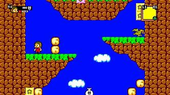
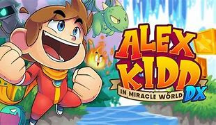
This game uses a similar aesthetic to what I would like to have for example I would follow this colour scheme as I think the bright colours would go well with the fantasy/leprechaun theme as it is so bright and punchy colours these may have to be put in a gradient though as they burn your eyes after looking at it for a while so if I pick to follow this colour scheme I may have to dull it down slightly or break it up with clouds as the solid blue sky is quite sharp. I also like the idea of having textures for the ground and grass instead of it being singular block colours. This games USP is that it is a simple vertical platformer so it is just simple to pick up and play and this is the case even with the art style which is why I like it because I prefer simplistic art style as art isnt my forte.
Undertale
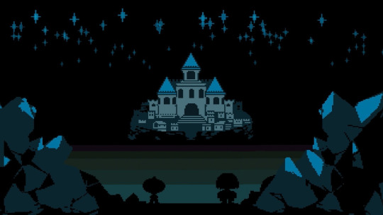
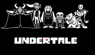
I like this design from undertale and it suits my aesthetic as leprechauns are fantasy creatures and this scene look very fantasy like with the stars and fairy tale esque castle. I picked this image as I was after a specific game that uses a backdrop in pixel art that matches my fantasy theme and I came across undertale so I decided to research this game. I chose exact image as I want a castle in the background of one of my levels and this gives me good inspiration for it as it matches the fairy tale theme which is sort of where leprechauns slot into and is obviously made from pixel art. I'm mainly focused on the towers as I feel like a tower stack like castle would suit the environment better than a full size one like this. This games USP is because the art style is so different for example it utilises a mix of pixel art and handdrawn art creating a very visually charming world allowing for simplistic looking backgrounds and art work but when looked into further you have a very detailed foreground and the background is really well detailed too.
Terraria
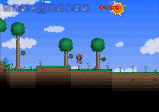
I chose this one as I like the backdrop and sky. I decided that i like the trees design and how the green colours of grass and trees are different colours from each other. I also like how under the grass isn't just a solid block of ground and it fades although not to black I feel thats a bit lazy. I also like the sky is in a gradient so it gets brighter the closer to the ground you go so it isn't a solid block colour. This games USP is that it is a very simple but detailed art design for example it uses basic things like gradients in the tree leaves and the minimaly textured dirt and the way that the dirt fades to black so the game dosen't reveal anything underground. I shouldn't have this issue as I plan for my game to be more zoomed in.
shovel knight


I like shovel knight for the textures and buildings as it looks fantasy and old which is sort of the theme I'm going for so it fits the leprechaun well and it has an actual environment around it that suits. I also like that there is the odd bit of detail but it is fairly simple design e.g the vines around the tree and the grass not being one flat plane. As I want my game to be simple design but not look like it's been drawn by a sub-5 year old. This games USP is that it uses simple pixel art but with a lot of texturing which I like and will try to use in my game so it isnt all just blank block colours. This game I feel did it well out of all the others on this list.
Sonic

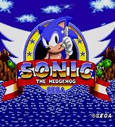
This game is one I like as it has a sharp colour scheme and its not all block colour it has a sort of chequered technique used instead of being gradient or block coloured. I don't personally like the chequered idea as it just looks odd and it's a bit lazy. Although its colour scheme is what I like as it is a lot like Alex Kidd's and I feel it would match the leprechaun theme well. This games USP is that it uses sharp and block colour which is really sharp on the eyes but it keeps players attention so it works in this way as it makes the game seem brighter.
Conclusion:
In summary I feel that I would like a sharp colour pallet with some textures on the backgrounds that has an old fashioned magical theme to it and it to use some gradients in places like the sky.

I have also been experimenting with palletes and I found that I like the more sharp colours as I feel the other ones look too washed. Also by looking at this it tells me that you get a lot of different colours by using a sharp coloured pallet. Also I feel it would match the retro and fantasy vibe my game is goig for and I feel the bold and pop art esque colours would work well with the mythological/fantasy idea.
The USP's are based on why the art work is unique.
0 notes
Note
hey morri, happy STS! what would be your dream cover style for COS and ATQH? (graphic, classic painted illustration style, photo-edit, handdrawn etc) (--@space-writes)
Hi Space!! Thanks for the ask! And boy is it a fun one!!
I'm very much a Cover Snob (thank you 3 years of graphic design classes + being a Very Opinionated Person), but I also have a hard time visualizing things, so coming up with my own dream covers is kind of hard. But I will try!
So, I actually made a cover for ATQH, which I can't be bothered to find the post I made for it, so I'll just pop it under the cut. But that's obviously not a super professional cover, and it doesn't quite fit the vibes of the story?? Don't get me wrong, I'm proud of it, and I was very intentional with my choices of the graphics I used to make it, but it doesn't exactly scream "low fantasy romance!".
In my mind, the story (or at least Fallon and Kris's romance) is symbolized by a sword wrapped in rose vines. But I feel like that's kind of an over-used set of symbolism (or at least roses and swords separately). Although, that might actually work in my favor, should I ever actually finish and publish the story, as much as I don't like the idea of "fitting in" with people's expectations.
But it seems like no matter what I choose for the cover (be it roses and swords or horses or something else), ATQH is destined to have a photo-edit cover of some sort. I'm rather partial to those myself, also due to my interest in photohop and graphic design in general, so I don't mind that at all.
For CoS, I don't have the aesthetics and symbolism figured out quite as well, so my cover ideas are less specific. But I am rather a fan of the banner I made for the WIP intro. So I'd probably end up with another photo-edit/graphic cover of some sort.
Thanks for the ask @space-writes !!

#thespacelizard#morrigan replies#wip asks#covers#book covers#wip: atqh#please be nice about my homemade cover#I'm proud of it#even if it's not exactly profession-grade#I'd love to get to professional grade some day#but as I'm self-taught from now on my skill improvement is slower than I'd like it to be
1 note
·
View note
Last Seen Blogs