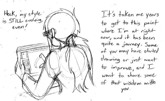
#i combined clip studio paint and paint tool sai to make this and going back and forth was the only way I knew how to draw lmao
Text
Tutorial/Step-by-step/Tips
I’m not a pro nor my art is perfect
But if you are interested or just curious by my coloring process and way to think
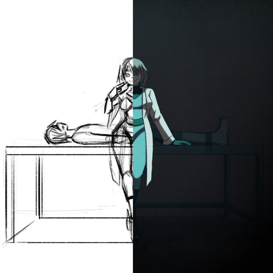
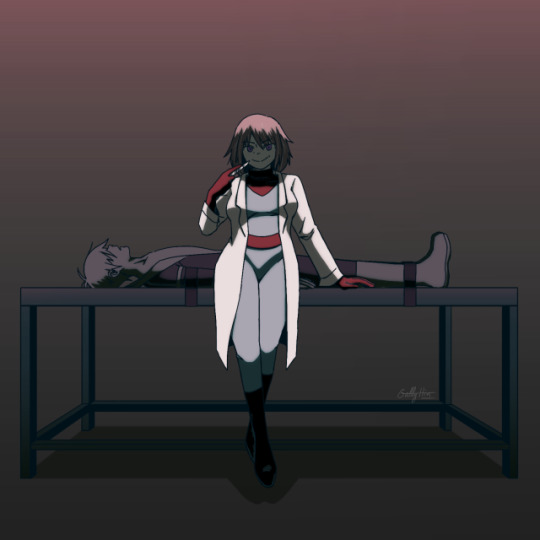
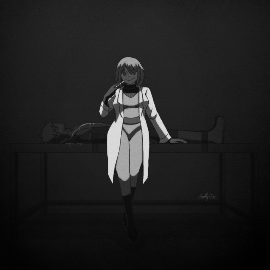
Step-By-Step and several tips bellow with my last “Maddie & Danny motherly love” drawing :)
(warning: bad English because i’m not a native)
(warning 2: i’m an art nerd so when I begin don’t know when to shut my big mouth, so very very long post and quite messy)
xxx
I use Procreate, but this could work with most software like Photoshop/Paint tool Sai/Clip Studio maybe Krita too
Some tips could also be use in traditional arts
Basic knowledge needed: color theory (warm|cold, saturated|desaturated), one digital software
Step 1: Sketch
Tips: Don’t be shy to try different compositions first and choose the best idea, at first I wanted to draw Danny viewed from above and Maddie looking at the sky hiding the gory parts but it’s didn’t work well, sometimes simplicity is more efficient
Tips: Maddie is here right in the middle, looking at the spectator, this composition in general is bad/uninteresting because the dynamic is weak, and the feeling it’s strange and unsetting
But it’s very efficient in horror and spooky stuffs where this feeling is wanted (like in the famous “Shinning” ‘s scene with the twins sisters), it’s uncanny
I could have draw Maddie very straight and symmetrical to really insist on this unsetting feeling (something way too perfect to be true), but I wanted her to be sultry (like in the song), not looking "death inside"
The square format help to insist on this strange feeling too

Tips: Composition is all about contrast, here Maddie is standing up and is build with curvy line of actions, in contrary of Danny who is lying down, and their bodies joined in a cross shape
I planned to draw her very cleaned and mocking while a gory scene is behind, I abandoned the « guts out » idea because it was too just distracting, we should see Maddie first and not what on the table
Tips: A quick way to check big anatomy problems is to flip your canvas with horizontal/mirror flip, on traditional medium you could flip your paper on a sunny window or a lightbox

Step 2: Lineart
Tips: I planned to do a very dark ambiance with little lights, so with my lineart I added heavy/dark shadow on Maddie’s hair, clothes, and the table
I don’t recommend it for light or pastel scene
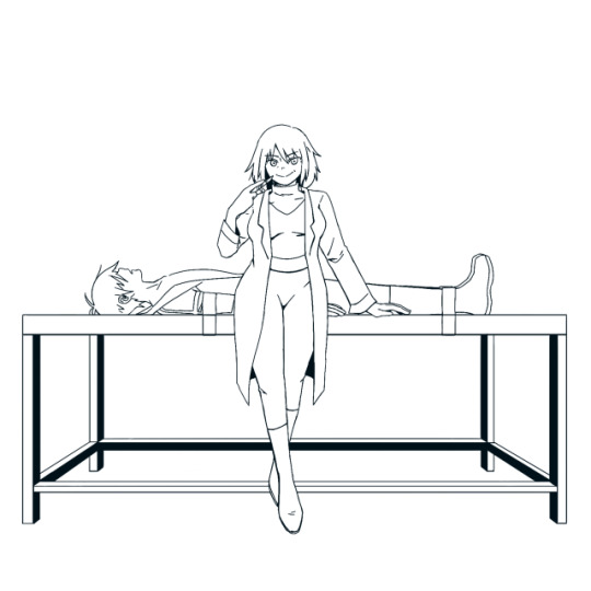
Tips: Often in art, people talk about line weight, but something effective I find is to use thicker (green) line where the shadow will be, and thinner (red) where the light will be

Tips: Avoid joints and interference
We tend to do that naturally, but better be conscious of it
If your lines are crossing more that 2 times (here on Maddie’s sleeves) or barely touching (Danny’s shoes) the line could be odd and heavy, try to do this as little as possible

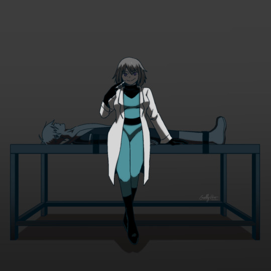
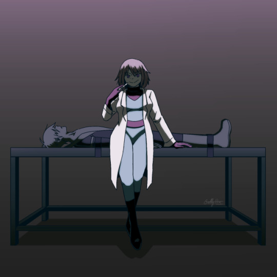
Step 3: Base colors
Tips: I already have a Maddie’s palette, but here I really want to give this drawing a cold feeling, so I desaturated her hair and her skin which were warm colors, for her jumpsuit and eyes to really pop out
Danny is hidden in the back and is a “furniture” so his colors are very dark, almost blending with the table


Tips: The lineart is painted in dark blue and parts hidden by the black part of her jumpsuit are painted in turquoise
Step 4: Shadows
Tips: I use a new layer for the shadows often on multiply but not always (play with your layers modes to find your wanted effect), please try to not use black because nothing in real life is pure black
Here I used a dark green shadow, for a cold feeling, if your drawing is warmer use a warmer tone like red or orange
You could add a secondary more saturated shadows inside the main shadow, but hey I'm lazy
Dark red shadow
Dark green shadow

Light pink shadow (pastel vibes...)

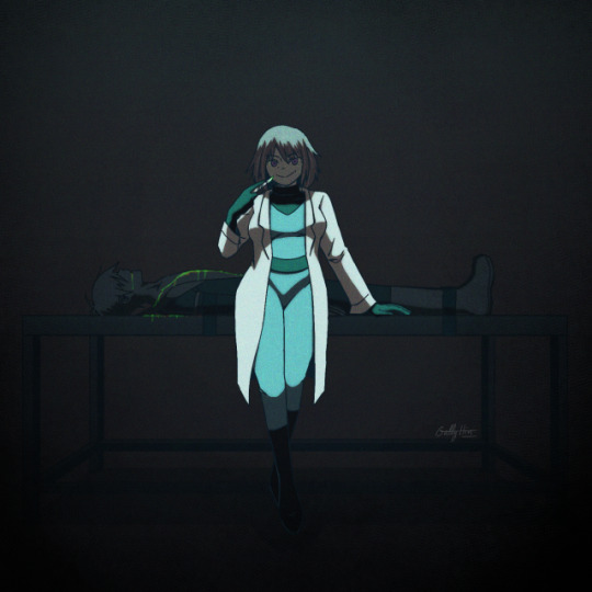
Step 5: Light
Tips: Similar to the shadow try to not use pure white and play with the modes, here I use a cold turquoise light
A warm light like yellow/orange/red will give a total different feeling
My tips for really making light pop is select shadow layer>invert>fill with light color>mask or clipping mask to set it on the subject>change the layer mode
Red light
Turquoise Light

Pink Light
Step 6: Additional contrast
Tips: The most important in a drawing are eyes/faces/hands/gestures/light
People are naturally attracted to eyes and face, and light
It’s one of the reason why I didn’t draw Danny’s eyes (even closed)
Gesture and hands give life to a drawing, hands are like a second face so don’t neglect its
Tips: I just add a dark layer between Maddie and Danny to make her pop even more, the viewer should see her eyes first and Danny after, like a bad surprise

Step 7: Additional effects
Tips: I just play here with layers modes, hue, and general shadows until I have what I wanted
Tips: It’s always interesting to give your drawing some texture, a paper-like texture is very common
To give is a shaking effect I use here a noise layer (black layer>noise max>overlay mode>blur if necessary
Step ?: Composition - Silhouette
Tips: To create strong characters in character design with unique body shape and body languages, professionals fill all the characters in black
If a composition is strong, being all black should be enough to understand who this character is, and the story you want to tell
Illustrations don’t go as far as characters design art where we really try to make one single character to shine, but this could be useful to check if every elements/characters is interesting enough

Step ?: Lights - Black and white desaturation
Tips: Colors are a combination hue, saturation and light
To check the lights, I use a black layer set on hue mode on top of my drawing to desaturated it all, and hide/open this layer regularly
This way I could check if the lights are right, if not I adjust the layers (colors, shadows or lights layers)
The lights are good when the drawing is self explanatory in B&W, when the parts aren’t blending together in weird way, and when the drawing converts the same feelings as it’s were in colors
Bad, her face and Hair are blending together, and her jumpsuit and her belt too
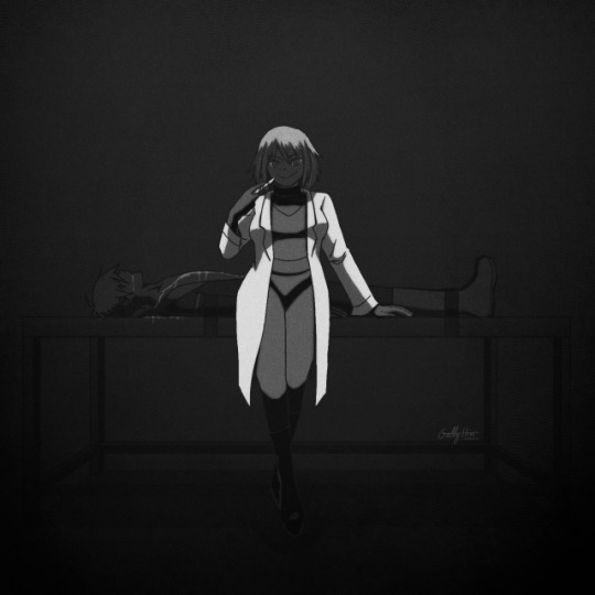
Better
Step ?: Let it’s matured
Tips: I always let my drawing several days before posting it on socials medias
This way if I’m too tired after finish it, the days after with cleaned eyes I could spot errors easier and corrected its before it’s too late
Furthermore you always make progress unconsciously each day by simply living and observing
For example I let this drawing 3 days before posting it, but maybe I should have wait 1 week...
Final words: As I said, I’m not a pro, it’s just some useful tips I learned in my art journey and from experience, none of this is « rules » and I don’t use all of these each times (sometimes I forget some tips, sometimes I’m just lazy and don’t want to put too much though on it)
Try, experiment, breaks rules, and be curious
Sorry for the big post, like I said I’m an art nerd and I never know when to shut my mouth
Hope it could help and have fun \( ^ ▽ ^ )/
Bonus: Step-by-Step gif

9 notes
·
View notes
Text
Tutorial Tuesdays--Getting Started
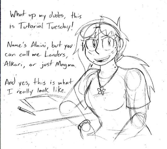
Tutorial Tuesdays is a new block on my blog in which I give art advice and tutorials for anyone looking to improve their art. But before we get into the good stuff, a quick obligatory background.
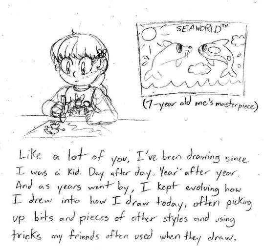
I know it’s tempting to look at my art and the art of people you look up to and come to the conclusion you’ll never get to that level no matter how hard you try, but it is possible to get to that level. You just gotta practice regularly and before you know it you’ll have it down-pat.
These posts will be pretty long, so to save Dashboard space, I’ll put the meat of things under a Keep Reading link so you can visit them in full. Alright, with that out of the way, are ya ready kids? Let’s go get some art tools!
I only say this because I’ve seen people make fantastic things with very limited materials and people with some of the finest tools but don’t use them to their full capacity. Again, it’s not what you use, but how you use it. When I talk about art tools, I’m mostly going off of what I use since those are the tools I’ve worked with a lot.
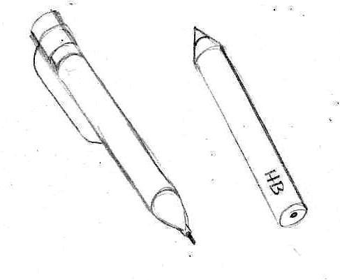
Pencils. Your most basic writing and drawing tool. For sketching and drawing, I use a 0.7 mm mechanical pencil with a good eraser. It’s quick, it’s convenient, and I often stick it in my ponytail when I’m not using it so I have easy access to it. They’re also pretty cheap. For commissions and grayscale shading, I use drawing pencils that come in various hardnesses. The hardness of your pencil will be noted by a number and a letter. A pencil with an H stamped on it will be harder, won’t smudge very easily, and has a very light load when the graphite is on the paper. A pencil stamped with a B will be softer, smudges very easily, and has a darker streak on the paper. The number on the pencil following the letter lets you know how hard or soft it is (4H is a very hard pencil, 8B is a very soft pencil). Your typical No. 2 pencils from school are in the HB category, which is middle of the road. You can find them individually at art stores or in packs. Walmart in my town offers a package of 6 drawing pencils bundled with two animation colored pencils, two markers, and an eraser for about $9. Pretty good deal. Speaking of...
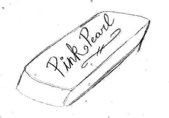
Erasers. A pink rubber eraser will do you just fine, though make sure your pencil has a nice one on it for finer details and while you’re drawing. You can use a kneadable eraser if you have one, they’re squishy, you can mold them to how you see fit and they don’t leave any crumbs to clean up, but I’m not quite fond of them.
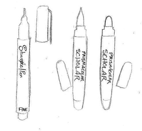
Markers and ink pens. Let me tell you, once you use a pen like one of these, you’ll never go back to ballpoint, which often has far too many broken lines to be practical to use and make your lineart look like trash. I use a Fine Tip Sharpie Pen, preferably in the no-bleed variety so the lineart doesn’t sink into the opposite side of the page. Recently I’ve been using Brush and Bullet tip Prismacolor Scholar markers for comics and good drawings. They’re a bit erratic to use at first, but it takes practice.
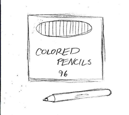
Colored pencils. Now these are my go-to for coloring since they give a wide range of color, combinations, and effects. For best results, I stick with Crayola or Cra-Z Art since the color tend to remain consistent from box to box and you can get a big box of them for a pretty good price. Prismacolors would be nice, but they’re pretty expensive and I don’t quite like the feel.
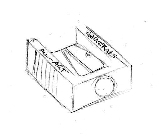
Sharpeners. Electric ones you can just keep at home, but for on the go I recommend a small manual one you can throw in your bag. Bonus if you get one that has a shavings catch so you don’t have shavings making a mess of your space.
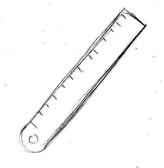
Ruler/straight edge. You’ll want one of these for comic panels, perspective guidelines, and, well, straight lines, though in some cases you might want to practice making straight lines without the use of it. I use a metal one, but a plastic will do you good as well.
And now, the most important thing of all, your drawing canvas!
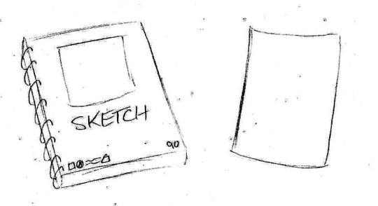
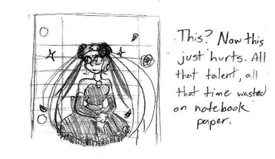
For starters, I recommend you get yourself a good sketchbook. Nothing too fancy, just one of those spiral-bound ones ideal for sketching. For your really good art, copy paper will work just fine. Really any kind of paper (or even cardboard!) will work but I implore you to avoid using loose-leaf notebook paper. I cannot tell you how much it hurts to see something so beautifully drawn wasted on lined paper. Not saying you can’t doodle in your notebook and show off something silly you sketched, but if you’d count a drawing as your magnum opus, your drawing probably deserved being on blank paper where it can shine.
I was considering making this an entry for Digital Art tutorials, but I’ll put these here just in case.
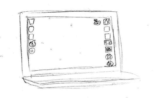
I do a lot of digital art using my HP laptop built with a touch screen. It can’t stream for sh1t but it runs single player Steam games alright and I use it for homework a lot. Before this, I had a desktop computer and used a mouse. I would like to own a Wacom tablet in the future, but until then this setup is nice enough. Remember, it’s about how you use your tools, not the quality of tools at your disposal.
Now this is a scanner that’s used only for pictures/documents. You can’t print or fax anything with it, but it’s good for just pictures. I own an HP printer/scanner combo, but it is pretty finicky and no longer prints. Alternately, you can just use your cell-phone camera to take pictures of your finished piece, but I do not recommend doing so for comics unless you’re giving previews of one panel.
For my programs, these are the three that I use:
Good for doodles, already on your computer (probably), and I use this program to make authentic looking Homestuck drawings (like, you could mistake it for being an actual panel in Homestuck).
My primary art program. Operates much like Paint Tool SAI and photoshop. Very good for general art and comics.

Still learning this one, but it’s just like Medibang and is equipped with tools for animation.
And yes, these three programs are downloadable for free. I do want to try out Clip Studio Paint EX, but the cheapest I can get it is $80 when it goes on sale during the holidays. Normally, it costs $250.
Next time, we go over some drawing basics and some tips that will save your sanity while sketching. Stay tuned!
#tutorial tuesdays#art tutorials and refs#sh1t magma-paint does#getting started#art supplies#art software
16 notes
·
View notes
Text
Windows 10 3d display mode turn off 無料ダウンロード.spacedesk | Multi Monitor App | Virtual Display Screen | Software Video Wall
Windows 10 3d display mode turn off 無料ダウンロード.3D in Windows 10

iOS/iPadOS.Trimble Connect を入手 - Microsoft Store ja-JP
3D in Windows Windows 10 More Less. Get started. Get to know the Paint 3D tools. Basic 3D modeling. Help & tips. Make a 3D doodle. Use stickers in Paint 3D. Paint 3D for 2D. Didn't match my screen. Incorrect instructions. Too technical. Not enough information. Not enough pictures. Other Launch the Microsoft Store app from your XBOX home page or the “My games & apps” screen. Select the Search tile Using the on-screen keyboard, type “ dts ” and select the DTS Sound Unbound application tile from the results Tap the side button to turn on the modifier, use the pen, when the stylus tip is lifted the modifier will turn off. "Auto Switching" - Automatically switch what
Windows 10 3d display mode turn off 無料ダウンロード.spacedesk | Multi Monitor App | Virtual Display Screen | Software Video Wall
Step 2: Uninstall spacedesk Graphics Adapter (for Windows 10 only) For Windows 10 operating systems, manually uninstall spacedesk Graphics Adapter in Device Manager. This only applies on spacedesk driver version z – later. Step 3: Uninstall spacedesk Mouse and Keyboard drivers (for Windows only) Sep 15, · TCH v (July ) -Updated! Offline Mode - Download, Display, Create, Edit & Delete ToDos, Views and Object-linked Spatial ToDos; Use QR codes to align models on the site; Sync changes to Trimble Connect cloud when the device comes back online. -Updated! Large Model Optimization - Support model layers. Turn Layers on/off Jan 17, · Windows 10 (laptop is plugged in) and sleep mode for display is set for 2 hours yet screen turns off after 1 minute of non use. I have attempted to change various power settings without success. Windows 10 does not seem to have the Console Lock function in Control Power, Advanced Options as all the answers suggest to change
Use the Pen Tool to use CTRL, ALT or SHIFT modifiers or keyboard shortcuts by pressing the side or Bluetooth button on your stylus while working in Photoshop, OneNote, Zbrush, Krita, Blender, Maya, Sai, Clip Studio Paint, Rebelle, Sketchbook, Blender, Expresii and many others by changing how the Pen works.
Surface Pro 7 and Microsoft Surface Book 3 compatibility added! ini presets per application preset" - use a keyword to create a drop down of presets to choose from per application example - OneNote allows you to choose from a list of presets with the keyword "onenote" in it Alt up, down and right allow you to navigate with the keyboard "Tap to unlock" - This option let's you use modifiers in programs that have a conflicting setting.
When you turn on this option the button will turn on the modifier until the pen is used. Tap the side button to turn on the modifier, use the pen, when the stylus tip is lifted the modifier will turn off. You can also LOCK the setting to keep auto switching from happening. In the LOCK state a single click on the Pen Tool icon will launch the current settings for the active top most window.
The modifier will stay on until you use the stylus or for 2 seconds. It allows you to use touch gestures in combination like "ctrl" then "s" to save a file. Click - and then drag from the "location" button to the desired screen location. It will map the side button to that location. Up to 6 locations can be mapped to a single button. The Pen Tool has EXTRA features built in to manage switching and editing, not only the side button per program, but Tablet Pro preset modes.
If you are looking for the Artist Pad on-screen touch keyboard shortcut panel from Tablet Pro please go to our website to install. Some of the extra features require Tablet Pro to be installed.
We hope you see this as a benefit that is available to you. We added an intelligent Screen capture tool that allows you to screen grab and paste with a single button. If you have a program that doesn't have a keyboard shortcut you can easily program the Pen Tool to click between 6 screen locations with a single button. great for swapping back and forth between tools like a pencil and eraser or two types of brushes! If you want to purchase a stylus built for artists, check out our website.
com Please send feature suggestions or bug reports to justice tabletpro. This app won't work if you are in Windows 10 "S" mode. this is a restricted mode It does support normal Windows 10 and The Tablet Pro Pen Tool has been updated to work with more than just Surface devices Surface Pro, Surface Go, Surface Book to change the function of the side button on the pen. You will want to use this in conjunction with any Windows Ink applications in the Microsoft store or Windows 10 or Windows 11 desktop programs.
Great for drawing apps, writing notes, brainstorming and whiteboards. We now include support for Dell active pens, Renaisser Raphael "R" stylus and allow for you to personally setup pens and stylus from other manufacturers.
Support for HP, Lenovo, Wacom and other brands of stylus are likely possible at this time. Please download the trial and test if your device is compatible. Select between modifiers or enable hover right, left or middle click. Great for use in Zbrush, Photoshop, Affinity Designer, or any program drawing or art program where you want to add extra functionality.
The tool also supports two button pens like the Wacom bamboo ink and Dell Active Stylus. Please test the free trial and make sure this works for you before purchasing. Contact support with questions: justice tabletpro. A single press will activate a single use of the modifier until the pen tip comes up. Sticky Mods: a single press of a modifier allows you to add a second key press.
This setting is per preset Quick Launch: single click the Pen Tool icon will launch the correct preset still needs refining for the active program. learn how to use the Pen Tool by hovering over elements New UI, launch editor, launch Tablet Pro settings, improved autoswitching, bug fixes, more check the www.
Microsoft Store での特別サービス、最新の製品、イベントなどについての情報をお届けします。日本 に在住の方がご利用いただけます。. Tablet Pro Pen Tool Tablet Pro. 続行 キャンセル. Tablet Pro Pen Tool. 対応プラットフォーム PC. 主な特長 Use the Pen Tool to use CTRL, ALT or SHIFT modifiers or keyboard shortcuts by pressing the side or Bluetooth button on your stylus while working in Photoshop, OneNote, Zbrush, Krita, Blender, Maya, Sai, Clip Studio Paint, Rebelle, Sketchbook, Blender, Expresii and many others by changing how the Pen works.
Surface Pixel 無料. Sketch 無料. Ink Workspace 無料. Pixel Art Studio Free 無料. FlowPad 無料. Tablet Pro Pen Tool Store trailer video - Advanced Stylus Controls. このバージョンの最新情報 v4. 機能 Windows ink, remap the stylus button, side button, Ntrig, surface pen, Microsoft, radial menu, wacom, bamboo ink, stylus, pencil, photoshop, zbrush, artist, digitial, best, new, bluetooth remote with custom eraser button settings use hotkeys and keyboard shortcuts with the side and eraser buttons Perfect for use in OneNote, Photoshop, Zbrush, Concepts, Krita, Sketchbook, Affinity Designer, Sketchable, Leonardo, Paint Tool Sai, Rebelle 3, Artrage, Medibang, Corel Painter and any digital art app drawing, digital art and note taking companion tool.
Add this to your favorite program to make OneNote more powerful or allow Alt Click Navigation in Zbrush, or Color Pick in Photoshop whiteboards, brainstorming, drawing and writing notes Dell Active Stylus supported Wacom Bamboo Ink stylus supported Microsoft Surface Pen stylus supported Surface Pen alternative R stylus support stylus side button remapping pen remapper change the barrel button function change the right click button behavior change the invert button function change what the eraser button does.
追加情報 公開元 Tablet Pro. 公開元 Tablet Pro. おおよそのサイズ 6. 年齢区分 3 才以上対象. このアプリは次のことができます すべてのファイル、周辺機器、アプリ、プログラム、およびレジストリにアクセスします インターネット接続にアクセスする Microsoft.
インストール Microsoft アカウントにサインインしているときにこのアプリを入手し、最大 10 台 の Windows 10 デバイスにインストールできます。. サポートされる言語 English United States. 公開元情報 Tablet Pro Pen Tool の Web サイト Tablet Pro Pen Tool のサポート. その他の規約 Tablet Pro Pen Tool プライバシー ポリシー お取引の条件. この製品を報告する このアプリをマイクロソフトに報告する 問題を報告していただき、ありがとうございます。弊社のチームで検討し、必要な場合は対策を講じます。 サインイン してこのアプリをマイクロソフトに報告する.
このアプリをマイクロソフトに報告する 違反の可能性 不快な内容 児童労働 マルウェアやウイルス プライバシーの侵害 誤解を招くアプリ パフォーマンスの低下. 確認 キャンセル. システム必要条件 最小 この製品を実行するには、デバイスが最小要件をすべて満たしている必要があります OS Windows 10 バージョン おすすめ 最適なエクスペリエンスを実現するには、デバイスがこれらの要件を満たしている必要があります OS Windows 10 バージョン サインアップする Microsoft Store での特別サービス、最新の製品、イベントなどについての情報をお届けします。日本 に在住の方がご利用いただけます。.
Microsoft Store からのメールを受け取るようにサイン アップしていただき、ありがとうございます。 閉じる. Surface Pen;Wacom Bamboo Ink;Stylus;Pen;Pencil;Windows ink;Microsoft Windows 10;Dell Active Pen;HP stylus;R stylus;Surface Pen alternatives.
0 notes
Text
How Black Mirror Embraced Its Horror Potential with Playtest
https://ift.tt/31rDHKg
Monster specialist Grant Walker of award-winning VFX studio Framestore was excited when he received an offer to work on an episode of sci-fi anthology Black Mirror’s third season. But the nature of the job, for an episode called “Playtest”, proved to be an unexpected one.
“I thought: ‘they want to make monsters for Black Mirror? I don’t get it,’” Walker says.
Through two seasons and six episodes on Channel 4, the monsters of Black Mirror were largely metaphorical and unseen, signals and dispatches from mobile devices in a dubiously fictional world. Then the show was picked up by Netflix, which quickly commissioned a six-episode third season. Among those six episodes was “Playtest,” an hour starring Wyatt Russell (Lodge 49), Wunmi Mosaku (Lovecraft Country), and Hannah John-Kamen (Ant-Man and the Wasp). When that episode premiered on Oct. 21, 2016 it looked quite different from any other Black Mirror installment before it.
In “Playtest,” the monsters of Black Mirror became literal with a grotesque human-spider hybrid and a shrieking flayed-faced zombie terrorizing Russell’s character Cooper Redfield as he playests the latest virtual reality videogame from a legendary game studio SaitoGemu. Though it all may be happening in Cooper’s head, the monsters created by Framestore are no less real to the viewer. That makes “Playtest” something truly unique in the Black Mirror canon. This is the one installment of the show’s 22’s entries that is undeniably, unapologetically horror. And four years to the day after its premiere, it still stands tall in the Black Mirror canon among the creative individuals who crafted it.
“I wasn’t expecting to do it. Then it just kind of just snuck in there, and it ended up being the highlight of my year,” Walker says of his BAFTA-nominated work on the episode.
“Playtest” director Dan Trachtenberg came to the project directly after the release of his film debut, thriller 10 Cloverfield Lane. Like Walker, he was pleasantly surprised that Black Mirror was set to expand its genre influences.
“I remember that was the big draw for Charlie (Brooker). He was really excited about making essentially Evil Dead 2. And I was excited to continue to do that kind of work and I felt like I was sharpening a tool that I hadn’t yet fully sharpened,” Trachtenberg says.
Trachtenberg and creator Charlie Brooker bonded over a shared love of both horror and videogames and quickly got to work fine-tuning Brooker’s concept into a lean horror machine.
“What evolved the most was probably Wyatt Russell’s character,” Trachtenberg says. “Initially, the character was much more of an ugly American. There’s still that quality to him, but there’s a lovability and a naivete to Wyatt’s performance that informs the gravity of some of the things that he’s dealing with. In initial drafts, it was more like one of the horror movie terms of the unlikable person who is put through a gauntlet to learn to have values.”
The first third of “Playtest” serves to set up the improbable circumstances that would lead a young American man to a creepy manor in the British countryside to playtest a VR horror videogame from a Japanese gaming giant. It all starts with Cooper out on a sprawling world tour, traveling to India, Dubai, Spain, and more before arriving in London at the tail end of his journey. When it’s time to finally return home, Cooper discovers that his bank account has been hacked and he’s unable to buy a return plane ticket. Thankfully SaitoGemu is in London working on its latest horror game and it’s willing to pay for some willing playtesters. That’s how Cooper makes his way to the opulent and spooky Harlech House where lead designer Shou (Ken Yamamura) and the team are hard at work creating the next great VR horror adventure.
If this seems like a lot of exposition before Cooper engages with the horrors of the haunted mansion, there’s a method to Black Mirror’s madness. Much of what Cooper experiences prior to entering Harlech House informs the horrors that he sees. One prominent example includes Cooper watching a movie on his flight about a monstrous spider and then encountering a terrifying spider of his own later on. There’s also a poster for Red Sonja, which foreshadows the moment that a specter of Cooper’s sex buddy Sonja (Hannah John-Kamen) enters the simulation and has her face torn off, revealing the crimson skull beneath.
“When (Cooper) kills that evil Sonja and slams her head onto the knife and through his shoulder that is (the position that) they woke up that morning. It’s kind of like in dreams, the way things are affecting you while you’re sleeping and then they show up later inside what you’re imagining,” Trachtenberg says.
The rest of “Playtest’s” dream sequences are positively bursting with similar dream imagery and Easter eggs that fans have done an excellent job of documenting over the years. Trachtenberg is fond of some of the subtler ones.
“There’s a typical, classic creepy girl in the painting in a creepy house, and the girl in the painting is the girl that he’s sitting next to in the airplane in the beginning. Everything you see in act one populates in act two and three,” the director says.
Once the horrors of “Playtest” get going, however, there is nothing subtle about them. And that’s where Framestore’s work comes in. Walker and his team were charged not only with creating a small, realistic spider that sets off the hallucination, but also a monstrous version with the human visage of his childhood bully Josh Peters.
“I played around with quite a lot of different iterations of where to put the face, and how to change the anatomy of the spider and the body,” Walker says. “The mandible things, they were coming out of his mouth at one point, and then they returned into part of his mouth opened up in the way that it does. I don’t know if people notice it or not, but those legs are hands with long nails. They’re like fingers. It’s got a belly button underneath it and other weird stuff that you might not ever get to see.”
The undead version of Sonja was a combination of practical and visual effects, with Walker’s team serving to make the terrifying red skull “gooier” for the most part.
“That was a tricky one. It was one of those ones when you spend a lot of time actually just massaging the integration so it feels tangible as opposed to kind of making this standalone thing and investing time in an amazing asset. She wasn’t quite so shiny, so we built our own CG version, and some shots were CG and layered on the top.”
The effects for Spider-Peters and Red Sonja had to be particularly on point as they are a product of Cooper’s brain and not merely SaitoGemu’s VR technology. As attentive viewers of Black Mirror know, “Playtest” actually “ends” roughly 20 minutes in when Cooper receives a phone call from his mom in the secure playtest area. The signal from his phone, which was supposed to be off and secured in a suitcase, fries the “mushroom’s” connection to Cooper’s brain and kills him almost instantly. Everything that follows is the product of his dying brain and not the work of SaitoGemu’s machine. This information, of course, isn’t revealed until episode’s end and as such Brooker maintains that it’s one of the most misunderstood endings in Black Mirror history.
“If there’s misunderstandings of it, I’m probably to blame, which may be why Charlie is cleaning it up,” Trachtenberg jokes. “But frankly, every reaction video that I’ve watched I feel like people usually do get it. There’s even a clip where someone put what actually happened, where they cut out the entire second that they just show that scene as if that’s all that happened, which is fun to watch.”
Read more
TV
Black Mirror: Ranking Every Episode
By Alec Bojalad
The best episodes of Black Mirror are never about how technology will torment humanity. They’re about how humanity will use new technology to continue to torment ourselves. And nowhere is that more apparent than in “Playtest.” The episode sets up a scenario in which a VR experience will go haywire, but then in reality it is Cooper’s brain that betrays him, not the machine. It’s Cooper’s conscience that takes him on this terrifying freak show of monsters and murderers and then dies before the game even begins. It’s the proverbial “flashes before your eyes” moment in which that flash is a literal horror movie.
“I do find it interesting how devastating that notion is for so many – that it could all happen in a split second,” Trachtenberg says. “We definitely went back and forth so much on the ending. And I certainly don’t love too many twists as well, I just felt the initial twist was the expected one and I wanted there to be something more. I really wanted to drive home that it’s his fault in the end and tie in the fear of inheriting what his father had.”
Though the monsters of “Playtest” offer up the biggest scares, it’s approach to horror is deeper, more existential. Cooper’s real biggest fear is forgetting who he is, just like his father did before his end. And the mechanism that ultimately kills him isn’t any malevolent entity within the game or SaitoGemu, it’s simply his inability to connect with his mother during a difficult time in their lives.
Cooper is quite the keen observer of his surroundings in Harlech House, despite being dead. During one moment in particular, Cooper opens up a cupboard door to find a bottle of (non-alcoholic) wine and before he closes the cabinet he says aloud to his handler Katie (Mosaku) “He’s going to be right behind this door when I close it, isn’t he?” referring to the shade of Josh Peters. And of course, Cooper is right – just a little delayed, as the spider version of Peters that launches itself across the kitchen shortly after he closes the cabinet.
Characters in horror movies being self-aware about the “rules” of horror is nothing new in our highly metatextual pop culture landscape. But identifying the “cupboard” rule is still quite impressive. According to Trachtenberg, acknowledging the legacy and tactics of horror is an important part of any horror enterprise.
“There’s a scene in I Know What You Did Last Summer with these two characters talking in a car. The frame they’re on is the extreme side, and the entire other two-thirds of the frame of negative space is the window; and you just know that someone or something is going to jump inside that part of the frame. It’s about riding the wave of tension then releasing it. (With the cupboard scare) the audience has the sensation of, ‘Uh-oh, it’s going to happen here?’ Then Cooper calls it out and the audience thinks, “Oh there. That’s what it is.’ Now that they’re not expecting it, we can actually still surprise.”
“Playtest” could have been a lot more meta than just as a mere horror critique. At one point, Brooker planned to have a “Nightmare Mode” version of the episode available on Netflix’s streams, in which viewers could revisit it and get a new horror experience. If that sounds like the choose-your-own adventure nature of the eventual special Black Mirror: Bandersnatch, it’s because it is … right down to the focus on videogames.
Trachtenberg says Netflix wasn’t ready to take on the technological burden of such a concept in 2016.
“Charlie is a huge gamer, as am I. We talked a lot about, ‘wouldn’t it be awesome if we could pull off alternate endings or an alternate beat, or could there be connections to other episodes that you only see if you clicked on this button or whatever. I think he really tried with Netflix at that moment and there just was no technology for it.”
Being on the bleeding edge was something of a trend for “Playtest.” Many Black Mirror episodes are known for their uncanny predictive abilities (right down to the truly insane real life rumor of a British Prime Minister allegedly sexually defiling a pig). “Playtest,” meanwhile, preceded a run of truly excellent horror games (including one literally called “P.T.” for “Playtest”) and a modest increase in the popularity of VR technology. But four years on from the episode, Trachtenberg doesn’t feel as though culture is fully embracing the tech’s potential.
“VR was around when we were shooting. And it’s gotten much better since but I think we all felt like AR was definitely going to take over. I still feel that eventually. You just have to try it to know how amazing it is. But still … I would have thought that would have taken over sooner.”
cnx.cmd.push(function() { cnx({ playerId: "106e33c0-3911-473c-b599-b1426db57530", }).render("0270c398a82f44f49c23c16122516796"); });
Perhaps that’s the real legacy of “Playtest.” It’s the one episode of Black Mirror that wasn’t cynical enough about our reliance on technology…despite killing its lead character with a phone 20 minutes in.
The post How Black Mirror Embraced Its Horror Potential with Playtest appeared first on Den of Geek.
from Den of Geek https://ift.tt/3jiM2pI
0 notes
Photo

Okay, so I decided that 2018 is going to be the year I get a little more back in touch with my old art habits self. Since I already got a new comic going again (stargazercomic.com if you've missed it), I'll focus on more fun fan art, more fun cheesecake, more comic side projects, more regular movie reviews... And more of these. (Hey, since I have a Patreon, I'm gonna start earning it!)
So ever since Combiner Wars, the Transformers toys have come with these neat little trading cards. The Combiner Wars cards were a little underwhelming, but the Titans Return cards were a lot more fun I think. (For the record, I am NOT a fan of the Power of the Primes cards. The color schemes seems poorly designed, I'm not a fan of the cheaper looking gloss cardstock they used for them, as opposed to the matte finish stock for the Titan Returns, and just in general... I think they lack uniformity and class.)
So I made a template based on the TR cards here. It's not 100% exact, but it's close enough I think. If you have your own custom characters, or you want a better card for any of your other Transformers... Here you go. You should be able to customize them, pop your artwork in there, print and cut them out. (If you got one of those card sleeves, they'll look nice right next to the original ones!)
Uploaded to DeviantArt is the .Tiff file to work with, which you can get here: https://machsabre.deviantart.com/art/Titans-Returns-Card-Template-725212001
I recreated it in Photoshop CS5, so be aware of that. (I didn't have any crazy effects. So whether it works on an older version is unknown.) It's at a larger size, so if you want it at the actual card size, you'll need to downsize it to 2.5 x 3.5 inches. The name plates are left intact, and you'll need to have the Arial font for it. (Though I suspect Helvetica would be a decent substitute.) Also needed will be the Combatron font, which is free online. Just search with Google. The Combatron font is needed in case you want to adjust the text to say something other than Titans Returns. (Like Power of the Primes, Combiner Wars, Machine Wars, Buttpuncher Alliance, Cyberverse, Rescue Bots and so on.) I included a strip of the brushed steel texture to overlay over the text to give it that effect. (Select the text and remove the rest.) The Tech Spec lines are adjustable with the transform tool. And there's a blue set of lines underneath the red ones for the Titan Master's lines, along with a separate set of numbers along the top on different layers. (For Standard-up-to-10 or Titan Master-up-to-20 numbering.) Autobot and Decepticon symbol are in the corner, and you can swap out which ever you need. And the Hasbro logo is on it's own layer too, you can keep it, lose it or swap it out for a Tomy Takara logo if you're feeling a little extra salty at the time.
Now I don't know if it'll work in Clip Studio Paint or not, as I haven't tested it. It's just a Tiff so it MIGHT... Or it might not.
(I have no intention of making a Power of the Primes card template. Like I said, I'm not a fan of it. I think it looks bad and I'd rather design a brand new one. As for the Combiner Wars style of cards? It's really easy and I could do it if people are really wanting it... But I think the TR design looks a lot better.)
6 notes
·
View notes
Text
a short painting process a.k.a tutorial
@reyindee requested this stuff, i’ll do my best at explaining ;’) this is kinda rough, but i hope you learn something from what i do!
youtube
so this was my finished artwork i just did lately, the programs i have used are paint tool sai and clip studio paint (also you can use photoshop)
and i drew moge-ko from mogeko castle as requested by @the-real-soji-abe

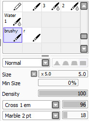
my brush settings are this: (note that I continuously change the dilution during the painting process--blending, density, persistence and size because they are important, also try them now to see it’s effect) (another note: this setting was used to make the sketch)
So let’s staaartt
First, make a sketch

Make an another layer, and put the color gray stuff behind the lineart (I ALWAYS USE DARK GREY FOR BASE)

Some colors on the back as well(another layer)

Start coloring! Start with darker colors! (note that i CHECKED THE “PRESERVE OPACITY” ON LAYER 4 WHILE PAINTING)

Then the lighter colors! Then make another-- Do this continuously until you are satisfied! Imagine where the light and shadows are. (Important note: I combined the lineart(Layer 3) and color(Layer 4) because I am more comfortable with that)
Make another layer, turn the mode into overlay. Fill it with brighter light. (note: It’s in clipping group)
and then..go to CSP for effects and stuff
Use some blur effect, adjust color balance, tone curve, saturation which can be found Edit>Tonal Correction.. and lastly make another layer with the Mode (Lumi & Shade) back in PAINT TOOL SAI, and make it lively xD

the crappy tutorial ends here.
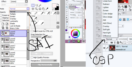
If you’re wondering where you can find the mode thingy in Paint Tool SAI and Clip Studio Paint..
545 notes
·
View notes
Text
Where I Work: David Stark
It’s been exactly a decade since we checked in with David Stark, a New York-based event producer, designer, author, and President + Creative Director of his eponymous, full-service event design and planning firm, David Stark Design and Production. Founded in 2006, the company has become a go-to expert for fully immersive experiences providing their innovative expertise to the likes of Target, Kiehl’s, Uniqlo, non-profit The Robin Hood Foundation, The Whitney Museum of Modern Art, and The Metropolitan Opera, in addition to a range of one-of-a-kind events for a host of celebrities. He’s also collaborated with West Elm on several collections, done a “store ambush” of Haus Interior in NYC for his WOOD SHOP collection, and a limited edition collection of unique art pieces made exclusively for Bergdorf Goodman. For this month’s Where I Work, we visit the busy mogul in his company’s Industry City headquarters in Brooklyn to see where he works and how he makes it all happen.
What’s your studio/work environment like?
Our office, where we design and mastermind events is a large, light-flooded loft that overlooks a great view of the Statue of Liberty in Brooklyn’s Industry City. It’s comfortable with many conference rooms, a kitchen where the team regularly makes all kinds of yummy, home-cooked meals, a design library that houses material samples and reference books, and an open office plan, encouraging the collaborative process. We also have an area that we use as a photo studio and crafting areas where we experiment regularly. While not fastidious in an overly fussy way, the office has a quiet intensity that wonderfully exudes rapt concentration and innovative thinking.
Wood shop
Paint room
Our studio, where we build the things we design, is a few blocks away. There are buzzing wood and paint shops, crafting areas, and a floral studio with a giant floral fridge. We also have an adjacent warehouse that houses a wonderful history of items we have purchased or built over the years that we regularly transform or reutilize. Trucks pull right up to the dock, and we load straight out of roll-up garage doors. The studio is a wonderland of art-making where anything is possible. The talented and passionate team there trumpet such optimism while continuously pushing out work that is innovative and of the highest quality.
How is your space organized/arranged?
I do have a personal office with a door as well as a glass wall facing into the communal team workspace. There are a few other individual offices like that including the ones for our fabulous administrative and finance teams, but the rest of the gang works in the open plan area. The truth is that I am actually in my office proper very little. I meet with the teams daily in our design library for what we call Office Hours. During Office Hours, the teams present the projects that we are working on for feedback, we kick-off new projects, and we discuss issues related to the events we are producing. Because our projects are incredibly collaborative, it’s more common that we use our conference rooms for big, group work sessions or meetings. We use my office in this way too. I have a giant table in the center of it in which the teams will join me for conference calls with clients or group discussions.
How long have you been in this space? Where did you work before that?
We have been in our home in Industry City for about four years. We have what now feels like a very “adult office” and a much more advanced studio than we had prior. These spaces were designed and planned to be efficient and to meet the needs of our growing organization which is very different than the original spaces we were in for about 20 years prior, held together by tape, hope, and a whole lot of love and ingenuity.
You know, our previous offices and studio were first my home and painting studio/loft when I was a fine artist. I and a former partner lived there, and when our business started to grow, and when we added staff, we simply got rid of the sofa, for example, to make way for a desk. There was no planning at all, and as our business grew organically, so did the way we used (or abused!) our limited space. We were more than overdue a new home for the scale of what our company had grown into. I mean, I remember waiting in line to use the one, single stall bathroom we had in the old, two-floor office with my legs crossed in angst and anticipation. It was time to move!
If you could change something about your workspace, what would it be?
You know, there is very little I would change, to be honest – I truly LOVE it, and I can barely remember life before our current home. Our studio and office feel so, so natural and so “us.”
Is there an office pet?
There is not.
Do you require music in the background? If so, who are some favorites?
At the office, we don’t have music playing, but it is not uncommon for our team to be listening to their own tunes on their headphones while they work.
At the studio, there is music of all kinds on at all times. The gang takes turns playing their favorite mixes. For a while, Buena Vista Social Club was on a constant rotation, but sometimes I walk in and am surprised (as well as delighted) to hear classical music playing in the wood shop!
How do you record ideas?
I have a series of pads all over the house, in my office, and in the bag that I carry around with me. They are mostly nothing fancy, usually simple, blue-lined legal pads, but at home, I like the thick blocks of white paper with silver painted edges by WMS & Co. It feels really luxurious to write on those blocks, especially with a mechanical pencil. One of our wonderful designers, Daria Semenova has taught me the joys of the mechanical pencil – she’s got a whole array of them that I am envious over. I finally got one for my home, but I don’t carry it around with me because I would lose it in an instant.
My best ideas come while I am in the shower shaving. I often have to take a break to quickly write them on a pad close by in the bathroom, jumping right back, under the water to finish after. If I don’t do that, I forget the thoughts by the time I am done with the shower. I mourn the many forgotten ideas that I imagined I would remember but did not.
Do you have an inspiration board? What’s on it right now?
I used to keep traditional, black-hardbound sketchbooks where I would draw or paste in clippings or other inspirations, but I have not done that in years. Now, we typically keep track of inspiration digitally, either with Pinterest or mood boards that our team creates in InDesign.
On occasion, though, we make physical boards that are particular to a project. For example, we are currently collaborating on a new tabletop book with designer and co-author Jane Schulak and photographer Aaron Delesie. There is so much content that we need to examine simultaneously that it was natural to go old-school and create pin-up boards that allow us to see all the materials in one place.
What is your typical work style?
I am personally quite disciplined. I get up every day (Monday through Friday) somewhere between 4:00 and 5:00am. I am freshest between then and 7:00am, before the world wakes up and before I am pulled in a thousand directions. I wouldn’t say it’s easy for me to get out of bed, though. When that alarm goes off at 4:15, it’s painful, but I love the focus that I have in those early hours and being that creatively fresh overcomes the temptation to stay in bed. At 7:00am, I go to the gym to take care of my body and my mind, and then I am off and running to the office, to outside meetings, and events into the evening.
My days are very, very scheduled, generally back-to-back, and the rigor can be intense. It’s a combination of inner office meetings with the team as well as meetings with clients and potential clients outside of the office, and then there are installation and event days/nights on top of that. It’s a marathon, for sure, but I thrive on it. I suppose I have built pretty good stamina up over the years.
But because there is an intensity to the work I do, it was very important for me, when designing and conceiving of our offices, that a sense of serenity and calm were as considered as how our spaces function for the work we do.
What is your creative process and/or creative workflow like? Does it change every project or do you keep it the same?
We strategically keep our creative process similar from project to project. Because we have a large team, with multiple people collaborating on each project, it’s most productive to have systems in place, so that we’re all working towards the same milestones. We start off with a team kick-off where we share the goals of our clients. It is super important to establish from the outset what we want/need to achieve, and then we outline the plan of attack as to how we are going to achieve it. We ask ourselves: What are the presentation methods we are all agreeing upon? What is the timeline? What is the budget? How do we build-in the right check-ins along the way? This stuff sounds boring, but the structure is critical to successful workflow.
What kind of art/design/objects might you have scattered about the space?
We have a collection of sculptures of old-school phones we have recently started. One, my husband (performer and artist) Migguel Anggelo made out of matches. A few others are from past projects, and a tiny one I picked up at the Brooklyn Flea. It’s what the old telephone door-to-door salesman used to bring to “sell” the concept of a rotary phone. I love them.
We also have our light-up building number, “87” from our old digs. It’s a fun reminder of where we came from. We even took the door from our old design studio. These relics are meaningful to me. They chart our journey.
Sculptures in the process of being covered with sand
Are there tools and/or machinery in your space?
We have quite an extensive wood shop, paint room, and floral production area, so we have all the tools-of-the-trade for those pursuits. The team is particularly pumped about our new quiet air compressor! We’ve also recently started using a Hopper gun which allows us to finish off our builds with various textures: sand, plaster, glitter, and more.
What tool(s) do you most enjoy using in the design process?
It’s not a “tool” in the traditional sense but . . . I most enjoy the collaborative nature of working with a team. The old adage of Together Everyone Accomplishes More, is so true, and it’s one of the reasons why I transitioned from fine art to design. I started off as a painter which was a very solo endeavor, but I much prefer working within a thriving community of doers, and that collaboration has become an integral part of my design process!
Let’s talk about how you’re wired. Tell us about your tech arsenal/devices.
I typically have my laptop, iPad, and iPhone all going at the same time. I review designs presented to me by the various teams on my iPad, while I type them feedback on my laptop.
What design software do you use, if any, and for what?
Because our team includes technical designers that come from all kinds of architectural, stage, and industrial design backgrounds as well as graphic designers, and 3D designers, we intermingle a lot of software platforms that include: Sketchup, Vectorworks, Adobe Creative Suite (InDesign, Illustrator, Photoshop), and a whole bunch of image search engines.
David’s desk
What’s on your desk right now?
My desk is covered with stacks of books, folders with notes for our current projects, a sculpture of the Carnegie Hall building which is also a lantern. We made 70 of them as centerpieces for their gala a few years back, and I kept one!
Robin Hood to the Power of You event
Robin Hood to the Power of You event
Is there a favorite project/piece you’ve worked on?
It’s very difficult for me to cite a favorite project as they are all so meaningful to me. I am proud, though, of the long collaboration we have had with the Robin Hood Foundation, designing their big benefit at the Jacob K. Javits Convention Center for so, so many years. It’s probably one of the largest projects that we work on and includes a seated dinner for about 4,500 people with another 2,000 joining for an after-party concert. It’s a giant team sport where we partner with a cast of truly inspiring, talented folks to pull off what is ultimately one of the most successful and moving fundraisers to fight poverty in NYC – or anywhere, for that matter.
Last year’s theme was Robin Hood to the Power of You. Our transformation included installations relating to math, measurement, calculations, education, and teamwork in general. Guests entered through a grand corridor of backpacks filled with school supplies that created vivid stripes on the walls. After the event, the backpacks were donated to over 7,000 New York City school kids. I loved telling an education story with materials that are meaningful and have a life after the event, so that there’s no waste.
Tell us about a current project you’re working on. What was the inspiration behind it?
We are currently designing and planning the Metropolitan Museum of Art’s 150th Anniversary Gala. This is another institution near and dear to our hearts, and we have just begun to dive into the research. We love nothing more than exploring an institution’s archives to find that perfect, conceptual idea to base the whole night upon! It’s a truly exciting milestone to be part of!
Do you have anything in your home that you’ve designed/created?
Yes! I have many, many things in my home that I have designed or created, for sure, and probably too many to name in their entirety. Here are three examples:
• Upon entering my apartment there is a piece of artwork that is hanging above an entry table. It’s essentially a chalk drawing that has been sealed, but it was actually cut down from a giant set piece that was created for a benefit we designed for the Robin Hood Foundation many years ago. For this event, we rendered New York City as a giant, dimensional chalk drawing so that the guests could, as a metaphor, redraw the city as we know it, erasing poverty in the process. The remaining piece that I kept as a keep-sake is somewhat abstract, but you can make out some figures walking across a series of horizontal lines. Before the piece was cut down, it depicted the New York Public Library, with horizontal lines as the grand staircase leading from the street to the Library. A fabulous artist named Dave Singley did the drawing. He has been a central part of studio team at David Stark Design for many years as well.
• In our kitchen, a basket woven “bull’s head” presides over the central island proudly. Years ago, when I was designing a collaborative collection with West Elm, this was a sample for a product within a Picasso inspired collection. West Elm did not move our bull into production, but I kept the sample and love it as much today as I did when we first viewed it.
• I also have a set of plates that I designed for Culture Lab Detroit in collaboration with Pewabic Pottery, Detroit’s iconic ceramics house. I love these and take good care of them, because it’s impossible to replace ones that break!
via http://design-milk.com/
from WordPress https://connorrenwickblog.wordpress.com/2020/05/19/where-i-work-david-stark/
0 notes
Text
KZK Discord Digest 6 - Week of Jan 18 - Jan 24
BLAU NOTES:
We had a snafu with the second database earlier this week. Kat tried to manually alter an entry and it got submitted before he was done writing, thereby accidentally overwriting all purchase logs in that DB with garbage entries.
IT IS NOW FIXED. We had a quick response from our host and they got it rolled back. Vendors were taken offline for a few hours while they worked. We had to manually re-enter some entries that got lost during the rollback, so if you get a redelivery from that timeframe that says ADMIN SEND, that’s probably why!
If you made a purchase on that database (Stone Pillar / Direwolf) between Jan 17 and Jan 21 2019 and you can’t get a redelivery please contact Sylver Bu.
This did not affect our primary database.
I put up a crystal in the mainstore near the Direwolf vendors that gives info for how to get creator files for em. This does not directly sell you the devkit or anything like that, and is meant more for folks who do not use Discord or follow group notices. Got friends lookin for that stuff, point em to that.
The deadline for getting the Direwolf Devkit Preorder discount has ended.
Also, neat news! If you made a Direwolf purchase before or on January 20th, you qualify for the preorder bonuses!
Our plans for the first half of 2019 or so (no dates set in stone unless mentioned):
1. Direwolf v1.01 update. The preorder bonuses (Direwolf plushy av & rezzable objects; two exclusive skins) will likely ship around the same time as the update rolls out.
2. Elemental Kirins Round 3: Ragnarok, Nova, Aeterna, Teknika (Destruction, Creation, Time, Technology respectively).
3. KAT - Con Crunch for TFF. Aiming for a spot in the Artist Alley.
4. KAT - Moving cross country. Will likely be limited availability for about a month. Likely happening in April.
5. New server & database setup. Aiming to launch late February / early March at the absolute earliest. This’ll allow us to combine our vendors & have a more robust back-end to prevent any more potential database weirdness. Bit more info below.
(Kat already spoke to someone at Caspervend about their system. They don’t support the way our vendors are set up & the sheer number of items we sell.)
______
Jan 18
Blau Last Friday at 7:50 AM
@everyone forgot to mention here, but I put up a lil crystal in Okarthel by the Dire vendors that you can click and get links/info for the PSDs/Devkit stuff. I'll update it as links change / new stuff comes out.
So if you have any friendos wondering where to get resources to make stuff, point em that way :smile:
______
Jan 19
Blau Last Saturday at 8:39 AM
@everyone Morning! Smol clarification, you don't buy the devkit from the crystal, you still have to contact Kat / Sylver Bu. The crystal just pops out that information. More for folks who don't pay attention to Discord or Group Notices. :3
Kat Last Saturday at 6:17 PM
@everyone Attention artists, new and veteran. I know a great many of you preach by Gimp, or paint tool sai, or clip studio paint, which are all great programs, but, something I learned very recently is that you can get Adobe Photoshop CC for just 11$ USD a MONTH. No, this isn't an ad, but I know for many of you the cost of Adobe's subscriptions are often too much. Thanks to a helpful tipster on twitter, if you go into adobe's website and sign up for/switch your plan to the 'Creative Cloud Photography' plan, it includes Photoshop CC for only ~11$ a month. again, not telling people to ditch their free software, but this info is useful for those looking to get their hands on Photoshop. Please don't take it the wrong way.
KatLast Saturday at 6:32 PM
@everyone To Clarify (as I have a bad habit of using the wrong words), I recommended PS strictly for 3D applications--If you're a budding 3D artist, or want to get into doing texturing for 3D models, most software is configured out the gate to work with PS, making for better streamlining. Not to mention native support for PSD and PSB(obviously) means you don't have to worry about files not opening in other software (as sometimes happens). PS is by no means a true 'art' program, in the vein of krita, sai or medibang, ect, so for art, stick with the freeware. but for 3D, i can't recommend PS enough. its 3D feature takes some getting used to, but can really help you quickly block out markings and ideas, all with the support of Photoshop's
@everyone Please stop advocating piracy. Seriously. its not funny. KZK is not the place to promote breaking the law. I don't know how many times I have to say this. Fun fact, kzk almost got shut down because I was a stupid fuck like 10 years ago and built everything using a cracked copy of zbrush. I got busted and their lawyers hit me with a nasty cease and desist. So I saved up, bought a legitimate key and play nice like a responsible business owner. Kat's lesson for the day, do with it what you will.
Blau Last Saturday at 6:43 PM
@everyone Subject jump, but, tomorrow is the devkit/fatpack discount deadline. Can grab the Fatpack & Devkit combo for 9kL$, or if you already have a Fatpack, just get the Devkit by covering the difference for 3kL$. After tomorrow the offer expires!
(Folks who have worked on contacting Kat prior to the deadline - sorry if we missed ya! As long as we hear from you before the deadline we'll honor the discount)
Kat Last Saturday at 10:57 PM
@everyone So.. Some uh. bad news. We'll call it that, in favor of 'Oh shit I might've just fucked up real bad'. Novice mistake, but I basically nuked our second database. And the real kicker? Apparently when flame and I set up the second database back in 2015, something went sideways with the backup automation. We have no backups of either database at this point. As of right now, my only hope is that my host will see my support ticket ASAP, and rollback my server to the 18th, to before I fucked it all to hell. This means I will be losing ALL SALES DATA for the 19th, 20th, and 21st. But that's preferable to losing 3 and a half to four years of sales data. This is the BEST possible outcome, The worst being that its completely and totally gone. Please wish me luck. I'm trying not to freak out right now. I really am. and please, for all you code monkies out there, please keep any 'humorous' anecdotes to yourselves. I already feel like a piece of shit for literally putting the database down like Old Yeller. However if you have any ideas that might help us recover the lost data, I'm all ears. Thanks.
______
Jan 20
Kat Last Sunday at 12:48 AM
@everyone Got a quick response back from my host, and its looking like I'll only be losing purchase data for the 19th. I can manually restore that data once the database is restored (assuming they succeed.
Blau Last Sunday at 8:44 PM
@everyone Heyo! Our host is working on getting things fixed. Until they give us the all clear we're pulling ALL kzk vendors down to prevent them from trying to update and breaking things over. We'll send notices/announce when it's all done! Thanks so much for your patience :heart:
Kat Last Sunday at 9:19 PM
@everyone Good news everyone! Our host was able to successfully roll our second database back to an image of the 17th. So this means we're missing effectively 3 days of transactions, BUT between Second Life and the server's emailed receipts, I can manually rebuild those missing chunks. Now, that said, we're already hard at work backing up the system, and discussing plans to update the system to avoid this again. And for those of you suggesting caspervend--I already looked into them. The owner told me himself that his system can't do what I need it to. THank you for your patience. I'll bring the vendors back on in a few hours.
______
Jan 21
Kat Last Monday at 3:40 PM
@everyone So it'll take me a fair bit to finish combing through emails, local chat logs (as I get an inworld message from the server for each sale), and cross referencing them against offline emails received to avoid any duplicate purchases, but I should be able to manually restore most if not all missing purchases. I say most because there's at least a couple hundred entries effected by the data loss, so a couple are bound to slip through the cracks. Once the seas settle, i'm sure well come across the missing entries and restore those over time.
Now, on to the topic of avoiding this in the future: A brief overview of our systems: We have 2 vendors because we have 2 databases. Naverous 1, when flame wrote it wayyyy back in 2009 (in fact the system officially turns 10 years old in a day or two, I think.), it wasn't built to last as long as it has. We'd expected to be able to put together a worthwhile successor far sooner but life got in the way. This scare was the final nail in the coffin and we've already discussed internally plans to completely overhaul the system. All new vendors, new server, new database, the idea being that ALL avatars we sell will be in ONE vendor (With the exception of the one-off stuff like we've already got inworld). Once done, the old databases will be called 'Legacy'. The crystals for those will remain active, but all new purchases will be relegated to a new database with better redundancy to avoid data loss and better memory to handle the large quantity of items we sell. We'll keep you up to date on that, thank you.
Kat Last Monday at 3:48 PM
@everyone Apologies for the notice spam lately, but lots to say: Current plans: First up, Direwolf 1.01 update. Fixes, improved resources for user customization, the 2 freeby skins, and the direwolf plush preorder bonus. once that's done, I'll get the last 4 Kirins done: Ragnarok, nova, Aeterna and Teknika. And then I go into con crunch for tff, prepping everything I'll be selling there, assuming we get lucky and get a table in the artist alley lottery. Then, i'll be moving cross country. that'll probably take up a month or so of my time, between packing, moving, and unpacking. after that, I can start talking new stuff, By then it'll be may, so I'm looking at what I want to do for the summer. I'm heavily leaning toward something awesome, but it depends on whether or not I can get it done in a timely fashion (Lesson learned from the direwolf). the new server won't be available til late feb, early march at the EARLIEST, but we're giving that plenty of time under the hood so eveyrthing works correctly. Thanks.
______
Jan 24
Kat Today at 1:34 PM
@everyone So, in this, the year 2019, our lord and savior Tetsuya Nomura has finally blessed us with a new Kingdom Hearts game. It launches today in Japan, so we'll no doubt start to see more posts regarding plot and spoilers on the web. I've already had a huge issue with youtube putting leaked footage in my recommended videos. I shouldn't have to say this, and while it isn't KZK centric or even important to the operation of the business as a whole, its something I'm very passionate about--Whether its KH3 or any other game, movie, or title that people are VERY excited for, DO. NOT. POST. SPOILERS. I will personally hunt down anyone who posts even minor spoilers and introduce them to the ground, and in the words of Android 17, Your relationship will be intimate. I know myself and MANY people who grew up with KH are super super stoked about 3 and getting it spoiled would seriously ruin the day. :heart:
0 notes
Text
Hyperallergic: Beer with a Painter: Suzanne Joelson and Gary Stephan
Suzanne Joelson “Crackrakecrate” (2016) paint, vinyl graphics on wood panel, 50 x50 inches (all images courtesy the artists)
Gary Stephan and Suzanne Joelson live and work together in a building in TriBeCa. Within the building they each maintain individual floors, so my suggestion of a “couple” interview was a bit of a radical experiment. We had to decide how and where to stage our visit. Luckily they were game, ready with Captain’s Daughter IPA, and an array of cheese and snacks.
Their zones are distinct: Stephan doesn’t keep anything extra around — leaving only some minimal, modernist furniture, a vintage rowing machine for exercise, and a fantastic rotating easel. Joelson’s area is full of color, with layered collections of fabrics, textiles, and clippings in full use. Stephan says he’s lucky that he can borrow supplies from Joelson when he needs them; he refuses to buy anything in advance. They use examples from domestic life to illustrate their aesthetics: Joelson apparently doesn’t like closing closet doors — it denotes a system of closed deductions. More than anything, I’m struck by their open, inquisitive nature with each other.
This rigorous but open questioning permeates both of their practices. Joelson asks what happens when two unexpected elements or techniques bump up against one another: collaged, industrial fabrics and the painterly, handmade gesture. Stephan refers to a formalist vocabulary, but turns any lingering obsession with the “framing edge” upside-down. There’s a curiosity in their work about different permutations of “meeting in the middle,” which is, in fact, echoed by the terms of our three-person conversation.
Stephan was born in Brooklyn in 1942, studied at Pratt Institute, and received his MFA from the San Francisco Art Institute in 1967. He has had solo shows in New York at Susan Inglett Gallery, Bykert Gallery, Mary Boone Gallery, Hirschl and Adler, and Marlborough Gallery; in Los Angeles at Margo Leavin Gallery and Daniel Weinberg Gallery. He is currently represented by Kienzle Art Foundation in Berlin, where he will be the subject of a solo exhibition in the fall.
Joelson was born in 1952 in Paterson, New Jersey. She received her BA from Bennington College in 1973. She has exhibited at galleries including Nature Morte in New Delhi, Fernando Alcolea in Barcelona, and White Columns in New York. She was the subject of a solo exhibition, Slipping Systems, in the fall of 2016 at Studio 10, Brooklyn, New York.
* * *
Jennifer Samet: Suzanne, can you tell me about any childhood memories you have of making art?
Suzanne Joelson: My mother was a painter. When I was twelve I helped her paint scenery for a local theater group and got to keep the paint. When friends came over we painted the walls of my bedroom with stripes and dots in clashing colors right over the patterned wallpaper. My parents were fine with this and I continued to alter the room until I left for college. All these years later I am back to combining paint and print.
Suzanne Joelson “First Back” (2012) interior of wood panel/hollow core door, 40 x 30 inches
I did not have many toys but I remember breaking, cutting, and reassembling the ones I had. Doll houses got major overhauls. At some point my mother hid the nicer dolls either to protect them or avoid cramping my style.
In high school I had a geometry teacher who did not like me. But I was oddly good at geometry. I just got it and did not need the class so she let me spend the time in the art room.
I went to the Noguchi Museum recently and thought that it was a bit like the art that I grew up seeing. It is beautiful and essentialist, and yet it’s not enough. There’s always a sense of Noguchi being a little too good.
JS: Gary, where did you grow up? Were you into drawing as a kid?
GS: When I was a kid living in Levittown, on Long Island, like a lot of guys, I loved drawing planes and cars. I remember that in the fifth grade, I was very enamored of this other kid’s drawings. His planes looked so much better than mine, but I couldn’t figure out why. I befriended him and finally said, “Bill, let’s be candid, your planes are much better than mine. Why?” He said, “Rivets. I draw all the rivets.” I realized that was it. He had all these little dots, so it felt like it had been built like a real plane.
We would go to Mass in Levittown Hall, where local artists put their work up on the walls. The work was full of the tropes of late 1940s art: caulk balls dipped in white paint, held together with sticks, on a ground of sandpaper. It was slightly Miró-ish, or like Picabia drawings — quasi-mechanical things. I did not understand what they were but I was attracted to the physicality of them, and the curious form-making. So the plane drawings and my interest in that work run along next to each other.
Gary Stephan “Untitled” (2008) acrylic on canvas, 32 x 32 inches
I had flunked 7th, 8th, and 9th grade. Eventually I got an art teacher who saw me drawing cars all the time and said, “You know, there’s a name for that. It’s called industrial design.” I decided that was it, and that I would go to Pratt for it. But then I fell in with the painters and, before graduating, I went out to the West Coast. I went to the San Francisco Art Institute for my Masters. Eventually, the two forces came together. A lot of my approach to painting is still with that clear, coherent, “What’s the project?” mindset of a designer.
JS: Gary, I wanted to ask you about your Catholic background, because you have said Catholic imagery, like the cruciform shape, has infiltrated your painting.
Gary Stephan: Although I’m now an atheist, I still have some of the Catholic furniture. Every once in awhile, its forms appear, or ideas about above and below: the spiritual plane and the bodily plane. I don’t resist it, but I don’t embrace it. I just let it roll into the mix and then it rolls out again.
When I was in first grade at Catholic school, I read a story called “The Prince’s Dessert,” which was the beginning of my fascination with paradox. The prince asks for a dessert that’s hot and cold at the same time. The punch line was that it was a hot fudge sundae.
I was disappointed with the outcome of the story — because a sundae is alternately hot and cold. It isn’t simultaneously hot and cold. As a boy I felt tricked by the answer. Anyway, these kinds of polarities have interested me since childhood.
As a Catholic, I never thought of the concept of shades of gray in ethical, moral, or emotional questions. That idea did not occur to me until I was well into my second year of college. It was uncomfortable for me, because it didn’t come to me naturally. I was constructed by my parents and by my church to be fundamentally binary. I know the world is not like that. It is fascinating how disappointing that is.
JS: Did the two of you meet originally through art? Suzanne, you were working for Robert Rauschenberg, right?
SJ: I worked for Merce Cunningham as the liaison between Rauschenberg and Jasper Johns, and Merce. I was hanging out in that period with Ross Bleckner, Julian Schnabel, and David Salle. Gary had an opening at Mary Boone, and I went to the opening with Julian. Gary and I talked for about an hour. I was completely smitten and thought I’d made a big impression. But I wasn’t even invited to the after party.
Then, two weeks later, Gary came to a Cunningham event at the Joyce Theater. I was with Ross, and after we took him to Studio 54, I took Gary home. He didn’t even remember me.
GS: It took a while for it to click, but once it clicked it was crazy great. We’ve been together for an amazing amount of time — 38 years. I’m incredibly lucky.
JS: Suzanne, do you think your use of recycled fabrics and materials from the street is related to the experience of doing costume and set design?
Suzanne Joelson “Broken Cocoa” (2016) paint,vinyl graphics on wood panel, 24 x 54 inches
SJ: I hadn’t thought about it but one of my favorite tasks working for Cunningham was recreating Rauschenberg’s set for “Winterbranch” (1964). At some point in the nocturnal piece Rauschenberg would drag what we called “the monster” across stage. It was usually a rolling ladder with an array of battery-operated lights and things he would find on the street. I loved doing it, even though I wasn’t as good at it as Rauschenberg was. He always had a more unlikely thought.
There is something about working with preexisting materials, adapting things outside one’s control. After Hurricane Sandy, I carried my wet paintings up six flights of stairs in the dark, with two assistants. The paintings were on hollow-core doors and water was sloshing around in them. When I ripped off the backs, a roughly applied cardboard substructure was revealed. Its diamond pattern was almost like African Kuba cloth but by different means. We arranged the paintings around the loft to dry with all the backs ripped off, and took photographs of the arrangements.
The effect of that experience was an idea of being very transitory about the work: being less caught up in the craft of it, less concerned about permanence. For a long time, I was a “pure” painter. At some point I started bringing the world back into the paintings. I don’t believe in zero-degree formalism.
JS: I am curious what you think about this, Gary: the idea of pure painting and formalism.
Gary Stephan “The Future Of Reading 5” (2016) acrylic on canvas, 20 x 20 inches
GS: My elevator pitch for my work is that I am using the tools of formalism to build the house of surrealism. I see formalism as a set of appearances designed to create something that’s visually dependable. The contribution of Surrealism is that it problematizes the reading of the world. If you take the appearance of formalism, but bang the cues into each other in such a way that the picture space wobbles or flickers, or doesn’t work properly — you are making a surreal proposition about formalism.
When I came to New York, the big division was between the sharp guys who made serious, formal objects, and the crazy aunt in the attic — of surrealism. Richard Serra would say, “The problem with Donald Judd’s work is that it is surreal.” He was referring to the concealed surfaces – things you can never know. Anytime you conceal, you’re essentially making a surreal object. That’s why Serra’s sculptures are solid steel. Anything that existed outside our vision would become secretive, mysterious, and romantic. The work has to be in plain sight and experiential.
But I could not just blow off de Chirico and Magritte. The contribution of de Chirico is that, for almost the first time in history, aside from Caspar David Friedrich, concealment is content. It is subject matter.
In my work, I try to have enough dependable information that there is a way to compare it to the missing part. The purpose is to re-engage viewers so that instead of them passively taking in the work at the level of style, you offer them the opportunity to engage the problematics of the picture space. In engaging them, they become co-constructors.
SJ: There’s also a lesson in that: that nothing is reliable. Your paintings seem like an inoculation for our collective anxiety about the contradictions of the world. You practice not being able to depend on a predictable space.
GS: Absolutely. It gets to the Russian idea of defamiliarization and the Brechtian idea of alienation. What they want to do is get the viewer into the pain of responsibility in a difficult world at the level of play. You are making art, so it should be fun, but it is also dealing with essentially difficult questions.
It has to do with the citizen’s relationship to the world. For example, I think one of the reasons Trump is appealing to people is that he is saying, “Only I can solve this problem.” It is essentially a paternalistic model. The academic model of painting was essentially paternalistic. It says, “We’ve got all the cards; we know what art looks like; we’re in charge; you’re in good hands.” It’s very Trumpian. What happens with the Impressionists is they say, “Who knows how this works? Get involved, maybe you don’t like it, maybe you don’t trust it. You can co-construct this if you’re so inclined.”
JS: Suzanne, can you tell me about how you deconstruct order and sequences? I know you utilize the Fibonacci cycle in constructing your paintings and multi-panel pieces.
SJ: I tend to start with an order, which I resist. But sometimes it is the other way around and I tug the visual cacophony toward a system. I utilize the Fibonacci cycle, but contaminate it with a degree of lived life.
Suzanne Joelson “Massaging Kale” (2016) paint, vinyl graphics on wood panel, 48 x 84 inches
My cousin who lives in Paris visited recently and we had a sort of French night out in Soho. On our way from Lucky Strike to dessert at Balthazar, we passed the biggest mass of rats I have ever seen in New York. On a shop-filled block we crossed the street to get out of their way. In the context of that evening it was the most exciting part.
GS: Wow. There’s a unique take — “Dessert was great, but the rats were even better.”
SJ: I’ve had lots of great desserts but how often have I seen that many persistent rats? They were undeterred by gentrification. I think about the fact that now, psychologically, so much is colored by what is happening with the Trump presidency. I constantly contend with the question of how much news and information I can digest.
GS: I’ve thought for a long time that if I paid really close attention to politics and then didn’t say to myself, “How can I consciously translate this into a work of art,” but let it leach into the groundwater of my brain, it would show up on some level. I think it does. The conversation I’ve been having with friends is basically, “What can be the relationship of abstraction to politics?”
Gary Stephan “Untitled” (2009) acrylic on muslin, 60 x 42 inches
JS: So this has to do with an idea about incorporating experience and contaminating “pure painting” with daily experience?
SJ: The interest in the Fibonacci sequence and spiraling goes back to the way I have thought about experience, which is as a coil. You go on a route and arrive at a shard of light, and recognize where you are. Then you keep going, and get back to that part again. But you are not going in circles, you are constantly staging a step up…or down.
In Proust’s Remembrance of Things Past, the narrator describes traveling from Balbec in a stagecoach. The coach is going up the hill and away. As it turns along the switchback, he can see back toward the town he has just left. He keeps looking back toward it, but from a little farther, as he is heading toward the future. Then, on the switchback, yet again, he looks back on where he just was, but now he is turned even more. That becomes a metaphor for how memory works.
Thomas Nozkowski came to my studio once when I was working on something that was overly coordinated and he said, “Jump cut.” That was all he needed to say. Now it is my mantra.
GS: It is related to the mosque you loved so much in Turkey, I’ve also always thought that a lot of Suzanne’s work had to do with translation.
SJ: Yes, the interior of the Rüstem Pasha Mosque in Istanbul is beautiful and perfect. There are four doors outside, and the door farthest from the entrance is completely broken up. The original tiles were found and put back on, but not in the original order. I love that kind of patching. It is similar to the Winchester Cathedral in England, where one rose window on the north transom was broken into smithereens and reassembled out of broken bits.
I consider different materials and methods of application in terms of translation. The model is conversation. For example, this format of today’s conversation is unusual for all of us. We can’t anticipate each other’s questions or responses, or the gap between what is said and what is felt or experienced, and how it will read on the page or screen. These change in the context of the situation. I am interested in how the familiar becomes strange, and the structure becomes fallible. A new thought emerges or an old thought can be re-imagined.
JS: Gary, you have described having “two masters”: the object and the painting. Can you explain what that means?
GS: That phrase, “serving two masters,” came from a chapter heading in an old fundamentalist Christian primer that I found. In terms of painting, at one end of the spectrum, you have the master of the concrete object — someone like Robert Ryman. At the other end of the spectrum, you have somebody like Frederick Church — the illusion of a space that can be entered. With Church, you want to experience Niagara Falls uncontaminated by the resistance of the object. With Ryman, you want the clarity of the object without any of the froufrou of the picture space.
Everybody conducts his or her practice along that continuum. That is what is meant by the serving two masters. Anytime you show fealty to one, you’ve weakened your fealty to the other. I was once given a hard time in print for “being compromised”: for the work vacillating between its allegiance to objects, and its allegiance to picture space. That vacillation was seen as a failure of nerve. I think times have changed enough that now it is considered a good way to look at things.
JS: You work on paintings from all directions and sides, and use a rotating easel to turn them around. Is that related to these ideas of concealment and moving between the object and the image?
Gary Stephan “Untitled” (2017), acrylic on Canvas, 30 x 30 inches
GS: The circular easel allows me to mess with expectations about gravity and the punch line. Sometimes I give way to the more obvious expectation, because I don’t see any reason to be obscure. Sometimes, it is too easy, so I turn them backwards, so to speak. Then they are slower. When you finally get to the punch line, it is more of a surprise.
JS: You think of the paintings as having punch lines? What does that mean?
GS: I definitely do. It is a term I got from Tom Nozkowski years ago. He would say, “Well, the gag of this painting is…” Some people see them right away, and some people never see them. I’ve had any number of people think they’re simply delightful, flat designs, and I think, “Okay.” I’ve gotten over the artist as educator part of my life.
SJ: Whereas Rothko hoped that people would fall to their knees and start to cry in front of his paintings, you want to hear people chuckling.
GS: Yes. I want them mildly chortling under their breath.
The post Beer with a Painter: Suzanne Joelson and Gary Stephan appeared first on Hyperallergic.
from Hyperallergic http://ift.tt/2vfyUgI
via IFTTT
0 notes
Text
Technique Tuesdays: Recycled Art
An artist’s imagination spins into high gear when working with recycled and repurposed items. In the hands of a mixed-media artist, rusty gears, an old book, or plastic mesh have the potential to become much more than what they were intended for. The exciting ideas below for creating recycled art can be easily incorporated in your next work of art. Don’t miss the great extra resources at the end for even more creative inspiration.
1. Mandy Russell discovered a great way to repurpose plastic switch plates–she turned them into felted book covers. In the Winter 2015 issue of Pages magazine, she explains that the plates’ firmness makes them perfect for wet felting, and the openings can become little windows. To wet felt a plate, Mandy begins by wrapping 3′ lengths of wool top fibers both horizontally and vertically around the plate, until the entire plate is covered. The wet felting process involves adding dish soap and hot water to the wool and gently rubbing it, rinsing it with hot water, and repeating those steps 5-8 times until the wool is well felted and tight around the plate. See the rest of the article to see how the covers and pages are sewn together, creating a uniquely bound—and very cozy—book.
Who knew switch plates could become the base for felted book covers? (Art by Mandy Russell, photo by Sharon White Photography)
2. Artist Rae Missigman found creative inspiration in the unlikeliest of places—the laundry room. She discovered that after going through a wash cycle, dye-trapping sheets are perfect for mixed-media recycled art: “Once I realized they could trap large amounts of dye,” she says, “I began to experiment with using them in my art.” Not only did they show off deep, vibrant color when dyed, but they were also very strong. Once laundered, they are sturdy and fabric-like. Rae uses these dye-trapping sheets in Art Lesson Vol. 5: Recycled and Re-inked: Bold, Colorful Embellishments. She first mists a shallow pan and the sheet with water, then adds several drops of acrylic ink (in analogous colors) to the pan. The sheet is placed in the pan and left to sit a few seconds to absorb the ink, then removed and placed on scrap paper to dry. Sheets can be cut into shapes or strips and sewn like fabric, and added to any mixed-media project.
With some ink and stitching, dye-trapping laundry sheets become colorful embellishments. (Art and photo by Rae Missigman)
3. Have you ever thought of recycling your own artwork? Danielle Donaldson got the notion when she realized that she had a huge collection of art that included pieces made at retreats, half-finished projects, and work that was sitting in a storage bin. In her book CreativeGirl: Mixed Media Techniques for an Artful Life, she uses the term “creative repurposing” to describe the process of taking parts of various pieces and combining them to make unique artwork. “Repurposing,” she writes, “gives me the freedom to hold on to just the bits and pieces that speak to me.” For one project, she starts by cutting up her old watercolor pieces, along with patterned paper. She then machine sews the strips together, using a variety of stitches, until she has a piece large enough to cover a birch panel. Danielle cuts the piece to size and adheres it with Mod Podge. The result: brand new artwork to fall in love with.
Repurpose your own artwork into new art by piecing and stitching it together. (Art by Danielle Donaldson)
4. Mandy Russell has another fun recycled art idea, and this one starts with vintage envelopes, used or unused. The text, postage stamps, and graphics on the envelopes, she discovered, are all great foundations for doodling. In “Zenvelopes: Inspired by Vintage Envelopes” in the Spring 2016 issue of Zen Doodle Workshop magazine, she recommends looking for jumping off points on the envelopes, such as a border, design, or logo. These become the anchors for doodles, or the beginning of a design. She drew pebbles, or small circles nested together, on the border of an Air Mail envelope, then drew fanciful flowers and plants growing out of them. She shaded the design and continued to add to it. On other envelopes, a business logo and return address became doodle anchors. Designs can be left black and white, or embellished with color.
Vintage envelopes can become canvases for doodle art. (Art by Mandy Russell, photo by Sharon White Photography)
5. Assemblage is a fantastic way to incorporate recycled pieces. Bits of hardware, broken plates, game and toy parts, and vintage typewriter keys can become whatever you want them to be—it’s all in how you see them. In “Artistic Salvage” in the January/February 2015 issue of Cloth Paper Scissors magazine, Jen Hardwick offers insight into the process she uses to collect, sort, and use odds and ends for her stunning detailed pieces, some resembling birds, people, and robots. “A rust-speckled washer may serve as a bug’s right eye, or a tarnished chrome wrench can become a robot’s left arm,” she writes. “As soon as I choose them and lay them out, my sense of order kicks in and I seek out ways to balance them on the other side of the piece.” Part of the inherent fun and challenge of found material assemblage, she adds, is gathering parts that complement each other, rather than trying to create precise matches. Take another tip from how Jen organizes her vast collection: “Putting like parts with like parts gets me thinking about patterns before the assemblage even begins. It allows me to see what’s available, and how things will fit together: hardware in one pile, game pieces in a second, old tools in a third…Once I’ve started to work on a piece and the creative flow is high, I know exactly where to go for the next shape, texture, or color that I want.”
This recycled art piece, “Queen of Things Discarded and Forgotten,” is made from hardware, kitchen tools, and game pieces. (Art and photo by Jen Hardwick)
6. For an artist, old or discarded books are a treasure trove of recyclables: pages, covers, and even a worn spine can be used for art. In “Books Unfurled: Altered Book Art” in the Fall 2014 issue of Paper Art magazine, Kathy Baker-Addy shows how an entire book can become a dimensional, sculptural recycled art piece simply by cutting and folding pages. Gather a group of about 50 pages in the front, middle, and back of a book that’s about 1″ thick, and hold them together with binder clips. Slide a cutting mat under about 5 pages and, with a craft knife, cut swirls, stars, leaf shapes, or other continuous designs into the pages; you can incorporate folded pages as well. Make sure to leave the pages attached to the book. When all pages have been cut, allow them to cascade out, arranging the pieces as you want. Kathy suggests practicing first on scrap paper to test your designs. See the rest of the article for how to turn the book into a showpiece.
With some strategic cutting, an ordinary book becomes a stunning work of art. (Art by Kathy Baker-Addy, photo by Sharon White Photography)
7. Hardware store finds can be repurposed into reusable printmaking tools. In her book Printmaking Unleashed, Traci Bautista says hardware stores can be gold mines for items like plastic sink and bath mats, and fence materials. To start, spread fiber paste over a plastic page protector and add a few drops of fluid acrylic paint. Place an open-design bathmat, plastic fence material, and pieces of a plastic needlepoint canvas over the paste and press with a brayer. Remove the fence material and canvas, and dab on acrylic paint through the bathmat with a foam brush. Add a touch of white paint. Continue to add paint through the bathmat, and remove it to reveal the final print.
8. Instead of tossing empty aluminum cans into the recycling bin, use them to create mosaic art. That’s what Dawn Hunter did in “A New Kind of Pop Art” in the March/April 2014 issue of Cloth Paper Scissors magazine. Start by drawing a simple design on tissue paper, then transfer the design to a piece of rigid foam insulation board by laying the tissue paper on top and poking shallow holes about ¼”-½” apart through the tissue and into the surface of the board with an awl. Paint the image with acrylic paint, approximating the colors of the cans you’re using. Cut the tops and bottoms off the cans, cut the cylinder apart, and trim any ragged edges. Sort the cans by color and cut them into a variety of shapes. Beginning at the top of the design, place the can pieces one at a time, gently poking through the metal and into the board with with an awl. Put glue on the tip of a wire nail and push it into the board until the head is flush with the metal.
This mosaic was made from cut up aluminum cans. (Art by Dawn Hunter, photo by Hornick/Rivlin Studio)
9. With a little color and some stitching, plain quilt batting can become eye-catching recycled art journal covers. In “Quilt Batting Journal Covers” in the Summer 2014 issue of Pages magazine, Rebekah Meier attaches quilt batting to fusible stabilizer, then machine stitches the piece, creating patterns and texture with the stitches. Hand embroidery can be added as well. Next, she paints the piece with clear gesso and adds vivid color with paint and Inktense Blocks. Pages are then machine sewn to the cover to complete the journal.
With some paint and stitching, plain quilt batting transforms into vivid book covers. (Art by Rebekah Meier, photo by Sharon White Photography)
10. In that same issue of Pages magazine, Carol Sloan turns a gallery-wrapped canvas into an artful home for tiny book in “Making Your Own Niche.” After plaster strips are applied, covering the canvas, cardboard is adhered to the front. Then, joint compound is spread over the back of the canvas, including the inside of the niche. When dry, the joint compound can be sanded smooth. The piece can be arted up at this point with stencils, Thermofax prints, carved marks, or drawings, and then it gets layers of acrylic paint and glazes to build up the surface. Antiquing medium and wax medium complete the look. Fill the niche with a small handmade book or other treasure.
Repurpose a gallery-wrapped canvas into a unique niche for a tiny book. (Art by Carol Sloan, photo by Sharon White Photography)
Learn more about recycled art in these resources from the North Light Shop!
Learn creative ways to artfully recycle in the March/April 2014 issue of Cloth Paper Scissors magazine.
See what can be recycled into book art and art journal pages in the Summer 2014 issue of Pages magazine.
Rae Missigman artfully turns die-trapping sheets into beautiful embellishments in Art Lessons Volume 5: Recycled and Re-inked.
Learn how to make a one-of-a-kind journal from recycled materials in Upcycled Fabric Books with Erin Zamrzla.
The post Technique Tuesdays: Recycled Art appeared first on Artist's Network.
from Artist’s Network http://ift.tt/2iZ71z2
http://ift.tt/2iD3g5J
0 notes
Last Seen Blogs

redmarker2611
Art and other fandom stuff!

allcarnews
Allcarnews

bamtoree
lila

crochetandloki
loki's (bisexual) wife

hornycouple696969
Untitled