#i get blocked so that my input isn't visible in the notes to a thing
Text
things twitter migrants may find useful that dont often get included in "how to tumblr" posts
1- queueing!
instead of feeling bad for spam-reblogging and clogging up other people's feeds, you can click the dropdown and add it to your queue instead!

you can edit how many times a day your queue posts, and between what hours. You can easily re-order or completely shuffle your queue as well!
PLEASE PLEASE PLEASE REBLOG STUFF. Tumblr doesn't run on an algorithm!! YOU are responsible for putting cool stuff onto your followers feeds!
"but if i reblog too much people can't see my posts!" i have just the thing for you
2- personal tags
You can have different tags you use on your blog to help people navigate! for example, i use "dh rb art" when I reblog art and "dh rb" for most other reblogs- that's so that people can filter my reblogs out of their feeds if they dont wanna see that, and only want my original posts to show up.
On the other hand, my art is tagged "dh2497" so they can easily search my account for it!
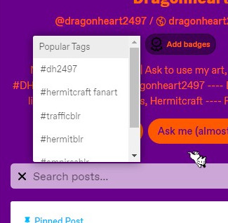
If you open a person's blog and click the search button, a list of Featured Tags will show up. By default this is just the blogger's most used tags, but you can customize what shows up on yours in your blog settings
You can follow entire hashtags too! if you wanna see hermitcraft fanart without following every hermitcraft artist, follow the tag :D
3- Filtering
Tumblr actually hides things you don't wanna see, very nicely!
In your account settings, you can filter specific tags, and even specific words that show up in the post.
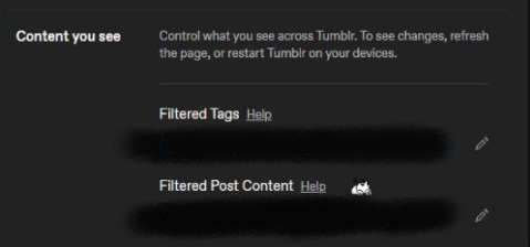
sometimes different bloggers warning tag differently (i do [trigger] tw or [content] cw) so you can try to input every variant, but if its something you really want to avoid just put it in the post content as well. Blocklists aren't really a tumblr thing, so if you wanna avoid an entire community you can block their tag as well
NEVER. CENSOR. YOUR WARNINGS. PLEASE. On twitter or tiktok or wherever, you may have to do that or else the algorithm suppresses it- THERES NO ALGORITHM HERE!!! if someone reblogs your post, it will show up for others, don't worry!!! you're just bypassing filters placed for people's safety, if you censor words.
Also! don't worry too much if a word you wanna filter is commonly used in unrelated contexts- tumblr doesn't remove it entirely, but rather adds a 'spoiler' so that you have to click on it to view it. So just in case it is what you want to avoid, you have time to prepare to see it.
4- effective tagging
[read more in detail here] Only the first 5 tags will show up for people who follow the hashtag. That makes them the most important! Then, the first 20 tags will make the post show up when searching that tag. The rest of them do not give your post any visibility.
I see a lot of people reblogging art with fanart tags- that can be useful for searching back the tag in the reblogger's blog specifically, but doesn't actually give the OP more visibility in that tag.
You'll learn what tags to use by checking the content you come across! most communities are "[word]blr", and most fanart goes "#[character/show] fanart". tumblr tags can have spaces!
Lastly, a few notes
you will only have 1 PRIMARY blog. this will appear when you like a post, comment on a post, or follow a blog. your sideblogs will not link back to your primary blog, but you cannot do those interactions as those sideblogs.
artists love receiving compliments when you reblog!! commenting does NOT boost the post. most people put their compliments in the TAGS of their reblog, so that it doesn't become a long post/thread, and if people reblog the reblog of your reblog you won't keep gettings notifications about it. The artist will still see and very much appreciate it
read up on tumblr etiquette, do not treat this place like twitter or you'll be disliked lol. there are some 'big blogs' but follower counts aren't public, popularity isn't a contest here. make friends, or just block/ignore people you don't get along with. no one cares about your petty arguments
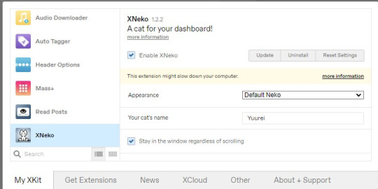
if you noticed the lil cat in my screenshots, that's from a very useful browser extension called XKit!! it enables 1-click queue reblogs (automatically adding your tags), mass-post editing, and lots of other great tweaks vanilla tumblr doesn't have! and the cat is a silly cute thing you can enable in it as well
#hermitblr#trafficblr#empiresblr#hermittwt#traffictwt#how to use tumblr#how to tag on tumblr#tumblr help#i didnt mean for this to be a whole tutorial thing but if it helps one person it's worth the hour i spent on this
472 notes
·
View notes
Text
Animated Matryoshka Dolls in CSS
Here’s a fun one. How might we create a set of those cool Matryoshka dolls where they nest inside one another... but in CSS?
I toyed with this idea in my head for a little while. Then, I saw a tweet from CSS-Tricks and the article image had the dolls. I took that as a sign! It was time to put fingers to the keyboard.

Our goal here is to make these fun and interactive, where we can click on a doll to open it up and reveal another, smaller doll. Oh, and stick with just CSS for the functionality. And while we’re at it, let’s replace the dolls with our own character, say a CodePen bear. Something like this:

We won't dwell on making things pretty to start. Let's get some markup on the page and thrash out the mechanics first.
We can’t have an infinite amount of dolls. When we reach the innermost doll, it'd be nice to be able to reset the dolls without having to do a page refresh. A neat trick for this is to wrap our scene in an HTML form. That way we can use an input and set the type attribute to reset to avoid using any JavaScript.
<form> <input type="reset" id="reset"/> <label for="reset" title="Reset">Reset</label> </form>
Next, we need some dolls. Or bears. Or something to start with. The key here will be to use the classic checkbox hack and any associated form labels. As a note, I’m going to use Pug to handle the markup because it supports loops, making things a little easier. But, you can certainly write the HTML by hand. Here’s the start with form fields and labels that set up the checkbox hack.
CodePen Embed Fallback
Try clicking some of the inputs and hitting the Reset input. They all become unchecked. Nice, we’ll use that.
We have some interactivity but nothing is really happening yet. Here’s the plan:
We’ll only show one checkbox at a time
Checking a checkbox should reveal the label for the next checkbox.
When we get to the last checkbox, there our only option should be to reset the form.
The trick will be to make use of the CSS adjacent sibling combinator (+).
input:checked + label + input + label { display: block; }
When a checkbox is checked, we need to show the label for the next doll, which will be three siblings along in the DOM. How do we make the first label visible? Give it an explicit display: block via inline styles in our markup. Putting this together, we have something along these lines:
CodePen Embed Fallback
Clicking each label reveals the next. Hold on, the last label isn’t shown! That’s correct. And that’s because the last label doesn’t have a checkbox. We need to add a rule that caters to that last label.
input:checked + label + input + label, input:checked + label + label { display: block; }
CodePen Embed Fallback
Cool. We're getting somewhere. That's the basic mechanics. Now things are going to get a little trickier.
Basic styling
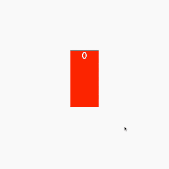
So, you might be thinking, “Why aren’t we hiding the checked label?” Good question! But, if we hide it straight away, we won’t have any transition between the current doll and the next. Before we start animating our dolls, let’s create basic boxes that will represent a doll. We can style them up so they mimic the doll outline without the detail.
.doll { color: #fff; cursor: pointer; height: 200px; font-size: 2rem; left: 50%; position: absolute; text-align: center; top: 50%; transform: translate(-50%, -50%); width: 100px; } .doll:nth-of-type(even) { background: #00f; } .doll:nth-of-type(odd) { background: #f00; }
CodePen Embed Fallback
Clicking one doll instantly reveals the next one and, when we’ve reached the last doll, we can reset the form to start again. That’s what we want here.
The mechanics
We are going to animate the dolls based on a center point. Our animation will consist of many steps:
Slide the current doll out to the left.
Open the doll to reveal the next one.
Move the next doll where the current one started.
Make the current doll fade out.
Assign the next doll as the current doll.
Let’s start by sliding the current doll out to the left. We apply an animation when we click a label. Using the :checked pseudo-selector we can target the current doll. At this point, it’s worth noting that we are going to use CSS variables to control animation speed and behavior. This will make it easier to chain animations on the labels.
:root { --speed: 0.25; --base-slide: 100; --slide-distance: 60; } input:checked + label { animation: slideLeft calc(var(--speed) * 1s) forwards; } @keyframes slideLeft { to { transform: translate(calc((var(--base-slide) * -1px) + var(--slide-distance) * -1%), 0); } }
That looks great. But there’s an issue. As soon as we click a label, we could click it again and reset the animation. We don't want that to happen.

How can we get around this? We can remove pointer events from a label once it’s been clicked.
input:checked + label { animation: slideLeft calc(var(--speed) * 1s) forwards; pointer-events: none; }
Great! Now once we have started, we can’t stop the animation chain from happening.
CodePen Embed Fallback
Next up, we need to crack open the doll to reveal the next one. This is where things get tricky because we are going to need some extra elements, not only to create the effect that the doll is opening up, but also to reveal the next doll inside of it. That's right: we need to duplicate the inner doll. The trick here is to reveal a "fake" doll that we swap for the real one once we've animated it. This also means delaying the reveal of the next label.
Now our markup updates labels so that they contains span elements.
<label class="doll" for="doll--1"> <span class="doll doll--dummy"></span> <span class="doll__half doll__half--top">Top</span> <span class="doll__half doll__half--bottom">Bottom</span> </label>
These will act as the “dummy” doll as well as the lid and base for the current doll.
.doll { color: #fff; cursor: pointer; height: 200px; font-size: 2rem; position: absolute; text-align: center; width: 100px; } .doll:nth-of-type(even) { --bg: #00f; --dummy-bg: #f00; } .doll:nth-of-type(odd) { --bg: #f00; --dummy-bg: #00f; } .doll__half { background: var(--bg); position: absolute; width: 100%; height: 50%; left: 0; } .doll__half--top { top: 0; } .doll__half--bottom { bottom: 0; } .doll__dummy { background: var(--dummy-bg); height: 100%; width: 100%; position: absolute; top: 0; left: 0; }
The lid requires three translations to create the opening effect: one to pop it up, one to move it left and then one to pop it down.

@keyframes open { 0% { transform: translate(0, 0); } 33.333333333333336% { transform: translate(0, -100%); } 66.66666666666667% { transform: translate(-100%, -100%); } 100% { transform: translate(-100%, 100%); } }
Next is where we can use CSS custom properties to handle changing values. Once the doll has slid over to the left, we can open it. But how do we know how long to delay it from opening until that happens? We can use the --speed custom property we defined earlier to calculate the correct delay.
It looks a little quick if we use the --speed value as it is, so let’s multiply it by two seconds:
input:checked + .doll { animation: slideLeft calc(var(--speed) * 1s) forwards; pointer-events: none; } input:checked + .doll .doll__half--top { animation: open calc(var(--speed) * 2s) calc(var(--speed) * 1s) forwards; // highlight }
Much better:
CodePen Embed Fallback
Now we need to move the inner “dummy” doll to the new position. This animation is like the open animation in that it consists of three stages. Again, that’s one to move up, one to move right, and one to set down. It's like the slide animation, too. We are going to use CSS custom properties to determine the distance that the doll moves.
:root { // Introduce a new variable that defines how high the dummy doll should pop out. --pop-height: 60; } @keyframes move { 0% { transform: translate(0, 0) translate(0, 0); } 33.333333333333336% { transform: translate(0, calc(var(--pop-height) * -1%)) translate(0, 0); } 66.66666666666667% { transform: translate(0, calc(var(--pop-height) * -1%)) translate(calc((var(--base-slide) * 1px) + var(--slide-distance) * 1%), 0); } 100% { transform: translate(0, calc(var(--pop-height) * -1%)) translate(calc((var(--base-slide) * 1px) + var(--slide-distance) * 1%), calc(var(--pop-height) * 1%)); } }
Almost there!
CodePen Embed Fallback
The only thing is that the next doll is available as soon as we click a doll. that means we can spam click our way through the set.
Technically, the next doll shouldn’t show until the “fake” one has moved into place. It’s only once the “fake” doll is in place that we can hide it and reveal the real one. That means we going to use zero-second scale animations! That's right. We can play pretend by delaying two zero-second animations and using animation-fill-mode.
@keyframes appear { from { transform: scale(0); } }
We actually only need one set of @keyframes. because we can re-use what we have to create the opposite movement with animation-direction: reverse. With that in mind, all our animations get applied something like this:
// The next doll input:checked + .doll + input + .doll, // The last doll (doesn't have an input) input:checked + .doll + .doll { animation: appear 0s calc(var(--speed) * 5s) both; display: block; } // The current doll input:checked + .doll, // The current doll that isn't the first. Specificity prevails input:checked + .doll + input:checked + .doll { animation: slideLeft calc(var(--speed) * 1s) forwards; pointer-events: none; } input:checked + .doll .doll__half--top, input:checked + .doll + input:checked + .doll .doll__half--top { animation: open calc(var(--speed) * 2s) calc(var(--speed) * 1s) forwards; } input:checked + .doll .doll__dummy, input:checked + .doll + input:checked + .doll .doll__dummy { animation: move calc(var(--speed) * 2s) calc(var(--speed) * 3s) forwards, appear 0s calc(var(--speed) * 5s) reverse forwards; }
Note how important the variables are, especially where we are chaining animations. That gets us almost where we need to be.
CodePen Embed Fallback
I can hear it now: "They're all the same size!" Yep. That's the missing piece. They need to scale down. The trick here is to adjust the markup again and make use of CSS custom properties yet again.
<input id="doll--0" type="checkbox"/> <label class="doll" for="doll--0" style="display: block; --doll-index: 0;"> <span class="doll__dummy-container"> <span class="doll__dummy"></span> </span> //highlight <span class="doll__container"> <span class="doll__half doll__half--top"></span> <span class="doll__half doll__half--bottom"></span> </span> </label>
We just introduced a CSS custom property inline that tells us the index of the doll. We can use this to generate a scale of each half as well as the fake inner doll. The halves will have to scale to match the actual doll size, but the fake inner doll scale will need to match that of the next doll. Tricky!
We can apply these scales inside the containers so that our animations are not affected.
:root { --scale-step: 0.05; } .doll__container, .doll__dummy-container { height: 100%; left: 0; position: absolute; top: 0; width: 100%; } .doll__container { transform: scale(calc(1 - ((var(--doll-index)) * var(--scale-step)))); transform-origin: bottom; } .doll__dummy { height: 100%; left: 0; position: absolute; top: 0; transform: scale(calc(1 - ((var(--doll-index) + 1) * var(--scale-step)))); transform-origin: bottom center; width: 100%; }
Note how the .doll__dummy class uses var(--doll-index) + 1) to calculate the scale so that it matches the next doll. 👍
Lastly, we re-assign the animation to the .doll__dummy-container class instead of the .doll__dummy class.
input:checked + .doll .doll__dummy-container, input:checked + .doll + input:checked + .doll .doll__dummy-container { animation: move calc(var(--speed) * 2s) calc(var(--speed) * 3s) forwards, appear 0s calc(var(--speed) * 5s) reverse forwards; }
Here's a demo where the containers have been given a background color to see what’s happening.
CodePen Embed Fallback
We can see that, although the content size changes, they remain the same size. This makes for consistent animation behavior and makes the code easier to maintain.
Finishing touches
Wow, things are looking pretty slick! All we need are some finishing touches and we are done!
The scene starts to look cluttered because we’re stacking the “old” dolls off to the side when a new one is introduced. So let's slide a doll out of view when the next one is revealed to clean that mess up.
@keyframes slideOut { from { transform: translate(calc((var(--base-slide) * -1px) + var(--slide-distance) * -1%), 0); } to { opacity: 0; transform: translate(calc((var(--base-slide) * -1px) + var(--slide-distance) * -2%), 0); } } input:checked + .doll, input:checked + .doll + input:checked + .doll { animation: slideLeft calc(var(--speed) * 1s) forwards, slideOut calc(var(--speed) * 1s) calc(var(--speed) * 6s) forwards; pointer-events: none; }
The new slideOut animation fades the doll out while it translates to the left. Perfect. 👍

That’s it for the CSS trickery we need to make this effect work. All that’s left style the dolls and the scene.
We have many options to style the dolls. We could use a background image, CSS illustration, SVG, or what have you. We could even throw together some emoji dolls that use random inline hues!
CodePen Embed Fallback
Let’s go with inline SVG.
I’m basically using the same underlying mechanics we’ve already covered. The difference is that I’m also generating inline variables for hue and lightness so the bears sport different shirt colors.
CodePen Embed Fallback
There we have it! Stacking dolls — err, bears — with nothing but HTML and CSS! All the code for all the steps is available in this CodePen collection. Questions or suggestions? Feel free to reach out to me here in the comments.
The post Animated Matryoshka Dolls in CSS appeared first on CSS-Tricks.
Animated Matryoshka Dolls in CSS published first on https://deskbysnafu.tumblr.com/
0 notes
Last Seen Blogs

ropoto
Ropoto
putting-the-pan-in-paniccc
"Some people feel the rain, others just get wet." - bob marley

classichorrorblog
CLASSICHORRORBLOG

bluearium
Bluearium

ly-nero-x
Angelic Anna