#i had the lorem ipsum text in the text box but then i had to create an actual text for it because of course
Text
InDesign Basics
Ideal for typography based design, things like magazines and other print media. Organising blocks of text and images.
Paragraph Styles
A paragraph in ID is described as a passage of text between two presses of the return key. So this includes actual paragraphs, and any lone pieces of text like titles. Paragraph styles can be saved and applied to other paragraphs, which can be good for large designs.
Paragraph styles are one of the main functions of InDesign, so it will be important to get familiar with them.
Under the parapgraph styles windows we can basically edit all of the aspects of the text, like the kerning, leading, text size and font. This is ideal for editing large bodies of text because the style of the paragraph can be saved and placed onto other bodies of text.

Pink lines at the top and bottom of the page represent the margin. These can be adjusted, but should be used as a sort of guide for where the page design should end.
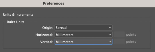
Under the top InDesign tab, we can access preferences and change them to millimeters.
The main ui of ID is familiar to photoshop, with windows being accessed from the windows tab. The most important one for todays lesson is the styles tab, under which we find paragraph styles which is what we will be experimenting with today.
Once a text box is created, the software will expect any keyboard clicks to be typing, so typical shortcuts and commands won't work. In order to exit the text box, we can command click anywhere outside of it and then will be able use shortcuts again. In order to edit the text we can just double click back inside the text box.

This screenshot was taken while the text box was edited, so in order to exit it I would have to command click outside of the box.

This tool at the top control screen is the gutter tool, which is ordinarily set to one. If we edit this number and make it two, it creates a "gutter" in the middle of the screen with two columns.
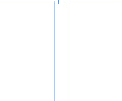
The aforementioned gutter, showing a split between what will become two distinct columns of text. In order to create this we had to select the outside of the text box with the select tool.
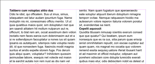
When in the type tool, we can select the type window at the top of the screen, and near the bottom of the options is a "fill with placeholder text" option which will fill the text box with lorem ipsum.
By creating a new paragraph style and calling it heading, we're able to select the headings and just clicking on the new paragraph style and it will automatically apply the style to them.
Now if we edit the heading style after the fact, it will apply any changes to any of the pieces of text that have the heading style applied to them. Using this we can put some space before and after the heading to make it somewhat more visually appealing.
After applying more before and after space to the heading style:
These changes are consistent across all of the pieces of text with the heading style applied.
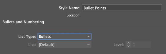
Adding bullet points is possible through the paragraph styles as well, using the bullets and indents tab. Selecting the area we want bullet pointed, and then creating a new paragraph style for bullet points and selecting the list type as bullets adds bullet points.

In order to format the bullet points properly, we need to make the left indent and the first line indent the same number, but with the first line indent as a minus. This will format the bullet points properly and make them look like actual bullet points.
Character styles function similarly to paragraph styles, except instead of editing a whole body of text it will only edit the selected area. This is good for bolding certain pieces of text, or making edits to just certain pieces of text or a sentence instead of an entire paragraph or body of text.
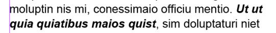
Edited using the character style option with bold italic selected under Basic Character Format.


Using the text wrap tool we can create borders around linked images. This image has been edited and then linked from photoshop, so any updates made to the image in photoshop will appear in InDesign. Using the text wrap tool accessed from window, we can create boundaries around the outside of the image in which text will not clip. This can be done with round images as well, in order to create a wrapping around effect.
0 notes
Text
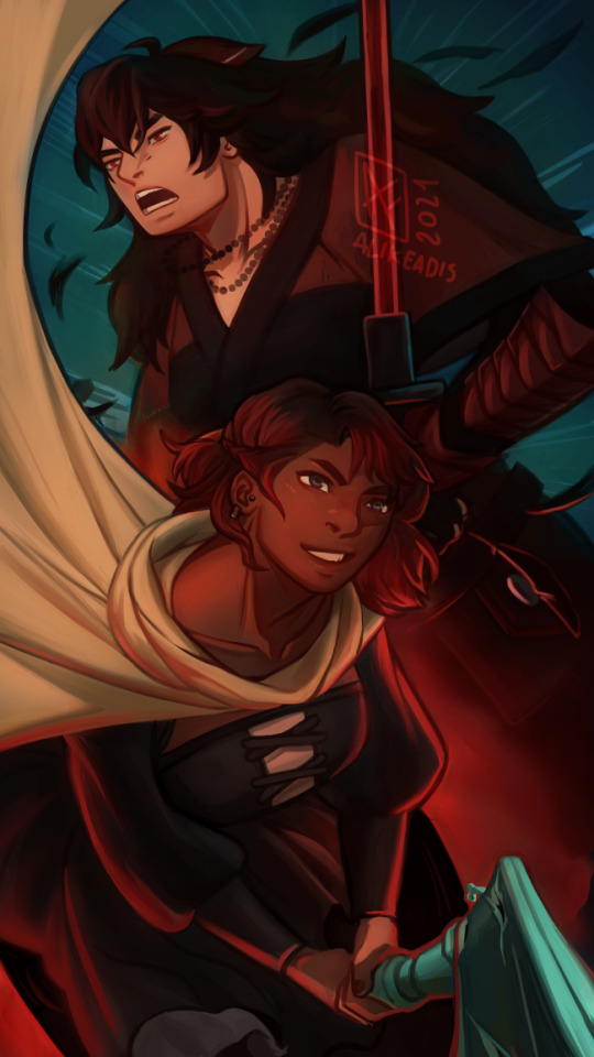
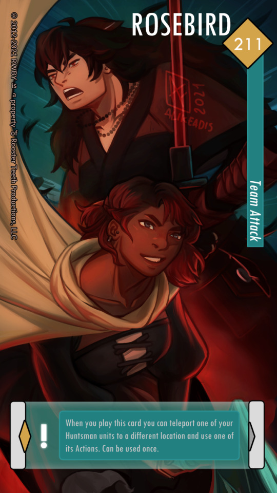
day 7: partners
team attack! + bonus trading card version
#rosebird#rosebirdweek#summer rose#raven branwen#rwby#fanart#illustration#my drawings#i. had a moment last week where i was like 'haha what if i made this' and then i actually did it#i had the lorem ipsum text in the text box but then i had to create an actual text for it because of course#i guessed the font(s) to use so it isn't an official one. i tried to look at screenshots and they seem mostly sans serif#i haven't tried to use graphic design in years i barely remember the notions i studied lmao#okay i'll stop writing#anyway there's an easter egg in this#👉👈 i hope you guys like it#one more thing: i didn't have a lot of time to make a proper weapon for summer#it's a wip i might work on more in the future#anyway BYE i'm done
419 notes
·
View notes
Text
Ladybug’s Kitchen
Happy belated holidays, @noblechaton! I hope you had a wonderful start to your new year, and I hope you enjoy this gift for the @mlsecretsanta exchange!
This assignment was a joke. Alya knew it, and the utterly ridiculous editor who assigned it to her knew it, too. She grumbled the entire walk to her desk and half-slammed a notebook onto her desk for good measure.
"Whoa. Is everything okay?"
She rolled her eyes. "Chloe just told me my next assignment is finding out who this stupid food blogger is. Just because her dad practically owns the school, doesn't mean-"
"Doesn't mean she should be able to run the paper like some kind of dictator," Nino finished for her. "I know."
"It's a fluff piece!" Alya hissed, glaring in the direction of Chloe's small office, built just for her when she decided to take over the school newspaper. "She doesn't even care about this. She just wants to be in charge something!"
"Then, let her." He shrugged. "Do your own stuff on the side if you want. She won't care."
"I care! And so should you! This is why journalism is dying!"
"Really?" he didn't need to give her more than a look to point out just how ridiculous she sounded.
"Okay, so it's not the only reason," she said, still annoyed but at least now she'd let out some of her frustration. Finally, she slumped back into her chair and pulled out her phone. "Have you ever even heard of Ladybug's Kitchen?"
"Now, you have to be careful when you pipe in the filling. If you overfill it, you're going to have some messy macarons. And it's harder than you think to clean chocolate filling out of the carpet. Not that I've done that..." She laughed a bit at her own joke, which was oddly endearing in Alya's opinion. "Just a little swirl like this, and you'll have the perfect treat for your family or your friends or even just yourself if you've had a long week."
"Are you still watching that?" Nino peeked over Alya's shoulder. "It's been hours."
"I'm doing research," she answered, despite the blank notebook beside her. "She doesn't ever show her face."
"Yeah, that's kind of her thing."
"I noticed." She paused the video. "You can see her apron, and sometimes, you can see her hair, but that's as close as I can get. I'm just looking for clues."
Nino reached over to scroll down the page. "How many videos does she have anyway?"
She swatted his hand away. "Hey, don't make me lose my place. She's been doing this for years, and I'm watching all of them. She had to leave a clue somewhere."
"Seriously?" he chuckled. "What happened to this just being a fluff piece?"
She blushed. "I'm a serious journalist, okay? I take every assignment seriously."
"Half of your last fluff piece was filler text. You just put your questions in and all of the mayor's answers were just lorem ipsum whatever."
"What, you don't think our mayor speaks Latin?" she smirked.
"Okay, Mademoiselle Serious Journalist. Have fun with your crepes." He stuffed his laptop into his bag and waved. "I'm off to fail a chemistry test."
"Good luck!" she called after him. "And they're macarons, not crepes! Maybe if you don't fail, I'll buy you some so you can learn the difference."
"Seriously, one point away from failing really shouldn't earn you anything, especially not the best macarons in Paris," Alya grumbled as they waited in line.
"Hey, you said if I didn't fail, you'd buy me some."
"I also said maybe."
"Next!" the woman behind the counter called with a smile brighter than sunshine.
Alya paused for a moment, just staring at her until Nino pushed her forward, and she nearly stumbled into the counter. "Uh, hey!" Alya straightened and smiled back. "A dozen macarons and um..." she scanned over the available pastries. "Do you have any crepes?"
She smiled. "Sure! What flavor did you want for the macarons?"
"What flavors do you have? Like vanilla or chocolate...?"
She produced a list from behind the counter and handed it to Alya. "We definitely have a lot more than those. You can pick up to six different flavors when you buy a dozen. Why don't you take a minute to decide, and I'll get your crepes started, okay?"
"Yeah, sure."
"Dude, you're blushing," Nino murmured once she'd stepped out of earshot. "And you're staring."
"Shut up!" Alya glared at him and shoved the list into his chest. "One more word, and I'm getting nothing but apricot."
"Rude, using a man's allergies against him," Nino said under his breath as he scanned the list that spanned both the front and back of the page. "She wasn't kidding. There's tons of flavors here. I didn't even know some of these existed."
"Let me see." Alya held up the list so she could read the back. "Wow, I've never even heard of pomegranate macarons."
"Do you still need a minute?" Alya hadn't even noticed the woman had returned from the back. "I know there's a lot to choose from."
"Uh, maybe," Alya said, glancing over and trying not to stare this time.
"I can recommend a few." She stepped out from behind the counter to stand beside them, and Alya could feel soft heat spreading over her cheeks. "The cheesecake and the strawberry are really popular, but my favorites are the green tea and the honey and lavender."
"Those sound great," Alya answered quickly, releasing the list so Nino could look it over some more and Alya could look anywhere else. "I'll get those two, and he can decide the rest." How was it possible for someone to actually smell this good? Was it just because she worked in a bakery? Maybe it was just the bakery.
"Perfect! And what about the crepes?"
Alya wasn't exactly new to the idea of flirting with women she found attractive. Some would even say she was good at it, but right now, she couldn't even speak. This wasn't like her. Sure, she'd felt flustered and tongue-tied before, but that was back when she was a teenager and still new at all of this. She shouldn't have trouble answering a simple question just because this woman was exceptionally pretty.
"Chocolate sounds good," Nino said from behind Alya, handing over the list as he did, "And we'll get cheesecake, strawberry, cappuccino, and orange."
"Coming right up." She looked back at Alya. "And could I get your name? For, um, for the order?"
And maybe it was Alya's imagination, but did she just trip over her words? "Alya. And you?"
"Marinette," she darted back behind the counter. "It'll be ready in just a minute."
"Huh," Nino said, watching her leave. "Was she blushing?"
"God, I hope so," Alya murmured.
"You know..." Nino spoke between bites. "If you buy these every time I don't fail a test, I might pass chemistry."
"Yeah, I so didn't sign up for that." Alya reached for another one while the latest video from Ladybug's Kitchen loaded. "If you want to pass, buy them yourself."
"But, if you do, you get to see Marinette again."
Alya hated how quickly her cheeks reddened at just the mention of her name. She'd nearly dropped the bag twice when their order had come out, and Marinette had been painfully sweet about it. "Who says I need to buy anything for you to see her again? My mom's been asking me to pick up some better bread. Apparently, she works at the best place in Paris."
"If it wasn't for me, you wouldn't even know she existed." He snatched one of the macarons from her pile. "You owe me."
She slapped his hand away. "Nice try. If we get married, maybe I'll send you a box from our honeymoon."
He shrugged. "I'll take what I can get." He looked over at her screen. "Any clues yet?"
"Nope." She sighed and clicked play. "And I've gone through all of them twice."
"Twice?" His brows raised. "But, you said she has tons of videos."
"I take my job seriously, okay?"
"Maybe you just have a thing for bakers," he teased.
"Yeah, like you've got a thing for models?" she smirked. "Or did you think I missed that perfume ad you've been staring at?"
It was nice to see Nino blush for a change. "That's research. Chloe needs a model for the front page."
"Sure..." she chuckled, grabbing one of his cheesecake macarons. "You keep telling yourself that."
As annoying as it was to admit Nino was right, maybe she really did have a thing for bakers. She'd been watching for hours now, and Alya was beginning to suspect she had a crush on a voice that she couldn't identify. Ladybug was cheerful and encouraging, and she had the worst sense of humor, but Alya chuckled at it anyway. She was humble, too, showing her failures right along with her successes.
"Everyone burns cookies every once in a while. And that's okay. It's not a great feeling, I know. The first time I burnt my cookies, I cried. I mean, I was seven, so of course I cried," Ladybug chuckled at the memory, holding up a blackened cookie. "My dad found me, and he told me that mistakes just means you're trying something new. Or, in my case, it means I got too invested in a tea party with my stuffed animals.
"So, just keep trying. And make sure you set a timer!" Ladybug waved at the camera. "Hopefully, I'll have something a bit more appetizing for you tomorrow! Thanks for watching, and I hope you all had better luck than I did making this!"
"Are you still going through her videos?" Nino dropped down beside her. "I thought you saw all of them like a million times."
"Yeah, I did." Alya took the coffee from his hand and drained it. "I'm not getting anything. And everyone says the same thing. They know she's in Paris, but that's about as close as they can get."
"They?" Nino took the cup back and frowned down at it once he realized it was empty. "Now you owe me coffee and macarons."
"In your dreams. And, yes, they. I'm not the only one looking for her." She smirked. "There's boards and websites trying to figure it out, and she visits sometimes to say hello."
"Nice." He nudged her side. "So, if everyone's trying to figure this out, maybe it's more than just a fluff piece, huh?"
He actually flinched at the look she sent his way. "Just because Chloe got lucky, and this is actually interesting doesn't mean she gave me a good assignment. She thought this was fluff, and she wants to waste my time."
"Whoa, hey, I'm not arguing with you. Just saying. It's a good piece."
"It will be if I can figure out who she is," Alya mumbled, scrolling through the notes she'd made for any sort of connection she might have missed.
She might never have figured it out at all if not for one little mistake.
Ladybug had just posted up a video, and Alya had started watching the second it was available.
"It took me a little while to come up with an idea for this video. I feel like I've kind of shared everything I know how to make with you guys, so you'll need to send in some new recipes for me to try." She shuffled through some pages beside her as she spoke. "But, then, I was inspired by a customer that came in the other day. They were looking at macarons and couldn't pick a flavor.
"I mean, I can't blame them. All the flavors are amazing. So, I offered some suggestions, and they went with my two favorite flavors. And that got me thinking, maybe I could try out a new recipe based on their order. You can find the full recipe under the video, but I'll go ahead and walk you through it. Hopefully it's better than my cookies from last week!"
Alya scanned every frame while Ladybug spoke, looking for even the hint of a reflection or some sort of personal item that might give her a clue.
"So, first, we'll gather our ingredients. Some of them are a little unusual, so feel free to come back and bake with me later on if you need to go get anything."
Nothing. Even when it looked like she might catch a glimpse, the image was blurred or distorted, or even in one case, replaced with a tiny stock photo of a ladybug. Whoever edited her videos was thorough.
"So, some of you might be wondering why I'm making a recipe based on a customer. It's not something I do every day, you know." She measured out flour as she spoke. "But, well, I have to be honest with you guys, this customer was just really, really gorgeous. And I really wanted to ask for their number or try and flirt or anything, but I just kept chickening out. I'm sure at least one of you knows that feeling."
Alya frowned. She knew it a bit too well. She'd tried to work up the nerve to ask Marinette for coffee or lunch or anything, but she hadn't even walked by the bakery since the day she and Nino went. She could use the excuse that she was busy working, but it really was just that. An excuse.
"And, anyway, they came in with someone, so maybe it's a good thing I didn't. But, I just wanted to try my luck. And if they ever come back, maybe I will. I know I always tell all of you to take chances, but I have to admit, sometimes I'm scared to try something new. You've all been brave enough to bake with me, so let's all try to take chances outside the kitchen, too! Even if it means embarrassing ourselves in front of someone we like."
Alya rolled her eyes. She had to, since it really was a bit on the cheesy side, but it was just like Ladybug to say something like that, and it hit a bit too close to home for Alya's liking.
"So, here we are! Honey and lavender crepes! Let's see how they taste." She pulled out a fork and cut off a piece to eat. "Oh, that's even better than I thought! I hope yours all turned out great, too! Tune in on Thursday for part two! We'll be making green tea crepes with our own handmade whipped cream on top!"
"Wait..." Alya frowned. "No way..."
It had to be a coincidence. Just because that happened to be her order and she happened to be with someone when she made the order and she also happened to go there a few days ago... It didn't mean anything.
Alya started the video over again, this time scrutinizing each frame. Her heart was racing, but she was still trying to convince herself that it was all in her head. It was just too convenient. Like something out of Hollywood or a cheesy made-for-TV holiday movie.
But then she saw it.
There, in the middle of the papers Ladybug looked through was the recipe she'd written down. Anyone else might not have recognized the significance, and Alya might not have even seen if it if she wasn't so desperate for evidence.
There it was. The title, clear as day: "Crepes for Alya". The recipe was for her.
And that meant Ladybug was actually Marinette.
And that meant Marinette was interested.
Alya arrived at the bakery moments before it was time to close, a little out of breath and hoping she wasn't somehow wrong.
"Welcome!" Marinette greeted her when she walked through the door. "What can I get y-"
Oh, that was definitely a blush. Alya grinned, all confidence now that Marinette was the one visibly flustered. "Hey, Marinette! I actually had a question for you."
"Sure!" Marinette relaxed a little. "It's, um, good to see you again, Alya!"
Great, now she was blushing, too. "Yeah, you, too." But, she had the upper hand here, and she had to find out the truth. "Do you do any special orders? You know, stuff that's off the menu?" she asked, her smile just a bit playful.
"Maybe." Marinette leaned in a little, her voice dropping just enough that Alya could tell she was starting to realize Alya was flirting. "What did you have in mind?"
Alya approached the counter, close enough that anyone else wouldn't overhear. "Well, I was thinking of some honey and lavender crepes. Maybe green tea, too, but I don't know. Do I have to wait till Thursday for those?"
The color drained from Marinette's face. "What? I mean... I don't think I've heard of anything like that, but I um, I could look that up or..."
Alya grinned. "Really? And here I thought you made the recipe for a really, really gorgeous customer just like me."
"What? No!" Marinette realized her mistake in an instant. "I mean, not no. You are really, really gorgeous, but I didn't make a recipe for you. I don't know what you're talking about."
Alya pulled out her phone to show the video, paused right at the moment where the recipe's title showed on the screen. "You know, if you wanted my number, all you had to do was ask."
Marinette stared at it, clearly stuggling to think up some explanation. Finally, she looked back at Alya. "You're not going to... tell everyone, are you?"
Even if she wanted to, Alya knew she never would. "Not a chance. I'm way more interested in dating you than making you famous."
"Thank you." Marinette grinned, and Alya couldn't help but smile back. "I really-" Then, her eyes widened. "Wait, did you say you want a date?"
Alya laughed. "Yeah. Is that a yes?"
"Hold on." She ran over to the back. "I need to leave early! Mom, can you take over?"
"Sure!" A voice answered from the back. "Is everything okay?"
"Yep, just gotta go! Bye!" Marinette tore off the apron. "I'll be five minutes. I just need to freshen up."
She was gone before Alya could clarify that exactly meant tonight, but maybe it was better that way. Who was she to argue? The more time with Marinette, the better. She pulled out her phone while she waited, a slow smirk spreading over her lips. Besides, her deadline was tonight, and the only thing that could make a date with Marinette even sweeter was turning her phone on silent and ignoring irate calls from Chloe during said date.
"Ready to go?" Marinette asked, somewhat out of breath.
Alya looked up, briefly mesmerized by Marinette's quick transformation. She'd somehow managed to pull her hair up into a perfect updo, put on a hint of makeup, and change into a gorgeous pink dress in just moments, which left Alya was simultaneously jealous, impressed, and completely smitten. "Absolutely."
#mlsecretsanta 2k18#miraculous ladybug#alyanette#au#food blogger au#sort of college au since that's where I imagine Alya and Nino are?#my writing
205 notes
·
View notes
Text
Activity Part 2 Final:
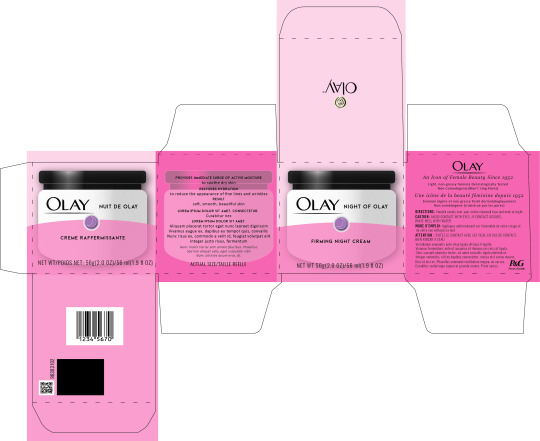

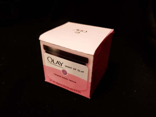
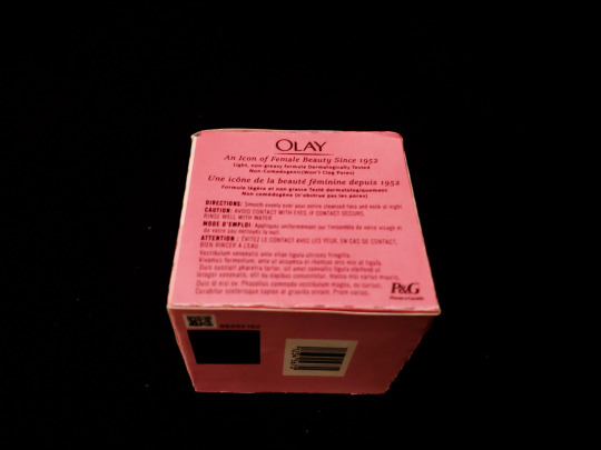
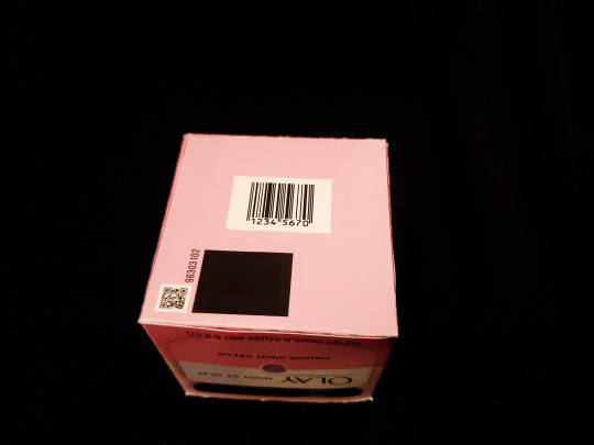
Here is my final design for my package! What an experience whew! When creating the digital portion of this I had to go back a couple times to fix my lines just because this box had some rounded corners that were tough to replicate. I think the most time consuming portion of this project though was putting in all the text, since the original packaging had lots of tiny text, so i copied some of it and lorem ipsummed the rest! And then the other challenging thing was that I had to create the image of the olay jar by hand as I couldn’t find a suitable image online. So I went and designed it in Illustrator with shapes and the pen tool then I played around with colours and a gradient to make it look less flat. When it came to the cutting and folding some of my folds were off because when I went to put the package together it wasn’t quite the perfect square which was disappointing but a learning experience none the less.
0 notes
Text
MAGAZINE NAME BRAINSTORM
As part of one of are tasks as a group we had to come up with a name for a magazine designed for creativities with topics based around the theme of diversity. Are process as a group was to think of as many words to do with are 2 subject which linked together similarly to the method of creating ideas in the first year with Andy, however with the topics being so different apart from a few words we wouldn’t come up with anything which popped out. For a magazine I feel the word needs to be short to word, it cant be more than one word and should instantly grab at you and evoke an urge to read.
A name which we did like was Lorem Ipsum or Lorem mag for short. It defiantly tick a couple of boxes due to the word being very unique, short and snappy, but most importantly it was tailored to are target audience; this being creatives. This is due to the word being filler text when using most creative programs like Adobe Illustrator or In design, by doing this it makes the magazine seem more tailored to the target audience and also something which would stand out more to them on a shelf. However after discussing the pros and cons of this we realized by tailoring the name so much we had also restricted any new readers who are curious about the creative industry and we also acknowledge as a group that the theme of diversity was more important than the target audience as more people can read, understand and reflect with this topic more.
After bouncing back on several good ideas we ended up looking for and symbol or already known names which have some connections to the theme of diversity and we looks in particular at tarot cards and eventually the zodiac which is where we chose the name Libra. Libra is the zodiac for balance, peace and judgement which fit the theme very well, its also a words which is known but not commonly used in conversation which is ideal for a magazine name; giving the brand a unique word which when said in a conversation will instant be linked to this brand. The name also had an existing symbol which we modified into the typeface giving the design a flesh adaptation of the word. Finally when we chose the name it was 22nd September which is exactly when the zodiac for Libra starts which is defiantly the strangest coincidence I've ever experienced.
To conclude I feel this name is by far my favorite as I can easily imagine this as an actual magazine name but even though it has a number of existing meaning and symbol, the room to experiment with design concepts and converting a ancient ideal into a modern brand is massive.
0 notes
Text
Unfinished - Trash Goblin
‘yThe Trash Goblin is meant to be a humanoid creature who lurks in allyways and blown-out buildings searching for rubbish to hoard and repurpose into weapons, clothes and totems. Trash Goblins are also devout recyclers; he may want to mug you on the street, but will also appreciate it if you don’t use single-use plastic.

This is the earliest sketch I have of the Trash Goblin. I didn’t like the eyes to begin with so I went on a mad tirade to find a more intimidating way to draw the eyes.
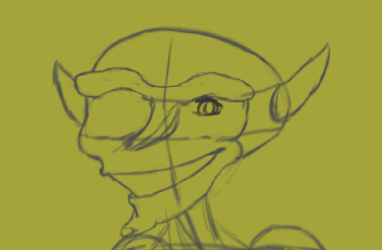
Too friendly

Too wonky
Eventually I just got bored and drew him with anime girl eyes

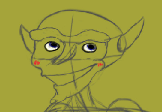
...Until eventually I came across this idea. If I could only get one eye right, I could make the other eye different, so I came up with the idea of giving him one normal and one crazy eye.


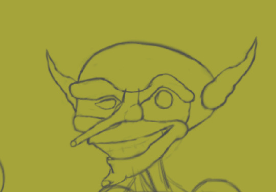
The next step was to create a body for him. I began trying multiple ways to elaborate on this goofy-looking sketch which I actually really liked for a long time until I got sick of re-drawing the body over and over that I wanted to try a different pose. Perhaps I should’ve done poses first.
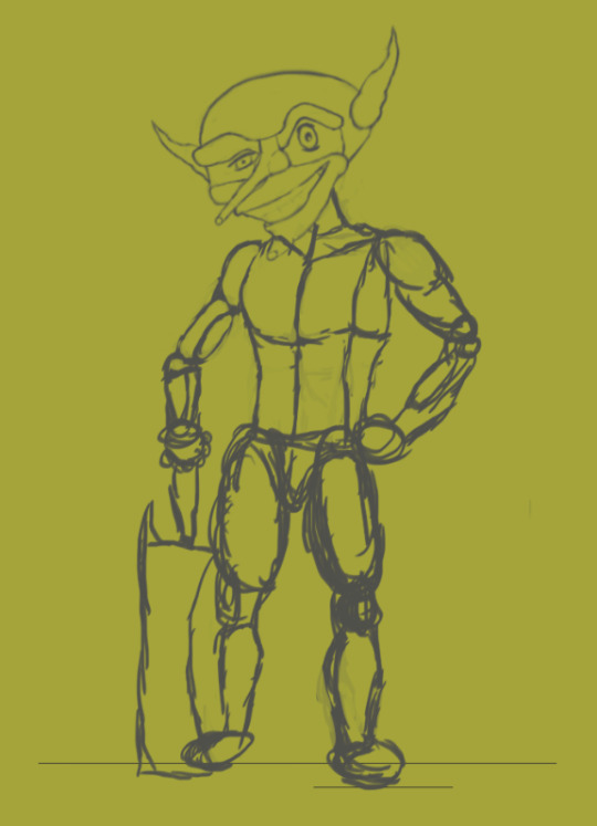
I tried this pose but he ended up looking buff and kind of heroic. I hate it.

I came up with the idea of a creeping, hunched-over Goblin that looks like he wants to stab you. I took direct inspiration from my friend Mat.

It’s also worth noting here I almost changed his name to Milk Goblin as I felt like he could be carrying two milk jugs in his hands.

I wanted to give the Goblin 2 knives he could hold in each hand (not milk jugs), but I wanted them designed that they would look like they were made out of broken scrap metal. I designed the handle to be a bit of broken pipe with a large bolt as it’s pommel, it’s handle wrapped in green garden twine and then nailed to a tarnished shard of scrap metal with notches, uneven parts and scratches across it’s bladed edge.
I also wanted his clothes to be made out of repurposed junk, such as his loincloth being made of old newspapers. How I got the effect of blurred text was by pasting Lorem Ipsum into a text box, converting that text box into a regular layer, merging it with the rest of the newspapers and then wetbrushing over it, bluring the text into the brown paper.

I took inspiration for his shoes from some particularly grubby trainers I found a picture of on the internet. I had to do a lot of mixing of gray on to white in order to give the impression that the white was there to begin with and it gained the scruffy look to it over time. I also refuse to belive that Goblins tie their shoes.

In the end, all I could get was this. I think the issue with why it wasn’t finished is that I am not good at art, and spent a lot of time experimenting and designing with no real finished product.
0 notes
Photo

Content as UX: Building a More Human Web
Lorem ipsum dolor sit amet, consectetur adipiscing elit, sed do eiusmod tempor incididunt ut labore et dolore magna aliqua.
How are you enjoying this article so far? Whatever your feelings, I’ll bet you’ll agree that content is a vital part of the user experience.
Wait. Did I say “a vital part”? I meant “the critical part”. After all, every user journey, whatever its goal, ultimately involves a user getting to content, or adding their own. That content may be text, like this article, or it may be imagery, video, audio — you name it. But whatever it is, it’s the point of the user’s interaction with every site or product.
Yet traditionally (and all too often still) when we design websites or make products, we design visually, and the content spaces are left blank. If you’re doing things as most do, you’re probably going to show the wireframes or mockups to someone internal — maybe even your founder — and ask them to fill the spaces.
Ugh. At least, that’s what your colleague is probably thinking at this point. Now they have the burden and responsibility of filling the literal and metaphorical blank page — but a blank page that already has a goal or direction they’ve had no part in choosing.
Here I’m going to suggest an alternative way to consider content, where content is UX.
1. How Can Content Be UX?
I said above that content is the critical part of the UX. Let’s build on that now.
Content is user experience.
Look at a site like YouTube. The landing page is a list of content. Even better, that content is presented based on your (or my) past usage patterns. The data associated with that content — the image, title, name of the account that uploaded the media, total views and upload date — is also content. When you access a video, the comments beneath it are content.
It’s all content. Content is the user experience. It’s what we’re here to use.
Okay, you say, but it’s YouTube. My product isn’t content.
Fine, let’s consider the example of a new computer. I just had to replace mine after six years of trusty service. I got a MacBook Air, and it came in a lovely box. Nice user experience. Other than the actual computer, there’s not much content here, right?
Well, no. But then I open the box, plug the thing in, and notice these little leaflets tucked away.
I’ve included the matchbox for a size comparison. I wear glasses, but I felt like I needed a magnifying glass to read the leaflet titled MacBook Air Info. In fact, I only read the first sentence (which hurt my eyes):
Review the Macbook Air Essentials guide before using MacBook Air.
“Right you are, Apple,” I thought.
But what’s this? The only other leaflet in the box is a MacBook Air Quick Start Guide. Is … is that what they meant? I hope so, because it has slightly bigger text, and it was the only other thing I glanced through before I turned on my thrilling new purchase.
Question: how am I ever going to start creating glorious content on that device, or access the glorious content accessible on the Web, if I can’t read the instruction content to get said device going? If I don’t need the content to get it work, then why include these crazy-tiny, unreadable leaflets with the product in the first place?
This experience doesn’t exactly fill me with confidence, nor the idea that Apple cares about actual people. Sure, the packaging is nice. But right now it feels like the business is in love with its own products more than its users.
Bottom line: content is user experience. Even in the Real World™.
The post Content as UX: Building a More Human Web appeared first on SitePoint.
by Georgina Laidlaw via SitePoint http://bit.ly/2JXOFAa
0 notes
Text
Sending an Email via Outlook Using PowerShell
Recently, our HR department came to us requesting that, if we could, put together a form that would allow for reporting of people’s outstanding vacation time before the end of the calendar.
Seeing as Paylocity didn’t offer anything worthwhile, I offered to write the thing myself assuming, as with most things, how hard could it possibly be?
Honestly? Not all that hard with a few minutes of googling.
Operating under the notion that this problem could most likely be solved via a mail merge, that was the route I initially pursued, which led me to this site. Link to the source, but the meaty bits of it are below for reference:
Requirements
Microsoft Office 2007 or 2010 must be installed on your computer including Word, Excel, and Outlook.
Your PLOW email account must be configured in Microsoft Outlook.
Your PLOW email account must be set to an unlimited message rate. Please contact your District Office and ask to have your account changed to an unlimited rate.
Prepare the recipients list
You should store all of the recipient's information in an Excel spreadsheet.
The first row of the spreadsheet should contain column headings such as First Name, Last Name, and Email Address.
Each recipient's email address must be in a column by itself without the full name, angle brackets, quote marks, or other special characters.
Each recipient's information must be listed on a separate row.
Row and column example with column headings:
Prepare the email message
Start Microsoft Word and begin a new blank document.
Switch to the Mailings ribbon.
Click on the Start Mail Merge menu and select the E-Mail Messages option.
Click on the Select Recipients menu and select the Use Existing List option.
Browse and select the Excel spreadsheet you created earlier, and then click on the Open button.
In the Select Table window, click on the name of the sheet that contains your recipient's information.
Compose the body of your message using Word:
To customize the contents of your message with information from your spreadsheet:
Save the body of the email message the same way you would save any other Word document.
If you have options for Sheet1, Sheet2, and Sheet3, the information is probably on Sheet1.
If you entered column headings in the first row of your spreadsheet, make sure the First row of data contains column headers option is checked.
Click on the OK button.
You can switch back to the Home ribbon to add formatting including bold, italics, font colors, and headings.
Not all formatting will visible to all recipients. Outlook users will see most of the formatting. Web mail users will see bold, italics, and lists but not font styles or colors.
Position the cursor where you want to insert the data.
Switch to the Mailings ribbon.
Click on the Insert Merge Field menu and select the field containing the data you want to insert.
Send the email messages
Switch to the Mailings ribbon.
Click on the Finish & Merge menu and select the Send E-Mail Messages option.
From the To drop-down menu, select the field containing the email address of each recipient.
In the Subject text box, enter the subject line used for the email message.
From the Mail format drop-down menu, select the HTML option.
For the Send records radio button, select the All option.
Click on the OK button to send the messages.
Email Merge Tips
If you customize the message for each recipient, use the Preview Results button on the Mailings ribbon to see the data from your spreadsheet in the body of the message instead of the field names. Use the arrows to right of this button on the ribbon to preview different records from your spreadsheet.
Customizing the email message for each recipient is easiest when the information is split into several columns. For example keeping the first name and last name in separate columns is better than keeping them in a single column called name. You can always put two fields together in your message, but pulling fields apart is much more difficult.
If you send newsletters or flyers as PDF attachments, consider publishing the PDF on your website and then using email merge to send a notice with a link. Later you can check your website's statistics to determine how many people downloaded the PDF.
You may want to add yourself as the first recipient in your spreadsheet so you can test the message delivery. Use the Preview Results button to view the message you will receive. Follow the sending instructions, but change the Send Records option from All to Current. This will send only the message currently being previewed through Outlook.
Realizing that this wasn’t necessarily a panacea so much as it was drudging up more questions that it solved, I opted to dig deeper and see what else I could find. The typical routes - Microsoft, Chron, Superuser, yielded things that looked like answers, but it only drew me in further.
Finally I stumbled on to two sites that had fantastic examples and allowed me to build something from the ground up in VS Code using PowerShell.
The first example comes from: https://www.jasonpearce.com/2016/02/08/mail-merge-email-via-powershells-send-mailmessage/
# This script will perform a mail merge for email from a CSV file
# The CSV file must contain a column of email addresses, other columns with other data are optional
# Created by Jason Pearce, 2016 February
# ####################
# BEGIN Example CSV File (optional)
# ####################
# CSV Example: A CSV file that could serve as an example (maybe replace with [email protected] to test)
$CSVExample = @"
Email,FirstName,LastName
[email protected],Aaron,Anders
[email protected],Betty,Blue
[email protected],Charlie,Cook
"@
# CSV File: Optionally create a CSV file to play with
$CSVExample = Out-File -FilePath "C:\temp\example-csv-file.csv"
# ####################
# END Example CSV file (optional)
# ####################
# ####################
# BEGIN Variables
# ####################
# From: Name and email of sender
$EmailFrom = "Your Name <[email protected]>"
# Reporting: Report on Success and Failure (optional)
$EmailDeliveryNotificationOption = "onSuccess, onFailure"
# Server: Your Exchange or SMTP server
$EmailSMTPserver = "smtp.example.com"
# Users: Tab-delimited list with columns named Name, Email, SamAccountName
$SourcePath = "C:\temp\example-csv-file.csv"
# Import: Import the comma-delimited list of users (if tab-delimited, add '-Delimiter "`t"')
$Users = Import-Csv -Path $SourcePath
# ####################
# END Variables
# ####################
# Begin Loop: Do the following with each row of the file you imported, referencing columns by their header
foreach ($User in $Users) {
# To: User's email address
$EmailTo = $User.Email
# Subject: Email subject (may merge variables)
$EmailSubject = "A personalized example for " + $User.FirstName + " " + $User.LastName + "."
# Body: Email body, with HTML formatting
$EmailBody = "<!DOCTYPE html PUBLIC ""-//W3C//DTD XHTML 1.0 Transitional//EN"" ""http://www.w3.org/TR/xhtml1/DTD/xhtml1-transitional.dtd"">"
$EmailBody += "<html xmlns=""http://www.w3.org/1999/xhtml""><head>"
$EmailBody += "<meta http-equiv=""Content-Type"" content=""text/html; charset=UTF-8"" />"
$EmailBody += "<meta name=""viewport"" content=""width=device-width, initial-scale=1.0""/>"
$EmailBody += "<title>" + $EmailSubject + "</title>"
$EmailBody += "</head><body bgcolor=""#FFFFFF"" style=""font-family: sans-serif; color: #000000"">"
$EmailBody += "<p>Dear " + $User.FirstName + ":</p>"
$EmailBody += "<p>Lorem ipsum dolor sit amet, consectetur adipiscing elit.</p>"
$EmailBody += "<p><ul><li>Your First Name: <strong>" + $User.FirstName + "</strong></li>"
$EmailBody += "<li>Your Last Name: <strong>" + $User.LastName + "</strong></li>"
$EmailBody += "<li>Your Email Address: <strong>" + $User.Email + "</strong></li></ul></p>"
$EmailBody += "<p>Phasellus nec sapien sit amet mi maximus venenatis.</p>"
$EmailBody += "<p>Sincerely,</p>"
$EmailBody += "<p>Your Name</p>"
$EmailBody += "</body></html>"
# Merge: Conduct the email merge, sending emails (remove -WhatIf)
Send-MailMessage -To $EmailTo -From $EmailFrom -Subject $EmailSubject -Body $EmailBody -BodyAsHTML -SmtpServer $EmailSmtpServer -DeliveryNotificationOption $EmailDeliveryNotificationOption
}
# End Loop and Script
The other site: http://sigkillit.com/2015/02/18/mail-merge-with-attachment/ details the steps as well quite nicely.
Step 1 – Create Data Source
I will use a users.csv as the data source of users we want to email. The users.csv file will look as follows:
FIRSTNAMELASTNAMEEMAILUSERNAMEPASSWORD
Step 2 – Create Outlook Profile to Send Mail Merge From
Now that you have your data source, you’ll need to make sure you have an Outlook profile. This profile should be setup with the email address you wish to send the mail merge from.
Step 3 – Create Powershell Script
In the below powershell script, you’ll need to modify the following variables:
$DataSource – Path to the data source (users.csv) file created in step 1
$AttachFile – Path to the file to attach to the email
$EmailSubject – Subject of the email
In addition to modifying the above variables, you’ll need to modify $Mail.Body, which is the body of the email. The below example is referencing data fields in users.csv for the mail merge, which you may want to modify. These correspond as follows:
$($_.FIRSTNAME) – FIRSTNAME field in users.csv
$($_.LASTNAME) – LASTNAME field in users.csv
$($_.USERNAME) – USERNAME field in users.csv
$($_.PASSWORD) – PASSWORD field in users.csv
Special Note: To add a new line in the body text use a backtick + n ( `n)

Extra Special Note: If you want to have the email body be HTML formatted instead of Plain Text, just modify $Mail.Body to $Mail.HTMLBody and add your HTML tags in the text. Using the example above:
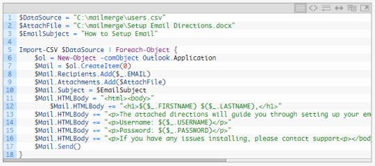
Step 4 – Send the Mail Merge
Open Microsoft Outlook with the profile created in step 2 (It is required for Outlook to be open in order for the powershell script to work!) Then open Powershell, and run the powershell script in step 3. You can confirm the emails are sending by looking in the “Sent Items” in Outlook.
Note: – If you’re using User Account Control (UAC), Outlook and Powershell must be running at the same security level. This simply means, if you open powershell using “Run as administrator” you must open Outlook with “Run as administrator”. Alternatively, if you open powershell normally (not elevated) you must open Outlook normally (not elevated).
I found both of these sites to be most helpful out of all the searches I’d performed up to this point. Spiceworks, Technet, MS Docs, and Stack Overflow were relatively helpful in clearing up some oddities, but not enough to address the overall issue.
Using those two sites and the code therein, I was able to generate a .csv in excel and knock out the below PS script:
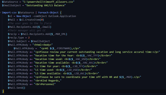
Actually, thinking about it, stack overflow did help me with one persisting issue and that was using the Cc field in addition to the To field to include the users manager. Particularly this thread, which helped me realize that the CreateItem(0) needed an additional numerical type to recognize the process.
After that, it worked as intended.
Overall work and investigating totals out to less than 3 hours once the initial bumps are overcome.
0 notes
Link
Hey - Pat from StarterStory.com here with another interview.Today's interview is with Chris waters of Constructed Adventures, a brand that sells seemingly serendipitous perfect days.Some stats:Product: Seemingly serendipitous perfect days.Revenue/mo: $5,000Started: December 2015Location: InternationalFounders: 2Employees: 1Hello! Who are you and what business did you start?My name is Chris Waters, I go by “The Architect, and I started Constructed Adventures.Simply put, the goal of Constructed adventures is to create a seemingly serendipitous perfect day for someone. Often times, these days are for special occasions like milestone birthdays or marriage proposals. They usually involve challenges and puzzles (think “escape room around the city”) but they’re always custom tailored to a specific person and location.I charge a flat rate for adventures. Between the adventures I run and the consultation clients I’ve added, my profit should be around 60k in 2019. It’s easy to gauge because I’m already completely booked for the rest of the year and into early 2020!The most important thing for me is the freedom and flexibility. I don’t have a home and travel from one adventure location to the next. With all the money saved, I spend my downtime traveling to amazing locations or visiting friends and family!imageWhat's your backstory and how did you come up with the idea?I was always that guy trying to create a fun experience for people. I hated the idea of waking up and knowing EXACTLY how the day is going to pan out (drive to work, meeting, lunch, get yelled at by clients, drive home, watch tv, go to bed. Rinse and repeat every day for the rest of your life) So I would be the one kidnapping people on their birthdays, putting googly eyes on every picture in the office, etc.“I hated the idea of waking up and knowing EXACTLY how the day is going to pan out (drive to work, meeting, lunch, get yelled at by clients, drive home, watch tv, go to bed. Rinse and repeat every day for the rest of your life)”The business kind of happened by accident. It all started with the Reddit Secret santa gift exchange. (here’s the wikipedia) In short, 100k people sign up, get matched with someone, and send them a gift for the holidays! I’d been participating for years. I’d sent and received some really incredible gifts.Then 2015 rolled around. I got matched with my giftee. I immediately looked at his location. It was literally 21 minutes away. I had this grand opportunity to do something really fucking cool for an internet stranger.So I started planning.The recommended amount for reddit secret santa is always $20. Some people send $20 gifts. Some people don’t send anything. Some people spend wayyyyyy more. I was one of those people. Frankly, I just kept coming up with cooler and cooler ideas. “What if they open an envelope here and there’s two tickets to the zoo and they need to decode messages on the plaques on animal pens! Then they’ll go to a restaurant where everything has been covered!” It continued like that.imageLuckily at the time, I was making good money as an account manager for a software company and hosting a weekly poker game. I’m not a spectacular poker player, but I’d somehow taken down the game 4-5 weeks in a row. I still joke with my buddies that they financed the start of my business.Anyway, the day of the adventure, I had a bunch of people willing to help put on a big production for an internet stranger. One of them was the boyfriend of a coworker. He was willing to hand deliver the century old suitcase at 8:00am to my giftee. Once my giftee and his girlfriend were at the zoo, I took him to breakfast as a “thank you.”He told me this was a cool thing that people would pay for. He insisted that I start a business and he was going to build me a website. He said “What’s your business name?”“uhhhh...Constructed Adventures?”“Cool, let me see if the URL is available. Yep! Just bought it. Give me a day.”The Reddit gifts adventure ended at this speakeasy bar where I met my giftee and his girlfriend. They were exhausted (In hindsight, I made the day WAY too long) but still blown away. Through our conversation I let him know I’m going to try to do this as a side business.imageA day or two later he posted it to Reddit, it hit the front page, my business page got linked, and the business blew up. The next night, it was all over the local news and I got another huge spike in publicity. Here is the Imgur AlbumI was still working full time but by mid january, Constructed Adventures was booked out through June.imageThis was everything from the first adventureTake us through the process of designing and coming up with your service.The baseline for every adventure is to create a magical experience, but I’ve learned an INSANE amount of lessons and created a pretty in depth set of rules that govern each adventure.For example: One rule is that no stop should ever be longer than 15 minutes travel distance from the previous stop unless it’s an absolute MUST. We watch movies like “National Treasure” where one scene they’re in Washington D.C. and the next scene they’re in New York, but they don’t show the hour plane ride! It’s important to make sure the adventure never stagnates!After every adventure, I tweak everything. My rules, my survey that I send to potential clients, the contract. Everything.I’m always improving.Aside from the few hundred dollars spent on the first adventure, there really wasn’t any other startup cost. The nice thing about events is the client pays a deposit that I use to purchase things. Upon completion of the adventure, I take the final payment. For the first 6 months, I just put all my profit back into the business (buying GoPros, chests, locks, trademarks, etc)About the business today. Potential clients reach out by filling out a form on my website (occasionally people call or email, but 99% of people do the form.) Right now I charge a flat rate which increases the further I book out. After that it’s just whatever the adventure costs (including my lodging and transportation, meals they have on their adventure, actors, etc)In the beginning I charged a flat rate for the entire adventure. This was a poor idea. I learned never to do that again after my first valentines day adventure. I charged $700 for everything. Including a fixed price dinner. Unfortunately they bought multiple bottles of wine and the dinner bill came out to $550. Lesson learned. Now I have an addendum in my contract: If the budget goes over because they went nuts during meals, the client needs to cover it all.My current business model is simple. I build 2-3 adventures a month. My profit on each adventure is around $2,500-3,000 but can get up to $10,000-$20,000 if it’s a massive undertaking. Add consultation packages on top and I’ve got a nice flow of income.Describe the process of launching the business.Oh man, the first website (the one that hit the front page of Reddit, was super barren. It didn’t even have a filled out “about us section”. All the text was still the stock “Lorem Ipsum” that squarespace defaults to.There was 1-2 pictures of the envelopes and boxes from the first adventure and some screenshots from the National Treasure Movie. At the bottom was the from you’d fill out if you wanted to hire me. Honestly though I think it helped. Reddit has this weird distrust of being “gamed” or marketed to. Someone made a comment that this was all an elaborate scheme. The comment below basically said “Look at the website! Does this really look like the work of a crack marketing team?!”After the launch, things just gradually grew. I slowly raised my prices and figured out how to make bigger and better moments!Then in October 2017 (almost 2 years after the start of the business) I quit my full time job to pursue Constructed Adventures. It was a calculated risk. I had money saved and I was starting to get requests from other states. I got featured at the end of a major Podcast called “How I built this” and completely blew up again.Since launch, what has worked to attract and retain customers?It was a slow grind. My goal was to stay booked and use that as leverage. As I write this (in early August 2019) I’m completely booked out through February 2020. This came from having my prices low (people still tell me they’re too low, but I don’t mind. I’ve got a great life)But now, it gives me the right to be picky about the people I take as clients! If someone is super aggressive or extremely pushy about the cost, I can just turn them away. My work is stressful enough without having to put up with a nightmare client!I also don’t pay any money for ads. The only marketing money I spend is in December! Every year, I signed up for the Reddit Secret Santa gift exchange, fly to my giftee’s location, and create a completely free adventure just for them. I do it for the publicity, but also because it’s just super fun and a spectacular tradition!Past that, every year I do an AMA on reddit. The two I’ve done have hit the front page. Regarding AMAs, I always recommend being super engaging and super transparent. If you aren’t completely honest with the online masses they’ll eat you alive. But a successful AMA can launch you. Can you guess what day I did my AMA?imagePast that, I’m lucky. My business is super unique. At the risk of sounding arrogant, I have a great origin story. I was a journalism major in college so I know exactly what news outlets want and how to give it to them. I always jump at the occasion to do interviews and talk about my business or methods. Sometimes they lead to nothing, but sometimes they get me a bunch of business. It’s like getting free lotto tickets.TL;DR I’m lucky in that I don’t need any clients and I’m booked very far in advance. Combine that with an openness to talk and a savviness with journalists/reddit and I keep staying relevant.How are you doing today and what does the future look like?Right now, I’m pretty profitable. Still a little room for more but I never want money to dictate me (I’ve seen so many companies that are doing great but they try to grow outside their lane and it eventually dooms them)“The most important thing for me is the freedom and flexibility. I don’t have a home and travel from one adventure location to the next. With all the money saved, I spend my downtime traveling to amazing locations or visiting friends and family!”My profit per adventure is anywhere from $2,000-$10,000 (if it’s an individual adventure like a proposal, I’ll charge way less than if a giant company hires me). My customer acquisition cost is very minimal. I spend $1,000-$3,000 every holiday season on my secret santa but that’s about it. Everything else is just time to talk about my business. I keep up on social media a bit but it’s not a huge focus. I’ve gotten enough SEO juice from reddit and news outlets to always rank pretty high. Plus there really isn’t anyone who does what I do. Probably because the start was such a grind.Last fall I started consulting. That’s been a fun arm of the business that I’m putting more focus into. As much as I love the world travel, I know in the future I’ll want to do less. Consulting allows me to eventually have a home again and spend time helping others create magical moment for the people around them.I also have a TV production company trying to sell a show about what I do. It’s a long shot but maybe HGTV will buy a pilot and a few episodes! That’ll probably help business!Past that, I love what I do. I just traveled to barcelona and ran an adventure that culminated with a gentleman proposing to his boyfriend! I get to travel the world creating fun moments for people, why would I change that?Through starting the business, have you learned anything particularly helpful or advantageous?Oh man, the biggest thing I learned is valuing your product. Learned a lot about pricing structure for events early on. It took a year before I was charging a flat rate. I’m sure I just straight up lost money in the first few adventures.One of my best decisions was to always be open and transparent about everything. Cost, ideas, methods. I don’t think it benefits me to have “trade secrets.” I have 4 protegès who i just help to build competing businesses. The world needs more fun. I had a ton of help to get where I am, who would I be to not help other creatives?Past that, I work very hard but also take plenty of time off. I’ll do 3-4 back to back adventures and then take 3-4 weeks off (not completely off, just deadline free). I think it’s important to have a balance.What platform/tools do you use for your business?.Google Drive is an absolute godsend for me. Each past, present, and future adventure has its own folder with a budget sheet, master schedule sheet, receipts folder, notes about conversations, surveys, everything. Love it or hate it, google works.I also love the snooze feature in gmail. At the end of every day, my inbox is at zero, even if it’s just emails snoozed until tomorrow morning. The Snooze feature helps me prioritize things so they pop up when they need to and I don’t have to spend brainpower on a future task.What have been the most influential books, podcasts, or other resources?How to Win Friends and Influence People is the single greatest book known to man.Podcast wise, I listen to everything. How I Built This, Without Fail, The first season of Startup might be the most inspiring one for me. I’ve gone through it a few times.Advice for other entrepreneurs who want to get started or are just starting out?Just start. Good God, so many people just. won’t. start. They spend 5 weeks asking people about what they should name their business or what their logo should be. They don’t launch a site because it’s not perfect. In the beginning of a business, the downside is you’re insignificant and no one knows about you. But it’s also a wonderful upside. Don’t worry about these little hiccups and just start doing. Don’t worry about figuring out taxes when you’re not even making money yet! JUST STARTAre you looking to hire for certain positions right now?Nope! It’s just me. I might get an assistant but for now I like being a one man show. That being said, If you want me to pay you to assist in an adventure, I have this form you can fill out! If I’m running an adventure in your area and I like what you wrote, I’ll reach out!Where can we go to learn more?Website: www.constructedadventures.comFacebook: Constructed AdventuresHere are some photos to give a little bit of flavor:imageimageimageimageimageimageimageimageimageLiked this text interview? Check out the full interview with photos, tools, books, and other data.For more interviews, check out r/starter_story - I post new stories there daily.Interested in sharing your own story? Send me a PM
0 notes
Photo

These are my final edits and the pieces I handed in.
As you can see I stuck with my minimalism plan all through my project hence my final edits not having much to them. I love the simple aesthetic they display.
I took a lot of inspiration for my final pieces from Aesthetica magazine and various different minimal magazine layouts that I found online. The idea for a mainly plain page came to me upon studying other magazines and how in photography sections there can sometimes be just a plain page with the photographers name on it next to a picture of theirs. I really loved how it was simple and how there wasn’t anything jazzy to it, just the name and the photo.
To create my cover I took an image I shot in the studio and turned it black and white by using the filter and then altering it from there, making shadows darker and highlights lighter. After some advice from my teacher I then took an idea I had in a mock-up and created a blurred effect by layering the same image twice and changing the opacity all the way down to about 20%, making sure the two images didn’t align. I then took a smoke brush I found and used it on 75% opacity in a white/grey colour to cover the eyes. The text was the last part and all I did was create a text box and change the font to Arial Bold (I believe) for both text pieces.
For my first double page spread I simply created a white background and inserted the text with my desired font - can’t remember the exact font but I know it was a downloaded font. I went for a bold font and then spaced it out after experimenting different layouts. For the picture next to it I used one of my previous edits, it is a simple portrait turned black and white with a filter and then painted on with a watercolour/acrylic brush in white. Again, I turned the opacity down for the brush as I like to layer until I am satisfied with the result. The text underneath it is something Lorem Ipsum generated and I simply put the words into a word document, changed the size and font (the font is Helvetica I believe) and the screen grabbed it for easier manipulation in Photoshop. I played around with the sizing and the placing of the text but after some encouragement from my teacher it felt best to make it small and have it near the bottom of the page.
For my second double page spread I submitted was even more simplified, this page having almost no text. I chose the front cover image to place on one side and then I chose another portrait I edited on the second side. To edit both portraits I changed them both to black and white using filters and then used smoke and watercolour brushes to add the effects across the eyes. On the left I used a smoke brush on white with the opacity on 75% and I layered it, and on the right I used watercolour brush on black with 90% opacity and layered. Again, the text was Lorem Ipsum generated and made smaller to fit with the aesthetic of the magazine.
I love all three of my pieces but next time I would definitely experiment with the front cover more as it wasn’t as strong as my two double page spreads.
0 notes
Text
Preparing as a photographer for Hurricane Irma | What to bring
Prepping for Hurricane Irma as a photographer!
The headlines aren’t here to scare you! The hurricane may be coming all the way up the coast again just like Hurrican Matthew. Well, that leads us on a fast and furious mission to prep and get things ready to pack up for evacuation. The essentials like food and water are a must but, if you find yourself seeing stores too busy or items sold out don’t forget about Amazon’s Prime Pantry. So if you are working and need to prep, a lot of the items you need can be found online and picked up in store. There’s a seeming need to get out and be in the masses but you clearly don’t have to.
Canned food and so many other non-perishables will be key to making sure you have what you need for the next week and a half. People may buy up more quantity than normal thinking it is the end of the world. Panic does cause more grief and then it tends to get donated near Thanksgiving anyhow. One thing I keep on hand is a MRE prepped meals similar to those from the military. These are great if you’re sticking out the storm and you lose power and want something hot.Let’ss explore some more prep that I have to do. Including writing this blog for you!:)
Essentials from Amazon Prime
Generators
Gas Can 5 Gallon
Portable Air Conditioner
Cleaning Wipes
Bottled Water
Bug Spray by Cutter
Batteries
Flashlights
First Aid Kits
Hurricane Go-Bag for a photographer
Everything I take with me is something I can’t replace or is hard to replace or will give me a headache if I lose it. Like all of my camera gear. I pack it away in my Bags. I have some pretty large lenses so I do have multiple bags so they all come with me so they don’t get damaged or looted. I keep all of my files on a server that is super compact. I use the Drobo 5n2. Plop these in a box and bring along with me. All of my images are safe and out of the storms reach. Packed along with this is my North Face Water Proof Jacket. I have a protective cover over my bags as well since we may be not too far off of location from the storm, just out of the strongest winds. Since my computers can easily be replaced and they are bulky they end up staying if we do leave. I can grab a decent computer from Best Buy and resume editing if we suffer a total loss. But having all of my work tools is a must while evacuating the house. I put the Phantom 4 and Mavic in the truck as part of my go bag so that I can have these tools when I get back to work the following week or two. They are easy to replace but the cost to replace vs their size to bring is minimal.
Readying the house
You’ll these need before and after!
Powered Screw Driver/ Drill
Chain Saw
Propane Tanks (grill) Empty
Portable Air Conditioner
Generator
Gas Can
There’s nothing more upsetting than having to leave your house wondering if it will be there when you get back. The last hurricane we were so relieved, it felt like a weight was lifted when we rounded the corner and saw the house was ok. My Dewalt drill broke just the other day. So I had to shop around for a new one. I learned that Ridgid comes with a lifetime warranty/service agreement . I was surprised, I purchased this to install shutters and fencing that I had planned to put up, now it looks like I’ll be using it to put the fence back up. I purchased the Ridgid Combo Kit, same price cheaper than local prices. Home Depot has since sold out. Tarps and plastic to protect from any leaks that might happen are a secondary thought. I didn’t buy any this year since we had one from last year. Generally, those come in boxes and can ship a few thousand into stores so they don’t always seem to run out of tarps. I had to put everything on hold and start cleaning up the yard and trimming trees. When we cleaned up our yard we had purchased a husqvarna chain saw. Prices on Amazon are $30-50 less than local. Runs great still and strong. Get a spare chain for it if you do. You may be cutting trees to regain access that may have nails or just need to get up and running without wasting time sharpening.
I am text block. Click edit button to change this text. Lorem ipsum dolor sit amet, consectetur adipiscing elit. Ut elit tellus, luctus nec ullamcorper mattis, pulvinar dapibus leo.
The post Preparing as a photographer for Hurricane Irma | What to bring appeared first on Mark Dickinson | Central Florida Photographer Serving Daytona Beach, Orlando, Lake Mary areas.
from Preparing as a photographer for Hurricane Irma | What to bring
#Preparing as a photographer for Hurricane Irma | What to bring#photographer#centralfloridaphotograph
0 notes
Text
Why you should avoid <div> and <span>
When I built my first HTML page, CSS wasn't that popular. Most webpages were created with tables for no reason other than styling. Whenever you saw a paragraph with rounded corners on the web, it was usually built with a table element and some images:
<table> <thead></thead> <tbody cellspacing="0" cellpadding="0"> <tr> <td><img src=“top-left-corner.gif” height=“10” width=“10” /></td> <td bgcolor="red"></td> <td><img src=“top-right-corner.gif” height=“10” width=“10” /></td> </tr> <tr bgcolor="red"> <td></td> <td>Lorem ipsum</td> <td></td> </tr> <tr> <td><img src=“bottom-left-corner.gif” height=“10” width=“10” /></td> <td bgcolor="red"></td> <td><img src=“bottom-right-corner.gif” height=“10” width=“10” /></td> </tr> </tbody> </table>
However, this practice was not ideal for multiple reasons. First of all, the code is long and not that readable. Except for server side rendering, there is no way to re-use this paragraph. In bigger projects, it’s really important to write maintainable, reusable and readable code. Secondly, four images are used, which increases bandwidth, load time and will decrease performance of the website. In this particular case, the images were created in red, but need to be recreated for each other color. Besides all of that, it’s just semantically wrong to use a table in this case. The purpose was not to create a table, but a paragraph. But, let’s get back to that later.
It took years till people started switching from the ‘table strategy’ to using CSS, mostly because border-radius wasn't supported till the 9th version of Internet Explorer. Although it took a while, most websites eventually switched to a complete separation between structure (HTML) and styling (CSS). This was a great improvement, however a new bad practice was introduced as well.
<div class=“rounded-box” > Lorem ipsum </div> <style> .rounded-box { border-radius: 50%; background-color: #ff0000; } </style>
The div-tag became the solution to life, the universe and everything. Literally everything was done with that tag, because it could easily be styled with CSS. Why div? It had mostly no default styling and was also known as the element that could be used when nothing else was in place. For all kinds of inline styling, people preferred the usage of span-tags.
Years later, HTML5 (nowadays known as HTML) became very trendy, but with a lot of misunderstandings about what it actually meant. HTML, HyperText Markup Language is the idea of structuring text, media, links and more in a standardised way. It’s nothing more or less of a worldwide agreement of how to structure documents so that everyone and everything knows what’s a title, an image, etc in the document. It has nothing to do with styling, interactions, design, feeling, whatsoever. HTML5 became the newest version of this standard.
With HTML5, some new elements were introduced:
Tag Description <article> Defines an article in the document <aside> Defines content aside from the page content <bdi> Defines a part of text that might be formatted in a different direction from other text <details> Defines additional details that the user can view or hide <dialog> Defines a dialog box or window <figcaption> Defines a caption for a <figure> element <figure> Defines self-contained content, like illustrations, diagrams, photos, code listings, etc. <footer> Defines a footer for the document or a section <header> Defines a header for the document or a section <main> Defines the main content of a document <mark> Defines marked or highlighted text <menuitem> Defines a command/menu item that the user can invoke from a popup menu <meter> Defines a scalar measurement within a known range (a gauge) <nav> Defines navigation links in the document <progress> Defines the progress of a task <rp> Defines what to show in browsers that do not support ruby annotations <rt> Defines an explanation/pronunciation of characters (for East Asian typography) <ruby> Defines a ruby annotation (for East Asian typography) <section> Defines a section in the document <summary> Defines a visible heading for a <details> element <time> Defines a date/time <wbr> Defines a possible line-break <datalist> Defines pre-defined options for input controls <keygen> Defines a key-pair generator field (for forms) <output> Defines the result of a calculation <canvas> Draw graphics, on the fly, via scripting (usually JavaScript) <svg> Draw scalable vector graphics <audio> Defines sound content <embed> Defines containers for external applications (like plug-ins) <source> Defines sources for <video> and <audio> <track> Defines tracks for <video> and <audio> <video> Defines video or movie content
(Source: w3schools)
It’s a shame, but even in 2017, those are still rarely used. Video and canvas became very popular lately, but the other ones seem to be forgotten. On the web, most developers still use div and span for everything.
But why am I whining about this?
Accessibility
Some users need special equipment to browse the web. Take blind users for example. They need specialised software to browse the web and this software relies on the semantics of HTML. This goes way beyond the alt tag on images. If you would use a table-tag for styling, this software would think it’s an actual table and try to pronounce the columns and rows.
SEO
Google and other search engines trust the semantic of your HTML-document. It parses the document and indexes everything based on whatever you describe as title (h1), section (section), paragraph (p) and so on. In short, a website will be ranked higher with a better HTML structure. Also all other websites (such as Facebook, twitter) relies on the same standard and will understand the document better.
Code quality
Who else likes a correct semantic structure? Developers, because it actually describes the code. This is more readable
<main> <nav></nav> <aside></aside> <article> <section> <h1>Title</h1> <p>Lorem ipsum</p> </section> </article> <footer></footer> </main>
than this
<div> <div></div> <div></div> <div> <div> <span>Title</span> <div>Lorem ipsum</div> </div> </div> <div></div> </div>
The future
Some browsers already have plugins based on the new HTML elements and the future is bright. For example, a browser could use the time tag to add something to your calendar. A device could know if the page is busy or not based on the progress element. Those are just some examples of what could be done.
Despite all of this might seem like common sense, it’s not really common on the web right now. (I’m not even sure if Tumblr will parse a correct HTML for this blog). The point is, if you weren’t using the new tags before, yesterday was the day to change…
0 notes
Text
Contextual Utility Classes for Color with Custom Properties
In CSS, we have the ability to access currentColor which is tremendously useful. Sadly, we do not have access to anything like currentBackgroundColor, and the color-mod() function is still a ways away.
With that said, I am sure I am not alone when I say I'd like to style some links based on the context, and invert colors when the link is hovered or in focus. With CSS custom properties and a few, simple utility classes, we can achieve a pretty powerful result, thanks to the cascading nature of our styles:
See the Pen
Contextually colouring links with utility classes and custom properties by Christopher Kirk-Nielsen (@chriskirknielsen)
on CodePen.
To achieve this, we'll need to specify our text and background colors with utility classes (containing our custom properties). We'll then use these to define the color of our underline, which will expand to become a full background when hovered.
Let's start with our markup:
<section class="u-bg--green"> <p class="u-color--dark"> Lorem ipsum dolor sit amet, consectetur adipiscing elit, <a href="#">sed do eiusmod tempor incididunt</a> ut labore et dolore magna aliqua. Aliquam sem fringilla ut morbi tincidunt. Maecenas accumsan lacus vel facilisis. Posuere sollicitudin aliquam ultrices sagittis orci a scelerisque purus semper. </p> </section>
This gives us a block containing a paragraph, which has a link. Let's set up our utility classes. I'll be defining four colors that I found on Color Hunt. We’ll create a class for the color property, and a class for the background-color property, which will each have a variable to assign the color value (--c and --bg, respectively). So, if we were to define our green color, we’d have the following:
.u-color--green { --c: #08ffc8; color: #08ffc8; } .u-bg--green { --bg: #08ffc8; background-color: #08ffc8; }
If you are a Sass user, you can automate this process with a map and loop over the values to create the color and background classes automatically. Note that this is not required, it’s merely a way to create many color-related utility classes automatically. This can be very useful, but keep track of your usage so that you don’t, for example, create seven background classes that are never used on your site. With that said, here is the Sass code to generate our classes:
$colors: ( // Define a named list of our colors 'green': #08ffc8, 'light': #fff7f7, 'grey': #dadada, 'dark': #204969 ); @each $n, $c in $colors { // $n is the key, $c is the value .u-color--#{$n} { --c: #{$c}; color: #{$c}; } .u-bg--#{$n} { --bg: #{$c}; background-color: #{$c}; } }
What happens if we forget to apply a utility class in your markup, though? The --c variable would naturally use currentColor… and so would --bg! Let’s define a top-level default to avoid this:
html { --c: #000000; --bg: #ffffff; }
Cool! Now all we need is to style our link. We will be styling all links with our trusty <a> element in this article, but you could just as easily add a class like .fancy-link.
Additionally, as you may know, links should be styled in the "LoVe-HAte" order: :link, :visited, :hover (and :focus!), and :active. We could use :any-link, but browser support isn't as great as CSS custom properties. (Had it been the other way around, it wouldn't have been much of an issue.)
We can start declaring the styles for our links by providing an acceptable experience for older browsers, then checking for custom property support:
/* Styles for older browsers */ a { color: inherit; text-decoration: underline; } a:hover, a:focus, a:active { text-decoration: none; outline: .0625em solid currentColor; outline-offset: .0625em; } a:active { outline-width: .125em; } @supports (--a: b) { /* Check for CSS variable support */ /* Default variable values */ html { --c: #000000; --bg: #ffffff; } a { /* * Basic link styles go here... */ } }
Let's then create the basic link styles. We'll be making use of custom properties to make our styles as DRY as possible.
First, we need to set up our variables. We want to define a --space variable that will be used on various properties to add a bit of room around the text. The link's color will also be defined in a variable with --link-color, with a default of currentColor. The fake underline will be generated using a background image, whose size will be adjusted depending on the state with --bg-size, set to use the --space value by default. Finally, to add a bit of fun to this, we'll also fake a border around the link when it's :active using box-shadow, so we'll define its size in --shadow-size, set to 0 in it's inactive state. This gives us:
--space: .125em; --link-color: currentColor; --bg-size: var(--space); --shadow-size: 0;
We’ll first need to adjust for the fallback styles. We'll set our color to make use of our custom property, and remove the default underline:
color: var(--link-color); text-decoration: none;
Let's next create our fake underline. The image will be a linear-gradient with two identical start and end points: the text's color --c. We make sure it only repeats horizontally with background-repeat: repeat-x;, and place it at the bottom of our element with background-position: 0 100%;. Finally, we give it its size, which is 100% horizontally, and the value of --bg-size vertically. We end up with this:
background-image: linear-gradient(var(--c, currentColor), var(--c, currentColor)); background-repeat: repeat-x; background-position: 0 100%; background-size: 100% var(--bg-size);
For the sake of our :active state, let's also define the box shadow, which will be non-existent, but with our variable, it'll be able to come to life: box-shadow: 0 0 0 var(--shadow-size, 0) var(--c);
That's the bulk of the basic styles. Now, what we need to do is assign new values to our variables depending on the link state.
The :link and :visited are what our users will see when the link is "idle." Since we already set up everything, this is a short ruleset. While we technically could skip this step and declare the --c variable in the initial assignment of --link-color, I'm assigning this here to make every step of our styles crystal clear:
a:link, a:visited { --link-color: var(--c); }
The link now looks pretty cool, but if we interact with it, nothing happens… Let's create those styles next. Two things need to happen: the background must take up all available height (aka 100%), and the text color must change to be that of the background, since the background is the text color (confusing, right?). The first one is simple enough: --bg-size: 100%;. For the text color, we assign the --bg variable, like so: --link-color: var(--bg);. Along with our pseudo-class selectors, we end up with:
a:hover, a:focus, a:active { --bg-size: 100%; --link-color: var(--bg); }
Look at that underline become a full-on background when hovered or focused! As a bonus, we can add a faked border when the link is clicked by increasing the --shadow-size, for which our --space variable will come in handy once more:
a:active { --shadow-size: var(--space); }
We're now pretty much done! However, it looks a bit too generic, so let's add a transition, some padding and rounded corners, and let's also make sure it looks nice if the link spans multiple lines!
For the transitions, we only need to animate color, background-size and box-shadow. The duration is up to you, but given links are generally around 20 pixels in height, we can put a small duration. Finally, to make this look smoother, let's use ease-in-out easing. This sums up to:
transition-property: color, background-size, box-shadow; transition-duration: 150ms; transition-timing-function: ease-in-out; will-change: color, background-size, box-shadow; /* lets the browser know which properties are about to be manipulated. */
We'll next assign our --space variable to padding and border-radius, but don't worry about the former — since we haven't defined it as an inline-block, the padding won't mess up the vertical rhythm of our block of text. This means you can adjust the height of your background without worrying about line-spacing! (just make sure to test your values)
padding: var(--space); border-radius: var(--space);
Finally, to ensure the styles applies properly on multiple lines, we just need to add box-decoration-break: clone; (and prefixes, if you so desire), and that's it.
When you're done, we should have these styles:
/* Styles for older browsers */ a { color: inherit; text-decoration: underline; } a:hover, a:focus, a:active { text-decoration: none; outline: .0625em solid currentColor; outline-offset: .0625em; } a:active { outline-width: .125em; } /* Basic link styles for modern browsers */ @supports (--a: b) { /* Default variable values */ html { --c: #000000; --bg: #ffffff; } a { /* Variables */ --space: .125em; --link-color: currentColor; --bg-size: var(--space); --shadow-size: 0; /* Layout */ padding: var(--space); /* Inline elements won't affect vertical rhythm, so we don't need to specify each direction */ /* Text styles */ color: var(--link-color);/* Use the variable for our color */ text-decoration: none; /* Remove the default underline */ /* Box styles */ border-radius: var(--space); /* Make it a tiny bit fancier ✨ */ background-image: linear-gradient(var(--c, currentColor), var(--c, currentColor)); background-repeat: repeat-x; background-position: 0 100%; background-size: 100% var(--bg-size); box-shadow: 0 0 0 var(--shadow-size, 0) var(--c, currentColor); /* Used in the :active state */ box-decoration-break: clone; /* Ensure the styles repeat on links spanning multiple lines */ /* Transition declarations */ transition-property: color, background-size, box-shadow; transition-duration: 150ms; transition-timing-function: ease-in-out; will-change: color, background-size, box-shadow; } /* Idle states */ a:link, a:visited { --link-color: var(--c, currentColor); /* Use --c, or fallback to currentColor */ } /* Interacted-with states */ a:hover, a:focus, a:active { --bg-size: 100%; --link-color: var(--bg); } /* Active state */ a:active { --shadow-size: var(--space); /* Define the box-shadow size */ } }
Sure, it's a bit more convoluted that just having an underline, but used hand-in-hand with utility classes that allow you to always access the text and background colors, it's a quite nice progressive enhancement.
It’s up to you to enhance this using three variables for each color, either rgb or hsl format to adjust opacity and such. You can also add a text-shadow to simulate text-decoration-skip-ink!
The post Contextual Utility Classes for Color with Custom Properties appeared first on CSS-Tricks.
Contextual Utility Classes for Color with Custom Properties published first on https://deskbysnafu.tumblr.com/
0 notes
Photo
Using CSS Transforms in the Real World
In this article, we’ll learn how CSS transformations can be used in the real world to solve various tasks and achieve interesting results. Specifically, you’ll learn how to adjust elements vertically, create nice-looking arrows, build loading animations and create flip animations.
Transformations of HTML elements became a CSS3 standard in 2012 and were available in some browsers before then. Transformations allow you to transform elements on a web page — as explained in our 101 article on CSS transforms. You can rotate, scale, or skew your elements easily with just one line of code, which was difficult before. Both 2D and 3D transformations are available.
As for browser support, 2D transforms are supported by all major browsers — including Internet Explorer, which has had support since version 9. As for 3D transformations, IE has only partial support since version 10.
This article won’t focus on the basics of transformations. If you don’t feel very confident with transformations, I recommend reading about 2D and 3D transforms first.
Vertically Aligning Children
Any web designer knows how tedious it can be to vertically align elements. This task may sound very simple to a person who’s not familiar with CSS, but in reality there’s a jumble of techniques that are carefully preserved between generations of developers. Some suggest using display: inline with vertical-align: middle, some vote for display: table and accompanying styles, whereas true old school coders are still designing their sites with tables (just joking, don’t do that!). Also, it’s possible to solve this task with Flexbox or Grids, but for smaller components, transforms may be a simpler option.
Vertical alignment can be more complex when element heights are variable. However, CSS transformations provide one way to solve the problem. Let’s see a very simple example with two nested divs:
<div class="parent"> <div class="child"> Lorem ipsum dolor sit amet, consectetur adipiscing elit, sed do eiusmod tempor incididunt ut labore et dolore magna aliqua. Ut enim ad minim veniam, quis nostrud exercitation ullamco laboris nisi ut aliquip ex ea commodo consequat. Duis aute irure dolor in reprehenderit in voluptate velit esse cillum dolore </div> </div> <div class="parent"> <div class="child"> Lorem ipsum dolor sit amet, consectetur adipiscing elit, sed do eiusmod tempor incididunt ut labore et dolore magna aliqua. Ut enim ad minim veniam </div> </div>
Nothing complex: just two nested blocks with a Lorem Ipsum text of different length.
Let’s set width, height, and border for the parent, as well as some spacing to make it look nicer:
.parent { height: 300px; width: 600px; padding: 0 1em; margin: 1em; border: 1px solid red; }
Also, enlarge the children font size a bit:
.child { font-size: 1.2rem; }
As a result, you’ll see something like this:
And now your customer says: “Please align the text vertically so that it appears in the middle of these red boxes”. Nooo!. But fear not: we’re armed with transformations! The first step is to position our children relatively and move them 50% to the bottom:
.child { font-size: 1.2rem; position: relative; top: 50%; }
After that, apply a secret ingredient — the translateY function — which will reposition the elements vertically:
.child { font-size: 1.2rem; position: relative; top: 50%; transform: translateY(-50%); }
So, what’s happening here? top: 50% moves the top of the child element to the center of the parent:
But this is not enough, because we want the child’s center to be aligned with the parent’s center. Therefore, by applying the translateY we move the child up 50% of its height:
Some developers have reported that this approach can cause the children to become blurry due to the element being placed on a “half pixel”. A solution for this is to set the perspective of the element:
.child { // ... transform: perspective(1px) translateY(-50%); }
This is it! Your children are now aligned properly even with variable text, which is really nice. Of course, this solution is a little hacky, but it works in older browsers in contrast to CSS Grid. The final result can be seen on CodePen:
See the Pen CSS Transforms: Vertical-Align by SitePoint (@SitePoint) on CodePen.
Creating Arrows
Another very interesting use case for transformations is creating speech bubble arrows that scale properly. I mean, you can definitely create arrows with a graphical editor, but that’s a bit tedious, and also they may not scale well if you use a bitmap image.
Instead, let’s try to stick with a pure CSS solution. Suppose we have a box of text:
<div class="box"> <div class="box-content"> Lorem ipsum dolor sit amet, consectetur adipiscing elit, sed do eiusmod tempor incididunt ut labore et dolore magna aliqua. Ut enim ad minim veniam </div> </div>
It has some generic styling to make it look like a speech bubble:
html { font-size: 16px; } .box { width: 10rem; background-color: #e0e0e0; padding: 1rem; margin: 1rem; border-radius: 1rem; }
I’m using rem units here so that if the root’s font size is changed, the box is scaled accordingly.
Next, I’d like to make this bubble become more “bubble-ish” by displaying an arrow to the right. We’ll achieve that by using a ::before pseudo-selector:
.box::before { content: ''; width: 1rem; height: 1rem; background-color: #e0e0e0; overflow: hidden; }
The larger the width and height you assign, the larger the arrow will be.
Now move the arrow to the right:
.box { // ... position: relative; } .box::before { // ... position: absolute; right: -0.5rem; }
Currently, however, this element doesn’t look like an arrow at all:
Let’s align this small box vertically. As long as its dimensions are static, this is a simple task:
.box::before { // ... top: 50%; }
It is not precisely aligned, but we’ll fix that later.
Now it’s time for transformation to step in. All we need to do is rotate this small box to turn it to a triangle, which will look just like an arrow:
.box::before { // ... transform: rotate(45deg); }
Here’s a screenshot from the developer console (the box is highlighted with blue so you can see how it’s actually positioned):
Then, just move the arrow a bit to the top using negative margin so that it’s positioned precisely at the middle of the box:
.box::before { // ... margin-top: -0.5rem; }
That’s it! Now, even if you need to adjust font size on the page, your box and the arrow are going to be scaled properly! HereÆs the final result:
See the Pen CSS Transformations: Arrows by SitePoint (@SitePoint) on CodePen.
The post Using CSS Transforms in the Real World appeared first on SitePoint.
by Ilya Bodrov-Krukowski via SitePoint https://ift.tt/2OQU0ax
0 notes
Last Seen Blogs

fantillis-angel
UMICH LOVER

nordseehexe
hexe

gaziantep-travesti
#gazianteptravesti

smokingdragons
Raghuraman R

supii0311
supi🍓🍉