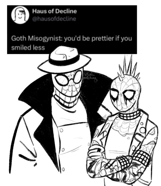
#i have so many more tho...
Text
They're fighting again <3
#also#IM ALIVE#kinda#i made this at work lol#ive wanted to use this audio for awhile#i have so many more tho...#but this was quick#death note#light yagami#l lawliet#lawlight#my art#death note shitpost#death note meme
1K notes
·
View notes
Photo

happy october third!
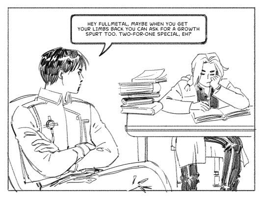
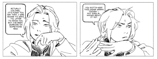
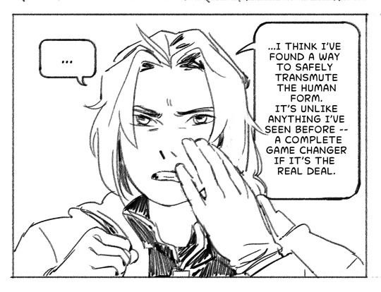
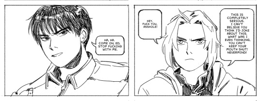
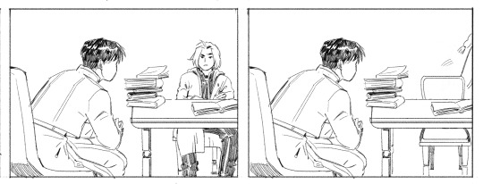
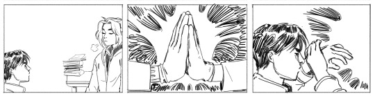
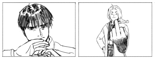
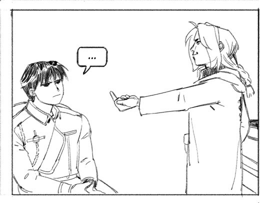
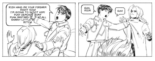
#asfhadlgajda#AU: ed has an iota of self-control#fullmetal alchemist#roy mustang#riza hawkeye#edward elric#art#fan comic#it's october third y'all#I really picked the best time of the year to fixate on this show#this was so fun I hope it's as funny as I intended although I fear it is not#oh welllll#I have many more sketches and things to finish later but I work tonight so this is it for now#love!!!!!#shout out to the person who pointed out in the hashtags that this just couldn't happen bc ed wouldn't be able to stop himself from reacting#you are correct lmao#I stand by it tho for comedic purposes
26K notes
·
View notes
Text
youtube
I might’ve spoiled the plot of Natlan | Genshin Impact THEORY
In which I read so much lore that I gained the power to see the future (maybe)
This ended up being a real challenge to make - but it was also really fun! Please do lemme know what you reckon of these ideas, and whether y’all wanna see me pattern-recognition my way into several corkboards worth of theories about any other topics sometime down the line! (^^)/
(also: HAPPY NEW YEAR! 🥳🎉 Here's wishing y'all every good thing for 2024)
#artists on tumblr#abd illustrates#genshin impact#natlan#game theory#idek how to tag this one i've never made a vid like this before uhm-- sgdfksdf#anyway oh my GOD i have had so many brain bees about this topic for the longest time#ik making a half hour video about it is unhinged enough but the fact that nobody else seemed to be talking about some of the patterns#was drivin me BONKERS#im so normal about this lore y'all mhm#but also silly tho the energy of this one is#im really proud of it! it was wierdly scary to branch out from my usual content like this#so i do sincerely hope it's a fun watch (^^)/#i'd love to make more off-the-wall and like deep-dive type stuff like this sometime if it goes over well 💖#it also took-- sO LONG TO MAKE#full time video essayists are to be feared i have learned#Youtube
895 notes
·
View notes
Text
why Aurora's art is genius
It's break for me, and I've been meaning to sit down and read the Aurora webcomic (https://comicaurora.com/, @comicaurora on Tumblr) for quite a bit. So I did that over the last few days.
And… y'know. I can't actually say "I should've read this earlier," because otherwise I would've been up at 2:30-3am when I had responsibilities in the morning and I couldn't have properly enjoyed it, but. Holy shit guys THIS COMIC.
I intended to just do a generalized "hello this is all the things I love about this story," and I wrote a paragraph or two about art style. …and then another. And another. And I realized I needed to actually reference things so I would stop being too vague. I was reading the comic on my tablet or phone, because I wanted to stay curled up in my chair, but I type at a big monitor and so I saw more details… aaaaaand it turned into its own giant-ass post.
SO. Enjoy a few thousand words of me nerding out about this insanely cool art style and how fucking gorgeous this comic is? (There are screenshots, I promise it isn't just a wall of text.) In my defense, I just spent two semesters in graphic design classes focusing on the Adobe Suite, so… I get to be a nerd about pretty things…???
All positive feedback btw! No downers here. <3
---
I cannot emphasize enough how much I love the beautiful, simple stylistic method of drawing characters and figures. It is absolutely stunning and effortless and utterly graceful—it is so hard to capture the sheer beauty and fluidity of the human form in such a fashion. Even a simple outline of a character feels dynamic! It's gorgeous!
Though I do have a love-hate relationship with this, because my artistic side looks at that lovely simplicity, goes "I CAN DO THAT!" and then I sit down and go to the paper and realize that no, in fact, I cannot do that yet, because that simplicity is born of a hell of a lot of practice and understanding of bodies and actually is really hard to do. It's a very developed style that only looks simple because the artist knows what they're doing. The human body is hard to pull off, and this comic does so beautifully and makes it look effortless.
Also: line weight line weight line weight. It's especially important in simplified shapes and figures like this, and hoo boy is it used excellently. It's especially apparent the newer the pages get—I love watching that improvement over time—but with simpler figures and lines, you get nice light lines to emphasize both smaller details, like in the draping of clothing and the curls of hair—which, hello, yes—and thicker lines to emphasize bigger and more important details and silhouettes. It's the sort of thing that's essential to most illustrations, but I wanted to make a note of it because it's so vital to this art style.
THE USE OF LAYER BLENDING MODES OH MY GODS. (...uhhh, apologies to the people who don't know what that means, it's a digital art program thing? This article explains it for beginners.)
Bear with me, I just finished my second Photoshop course, I spent months and months working on projects with this shit so I see the genius use of Screen and/or its siblings (of which there are many—if I say "Screen" here, assume I mean the entire umbrella of Screen blending modes and possibly Overlay) and go nuts, but seriously it's so clever and also fucking gorgeous:
Firstly: the use of screened-on sound effect words over an action? A "CRACK" written over a branch and then put on Screen in glowy green so that it's subtle enough that it doesn't disrupt the visual flow, but still sticks out enough to make itself heard? Little "scritches" that are transparent where they're laid on without outlines to emphasize the sound without disrupting the underlying image? FUCK YES. I haven't seen this done literally anywhere else—granted, I haven't read a massive amount of comics, but I've read enough—and it is so clever and I adore it. Examples:


Secondly: The beautiful lighting effects. The curling leaves, all the magic, the various glowing eyes, the fog, the way it's all so vividly colored but doesn't burn your eyeballs out—a balance that's way harder to achieve than you'd think—and the soft glows around them, eeeee it's so pretty so pretty SO PRETTY. Not sure if some of these are Outer/Inner Glow/Shadow layer effects or if it's entirely hand-drawn, but major kudos either way; I can see the beautiful use of blending modes and I SALUTE YOUR GENIUS.
I keep looking at some of this stuff and go "is that a layer effect or is it done by hand?" Because you can make some similar things with the Satin layer effect in Photoshop (I don't know if other programs have this? I'm gonna have to find out since I won't have access to PS for much longer ;-;) that resembles some of the swirly inner bits on some of the lit effects, but I'm not sure if it is that or not. Or you could mask over textures? There's... many ways to do it.
If done by hand: oh my gods the patience, how. If done with layer effects: really clever work that knows how to stop said effects from looking wonky, because ugh those things get temperamental. If done with a layer of texture that's been masked over: very, very good masking work. No matter the method, pretty shimmers and swirly bits inside the bigger pretty swirls!
Next: The way color contrast is used! I will never be over the glowy green-on-black Primordial Life vibes when Alinua gets dropped into that… unconscious space?? with Life, for example, and the sharp contrast of vines and crack and branches and leaves against pitch black is just visually stunning. The way the roots sink into the ground and the three-dimensional sensation of it is particularly badass here:

Friggin. How does this imply depth like that. HOW. IT'S SO FREAKING COOL.
A huge point here is also color language and use! Everybody has their own particular shade, generally matching their eyes, magic, and personality, and I adore how this is used to make it clear who's talking or who's doing an action. That was especially apparent to me with Dainix and Falst in the caves—their colors are both fairly warm, but quite distinct, and I love how this clarifies who's doing what in panels with a lot of action from both of them. There is a particular bit that stuck out to me, so I dug up the panels (see this page and the following one https://comicaurora.com/aurora/1-20-30/):

(Gods it looks even prettier now that I put it against a plain background. Also, appreciation to Falst for managing a bridal-carry midair, damn.)
The way that their colors MERGE here! And the immense attention to detail in doing so—Dainix is higher up than Falst is in the first panel, so Dainix's orange fades into Falst's orange at the base. The next panel has gold up top and orange on bottom; we can't really tell in that panel where each of them are, but that's carried over to the next panel—

—where we now see that Falst's position is raised above Dainix's due to the way he's carrying him. (Points for continuity!) And, of course, we see the little "huffs" flowing from orange to yellow over their heads (where Dainix's head is higher than Falst's) to merge the sound of their breathing, which is absurdly clever because it emphasizes to the viewer how we hear two sets of huffing overlaying each other, not one. Absolutely brilliant.
(A few other notes of appreciation to that panel: beautiful glows around them, the sparks, the jagged silhouette of the spider legs, the lovely colors that have no right to make the area around a spider corpse that pretty, the excellent texturing on the cave walls plus perspective, the way Falst's movements imply Dainix's hefty weight, the natural posing of the characters, their on-point expressions that convey exactly how fuckin terrifying everything is right now, the slight glows to their eyes, and also they're just handsome boys <3)
Next up: Rain!!!! So well done! It's subtle enough that it never ever disrupts the impact of the focal point, but evident enough you can tell! And more importantly: THE MIST OFF THE CHARACTERS. Rain does this irl, it has that little vapor that comes off you and makes that little misty effect that plays with lighting, it's so cool-looking and here it's used to such pretty effect!
One of the panel captions says something about it blurring out all the injuries on the characters but like THAT AIN'T TOO BIG OF A PROBLEM when it gets across the environmental vibes, and also that'd be how it would look in real life too so like… outside viewer's angle is the same as the characters', mostly? my point is: that's the environment!!! that's the vibes, that's the feel! It gets it across and it does so in the most pretty way possible!
And another thing re: rain, the use of it to establish perspective, particularly in panels like this—

—where we can tell we're looking down at Tynan due to the perspective on the rain and where it's pointing. Excellent. (Also, kudos for looking down and emphasizing how Tynan's losing his advantage—lovely use of visual storytelling.)
Additionally, the misting here:

We see it most heavily in the leftmost panel, where it's quite foggy as you would expect in a rainstorm, especially in an environment with a lot of heat, but it's also lightly powdered on in the following two panels and tends to follow light sources, which makes complete sense given how light bounces off particles in the air.
A major point of strength in these too is a thorough understanding of lighting, like rim lighting, the various hues and shades, and an intricate understanding of how light bounces off surfaces even when they're in shadow (we'll see a faint glow in spots where characters are half in shadow, but that's how it would work in real life, because of how light bounces around).
Bringing some of these points together: the fluidity of the lines in magic, and the way simple glowing lines are used to emphasize motion and the magic itself, is deeply clever. I'm basically pulling at random from panels and there's definitely even better examples, but here's one (see this page https://comicaurora.com/aurora/1-16-33/):

First panel, listed in numbers because these build on each other:
The tension of the lines in Tess's magic here. This works on a couple levels: first, the way she's holding her fists, as if she's pulling a rope taut.
The way there's one primary line, emphasizing the rope feeling, accompanied by smaller ones.
The additional lines starbursting around her hands, to indicate the energy crackling in her hands and how she's doing a good bit more than just holding it. (That combined with the fists suggests some tension to the magic, too.) Also the variations in brightness, a feature you'll find in actual lightning. :D Additional kudos for how the lightning sparks and breaks off the metal of the sword.
A handful of miscellaneous notes on the second panel:
The reflection of the flames in Erin's typically dark blue eyes (which bears a remarkable resemblance to Dainix, incidentally—almost a thematic sort of parallel given Erin's using the same magic Dainix specializes in?)
The flowing of fabric in the wind and associated variation in the lineart
The way Erin's tattoos interact with the fire he's pulling to his hand
The way the rain overlays some of the fainter areas of fire (attention! to! detail! hell yeah!)
I could go on. I won't because this is a lot of writing already.
Third panel gets paragraphs, not bullets:
Erin's giant-ass "FWOOM" of fire there, and the way the outline of the word is puffy-edged and gradated to feel almost three-dimensional, plus once again using Screen or a variation on it so that the stars show up in the background. All this against that stunning plume of fire, which ripples and sparks so gorgeously, and the ending "om" of the onomatopoeia is emphasized incredibly brightly against that, adding to the punch of it and making the plume feel even brighter.
Also, once again, rain helping establish perspective, especially in how it's very angular in the left side of the panel and then slowly becomes more like a point to the right to indicate it's falling directly down on the viewer. Add in the bright, beautiful glow effects, fainter but no less important black lines beneath them to emphasize the sky and smoke and the like, and the stunningly beautiful lighting and gradated glows surrounding Erin plus the lightning jagging up at him from below, and you get one hell of an impactful panel right there. (And there is definitely more in there I could break down, this is just a lot already.)
And in general: The colors in this? Incredible. The blues and purples and oranges and golds compliment so well, and it's all so rich.
Like, seriously, just throughout the whole comic, the use of gradients, blending modes, color balance and hues, all the things, all the things, it makes for the most beautiful effects and glows and such a rich environment. There's a very distinct style to this comic in its simplified backgrounds (which I recognize are done partly because it's way easier and also backgrounds are so time-consuming dear gods but lemme say this) and vivid, smoothly drawn characters; the simplicity lets them come to the front and gives room for those beautiful, richly saturated focal points, letting the stylized designs of the magic and characters shine. The use of distinct silhouettes is insanely good. Honestly, complex backgrounds might run the risk of making everything too visually busy in this case. It's just, augh, so GORGEOUS.
Another bit, take a look at this page (https://comicaurora.com/aurora/1-15-28/):

It's not quite as evident here as it is in the next page, but this one does some other fun things so I'm grabbing it. Points:
Once again, using different colors to represent different character actions. The "WHAM" of Kendal hitting the ground is caused by Dainix's force, so it's orange (and kudos for doubling the word over to add a shake effect). But we see blue layered underneath, which could be an environmental choice, but might also be because it's Kendal, whose color is blue.
And speaking off, take a look at the right-most panel on top, where Kendal grabs the spear: his motion is, again, illustrated in bright blue, versus the atmospheric screened-on orange lines that point toward him around the whole panel (I'm sure these have a name, I think they might be more of a manga thing though and the only experience I have in manga is reading a bit of Fullmetal Alchemist). Those lines emphasize the weight of the spear being shoved at him, and their color tells us Dainix is responsible for it.
One of my all-time favorite effects in this comic is the way cracks manifest across Dainix's body to represent when he starts to lose control; it is utterly gorgeous and wonderfully thematic. These are more evident in the page before and after this one, but you get a decent idea here. I love the way they glow softly, the way the fire juuuust flickers through at the start and then becomes more evident over time, and the cracks feel so realistic, like his skin is made of pottery. Additional points for how fire begins to creep into his hair.
A small detail that's generally consistent across the comic, but which I want to make note of here because you can see it pretty well: Kendal's eyes glow about the same as the jewel in his sword, mirroring his connection to said sword and calling back to how the jewel became Vash's eye temporarily and thus was once Kendal's eye. You can always see this connection (though there might be some spots where this also changes in a symbolic manner; I went through it quickly on the first time around, so I'll pay more attention when I inevitably reread this), where Kendal's always got that little shine of blue in his eyes the same as the jewel. It's a beautiful visual parallel that encourages the reader to subconsciously link them together, especially since the lines used to illustrate character movements typically mirror their eye color. It's an extension of Kendal.
Did I mention how ABSOLUTELY BEAUTIFUL the colors in this are?
Also, the mythological/legend-type scenes are illustrated in familiar style often used for that type of story, a simple and heavily symbolic two-dimensional cave-painting-like look. They are absolutely beautiful on many levels, employing simple, lovely gradients, slightly rougher and thicker lineart that is nonetheless smoothly beautiful, and working with clear silhouettes (a major strength of this art style, but also a strength in the comic overall). But in particular, I wanted to call attention to a particular thing (see this page https://comicaurora.com/aurora/1-12-4/):

The flowing symbolic lineart surrounding each character. This is actually quite consistent across characters—see also Life's typical lines and how they curl:

What's particularly interesting here is how these symbols are often similar, but not the same. Vash's lines are always smooth, clean curls, often playing off each other and echoing one another like ripples in a pond. You'd think they'd look too similar to Life's—but they don't. Life's curl like vines, and they remain connected; where one curve might echo another but exist entirely detached from each other in Vash's, Life's lines still remain wound together, because vines are continuous and don't float around. :P
Tahraim's are less continuous, often breaking up with significantly smaller bits and pieces floating around like—of course—sparks, and come to sharper points. These are also constants: we see the vines repeated over and over in Alinua's dreams of Life, and the echoing ripples of Vash are consistent wherever we encounter him. Kendal's dream of the ghost citizens of the city of Vash in the last few chapters is filled with these rippling, echoing patterns, to beautiful effect (https://comicaurora.com/aurora/1-20-14/):

They ripple and spiral, often in long, sinuous curves, with smooth elegance. It reminds me a great deal of images of space and sine waves and the like. This establishes a definite feel to these different characters and their magic. And the thing is, that's not something that had to be done—the colors are good at emphasizing who's who. But it was done, and it adds a whole other dimension to the story. Whenever you're in a deity's domain, you know whose it is no matter the color.
Regarding that shape language, I wanted to make another note, too—Vash is sometimes described as chaotic and doing what he likes, which is interesting to me, because smooth, elegant curves and the color blue aren't generally associated with chaos. So while Vash might behave like that on the surface, I'm guessing he's got a lot more going on underneath; he's probably much more intentional in his actions than you'd think at a glance, and he is certainly quite caring with his city. The other thing is that this suits Kendal perfectly. He's a paragon character; he is kind, virtuous, and self-sacrificing, and often we see him aiming to calm others and keep them safe. Blue is such a good color for him. There is… probably more to this, but I'm not deep enough in yet to say.
And here's the thing: I'm only scratching the surface. There is so much more here I'm not covering (color palettes! outfits! character design! environment! the deities! so much more!) and a lot more I can't cover, because I don't have the experience; this is me as a hobbyist artist who happened to take a couple design classes because I wanted to. The art style to this comic is so clever and creative and beautiful, though, I just had to go off about it. <3
...brownie points for getting all the way down here? Have a cookie.
#aurora comic#aurora webcomic#comicaurora#art analysis#...I hope those are the right tags???#new fandom new tagging practices to learn ig#much thanks for something to read while I try to rest my wrists. carpal tunnel BAD. (ignore that I wrote this I've got braces ok it's fine)#anyway! I HAVE. MANY MORE THOUGHTS. ON THE STORY ITSELF. THIS LOVELY STORY#also a collection of reactions to a chunk of the comic before I hit the point where I was too busy reading to write anything down#idk how to format those tho#...yeet them into one post...???#eh I usually don't go off this much these days but this seems like a smaller tight-knit fandom so... might as well help build it?#and I have a little more time thanks to break so#oh yes also shoutout to my insanely awesome professor for teaching me all the technical stuff from this he is LOVELY#made an incredibly complex program into something comprehensible <3#synapse talks
742 notes
·
View notes
Photo
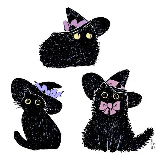
happy halloween, her are some witch kitties <|:-3
[ID start: fine liner drawing of 3 stylized balck cats in conical witch hats, the witch hats have ribbons wrapped around them tied in bows, the ribbons are in shades of lilac, the cat in the lower right corner has a bow around their neck end of ID]
#happy halloween#cat#black cat#Halloween#witch cat#witch#witchy#artists on tumblr#mixed media#ppl don't get used to me drawing so many back cat adjacent things it is phase sorry#i have one more black cat coinatining spoopy post for today tho lol
8K notes
·
View notes
Text
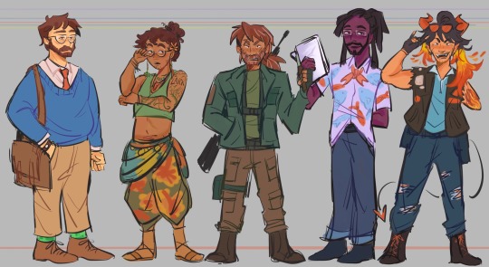
raahhhh guh. another lineup, s2 kiddads. i love them so much they're rotating in my mind like a rotisserie chicken. god.
design notes for them under the cut if ur interested!
Grant
blue sweater bc blue is symbolic of titanic ep (something borrowed, something blue)
his tie color is the same color as Darryl's hat in my design
Wears Frank's watch that Darryl gave him, even if it's broken he doesn't take it off.
Green creeper socks because it's a Must. He wouldn't be Grant without them.
Sparrow
curly hair he got from mercedes' genes. he grew out his hair like lark
has a pink flower tucked in his hair like my henry's design
his jewelry and clothes are mostly borrowed from mercedes, he got really into crystals and other things like that growing up and got closer to his druid roots.
earrings are a feather and an oak leaf maybe i dunno i'll figure it out later lol
tattoos! there's supposed to be a bird outline there and other plant/nature related stuff on his arm. I'll draw it out better in the future mayhaps.
colors are brighter, more lifelike cuz he's closer to nature and all that jazz.
Lark
his hair has strands of white hair because of stress/trauma/Everything going on
hair is messier, unkempt because he cares less about appearances and doesn't have time anyways.
darker forest colors, less in tune with nature than sparrow.
his pants are the same color as my Henry's shorts :0) i needed a connection somewhere to his parents, and it just had to be henry.
Terry Jr.
purple shirt because his color is purple to me
fish motifs!! everywhere! i hc that when he and ron get closer bonding thru fishing they'd get each other fun fish printed shirts or something. This was Ron's gift to Terry. The colors of the fish are color picked from my Ron's design.
Fish tail tie and the shirt is also split like a fish tail maybe.
he's the tallest of the kiddads forever and always
Nicky
he wears glenn's sunglasses on his head
he grew out his hair long like morgan's because it's like the one thing he still really has of her. has her hair type and he takes very good care of his hair.
still has the ripped leather jacket from his time as nick and various patches of bands he likes (didn't want to draw them out yet.)
blue shirt because of his time as nicholas/reminder of jodie. blue holster belt and pants are also blue for jodie association
#dndads#dungeons and daddies#dungeons and daddies fanart#dndads fanart#dndads season 2#grant wilson#sparrow oak#lark oak#terry jr#nicky foster#kiddads#i love them all so dearly#i have so many thoughts and more things i wanna incorporate in their designs later on#nicky is my fave tho i'm so biased#ehehe i will draw more of them sometime
590 notes
·
View notes
Text
Awe yeah Hitman JD art (+ semi-unrelated doodle bc I wanted to put something over the cut)
!! Blood warning for the art under the cut !!
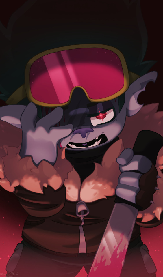
@lemony-and-zesty HI I stumbled upon your Hitman John Dory au while looking at trolls fanart and I'm SO NORMAL abt him!!!! I just had to draw him I hope that's okay
#HIS DESIGN IS SO COOL AUUGHJSJGDUS!! THE GUY EVER!!!#he could kill me and he should /j /lh#theres so many amazing john dory aus ive seen on here fr fr#hitman jd is definitely one of my faves tho#also yall forgive me i havent drawn trolls in uhhhhh idk how many years im a bit rusty#I was gonna say more put its late where i am and im eepy sorry chat#trolls#trolls world tour#trolls band together#trolls john dory#trolls chaz#hitman!john dory#cherris canvas#cw blood#tw blood#speaking of blood idk what blood color trolls have but id like to think it depends on the type of troll#(pop has pink blood. funk has purple blood. etc etc)
321 notes
·
View notes
Text
No but like every time I think about Splinter and what he had to go through just to keep the boys alive, my heart hurts for him so badly. Is he perfect? No not at all, but none of them are and by god does he love his sons.
The fact that all of them are alive, and grew to thrive despite the circumstances surrounding them is a testament of how much Splinter loves his boys. He raised four babies following the most traumatic time of his life, all alone with nothing but the sewers to house them (to hide them.) I feel like he’s not given the credit he deserves for all he’s done.
And I get that it’s easy to hold up his flaws and faults when it comes to parenting, I myself like looking into them because flawed characters are super interesting and said flaws make them more realistic and engaging, but he tries, and again, so many others would have given up on the boys or failed along the way but Splinter didn’t.
He’s their father, for all his faults he did his damndest to make sure they survived.
#rottmnt#rise of the teenage mutant ninja turtles#rottmnt splinter#rise splinter#he’s not perfect as I’ve said#and he’s got a whole slew of flaws and faults#but he’s a person - we are all flawed#he loves his sons dearly dearly dearly even if he struggles along the way to show that#parenting is not easy! especially as a traumatized mutant who is forced to do it alone#side note but I think this is one of the reasons why it kiiiiiinda ruffles my feathers to see so many people assign parentification to Raph#and in turn make Splinter out to be way worse and way more distant than he is in canon?#like idk I just don’t see what so many others see ig but maybe that’s just me#i guess my thoughts are like- let parents have flaws without villainizing them?#they’re still parents even if they mess up?#we can discuss the repercussions of a parents actions on a child while not casting that parent as an awful person#parents are peopleeee#I could go on but yeahhh#idk it bothers me seeing splinter’s efforts undermined when he’s been through so much#idk if ppl realized this by now but I love me some flawed characters#tho I do think in this fandom the ones whose faults are discussed the most are like#Splinter mostly then Draxum then Leo#of the main cast#and in Splinters case in particular his faults are made to cover his good qualities which makes me sad#because he is SO INTERESTING#they’re all flawed characters and tbh so interesting because their flaws are ALSO their strengths in many aspects
354 notes
·
View notes
Text

sticker sheet wip -___-
#was gonna make a shuake / general persona 5 sheet#third sem goro akechi disease is terminal tho#still have to edit some designs and idk why the scarf is so big. but lets finish this#my art#is this too many on one sheet???? is the sizing ok??????????/ does anyone want a sticker of a toppled over glass and a crosshair symbol#the more i look at it the more im like man wtf /i/ wouldnt buy this. its ok. its just in the ugly phase rn fingers crossed it comes out ok.
376 notes
·
View notes
Photo

I think the world is so wonderful... (Patreon)
#My art#Handplates#UT#Papyrus#I have not been able to get this idea out of my head for like - days now lol#It's only solidified the more I read! Heck!!#I dunno if I was necessarily hoping that reading further would point me in another direction but no now this is one of his songs lol#I really like Rugrats Theory actually :) The song of course it's lovely but I even have some nostalgia for the creepypasta haha#Been a while since I read it tho so that's probably just the soft haze of memory talking lol#But the song is still great! I'm partial to the English cover but I like the original as well :)#There are just so many fun lyrics! Especially for Papyrus specifically#''Everything I've been told I believe and yet people that I love just leave'' Gasterrr#''I think I'm old enough to understand so there's no reason to hide from me'' Sanssssssss#Once I returned to the scene of Sans trying to lie to him I just fjdslahfd these lyrics would Not leave me alone lol#I'm also Extremely partial to the second verse surrounding blindness and willful ignorance - his vision problems literal and metaphorical!#I wasn't planning to start a Handplates playlist but I guess by this point it's kinda too late haha#I also tried a different style of shading for this one ♪ Trying to style match a bit hehe#It's fun! Scratchy - tho some of that is from still using my usual brushes lol#I was Very inspired by watching the comic creation playlist - so cool! Very fun to watch and pick up ideas hehe#I knew I forgot something lol dang it - forgot the dash between WDG-2#S'what I get for using pre-plates references :P#For just a quick little thing I'm fairly pleased overall tho :)
286 notes
·
View notes
Text
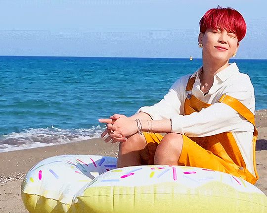

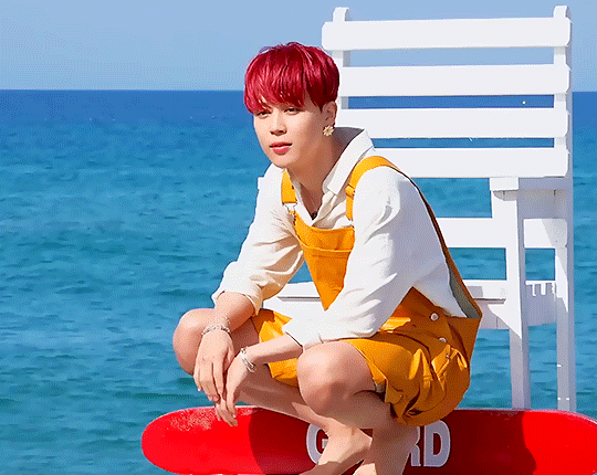
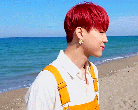
‘Butter’ Jacket Shoot Sketch
Day Three - Jimin
#bts#park jimin#jimin#bts jimin#bangtan#bangtan sonyeondan#bts gifs#btsedit#my gifs#his sweet lil face in the first one like shut UP#he gets more screentime in the group shots but i haven't sorted those yet#and like i probably should have so that i would have more individual gifs#but like he got SO MANY on day two so it's fine#his lil overalls tho jesus christ
251 notes
·
View notes
Text
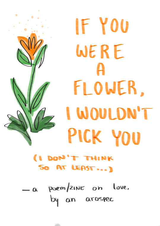
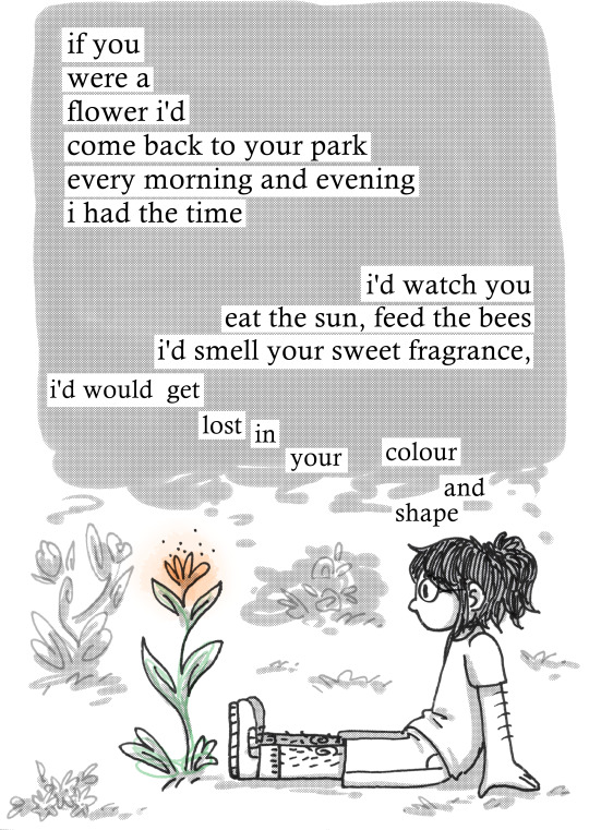

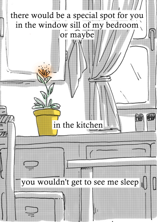


after seeing this post by the artist afkeii on instagram, i got inspired to write a poem... and then i drew something to make it into a zine...
the way i feel about romantic love is... complicated... but i've known i'm on the aromantic spectrum for over a year now ! yippiee !
if you'd like to have a physical copy, feel free to [download the print version here] , and check [how to put it together / make a 8-page zine here]
#zine#personal zine#art#aromantic#aromantic spectrum#my art#id in alt text#that was very... interesting to write and draw about#dont ask me how i feel about romantic love its too tiring to explain#(<- thats a lie- do ask me about it as much as you want i have so many thoughts on it. probs more questions than answers tbf tho)#also yeah the black ring on my middle finger and right hand is bcs im asexual too#but ive known im ace since i was 13 so i dont have nothing poetic to say about it cuz its been just a normal thing for me for so long lol#aight its getting late and i need to go sleep byeeee
272 notes
·
View notes
Text

pov you’re the wither and you have about 30 seconds to live
(the marks under his eye just say ‘RIP’ in sga/enchantment table language if anyone was curious)
#my art#witchcraft smp#smajor95#i just thought it was funny seeing as his whole deal is not letting people do that#the idea was actually that he was *about* to summon the wither which is why the sword’s in his off hand you know what nobody cares topsy#the witchcraft smp kinda got me tho ngl i literally have like 4 things i want to draw from this episode alone#i keep saying this but i really need to start just posting stuff and not letting myself finish it bc i want to draw so many#and frankly almost none of it needs to be polished but i keep getting carried away and not having time for other drawings >:[#i even do this fully aware that people in general like sketches *more* than finished stuff! my brain doesn’t care!#anyway enough about me how about those block game witches
1K notes
·
View notes
Text
youtube
IVE DONE IT.
this took me like a week to make and its FINALLY DONE.
watch bad b oy halo have a good time. click.
(its a bit slow to start dw it gets going)
#qsmp#qsmp badboyhalo#qsmp bbh#mishapen draws#mishapen animates#what other tags do i use#i think thats it for now#i am so scared of every animatic artist ever now#this shit takes EFFORT#eyah i made that little jaiden animatic but that was just a lil bit of a song#this is a full song#i have drawn so so many badboyhalos#i am so good at drawing badboyhalo now#also why are cornflowers like that#i get why they're his and pomme's favourite flower tho that shit's Gorgeous#get ready to see me rb this like eight more times over the next month this is the biggest project ive completed in. a hot minute
271 notes
·
View notes
Text
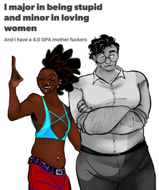
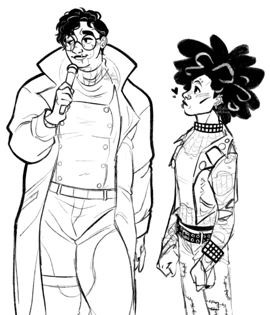
memes in defiance of valentine’s day
(blood & artistic nudity under readmore)
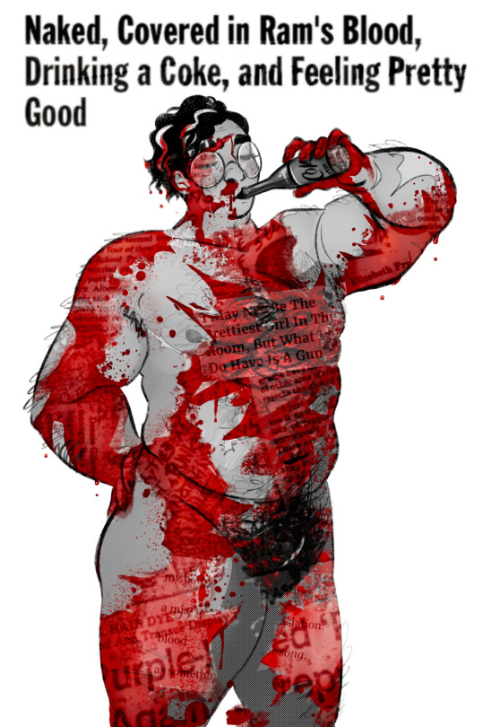
#spider man: across the spider verse#spider punk#spider noir#hobie brown#noirpunk#hot bloody transmasc peter under cut#not doing anything risqué tho sorry lol#hobie brown’s spider getup includes four inch platforms thats why hes tall only when hes masked#otherwise theyre 5’8 which is still tall but not compared to their GIANT PARTNER whom they LOVE#did you know theyre so in love did you did you#that last no-color sketch is actually transfem peter but i dont think too many people will pick up on that#oh well. i do my work regardless of praise#(not true please love me)#these were a lot of fun and i do have more to post hehe#tw blood
183 notes
·
View notes
Text

Finally got a fancy(tm) pic of my aquarium - think I figured out the solution to awful photos is just I have to do them at night because the hugeass window in my room directly adjacent ruins everything. Going to try and take a pic like this weekly to track growth!
Anyway it's looking close? Closeish? to being cycled so the question is: WHAT COLOUR SHRIMP
#kerytalk#fish nonsense#planted tank#aquablr#fishblr#cherry shrimp or neocaridina is what I'm looking for#I just don't think I'd like reds. Or yellow#also rip I found the underground shrimp trading groups (complicated) and went from not finding any Caridina to so many#DO NOT TEMPT ME! I KNOW THEY'RE MORE SENSITIVE#they look bomb af tho rip#I do prefer them over Neos#idk how close is close but ammonia is 0.2 nitrites 0.0 and nitrates 20ppm#been sitting at that for a hot minute tho so not sure what's happening#dosing with bacteria and a fertiliser (both seachem) daily#things I've read saying as long as I have nitrates it means something is being converted so yay? it's def not in our tap water I tested
176 notes
·
View notes
Last Seen Blogs

polyamiam
PartnerCore Side Blog

evitems07-blog
EV items

brindha8797
Untitled

a-nice-egg-offering
Welcome Sexual Conquest