#i hope those are all the tags
Text
Amatonormativity has destroyed so many people's understanding and acceptance of themselves, and it's heartbreaking.
Yes, it is normal to be in your 20s, 30s, or older and not have lost your virginity, had a first kiss, or a partner. It is normal to say that you aren't ready for those things, too! It is normal if your life doesn't follow the "college graduate -> engagement -> buying a home -> 2.5 kids and a dog" trajectory that so many people have idealized.
So many people associate maturity with losing your virginity, or having a first kiss, or a serious relationship, and I think that's a dangerous association. Maturity isn't gained through those things, and you don't have to have those experiences to be considered "mature" or "grown." It is not a bad thing to go at your pace. Nobody else can live your life but you. If you end up having those experiences, that's great! But it should be done because you want to experience them, not because you feel "broken" and "immature" without them.
#amatonormativity#ask to tag (genuine)#i honestly *wish* conversations like this were things i was exposed to when i was younger...#...maybe then i'd've felt less of a need to surpress my aromanticism and asexuality...#...the feeling of brokenness still trails behind me sometimes because so many of us are taught that this all WILL happen...#...we WILL fall in love. we WILL have a nuclear family. we WILL be satisfied with this...#...and that this is the IDEAL for cishet patriarchal structures...#...and that /any/ deviation to the SLIGHTEST degree is that fault of the *individual*. who WOULDN'T want this life?#there's this idea like i said that maturity is gained as you almost... adhere to expectations...#...and that's genuinely dangerous to associate maturity with that and i hope you can fill in those gaps because it can get dark fast
7K notes
·
View notes
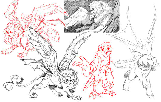
Text
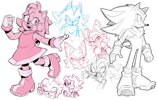


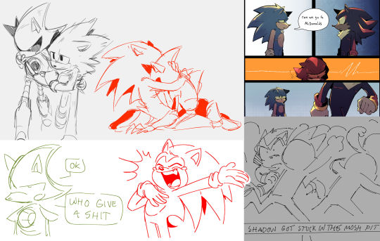
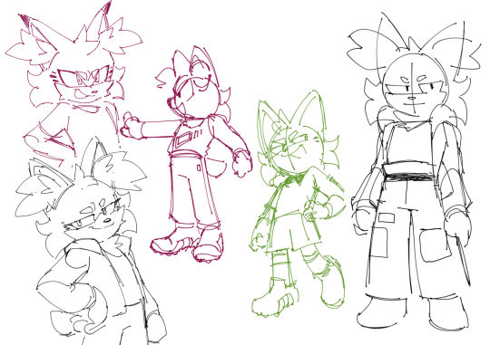
cleaning out the files, sonic sketch edition
#i think the one thing i'll always admire about my art is my lack of consistency lol#my style depends on the emotion or the character or the scene i'm drawing. and i hope seeing how messy my process can be#helps other growing artists out there just get messy with their work. get those feelings out onto a page#fern's sketchbook#sth#not tagging all those characters lol#🦔🦇🤖
2K notes
·
View notes
Text
rian johnson took all that time, put in all that effort to make glass onion a fantastic period piece to the first four months of pandemic, a prescient narrative that anticipates the stupidity of rich billionaires, and then pulled the rug from under us because the world of benoit blanc just straight up doesn't have the mona lisa anymore
#Some geniuses in the notes are talking about how it wasn't the real mona lisa#And I'm editing my tags because tumblr is a website with minimal reading comprehension#But the POINT is that he went through all that effort to make the world canon complaint with ours#Only to DESTROY a cultural artefact real or not#Having massive political implications for the world#And that's what I was pointing out. Here and in another reblog that presumably no one will care to fish out#It's in the replies for those looking#Anyway I hope rian johnson makes ten of these without the mona lisa#Also as a side note. So many movies have ignored covid#Not this man. He's like no we'll include it. But if we divert from canon reality#We're going to destroy the mona lisa#Love that for him. Icon#hello void this is ridiculosity#knives out#glass onion
9K notes
·
View notes
Text
a little wip for a little thing i'm working on!
#fnaf moon#fnaf dca#dca fandom#traditional art#when you pat your robot coworker on the head and then he makes it WeirdTM#it's all fun and games until you realized you're touch starved#this idea has me by the throat#it has been occupying all my attention since i got my exam marks back#(i passed by the way! hooray! my reward is more courses!)#cuz i want to get it done before i start my second course#or i will not know peace#so hoping to get it done some time this week#also! a little extra sneak peak for those of you who read my tags#(love you all by the way!)#(my tags are where i tell all my best and worst jokes)#this will be angst#>:)#crab art
975 notes
·
View notes
Text
Many siffrins!! Wanted to practice expressions and i love how expressive he is ( minus their hat sometimes cuz it takes up lotsa space, and plus some various states of Hair Dye)
Plus the sprites used:
#in stars and time#isat#siffrin#isat siffrin#josh art tag#and all those sprites r from very early game so theres no spoilers to be found here!#i have lots of spoilery art ideas but im trying to stall posting them for a bit#lowkey hoping some of yall non isat fans seeing this might be encouraged to play by my art...#anyway i love siffrin sm and i love drawing them happy <33
623 notes
·
View notes
Text
why Aurora's art is genius
It's break for me, and I've been meaning to sit down and read the Aurora webcomic (https://comicaurora.com/, @comicaurora on Tumblr) for quite a bit. So I did that over the last few days.
And… y'know. I can't actually say "I should've read this earlier," because otherwise I would've been up at 2:30-3am when I had responsibilities in the morning and I couldn't have properly enjoyed it, but. Holy shit guys THIS COMIC.
I intended to just do a generalized "hello this is all the things I love about this story," and I wrote a paragraph or two about art style. …and then another. And another. And I realized I needed to actually reference things so I would stop being too vague. I was reading the comic on my tablet or phone, because I wanted to stay curled up in my chair, but I type at a big monitor and so I saw more details… aaaaaand it turned into its own giant-ass post.
SO. Enjoy a few thousand words of me nerding out about this insanely cool art style and how fucking gorgeous this comic is? (There are screenshots, I promise it isn't just a wall of text.) In my defense, I just spent two semesters in graphic design classes focusing on the Adobe Suite, so… I get to be a nerd about pretty things…???
All positive feedback btw! No downers here. <3
---
I cannot emphasize enough how much I love the beautiful, simple stylistic method of drawing characters and figures. It is absolutely stunning and effortless and utterly graceful—it is so hard to capture the sheer beauty and fluidity of the human form in such a fashion. Even a simple outline of a character feels dynamic! It's gorgeous!
Though I do have a love-hate relationship with this, because my artistic side looks at that lovely simplicity, goes "I CAN DO THAT!" and then I sit down and go to the paper and realize that no, in fact, I cannot do that yet, because that simplicity is born of a hell of a lot of practice and understanding of bodies and actually is really hard to do. It's a very developed style that only looks simple because the artist knows what they're doing. The human body is hard to pull off, and this comic does so beautifully and makes it look effortless.
Also: line weight line weight line weight. It's especially important in simplified shapes and figures like this, and hoo boy is it used excellently. It's especially apparent the newer the pages get—I love watching that improvement over time—but with simpler figures and lines, you get nice light lines to emphasize both smaller details, like in the draping of clothing and the curls of hair—which, hello, yes—and thicker lines to emphasize bigger and more important details and silhouettes. It's the sort of thing that's essential to most illustrations, but I wanted to make a note of it because it's so vital to this art style.
THE USE OF LAYER BLENDING MODES OH MY GODS. (...uhhh, apologies to the people who don't know what that means, it's a digital art program thing? This article explains it for beginners.)
Bear with me, I just finished my second Photoshop course, I spent months and months working on projects with this shit so I see the genius use of Screen and/or its siblings (of which there are many—if I say "Screen" here, assume I mean the entire umbrella of Screen blending modes and possibly Overlay) and go nuts, but seriously it's so clever and also fucking gorgeous:
Firstly: the use of screened-on sound effect words over an action? A "CRACK" written over a branch and then put on Screen in glowy green so that it's subtle enough that it doesn't disrupt the visual flow, but still sticks out enough to make itself heard? Little "scritches" that are transparent where they're laid on without outlines to emphasize the sound without disrupting the underlying image? FUCK YES. I haven't seen this done literally anywhere else—granted, I haven't read a massive amount of comics, but I've read enough—and it is so clever and I adore it. Examples:


Secondly: The beautiful lighting effects. The curling leaves, all the magic, the various glowing eyes, the fog, the way it's all so vividly colored but doesn't burn your eyeballs out—a balance that's way harder to achieve than you'd think—and the soft glows around them, eeeee it's so pretty so pretty SO PRETTY. Not sure if some of these are Outer/Inner Glow/Shadow layer effects or if it's entirely hand-drawn, but major kudos either way; I can see the beautiful use of blending modes and I SALUTE YOUR GENIUS.
I keep looking at some of this stuff and go "is that a layer effect or is it done by hand?" Because you can make some similar things with the Satin layer effect in Photoshop (I don't know if other programs have this? I'm gonna have to find out since I won't have access to PS for much longer ;-;) that resembles some of the swirly inner bits on some of the lit effects, but I'm not sure if it is that or not. Or you could mask over textures? There's... many ways to do it.
If done by hand: oh my gods the patience, how. If done with layer effects: really clever work that knows how to stop said effects from looking wonky, because ugh those things get temperamental. If done with a layer of texture that's been masked over: very, very good masking work. No matter the method, pretty shimmers and swirly bits inside the bigger pretty swirls!
Next: The way color contrast is used! I will never be over the glowy green-on-black Primordial Life vibes when Alinua gets dropped into that… unconscious space?? with Life, for example, and the sharp contrast of vines and crack and branches and leaves against pitch black is just visually stunning. The way the roots sink into the ground and the three-dimensional sensation of it is particularly badass here:

Friggin. How does this imply depth like that. HOW. IT'S SO FREAKING COOL.
A huge point here is also color language and use! Everybody has their own particular shade, generally matching their eyes, magic, and personality, and I adore how this is used to make it clear who's talking or who's doing an action. That was especially apparent to me with Dainix and Falst in the caves—their colors are both fairly warm, but quite distinct, and I love how this clarifies who's doing what in panels with a lot of action from both of them. There is a particular bit that stuck out to me, so I dug up the panels (see this page and the following one https://comicaurora.com/aurora/1-20-30/):

(Gods it looks even prettier now that I put it against a plain background. Also, appreciation to Falst for managing a bridal-carry midair, damn.)
The way that their colors MERGE here! And the immense attention to detail in doing so—Dainix is higher up than Falst is in the first panel, so Dainix's orange fades into Falst's orange at the base. The next panel has gold up top and orange on bottom; we can't really tell in that panel where each of them are, but that's carried over to the next panel—

—where we now see that Falst's position is raised above Dainix's due to the way he's carrying him. (Points for continuity!) And, of course, we see the little "huffs" flowing from orange to yellow over their heads (where Dainix's head is higher than Falst's) to merge the sound of their breathing, which is absurdly clever because it emphasizes to the viewer how we hear two sets of huffing overlaying each other, not one. Absolutely brilliant.
(A few other notes of appreciation to that panel: beautiful glows around them, the sparks, the jagged silhouette of the spider legs, the lovely colors that have no right to make the area around a spider corpse that pretty, the excellent texturing on the cave walls plus perspective, the way Falst's movements imply Dainix's hefty weight, the natural posing of the characters, their on-point expressions that convey exactly how fuckin terrifying everything is right now, the slight glows to their eyes, and also they're just handsome boys <3)
Next up: Rain!!!! So well done! It's subtle enough that it never ever disrupts the impact of the focal point, but evident enough you can tell! And more importantly: THE MIST OFF THE CHARACTERS. Rain does this irl, it has that little vapor that comes off you and makes that little misty effect that plays with lighting, it's so cool-looking and here it's used to such pretty effect!
One of the panel captions says something about it blurring out all the injuries on the characters but like THAT AIN'T TOO BIG OF A PROBLEM when it gets across the environmental vibes, and also that'd be how it would look in real life too so like… outside viewer's angle is the same as the characters', mostly? my point is: that's the environment!!! that's the vibes, that's the feel! It gets it across and it does so in the most pretty way possible!
And another thing re: rain, the use of it to establish perspective, particularly in panels like this—

—where we can tell we're looking down at Tynan due to the perspective on the rain and where it's pointing. Excellent. (Also, kudos for looking down and emphasizing how Tynan's losing his advantage—lovely use of visual storytelling.)
Additionally, the misting here:

We see it most heavily in the leftmost panel, where it's quite foggy as you would expect in a rainstorm, especially in an environment with a lot of heat, but it's also lightly powdered on in the following two panels and tends to follow light sources, which makes complete sense given how light bounces off particles in the air.
A major point of strength in these too is a thorough understanding of lighting, like rim lighting, the various hues and shades, and an intricate understanding of how light bounces off surfaces even when they're in shadow (we'll see a faint glow in spots where characters are half in shadow, but that's how it would work in real life, because of how light bounces around).
Bringing some of these points together: the fluidity of the lines in magic, and the way simple glowing lines are used to emphasize motion and the magic itself, is deeply clever. I'm basically pulling at random from panels and there's definitely even better examples, but here's one (see this page https://comicaurora.com/aurora/1-16-33/):

First panel, listed in numbers because these build on each other:
The tension of the lines in Tess's magic here. This works on a couple levels: first, the way she's holding her fists, as if she's pulling a rope taut.
The way there's one primary line, emphasizing the rope feeling, accompanied by smaller ones.
The additional lines starbursting around her hands, to indicate the energy crackling in her hands and how she's doing a good bit more than just holding it. (That combined with the fists suggests some tension to the magic, too.) Also the variations in brightness, a feature you'll find in actual lightning. :D Additional kudos for how the lightning sparks and breaks off the metal of the sword.
A handful of miscellaneous notes on the second panel:
The reflection of the flames in Erin's typically dark blue eyes (which bears a remarkable resemblance to Dainix, incidentally—almost a thematic sort of parallel given Erin's using the same magic Dainix specializes in?)
The flowing of fabric in the wind and associated variation in the lineart
The way Erin's tattoos interact with the fire he's pulling to his hand
The way the rain overlays some of the fainter areas of fire (attention! to! detail! hell yeah!)
I could go on. I won't because this is a lot of writing already.
Third panel gets paragraphs, not bullets:
Erin's giant-ass "FWOOM" of fire there, and the way the outline of the word is puffy-edged and gradated to feel almost three-dimensional, plus once again using Screen or a variation on it so that the stars show up in the background. All this against that stunning plume of fire, which ripples and sparks so gorgeously, and the ending "om" of the onomatopoeia is emphasized incredibly brightly against that, adding to the punch of it and making the plume feel even brighter.
Also, once again, rain helping establish perspective, especially in how it's very angular in the left side of the panel and then slowly becomes more like a point to the right to indicate it's falling directly down on the viewer. Add in the bright, beautiful glow effects, fainter but no less important black lines beneath them to emphasize the sky and smoke and the like, and the stunningly beautiful lighting and gradated glows surrounding Erin plus the lightning jagging up at him from below, and you get one hell of an impactful panel right there. (And there is definitely more in there I could break down, this is just a lot already.)
And in general: The colors in this? Incredible. The blues and purples and oranges and golds compliment so well, and it's all so rich.
Like, seriously, just throughout the whole comic, the use of gradients, blending modes, color balance and hues, all the things, all the things, it makes for the most beautiful effects and glows and such a rich environment. There's a very distinct style to this comic in its simplified backgrounds (which I recognize are done partly because it's way easier and also backgrounds are so time-consuming dear gods but lemme say this) and vivid, smoothly drawn characters; the simplicity lets them come to the front and gives room for those beautiful, richly saturated focal points, letting the stylized designs of the magic and characters shine. The use of distinct silhouettes is insanely good. Honestly, complex backgrounds might run the risk of making everything too visually busy in this case. It's just, augh, so GORGEOUS.
Another bit, take a look at this page (https://comicaurora.com/aurora/1-15-28/):

It's not quite as evident here as it is in the next page, but this one does some other fun things so I'm grabbing it. Points:
Once again, using different colors to represent different character actions. The "WHAM" of Kendal hitting the ground is caused by Dainix's force, so it's orange (and kudos for doubling the word over to add a shake effect). But we see blue layered underneath, which could be an environmental choice, but might also be because it's Kendal, whose color is blue.
And speaking off, take a look at the right-most panel on top, where Kendal grabs the spear: his motion is, again, illustrated in bright blue, versus the atmospheric screened-on orange lines that point toward him around the whole panel (I'm sure these have a name, I think they might be more of a manga thing though and the only experience I have in manga is reading a bit of Fullmetal Alchemist). Those lines emphasize the weight of the spear being shoved at him, and their color tells us Dainix is responsible for it.
One of my all-time favorite effects in this comic is the way cracks manifest across Dainix's body to represent when he starts to lose control; it is utterly gorgeous and wonderfully thematic. These are more evident in the page before and after this one, but you get a decent idea here. I love the way they glow softly, the way the fire juuuust flickers through at the start and then becomes more evident over time, and the cracks feel so realistic, like his skin is made of pottery. Additional points for how fire begins to creep into his hair.
A small detail that's generally consistent across the comic, but which I want to make note of here because you can see it pretty well: Kendal's eyes glow about the same as the jewel in his sword, mirroring his connection to said sword and calling back to how the jewel became Vash's eye temporarily and thus was once Kendal's eye. You can always see this connection (though there might be some spots where this also changes in a symbolic manner; I went through it quickly on the first time around, so I'll pay more attention when I inevitably reread this), where Kendal's always got that little shine of blue in his eyes the same as the jewel. It's a beautiful visual parallel that encourages the reader to subconsciously link them together, especially since the lines used to illustrate character movements typically mirror their eye color. It's an extension of Kendal.
Did I mention how ABSOLUTELY BEAUTIFUL the colors in this are?
Also, the mythological/legend-type scenes are illustrated in familiar style often used for that type of story, a simple and heavily symbolic two-dimensional cave-painting-like look. They are absolutely beautiful on many levels, employing simple, lovely gradients, slightly rougher and thicker lineart that is nonetheless smoothly beautiful, and working with clear silhouettes (a major strength of this art style, but also a strength in the comic overall). But in particular, I wanted to call attention to a particular thing (see this page https://comicaurora.com/aurora/1-12-4/):

The flowing symbolic lineart surrounding each character. This is actually quite consistent across characters—see also Life's typical lines and how they curl:

What's particularly interesting here is how these symbols are often similar, but not the same. Vash's lines are always smooth, clean curls, often playing off each other and echoing one another like ripples in a pond. You'd think they'd look too similar to Life's—but they don't. Life's curl like vines, and they remain connected; where one curve might echo another but exist entirely detached from each other in Vash's, Life's lines still remain wound together, because vines are continuous and don't float around. :P
Tahraim's are less continuous, often breaking up with significantly smaller bits and pieces floating around like—of course—sparks, and come to sharper points. These are also constants: we see the vines repeated over and over in Alinua's dreams of Life, and the echoing ripples of Vash are consistent wherever we encounter him. Kendal's dream of the ghost citizens of the city of Vash in the last few chapters is filled with these rippling, echoing patterns, to beautiful effect (https://comicaurora.com/aurora/1-20-14/):

They ripple and spiral, often in long, sinuous curves, with smooth elegance. It reminds me a great deal of images of space and sine waves and the like. This establishes a definite feel to these different characters and their magic. And the thing is, that's not something that had to be done—the colors are good at emphasizing who's who. But it was done, and it adds a whole other dimension to the story. Whenever you're in a deity's domain, you know whose it is no matter the color.
Regarding that shape language, I wanted to make another note, too—Vash is sometimes described as chaotic and doing what he likes, which is interesting to me, because smooth, elegant curves and the color blue aren't generally associated with chaos. So while Vash might behave like that on the surface, I'm guessing he's got a lot more going on underneath; he's probably much more intentional in his actions than you'd think at a glance, and he is certainly quite caring with his city. The other thing is that this suits Kendal perfectly. He's a paragon character; he is kind, virtuous, and self-sacrificing, and often we see him aiming to calm others and keep them safe. Blue is such a good color for him. There is… probably more to this, but I'm not deep enough in yet to say.
And here's the thing: I'm only scratching the surface. There is so much more here I'm not covering (color palettes! outfits! character design! environment! the deities! so much more!) and a lot more I can't cover, because I don't have the experience; this is me as a hobbyist artist who happened to take a couple design classes because I wanted to. The art style to this comic is so clever and creative and beautiful, though, I just had to go off about it. <3
...brownie points for getting all the way down here? Have a cookie.
#aurora comic#aurora webcomic#comicaurora#art analysis#...I hope those are the right tags???#new fandom new tagging practices to learn ig#much thanks for something to read while I try to rest my wrists. carpal tunnel BAD. (ignore that I wrote this I've got braces ok it's fine)#anyway! I HAVE. MANY MORE THOUGHTS. ON THE STORY ITSELF. THIS LOVELY STORY#also a collection of reactions to a chunk of the comic before I hit the point where I was too busy reading to write anything down#idk how to format those tho#...yeet them into one post...???#eh I usually don't go off this much these days but this seems like a smaller tight-knit fandom so... might as well help build it?#and I have a little more time thanks to break so#oh yes also shoutout to my insanely awesome professor for teaching me all the technical stuff from this he is LOVELY#made an incredibly complex program into something comprehensible <3#synapse talks
742 notes
·
View notes
Text
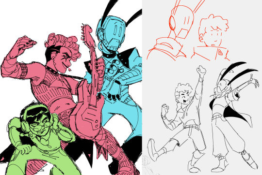
The second installment of this comic right here. In which the gang hangs out :) pages under the cut!
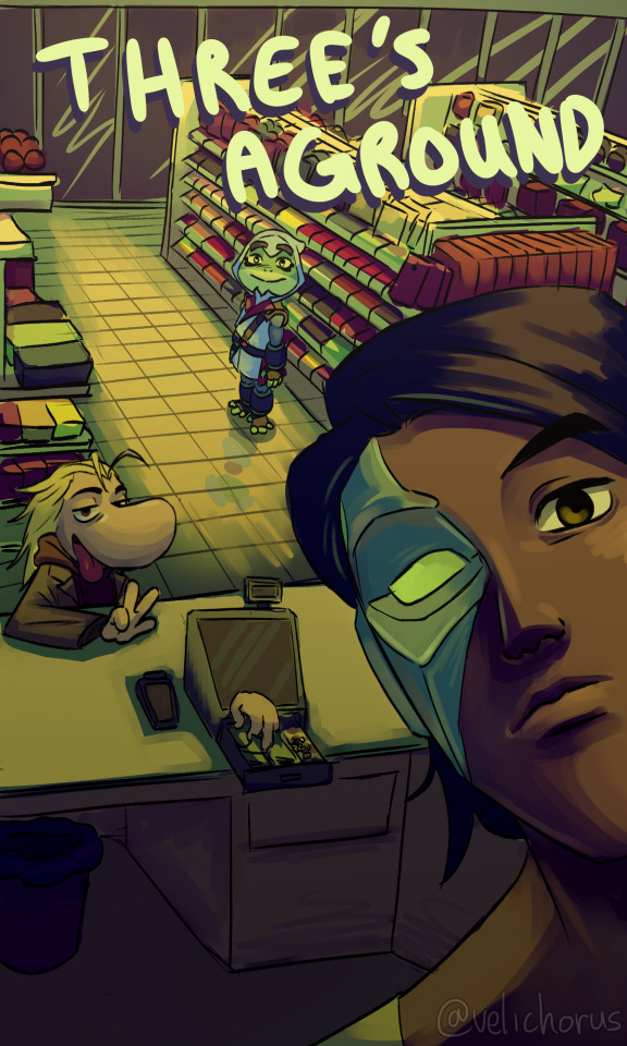
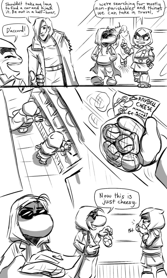
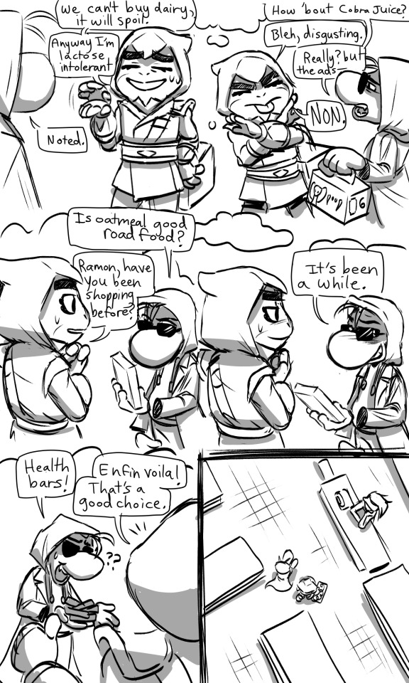
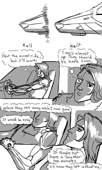

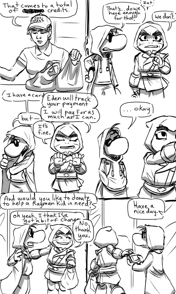
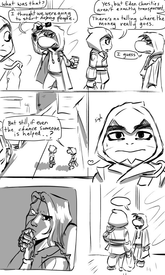
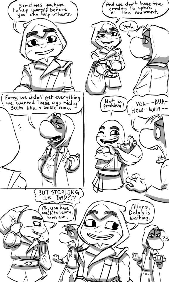
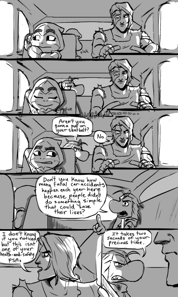
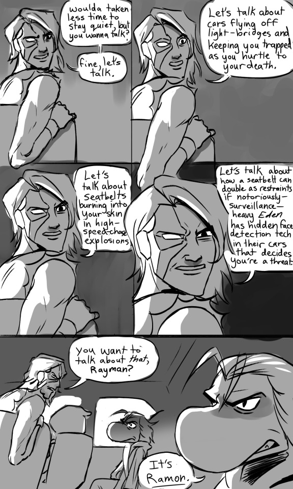


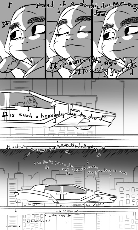
#The thing about repetitive panels is that they look easy but I have no process so they are in fact extremely difficult and I hate doing them#But they're IMPORTANT#Those last few panels look like an edgy music video but Im allowing myself to be cheesy. I can do whatever I want forever (sweating)#rayman#ramon#bullfrog captain laserhawk#dolph laserhawk#captain laserhawk#clh#clh fanart#three's aground#three's aground comic#art#alcohol#smoking#discussion of death#mentions of violence#violence mention#Like I have no idea how to tag tws hope that's ok#*vine noise* *sweeping hand gesture* look at all those tags
946 notes
·
View notes
Text
Danny moved to Gotham.
Freakshow is touring in Gotham.
Freakshow knows Danny is in Gotham.
Danny knows Freakshow is still after him.
Danny's faith in heroes has been shattered.
Danny turns to the only person powerful enough to run Freakshow out of town, hopefully for good.
Danny turns to the Joker for help.
The Joker is looking for a new punching bag sidekick after Harley Quinn left him.
Danny is just the perfect person to be shaped by the Joker's hands.
Danny becomes the new Joker Junior.
#pondhead blurbs#dpxdc#how we feeling about this fellas#i think it's an ideal angst fic#but i don't wanna write it lol#the younger danny is the worse it gets#someone said that danny shouldn't be afraid of the joker because he's a clown and freakshow is a ringmaster. not a clown#if i find that post i'll tag the creator cause i can't remember rn#but i'm imagining danny who is heavily traumatized and scared and lonely#finding out that one of his worst enemies he hoped to never see again is hunting him and is so close danny has to check his eyes every day#just to make sure they haven't turned red#his anxiety is out of control and he's not about to go find a Bat or Bird to talk to#who would believe him anyways? he's a monster#but danny needs help cause he will not survive this on his own and he knows it#freakshow haunts his every waking dream#but freakshow isn't from gotham. he doesn't have the city's curses engraved into his blood. he never died and he's not truly teasing death#so danny chooses to plead for help from the only predator bigger than freakshow (in his eyes) who IS from gotham#danny goes to the Joker. prepared to offer everything but his free will and free mind. he can't give those up. it's all he has.#danny is a feral house cat asking a tiger to take care of a mountain lion for him by offering the tiger his own liver on a silver platter#joker is...delighted? maybe? no one is quite sure. but he takes what danny offers.#here is this little boy. almost the same age as the second robin when he died. pleading for the JOKER to be his savior. this will be fun
491 notes
·
View notes
Text
Happy disability pride to everyone whose disability makes it hard/impossible for them to leave the house.
Happy disability pride to everyone who WANTS to do something they love, but can't because of their disability.
Happy disability pride to everyone who has ever been ignored, side-eyed or scoffed at (or otherwise judged) for being themselves in public.
Happy disability pride to people in constant pain, that doesn't end or break.
Happy disability pride to people who can't/don't want an official diagnosis because it would fuck up their lives, but they need the accommodations anyway.
Happy disability pride to people who did get/have gotten/had to get a diagnosis, because they needed what came from it.
Happy disability pride to the under-represented disabilities that people don't talk about much, or that get ignored both online and IRL.
Happy disability pride to those whose disabilities get represented in ways that do not match your experience at all.
Happy disability pride to the physically and mentally disabled people who are reading this. If you are one, the other, or (more often) both, you are still a valid person who faces discrimination and hardship from ableists, and we must all band together to vouch for our rights- ALL of our rights.
Happy disability pride to all of you, I love you all, and may we get through this month, and all the rest, together.
#disability pride month#disability pride#actually disabled#I have both:#chronic pain#cane user#and also:#actually autistic#(I wanted those tags to come up so I formatted it weird. sorry)#I hope this reaches you#and makes you feel seen and loved and happy#at least a little bit#to me you are all my siblings and we need to ALL stand together to survive
1K notes
·
View notes
Note
you cannot tease wei wuxian and hua cheng hunting for funsies and not show that to us??? it has to go one of two ways right? either an absolute visious blood bath where everyone cowers in fear or the equivalent of a teenage girl's slumber party. both??? both.
Hunting each other for sport is the keystone to a fun slumber party
#poorly drawn mdzs#mdzs#tgcf#wei wuxian#hua cheng#I was so happy to get this ask because it have me the perfect segue to show these two being silly together#This comic also kicked my ass while trying to draw it....I have learned a lot while gasping for breath outside of my comfort zone#action scenes are hard....help I don't want to look at this ever again.....#But yes. These two would have a lovely time being *silly* ^_^ together (actually winding up for a sparing match).#Then go right back to being very casual and chill. They have lots in common!#Both of them love to fight and would be thrilled to have a partner for it. Then talk about paint mixtures.#How long LWJ and XL take with their cooking classes is up for interpretation. But these two are frolicking the entire time#Everyone loves being hunted and hunting. That's what tag is all about. This is just tag with swords.#I hope everyone enjoys looking at HC's bare feet. He puts those cold puppies on Xie Lian every night.
883 notes
·
View notes
Text
Hey what show is this?
#docm77#rendog#hermitcraft#hermitblr#rendoc#can be read as such!!!#also i hope this does look like a screenshot of smt otherwise my caption is Not It#took me many business days to recover from those eps and draw this#so much happens all the time when you put these two together huh /aff#hermitshipping#since im putting the rendoc tag#ghast.art
1K notes
·
View notes
Text

One-hour experimental comm i finished in January! This is my first time drawing a marvel villain and my big-men loving self was overjoyed to get to draw one of my fave depictions of Doc Ock ever, tied with Spiderverse's Liv 💚
#artists on tumblr#doc ock#doctor octopus#alfred molina#spiderman#mcu#marvel#Gabriel's arts#commission#man i hope those are all the right tags for this NJHBGVDBGDV#anywas i am SO insanely proud of this and RBs always appreciated..#ive nevr done a piece like this before and i rlly do love the result!! i never wouldve imagined that i could get THIS much done in#only an hour. i might make a habit to time myself for art to see how much i can accomplish and improve on drawing faster#ALSO hello the whole purpose of this piece was to test#new brushes!! which is why it was dubbed experimental
234 notes
·
View notes
Text
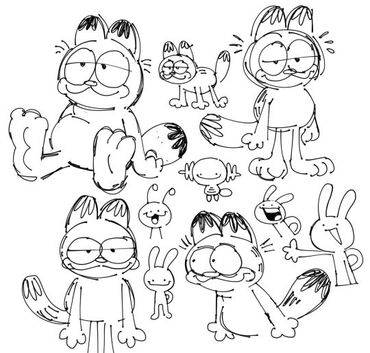
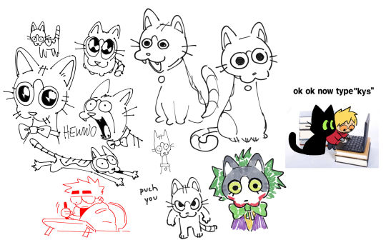
cleaning out my files, oc art and misc edition
#some of this i don't. remember drawing lol#but a lot of it i do. and a lot of it means the world to me even though they're shitty sketches#i'm hoping posting a lot of this will help me get a clean slate moving forward#but i'm not going to forget what my art means to me#fern's sketchbook#not tagging all those characters lol#eyestrain#original art
532 notes
·
View notes
Text
House M.D. but it's when a character says the name of the episode
#house md#prince's talk tag#flashing#repitition#so as i was watching this show i noticed they'd say the episode title in the episode#so i wanted to see how many times they did it#the people on livejournal who made transcripts of the episodes are my saviors and without them this would of been so much harder to do#thank you all for your service and i hope wherever you all are you're having a great day#sometimes they would use a variation of the word like in the episode poison they would say 'poisoned' or 'poisoning'#i did not include those instances#there was an instance in 'merry little christmas' where they do play the song in the show#but since ella fitzgerald was not a character in the show i did not include it#where as in the episode 'joy to the world' the students are singing it in the concert so i did include that#i apologize for the tonal whiplash when you get to that part but it did make me laugh#one of the times kutner says 'locked in' is overshadowed by the POTW's voice over but i assure you he says it and thats why its in there#out of the main characters from the one who said the title the most to least are#House > Foreman > Wilson > Chase > Cuddy > Adams > Cameron and Taub > Kutner > Thirteen and Park#this took a bit to do lolol its probably been done already but i wanted my own#there is a chance im missing some on technicalities but idc. im fine with this#there are two more i wanna do but with a character saying another character's name but ill do that some other time#EDIT: When I was making this video I was unaware that the Pilot episode went by two names: 'Pilot' and 'Everybody Lies'#Basically everywhere I looked the first episode was only referred to by 'Pilot'#which I found weird bc i remember seeing somewhere that the last episode was paired with the first episode in terms of title#but i couldn't find hard proof so I decided to leave it out at the time#well i checked again last night and yea the pilot IS also called Everybody Lies so I updated the video#I also think it goes well with the fact that House does say 'Everybody Dies' in the finale so another reason to fix it#AND he says it without Wilson while he and Wilson say the title of the pilot sooooo yea hehehehehe
269 notes
·
View notes
Text


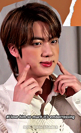
kim seokjin, according to @aprylynn
happy birthday apryl! ♡♡♡
#aprylynn#bts#btsedit#btsgif#dailybts#btsdaily#jin#seokjin#kim seokjin#dailybangtan#userbangtan#trackofthesoul#usersan#heyryen#annietrack#userpat#tuserandi#raplineuser#userdimple#rjshope#ksjedit#***#!!!!!!! happy birthday queen apryl !!!!!!!!#i just wanted to do something for you since you've done so much for me with your kindness and your support#and you deserve all the nice things in the entire world#and while i try to find all those nice things i can at least give u jins face u kno#and i had to use ur iconic tags bc you always make me laugh every single time i go thru my notes#ur just like me fr fr ur always in my brain i swear ;o;#ANYWAYS !!!!!! i hope u have the best day and i hope you are loved and cherished and that you get yummy treats and lots of presents#and are surrounded by people that love you and adore you uwu
167 notes
·
View notes
Text

A continuation of my last post cuz I just had to draw the red life version, its also just so good.
#secret life#secret life smp#trafficblr#mcyt#goodtimeswithscar#josh art tag#a tad of the lineart on this is used straight from the last one#and some of the shading is reused but i had to redo that myself#otherwise its all new!#actually except for the wheelchair wheels i also reused those#anyway i hope u enjoy my goodtimeswithscar appreciation
1K notes
·
View notes
Last Seen Blogs

yourfavisgreenmansexual
Your Fave is Greenmansexual
zardoze69
"The Surreality Of Nature"

woezille
www.west4flowers.co.uk
6oob
🏳️🌈🇵🇭🇺🇸

waltherdental
Walther Dental