#i love them too much ok
Text

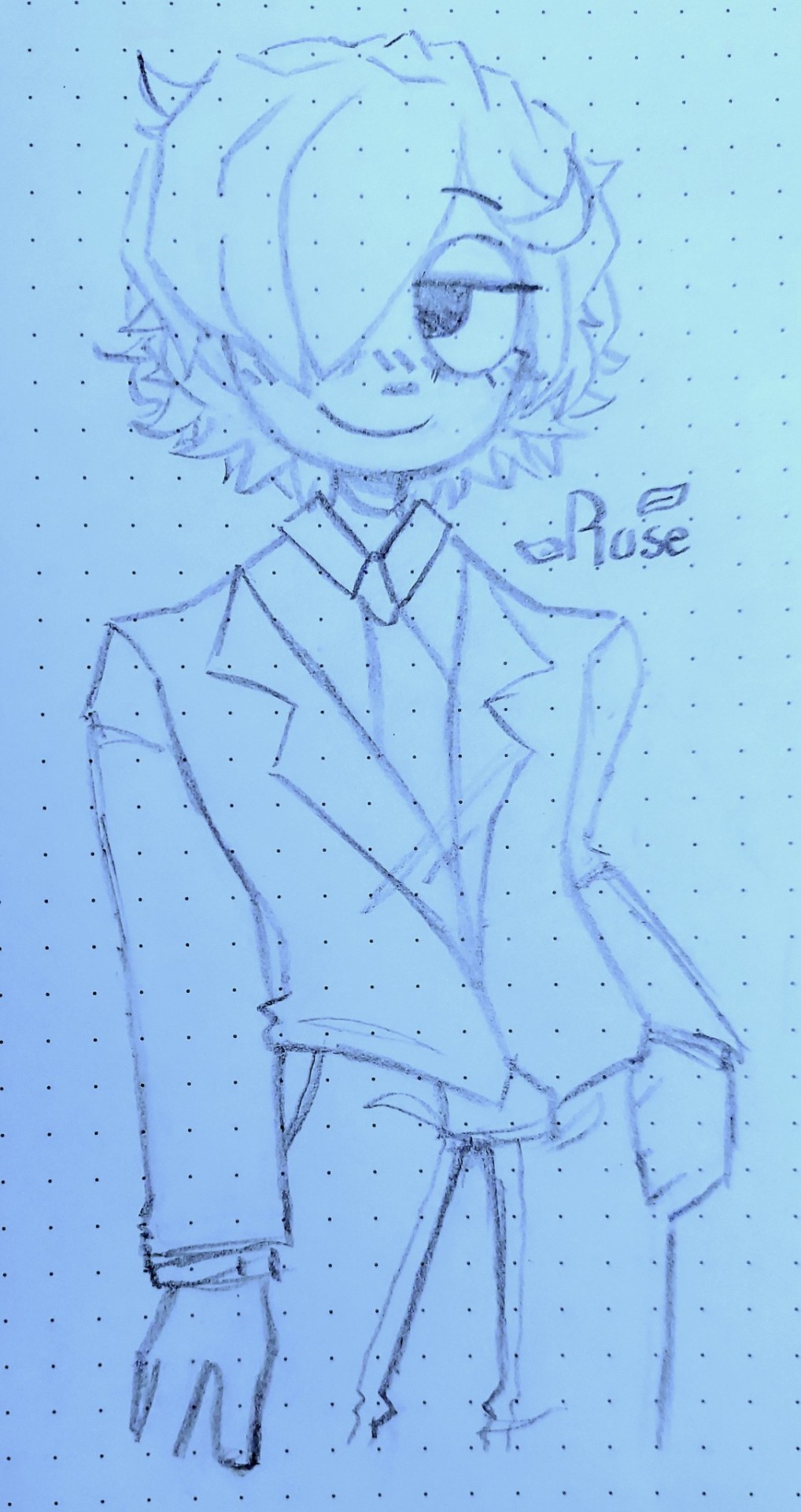

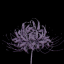
reverted to one of my old art styles for simplicity sake ..... have lob corp employees + click 4 better quality yk
#lobotomy corporation#lob corp#lobotomy corp oc#ig idk what to tag these guys as man#this is more a mix between the older style and my current one idk man i didnt feel like drawing full human faces#i love them too much ok#hobos creations#ratcorp#<- lob oc tag <3#can you guys tell i only know one (1) pose
28 notes
·
View notes
Text
sooo…. not saying i’m possibly adding a final part to this fic… but i might be
5 notes
·
View notes
Text
I love drawing Copia either as his awkward Cardi self or as Popia but it's truly a struggle which one to choose cause both stole and won my heart :((
I say this cause there's a different vibe with how I draw both
#at this point its cardi popia and terzo having to share my hand for drawing >:((#i love them too much ok
19 notes
·
View notes
Text


been thinking about the sinnohtrio lately......plus misc other stuff
also, casual ko-fi drop!! get something in this sketchy style starting at $10 woop woop
#finally decided to do a commission test run u_u#pokemon#trainer lyra#trainer kris#trainer dawn#trainer lucas#rival barry#rival silver#ayalumi#hisuian zorua#luxio#timeskip tag#rkgk#anyway it's sinnoh time !!!#still figuring out their designs and lore but this works for now#god's specialest little guys & their very normal bestfriend who they would kill/die for. up to interpretation who is killing/dying#dawn is the platinum protag who meets giratina and becomes champion#distortion world affected her way more than compared to cynthia and cyrus since she's still a developing kid. but hey cool ghost hair!#4-5 yrs later lucas gets blasted to hisui..lost his memory for the three years he's there and when arceus sends him back he's just like Man#the entire time barry is CHILLING PLAYING HAVING FUN#and forever worried abt his friends ): dawn & lucas are soo nonchalant about what happened to them it's a bit concerning to everyone else#design comments umm the only thing that matters is that they still have their og scarves 👍#and i guesss these are spring/summer outfits. winter dawn gets leggings and big coat ok. she already has too much yin energy#btw i use the cleanse tag as the direct opposition to the spell tag even tho that's probably not a real thing LOL)#oh yea barry wears the tower master ribbon 24/7. tower tycoon in training and won't shut up about it (i love him)#character dynamics i will talk abt that in another post if i feel like it... these days i just want to go replay pla aughh
837 notes
·
View notes
Text

kissed by a bullet
#it's 1904 john <3#maybe i'll tell people more about him in the future#and about 1904 javi too because they live in my head rent free and i have a lot of art with them#but for now i wanna keep them as my dearest secret for a bit<3 (btw hi lucas ily)#anyway#i love him#kissing him as we speak#barghestland#rdr2#rdr2 fanart#john marston#art#artists on tumblr#tw animal death#tw gore#tw blood#not much but just in case#it feels like im not out of artblock yet it's hard to draw rn:(((#but im trying !!!!!!!!#im trying ok !!
1K notes
·
View notes
Text
REQUIRED READING for any noisecouple enjoyers: @manicplank 's "the colour pink" fic ITS SOOOO GOOD and i just had to do a little animation of their date.... so so so so cute i love them forever
gif version under the cut:
idk why it loses so much quality . kind of annoying but oh well
#pizza tower#my art#animation#noisecouple#noise x noisette#the noise pizza tower#noisette pizza tower#theodore noise#noisette#ok a couple of rambly things#number one i prommy their hair started off as black but i kept adding layers and it kinda turned brown and now its too late.#just pretend their hair is darker lol#secondly im genuinely so bad at understanding . words#so i may have interpreted the scene / outfits wrong but i tried my darndest#third of all i love them so much#and i loved every second of drawing this#FOURTH OF ALL sorry i have lots to say#i tried out the watercolour feature for the background of this one#so if it looks a little weeiiird thats cuz idk what im doing :)#ok thats all enjoy mwah
555 notes
·
View notes
Text
why Aurora's art is genius
It's break for me, and I've been meaning to sit down and read the Aurora webcomic (https://comicaurora.com/, @comicaurora on Tumblr) for quite a bit. So I did that over the last few days.
And… y'know. I can't actually say "I should've read this earlier," because otherwise I would've been up at 2:30-3am when I had responsibilities in the morning and I couldn't have properly enjoyed it, but. Holy shit guys THIS COMIC.
I intended to just do a generalized "hello this is all the things I love about this story," and I wrote a paragraph or two about art style. …and then another. And another. And I realized I needed to actually reference things so I would stop being too vague. I was reading the comic on my tablet or phone, because I wanted to stay curled up in my chair, but I type at a big monitor and so I saw more details… aaaaaand it turned into its own giant-ass post.
SO. Enjoy a few thousand words of me nerding out about this insanely cool art style and how fucking gorgeous this comic is? (There are screenshots, I promise it isn't just a wall of text.) In my defense, I just spent two semesters in graphic design classes focusing on the Adobe Suite, so… I get to be a nerd about pretty things…???
All positive feedback btw! No downers here. <3
---
I cannot emphasize enough how much I love the beautiful, simple stylistic method of drawing characters and figures. It is absolutely stunning and effortless and utterly graceful—it is so hard to capture the sheer beauty and fluidity of the human form in such a fashion. Even a simple outline of a character feels dynamic! It's gorgeous!
Though I do have a love-hate relationship with this, because my artistic side looks at that lovely simplicity, goes "I CAN DO THAT!" and then I sit down and go to the paper and realize that no, in fact, I cannot do that yet, because that simplicity is born of a hell of a lot of practice and understanding of bodies and actually is really hard to do. It's a very developed style that only looks simple because the artist knows what they're doing. The human body is hard to pull off, and this comic does so beautifully and makes it look effortless.
Also: line weight line weight line weight. It's especially important in simplified shapes and figures like this, and hoo boy is it used excellently. It's especially apparent the newer the pages get—I love watching that improvement over time—but with simpler figures and lines, you get nice light lines to emphasize both smaller details, like in the draping of clothing and the curls of hair—which, hello, yes—and thicker lines to emphasize bigger and more important details and silhouettes. It's the sort of thing that's essential to most illustrations, but I wanted to make a note of it because it's so vital to this art style.
THE USE OF LAYER BLENDING MODES OH MY GODS. (...uhhh, apologies to the people who don't know what that means, it's a digital art program thing? This article explains it for beginners.)
Bear with me, I just finished my second Photoshop course, I spent months and months working on projects with this shit so I see the genius use of Screen and/or its siblings (of which there are many—if I say "Screen" here, assume I mean the entire umbrella of Screen blending modes and possibly Overlay) and go nuts, but seriously it's so clever and also fucking gorgeous:
Firstly: the use of screened-on sound effect words over an action? A "CRACK" written over a branch and then put on Screen in glowy green so that it's subtle enough that it doesn't disrupt the visual flow, but still sticks out enough to make itself heard? Little "scritches" that are transparent where they're laid on without outlines to emphasize the sound without disrupting the underlying image? FUCK YES. I haven't seen this done literally anywhere else—granted, I haven't read a massive amount of comics, but I've read enough—and it is so clever and I adore it. Examples:


Secondly: The beautiful lighting effects. The curling leaves, all the magic, the various glowing eyes, the fog, the way it's all so vividly colored but doesn't burn your eyeballs out—a balance that's way harder to achieve than you'd think—and the soft glows around them, eeeee it's so pretty so pretty SO PRETTY. Not sure if some of these are Outer/Inner Glow/Shadow layer effects or if it's entirely hand-drawn, but major kudos either way; I can see the beautiful use of blending modes and I SALUTE YOUR GENIUS.
I keep looking at some of this stuff and go "is that a layer effect or is it done by hand?" Because you can make some similar things with the Satin layer effect in Photoshop (I don't know if other programs have this? I'm gonna have to find out since I won't have access to PS for much longer ;-;) that resembles some of the swirly inner bits on some of the lit effects, but I'm not sure if it is that or not. Or you could mask over textures? There's... many ways to do it.
If done by hand: oh my gods the patience, how. If done with layer effects: really clever work that knows how to stop said effects from looking wonky, because ugh those things get temperamental. If done with a layer of texture that's been masked over: very, very good masking work. No matter the method, pretty shimmers and swirly bits inside the bigger pretty swirls!
Next: The way color contrast is used! I will never be over the glowy green-on-black Primordial Life vibes when Alinua gets dropped into that… unconscious space?? with Life, for example, and the sharp contrast of vines and crack and branches and leaves against pitch black is just visually stunning. The way the roots sink into the ground and the three-dimensional sensation of it is particularly badass here:

Friggin. How does this imply depth like that. HOW. IT'S SO FREAKING COOL.
A huge point here is also color language and use! Everybody has their own particular shade, generally matching their eyes, magic, and personality, and I adore how this is used to make it clear who's talking or who's doing an action. That was especially apparent to me with Dainix and Falst in the caves—their colors are both fairly warm, but quite distinct, and I love how this clarifies who's doing what in panels with a lot of action from both of them. There is a particular bit that stuck out to me, so I dug up the panels (see this page and the following one https://comicaurora.com/aurora/1-20-30/):

(Gods it looks even prettier now that I put it against a plain background. Also, appreciation to Falst for managing a bridal-carry midair, damn.)
The way that their colors MERGE here! And the immense attention to detail in doing so—Dainix is higher up than Falst is in the first panel, so Dainix's orange fades into Falst's orange at the base. The next panel has gold up top and orange on bottom; we can't really tell in that panel where each of them are, but that's carried over to the next panel—

—where we now see that Falst's position is raised above Dainix's due to the way he's carrying him. (Points for continuity!) And, of course, we see the little "huffs" flowing from orange to yellow over their heads (where Dainix's head is higher than Falst's) to merge the sound of their breathing, which is absurdly clever because it emphasizes to the viewer how we hear two sets of huffing overlaying each other, not one. Absolutely brilliant.
(A few other notes of appreciation to that panel: beautiful glows around them, the sparks, the jagged silhouette of the spider legs, the lovely colors that have no right to make the area around a spider corpse that pretty, the excellent texturing on the cave walls plus perspective, the way Falst's movements imply Dainix's hefty weight, the natural posing of the characters, their on-point expressions that convey exactly how fuckin terrifying everything is right now, the slight glows to their eyes, and also they're just handsome boys <3)
Next up: Rain!!!! So well done! It's subtle enough that it never ever disrupts the impact of the focal point, but evident enough you can tell! And more importantly: THE MIST OFF THE CHARACTERS. Rain does this irl, it has that little vapor that comes off you and makes that little misty effect that plays with lighting, it's so cool-looking and here it's used to such pretty effect!
One of the panel captions says something about it blurring out all the injuries on the characters but like THAT AIN'T TOO BIG OF A PROBLEM when it gets across the environmental vibes, and also that'd be how it would look in real life too so like… outside viewer's angle is the same as the characters', mostly? my point is: that's the environment!!! that's the vibes, that's the feel! It gets it across and it does so in the most pretty way possible!
And another thing re: rain, the use of it to establish perspective, particularly in panels like this—

—where we can tell we're looking down at Tynan due to the perspective on the rain and where it's pointing. Excellent. (Also, kudos for looking down and emphasizing how Tynan's losing his advantage—lovely use of visual storytelling.)
Additionally, the misting here:

We see it most heavily in the leftmost panel, where it's quite foggy as you would expect in a rainstorm, especially in an environment with a lot of heat, but it's also lightly powdered on in the following two panels and tends to follow light sources, which makes complete sense given how light bounces off particles in the air.
A major point of strength in these too is a thorough understanding of lighting, like rim lighting, the various hues and shades, and an intricate understanding of how light bounces off surfaces even when they're in shadow (we'll see a faint glow in spots where characters are half in shadow, but that's how it would work in real life, because of how light bounces around).
Bringing some of these points together: the fluidity of the lines in magic, and the way simple glowing lines are used to emphasize motion and the magic itself, is deeply clever. I'm basically pulling at random from panels and there's definitely even better examples, but here's one (see this page https://comicaurora.com/aurora/1-16-33/):

First panel, listed in numbers because these build on each other:
The tension of the lines in Tess's magic here. This works on a couple levels: first, the way she's holding her fists, as if she's pulling a rope taut.
The way there's one primary line, emphasizing the rope feeling, accompanied by smaller ones.
The additional lines starbursting around her hands, to indicate the energy crackling in her hands and how she's doing a good bit more than just holding it. (That combined with the fists suggests some tension to the magic, too.) Also the variations in brightness, a feature you'll find in actual lightning. :D Additional kudos for how the lightning sparks and breaks off the metal of the sword.
A handful of miscellaneous notes on the second panel:
The reflection of the flames in Erin's typically dark blue eyes (which bears a remarkable resemblance to Dainix, incidentally—almost a thematic sort of parallel given Erin's using the same magic Dainix specializes in?)
The flowing of fabric in the wind and associated variation in the lineart
The way Erin's tattoos interact with the fire he's pulling to his hand
The way the rain overlays some of the fainter areas of fire (attention! to! detail! hell yeah!)
I could go on. I won't because this is a lot of writing already.
Third panel gets paragraphs, not bullets:
Erin's giant-ass "FWOOM" of fire there, and the way the outline of the word is puffy-edged and gradated to feel almost three-dimensional, plus once again using Screen or a variation on it so that the stars show up in the background. All this against that stunning plume of fire, which ripples and sparks so gorgeously, and the ending "om" of the onomatopoeia is emphasized incredibly brightly against that, adding to the punch of it and making the plume feel even brighter.
Also, once again, rain helping establish perspective, especially in how it's very angular in the left side of the panel and then slowly becomes more like a point to the right to indicate it's falling directly down on the viewer. Add in the bright, beautiful glow effects, fainter but no less important black lines beneath them to emphasize the sky and smoke and the like, and the stunningly beautiful lighting and gradated glows surrounding Erin plus the lightning jagging up at him from below, and you get one hell of an impactful panel right there. (And there is definitely more in there I could break down, this is just a lot already.)
And in general: The colors in this? Incredible. The blues and purples and oranges and golds compliment so well, and it's all so rich.
Like, seriously, just throughout the whole comic, the use of gradients, blending modes, color balance and hues, all the things, all the things, it makes for the most beautiful effects and glows and such a rich environment. There's a very distinct style to this comic in its simplified backgrounds (which I recognize are done partly because it's way easier and also backgrounds are so time-consuming dear gods but lemme say this) and vivid, smoothly drawn characters; the simplicity lets them come to the front and gives room for those beautiful, richly saturated focal points, letting the stylized designs of the magic and characters shine. The use of distinct silhouettes is insanely good. Honestly, complex backgrounds might run the risk of making everything too visually busy in this case. It's just, augh, so GORGEOUS.
Another bit, take a look at this page (https://comicaurora.com/aurora/1-15-28/):

It's not quite as evident here as it is in the next page, but this one does some other fun things so I'm grabbing it. Points:
Once again, using different colors to represent different character actions. The "WHAM" of Kendal hitting the ground is caused by Dainix's force, so it's orange (and kudos for doubling the word over to add a shake effect). But we see blue layered underneath, which could be an environmental choice, but might also be because it's Kendal, whose color is blue.
And speaking off, take a look at the right-most panel on top, where Kendal grabs the spear: his motion is, again, illustrated in bright blue, versus the atmospheric screened-on orange lines that point toward him around the whole panel (I'm sure these have a name, I think they might be more of a manga thing though and the only experience I have in manga is reading a bit of Fullmetal Alchemist). Those lines emphasize the weight of the spear being shoved at him, and their color tells us Dainix is responsible for it.
One of my all-time favorite effects in this comic is the way cracks manifest across Dainix's body to represent when he starts to lose control; it is utterly gorgeous and wonderfully thematic. These are more evident in the page before and after this one, but you get a decent idea here. I love the way they glow softly, the way the fire juuuust flickers through at the start and then becomes more evident over time, and the cracks feel so realistic, like his skin is made of pottery. Additional points for how fire begins to creep into his hair.
A small detail that's generally consistent across the comic, but which I want to make note of here because you can see it pretty well: Kendal's eyes glow about the same as the jewel in his sword, mirroring his connection to said sword and calling back to how the jewel became Vash's eye temporarily and thus was once Kendal's eye. You can always see this connection (though there might be some spots where this also changes in a symbolic manner; I went through it quickly on the first time around, so I'll pay more attention when I inevitably reread this), where Kendal's always got that little shine of blue in his eyes the same as the jewel. It's a beautiful visual parallel that encourages the reader to subconsciously link them together, especially since the lines used to illustrate character movements typically mirror their eye color. It's an extension of Kendal.
Did I mention how ABSOLUTELY BEAUTIFUL the colors in this are?
Also, the mythological/legend-type scenes are illustrated in familiar style often used for that type of story, a simple and heavily symbolic two-dimensional cave-painting-like look. They are absolutely beautiful on many levels, employing simple, lovely gradients, slightly rougher and thicker lineart that is nonetheless smoothly beautiful, and working with clear silhouettes (a major strength of this art style, but also a strength in the comic overall). But in particular, I wanted to call attention to a particular thing (see this page https://comicaurora.com/aurora/1-12-4/):

The flowing symbolic lineart surrounding each character. This is actually quite consistent across characters—see also Life's typical lines and how they curl:

What's particularly interesting here is how these symbols are often similar, but not the same. Vash's lines are always smooth, clean curls, often playing off each other and echoing one another like ripples in a pond. You'd think they'd look too similar to Life's—but they don't. Life's curl like vines, and they remain connected; where one curve might echo another but exist entirely detached from each other in Vash's, Life's lines still remain wound together, because vines are continuous and don't float around. :P
Tahraim's are less continuous, often breaking up with significantly smaller bits and pieces floating around like—of course—sparks, and come to sharper points. These are also constants: we see the vines repeated over and over in Alinua's dreams of Life, and the echoing ripples of Vash are consistent wherever we encounter him. Kendal's dream of the ghost citizens of the city of Vash in the last few chapters is filled with these rippling, echoing patterns, to beautiful effect (https://comicaurora.com/aurora/1-20-14/):

They ripple and spiral, often in long, sinuous curves, with smooth elegance. It reminds me a great deal of images of space and sine waves and the like. This establishes a definite feel to these different characters and their magic. And the thing is, that's not something that had to be done—the colors are good at emphasizing who's who. But it was done, and it adds a whole other dimension to the story. Whenever you're in a deity's domain, you know whose it is no matter the color.
Regarding that shape language, I wanted to make another note, too—Vash is sometimes described as chaotic and doing what he likes, which is interesting to me, because smooth, elegant curves and the color blue aren't generally associated with chaos. So while Vash might behave like that on the surface, I'm guessing he's got a lot more going on underneath; he's probably much more intentional in his actions than you'd think at a glance, and he is certainly quite caring with his city. The other thing is that this suits Kendal perfectly. He's a paragon character; he is kind, virtuous, and self-sacrificing, and often we see him aiming to calm others and keep them safe. Blue is such a good color for him. There is… probably more to this, but I'm not deep enough in yet to say.
And here's the thing: I'm only scratching the surface. There is so much more here I'm not covering (color palettes! outfits! character design! environment! the deities! so much more!) and a lot more I can't cover, because I don't have the experience; this is me as a hobbyist artist who happened to take a couple design classes because I wanted to. The art style to this comic is so clever and creative and beautiful, though, I just had to go off about it. <3
...brownie points for getting all the way down here? Have a cookie.
#aurora comic#aurora webcomic#comicaurora#art analysis#...I hope those are the right tags???#new fandom new tagging practices to learn ig#much thanks for something to read while I try to rest my wrists. carpal tunnel BAD. (ignore that I wrote this I've got braces ok it's fine)#anyway! I HAVE. MANY MORE THOUGHTS. ON THE STORY ITSELF. THIS LOVELY STORY#also a collection of reactions to a chunk of the comic before I hit the point where I was too busy reading to write anything down#idk how to format those tho#...yeet them into one post...???#eh I usually don't go off this much these days but this seems like a smaller tight-knit fandom so... might as well help build it?#and I have a little more time thanks to break so#oh yes also shoutout to my insanely awesome professor for teaching me all the technical stuff from this he is LOVELY#made an incredibly complex program into something comprehensible <3#synapse talks
743 notes
·
View notes
Text

I'm not ever careful and I can be rude, yeah
#i am sooo normal about the pjo series#oh my god theyre friends#they are such good friends#and they are going to help each other survive#till they fall in love#lyrics are from I'm not okay by Weathers#i have a feeling this looks like a postcard#but i had too much fun drawing hands to discard them#pjo#pjo series#pjo tv series#percy jackson#percy jackson series#percy jackson show#percy jackon and the olympians#ok i think thats all#ater art#its 6 am help i wake up at 8 am
491 notes
·
View notes
Text
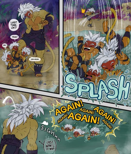
I am once again drawin the most mundane shit :D
These are all sento saiyans, an AU race of saiyans created by @bahnloopi read more about em here :U
#sento saiyans#ok but fr this is just: my older cousin has 3 kids#theyre all as close in age as they can p much possibly be#and i love playin w em but also i am tired and lazy#and im projecting ALL OF THAT onto a monkey guy w way more muscle but shh its fine hes tired too#rus#i dont have names for any of the kiddos but 1 of them is the same 1 from the last pic#the 1 sayin uh-huh in the first panel
503 notes
·
View notes
Text

1989 dreamling reunion but make it the series version 🤪🤪
Hiii *posts at 5am and doesn't come back in like a month* 💋kissyou
Textless version bellow

#dreamling#the sandman#dream of the endless#hob gadling#I WILL DRAM THEM AGAIN OK#it's a threat#I loveeee 1989 dreamling pleasee i need them me needs it#GOTH DREAM GOTH DREAM SUPREMACY#spend too much time in this whooooh#loved Dreams fit tho#my art
2K notes
·
View notes
Text

check your mirrors has a whole new meaning
#dimension 20#fantasy high#fhjy#baron from the baronies#honestly. idk. its ok. not my favorite but not my least favorite#inly because i love this thing and we're getting sooooo much of them tomorrow >_<#AGAIN MOST OF MY USERNAMES ARE CLOVRMOCHA🚨 ON MOST SOCMED PLATFORMS#ok but yeahanyway just dont look too hard Thankyou!!!!!!!!!!'#ann art
279 notes
·
View notes
Text

And for the holidays I give you memes! Memes everywhere!
I hope that all of you are having a wonderful time, but if not, I at least hope these silly doodles brought you a little joy!
I'm going to keep this short and sweet today, so to round this of: These doodles are based off of the fanfic Apex Polarity, which is written by the lovely @naffeclipse and Eclipse' design is based off of @themeeplord 's fantastic design!
And as a bonus, you will find an alteration and a bunch of Yeti slogans/puns under the cut:
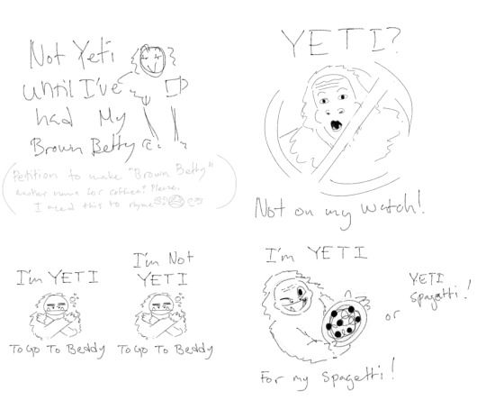
and if you're wondering why I made so many gd yeti puns, it was for michael's mug. You gotta have some fitting and funny slogan for all mugs. Btw If any of you know some good yeti slogans and/or puns, please call me, I've been struggling.
Michael; local cryptid believer, but not cryptid enjoyer
Vanessa; POLAR BEARS
Eclipse; I'm having the best time of my life! :D
Y/n; I'm having A TIME :')
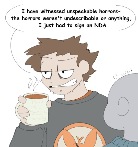
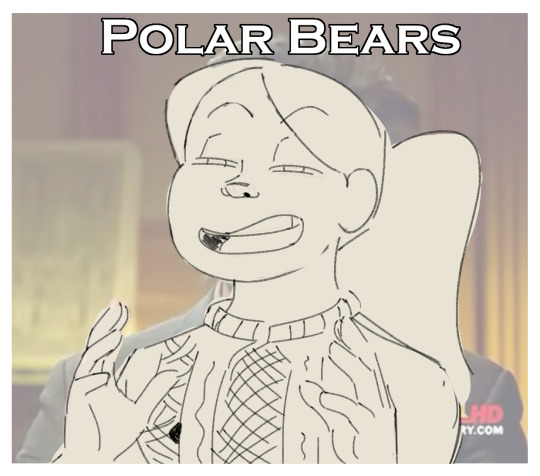
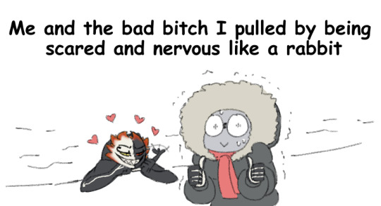
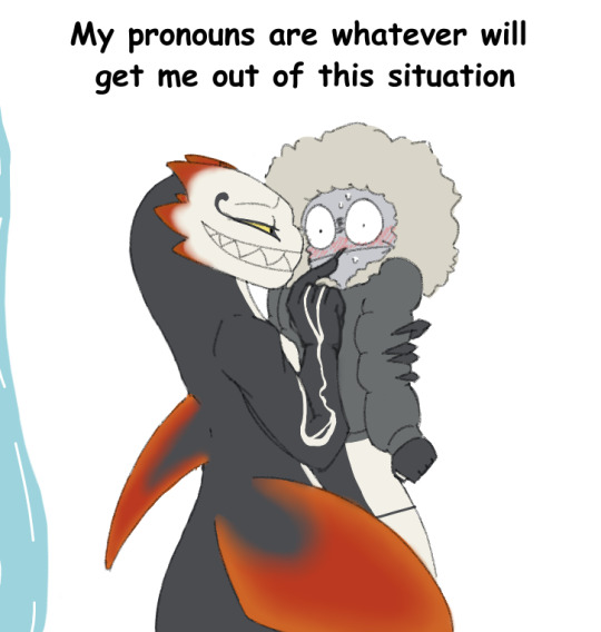
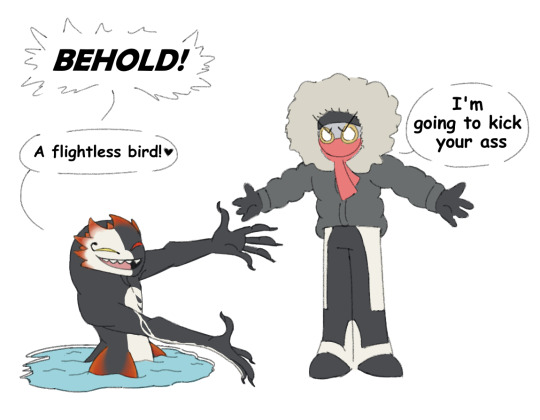
#apex polarity#polar!y/n#polar!vanessa#polar!michael#polar!eclipse#orca!eclipse#dca#dca au#OK! Here comes the obligatory extra thoughts section- from top to bottom order- GO!!!#BEHOLD!: is the will smith meme- but it's also kind of a reference to the “BEHOLD- a man!” joke but- you know- in reverse :P#also if you wondering why Y/n is kind of T-posing- it's the 'I have too many layers of clothes so I'm sort of T-posing' pose#I love drawing them like that XD#and also I'm giving them a little sass- you know- as a treat 💅❇️#NDA: I love michael. He's been through shit and is trying so hard to keep everyone safe-#and for that I want to give him a break and a hug :')#POLAR BEARS: I know and you know and SHE knows *nods knowingly* polar bears XD#Me and the bad bitch: this fits so well with polar!y/n but it would be an even better fit for hare!y/n XD#my pronouns: Sorry Y/n- eclipse will like you no matter the gender- so you're stuck! Good luck! XD#Yeti puns: OK so Michael knows sirens exists right?#So I was thinking that he's probably a cryptid believer- but not so much a cryptid enjoyer#So I was trying to make a mug slogan that was kind of both#but that was HARD- so in the end I picked just a pure and very simple yeti pun for his mug#the 'Yeti? Not on my watch!' ties back to michael believeing in cryptids- but not liking them#so yes- my headcanon is he will send cryptids to Uno hell if possible#at 'yeti spagetti!' I was grasping at straws- NOTHING RHYMES WITH YETI EXCEPT SPAGETTI!! Also yes-#spagetti is misspelled and I'm going to keep misspelling it because why tf is there an H in the word spagetti? NAY I SAY!! *GASP* ok done!#again I hope all of you are doing well in these times#and I'm sorry for being so late in saying this naff (got caught up in the holiday prep)- but I hope you're feeling better now! Ik how#stressful it can be around the holidays- but I hope this cheered you up and that you'll get to relax after chirstmas!#NOW I NEED TO STOP BECAUSE I'VE REACHED THE TAG LIMIT- happy holidays everyone and hope you have a good one!
382 notes
·
View notes
Text

They're so dear to me....
#i WILL die if i think too much about them#oh how i love complicated family dynamics#they're a pretty cute family if you ignore all the emotional manipulation and treason#ok ko lord boxman#ok ko darrell#ok ko let's be heroes#ok k.o.! let's be heroes#ok ko fanart#my art#kappart
171 notes
·
View notes
Text
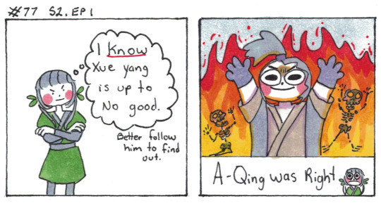
Peeped the horrors
[First] Prev <–-> Next
#poorly drawn mdzs#mdzs#a-qing#xue yang#A-qing went 'there are horrors he is committing and I am going to peep them' and then faced horrors that she could not fathom#The fact she sees the evidence first hand but it genuinely is too much to handle is a lovely tragedy that betrays her youth#It is interesting that she clearly does have more knowledge than the lay person about cultivators and night hunts (possibly from xxc?)#she does mentally call out xue yang for using the right terminology (betraying his 'no one important' façade)#but corpse poisoning is...well....probably not something she could have known about#so instead she has to encounter this horrible and suspicious event and justify it to keep herself sane#Ah....that's not going into the really interesting ambiguity of xue yangs targets#the people he kills specifically slandered *all three of them*#Was it just for himself? Was there a sense of protectiveness over his two blind companions?#I don't want an answer. I love that it is ambiguous#And oh man. having the noble XXC do the killing is so deviously evil. What a loaded chekov's gun.#you know xxc is gonna have a breakdown over it *when* he finds out. Its all a matter of timing#ok ok funny tag time#I think little apple and xy should meet up so they can swap arson tips. Truly the power team nobody wants. Not even them.#they would fight to the death and little apple would *win*#EDIT: HAPPY BIRTHDAY XUE YANG
801 notes
·
View notes
Text
hi i havent drawn in almost 2 weeks. have a summer vibe ichiban🏖️
#ichiban..... ichiban....!!!!!!!!!!!!!!!!!!!!1 i lvoe ichiban!!!!!!!!!!!!!!!!!!!!!!!!!!!!!!!!!!!#50 hours into infinite wealth and my love for him has only grown stronger over time i love him so much#im not gonna like the ending of the game but . ill do it for him. and all his friends ill do it for all of them#hope everyones doing okay playing through the game! for the ppl who finished it! my condolences to you. hope youre ok too </3#like a dragon#ryu ga gotoku#kasuga ichiban#allyart
244 notes
·
View notes
Text
~ Show More Than Tell ~
First Short Animatic I've ever done...
#transformers#transformers maccadam#maccadam#artists on tumblr#slickver draws#megatron#megop#optimus prime#orion pax#first animatic#Touches the feels#open to interpretation#hidden meanings#i was bored ok#i love them#way too much
154 notes
·
View notes
Last Seen Blogs
ralhiel
Cosmic
volsixiv
Volsix Esfra, Warrior of Light
wearethelol
WE ARE THE LOL.

npyn
想吃蓮蓉包

dirtrifle48
제목 없음