#i mean im not an expert but
Text
Big cat
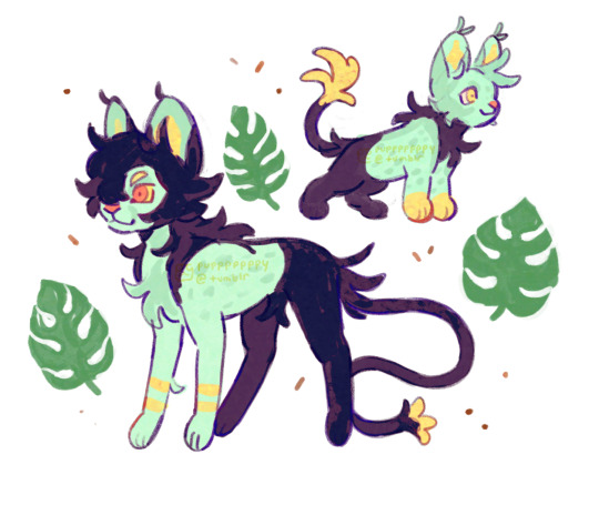
#ft my poorly drawn monstera leaves for vibe#I was thinking abt shinx and luxray like. I know theyre supposed to be lions but I feel like cheetah or serval would work well too#like with electricity and stuff. wouldnt speed and agility make more sense for an electric type? esp a cat shaped electric type?#maybe it would be ok for luxray to be heavy built because itd be really big by then. but I thought hey it would be cool if its preevolutions#could focus on speed for escaping. escaping and hunting yknow#maybe this is just because I watched a cheetah documentary last night and thought they were cool#I also have a hc that luxray can charge up electricity and make its whole body glow like an x ray#like you can see it’s bones through the blue parts of skin. either as a threat display or courtship#the shinier and bluer the fur is the better you can see the bones. which would mean its feeding itself well#but Im not a biology expert Im just using what I learned from birds LOL#so sososo normal abt luxray line (is my favorite pokemon)#my art#myart#pokemon#illustration#shinx#Luxio#luxray#luxray line
2K notes
·
View notes
Text

I mean I’m just saying I’m surprised Baghera didn’t do a Baghera on this one
#didnt mean for this to be my last post of the year but didnt expert to fall sick either#last year i spent the new year rushing homeworks last minute and tonight i spend it confined in a bedroom whatsup#i was sad so to distract myself i pulled my tablet and tried to draw something that didnt require too much effort#but i still spent a whole day on this wtf#i wanted to tag something like ‘spotty tries their hands at procreate again’’ but im so feverish i forgot to write the part about the hands#and got jumpscared upon reading it again#qsmp#qsmp fanart#qsmp ron#qsmp baghera#comic#my art#ron lemons#bagherajones fanart#mcyt#does this count as body horror lmao ? i mean whatever theory you have about the faceless thing HAS to have some sort of horrific implic#-ations surely
214 notes
·
View notes
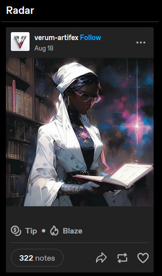
Text
youtube
Watch the American Climate Leadership Awards 2024 now: https://youtu.be/bWiW4Rp8vF0?feature=shared
The American Climate Leadership Awards 2024 broadcast recording is now available on ecoAmerica's YouTube channel for viewers to be inspired by active climate leaders. Watch to find out which finalist received the $50,000 grand prize! Hosted by Vanessa Hauc and featuring Bill McKibben and Katharine Hayhoe!
#ACLA24#ACLA24Leaders#youtube#youtube video#climate leaders#climate solutions#climate action#climate and environment#climate#climate change#climate and health#climate blog#climate justice#climate news#weather and climate#environmental news#environment#environmental awareness#environment and health#environmental#environmental issues#environmental justice#environment protection#environmental health#Youtube
3K notes
·
View notes
Text
colin is not a himbo btw. hes a little guy soaked in milk being thrown at a brick wall.
#i do mean this though i am a himbo enthusiast. and colin is not one#my two types are 1. himbo and 2. pathetic man. so you can trust me im an expert#rattling bones#colin provolone#dimension 20#dimension 20: the ravening war#the ravening war#ravening war#d20 trw#d20
563 notes
·
View notes
Text
not fucking AI generated art on the tumblr radar 💀💀💀💀💀
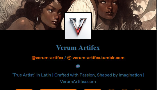
#thunderclap#1. why is the radar there i have that shit deactivated#2. the absolute iron steel nuclear fuel BALLS this guy has to call their account and brand 'verum artifex' or '''true artist''' in latin#or whatever the genuine fuck theyre on about. im pretty sure artifex doesnt actually mean artist but go off#the second i read 'shaped by imagination' i knew what this guy was about it was so obvious#their faq is so fucking lame even their picture of a paintbrush is ai generated#and theyre like 'i incorporate my own touch into the ai generated pieces'#my brother in christ theres no fucking way. the art you show thats supposedly yours figures nowhere stylistically in the ai pieces#YOURE MAKING PIECES WITH STYLES THAT ARENT EVEN YOURS HELLO!!!#AND THEY HAVE THE GALL TO TAKE COMMISSIONS TOO....#ai#ok i looked up artifex and it means skilled/artistic/expert 💀💀💀💀 hermano. que cojones.#este pavo se ha llamado a si mismo experto verdadero/ talento verdadero voy a explotar te lo juro
309 notes
·
View notes
Text
Someone: What's your sexuality?
Me: well you see, I never had a serious crush on anyone. Also, I had trouble understanding what a crush even was for most of my life. Also, I identified as aroallo for a while because I thought I was aro but not ace, but now I think I'm ace too. Also, fictional crushes. Also, I enjoy learning and reading/sometimes even writing about kink but have no idea if I would be comfortable actually participating on it. Also, some days I'm perfectly happy like this but other days are still confusing and shitty because it's all still new to me. Also-
#aromanitc#asexual#aro#ace#aro ace#im what experts call a very complex individual#by “complex” i actually mean confused and weird#but whatever#im still awesome#so are other people with complicated relationships to their sexuality!#or gender!#or anything really#you're not “difficult”#or “too many things/labels”#or anything queerphobes might have told you#especially if you're young and just started questioning#it's okay#(im literally just saying things I wish more people had told me)#FUCK I MISPELLED AROMANTIC#aromantic#there we go
78 notes
·
View notes
Text
Anyone who says Diluc is mean is just incorrect he is the nicest dude ever he's just plagued by the horrors and is also an introvert
#im a diluc expert hes my babygirl i know him so well#i could write an entire essay on what he's actually like cause yall dont know how to properly portray him 😭#he's really not an asshole like many of you write him to be! he's a little grumpy but he's not mean!!#diluc ragnvindr#diluc#genshin diluc#diluc genshin impact#genshin impact
164 notes
·
View notes
Text
seeing american (very probably racist) politicians talking about europe like there are only blonde and blue eyed people here and imply that that is somehow a sign of people being "better" and more deserving of life than those in any other part of the world that isnt america or europe makes me so unbelievable angry, not just bc its obviously racist but also bc its just not fucking true, there are all kinds of people here in all kinds of color and shape from all kinds of backgrounds, its not a fascists wet dream like they seem to pretend and them using this shit ass fantasy to justify condemming russia but not israel just makes my head want to explode twice as much
as a native, brown haired, brown eyed german with the biggest and bumpiest nose you only see in the before photo of before-and-after-surgery photos, fuck that, free palestine, genocide is wrong not matter what the people being killed look like, all of them deserve to live a long and good life in their homeland
(fyi; i am not saying we dont have a fascism problem here, oh boi, we definitely have, doesnt invalidate my point however.)
(fyi fyi; i am not fishing for sympathy, just needed to vent this bc i read about american politicians doing exactly that and it made me see red)
and to add something more useful to this post, remember your daily click https://arab.org/click-to-help/palestine/
#ganondoodles talks#personal#over and over its acted like europe automatically means blond and blue eyes both irl and in media#and it always grinds my gears#im no expert on every part of the worlds history and political stuff but pretending europe is like that#especially when its done in the “good people look like that” way#its literally nazi rhetoric#brown haired and eyed people are just as native to here as blonde ones#it feels like extended racism#the skin color might be “right” but the rest isnt#not saying that its racist to white people#i mean hating brown eyes and hair and pretending those are worse than blonde and blue eyes is associated with racism towards poc#since poc more likely have those features#(please understand what i mean here)
67 notes
·
View notes
Text

@thresholdbb omg tumblr ate your ask but thankyou for asking!!!!
👕Character whose fashion you like.
Phoar! Startrek really isn't a show I associate with being fashionable. It's very camp isn't it? In theory a lot of the wardrobe is really cool and they wanted to gain that retro-future aesthetic. Did it work? I'm not sure. However it does make a statement. The Startrek aesthetic is really recognizable and that's important! I think that's where modern trek kind of looses the plot. It's not as careful about the unique visual design as a whole anymore and as a result it doesn't settle in our minds. Is it bad artistry? No but it's not as stringent. What I mean by that is older trek cared about nuance. For example every haircut was done the same way on men, or suits were tailored in a way to look sleek but practical (they weren't). Gaudy patterns were important to denote things like status. It looks ugly on the outside but when you're watching the show it envelops you and makes you feel welcomed into the universe.
I digress.
To answer this, the most fashionable character, hands down, is Quark! That mfer always looks good, and has the finest drip in the galaxy. Love that.
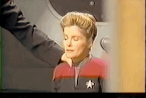
🥲 ST moment that makes you cry.
youtube
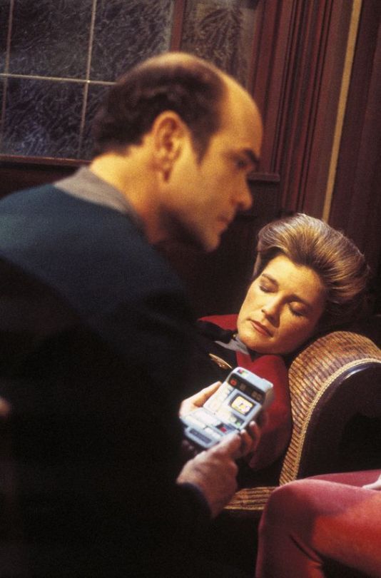
There are two moments that make me particularly sad. Kate's acting in the climax of Resistance is incredible. I read somewhere she had a special-wink-wink- relationship with the Director in the early seasons and she was being tested by this episode in some regard. I think it paid off. I treasure any time her captain-hood is removed, and the extreme vulnerability of Janeway is on display-MWAH MWAH poignant. This episode is beautifully intimate, particularly this scene. It's overall gorgeous and unique in how she whispers to him, as if there is nothing more important than to secure his peace of mind as he dies, and it's heart rending when it ends with her just crouching there, emotionally alone. I love how Janeway is forced into the father-daughter dynamic between her and Caylem, one that she would ordinarily resist (heh themes) because I think it inherently weakens her status. The back and forth throughout the episode of them taking care of each other's welfare is so it's terribly sad when it's torn down and we discover the truth behind Caylem's family. If you've dug around her character you know that her Admiral-Father has had impact on her life. She's haunted by him in both a figurative way by being a Captain, and literal sense later on in Coda. Much like Caylem, she looses her father in a violent manner that she has to carry around while she forges ahead. It also reflects well on Kate's relationship with her actual father, she recently revealed that she was never able to get him on her page, but in spite that she adore him with all her might. So a scene like this is really revealing-I believe she was able to draw upon those feelings and that's kinda neat to be so raw as an actor. SIGH.
This one just straight up made me cry fr because Prodigy s1 is a really mature, well done piece of (Startrek) media. Holo Janeway has an irony about it where in the end she is program designed to be a teacher, and she didn't expect to develop a strong bond with the crew. Her final moments are of displaying a huge amount of selflessness and courage to help the kids get out of trouble, similarly to how Janeway would approach dire circumstances. The music swelling and the ship activating is just OOOOF!!! I love how it parallels Dal's initiation of the first Protojump in a Moral Star. By that means It suggests how proud she is to get to do this for them. As a character she is really interesting to think about, in a way I can't entirely articulate. A lot of her moments are quite sad in general, she has to keep an active role so she isn't ignored, and help where help is needed, but at the same time she has constraints, one being that she manipulated by the antagonists. And In contrast to that, the kids do their best to help her feel like she is important and more than a command program to be used insincerely. She grew to love the Protostar crew, that's evident in her body language in this scene. She has a lot of depth overall. Equal to the real Janeway she deeply feels love, guilt and pain, but importantly she is transformed by the her time on the Protostar and while active, learns and grows with Dal, Rok-tak, Zero, Jankom and Gwyn. It's REALLY sweet that they care all care about each other.
I love her and I love JANEWAY!!!!
🥹 Favourite behind the scenes picture.
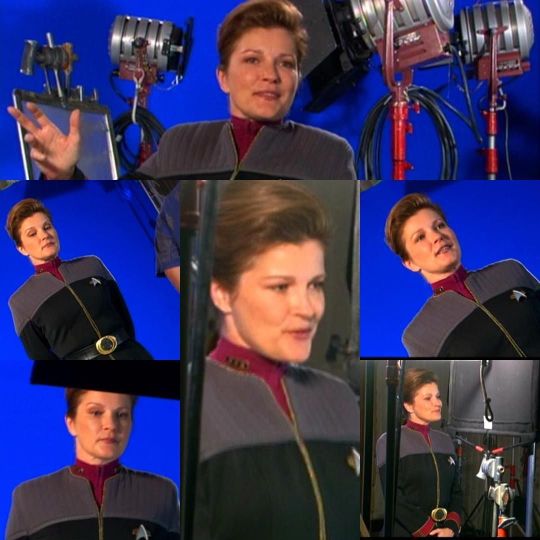
Ooooh I love all behind the scenes stuff. My brother in Christ It's super difficult to just name one thing and I'm very greedy!! I wish we had more BTS content for Voyager but sadly, it's a matter of grab what you can, however you can. Anyway, I have an inherent interest in seeing the cogs behind the wheel. I chose these samples because I think they're charming.
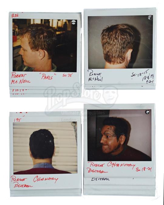
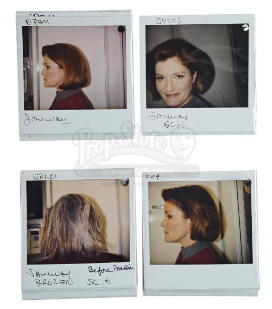
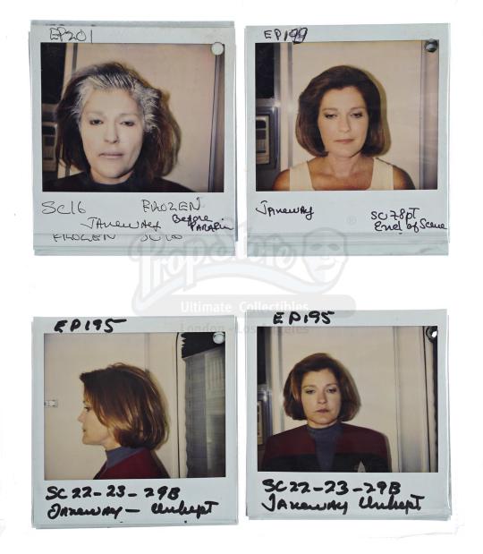
The continuity polaroid's are so fun and a lost technique, I like to think about assistants having to pull the actors aside and asking them to take those. How daunting! Kate's grin in the one where she is offset is SO cute. So she must have been in a good mood, super Cheeky!
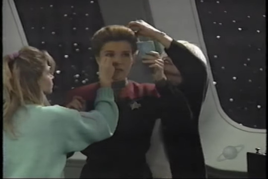
Following that is a screenshot from a video of her having her makeup done. A rare catch. I like this because she often sooks about how much time hair and makeup was spent on her to become Captain Janeway. I get it's a huge time-sink, but love or hate it, the full irony is that her early season appearance is really iconic and in it's own right adds to Captain Janeway's sensibility. Silly goose Kate! Besides that, she looks hot checking herself out, haha.

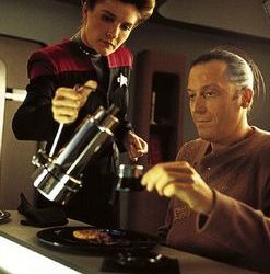
Moreover, I love on-set editorial photos of actors in costume. While we did have heaps of them in the Starfleet uniform, I wish we had a larger collection with clearer releases, it would have given an opportunity to see in things of interest better detail. Particularly the lower half of unique costumes. For whatever reason special outfits weren't often established or framed for us to see the legs in the show, so a nice big photograph would have solved that. Also I love that these style of pictures capture an impression of an episode without giving it away.
Similarly, fly on the wall on-set photos are cool. They're way more intimate and candid than anything else and it makes me feel as though I am spying on the actors, but they're also a good way to document how things might have been on set.
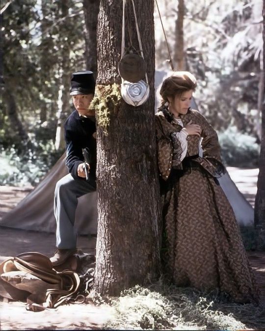
The Timeless one is interesting too because it's of a deleted scene, we never see Chakotay look at a dead Janeway (how deliciously macabre!), but at some point in time it was in the script and they filmed it.
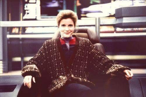
Hmm this bts picture of Janeway in the Cardigan is adorable! I believe it was worn by Kate for a Charity but look how cute she looks? Makes me wish we saw her mess around with things like that more because 7 Years is a long ass time to be in uniform everyday ( coming from someone who went to school in a Uniform and enjoyed it for the most part). Casual Fridays anyone?
I love this gif. It's from the first shoots of Caretaker and Kate looks so radiant! Her smile is is breathtaking! Whenever I see this gif I get a sense of delight. Poor thing had no idea what she was getting herself into, haha. Really though, check out the original Caretaker photos, they're super-cool. The history behind it is fascinating; I'd love to see more footage from that version of the pilot episode. Unfortunately, it's probably not preserved well, much like lots of Paramount's historical material.
On a similar trend, it's fun to see this set of pictures too. It's for the First Contact film / maybe the Universal studios ride, when she reprised her role as Vice AdmiralJaneway. Kate was genuinely delighted to do this cameo and it shows. As per her operandum she put her whole self into this small segment and that's so darling. It makes me wish we had more of this Janeway at that point in time. I love post Endgame chubby-Janeway. In a fictional sense it denotes that she is comfortable or stressed to be an Admiral (sadly it's the latter in real life) or whatever and I love that for her.
These kind of pictures are fun because it's been said that at times it was the most playful set to be on. There are tales that the cast were not that serious all the time. You get that impression here, and it's probably why the majority of them are still good friends to this day. They're like a family bros!!! Having worked in media I know that wrapping up after working on something for a long time is really rewarding and I bet they had a good time at parties.
Apropos previous, the opposite can be said. While they had fun, the hours were long and the scripts intensive. Kate was around for all of the episodes of Voyager in one way or another, and still managed to bring her A-game each time. She is truly admirable! Seeing her so exhausted is charming. She had a lot of weight to carry for the franchise and did an exemplary job performing her way through 7 years of weird and wonderful material. I wonder how often they fell asleep on set? I know I would. Get some rest queen!
Finally, I've been following Prodigy bts as best I can, and because of my career in animation I get pretty interested in Production art. I love seeing the fast metamorphosis of a visual style. It's really impressive how much attention they applied to the designs, maintaining the older stuff, while adapting a new frontier. One of the lead artists made some pretty neat observations to get Kate's appearance right. It's so cool that they documented that journey, because from my dabbling I know she has a very beautiful, distinct face that isn't easy to capture.
ANYWAY Thankyou for reading my fat thesis fellas. tl;dr i love this stinky Startrek Voyager and by extension the franchise.
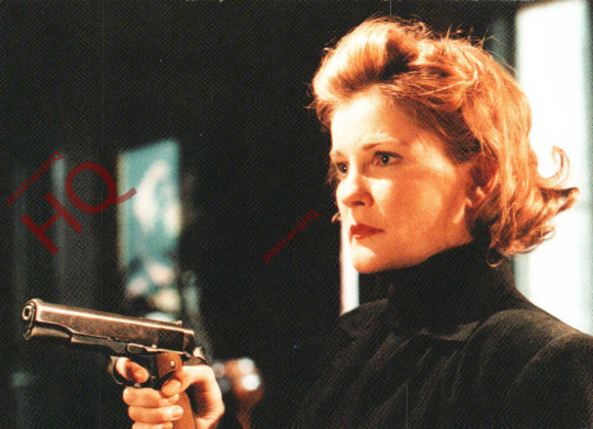
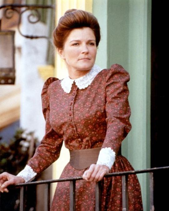
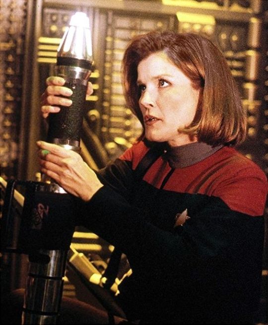
#I AM SO SORRY FOR THIS WALL OF TEXT I HAVE A LOT TO SAY AND I THINK ABOUT THIS DARN SHOW A LOT#also my bad it's mostly voyager but it's my true love#hope you can make sense of this I'm fairly illiterate and writing is so hard for me lol that's why i write more than is probably necessary#i like the other trek shows but this one is something special if you know what i mean#appreciate you if you read all this MWAH MWAH#thankyou for the ask thresholdbb ily!!!#Thresholdbb#Kathryn Janeway#janeway#star trek voyager#star trek prodigy#st:voy#kate mulgrew#no sources for this you just gotta trust im a big fat expert :^)#i really need an editor my dyslexic-a jumbles up and forgets words when i write its so embarassing#i have a pretty large collection of pictures now but i could always use more#i also should probably save videos where i can because they get buried / removed from the internet
53 notes
·
View notes
Text
genuinely genjutsu expert vs. taijutsu guy remains to be the funniest shit like. one is so SUPER sophisticated and gives u so many options to fuck over the other party while at the same time .. a guy who prides himself on his genjutsu skills and is maybe a bit pretentious abt it too getting punched in the face?? hilarious. but then also all taijutsu is literally nothing if the genjutsu expert successfully fucks with ur perception of reality. see naruto just falling flat on his face bc itachi made him hallucinate something and he just fires his rasengan into nothing. asgdfdfsfs. whoever wins. its humiliating as fuck for the other guy
#like gai?? all his wins are hilarious#mdr isnt just genjutsu proficient i guess but he is a GOD. and gai just goes yeah what if i just Punched him real hard#itachi .. he is infamous for his genjutsu skills but he Fucks off immediately when he shows up#asddfdfsfs#its like all that eyeball magic is nothing if u get just fucking beat to death#on the other hand. a taijutsu expert looks stupid as fuck when a genjutsu professional makes him see funny stupid or horrible illusions#and he tries to fight it like Huh okay what are u gonna do?#PUNCH the genjutsu? asfsgdfds#im thinking it would be quite funny also if the ninjas saw it that way too?#like what if itachi for example is like 'punching each other is so stupid. i dont even have to MOVE and i'll still fuck u over#taijutsu is for fucking LOSERS who cant do anything sophisticated'#and gai was like 'these fucking uchiha and their stupid eyeballs what're u gonna do if i just beat the fuck outta u huh?'#'genjutsu is for NERDS only real chads know taijutsu. using genjutsu just means youre a loser virgin who cant lift'#adsddgdfsgds#posts#naruto#itachi#maito gai
47 notes
·
View notes
Photo
also, cause i mentioned it at some point - here’s the colour ref sheet i put together this month. mostly just as future reference for myself, but maybe some of you are interested too
#theres honestly not much thought behind these im no colour theory expert#i just try using limited palettes and ive been meaning to make something like this for a while#so i dont have to colour pick through old drawings whenever i draw certain characters lol#hermitcraft#art process#(<- i guess that goes in the tag)
137 notes
·
View notes
Text
. Suffering idiots .
☆゜ .*: ・゚✧. 。・+. ✩ ° 。 ⋆* ✩⁺ ˚ 。 ☆.* ・☆
☆゜ .*: ・゚✧. 。・+. ✩ ° 。 ⋆* ✩⁺ ˚ 。 ☆.* ・☆

☆゜ .*: ・゚✧. 。・+. ✩ ° 。 ⋆* ✩⁺ ˚ 。 ☆.* ・☆

☆゜ .*: ・゚✧. 。・+. ✩ ° 。 ⋆* ✩⁺ ˚ 。 ☆.* ・☆
#our good shadows#ourgoodshadows#our flag means death#good omens#what we do in the shadows#my gifs#paralells#of sorts anyways#||#FIRST TIME MAKING GIFS SO I HV NO FUCKING IDEA WY IT LOOK SO GRAINY BUT I LIKE IT SO FUCK IT#ALSO#let's play which couple is toxic but im still fucking obsessed with them? [even more than the others]#and once again#first gifs ever#i said i will do everything i can but i am not an expert in anything so T~T#I HAD FUN OKAY#AND THAT'S ALL THAT MATTERS#|||
75 notes
·
View notes
Text
youtube
Watch the American Climate Leadership Awards 2024 now: https://youtu.be/bWiW4Rp8vF0?feature=shared
The American Climate Leadership Awards 2024 broadcast recording is now available on ecoAmerica's YouTube channel for viewers to be inspired by active climate leaders. Watch to find out which finalist received the $50,000 grand prize! Hosted by Vanessa Hauc and featuring Bill McKibben and Katharine Hayhoe!
#ACLA24#ACLA24Leaders#youtube#youtube video#climate leaders#climate solutions#climate action#climate and environment#climate#climate change#climate and health#climate blog#climate justice#climate news#weather and climate#environmental news#environment#environmental awareness#environment and health#environmental#environmental issues#environmental justice#environment protection#environmental health#Youtube
3K notes
·
View notes
Text
in conclusion the most poignant thing about ruina is its running theme of Imperfection. imperfection, focused not on its flaws, but on the miracle of it existing to begin with. imperfection not as a failing, but as a triumph. its cracked, broken, deeply in need of repair-- but it's real and its ours and it exists. despite everything it exists and that enough is a relief beyond words, beyond expression. to present a toppled structure not as a conclusion, but an opportunity.
its the choice-- and the joy-- of looking forward, unflinchingly, and facing it. one step at a time.
#piktalk#projmoon#didnt want to . make a bigger tagwall than i already made . ae if ur reading this uhhhhhh sorry <33 hai KSJNFD#anyway one of these days i might get th voice to really truly put down everything and what it means in regards to . [motions w hands]#but this ones just on my mind right now. something abt the presentation of ruina just fucking Kills and this is the big reason why#ilike. had to take a good couple hours after th finale to just simmer with it. because well..#again. its imperfection. every other story has such stark; lined up beats and paths and Messages Youre Supposed To Take#which ive spoken on before-- and it isnt a bad thing necessarily! but it does really speak something; quietly;#for those whose development Isnt That Neat. that Isnt That Kind. to themself or to others. im no expert; but it really does mean something#that ruina is written in such a way where there is no 'this is wrong and heres how they fix it to be forgiven'#or 'this is right and what everyone should do to be a Good Person'#angela simply Is. roland simply Is. they all simply Are. they make choices; have hopes; dreams; things they care about--#and theres no overarching echo of What Should Be. simply what people do; and what people hope for.#um. anyway. tag wall again; in conclusion: Why Dont You Go Listen To Poems Of A Machine And Maybe Then Youll Calm Down
53 notes
·
View notes
Text

Vaggie bc why not
i think that vaggie is very underdeveloped and that chaggie is a very plain and boring ship (they're cute tho) the only moment that made me go "awww they're so cute" was in the more than anything reprise which was in the last episode (not a good thing)
anyways i think vaggie had a lot of potential and yea, she pretty
#tiny art#art#digital art#hazbin hotel vaggie#vaggie#yea chaggie is rlly plain and ive seen many people said this#and i agree#it's kinda like we were forced to see these two as a couple#i mean if they took away all the romantic stuff between them#it could still work with them being best friends#just no duet and no kiss but maybe still have duet but no kiss#i don't know#im not an expert at writing soo ye#just my opinion#tiny rambles#in the tags#ye
24 notes
·
View notes
Note
Phullo there, I’d like to ask you a question! I hope I won’t be such a bothersome.
So, I’m planning to write a story about Laughingstock and since I find your storytelling very pleasing I figured it’d be a great idea to ask for your advice about the writing!
My Idea in general for this story is just Howdy taking a day off from working in his bodega. And basically, he’ll be just wearing normal clothes.. shocking truly.
And thennn, Barnaby and Howdy accidentally stumbled into each other’s path. They later then of course had a very long conversation that lasted until evening maybe.
Of course there’ll be some fishy moments like them looking at each other with goggly eyes and other cheesy romantic nonsense- but it’s just mainly them having their usual conversation with a ‘couple’ of jokes here and there. It’s supposed to be a sweet memory for them to remember basically.
So, what I’m really trying to ask you for is- how the heck do you start a story exactly and not make it into just the dialogues? Like, I want my story to be kind of long but I’m afraid it’ll be just them, y’know, talking and I really don’t want it to be boring.. therefore, I really need your help.
I am so sorry if it’s such a bad timing considering the fact that you just had an interview which I am very proud for you for that! Even if it didn’t go as expected at least you did good half of it.
Soo, yeah! I’d very much appreciate your advice and I am sooo sorry that this was soo long!!! And again, a bad timing too.. but hey if you got any time, please consider answering. Thank you..
Also any response yet? On the interview of course.
hmmm... in my experience and Knowledge Accumulated Over The Years via reading And writing... the best place to start is to just drop in. no story introduction, no "it was a dark and stormy night", just Start. it sounds like your story begins with Howdy taking the day off, so maybe kick off with him getting ready / choosing an outfit, or w/ him reflexively almost opening the store before he stops and chides himself for almost forgetting that he's taking the day off
to combat the dialogue, maybe detail him leaving the bodega to go into the neighborhood. what does he see? hear? feel both physically and mentally? is there anyone else out and about? set the scene! ive been struggling with this too lately since i haven't seriously written in a while and i haven't been reading actual books
WHICH! IMPORTANT TANGENTS!! read well-written books, Not fanfic! im not saying dont read fanfic ever or i'd be the world's biggest hypocrite, but also read actual books. it's important to study how published authors write, how stories are structured, dialogue and action. because these books have more often then not gone through a Rigorous screening process. multiple drafts, beta readers, publishers reading it with great scrutiny before agreeing to publish - of course there are exceptions, but a lot of books are the highest quality they can be, and will outshine most fics.
because, and i say all of this as good things, fics are unregulated. most dont have beta readers. a lot are from amateur authors new to the scene. there will be spelling mistakes, weird grammar & sentence structure, etc - most fics have Entirely different writing styles from each other. so if you only read fanfic, That is what your brain will learn, and it's gonna be harder for you to write.
published books have less variation in styles, and the styles are subtler. there's less spelling mistakes if any, so your spelling will improve. your internal vocabulary will expand. even if you don't consciously study what you read, your brain will pick up on & internalize patterns, how action works, how dialogue works, how to structure a story, all that good stuff.
if you want, i can recommend well-written books! i've been an avid reader since... like, ever. i've got recs galore! you can tell me your preferred genre & literary interest and i'll probably have something for you! and if you're not big on books, well... get out of your comfort zone lmao, books are fucking awesome and i guarantee there are plenty out there that you would love.
and when you're writing dialogue, intersperse it with little actions or the main povs' internal dialogue. if there's a natural lull in the conversation, explore that lull! what do the characters do in this moment? what's going on around them? sprinkle bits of setting in so that your reader knows where they are and what's going on.
plus, exploring the non-dialogue sections of your story can, and often will, spark inspiration in your brain for scenes and actions to fill out the story if you want it to be long (but also! if you just want to write the scene of their conversation, that's the beauty of fanfic - there's no requirements. do whatever you want lmao). when Howdy is going into town, maybe Wally calls him over for a quick pose - does Howdy say yes or no, and how does that decision change the story? maybe Julie invites him to join her in a game, or Eddie stops to talk to Howdy about him being out and about. maybe there are some complaints over the bodega not being open. what's the lead-up to Howdy and Barnaby running into each other? do they literally run into each other? what happens when they do? those are just a few possibilities of many!
remember, when you're writing, you're that story's god. you can do literally fucking anything. you decide what the characters do, where they go, what happens in their world. that mindset should help you bolster the plot instead of just "these two characters have a conversation", yk?
i hope this helps!
#im so serious i am talking from personal experience#the quality of my writing improves after reading an actual book / when im reading one alongside writing#which is why im getting myself back into it#i spent a while not reading books and boyyyyy howdy have i suffered for it!#i miss when i was in elementary school reading at least one full length book a week...#BUT BOOKS HELP. GOOD BOOKS#not the fuckin cookie cutter booktok recs that're just a bunch of tropes slapped together#im talkin about the quality stuff.#im talkin about authors who really see the art in writing & storytelling#rambles from the bog#but also do take everything i say with a grain of salt#i have a lot of room for improvement myself & as with my art im an Entirely Self Taught Writer#so im by no means an expert on the subject! im a medium level writer at best <3#and im not saying that in a derogatory way! it just means i have a ways to go in becoming a legitimately good writer#& reaching the level that i want. its something to strive for!#also thank you! ive never done an interview before so i really have nothing to compare it to!
29 notes
·
View notes
Text
hi please bear with me while i go insane about the colours in Hilda (aka I'm looking at the trio's season 3 designs and losing my mind)
SO in most visual media, quite a bit of thought goes into the colours they use and how those colours interact with one another - not in a "the curtains are blue bc [character] is sad" kind of way but in terms of which colours stand out and which are harmonious, and even if the viewer doesn't know any colour theory (like me, lol) and isn't paying attention to it, I think it still helps reinforce what we know about the characters, and influence what we take away from the show. visual design is a language and colour is one of the key aspects of it and if you want to hear about how Hilda uses colour in so many clever ways, to guide the viewer's eye or distinguish important characters, there's a really excellent video on that made by someone who actually does know what they're talking about, but one thing I wanna talk about based on my own limited knowledge is how it tells us about the characters -
FOR EXAMPLE Johanna - so you have Hilda, who is dressed in bright primary colours, especially her signature blue hair which makes her stand out as different even more - and then there's her mother, who has, by contrast, a much more toned down colour palette. she broadly shares the colour red with her daughter, but a less-saturated shade and her standard outfit consists of that, brown trousers and sometimes her yellow coat. Hilda's signature blue is completely absent from her design (and even if the creators didn't want to give Johanna the same hair colour as her daughter, they could have added some small blue accent of clothing if they'd wanted to, but chose not to), leaving her with purely warm, harmonious colours. she has an almost completely different palette to her daughter, but still just enough similarity (particularly with her yellow coat) to reinforce that the two are related in some way. (I'm not saying that Hilda is related to everyone who wears yellow in the show, just that the fact they share a colour helps tie them together on screen)
(yep, this is the screencap i'm choosing to illustrate this point it's fantastic)
most importantly (to me, anyway), Johanna's colours are warm. they're safe. to me, the dominance of warm colours and absence of Hilda's blue signify that Johanna is a safe person to Hilda, someone who is supposed to be a respite from her adventures rather than someone who dives into them with her (which, y'know, ties in quite nicely to Hilda's line in Stone Forest about preferring to adventure on her own and then come home to her mum, and how in the show she generally likes to keep her adventures and home life separate... (I could probably write an essay on how Hilda and Johanna's issues in season 2 were kind of a commentary on how Johanna has been coded as the safe stable bg character and how she is actively trying to go beyond that role but I shouldn't tbh)). the point is, they are connected, but Johanna doesn't have the same adventurous streak that Hilda does, so they have some of their warmer colours in common, but not Hilda's unusual, stand-out blue.
(I could also talk about Kaisa here and her copyright claim on the colour purple, but truthfully all I would be doing is paraphrasing the excellent video I linked earlier, so I won't. however I do think its fun to compare her to Johanna, in the sense that here are two adults who Hilda often comes to for guidance, and one is all warm gentle colours that match the home decor and the other all monochrome with two little hints of a colour we rarely see elsewhere in the show, suggesting that this is a character of particular interest.. it kind of hammers in how one is meant to embody the safety and comfort of Hilda's home life and the other is literally there to point hilda at things that might kill her lmao)
that was supposed to be a quick example and it got away from me so uh ANYWAY what I'm getting at here is that in Hilda's friend group, I believe their colour palettes were constructed in a similar way - they work together to tell you about the group
I feel like Hilda as a show is known for making excellent use of a limited colour palette - a lot of the characters have at least one black or brown item of clothing and just one or two stand-out colours, particularly the main trio. you can easily look at Hilda, David and Frida come away with one particular colour associated with them - blue or red for Hilda, orange for David, and...blue again for Frida, which doesn't sound great on paper but works well in the show because Hilda's palette also has a lot of red, so when the two characters are put together it doesn't seem like blue is dominating the colours. I also find Frida's colour palette (basically just her hoodie, lol) super interesting because it used to be different.
now, I haven't spoken to anyone who worked on the show about this, this is purely conjecture, but if you've ever googled the characters you've probably seen an official-looking turnaround page of Frida in a purple hoodie.
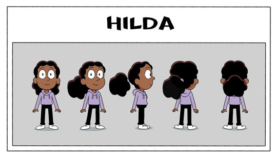
this is real pre-prod show art, and considering the purple hoodie made it all the way through the design pipeline to be included in the turnaround (generally the last stage of character design, as this is what would be given to the riggers to make the character rig)....and was even posted on twitter months before the show aired -
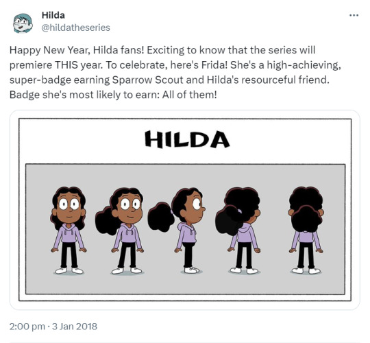
then I think it's safe to say that her hoodie was changed after the fact (2 or 3 episodes into production, by my vague guess looking at the date of this tweet) - not too hard to do, if your show is 2D rig animation, luckily - but if you're me and like reading into things way too hard, this begs the question of why. having purple as Frida's signature colour is perfectly serviceable and sets her apart from Hilda and David nicely. but what her new hoodie colour does is the opposite - it ties them all together
(the other possible explanation is that maybe Kaisa's design was finalised later in production than this turnaround was made (speaking purely from my own experience, secondary characters who appear in later episodes are often finalised later than the main characters, just ahead of the episode they're needed for, and Kaisa wasn't needed until halfway through the first season) and someone noticed that her and Frida sharing the colour purple made them look a little too similar...(I'm sure ppl who like the idea of Frida and Kaisa being witch sisters are yelling through the screen rn that this would've been a good thing and maybe lightly foreshadowed Frida becoming a witch, like Kaisa, but this was all set at the start of season 1, probably a bit too early to start hinting at the witch stuff :') we will come back to this tho)
anyway I love the trio's designs bc if you put Hilda and David next to eachother, they don't visually have much in common, but if you put Frida there then suddenly they're a unit. they got rid of her signature colour and gave her her friends' ones. she quite literally ties the group together so that they look cohesive as a whole
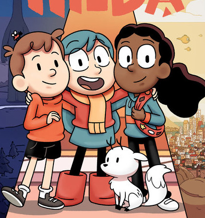
and this is absolutely me digging too deep in things here but her being the one to bring the group's colour palette together also lends itself thematically to their falling out at the end of season 1, and how Frida leaving also caused Hilda and David's friendship to struggle. they are a set and it doesn't work the same if they're not all there. Frida sharing Hilda's signature blue could also lend itself to the idea that Frida shares her love of adventures to a greater extent than David does (though maybe that's closer to 'blue curtains' territory tbh). anyway I love the design of this show so much
SO (if you actually made it this far down I'm so impressed) the thing that sparked all of this was...if this is what the trio's designs are doing in seasons 1-2.....what are the season 3 designs doing
no but this is super interesting to me, Hilda essentially just traded her skirt for leggings and left her colour palette intact, but David and Frida changed theirs entirely and I'm fascinated. both their signature colours are GONE. is it to imply that they've grown and changed in the duration of the time skip? is it David's turn on the 'having a colour in common with Hilda'?? but particularly I want to draw attention to Frida bc now that her hoodie is gone her original purple is BACK and (if there is any weight to my theory that she was changed bc she looked too similar to Kaisa) what's even more interesting is that they doubled down on the witch vibes. she literally has Kaisa's exact colour palette minus the dark purple cape lining. Kaisa's design reflected her personality as this unknowable person with a hint of mystery to her - all monochrome with that pop of an unusual colour - are we to expect the same of Frida? is this a sign that she's leaning further into witchcraft than before? does her contrast to Hilda and David signify that she's come more into her own and has a stronger sense of her own identity (something something closure for her issues in season 1)? or do we take things way too literally and assume that season 3 has her breaking off on her own from the group? or maybe it means absolutely nothing and someone on the design team just thought grey/purple was a neat combo. I know I've talked in this post as if I know things but here I truly don't and I'm obsessed w the possibilities. what does it mean what does it all mean
anyway that's all for this delusional fever dream post, hope you enjoyed and if you made it this far down you deserve some kind of prize
#yeah this is a long post#why did i do this. dear god its midnight i DIDNT MEAN TO MAKE THIS#im so normal about this show as you can see#colour design is my passion#hilda the series#post tag#im sorry if any of this is poorly explained and sounds like nonsense. it is but also im sleepy so blame it on that#alsoo like i said a million years ago im really not a colour expert please dont cite me on anything :'))#i kinda just wrote this to get the thoughts Out of my brain
39 notes
·
View notes
Text

I LOVE THEM SO MUCH OKAY?? This post made me think of them so much and I wanted to draw it for @miz-orque's ship of Jimsoon heheh <3
Bonus they are now cat dads:
Monsoon becomes a big fan of cats now that they have adopted this guy!!
#im by no means an expert on drawing cats forgive me LMAO#gOD theyre so cute i will squish all three of them in my hands#holds them#mgr monsoon#jimmy kurosaki#cyberpunk#Jimsoon#MAN JIMMY IS FUN TO DRAW HES SO FUNKY!!!
18 notes
·
View notes
Last Seen Blogs

fanwarrior321
Llamame ✨Attachement Issues✨
ganbaroyz
Ganba Royz!

rozelkazi-blog
rozel kazi

farheen073-blog
Untitled
paragonevil
— the nexus of the crisis.