#i mean this unironically but also
Text
smoke and mirrors
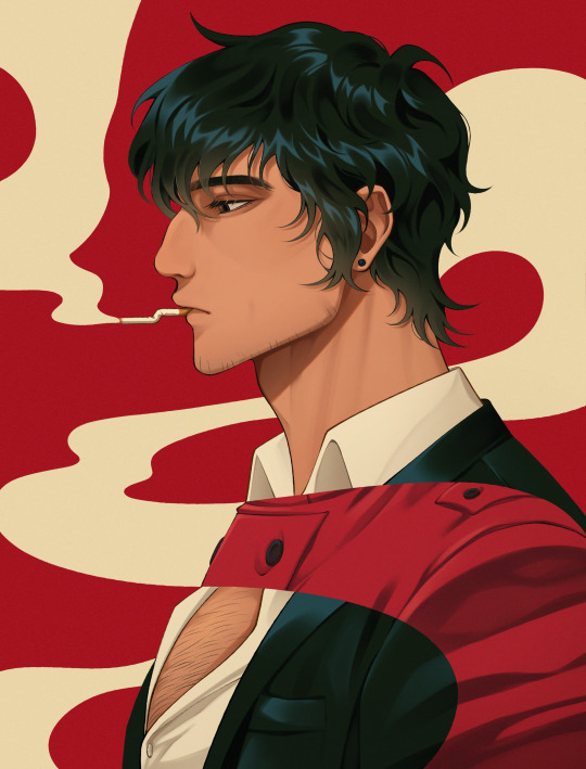
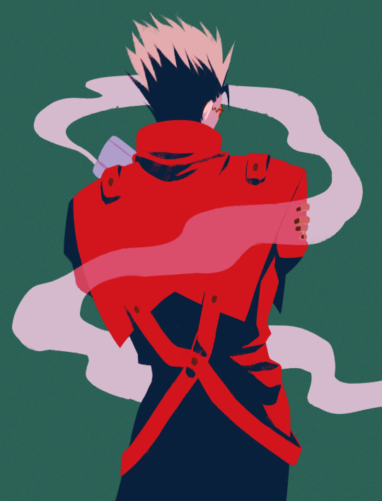
#trigun#nicholas d wolfwood#vash the stampede#vashwood#tsunosagun art#ok adding to the tags cuz i unironically love explaining my own art bfnejfs#smoke cuz literal smoke but i also wanted to have a sense of ephemerality#and mirrors cuz of how they both see themselves in each other (but in such different ways) and it drives me bonkers#also in case it isnt clear thats ww's hand but still vash's body in the smoke in the 2nd pic..#taking comfort in the idea that their similarities mean its like he carries ww within himself.. still there even if only figuratively
1K notes
·
View notes
Text
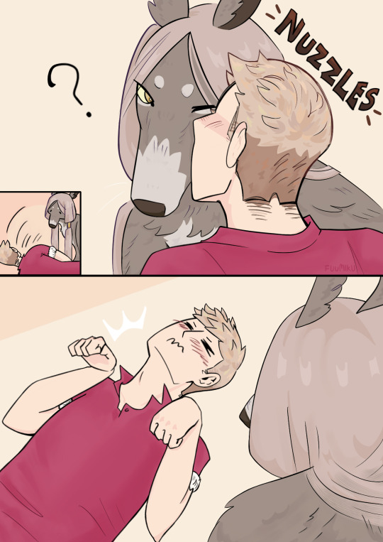
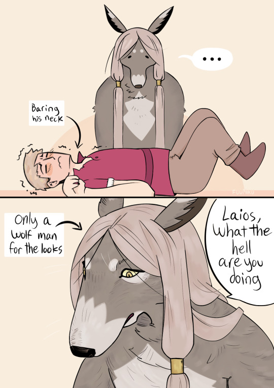
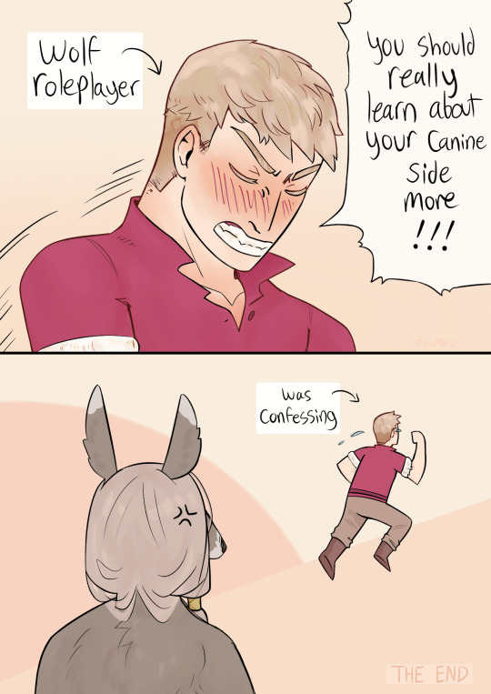
Laios: Dog stan, raised by dogs, attempts to dog behavior at his boyfriend
Lycion: Only is in it for the wolfman swag, no dog society rizz, doesn’t understand and doesn’t care
Nothing as fierce as wolf girls when they have creative differences… Can the divide between wolf roleplayer and wolf cosplayer be breached?! Truly the height of narrative themes that laicion offers us
#The irony of Laios asking someone to learn social cues…#Dungeon meshi#laios touden#lycion#This is unironic btw I will go down with this ship#Could be a part of cringetober tho yay#If my handwriting is hard to read lmk#This was supposed to be a quick sketchy comic dammit#Also no I don’t think baring your neck means I love you romantically in dog but close enough#Laios would so want Lycion to bite him tho lol#Laicion#dunmeshi fanart#fuumiku art
940 notes
·
View notes
Text
Highkey so sad to see Kim's character get butchered by people who see Harry as whichever addict wronged them in their life.
#disco elysium#unironically seek help Disco Elysium isn't your revenge story#like treating him like he *wants* to be an addict and *wants* to be the way he is#idk how you can play most of the game in his head and still come out of it thinking he's choosing this on purpose#atp i think you're just stupid sorry#“I don't want to be this kind of animal anymore” means nothing to some people I guess#and also the people who treat Jean like he's better than Harry for not being addict should know that its heavily implied#that jean also uses substances#and also kim shows interest in using speed#so literally none of these characters are any different than harry#saw someone say that “everyone enables harry” as if 99% of the game isn't everyone telling him he's shit garbage for being an addict#assflash newshole everyones addiction gets enabled it came free with your fucking RCM badge
426 notes
·
View notes
Text
I am once again reiterating that Leo could and should be a figure skater because what are ice skates if not twin blades? What is dual blade swordsmanship if not a dance-like performance? Using the skates as blades themselves could let Leo make portals be his ice rink no? I rest my case. ⛸️
#rottmnt#rise of the teenage mutant ninja turtles#rottmnt leo#rottmnt headcanons#rise leo#would also like to add that he loves glam rock and unicorns! and what’s something glam rock unicorns and figure skating share#that’s right ✨glitter baby✨#(his glam rock look unironically fits right in with figure skater attire ngl)#I also mentioned his incredible ability to hold a pose before which helps him here#plus his fighting style in general can easilyyy incorporate figure skating elements#I am this 👌 close to animating a quick gif to show what I mean by those ice skate portals#and I do specify figure skating over hockey because 1) hockey is CASEY’S thing 😤 and 2) hockey just. doesn’t fit Leo? not enough ✨pizzazz✨#episode where the A-plot is Casey Sr showing her love for hockey and ending up playing a life or death game against yokai#she brings Raph in for help (since I like Casey & Raph friendship) and he gets the rest of the fam to help fill out the team#Casey Jr is especially excited but he’s never actually played hockey before#Leo tries to join and immediately accidentally makes a portal with his skates when he tries twirling to show off#the gang wins the match and the ep ends with Leo finally making it back completely beat up from accidental portals#the gang: wow we won! haha let’s go get hot chocolate it’s cold in here#leo: *desperately twirling over an active volcano* THIS IS THE OPPOSITE PLACE TO BE RIGHT NOW#actually to extrapolate on this more I really adore the idea of the boys’ abilities needing to be retrained as they grow#because their powers have the opportunity to grow#Mikey just randomly floating off and needing to be tethered down until he gets the hang of it lol#and stuff like that
148 notes
·
View notes
Text
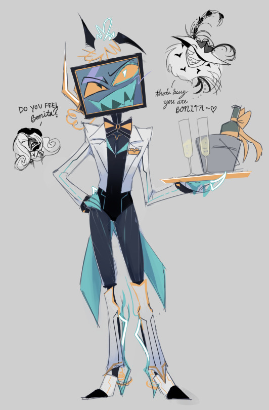
i am not above objectifying my own design to get past creative blocks
#is this cursed oh lord#well you got#bamf/silly/cool rr!au vox#it was about time for whatever this genre is#au: reset resort#also ummm peep#velvette#valentino#hazbin hotel au#just think that they had a sponsors day or something for the resort#by objectifying i mean as much as a demi is able to#take that as you will#my art#vox#ok unironically#rr!au vox the kind of guy to understand the assignment#he's unapologetically fake#just makes sense that for showmanship his dignity knows no bounds
149 notes
·
View notes
Text

i know im late to the matter but why does solmare keep putting my guy in ugly outfits 😭
either way im asmo's #1 and will love him no matter what he wears
#i mean unironically i do like it tho. i warmed up to it and give it like a 7/10#(this is also my way of saying the last outfit i'll include will (most likely) be carnival#obey me#not a tournament
156 notes
·
View notes
Text
late night mind posting lets go
#unironically my favorite concept of he i've done this far. def gonna have to expand on it with my Serious Art Program instead of a magma LOL#also i keep meaning to repost a lot of my other stuff i swear ill get there eventually i just forgor#winter draws things#chonny jash#cccc#cj mind
169 notes
·
View notes
Text
WAIT WAIT WAIT HOLD THE FUCKING PHONE
So normally we only get fullblown, extended and dedicated flashbacks for heroic characters in One Piece, the characters who we're meant to root for. The literal only TRUE exception we've had to this rule was Big Mom's flashback. Even fucking Doflamingo's flashback was tied to Law and Rosinante's
So the fact that we haven't gotten a single fucking GLIMPSE at Crocodile's backstory is?!?
Like sure, we haven't gotten like a Moria flashback, but you know, he literally told us all we needed to know himself, AND we got to see glimpses of him in the Wano flashbacks. Arlong didn't get a flashback of his own, but he did get to cameo in Fisher Tiger's flashback. And Rob Fucking Lucci got a flashback that was 6 whooping panels long
BUT CROCODILE?? Not only do we know almost Fuck All about his story, but also have never gotten as much as a glimpse at it? But his backstory has been HINTED and TEASED at multiple times??
GUYS. FELLAS
Like. I am SURE the "Full Backstories for Heroes Only" rule is going to get broken again, but with Imu and Blackbeard already there just BEGGING to have their beans spilled, can we even be sure Sir Fucking Crocodile is somehow going to become A Villain So Dangerous To The Narrative that he ALSO should also recieve a Full Fucking Backstory?? For his Nefarious Schemes?? AT THIS POINT??
Y'all
I think it's more likely Oda's been saving up Croc's backstory because it might just completely recontextualize his entire character
#CROCODAD REAL?!#UNIRONICALLY#Sir Crocodile#Crocodad#Crocomom#OP Meta#Moon posting#Sleep Deprivation opened my third fucking eye I can see the fucking Matrix#Unironically this is the thing that has pushed me back into actually believing in Crocodad despite the timeline#Because I genuinely can not imagine how else Crocodile could be turned into an (anti) hero if it's not Crocodad#And I can not imagine his villanous schemes needing a backstory to explain them at this point- not over BB and Imu#And I mean sure maybe we could get three whole Extended Villian Backstories for Imu Blackbeard and Croc#But I just feel like it'd be so unnececary#Because there is no fucking way Crocodile is going to become The Ultimate Villian of the Story again#Not without some Darth Vader bullshit happening#But since he's supposed to be based on Wagnas from Romancing SaGa 2 and Wagnas wanted to SAVE the world#Look I have a whole different post about that waiting in my drafts I'll post it later#Point is!! I can't imagine him becoming The Final Villian!! Not at all!!#Also yes there are characters like Mihawk who have like histories etc that I'm sure many people would love to learn about#The only difference is that we've never gotten as much as a hint at what kind of a backstory Mihawk might have#Meanwhile Crocodile Having A History is something that's been hinted at every arc he's appeared in pre-timeskip#Like we KNOW he has a story we just don't know what it is
186 notes
·
View notes
Text
seeing all those posts from ppl ab how miserable they are without a partner like sorry can't relate. i'm doing great and in fact i hope i die alone 🖤
#THIS POST IS ABOUT NON-PARTNERING AROMANTICISM#like unironically! i hope i die having been by myself my whole life!!!!#in a romantic/traditional partnering sense. in the way that people usually mean 'die alone'#to me there is such poetic beauty in my life ultimately being about myself.#and also i think saying that i hope i die alone fucking rocks.#fuck you and your societal standards. i am going to aspire toward the worst thing you could imagine for yourself#and i am going to hold such joy in it. your worst nightmare is my perfect future. my jubilation. my victory.#i'm going to be by my fucking self and it's going to be my decision and i am going to be deliriously happy.#SO fucking excited about it. looking forward to a long and fulfilled life and i hope i fucking die alone :)#new favorite phrase so obsessed with it can't stop saying it. i fucking hope i die alone!!!!!#i might be so lucky!!!!!!#aromantic#aromanticism#arospec#aro positivity#aspec#talking
148 notes
·
View notes
Note
Do you think Wei wuxian listens to weezer?
I don't know...I don't know...I really don't know.....
#poorly drawn mdzs#mdzs#wei wuxian#lan sizhui#blood#I mean this in the most sincerest way possible: This ask has become my 'does bruno mars is gay' to me and anyone in close enough proximity#I first read this after having just woken up and it rattled me so intensely#would he???? I don't know??? It's dad music but it also sort of works for someone a little bit out of step with time?#I'm a bit of a wwx kinnie and I love music but I don't really have any headcanons for what modern music he'd like#other than 'unironically classical music and its one of the first things he bonds with lwj over as teens'#(they get into very heated arguments about composers and arrangements)#but also. the concept of wwx really liking wheezer to the point its the first thing he's gotta check in on after 13 years dead?#*that* did me in real good#I hope people enjoy this one as much as I did#'Does wwx listen to wheezer' Please oh god wheezer and mdzs fans please come together to tell me what songs wwx would like#my money is on 'lost in the woods' its so campy#EDIT: just been informed weezer doesnt have an H in it..this is how much i know. thank u everyone who left weezer recs in comments and tags
466 notes
·
View notes
Text
you know she got that honky tooonk, badonkadonk 🤠🏜️🌵 🐎🏞️
#ts4#ts4 cas#ts4 screenshots#sim: sawyer cavazos#ain't she somethin purdy~#PLEASE i was listening to this the entire time i was dressing her and i entirely blame it for the canadian tuxedo she's in fsdhjf#but this is what i did while waiting for her to load up for laur~#i'm so excited to see what this bde woman gets up to aight#she's a horse behavioral therapist and she WILL beat you in a moonshine drink-off and an arm wrassle respECTFully#i wish i could find a straw acc for her mouth bc she would ABSOLUTELY have a straw hangin out of her mouth 24/7#entirely unironically#you could ask her to her face if it was a joke and she'd be like#'... what d'ya mean??????' COMPLETELY GENUINELY#anyway laur omg go buckwild with her bb but bless u for the inspo bc i absolutely and utterly adore her mwah#also she has the most horrendous farmer's tan it makes me so happy uvu
212 notes
·
View notes
Text
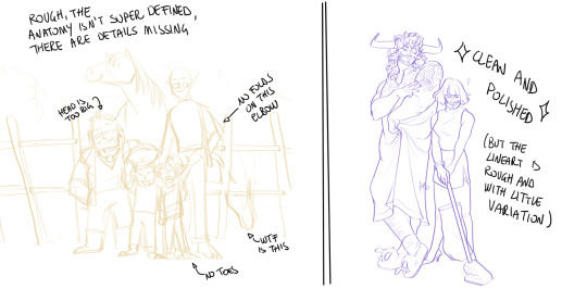
Crisp those Lines!
Or: a small collection of suggestions for a crispy, neat lineart.
SO MANY OF YOU ASKED FOR THIS (it feels absurd to say, yes), so here you go.
A premise: there's no right or wrong way of inking, and some of the following tips entirely depend on the type of inking I do. Which is neat and clean, with no blacks, and moreover: digitally. More under the cut because it's gonna be long and full of explanatory pictures. Here's an example:
SOFTWARES AND BRUSHES:
Let's address the elephant in the room: Photoshop SUCKS for inking and linework. The stabilisation of the brush there is SHIT. Good for colouring and painting and doing photobashing, but for Lineart you want it to be precise. Do yourself a favour and don't use Photoshop.
I generally use Clip Studio Paint, but i have to say that the best program for it that I've tried keeps being Paint Tool SAI 2. It has few functions, it's true, and I use CSP because it has more instruments. But if you don't want to pay much, SAI is incredible as for brush rendition and stabilisation.
As for the brush: you don't need a fancy brush, anything in your software will go. What I use and what works best tho must have:
Tapered start and end.
High stabilisation (I go from 60 upward, lower it down for trees and grass or anything more natural that needs to be less neat and flowy)
Low tapering.
It must be set so that pressure controls only the dimension. The more you push on your pen, the bigger the line gets. No colour or opaciy variation!
On Clip Studio Paint, I use the G-Pen in the program. It's good as it is, but I think I did some variations as per here:
FILE DIMENSIONS:Better work larger and then resize down. Sizing files up digitally is possible, but it leads to unfocused images.
I generally work on files at 600dpi (300 is fine too, but don't go any lower. Particularly if that's something you want to print later on, any printing wants a minimum of 300dpi). in roughly an A3 format (bigger dimension is 43cm). Most pictures I upload here are 6000x5000 pixel.
A bigger file will give you more possibilities with brush sizes, and it'll be easier. Remember: digitally, sizing down is ok, sizing up is not something you should do.
SKETCH:
This is the suggestion I should follow but never do.
Having a clean, polished sketch simplifies your life A LOT. This is because if you don't have to worry about drawing details and fixing the anatomy of your drawing during the lineart, and doing it so GOOD because it's the lineart... You'll go that much slower and your life will be more complicated (it's not impossible, my sketches usually are very rough. I am ok with it, the most I do drawing wise is during the lineart... But I'm lazy, don't do like me. A good sketch will help you out.)
Compare the two sketches below:
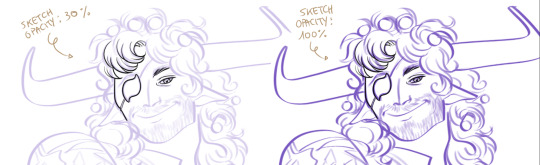
Another note about your sketch layer: you know those memes that complains that the sketch looks good but when you hide it the lineart is shitty? That's easily solvable.
When you're inking, lower the opacity of the sketch layer down, A LOT. I generally go for a 30 or 40% opacity (depending on the colour of the sketch. the yellow sketch will go around 40% because it's less visible, the purple one lower).
When you're inking, you MUST see clearly the lineart you're doing. If the sketch isn't contrasting enough, you won't see clearly what you're doing... It's like trying to sketch with a dim light, not seeing the paper clearly. See the difference:
BEFORE YOU START:
You probably have read it everywhere, but it bears repeating: warm up your hand.
You're using muscles and for more than five minutes. The warmer they are, the firmer your hand is, the easier it gets controlling your lines. It also prevents you from damaging your wrist. Stretching is also great, and grippers are nice to have. Keep your hand fit!
As for warming up: I usually do some calligraphy exercises, practicing on flowy cursives. You want to practice varying the pressure of your lines in a single trait, hence why calligraphy is good. But generally, what you can do is...

PRESSURE VARIATION AND LONG LINES:
So. My main tip and trick is to vary the pressure of your lines. In the same line, and between different details. This will help making the lineart more dynamic and interesting.
A note: this works for semi-realistic styles. If your goal is obtaining a Cartoon Network style: they have generally little to no variation and it works. My suggestion would be to study the kind of style and effect you want to obtain, different styles will work best with different linearts. If you're aiming at hyperrealistic painting, there's no point in spending time over a lineart, for example, I inked the same lineart, but with a brush that doesn't vary it's dimensions with pressure, and not changing the dimension of the brush.
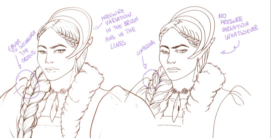
What makes my linearts look "flowy" and "neat" is the fact that I tend to draw less lines and longer, and pay attention when I stop, to start the line where I end it. This will give the impression of one continuous, single line, and make everything more fluid. See above in the french hood: on the right, I left the line rough on purpose, you can see where I stopped and started again. On the left, where I took care of it, you can't.
Generally speaking:
Thick, dark lines communicate that the object is close to the viewer (always keep the viewer in mind!) or in shadow. Lines should be thicker on the outside of your objects, to separate two planes, and in stuff closer to you.
Thin lines are delicate, they should be used in the background, for small details (see the hair, the lips, the small wrinkles around her eyes.)
As for line continuity: in both cases, the line of her face is one single line I drew. This can be obtained with a smooth result, particularly in curved lines, by getting the brush stabilisation on higher settings (80-100): sacrifice speed for accuracy.
MORE IS MORE, WHEN IT COMES TO LEVELS:
Particularly when there are two objects intersecating, or more characters interacting… Instead of inking all on the same level, I always do one level for each object, trace the WHOLE line as if there was nothing above, and then erase where it's not shown. This is a little thing, but pays off. Always in the drawing of above, the feather and the hem of the bodice were on separate layers, and then I erased the bodice under the feather. Take advantage of being inking digitally and not traditionally!

For many characters, here's an example of a vignette of a comic page before cleaning it up and erasing. Every single character and the weapons are on separate layers

For this it's very useful knowing your recurring mistakes. For example, I tend to draw heads bigger than they should. I know I do, so generally I keep the head on its own level, and the body on another, so it's easier to modify and size down just the head without getting crazy selecting only the lines you want with the lazo.
Again, you're inking digitally. It's not easier than traditionally necessarily, take full advantage of your instrument!
OTHER TIPS AND TRICKS:
High brush stabilisation sacrifices speed for accuracy. The line will lag a little from your cursor. Get used to watching the cursor and not the line, and trust that the line will follow.
GO SLOW.
Rotate and flip the canvas. Don't ask me why, but tracing long lines towards me is always easier than not the other way around.
Use the Free Transform, Warp, Distort etc etc and the Liquify to your heart's content if you notice the lineart has something wrong. The only cheating in art is using fucking AI generators (and AI pictures are not art, sorry not sorry)
References are your friends. Study how an artist you like does the lineart. Try and imitate them, and if you can and need to post them: tag them! (don't trace and sell it as your own)
Experiment with brushes, find one that you like for the effect you'd love. You do you, there's no right or wrong way of inking.
Remember to breathe when you trace those lines! (and to drink and do pauses and stretch, you don't want a tendonitis!)
Have fun. Lineart is not evil, lineart is your friend!
I hope this essay is exhaustive enough. I'm tagging ALL THE PEOPLE that requested it (and giving each of you a muffin).
@ndostairlyrium @narina-gnagno @salsedine @whimsyswastry @layalu @n7viper
If you have any questions, don't hesitate in asking!
#tutorials#lineart#inking#digital inking#digital art#tips and tricks#petrel explains#COME LO FECI (cit)#listen if we're mutuals and we chat... ask me to share my screen I don't mind the company when I work if it's not something I can't show#or if it's not too late at night for me#also I unironically like how Alyra inked without variation looks even angrier and more judgemental than normal LOL#also some spoilers for The Last Bacchae if you follow that#“Marmotta” means “Groundhog” in italian#art ref
121 notes
·
View notes
Text
When I find it hard to do certain things, I like to pretend I am a neanderthal living in a cave with my clan, and I must do The Thing in order to survive.
So, when I'm doing cardio at the gym, I'm actually chasing and tracking a mammoth, and when I need to cook, well, I'm not cooking on a stove top, I am hurdled over the first fire and watching the fat of our kill drip down onto the burning wood. And when I find it hard to crochet, I pretend that the first winter storm is coming and our clan needs me to make blankets to hurdle under and that I must contribute.
I hope whatever you do to do The Things will help. It is a uniquely personable trait to motivate yourself through pretend and stories. That's what makes this life interesting - that's what makes you feel larger than yourself 💛
#mental health#positivity#it helps that i absolutely adore learning things about ancient people too - it's endlessly fascinating#unironically if somebody has textbook/video recommendations about neanderthals/ancient civilization let me know i will froth at the mouth#i like talking about this because it gives other people ideas about how they can motivate themselves#and personally the feeling of being ancient or a part of something old makes me feel that#in addition to the There Are 8 Billion People principle i work on the There Have Been ~117 Billion People Here principle#i find it comforting to think that i don't stand out significantly in a good or bad way because of the sheer NUMBER of people who have live#the human brain is bad at computing those numbers but... just... that's an insurmountable number#there truly are very VERY few experiences truly unique and that's not a bad thing#that just means that you aren't forgotten nor are you alone in anything#i was watching a video about somebody making flax into thread using a paper that was published about ancient textiles#and holy shit i wanted to bite somebody because i was so interested in it and it's just so humanizing to both us but also ancient people#those people probably used very very similar techniques that the video maker did - at first she used a rock to get the fibers#and then she remarked that saliva helped to get to the fiber of the flax and i wonder how many ancient people also did that
89 notes
·
View notes
Text
"Trans men and lesbians can date!!" "Trans men and straight men can date!!" "Lesbian includes attraction to men!!!" "Labels mean nothing just use what you want!!!" what if I threw a rock at you.
#lgbt discourse#queer discourse#queer#yes ive seen all of those things being said unironically#y'all wanna include men in lesbianism so bad#y'all wanna invalidate trans men so bad#just say you're a mysoginist and go#just say you don't see trans men as real men and go#and for people who think it doesn't invalidate their label?#why even bother? why do y'all refuse to identify as bisexual?#why do you continue to disrespect lesbians and trans men#we can be different communities and still respect and uplift each other#identify as you want but one day you'll learn that actions have consequences#and get called a transphobe#and i will LAUGH#lgbt+#anti bi lesbians#also labels mean things and if you don't agree with it don't participate in society!#because everything and everyone has labels whether you like it or not
257 notes
·
View notes
Text
The problem with the church today is that so many "Christians" do not actually believe in redemption.
#unironically christian#i say this because of all the people who make comments about people's testimony#like saying they don't believe that only fans girl who was saved and baptized was really saved#like... reading through the comments it becomes clear that the “Christians” don't actually accept her#like... my brother in Christ... your good deeds are as worthy as my used pad#that is straight up in the bible#you are not better than her and you do not deserve redemption more than her#her salvation is between her and God#and yes... you say that time will reveal her fruit and you are correct#but guess what#ananias was called to extend a hand to paul *before* his fruit showed#and he was a frigging serial killer who was out for ananias's blood the week before#you do not get to pick and choose which converts you get to except#you are not God and thank heavens for it because if you were we would all be doomed#*deep breath*#i am just so sick of this... farse... that Christianity has become#Christians need a wake up call#oh! and and when you act like its impossible to accept that she could be saved you belittle God's power#you call into question Jesus's blood and it's ability to cleanse and if that is false your salvation is worthless!#also also you go against the things clearly written in the Bible while wearing the title of Christian#which means you are misrepresenting God's nature and intentions which means you are breaking the command to not take the lord's name in vain#wow... i thought i was done at the deep breath... guess not😅#rat rants
23 notes
·
View notes
Note
man, reading ch3 was a ride, it's like all fun and jokes and then all of sudden, Nope! It's time to be sad now! but it's so good with it? like, I really enjoyed how seriously you took it, and that moment in the classroom was really like 'oh shit this is legit' in a way that had my heart just sinking in my chest and with the tone whiplash from the rest of the fic so far, it was just literally so good to read. also, seeing byleth and the rest of the class just kinda grapple with wth to do with dimitri while he's deep in this episode is just very interesting, especially when they all have their own hangups and issues with everything. 👍
YESSSSS. I'm always so excited to post the moment the story actually kicks into gear, and this chapter was it for Weekenders. A lot of fun.
I wrote a post a while back about people's discomfort with writing severe mental illness,
and while I wouldn't say Weekenders is a spite fic, it was influenced by how difficult it was to find non-modern AU fic that wrote Dimitri specifically as somebody on the schizophrenia spectrum/bipolar.
It was so hit-me-over-the-head obvious while I was playing! His entire personality and behavior flipped on a DIME in Part 1, and it flipped 'back' in Part 2. He couldn't switch topics, he was ranting incoherently, he was having headaches, he was doing nothing but training, he obviously wasn't sleeping or grooming, he was convinced a 12yo had orchestrated an assasination - that's not depression/anxiety/PTSD, and it's not even just a psychotic episode (mania does have elements of psychosis, hence the paranoid delusions). And, obviously, the actual hallucinations, delusions, antisocialness, lack of grooming, impulsivity, etc, of Part 2 that rang very loudly of a schizophrenic/schizoaffective psychotic break.
But equally important is the fact that Dimitri's illness did not make him hateful and homicidal. Dimitri was always a hateful person. I don't think he's naturally hateful nearly to the degree that he shows while having an episode, but one of the most important lines in the BL route is when Dedue just says that Dimitri was always angry and hateful, and that he just hid it. His behavior in late Part 1/part 2 is him losing all capability to hide it. I don't think he's a pathological liar, and I don't think the Dimitri we see throughout Part 1 is 'fake' - I just think he withholds a lot. Dimitri's cruelty is just as important as his generosity. His hatred is as important as his empathy. The horrible sides of his illness are just as important as the comfortable sides. Do you see what I mean?
That is what interests me about Dimitri so much. Dimitri wants to be Marth. Dimitri tries to be Chrom. Dimitri dresses up like Roy. He is not. He is an angry, paranoid, brutal murderer. Any depiction of Dimitri that forgets that - that unironically only protrays the Dimitri that he shows the world and never the sides of him that he's ashamed of - is kinda buying what he's selling, and it both demonstrates a deep disinterest in who he is and a discomfort with the sides of his illness that aren't palatable.
Dimitri's psychosis did not make him hateful (I think his PTSD had a lot more to do with his anger problems). It made him scared. Mania and psychosis are a very, very scary experience. His mind is constantly telling him that he's in danger, that Byleth's in danger, that everybody and everything around him wants to hurt and kill him, that he is a sinner if he doesn't avenge his dead family. And Dimitri is a good child soldier, and he knows that we destroy our enemies with prejudice. He's a good leader, and he knows that the BL are never safe and that their enemies are everywhere. He's a good son, and he knows that you have to avenge them. Violence solves problems and Dimitri is scared and angry and if he doesn't solve the problem he can't protect the woman and people he loves.
This is serious to me! I'm trying not to make this THAT long but I could go ooooon lol. I understanding wanting to either make him realistically/explicitly schizophrenic OR make him violent, because violent schizophrenics are a bad and harmful stereotype. But I think both sides of him are important, because I don't want to whitewash Dimitri's illness or his experiences. It's scary for the people around you. It very frequenty is triggered from trauma and hardship and it is informed by your life. Like many characters in FE3H, Dimitri is the product of the evils of his world.
Byleth's arc in this story is about her growing into a human being. It is shown as a beautiful thing. It is wonderful to be a person. It would contradict the message of the story to show Dimitri as anything else but a human being - flaws, traumas, SMI and all. He was Marth to her. That's the point.
I went on for soooo long lol but thanks for the ask!
#my writing#my asks#you didnt directly ask about any of this but ive been itching to say it so love and peace <3#i think its also worth mentioning that sometimes PTSD uh DOES make you hateful and angry and mean#and that it's. normal? expected? it's not inherently bad rep to show a character w/PTSD and anger issues?#like ppl will write a character w/PTSD but only if they get panic attacks and are sad :(#you know. sympathetic people.#i do think connecting violence with psychosis is bad rep but uh it's EXTREMELY hard to argue his ptsd#i felt this same way about Vash Trigun.#when people wrote Vash as GENUINELY#UNIRONICALLY#the person he pretended to be#it misses the point. to me it demonstrates a lack of interest in the character#you can project onto the self-esteem and depression so that's all the character is#and that doesn't leave room for the parts that are uncomfortable so those parts just don't exist#LIKE NOT A CRIME BUT.#JUST BORING?#BAD WRITING?#ok and to me. on the internet. being boring is the greatest crime of all.#fe3h#fire emblem three houses#dimitri alexandre blaiddyd
36 notes
·
View notes
Last Seen Blogs

deadlupin
deadlupin
kjellbergbxtch
PEWDIEPIE

kayleeawna
Untitled

jma37
Sem título
undangannikahjogja-blog
Undangan, Souvenir, dan Mahar Pernikahan