#i must be clear this is a complementary post
Text
Just an apple... <?> - a Sandman fanfiction

I dedicate this to @wickedly-grim who inspired the story by this post:
Can anyone do a fic or a fanart of a clueless reader tossing/handing Morpheus an apple and then Dream automatically thinking they are engaged now so he’s way more touchy and friendly with them (due to the fact that he thinks they are in a relationship now). All while the reader has no clue about anything, and is wondering why (maybe her boss) the scary king of nightmares is being kind and touchy with her?
If anyone doesn’t know, giving an apple to someone is basically a marriage proposal in Greece.
JUST AN APPLE
Ok. Let’s make thing crystal clear. Being human is hard. Being human who’s familiar with some supernatural power beings (yes, I mean the Endless) is ten times harder. Imagine riding the biggest rollercoaster in the theme park. And then add to it riding it after eating a really big dinner. It’s the greatest recipe for catastrophe. Or at least gastric catarrh. I mean, if you think about it – these being are eternal. They existed long before human race and will be around after any other living thing become extinct. They are powerful, knowledgeable, teasing and have undeniable effect on the human world. But then, it seems like it works the other way round too. No matter how smart the Endless may be one second, they are completely oblivious to customs and habits of people. And that can sometimes lead to some unexpected situations. Serious situations.
I’ve been around the Endless for quite a while now. No matter how crazy that may sound my best friend of them was actually Death herself. From the outside we must have seemed like an unusual besties but it worked quite well. I was rather quiet and observant with a bit of a snarky and sarcastic attitude while she was more of a motherly approach and love-for-live vibes. I suppose I was just telling myself we were complementary to one another. Then one day I get to meet her brother, Dream. Oh, god, what a meeting that was. At the time being I had a job as a waitress and their appearance out of nowhere almost caused me to drop the tray with the dishes.
-What are u doing here? – I hissed as I spotted not one, but two of the Endless just casually sitting at the table.
-Just having fun, y/n – Death flashed me one of her widest smile.
-Fun? – I raised my eyebrow – you surely do, but your friend here seems like he is about to get crucified.
-He’s not my friend, he’s my brother Don’t mind his broody attitude, he’s going through a lot of things.
-Ok, well, ok. Nice to meet you….? What was your name again? Or more like what do you represent.
-I’m Dream of the Endless.
-His true name is Morpheus – his sister added – you can call him that.
-Under no circumstances ….
-Pleasure, Morpheus– I nodded and reached my hand towards him. For a second he was eyeing it with no intention of shaking so I just put it away awkwardly – right, is there anything I can get you two? We got delicious peas soup as a main course today.
-What is the purpose ….. – Dream started, lips pouted, still grumpy, but Death cut him off.
-We’d like that very much, thank you, y/n – she smiled again. As I left them to collect the order I was able to hear muted conversation.
-Behave Dream, be nice. She’s my friend and a really nice person to be honest. Besides, you are supposed to taste a bit of humanity to understand it better, so stop brooding.
-I am not brooding.
-Oh, come on, brother, you are scaring everyone here. Look around – she waved her hand and as a matter of fact all of the guest in the restaurant seemed a bit intimidated by Dream’s presence.
-They should be scared. I am the one who can give them nightmares after all. And trust me, some of them truly deserve them.
-Dream! – Death clipped him round the ear gently and got a sad and confused look in return – just observe. See how they enjoy their time together, please, for God’s sake just try to do the same.
-Here’s your soup. Enjoy it – I smiled returning and serving them their dishes.
-Thank you, y/n. This looks delicious. Dream? Is there something you’d like to say to our friend.
-She’s not … - he started but a cold glare from his sister made him change the sentence – thank you, I guess.
That was a year ago. Even since I was trying my best to warm Dream up to human race and show him that we are actually not that bad. Not of my own volition, but only because Death asked me too. She was worried about her sibling becoming some sort of eremite, detached from everyone and everything, denying any positive feelings that came his way. I couldn’t say no to her. So, I was balancing my job, crumbles of my social life and a relation with some certain Endless. If you can call it like that.
-Why are you always like that? – I asked him one day while we were walking in the park.
-Like what?
-Distant. Cold. Black – I hesitated pointing towards his coat.
-Why should I be anything else?
-Because you are dream. Aren’t they supposed to be more vibrant? Emotional? Lively? What’s with the sad attire?
-I’d rather not speak about it.
-Of course not – I sighed. – But fine, let’s not talk. How about we get some ice cream instead.
-Ice cream? – he was dumbfounded
-Yes. Come on – I grabbed his hand and draw him towards the ice cream stall. I only stopped when I reached it, and then noticed the inexplicable expression on his face.
-Dream? Are you all right?
-You touched my hand.
-I guess I did….?
-Why?
-Why? – I repeated not quite understanding what he meant by that – Oh, you’re seriously asking me that. Well, I suppose I was just trying to … make you move?
-And taking my hand was necessary for that?
-I… - God, he was really hard to be around sometimes. – I guess not. I’m sorry.
-Don’t ever do this again. It’s courtesy enough that I tolerate you and your presence.
-I’m sorry? – his simple sentence stroke a nerve in me. – tolerate my presence? Believe me if it wasn’t for the promise I made to Death….. – I shook my head – unbelievable – it’s not like I kissed you or something – Dream eyed me when I said that – whatever. Can we just get those damn ice cream and move on with our lives?
-I would accept that offer.
So, yeah, it was that kind of relation. We would meet every week to introduce Dream to every other human attraction. Sometimes it was something simple, like hiking sometimes something more complex (in Dream’s own words) like a visit to the cinema (which only happened once as we were kicked out of the movie theater). However, he was still pretty hesitant when it came to forming a bond. I felt him warm up a little but it was taking him literal ages. After all, what is time if you are an eternal being? Sometimes, if she was not busy, Death would join us. And since she was a foodie those meetings usually took places in my restaurant. Ironically, the place where me and Morpheus met.
-What can I get you today, my friends? – I asked and pretended like I didn’t notice Dream shudder at the words
-Surprise us, y/n. I’d like something new. And Dream will take the same thing as I.
-I am fully capable of deciding for myself.
-So what can I get you then, Dream? – I turned towards him
-I… I will get whatever my sister gets- he looked down almost shyly.
-Delightful. I got something special coming for you two right away.
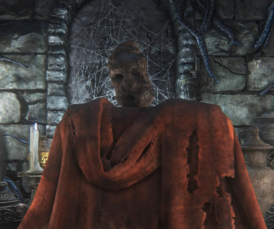
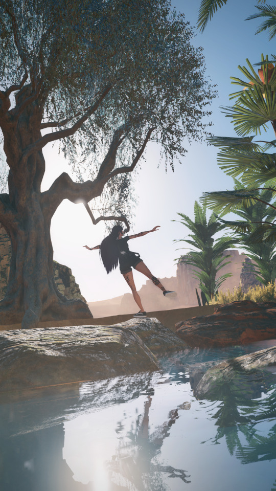
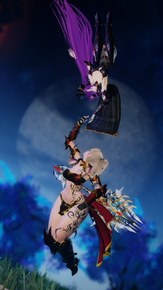
If only I knew what kind of situation I would get myself involved in… I suspected nothing when I gave the Endless apple dessert. It was a hollowed-out fruit filled with creamy and a bit sour stuffing.
-Bon appetite – I obliviously smiled but it quickly faded away as I saw Dream’s face. – Is something wrong?
Death was quick to catch up on the situation but obviously she said nothing just sitting there trying to suppress her laugh.
-Is that really what you’re giving me?
-Yeah, you said you wanted whatever your sister takes. Don’t you like it? I can take it back if…
-No. Thank you. I understand the message.
-What message? – I was confused beyond recognition but decided to let it go since it was Dream. – You know what, I don’t want to know. Enjoy your meal.
-Did she really just… ? – Morpheus asked his sister when the girl was out of sight.
-I know nothing. I do not interfere in your affairs dear brother. You go and figure this out on yourself – she answered with her mouth full with the dessert.
To say the next couple of day were crazy would be a serious understatement. Dream, who was unapproachable for the past year suddenly became more touchy. Wherever we were going he found every possible excuse to brush his hand against mine or stand closer than usual or even trying to grab my waist when we were walking. Not that I was complaining but that was highly confusing. One day when we were sitting on the bench he awkwardly moved so our thighs were touching and that was the breaking point.
-What the hell, Dream? – I jumped from the bench – what do you think you’re doing?
-I don’t understand what you mean, y/n.
-You’ve been acting bizzare for the last week. All that touchy-feely? All the affection? This is not you. I would risk saying you’re making fun out of me, but again… it’s you, so what is this about?
-Is this not how I should behave?
-Should behave? Why?
-We are betrothed now, so the situation would require a bit of closeness.
-Come again? We are what?
-Betrothed.
-Where on Earth did you get that idea?!
-From you.
-Dream, I swear to God, elaborate on your sentences or I’m going to explode – I was rubbing my forehead in pure frustration.
-You gave me an apple and I accepted.
-I gave you…. Oh my god, do not tell me I got myself in some sort of Persephone situation here.
-In Greece giving one an apple means a proposal.
-IT MAY HAVE SUCH MEANING IN SOME ANCIENT TIMES! – I yelled but quickly calmed myself after receiving some damning look from the pedestrians. – Damn it, Dream. I don’t know what century you’re living in, but I;m definitely a XXI century girl. No fruit, vegetable or plant means engagement here. Do you understand me?
-But…
-Do. You Understand. Me? – I grabbed his coat and looked him straight into the eyes. – Do you?
-I do. Now, you might want to let go of my cloak – here it is again.
-Great. I missed your warning tone. We are not and will never be engaged. Betrothed, if you like. But I got to admit that was a great development. Last Monday you wouldn’t even say we were friends and now this. However irrational it seems, I’m proud of you, Morpheus. You are growing.
-Maybe you are the reason of it – he smirked and for the first time it actually made me blush. Perhaps there was something new coming for this relation after all.
#sandman#sandman x oc#morpheus#morpheus x oc#the sandman imagine#morpheus fanfiction#fanfic#dream of the endless#dream of the endless x oc#dream#dream x oc#dream lord#dream lord x oc#the sandman netflix#lord morpheus#lord morpheus x oc#the sandman#morpheus x reader#dream of the endless x reader#the sandman x reader
496 notes
·
View notes
Text
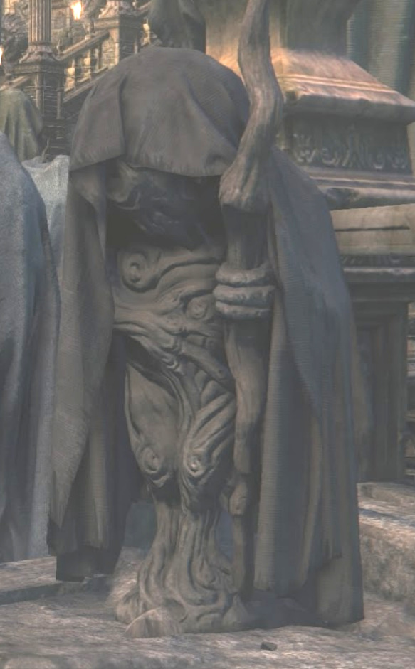
BLOODBORNE LORE Q+A PART 3: OTHER STATUES
part 1
part 2
---
most images are from here, here or here
i cannot write 1200000000000 words about each individual statue of bloodborne or they will start using my brain as a hockey puck. however, friend shawn asked about other statues, such as the hooded figure statues in yharnam. oh that really narrows it down.
do you mean this one, of the man mid-transformation into a puppy?

this one, with the pthumerian face and the messengers at its feet?

messengers show up so often in the statues that it must be assumed that they are a widely known phenomenon. they appear as drainpipes, gargoyles, and spitting traps in chalice dungeons.
there are some hooded statues in central yharnam but they're pretty tame and boring. lots of griffins, however, which is the royal crest of cainhurst. weird.
i don't think any of THESE are petrified people. the things that byrgenwerth raided from the fishing hamlet (not revealed until the dlc) were likely once fish...people.

i dont know what these are. they have a complementary version in the forbidden woods that looks like the boss amygdala
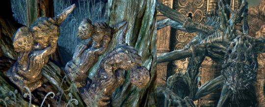
there are less developed versions growing up out of the ground.
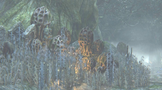
amygdala's peanut head is not an uncommon motif in bloodborne. im running out of statue related steam so i'll leave you off with whatever the hell is going on here
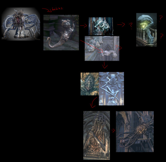
please do not take the above as fact in any capacity. this is the loosest interpretation of what are clearly statues depicting...some kind of evolution. its not just clear what kind or how it goes.
its common to think of the amygdala we fight (the non-tentacled one) as the "official" amygdala but theres really nothing that indicates that its the final evolution of the creature. imo, the tentacled ones with the bulging eyes and the more direct resemblance to the moon presence are the more developed versions. the english name for the lamp located in the boss amygdala's room is "amygdala's chambers" but the japanese text specifies that it's where it sleeps...like a cradle...! what if its just baby!
alright its time for
STATUE FACT LIGHTNING ROUND
the statues in hemwick are unique, they are the only place where people are depicted as being covered in rags like the witches.
there is a statue in the hunters dream that serves no purpose and does not appear in the game outside of the chalice dungeons. it depicts a woman with sutures on her head like someone cracked it open
3. there are carvings of the moon presence in the upper cathedral ward in the celestial children boss room. iirc it also appears in a tiny form on the ritual blood altar in old yharnam
4. what the fuck is this
5. the hooded statues in the cathedral ward are of pregnant...things. beasts?
----
we can finally answer the second half of shawn's question about statues in the next post. we will split this here and talk about PETRIFICATION, a strange and recurring phenomenon next time (soon)
34 notes
·
View notes
Text
Taking Pictures, a bit of what I learned
A small post with some "tips" that i sent on Twitter condensed on a single post here on Tumblr. i think with the organization here will be better for sharing later on ^^
Framing
Picturing (pun intended) what you are trying to show beforehand helps a lot on keeping a clear vision of the final image. The famous rule of thirds its super important to make pleasant and cohesive pics, This is more focused for scenery shots, but works to close ups as well, having natural "frames" within your subject makes it popout more! it can be trees around your character, a window, a door, a fountain arching over, a light beam, anything really works.
What you are trying to tell through your pictures?

Playing with Angles
This is the most fun part i must admit, i always loved playing with angles to make my pics unique, but what i learned is that sometimes the simplest is the best, but always experiment with new things!


Negative Space
Negative space is a concept of filling the picture with "nothing", meaning, your background although important for the picture it doesn't draw too much attention to it, it greatly helps keeping what you want to show up in focus.

Leading Lines
Well, this one is rather complicated to achieve, i can find examples of it but can't replicate it the way i wanted ingame. The idea behind the concept its to use geometry and light to direct your eyes to the focus of the image. Exemples of that would be a flow of a river, nature growing in a single direction, light beams and many, many more!
Color Theory
Ah yes, color theory its the thing a lot of people talk about but never goes in-depth, reason being its subjective, but also very defined.
Here some psycology of the colors.
White - purity, innocence, cleanliness, sense of space, neutrality
Black - authority, power, strength, evil, intelligence
Gray, neutral, timeless, practical, boring
Red - love, romance, gentle, warmth, comfort
Orange - happy, energetic, excitement, enthusiasm, warmth
Yellow - happiness, laughter, cheery, warmth, optimism
Green - natural, cool, growth, money, health
Blue - calmness, serenity, cold, uncaring, wisdom
Purple - royalty, wealth, sophistication, wisdom, exotic
Brown - reliability, stability, friendship, sadness, warmth
Pink - romance, love, gentle, calming, agitation
Complementary colors are the most common way to make it stand out due to contrast, speaking of which.


Contrast
There is a bunch of ways to make contrast happens. Light and Dark, Nature and Buildings, Opposite Colors and many, many more, but as the other topics i talked about the idea its to draw attention to the focus point, natural light can make it even better


Visual Hierarchy
Framing, Colors, Contrast, and Spacing, you have to think all of that before you take the picture, The idea is to use the whole canvas to tell the story of your picture.


Analyse
Not really a lesson, but more a suggestion, try new things, even your older shots can be remade into something stunning if you aproach it from a different angle, me and my gf did a shot a while back, but we were thinking on what we could improve, and we did improve it a lot!
Style
Developing a style comes with time i guess, i don't even know mine at the time of writing this post, but im sure i'll find it and so do you who was reading until now. Wish all the people who did the best of luck!
Don't forget to smile!
Kisses - Angela


7 notes
·
View notes
Note
your tags on that post you just rb’d (about dc being inconsistent and thus more open to fan interpretation) are so real that’s exactly how i feel about it
haven’t been reading the comics/watching the various animations + films for long but i have noted how differently characters and dynamics are portrayed per source
some of the writers (comics not fanfiction) can be a bit annoying when it’s clear that they don’t like the character they’re writing and it’s directly affecting how they write the character but for the most part it’s honestly kinda refreshing imo that dc has this yesterday does not reflect today sorta vibe when it comes to characterization and how the characters interact
like yeah let them be insane in different but complementary ways throughout the various forms of media <3 it’s a treat
they seem to do this especially with jason todd and like i’m all for it bc it opens up so many different ways fans can interpret his character in fanwork
there’s not really a right or wrong way to go about interpreting dc characters bc chances are, the source material has already portrayed them in that manner years back before scrapping it for a slightly different characterization (that still maintains a few core personality traits that act as the character’s signature)
kinda pick your own adventure in the sense that you can choose which canon version of the character/plot you like the most
(I got excited, wall of text incoming lmao)
Yes!! Exactly, yes - the funniest thing to me about writing fic for comics is that I'm p sure the Official comic artists and writers basically get a set of golden rules on the characters they're going to be writing for (batman must be x, dick grayson cannot do y, gotham must be grungy) but a lot of things are up to them.
While their stuff goes through edits and vets to make sure it will fit the canon...the canon is already one big, ongoing game of telephone. It's why we can sort comics ala the "golden age" vs the "silver age" and why these tonal shifts happen. So when you write fic, you're basically hitching a ride on this grand tradition lol you just don't have any industry standards you have to follow or edits that you have to make
And oh god, yeah, it can be very annoying when you figure out that a writer simply...does not like a character lol. Like, excuse me, DC, could you tag this for character bashing please
But I 100% agree, and i love that way you put it, that 'yesterday does not reflect today' - absolutely the vibe. The desire to be evergreen in comics means that they Will scrap things at a certain point to reintroduce a character so that they can tell a different story with them - which is fun! And very, very close to the nature of reading fanworks!
Every time I open a new fic, I have to reset the characters in my brain because a different author is writing them and will cherrypick the things they like about canon and about the characters. It's like a faster, rawer, and generally hornier version of picking up new source material lol (with many caveats about accuracy, something something industry standards something something "i know them best" but i digress)
"like yeah let them be insane in different but complementary ways throughout the various forms of media <3 it’s a treat" - points at this. yes. YES. YEESSSSS
And Jason. Ough. Jason is such a fascinating character to me, not just because of the whole black sheep of the batfam thing he has going, but because of the absolutely divisive nature of him. (I still reel over the whole 'do you HATE this child? Would you like us to KILL HIM FOR YOU? Vote now and we'll brutally murder a teenager!' thing. Like what!! That happened!!)
You can't get away from how brutal he is (cool backstory, still murder) but there is a wiiiiide range of sympathy to play from. You can figure out a lot about how a person feels about the death penalty based on how they treat Jason Todd lol
But yeah, I kind of love the modular nature of comics - from a writer's standpoint it makes it so much easier to relax about getting it "right" because like. There is no right way and also a hundred right ways, and you're doing fine sweetie <3
#hardlycats#dc#i could talk for hours about this#me: i'm a casual comics enjoyer#also me: *gestures at this post#jason todd#he is my little babygirl meow meow and he does so many wrongs#and I love that for him <3
8 notes
·
View notes
Text
Personal rules for character design
I don’t own this translation or interview, All credit to the translation belong to Kimi Dake Translations who did a lot of hard work translating this. the original interview came from here

Hello, Kenkou Land’s Kokoroten here.
I got a message from someone who wanted to know more about character design, so today we’re going to cover that topic!
Yay, thank you so much for your message!
I make games because I was inspired by the games that other people made. If I can inspire you too, it’ll make me so happy!.
I wanted to share the aspects I pay attention to during character design, as well as the rules I always follow. This post might get a bit long, though.
Normally, the illustrator designs the characters after the setting and direction of the project has been decided. It’s easy to think that style is the basis for everything, but in this case, there are other aspects to keep in mind, like the fact that you need to establish the characters’ background in addition to their design, and that all of them must be suitable to be used in the standing portraits that are common to visual novels.
However, the request I got was to discuss the aspects to take into account during character design, not the process on how to come up with ideas.
The main goal is to define what rules should be followed to gather all the ideas you’ve come up with, and refine them.
I will use the works of my circle as examples for this explanation.

“Lemures Blue’s 2AM ” (official site)

“MAMIYA - A Shared Illusion of the World's End” (official site)

“Vamp the Pray Velvet” (official site), a work by my collaboration circle
***
◆ Lemures Blue’s 2AM

·How to decide the color of the illustration
Let’s start with the basics.
Aoi is blue, Hinata is red, Itsuki is yellow, Sakura is green.
Blue is present in several shades and it’d be a good idea to pick colors that harmonize with blue when designing sub-images. Here, you can use your personal palette as reference.

In Aoi’s case, his sub-image color is a reddish shocking pink used in his flower-like pupil. Once the image color has been decided, you can use complementary colors to accentuate.
I used yellow for his shirt because yellow complements blue.
·Symbolism of facial features, hair style
·Flashy colors that are easy to understand, deformation of characters
For Lemures Blue’s, the character design process took an entire year (for more details, read the explanation in the Lemures Blue’s artbook!), and I kept this particular aspect in mind.

Aoi’s large, round, slant eyes, Hinata’s clearly defined drooping eyes, Itsuki’s emphasized drooping eyes, Sakura’s long slit eyes…
As I will explain later, back then, I didn’t really think about making their faces look different. I believed that characters could be recognized by the design of their eyes. And I also thought that, as long as they had one strand of hair sticking out (ahoge), they would gain personality as characters.
Overall, characters in Lemures Blue’s were mostly two-dimensional, because the approach was similar to the one used in games aimed at men and featuring female characters (known as gal games).
***
◆MAMIYA - A Shared Illusion of the World's End

Here, the approach was different from Lemures Blue’s. The colors weren’t decided from the start.
I used a more intuitive design process for the characters and the initial designs didn’t have to be redone (whereas Lemures Blue’s characters were changed at least five times…)
With MAMIYA, there was a period of three or four years between the design of the characters and the production of the standing portraits, and I’ll talk about what happened during that time.
·How to define the body and facial features
Body type → Compared to Lemures Blue’s, in MAMIYA, all the characters are handsome guys with narrower faces, and we aimed to make a clear differentiation between them.
This can be described as enjoying the small differences between members of male idol groups.
For example, muscular but delicate, curvy, bony… Even if you can’t express it clearly in a drawing, just being aware of their features will make a big difference!
These body characteristics, and details like deciding to give some stiffness to hair by drawing straight lines, have a tighter connection to the characters’ looks this time.
Looks → Specifically, I use the face of a famous person as a model, while thinking that it would be wonderful if the character could be drawn in the style of [redacted]-sensei. With this in mind, I decide who my ideal author is.
I believe that in the final design, the look and idiosyncrasies of the character will come together. And when I analyze a draft, I’m impressed by how similar it looks to my celebrity of choice, and my understanding of the shape of the face improves.
When you pick a real world celebrity as a model, you come to understand what type of face goes with what type of hair, and what clothes suit them best, and you can use this knowledge as reference to fine-tune the smaller details.
Again, this was different from Lemures Blue’s, but here’s another point that you have to keep in mind:
· Characters are deformed, but they still resemble real people
In addition to the individual characteristics of the MAMIYA cast, the visuals needed to have a tendency towards realism without causing interference to the people reading the story. Compared to Lemures, which was more similar to a gal game, the design of MAMIYA was more shoujo manga-ish.
I also used real brands for the clothing, provisionally, and it allowed me to think about the meaning behind each character’s selections regarding clothing, their personalities, their sense for spending money, and their eye for aesthetics, and, by doing so, I was able to express their normal everyday life.
You can check the final result in「マミヤFallDown RecordBook公開」(available only to supporters).
***
◆ Vamp the Pray Velvet

This one was completely different from the previous game, because all the characters were women!
I finally drew full-body portraits.
Kinari-sensei, who was responsible for the script, has vast knowledge about shoes. They researched the topic, and shoes were incorporated into the standing portraits. When shoes work well, they significantly deepen the character’s personality!
· Setting a clear fashion category for the outfits
This is a game about female characters and battles, and it was a lot of fun to break free from the aspects mentioned above!
Sweet lolita, military, sporty, etc. It’s a bit of an exaggeration, but I truly prefer when you can understand the character quickly just by looking at their name.
· Defining the silhouette
· Balance when looking at the body
We’re finally here, let’s talk about the basics of character design: silhouettes!
You can express a character’s personality through the length of a skirt, so the concept of silhouettes might be easy to tackle!

The easiest way to understand it is by looking at this girlxgirl pair, Reina and Yuriya.
When I decided the design of these two, and their colors and vibe, I knew that they would form a pair, but what matters here are their silhouettes!

For Reina, volume is located in the upper part of the body, while for Yuriya, it is in the lower part. These two are my favorites.
VampVel’s story is about battles between two people, so I had to be mindful of the height difference between them when they were standing together.

Momo and En. The protagonist pair. Normal girl/punk androgyny. Black and white. Pink and cyan.
Seimei and Ruri. Graceful/military. Light/dark colors. But their collars and the length of their skirts are similar…
Et cetera!
When I draw the standing portraits, I don’t draw the characters by themselves, but standing next to each other (the resulting file is pretty large, though).
***
These were three examples of how the aspects that you must keep in mind while designing characters make a transition onto the page. I hope the explanation was good enough.
These aspects vary from work to work, and it is difficult to tell you “do this!” in just a few words. If I had to talk about media other than visual novels (manga, Vtuber, characters for specific projects), the explanation would be different.
Looking back, I feel that every time I reflect on my work, it becomes clearer! And thus, continuing to create works is the way to go! Not that it needs to be said, right?
***
In the message, you mentioned that you wanted to make a game…
Assuming that you have the basis for the characters, now you need to ask yourself: what kind of game do you want to make?
Drama, suspense, romance… The power of character design can draw upon the current parameters of traditional works and break them!
Here’s to hoping that you’ll create beautiful characters that fit perfectly in the world of your game.
And I hope that this post will be helpful to all of you 🌟.
Kokoroten
#character design#Lemures Blue's 2 A.M.#lemures blue#MAMIYA – A Shared Illusion of the World’s End#mamiya
8 notes
·
View notes
Text
Getting Shipshape with Starfleet Ship Shapes: Part 4
By Ames
We’re finally at the end of our starship road trip, until the upcoming seasons of all the currently running shows introduce more and more ships to prove me wrong. We’ve enjoyed getting pedantic about Star Trek ship aesthetics with you here on A Star to Steer Her By, so let’s finish off the last leg of this journey with some of the newest designs we’ve seen in the last couple of years, months, even weeks!
Last week, we took a look at all the ships from the Kelvin universe and from Discovery, and the final ships we have to look at come from the rest of the currently running shows, featuring some captains from the past to swoon over! I’ve battled to nab screenshots of some of the latest glimpses of ships, here for you to feast your eyes on below (when you can see them, that is; some screens are way too dark!). Listen to our full coverage of the ships on this week’s podcast episode (banter starts at 50:49) and sail away with us on our journey. Second star to the right and straight on ‘til morning.
[images © CBS/Paramount, Ex Astris Scientia, Eaglemoss Ltd., Star Trek Shipyards, Star Trek Timelines, probably others]
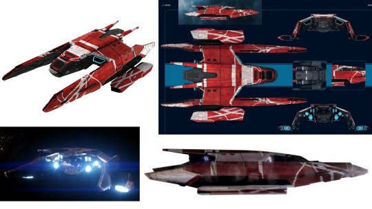
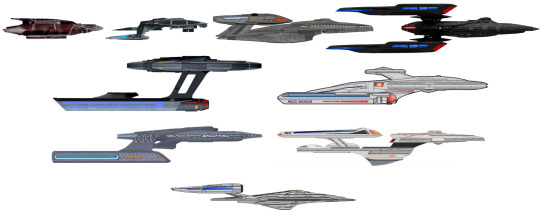
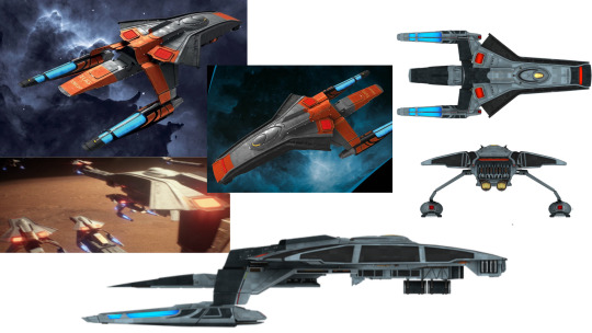
La Sirena (Kaplan F17 speed freighter)
La Sirena is a whole different shape than normal ships because we’re looking at a freighter instead of a big starship, but she’s the hero ship of the show, so we’re covering her! The red color and white stripes are nice. She looks a little like a cricket, with wings and antennae that swoop back very efficiently. If not for the smaller size, we could see this ship in Star Wars. Mostly, it’s clear by her looks that she’s utilitarian but still has that need for speed.
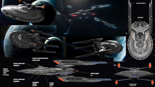
USS Nightingale (Wallenberg class)
We see some more nice colors, this time in nicely complementary turquoise and orange, in the fleet of Wallenburgs we see evacuating Romulus. Their compact, LEGO-like structure makes them solid little things, which makes sense because they were meant to tug other vessels or cargo containers. We also see two slight variants in the design (one a little bigger than the other), which is always good for variety’s sake.

USS Zheng He (Inquiry class)
We see roughly one million of these things at the end of season one Picard, though purportedly there are like three slight variations in the design. Collect them all! When you think about where the Federation is at (post Borg attacks, post Dominion War), it would make sense to just crank out the same ship on an assembly line. Eagle-eyed fans may see something like these oyster shells with nacelles in the Star Trek Online MMORPG game, though we must admit that those pylons that angle forward like a turkey aren’t the prettiest things.
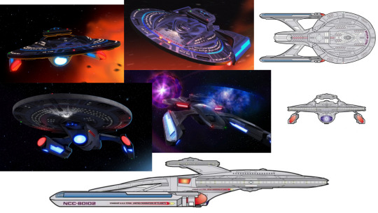
USS Stargazer (Sagan class)
Somehow we have a new Stargazer just to be confusing. Like the old Stargazer, it’s got the four-nacelle look. It’s like someone made a Constellation class ship but with the Sovereign class aesthetic, so that’s kinda interesting. We suspect it was designed to look like it could be a kitbash, except that it’s all CGI new. I’m left thinking this was all just a nod to the fans, which I could go either way on.

USS Cerritos (California class)
Speaking of ships that are all CGI, let’s look at some more animation! The California class seems unnecessarily huge for its role, at least to me. It’s over 100m longer than a Sovereign class ship, and the biggest hero ship of a show so far, mostly thanks to it’s incredibly long pencap nacelles. Overall, it kinda looks like a cartoon scooter. It’s fine; I’m not gaga over it or anything. But really, what’s the in-universe reason why it’s so big?
USS Titan (Luna class)
Riker gets a leg up every so often in Lower Decks, and we finally get to see the canonical design of the Titan that he’s at the helm of in a bunch of novels. It’s a little like the Voyager and the Reliant had a baby. It’s got that crow’s nest section and underslung nacelles of a Miranda class, while having the sleek, futuristic look of any of the more recent ship designs we’ve seen. We’re digging it.
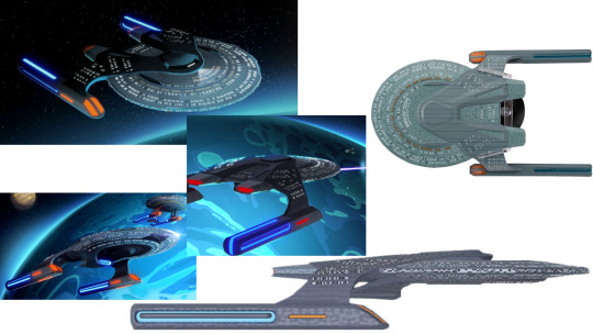
USS Vancouver (Parliament class)
I may have misspoke on the podcast about which ship on Lower Decks this one was because all the CGI kinda runs together for me. This is the one Tendi and Rutherford are enamored with in “Cupid’s Errant Arrow.” Tendi calls it “the greatest ship I’ve ever seen,” but I’ve seen better (just keep reading this list for one!). We find the Parliament class to mainly be a trimmed-down Nebula class without the table on top. Like California class, it’s also needlessly huge, with the biggest saucer section in Starfleet. For reasons!
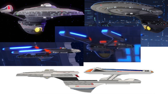
USS Archimedes (Obena class)
Sigh. Sonya Gomez’s little ship is literally just an Excelsior class with a little extra stuff it didn’t need. Like we said about the Enterprise-B: you messed up an already perfect ship when you didn’t need to. We’re a bit disappointed in how the Lower Decks designers updated one of our favorite designs, chunking up some of the smooth lines with rough edges. Our beautiful luxury cruise liner now looks more like the rows of balconies on an apartment building, and we’re pretty displeased.
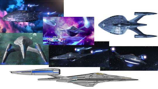
USS Protostar (Protostar type)
Here’s the good news! We’re big fans of Prodigy on this podcast, and also big fans of its beauty queen of a ship, the Protostar. It’s got a really sleek, spade-like shape to it and it just looks so smooth and shiny like someone’s been polishing it incessantly for years. The bussard collectors are just flat disks, which is new. The deflector dish just looks like a strip, like on the Defiant. It’s a smiley, happy little corvette of a ship and we’re into it!

USS Archer
These next ones are the newest ships on the block, so bear with the relatively few screengrabs from Strange New Worlds that are available since there’s no model kit to refer to for these ones. We get mere glimpses of the Archer in episode 1, and we can tell that they went with the one-nacelle style of something like the Kelvin, but it’s unclear just how well-attached that neck is based on the couple of angles we see. It’s like they took the infamous Freedom class and made it a little less utterly ridiculous. A little.

USS Farragut
And lastly, we finally get a look at Jim Kirk’s first ship, the Farragut, and she looks a little like the Kelvinverse’s take on a Miranda class. The nacelle pylons are rounded, like everything in the Kelvin movies is rounded (but we opined on this last week, so let’s move on). Mostly, this ship just looks clunky. It’s a little like someone tried to streamline a Miranda class, with its single hull and underslung nacelles, but managed to lose all its charm while doing so.
—
And those are all the Federation starships we have on the lot until we get a new shipment in! We’re sure to see more in the future, so keep watching this spot. We’ve also got more ships on the way in the coming weeks as we detect some alien ships in the vicinity! And as always, make sure you’re also following along with our watch through Voyager (we’re almost halfway through already!) on SoundCloud or wherever you like listening to podcasts, hail us on Facebook and Twitter, and set course for the shipyard! Engage!
#star trek#star trek podcast#podcast#starfleet ships#starships#picard#lower decks#prodigy#strange new worlds#la sirena#nightingale#zheng he#stargazer#cerritos#titan#vancouver#archimedes#protostar#archer#farragut
24 notes
·
View notes
Text
Strangled and Mangled: Classicism and Its Ersatz After Architecture’s Commodification
N.B.: All images, unless otherwise stated, are of my own making. Additionally, if you are having difficulty with parsing the images’ captions in this post, you may want to try viewing this same article on Medium.
If you have ever enjoyed and appreciated the special insights and emphases of my writings, I would encourage you to support me on Patreon! Most of the essays I write are so particular in their subject matter, and so committed to preserving the integrity of my authorial voice, that publication elsewhere is often out of the question, and so I opt for self-publication.

A local example of excellent classical modeling around the base of a column, found on Gainsborough Street in Boston, MA. Despite advancements in industrial production, many new buildings with classical pretensions will cut corners, or employ people bereft of the relevant formal knowledge.
The following can be considered complementary to my series on the Dark Souls series, Bloodborne, and Sekiro, entitled Putting Names to Built Things, the entries for which can be viewed by clicking here.
It is not difficult, when treading the relatively casual discursive spheres of architectural observation and criticism, to find many instances of designs for élite clientele being mocked for formal ugliness, stylistic ignorance, and architectonic ineptitude. Many of these designs have pretensions of classicism (that is, of the Greco-Roman variety), meaning that such criticism can draw from well-established stylistic rules or suggestions. What is rarer to find is an equivalent scrutiny regarding common architecture. This discursive rift is understandable yet problematic: on the one hand, it makes sense that people will find special delight in pointing out the ineptitude of wealthy persons’ taste (which, I would argue, has been a commonality only since the so-called Victorian period’s free-for-all destruction of a coherent classical tradition); on the other hand, the overt focus on “exceptional” sites reinforces a long-standing preoccupation with the 1% of things within architectural studies, to the general exclusion of what most of us encounter day-to-day.
Classicism today, or what remains of it, typically exists in a state far more dire than anything the Victorians could have imagined doing to it. Rather than see it twisted, turned, incised, and scooped out by designers under the delusion that, with enough arbitrary tweaks, a totally new style might emerge by chance, we rather see it paraphrased or mutilated in cheaply assembled new buildings or in a grim life-support state as the vestiges of prior designs. As someone who lives in Boston, a city with an abundance of buildings built during the late-19th and early-20th century, I see much of the latter; and so newer buildings do, on occasion, attempt to integrate into this environment by loosely conforming to some degraded vernacular. Correctives for either of these situations aren’t clear-cut. Usually, the more a building is made-over to keep it up to date, the further its appearance is jumbled about or demeaned by ugly materials (to say nothing of the expenses and labor involved); and a modicum of knowledge of classical detailing, and a team’s ability to competently execute it, is required for new building schemes with an integrative or “historical” objective.
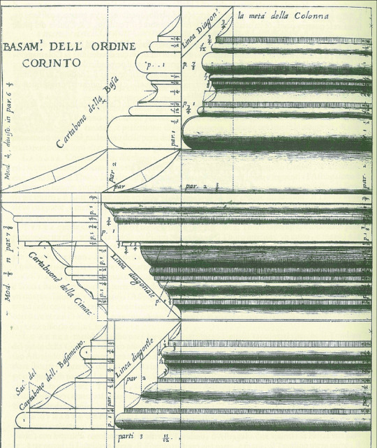
A drawing of a Corinthian order base, done by Vincenzo Scamozzi.
Exactly describing the classical style is not easy, but it must be stressed that none of its components come close to being a domain of esoteric or bewildering knowledge (like many things, the real complexities arise from arrangement). These are things schoolchildren could learn. A great deal of laypeople might associate classicism with, say, the usage of columns, or a certain profusion of sculptural ornamentation; and while these are, or can be, marks of classicism or its variants, among its further-reaching aspects are types and usages of moldings. Moldings are essentially horizontal bands with a dimensional characteristic — either rectilinear or curved, with varying depths and orientations. Each molding is an element of great simplicity which, through contextual application and iteration, acquires its status as a crucial characteristic of classicism, at its best and worst. Like other dimensions of classicism, too, once you are educated as to the types and historical uses of moldings, and once you work with them enough to internalize their properties, you can begin to adjust the implicit or explicit rule-sets for invention. To my mind, two of the greatest practitioners of this were the architects Edwin Lutyens and Richard Norman Shaw.
Martino Longhi the Younger, an Italian architect of the 17th century, went to the extent of claiming, “Whoever does not have, among other branches of knowledge, an understanding of the exceedingly important art of moulding cannot be called an architect.” Longhi’s claim, of course, has limited contemporary application, since he was practicing within a culture and a time when the classical paradigm was normative; but the fact such an assertion could have at one point been made — and that its sentiment was shared by other practitioners, before and after — demonstrates its assigned artistic importance, equal to matters such as intercolumniation or superimposition. Michael Hill and Peter Kohane’s paper, “The Signature of Architecture”: Compositional Ideas in the Theory of Profiles, explores how the once-popular idea of columnar proportions and divisions being an analogy for the human body had a parallel in the physiognomic idea that profiles were alike facial profiles of various affect. Jacques-François Blondel, for instance, argued that “the facial resemblance enabled the spectator to quickly apprehend what is pleasing or otherwise about the cornice. …the face was there for theatrical reasons, to be seen by the building’s audience.” Before him, Augustin-Charles d’Aviler wrote (anticipating the notion of architecture parlante) that “[just] as the combination of characters makes an infinite number of words in different languages, so by the mix of mouldings can one invent distinct profiles for each of the Orders.”

Two drawings by Jacques-François Blondel, comparing a couple of Tuscan order profiles, one by Scamozzi, the other by Palladio, and situating them within a physiognomic framework.
As with a number of other intellectual domains, these analogical elements were gradually phased out, alongside metaphysical concerns, as cultural relativism became the order of the day. Today, the physiognomic aspect might be considered especially suspect, given its proximity to anatomical, or racial, prejudice (although the term has enjoyed a very recent resurgence in popularity on platforms like TikTok, perhaps because it can complement sun sign astrology’s typologizing of personality). Hill and Kohane identify Charles Howard Walker’s 1926 text, The Theory of Moldings, as “the last book on the topic.” As they explain, “The book is practical, with no mention of earlier theorists, nor any discussion of the relationship of mouldings to the face or the body; other than prescriptions for cornice ‘facial angles’, which probably derives from Jacques-François Blondel.”
Just as significant as the deprivation of profiles’ symbolic value is the fact that the bulk of architecture students now are not taught anything about profiles, even from the perspective of “practicality” — nor are they taught the intrinsic value (and pleasure) of drawing, as distinct from angular-centric computer modeling. If one were to ask our average architect to draw a small arrangement involving the Doric order with competence, and without an external point of reference, they would be unable to do so. Such information, although readily available to anyone looking for it, has long been relocated to an area of superfluous considerations, alongside forms of ornamentation, deepening an artificial rift between “legitimate” and “classical” architecture. Profiles have rather become the domain of cabinetmakers, trim installers, or some form of interior designer, although this specialization has been by no means a guarantee of competence.

Classicism transformed, wielded with imagination and tact. Central Congregational Church, Newton MA, designed by Hartwell and Richardson. Here, the elements of an enriched entablature have been put into a rustic format, giving the effect of the layers phasing in and out of a sheath.
Classicism’s system of moldings is accompanied by a system of alignments and positions involving posts, lintels, and fenestration. As a classical structure grows and each component is put into place, it asks for a relevant response and optical relationship. Again, there is wiggle-room within the creative process once one has graduated to competence. But there are certain rules which ask for regular adherence: for example, the rule which requires that a column’s outline (given that the column’s entasis has not been deliberately exaggerated) aligns with the first fascia of the architrave; or the rule which requires the column to be positioned so that the capital is not under, but extends a certain distance beyond, the architrave.
It should be stated that there is quite enough modern-day classicism so committed to a kind of prim accuracy that the results are simply myopic expressions of core rules, such as the work of Quinlan Terry, or Michael Dwyer. This work is deficient not in competence but in imagination. It is correct, fine, and unremarkable. The trick to mastery would appear to be finding the unteachable midpoint between Lutyens’ apparently paradoxical statements that, “You cannot copy: you find if you do you are caught, a mess remains”, and that, “You cannot play originality with the Orders. They have to be so well digested that there is nothing but essence left.” Our focus here, however, is not unimaginativeness but incompetence, ignorance, and forms of degradation — makeshift, renovative, professional, industrial.

A portion of the exterior of the W. J. Sullivan House, Brookline MA. Despite a fairly ugly exterior, the house’s designer provided some amusing flourishes, such as this chair rail molding reappearing between a salient, recalling the various solutions to the problem of corners during the Italian renaissance.
A few more comments. Although cultural relativism has had a hand in freeing up assessments, theories, and practices from certain constraints, it has had the additional effect of making it very easy to believe that, after a point, classicism was holding on simply by way of convention (local, national, imperial) or according to socioeconomic pretensions to taste (I would reiterate that the new, house-proud middle-class, and the aimless architects, of the 1800s more or less obliterated any sense of what proper classicism is, with the effect that today’s élite really have no more of an idea of what an entablature should look like than the column- and gable-desiring lower classes). To be sure, these were, and are, sustaining factors; but they do not fully explain the incredible persistence of classicism. I believe that the relativist sentiment can only be upheld by people who have not spent significant time doing classical designs themselves. Get in deep enough and you might begin to sense that this system really does hold a sort of inherent aesthetic perfection, an almost inevitable rightness that, after a while, becomes as natural and sensual as the human body.
What I mean to do with this mini-essay — actually more of a brief tour with a preamble — is not provide a reason for why any of this matters. Readers will have to do (or not do) that for themselves. I am not going to indulge an imaginary debate over whether or not taking common facades to task for their aesthetic disasters is class warfare (in these instances, however, given the sites, it is probable that most of the private buildings depicted have fairly high monthly rents). Nor is my intent to make a hard correlation between a form of external propriety and residential, or public, happiness. It is rather to illustrate how the vast majority of what we directly, civilly perceive as deriving from Greco-Roman classicism has been degraded into the crudest, barely composed forms — and to ask if it might not be better to omit these details altogether from renovations or schema if they are going to be so tortured and blunted. It is my opinion that cheaply made and ineptly executed classicism is far less preferable than any adequate “modernist” design. Classicism, by nature of being distinctly composed of standardized modes of articulation and units of assembly, gives us an executional baseline. Anything below this baseline merely impresses a discrepancy. Modernist architecture has no such baseline, no such codification, even if there is a common canon of its practitioners.
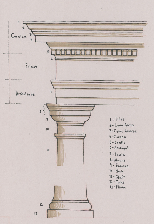
A visual point of reference for a standard classical profile. Note that, even within this example, there are certain alternatives present, such as the architrave having two, rather than three, fasciae; and that certain forms, and their terms, are not included (such as the ovolo, scotia, or cavetto).
With all that out of the way, let’s begin. You can use my drawing, above, as a point of reference for arrangement and terminology; but please also refer to other diagrams online which are sure to have more information. And be sure to enlarge the photographs if the captions are illegible.

1
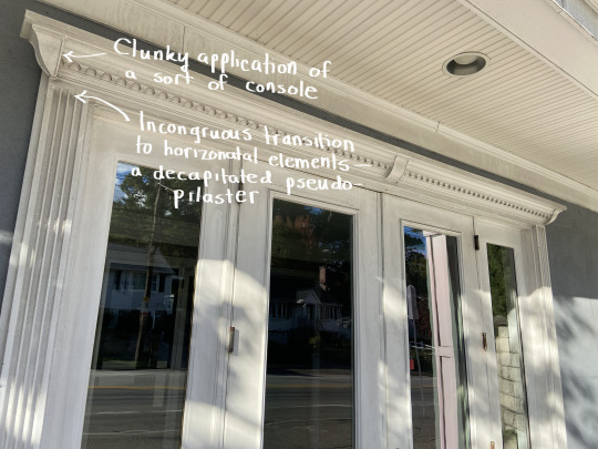
As with some of the other examples, it’s difficult to tell if this building had a prior appearance and if its current state crudely reuses, or “renovated”, some external structural details, or if it was entirely designed this way, so haphazard is its assembly, so slapdash its detailing. A vaguely classical surround frames the entrance with pseudo-pilasters missing their extremities. Consoles have been mashed into the middle and sides of the surround’s top, and the side consoles’ “hovering” bottom-tips highlight the pseudo-pilasters’ headless state. The entablature is nonsensical — a cornice with an overly large corona, and a slightly smaller duplicate of that below. The columns are unrelated, having no classical character, and being set too far in from the side of the lintel they are supporting.

A diagrammatic portion of a Doric order. Taken, and edited, from Pinterest.
Note the orange line I’ve drawn on the diagram above, showing how there is a continuous “line” conforming the column’s upper portion to the side of the architrave (at least that of its lowest fascia), and then to the frieze’s side. Note, too, that the column’s capital consequently protrudes past the architrave, rather than being all under the lintel. These are a couple of core attributes of classicism, the absence of which generally indicates that the designer has no idea what they are doing, or that an inconsiderate, abusive renovation has pushed the classical elements to do what they are not meant to do. We will see many instances of this mistake hereafter.

2
It is almost certain that the bay projection on this house once had a strong cornice above it. As the owner(s) proceeded to “update” it over the years, this cornice may have been in a deteriorating state and was removed, but not replaced, with the rest of the projection’s top covered over with shoddy laminated roof shingles. I’m tempted to venture the guess that most of the courses with dentils here are replacements, but it’s not clear. What is clear is that there is too much dead space above the bay and upper story dentils. Moreover, the dentils do not emerge from a molding but are each a thin block stuck to a board’s underside. They look flat, lifeless. They are a child’s project. One cannot even say that these upper jaws are “snarling.”

3
Designs such as this one are so ridiculous that it is frankly extremely difficult to not imagine it as having been conceived with a condescension verging on subconscious contempt (similar to Robert Venturi’s Guild House, originally capped by sculptural TV antennae, mocking the inhabitants for their “chief pastime”). What is more likely is that it is a cheap and inept attempt at bridging the “southern colonial” look with a modern housing block. Why have the classical details at all, though? The columns — pornographically stretched out to Fun Size, and bereft of entasis — are like a bad joke that’s worn out a tepid welcome, and the pediment is just dumb, with its raking cornice sliding clear past the lintel below, its body covered by clapboards. Of particular unfortunate note is the detail of the lintel above the columns “clipping” through the abacus of each.
4
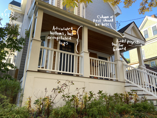
Classicism here assumes a highly reduced appearance (as with so many houses, a curvaceous cyma is retained for the gutter cornice), yet still asks for certain responses to its calls. The rectangular posts have singular base moldings, but no capitals; and, again, they are out of sync with their lintel — especially where it protrudes to match the pediment’s projection. The reductions, or abstractions, of this design do make it a little less offensive to my eyes, and I might not have stopped to take this photo at all if the silly pediment, and the problems it brought along with it, weren’t included.
5
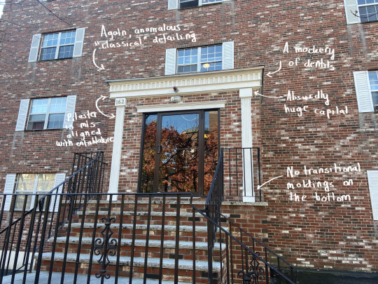
I’m not sure if this is or isn’t uglier than the third example, but its similarly anomalous (or nearly anomalous; the building’s sides are clasped by brick quoins) and inept classical details make one wonder why they were included at all, besides as a cheap, preemptive acquiescence to sentimental taste, as the out of place, non-functional window shutters additionally suggest. Despite having capitals and bases, the “pilasters” are barely an improvement over those in the first example, and are set too far away from the block’s edges. The entablature is brutal idiocy, with a row of pseudo-dentils maimed so badly that the section looks instead as if shallow rectangular impressions have made into the surface. I’ve seen gas station roofs styled as huge entablatures with more literacy than this.
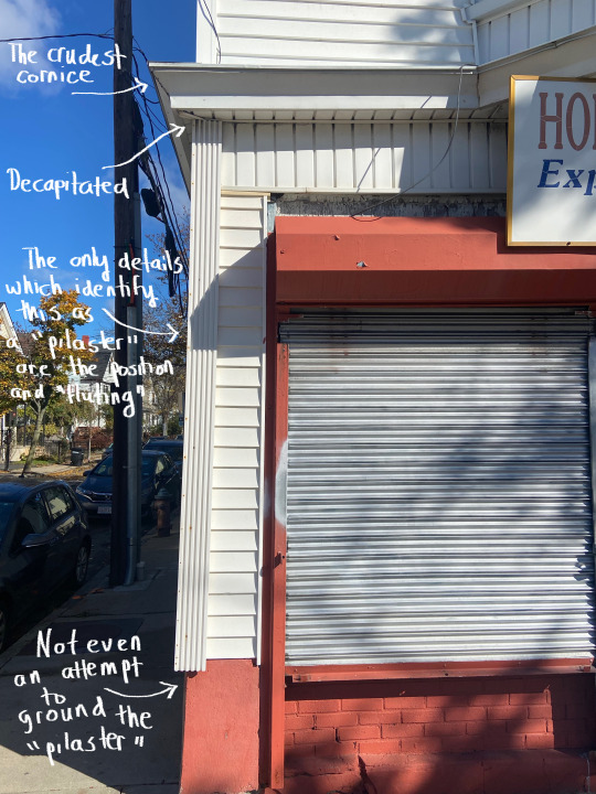
6
Zombie classicism, so deprived that it has retreated into an unconscious form of camouflage, several levels removed from the referents, all of its cracks showing. This may be the most dire example of the bunch.
7
A newer, mixed-use building. Oriels are not a classical element, but they have traditionally been visually, if not also structurally, supported by an underside of diminishing moldings, corbels, or consoles. The lack of either here, combined with the string course below appearing to jut out just as far, if not further, than the cornice, gives their sudden thrusting-out an absurd effect: too bottom-heavy and yet floating. The cornice makes a big deal of itself, despite having nothing to say. Its only organizational, formal principle is the sections’ gradual thinning as they near the top. There is a feeble attempt at suggesting corner pilasters on the building’s first story, comparable to the shoulder-shrugging posts from the first example.

8
One can find ample examples of entablatures and molded bands from antiquity, and throughout various phases of neoclassicism, which reuse certain ornamentation (such as the bead and reel pattern, or egg and dart pattern) in quick, adjacent succession. Dentils, however, have always been excluded from this duplicative leeway. Note how, in a photograph of a detail of the Triumphal Arch of Septimius Severus, dentils are indeed reused, but always within a different zone on the structure: first, at the arch’s imposts; then, along the entablature; and finally below the cornice. Crude and arbitrary segmenting and modeling aside, the entablature here breaks this rule, looking even more ridiculous since its dentils are crimped as a pie’s crust is. The columns lack echini, and the oversized abaci look like cardboard boxes placed atop tubes.

9
A situation so grim that one resists the fact that it is a finished product and not a construction site. The entablature is a set of rickety chunks cobbled together, their sole pretensions to enrichment being the semblance of panels, echoing the dado’s pseudo-panels. It is curious that the columns utilize a different material and exhibit entasis, almost as if they are molds taken of prior columns. Again, this facade — the clapboarded rise beyond included — is such a hodgepodge that one has to wonder about the chronology of development. Was this once a Queen Anne-styled home, mutilated through renovation and now unrecognizable as such?

10
Classicism kept in a vegetative state when it has lost nearly everything that once made it whole. This portico would look so much better if all of the entablature’s vestiges were scrapped, replaced by a plain lintel, and if the posts weren’t poles. As it is, this is a surgically removed, rotting upper jaw, the overt mass of which goes against a minimalist supportive solution.
11
There is a bit of play here which identifies the design as more postmodern-classical than classical, at least within the realm of intentionality, yet the materials’ cheap appearance and the overall cartoonish, warbling tenor — the way an entablature has been suggested by abstract quotations of a blown-up cornice — merely call to mind the reality that the built-in exaggerations of postmodernism have ultimately led to an uncontrolled flood of kitsch. One often sees this sort of kitsch around outlet malls/centers, where gables, faux-chimneys, and hollow Italic towers have been propped up as if to offer scraps of “humanizing” design, all the while implicating the tradition-deprived mundanity and regurgitated tedium of persons’ consumerist lives.
12
An acceptable design lurks beneath this newer building’s fussy exterior. As I’ve remarked, the projected entrance block looks better if you squint your eyes, omitting the jumble of panels and strips. Once again, like the seventh example, the designer has replaced pilasters with vague and vapid substitutes, the “capitals” of which have no geometric relationship to adjacent element, and which are out of sync with the capital-molded posts above. Amazingly, however, the latter’s outlines are aligned with their lintel’s sides. The main block’s first story windows on the right are echoed by blind windows on the left, but these are very obviously not genuine recessions — rather, frames stuck onto the surface — and only detract.

13
Another nonsensical hodgepodge. Everything about the portico is wrongheaded. The paired columns are not only set too far in from the lintel’s edges but have differing positions relative to one another — and they are too visually weak relative to the enormity they are upholding, similar to the tenth example. Such eaves asks for bold, rustic piers. Perhaps the owner(s) wanted as much shelter as possible, which may explain the eaves’ extent, but nothing about the solutions here are elegant or formally coherent, and the columns’ classicism appears desperate.

14
Not as bad as the sixth example. Still, pretty bad. The square columns’ capitals are meager to the extreme. They might work on a fence’s main posts — not as the caps for a building’s prominent structural device. And nothing about what they support is worthy of being seen.


15
This monstrosity of a gaffe provoked a double-take. Despite being a newer building, the portico is hardly any better than the last one shown. Correct modeling on the columns can’t hide their incorrect positions. The entablature, with its blundering triple-threat stack, is laughable — a protuberance with all the stylishness of a bellowing burp. What it brought to mind, actually, are photographs of a shockingly ugly mansion in Sandton, Johannesburg (see the second image). Anyone with an informed eye knows that this is the polar opposite of sophistication.

16
Not much new to say here, except that this example is particularly baffling, since there is a point of reference next door. Columns, yet again, aren’t where they should be, the architrave is missing at least one fascia, the dentils are badly spaced, the cornice is too flush and flat, and the entablature as a whole has been contorted into a boxy mold. I just don’t get how stuff like this happens when all you have to do is look to your right.

17
All pretension — no discrimination. This portion of a Newton residence was more recently executed. The rest of the house, which has been altered/renovated to different degrees, appears to have once been of a sort of late-19th or early-20th century “free classic” variety. Metal Corinthian columns (now showing signs of rust) have been used, but nothing else is recognizable as the Corinthian order — or, really, as any sort of order. The entablature is an omissive pseudo-entablature, and the pediment’s size asks for its vacuous tympanum to have some kind of infilling or relief work.
18
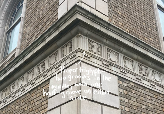
This is our last stop today. Many more examples could have been used, but after a while the faux pas are so consistent that commentary becomes redundant. Because they are barely underneath the entablature, it is unclear if the posts mean to be engaged square columns or pilasters with too much dimensionality. As either thing, they are four absurd interjections, symbolically and structurally unmoored. The frieze’s triglyphs have four grooves — one too many. Triglyphs are named such because they have, literally, three (tri) carvings, or grooves (glyphs). Expressed correctly, a triglyph has two “whole” grooves incised onto the main body, and then a half-groove on either side — coming out to three grooves total.
I hope that this tour has been educational and engaging. I also hope that it has not given you the impression that the wielding of a discriminating view is done to detriment of the viewer; rather, I believe that explorations like this have the ultimate effect of helping one grow into an appreciation of architecture well-done all the more. The eye is transformed for the better. It is likely that I’ll do another installment later on, if I can find enough novel missteps around the area. I’m pretty sure I can; and I’m pretty sure you can, too — unfortunately!
#architecture#boston architecture#architectural criticism#classical architecture#neoclassical architecture#vernacular architecture#architectural history
12 notes
·
View notes
Note
Helion cannot die, he must live a peaceful life with the lady of the autumn court (PLEASE SOMEONE NAME THIS WOMAN) !!!
Azriel is possessive, so he didn't date Helion and Mor, so I also think he would be a Scorpio. Sharing is not his thing... That can make him possessive, look at how he acts when this is Elain. and I say more, Elain must be a Taurus, which is why he's so attracted to her. Complementary bets lol. And let's face it, azriel doesn't have feelings for Elain, he just feels horny for her. Only that.
theres sm to unpack here but i love it.
i rlly don't want Azriel to be a scorpio, as you can see i'm very traumatized when it comes to them😭you can check this and this post to see what others think Az's big three is. Rhys is a scorpio though and did offer Feyre a threesome with him and his brothers in the sauna during Winter Solstice. my ex also may or may not had also suggested that we open up an onlyfans account with some "solo rolpay shots" of me🤦♀️idk how i haved kms yet. anyways! therefore i think scorpio males are territorial but are also prone to share just as long as they make clear what's theirs. as for females idk, i've only met one.
i think it's interesting that you think Elain is a taurus because i, personally didn't view her as one at first, but it would make sense. taurus' and libras are both Venusian signs, which evolves around the aesthetics, beauty, and love. it seems like everyone and The Mother is attracted to Elain since her beauty is mentioned many times so it would make sense if she was either of the two.
i love you for saying that "he only feels horny for her"💀that male doesn't know what he wants, he just needs to get laid.
2 notes
·
View notes
Text
The 2016 Auckland Unitary Plan (AUP) upzoned 3/4 of the city’s residential land to legalize townhouses, terraced homes, or multi-story apartments in areas that previously only allowed detached single-family homes, helping to reverse decades of successive downzonings that had occurred as recently as 2005. This makes Auckland perhaps the largest real-life experiment of what broad-based upzoning can achieve in an expensive, supply-constrained city—and in the 7 years since the implementation of the AUP, residential construction has skyrocketed. The total number of housing permits issued smashed previous records, while permits for the multi-unit attached housing projects legalized in the AUP went from only a small percentage of overall construction activity to the city’s dominant source of new housing.
In fact, upzonings in Auckland and elsewhere in New Zealand have set off a massive construction boom throughout the entire archipelago. In 2023, New Zealand (population: 5.2M) permitted 37k housing units, more than the San Francisco and Los Angeles metro areas combined (population: 17.3M). Auckland, a city of only 1.7M, permitted 15k units last year—while preliminary data shows the 5 boroughs of New York City (population: 8.3M) permitted a meager 9.2k units by comparison. In total, New Zealand permitted 9.7 new housing units per 1000 residents in 2022, a 45-year-high that was nearly double the rates seen in the US.
So over the last decade-plus, what has been the economic effect of these upzonings in Auckland and other parts of New Zealand? The best evidence comes from a series of academic papers by Professor Ryan Greenaway-McGrevy at the University of Auckland and comprehensive data tracking done by Matthew Maltman at Australia’s E61 Institute. Despite some early back-and-forth academic quibbles, the evidence is overwhelmingly clear that upzonings have significantly increased housing production—the AUP is estimated to have created more than 43k extra housing units from 2016-2022, while the Lower Hutt upzonings increased total Wellington region housing starts by 12-17%. That, in turn, has significantly improved housing affordability—rent-to-income ratios in Auckland have significantly declined even as they have steadily risen elsewhere in New Zealand.
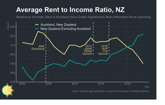
The AUP also represents an instructive case study for the modern housing discourse that pits upzoning as a market-based solution in opposition to direct government action like rent control or public housing. New Zealand’s experience shows the two approaches are complementary, not contradictory—a post-2017 political push for more state housing construction, combined with the upzonings in Auckland and elsewhere in New Zealand, has driven public housing permits to record highs. While the government came nowhere near meeting its ambitious national public housing goals, Greenaway-McGrevy estimates that AUP reforms nearly tripled public housing construction in Auckland. That construction boom has been especially important for the indigenous Māori, who make up 40% of public housing residents, and Pacific peoples indigenous to other islands, who make up another quarter of residents.
KiwiGODS... I KNEEL
0 notes
Text
In today’s fast-paced digital world, mobile apps are necessary for businesses to stay relevant and competitive. However, developing a successful app requires more than an innovative idea and technical skills. It also requires funding from investors who believe in your vision. But how can you find the right investors for your new mobile app?
As a freelance mobile app developer, In this blog post, I’ll explore various types of investors and share valuable tips on gaining their trust and securing funding for your next big project.
Types of investors
When it comes to finding investors for your mobile app, there are several types you can consider. The type of investor you choose will depend on various factors, such as the stage of your business and the amount of funding you require.
Family and friends may be the first type of investors to come to mind. They can provide seed money or initial investment without requiring a high return on investment. However, investing with family and friends can also lead to complicated relationships if things don’t go well.
Another option is co-founders who share your vision and invest their time, skills, and resources into building a successful app with you. App contests offer another great way for entrepreneurs to get noticed by potential investors while receiving feedback from experts in the industry.
Crowdfunding platforms like Kickstarter or Indiegogo allow startup owners to showcase their ideas directly to users who pledge money towards its development in exchange for perks or equity shares. Angel investors and venture capitalists are traditional options that typically provide more significant amounts of capital in exchange for equity ownership.
Hire freelance mobile app developer like me for your next project, as i have years of experience in same field and developed more than 50 appd i can suggest you in every aspect of the project.
Each type of investor has its unique benefits and drawbacks that should be carefully considered before making any decisions concerning mobile app development services.
Family and friends
When finding investors for your mobile app, one of the most accessible places to start is with family and friends. These individuals already know and trust you, making them more likely to invest in your idea.
However, before approaching your loved ones for funding, it’s essential to have a solid business plan in place. This will help you present a clear vision for your mobile app and show that you are serious about its success.
It’s also important to be transparent with these potential investors about the risks involved in investing in a new venture. Make sure they understand the potential rewards as well as the potential losses.
When asking family and friends for investment, consider offering them equity or shares in the company instead of simply asking for a loan. This can make them feel more invested and motivated by their stake in the success of your mobile app.
Remember that even though these individuals may be close to you personally, treat this opportunity as professionally as any other investor meeting.
Be prepared to answer tough questions and provide detailed information about your plans for development and growth.
2 Co-founders
Co-founders are individuals who share the goal of starting and running a business. Regarding mobile app development, having a co-founder can be beneficial as it allows you to divide the workload and bring different skill sets to the table.
When looking for a co-founder, it’s essential to find someone who shares your vision and passion for the project. This person should also have complementary skills that will help drive the success of your mobile app.
You must establish clear roles and responsibilities from the outset so both parties know what is expected of them. Communication is vital in any partnership, so schedule regular check-ins with your co-founder.
3. App contests
App contests are a great way to get your mobile app in front of investors. These contests can be organized by tech giants like Google and Apple or smaller organizations dedicated to promoting new apps. In these contests, developers submit innovative ideas for new apps, and judges choose the best based on various criteria.
Winning an app contest not only brings recognition but also allows startups to showcase their product to potential investors. It’s essential to research before submitting your app idea to a contest, as each contest has its own set of guidelines and requirements.
4. Crowdfunding
Crowdfunding has become a popular way for startups to raise funds, and the mobile app development industry is no exception. With crowdfunding, startup owners can pitch their ideas to a large audience of potential investors interested in contributing money towards the app’s development.
The process starts with creating a campaign on one of many available crowdfunding platforms, such as Kickstarter or Indiegogo. The campaign must include an engaging video that explains what the app does, how it works, and why people should invest in it. It also needs detailed information about the project’s goals and how much money is needed.
5. Angel investors and venture capitalists
Angel investors and venture capitalists are two types of investors that startups often seek out for funding. Angel investors typically invest in the early stages of a startup, providing seed capital to get the business off the ground. They usually invest their own money and want to see your business succeed.
On the other hand, venture capitalists are institutional investors who manage funds from large corporations or wealthy individuals.
Steps to gain the trust of investors for mobile app development
1. Validating your idea is the first and most crucial step towards finding investors for your mobile app. Your idea might seem perfect to you, but it’s essential to ensure a market demand for it. You can’t expect investors to fund an untested concept.
The best way to validate your idea is by conducting thorough market research. This means analyzing trends, identifying potential competitors, understanding customer needs and preferences, and assessing the viability of your business model.
2. Identifying the right market is one of the most critical steps in finding investors for your mobile app. It would help if you were sure there is a demand for your product and that you’re targeting the right audience.
Start by researching who will benefit from using your app. Look at similar apps in the market and see what demographics they target. Consider age, gender, income level, interests, and location.
3. Define the market size.
Defining the market size is crucial in finding investors for your mobile app. It helps you determine the potential demand for your product and estimate its revenue-generating capacity.
Before launching your app, it’s essential to identify the target audience and evaluate its size. This will allow you to tailor your marketing strategies and present a realistic growth plan to potential investors.
Choosing the right app development partner is crucial to ensure that your mobile app is developed with quality and efficiency. Here are some tips on choosing a reliable app development partner for your project.
First, ensure that the company has experience developing apps similar to yours. Check their portfolio and see if they have worked on projects similar to what you have in mind. This will give you an idea of their expertise and whether they can meet your requirements.
To successfully secure funding for your mobile app, it is essential to understand the basics of investment. Firstly, you need to know that investors are taking a risk by investing in your idea. Therefore, they will want to see a return on their investment.
It’s essential to prepare yourself before approaching investors. It would help if you understood how much money you need and what percentage of ownership you’re willing to give up in exchange for the investment.
Freelance mobile app developer can help you in every aspect of a project and hiring a freelance can also be proven as a budget friendly idea.
Finding investors for your mobile app startup is a challenging but exciting process. It requires thorough research, validation of your idea, and building trust with potential investors.
Remember that there are various types of investors you can approach, such as family and friends, co-founders, app contests, crowdfunding platforms, angel investors or venture capitalists. Each investor type has its own advantages and disadvantages.
0 notes
Text
Freelance Your Way to Success: Career-Building Hacks Uncovered!

Freelancer, contractor, consultant, self-employed - these all have similarities but can be different as well. Working as a freelancer typically means you are self-employed and offering goods or services to others.
The best part about being a freelancer is that you can typically set your own hours as well as pick and choose who you want to work for. The bad news is that until you build your business up, you are likely to have times when you don't have any work.
Many people are giving up working for an employer altogether, and are working for themselves on a freelance basis. There are many advantages to this, including the possibility of flexible hours and control over what clients you choose to work with, and getting out of what could be a hostile work environment.
You need specific skills in order to work as a freelancer, as you will need to be clear about the service you are offering others. To ensure regular work, you need to prove you have what it takes to encourage businesses to hire your services.
Survey Junkie
Sign-up to complete surveys and other tasks for cash rewards.
Earn Now
We earn a commission if you click this link and make a purchase at no additional cost to you.
Networking
Now's the time to let everyone you know (business acquaintances, family, and friends) that you are now freelancing. This will help you build your network of potential clients. Be prepared to give your 30
second "this is what I do" speech to everyone you meet who asks you what you do. This is a very important way to network and advertise what you do. This is typically called an "elevator speech" (see Your Elevator Speech).
Ready to freelance your way to success? Discover the ultimate career-building hacks that will take your freelance game to the next level! Check out our latest blog post now! #freelance #careerbuilding #success #hacksClick To Tweet
Other key resources are industry and trade associations. Join the ones that make sense for your career and participate as much as possible. Taking leadership positions in these organizations can also help you grow your business.
Branding Yourself: How to Use Social Media to Invent or Reinvent Yourself (2nd Edition) (Que Biz-...
$24.99
Learn More
We earn a commission if you click this link and make a purchase at no additional cost to you.
02/21/2023 01:43 am GMT
Put the Right Infrastructure in Place
Sounds scary, but makes great sense. Ensure you create whatever legal entities you need to set up and run your business. Make sure you have a good understanding of any licenses or registration you may need in your municipality. A great resource for helping you figure out what you need is the Small Business Administration.
What about your website? Everyone looks to the Internet for finding whatever they need. This includes products and services. You must have a website where people can find you as well as read more about what you do. As you grow your business, add testimonials of those you've worked for. Recommendations are very powerful.
Build out your marketing plan. Advertising in local papers and bulletin boards placed in local businesses certainly helps. Another great idea is to see if you can set up a "How to" night with your local Chamber of Commerce or Public Library, giving some demonstrations on your service or product. This is a great way to advertise and to meet people.
Starting Your Career as a Contractor
$14.99
This incisive, practical guide provides a thorough breakdown of the ins and outs everyone needs to know when turning contracting skills into a business.
Buy now on Amazon.com
We earn a commission if you click this link and make a purchase at no additional cost to you.
12/03/2022 12:28 am GMT
Find Others to Work With
Partnering with complementary businesses can definitely help you grow your business. As an example, if you are starting a tile installation business, perhaps you could partner with a plumber. Or, maybe you are building a graphics design business - partnering with a marketing pro or a website developer might work for you.
One thought is to think about businesses, products, or services that either precede what you might offer or follow what you offer.
Keep in mind that it's not all about you. There are benefits for partners as well (they gain from your business network as do you from theirs).
Business Plan Template And Example: How To Write A Business Plan: Business Planning Made Simple
$4.99
Learn More
We earn a commission if you click this link and make a purchase at no additional cost to you.
12/04/2022 12:12 am GMT
Create a Business Plan
This can be boring and challenging but it is a necessity. You need to have a plan which includes funding (cash flow, funding equipment, and supplies, incorporating your networking and marketing plan, etc.).
Regardless of your location, the SBA is a good place to start to help you figure out what you need. You should also take a look at How to Make an Ecommerce Business Plan for Your Startup. Try not to over-build your plan, but don't leave out the important parts either.
Set Yourself Apart from the Competition
Defining your unique selling proposition is essential to gain a competitive advantage in your advertising. This could include offering exclusive products or services, providing discounts, or creating unique promotions that align with your marketing plan. It's crucial to identify and highlight these values that make your business stand out from the competition.
Marketing
If you already have a background in marketing, it is worth hiring out your services to small businesses. They may not have the know-how or the time to market themselves effectively, and you may have the skills to assist them with branding, and finding new ways to advertise their services, such as through social media.
I.T. Consultant
Part of being a freelancer is fitting yourself into areas where others struggle, and many business owners are reluctantly catching up with technology, even if they have no idea how to use it. Hacking is also becoming more prevalent, and a lot of companies are unsure as to how to protect their networks. So from servicing computer hardware to installing firewalls, you may have the I.T. skills that a lot of businesses lack.
Getting Started in Consulting
$19.95
$1.45
Learn More
We earn a commission if you click this link and make a purchase at no additional cost to you.
12/04/2022 12:35 am GMT
SEO Consultant
Businesses live or die depending on their online presence. Considering the competitive marketplace, they want to be at the forefront of internet search engines and not twenty web pages behind. If you know your way around SEO then you will be just the person managers are currently looking for. Ensure you get accredited with SEO certification to prove you are the right person for the job and give other businesses the online push they need to survive.
Our Pick
HireWriters.com
HireWriters.com is a premier content marketplace for writers. There is currently a huge demand for articles, blog posts, press releases and other website content
Start Writing
Writer
There are many forms of freelance writing, from bloggers to ghostwriters. There are many low-paid writing jobs out there, so don’t be short-changed when approaching prospective clients. As with most freelance jobs, it is worth building up a portfolio of writing, so consider writing for free for a short time until you have something to showcase. You can advertise your services on sites such as Upwork, but be aware that the competition is high, so you will need to know how to sell yourself.
Our Pick
Going Pro: How to Make the Leap from Aspiring to Professional Photographer
$29.99
$22.90
Buy Now
We earn a commission if you click this link and make a purchase at no additional cost to you.
12/04/2022 12:28 am GMT
Photographer
There are a lot of people setting themselves up in photography, but many are complete amateurs who don’t know one end of a camera from another. However, if you have a good eye for a picture, as well as the photoshopping skills to enhance your work, then you may make a good name for yourself. Wedding photographers, in particular, make a lot of money, so this could be a profitable business.
Our Pick
Starting Your Career as a Freelance Photographer
$19.95
$15.98
Buy Now
We earn a commission if you click this link and make a purchase at no additional cost to you.
02/21/2023 03:38 am GMT
Taking the leap
If you have decided that you want to give up your 9-5 role and try to make it as a freelancer, then congratulations.
One that many others have made successfully before you and with the right strategy and a bucket load of motivation there is no reason why you cannot carve yourself out a successful career as an independent worker too.
The one thing to get straight in your mind, first of all, is that choosing to break away from the normal 9-5 life is not choosing the easier path. While you are indeed in control of the hours you work and there won't be anyone there looking over your shoulder, you might well find yourself working longer hours than before in an attempt to make a name for yourself and become established.
The thing about being a freelancer is that the only person you have there in the office that you can rely on - is you. There are no colleagues, no boss, and no friendly faces to help bear the burden.
There is you. Just you.
If you want to take Monday off, then that's no problem – just remember that when you are not in the office – no one is. When you are not at your desk making money then there is nothing coming into your business.
Of course, knowing that you're doing something off your own back that has been created through your own hard work is hugely rewarding and this is one of the main reasons why people decide to go freelance.
Flexibility and freedom are the watchwords when it comes to freelancing and these are often the things that established freelancers say they would never give up.
Working From Home: Making the New Normal Work for You
$22.00
$16.02
Working from Home: Making the New Normal Work for You provides readers with a detailed strategy on how to turn working from home into a powerful career choice.
Buy from Amazon
We earn a commission if you click this link and make a purchase at no additional cost to you.
03/02/2023 04:54 pm GMT
Not having to commute to work and potentially spending hours stuck in traffic are major plus points. Just remember that working from home means that in a way you are pretty much always in the office and it can be hard to separate home and work life. It's important to get the right balance otherwise it won't take long for you to burn out.
Being able to budget when you first start as a freelancer is also a difficulty that people might not immediately be prepared for. Remember that you'll no longer have a set income, and not knowing exactly what cash you will have coming in at the end of the month can be incredibly difficult to get used to.
Speaking to established freelancers and agencies that specialize in supporting independent workers is a must. In fact, speak to as many people as possible in order to get a wide cross-section of views. The more the better!
Freelancing can be extremely difficult to break into, but once you have got a few clients under your belt and have some money coming in, things will no doubt seem a lot rosier.
(Re)Defining the Goal: The True Path to Career Readiness
$14.98
Buy on Amazon.com
We earn a commission if you click this link and make a purchase at no additional cost to you.
12/03/2022 12:31 am GMT
Read the full article
0 notes
Text
3 tips to solve conflicts in your business
Knowing how to resolve conflicts is part of the daily work of any businessman or entrepreneur. Conflicts are something natural in society and therefore also in the company, which can cause lower staff productivity and a bad environment. The conflict arises from opposing opinions, and its origin may be small disagreements. But knowing how to resolve conflicts will allow you to have a stronger team and be a leader who gives your workers more security to express their ideas and problems. You will also be able to know how workers think through expressing their ideas and emotions during the conflict. That is why it is essential to have clear and solid leadership and apply the following tips to resolve conflicts:
1. Study the origin well, to be able to face it in a more rational and less emotional way. If we study the origins, it will be easier to prevent than to solve conflicts. For this, it is necessary to see possible reasons that give rise to conflicts, such as, for example, resources that must be shared, setting up teams based on ways of being complementary and not opposite, taking care of communication so that envy or misunderstandings are not generated, establishing common objectives, avoid work environments with high stress and pressure to achieve results, assign tasks and responsibilities based on knowledge and skills, set clear policies from the Management, etc.

2. Learn to mediate between the parties in order to solve conflicts instead of increasing them. In addition to emotional control, mediation implies understanding the point of view of each party, that is, empathizing. Only in this way will you be able to identify the problem from the beginning, instead of hiding it behind the personality of each side. It is important to avoid agreeing with one party to the detriment of the other, mediation must be done without favouritism, analysing the reasons objectively and rationally.
3. Search for individual solutions but that fit into the company and do not suppose precedents for the future. Instead of imposing oneself to resolve conflicts, which postpones the problem but does not resolve it, it is necessary to seek common points of agreement. Only in this way can partial agreements be reached that allow conflicts to be resolved at any time and in any area.
Your opinion is very important to us, so I invite you to leave your comments and opinions. And if you think that the post can be useful for other people, help us spread it through Social Networks.
0 notes
Text
I love Lannister POV chapters. Every single one is like "dear diary. woke up today angry and horny. drank eight glasses of wine for breakfast. a peasant came to court and asked for bread. gods they were so whiny, i could barely finish my lunch of swan and caviar. can't believe I'm so hated for no reason. better drink more wine. thinkin bout helping one(1) person today. i'm so sexy. I am repulsed when I look at my body however. my childhood hero came to visit in the afternoon - told me I was a massive disappointment. I threw a baby at them. gods I really am so sexy. why doesn't my dad love me."
#i must be clear this is a complementary post#golden disaster morons#House Lannister#cersei lannister#jaime Lannister#tyrion lannister#asoiaf
6K notes
·
View notes
Last Seen Blogs

fuckyou69695
Untitled

trashclownart
Trash Clown

chromatocloo
Watch out for bears
ʕ•ᴥ•ʔ

rabbit-illustrations
Rabbit-Illustrations