#i need an sf tag
Text
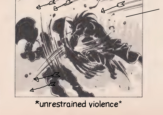
[CW: SUGGESTIVE OUTFIT]
I didn’t know if I was gonna post this originally, because suggestive stuff isn’t really up my alley, but here we are. Sketch was good, lineart was good, and the rendering wasn’t half bad so I’m throwing this to the void
Those fancy designer bunny suits are gorgeous, I’ve been looking at a lot of them recently just to see how people add to the original base of it, people get really creative it’s so neat!
I was originally gonna draw Rue but I’m trying not to draw them as much to reign in spoilers where I can, soooo I was left trying to somehow fit a suit over poor Solar Flare, it was like trying to dress up a toaster lmao
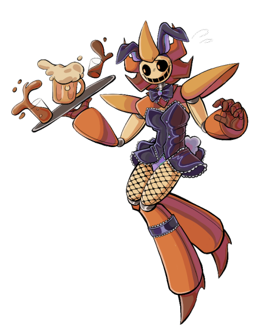
[ID: A digitally drawn image of Solar Flare from the Working for E.V.I.L. AU wearing a bunny suit and tipping over a serving tray of various alcoholic beverages, they give a nervous smile, blush on their cheeks. The background is transparent. Solar Flare is a boxy, orange, brown, and light yellow robot with a circular head, bent sun-like rays and large triangular shoulder pads. The outfit consists of a dark purple button up bunny suit, combined with a skirt, bow tie, and a rabbit eared-headband of the same color. /End ID]
#cw suggestive#tw suggestive#my art#working for e.v.i.l. au#working for e.v.i.l. solar flare#do… do I even use regular tags for this??#nahh I don’t want to be rude#I’ll just use my own#don’t need someone looking for sf art to get jump scared by this /lh#I think. for as cursed as it is. I might do a Bloodmoon ver#designing the suit was a lot of fun oddly enough#and for Bm I could include like. a lot of chains and belts and shit#anyways it’s like 3 am rn I’m going to bed
205 notes
·
View notes
Text
Just finished this Salvis fic called Camp Cornerstone and I am unwell about it
#like it didn't have a sad ending#but I need more#give me a second part#and a third#and a fourth#please#sally face#sal fisher#sally fisher#sf#sallyface#salvis#travis x sal#sal x travis#travis phelps#sal's tagging tag
111 notes
·
View notes
Note
So I saw the instrument ask and I hope this is cool to drop this question I’ve been puzzling over. If not just ignore this. I don’t have anyone else to theorize with.
I read a fic where all the au! Skeletons end up in the og world on the surface (classic scenario.) They use nicknames for each other but they have to register “legal” names with the government (for jobs and licenses etc.) Sans and Papyrus are already taken so they use other font names as for it. Ever since I’ve read it I can’t decide what names each would go by and I want your opinion.
There are only two I’ve decided on:
Swapfell Sans - Garamond
Underfell Papyrus - Roman (from times new Roman obvs)
But I’m going crazy trying to decide on any others and I seek your counsel.
I have a list of possible fonts but I don’t want to drop it on you because this ask is already kinda long but if you do want it I’ll send it. Sorry again for the text dump.
IT'S ABSOLUTELY ALRIGHT <333 I'd love to see if I can help out any :o!! (*grabby hands* GIMME LIST. I LOVE LISTS.)
What are your criteria and thoughts for picking fonts👀? Is it just Vibes or are there any specific reasons for the ones you've chosen so far :?
I really like Roman for UF!Papyrus... sharp, tight and snappy- full of straight lines and points... free of frills and loops but still stylish in it's own right! Also somewhat disliked in certain spaces PLUS it has the inherent correlation between the Romans [empire] and UF!Papyrus' role in the royal guard !
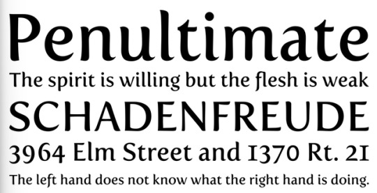
Tangentially related, I found an article by the NY Times (coincidence? I think not!! /lh /j) that's just all about Garamond (the font), and it's especially fun to read with the context of Swapfell!Sans
"And where some see elegance, others perceive fussiness. There’s a stereotype associated with the sort of person who loves Garamond: The Garamond Guy, if you will, is irritatingly uptight, so certain of his own profundity that his words must be conveyed with the weight of a 500-year-old French typeface."
Source
#i feel like ive probably read that same fic...#esp. if SF!Sans' brother was called Palatino lol#sorry i havent given any help yet im reclining on a fancy fainting couch and batting my eyelids at u because i love getting asks-#-except instead of looking cool and or sexy i just look a bit like a limp noodle draped over the cushions. what was i saying#i also went thru a crisis abt what legal names to give the skeletons a while back lol#i didnt go anywhere with it because it is relevant for 1 (one) scene and thats it so i just named sf!sans Sans Serif#purely because i think he was the first to get the paperwork done and classic sans' legal name is either-#- 'comic sans' or 'sans' (all lowercase)#velwy.txt#inbox#anon#do i need to make a tag for these lol#mindmortar
24 notes
·
View notes
Text
i'm rationing one episode of scavengers reign per day but this show still has a death grip on me... all the best sf stuff like "how close can you get to something before it consumes you?" "what are we going to do about the fact that we're not closed-off separate systems but rather permeable components of our environment?" "how many stern butches can fit in this thing?"
#text tag#i guess the first question is also like. a moby-dick question. there must be moby-dick derivative sf out there and i need it#additionally the sparrow heads this is sparrowlike. sometimes you go to a planet and it’s a horror movie#also i’m still waiting to see how this ends but like… the necessity yet danger of letting people in… aaa#also also there are so many great froglike creatures in this. evil telekinetic frog wife you will always be famous
17 notes
·
View notes
Text
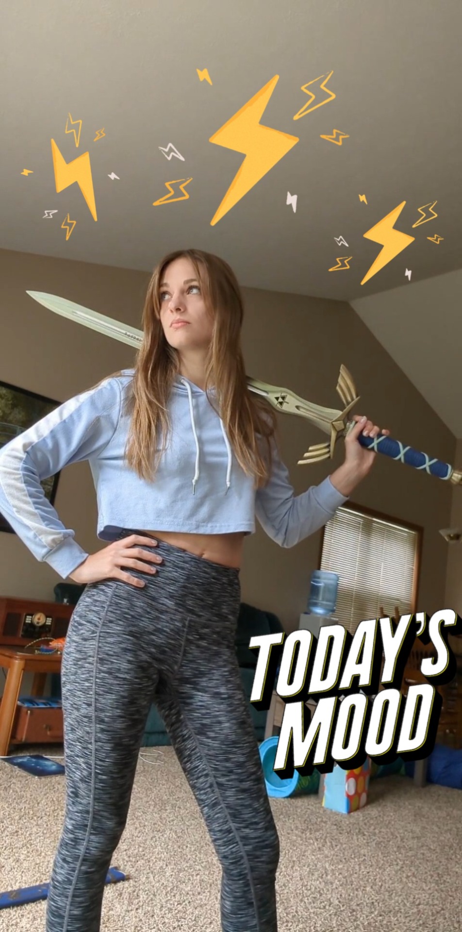
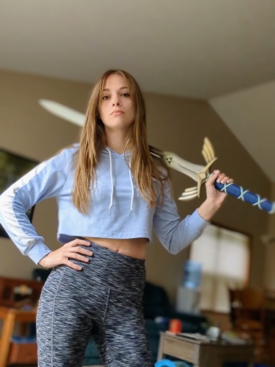
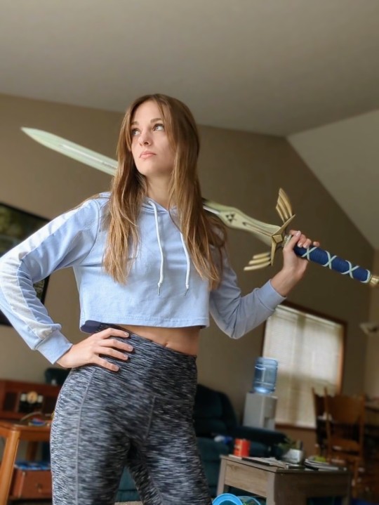
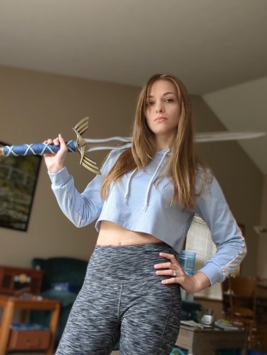
@dis-spoopy-boi was kind enough to tag me for a selfie on his birthday, the least I could do was post this nonsense from my drafts 😆
Babes @mikaababy @necr0romancer @prxttypeony bless us if/when the mood strikes? 🙏🏼
#i hope your day was great!#this was a great purchase#i need a knife and sword tag...#loz#ocarina of time#master sword#loz oot#sword of time#twilight princess#breath of the wild#skyward sword#a link to the past#selfie#sfs
155 notes
·
View notes
Text
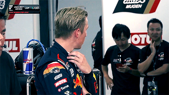

Super Formula round 7: Motegi. Liam during the red flag
#liam lawson#idk what else to tag this i just needed this moment preserved on my blog badly enough i taught myself how to make gifs#my gif#i guess that can be the tag lmao i don't want to put this in the tag with my art#anyway: hand.#liam#sf
17 notes
·
View notes
Text
anthony green stans come get y’all juice
#was i here???ike thats my video?????? yeah no but sure okay apparently so#camera goes down for a sec bc crowdsurfer but it’s quick#tumblr said ✨video quality ✨#ls dunes#my dunes show#anthony green#frank iero#not tagging the others bc you can’t see them. i was caught up in anthony world not sorry#he was struggling with the in-ears all night. the fillmore is old and needs to update its equipment everyone struggles there#ls dunes sf
7 notes
·
View notes
Text
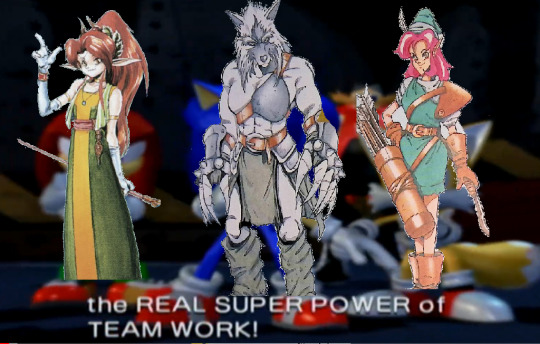
Shining Force - Bloodline of the Sacred Dragons chapter 2-7
#shining series#shining force#shining force cd#bloodline of the sacred dragons#sf zylo#sf diane#sfcd wendy#i have done this joke about this scene three times already and i'm not above doing it a fourth. super power of team work be upon ye#also this is not just a meme but public service because i know there's people who only look up zylo#and they deserve to know the novel exists#no joke i think the post with zylo's gba dialogue got past 20 notes and i was just like. okay#i do not blame you the man is really great#also sorry for the small spoiler that wendy is there. i needed a third character#and i wish the writer had actually done something with her instead of only revealing she's around when the battle's done#he already lost track of the dog though so dude was clearly melting over the amount of characters#but from this we can extrapolate that wendy was playing with the dog off screen#you know how it is. many bones around#god look. another giant set of tags. i could talk about this battle forever#i should be sleeping and yet
2 notes
·
View notes
Text
ahhhhh so when I decide to do some organizing in inventory, it's a waste of time. but when my lead decides to do some "organizing" that is decidedly useless, it's a good use of her time and a whole hour that she spent on something useful. I see now!
#personal tag#work tag#we have labels marking spots on the cubbies that weren't even faded but she replaced anyway? like one of them I made a few months ago lol??#needlessly marking the top of the shelf as being where wrap and gloves and bubble wrap would go. as if it hasn't been their spot#for over a year so how is this helpful hmm?? >>f..sf/d#at least MY alphabetizing was actually useful for something. I can't stand her lol#also frankly it just seems like a waste of paper? those spots didn't need labelled! I have put those items up there since I started#working here over a YEAR ago this doesn't help anybody
5 notes
·
View notes
Text
☞ chri ◇ 31 ☆ she/her ๑
personal blog that i throw all my interests at
i tag most things but let me know if there something specific you need
#i have an old list of tags in my about but i need a new one tbh#basically search it u might find it#tp is my transparent tag and sf is my scenery one
3 notes
·
View notes
Note
27 for Rachael! - Worst gift she's ever received? How'd she respond?
32 for Lafayette! - If he'd commit a petty crime/misdemeanor, what would it be? Why?
25 for Burnie! - Smth he knows a lot about but is useless for main plot?
33 for SF! - How does he greet someone he dislikes/hates?
Rachael:
There had to have been a point in her adolescence where she got coal for Christmas. She was a descent kid, but was a rebel from birth.
Lafayette:
Bread theft. Like the Le Miserables. He could hide a whole baguette up his sleeve.
Burner:
How to make a house of cards without fail.
Lt. Col. SwordFish:
Purposely shakes with the left hand and leads the conversation. He will have superiority.
#prickly pear [rachael]#breathing tube [Lafayette]#knuckle wraps [Burner]#Lt Col SwordFish#I need a tag for SF so bad....
2 notes
·
View notes
Text
i think i need to rewatch mla0 i straight up dont understand anything that happened
like.. i remember it but none of it made sense
#pine moment#honestly im due a rewatch for a lot of sv series#i need to finish e mh#and start sf#oops! all wf#but no mla0 is the one i just cant wrap my head around?#maybe its cause i havent finished the.. the tapes#i cant remember what theyre called the e mh ones#also sorry for spacing that out i dont want this to show up in the tag ive had that happen to me before oops
9 notes
·
View notes
Note
Skeletons am I right or am I right

God you’re so right. Skeletons man
#this is cuter in dark mode#shit i need some kind of mail/inbox chatter tag#let me think on it i can be clever if you give me some time#•centipede talks•#•centipede draws•#sf!papyrus#sf!sans
2 notes
·
View notes
Note
Font anon again! Thanks for indulging me. Yes it is the fic where SF!Papyrus is Palatino. It’s one of my favs. I agree with Serif as a last name because it’s funny.
I’m going mostly off vibes. You completely nailed what I was going for with UF! Papyrus (you are definitely the right person to brainstorm with and have great insight.) My original font search prioritized fonts people complained about, sticking to the theme of Comic Sans and Papyrus being “annoying fonts.” If you can think of any other ones I’m down to hear them.
Here is my list of names:
Courier
Helvetica
Trajan
Bradley Hand
Gentona, Avenir
Calibri
Verveine
Corsiva
Frutiger
Bodoni
Vivaldi
Zapfino
Rockwell
Amadeus
Clarendon
Arvo
Avenir
Casion
Cooper
Didot
Carrington
Anviers
Fontin
Fertigo
Harrington

*waves hand at you* nOOOOO WORRIESSS and thank you for the clarification ;D!! I'm always here for indulgence owu!! And thank you! I'm glad you like my take on things haha! (ANNOYING FONTS LETS GO!!!!)
This is a fantastic list :o!! I pulled up all the fonts in your list in another window for maximum ponderance lol.
I stuck my thoughts under the cut because as usual it got long (and for some of them I'm spitballing more than anything) but hopefully it's of some help ^^!
Swap!Papyrus: Hands down (haha), he suits Bradley Hand visually- the font is like Papyrus (font) but more loose and scribbled- it has more curves and thus has a more laidback kind of vibe, which is why I think it'd suit him... but also I'm losing my mind at the idea of calling him Bradley (derogatory) (/lh).
(I'm also biased though. I used to use this font for writing when I was younger LMAO. You know how people say to write with Comic Sans? I did that with Bradley Hand.)
Swap!Sans: I reckon he'd fit Cooper.
Round, bold, a little bit 'childish' when compared to other fonts, but infinitely more put together than Comic Sans. It also makes me think about comics like Archie or Garfield, which used similar rounded fonts for their titles! Cooper (font) feels so... cartoony to me, y'know? Also it makes me think of Sly Cooper just namewise lmaooooo
Underfell!Sans: Ok. OK. Listen I don't think this font suits him BUT!!! Fontin would be REALLY FUNNY just purely because I think he'd have the time of his life making jokes about "Fonting". Like: "ey! i'm fontin' here!" type of jokes which would get old so so so quickly. Do you see my vision.
If Carrington was less... curly-cursive I'd say it'd suit him purely for the potential visual association with like. the typeface you might see at a stereotypical tattoo parlour or something. IDK it makes me think about tattoos and motorcycles.
SAYING ALL THAT THOUGH: I think he could suit Rockwell! It makes me think of titles and bold headers, also cowboy westerns and Very Masculine and Cool products lol. Except... Rockwell is usually used with Uppercase, Title case or Sentence case. Purely lowercase Rockwell feels inherently cursed to me. (Like truly, what are you doing if you're using Rockwell in lowercase. That's committing a violence.)
Swapfell!Papyrus: Weirdly enough, I reckon I could see him with Corsiva or Fertigo? (Which... looks strikingly similar to Fontin. Huh!)

(Fertigo on the LEFT, Fontin on the RIGHT)
IMO, Fertigo feels more laidback due to the curling tips (which still come to sharp points). The way that the ends of "strokes" get flicked gives it a sort of lazier vibe.
BUT the font choice here also depends on your interpretation of SF!Pap!!
If you want to have a font that's underrated and everywhere?? GO Calibri. It's used as the default font for Microsoft, and is designed to be very easy to read. This is particularly befitting of the interpretations of SF!Pap where he's well versed in computers/electronics and/or doing spywork. His presence is not actively noticed, but he's always there! Alternatively, if you wanted to name him after a serif'd font, similar to Calibri, one of the fonts from your list, Caslon, has a somewhat ubiquitous presence, and also feels a little rougher/crunchier than stuff like Calibri or Fertigo.
Other notes:
I know you already decided on a name for him, but Trajan is also a really good alternative option for UF!Papyrus imo. Similar Roman-Commander vibes except even more explicit LMAO. Plus, it's a solely uppercase font, which is even more fitting.
Didot... if you swap the 'i' for a 'd' and vice versa, you get 'idiot' which is simply ripe for the teasing, but I don't think it fits any of the skeletons lol.
I would have suggested Arial as an option due to it's former prevalence, but honestly that name (+Verdana) have like… cemented themselves in my brain as 'fan-made skeleton' fonts ajbhjsmhjmdh (no shade whatsoever to anyone who uses them ofc, but MAN are they used a LOT.)
#i considered the fells having serifs and the non-fells having no serifs but mmm i think that puts a lot of restrictions on the options#additionally i feel like sf!gold bross fit script/cursive font names for some reason#zapfino and vivaldi for wine and coffee maybe...#velwy.txt#inbox#anon#i feel like i need a tag for these sortsa posts at this point lol#mindmortar#get it? because. headcano- *the mindmortar goes off and i m shot offscreen*
22 notes
·
View notes
Text
I'm awake and feral again and my partner's asleep in the bedroom with all the toys and my poor pussy is so sore from this same bullshit last night. I want to get off so fucking bad but I'm afraid my poor cunt can't handle it tonight. 😭
6 notes
·
View notes
Text
suspiciously close to dropping a concerning amount of money to get hadestown tour tickets
#I NEED TO SEE HANNAH'S EURYDICE#the tour is going to be in california this september#and they're going to be in three theaters instead of just the orpheum in sf#and one's like only 45 minutes away instead of 2 and a half hours#only problem is the absolute cheapest ticket is $100#with like the worst possible seats#the pricing for the other theaters hasnt dropped yet#so im restraining myself#but i literally have no money.....#and would most likely pay for my mom because i want to bring her#cause i brought my dad last time#so thats 200$ already#but its been a rough year#i kinda need to see the tour again#okay that was a very long ramble in the tags
3 notes
·
View notes
Last Seen Blogs

ardent-artists-art
∠( ᐛ 」∠)_ Hello, friends.

muslims-corner
Muslim's Corner

emberismyname-archive
Say my name!

thingswedotoday
Will be tomorrow's news

fedyorivans-moved
c'est la saison effrayante