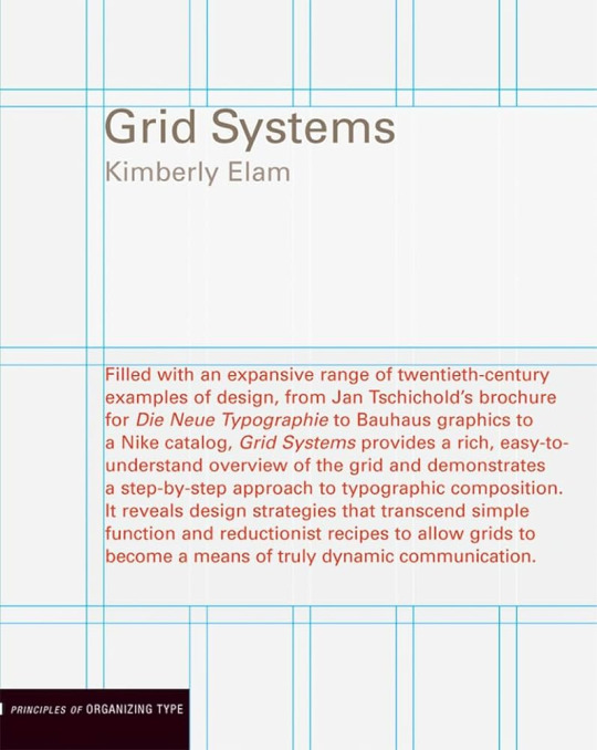
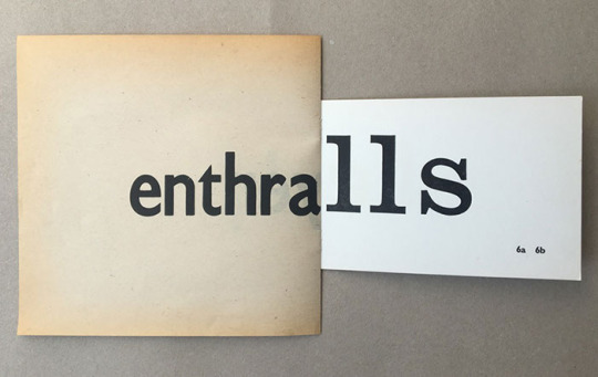
#i need to find more ~~~vintage~~~ fonts
Text
Plastic heart - (4)
<<<Prev Next>>>
---
The OG Barbie movie made me believe in magic.
---
“Give me the rollerblades.”, you stomped up the stairs to only notice then, that weird Barbie was headed out.
“I would but we’re all gathering for the sending away party are we not?”, she asked you but in the state that you were in, you were sure your plastic heart was melting. Atleast that was what you hoped your body could do, so it could shed this uneasy feeling. To become a rain cloud so you could pour it all out.
“Who are we sending away?”, you asked feeling out of touch with everything going on.
“Stereo. She’s having a crisis.”, you heard the answer and began to zone out. So that was what she meant before. If she was leaving, then you possibly had a chance now, a thought gripped you.
But the anger that Ken displayed flashed in front of your eyes again. As much as you loved him, he didn’t.
“Tell me where they are and I’ll get it myself.”, you brushed past her. Your only need right now was to forget.
“In the trunk. Don’t forget to read the instructions.”, she bid you farewell as she went on her way while you trudged ahead to find your cure.
The house was dark and eerie. No one could explain why dark clouds swirled around this particular house or maybe it was an aesthetical add on. There was only one trunk, placed in the center with ominous lighting over it. The fear was beginning to take root.
Why would you need instructions for rollerblades?
As you popped open the lid, it let out a hiss and smoke began to bellow from within it. As you seated away the grey wisps, you caught sight of a shimmering pink rollerblade set that looked brand new.
You reached for it and picked it up, the metal rim gleaming almost as if you heard voices telling you to put it on.
In it’s place was a small post it note with something written on it.
In bold font, it was labeled as ‘instructions’
Go to the tunnel of dreams and use the rollerblades to venture further in.
At the heart of the tunnel, you will be shown your deepest desire that could fix your broken heart.
If you chose to accept it, a path will open that will take you to it.
That seemed much more simpler than the box of chocolates. You began to wonder why she didn’t give this to you in the first place.
So you took the skates, the instructions and exited weird Barbie’s house, the cold air was making your smooth skin shiver.
Malfunctioning was the worst experience, so much so that you had had enough of it. You just wanted to go back to your routine, forget Ken and start making cakes again.
‘The tunnel of dreams’, a vintage poster that looked faded was stuck on to the side of a big gapping hole that you were sure was the just the main sewer tunnel. Except it looked it wasn’t in use.
You looked back at Barbie land, you could hear faint cheers and fireworks, no one was going to notice you had gone. You inhaled deeply and then put on the blades. There was nothing here that could make you stay and if you truly were to get your heart’s desire by doing this. Then there was no better bargain.
The wheels glided smoothly against the plastic floor of the pipe, the dark enveloping you until you could see a small light at the end, which began to glow brighter as you approached it.
The buzzing white light was actually coming from a small vintage TV, it’s screen flickering with different ads of different barbies. As you came to a halt in front of it, the screen flickered and it played an advertisement about you.
"Great potential combined with impeccable skill to make the most profound dishes from all around the world. This Barbie has it all, the house, the intellect, the resilience to survive in the most cruel places, *with a drumroll* ‘the chefs kitchen’."
"But not everyone can have everything. This Barbie however does not have a Ken accessory and the one Ken she loves never truly sees her for who she is. "
"So go follow your dreams and establish your careers by adding her to your collection!"
*Each item sold separately
Now that didn’t make anything better. The screen glitched to have a noisy black screen as you stood there taking in the information. But from the darkness came a voice, starting soft as a whisper to soon becoming a commanding echo.
“Is that what you dream of?”
“Is that who you are?”
“What do you long for?”
"Speak it out at once."
The silence had vanished and as the voices echoed, the TV came alive playing pictures of your life here.
What did you long for?
You didn’t know anymore.
Say it
What did you want?
Say it
You covered your ears and began to crumble as the space around you became overwhelming.
The noise, the swirling wind, the jarring lights from the TV that began to flick images from your mind, all of them full of Ken and a few from the bakery. As the foundation of your life began to shake, it cracked all the unnecessary thoughts until there was only one that echoed along with the voices outside.
You wanted to feel like yourself again.
To wake up and wear your outfit and smile like this was who you had always wanted to be.
So you said it softly, first. Unsure.
“I want to be me.”
But it was lost in all the chaos around you, so you began to yell.
“I want to be me.”
“I want to feel like me again.”, you didn’t know you had that in you, a commanding presence to change this storm. And as you peeled away your hands to stand up straight because now you knew your demand. Your true desire.
If you didn’t value who you were? Deriving satisfaction or attention to fill that void from an outside source was never going to prove to be useful.
So as you said it, without a trace of doubt, without Ken’s face appearing in your mind, there was a new conviction.
You were going to put yourself first.
And with that everything stopped instantly. The chaos died and with it your skates began to glow. A bright pink that filled you with a warmth that felt good.
As you began to feel like everything was finally piecing itself together, it only began to fall apart. There was a tear in the dark floor that made it look like you were tearing out of your barbie box. The tear grew and grew until it swallowed you, causing you to fall through.
A choir began to sing around you, as you felt the grip on gravity on your legs.
Never let them know where you are from
Never go in search of your Barbie form
Keep this and you can return when you wish
But beware the tempt of reality, for it will change you
The more you crave to be real, the more it will sever your ties to your world.
All it takes is a wish to come back
If you choose to come back
All it takes is a wish to come back
Will you choose to come back?
With that, as the voices faded, you felt solid ground beneath your feet and immediately, a jarring sound of car horn.
“Oy get off the road!”, a man shouted from with a yellow car that had taxi written on top of it.
As your eyes began to adjust to this unknown world, buildings stretching up all the way up into the sky, strong smells swirling around you, you panicked to skate away when a pair of strong headlights blinded you. You scrambled to the sidewalk and bumped into another woman, who only turned to shout at you.
You backed into an empty alley way as you watched the crowd pass by.
Feeling scared but strangely, feeling set free too.
---
Tags:
@imogen-skye @ateliefloresdaprimavera
@meowkid1000 @jokersgrf @linacool13
@oh-kurva @dreamsarenicer @memospacexx
@haleysucks00 @ibetyouthinkaboutmefics
@tempobaekh @fallingwallsh @whatafreakingloser
@lcversrockk @imonmyvigilanteshh
@constellationscharts @eddiemunson4ever
#barbie movie 2023#barbie movie#ken barbie#barbie#ken carson#ken x reader#ryan gosling ken#ryan gosling#im just ken
491 notes
·
View notes
Text
⋆ barbie fever . . . by petalsource .
. . . a complete blog makeover inspired by barbie .
hi, barbies! today, i bring you a complete makeover fully inspired by our favorite pink lady, barbie herself, to allow all of you to bring your own characters into her world in plastic!
feel free to tweak and adjust to your needs, add different background colors and overlays, but kindly do not claim as your own or use it for commercial purposes. feel free to tag me on your creations with this on #petalsource! seriously... i can't wait to see what comes of this!
💐 click the source link to get it as a package or individually on deviantart or payhip !
and . . . keep reading to find more details about the graphics, hq live previews and important tips to use the templates !
✩ about the items!
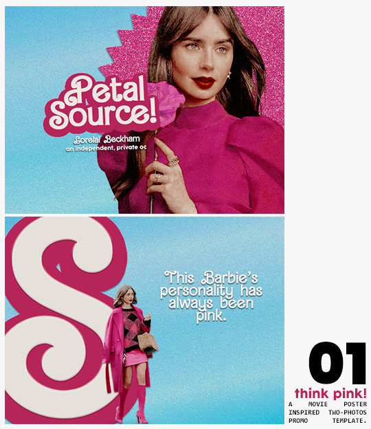
➷ think pink! -- a two-picture promo template inspired by the iconic 2023 movie posters. you'll need: two pngs of your faceclaim of choice, and the custom fonts (listed below). the glittery polygon of the first picture is available in 7 different glitter colors! high quality examples.
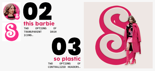
➷ this barbie -- two options of transparent dash icons; one matching the "initial" poster and one matching the "glittery polygon" poster. high quality examples.
➷ so plastic -- two options of centralized headers; one matching the "initial" poster and one matching the "glittery polygon" poster. to use it at its best quality, disable the "stretch header image" option when uploading the header. high quality examples.
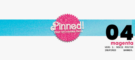
➷ magenta -- version 1.0: pinned post (or miscellaneous) banner inspired by the 2023 barbie poster. version 2.0: pinned post (or miscellaneous) pair of banners mimmicking the layout of a barbie doll box. one banner goes on top of the postbox, insert pinned post or text, and the other banner goes on the bottom! high quality examples.
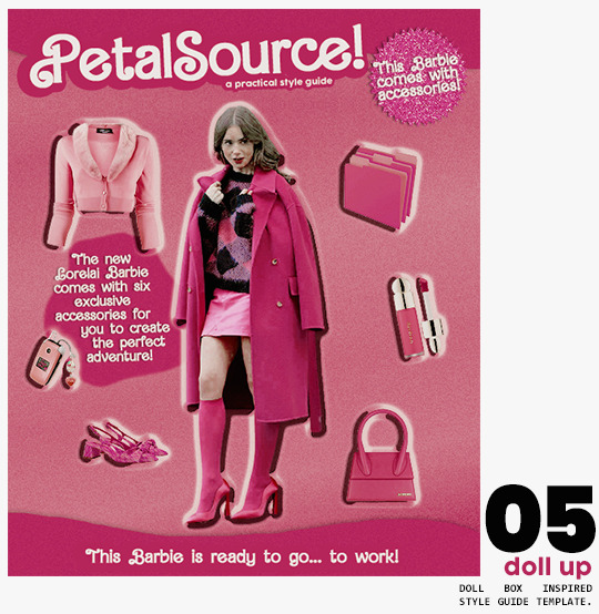
➷ doll up -- lookbook template inspired by the barbie doll box, featuring a "doll" picture and six customizable objects / accessories. you'll need: full body png of your faceclaim of choice, custom fonts (listed below), and 6 pngs of random objects or clothes to "come with" your doll. i've added a short tutorial down below on how to find and use some easily! high quality examples.
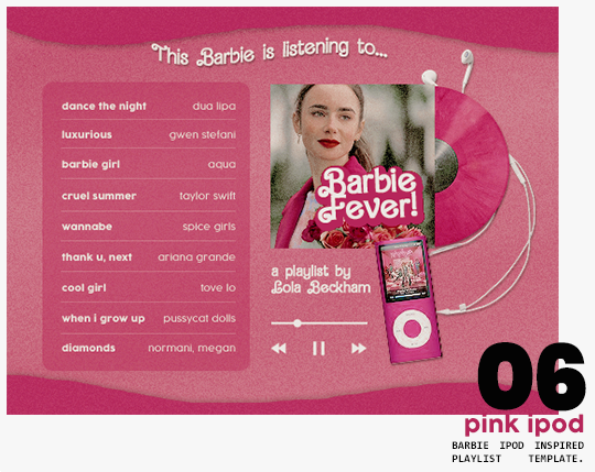
➷ pink ipod -- playlist template inspired by the barbie ipod, featuring a cover art and nine songs. high quality examples.
you can purchase all items as a package (deal price) or individually!
✩ important tips & useful information!
➷ needed fonts: bartex, cocogoose.
➷ object pngs + removing background of images: i found a super useful pinterest board with photos that can be used on your graphics: oxfordcommah's object pngs. additionally, the clothes png search on p*nterest is really diverse, and you can narrow your interests like "pink clothes png" or "vintage shoes png" and find a lot of options. once you found your images, go to remove.bg and paste their urls in there. it'll remove the background of those images for you and you can just paste them on your template and have fun!
➷ used coloring psds: the beautiful and super pink psds i used on the previews were not made by me and are NOT included in the downloads. in case you want to use them, they can be found here: dreams, 003.
➷ styles: the download includes two styles, one for a subtle drop shadow used in a few layers and one for the plastic box effect in the lookbook template. you can install them by opening the styles tab on photoshop > the four lines > load styles > find the barbie styles on your downloads!
➷ in case you have any questions, pop into my inbox or ims and i'll be happy to help you!
#template psd#template psds#barbie psd#character psd#character psds#𓂅 ♡ ⋆ 𝐦 ‚ templates .#i really really really hope you guys like this!!! i had so much fun doing it
276 notes
·
View notes
Text
So uhm... I did a thing...
✨Character Info Template✨
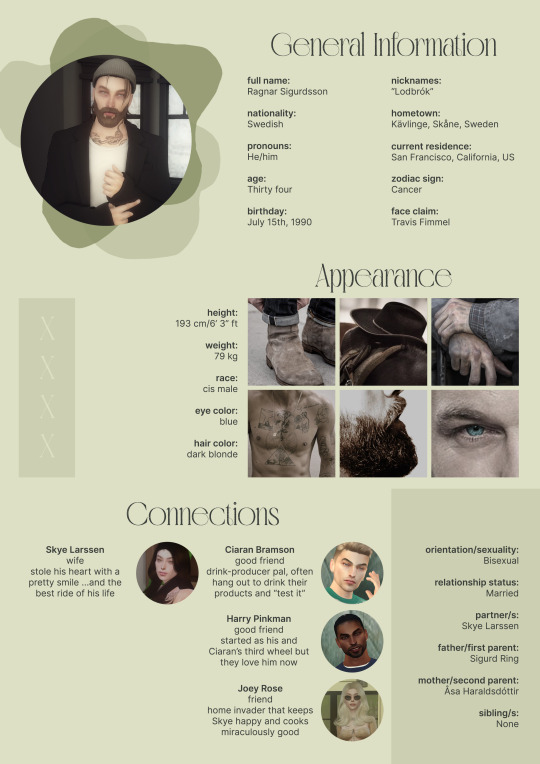
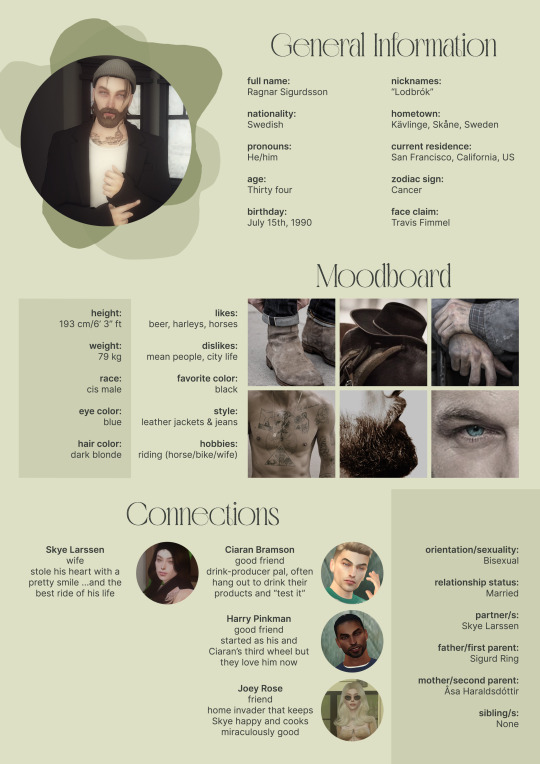
Been meaning to do this a long time ago (and actually started it but never finished it, lol) as a way to share some more information about my ocs without needing to use a custom page theme, but mostly because I haven't found any page theme that looks exactly as I want and allows this much customization.
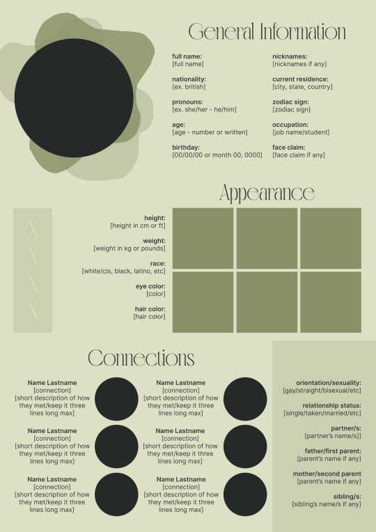
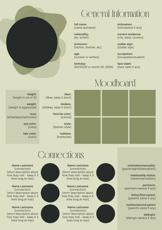
There are two versions and both are almost exactly the same; but the example shown in the left has an 'appearance' section which is small and has few quick facts regarding the oc's appearance; while the example on the right has a 'moodboard' section instead which allows you to add more info about your oc.
You can change every section/title to fit your needs like I did in the examples below; I personally removed some categories as well and got rid of some connections as this oc doesn't have that many close friends/partners to fill the original template. However, I also included an extra separated 'connections' section in the download in case you want to add more people and more information.
I recommend you stick to square-shaped pictures so it's easier to fit them to each section. Also if and when you edit the information or section titles, please select only one line at a time to replace it so you don't lose the text format. (Titles shouldn't change because that's a single format/font within the same text box, but should it change you can always hit ctrl+z hehe) When you're done, I strongly recommend you save this as a .png instead of .jpg so it's the best possible quality!
Last but not least, this is a .psd file. So you'll need either Photoshop (I did this with Photoshop Portable, but it supports newer versions of PS and it *should* support older versions too) or Photopea to open and edit this file.
Credits: Adobe Photoshop, Inter font, Golften Vintage font
>DOWNLOAD< (patreon but free :p)
(note: I'm posting this with my gaming blog because I think my fellow gamers might be interested in this, but please consider giving credits to me if you use this template by tagging @synindoodles instead of this blog)
More info on how to use and edit this template below the cut!
Layers:
>Each layer is properly named and categorized. The general layers such as the background, the icon shape and background shapes are under the groups.
>If you don't want to see/don't need one of the connections' pictures and information, I recommend you find which one it is (1, 2, 3, 4, 5 or 6) and click on the eye symbol next to the layer to hide it so that way if you ever need it, it won't be truly gone.
>To edit a text section, simply find the layer (such as General Information>Left Column) and double click on the 'T' symbol next to the layer. That way it will open edit mode and allow you to edit the text, just don't hit delete or enter while everything is selected or you'll erase it :p
>Main text sections aren't separated, they're blocks of text. I recommend you don't remove the amount (for example, if you downloaded the version with the 'appearance' section, which has 5 sections of information, don't remove the fifth line.) Either leave it empty or replace it with another data, otherwise it will look weird. The 'general information' section might look good even if you remove a few lines, just don't get rid of the whole block of text.
Pictures:
>To add a new picture, simply paste it over this document and move it using the Move Tool.
>To frame it (so it becomes a circle or fits over the shape you want), make sure the picture layer is over the layer you want, then while holding alt click between the two layers. [For example, if you want to add a new main oc picture: 1) paste the pic you want, 2) move it with the Move Tool so it's covering the big circle, 3) once you've fully covered the shape (if it isn't you can resize it by right clicking on it then on 'free transform', sometimes you might need to hold shift to proportionally resize it) make sure the newly pasted pic layer is over the layer named "picture goes here", 4) hold the alt key and hover your mouse cursor over the line between your pic layer and the circle layer until you see an arrow going down symbol, once you see it click it and tah dah! your picture should now have the same shape as the circle! - you can further move it if it doesn't fit the way you want with the Move Tool (;
Others:
>You can change every color, font and section to your liking, just don't change the general layout of the template.
>To hide/show the guides (those bright blue lines all over the document), click ctrl+,
>'Inter' is a free font and you can get it in the link above (linked with the credits), Golften Vintage is not, but you can get the demo version >here< (just scroll down and click the blue download button under license). I will not tell you how to install fonts as it might be different for everyone (for me it's C:/Windows/Fonts and I just drop the zipped files (except the .txt one) there), but google is your friend.
>I can't think of anything else that needs to be said here, but if you have any other question feel free to send me an ask or dm and I'll help you out!
>Last but not least, a like is appreciated if you plan to use this plus consider tagging @synindoodles if you use it <3
#psd template#template#characters page#muses page#muse page#muse template#character template#character page template#oc page#oc page template#synindoodles#rp resources#rp template#roleplay resources#roleplay template#writers resources#writing resources#writing template#writers template
50 notes
·
View notes
Text
RESOURCES FOR ARTISTS VOL 1
In the spirit of gratitude for the plethora of free resources out there for artists that I've been gleefully ransacking my entire life, I want to share some of them that I've compiled.
smithsonian open access: this is a HUGE one! lots of images that are absolutely free to use, as well as an incredible set of 3-D resources. Their collection spans the same breadth that their multiple museums do-- natural history, gems, fine art, aerospace/engineering stuff, etc. so do not sleep on this.
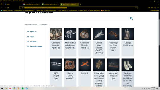
(screenshot is the 3-D digitization page, one of my fav sections)
2. The League of Moveable Type is a resource for free fonts, but not just any free fonts-- professionally designed free fonts. Some of the bigger sites can be a lot of wading through sub par stuff, but every single thing here was very carefully and lovingly designed, and is free.
3. Unsplash is full of great free to use images. Seriously, huge collection. Portraits, textures, 3-D renderings, you name it and it's probably here and free to use. ALSO cool because images will note whether their creator is for hire if you like their work. You can also submit your images to this platform. (I think it has a premium section but I haven't needed to engage with it yet)
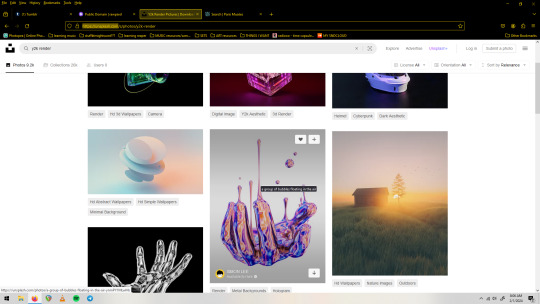
(screenshot of unsplash.com with a search for 'y2k render')
4. rawpixel's Public Domain collection. They've been high quality scanning public domain images for a while. They're free to use under a CC0 license, which is basically without restriction. They've got lots of categories, I personally love the Graphic Design and the Vintage Illustration sections.

(screenshot of the 'patterns' section of the Public Domain collection on rawpixel)
5. Photopea is a free Photoshop alternative that runs in your browser. It's got a few quirks(especially if you run a non-chromium browser, but stay strong anyway) and is ad-supported, but really powerful and robust. It also opens PSD files, supports smart objects and basically all of the Photoshop asset filetypes(.abr .grad .pat etc), as well as has filters, even a couple that Photoshop itself has gotten rid of in their more recent versions. You can use the fonts on your machine, export transparent pngs, and do generally anything that the big guy does. You can also donate a small amount to remove ads and support the singe person(!) who created and maintains it.
(screenshot of a .psd file with smart objects/smart filters open on photopea. The 'file' dropdown menu shows exciting options such as 'export' and 'save as psd')
6. Brusheezy.com is a great place to get free brushes, vectors, and photoshop assets in general(which can all be used in Photopea, btw).
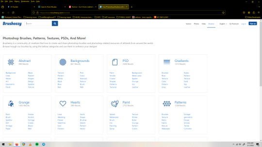
(screenshot of the 'categories' page of brusheezy.com)
7. dafont.com Last but not least, I will include this huge font site but assume most people already have it on their radar. Free fonts! No account needed to download! Tons of categories! Many are demo/limited versions, so pay attention especially if you plan to use numbers or special characters as those are often the things left out of the free to use demo versions. It's nice to have a lot of options but to the discerning eye a decent amount of the fully free fonts here will fall a bit short/feel unpolished. That's not to discourage you from it, as I have a huge collection of types from here and routinely check it when I need something specific.
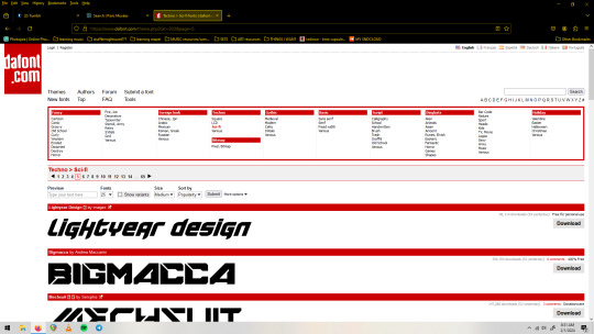
(screenshot of dafonts.com with the 'sci-fi' section pulled up)
So that's what I've got right now for visual art resources, I hope you can find something useful in here. Feel free to share this list and keep an eye out for the next one! Thanks to everyone out their with a love for sharing in their hearts, it's really inspired me to make some things with no other intention than to put them into the world as tools for others!
#free resources#resource list#art resources#free stuff#free collections#royalty free#free to use#shareware#for the people#dafont#brusheezy#smithsonian#rawpixel#unsplash#league of moveable type#public domain#cc0 license#fonts#textures#patterns#brushes#vectors
35 notes
·
View notes
Text
BUTTERFLY: LUFFY x Y/N (modern au part 7)
modern au
(cw: mma!luffy, celebrity, dress shopping, flirty banter, food mention, interview w Teen Vogue reporter, reader is a camgirl)
(a/n: help)
Songs: “The Louvre” by Lorde
words: 1.4k
****
“I’m not askin’ what I look like,” Luffy drawls with a crooked smirk. His hands are loose in his pockets as he steps closer, space minimizing between his heated body and yours. “I’m askin’ if ya like whatcha see. Cmon, kitty, how’re the threads?”
He leers at you in his fitted black suit, paired with a deep red, satin button down the color of a dry cabaret sauvignon. A silver chain with a skull-and-crossbones hangs around his neck. It glitters between his exposed collarbones. You want to take it off with your teeth.
“Sexy.”
He snickers, and rushes back into the changing room. “Awesome,” is all he says as he finishes redressing.
You’re standing outside the velvet curtain holding the socks, tie, and pocket square that match the suit.
He adds a Rolex to the mix.
You both check out of the swanky menswear shop, and head down the sparkling strip to find you a dress.
****
You stand in the fitting room, obscured by a black door with a chalkboard sign that says “#2” in a curly, squiggly font.
You’d decided to hit one of the local thrift stores, decked out in miniature Calico Critter toys, porcelain tea sets, vintage dresses, and strange plants. Luffy seems comfortable enough, chatting with the elderly saleswoman at the counter.
You squirm.
You’re wearing a deep red velveteen dress with a gathered waist and a slit up the side. It’s heavy, and smells like mothballs. You shimmy out of it; the texture is abhorrent.
“How’s it goin’, dollface?”
Luffy asks you through the kitschy little door. His sandals scuff the uneven floorboards on the other side of the fitting room. You’re tangling your limbs in an emerald green
cocktail dress with too-tight sleeves.
“Struggling!”
You huff with an honest sigh.
“What’s wrong? Need my help?” He asks cheekily, and you snort.
“Not yet, Prince Charming.”
He laughs, but lays off the banter. It’s a sorta sweet balance that you two have found with each other.
Luffy knocks on the door.
“How’s this one? Saleslady said—,” he stops as you open the door, still half-dressed in a champagne gown. It’s pale pink with diamond shimmers. The sweetheart neckline dives between your breasts, tapered empire waistline revealing the goddess-like, Boticelli version of your pear-shaped body. The long, flowy skirt wraps around your legs in waves. There’s a subtle slit to your thigh, and you found a rose gold clutch to match.
You slowly turn, sweeping your hair to the side so he can zip the back of the slinky, incandescent gown.
His fingers are slow as he clips the zipper up your exposed back.
“What jewelry d’ya want?”
He asks, raspy.
****
You decide on a single, Swarovski swan pendent with a rose-quartz center. The wings of the silver swan are outstretched behind her, with a diamondesque eye sparkling at the center of her graceful face.
You spray Daisy by Marc Jacobs at your pulse points. You curl your hair. You apply eyeshadow, lip liner, and gloss. You contour and highlight: blush, false lashes, winged eyeliner, everything.
You stare at yourself in the mirror of Luffy’s luxurious bathroom.
Sparkling.
Glittering.
Insane.
****
The dinner lasts so long.
You find yourself picking at the fabric napkin in your lap: undoing scratchy threads as you fiddle.
There’s so much social labor.
You have no idea how your boyfriend does it. It’s so many hours of smiling, chatting, answering questions, social media marketing, and more.
Everything said is scrutinized. Laborious. Every single face you make has a chance to be photographed. Immortalized. Tweeted. Instagrammed.
Commented on.
You scrunch your nose to the side, staring down at your green tea sorbet. A dessert that is so light and refreshing actual tears spring to your eyes as you taste the light green ice.
The champagne is sweet.
Your stomach is sour.
Luffy is standing off to the side, doing an interview. The reporter is smiling, seemingly kind.
Luffy kicks ass at interviews.
The social media burnout seems to roll off his back. Like staring into flashing lights doesn’t dizzy his head. Like he can still focus through the humming buzz of food, conversation, drinks, and laughter.
You feel like a scared rabbit.
Someone bumps your elbow, and you squeak out a frozen gasp of terror. Someone laughs, and the tension leaves your body as you force yourself to breathe. You’re safe, here.
It’s just new, is all.
“Sorry bout that,” someone says, as they hover next to your seat. You force yourself to see past lights and sounds and system overload. Person. Individual. Someone is standing next to you and you must learn their name. “Is this seat taken?”
You shake your head, and shift so they have room to sit in Luffy’s vacant seat. They’re lovely: dressed in sky blue and silver accents.
“Maria.”
You smile wide at hearing her name, her pronouns, her career as a social media manager. She’s working at Teen Vogue, something you particularly respect. “Is it okay if I ask you some questions? It’s super interesting to see your social media presence as an egirl,” she smiles, “And I’d love to see what you have to say about it! It’s okay if you’re a little overwhelmed,” she allows. She had a gap between her front two teeth.
She is sparkling.
“Sure! I’m an open book, really. My social filter is all outta wack,” you admit, shyly. But you hope your open body language and softer voice help get the “friends” message across.
Expression. Communication.
Honesty.
Sweetness.
Swiftness.
She starts:
“So, how long has it been since you started camming?” She licks her lips, iPhone recording the conversation. She sets it on her knee, face up. She had a daisy-patterned pop socket.
“I started in 2020, once the pandemic started. I started an OnlyFans, and I haven’t really looked back since. Although, I take some breaks now and again.”
She smiles, “Breaks are healthy,” she assures you, as someone starts filming you over her shoulder. You scoop another bite of sorbet.
“So, what would you say is the most interesting thing about your career?”
“Mm!” You hum through a mouthful of green tea ice, “So many things! It’s so creatively expressive. I get to assign myself whatever roles I want,” you start bragging a little, “Since I choose whoever I wanna cosplay. It’s also so sweet to see what content people vibe with. Like, someone said they listen to my ASMR as they fall asleep! It’s amazing, seeing that someone sees you as their comfort content, y’know?” You smile, rambling a bit.
She smiles, though. She seems to enjoy listening. So you smile, too.
“Awesome, that’s super cool. What are some challenges about sex work?”
You nod, sober.
“The shame. People want to criticize me so much for showing my body onscreen, but burlesque has been around for centuries. The art of the striptease, the art of pornography, the skills of prostitution—it’s all so gorgeous. It’s got its shadow side, like everything, so when I speak about sex work as a career, I am always only ever speaking about consensual sex.”
She nods sagely, listening.
“So, um…ah—is it okay if I speak more on this?” You ask nervously. The napkin is scrunched into knots in your fists. The reporter—Maria—nods. She is smiling, and focused. Her eyes are deep brown, with fluffy eyelashes even without mascara.
She is not wearing makeup.
You smudge at your own lipstick, wishing you could swipe it off.
“Okay, so…it’s a way for me to flirt with strangers on the internet. It’s like, a very fun thing to do for me,” you smile, honestly. “And that’s how I met Monkey D. Luffy! Oh, I hope that’s okay to say,” you suddenly fret, social filter glitching out. “It’s so hard to understand censorship,” you confess, “I’m an adult performer so like…all the stuff I say is gonna be, like, eighteen plus. Or like, how do you decide what’s private and what’s public? It’s all so discomfortable,” you huff.
She smiles, laughing softly.
“I understand. Is there anything else you wanna say?” She has her hands folded in front of her, with several silver rings on her slender, piano-player fingers.
“Don’t say he met me through my day job, please.”
She meets your eyes, scanning.
“Seriously.”
She nods, satisfied.
“Thanks so much for your time, Miss Hero Butterfly!” She smiles, and stands up. Her dress rustled around her. She has a butterfly pendant in her hair. You smile, and stand to shake her hand.
“I love your butterfly necklace,” you say, grinning.
She winks.
“I wore it for you.”
****
#holy shit fuck christ god#sgsggaba#dumpster dive#kitty speaks#modern au#luffy x y/n#one piece fanfic#luffy fanfic#luffy x reader#luffy x you#one piece modern au#luffy modern au
22 notes
·
View notes
Note
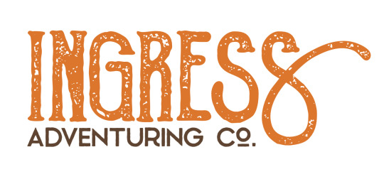
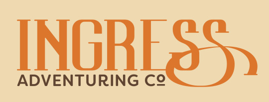
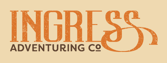
This is a pretty random one, but how did you design the logo for Ingress?
Little did you know, I love to answer questions about ~design~.
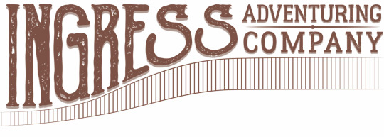
The Ingress logo has gone through about 3 different official versions, but at least 50 different conceptual iterations. I'm a graphic designer by trade and profession, so I approached it any other way I would approach making a logo.
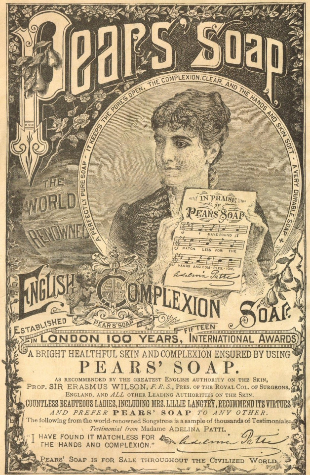
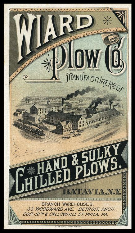
The first iteration of the logo I have less information on the development of, but I was looking at a lot of advertising from the late 1800s to early 1900s. For example, these advertisements have a lot flourishes on the text and warping letters, as was common in that era.
I took that concept and made the first iteration of the ingress logo at the comic's inception in 2017. My graphic design skills weren't as strong then, and I mostly just took a font I thought fit and slapped it around a little bit to try and get the look I wanted.
I wasn't particularly happy with how this one turned out, and it only ended up being used for a few months on the first version of the website and on a single printing of the first chapter of the comic, but I also didn't put a ton of time and energy into making this one. So, I went back to the drawing board soon after I made this first one.
The second iteration of the logo took a lot of inspiration from the same sources, but I first took a lot of time drawing out concepts in my sketchbook to try and get the right visual look for how the logo should be.
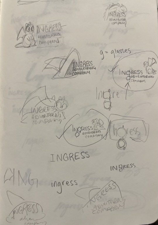
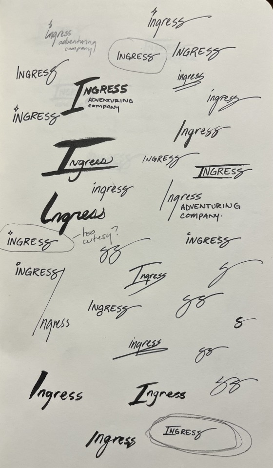
At first I played with the idea of including a little picture along with the logo. I thought maybe Toivo's glasses would be a good thing to try to include in the 'g' in Ingress, or that Rocky or Toivo's hat should appear in the logo. These were all discarded for cluttering up the logo, because the words themselves are all pretty long. Eventually, I started playing with the shape of the word itself, which very quickly lead to the last S becoming the signature swirl.
Next was iterating on this concept with fonts.
That lead to the second iteration of the logo, and the longest running version of it.
I chose a textured font to give it that "worn" feeling that was so popular in the design world in 2018. There were a ton of brands doing textured stuff to give their brand an edgy feel, but I did it to make it feel old and like it was from the late 1800s.
This would still be the logo today, but I ran into a problem: the font I used, Goldsmith Vintage, had a limitation on how long you could use their font for free and for printing. Fonts aren't particularly expensive, but if you want to use a font for publishing, you need a special license and those fees can rack up in price pretty quickly. It was unlikely that the people who made the font would come after me for using it, but I decided to not take that chance and instead refresh the logo one more time, this time putting more of my own hand in it.
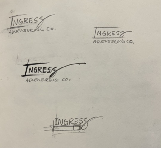
This time, I took a different approach. I liked the old logo, but I was having a hard time finding a font that I really liked and would get the same feeling as the old logo... So instead, I decided to use calligraphy to draw it myself.
I rewrote the word Ingress Over and Over and Over, and specifically I rewrote the S's to try and get the perfect shape of it. Then, I picked out specific letters that I liked.
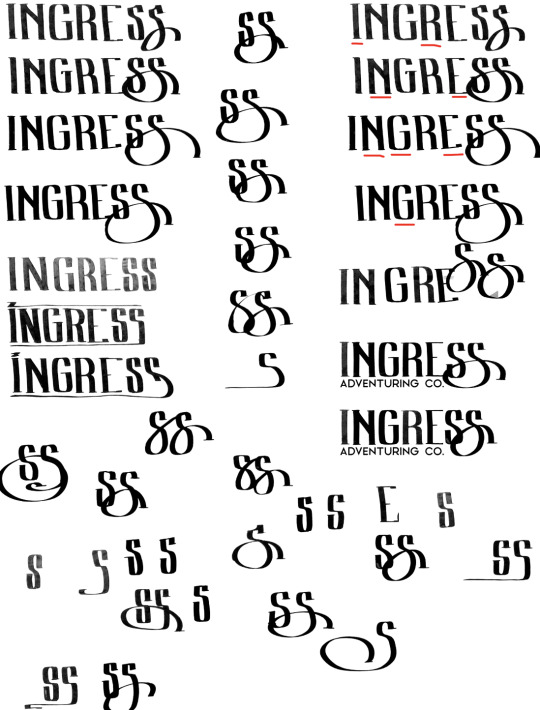
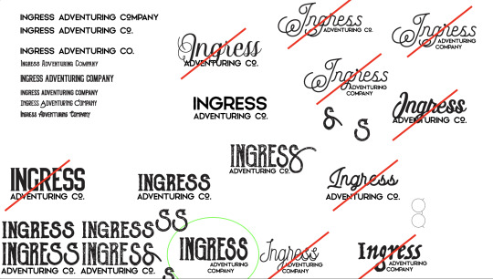
From those letters, I picked the ones I thought looked best, and smashed them together into one rough version of the logo that I liked.
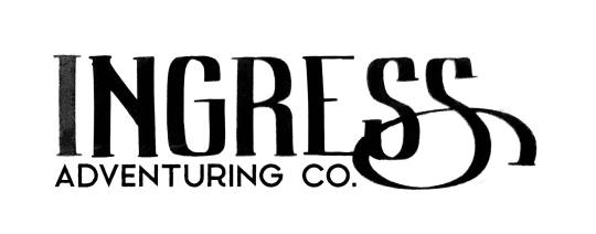
And then from here, I made a digital version of the logo in Adobe Illustrator so I could get a nice crisp vector version. Also, I made rough versions of it, so I could keep doing the same 'old' look.
And... that's about it!
Ultimately, I think the new one is really fun, and I really like the fact that the latest one was made with my hand directly. Those aren't letters you can find in any font, they're my letters.
Maybe you can tell but, I have a lot of opinions on letter shapes.
Anyway, thanks for asking, and I hope this was as entertaining for you to read as it was for me to blather on about.
17 notes
·
View notes
Note
I just found your acc today and I really love your graphics!! May I ask where you pull inspiration from? I want to make some graphics of my own but I need some inspiration images and I have no clue where to start rip
Thank you so much :D
I am inspired by a lot of graphic design, specifically vintage and mostly 60s+70s design, so some resources I use are:
Fonts In Use
A great site that has tons of graphics from books to album covers from different era, and identifies the fonts used
Internet Archive
Awesome for vintage art, magazines, and more. I find a lot of vintage things I use in collages for my designs. There are so many graphic design books on here too you can look at for free!
The Peculiar Manicule
The best resource for me for 60s and 70s's psychedelic design, all uploaded at very high res
Vintage Ad Browser
Huge variety of vintage ads
Flickr!
A lot of people upload vintage type specimens from books, you can find the groups and similar ones. And people post great vintage signs
Hope that helps ^^
Pinterest is also something like everyone has, it's great for organizing vintage images and finding inspiration if you know what you're looking for
54 notes
·
View notes
Text
17 of the Best New Font Releases: March 2024
New Post has been published on https://thedigitalinsider.com/17-of-the-best-new-font-releases-march-2024/
17 of the Best New Font Releases: March 2024
Check out the best new font releases for March 2024! Often new fonts are released with some nice discounts, so it can be the perfect time to pick them up when they’re fresh out of the font foundry. Some of these typefaces have up to 60% off, and certain fonts can even be downloaded free!
[embedded content]
Up first is an expertly designed font called Garrison, it’s a nice modern sans serif with a humanist style, a little like the classic Gill Sans. This one comes packed with 21 individual fonts in a variety of weights and styles, and what’s more it’s currently 60% off as part of its launch sale.
Next up is a great looking new condensed sans named Entropia. It’s another family of loads of styles, including a rather unusual backslant version, for those rare occasions you might want an italic but leaning the opposite way. The full collection is quite pricey at almost £300, but you can pick up 3 versions for free. You could even combine them with a selection Regular, Bold, Black and Heavy fonts to build your own much more cost-effective bundle.
Petrov Sans is another highly ranked new release. This modern sans has quite a futuristic look to it and includes 19 styles ranging from Thin and Extra Light all the way to Black and Extra Black. It’s another font that is currently on offer at 60% off.
Greater Neue Condensed… Or ‘NOIER’ is if I was to pronounce it correctly… is a nice new industrial style condensed sans that’s right up my street. I can see myself only using this in its heavier weights and only in all caps for logos or headlines, so the full price of £200 probably wouldn’t be worth it for me, but it just happens that you can pick up the individual Greater Neue Condensed Heavy font for free.
Script fonts have been in trend for several years now, but this new Retro Script named The Original stands out with a pretty unique style. It’s based on vintage car badge inscriptions, so it’s much slimmer than some other scripts and has a large selection of elegant swashes to completely customise its appearance.
Font Duos take the hassle out of having to find two separate typefaces to pair together. Hajime is the perfect combo of bold condensed sans and a cursive script. You can use them individually in your regular design work, or together to create cool quote art. At the $10 discount price it’s definitely worth adding to your collection.
Brush scripts are one handwritten lettering style that fully makes use of SVG font technology. With SVG Fonts like the new Beast Mode you can include the authentic texturing of hand painted lettering directly into each glyph, rather than it just being a solid letter shape. Several of Sam from Set Sail Studio’s fonts are amongst my go-to favourites in my library so I think Beast Mode definitely needs to be added to the collection, especially with such a memorable name!
The name of Qumer Pefolijqey probably *isn’t* one of the most memorable font names, but this new script font needs to be one to remember for when you need a cursive, monoweight typeface. With 363 glyphs comprising of multilingual characters and several ligatures it’s capable of displaying whatever words you need it to. This is one of a few fonts in this roundup from Envato Elements, so it can be downloaded as part of your subscription if you’re a member like me. Check the link in the description to sign up to the biggest creative library out there.
Millaris is another font with extensive multilingual support, but the reason I chose it for this roundup is its lovely design. It’s described as a modern retro serif. It doesn’t come in any other weights or styles, but with a decent selection of alternates and ligatures it would be a great choice for logos or even editorial titles.
Kirgina is a Modern Condensed Sans with a cool unique style. It has some really high contrast in its letter shapes and tight angles which makes it almost a display font, but it comes in plenty of styles from Light to Extra Bold. This is another font that’s available to download from Envato Elements.
Brickers is a really narrow condensed sans that doesn’t come in any additional weights, but some of the ligatures do transform this font with some quirky and unusual layouts that would make great logos or quote art. It’s available in an inline version too, but to be honest you could save some money by just picking up the main regular version and apply your own stroke.
The Brucken is another brush script, but this one is more in the style of the popular brush script fonts with its fatter appearance and simpler swooshes. There are loads of these kinds of brush scripts out there but the best ones are those that include lots of stylistic alternates so you can tweak it to perfectly suit your wording. The Brucken has plenty to choose from!
If you already have some of the classic Swiss neo grotesque fonts such as Helvetica, Univers or Akzidenz then there might not be much reason to spend $360 on Solidus Open as a newcomer in 2024 compared to those timeless typographic icons from centuries past. But if you look closely it does have some really nice features, namely the opened up terminals which gives it a really cool appearance. It also comes in a huge selection of 19 styles with weights from Hairline to Black.
Massivemoon is one font I wasn’t going to include in this roundup with it being more of a display typeface, but I really like its retro style and it has some unique alternate characters that can inject ludicrously stretched out letters. I’m not entirely sure when you might need to create such a typographic layout, but the main reason it made the pick was its bargain price at just $5 for the main desktop version.
Variable Fonts are the latest typographic technology. Rather than have several separate font files for each weight, variable fonts combine them into one so you can essentially stretch the font to the exact size you need and the font will fill the space with the relevant weight without affecting the typefaces proportions. Check out Graveur as a classy looking serif that’s ideal for headings and even small book text.
Corsario is another variable serif font, but this time with a much more modern style. This was designed with magazine and editorial use in mind, so if you’re in that field of graphic design, it could be a great choice for a headline, especially with it being easily accessible directly in InDesign via Adobe Fonts.
And to finish off this first roundup of the best new fonts we have another variable font choice from Adobe Fonts named Picholine Antique. This one is a slab serif with some nice curves that help soften it up compared to many other hard slab serif styles. What’s great about the Adobe Fonts library is not only are these hot new variable fonts available for use directly in your software at no extra cost, they’re also cleared for commercial use too.
#2024#adobe#Art#badge#book#bundle#Design#desktop#display#editorial#Features#fonts#Full#Graphic design#hand#icons#it#italic#layout#Light#Link#Logos#mind#money#namely#News#One#opposite#Other#price
2 notes
·
View notes
Text
Weeks 1 and 2
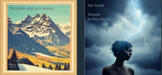
During these two weeks we have been working on our 6 word memoirs and critiquing them. Before this, I had never used photoshop or AI, so it was a little challenging to get started. I knew I wanted to incorporate weather because I love when nature is expressed through art, but I didn’t really start with a plan.
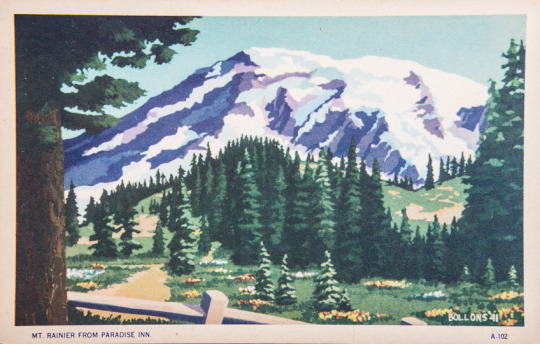
After awhile, I decided to make my first one about a snow, since we really never get any down here. I wanted to focus vintage ski posters and vintage post cards and the way they represent snow. I loved their painterly style and I wanted to see if AI could accurately achieve that look. I eventually found one that worked, cleaned it up, and then added the text. I tried to chose a more understated typeface that didn’t take away from the image, but I may need to change it later on.
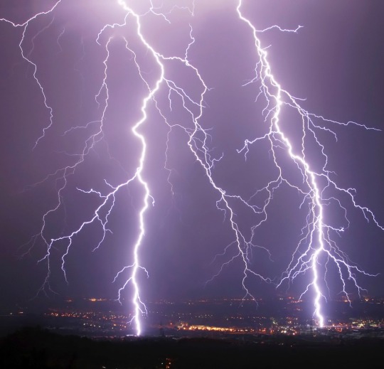
For my second image, I wanted to do something inspired by the stormy weather we’ve been having. I’ve always been told by teachers and other adults that my head is too stuck in the clouds and I wanted to use that idea, but make my image moodier than the last. For the AI component I did my best to find a woman in a storm, but they were all missing something. To make the composition more appealing and provide a better atmosphere, I added a lightning bolt in the center of the image. Using the brush tool, I drew the lightning and used references to make it look as realistic as I could. To achieve the glow, I had help adding color and noise to the base of it and then added the smaller branches.
In the critique I got a lot of really good feedback about the font, and text color of both. I think the most important change I plan to make is make the leading better on the second piece. The idea would be to bring the second part up a bit to match the margins. I also plan on looking at different typefaces for my first image, to make it look more like a vintage poster.
2 notes
·
View notes
Text
Today's Topic is Hot Topic
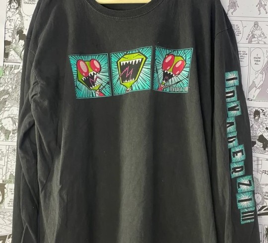
"The pants command me!" Invader Zim
It turns out that one of the Hot Topics in the Tampa Bay area - at University Mall in Tampa - still has the old gate style entrance. I asked the gal working there why the owner never removed the gate, but she didn't know. She did confirm, however, that it is one of only three out of 675 Hot Topics that still have the gate.

I used to see these gates on Hot Topics all the time, and I am sorry to say, I didn't even notice when they stopped having these gates. But then again, my time of frequenting Hot Topic was back in the '90's. By the mid-aughts, I had stopped visiting the brick & mortar Hot Topics and started ordering everything I bought from them (which, admittedly, was never a lot) online. The last items I purchased from the Hot Topic website was several striped shirts, both long and short sleeved, of a type fairly difficult to find anywhere else, plus they were on sale, so I snapped them up.

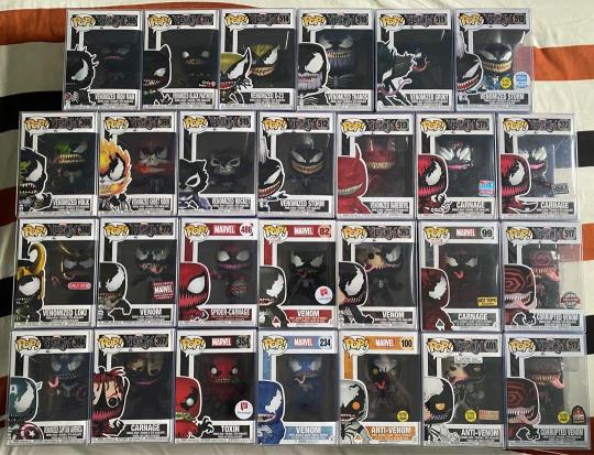
As for my reminiscences of Hot Topic back in the 'good-ole-days' of the '90's, they might be a bit underwhelming. I was never a 90's mall rat, so you won't find any vintage pics of me wearing those super baggy pants, but I still went to malls about once a month during the 90's. Much less than the once a week, or more, during the 80's. I first encountered a Hot Topic about 1992 in either Richmond, Va, or Washington, DC. I didn't realize it was a chain, of course, until I encountered the second one. Independent stores similar to Hot Topic were common enough back then that I really only took particular notice of Hot Topic once I realized it was a chain and, clearly, doing quite well. Even back then, it was an expensive place to shop, so I rarely bought anything but would just browse. They used to focus much more on goth items and maintained that emphasis throughout the '90's, but by the early aughts they'd begun to shift to other areas until eventually evolving to the Funko Pop shop they are now.
Not that I have anything against Funko Pops. Folks really seem to like them, although they're not my thing. I'm still able to order gothy stuff via Hot Topic's website when needed, so it doesn't matter to me what they stock in their brick & mortars. They also changed the font at some point - also didn't notice when that happened - but this is how I remember Hot Topic from the '90's:

Another reason I'd usually visit one whenever in the mall, was to socialize with my friends working there. I might be the only person I know who didn't work at a Hot Topic for at least a week or two back in the '90's. I just don't have the customer service skills. But it was always fun visiting with friends and acquaintances and catching up on the latest news from my fairly large social circle. The Hot Topic folks always knew the latest since everyone else also stopped by to socialize, so they were practically town criers. And after inevitably quitting the job, they would lament that they no longer got to hear all the latest, juicy gossip. The last person I knew who worked at Hot Topic - a co-worker of mine at a haunted house - quit working her Hot Topic job in late 2005, and that's when I stopped visiting the stores with any degree of regularity.

I'd also always visit the Spencer Gifts that was, invariably, just a couple stores away from the Hot Topic. While Hot Topic has changed, Spencer's has remained the same - so much so that stepping into one is almost like traveling back in time to the 90's. And with over 600 stores, Spencer's strategy seems to be working as well.
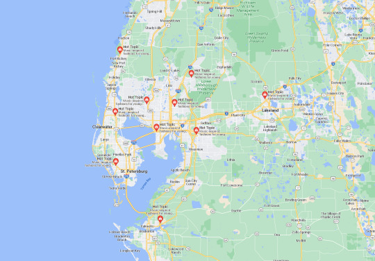
Another somewhat odd thing I discovered, is that the Tampa Bay area has an unusually high number of Hot Topics with 10. Orlando only has 4 and even the vastness that is the Miami metro only has 7. My old stomping ground of Richmond, VA, only has a single Hot Topic remaining. Why does Tampa Bay get 10 while Richmond only gets one? I don't know. And why does one of our ten still have the gate? Also, unknown. And what ever happened to that cool Invader Zim shirt I bought at the Hot Topic in Mall St. Mathew's in Louisville, Ky, back in 2003? Yet another great, cosmic mystery on par with GIR's...well, on par with GIR.
creaturesfromelsewhere 7-3-2022
#hot topic#funko pop#invader zim#hot topic gate#gir#goth#goth style#goth fashion#gothic#darkly inclined#the 90's#spencer gifts#malls in the 90's#musings from an elder goth#creaturesfromelsewhere
7 notes
·
View notes
Text
Arts 102: Blog Post, Weeks 9-10 + Reading Reflection
Week 9: This week was focused on my concept statements and the digital rendering of my two logos for Matilda and Trunchbull. I sketched and scanned out the several logo ideas I was most likely to go with (attached below), and chose the floating book with for the character Matilda and the newt trapped inside the glass for the character Trunchbull.

When receiving feedback from professor Khalili, she suggested removing the arch of text for Matilda's logo and doing scrambled letters instead for more visual impact, and removing Trunchbull's hand on the newt logo. I suggested changing my character from Trunchbull to Lavender (she did the original initiation of the prank in the movie), and professor Khalili agreed, resulting in the character change in my project. Class on Wednesday was asynchronous and was focused around the completion of my concept statements (attached below). In my concept statements, I described the character, discussed the Gestalt principles used (similarity and area), the font (Big Caslon Medium and Chalkboard), and my color scheme (contrasting and analogous).
Week 10: This week was focused on the completion of my character logo project. During the weekend, I spent a lot of time working and editing my character logos. Using Adobe Illustrator was a challenge as my logos both featured illustrations (Matilda's hands and the newt) more than shapes, leading to a lot of time being spent in revising and reediting the digital art. Eventually, I ended up using another program, Clip Studio Paint, as a way to complete my digital art as I find there to be more line and tool diversity on this program for digital art. After finishing my artwork on Clip Studio Paint, I brought it back into Adobe Illustrator, and had to make some more digital touchups since my imported images were not to scale and were heavily pixelated. The process was arduous, but eventually, I found myself to be satisfied with both of my logos. My project was completed on Wednesday, when I used an Adobe InDesign template to import my images and concept statements. Then, I sent my work to the printing lab, where it will be printed on 11"x17" matte presentation paper. Though this project came with many of its challenges (The main one being me being a novice student and still learning to achieve proficiency with the Adobe programs), I found myself to be happy and satisfied with the end result.

Reading Reflection (246-291): With app design, I never realized that there are so many factors needed to be considered, such as the state of the person using the device and potential interfering technologies (like headphones). I think it's interesting how this is a potentially high-reward form of design. The work that stood out to me the most was Michel Chanaud's- I am visually drawn to visually vintage works like his Etapes magazine cover, which appears to be illustrated with an airbrush and has hazy color choices, like the fainted blue in the background. I also thought the excerpt on Girls and Games (page 262) to be interesting, as it comes to show how modern open-mindedness in thinking and disattatchment from old stereotypes and beliefs is a valuable trait to have in the world of graphic design. In the section for E-commerce, I found the clean, modern, and floral work of Randy J. Hunt to be visually striking. The edge in Lucy Sisman's ink art designs also stood out to me from a chaotic, yet harmonious stand-point. I found the fact that in the past, message delivery was prioritized over consumers to be surprising- It comes to show on how many fronts graphic design has evolved.
2 notes
·
View notes
Text
7 Best Cricut Fonts for Wedding Signs to Elevate Your Decor
Recently, my brother Kevin got married, and I was responsible for the decorations, including invitation cards. As a pro crafter, I made all those cards and needed many different fonts to add text to them. Although many fonts were available on Cricut Design Space for free, I preferred to find some from the internet, too.
To my surprise, I had a collection of fonts that could be used for weddings if you are curious and want to know about the best Cricut fonts for your or your loved one’s wedding ceremony.
1. Always Loving
Choosing the best Cricut fonts for wedding signs is the most important part of creating an invitation card, and it is a big deal for everyone. Crafters familiar with the Cricut machine know that the fonts must be cuttable so they can be cut smoothly. Also, if you want stunning text that attracts people’s eyes, you need something like the Always Loving font.
Those crafters looking for a sure winner and who love this type of font must give it a shot!
2. Hello Honey
‘Hello Honey’ is the most beautiful font I crave. The heart swashes and tails-like features are very impressive and eye-catching. It looks stunning and luxurious, too, giving it a pure premium look. This font is easily compatible with your Cricut Design Space and is cut easily on a Cricut cutting machine.
So, if you are into adding a playful touch to wedding crafts and cards, this is the right choice!
3. Dear Agatha
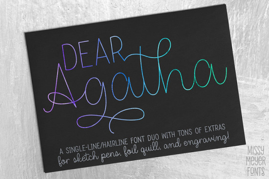
Want the perfect font for your wedding invitations and envelopes? In addition to making cards, you can also use them as gift cards. The name of the font is Dear Agatha, which I got from a well-known website called Creative Fabrica.
The font style combines script and serif, and it is super readable with all caps and serif font. This fancy font can be used to write names, and it adds some flair. Also, the clean Sans will be the perfect fit for addresses.
Madelyn Heart
Are you looking for the best Cricut fonts for wedding signs that combine hearty shapes? This font looks full of art to me. The adorable heart accent gives it a unique look that everyone wants to see. Don’t you think it is more like a piece of art? Besides, the font has many glyphs and swashes, giving you endless customization for every wedding ceremony.
5. Randy Sofia
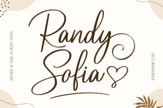
If you asked me what my favorite Cricut fonts are for wedding cards, my answer would be Randy Sofia. I really love simple fonts and don’t like fonts that are too fancy. This was one of the best Cricut fonts for wedding signs I used on my brother’s wedding cards.
However, this was not only the font I used on my card; I also used it with a combination of others. For different texts, I used different fonts. Rather, it is your choice. Overall, the Randy Sofia font is my first choice.
6. Little Love
This is one of the modern calligraphy fonts for Cricut users. It will add a graceful touch to your wedding gifts and invitation cards. This gorgeous font, with artistic-style letters, makes it look elegant.
It is not very thought-provoking, but it is a smooth and clean font suitable for cutting or writing on a Cricut machine. Using this font, combine the bride’s and groom’s initials to make a unique monogram.
7. Creative Vintage

Want a more stylish font? Here is Creative Vintage, a stylish serif font that will add charm to your wedding crafts. Whatever you use it for, it will make it stand out. Add some flourishes to your letters and personalize any names that you want to make it look unique.
This bold font looks really elegant, doesn’t it? And it is available in two versions — grunge and clean. A clean version will look very smooth, making it easier for your Cricut to cut the vinyl quickly. However, if you want a rough look, you will want a grunge version.
Final Thoughts
Elevate your wedding celebrations with these 7 best Cricut fonts for wedding signs. There are all types of fonts, from smooth to rugged. Also, many fonts have an artistic style that is best for making the bride’s and groom’s initials. Besides, I found all those fonts from Creative Fabrica, and they are cuttable and Cricut machine-friendly fonts. So, explore the fonts I mentioned in this blog and use them to make wedding signs.
FAQs
Question 1: How to add fonts to Cricut Design Space?
Answer: In order to add the fonts to Cricut Design Space, you have to follow the steps below:
First of all, you have to download the font file.
Afterward, you will need to install the font on your device.
Then, open the Cricut Design Space.
After that, move to the New Canvas.
Next, you will have to select the Text tool from the left toolbar.
Now, add the Text box to the canvas.
Here, click the font drop-down menu.
Finally, select the new font from the list.
Question 2: How to download font to Cricut?
Answer: Downloading a Cricut Design Space is no longer tedious. In other words, many online platforms offer free or paid fonts to meet all your needs. Hence, you only need to know the platform that offers the best free fonts for Cricut users. The website that offers the free Cricut fonts are as follows:
Dafont
Fontget
Creative Fabrica
Font Squirrel
Honey Florist
Question 3: How to upload a font to Cricut?
Answer: To upload a font to Cricut, you have to follow the steps below:
First of all, download the font and find the place where you have downloaded it.
Then, you need to unzip the file folder.
After that, double-click on the downloaded font file and follow the prompts to install it on your system.
Next, open Design Space and create a new project.
Then, add the next layer and select the text tool.
Finally, choose the font from the drop-down menu.
Source: best Cricut fonts for wedding signs
Visit here for more Information: cricut.com/setup
cricut explore 3
You tube
#best Cricut fonts for wedding signs#How to download font to Cricut#How to add fonts to Cricut Design Space#cricut.com/setup#cricut explore 3#design space cricut#Cricut Design Space
1 note
·
View note
Text
Reflection Week 4-5
In week 4 My classmate and I brought in different objects, and we arranged them according to needs, wants, and prices. We had some debate on needs and wants, as everyone's perception of needs and wants is different, which is fair considering each of us has a different way of life.
(left needs and wants, right least to most expensive)
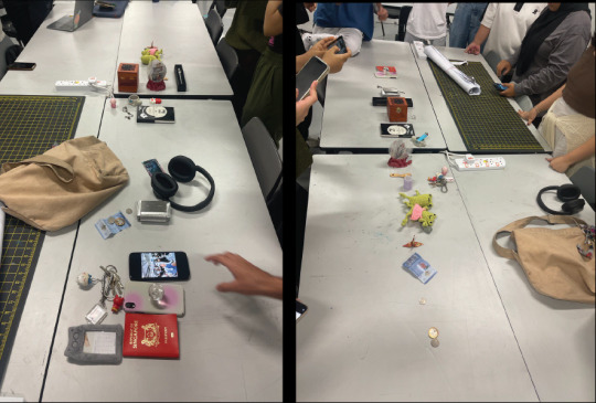

debating on the topics we were going for haha
Tells me how things are being organized in a type of system to make it a clearer view. Just like how I have been using the grid system to make posters and websites so that they would be aligned and have a sense of hierarchy.
For Week 5, we went on a field trip! This was fun and interactive. We were told to capture five points in the museum that we found interesting to talk about.
Recycling Upcycling
This part of the exhibition caught my eyes by its vibrant colours and object placed. I was instantly drawn into it and wanted to find out more. The signs use and colours were definitely the main point the caught my attention the use of real life example were also nice for a viewer to experience. As mention above I believe that designer should design with a purpose. And this is another great example!
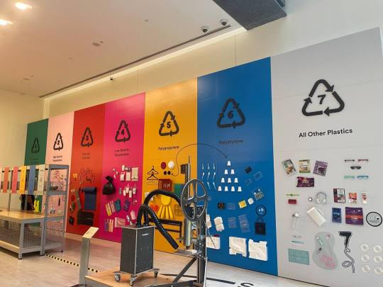


Upcycling! Using used plastic to create beautiful art.
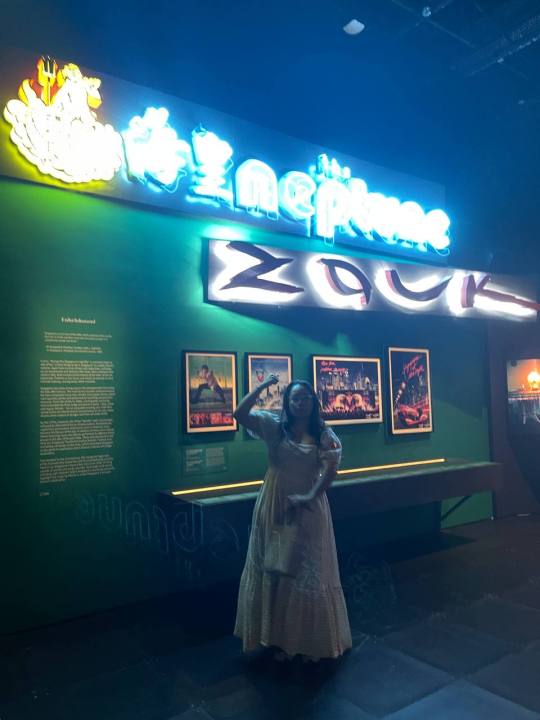
2. Signages
We came across another part of the exhibit which were we saw some familiar signs. It was Singapore's iconic nightclub! With its neon light and font someone would be easily attracted to it and would even want to search it up afterwards! The night scene in Singapore has become lively over the years and this is great in attracting tourists.
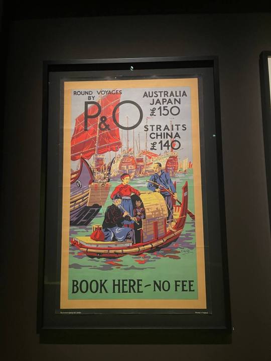
3. Poster / Tourism
I saw a bunch of old-day posters of Singapore and other countries promoting tourism. I loved the colors and vintage style of the poster. Combining colors of each country and forming a poster I also liked how the poster was straightforward and you could understand from a glance. I would love to experiment this type of style and font in my future design as I talked about how I only like monotones and neutral colors however with seeing this inspired me to explore more retro colors and styles. Not limiting myself.


4. Timeline
I saw this huge stretch of timeline smack at the wall and of course, I would be curious as to what it was it was big and had a lot of words to it. Though it did not have many images it still managed to make me stay and the layout and bold fonts were good to grasp a reader's attention. This is a great way for travelers to get a glimpse of knowledge of Singapore too. I love the typography of this and how I could make use of such layout in the future, especially for newspapers and magazines!
5. Information
While browsing through the museum information of the artifact could be easily understood with the description at the side. The descriptions were in a simple font, easy to read, and a good length. information should be kept this way as I feel we should not overcomplicate the design when it comes to important information about history.
Overall this museum walked me through different styles of signs and how messages were delivered in different ways and compositions.
0 notes
Text
Case room Press
To inform the layouts of my outcome, I have decided to look at Case room Press, to see how typography is used as a design element. This will inform me how I can develop a graphical language to convey the emotions behind my conversations.
Fond Farewells
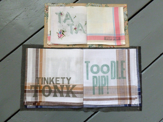

Fond Farewells explores lost language by highlighting well known phrases that are no longer used in current society (Butler, 2016b). I like how the type changes depending on hoe the word is said or pronounced. For example, Too die pip!, places emphasis on the last part by increasing the letter height. This shows that the end of the phrase is said louder than the start, Whereas, 'Pip Pip' is the same type throughout, showing it is said in the same volume and tone.
To give the English farewells more context, they have split the project into two volumes, his and hers (Butler, 2016b). This implies that the farewell phrases in each book relate to which farewells different genders would typically use. I like how they have reinforced this message by using pieces of traditional suit and dress materials to make the pages. This makes the narrative and message clear and concise throughout the book.
Furthermore, by using a ribbon to close it, they are showing that this is something to be cherished. This will make a person take extra time to examine it because it shows that it holds important information.
The phrases are different sizes throughout the book. This implies that the phrases that are bigger were used more frequently than phrases that have a smaller sized font.
This book has reinforced the fact that the form of my outcome is just as important as the content within it. By choosing a form that links to my narrative, I can use the audiences interaction with my outcome to engage them and draw their attention to the important elements.
Look+Say
This book is a collaborative project that began with a set of 1960s ladybird flashcards (Grainger and Wood, 2022). It starts with one person creating a word by folding the flash card in half and inserting a piece of vintage proofing paper, they then create a new word on the parchment paper before passing it on to the next person (Grainger and Wood, 2022).
I like how this forces the artists to focus on how they can create a narrative. This leads to them having to carefully consider their next word and how it could impact the narrative as a whole. I also like how the narrative is not controlled by one person, which makes it random and unpredictable.
I like how the collaborative element of this book encourages the audience to explore the word around them. By using a simple exercise to create the book, they have made it easy for the audience to try themselves. Therefore, they are encouraged to explore the subject further. I think this method could be useful for my outcome because it will encourage my audience to start getting to know people by showing them a simple exercise they can use. I could use my conversations to show this, making it easier to see that the steps do not need to be scary.

Editions at play
When looking at the case room press, this project was listed below it on google. When I clicked on it I was intrigued by the concept because the project explores ownership in a digital format, when ownership is usually classed as something you physically own.
This digital book explores ownership and authorship by allowing each person who owns it to edit the book (Uglow, 2017). I find this concept interesting because the creators original narrative may be completely lost as it is owned by more and more people. Therefore, the narrative is controlled by the audience.
Furthermore, by using a visual system to show this change, a transforming grid, the audience can see how the narrative has changed and differed from the original over time. This shows how a visual system can help to aid the narrative. Therefore, when considering the layout of my book, I will need to consider how I can include lines, grids, shapes or type to direct the narrative and give context to my audience. This could be through a line, arrows or illustrations.
Butler, A. (2016). Fond Farewells. [Artists Book]. Caseroom Press ABPress. Bournemouth: Arts University Library Specials Collection.
Butler, A. (2016b). Fond Farewells. [Artists Book]. The Caseroom Press. Available from: http://www.the-case.co.uk/fond-farewells.html. [Accessed 21 November 2023]
Grainger, H. and Wood, P. (2022). Look Say. [Artists Book]. The Caseroom Press. Available from: http://www.the-case.co.uk/looksay.html. [Accessed 21 November 2023]
Uglow, T. (2017). Editions at play. [Artists Book]. Visual Editions. Available from: https://editionsatplay.withgoogle.com/#!/detail/free-241. [Accessed 21 November 2023]
0 notes
Text
Today I feel an incisive pain in my body, and all I can do is vibe with it. That's a normal I am glad I can see I did not miss, because it means I don't live with it everyday anymore.
I rebloged a story about a robot's soul today, and it stuck in my head. I feel like I'm not as good a writer as I could be if I practiced, and that I'd need to actually produce some writing that I can share, which is not the present purpose of writing in a pretty notebook with fancy ink and a quill.
I do love my fancy quills and inks though, but that's not the point.
The point is, I think most of my followers are bots right now. And I guess that's as good an audience as I need to pracrice. And tumblr is a safe enough social media, and more importantly, I barely interact with people I know irl (or anyone really) on it, which grants me relative anonymity. I forgot tumblr was like that. I'm called back to despair on every other social media my friends use, and I'm growing tired of adding despair in my life, on top of a recent heartbreak which I still mourn, the chronic pains flaring up because of an illness my school-working-housemates brought home, the adhd wanting to do many things and frustrated at my current inaptitude to carry my own head comfortably, and the money drifting away slowly, with the dread of not doing enough about it, even though I did put some stuff into motion, it just takes time to become something because I'm shooting in the dark and pulling many strings together.
I want to create art and show it to people I love.
I want to bring my chosen family closer together so that I can actually live with all them people I love. I want for the world to realize its mistakes and act accordingly, respecting life at its most diverse sense.
I want to live among the trees and the rivers, in a mobile device, and bring chill corners everywhere I go, and call it TransChill3000 with a vintage and kitsch font on one side.
I kinda want to create a virtual chill corner here I suppose, where there are pretty pictures and sounds and where my thoughts can be free to be perceived by moving particles, be them sentient or not.
I stopped dreaming about having a normal life long ago. I want to be (part of) a circus company, not a company company. I want to hear stories and let them move through me, and show what it feels like to be alive, in this day and age.
I want to live with flow and chaos, and rest too, because if I don't, my body will eventually, and it is very unpleasant times, so might as well make it so I can manage. I guess i'm still scared of scheduled work thingies.
I want to know how to drive. No learn, only drive. (But we're still before the apocalypse, so I have to take lessons and give money to capitalism and it bores me to death)
I want to heal lands and people's hearts, to care and to love, just like I marvel at the teeny tiny kitten we rescued some weeks ago.
I want to enjoy a silent retreat, to go elsewhere than the noise of everything happening all at once.
I want my heart to get better, and to cry a little, though my fear of getting stuck in that sadness loop keeps my emotions pretty much bottled still.
I want to dissociate and I want to find peace within my body-heart-mind. These are contradictory and it annoys me.
I want to be better at my stopping tabacco resolution. But the joints do help me survive today, so, i let the part of me that wants to die to cease suffering take a little hit. Masochistic in the way I can manage.
I want the soft embrace of tender arms, to let myself be supported and cared for by someone that wants to just be there for me. I struggle to make it known still, yet I'm getting better at it I think.
I want to let my limiting beliefs go, and let new ones take over. That's a work in progress.
I want to be able to rest my head on a pillow without restlessness makes me want to move every few minutes, and awakening the pain again.
I want to dream of more things that become true. My visions are getting clearer these days, and I remind myself that this, here and now, is also a dream.
I breathe.
1 note
·
View note
Text
Taylor Swift DigiPack
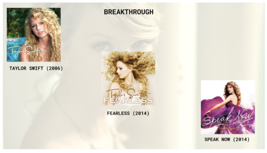
Taylor Swift (2006)
She was 16, when she released her self-titled debut album that showed Taylor was filled with potential and portrayed her obsession of youth and her love for her senior boyfriend.
Her image is portrayed as a sweet young country singer who is finding herself in the world. The album cover is simplistic showing the star with a highlighted zoom on her face. The addition of butterflies on the left side provokes a sense of innocence formulating the idea of a young teen's imagination. Furthermore, the colorful background is effectively used to create a happy major feel to the album. Her hair is highlighted showing her golden locks which stand out in the overall image.
The text font, through AI research is Satisfaction Pro
Fearless (2008)
She was 18, when she released Fearless, this album is about "Continuously pushing for what you believe in and never backing down."
Her image is portrayed as a young teen who is growing up in the world. The cover of the album shows more of her body that her debut album. However, her hair is still a key noticeable feature of the image the wildness of it could possibly portray her freedom as she expresses herself to the audience. The wash of colours could also show her youth, purity and also this sense of maturity which seems to be portrayed.
Speak Now (2010)
Her second album to be released in 2014 shows this transition to womanhood where she express her pain and vulnerabilities of finding her first true love.
Once again, the image of Taylor is more zoomed out, ending her break through period with a very "this is me" type attitude. The image for the album shows this beautiful purple dress which conveys the image of a mature lady. Furthermore, the use of special effects on the dress show this merge into the modern world while also adding an extra layer to the image. The image is very minimal and shows a larger amount of skin on her shoulder blade possible showing this transition to maturity. Her hair is curly and flowing once again, however this is the last album in which her hair is like this. I believe this shows her change into a womanhood. Finally the lighting on her body is very whitewashed, possibly showing authenticity with her fans and listeners.
Taylor's early album covers seems to flow between one and another simultaneously which shows the first era of Taylor's career.
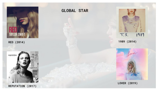
RED Taylor Swift
Darker color palette
- More mature
- Contrasts more with the colors and tone of previous albums and marks a shift in star persona.
Red
Previous album 'Speak Now' had Taylor in a magenta dress, typically considered a childish color. The use and titling of red signifies Taylor maturing.
Chiaroscuro
Already an established star with a strong name; no need to market with face strictly.
1989 Taylor Swift
Use of polaroid
- Polaroids saw a resurgence in popularity in the early 2010s
- Popular in hipster and twee subcultures due to the vintage 70s feel
- Taylors music was mostly targeted towards teenage girls and young adult women, which in 2014 were mostly congregated on the social media website Tumblr, where polaroid's were a trendy image format
Sepia filter
- Vintage was a popular trend in 2014, and the use of sepia enabled the feeling of ageing and authentic vintage
- Reflects the theme of '1989'
Lack of face
- Taylor was already an established star with strong branding; no need to show her face
- Generated an aura of mystery behind the theme of the album
Reputation
This album released 3 years after Taylors album of 1984, this is kind of a push to show that she is still present in the music scene. The album cover shows Taylors full face in a black and white filter. Almost portraying this newspaper type article possible showing the judgement that society places on females. As well as, further pushing the idea through the use of New York Times text font saying Talor Swift over again. The lack of a vibrant dress in this image also shows authenticity from Taylor. The removal of her red lip stick also shows this behind the scenes image of Taylor. I believe the fact we know that her lips should be red for this image proves her point of this reputation she has made up around her image. Possibly being seen as a statement to all her judgmental haters.
Lover
This album released 2 years after Reputation shows a stark juxtaposition in album covers. This vibrant colorful image portrays this regaining of youth and almost a sense of freedom towards her creativity. As well as this limitless and lack of care towards the hates against her. This color combats the statement of the previous album and shows her emotions liking to true love hence the name Lover. I believe these colorful clouds in the background show her weightlessness when falling in love. Furthermore, this washed out glow around Taylor possibly shows the image as an insight into her mind.

Folklore
- Naturalistic
- Shift from pop to folk - sound takes a large shift/turn
- Folklore and Evermore commonly seen as sister albums, because of the closeness in title and genre of music
- First album discussing personal and other stories (rather than focusing on her own)
- Very small in the album cover, insignificant
- Want to stray from the limelight
- Maybe wouldn’t have shifted music if there wasn’t a pandemic; stems from wanting to pursue her own music
- First of albums where she attempted to stray from “charting music”
Evermore
- Folklore sister album
- More personal (reflected through album)
- Evermore is Autumn to Folklores spring
- Stories are much more reflective on her own life, but more subtle
- album cover, cannot see her face, yet she is still there/present (she is not the main focus)
- Continues folk music (hence the sister album consideration)
- Passion project versus previous pop hits
- No heavy promotion (unlike her typical album releases)
- Album cover shifts her typical star persona, however is still recognisable
- Personal/less spotlight
Midnights
- Foray back into pop music
- Follows speak/red releases - reclaiming of roots
- Goes back to pop, her past
- Very blue, may be a sister to Red album
- Bedroom pop, dark music
- Minimalistic album cover
- 4 versions of the album, combine together to form a clock
- Songs she has written after dark, that have found her versus her typical finding of music
- Midnights, 3am tracks (a lot darker, intrusive thoughts)
- a lot of the music reflects her thoughts about her recent breakup, spending life with herself
- A lot of the photo shoots show herself, makeup smudged
- Alleged boyfriend at the time, collected old lighters, which may be what the the lighter is referring to
- Resembles 60s-70s era where track lists were listed at the front around a white border
0 notes
Last Seen Blogs

zhniven
Zhniven
purplerock11
"Grief is the price we pay for love"

writerkovoli
Kovoli's Ramblings
nanngostino
Under many names
spiritspeaker03
The Séance Table