#i never want to see a colorpicker again
Photo

MCC but its one of those buggy rpgs
#mcyt#mcc#mc championship#too many to tag#i never want to see a colorpicker again#but yes hype hype#pls tag with whos pov youre watchin :D
11K notes
·
View notes
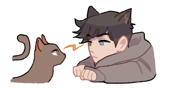
Note
hI!! i love your art and was wondering if you could make a tutorial showing how you paint stuff? only if you can! it's just really pretty !!
hi nonnie! thats very flattering !! i’m sorry i dont think i’ll be very helpful bc i’m a mega noob as well :D but i’ll try my very best <3
my process is very tailored for speed instead of quality (oops soz LOL) so i do suggest this for if u have short doodle breaks ⬇️⬇️⬇️
thumbnailing (for comics) -> lines (sketch who?) -> bucket tool/color drop in the base color -> color in the lines -> one multiply layer for a “base” shadow (in the vid below its purple!) -> one (1) render/paint layer a.k.a lawless no man’s land
full rendering process & more general painting tips below the cut‼️
NOTE: i’ll be focusing more on traditional/fundamental tips for stylized art because i’m sure there’s a much more effective way in digital. I truly do only use one normal layer for render... i think this is bc before i made this blog, my only prior experience in drawing is middle school art class, so all i know is traditional painting on one layer.... pray i can answer this again in the future with something smarter lmao
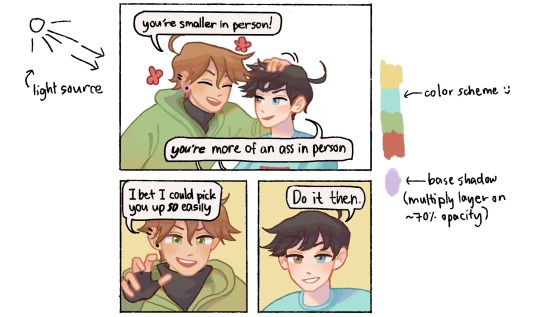
🌺 MY PAINT PROCESS
1. Choose a color scheme!
It doesn’t have to be set in stone like below, but i at least keep in mind the color range i’d like to use depending on what i want to convey (ex. soft pastels for soft fluff, or warm colors for happy vibes). I try to be as limited as possible for base colors because I tend to go ham when painting, you’ll see later AHAHA
2. Base coloring + Base shadow
Base -> bucket tool in the color scheme (I know other artists are against this but when i discovered the bucket tool in digital art I immediately divorced manual coloring i’m sorry i loved you tho bae) (this is why my style and lines are simplistic as they are, so the color drop works!)
Base shadow -> in theory, warm-colored light creates cool-colored shadows and vice versa. because i’m a fluff addict i mainly use warmer light, so i like using blue/purple as the shadow. generally u can’t go wrong with complementary colors!! (yellow light & purple shadows / orange light & blue shadows).
I make a new multiply layer (decreased opacity just bc i like things soft okay) and clip it on the base layer, then block in the areas i think would get blocked from the light.
3. Color in the lines!
for simplistic styles i swear this works wonders. i just clip a layer to the lineart and manually color the lines with a darker but more saturated version of the base color. it just tends to look more dead i guess with low saturation lol (ex. u can see above i use both peach and red or pink for lines of skin, i guess it implies the blood under the skin too. or something :D)
4. RENDERRRR
when i’m not in a rush i just paint things completely (and mindlessly), but here are the things i almost always do:
line the shadows with a saturated color! i’m not sure this is common but i love it lol, in almost all my doodles just check the shadows—on the edges, there’s bound to be a wild color :D (usually its the light color, shadow color or a color scheme color but sometimes i’m just like boY do i loVe piNk)
my art major friend told me about saturated colors on desaturated bases and my life was changed forever lol. u can see below even when my base is very grayyy, my rendering is very gay :D ❤️🧡💛💚💙💜
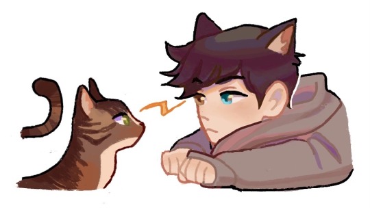
make the shadows darker where i think they should be darker. usually i can just colorpick from that darker, saturated lineart color!
if it’s a more realistic piece i usually make the highlights lighter, but in simple doodles i find it unnecessary, and i dont like how light/white it looks :( i tend to just make the areas exposed to light more saturated
color in the rebound light~ in reality there’s usually not only one primary light source, at least there’d be secondary light from where light bounces off objects. in art we just emphasize that! so in large shadow areas, or in areas close to other objects/colors, i like to ‘splash’ other colors on
yeah this part is less intuitive for beginners and u have to learn a grasp on the concepts over time, like for lighting and structure. values can be more important than color, so i do suggest learning shading first before coloring, but only if u like (u can always be like me and just pull up references when u dont get how the light would fall on some materials :>). i have more general paint tips below! don’t give up okay, i believe in u nons, we’re all still in the eternal learning process together ( •̀ᄇ• ́)ﻭ✧
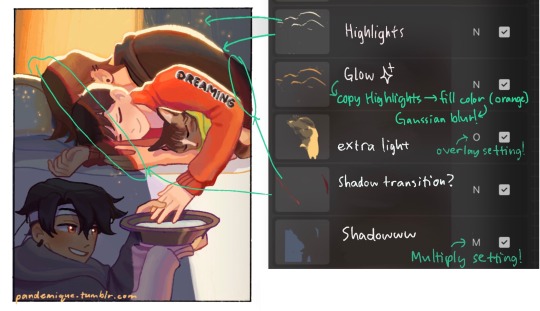
5. OOOOHHH SHINY ✨🤩
this step is just me being mesmerized by how easy it is to play with lighting in digital. i play around with the layer settings (multiply for shadow, overlay for light, and often try out the other settings too!). my favorite effect is the highlight glow thing, where u just make a copy layer of the highlights below the original layer, and blur it slightly so it looks like glow ✨✨🤩 overpriced acrylic could never
6. COLOR ADJUST / EDIT
Truthfully i usually skip this step, but my more pro friends really vouch for it!! i think definitely an incredible thing with digital is that u can edit proportions and even color after you’re done. i think they usually use like the curves adjustment layer in photoshop until they get colors they like, but for me, well, in a reaally diligent day i like to slap on the “auto” fliter in the iphone’s photos edit button lmaoooo
🌺 GENERAL PAINTING TIPS
learn basic theory: i think theres free courses everywhere online, but heres a few things u might like to have a basic understanding of: color, perspective, shape language, lighting, composition. don’t sweat it too much tho, it should be fun to explore the concepts!
and for drawing hoomans: proportion, gesture, expression, and veery basic anatomy. i find that overall forms are so much more important to learn than like detailed anatomy bc u can always look it up lol
but remember, u mostly want to learn the rules so u know better ways to break them :)
uuuuse manyyyyy referencessss every time u draww!
^this includes other people’s art — when u see good stuff, figure out why u like it and apply it to ur own art
get feedback!!!!
draw tons!!! brainrot helps !! ;D
aaand thank u for coming to my ted talk! sorry for the ramble nonnie, i hope u got something out of this lol
#VERY LONG POST ALERT‼️#thanku for enabling my rambliness nons#thanku for asking <3#love u anon#demi rambles#untagged#art advice#art tips#art tutorial#art#painting#i’ll update this as i go bc lord knows im also just a noob
182 notes
·
View notes
Note
hi! your art is gorgeous and i say this in the kindest way possible… but it’s a little upsetting to see you draw asian characters with very yellow skin (ex. your recent pics of sagawa). i know that you are just picking colors that look good together (and they do!) but i think it’s something to keep in mind for the future. thanks so much for reading and thanks for sharing your art with us 🌟
hey thank u so much for your kind words about my art i really really appreciate all feedback abt it!! the colors ive been choosing have been entirely colorpicked from various images both from yakuza (and sagawa's actor specifically for him) but i can now see where youre coming from now that im looking through my art again, and im going to work on how i choose my colors and undertones because i take this sort of stuff really seriously i never want to portray stereotypical/racist skintones in my art. i always just want to portray characters realistically and caringly. Im so glad youre a fan and im going to work on improving!
13 notes
·
View notes
Note
Forgive my absolute novice question, but those environment studies are BEAUTIFUL! I've never done them but I want to try, since it's good practice. What's your process, do you have any advice?
Thank you! No reason to apologize either. I can give a glimpse into my process, but fair warning it’s quite messy (I did this one quickly after work as an example) and I might not have the besssst explanations for everything.
Everything under the cut!
I do these off of photos I find on google images, since i’m not using them for profit or anything like that. I kind of decide what i wanna try and study (tropical scenes, forests, mountains, whatever) and then just look for an image that strikes me.
Something to note when you’re going into this is to have some idea of what you want to try and focus on. If there’s a specific thing you want to work on or capture when you do this. For me, it was trying to get better at seeing and picking colors, plus maybe fiddling w/ how mountains and rocks work haha
Having a specific goal makes doing studies easier because you don’t feel like you have to focus on basically everything when you’re painting. When the end goal is just ‘get better,’ that’s a lot of stuff you have to try and get right or pay attention to! Doing things one at a time is good.
So anything like...Wanting to understand color, wanting to understand shadows, wanting to understand light, wanting to know how trees work, or even something like ‘i saw this photo and i like how the light hits this one particular spot and i wanna capture how that spot feels’--just give yourself something to focus on!
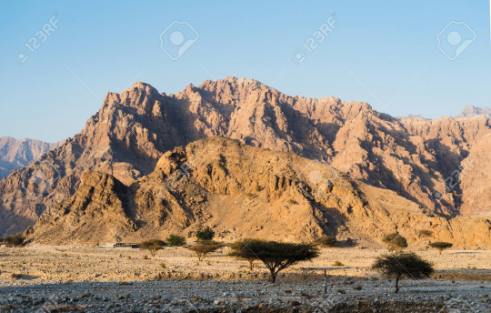
Anyhoo, I picked this one. wanted to try a desert scene. My focus, again, is trying to understand color a lil better (kinda gave myself a rule, which was ‘no colorpicking’)
I work on a really tiny canvas btw like... 3 inches by 2 inches, and with a kinda fat chalk brush with pressure opacity on. This makes sure i can’t get fiddly on it.
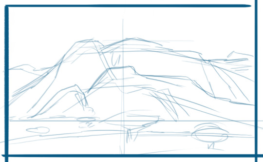
Usually start with a really basic composition sketch that is definitely gonna be inaccurate, but that’s okay since that’s not what i’m doing this for lol

a lil more ‘detail’ pulling out the forms of biggest interest. sometimes this includes the a shape of a large shadow, like at the bottom! just the big important sections of the composition that you see.
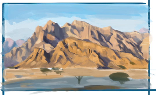
I start laying in the colors really messily, again going for BIG at first. Right now the focus is establishing those big spaces in the composition. Right now this also includes some of the stronger shadows, since those are important to the form of things. The colors I choose to lay down vary, but usually go for the sort of ‘mid tone’ that i can suss out, maybe a a bright hilight, and then a deep shadow.

lol okay this is definitely a jump forward. But you can see i focused on the mountains. I ended up painting over that tree because it wasn’t in the right place anyway.
Anyway, TIPS on how I approached this:
TRY NOT TO GIVE A SHIT OVER WHETHER SOMETHING IS SUPER ACCURATE. Just make sure that it reads!
Focused first on laying in the darkest shadows, bc those really inform a lot about the shape of the thing.
A lot of squinting and stepping back, and also making the reference picture zoomed out small. This really makes the small detail disappear and helps keep you from getting caught up and confused by it. Sometimes you can eliminate certain details, or combine them with nearby details.
I added some new colors here and there, but nothing too strong. I avoided introducing too many different colors though, and most of what i had was a result of mixing the colors I already. If you add a very different color, that creates an area of high contrast. Which can be great, if that’s the focus and you want to hilight the area, tho!
Tried not to draw outlines. In fact, I made sure most of my strokes were downwards or sideways to make sure that I had to focus on things as blocks of color.
How do you do manage the shape w/out outlines? One thing to remember! You perceive form through contrast! Basically, in an area, how does the shadow butt up against the light? Look for those edges/places where they meet, and then think about how different those areas look to each other. Are the colors really different from each other? Are they similar? Is the edge hard, or is it more gradual? Look for those places where things meet!
Keeping in mind that color is relative. When you’re trying to figure out what color something is, peer at the color itself and try to isolate it. For instance a color may seem grey to you, but maybe it’s blue, and it looks much more desaturated bc you have it up against a really warm, bright color. Maybe what you think is a green is actually a red or a brown. SOME TIPS:
If you’re not focused on color as your study, feel free to colorpick off the photo! You’ll see the difference between what you perceived and what the true color was, and you’ll learn from that!
I’ve gotten good enough to be able to peer at colors and separate them in my brain from the rest of the picture. If you can’t do that, then you can mask it out physically in photoshop so that it’s literally isolated! You’ll get way better at picking up on color differences this way, and then can work towards doing it without having to physically mask things.
Questions to ask yourself when trying to figure out a color: Does it feel warmer or cooler? What hue is it (does it look purple or purple or red to you)? How saturated does it look?
Shadows usually gradiate. Shadows are made bc they block out light. So they’re darker when it’s harder for light to get into a space. So the further away from an edge or a crease, the lighter the shadow becomes.
Be wary about your colors getting too muddy, bc that happens when you’re mixing colors. Step back now and again, and if they look like they’re getting too grey or brown, feel free to paint some saturated color back into it.
Anyway, I added the trees (spent less time on them bc they’re unimportant to me lol) and cleaned up a couple other things...

And the last step is just creating a clean border around the painting to make it look clean!
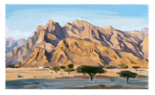
And there’s my study.
ALSO
Also
the most most most important step
is to close the fucking Reference you were working off of and not look at it after that, because you’re gonna like what you did way better as its own thing when you’re not comparing it to the real deal lol
Anyway...I think that’s all i have to say? Idk. If something’s not clear, feel free to ask, but that’s what I got. This painting was pretty rushed so it’s not the *best* representation of everything, but hopefully it got most of the point across.
78 notes
·
View notes
Last Seen Blogs
levisdustymop
Current Location: Feel Ocean

spiralknigit-blog
Ixtharion, Spiral Knight
avant-gardegalore
Avant-Garde Galore

talan-dracht
The Wanderer's Journey

iwishicoulddrawheatherforaliving
CottonCandyCloudscape