#i really want a cricut
Photo
Greetings, human! ♥ (Patreon)
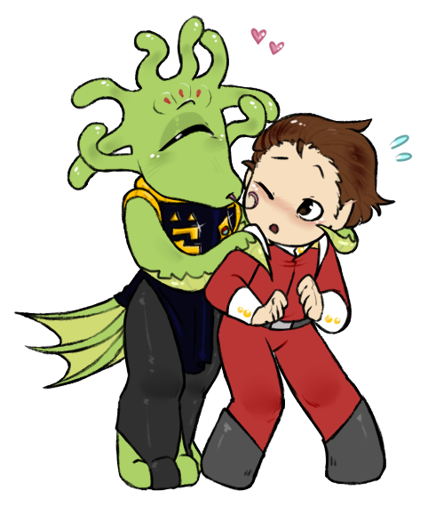
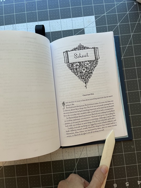
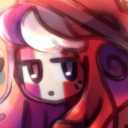
#My art#SCII#ZEX#The Captain#A warmup that I took a little longer with - pacing myself?? Could be#I wanted to work on the daily more at the time but ah I had a good fun with this one ♪#Even if it was one I failed to record hhhhuah#Oh well - next time lol#Mostly inspired by accidentally starting a new fic with these two heck#Yeah on top of the recent DAX ideas coming in my brain decided to prank me with Yet More inspiration lol#I'm happy about it! I do enjoy writing :)#But it's also Extremely self-indulgent so fjdslkafjd while I'm having fun it's also like Oh No I'm Having Too Much Fun With This lol#Not such a bad thing every once in a while ♪#They're just so cute hehe#Been having a lot of fun with this sizing of chibis lately - small sketches then upsized to ~about where I'd want them on-screen#Maybe a bit small still but that's not that strange lol#I really want to hit whichever library near here has a Cricut I must learn how these machines function and how much they charge#I mean if I can just make bookmarks at home what might the library be able to offer me hehehe ♪#Anyway
115 notes
·
View notes
Note
your bindings are insane! dripping fingers and the secret language of plants series are my favourite fics of all time so seeing them in physical form made me lowkey emotional ngl
ahhhh thank u so much!!! it makes me emotional that it makes u emotional omg!!! but yes i think that’s exactly why this hobby is so rewarding it’s like this thing that i am so deeply connected to is in my hands bc i made it. i sewed her up and glued her together and tried to make her pretty and now she exists! physically exists! sorry that got weird but thank u for your comment!! it really means a lot:)
#this is my first ask omg#did i do it right LMAO#also plz get into bookbinding#everyone!#it’s legit making something from scratch#i got my first cricut and felt like god#anything u wanted u could just print it out#and bam#now u have design!#very heady feeling#had another god moment when i finally figured out how to create a typeset#it took me MONTHS!!#word is really fantastically bitchy#she’s all like “omf something’s wrong”#and you’re like#what’s wrong???#and she’s all like#oooof can’t tell u that partner#and it’s like#fuck u!
4 notes
·
View notes
Text
It is so hard to find actual handmade goods. Like Etsy’s been overtaken by mass production and drop shippers for a while, but that stuff is creeping into real, local small business events. Half the sellers are pyramid scheme reps or people who just slap their packaging on something they bought in bulk elsewhere.
#tried to do some small business Saturday stuff and it was depressing 😭#the proliferation of people wanting a side hustle (which is just a spin on wages being too low#and making people feel like they need at LEAST 2 shitty jobs)#is the worst like we really just can’t have anything untainted by consumerism.#I’m not saying crafts HAVE to involve intricate beadwork or anything but I am also tired of walking past 3 stands#that’s just someone with a cricut machine that prints out quirky quotes#that they downloaded online like :(
4 notes
·
View notes
Text

Ash's shadow shirt design
》free to use for non commercial use《
#you could probably cut it out on a cricut or something in vinyl and make it look really good#but i think im going to print it#i know the medium gray is silver on the real shirt but#thats just toouch work for me rn#rainbow high#bruise.jpg#shadow high#ash silverstone#i kinda want to make the astronaut but i dont wear white shirts#t shirt designs
15 notes
·
View notes
Text
After having worked on library projects using a cricut and a 3d printer I have decided that crafting technology has never been better and also I would pay any amount for someone else to do it
#been prying one too many sheets off a cricut mat screw this#i do have a 3d project i really want to work on#but the library printer is not equipped for it
0 notes
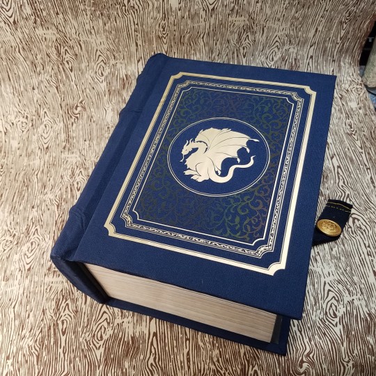
Text
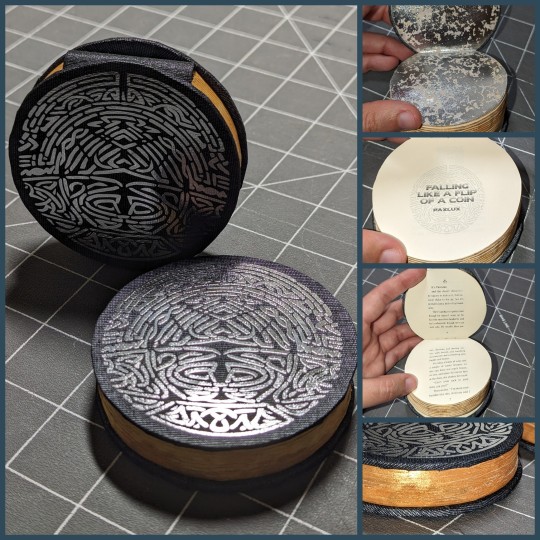
Here's the bind I did of @mythrilthread's typeset of @psychofink's fic Falling Like a Flip of a Coin.
I picked this one up for Renegade's Tiny Books Bang (after completely failing to typeset anything myself, cry) and immediately knew what I needed to do with it. It needed to be a coin. The story loops, and I wanted the book to have that similar over-and-over vibe, so I took Ril's perfectly reasonable left to right tiny book typeset and printed it so the pages flip up. When you reach the end of the book, the natural action is to flip it over (and start again).

It was quite tedious to punch the spine and cut out the circles; I made a template out of vellum tracing paper to frame the text when punching holes and tracing the circle for cutting. I roughly trimmed the sewn and glued text block with a craft knife, then I clamped it between book boards cut to size (and shape) and finished it with a belt sander. The belt sander (while effective) left the edge a little toasty, so I painted it with acrylic gouache.
The endpapers are mercury glass paper (from a scrapbooking pack), the bookcloth is Duo 105 (Graphite/Brikett/Briquette), the cover decoration is silver iron-on vinyl cut on my cricut. The knotwork design (from the title page) is repeated on front and back.
I used a lot of new techniques on this book, including shaping, sanding, and edge painting. This is also the first book I've made that isn't my usual case structure, as the spine piece was made separately and attached prior to the boards.
Overall this was a really fun if challenging project, and I'd definitely try it again if I had a book that really called for that sort of shape!
#fanbinding#ficbinding#bookbinding#my books#tiny books bang 2023#falling like the flip of a coin#my wife calls it the magic oreo
455 notes
·
View notes
Text
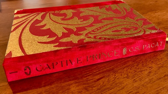


Rebind of Captive Prince by C.S. Pacat
My copies of the Captive Prince trilogy were getting quite ratty, and I've never been a huge fan of the covers. They're without a doubt the perfect target for a rebind!
I also wanted to use this opportunity to practice using faux suede (spoiler: it's easier than I thought it would be) and heat transfer foil (second spoiler: also easier than I thought it would be). I'm mostly happy with the overall results!
Materials used:
Cloth is faux suede in ruby from Hollander’s
Paper on cover is Thistle by William Morris in claret & gold
Endpapers are Snakeshead by William Morris in madder & gold
Endbands, ribbon and metal corners from Traditional Bookbinding
Title done in Cricut heat transfer foil in rose gold
Using wallpaper samples in bookbinding is inspired, honestly!
I’ll be doing the same design and materials for books 2 and 3, but in blue and green respectively.
The font I’ve chosen was a bit too thin in some places, but I sort of like the gaps it creates, so I’m not mad! I am, however, a little miffed that I didn’t centre it very well on the spine. I’m also not super happy with how the pre-made endbands sit. But really, I’m trying not to be so critical of my creations, so! I’m generally happy with how it has come out, and I’m super pleased with the colour scheme and the look of the suede. The foil goes especially well with it, so I’m keen to do that combo again.
180 notes
·
View notes
Text
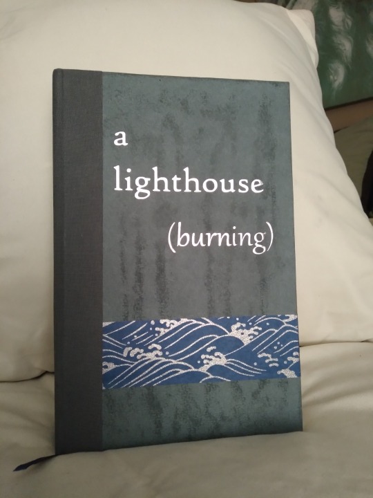
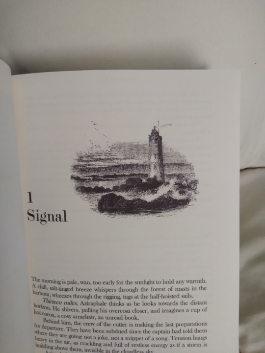
Today I've got binderary book #3 to share! It's a lighthouse (burning) by books-and-omens. This is a really excellent canonverse (sort of) historical setting liminal ghost story-esque fic that I read practically in one sitting sometime last summer. It's fantastic, well-characterized, angsty and fluffy and fairly plotty and with some really unique worldbuilding. I honestly can't sing its praises enough; it's one of the only times since taking up this hobby that I've known I wanted to bind something before I actually finished reading it.
Have a look at the rest of the photos under the cut; this one came out really well and I'm in love with it.

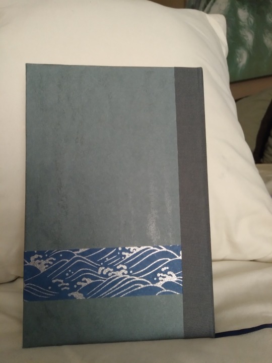
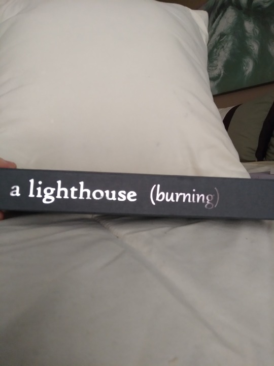
For this cover we have lineco book cloth on the spine, a strip of chiyogami paper that I got in one one ChibiJay's random paper packs, and blue-gray sketch paper for the primary gray space. It's a little hard to tell in the photos but the HTV for the titles is in two different colors, silver for "a lighthouse" and pewter for "(burning)". The effect is more pronounced in person and I love it. The pewter came in a multi-pack of cricut foil HTV and I can't seem to find it on its own anywhere, which is a shame because it's beautiful. The sort of streaky effect on the cover was unintentional but I'm kinda liking it? It's a more porous paper for drawing or painting or something, and I tried to wax it for waterproofing, but when I used the heat press to get the title on the wax darkened in the spots where the glue was applied to the cover board. At first I was disappointed, but the fic features a really massive unnatural storm, and it sort of looks like water running down a windowpane, so I'm leaning into that and calling it an aesthetic. The back didn't get this heat treatment, so it doesn't have the pattern.
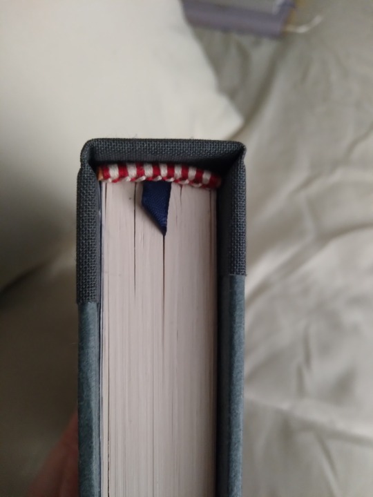
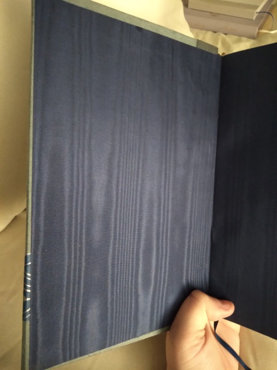

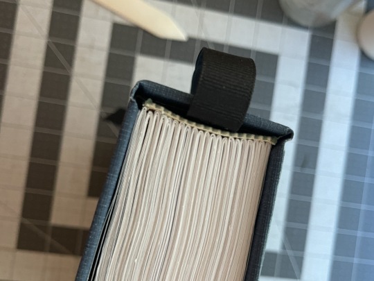
Top view, showing the bookmark and handmade end bands. The bookmark is a navy blue ribbon cut from the inside of a shirt, and I chose red and white because there are so many picturesque lighthouses that have red and white stripes. It's the only color in the book that's not blue or gray. The endpapers are a navy blue silk moire, and I had better luck with them than I did with the platinum ones on my Persuasion bind even though they are the same brand. Maybe it's practice or maybe navy just hides more sins than platinum.
For the title page I went fairly simple (for me anyway) with just a frame I pulled from rawpixel. It suits the story, though, being set sometime around or before the early 20th century. I also played with text colors on the title page, with some words being grayed out to mimic the effect on the cover. The section break is me getting clever with a feature of my printer. I often use a gray line to denote section breaks, but for whatever reason my printer doesn't like them and often makes them blurry. It is only these lines that come out blurry; larger images don't do this even if they are complex. So for this one, where a major feature of the story is trying to figure out what's real and what's a supernatural occurrence, I made one that was deliberately heavier in the center so it would come out sort of smoky or fuzzy, like it wasn't quite real and couldn't be clearly seen. It doesn't look this fuzzy in the unprinted file but I love the effect and I feel very clever for manipulating the printer like this.
I'm going to show off some interior shots but this bit contains spoilers for the story, so if you don't want to see that then maybe skip the rest of the post.

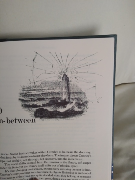
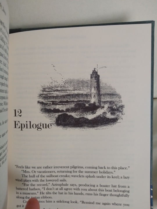
I wanted to get creative with my title placement since a lot of my binds look very similar inside, and this concept really let me try that out. The plot of the story is that the reason there are so many supernatural phenomena at this lighthouse is that someone in the future ran an experiment to harvest energy and accidentally cracked spacetime with it, and bits of the future and the past and the might-have-been are seeping through the cracks, and the longer the cracks exist the more seeps through them and the worse the ghostly stuff gets. At first it's not clear whether there's anything weird happening at all, and it becomes clearer that something is wrong the further in you get because the cracks are worse. So I had this idea for a vintage lighthouse illustration with an overlay of cracks in glass, that become more defined as the story progresses until something is done and they're sealed up in the end. I am not a visual artist and even this straightforward concept was too much for my skills, so I chose the lighthouse and the crack overlay and my amazing husband did the actual image manipulation. There are five different images, with the cracks invisible in the first and final chapter and most visible in chapter 10 and 11, when the characters are trying hardest to fix the problem. I'm really really proud of how well this turned out.
And that's it! I have several more binderary books to post but they are all still waiting for titles before I do the photos, so I don't know when I'll have them up.
#guys i love this book it came out so pretty#though it was a struggle at times#it got trimmed crooked and the gilding had to be scrapped and then the case was too small#so it actually got trimmed like 4 times#totally worth it though i mean look at it#everyone look at the cool thing i made#i'm so proud of it!!#bookbinding#fanbinding#snek makes books#good omens#fic rec
128 notes
·
View notes
Text
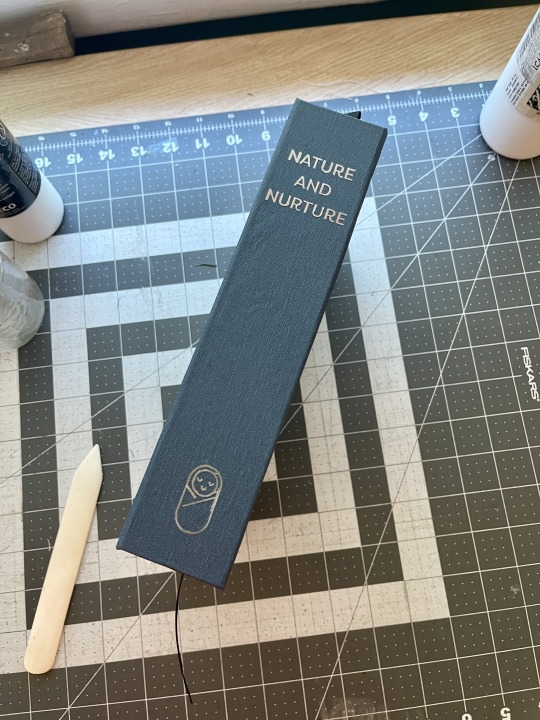
Bound: Nature and Nurture by @earlgreytea68
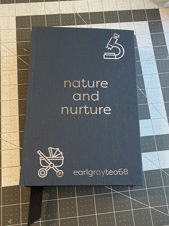


What an utterly fantastic fic! I'm happy with how the bind came out, but I have a few things I'd change if I did it again:
I wouldn't forget to put the ribbon in before the endbands
I would make the style more consistent. The chapter headings and the cover do not match at all.
I would be more careful when ironing the HTV on the spine
Not put a dang ampersand in the title on the header and the cover page. Argh.
I WOULD NOT MISSPELL THE AUTHOR'S NAME wow this is embarrassing
Also to note about this bind:
I was going to print the chapter pages in color. I used this lovely graphic and beautiful drop caps, but a 57 chapter fic when you don't have a color printer is maybe not the best choice. Half the sheets would have had color on them, and it would have cost a fortune to print.
I scavenged the end bands and the boards from a book I bought at a library sale. Just to see. I feel like the glue didn't stick as well to the smooth cover as it does to bare chipboard.
The HTV on the spine got messed up a little bit when I was ironing it on, but I was able to pick off the bits that were messed up and iron on a fresh set of lettering/graphic and you really can't even tell now! Whew. (Note to self: Cricut brand metallic htv has been the best of all the brands I've used as far as application goes.)
But all in all, I'm happy with it. It's just for me, after all, so it's okay if it's not perfect. That said, if I do this one again, I'd make a different cover that's more consistent with the chapter headers. (Like, if the author wants a copy?)
Bookcloth: Allure Bookcloth Indigo
Body Text: Corundum Text Light
Chapter Headings: MrKeningbeck Pro
Drop Caps: FLOWER
Inside title: FLOWER and MrKeningbeck Pro and Filson Pro
Cover: Filson Pro
All icons from The Noun Project
#fanbinding#ficbinding#bookbinding#sits bound#bbc sherlock#sherlock fic#earlgraytea68#nature and nurture
179 notes
·
View notes
Text
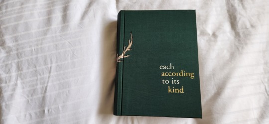
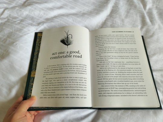
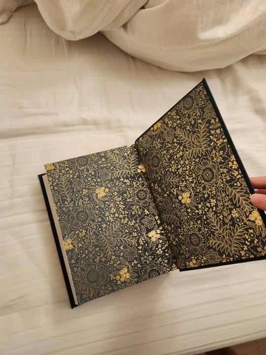
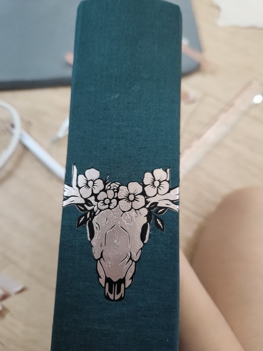
each according to its kind by @chaparral-crown


More photos under the cut!
Statistics:
192,571 words || 604 pages
chapter titling: crimson text
body text: charter, 10.5 points
So I went a little crazy after reading two chaparral_crown fics one month ago, and promptly started typesetting. the body and chapter titling is relatively simple. when i first started binding this, i knew i wanted to emulate the feeling of trees and wilderness, but i wasn’t sure what i wanted to put on the cover. i did, however have this very lovely green colibri malachite bookcloth, though it did get ridiculously scuffed very easily. I ultimately decided on this beautiful (intricate) stag skull design which was so symmetrical that i had to put it on the spine.
what i love about the design is how simple it is, design-wise, yet it’s still very impactful, where when you look at just the front cover, the antler seemingly comes out from nowhere, a lot like the wendigo that haunts Will’s dreams. i had help from @pleasantboatpress who gave some great suggestions for the cover titling.
for the cover spread i really wanted to do a double page spread - and i chose this really beautiful stock photo of Astoria’s pier.
I used these beautiful green and gold foiled cardstock papers which i have had on hand for a while.
All in all, i loved doing this bind and i love the endproduct. it’s not perfect - my glue management was abysmal for this bind, but it’s still something i’m absolutely proud of.


A little process pic of the spine post HTV application. As you can see- it’s mostly mess with me, the cricut mini press, washi tape and a ruler. jeez, it took me an hour to apply it after measuring it incessantly. shop supervisor AKA the hound licked it a few times and tried to investigate the mini press so i had to banish him from my living room. every time i apply HTV with the supervisor around i’d need to spend 25 mins post HTV application picking fur out from under the HTV.
609 notes
·
View notes
Text
Sticker Cutter Research
I was looking into getting a sticker cutting machine, and I decided to start by looking into cricut which is a well known brand. I had a look at what models they had than their feature etc, but what I was most concerned about was their software. Printer companies like to lock you into a defacto subscription to support hardware you don't really own, and as I was to discover, cricut are operating in a similar way.
The cricut software is online-only*. To cut your own designs you need to use their software to upload your art to their server. There's no way to cut a new design without a logged-in cricut account and an internet connection. At one point in 2021 they flirted with limiting free accounts to 20 uploads/month but backed down after huge community backlash, as far as I can tell.
The incident spawned several community efforts to write open-source firmware for cricut hardware. Some efforts were successful for specific models/serial numbers, but require cracking open the case and hooking in to the debug contacts to flash the chip; not exactly widely accessible. Another project sought to create a python cricut server you can run locally, and then divert the app's calls to the server to your local one.
I restarted my search, this time beginning with looking for extant open-source software for driving cutters, and found this project, which looks a little awkward to use, but functional. They list a bunch of cutter hardwares and whether they're compatible or not. Of those, I recognised the sihouette brand name from other artists talking about them.
I downloaded the silhouette software to try like I did w the cricut software, and immediately it was notable that it didn't try to connect to the internet at all. It's a bit clunky, in that way printer and scanner software tends to be, but I honestly greatly preferred using it to cricut's sluggish electron app⁺. Their software has a few paid tiers above the free one, adding stuff like sgv import/export/and reading cut settings from a barcode on the input material. They're one-off payments, and seem reasonable to me.
This is not so much a review, as sharing some of the research I've done. I haven't yet used either a cricut or a silhouette, and I haven't researched other brands either. But I wanted to talk about this research because to me, cricut's aggressively online nature is a red flag. Software that must connect to a server to run is software that runs only at the whim of the server owner (and only as long as it's profitable to keep the server up). And if that software is the only thing that will make your several hundred dollars worth of plastic and (cheap, according to a teardown I read) servos run, then you have no guarantee you'll be able to run it in the future.
Do you use a desktop cnc cutter? What has your experience been like with the hardware and software? Do you have any experience from home printers with good print quality and user-refillable ink cartridges?
* Cricut's app tried to connect to more than 14 different addresses, including facebook, youtube, google analytics, datadoghq.com, and launchdarkly.com. Launch Darkly are a service provider that help software companies do a whole bunch of things I'm coming to despise, for example, they offer infrastructure for serving different features to different demographics and comparing results to control groups. You know how at various times you've gotten wildly different numbers of ads than your friends on instagram? They were using techniques like this to work out how many ads they could show without affecting their pickup/engagement rates. Scummy stuff.
⁺ Electron apps are web-pages pretending to be applications. They use heaps of ram, tend to have very poor performance, and encourage frustrating UI design that doesn't follow OS conventions. Discord's app is a notable example of an Electron app
55 notes
·
View notes
Text
Special Interest 3
Warnings: non/dubcon, age gap, creep behaviour, and other dark elements. My username actually says you never asked for any of this.
Characters: Cole Turner, short!reader
Part of the Bookstore AU
My warnings are not exhaustive but be aware this is a dark fic and may include potentially triggering topics. Please use your common sense when consuming content. I am not responsible for your decisions.
As usual, I would appreciate any and all feedback. I’m happy to once more go on this adventure with all of you! Thank you in advance for your comments and for reblogging.

You package up another pair of mitts. It’s that season where sales pick up. It’s cold and the holidays are lurking just around the corner. Your hands are achy from working your needles but you can’t complain for the uptick in demand.
Along with your crochet menagerie, you supplement your etsy shop with stickers, while pondering the prospect of cards, especially given the time of year. As overworked as your hands are, your mind feels more so.
Your computer bings. Another sale? You go around to check your open Etsy page. Nope, a message from a customer. Please don’t be a return.
It’s a message. From the vaunted Farmer’s Delight. You might be avoiding them but that doesn’t need to be a whole thing. You’re working on their order! That’s not neglect.
You open the chat, knowing to leave that little dot just hovering there would drive you crazy.
‘Hey, just checking in. Was hoping to do a pick-up soon. Maybe in the next week?’
Sigh. Great, did they not read your last message? You know you’re a bit hard to take seriously in real life but this is text. There is no height difference or age gap. You’re on even ground. You’re traversing a world of digital equity.
‘Hey. Not sure if you saw my last message but I can’t do a pick up. Please provide your mailing address and I’ll be happy to send this out. Please let me know if you have any questions or concerns.’
There, firm but still customer service-y. You hit send and go back to smooth labels onto bubble packs. Another chime.
‘Like I said, mailing out here is inconsistent. I need the order as soon as possible. Please let me know a time that works for you. I need to hit the hardware store so I’ll be coming to town. We can meet there for exchange.’
Ugh. You want to punch the computer. You should just refund their order and be done with it. Even with your pick-up in sales, it’s a big chunk. You just can’t stomach giving back that much money and they didn’t even ask for their shipping fee back.
You let the message stew. They are offering a public meet-up. That seems like a good omen, at least. Friday night might work, your mom will be done work at four. That’s a decent amount of time. And it’s close to the post office.
You seal another package and leave the room, treading down the hall as you hear your mother clacking away at her keyboard. You approach cautiously. She closes the door when she’s in a meeting. You tap on the doorframe and peek through the open door.
“Mom, sorry, I don’t wanna bother–”
“All good,” she sits back and pushes up her glasses to rub her eyes, “all these emails are doing my head in.”
“Um, well, you remember that order I got. For pick-up. Could you drive me to the hardware store on Friday?”
“Friday?” She echoes.
“I figure we can stop by the post office on the way. And I’ll buy dinner. You know dad loves the gyros down at Eddie’s. It’s on our way…” You give a smile and sway, “please.”
“Sure. Sounds like a good excuse to get out. Besides, I need to grab some washer thing for the sink. I don’t know, your dad was going on about it. I’ll ask,” he flips her glasses down, “oh, that’s so nice! A big sale–” she claps her hands. “I’m so proud of you, honey.”
You raise your brows, surprised by her excitement. You remember when you quit your craft store job to buy a Cricut machine and go all in. She was less than jazzed.
“Really?”
“Of course,” she beams, standing and grabbing her empty mug, “you know, I was a bit concerned. No school, no job, but you’re a go-getter. Any man would be happy to marry someone with so many hobbies, and hobbies that pay.”
“Hobbies? Mom, this is a business. I have to pay taxes,” you back out of her way as she comes into the hall.
“I know, sweetie, but…” she glances around, “it’s still young. You don’t know if a business is a business for a few years. I’m not knocking you down, I’m trying to be realistic.”
“Mom, please, do we have to worry about five years from now? I want to see how far this goes without worrying about guys or a husband or– I can’t even order a beer yet.”
“Me and your dad married right out of high school. We never worried about all that dating stuff and it was all so simple. Trust me, once you find someone, the world will be so much clearer.”
“If it’s easier, I can get an uber on Friday,” you cross your arms and follow her towards the stairs.
“Don’t be like that. I’m being supportive. But you make sure you’re saving money. Pray the day comes and you’ll have a nice nest egg for your wedding,” she stops at the top of the stairs, “or tuition. There’s lots of cuties in college.”
“Mom,” you roll your eyes, “let’s just take it a day at a time. Friday I’ll get that order out.”
“Oh, remind me to grab some grout cleaner when we’re there too,” she points at you before she turns to descend the stairs, “the bathroom is looking a bit grimy.”
You mutter, “alright, mom,” and slowly turn away.
Everything with her comes back to that one thing. She just assumes that you’re lonely. Worse, she seems to believe you’re wasting your time on all this.
You shut your door and tramp around to your laptop. You sit on the cushioned stool and type in your reply to Farmer’s Delights; ‘Friday works for me. After four.’
Three dots pop up almost right away. Then disappear. Then appear again.
‘Sounds great. I’ll see you there.’
You send a thumbs up and close out. You have to finish packing then get back to destroying your carpal tunnel. It’s money, your mom’s right about that, but you won’t be saving for a wedding.
#cole turner#dark cole turner#dark!cole turner#cole turner x reader#drabble#au#bookstore au#series#special interest#ghosted
99 notes
·
View notes
Text
grabs patreons and shakes them
Patreons! I haven't gotten the patreon website to load yet to make the posts but I wanted some feedback on the future of stickers
I've been thinking about making sticker/print benefits an every-other month basis reward instead of every month. Sending out stickers monthly is very time consuming in all areas, since I have to physically make each one (I use a cricut at home, so I don't order the stickers, but I have to order the paper and ink and shipping supplies and wait for them) and can be frustrating when things take a while to ship or end up lost in the mail + the overall process.
And to be honest, it's getting a harder to afford things for supplies to make and ship everything with inflation right now, and while I've been told to do so, I'm really not a fan of having to raise my prices.
So if possible! I'd like to be able to start doing more other benefits, like clay crafts, youtube videos (speedpaints, cosplay crafts, traditional painting, art tutorials ect). I'd like to more often consistently update my patreon with more varied posts, especially of things I'd like to work more on. Also, sticker designs are fun and I'd still like to do them, but this would also give me the time and space to actually make a stock of them and make them more easily available on kofi without having to become a patreon, so past stickers are available.
If I can get Patreon to load, I'll have a poll over there as well as update posts, but some feedback would be appreciated!
165 notes
·
View notes
Text
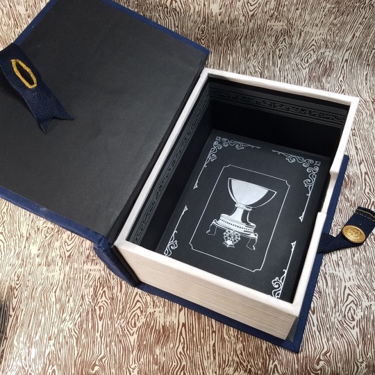
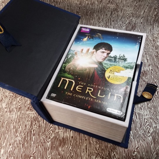
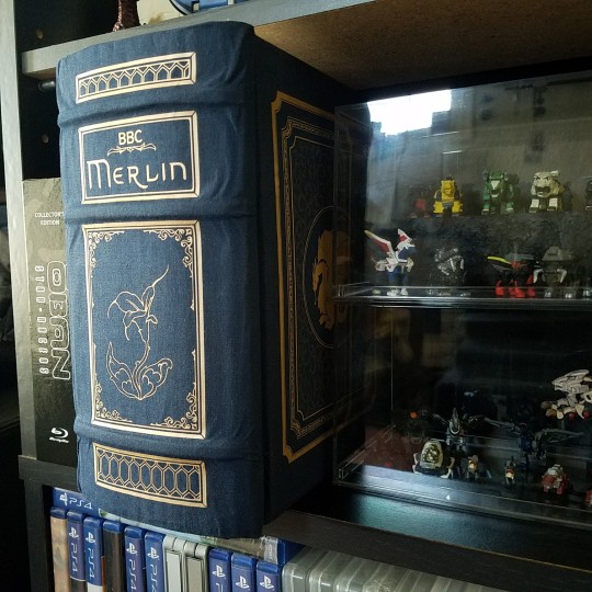
Its finally done!!!
After getting back into BBC's Merlin recently (read: a couple months ago) I realized I no longer trusted streaming services to still have it available long term and managed to buy a complete DVD box set.
But because the slip case had quite a bit of wear to it (and due to some minor scopophobia) I made it a box that looks like a book!
(More rambling info & video under cut)
Materials:
The base construction is cardboard and paper (used to cover the exposed cut edges and strengthen corners). The box's faux paper edge is a printed texture on cardstock that was then waxed. The interior is black cardstock with silver vinyl. The 'book case' is that same cardboard construction with faux raised bands (made with some scrap foam I had) wrapped in Cialux's night blue bookcloth (hence the minor wrinkles) with Cricut HTV in metallic gold and 'reflective rainbow'.
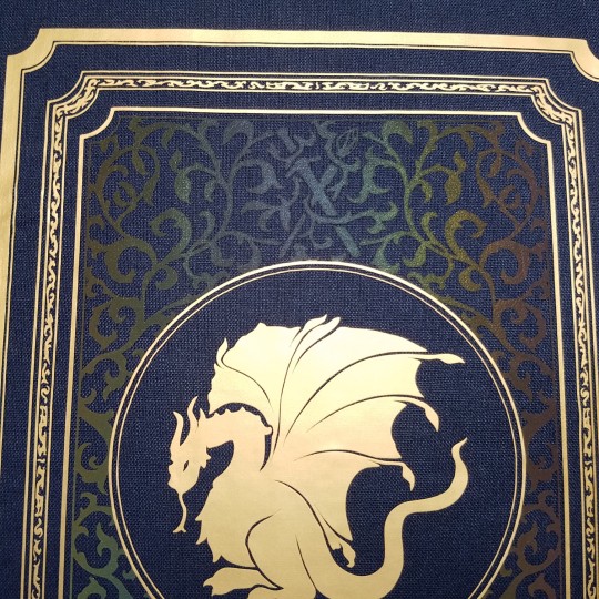
Design:
Cover: Obviously Pendragon logo had to go front and center, no argument on that one. (Also partially cause Merlin doesn't really have his own symbol to him? The triskelion just doesn't make sense to me because although Emyrs is a symbol for the druids, Merlin himself isn't a druid and I'd imagine would instead choose icons of Camelot and Arthur to represent himself besides.) ANYWAY-
Behind the crest, filligree containing a blade and the sidhe staff in that subtle reflective HTV that blends into the bookcloth exactly how I wanted until it catches the light (something something, hidden magic in the background something something).
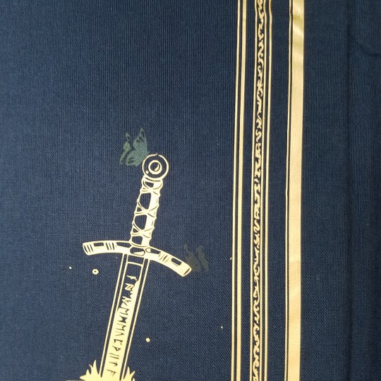
(Appologies for the unsteady hands)
Spine: Mortaeus flower! Because it really felt like a turning point for the two (you've known each other... what a week? and you're going against your father to travel to some far off cave to get a flower?? that's some good as dnd-adventuring-party type shit I love it). Minor detail are the top and bottom shapes: pulled from some cool windows we see a lot in season one (I just think there' neat, okay?)
Back Cover: Excalibur with two butterflies cut from the blue-toned area of the rainbow HTV :)
And finally the Inside!: The cup of life! Because it felt just a little empty. I'm still tempted to put something small on the bottom left corner of the inside cover... maybe a crown? not sure yet
And that's everything! Thanks for reading! If anyone wants to make something similar for their own dvd set I'd be happy to share the .svg or .png file of the cut outs, just shoot me a message 👍
Before you go, wanna know the worst part about this project???
.
.
It doesn't even fit on my DVDs shelf :)))) It sticks out by about an inch and a half 😭So we maaay have to be relegated to the 'actual books' bookshelf...
#merlin#bbc merlin#loooove how this turned out besides the wrinkles and a fuck up I had around the flower#but thats what I get for trying to do raised bands with bookcloth like that i guess lol#(typically you'd do leather and not bookcloth (which has a paper backing) buuuuuut I don't have the kind of spare funds for that)#I think the construction of this whole think took about a month on and off?#but I'd been figuring out what I wanted the designs to be for a month or so previous to that#very happy to be done with this so I can finally put time back towards actual book/fan binding again haha#my art#my posts
45 notes
·
View notes
Text
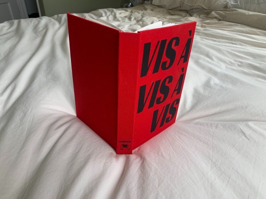


Vis-à-Vis-à-Vis by @vukovich
Harry's assignment was simple. Close out Draco Malfoy's missing persons case so he can be declared dead.
But who's making withdrawals from Malfoy's vaults? How is a death omen-turned-Unspeakable involved? Is an organization known as the Moirai to blame?
Harry brushes it off until he can't. Until The Prophet is flooded with sightings of dead people. Until Robards throws himself on his sword. Until Ron turns on his own family. Until Harry scarcely trusts his own reflection in the mirror and trusts the stranger in his bed even less.
Until all that stands between war and peace is Harry, a name plate, a stadium of murderers, and Draco Malfoy.
God save the Ministry.
Vis-a-Vis-a-Vis was one of the most inventive, thrilling, nasty (in the best way), and intriguing fics I read last year and I’m so happy I got to bind a copy for Vuk & myself. I bound this as a part of Renegade’s Binderary 2023 (where we challenge ourselves to make as many books as we can). I specifically focused on some of my favorite fics published in 2022 that I hadn’t already bound :)
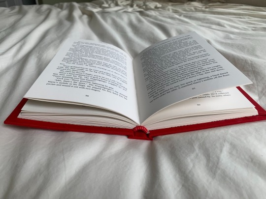
Inspired by @lettersbyelise's ask, I’m going to interleave the inspiration & the process in this post! I knew when I was reading Vis-à-Vis-à-Vis that I wanted something graphic and bold and a little bit sinister. My hand-painting skills are not good enough for the super sharp edges I wanted, so I used heat-transfer vinyl for the first time (tysm Rhi, my guru & owner of a cricut). I also couldn’t find a commercial bookcloth that was a bold, bright red, so I made my own from fabric.
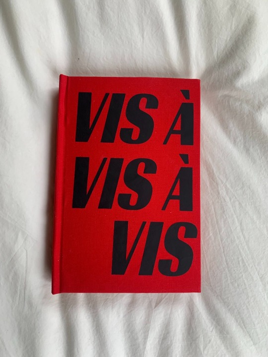
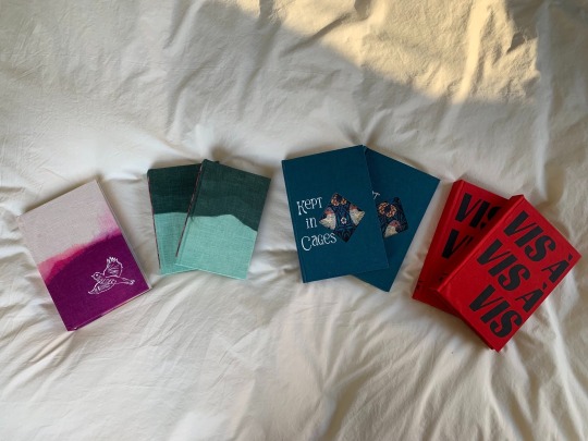
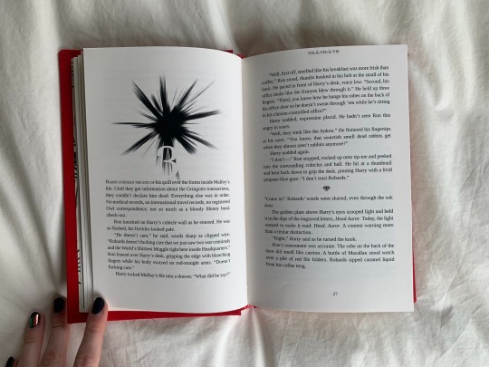
I also HAD to have something that only was exposed under camera, which is a central leitmotif (motif? theme? Idk it’s been so long since I took a lit class) of the fic — whatever it is, Harry is always trying to get a photo of the Doppelgänger to expose their identity. There are only two (2) flash-sensitive inks on the internet & I bought the cheaper one. It’s absolutely not perfect - you can see the image of Draco when you tilt the page because, really, the ink is just a reflective white (as Vuk called it, a shiny paint lol) — but I am absolutely delighted with the effect. Also happy to chat via ask or dms about the experimenting I did with the ink if you’re a fellow binder wanting to use it! I also would use a stencil next time to paint, as it turns out painting with basically invisible ink is really hard lmao.
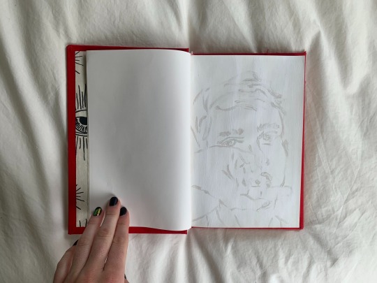
I then really beat this things hidden/unseen theme to death, as I am wont to do. The title page is meant to simulate a flash/spotlight & so only parts of it are illuminated. The chapter headers are a reverse flash in black, while the chapter numbers are hidden/revealed by it (are they hard to read? Yes, absolutely. Am I happy with them anyways? Absolutely, yes). Even my bindery logo is a paparazzi camera for this bind :) the endpapers are spooky eyes WATCHING YOU READ (also kinda leant itself to the Illuminati/hidden conspiracy vibe), as are the scene dividers.

Headbands are just a fun hot pink and candy apple red, because I love that combo, and it’s certainly a bold statement. This is probably the bind I stretched myself most creatively on, as I think my style is naturally softer and more romantic, but I am so pleased with how it came out.


Materials:
Body font: Liberation Serif
Title font: Timonium
Endpapers: Lokta eyes
Bookcloth: handmade from red fabric
Flare brush for chapter headers: Xresch on DeviantArt
Flash-sensitive ink: MaxMax Flash-Sensitive Ink
166 notes
·
View notes
Text
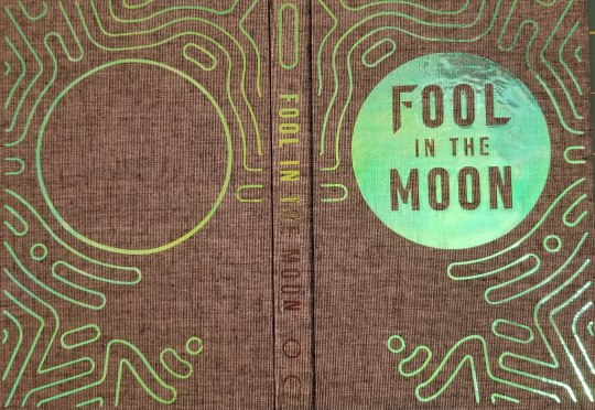
Fool in the Moon binding
All right, time for a successful binding post, how about that? This was for @arahir's amazing work, Fool in the Moon. As you can probably tell by the rest of my feed right now I'm a little obsessed with Trigun at the moment (it's okay, it's normal, I feel normal things about all of these people, I'm not obsessing and listening to the soundtrack 24 hours a day, I haven't watched the whole thing twice in two weeks, all of my targeted ads on my computer aren't about plants right now, I'm fine) and suffice to say this story was just an emotional gut punch. It's so good, you guys. Go read it.
Anyway. The binding.
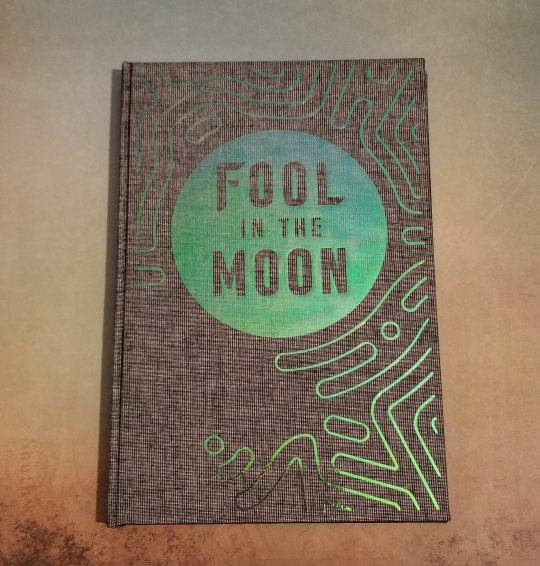
This was my first time using holofoil vinyl, and it turned out AMAZING. Look how pretty it is. And the color change in the light is just crazy.
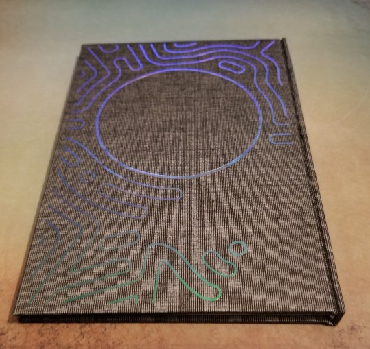
Here's the back. Sorry I don't know how to make a gif, or I would totally show you guys how it shimmers and ripples. At certain angles it's green, blue, purple, orange, sometimes you can get it to be all of those at once, it's a really neat effect.
Also, I love the effect it gives when you open the book up (hard to do once it's bound with the textblock, but doable. This picture was taken before I cased in).
You have to squint your eyes a little but it's supposed to be reminiscent of Vash's sunglasses, and the way (spoilers? maybe?) his face looks when the plant lines come out. I think it's just the super neatest thing.
Here's the endpapers and the title page:
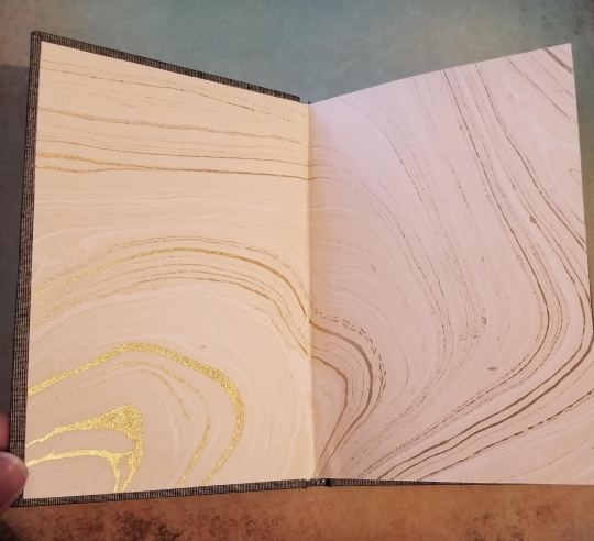
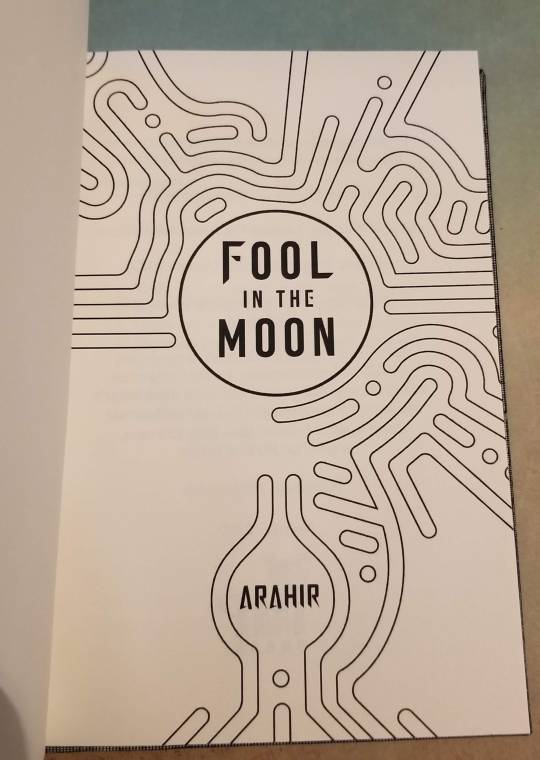
Isn't the title page just the coolest?
And here's a pic of some section breaks:
I just made them with the draw tool in Libreoffice, I wanted it to reflect the lines of the endpapers and maybe (?) look like dunes. Either way I think it turned out really great. I kind of maybe wish that I could have incorporated some of Wolfwood's imagery into this, but the design pretty much made itself and I'm super happy with it. Plus at the end of the day everything is about Vash, isn't it? He's Vash the Stampede! (I'm not crying YOU'RE crying!)
Anyway, I figured out the reason my previous book was so crooked was because my guillotine is messed up. It can't cut straight (which is...kind of the point) but it does okay on smaller works like this. So this one cased in very nicely. I used the 5 mm gutters again, and duo bookcloth (magpie I want to say?). The cricut vinyl came in a sample pack and unfortunately didn't come with a name (the sample pack was called Berry something), but it's very similar to Siser's Rainbow Pearl HTV, which is what I used for my copy. Once again the siser was a pain to use, with little bits flying off everywhere and wanting to wrinkle underneath the iron. I don't know why I keep buying that brand. But it worked in the end, and the effect of the holofoil is so cool I'll probably use it again. Endpapers are from Mulberry paper, I love those guys so much.
Let me know what you think! And if you have any questions please feel free to ask, I could talk about bookbinding stuff all day!
#fanfic bookbinding#fanbinding#bookbinding#trigun stampede#vashwood#ao3 author#fanfic#I'll get over that Trigun finale some day#but it won't be this day
150 notes
·
View notes
Last Seen Blogs
mewzawa
🔮 Miazawa 🔮
thierry-facon
c'est à quel sujet? quel est l'objet?

advent-of-winter
Thawing
germanyballartsandanimations
this is how it ends
kuromicat
i'm cute!