#i still have a lot to work on art-wise but lineart is always a favorite
Text
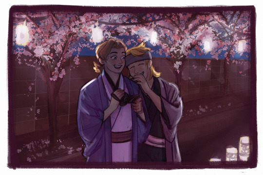
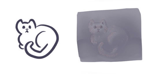
Art trade with @sapherin 🌸
Thank you so much for your patience and for suggesting doing this! It was really fun and enriching, as I was trying out a lot of new things.
just a couple of guys being dudes 🥰
Check out sapherin's piece here! It's adorable 🥺
#pokemon#den markings#sapherin#i still have a lot to work on art-wise but lineart is always a favorite#hope you like it!!!!!!!#uhhh well here we go with the tags#gym leader morty#eusine#uhh oh boy here it comes#sacredshipping#heart is racing a bit#ID in alt text#please let me know if i should rewrite it in any way im not that great at writing them#art trades 🌻#they're laughing at an old video from 'lance's haunted lair' the yearly halloween party#yes yes mhm#forgot my blog's tag#sacred
138 notes
·
View notes
Text
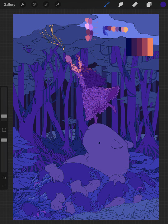
Process Breakdown: Starfall
Since I got some positive responses to my question on process stuff I’m gonna do a behind the scenes breakdown for my most recent piece to help people see the process I use and how I problem solve. I didn’t plan to do this initially so I won’t have a ton of process shots but I did save a handful. There’s a few scattered hyperlinks to other pieces I reference too. Just a warning this is mostly train of thought so it’s super verbose.
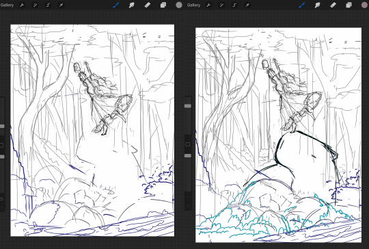
So base sketches were mostly focused around me defining the shape of the girl since she was the focal point and building the environment around her. Going in the things I knew I wanted were a girl precariously balanced on top of a massive capybara catching a falling star, while surrounded by smaller sleeping capybaras on rocks. I layered out a general forest scene surrounding it but didn’t really commit to much in the sketches. Messed with the angles of the large capybara a few times to make it feel less flat and more 3D in the space, used a lot of reference photos of capybaras and sorta simplified them to what I thought was cute/ what stood out to me as their defining features.

Skipping ahead a solid amount is midway through the initial lineart, with some areas just colored in to define them as separate. Initially this piece was supposed to be in a similar style as my “Stratosphere Dreaming” art, with a single uniform line thickness, bright colors, and no gradient shading at all, but I realized pretty soon after I finished the lineart and started coloring that I had done what I tend to do a lot and made it too complex to pull off successfully in that style so I had to pivot to using gradient shading and other non-cell style techniques (though you can see a lot of those methods still in the coloring of the girl). This caused an even bigger challenge as I was drawing on a large canvas with high DPI in Procreate which resulted in me having a cumulative 50 layers to work with at any given time (hell).
Now once I made that rendering style pivot is when the really hard part began, and why on top of my persistent arm injuries this took me about two months to finally finish.
1.) I had an extremely difficult time trying to figure out the color pallet for the piece. I had an idea of the values and general colors I wanted (you can see some pallets and random base color tests in the image above) but I just couldn’t get them to look right and I became extremely more aggravated as I kept trying new and different things. My biggest mental block was feeling like I was stuck trying to make the initial pallet idea work, but eventually I was able to bump it to a slightly adjacent pallet and it worked far better. Essentially a lot of angry experimenting and testing.
2.) I made the piece too complex for its own good when it came to the foliage and scene. After finding success with a very specific way to render foliage in one of my favorite pieces I started to use it as my standard, but that standard started to show cracks when I had foliage heavy scenes like in my Hollow Knight piece from last year. The rendering style became insanely too time consuming, and incredibly distracting when used in abundance, taking away from the focal point. I knew this but I still attempted to use the same style to render the foreground foliage MULTIPLE times in increasing states of frustration until I stepped back, evaluated it wasn’t working, and tested out a very similar style with the same effect but that I could throw together twice as fast without the aggressive distraction and minuscule details that were irrelevant in the scheme of the art. This frustration in the rendering not working was only exacerbated by the color pallet indecision making a lot of the attempts just look bad both color and style wise.

Due to the limited layers I had to finish rendering out the girl very early and merge her together to free up layer space, and couldn’t keep my lineart layers as separate as I would have liked to allow for quick line color swaps. She ended up being a key point in defining the rest of the color pallet of the piece. The dress shape was indeed inspired by the Lirika Matoshi strawberry dress, but with my own twist.
Once I got a more solid color pallet down the rest started to come a lot easier and I was able to begin filling stuff in and doing general color adjustments to make the backgrounds darker and give it more depth. I don’t have any more process shots beyond the initial color pallet exploration unfortunately, but the last hurdle I hit was at the very end once I was doing final touch ups. I found that with the only light source/ lighter color being the falling star that it washed out a lot of the rest of the pieces and made the details I spend so much time on feel unnoticed. I found though that adding the bright orange stardust specks into the trees, the girls hair, and falling from the star itself gave the last bit of color I think it needed without completely destroying the atmosphere. Originally (you may see it in some of the process shots) there were going to be jars with stars already in them illuminating the bottom of the piece, but after multiple trial and error iterations it just didn’t work out and ended up taking the focal point away from the girl and the star too much so I scrapped it.
Finally once I got everything done I made a copy of the entire art file to save as a backup, then with one of the copies merged all the layers together. Once all merged I made a copy of the fully merged layer, and went and adjusted the entire layer copy using a Gaussian Blur, reduced the opacity of the blurred layer to a super low percent, and put it on top of the original merged layer. This gave it that ethereal sort of feel that is difficult to notice unless you zoom in but really helps soften the piece and make it more dreamlike overall. Then I merged that blur layer down, and turned on about a 3% noise layer on it all to give it a bit of texture.

But that’s enough rambling from me, hope this helps give a bit of background to my process and decision making and it wasn’t just a wall of random musings.
My last piece of advice is if you’re looking to do art professionally, do commissions, or make a lot of pieces in a short period of time I would highly advise against directly copying techniques I use. Because while I’m always working to improve I do only do this as a hobby rn so I have the luxury of being able to invest a lot of time, energy, and details into higher complexity pieces that would take way too long in a professional environment. I can put a lot of time into making a single piece exactly as I want it since I’m not reliant on art as my sole income. As I improve I can make things faster, but it’s still an overall slow process and I just end up moving my quality standards up with any level of improvement anyway. Use stuff I do as inspiration but I cannot stress enough to learn as many shortcuts as possible (I’m still struggling with this myself).
If y’all have any questions about bits feel free to dm, if I do something like this again I’ll try to get better screenshots during the process n try to be less verbose.
52 notes
·
View notes
Text
thank you teresa and soph for tagging me for 2020 Creator Wrap: Favorite Works
Rules: it’s time to love yourselves! Choose your 5 (or so) favorite works you created in the past year (fics, art, edits, etc.) and link them below to reflect on the amazing things you brought to the world in 2020. Tag as many writers/artists/etc. as you want (fan or original) so we can spread love and link each other to awesome works!
no particular order lol. wait also i didn’t quite follow “favorite” i suppose, i like, judged by Significance. but in a way that was still plenty subjective, so
tayston kiss on the Mouth - self-explanatory like of course it was crucial to draw a Tayston Kiss and i finally got around to it. also when i opened it now it was like “oh nice that’s cuter than i was remembering it even” lol. rly enjoy taylor here too like them in a tee and i like that they’re leaning back a bit but w/drawing their forearms/hands where i did it feels like they’re pulling winston in and i’m just overall like “nice that turned out well” @ drawing them here. i also personally enjoy the Blush Patch drawn in one linear stroke between them. it’s fun to try to have that essential detail be both Soft enough but also have some geometry to it b/c i’m always On That
riawin kiss on the Mouth - same thing all over again lol of course i had to draw it. and it started with several different failed attempts which was annoying but then i got this one in one night and it works well enough. also has a fun clothing detail in rian w/a hoodie (of winston’s) and once again i draw the hand-on-jaw l’intimacy and i think it Works Well again b/c why wouldn’t it, classic. also i’d been intending to draw the Lines detailing rian’s hair curls rather than silhouette and that was pretty fun to just jump into. oh i did the same thing with the Blush also, s/o to that. and the fact that there Is that height diff as depicted here....hopefully artistically successful in having you Think About It
tayston embrayston Cuddling - i think the first proper Fanart Of Fic? so that’s crucial. helping put the essential tayston ideas into the world and hopefully helping put People into Reading Said Fic, i’m glad this turned out to have enough of a relaxed vibe to do the concept’s written execution some justice....this was also just a success of “the colors i put down originally managed to be really Incongruous palette-wise” and i had to wrangle that situation with some added Layers lol but now they’re soft and nice i think, a much more Congruous pink-purple and i’m now remembering i struggled a lot picking a Solid Bg Color even though now a pale yellow seems like an obvious choice, s/o to the little border highlight around them i like that too....things turned out solidly here....enjoying the Geometry going on re: winston’s sleeve lol
agtikbi reprise - again i think it was Important to have done something for this absolutely iconic bit of media, thank you so much obcr for including this track. did a bunch of coloring for it (ft. many purple overlays as usual lol but that was always the plan) and the lineart i knocked out pretty fast w/o worrying about editing it super hard but it turned out solidly which is always a gift. really this was one of those “yeah it takes a while but i make pretty consistent progress and just knock it out in a couple of days” works ft. a decent amount of detail and that’s always an Epic Win and again i love agtikbi reprise so much so it was Very Good to have officially done something for it. also i’d been meaning to draw jeremy again for eons so that accomplished that goal too
monthlong riawinning - the opposite experience but also I Guess its own kind of win, where drawing is not quite as cooperative and one thing takes me A Month where it’s v much not consistent progress and i Do edit a lot which has pros (looks kinda fancy i guess) and cons (sweating details unnecessarily / overthinking or second guessing stuff / forest for trees or whatever / it takes ages and was it worth it....) like when i started with the Lineart Layer i was like “uh oh i’ve Cleaned This Up a lot but there’s already stuff i like too much to Restart this even though i’m not even close to halfway done yet” and yeah it took me ages to finish with lineart that’s been entirely Cleaned Up but then hey, you get this one thing with Completely Exhaustively Edited Lineart....i’m very Particular about like these self-imposed geometry rules re: lineart / shapes according to my own ~aesthetic sensibilities~ and stuff so like, it’s not even just a matter of Are The Lines Fairly Uniform Width / erasing stray marks / making sure the lines are all Closed and stuff, and even w/ the finished product it’s like “oh i could’ve connected some lines in rian’s hair for more Flow or moved this thing over by a few pixels or w/e,” isn’t that always the way though....it’s fun to have 1 Thing from this year v polished though. and i like the riawin contribution of “what if winston went down on rian and then there was this Snapshot Of Affection afterwards ft. an embrace and a kiss and the love language of tenderly feeling him up in the process” i was like “is this all Obvious or am i being too coy” and i was being too coy but here come opportunities like this one right here to make the meaning clearer i hope. that’s part of this pic’s Importance as well lmfao. the content of it and all
(everyone is tagged i think lol)
#now the cheating zone of Honorable Menchies#Winston Looking Sadly At His Phone. implied benston! colors! lighting 4 once! composition notebook! his Expression is good i think!#winston the autistic quant bicon moodboard! further Self Explanatory Importance. s/o to having a usable Winston Pic now/like other pix used#Dollar Bill Harassing Winston Video: what could be more transformative than getting some fun out if that. handful of well timed moments lol#Are You Bi(lingual). jokes. prescience (cassandra). bisexuality. my 1st formal attempt drawing rian & turned out well. love Tiny Winston#Riawin(ston Billions Gets Pegged): obviously! a lot of care put into it obviously! i am V happy w/a lot of the details around winston's Head#and then of course for similar reasons Tay(win)ston Billions Gets Pegged. the colors there are Chefs Kiss & again love how tay turned out
4 notes
·
View notes
Text
Why people like your doodles better than your finished works
Learn from your doodles rather than resent them
I frequently see artists complain that their finished works got less attention than mere sketches, doodles and other smaller or less serious work. Which is frustrating! But almost as often, I can see exactly why the doodle got more attention. I’m going to cover some of these reasons, so you can use that information so you can do more than fume about it.
The doodle is easy to read, the polished work is busy
The polished work is completely drenched in little details that the artist slaved over, but the details create a kind of overall noise that makes everything harder to understand, making the whole image less appealing.
Don’t get too lost in little details, work from larger shapes to small details, use things like a highly readable silhouette, contrast, variance in line width or negative space to keep the image understandable. Pay attention to the composition to guide the eye where you want it.
The doodle is high contrast, the polished work is low contrast
When you do lots of details all equally well lit and easy to see, overall you lose the strong lights and darks that make a work pop. You have to sacrifice some of those details, let them be in shadow or out of focus in the background, to create a more appealing image overall.
You might also be forgetting that without lineart you need to use strong lights and darks, since lineart creates it’s own natural high contrast.
Contrast draws the eye, use that to create focus where you want it.
The doodle is simple to understand, the polished work is highly ambiguous in meaning and message
Many doodles that outstrip the artist’s polished work are jokes. Jokes usually have a specific clear focus and message, the viewer can understand it immediately (if they couldn’t, it wouldn’t be funny). You don’t have to make everything funny, but like a joke, you need to get to the point and give the audience the information they need to “get it.” More details can be present, but the viewer should not be confused about what to look at from the outset. Remember: people will look at and interpret your art in milliseconds. They might give it a longer look but only AFTER that millisecond look.
The initial glance is like the first page of a book. If it wows them they keep looking to understand more, if they are lost and confused, no second chances, they’ve already scrolled away.
You can use things like composition, basic structures of shapes and simple shape symbolism to give viewers the initial information they need to stay interested. Don’t feel like you have to abandon more personal and difficult to parse symbolism, these things can work together to create intrigue.
The doodle is fluid and expressive, the polished work is stiff and dead

The sketch for your polished work needs to be done with spontaneity and fluidity. When you want to really flex your drawing skills and show the world your beautiful realistic human faces, your sublime anatomy, gorgeous textures - it’s easy to forget about the undersketch and jump to rendering as soon as you can, creating a stiff or boring sketch that isn’t worthy of all the time you’re sinking into the minute details.
Practice quick gestures, read up on line of action, and before you make a polished painting, make sure you have a sketch that’s fun to look at even without the detailed rendering. Thumbnailing helps. Studies too. Sometimes you have to do the bad boring sketch, but you can take a few stabs at it.
You can’t make a bad sketch good by painting more details on it, you need to work out the sketch first before moving to the details.
Remember, if you’re going to spend 20 hours painting the thing, you can afford another half hour sketching a few different takes on your idea before digging in.
Lots of doodles, very few polished works
If you mostly post one kind of thing, your audience will be people who like that. Also, you may not have much practice with the techniques you are using in the polished work, while you have become a pro at doodles. You become an expert at what you practice, do more of what you want to be known for, become an expert at it, make it the only thing your audience is there for.
The audience is familiar with the subject of the doodle, unfamiliar with the subject of the polished work
Many artists do doodles of fanart and get fed up that people like that more, but the truth is, they don’t like it “more” they just already know they like it. You can increase the chances of people appreciating your original works by making sure they can understand what’s going on in the illustration without prior knowledge of who these characters are, or simply sticking to it until you have garnered an audience. Just keep at it.
Remember, the creators of the property you made fanart of are themselves artists who were pushing an original idea at one time. You can follow in their footsteps.
The doodle is quirky and unusual, the polished work is stale and samey
This can happen when an artist has an image in their head of what a SERIOUS and PROFESSIONAL painting looks like, usually based on a very narrow subset of artwork, often itself based on the same cargo cult of seriousness.
Try studying works outside your usual stomping grounds. Look to artists that likely inspired your faves (if you’re talking about realistic artists who inspired your favorite concept artists, here’s some likely culprits to get you started on the google search: JC Leyendecker, Alphonse Mucha, Norman Rockwell, James Gurney, Rembrandt), look to artists outside your genre, and look at your doodles and ask yourself what “not serious, just for fun” source of inspiration is making them so fresh and vibrant that your audience is connecting to them so strongly. Study that, respect that fun and try to pull it into your serious work.
The polished work was hard to make and no one cares
Being an artist is hard, and that we keep at it is commendable, but struggling and taking more hours doesn’t make a piece better necessarily.
There are a few things to consider here. First, you need to realize looking to the vague faceless masses of the internet for a fatherly “I’m proud of you, son” moment is always going to be disappointing and painful and attempting to guilt strangers into fulfilling that role for you is awkward and inappropriate. You need artist friends who can recognize your hard work and cheer you on and you need to be your own cheerleader, value your own hard work and practice.
Second, you need to realize torturing yourself doesn’t in and of itself make art better. Hard work is something people love about art, the meaning of someone spending that time, but if I screamed for 8 hours, drew a single line, then posted that, the internet wouldn’t be wrong to be unexcited about it. Rather than blame the viewer, think about two things: how can you make the art itself more appealing while still doing the painting that you’re interested in doing, and how can you do that faster and with less pointless suffering?
It’s okay to be a masochist when it comes to art, many artists are, just make sure you’re spending your time and suffering wisely.
You’re complaining about someone else’s “doodle”
Sketches and cartoons are deceptively hard to make appealing, rather than fume that they are getting more attention, look to them for lessons. What could you learn from them? Could you do it? Maybe you should try. Would make a good exercise.
And never get mad that their drawings are more appealing to the internet than yours, even though they spent less time on their drawing than you did on yours. See above for why time is not important here, but also keep in mind they may have been practicing longer than you or may be more established than you.
Keep working on your art, keep posting, push to be seen, advertise your work, put yourself out there. These things take time but work.
35K notes
·
View notes
Text
Tumblr Friends
Chapter 2 ~ Usernames
My next few days could only be described with one word: spree reading.
Wait. That’s two words. Or is it hyphened? Whatever, you get what I’m trying to say.
I breathed and ate books. And pizza. And chocolate.
My days consisted on getting up, goin to my classes, coming back, eating and reading. I read everywhere. On the couch, on my bed, on the toilet, on the bathtub... My sisters put up with it because they knew what I was going through, and because they were too busy with their respective boyfriends to say anything.
You might be asking yourselves: why doesn’t she study?
Well, I’ll tell you. The day I caught Tamlin smooching Ianthe was actually the first day back from summer, so that meant that the professors hadn’t had enough time to dream about us and the way they wanted to torture us with projects and exams.
Another question that may be popping up in your head is: What is she reading?
Well, I’ll tell you. Only the best freaking sagas from the best freaking author in the world: Brandon Sanderson. I’ve already read the Mistborn Trilogy, but it is like my comfort food in books, so I reread it. And then I started The Way of Kings, the first installment of the Stormlight Archive saga, and then the second and third one, which just came out. Those will be Words of Radiance and Oathbringer.
I saw them a while ago in the book shop and just had to buy them, but Tamlin always said that reading was boring, so I never started them.
And now I’m starting them just to spite him. Even though he won’t see me. Or talk to me. Crap, I really didn’t think this through.
That’s actually not the only reason. As one of my other favorite author says: “It was books that made me feel that perhaps I was not completely alone. They could be honest with me, and I with them.”
And I desperately needed not to feel alone right now. So, I binge-read all of them (they’re like a thousand pages each) and when I was finished, I swear I could breathe a little better and life felt a little brighter.
As I read the last page of Oathbringer and closed the book, all I could think about was that it couldn’t be over.
It’s not over yet silly. There’s going to be seven more books.
You get me, it can’t be over right now. I know the story continues, but I NEED more NOW.
Go to the internet.
I should, shouldn’t I? I’ve heard about something called...Tumble? Timblr?
Tumblr.
Oh, yeah right. My best friend, Mor, who’s into super weird stuff, like History-wise weird stuff, told me about it, and also said that there’s this thing called fanfiction, where people who read a book keep writing (non-cannon, but still) about it. She says that, sometimes, the fic is actually better than the book coming after it, and that the authors put in tons of work so their followers can get a weekly update, and maybe even more. Currently, she’s reading a fic about Aristotle and his secret lover Hades, god of the Underworld. Like I said, weird.
I opened my laptop and turned it on, getting on my browser and searching ‘Tumblr’. Then I clicked on ‘get started’ and typed my email and password in. The username was the tricky part, because so many of the were already taken. At last, I decided to go with fey-oathbringer, thinking that if I wanted to meet people of my same fandom, my user had to be somewhat related.
Then I got down to bussiness.
To defeat, the huns.
Ups, there we go with the puns.
No, the huns.
No, seriously. I typed ‘stormlight archive’ in and... search!
After hours looking through and reading everything I could find about Brandon Sanderson on Tumblr, I had two conclusions. The first one was that people really put a lot of time and effort into the fics. The second was less of a conclussion and more a person, more especifically, stormblessed-radiant.
He was the epitome of all things good. Not only was he a hell of a writer, he was also a very nice person. I think so, at least. I mean, you can totally tell by his answered asks, no?
He could be faking it... He could be a she.
No! He’s good. And a boy. And adorable. And possibly very cute...
Okay, this got out of hand. Focus Feyre.
So I decided to follow him (definitely a him) and turned on the notifications so every time he posted something, I could be up to speed.
Now I just had to wait.
On Saturday, I woke up, had breakfast and pulled out my phone, only to see that stormblessed-radiant had uploaded a chapter of his latest fic, Alethkar Remembers.
Inmediately I propped up my computer and started reading it. I loved everything about it: the way he wrote the characters and their development, how he wasn’t afraid of putting some romance into it, how loyal it was to the books... It was so fine that it inspired me.
So, when I finished, I decided I had to draw some fanart of the main characters, maybe even throwing in one of the few he made up, just to see if I could do it.
Motivated, I got to work.
Ten hours later, I had my “finished” product.
There were three pieces of art, depicting Kaladin (with Syl on his shoulder), Adolin and Shallan and finally, Aadya (stormblessed-radiant’s incredible creation).
They were only linearts, because I knew myself enough to be certain that if I started coloring it, I would never finish.
With the last of the retouches done, I uploaded the pictures with a little text that said that I was new to the fandom and that Aadya was a non-cannon character taken from stormblessed-radiant’s fics. I also added a few tags and... there.
Now all I could think about the reaction the art was going to have.
I stayed glued to the screen of my computer until everything went black.
***
Here’s the next chapter!! I hope you all are enyoying it and ready for more.
Also, thank you so much for reading.
I'll try to upload, at least, once a week. Scout's promise.
Read it on AO3
I’m tagging these lovely people @songbirdsbooks @kaliejane26 @personpersonper @turtlesnook @highladyfxyre who are willing to read my rants.
57 notes
·
View notes
Photo
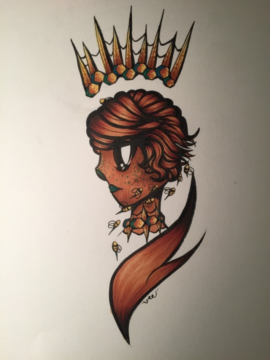
Queen Bee 🐝
(Process pics/extra info under the cut :D)
So, this was fun?? I wasn’t planning to make an illustration today, but I doodled this concept earlier this week in Latin class and decided to run with it. What can I say? I’m always a sucker for bees and royal imagery. Iresine’s hair is way too fun to draw. And I cannot resist drawing super minor OCs instead of actually important ones, especially when they have a dramatic aesthetic to work from. Lol. Listen, she’s still my baby, even if she doesn’t do much in Belladonnas.
If you’re wondering, Iresine’s not actually a queen. She’s a witch/criminal, as are most of the characters in Belladonnas. She’s also a tertiary member of the Glass Diamonds, rival coven to the Belladonnas, and she’s bargained with a demon for the power to talk to bees. As payment, she’s given up her tongue and the power of speech. She’s generally a tranquil and satisfied person, and she’s one of the most emotionally balanced of my characters. Despite the fact that there’s no crown in her story, “Queen Bee” is a punderful expression :D
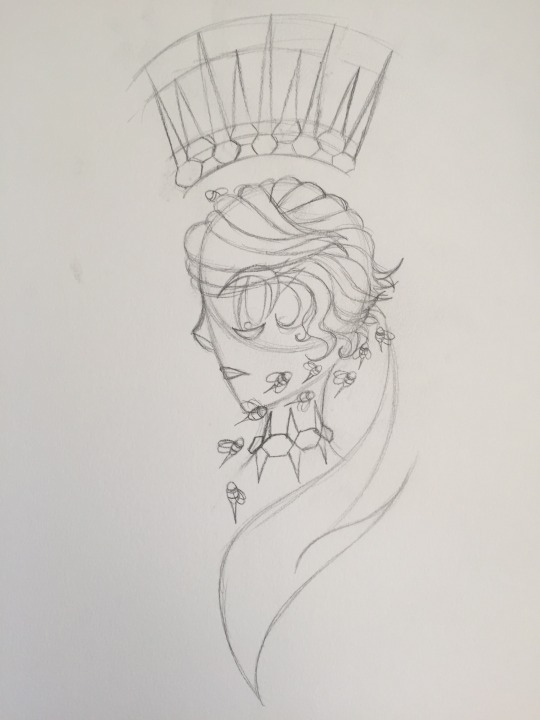
Here’s the sketch! I’ve been working on profiles (notably, translating them into my style), and although there’s a lot I could improve on, I’m proud of my progress. Accessories/objects are also a point of interest for me here. I originally planned to draw sharp, defined spikes on the crown and necklace, but I ended up going for a more organic “beeswax” look later on.

This is not my favorite lineart, tbh. Some bits could be cleaner, and the weight feels all over the place without color. But I had fun doing it anyway (especially that swoopy lapel thing)
And finally, we’ve got the colors. The green was not originally planned, but I think it contrasts the warmer browns in a way that a pure yellow wouldn’t. I wanted to keep with a bee theme, and forest green doesn’t entirely fit that, but maybe it invokes nature generally? Idk. I wasn’t feeling cheery yellow today, and I love how the green turned out.
In coloring technique-wise, I got a little experimental with shading. I used dot shading on the accessories to simulate a bumpy, waxy texture (and generally to play around with dot shading, as I haven’t done a lot with it). I put those green dots under her skin for a similar purpose. I thought they would end up less visible under a few layers of brown marker, but you can see them really clearly… whoops! I guess Iresine has green freckles now. I kinda like them, I’ve got to say. The green on her nose was a style experiment, and I need to think about whether I like it or not. (I realize, also, that the green makes her look a lot like a humanstuck Kanaya. I am 100% okay with this.)
Her face shading could be smoother, but I’m low-key proud of that cheekbone. And I’m high-key proud of the contrast in her hair.
Overall, this was a fun and relaxing piece! Let me know what you think, and whether I should include process information on my art in the future. Writing my thoughts out helps me analyze my own artistic growth/weaknesses, but I want to know what you think about it!
#veescribbles#veedraws#my art#belladonnas tag#art#tumblr art#bees#queen bee#copics#lineart#my ocs#iresine apoidea#oc art
10 notes
·
View notes
Note
1-30
This is long
1) Do you prefer traditional drawing, or digital?
Uhh recently I’ve preferred traditional as for recent style updates/changes but I do most my work digitally.
2) How long have you been drawing?
I’ve been drawing all my life really but I started taking actual art classes when I was around 7?
3) How many classes have you taken?
(I’m assuming art classes here.) Well I’ve taken after school art classes during middle school and I’m currently in an art school! The classes I’ve taken for art are: 2D (painting, drawing, etc.), 3D (wood, metal, wax, etc.), ceramics, photography (film, digital, photo editing in photoshop & dark room settings), computer (digital art classes based in photoshop), printmaking (screenprints, copper etchings, woodcarving, etc.). While I’m still in high school, I go to my art school half-day (all these courses are college level btw kjrgnweklv).
4) Do you have a DeviantArt, personal website, or art blog?
I have a DA, Instagram, Art Amino, Paigee World, and this blog. I’m more active on here and Instagram however.
5) What’s your favorite thing to draw?
I love drawing arms and legs kejglvebtlkhnj I like the curves the body tends to have bc I just tend to like drawing round shapes?? But sketching a person is just generally fun to do.
6) What’s your least favorite thing to draw?
I dislike drawing still lives so much like, you don’t understand. While it’s great for basics and learning how to properly space things out, I find it completely tedious now.
7) How often do you use references?
Most of the time. Always use references. I use them for hands, shoulder placement, scenery, etc. I suggest not copying it directly, but looking up a stock photo can really help with learning how the body works for anything.
8) Do you draw professionally, or just for fun?
Both. I draw professionally at my art school and have sold work through them, but I also draw for fun so I can draw better professionally?
9) How much time do you spend drawing on an average day?
Almost everyday I spend about 1-4 hours drawing? My job qualifies I help little kids draw so that’s also added in but this also helps my drawing abilities.
10) Are you confident about your art?
Ha.
11) How many art-related blogs do you follow?
I follow a lot on Instagram but maybe 5-8 on Tumblr.
12) Is it okay for people to ask you about your process?
Yeah! If it helps someone perfect their process sure!
13) Do you prefer to keep your art personal, or do you like drawing things for other people?
I like doing both but I guess it depends on what the subject matter is?
14) Do you ever collaborate with others?
Not often but I have in the past. I would like to collaborate more with others so if anyone is interested let me knoow!!
15) How long does an average piece take you to complete?
A digital work takes me about 1-3 hours to complete depending on how complex I make it. A traditional work (ex. my paper star project from forever ago with the hands on the jar) takes anywhere between 5-10 hours.
16) Do you draw more today than you did in the past, or do you draw less?
I draw so much more given my IB Art workload and art school workload and then my job. I think it has helped me improve a lot quicker than I would’ve if I were going slower.
17) Do you think you’re justified in giving other people art advice?
Yeah credential wise. I mean I go to and art school (for almost 3 years now) and have been in critique class settings so I mean?
18) What are you currently trying to improve on?
Being more racially/body type inclusive in my art style. I find a lot of my characters are white and thin and it’s something I want to fix, along with making the different body types appear successful in my style.
19) What is the most difficult thing for you to draw?
Animals of any kind along with feet.
20) What is the easiest thing for you to draw?
Hands and legs and eyes.
21) Do you like to challenge yourself?
Yes. Challenging myself is a way to get better and I’d prefer improve a lot more rapidly by always challenging myself.
22) Are you confident that you’re improving steadily?
Yeaah, if you were to see my personal sketchbook you could see a definite improvement from February to now.
23) Do you draw more fanart, or more original art?
I do a good mix of both?
24) Do you feel jealous when you see other people’s art, or inspired? (Be honest!)
Sometimes I get pretty envious but mostly I chose to take that envy and turn it into determination to get better at my own thing? So yeah I suppose I do get inspired lmao
25) Do you like to draw in silence, or with music?
I prefer music because I like taking frequent breaks to just, jam out?
26) For digital artists: what program(s) do you use?
I mostly use Medibang Paint Pro and sometimes Photoshop CS6.
27) For digital artists: how many layers does a typical piece require?
Over 20. I separate all the colors of a piece on multiple layers and add a clip layer if I want to change a color quickly, then lineart and the initial sketch both have different layers, then overlay and background. It’s a big mess.
28) For traditional artists: what medium do you like most? (Pencil, charcoals, etc)
I mostly sketch with a blue color pencil (as I find a regular pencil transfers the graphite too much for my liking) but I love working in watercolors and oil paints.
29) For traditional artists: How do you usually start on a big piece? (Light sketch, colored lead, sketchpaper, etc)
For something around 18 inch x 24 inch it all depends on the media I’ll be using. For a painting I start with a pencil sketch, then go to an acrylic wash (to block in the shadows), then do the actual painting.
30) What inspires you to not just make art, but to be a better artist?
I want to get better, not the best, but better. I want to be able to be someone’s inspiration to get better and want to overpass my technical skills.
2 notes
·
View notes
Note
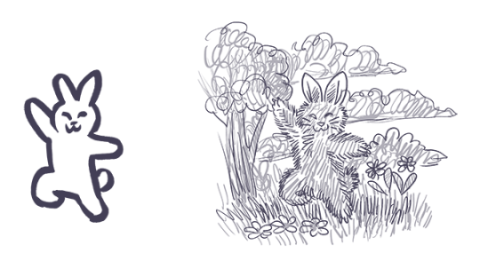
any art tips?
Oh. Well, I can try to give tips? I’ve never really done that before honestly. My level of arting is nowhere near professional and I haven’t tried a ton of stuff to have opinions on them, but I can try.
This kinda turned into a supply list, but for my own drawing process look at the bottom of the post!
Paper
Since I am a traditional artist over a digital artist, paper is kinda a big deal. My current personal favorite is the Strathmore 400 Series Sketch 9 x 12″ fine tooth surface sketchbook. The thickness of the pages keeps it from getting ripply as you work with it, hard coloring in with pencil does not cause bubbles, and pens/markers do not bleed onto the next page. However, it will leave an indent on the next page if you press too hard.
I highly advise against standard 70 page spiral notebooks for anything more than little doodles. The pages are much thinner than they used to be, and will ripple, bubble, fall apart under heavy marker use, and indent many pages. Heavier paper is honestly just the way to go, plus no annoying blue lines.
Price-wise, I know the standard spirals are usually extremely cheap and easy to buy in bulk, but I can’t remember the price of my Strathmore. It’s not too terribly expensive though.
Pencils
Honestly? Pencils aren’t a big deal to me. I use a variety ofcheap, basic mechanical pencil brands. My current preference however, seems to be Bic. Any brand should work fine, but if the lead constantly breaks, I’d suggest moving up to a larger lead size, or buying a different, stronger brand of pencil.
Personally, I never use 0.5mm lead. It is far too delicate, and I have never found myself needing such a small point to draw with. I find 0.7mm to be the best, as you can achieve both thick and thin lines easily, and press fairly hard with it. I mainly use 0.9mm, as I can press veryhard for dark lines, sketch large and clearly visible soft lines, and it compliments the exaggerated features of my casual art style.
Pens/Markers
So this one is a doozy. I use a very large range of pen products with varying standards of quality. For black pens, the Pilot Precise V5 was my trusty pen for many years before the ink ran out. Now, I currently use a 3 pack of Sakura Pigma Micron pens (specifically 01 (0.25mm), 03 (0.35mm), and 05 (0.45mm)) and previously also had a 005 (0.20mm) Micron as well. The clarity and ease of lines with Microns in my experience is excellent, but the ink quality itself, not so much. It is quite pale compared to other inks, and can be worn away by an eraser even after fully drying. Overall though, it’s quite nice.
My general rule of thumb with pens is that the point shouldn’t indent the page, and if the ink is black,it should shine black under a light and not purple. (Lower quality inks will shine purple when tilted to face a light).
With colored pens my use isn’t as narrow. My favorite is my Uni-ball Vision red pen (I also have a green one), but I also use Bic intensity pens, Inc R-2 Blast pens (careful with these, they release a ton of ink), and even Sharpie pens.
For markers, I can’t really suggest what to stay away fromand what’s good, but I can tell you what I use. On the higher quality end, I have a trio of Prismacolor Premier markers which I’ve found have excellent color, and cover space quickly, but can spread and bleed easily. But what do I mostly use? Sharpies. You have to be careful with these. Sharpies bleed very easily, and will darken very clearly when you overlap it, so coloring has to be very neat and a one-time thing unless a darker color is desired. The color range of Sharpies from what I’ve seen, also isn’t very diverse if you don’t go hunting for the stranger colors, so if you use them, have something to color over them to adjust to the color you desire. In my case, I often use a mixture of Sharpies as a base color, and colored pencils over it to adjust.
I won’t make it’s own section about it, but the brand I use of colored pencils is also Prismacolor, as they work really well with the Sharpies, and can even solidly color over the marker. The larger the set the better, as it gives you more colors to adjust with. However, they’re not cheap.
Technique?
So this is less tips I guess and more my own personal routine with drawing. Feel free to draw your own way, or if you think the way I do it may help you improve your own art, go ahead and try some of the stuff I do! This by no means is any standard of a good art practice, it’s just personally how I draw.
I always start with a sketch, as many artists do. I make sure it’s very light that I can erase it, but clear and visible even after erasing it. Which is the odd thing I do? I erase a sketch immediately after I finish it. My sketches are less posing and positioning than they are quick, sloppy, simplistic versions of my final product. I do not usually draw basic shapes and lines for anatomy and poses, but I do sometimes. If you struggle with anatomy, I suggest still using basic shapes, as they help a lot.
Here this can go one of two ways. If I decide to ink the piece, I do not erase the sketch, and simply clean it up while doing the new lineart. This can be risky, and can result is messy lines or concave shapes that weren’t intended, so redrawing in pencil first can always be helpful. If I decide to not ink the piece, I erase the sketch, leave it visible, and draw a much darker and more visible clean version.
When it comes to colored pens, I usually only use them to supplement the drawing, blood being the most often example. Coloring large areaswith pens is messy, and a waste of ink, and I advise against it. Coloring in a pencil piece with colored pencils is also a big no-no to me personally, as it will cause the colors to blend with the gray lead, can smudge said lead, and they will pop much less against the lead as opposed to ink.
I hope this means something/helps I guess? I’m not very good at the whole tip thing, sorry!
0 notes
Last Seen Blogs

tumblers-flops
tumblers flops .

idogmini
iDogMini

pleaseme24u
Untitled

futurefatboy
FutureFatBoy

mxwdlr
Untitled