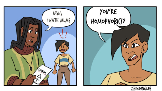
#i totally want to draw traditionally now
Note
I gotta ask (of you're okay with answering of course!!) How do you get your traditional sketches- that are on paper- I'm assuming, so clean?
I'm totally envious of how pretty it is and how vibrant and clear it turns out in pictures!
I was wondering maybe what your process is or simply how you edit your art to look so pretty! 💜💜
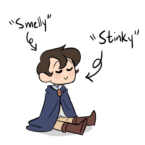
Ahhh thank you!! I’m happy to help!
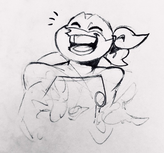
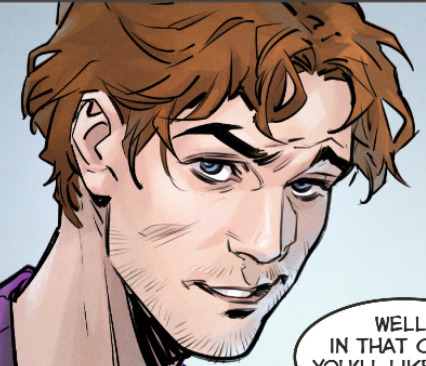
I’ll use Mikey for this demonstration :>
When traditionally sketching, I first start out with really light lines, then after getting a rough sketch down, I come in with darker lines, then I erase the lighter ones
The darker lines may also get partially erased, but because they’re darker and pressed into the paper more, they remain and I can still see them, so I can just go over them again without keeping my rougher light lines I’d done before

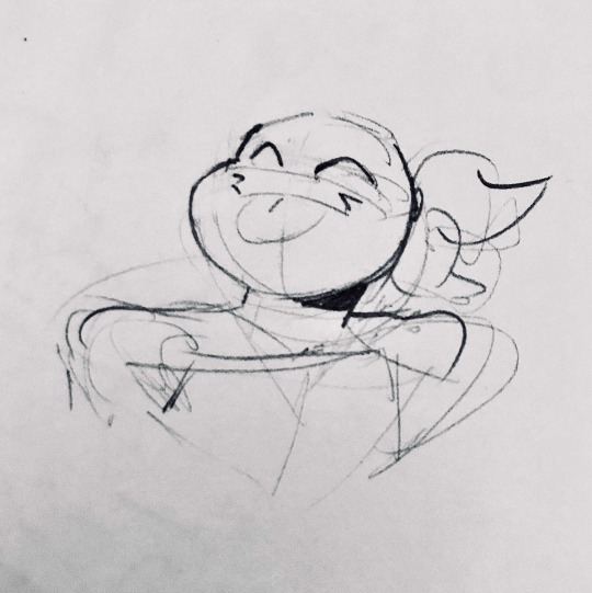
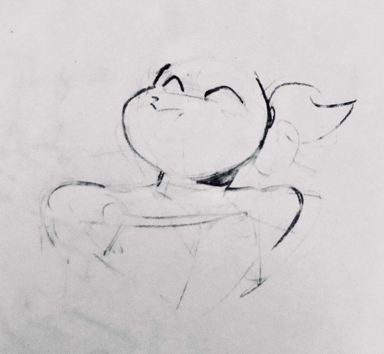
I rinse and repeat until I feel satisfied with my drawing!
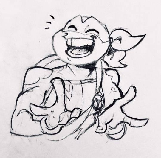
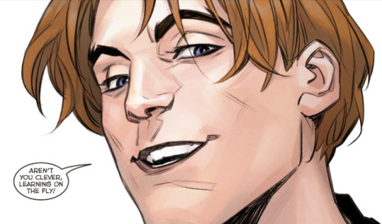
Now for the editing, I just use my phone’s camera app editing settings
If this went by a bit too fast, (I’m so used to doing this at this point lol)
In short, what I did was turn the contrast up 100%, then brilliance up to 80% (this varies, it depends on the lighting I took the photo in,) and then I adjust the rest from there. With “highlights” being turned up pretty high, and “shadows” turned pretty low.
Then for the coloring I turned the saturation down to 0%, (for a crisper black and white look, I don’t do this all the way if I used color,) and then I put the “dramatic” filter on it, I like how the filter makes darker hues sharper and how it evens out lighter ones.
Also!! The “sharpness” setting is really nice for making your lines less blurry!! I turn that up to around 15-25%
The cropping is just a matter of framing the main subject well, then taking out unwanted space. I usually adjust angles before cropping, otherwise I might crop out something I wanted in
Here’s the before + after

I hope this wasn’t too confusing, lmk if you want any clarification!
#I’m notoriously bad at explaining things#there’s probably better ways of taking and editing photos of traditional art#but this works for me!#oh yeah also having even lighting when taking the photo really helps
596 notes
·
View notes
Text
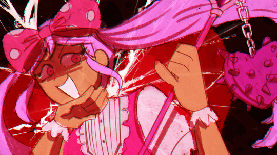
Analysis of how Natalia Zaidova draws Sergey Razumovsky
Or: trying to justify a thirstpost about the world's most terrible man
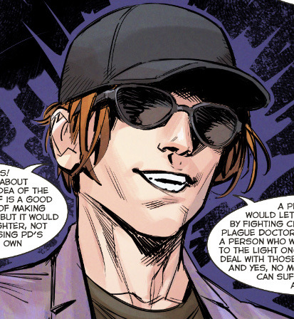
Sergey's gone through a number of artists through the years, and I gotta say, Natalia Zaidova's rendition has captured my heart. In fact, it was a screenshot of Natalia's Sergey that first got me into Major Grom. While Phob's is the official art style that we associate with the comics, Natalia's style, I believe, better serves Sergey's character in the current PD run.
Genre-wise, PD returns to being a big-action, ensemble comic, which--compared to The Game's tight conflict and human drama focus--deliberately implements Natalia's more traditionally comic-book style to this effect. The first arc (nine volumes in total) of PD are all Natalia; though the current issues are being outsourced to a number of different artists now, Natalia's style--with its roots in distinctly American superhero comics, such as DC--was what they wanted to prime audience's expectations with. After Time of the Raven, there was a big push for Bubble to adhere their stories to big names like Marvel, and with that came the desire to usher in things like a multiverse, space and supernatural elements, and franchise crossovers. Plague Doctor was one of their latest installments of that new "culture," and they had to match their aesthetics appropriately.
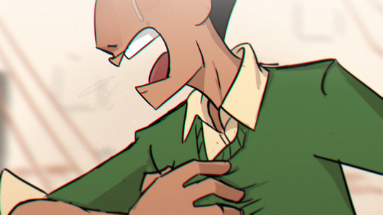
Okay, but that brings me back to the brainrot part of this post, which is HOT DAMN NATALIA'S SERGEY LOOKS SICK???
The whole idea of Plague Doctor is that, for like seven years or something, Sergey has been declared dead or missing or otherwise MIA. Nobody, both in-universe and irl, knows where he is or what the fuck he's up to. You crack open issue 1, encounter a guy in sunglasses and a hat who is painfully obviously Sergey, but you get to the last page and

(I will say this is probably the most unflattering frame of him. His chin makes him look like such a chad derogatory)
BAM. HOMEBOY IS ROCKING A NEW HAIRCUT, HE'S WEARING ANOTHER STUPID PURPLE SUIT, HE'S RIPPED, AND HE HAS BLUE EYES.
This isn't the soft, sort of angelically beautiful Sergey we're used to seeing from Phobs. It's radically different, an entirely different character almost, which was the intent.
His new look is more practical, both tactically and socially. His hair is cut, so people won't recognize him as easily. It won't get in his face or get grabbed during fights, and combined with his more muscled build, this is a Sergey who's taking things more seriously this time around. Gone is the flamboyant cape and swishing fiery locks; the plague doctor campaign is no longer a passion, but a duty. And he's ready to enter the thunderdome and get his hands dirty and god damn it, he will die trying.
Natalia does take care to preserve the core elements of Phob's Sergey, while making a hard left into traditional masc territory. He's still unrealistically attractive, in that distinctly soft and youthful way. He's more noticeably fit but still maintains a slim, smooth appearance.
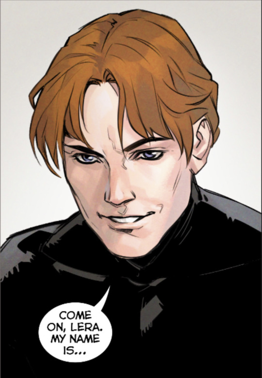
But on top of that, she adds this charm and charisma to him that is distinctly boyish (as in, young and mischievous, a pretty face that's up to no good). It makes his persona as a young, leftist radical more believable; he looks like a student revolutionaire, angry and passionate about all issues topical and trending.

He does look more obviously aged. Guy is now in his mid(?) thirties, and the past five years probably amounted to like three lifetimes of stress, so it certainly makes sense. Compared to how Natalia drew The Game Sergey, his face is more defined with sharper lines, muscularity, and wrinkles. The short hair also ages him somewhat, making him look less angelic and more like... a regular dude.

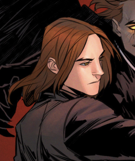
And of course, there's the overnight peach fuzz.

The more mature, aged look helps him actually look like a person who's lived a life as loaded and fucked up as Sergey's. He's a guy whose parents died, grew up in foster care, became a CEO that rocketed to stardom in five years, committed the most elaborate fucked up terrorist campaign ever, and then immediately fell from fame to the deepest coldest cell in St Petersburg (and this is all just the OG Major Grom run). He's not Phob's Sergey (or Rag, whoever it was in The Game)--a blameless childish pretty boy who's detached from his crimes. Natalia does a good job in making Sergey have this subtle undertone of... unsettled, unhinged, what have you. I don't know how much of this is hindsight bias, but he looks like a guy with a fucked up secret. You wouldn't think twice if you were seeing him in a grocery store or something but I can imagine later recognizing his mugshot on the news and thinking wow now that i think about it, he really does look like a serial killer.
And let's talk about his fashion. For all the features of Sergey's flamboyant costumes in Phob's renditions, Natalia dresses him quite casually, and it works, ironically, to make him look deceptively plain in the way all extremely rich people dress (think of the $10k white t-shirts and sunglasses get-up all rich men wear). He dresses like his current social stature: a new-money sod who has gotten used to his wealth enough that he doesn't have to show off with his clothes anymore. Of course, this could also be turned on its head and instead, be an indication of Sergey's original, cheap clothes that he habited from his childhood. Certainly, the ironic rightwing graphic tees Natalia puts him in edge towards that point of view, only now they're colored by Sergey's sense of political humor. I doubt a "god guns government" shirt is selling for $500 at some luxury tailor shop.

This is what I love about Natalia's Sergey. In making him look more human, we get to orient him more organically into our own world. He looks like a thirty year old loser who studied CS in college and now commits cyber terrorism and doesn't know how to cook. He looks like a young adult leftist who is terminally online and has 500+ open tabs on Marxist theory. He looks like a guy who became too rich too young, who was the world's angle and then its devil in the span of like two years, and is now disillusioned with it all, who wears $5 graphic tees and stays up all night looking behind his back and tries desperately to find something that actually matters.
Once Sergey looks more believable, he becomes more understandable. And the more we understand him, the more the story has the potential to make him intrigue and surprise and reach us in multiple, unexpected ways.
#not as expansive as I wanted but I wanted to get The Thoughts out#major grom#plague doctor#sergey razumovsky#bubble comics
125 notes
·
View notes
Text
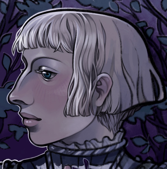
ON BRIENNE, HAIR, AND BUTCHNESS — META AND A WIP BELOW THE CUT.
So I’ve been working on a Brienne piece recently, and noticed in my reference designs that her hair isn’t a consistent length — a totally unintentional piece of Brienne meta in itself — and I wanted to type out some thoughts about it.
I think Brienne’s relationship with femininity is so interesting and complex. She’s living in a deeply misogynistic society, and she’s simultaneously insecure about not being feminine, and functionally unable to be feminine, at least by Westerosi standards. This is both because of her physical appearance and because of her aspirations. However, she’s not willing to reject femininity outright. Being feminine in some regard is important to her, enough so that she is upset both at being called a man and being mistaken for one.
Because of this, my Brienne hair headcanons are complicated. I’ll explain.
It needs to be awkward, because Brienne’s awkward. It needs to be functional, since she’s practical. It needs to be recognizably feminine, because she values her femininity. Hair, at least in our western society, is very gendered, both when conforming and subverting. I cut my hair in a men’s cut (or as close as I can get) specifically because I have very feminine features and I dress in a feminine way. My hair is simultaneously form of disruption, a deliberate contrast, and a signal of my identity. So my design of Brienne’s hair needed to be an intentional and nuanced choice.
I imagine, and I believe the text supports this, that Brienne is unsure of herself in terms of presentation, especially gender presentation. This is partially because she’s young, and partially because Westeros isn’t known for its great diversity of female role models. So I drew inspiration from my awkward middle school bisexual bob, from when I didn’t know what the fuck I was doing in terms of presentation. Also, since Brienne’s name is a play on Joan of Arc, I took into consideration classical depictions of Joan, especially Albert Lynch’s Jeanne d’Arc.
I have been talking about this with my dear friend Jasper, who is butch, and in terms of Brienne’s butch factor, we agree on a few points. Brienne can definitely be considered butch (adjective), but I don’t think she’s truly butch (noun), at least not yet. Brienne’s at a point where she definitely resents not being a traditionally feminine woman, insomuch as it makes her life difficult, but she’s also too insecure to project any intentional masculinity. In a modern analogy, I would say that Brienne is the type of person to wear women’s clothing, but not women’s clothing that is overtly feminine — the type of person to try putting on makeup in the bathroom and then quickly wipe it off. She’s not really participating in femininity actively — she’s just trying to blend in. Also again, practicality. I doubt Brienne, in any setting, is going to be wearing skirts on the regular.
I’m also drawing on Brienne’s thoughts and experiences in the books, which I interpret as follows: Brienne doesn’t dislike being in dresses just because they’re feminine; there are distinct reasons. Firstly, they draw attention to her lack of traditional femininity/beauty. Secondly, they have bad associations for Brienne — she’s been mocked in them, she’s been forced into them, and she fought a bear in one, so I can’t imagine they bring up good memories. Third, they just aren’t suited to a lifestyle of kicking ass. But I struggle to believe she truly dislikes the, for what they are — a gendered garment.
Most of this comes down to my personal thoughts on Brienne’s future and present. I think right now, a lot of Brienne’s gender angst comes down to the fact that she’s not yet comfortable enough in her presentation/gender/personhood to fully commit to being something in between. In my dream scenario, Brienne is comfortable embracing her unconventional gender and presents the way she wants, not the way people expect her to.
All this to say, I think Brienne has a really shitty bob with bangs she cuts herself. A little piece of my WIP below ->
191 notes
·
View notes
Note
Excuse me, could you explain the Easter egg decorating event in a little more detail? I'm a little clumsy and I don't quite understand...
Ofc!!! I'll do my best! But please feel free to send more asks if I don't answer your questions!
Alright so!
To enter the event all you have to do is decorate an egg! I realize now I didn't specify, but I was thinking of just drawing and coloring an egg either digitally or traditionally! However, you're welcome to use other mediums or decorate an actual egg!
The egg can be as simple or complex as you want! So you could just draw an egg shape and color with a more simple pattern or go bonkers with it hsjshsjsj
You have up to the next Thursday 4 to submit your egg!
If you want to submit on here I ask that you do so by adding your image on a reblog, if you submit your egg on Toyhouse you'd add the image on the comments of the forum post!
Now! What will you win?
So, every person that submits an egg in that time frame will get a basic MYO or Make Your Own slot!
That means that if you submitted an egg you'll be able to design your own milagro after the event! (More abt milagros below)
There are only two rules:
1. The milagro you create must be based on the egg you submitted
So let's say your egg is sea themed with a blue and yellow color palette, your milagro must be sea themed with a blue and yellow color palette as well!
2. The milagro you create can only have basic or typical traits
You can check this chart to know what you can and can't include:
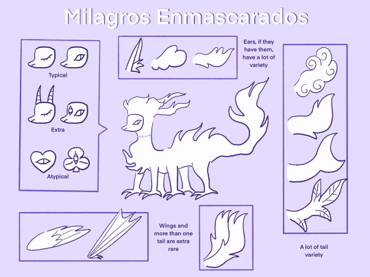
But in short, your milagro would need to have a typical mask and no wings, extra tails or heads, detached limbs, etc. Since those are rare traits
You can, however, pick whatever ears and tail you want since there is a lot of variety! The fur is smth else where you have a lot of liberty! See #milagros enmascarados to look at some examples if you want!
Now, three winners will be picked on Tumblr and three on Toyhouse, so six in total
Those ppl will win the ability to include rare traits in their design! So extra or atypical masks, wings, extra tails or heads, detached limbs, etc.
Lastly, a little abt milagros:
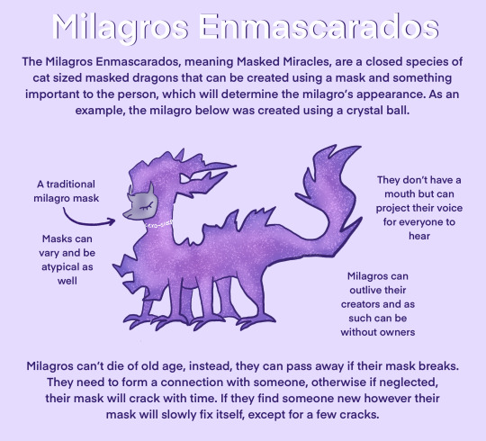
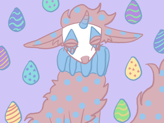
The Milagros Enmascarados, meaning Masked Miracles, are a closed species of cat sized masked dragons that can be created using a mask and something important to the person, which will determine the milagro's appearance.
I hope I was able to answer your questions but again feel free to reach out if I didn't!
Thanks for reading!
12 notes
·
View notes
Text
The Lost Boys are a bunch of hoarders. I can see each of them having a massive collection of things from over the years and from their victims.
If they see something they like they will take it. For example if their latest victim has a nice leather jacket that looks like it'll fit them, well, it's theirs now because it never hurts to have a spare -- or twenty more. It's the same thing with jewelry and any cash in wallets.
That's not to say they'll keep everything. What they don't want will most likely be pawned off. Some things they like and actively collect while other things they will get because of necessity like candles. Vampires have better eyesight in the night than normal humans, but that doesn't mean they can see in total darkness. This is most likely why they had all those candles lit in the cave.
The cash taken from their victims isn't only used for food, but towards candles, batteries, gasoline, and other things that aren't easily found on their victims or on the boardwalk.
Most of the time they steal shit. They don't even need to use their hypnosis-compel ability or illusions to get want they want. Though I can definitely see them doing things the old fashion way just for the fun of the challenge it brings. Other times they avoid stealing if it'll be something that draws too much attention after a while. After all, the more often something goes missing the easier it is for unwanted eyes (like vampire hunters) to catch on and make the connection.
Would they even need to worry about being caught on camera or video? One of the points in the film was that vampires don't have reflection in mirrors. We saw this with Michael's reflection being transparent because he was only half-turned, but what if that wasn't the norm anymore (as it could've just been an old mirror)?
Vampires traditionally couldn't be captured in mirrors because they were made with silver, and thus old timey cameras which used silver nitrate plates also couldn't capture the vampire's image. However, modern mirrors are made with aluminum and advances in technology has made it so film/(digital) cameras can do a lot, even capture vampires just fine, well, that's the theory anyway.
I suppose it'll be up to the fans and writers to decide if the boys can be capture or not. Will they be invisible no matter what? Or did that vampirism aspect only apply in the past (because silver was used and is typically a weakness for most monsters), but they can now be caught on cameras? If so, will they look like normal people? Will their eyes give off a weird reflective glare like most animals do in photographs? Or will their imagine be super blurry no matter what anyone does to try to "enhance" it, while everything else in the photo (or video) stays super clear and normal?
I digress. The point is that I can totally see them having piles of stuff scatter around their hotel-cave.
Each one will have a pile of clothes. I wouldn't be surprise if some of it is out of style too. They either forgot about it or still keep it around to help feed the fire because why else do they have those drum barrels around?
They also got a lot of books, vinyl records and cassette tapes. I imagine on slower days or late at night when everything is closed they find ways to entertain themselves, be it by reading, listening to music or the radio. If not, they probably have a collection of various games too like darts, playing cards, monopoly, charades, chess, etc.
As for what does each one personally collect?
Hmm, I guess Marko with the state of his jacket he probably collects patches and pins. Maybe even owns a few sewing thread sets with other art and craft supplies.
In the cave there was some seashell mobile or wind chimes hanging around. I think Dwayne is the one to make it (or one of the boys got it from the souvenir shop knowing it'd be something he'd like). He might like collecting seashells. I can also see him collecting some books, animal bones, antique keys, sea glass, ammonites, pretty or interesting looking rocks, etc.
Paul is probably the one to expand the collection of music and games. Batteries too, though I wouldn't be surprise if all the boys add onto it and make sure their stockpile of batteries never runs too low. Maybe movies and concert ticket stubs? I don't see him paying for it though, so he probably snatches them from others. He might even collect or make his own guitar picks too.
As for David...I don't actually know. Probably books, oh, maybe cool looking zippo lighters? He does smoke so that would make sense. Oh, what if he has a collection of pocket and folding knives? It certainly wouldn't be hard to come by. I imagine there's been plenty of times of people thinking they can take him on with just a knife (this of course is before he reveals he's a vampire). He would probably find it amusing and be like 'oh, how nice' if it's something he doesn't have already. He'll be picky about it though. No shitty quality knives unless it's aesthetically pleasing.
Other possibilities is watches, badges, matchbooks, dice, shot glasses or keychains from states/countries they've been to (though this might be more of a Marko and Paul thing) and coins.
#the lost boys#the lost boys 1987#the lost boys (1987)#tlb 1987#thoughts#david the lost boys#marko the lost boys#dwayne the lost boys#paul the lost boys
40 notes
·
View notes
Text
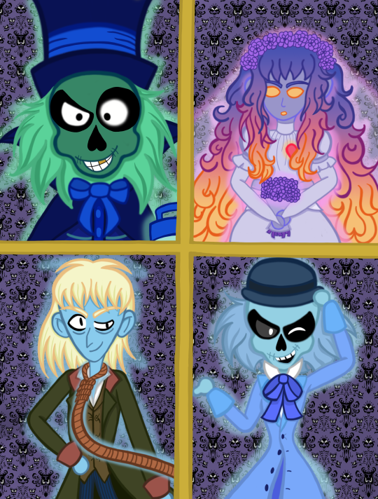
"Grim Grinning Ghosts Come Out to Socialize"
Hello Haunted Mansion fandom! I drew some of my favorite happy haunts! I hope you like them as much as I do. I'm very excited to draw more ghosties in the future. But for now, look upon my creation!
Artist Notes Under the Cut:
I drew Hatty first, so that's why he's a little closer up than the rest. I intended for him to look short, and everyone else is supposed to be much taller. But when I drew their heads higher up I didn't quite get it to the same scale. So we'll just say that since Hatty's hunching over all the time he's just sitting up closer to whoever is doing their portraits lol
I based Emily's appearance on both the Tokyo bride and the Beating Heart Bride replica made by brandon.hardy.art on TikTok. The replica bride in particular had this ombre color effect in the hair that I thought made her look really cool and ethereal, so that's why her hair looks like that. I drew her expression to be kinda spaced out here, but I imagine Emily to be a more bubbly character. So I thought giving her a slightly more colorful look would suit her.
Hatty might be my favorite, but Ghost Host was definitely the most fun to draw. Maybe because I'm just used to drawing skinny guys lol. He has a very unique nose shape I've never drawn before, and I like the swooping motions I can do with his noose.
After reading the Ghost Gallery, I got the impression that Ezra was a sleazy, flirty type of character. He feels like the kind of guy to make a total fool of himself because he thinks he has rizz when he really doesn't. So I tried my best to convey that with his expression. I wanted to him to look like he's trying to rizz you up to convince you to let him follow you home XD
Since Hatty and Ezra use the same head mold, I wanted to make sure they looked distinctly different from each other. I notice in a lot of official art that Ezra's hair tends to look square (if they give him any hair at all lol). So I gave Hatty longer hair while Ezra's is shorter and puffier. I also gave them different eyes, with Ezra's being inspired by how @ whatwouldwaltdo would draw him in their old asks.
Very glad I colored this digitally. Normally I'm a traditional artist and I did the sketch for this piece traditionally. But I wouldn't have been able to give them the "ghostly glow" if I had gone the traditional route, and I think it looks really good on them.
#the haunted mansion#haunted mansion#hatbox ghost#beating heart bride#attic bride#ghost host#hitchhiking ghosts#ezra the skeleton#ezra the hitchhiking ghost#ezra dobbins#ezra beane#disney#fanart#my posts#artofthejester
52 notes
·
View notes
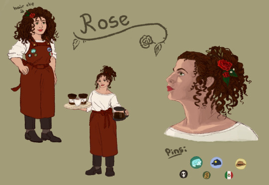
Text
Wanted to make some fanart of @writeforfandoms's oc Rose from Fall Into Me since the fanfic has been living rent free in my head. I first thougt I'd just do the stuff traditionally but then it kind of got out of hand and I wanted to do some digital stuff as well since I really wanted to get her hair and eye color in there.
Anyways, here ya go, Jen! ^-^

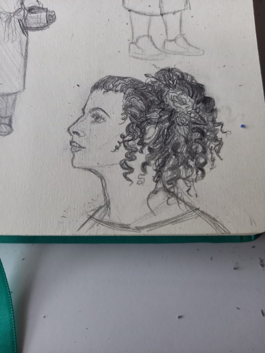
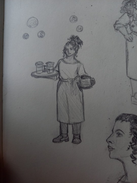
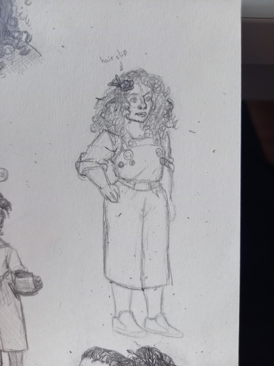
This was actually one of my first times drawing long curly hair so it was fun to learn as I went. Also I just thought it'd be cute that (since her name's same) she sometimes wears flower crowns or similar accessories. And as a cute easter egg I added little pins to symbolize all the guys. Unfortunately couldn’t think of any for Alejandro and Rodolfo so I drew the Mexican flag... yeah original I know 😂
Here's the digital drawings of Rose:

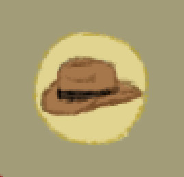
And I headcanon that Gaz, as the menace he is, would definitely wear a cap with a smiley on it because someone got it as a gag gift for him.
Wait no, I totally could've drawn a cowboy hat for the Los Vaqueros arrggh. Great. Just great to realize now after having drawn the whole thing and writing this post
Hehehe update: I went back and drew the hat because I couldn't just leave this injustice unrectified. Now the lads have two pins
Okay here's the officially finished piece:
26 notes
·
View notes
Photo
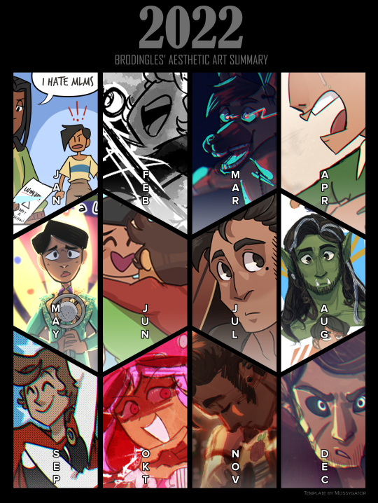
Year in Review, 2022
I actually made a couple of these, because it was hard deciding what really encompassed my year. The version above is the one with my Aesthetic version, which has the pieces I think were the prettiest or most aesthetically pleasing ones I did for that month.
This post has my thoughts on the pieces and some overall thoughts on my progression through the year! I’ll post one with just the image afterwards.
January
I spent most of January coming off the end of IR and DMP, and as such I had a lot of. Juniper, Dorkus, and Angie on the brain. I actually made a few of these little comics. >:0 Dorkus is one of my favourite expressions I’ve done in a long time, and it lives in my army of Discord emotes haha.
This kind of WAS my meme for the month, my favourite thing overall.
February
This piece is actually part of a set that I did on stream! It’s part of a set. Keep this artstyle in mind, it will come back later!

Was still drawing Triad Shenanigans this month. I just wanted to share Discount Chocolate Dorkus.

Despite what it may seem like, I actually spent this month planning Tiny Gents! I made headshots for every important NPC for the first oneshot I ran ever in my life. Very shaky knees, but everything went well!!
March

I have no idea what came over me for this one I just went as feral as Barbeau haha. This HAD to be when we were talking about doing a certain DnD game, but the DM and players have been so busy all year we never played. Maybe 2023 is the year Barbeau comes into fruition??
Not the full comic and no Dorkus because I’ve already shared plenty of Dorkus and Juniper needs to be in here SOMEWHERE, but apparently I was still going strong with these in March?? Wild!
We ran the second(?) Tiny Gents session this month. I am including Tiny Gents because it was such a big part of the year in total haha.
April
I actually don’t like this piece very much, if I’m honest, but I made it and that should be worth something!! I had the song Eyes Don’t Lie going on loop for this, and I put it on my Rememdium playlist, which is probably my most played playlist of the year (If not, it’s TG). This song is going to come up again, but it definitely put me in A Rememdium brainspace.

I actually spent the month drawing more Tiny Gents stuff. Pictured above is one of the “Feral Group” PCs (featuring Charming reading a book). I did some more character design stuff this month, mostly sketching traditionally.
May
This piece is actually from a LIST of pieces that I did in a row for the Song Meme. This one just looks the nicest when cropped to me haha.
I also redrew a classic comic with the newer designs for the TG RA’s. I...got so much done this month haha.
June

Pride! Emilio and (then) Geon! This was actually NOT the highlight of the month, because this month I created Aine!!

She just POPPED into existence while I was listening to Eyes Don’t Lie and then she took over my brain for a while.

I also did more Tiny Gents art because I had brainrot all year.
July
ANTHONY TOKEN
So Anthony, my boy, came into existence a little before this month, but I didn’t draw him much or think about him much until AFTER I drew his token. Now I’m obsessed with the goober. I plan on redrawing this, I’m not as happy with it now.

I actually posted this one here recently, but I did this as a send off with the Feral Group for TG. They haven’t played since and I miss them ;v;
August

I did a lot of doodles? This month? It was a little slow. I created Hisscisca (the half orc) and Jamie (the pink goth). I actually did frames for an animatic done by @anatthema-art
Also created another character with the help of @churrobird
Got back into Triad shenanigans and made Dorkus a gf. I also did a set of outfits for Juniper! I’ll try to post these separately, this post is getting long.
BUSY MONTH.
September
More Tiny Gents. I did so much Tiny Gents. Not so much art but just doing Tiny Gents.
BUT I ALSO WENT INTO ANTHONY BRAINROT

I HAVE SO MUCH ANTHONY. I DID AN ANIMATIC FOR ANTHONY I WEEP. I SOB. I CRY.
October
I drew this one in a haste and for love of the game to do MOTI’s Songtober! It was a really fun piece to do, and I’m surprised I have not done more fanart for this game ohoho. Omori made a big impact on my art.
I also tried really hard to do a TG comic this month, and I did 3 pages. Hooray! I can’t find it in my files, but it sure is a thing I did.
I also did like...3 birthday pieces because I have so many OCs with October birthdays.
I actually also spent this month working on an even bigger project...

So Monkey’s Paw is not mentioned ANYWHERE in this summary, and that’s because I forgot I had to do a ton of art for it despite it consuming my being for several months. It is a surprise I got anything else done, really. I don’t even remember when I drew these-- technically they should be earlier. I’m glad the song and video are out haha.
Also yes I put an Omori reference in the video.
November
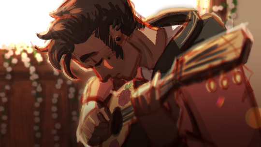
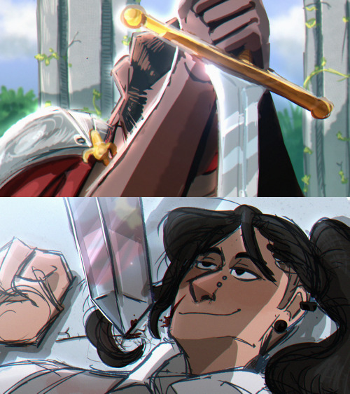
This piece kind of changed how I approach my pieces in general? There was a lot of reference gathering and editing that went into it, even though it didn’t take long to actually draw. I just wanted to try something cool, and it seems to have succeeded.
Really this month I did a bunch of cool art with Anthony, I’m also quite fond of the sword piece.
I have so many feelings about this image you don’t understand.
December

I actually don’t know if the person I did this for has a Tumblr, but it was a Secret Santa gift! I did other smaller pieces this month, a lot of them, actually, but I mostly just chilled out. December was very reflective for me personally, and I became so grateful for things that happened this year.
This summary is very visual heavy and I apologize for that, but there’s so much art to share this time around and I wanted to do that!
Conclusion
I spent this year working mostly on my own projects, which was very surreal. I’m very grateful for being able to do that, and would like to continue working on projects throughout 2023 as well!
25 notes
·
View notes
Text
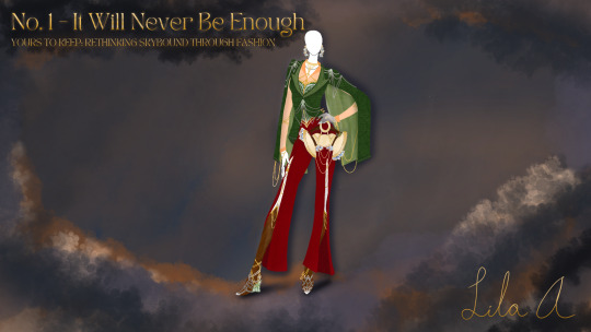
Keep it in and we'll all get rich. This is "It Will Never Be Enough."
For his first wish: the mortifying ordeal of being known. I'm not even kidding.
Given that this series is just a front for an in-depth Nadakhan character study, there's really no other way to start than with the man himself. This design has been bouncing around my mind for a few years now, actually - it first came to mind before I had the skills to pull it off and has been tapping impatiently on my shoulder ever since. This past fall (yes, this has been in the works for months), that moment arrived. I felt confident enough in my artistic abilities to bring it to life, sparking this series and analysis.
So, back to the tagline: the mortifying ideal of being known and my bold claim that that's the first of Nadakhan's actual, character-defining wishes. It's a desire that becomes apparent early in his life, when he abandons his home to seek a life not defined by his royal heritage. And, somehow, he gets it: he spends decades, if not longer, practically ruling the Endless Sea. Nothing gold can stay, though, leading to his two-hundred-year stint imprisoned and a less-than-glamorous return to existence in Stiix. Shortly after that, though, there's a shocking development: he wants to go home. Generally, going home after a life of adventure is seen as a retreat of sorts, but it means something entirely different for Nadakhan. In episode 57, Flintlocke's the first to express surprise that Nadakhan wants to go back, leading into a telling exchange:
Flintlocke: But you said you'd never be welcomed back there. What about your father?
Nadakhan: Better to live in a world where you are hated than in a world where you are forgotten.
In short: Nadakhan refuses to exist where he won't be seen. No such thing as bad press, right? The sheer ridiculousness of framing teenagers for petty crime, the real possibility of being ostracized by his own home realm - it's all about attention. He's been alone for two hundred years, only to emerge in a world where he can't relive his glory days. Finding out his backup plan of being the resident black sheep in his home realm is off the table, well... that's just saltwater in the wound. That's also the start of his second secret wish, so that's where this chunk of the analysis stops and we get into:
The Outfit Breakdown
Because any Ninjago villain traditionally sets the tone for their season, I chose to go perhaps a little too hard on this design in order to have a pool of motifs to pull from later. It's also meant as a mirror to the quote this look is named after - truly, I could have added so much more to this look. I only stopped out of necessity when my art app started lagging. I still like the effect this gives off, especially in regard to Nadakhan's origin as a character. His existence draws from a dizzying number of tropes and sources, creating an unusual and unforgettable presence. We'll break this one down piece by piece.
Of course, we've got to start somewhere: this is heavily based on Nadakhan's (positively awful) human disguise from the season premiere. Oof, did someone get dressed in the dark or what? Pine jacket, red pants, a hairdo that literally prompts a total rando to call him a bozo - let's be nice and call it a difficult pairing. No drip. Anti-drip. Dry as the Sea of Sand. One of the first pieces of feedback I received on this design was "goth band prep goes to a holiday party," if that tells you anything. It never entirely got away from that, which I'm willing to embrace - it's a loud combination! This is the garb of an attention-seeker! Step into a holiday party in this and immediately trigger several record scratches. I just wanted to do it better, because the original iteration is not it.
Originally conceived as a stereotypical pirate jacket, the brocade silk-lined cape blazer came into its own after the friend who gave me the "goth band prep" feedback suggested amping up the drama. It was an inspired suggestion given that said friend knows nothing about Nadakhan - who was I trying to design a stereotypical pirate jacket to embody his character? A fool, that's who. This blazer features a few nods to his origins, both meta and in-universe: sharp lapels as a nod to the Dracula love story that fueled his arc and rich materials to suggest his royal heritage. The silver dangly sections on the clasp and shoulders are extra pointy to reference the silhouette of his iconic chestplate.
Beneath the jacket lies an emerald-and-silver corset intricately woven with a set of golden body chains. These were initially separate elements, but while I was drafting the choker and chains, I had a thought: what if it was all one piece? Thematically, this ended up making perfect sense - this is the world's most uncomfortable halter top, reflecting how his own rage and desires slowly choke out his relationships with his crew. Zoom in and you'll notice that these body chains permeate nearly every inch of the ensemble: as bracelets and arm chains, a pair of draped garter bracelets in the slits of the slacks, and even wrapped around the boots as anklets. These constitute a twist on the concept of the gilded cage, which I feel Nadakhan both experiences and weaponizes. They're intentionally subtle - as hard as he works to conceal his plans, his tragic greed is an integral part of his character, heightened by the dramatic irony of the audience getting to know him before the rest of his crew appears. That we know just what he wants, but the people closest to him (emotionally and physically) don't?? Beautiful. Give me more of that, please. In addition, silver filigree elements on the corset are meant to mirror Nadakhan's hook hand.
The collared shirt under the corset is purely functional (and designed to be reasonably easy to bring to life because FSM knows the rest of the design would be a nightmare to make) - the peach shade is both a nod at Nadakhan's coloring and a weak attempt to fend off Christmas outfit accusations. The original human outfit uses a white shirt, which doesn't blend in quite as well.
A silver glove on the mannequin's left hand calls to mind Nadakhan's hook hand and brings in a little bit of needed contrast. Despite his association with piracy, gold, and opulence, Nadakhan's canon metallic accents are all silver; this is deliberately overridden to heighten his strangling sense of greed. The glove, modeled after his hook, helps ground the outfit in canon.
Even though I don't think I'll ever bring these designs into the real world, I like to design them with a cosplay runway in mind. Simple as these velvet slacks are, they're meant as a stand-in for Nadakhan's.... lower body? Tail? (What are we calling that, y'all? It's been seven years and we haven't arrived at a consensus. I read a fic that called it his "lower area" once, and we definitely can't use that.) The smoky bit that's always moving? That part. The part that should be legs but isn't legs. Anyway, point is that it has some crimson shading and that it moves. So would these pants with a sassy enough runway walk. Beyond the rebellion implied by slashing massive slits into expensive pants, there's not a lot of symbolism here.
The leather boots are the first of two mirrors to Nadakhan's iconic heirloom weapon, the Sword of Souls (the name Djinn Blade, while entirely canonical, is simply not as cool): sparkling crystal wedge heels and thick leather, with the same hook filigree motif as the corset. After he acquires the Sword of Souls, much of Skybound's plot hinges on how Nadakhan chooses to use it; in the same way, the green crystal wedge heels physically support the entire look.
The second reference to the Sword of Souls is far more overt: a luxury handbag traced directly from the Sword's theatrical hilt. Made of pale leather and gleaming gold blades and chains, this handbag doesn't quite coordinate with the rest of the outfit. Instead, it's forced to work out of necessity in the same way that Nadakhan feels he has no choice but to wreak havoc with the blade. Asymmetrical blue crystal accents on both the handbag and the statement earrings are a twofold callback: both to the shattered Realm Crystal that reveals his realm's fate and to the mirror he manipulates in "The Last Resort".
Exhausted yet? I hope not - we're just getting started. As a reward for making it to the end, behold the duality of my art skills: this meme I made months ago, somewhere in the middle of designing this outfit, after a heated Ninjago-themed round of Skribblio where I was tasked with actually drawing Nadakhan. Safe to say, that's not where my skills lie:

#ninjago#ninjago skybound#ninjago couture#Yours To Keep: Rethinking Skybound Through Fashion#ninjago nadakhan#ninjago fanart#fashion design
19 notes
·
View notes
Text
Dear Unsent Letters Writer
Hello! Lovely to not-meet you! Thank you for signing up, and thank you for writing a work for me, I am truly so excited already to just be participating, and the prospect of receiving a work has me absolutely giddy! Now, let's get down to business, shall we?
Likes: I love Happy Endings and Not Totally Angsty Endings, basically, I need a kernel of hope in there at the end and not a complete tragedy. Bitter and sweet combined, y'know? I really do need a kernel of hope and to just not be completely devastated come the end, basically, not a distressing ending, please.
Additionally, I love complex characterization, not one-note, and I love feeling characters as human. The human experience is so rich!
I love fairy tales and mythological allusions, so if you go the AU route with that, I would be very down for that! Same thing for Shakespeare, I’m a huge Shakespeare nerd, and any allusions or inspirations for that would be more than welcome!
I do love smut, and I write it myself, but I absolutely do not expect it. If you find yourself inspired, though, I will be delighted! I’m not against dead dove themes, but again, not a fan of completely distressing endings.
Finally, if a general overarching theme I just love is hope.
For me absolutely Do Not Wants, I think they’re self-explanatory, and include scat, watersports, suicide, self harm, unprompted crossovers, character bashing, addiction/substance use, homophobia/transphobia, use of the first person outside of epistolary itself.
Request #1: Ancient Scribe & Modern Scholar (Original Work)
Books and Articles, Journals and Diaries
I think what's drawing me to this prompt is the openness. Is the ancient scribe a hero? Have they been forgotten by society? Is the modern scholar researching their work in desperation or out of pure curiosity?
I will admit, part of my interest in this prompt is because of the potential romantic spin one could take on this, on two people interested in the same topic years apart, but that is absolutely optional, and I would love to read about admiring someone and learning about the person behind their work, too. What does their research/work say, and then maybe what does their journal say? What do they think versus how do they feel?
I would love if this was fantasy, and I would be most appreciative if this was between two women, but I'm really leaving this up to you. Some ideas to throw at you if you're stuck:
- the ancient inventor of a cure for an ailment the modern scholar suffered from and who is now reading the journals and works their hero who they owe their life to
- two priests/priestesses devoted to the same god(dess) centuries apart
- someone researching how to cure a broken heart/grief and someone in the midst of that pain
- someone who discovered a prophecy and recorded it, and then the scholar realizes they are the subject of the prophecy
Really, go wild! I'm excited to see what you come up with.
Request #2: Sally Jackson/Poseidon (Percy Jackson and the Olympians [TV])
Books and Articles, Journals and Diaries, Letters/Emails/Audio or Video Message Transcripts
Whew, where to begin! I love a love story, through and through, and I would be most appreciate of any angle that really emphasizes the enduring aspect of their love, even if it's not a traditionally happy ending where they end up together.
There's an idea I have where the epistolary aspect is a book/article going through Poseidon's lovers and how Sally is or isn't like those lovers, and there's absolutely potential to bring Medusa in here if that's your vibe, but not necessary! Honestly, I also love the idea of either of them writing and keeping literal unsent letters to each other, about each other, about Percy, about their lives. Why or why not each letter is or isn't sent could be interesting, too, what is "worth" it and what isn't. Selfishness v. selflessness, etc.
I just adore Sally Jackson, and I think she deserves the world. If you wrote 1k about Poseidon adoring her, I'd be thrilled.
Request #3: Alicent Hightower/Rhaenyra Targaryean (House of the Dragon)
Books and Articles, Journals and Diaries, Letters/Emails/Audio or Video Message Transcripts
I love messy sapphics, and I am here for all passion and fury and desperation and, at the end of it all, this quiet, enduring, stubborn love for each other. Maybe it's what gets them through, maybe it's what damns them, but the love they have for each other, even as it evolves. Are the letters sent, are they not? What is said and what isn't said between them, what is heard?
I am also here for some tongue in cheek irony, i.e. "historians say they were very good friends" passages for the epistolary aspect and then them being very ;) good ;) friends ;) soft and romantic, smutty, or otherwise! If you want to do an AU where they're queens together and this is still what the historians report, I would cackle with utter delight! So no need to go super angsty with this, I'm also here for the soft letters they wrote as maidens to the scathing confessions they wrote as mothers and everything in between, so long as the love they hold for the other endures, even if they don't want it to. Maybe especially if they don't want it to.
Request #4: Crown Princess/Her Arranged Marriage Bride (F/F) (Original Work)
Letters
I am here for the PINING. I am here for sensual tension, I am here for sexual tension, I am here for tentative and longing pens flowing over parchment and love, above all else.
How did this match come to be? How do they both feel about it? Is either party less-than-willing? What's making them both go along with it?
I would really love and appreciate a happy, sweet fic for this, so write as much fluffy sapphic love to your heart's content! Also, if you want to make one of the women a she/they baddied and/or a they/them baddie, I am SO Here for it, but you're not obligated to!
Again, thank you for all your hard work in advance, and I look forward to reading your creation!
3 notes
·
View notes
Note
I hope this is the right blog to ask this and that it won't sound too stupid, but how do you manage to draw such clean lines?
I've been trying my hand on and off at digital art for the past couple of years and drawing straight, clean lines with thin brushes is something I struggle with immensely
this isn't a stupid question at all!
so I actually consider myself someone who is more inclined to using traditional tools (pencil and ink) over digital (I keep several sketchbooks and do all of my studies and rough drafts by hand, I enjoy using water colors and oil paints, etc), and the techniques I use to do traditional art all carry over into how I draw digitally.
before I get into some more specific suggestions, for straight lines I have some more universal advice: a lot of people will draw from the wrist when you will get a much smoother, steadier line if you learn how to pull longer lines with your forearm/shoulder. this is something I learned to do with traditional art, but I carried it over to digital art (it's also vaguely reminiscent of advice I got when I played the violin, if that somehow clarifies the motion I'm trying to describe here. it'll save you a lot of wrist pain in the future!)
and now for the hard work part of this!
if you're willing to give the traditional art route a shot, this is how I'd go about doing it (because anything you learn traditionally can and will carry over to digital): I'd get a cheap sketchbook and do the usual round of artist warm ups (circles, straight lines), and then I'd do the same exercises again with a brush and ink. if you can pull a straight, smooth, steady line in brush and ink, you can pull a straight smooth line in literally anything. this is the main reason why my art looks the way it does, a lot of the traditional art I do, I ink with brushes, and my digital inking style is a direct result of that.
the downside to this is that if you're not used to it, it can be hard and the learning curve can be frustrating, and I've been doing it for a long time (like, over 7+ years now) (I also keep a sketchbook of pen only studies, which is probably the most nerve wracking thing to start, but the payoff is definitely worth it imo) this might not be something you want to do or have the time to invest it. which is totally fine!! because here's part two:
if the above is inaccessible to you in anyway for whatever reason, pen/brush stabilizers! I don't use them because they frustrate me (I know how I want my lines to turn out, so I get annoyed when something tries to 'fix' it for me and personally avoid them/turn the feature off), but I know a lot of people who use digital stabilizers with their digital art! some brushes have a stabilizer built in and you can adjust how much stabilizing you want (I find this a lot with procreate brushes, I always turn it off), clip studio paint has a stabilizer tool built into the program!
anyone who says using the stabilization features in a program/brush is cheating is a liar and a dick.
also if you ever need to draw a regular straight line digitally but with some line variation to it that the program won't give because it's straight line tool is too chunky, a lot of art stores sell these plastic six inch rulers that won't fuck up your screen/tablet, you can slap one of them down and draw a straight line with that sweet pressure variation using that.
26 notes
·
View notes
Note
😭 okok im a lil silly let’s go 🟨 and 🟧 for the artist ask! which. are soso totally the same colour amirite KDJDLFJJF
okok sorry took me so long to respond but WHATEVER I AM HERE NOW!
🟨 - Art medium used the most (if digital what program)?
I mostly work digitally on Clip Studio Paint, although I sometimes use Procreate! For more complicated pieces I usually draw the whole thing in CSP, then switch over to Procreate for color adjustments - they look better in procreate for some reason? Idk. But when I work traditionally, I LOVE USING CHARCOAL SO MUCH IT’S SO FUN I LOVE IT SO MUCH. Very fun medium :]
🟧 - Favorite thing/character to draw?
I mean basically whatever my autism wants lol :]. I’ve had a d&d special interest for a pretty long time now :3 (the reason I started watching critrole lol), so my art is mostly the dnd characters I love! Which online is mostly critrole c3 characters (especially otohan and the temults because i love them a whole lot), but I also draw my (or my friends’) d&d characters a lot! So yeh :)
3 notes
·
View notes
Text

K🅾️-FI SH🅾️P 🔗
Details below here!
Just as it says on the title, Buttermilk & Yoyo is getting a print run. I've been working on this since Fall 2021, so I'm really excited to share it with you guys! It's ordered through a printer, and self-published by me. It's available to purchase on my Ko-fi shop for $15.
There will be a total of 64 comics pages, including 26 pages that I have never published publicly anywhere!
Accesibility is very important to me, however, so these comics will not be locked behind a pay wall. After this announcement, they'll be published on Comicfury every Saturday at 3pm EST, as usual. The 26 unseen pages in the physical version are just incentive if you want to see it early, or give me some financial support.
Additonally, my Ko-fi shop will have some other Buttermilk & Yoyo goodies for purchase. Like keychains, stickers, and a ~DELUXE~ (ooo) phsyical release. There's also Blackbell and Clay keychains from Dead or Alive, and a Mouse sticker from UNIT44.
---
$15 Standard Physical Release includes:
- 76 page Buttermilk & Yoyo comic book
$25 Deluxe Physical Release includes:
- 76 page Buttermilk & Yoyo comic book
- A 1.5" holographic B&Y sticker
- A 64 page pdf of textless pages
- A 56 page pdf of sketch stage versions of pages
- A traditionally drawn and signed doodle of your favorite character of mine, from Buttermilk & Yoyo OR Dead or Alive*
*You have to message me with your favorite character + proof of purchase. If you don't, I'll just draw whoever I feel like- a 'surprise me' option!
---
Specs:
- 76 total pages (64 comic pages)
- 5.5 x 7.5"
- #28 Hammermill Laser Bond (including covers)
- Saddle stitched
- Color printed
---
My plan is to send out packages every Tuesday. Unfortunately, US only shipping for now, but hopefully in the future when I can figure out fair shipping prices I'll be able to offer international shipping.
---
If you have any questions or concerns, please feel free to let me know! Thank you for the support :)
🛍🔗 again
#rbs or sharing w ppl you think might be interested is super appreciated esp if you cant get anything!#buttermilk & yoyo#buttermilk and yoyo#dead or alive#cartoon#zine#comic#keychain#sticker#cute#original#oc#original character#independent artist
57 notes
·
View notes
Text
EXO Fandom - Part 2 - FanArt
This post follows part 1 - available here.
After working on stories and loving the imaginative fiction created by the fandom, I came across stories that highlighted visual work by fanartists to help provide visual reference. Initially I found most artwork to be digital, but it was happening upon a pencil artist that struck a chord and made me think, “I could probably do that.”
At the time, I was close to graduating with my Bachelors Degree in Studio Arts with an emphasis in painting and mural. I was known for hating portrait work and chose to mostly work in abstracts and landscapes, or still life. The pressure to make a person look recognizable was daunting. I had just finished my senior project early and had very little to do in studio reserved time, but had an ample supply of medium and papers. So, without much thought, I started to draw EXO.
My early work is pretty rough, but as I mentioned, I did not like drawing people. I spent most of an entire semester working on some random drawings and eventually completed my first ‘series’ which was really just portraits of all members using the same medium and paper. I posted those drawings on my personal Instagram because I didn’t see it being a big deal. It became a big deal.
With enough positive comments, I decided that I wanted to keep working on portraits of EXO and sometimes other K-pop artists when inspired. I wanted to improve and to see if I could get better at drawing faces. As I continued working on shading and texture - especially hair, I began to wonder what other mediums could be used to achieve different effects. I also began networking. I started to follow and talk to other digital and traditional fan artists who used all sorts of effects. I wanted to emulate digital effects traditionally, working with physical media in layers. I went to the art store often and purchased more variety of tools. I got recommendations for brands and techniques from a network of artists that was beginning to span the globe. I had never felt so rich in community as I did around my 2nd year of working on fanart.
Of course, it wasn’t just the community that prompted artistic growth. Not to be biased, but Kai has always been just a little more artistically portrayed in photoshoots. What I consider to be odd fashion preferences became amazing to recreate in charcoal and colored pencil. Still frame movement and emotions were so motivating that at times I couldn’t keep up with the amount of visual content that was coming out and how fast I could draw.
It was a constant race to keep up. I remember that the Die Jungs photobooks were the first that I felt so incredibly motivated by and yet could never draw everything I wanted to from those books before new content was available. When Exodus and Love Me Right came out, I was cranking out 1-4 portraits a day or at least in a week. I wanted to do more series. As EXO members moved on (Kris, Luhan, Tao) I wanted to keep making series that included the 12 regardless. I wanted to merge charcoal with paint and do blends of medium that seemed impractical. It was intensely motivating because I had not just Kai but 12 total muses that belonged on canvas.
At the time of writing this I have produced 692 pieces of traditional fan art. That’s 692 pieces of paper or canvas where the medium was applied by hand via pencil or paint brush. Never in my youth did I think I would ever complete that much body of work in an entire lifetime.
EXO gave me the inspiration to get over a fear of portraits, dabble in more medium than I’d imagined, network globally and make friends, and for the first time made me feel like a legitimate artist. Now, we could spend another entire post talking about the copyright issues and art practices and their validity, but for now - my creative growth is still one of the many reasons EXO is my favorite K-Pop group.
More to follow, thank you for reading.
8 notes
·
View notes
Text
How Batching Comics Saved My Life
Jesus its been...quite a while since I last posted onto any of my tumblr accounts. Its not that I didn't forget that I had an account here, its just that I've been busy with school and my drawing Crescent Blue. Meaning any free time I have is limited which results in me neglecting like half of my socials. Comics and college has made doing social media difficult. That and I wasn't sure how to handle 2 out of the 3 tumblr blogs I have. But I've thought that I had use this specific blog for text blog posts, along with drawings I'm working on and stuff like that. Most of it will be a lot of writing type stuff like this so this should be fun. Anyways, onto the topic I wanted to talk about.
I've been drawing Crescent Blue for coming on 4 years now. And those 4 years were spent drawing its first Chapter. Its overly long chapter. I have realized the mistake I made back when I was prepping to draw it back in 2019, where 16 year old me who had never drawn a comic at this scale decided to go out adapting the opening chapter draft which was written to be the length of a double length tv show pilot (because that's how wrote scripts back in the day) without realizing the implications of how many pages I would have to draw, and that maybe I should've done more prep work to make sure I wouldn't be working on it well into college. Because I probably would've gotten burnt out with it after being stuck on it for so long. And that would end up happening when 2021 rolled around. Thanks to mental health struggles I faced through out 2020, which lowered my tolerance to drawing comics which I didn't enjoy, I had drawn a total of 28 pages by going into the new year. Feeling ashamed of that pace, I managed to motivate myself and make it a new years goal to devote more time to my comic and get faster in order to complete my first chapter. This manifested in a couple of ways, from illustrating backgrounds in graphite as to avoid inking them and potentially screwing them up, to manning up and move to drawing it digitally as opposed to traditionally (I did not have access to photoshop or a good drawing tablet when I had started so I did what I had always done and use paper, pencils and inking pens/brushes. However, I would get my XP Pen Artist 12 for my 17th birthday 2 months later, and I would be able to use photoshop at home by early 2020). But what I mostly did was focus on drawing pages more, moving onto the next one after finishing the last one without taking a break. Basically muscling my way through with the expectation that I would eventually get faster. This did not work, and here's why.
This one by one approach isnt bad on paper, and there are plenty of artists out there that drawing comics this way and don't have any issues. For me, the issue I found with this process was that it didnt lend itself very well to spend. Not all pages are created equal, taking longer or shorter to complete depending on the complexity of the drawing. In my experience, there were pages that took only a couple of hours to complete, and others that took days to get done, and this isn't factoring in stuff like school. This aspect brings up the problem with me muscling through pages. There are times where I dont want to work on my comic, and often times after I would finish a page, I wouldn't have enough motivation to get to the next one. But in my attempt to not spend years drawing my first chapter, I would force myself to draw pages even when I didn't want to. This results in numerous cases of burnout and art block, which can cripple you and slow you down, defeating the point of muscling through it all. One notable instance of this I can remember happened in February last year.
By July of 2022, I would've been drawing Chapter 1 for 3 years and as my new years resolution, I wanted to get it done by that time. I had made great progress in 2021, catching up to page 75 by the time of new years, and I felt confident in my ability to get it done that year. That hope was shattered when I did what I had done with one of my pages and complete a future page ahead of time. Said page was the last post I made on this blog which I've actually completed a few weeks ago. The numbering for that page is 148 (was probably lower last year as I did end up adding pages during that time thanks to rewrites). And at that time, I had just passed the 80th page mark. It was then that I realized the implications of what I needed to do in order to get Chapter 1 done that year. I would've had to draw more than double the amount of pages I had drawn in 2021, and given the way I was drawing comic pages at the time, I knew deep down that wouldn't be possible. But not wanting to admit it, I tried muscling through the pages I was working on, hoping that if I pushed myself beyond my limit I would miraculously become faster and more efficient. But that didn't happen. The stress caused by my realization and the refusal to accept it caused me to become more and more agitated, which caused me to make errors and not draw as well as I would've wanted. Said agitation also clouded my thoughts and made drawing more and more difficult as soon as I knew it. I had burned myself out.
I think I've done a good job at laying out why this method didn't work for me, and if I was still drawing comics this way, I would not be finishing my first Chapter this year. And at this point, I would like to take a moment to shout out @the-underground-beauty. If it hadn't been for her, I not have found out about batching and I wouldn't have been even close to ending this long ass chapter. I was in a discord call with them and other art friends I knew, and I talking about ways of becoming faster at completing pages. They explained that they batched multiple pages instead of drawing them one by one like I had. Like, you would do the layouts for one page, then you would do the layouts for the next page, same goes for sketching and inking. This makes it so that instead of dumping all of your energy into one page, you're spreading that work into multiple pages and thus, become more efficient. Now you might be wondering how this would be better than my old method. Wouldn't working on multiple pages at the same time instead of going one by one be worse? In my experience, it's the complete opposite.
Along with the upsides I've mentioned above, its also very flexible in regards to inking/coloring. In the past, I found myself getting board with pages and wanting to move onto the next one but couldn't because I had to finish the one I was working on. I don't need to worry about that with batching. I can go in chronological order or skip pages to come back to them latter. This can be very handy when it comes to complex pages that would take a lot of time to complete. If Im not feeling up for it at that moment, I can just skip that one and come back later once I feel ready. It also points out the most time consuming part of drawing comics, sketching. Inking is one thing, but when you're doing a lot more work when doing the sketches. And depending on what the storyboards call for, the sketching process for a given page can take a pretty long time and a lot of energy. But with the batching process, the energy I would've spent finishing said page with inking and shading/coloring can be better spent on other pages. This means that I would need to worry a whole lot when inking as most of the hard work was done prior.
Batching also helps with putting what you're working on into perspective. Throughout most of my time drawing my comic, I found it difficult to view the pages I'm working on as being apart of a much larger story, rather than on a page by page basis. I would spend so much time on them that I would view the page I was working on as being its own separate thing, unrelated to the pages that came before or after. Batching, in a way, solved this issue, because now that Im working on a part all at once instead of going page by page, it helped me view what I'm working on as being pieces of a story, rather than being their own thing. I felt that the pages I was batching had more unity to them than the ones before it. Its difficult for me to describe this feelings, because I would always get it when finishing a part and rereading it. Pages that would take weeks to complete took more a couple of minutes to read, despite the specific pages taking so much time to finish. I haven't had that feeling after adopting batching as my new method of drawing comics, since every page all at once.
But how has it worked in practice? Well to see if batching was effective or not, I decided to batch the remaining six pages of what would by episode 7 on CB's tapas page. I got those done in a week. And 2 months later in May, I began work on pages 95 through 105 and this was the true test to to see if batching could really be effective for an entire part. I got it done with in a month. The after that wasn't as successful, but I mostly contribute it to external factors that had nothing to do with batching. At the start of this year, I decided to ditch the part by part method and go at the remaining 67 pages of Chapter 1 all at once. At the time of writing this, I'm still not finished with this Chapter yet but I don't expect it to be for quite long. I anticipate on wrapping it all up around June of this year. So with all this being said, I think I can conclude that batching comics has been way more effective in terms of speed. Over a 100 pages over the course of one year, way more than I had in the past with the old method. If I hadn't switched up the way I had been drawing comics back in March of last year, I don't think I would've come this far! Now I am aware that batching might not work for other artists, and that's fine. But if you are in a place like I was and want to get pages done quicker, I suggest giving it a try and see if it works for you or not :)
9 notes
·
View notes
Note
Hi hi! I'd like to request a matchup, please :D
(Don't mind any grammar mistakes, my goofy brazillian ahh is self-taught 💀)
I go by the name Leo and I'm an ENFP! I have really short, curly brown hair and brown eyes, my skin is also in a light-brown shade! I'm also 5'10 and my body type is skinny and slightly athletic, I think? I'm a gay transboy too so yippee
I love talking to people and making friends! The more, the merrier, especially introverted or quieter people, they are literally so fun to be around what 😭
I draw (traditionally, digitally if I'm feeling silly) a lot, and I also write, program and read! I'm pretty interested in horror, cutesy-stuff, psychology, greek mythology and fashion too! Even tho my style is mosty "hawaiian shirts and a concerning ammount of jewlery" 💀
I think my biggest flaw is that I tend to be a little overwhelming and loud when I get excited-
That's it i think, have a nice day!!! ^^
Hello there! This was fun to do! Hawaiian shirts are amazing and I will die on that hill if anyone disagrees!
I wrote this on my phone so I apologize if it gets laid out strangely
I pair you with…

Billy Loomis!
Okay so I strongly believe you were the one to meet this dude. You saw quiet and mysterious and you were like FRIEND. NOW.
And then of course y’all became something more :)
You love horror? Oh boy, prepared to have this boy sit you down and watch all his favorite horror movies (even if you’ve most likely seen them already)
Billy loves to hear what you know about psychology. Especially if it’s about horror characters. Yes Leo please tell him about how dangerous it is for Hannibal to be a doctor due to his mental health! He will listen like an excited puppy (even if he looks completely neutral on the outside)
He totally would see something cute in a store and buy it for you. That stuffed animal? Leo just NEEDS it! A cute outfit? Guess what dude? It’s yours now! Please don’t try and dress him up though and put make up on him or anything like that- he will strangle you (not actually but he will not be amused. Dude likes his basic white shirt and jeans)
He would fiddle with your jewelry all the time. Got rings? He’s spinning them around your fingers. Necklaces? He’s fiddling with the chain.
Forget any jewelry and his house and he is playing with it until you find it again
A little overwhelming and loud? This man is best friends with Stu Macher. Loud and overwhelming is something he is a master with dealing with. Trust me you won’t annoy him.
Speaking of Stu, he’d probably introduce you to him. You are now also Stu’s best friend, and Stu is like you guys number one fan with you being a couple. Very supportive boy!
You two are the same height! You can look each other directly in the eyeballs if you want.
#slasher x reader#cannibals matchups#cannibals writing requests#slasher matchup#matchups#scream x reader#scream#billy loomis#billy loomis x reader#slasher#slashers x reader
11 notes
·
View notes
Last Seen Blogs
firefly-flickers
Fandom Fireflies
catboyeddy
Eddy's still gay
sassysnax
* 𝐎𝐌 / 𝐍𝐎𝐌 !
ishipcam
Welcome aboard, CAM shippers \o>
animamundicrystals
Anima Mundi Crystals