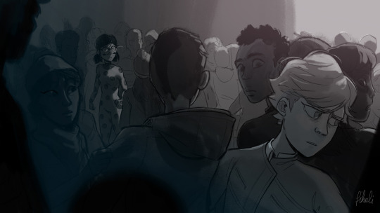
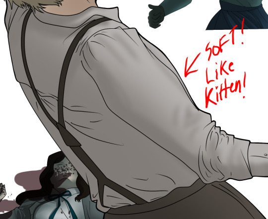
#i was really trying to challenge myself with the light dark contrast to create depth because i usually suck at it
Text
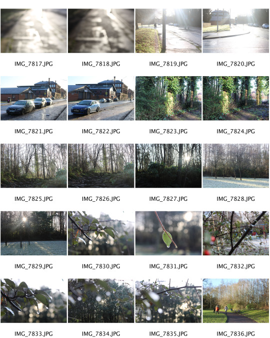
Week 10 Photos: Still life as a portrait of me and my family
This week I photographed spaces around my home, trying to focus on areas that my family had left their mark on- half-drunk coffee cups, food scraps, mess. Even though there are no people in these scenes, I could see my family and myself in all of them. The food we eat, the untidy habits we have- our spaces say a lot about us. I’ve tried to photograph images that contrast with the cloudy portraits I have been taking. As well as giving clues about my family, these photos show the facts of life- the messes, the chores to be done. I have shot all of these in colour because unlike the self portraits which represent my precarious and personal sense of self, the mundane aspects of life- crumbs to be cleaned, rubbish to be emptied- are something we can all relate to and are constant in our day to day lives.
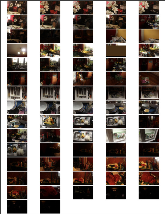
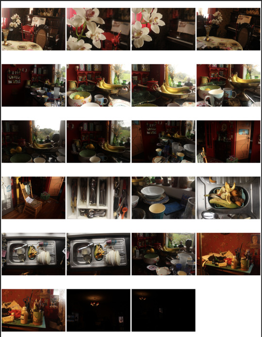
Below: Some of my favourite images from this shoot.
Editing
Below: I took this image at sunset. It was really dark inside, but the lights was really intense outside, so only the window and the light showed up brightly in this image. It captures the drama of a sunset. I used a shorter shutter speed to keep the shadows dark, and a higher aperture to keep both the window and the light in focus.
Below: I love the contrast in this image, so using camera raw I increased the strength of the whites in the image and darkened the shadows. I also cropped the image tighter to draw the focus in to the two lights.
Below:
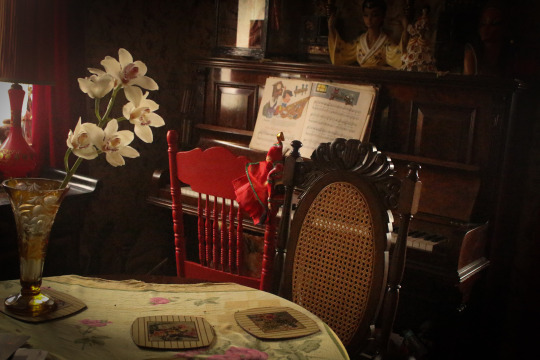
Some technical challenges I faced with this image were lighting and balancing ISO with other settings. My house is very dark, so this image was hard to light. I didn’t want to use a lower f stop as there is nothing in the foreground of the image so I wanted a medium-deep depth of field, and as the subject is stationary I didn't want blur in my image, so I used a faster shutter speed. My best option for gaining light without compromising the key features I wanted in the image was to use a higher ISO. I tried to minimise the grain this caused by shooting at the brightest time of day and using artificial lighting as well. I used the shade white balance setting to warm the image up. This emphasises the afternoon sun and brings out the gold tones in the chair, vase and tablecloth.
I took this image in the late afternoon of my dining room table. By using the flowers as a framing device, and following the rule of thirds, focus is drawn to the chair. It’s a mysterious photo, because the chair is empty, and you have to guess at who this chair belongs to. The piano and music book are also open- details like this make it seem like a scene which has recently been left. They hint at the people who live here- my family. This is my brother’s chair. He always leaves crumbs at the table and pulls the tablecloth off a bit when he eats. My mum sometimes plays songs from an old Disney songbook and my brother loves to sing along. They were doing this before I took this photo.

Below: In my camera raw edit of the image, I turned the exposure down a fraction to strengthen the shadows in the image. I also put a slight vignette on the image to minimise the patch of white light from the window on the right. I’m unsure whether I prefer the image with a vignette or without. I think both have an appeal. The image without a vignette seems more candid, and the vignette image seems more theatrical. On the one hand I've been trying to keep my photos candid and natural, but on the other hand I like the idea of adding some drama and a sense of monumentality to the everyday. My mum and I are also avid op shoppers , and my house is full of all the things my mum has collected over the years. I think the aesthetic of my house really lends itself to vignettes, because its full of little scenes and collections which speak to different parts of our lives.
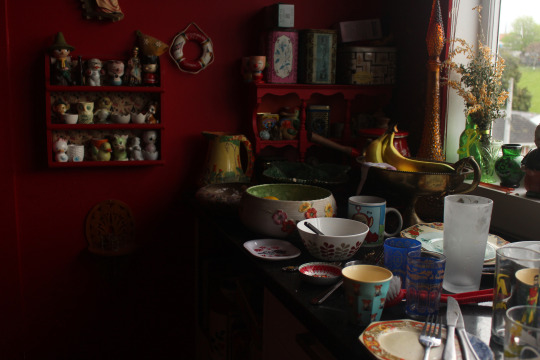
Below: The dirty dishes on my bench. The afternoon sunlight creates strong shadows in the image, and artificial lighting highlights the bananas. The gold in the flowers on the window, the bottle, the bananas, the plate, the jug, and the bird egg cup bring the image together. I used

Edit: to emphasise the saturation and high contrast in this image, I adjusted the curves on camera raw, bringing the lights up to about +10.
0 notes
Photo


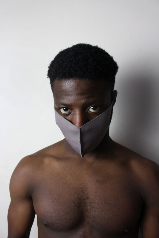
I realized I’ve only drawn fun stuff for my Acrocat AU which is kinda odd because the story is pretty much all angst just that it’s covered in glitter, and the name of the AU doesn’t help with its image, lmao.
I really tried to make the expressions speak for themselves in these drawings so I’d love to hear what you think is going on. Just a little backstory, this is after Adrien loses Plagg but before he gets Stompp and Roaar. Chat Noir’s been MIA for over a week.
#ml#miraculous ladybug#adrien agreste#ladybug#ladrien#i heard june is ladrien month so i guess this is just perfect#acrocat au#can you tell adrien's trying to speak with his eyes in the fourth panel?#my art#i was really trying to challenge myself with the light dark contrast to create depth because i usually suck at it#i think i did pretty good#also what is male fashion? i'm just making stuff up on the go
7K notes
·
View notes
Text
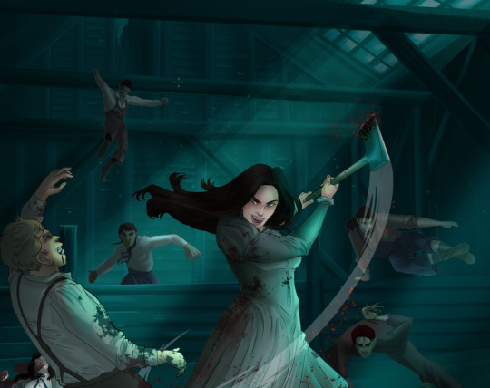
How I Digitally Paint like a Scenic Artist/Designer
Aka: how I did this and put my degree to good use.
LONG POST WARNING
Step 1: Research.
First off, get to your image search. If you are going to be using Google, you may want to type “-pinterest” in the search to eliminate the countless boards.
I had to figure out clothing that is vaguely late 1800s. I found a multitude of reference images that were fancier clothes- but I wanted to find images of clothing for kindred across all social classes. Photographs from the era and paintings are your friend. They will more accurately showcase what was worn.
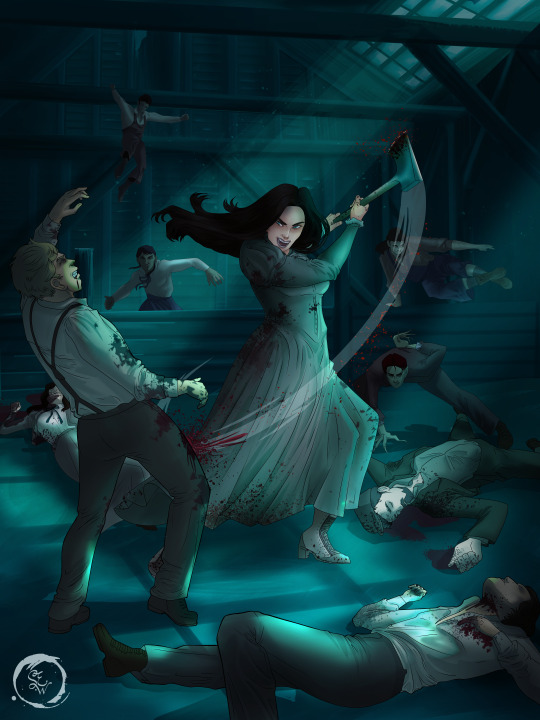
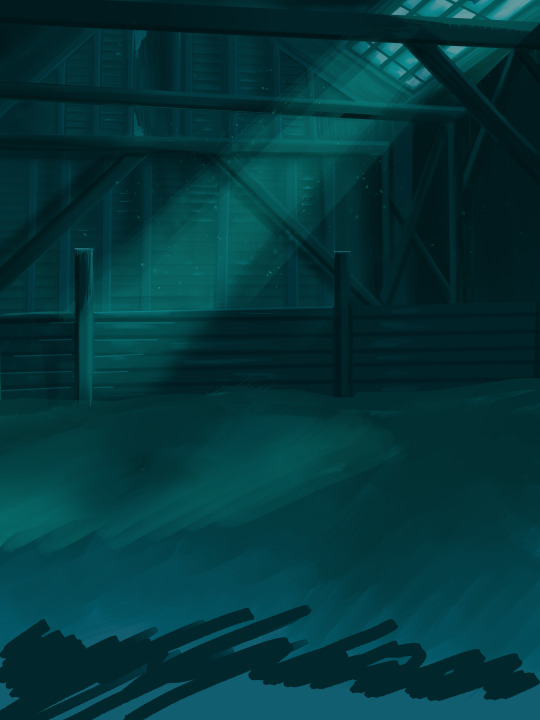
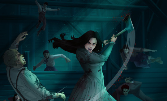
After Fashion research comes location research. The 1890s in America is known for the rapid industrialization. Factories were getting bigger and work days were getting longer. But, I wanted the moonlight to be cascading into the place, illuminating the scene. This means I needed to find a structure that had skylights or let sunlight in. And the best images I found? Slaughterhouses. Fitting, huh?
The same rule for fashion still stands- if you can find photographs or paintings from the era- they’re better. There are tons of places still standing today from the 1800s. But today, they look WAY different. Ya know, Abandoned! So just be sure to take this into consideration if you search “abandoned slaughterhouses” or go trespassing like I did.

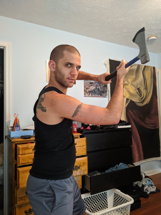
Lastly, pose research. Finding the poses for a fight scene can be tedious. So, I enlisted some help from a few fight choreographers and stunt men. You can record their fights and play them back at quarter or half speed. You can also get a mirror and flop on the floor a bunch. I did both. This lets you see the action/motion lines you are going to replicate in the drawing. Heres how we initially did fina’s pose:

And sometimes you have to go back and get a clean shot. I ended up using this pose for the axe.
Step 2: Set up and Background!
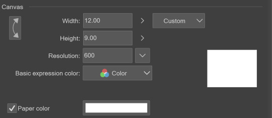
When you open a new file, set it to the dimensions and resolution you want. I was working at 600. Usually, I’m working at 300-350. You can always reduce resolution. Its hard to prevent fuzzy lines if you increase it later.
I cannot stress the following enough:
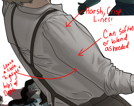
You work background to foreground. Big Shapes and areas to little shapes. Work your way forward. What this means is you need to fill in as much space as possible first. Then build your details. I prefer working as follows: Big Solid tones, Soft shadows, Dark Shadows, Highlights, then final blend. Once you finish this, put an overlay on top. This knocks everything back and helps create the illusion of depth. See this at work with the video below or here
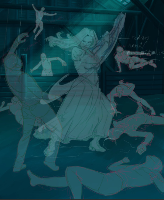
Step 3: Figure Drawings + Composition
Utilize that research and images you collected to pose your characters. I create subfolders for each set of figures. Organization is important here. This will help keep you on the right layer and prevent the eternal digital artist struggle of “Fuck that was on the wrong layer!”
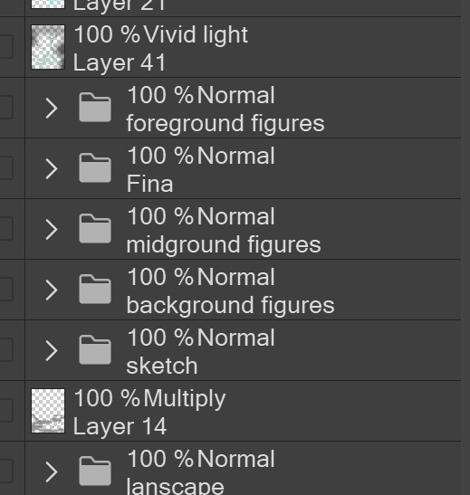
Even after you move on to lineart and shading, Keep the sketch layer as a reference. You may need to see what youre original notes/ figures looked like as you do the lineart and shade. Don’t be afraid to move them around and alter the composition rn. You want to be able to make changes. Make notes! Detail light sources!
I’m about to through out some art jargon:
You want to think about asymmetric balance. The easiest way to achieve this in an eye-pleasing manner is to use the Fibonacci spiral. Yeah. This boi:

Place your figures and actions in a similar sequence to the spiral and the viewer’s eye tends to naturally follow it. This is sometimes called the Golden Ratio in the art world.
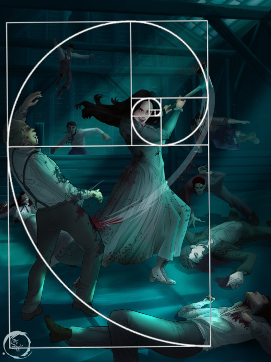
Doesn’t need to be perfectly on the spiral. You can break it- but its an excellent tool to plan how things move in the piece.
Step 4: Lineart
Once you got things sketched- its time to do the lineart. I’m using clip studio paint’s standard brushes. Nothing fancy. I often switch between the G-pen and the For Effect Liner. Mapping and Turnip are for thicker lines.

Usually I set these pens to a specific thickness depending on where I’m drawing.
My background figures are lined at 0.05 thickness, the midground is .1 to .2, Fina is .3 and the foreground is .4. I set my stabilization high to help keep my lines smooth. Stabilization 100 means there’s a significant delay between where the pen is and the cursor. I like the stabilization to be at 20 for freehanding and at 50 ish for outlining. Dont become completely reliant on the stabilization though. Good and smooth lineart is drawn from the arm not the wrist. Your range of motion is severely limited if you only move your wrist. Practice moving from your elbow and you’ll be surprised how much smoother your lines get.

Once I finish lining the figures, I usually go around it with an outline. This does three things:
1. Solidifies the figure and cleans lineart for paint bucket tool. More on that in the next step.
2. Its a stylistic choice. Helps give it that comic book feel with a heavy outline.
3. Pushes figures forward or back in the composition. Thicker outline helps denote that a figure is farther forward than another. My background figures have no outline to push them away
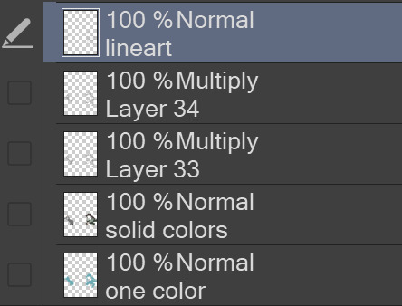
Step 5: Digitally coloring
For each figure you are going to select outside the lineart.
Create a new layer under the lineart
Invert the selection. Paint bucket. You should now have a solid shape of the figure under the lineart. Do not deselect.
Create a new layer above the one color. Title it solid colors. Paint in thick, solid tones. I like to use the mapping pen and turnip pen to color in my solid tones: skin, clothing, hair, etc.
After that, deselect. Create a multiply layer if you can. If your program does not have a multiplier function, Pick a tone you want to use for shadows and lower the opacity (usually 30-40% I like to use lavenders or blue tones). It will not be as vibrant, but you can edit it in post. Select off of the solid colors layer. I like to start with skin tones. Use the airbrush tool to create soft shadows. You don’t want to create harsh lines on this layer.
Then repeat this process with harsh lines.
Then knock it all back with an overlay. If you dont have the ability to create an overlay, you can again drop a solid color and lower the opacity, but you’ll have to mess with the color balance/ brightness/contrast to let all the hard work come through.
You’re going to repeat this for every single figure. Here’s a few color theory tips though.
Your overlay colors should be darker (not more vibrant) in the foreground and lighter (avoid using pure white) in the background. This helps with the depth of the piece. Things closer tend to be darker (not always true, depends on lighting)
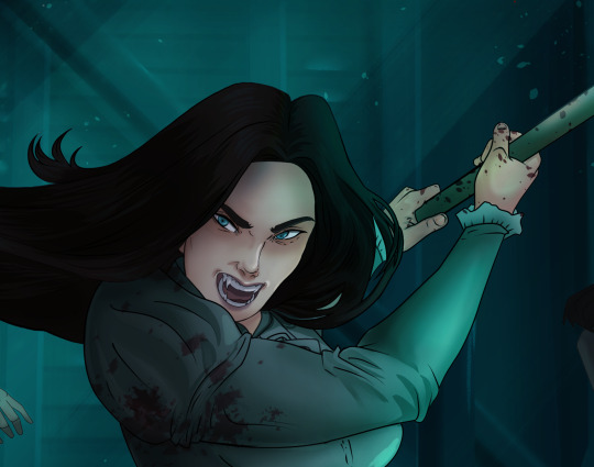
You can choose to use color theory to aid your shadows. Instead of choosing black or grey for shadows, choose a complimentary color. I used a lot of green for this piece, I used red for really dark shadows. Its not that black drains color- its just loses some depth if not used carefully.
Keep your colors consistent. Helps unify the piece. You can strategically break the consistency to draw focus. For example, Fina is the only figure with a true blue overlay. This helps her stand out from the other figures who have reds and greens.
Step 6: Touch Ups and Final Renderings
Now comes the most tedious part. If you’re like me, your computer fans have been whirring for the last few hours trying to render this monster of a file. If you havent already, SAVE FOR THE LOVE OF ALL THINGS GOOD

These are the last four layers I have for the entire piece. Here, I am trying to create effective and believable lighting. This kind of work I have only been able to achieve in clip studio or photoshop. You can do it with normal layers, but choose your colors CAREFULLY. Stay away from pure white. Carefully utilize your knowledge of light and shadow to create soft highlights. Harsh lines tend to be a stylistic choice for me. The final layer, subtract, dulls out harsh red tones. I used this as a final overlay to help put everyone and everything in the scene. Without it, things are a little too green and skin tones are a little too blushed for vampires.
The challenge here is I want to tone down the red, but not lose the vibrancy of the blood. So, shift it to a blue. This also helped reinforce the “nighttime” effect. Its only a slight change.
Final thoughts:
Whenever you finish something, its important to reflect.
1. I am so FUCKING PROUD OF MYSELF. This is easily one of the most complicated pieces I’ve done in a while- and I’ve made 16′ tall faux stained glass. Brag. Let yourself feel awesome cuz you just made something awesome.
2. I timed myself on the piece. I could have easily spent another 7 hours on it. But its important to know when to stop messing with it. Partially for budget reasons but also when you get down to the details you can make yourself go insane. Theres also a ton of detail work I lost cuz of overlays or its just too small to notice. Fina’s face? hard to see cuz its not close enough.
3. I needed to take frequent breaks for this piece. That was good. Resting and stretching was very important. That is one of the reasons why I was able to work so fast.
4. I started doing more digital art in April 2020. I have to say, practice makes perfect. I practice drawing and digital painting for at least 3 hours a day.
That discipline has allowed me to improve so rapidly. So- I don’t wanna hear shit about I can’t possibly get this good! Or I couldn’t even draw a stick figure! BULLSHIT. You can. Get yourself some free software like Krita or Autodesk sketchbook and start playing!
And thats what I got! Thanks for coming with me on this long post!
27 notes
·
View notes
Text
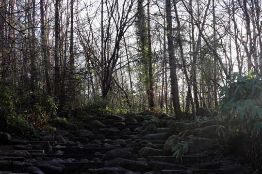
Looking for light- a journey
Contact sheet
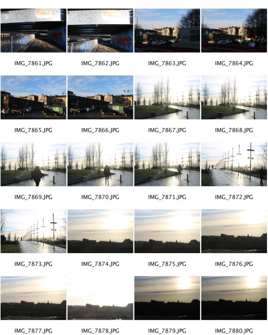
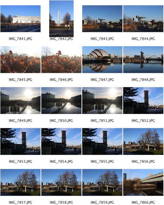
Favourites


Into the light
For this project I was asked to take photos of light on a journey, I took this to mean taking photos of light and/ or its absence. For example long shadows, or shadows that are being cast, or out of focus light in the background of an image. I also wanted to try and capture light that is being reflected off surfaces, and what colors are bouncing back.
Over the span of the day, the temperature of the light changed, this means that some of my images have a warm colour over them when others have colour such as blue, making them feel colder. All of the light throughout these images are natural light, and that is what I had set out to capture within these 50+ photos.
Throughout these photos, I wasn't totally sure what setting would do my subjects justice so I used aperture priority more for most of the images, and would change this until it was an image I was happy with. In lots of these photos I wanted to play with the background light to be very out of focus to cause those round lights in the background. And I think this was very effective, especially for the first photo of my final three. To amplify this i had to focus on having a narrow depth of field
For all three of my final images the light is coming from quite a low point in the sky, i think this always creates fantastic shadows and depth, so i wanted to capture this, i think i have done this in the 3rd image shown. The majority of this image is in shadows and darkness, but if you look into the far ground, you can see the light shining through the trees.
My favourite of the final three is the second image, this is due to the amber light that is being created by the light shining through the orange leaves, i think this is a good contrast for the warm colours on the bush and the cold light in the background that is being cast. This image is very autumnal despite it being taken mid January. I really like the composition of this image, although I wouldn't say it directly subscribes to the rule of thirds, I think it is very pleasing to look at, and it is off centre.
Overall I am very happy with my images, they are all sharp, and have interesting subjects, i would like to challenge myself to try and strictly use composition rules and see if this brings me more opportunities for interesting photos. If I were to do it again I would try to vary my shots more. By this I mean try portraits that can catch people walking around and being struck by the natural light, and how it is interacting with them, or just wide angle photos. I would like to try taking wide shot images of buildings and how light interacts with the different materials and stone work.
1 note
·
View note
Text
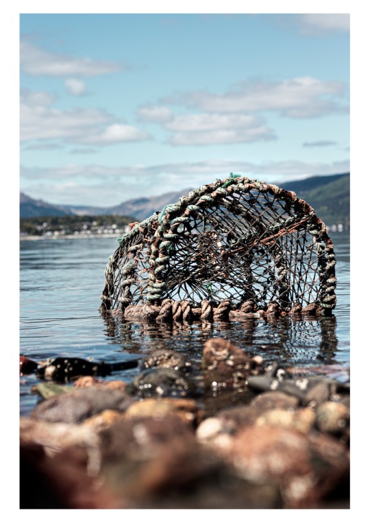
Final 10 - Personal Project
For this image I am very pleased with the final outcome of it. I like the use of my depth of field within this image as the foreground with the rocks and the background with the mountains and houses are both blurred, completely making your eyes lead straight towards the focal point of the whole photograph. I particularly like my use of editing for this shot, I have managed to get both the sky and everyone else well lit as usually there is an area over or underexposed. but I managed to not have that, which I'm glad of as personally I don't like the idea of having that as I feel it makes the image seam slightly messy. I love the colour palette throughout, its has very muted colour however I feel there is still this vibrancy about the shot. Overall I am very happy about this photograph.

This is probably one of my favourite shots out of all 5 of the location shots. I love the moody and dramatic atmosphere that the image carries due to the rain around the composition and the destruction due to the grey skies and the post optimisation. The use of negative space at the top of the image draws you eye to the coins which is the main goal with all of my photographs. Using the rain as an advantage in my photoshoot gave me the opportunity to experiment with texture and a more moody tone.
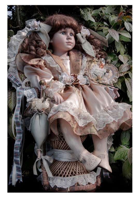
This image I find is a unique object that isn't really considered a modern subject that people now would be interested in seeing, however I feel it has a very captivating feel to it. I love the horror movie style I have created with the editing process as it fits in very well with the object itself. the thing that makes this image special to me personally is the fact I have an object from when I was a baby in it, it creates this personalisation to my image that isn't too obvious but when you look into detail its there, which I really like the idea of.
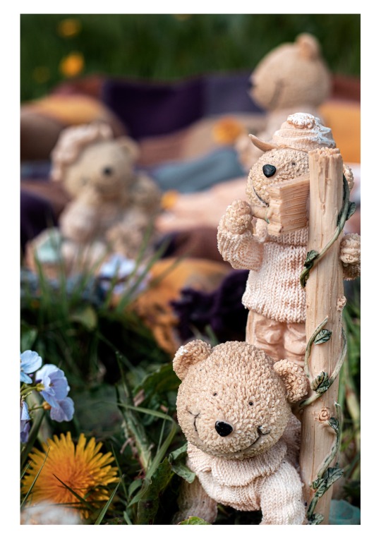
Going down this style of photography I was very unsure about this object in particular. I have no knowledge on how to shoot teddy bears and I didn't want the image to come across very cliche and even cringe. However I feel I have managed to create this small world with the picnic blanket and the other two bears looking like they are engrossing in a conversation, it gives a humorous approach to this project which I really like as I didn’t want it to all come across as very serious I want a light hearted feel included in it also.
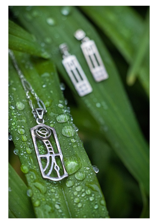
When deciding how I was going to photograph jewellery I automatically thought of the studio style, however I had already gotten all of my light painting shots therefore I decided to give myself a slight challenge and try and shoot the jewellery outside. I hadn't seen much of location shots for this subject therefore it was a great thing in a way because I knew I was coming up with my creative ideas all on my own which is a very refreshing feeling once you've got the shot completed. overall I love the contrast between the colours and also with the silver material and the botanics. Its just a very invigorating shot.
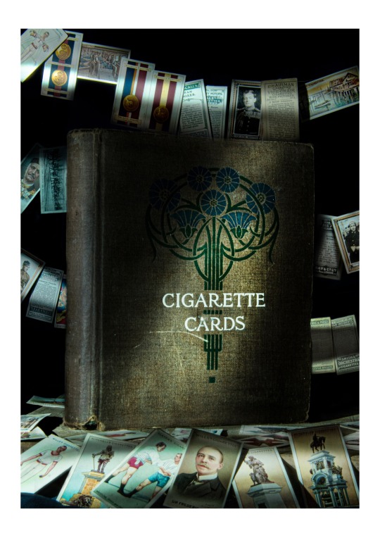
this was my first ever composite shot for this project. I was nervous because the shots weren't working out with shooting all on the one and I didn’t know what to do, I was quite hesitant with doing a composite as I felt I wasnt as strong in the photoshop department as I was just in the shooting department. I love how my modern styling of images through editing has correlated with this old cigarette book so well, I love having a slight twist to my images as it makes them more unique and almost personal to me. I love the composition and the perspective of this photograph. This is definitely one of my best work throughout. However I if I were to change anything about this image it would be how smooth I made the edged of the book, I have made them very smooth and usually that ok. because it helps blend layers together however I have done it a little too much.
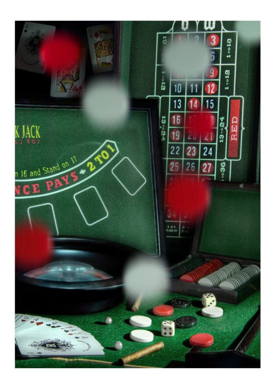
This image was a challenge. This composite had a lot of different areas within it. I have never done an image so busy like that, however I feel I have managed to almost master it right away. The main colours within this composition are reds blacks and greens which gives the image a slight pattern of colour which I love the idea of. I love how I have this shot of a still life yet still have two objects that appear as motion blur, the roulette bowl to the side and the checkers in the foreground. Having this motion in the picture gives the image more life to it and it helps you image how chaotic the life of gambling actually is. After stressing during the edit I am overall happy with how it has turned out.
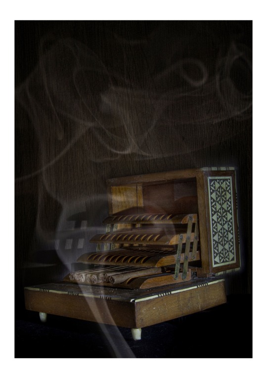
This was the only photo I had to reshoot through all 10. The over all aesthetic of this shot really gives you the era of say the 70′s type of home, from the subtle brown and warm tones to the cigarette box itself it all correlates together very well. I am very glad I ended up reshooting this image as I loved the photograph before but now that it is in a more of my level of photography I love it a whole lot more.
This image is the most elegant style of image I have ever created. the dark tones and the clean lines of light, along with the modern style of editing I really love the overall shot. I feel objects like this aren't supposed to be shot in a busy environment and should have the full composition dedicated to this one object. I love how I have managed to edit the colours to show a lot of vibrance yet still have this desaturated feel to them also, creates a very modern approach to this older object. If I were to re shoot this image I would have potentially lit the red sheet a little more as I feel it served a good purpose but jut not enough attention on it.
This was the first image I had shot with light painting and never created a composite with it. I felt if I were to tamper with my lighting too much with this shot I feel it would have gotten a little too reflective and I personally love the harsh shadows within this shot so I decided to keep it as the one image. I really lie the vignette style of editing I created as the green is just the perfect amount and doesn't take attention off of the subject. I feel like the amount of black with the composition creates an elegance and sophistication to the shot, I also feel it gives a mysterious approach which I find very enchanting. If I were to shoot this again I would probably change the crop, the original image had the object too far to the right and it was very distracting therefore i had to crop it in to quite an awkward crop.
Overall I am very happy with my ten final images and it clearly shows the amount of work and quality I put Into each photograph.
7 notes
·
View notes
Text
Evaluation Form - Chiaroscuro
What was the project theme and what did you think of it?
The Theme of the project was to create photos inspired by a type of panting – Chiaroscuro – which has very contrasting tones of light and dark shadows. I think these images turned out well and I really enjoyed working with the high contrasting tones.
What part of the project did you enjoy the most/found most interesting (making the photographs? Optimising the images? Printing?)
Trying to recreate some of the lighting styles was more difficult than I imagined but I think the results turned out well and I am happy with the results. Researching the old painters was good too as it helped me gain a deeper understanding of what I was trying to achieve.
What new techniques have you experienced?
I learned how to flag, this technique involved using two boards in front of the camera to stop the light from bouncing back to the model and gave the photo more shadows more depth. This really helped when doing this project as there is a lot pf shadow in this style.
What technique would you like to develop further?
Which photographs did you research throughout this project?
Researching modern photos of dramatic lighting types to recreate was my main source of research but I also investigated the traditional style paintings. If I was to do it again, I would investigate finding books with this style of painting and using this too.
How have they influenced your photographs?
They influenced my work as they Helped me pick modern images that replicate the old-style paintings but still have the dramatic effect of chiaroscuro
Which technique did you enjoy the most?
The technique I enjoyed the most Was Rim lighting as it was the most challenging. It was difficult to get the lighting placement right within the image and I had to flag the image, but the final image was well executed and looks good and this is one of the more interesting compositions.
What do you feel is the most successful part of your project and why?
I think my 45* lighting was my most successful as the positioning, lighting was both accurate and I was pleased with the image in colour and black and white.
Did you encounter any problems in your project?
Some problems I encountered were with the positioning of the lighting, the image I used original for the split was far too hard as it was hard to tell where the light was coming from and the positioning of the model was hard to get perfect so it was smarted to choose a different image and this worked a lot better.
How did you learn from them and how did they affect your final images?
I learned to think more about the image I choose as some would be easier than others to recreate. This affected me as I felt it was time consuming to get everything perfect but not have the image turn out the way I wanted and wasted time on trying to create the image.
What HABITS OF MIND did you use throughout this project?
Disciplined, Persistent and inquisitive.
What would you do differently give the chance to complete the project again?
I would try and push myself and recreate the paintings instead of the modern photos or If I had more time, I would try creating one of the more difficult images with complicated lighting that failed the last time.
Discuss any technical issues with your final images? (focus, sharpness, exposure, highlight/shadow detail)
The theme of chiaroscuro is dark dramatic images it was sometimes challenging to get a dark shadow that I wanted and accurately represented the theme but using flagging as a technique I was able to get this as it stopped the light from bouncing. Also trying to get the highlights in some of the images was difficult to get it exact working with the time frame I was working with.
Going deeper; if you were asked to do a project using this technique what would you do? What new ideas do you have? this may be explained as a visual, a drawing, sketch, photograph…you decide how you present this section.
If I could do the project again I would try sourcing photos from books so I had different refences, I would also try using more than one model and see how the lighting would be different and how it would affect the images.
1 note
·
View note
Text
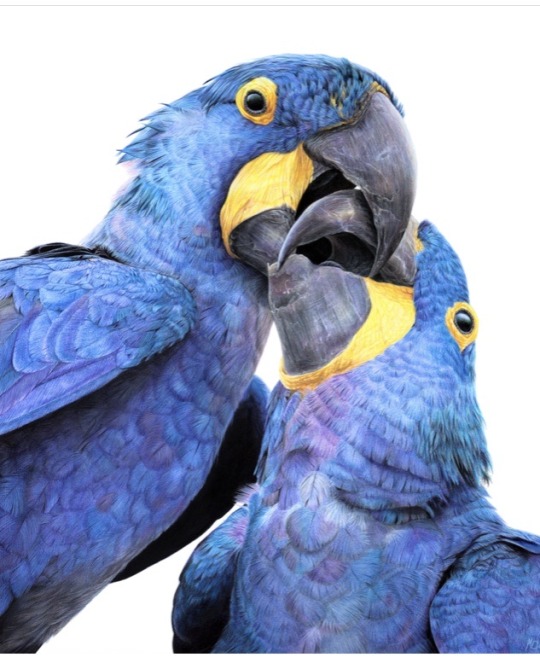
Congratulations to Monique Castellani-Kraan for winning Best in Show at the UKCPS Keswick Exhibition 2021.
Monique has kindly share some background information on her wonderful piece Kisses in Blue.
I drew my first hyacinth macaw back in 2015, and it was wonderful being able to revisit the same subject again with “Kisses in Blue”. Parrots are honestly such a delight to draw. Their colours are bright and happy, and they have so much character. I will also always jump at the chance to get out my blue coloured pencils!
I started work on this piece back in January. After a long spate of only making miniature pet commissions over the Christmas period, which was slowly sending me into a spiral of madness, I decided to overcompensate by starting my largest drawing to date, at 40 x 50cm (16 x 20 inches approx).
As someone with a background in digital painting, I like to do all of my sketches and compositions digitally nowadays to transfer to paper. That way my expensive watercolour paper stays free of eraser marks and errant sketch lines. It saves a lot of time in the long run, and if I mess up I can very easily just print out the sketch again to start over. I don't know what I'd do without my iPad!
This drawing proved to be a little intimidating because of the size I was working at. I ended up setting it aside for a few months. You know that famous "fear of the blank canvas" we've all experienced? This one hit me hard. I got a tiny section of the eye and surrounding feathers done and then proceeded to swiftly run away, back to the safety of drawing miniatures! A few months later, I finally decided to stop hiding and to give this piece a proper go. As I got into the rhythm of it I quickly felt myself being sucked into that "zone" of intense focus - where time just slips away until it's suddenly dark outside and you've skipped a meal!
Now that I had finally got my toes wet, I was gaining confidence. Art is a bit like exercise - it takes effort and routine to get into the swing of it - but once I do, I feel like I'm flying! With every new drawing I'm reminded of just how much I adore coloured pencils and how fun the process is.
Translating the reference photo’s feathers on the left macaw’s cheek was proving to be a bit of a challenge. I could only stare for so long at the complicated mess of shadows without going cross-eyed - so I decided to treat myself to tackling the beak first instead. If ever you find yourself in a rut with a painting, look for the deepest, darkest shadows in your reference, and block those in first. You will have a much easier time once they're there. Here, the darkest shadows were the inside of the macaws' mouths, so I put my much-loved Polychromos black to work, blending with paint thinner in between each layer and tinting it with Luminance Dark Indigo to get it nice and deep. Now that the darkest shadows were blocked in, I would have a much easier time in the areas surrounding it. That shadow became my reference point for judging the values for the beak, skin and feathers nearby.
I used Daler Rowney Low Odour Thinner to blend my pencils in between layers, with a flat taklon brush. I primarily used it in the first few layers of the underpainting. The yellow skin on the beak was a tricky customer with this - my blending brushes had to be impeccably clean, or else I would end up turning it green with the blues being so close by. In addition, I didn't want the very pale yellows getting contaminated by the oranges that are in the shadows. I made sure to carefully wipe my brush off thoroughly on some paper towel before blending in small areas at a time.
Beaks are so much fun to draw! They have a lot going on, from subtle colour shifts, to chips and cracks and ridges. The texture is a treat for the eyes! Here, I started by creating a gradient of soft earthy purples, greys and creams in the underpainting. At this stage I used mostly a mix of Luminance and Polychromos pencils. For underpaintings, I like to go darker than what the final result will be - though some would say I go a little TOO dark (coloured pencil is technically a light to dark workflow because they are mostly transparent).
After blending it with OMS, and making sure it's still a little damp, I go in with my pale tones from the Derwent Lightfast, Caran d'Ache Luminance and Holbein lines. These brands are soft and have more wax than oil in them, making them very creamy and more opaque than brands like Polychromos. Because the paper is still saturated with paint thinner, the pencil melts as it makes contact with the paper, making it go on super thick, even though I'm only pressing gently. This is my dirty little secret for how I work from dark to light in all of my coloured pencil pieces. The paper you're using, of course, is paramount for this technique too. If you're not using a good paper, you're going to run out of tooth extremely quickly using this technique. This piece was drawn on Saunders Waterford Hot Pressed 300gsm- and I wholeheartedly recommend it!
However, I just want to add that if you have an area or texture you want to keep REALLY light, for example a large white crack in the beak, you should draw that in first before doing anything else. That way, when you put your underpainting over it and blend with paint thinner, the white detail you added first will show through, clear as day! (This is great for whiskers on cats and dogs for example) You can also use a ceramic cutter to do this afterwards instead, though personally I have yet to use one myself.
After finishing the beaks, it was time to face the feathers on the birds’ bodies head-on. As always, I block in my darkest shadows first and then my underpainting, giving it a good blend out with plenty of OMS. This is so that I don't get lost in a sea of repeating shapes. Without doing this, I find it's very easy for your artwork to end up all the same value with not enough contrast between the highlights and shadows. I also rough in where I want each contour feather to be on the bird’s chest with a dark blue, though I only very gently line them in with my pencil so I can still move things around if needed while I build on the textures and detail.
Once the underpainting is done I am free to start pulling out those details. I went feather-by-feather, preferring to go in with my lighter coloured pencils first, gently pulling out each feather’s barbs. After that, staying mindful of how the lighting is hitting each feather, I used my mid tone and darker pencils to work in between each barb, gradually building up shadows. I also glazed in shadows over this with a very gentle hand to give the overall shape of the feather form and depth.
It can be tempting to rush through areas like this where there is lots of uniform texture, but it’s important to stay patient and take your time. Body feathers especially can become indecipherable after a certain point, because they all overlap and merge into each other. Sometimes even though the reference photo is sharp as a tack and super clear, there is just so much going on that it wouldn't 'read' well as an artwork. So I used my reference to help me with the general structure and composition, and to inform me on how the shapes and textures should look. But I didn’t stress about getting it exact.
Once you have good knowledge of a subject, after doing study sketches and looking at lots of different references, you can be a lot freer with how you approach your final artwork. A lot of the colours, textures and feather placement in ‘Kisses in Blue’ were not there in the reference. I opted to go for a much warmer, cheerful blue. The reference I was using was also fairly flat as it was taken on an overcast day, meaning the lighting was quite diffused. I made my artwork brighter than my reference material, pushing the overall contrast between the midtones and the deepest shadows. I also found myself intermingling soft lilac hues and subtle teal with my Polychromos and Luminance pencils, almost over-exaggerating the birds’ vibrancy. I tried not to stress too much about feathers either - while getting the shape and placement of feathers right on wings can be paramount to a realistic piece, the same does not apply for contour feathers and down feathers. As long as you stick to the right shapes and sizes, paying attention to the bird’s form, you don’t need to get it looking exactly like your reference.
I try my best to bring myself out of my comfort zone with each new drawing. This piece was my biggest challenge yet – quite literally. I’m glad I pushed myself to draw larger than I am used to and I can see why a lot of coloured pencil artists like working at this size – while it is more time-consuming, you have much more room to breathe and fit details in, that would normally get lost in a smaller piece. With my choice of composition and lighting, I wanted to convey a feeling of intimacy and closeness with the birds that I don’t think I would have been able to achieve were this drawing smaller.
1 note
·
View note
Text
29/10/20
MP1
I want to make my images more personal as I want the viewer to be able to connect naturally to the subject and the subject matter. I feel as though, despite my photographs so far being used to generate ideas, I want to start focusing on how I will position myself to take the photographs to create this impact. I started thinking about portraits I have taken previously that produced the intensity I wish to generate here:
What can I take forward into my project now?
What can I take forward?
What can I take forward?
What works well?
What can I take forward?
------
I also took a look at documentary photographer, Pete Souza, who did a series of photographs for the previous American president, Barack Obama. The book is called “Obama An Intimate Portrait” and discloses his whole presidency through photographs - it is one of my favourite documentary photography books.
Souza, Obama’s official presidency photographer, records almost every possible moment of the Obama reign. His exceptional attention to detail makes every image so powerful in their own right which produces a seemingly accurate representation of the former president’s personality with his insightful approach to capturing emotion. His use of light is flawless in almost every photo and when it isn’t he uses it to his advantage to produce the message he is trying to convey.
Acting as a “fly on the wall” (Horton, 2020) Souza quietly captures some of the most important moments in American history without anyone seemily noticing his presence. This approach to the photographic process is one that I hope to take forward into my own work. It seems Souza simply observes and captures as he goes along and for his work to be as compelling and true-telling as it is, is something remarkable that I hope to reflect in my project.I have attached a couple examples of his work from the book below (I am sorry it is bad quality, I do not have access to a scanner!):
What works well?
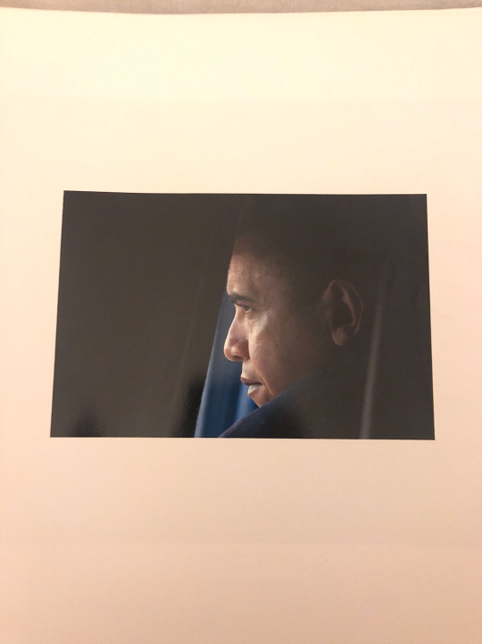
The lighting - defines the president’s face effortlessly, highlighting his facial structure and expression while shadowing the back of his head. The most interesting part of the image is the face and the rest is captured in shadow, this works really well in creating a powerful portrait.
The composition - The president is seen looking out of what appears to be the window of a car or a plane. Regardless, the object surrounding the head and face are not important and therefore not in focus - they are in the shadows, a mere outline is visible. The contrast between the highlighted face against these dark tones works really well to define the contours of the face.
What works well?
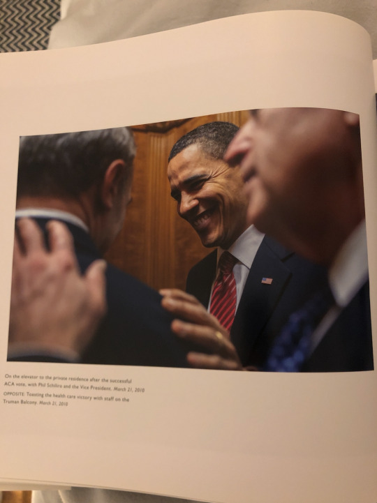
Depth of field - This photograph is taken in a shallow depth of field by putting the president in focus whilst blurring out the the other individuals interacting with him. Despite the blurring, you can still see parts of the body - particularly the hands - this communicates a closeness between the two. Emphasising the facial expression while partially blurring other parts of the image could work really well in my own work to capture body language, without it being too distracting.
What works well?
Narrative - One of the reasons I want to create my project through a documentary style approach is because despite the lack of eye-contact, a strong narrative can be conceived. For me, the two main factors to consider is the lighting and how I want to convey the emotion in the photography - which is often through body language. Body language can produce equally, if not more, of a emotive image than the obvious facial expression. For me, the challenge of capturing a subject without showing any or part of the face provides a greatly rewarding result, in communicating the message I want to convey. Again, it leave space for the viewer to interpret and process how they want to - it is more subjective to the viewer and this is a concept I wish to take forward.
0 notes
Text
under the same sky (m)
Genre: Fluff/Romance, Angst, Smut, art student!Jun
Word Count: 7320
Characters: Wen Junhui/Original Female Character, Jeon Wonwoo
(a/n): Inspired by BIGBANG’s Last Dance, 2NE1′s Goodbye, and SEVENTEEN’s Smiling Flower. ♡
Paintbrushes soaked in water. Tubes of watercolor scattered across a white plastic sheet covering the hardwood floor. Sunlight poured into their apartment, the natural lighting helping to achieve the perfect stroke and shade.
Their easels were propped up against each other back to back, both of them unable to see each other’s work. They were working on the first major project of their last semester as undergraduate art majors. Their task was to create an abstract painting expressing their feelings towards the future using only watercolors. They were situated next to the tall windows in their living room, the buildings and streets of Seoul in a landscape view below hoping to provide them with some inspiration.
For him, it was an easy task to accomplish since he pretty much mastered every type of medium by this point in his career. Although charcoal was his favorite, watercolor was a good way to experiment with different colors and opacities. He admired the streakiness of the water and how it made the colors overlap with each other to create one whole picture. His face was very relaxed as he dipped his paintbrush in the water and mixed colors together on his palette. He created soft but meaningful strokes on the canvas, effortlessly blending everything together.
For her, it felt more like an excruciating hike up a steep mountain than a simple walk in the park. Her strength came from drawing pieces using the classic paper and pencil. Painting was the form of art where she had the least control and struggled with the most. Pens and pencils gave her the most precision with their fine sharp tips, which gave her the ability to create the thinnest lines possible. Her main problem with paint, however, was that she had trouble letting herself go and having the brush create the image for her. Watercolor was the medium she struggled with most on top of that. Her eyebrows scrunched up together in the middle of her forehead, trying really hard to transfer the image from her head to the canvas. She hovered her brush over the painting and hesitated every time it almost made contact with her piece. She tried to find the perfect spot to place every color, thinking that one small mistake could ruin the entire image altogether.
He placed his brush in the water-filled cup and scanned his eyes over his piece, content with the progress he made. He put his palette on the small table next to his easel and peeked over at his girlfriend, who looked like she was about to stab her canvas with the paintbrush. “You know you won’t be able to hand in your project if you murder it, right?”
“Shut up, Jun.” she mumbled in annoyance. She tried to dismiss his remark and focus on her painting. He could tell from her face that it was nowhere near the point she wanted it to be. The deadline was two weeks away, which stressed her out even more. Her whole demeanor suddenly slipped and she slumped her shoulders in defeat, dropping her brush and palette onto the paint-stained floor. “This is terrible! I’m never gonna finish this on time and I’m gonna fail and—” Jun walked around to her side and gave her a gentle kiss. He pulled her into a soft embrace and wrapped his arms around her waist. She was taken aback by his sudden intimacy and her eyes widened in surprise. Negative thoughts were running through her mind just seconds before but feeling his plump velvety lips against hers helped her calm down. She slowly closed her eyes and wrapped her arms around his neck fully reciprocating.
Once they pulled away, he pressed his forehead against hers and looked into her milk chocolate brown eyes with hope and pride. “Listen you’re not going to fail. You’re going to do well and like I always say, if you need any help at all you can always ask me since I can work with anything.” his smirk might’ve been taken as a challenge but his eyes genuinely wanted to see his girlfriend succeed. They’ve been painting together ever since they met in their freshman year of art school and he would do anything to help rekindle her light whenever it started to douse.
She stared into his eyes and he could see that her stress was slowly melting away like watercolors on a canvas. She was the type of person who wouldn’t settle for anything less than perfect, no matter how many times he told her that anything she created was more than good enough. Because it came from the depths of her own mind, it was already perfect. They admired each other’s work and their contrasting styles worked harmoniously together. However, they were the top two students in the class so they enjoyed treating each other as rivals. It definitely spiced up their relationship from time to time. Despite living together, they never saw a fragment of each other’s canvas when they painted. It was an unspoken rule between them, to never reveal the final product until they presented them in class.
“I know but… this time, I really want to challenge myself and improve on my own. Don’t take this the wrong way but, how do I know that you’re not planning to potentially sabotage my project so you’d get a better grade?” she teasingly tilted her head as she raised her eyebrows at him. She pressed her body slightly harder against his purposefully bringing her face closer. “Hm?”
“Because angel, I always do better than you. My hands have mastered every type of medium and can paint the gentlest and hardest of strokes. I’m sure you know that by now.” he whispered, his hot breath ghosting over her lips. He tightened his hold on her waist and pulled her even closer, their faces just centimeters away.
She smirked in reply. Whenever she was too stressed about a project, Jun always knew the perfect way to relieve all her worries. He never failed to find the words that triggered the burning feeling within her body every single time. It was like a game of chess where he knew exactly which pieces to play to produce a favorable outcome. But this time she was the queen about to checkmate the king.
“Oh yeah? Well, not this time around. You may have the technique but I have the control.” she pressed her lips against his with enough force to make him lose his balance and stumble back a bit. She grabbed the hair at the nape of his neck as she took the lead.
Jun smirked against her lips, amused at her bold advance. His hands slowly went down her body to squeeze her hips. He pulled away for a quick moment to say, “Control, huh? You can’t even control yourself right now.”
She looked at him with a fire in her eyes, wanting to get rid of the stress that was building up inside her all week. She hopped to wrap her legs around his waist, rolling her hips against his body and closing any form of space between them. “Shut up and just show me your beloved technique, alright?” she growled before kissing him again.
Jun slid his hands under her loose, paint-stained shirt and squeezed her waist, making her moan briefly. He carried her to the kitchen and propped her body on the counter. His hands reached for the hem of her shorts and with one swift motion, he pulled them off her body and threw them onto the floor. He teasingly placed his fingers on her already soaked underwear and drew small, gentle strokes along the folds of her hot core. She dug her nails into the nape of his neck and drew in a sharp breath of air.
“Jun, I swear if you don’t take me to our room right now—” she suppressed a small scream when he dug his canines into the side of her neck, his tongue making small swirls on her warm, tender skin. She rolled her hips harder against the lower part of his body, unable to suppress it any longer.
Jun grabbed her butt and lifted her off the counter, biting harder into her neck. He walked quickly down the hallway and into their room shutting the door with his foot. He threw her on the bed and hovered over her body, pressing his lips to hers. She started to unbutton his navy-checkered button down while he removed her underwear and flung it across the room. He continued to draw strokes on her warm, wet skin down below, gradually increasing the speed and pressure. She moaned loudly in response as she undid the last button on his shirt. Her hands traveled up from his waist, over his chest, and across his broad shoulders attempting to take off his shirt. He broke away to remove it from his body as she took off her t-shirt. He pinned her down to the bed once again and stared into her eyes. “You need to stop procrastinating and dragging me with you, you know? Those paintings aren’t gonna finish themselves.” he gave her a devilish, sinful grin.
Her expression changed with the blink of an eye indicating that she was absolutely done with his sarcasm. “The only thing you’re going to finish for the rest of the day is me.” she whispered before unbuttoning his jeans and closing the gap between them once more with her lips.
She was right in the sense that their paintings were left untouched for the rest of the day. Everyday for the next two weeks, however, consisted of a wide array of colors and strokes until they were both happy with the final results.
Jun and his girlfriend stood side by side at their window watching Seoul’s skyline, bathed in the gentle sunset. Their easels were sitting behind them, the final layers of watercolor drying into the canvas to become one with the rest of the painting. It was the day before their piece was due and they were enjoying some well-deserved relaxation. He wrapped an arm around her waist and looked at her lovingly. The sky was her favorite form of inspiration, awed at how both bright and dark colors can blend seamlessly into one. A time where they can both see day and night simultaneously. She looked up at him, her eyes were twinkling with hope and a smile as bright as a diamond. He loved being able to be with her during moments like this, where he can feel her own personal accomplishment right by her side.
He gently kissed her forehead and held her tighter, knowing that this was only the start of a new beginning in their lives.
They sat next to each other in the fourth row in one of the art school’s main studios. All of the students pieces were covered with a black drape until they were called up one by one to present their masterpieces. A student with light brown hair and round silver glasses was currently talking about how his piece represented his endless craving for knowledge and intellectual stimulation. Jun observed every single detail of his piece, which was a self portrait of the student with his eyes closed and numerous sources of knowledge flowing into his head.
“I want to never stop learning. No matter what path I may take or how hard times may get, I will always take it as an opportunity to grow and learn more perspectives. As I age, so will my knowledge which will eventually turn into wisdom.” he smiled one last time at his piece and looked at the professor indicating he was finished. The class clapped as he walked back to his seat with his canvas tucked under his arm.
It was finally her turn. Jun gave her a soft smile as she walked to the front of the classroom hugging her piece close to her body. Taking a deep breath, she nervously propped her canvas on the easel and swiftly took off the drape. Jun’s jaw dropped when he saw her finished painting. She turned to face the class, stood up straight rolling her shoulders back, and confidently smiled. All the hard work she endured for the past few weeks lead up to this moment.
“My hope for the future is to never stop reaching for my dreams, no matter how hard or impossible it may seem. At the same time, I always want to improve and never lose my inspiration. Scenes in nature and the people that I love never fail to spark the artist inside me, always craving for something new and exciting.” she pointed to various parts of her painting as she explained each of its significance. It featured two people on the top of a mountain overlooking the beautiful landscape below them. The top half of the canvas featured the timeline of a sky changing throughout the day from sunrise to nighttime decorated with the moon and stars.
“No matter when and where I am, I hope to always remember my roots and what sparked my passion for art in the first place.” she looked at Jun as she made her final statement with a bright smile. “And I don’t want to forget those that helped me grow in ways I would’ve never imagined if I pursued this path alone. They’ve become a part of my journey and I hope they’ll be there until the end.” she gave a small, cute bow as the class applauded. She gently lifted her painting off the easel and walked back to her seat.
Jun simply stared at her with no words. Usually, he did a lot of smooth talking in their relationship. He always had her speechless with his pickup lines. But this time? He couldn’t even find the most basic adjective to describe what he was feeling right now. For her painting. For its significance and how much he means to her. For being so lucky to have her in his life.
She looked at Jun with a soft smile and a faint blush on her cheeks as she sat back down to the left of him. He fought back the urge to grab her right there and kiss the living hell out of her. He made a mental note to remember once they got back to their apartment. Just before he was about to steal a quick kiss on her cheek, the professor called his name. He was the last one to present. It was his time to shine. He stood up and carried his canvas with one hand, the wooden frame in the back hanging on his long slender fingers. He gracefully placed it on the easel and spun around to face his peers. He pulled off his drape and revealed his work to the class.
The painting featured him sitting in a white chair wearing an all black outfit and looking up with twinkling eyes. Swirls of color and images of people and places surrounded him from every angle. “As you all know, black contains every color in the spectrum. It absorbs sunlight, providing warmth to those who wear black clothing. Black is one of my favorite colors along with white. The reason being that just like how black absorbs sun and colors, every experience that I’ve encountered so far and all the people that have had an impact in my life are a part of me and who I am today.” he pointed to various points in the painting where intricate scenes contrasted against the abstract rivers of color.
“The swirls of color represent memories and experiences that I have yet to make and absorb. I’m sitting on a white chair because white is the absence of color. It symbolizes everything that I have yet to learn to discover. It’s an empty palette I want to make a mess out of. I want to continue growing and absorbing color. I want to make those swirls of color into concrete and tangible memories. They may be an abstract concept now and have an infinite number of possibilities, but I want to make them into my own wherever the colors take me.” he smiled confidently at his professor, knowing this was his best piece of art he’s created so far in his life.
He looked over at his girlfriend who was just as stunned as the rest of the class. He loved how wide her eyes, filled with childlike wonder and awe, became whenever she was inspired with how much meaning and depth a piece of art could emulate. Jun’s paintings, in particular, always left her speechless and challenged her to think of more complex ways to incorporate her feelings and stories into her own art. It helped her flourish as an artist and as a person.
The professor and his classmates clapped loudly as he returned to his chair, expecting nothing less from the top student in the class. Her girlfriend leaned over and gave him a tight hug. She kissed him on the cheek, looking like the proudest girlfriend ever. “I always say I’m going to beat you but I end up short every time. You’re lucky I’m proud and happy for you instead of plotting a way to injure your wrists.” she whispered in his ear before sitting up straight again in her chair. He couldn’t help but smirk at her endearing remark. Being rivals with her made everything so much more exciting and he hoped that their rivalry and her desire to win would never fade away.
Their professor got up from his seat in the corner of the studio and stood in front of all his students. “You all did a magnificent job with your midterm projects. I am very pleased with all of your work and I hope that you will be able to achieve your hopes and dreams for the future when you graduate this semester. Before I dismiss you all, I have the results from the prestigious international graduate art program in New York City. They were just sent to me last night and I thought this would be the perfect time to tell you all.”
The atmosphere in the room suddenly changed as students sat up in their seats and whispered anxiously to each other. This was every art student’s dream at the university, a full scholarship with the opportunity to learn from some of the world’s most renowned artists. This was the way to perfect and hone one’s own unique art style and only two students get chosen.
Jun turned to his girlfriend, knowing that the both of them would be the two lucky ones. They were the top two students in the class, what more could they want? He grabbed her hand and gave it a gentle squeeze as she looked at him with eyes full of hope. They turned back to face their professor, who was about to share the results.
“The two lucky students are … Wen Junhui.” he nodded his head towards Jun with a confident smile on his face. “No surprise there. I’m very sure the professors there will be amazed by your work.”
Jun smiled in return, letting his whole body relax. He was never unsure that he would get accepted, but actually hearing his name made him feel so much more at ease. Now all he had to hear was the name of his girlfriend. Jun turned to her, ready to hug and congratulate her with all the love in his body just as the professor was about to say—
“And Jeon Wonwoo.”
He started to jump up from his seat but suddenly paused. Wait … did he hear correctly? He knew for a fact that he didn’t hear her name. Did the professor make a mistake? Did he accidentally read the wrong name? All of these thoughts were running through his mind, refusing to believe that she didn’t get accepted with him. Ever since they applied together in the fall semester, all they thought about was moving to New York together. They imagined having dates at the MET and the MoMA and other museums around the city. They’d visit cute cafes and explore the city streets and all that it had to offer. They pictured late nights in the campus just laying in the grass looking at the sky above them. This life that they pictured vanished right before his eyes. All because the name their professor called wasn’t hers.
Jun looked at Wonwoo, the boy who presented right before her, who had the biggest smile on his face. He accepted the congratulations from his fellow classmates around him including her. He watched as she turned to face him and shake his hand. She had a big smile on her face, but Jun saw that the twinkle in her eyes disappeared. The twinkle that resembled the stars in the night sky, present in her eyes just moments ago, faded away instantaneously.
Wonwoo stood up and walked over to Jun. “Congratulations, man. I’ve always admired your work and I can’t wait to work with you as we go on this journey together.”
Jun gave him a small smile and nodded his head. “Yeah, same here.” he couldn’t think of anything else to say without sounding ungenuine. He accepted more praises and warm wishes from everyone else in the class and his professor with half hearted “thank yous” and handshakes. He waited until everyone trickled out of the studio one by one and they were the only two left in the room. He scooted his chair up next to her and gently wrapped his arm around her waist. She stared at her painting with a blank expression.
He craned his neck and looked into her eyes hoping to give her a bit of reassurance, but she couldn’t turn her attention away from the image in front of her. He reached for her hands and softly squeezed them to get her out of her trance. “Hey.”
She turned her head and faced him with tears about to spill from her eyes. Jun saw her cry a million times before, whether it be from stress or because of a sad song. But he never saw her so vulnerable like this and it absolutely broke his heart. He stood up from his chair and grabbed her wrists to pull her into a hug. He held her as tight as he could, with the realization dawning on him that the next few months might be their last together for a long while.
He heard her sniffle as she slowly wrapped her arms around his waist, holding onto his flannel as if that was her only anchor to stay above the deep sadness she was feeling right now. All of the tears that she held in for the past ten minutes or so suddenly burst out like waterfalls from her eyes accompanied with loud sobs and heavy breathing. Feeling her fragile, shaking form against his body, all he could do was stand there and rub comforting circles on her back. He would’ve done anything in the world to give her any bit of happiness in that moment, but he knew that all she needed was for him to stand there and be her only form of support.
Although their bodies were pressed so closely to each other leaving no space in between, she started to feel as if they were already millions of miles apart.
“Do you think there are a lot of hot girls in New York?”
“Why? Do you feel threatened?”
“No … it’s just … I hope Wonwoo will able to find someone there! You know, a nice girl he can paint with and go on cute dates to bookstores and stuff together.” she tried to hide her jealousy by looking at anything but him. She looked straight ahead as they walked side by side together, attempting to get Jun to imagine Wonwoo and a potential future girlfriend.
“Mhmmm. You’re just worried everyone will go crazy for me. I don’t blame you. It’s hard having a handsome boyfriend, right?” he nudged her shoulder and gave her a cheeky smile. He knew how hard it was to be that good looking and it did amuse him sometimes whenever she got a bit jealous.
“Shut up, you pig. What if I find an even more handsome boy when you’re gone, hm?” she smirked and raised her eyebrow at him.
“Tch, that’s impossible. There’s no one else on this Earth that’s better than me.” he smiled wider, revealing his canines. He wonders why she tries to purposefully make him jealous like this. She already knew that he would win every time.
“Well, beauty is in the eye of the beholder.” she said matter-of-factly with her arms crossed like she was a brilliant know-it-all who one-upped him in his own game. Jun paused and nodded, acknowledging her clever remark. He stared at her face, eyes shaped into crescents and cheeks puffed up ready to burst into laughter. Just seeing her like this was enough to make him trigger the laughter between them, letting their voices fill the air.
It was the evening before his departure to America. They graduated two weeks earlier and his family came from China to attend the ceremony. He spent every day that they were in Seoul with them, since he won’t be seeing them for the next few years. His little brother made sure to get as many selfies as he could with Jun, wanting to make up for the lack of pictures they had together ever since he left home to pursue art in Korea. They went back to China last week and since then, Jun wanted to spend as much time with his girlfriend as he possibly could.
They were walking through their favorite local park just blocks away from their apartment complex holding each other’s hands. Both of them came there often, especially at night, whenever they wanted to think and let their minds roam free. The playground, usually filled with screaming children during the day, was empty as it came into their line of vision. She suddenly let go of his hand and dashed towards the swings. Jun ran after and sat on the swing to the right of her.
The two of them didn’t speak for several moments after sitting down. Neither attempted to push their feet off the ground and fly into the air like they always do. Jun became more aware of his surroundings and felt the tangible silence and space between them. He listened to the cars driving down the street and people talking in the distance but no sound came from her. He knew so many thoughts were running through her mind right now. She was always quiet whenever something serious was on her mind and he always liked to wait until she was ready to talk.
“Do you think that… things will be the same between us when you come back? Do you think we’ll be able to stay together like this?” she quietly said. The two of them avoided this conversation ever since the announcement in class. The program ran for two years and they did think about visiting each other in between but they both knew how rigorous it was. Jun knew he wouldn’t be able to come home very often considering all of the work that he needed to complete in the two years ahead of him. Since they were only fresh college graduates with no stable income, traveling from New York to Seoul back and forth wasn’t easy.
Jun stayed quiet for a while, thinking about his answer. “It’s going to be hard only to see each other through a camera and hear each other’s voices through a speaker. But I think… even if something really were to happen to us, we’ll always be together like we’ve always been.” he swung around to face her, hoping to give her a sprinkle of optimism.
She was still looking at the ground in front of her with a sad expression on her face and her hands clutching onto the metal chains of the swing. He didn’t want to force her into replying to give him any sort of reaction. As long as he got his message across, that’s all that mattered to him. He was always the more positive one out of the two and he would do anything to bring a smile back on her face.
“Jun, two years is a long time. Anything could happen in those two years, especially if we’re not seeing each other in person at all within that time. It’s not that I don’t have any faith or trust in us it’s just… I’m scared.” her voice was unstable struggling to vocalize each word. She finally looked at him with tears streaming down her face. “Do you realize that this is the last time we’ll be able to see each other face to face and hold each other’s hand? I know it’s not the end, I know! But I’m just so scared and you’ll be halfway across the world and—”
“I love you.”
Jun’s heart was beating at the speed of light as he said those three words into the night air. He knew from the first time he saw her in their intro to art class freshman year. He knew from the first time he saw one of her paintings in the art studio on campus. He knew from the first time he heard her laugh and saw her cry. He knew for a long time that she was special to him and for the four years that they’ve known each other, neither of them uttered those three words. He thought it was time for her to know how much he meant to her and that no one else in this universe makes him feel the same way she does.
She looked at him with wide eyes and pink lips parted in surprise. It seemed as if she was glued to the swing, unable to move. She simply stared at him with so many thoughts running through her mind.
Jun got up from his swing and kneeled down in front of her. He placed his hands on her shoulders and looked straight into her eyes with so much warmth in his pupils.
“I know you can't help but be scared and wonder what will happen. If this the end or not or if we’ll end up changing for the worse. Trust me, I'm scared too.” he wiped the tears off her face and tucked her hair behind her ears. “But I want you to know that I’ll always be here for you. Even if we’re not physically there and we’re time zones apart, we’ll still be connected.”
He looked up at the night sky above them, filled with stars of all shapes and sizes. “Do you know why the sky is one of our favorite things? Do you know what it means for the both of us?” she followed his gaze and observed the dark space decorated with faint specks of light.
“We’ll always be connected through the sky. It might be daytime where I am and night where you are. But even though the sky appears different for the both of us, we’re still looking at the same sky. Just like in your painting how we're viewing the sky at different points in the day, we’ll always be together in this way.” Jun gave her the softest and sweetest smile he could. He held ones of her hands and cupped her face. “I love you and nothing will change that. No matter when and where you are even if we’re unable to be together, we will have like always, the same sky above us.”
Throughout their four years together, from being friends to becoming a couple, Jun felt indebted to her in so many ways. Although he was better than her at art, he never felt so inspired and motivated before meeting her. Being the best at everything allowed him to breeze through university but it also had its negatives. He constantly struggled with finding new inspiration and keeping his passion for art alive. Seeing her determination and persistence to improve herself gave him the spark he needed. He felt like he received so much from her and he was never able to give the same amount and more back to her. He always made sure to care for her every chance he'd get and make her feel like she was never alone. He thought this was the perfect time to pour his heart out and give her as much of himself as he could.
Tears started falling from her eyes once again, but this time it was out of relief and happiness. Jun felt her entire body relax under his hands like a huge weight was lifted off her shoulders.
She wiped the tears off her face and she smiled, eyes curling into crescents as she gazed into his dark, twinkling eyes. She leaned forward and placed a light, feathery kiss on the beauty mark right above his lip next to his cupid’s bow. She pressed her forehead against his and encircled her arms around his neck.
“I love you too. I'm so thankful to have you in my life. Words can't even begin to describe how much you mean to me and I can't thank you enough for everything that you’ve given me, for helping me grow and improve and for being my inspiration, my muse. I think I'll still worry and be scared because that's how I always am but you're right. We’ll always have our sky.” she smiled and gave a small giggle. “I expect you to be the best artist in the world when you come back, okay? You can't let Wonwoo become the underdog and come at you from behind.”
He laughed and kissed her, letting his lips linger for a while before sitting back on the heels of his feet. “Let’s go home?” he stood up and offered his hands. She slapped her palms against his and hopped up on her feet. She hugged his left arm and rested her head against his shoulder all throughout the walk back home.
The second they closed the door behind them in their apartment, Jun grabbed her face and kissed her hard on the lips. Wanting to make the most out of their last night together, his hands made their way down her body and stopped right on her butt giving it a tight squeeze. She yelped in reply, smiling for a second under the kiss as she ruffled her hands through his jet black hair. Jun led them down the hallway and pressed her up against their bedroom door. He broke away from her lips and started to kiss her jawline and neck as she fiddled with the doorknob struggling to get it open with one hand, the other still tangled in his hair. She slightly gasped for air when he made his way down to her collarbone. He traced his fingers along the sides of her body and stopped at the band of her red pleated skirt, unzipping it and letting it fall to the floor. When she finally unlocked the door, Jun placed his hands on her waist underneath her shirt and lifted her up to bring her in the room.
He sat down on the bed and pulled her into his lap, wrapping her legs around his hips. His hands trailed from her knees moving up along her thighs, tenderly caressing the soft skin underneath his fingers. He played with her pastel blue lace underwear once he reached her hips, hooking his fingers and gently tugging on the waistband. She rolled her hips slowly against his and he couldn’t suppress the loud moan escaping from his lips. He pressed his lips against her neck and took small bites, his canines indenting the soft warm skin beneath his mouth. She grabbed onto his shoulders for support and rolled her hips harder against his, aching to make as much contact as possible. He continued to make marks along her neck and progressed to her shoulder as he started to unbutton her white checkered flannel, which was actually his. He had to admit that it looked slightly better on her than it did on him. He couldn’t help but love how the oversized silhouette looked on her figure. It draped off her shoulder and showed just the right amount of skin, enough to set him off.
“Jun, wait.” she whispered in his ear. His lips lingered on her shoulder as he undid the last button. He looked up at her, his face just centimeters away from hers. “Is it okay if we take it slower tonight and … take our time for as long as possible? Since you know, it’s our last night together.” she softly said, shyly biting her bottom lip. He could feel her heartbeat accelerating as she waited for his reply.
His eyes scanned every inch of her face not wanting to forget the tiniest details. The way her face was flushed a bright, rosy pink. The way she slightly bit her petal pink lips at the thought of her request. The way her eyelashes fluttered as she looked at him with so much love. He was going to miss being able to admire all the parts that made her beautiful in person for the next two years. But for now, he was determined to take in and engrave every part of her into his body and soul.
Jun gently pressed his lips to her cheek and smiled. “I wouldn’t have it any other way.” his hot breath ghosting over her face. He held the nape of her neck and kissed her soft pink lips. He pulled away and smirked, staring directly into her eyes. “Now angel, play with me.”
They stood facing each other at the front of the security line. This was where Jun and his girlfriend had to say their last goodbye. It felt like a typical TV drama when they arrived at the airport. He always thought those types of scenes, where the two main leads make the goodbye much worse than it actually was, were too ridiculous for it to actually happen in real life. But now that he was standing here facing her, the moment he thought would never come was actually happening and he understood the severity of the whole situation. He noticed her eyes starting to well up with her lips pressed firmly together trying with all her might to prevent tears from spilling.
“Hey, I know it’s hard but you can’t break down in front of me like this. What if some random guy comes up to you and asks you what’s wrong? You know how those situations always end up.” he laughed making an attempt to lighten the tangible sadness between them.
“Don’t tell me you’re already worrying and getting jealous when you haven’t even left the country yet.” she sniffled, her voice shaking with every word.
He set his backpack down on the ground and pulled her into his arms. He gently stroked her hair and kissed the top of her head. He felt her arms encircle his waist as she buried her head in his hoodie. Her body started to shake and he could feel the vibrations of her muffled cries against his chest.
Ever since they found out that they would be separated, he never shed a single tear. He always looked on the bright side knowing that this goodbye would only be temporary like a physical body injury that needs to heal with time. But realizing that this is the last time he can hold her like this for a while, his heart felt a million times heavier. His throat started to tighten up as tears began to form in his eyes. He held her as tight as he could, burying his face into her hair.
To all the passengers boarding Flight 0819 to New York City, please be at Gate 17 within 30 minutes.
He pulled away from the embrace and saw her face stained with tears. Her arms were still circled around his waist. He wiped the tears off her cheeks and kissed her for as long as he possibly could for the final time. He then pressed his forehead against hers. “Always remember, day by day I’ll be looking up at the sky, because you are my angel. Never forget that, okay?” he whispered as quietly as he could so only she could hear his words.
She gave a small smile and kissed the beauty mark on his cheek. “I love you, Wen Junhui. If anyone else calls you a pig in New York, I’m hopping on the quickest flight there and fighting them.” her arms let go of his waist and fell at her sides, her face filled with genuine happiness.
He laughed always loving when she shows affection through sarcasm and jokes, knowing that it was her most genuine way of telling him how much he meant to her. He put on his backpack and gave her one last hug. “I’ll be back soon.”
“Don’t look back once you’ve made it past security, okay? There’s a reason why Chihiro wasn’t allowed to in Spirited Away, and I don’t want you to turn into an actual pig because of that. Also because if you do, I’ll become a crying mess all over again and I’d rather not.” she laughed as she pulled away.
He smiled and nodded. Right before he was about to get in line for security, he took out his phone from his pocket and stood right behind her. He wrapped his left arm across her chest and pulled her closer. “Wait, I need one last selfie with you.” he stretched out his right arm and adjusted it to get the perfect angle.
“What the hell, Jun! I look like a mess right now. Do you see how puffy my eyes are?!”
“Yeah you might look like a mess, but you're my beautiful mess.” he smiled cheekily. “Now hurry before I miss my flight!”
“Fine but only because you have prime selfie game!” she laughed before smiling and looking into the camera. He pressed the shutter on his phone and jammed it in his pocket.
He gave her one last peck on the lips. “Keep the bed warm for me until I get back.” he grinned and winked at her before making a quick pace towards security. He didn't get a chance to see her reaction but he didn't need to, keeping his promise not to look back. He knew she would be smiling and not shedding a single tear.
He was able to make it onto the plane just in time, with only two minutes to spare before the gate closed. He sat in the window seat next to Wonwoo, his new rival for the next two years. They talked about visiting all the tourist spots as the plane prepared for takeoff. Since the school year in America didn't start for the next few months, they planned on visiting as much of the city as they could before they drowned in projects and paintings.
Once the engine of the plane roared to life, Jun looked out the window ready to start this new chapter in his life. Although she wouldn't be able to experience it with him, he knew that she would embark on a bunch of adventures back home ready to make her own mark on the world.
He looked at their selfie on his phone and smiled bittersweetly as the plane lifted off the ground and he became a part of the clear blue sky.
#seventeen#seventeen fanfiction#jun#jun fanfiction#junhui#junhui fanfiction#kpop#kpop fanfiction#seventeen fanfic#seventeen scenarios#svt fanfiction#svt fanfic#svt scenarios#jun fanfic#jun scenarios#kpop scenarios#wen junhui#my prince
234 notes
·
View notes
Text
field trip to the art institute.
I attended the Art Institute of Chicago on a rainy Sunday morning, full of possibility. It had just opened, and the hallways were open wide, some galleries completely empty. It felt like a place for retreat, a place to come and set down my responsibilities, my worries, my to-do list, and just exist, for a little while. To think, compare, and talk to myself, learn about myself – why did I like this piece? What about it draws me to it, what keeps my attention? How would someone go about making it, what is the process like? Learning about myself alongside learning about art, being in a place with artifacts and histories from around the world feels like cumulation of humanity under one roof. It’s beautiful, a little sad, and leaves me with many more questions than my curiosity has answers for.
Some of the pieces that caught my attention the most were of various different sorts, styles, and mediums.
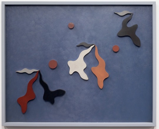
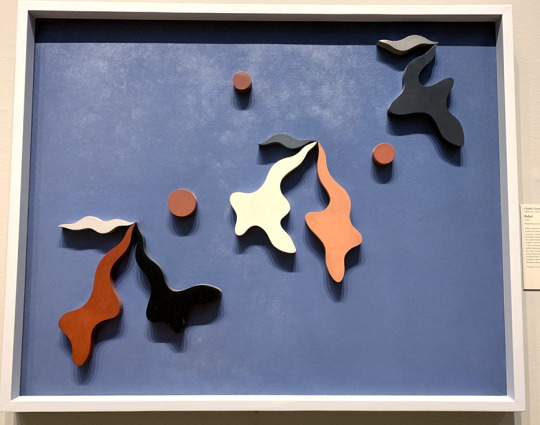
Relief, Charles Green Shaw, 1937. The Art Institute of Chicago.
Relief, by Charles Green Shaw, was on view in one of the American Art galleries, next to other paintings and objects in glass cases. Yet it stuck out, looking like something more fitting towards the abstract galleries, with its shapes and pops of color, as well as the fact that it is made out of wood. Unlike its neighbors, Shaw’s piece is more than just paint on canvas, quite literally jumping out of the frame’s two-dimensional space. It was unlike anything else in the room, in the gallery, and I loved it.
Upon further research, I found that this work was inspired by Shaw’s challenge for himself, to create a piece of art that did not require a specific subject to provoke an aesthetic response from its audience. It is both painting and sculpture, within a frame. It meshes traditionalism with new age abstraction and conceptual efforts, and it amazes me – art that challenges and makes you question your initial reactions to art in general. (Shaw)
I’m including two pictures – one in neutral lighting from the Art Institute’s website, and another that I took in the gallery, where the light shining down onto the piece caused multiple shadows that made it look like the pieces themselves were vibrating. The piece is absolutely stunning, conceptually and visually.
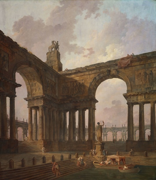
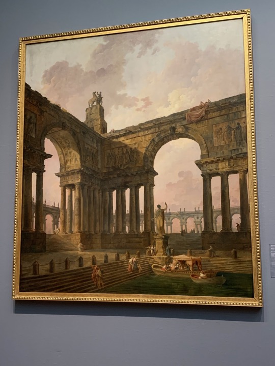
The Landing Place, Hubert Robert, 1787-1788. The Art Institute of Chicago.
Hubert Robert’s The Landing Place is one piece in a collection of four colossal paintings that were a part of a commission to decorate a salon in the late eighteenth century. The size of it is the first thing you really see when you walk into the gallery – it’s nearly eight and a half feet tall by nearly seven and half feet wide. They take up almost a fourth of an entire gallery wall. Walking towards it, it feels more like a portal than a painting, the details and color so rich that you could step into it, and come out into the scene itself.
Something about the light of the gallery adds a golden-hued touch to the piece. The shadows seem more pronounced in their details, the direct light highlighted brighter. Like a more direct lighting approach that doesn’t quite copy itself to the online version, so I’m putting both pictures in here as well.
This was also the piece that I sat with for fifteen minutes for the Responsive Time Exercise.
It is the sky that pulls me in first, after looking up from starting my stopwatch. The contrast of light to dark, the clouds beckoning dusk, or daybreak, how people have already gathered together in this space in the early hours of the fabricated day. The canvas is stunning, in both scale and content. If I close my eyes to my surroundings, the painting’s scene feels incredibly real, like I'm there, the warm breeze and insects chirping, the light falling in, shading the structure, full of depth and scale.
I can’t seem to grasp the scale accurately in words – the painting must be twice my height, maybe a little over, how incredibly vast and wonder-filled this piece looks, how the people gathered all around are ants compared to the towering architecture, and how yet it makes them feel as if they are so alive, within their detailing. The boats. The texture of the water, the differences in clothes and colors and ages. It brings so many questions to light: who are they? Why have they come? Who are they meeting, and where are they going to go? Why have they come here, now, or is it then? Where is this place? What smell does the wind bring? How hot is the air?
Or maybe, there isn’t a story here at all. Or there are too many stories to be seen. Who built this place? Where did the materials come from? Why choose these pictures – is it a shrine? A place of knowledge? A place of peace? Why did Robert choose this scene, these types of locations for his patron? Reviving Hellenistic ideals? Is he trying to show calmness through scale? Peace through space and time? Domesticities and how history makes romantics of us all? How even the smallest of activities can be beautiful?
I’m now five minutes into the response, and I’ve come to decide that there are two versions of this painting - one version up close, and one far away. The entire piece is too big to really feel the scale up close, where the gallery’s lights reflect the texture of the brush used and the sky, the clouds, the colors, all disappear beneath the shine of it. Yet from afar, it almost seems like the scale is more striking. The color vibrates. The structure and framing of the scene seem to focus the lighting, the whole of the scene.
Up close, the details are in their full glory. There is nothing you cannot spot; wrinkles, shadows, texture and incredibly minute, small details you may have missed from afar. The woman peeking out behind the column to the right. The groups beyond the right-side gate. How they are together, or separated. The woman below catching the large boat from her own. The effort that Robert put into this piece, as well as his other three in the collection, isn't for even a moment half-hearted, nor half-hazardly detailed, every face has eyes, a nose, a specific look to them and only them. The statue has a dedication written on it. There are faces and further statues on the gates beyond. There is so much attention to lives that don’t even exist, the piece is overflowing with love and care. There is so much beauty in this piece, it strikes and never stops. It feels never ending, beauty upon beauty upon beauty – nature, architecture, humanity, domesticity. Once you see it, you can’t stop.
Ten minutes in, and surprisingly, I'm not yet tired of standing here, nor of this piece. It feels as if every time I look up there is something new to see, and maybe I’m cheating a little bit, choosing such a large piece, but it is everything I admire put in a painting. Parts history, humanity, domesticity, all under a rosy sky. The romanticism of everyday life, how it in itself is art. It leaves me wondering what the other people passing by are seeing. What are they drawn to first? What am I supposed to take away? What am I supposed to see, where am I supposed to look? Is it not subjectively, not entirely up to me? Aspects like shading and lighting can direct my eye, but the pieces that portray love and humanity – how am I to look away?
The detail is too much, now, almost, you feel too powerful, seeing everything. To be able to control this perspective of daily life. It feels unnatural, but real in the same tone. I want to hang it from my wall, peace and power and domesticity. I adore this piece because it feels like a memory, I've decided. Something rose-filmed but true, depending on how you see, where you look. Beauty, everywhere. So blatant, like it has nothing to hide, in everything, afar, close, in every step in-between.
I hadn’t planned out what pieces I was going to pick for the exercises beforehand, deciding on wanting to find them within the museum and being inspired, pulled towards them. I found one for the response exercise in the colossal pieces done by Robert, and found my secondary pick, for the criticism analysis, tucked into the Contemporary galleries on the second floor.
Velocitas – Firmitudo from the Dürer’s Loops series, Sigmar Polke, 1986.
The Art Institute of Chicago.
Velocitas – Firmitudo is a graphite, silver oxide and damar resin made piece by Sigmar Polke in 1986. The plaque on the wall had no further background information. It was a mystery within the gallery, and one I wanted to piece apart and see if I could solve by analysis, so I chose it for the analysis exercise. Yet even before that, it stuck out to me, feeling almost like an mounted optical illusion – part topographical map, part three-dimensional treasure map, part story told through script, part picture of the sea taken from space – it felt like everything worldly poured down into one piece, in shades of grey. It looked like sand struck still on the canvas, inked and blown away to create dunes. How did one piece manage to convey so many different perspectives, so many images that I could list and list for what felt like forever? What was Polke thinking when creating this piece, this series? Why does it look like it will change, as soon as I look away?
It’s a fairly large piece – nearly eight feet wide by eight and a half feet tall – and is incredibly striking, for using only black and white for its range of color. It has many different textures on the underlying later, that look like they are overlaying themselves. There are thin ones, thicker edges, like mountain ranges of contrast. It is more sparse in activity around the edges, and then gets more intense the further to the center of the piece you look. Over the center of the piece is a black detailing. It looks to be two lines that intersect towards the center of themselves, and yet diverge greatly. The left is circular for most of it on the right, but on the left diverges into a looping, almost cursive-like detailing that twists and curves along and around itself. On the left it curves off to the opposite right side of the piece, a great curve leading to smaller details, looping in and around itself there as well.
The design elements this piece portrays are space, color, texture, form, and line. The line is the first thing that draws your attention into the piece. The dynamic dark blacks contrast the lighter greys in color, playing against the different textures. Some look to be almost splattered or spray-painted, others traced upon itself over and over until bleeding-edged and dark, others dripped down to look elongated and heavy in form. The space of the entire piece is enthralling, it is heavy in some places and blank entirely in others, a conundrum in itself. The design principles present in the piece are emphasis, balance, variety, and movement. The emphasis of the contrasting colors and textures. The balance in them as well, the whole piece looks equal on both sides, not one heavier than the other. The variety in textures, in shades, in the touch of elegance in the line symbol that adds movement to the piece. Polke has organized his work in almost diagonal quadrants, from range to range, the blurred darkness to the heavy edges to the lighter outlying edges of the entire piece. Your eye follows the line, at first, from left to right to back again, before it really sees beneath, and then gets stuck in the middle range of shading before following the rest of the piece up and counter-clockwise, before starting the whole process again and again.
This piece is stunning in its abstraction. It looks like it could be a list of things, and yet none of them at the same time. It’s chaotic, and yet looks like it has a central concept or meaning, due to the emphasis and contrast of its elements. It looks like it’s meant for you to get lost in. To turn over and over, to follow that line again and again like it will lead to some final message of the piece. I think that that is what Polke wants, this repetition, this losing of oneself in the piece. Every bit of design choice that I could figure leads to this – the variety and yet balance, the constant linearity of perpetual guessing– there is curiosity at the center of this piece, I believe. It’s what makes your eyes go for one last time around the piece, tracing the edges of darkest blacks one last time. Polke wants you to feel the textures, the question, the never-ending curiosity of it, with just your eyes.
Head of A Woman, Pablo Picasso, 1909. The Art Institute of Chicago.
The Institute’s collection loses me, sometimes, within the modern contemporary galleries. I understand that there is incredible technique and thought that goes into the creation of these pieces, and it’s not a technical issue that separates them from my eye. Sometimes, it feels as if there are just too many concepts at play and it overwhelms me, seeing them all crisscrossed across one another. Pieces, for example, like Picasso’s Head of a Woman, are technique-based of interest, but the visual aspect I find lacking. I don’t know if it is the color choices or the style, but overall, it just doesn’t end up appealing to me. I really do love many types of abstract and contemporary pieces, and yet some don’t connect with me. Though, they are easier to walk past in knowing that others love them as I love other pieces.
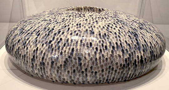
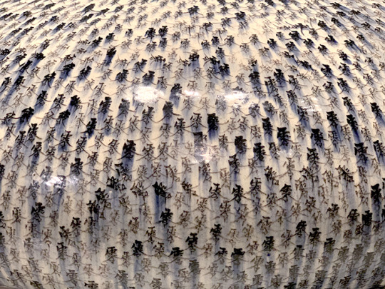
Water Drop, Mineo Mizuno, 2011. The Art Institute of Chicago.
The piece that affected me the most emotionally I actually stumbled upon, tucked away in the corner of one of the Asian Art galleries: Mineo Mizuno’s 2011 work Water Drop. Personally, I really don’t believe that the online photograph does this piece justice. Seeing it in person, it feels like you’ve just caught it mid-bounce, pressed pause right where it has flattened itself at its lowest point, right before springing back up again. There is weight to this motion, to the curve of it. It’s surface tension that never breaks, forever holding, existing, keeping. It gleams with a lost possibility.
This feeling was emphasized upon reading the wall description – it’s a personal piece. Mizuno dug his hands into the center of the piece, his fingers curving marks into the sides of hollow crater at the piece’s center. The Japanese character Mizuno has written all over the piece represents “zero”, “null”, “void”, or “nothingness”, as well as the title of Japanese World War II fighter planes. Mizuno’s father had died in the war before he was born, addressing that loss in this piece. The emotion of it is nearly tangible, palpable, like you are waiting for the return of motion, the bounce, the breath of life – but it never comes.
Art Cited:
Mizuno, Mineo. Water Drop. 2011. The Art Institute of Chicago. URL.
Picasso, Pablo. Head of A Woman. 1909. The Art Institute of Chicago. URL.
Polke, Sigmar. Velocitas – Firmitudo from the Dürer’s Loops series, 1986. The Art Institute of Chicago. URL.
Robert, Hubert. The Landing Place. 1787-1788. The Art Institute of Chicago. URL.
Shaw, Charles Green. Relief, 1937. The Art Institute of Chicago. URL.
0 notes
Text
Why Below has taken half a decade to make • Eurogamer.net
"Making a game is obscenely challenging," Nathan Vella, boss of Toronto, Canada developer Capybara tells me over the phone.
"It's a little bit physically challenging, but it's always mentally challenging. Making a project pushes you. The metaphor I always use is - I don't know if you've ever been to the desert or somewhere ridiculously hot, and you're standing out in crazy warm weather, it's 35 degrees and you're like, oh my gosh, it's so hot! But it's a warm hot, so you're like, okay, I can kind of deal with it, and you're used to it not being this hot so you think it's kind of nice, and you acclimate yourself to the ridiculous heat in a desert.
"Having a five-year project is like putting a giant magnifying glass between you and the desert and the sun. It makes everything so much harder. It makes every problem so much bigger. It requires so much dedication and commitment from the team just to keep moving forward and past a certain point. It's really disappointing to delay games. It's really disappointing to miss deadlines. But at the same time, nothing is more disappointing than putting out a game you're not happy with and aren't proud of and can't speak honestly to players about."
Capy announced Below in 2013 - too soon, the developers admit.
Vella is talking about Below, a game Capy has worked on for over five years. The roguelike survival procedurally-generated dungeon crawler with a zoomed out perspective and a tiny warrior was announced in 2013 during Microsoft's E3 press conference, and has been delayed multiple times. At one point, it felt like Below might never come out.
But Below, Capy insists, is coming out this year, in 2018. That's good news for people looking forward to playing the game, but it's even better news for the developers, the people who have spent every day for five years trying to make Below work, trying to make it the best it can be.
Clearly, Capy has run up against significant challenges in the development of Below. As Vella tells me, no-one wants to delay a video game, and no-one wants to spend half a decade making one. But what kind of challenges has the team faced? In short, why has Below taken so long?
Vella, who is happy to discuss the problems Below has thrown up, says the team spent a lot of time trying to work out whether the game was more than the sum of its parts. That is to say, trying to work out whether combining Below's mechanics and systems made for a fun experience.
"Every one of the major pillars of the game - the scale, the perspective, the systems, the combat, the goal of creating interesting exploration - all of those things, we did them," Vella says.
"They were there. And then it was the question of self-reflection as a developer, like, is them just being there good enough, or is there somewhere else this game could go?
"The way our creative director and the game director Kris Piotrowski talks about it is like, we were actually excavating the depths as we were making a game about the depths. You find a lot of stuff along the way."
Below has turned out to be a much bigger game than Capy intended. Now, with the benefit of hindsight, Vella regrets announcing the game in 2013. "We thought it would be cool to announce a game a little bit earlier and bring some fans along for the ride," he explains. "We totally understand it was too early." Then, though, Capy didn't see the problem with announcing the game. Then, it was nowhere near as big as it is now. "It's a big, long, weird game we didn't necessarily expect to make."
youtube
Back then, all those challenges Capy ran up against had yet to present themselves. Indeed, Capy didn't think Below would suffer such a tricky development in the first place. "It's not one of those shit happens scenarios," Vella explains. "It's one of those, we made a whole bunch of choices to try to make the game as good as we can after a certain point. Once you've delayed it once, you may as well do what you need to do to make it great, because a delayed game that still comes out crappy is not really going to be okay by us, by any means."
When Capy last delayed the game - in 2016 - it sounded like it had done so indefinitely. There was a negativity associated with the delay and Capy's accompanying blog post. It suggested, at least it did to me at the time, that Below might never come out. It was quite a depressing delay announcement to read, as someone who had high hopes for the project.
At the time, Capy was conscious of the risk associated with telling people Below would come out at a certain time, or even a specific year, because it had already delayed the game a couple of times and didn't want to again. It wanted this latest delay to be the last one, the delay that would see the studio go dark for two years before re-emerging with something concrete: what we now know is a promised 2018 launch.
"When we sat down to talk about it, the biggest risk we saw was telling people it was going to come out and then delaying it again, and saying, oh, you know, we said it was going to come out this time but we need another six months, and then after that six months being like, actually we need another six months," Vella says.
"There are only so many times you can do that before people tell you you're crap and that's the end of any potential relationship you have with them as players.
"It was like, we know we need some time, we think we know approximately how long that is, but instead of saying approximately how long it is, let's just say we're going dark and we'll come back when we believe we're ready. It was the most honest way of putting it. The least PR'd way of saying we're delaying is saying we're delaying for maybe a long time."
Some thought Below secretly cancelled. I wondered whether it had been - or would likely be - myself.
"A lot of people took it like we were cancelling the game, and I totally understand that," Vella reveals. "But in our gut it was just better to do that than to risk anything else and to let people down and have them become apathetic about the game. I would rather people be angry about it - or even worried it's delayed - than have them just be like, meh, I don't care about these guys any more."
youtube
Since that announcement, Capy has worked to get Below where it feels it needs it to be. It has spent months refining systems, adding content, cutting content, putting content back, and taking more content away. Vella mentions the old adage: the last 20 per cent of any video game development takes 80 per cent of the time, and says it's "never been more true than on this project". Below, he says, is a long game, fuelled by procedurally-generated content but also Capy-created bits and bobs, "hand-done" content for players to find. Then there's all of the various systems, all of the enemies, and all of the "moments" Capy wants players to experience.
"All of that stuff required either a bunch of polish or redo it from scratch because we weren't happy with the way it was," Vella says. "Even just taking the pieces that were mostly complete and giving them a hard look to see if they were actually going in the right direction.
"It's been a lot of work and taking the things we think are working and try to make them work even better, which is in a lot of ways just as hard as starting stuff from scratch."
Digging into the detail, Vella says Capy has done four full iterations, "almost from scratch", on the procedural generation system and how it builds the single screen levels of the depths of Below. Each iteration worked, Vella says, but there was something about each that didn't. Either it didn't feel like it was creating enough "gameplay moments", or it felt "too grid-based" and as a result "looked kind of janky", which was a problem because Capy wanted Below to feel like it was set in natural spaces.
Then there was the technical challenge of getting Below running well. The game has a unique, heavily stylised art style, but even more unique is the camera perspective, which is zoomed out and at times presents the player character as a tiny warrior on-screen. The single screen levels can be vast, despite being single screen. When you begin the game, you find yourself exploring a huge field of grass in a storm, with rain and wind battering each of the thousands of blades you can deform by simply running about.
Because of its aesthetic, Below doesn't look like the most performance-heavy video game, but Vella says there's plenty going on under the hood to tax the Xbox One, the console it's launching on first.
"We're so used to everything in games being up close," Vella says. "How close can we put the camera to a character? We want to be able to see their ear hairs if they're in third-person, or we want to be able to see the scratches on their guns if it's an FPS. For us to go the opposite direction, quite often people think that's easier to do. Of course they're going to do 4K / 60 frames per second, that's easy! But we're doing so much to make that work and it is actually extremely technically challenging to do so."
Capy originally intended for Below to run at a 1080p resolution and at 30 frames per second. But over the course of the development, and to make the most of the Xbox One X, it spent time boosting the game's performance to 4K and 60fps. This is made easier on the more powerful Xbox One X, but Below will run at 1080p and 60fps on the bog standard Xbox One, which Vella says was a challenge.
Below is a much darker game now than it was even two years ago.
Below's aesthetic also evolved as the scope of the game ebbed and flowed. Early in development, Below was a lot brighter than it is now. Over the years, the developers have become more confident in making Below a game about the contrast between light and dark, about the mysterious lantern you find, about the way the fire pits and torch pillars work. Capy has become confident enough to shroud Below in actual darkness, to the point where you sometimes find yourself in what looks like an entirely black screen, save a small circle of light around your tiny warrior in the corner somewhere. "Even in the past little while - and by that I mean since we've gone dark - that's become more foundational for us," Vella reveals. "To be confident enough to make a game that is dark and hope to god people set their gamma settings correctly."
Burnout is one of the biggest issues affecting video game developers today. Developers, who work so hard for so long on projects, some of which never see the light of day, can sometimes exit the industry altogether, so exasperated and exhausted are they with the seemingly never-ending games they have become embroiled with. When you spend years working on a game that struggles for direction, or vision, or identity, developers can, understandably, lose faith. They can lose hope.
"We constantly have that balance between burnout and optimism," Vella says when I ask about how Below's development has affected the team.
"That's just something every game has, but the longer it goes, the more aware you are of it. It's definitely been a challenge. For me it's a little bit less so because I'm not into in the nitty gritty of the project. I'm not making assets or trying to solve some of the big ticket problems. But for the people who have been working on the game every day for years and years of their life, I know for sure it's been a very big challenge. The fact we're positive we can overcome that challenge together is one of the things I'm most proud of about the studio."
For the makers of Below, there is light at the end of the tunnel.
I ask Vella if he ever considered cancelling Below. His answer is unequivocal.
"No, absolutely not. It probably crossed the minds of other people on the team. But the idea of letting our team's work not see the light of day was never really an option for us. Everybody's worked so hard and put so much of their life and effort and creativity into the game, people need to see it.
"I'm 100 per cent sure there are people who are not going to like this game, but at least we know that going in, because of the type of game we're making. It's a hard game. It's a game that doesn't do the things some people like about games. Some people like having their hands held. Some people find constant death frustrating. That's okay. Some people aren't super into playing as a tiny little character. That's okay, too. At the end of the day, we put such good work into the game, I think, I never once thought we shouldn't keep working on it."
Like Below's tiny warrior emerging from the depths, for the developers of the game there is, finally, half a decade later, light at the end of the tunnel. Clearly, Below's development has had its ups and downs. In the game, when you die you respawn but must find your corpse to reclaim lost items. But the world is reshaped, the caves shifted slightly, the paths moulded anew, the procedural generation system doing its thing.
As I learn more about the depths Capy went to in the making of Below, I wonder if this is art imitating life. As Below repeatedly reshapes itself for the player after each death, the developers have reshaped Below - thankfully without death.
"It's happening, man!" Vella declares. "It's happening."
0 notes
Text
Evaluation
College Space
Was a fast brief that tested my ability to work fast. I as a photographer prefer to have time to plan and formulate a structured plan for when I shoot. However, this was about using the short time you have to the best of your abilities. I like my images however, do believe that I could improve them further by exploring more of the building and coming up with more dynamic compositions.
Contact Sheet
Usually for all of my briefs or projects I complete I create a contact sheet. I believe contact sheets can show you the progress and important elements that occurred within the shoot. Also, by having a contact sheet you are able to actively select out the images that don’t work and do work.
Stock
The images I uploaded were my final ten Depth Of Field images. However, I plan to upload many more such as; glass, wait for it, white shirt and fashion cover. Alamy was very simple to register with. Also, if your having problems just email them and they’ll personally help you. After submitting your images to alamy there is a 48 hour waiting process for there standard quality control check. After that you tag and label your images till the bar in the top right corner says ‘On Sale’. Alamy is a good strong way to put your images out for the public to see and use. I can also, become some source of income for a student photographer like me.
Press Event
I struggled with this brief because personally I don’t see myself as a Press photographer. However, by selecting an event that was local I was able to calm my nerves. I took pictures at the local Santa Dash 2018 which was being documented by the local newspaper ‘Echoes’. I believe I was able to fulfil the brief as I captured the different elements of the event and created strong dynamic looking images in the process.
Depth Of Field Trip
Within this project I struggled with finding a subject matter. I finally came up with the idea of shooting Statues. All of my images were shot within my home town. The two large statues are situated around the centre of my town and the smaller ones are from around my garden. I found shooting with the larger statues it was easier to gain a shallow depth of field as I was shooting with the 50mm. With my smaller statues if I shot the images with a 100mm macro lens, I probably would have gained stronger images. I enjoyed this brief as it made me explore further into a subject I already know.
Wait For It
I believe I was able to successfully complete this brief. This brief was different for me as I have never actually taken the time to select a strong compositional area and patiently waited for an image to appear. I enjoyed seeking out areas with high contrast and strong dynamic compositions. I like having to patiently wait to capture interesting images. Also experimenting with the high contrasts of the images. I should have acquired a tripod at some points. Also, I should have trusted the weather more, when I was shooting the big rain clouds covered the sun I waited for around 20 minuets for it to clear and went in. However, if I had stayed put I could have gotten some more images.
Rush Hour
I believe I was able to successfully complete this brief. I found this brief quite difficult in the elements of trying to grasp both the grittiness of Glasgow and the rush hour element. However, I trusted my instincts and shot. I mostly aimed my images around groups of people and transport to focus on rush hour. However, I also took some single people images to show the 'People Of Glasgow'. I feel I captured strong composition, The use of the technique, the use of contrast, patience, interesting images and all sharp. Improvements; Camera shake was a strong issue within this project. Also, capturing the right moment where my subject was in focus. To fix this I would shoot on a brighter day or a higher ISO so I could have a faster shutter speed and put my camera on continuous shooting.
People At Work
I found this project challenging. I struggled with approaching people and asking them for their time. However, I perceived. It was challenging at first and I felt uncomfortable asking people to stop their work so I could take their picture. However, by planning out the best times and opportunities I decided to go to the local stores and businesses within the town I live. I first travelled to the dump and then made my way to the centre of town. I timed it so I was inquiring about taking their photos just after lunch. This meant I didn’t need to worry about the school children or lunch rush. I also gave me enough time to capture a picture of the local lollypop lady. I believe I could improve with this project if I gain more confidence in asking strangers for their time. However, I still enjoyed the fact that this project pushed me out of my comfort zone.
Stylish Strangers
I believe I was able to successfully complete this brief. I found this project challenging. I struggled with approaching people and asking them for their time. It was challenging. However, I decided starting small was a good idea, the first girls I asked were around the same age as me so I felt more comfortable talking to them. By breaking the pattern I had enough confidence to ask other people. At first I manly looked for people in groups so that I was able to obtain more than one image. However, eventually gained enough confidence to ask separate people. Strengths; Strong Composition, use of viewpoints, the use of contrast, interesting images, built my confidence and all sharp. Improvements; I could have gotten more creative with my images, but because I was so tense and nervous and didn't want to take up much of their time I wasn't able to create thoroughly interesting and dynamic images. However, I enjoyed the fact that this project pushed me out of my comfort zone.
Environmental Portrait
Still To Complete
Group Portrait
I believe I accomplished the brief and was able to achieve a lovely family group portrait for my clients. I got my models to sign release forms and the parents to sign a permission slip for the child under the age of sixteen. At first I stuck to the classic style group photographs. However, I decided to have a bit of fun with my clients. By talking with them and making the shoot fun I was able to get them to climb on trees and give each-other piggy backs. I shot quite late into the day so using the two flashes really helped level the lighting of the images. Overall, I had a really fun time with this project and would be willing to look further into this area of social photography. Strengths; Strong Composition, use of viewpoints, the use of contrast, interesting images and all sharp. Improvements; With the time when my clients were able to shoot and the weather being against me most days I ended up shooting around 15:15 that meant the sun was nearly setting. However, I was able to work with it and have learnt that the weather and daylight might not always be on my side. Also, I made sure to be calm and collected on my shoot even-though I was felling rushed for time.
White Shirts 1
I believe I was able to successfully complete this brief. This was an interesting project as it was looking into elements of social photography. I enjoyed talking with my client and making the shoot fun and relatable for them. I also am extremely happy with how my final image turn out. Strengths; Strong Composition, use of viewpoints, the use of contrast, interesting images and all sharp. Improvements; I could of experimented with the lighting more as I only focused on using the spotlight. However, I still believe my final images is great and fulfils the brief.
Fashion Front Cover
I believe I accomplished the brief and was able to achieve the creative look I wanted within my shoot. My aim was to create a background that looked like a cityscape. Throughout this process I found that I struggled with picking a Movie and creating a concept I was willing to stick to. However, after much debating I went with ‘Wonderstruck’ and created a cityscape constructed out of a scene in the movie and a space theme. I chose the space theme due to the focus around a meteor in a scene in the movie. Due to a fault on my part I was quite unprepared with my set on the day of the shoot. I didn’t take into account the hight my background would need to be nor the sheer weight of the soft box I was using to light it. However, with the help of my lecturer and classmate I was able to fix my mistake before the shoot began. To improve on this I will add in more planning time for example booking the studio the whole day so I can test my set-up. Overall, I love this image and believe that I have successfully interpreted the brief.
Glass
Glass was a tricky brief as there were so many elements we were told to cover. For example, we were told to advertise the glass, show the quality of the glass and create an abstract image. I struggled trying to combine all of those elements into one set image. However, I believe I have completed and fulfilled the brief. By using the ‘Light, Science and Magic’ book the lecturers recommended I was able to correctly use the Bright-Field and Dark-Field lighting techniques. I was able to experiment with flags and create abstract dynamic images. Post editing was time consuming as the glass had small finger prints or dust particles on it which I removed in photoshop with the spot healing tool and the clone stamp. However, I completed it and am happy with my images.
Business Card
I am glad I was able to create business cards. As it is helping me to further expose myself as a photographer. Recently I have been taking my cards with me if I am shooting out I public so if I am conversing with someone I have them on hand to advertise my business and also give them a taste of what type of work I do and shoot.
#College Space#Contact Sheet#Stock#Press Event#Depth Of Field Trip#Wait For It#Rush Hour#People At Work#Stylish Strangers#Environmental Protrait#Group Portrait#White Shirt 1#Fashion Front Cover#Glass#Business Cards#Evaluation#Portfolio 1
0 notes
Text
7 Design Challenges to Sharpen Your Skills
Once in a while, I just have to try something new. Maybe I feel my skills are slipping. Maybe I want to jumpstart the neurons responsible for my creativity. Maybe I’m bored. There are a lot of good reasons to take on a design challenge, really.
Here are some more: You can add conceptual designs to your portfolio. You can blog about your experiences, and advertise your skills in doing so. You can take on a design challenge with other designer friends, and perhaps compete. You can gain a greater understanding of the technology you use.
The point is to do something differently from the way you usually do things. Change for its own sake isn’t always advisable, but trying new things is how we grow as designers, and as people. Just maybe don’t do any of these challenges on a client’s site unless you’re absolutely sure they’ll like it.
1. Try to Build Something New
This is actually my personal go-to challenge. I try to build something—usually something to do with layout—that I haven’t built before. It could be an effective and accessible horizontally-scrolling interface, a three-column site I actually like, or a full-screen responsive background image with absolute positioning.
you get to try out newer CSS modules…without worrying too much about cross-browser compatibility
This is a challenge where you get to try out newer CSS modules, or techniques you might not have thought of before, without worrying too much about cross-browser compatibility or other issues like that.
2. Change Your Colors
I know that I personally am always tempted to stick with what I know works, as far as colors go. I love my muted shades of colors, my grays, my de-saturated greens and blues, and so on. Unless you’re required to follow a specific style or branding guide, it can be easy to fall back on what you know works.
Well, get right on out of your comfort zone! Build a site with a color scheme you wouldn’t normally go for. For me, that would be using more bright, and bold colors. I’d have to turn up the saturation in general. For you, you might consider a dark layout, if you usually do light ones. Use calmer colors, if you’re prone to going bright and bold. Many of us, myself included, aren’t using enough contrast in our designs. Try adding more. Heck, try a design that’s totally just black and white, and make it work.
3. Copy a Complicated Layout
Okay, don’t copy someone else’s site exactly. Just find a site with a nice, complex layout or design, and copy it without looking at the source. Build the thing up from scratch by examining the major layout elements, and figuring out how to do it yourself. Don’t use this for a live site, but as a simple HTML/CSS/JS exercise.
the point is not to create a pixel-perfect copy, but to learn the principles behind the design decisions
You could choose to copy one of those fancy, experimental-looking sites to see if you can manage the same feat. Or you could copy the layout from a large retail site, to see figure out how you would manage that amount of HTML and CSS in a practical way. Copy a news site to see how they handle the scaling of large amounts of text and images in a responsive way.
Remember, the point is not to create a pixel-perfect copy, but to learn the principles behind the design decisions.
4. Design and/or Code a Site Using New Tools
If you’re used to Foundation, try Bootstrap, or a lesser-known framework. Try a different pre-processor. Try a different CMS. Try a different file manager or text editor. If you’re a programmer and/or like pain, drop your favorite JS framework, and try another.
Obviously, if you want to go in-depth this would be one of the longer challenges, but it doesn’t have to take too long to learn the operating principles of new tools. The key is not to necessarily change everything about your workflow, but to expose yourself to new and potentially better ideas.
5. Try Out a New Methodology
Similar to the last entry, you can spend an afternoon or two trying a totally different way of working. If you’re primarily a graphics specialist, try looking at how others start and fill out their mockups. Look at how others organize their layers. See if you can learn something from them. Or you might look into a full-fledged design methodology like Atomic Design.
On the front-end development side, you might try out a new CSS methodology. Hongkiat has a good overview of a few of the more popular ways of organizing your CSS.
6. Refine an Old Design
When I look at my older design work, my most common emotions are frustration, and a small amount of disgust. In that state, I have often decided to go for a full redesign. If you’ve been doing this for some time, chances are that your old work is built on solid principles. It just needs to be updated and refined.
apply new knowledge to old design instead of burning it all down and starting over
Take an old design, and update it without changing its core elements. Maybe keep the same layout, but update the spacing of elements. Keep the chosen typefaces, but update the text styles to better reflect your knowledge of typography. Keep the chosen colors, but make better use of them.
Just see what happens when you apply new knowledge to old design, instead of burning it all down and starting over.
7. Follow a Tutorial (the Hard Way)
Tutorials are often a wealth of information, even if you’ve been at this for some time. Don’t copy and paste the code. Find a good, long tutorial, and type every line of example code out yourself. Follow every step in Photoshop carefully. Observe how everything changes as each piece of the puzzle is added in.
If there’s a bit you don’t understand, Google it until you do. The challenge here is not one of creativity, but of understanding…and maybe endurance.
LAST DAY: Effortless, Real-Time CSS Editing with Stylizer Version 7 – only $29!
Source p img {display:inline-block; margin-right:10px;} .alignleft {float:left;} p.showcase {clear:both;} body#browserfriendly p, body#podcast p, div#emailbody p{margin:0;}
7 Design Challenges to Sharpen Your Skills published first on http://ift.tt/2fA8nUr
0 notes
Text
7 Design Challenges to Sharpen Your Skills
Once in a while, I just have to try something new. Maybe I feel my skills are slipping. Maybe I want to jumpstart the neurons responsible for my creativity. Maybe I’m bored. There are a lot of good reasons to take on a design challenge, really.
Here are some more: You can add conceptual designs to your portfolio. You can blog about your experiences, and advertise your skills in doing so. You can take on a design challenge with other designer friends, and perhaps compete. You can gain a greater understanding of the technology you use.
The point is to do something differently from the way you usually do things. Change for its own sake isn’t always advisable, but trying new things is how we grow as designers, and as people. Just maybe don’t do any of these challenges on a client’s site unless you’re absolutely sure they’ll like it.
1. Try to Build Something New
This is actually my personal go-to challenge. I try to build something—usually something to do with layout—that I haven’t built before. It could be an effective and accessible horizontally-scrolling interface, a three-column site I actually like, or a full-screen responsive background image with absolute positioning.
you get to try out newer CSS modules…without worrying too much about cross-browser compatibility
This is a challenge where you get to try out newer CSS modules, or techniques you might not have thought of before, without worrying too much about cross-browser compatibility or other issues like that.
2. Change Your Colors
I know that I personally am always tempted to stick with what I know works, as far as colors go. I love my muted shades of colors, my grays, my de-saturated greens and blues, and so on. Unless you’re required to follow a specific style or branding guide, it can be easy to fall back on what you know works.
Well, get right on out of your comfort zone! Build a site with a color scheme you wouldn’t normally go for. For me, that would be using more bright, and bold colors. I’d have to turn up the saturation in general. For you, you might consider a dark layout, if you usually do light ones. Use calmer colors, if you’re prone to going bright and bold. Many of us, myself included, aren’t using enough contrast in our designs. Try adding more. Heck, try a design that’s totally just black and white, and make it work.
3. Copy a Complicated Layout
Okay, don’t copy someone else’s site exactly. Just find a site with a nice, complex layout or design, and copy it without looking at the source. Build the thing up from scratch by examining the major layout elements, and figuring out how to do it yourself. Don’t use this for a live site, but as a simple HTML/CSS/JS exercise.
the point is not to create a pixel-perfect copy, but to learn the principles behind the design decisions
You could choose to copy one of those fancy, experimental-looking sites to see if you can manage the same feat. Or you could copy the layout from a large retail site, to see figure out how you would manage that amount of HTML and CSS in a practical way. Copy a news site to see how they handle the scaling of large amounts of text and images in a responsive way.
Remember, the point is not to create a pixel-perfect copy, but to learn the principles behind the design decisions.
4. Design and/or Code a Site Using New Tools
If you’re used to Foundation, try Bootstrap, or a lesser-known framework. Try a different pre-processor. Try a different CMS. Try a different file manager or text editor. If you’re a programmer and/or like pain, drop your favorite JS framework, and try another.
Obviously, if you want to go in-depth this would be one of the longer challenges, but it doesn’t have to take too long to learn the operating principles of new tools. The key is not to necessarily change everything about your workflow, but to expose yourself to new and potentially better ideas.
5. Try Out a New Methodology
Similar to the last entry, you can spend an afternoon or two trying a totally different way of working. If you’re primarily a graphics specialist, try looking at how others start and fill out their mockups. Look at how others organize their layers. See if you can learn something from them. Or you might look into a full-fledged design methodology like Atomic Design.
On the front-end development side, you might try out a new CSS methodology. Hongkiat has a good overview of a few of the more popular ways of organizing your CSS.
6. Refine an Old Design
When I look at my older design work, my most common emotions are frustration, and a small amount of disgust. In that state, I have often decided to go for a full redesign. If you’ve been doing this for some time, chances are that your old work is built on solid principles. It just needs to be updated and refined.
apply new knowledge to old design instead of burning it all down and starting over
Take an old design, and update it without changing its core elements. Maybe keep the same layout, but update the spacing of elements. Keep the chosen typefaces, but update the text styles to better reflect your knowledge of typography. Keep the chosen colors, but make better use of them.
Just see what happens when you apply new knowledge to old design, instead of burning it all down and starting over.
7. Follow a Tutorial (the Hard Way)
Tutorials are often a wealth of information, even if you’ve been at this for some time. Don’t copy and paste the code. Find a good, long tutorial, and type every line of example code out yourself. Follow every step in Photoshop carefully. Observe how everything changes as each piece of the puzzle is added in.
If there’s a bit you don’t understand, Google it until you do. The challenge here is not one of creativity, but of understanding…and maybe endurance.
LAST DAY: Effortless, Real-Time CSS Editing with Stylizer Version 7 – only $29!
Source
from Webdesigner Depot http://ift.tt/2hwvD3F
from Blogger http://ift.tt/2zqCwOT
0 notes
Text
7 Design Challenges to Sharpen Your Skills
Once in a while, I just have to try something new. Maybe I feel my skills are slipping. Maybe I want to jumpstart the neurons responsible for my creativity. Maybe I’m bored. There are a lot of good reasons to take on a design challenge, really.
Here are some more: You can add conceptual designs to your portfolio. You can blog about your experiences, and advertise your skills in doing so. You can take on a design challenge with other designer friends, and perhaps compete. You can gain a greater understanding of the technology you use.
The point is to do something differently from the way you usually do things. Change for its own sake isn’t always advisable, but trying new things is how we grow as designers, and as people. Just maybe don’t do any of these challenges on a client’s site unless you’re absolutely sure they’ll like it.
1. Try to Build Something New
This is actually my personal go-to challenge. I try to build something—usually something to do with layout—that I haven’t built before. It could be an effective and accessible horizontally-scrolling interface, a three-column site I actually like, or a full-screen responsive background image with absolute positioning.
you get to try out newer CSS modules…without worrying too much about cross-browser compatibility
This is a challenge where you get to try out newer CSS modules, or techniques you might not have thought of before, without worrying too much about cross-browser compatibility or other issues like that.
2. Change Your Colors
I know that I personally am always tempted to stick with what I know works, as far as colors go. I love my muted shades of colors, my grays, my de-saturated greens and blues, and so on. Unless you’re required to follow a specific style or branding guide, it can be easy to fall back on what you know works.
Well, get right on out of your comfort zone! Build a site with a color scheme you wouldn’t normally go for. For me, that would be using more bright, and bold colors. I’d have to turn up the saturation in general. For you, you might consider a dark layout, if you usually do light ones. Use calmer colors, if you’re prone to going bright and bold. Many of us, myself included, aren’t using enough contrast in our designs. Try adding more. Heck, try a design that’s totally just black and white, and make it work.
3. Copy a Complicated Layout
Okay, don’t copy someone else’s site exactly. Just find a site with a nice, complex layout or design, and copy it without looking at the source. Build the thing up from scratch by examining the major layout elements, and figuring out how to do it yourself. Don’t use this for a live site, but as a simple HTML/CSS/JS exercise.
the point is not to create a pixel-perfect copy, but to learn the principles behind the design decisions
You could choose to copy one of those fancy, experimental-looking sites to see if you can manage the same feat. Or you could copy the layout from a large retail site, to see figure out how you would manage that amount of HTML and CSS in a practical way. Copy a news site to see how they handle the scaling of large amounts of text and images in a responsive way.
Remember, the point is not to create a pixel-perfect copy, but to learn the principles behind the design decisions.
4. Design and/or Code a Site Using New Tools
If you’re used to Foundation, try Bootstrap, or a lesser-known framework. Try a different pre-processor. Try a different CMS. Try a different file manager or text editor. If you’re a programmer and/or like pain, drop your favorite JS framework, and try another.
Obviously, if you want to go in-depth this would be one of the longer challenges, but it doesn’t have to take too long to learn the operating principles of new tools. The key is not to necessarily change everything about your workflow, but to expose yourself to new and potentially better ideas.
5. Try Out a New Methodology
Similar to the last entry, you can spend an afternoon or two trying a totally different way of working. If you’re primarily a graphics specialist, try looking at how others start and fill out their mockups. Look at how others organize their layers. See if you can learn something from them. Or you might look into a full-fledged design methodology like Atomic Design.
On the front-end development side, you might try out a new CSS methodology. Hongkiat has a good overview of a few of the more popular ways of organizing your CSS.
6. Refine an Old Design
When I look at my older design work, my most common emotions are frustration, and a small amount of disgust. In that state, I have often decided to go for a full redesign. If you’ve been doing this for some time, chances are that your old work is built on solid principles. It just needs to be updated and refined.
apply new knowledge to old design instead of burning it all down and starting over
Take an old design, and update it without changing its core elements. Maybe keep the same layout, but update the spacing of elements. Keep the chosen typefaces, but update the text styles to better reflect your knowledge of typography. Keep the chosen colors, but make better use of them.
Just see what happens when you apply new knowledge to old design, instead of burning it all down and starting over.
7. Follow a Tutorial (the Hard Way)
Tutorials are often a wealth of information, even if you’ve been at this for some time. Don’t copy and paste the code. Find a good, long tutorial, and type every line of example code out yourself. Follow every step in Photoshop carefully. Observe how everything changes as each piece of the puzzle is added in.
If there’s a bit you don’t understand, Google it until you do. The challenge here is not one of creativity, but of understanding…and maybe endurance.
LAST DAY: Effortless, Real-Time CSS Editing with Stylizer Version 7 – only $29!
Source p img {display:inline-block; margin-right:10px;} .alignleft {float:left;} p.showcase {clear:both;} body#browserfriendly p, body#podcast p, div#emailbody p{margin:0;}
http://ift.tt/2oZDI69
The post 7 Design Challenges to Sharpen Your Skills appeared first on Unix Commerce - Create Your Beautiful Website Today!.
from WordPress http://ift.tt/2iSEIaC
via IFTTT
0 notes
Text
Hello friends, I’m Meeta Dani. I was born and brought up in Nagpur, India and am presently living in Vancouver, Canada with my family. Since my early childhood, I had a strong inclination towards all forms of art.
My Childhood
My interest in art began at an early age of 4 years with drawing and coloring. Every year during my summer vacations, my mother and I used to spend several hours learning new forms of art like candle making, pottery, clay modeling, etc. I did my post graduation in computer science and worked as a software engineer with reputed companies for over a decade. I was so busy with my personal and professional lives that I had no time to pursue any hobbies.
Back To My Artistic Self
In March 2008, I had to quit my software profession to take care of my infant. To keep myself occupied, I started taking drawing and painting classes for kids of all age groups. This was the period when I rediscovered my love towards art and started devoting time to pursue my childhood passion of learning new forms of art.
In 2010, my mother died of Cancer. She always wished to see me as an artist. After her death, I started painting mostly using oils and acrylics and also participated in local art exhibitions in India. My family moved to Seoul, South Korea in 2013. I continued taking drawing and painting classes in Seoul and also participated in exhibitions in Seoul and Singapore.
Finally Painting In Watercolors
In 2015, I was diagnosed with endometrial polyp. As my mother had died of endometrial cancer, which was hereditary, my doctor advised me to get a biopsy done as there was a chance of it being cancerous. The reposts suggested that the polyp was non-cancerous, but this incident shook me from inside, and I was now more determined to become a professional artist.
During this same period, I saw mind-blowing watercolor paintings while browsing the internet. I could hardly believe that those were actually paintings and done using watercolors. I had never seriously painted in watercolors and photorealistic paintings looked so very interesting to me. I thought of trying my hand at photorealism using watercolors. I painted my very first photorealistic painting, ‘The Blue Door’
I Am Completely Self-taught
I was never interested in learning any specific form of art for a longer duration and so I never tried to learn drawing or painting professionally. All the paintings that I did during 2010-2014 were all of different styles and done using different mediums like oils, acrylics, mixed media, clay, etc.
Painting in photorealistic style was new to me. I mostly learnt by watching YouTube videos and by experimenting with watercolors.
What Is Photorealism In Watercolors?
Photorealistic paintings are often based on one or multiple photographs. However, there are several artists who create photorealistic paintings mostly by their imagination and/or looking to actual 3 dimensional objects. The process of painting in photorealistic style using watercolors seems like solving a complex puzzle to me. It is sometimes as challenging as taming a wild horse.
I am often suggested to paint in a loose style as watercolors are meant to be painted loose. My thoughts are a bit different. I think that watercolor is a medium of expression of art, and a medium should not force the artist to paint in a specific style. Rather, artists should use the medium to express artistic views the way they want. I have found that watercolor is a very powerful and perhaps the most versatile medium to paint in a photorealistic style.
Painting Different Subjects
I like to paint portraits, birds, wildlife, still life, interiors and basically everything which seems challenging to me. I always try to paint outside my comfort zone. Light is an integral part of most of my paintings. I love to add an extra dash of colors to make my paintings look more eye-catching. I use bold colors and love to have a single strong point of focus in most of my paintings.
Tips On Photorealistic Painting In Watercolors
Proper Planning – Planning is the most important and probably the most neglected stage of a painting. For a complex realistic watercolor painting, one needs to plan how to approach the subject so that the painting process becomes easier and more effective.
Careful observation – Realistic painting is all about details, and observation skills play the most important role here. If you really want to improve then spend a lot of time in studying the subject carefully and understand it well before you actually start painting it.
Accurate drawing – Realistic painting requires an error-free drawing. If the drawing is not accurate, the painting will definitely not look realistic. Sketching techniques like grid technique, measurement technique, tracing, etc., can help to get an accurate drawing done.
Perfect Values – Values and contrast plays a very important role in making a painting look realistic and more appealing. A painting that has a full range of values, bright highlights and crisp shadows looks aesthetically pleasing and more interesting to the viewer.
Appropriate Edges – One of the common mistakes that most of the beginners make is to create a sharp edge for most of the shapes in their painting. However, a realistic painting with all sharp edges looks flat and unconvincing.
Patience – To paint in realistic style one needs to have a lot of patience. You like it or not, the fact is realistic paintings take a lot of time to finish. Start with a small simple subject and try to paint it as realistically as possible. Choose a more difficult subject next time to improve your patience level.
About My Book
I have written a book called Realistic Watercolor Unleashed on painting photorealistic watercolors. In this book, I’ve revealed all the techniques that I use for painting photorealistic paintings using watercolors. This book not only covers traditional painting techniques in detail, but also describes different ways to avoid and rectify common watercolor mistakes.
Highlights Of Realistic Watercolor Unleashed
This book is a comprehensive guide to realistic watercolor painting for artists of all levels.
It explains the scientific reason behind the behavior of watercolor paints.
It includes paper stretching, drawing techniques, masking, and painting techniques.
It explains how to make a strategy for a painting based on the complexity and type of subject.
It has seven demonstrations on a variety of subjects such as water, wood, fur, feathers, skin, blurred background, perspective painting, etc.
The book provides several tips on how to make a painting impactful.
It provides lot of tips and guidance on different aspects of painting.
It has a comprehensive list of watercolor pigments along with their characteristics, a few important color mixes, and a comprehensive list of complementary hues.
In this book, I have explained how you can design your own method for painting any complex subject like a professional watercolorist. This book is a perfect blend of in-depth theory and hands-on techniques that will inspire and motivate you to paint realistically using watercolors. It can be purchased from Amazon and on my website.
How To Paint A Blurred Background In Watercolor
The following is an example of how I painted a blurred background in my painting ‘The Look’. The reference image of chinkara by Sriram Reddy had a beautiful blurry background. I wanted to paint a similar background with a warmer feel. Painting the background first helps in judging the tonal values for the foreground. So, I decided to paint the background first and left a scope of darkening it later if required.
Step 1
Figure 1
I first sketched the outlines and few prominent shapes of my subject using measurement technique directly on the Arches 18” x 24” 140 lb cold-pressed paper-block. Watercolor blocks by Arches are very convenient for painting small and medium size paintings as the paper does not require to be stretched before painting. Once the sketch was ready, I applied masking fluid on the boundaries of the subject. This way I can be more carefree while applying the wet-on-wet washes on the background. I use Winsor & Newton masking fluid. It has a yellow tint and the masked areas can be clearly identified. [Figure1]
Step 2
Figure 2
Once the masking fluid was totally dry I applied a generous amount of clear water on the whole background area using my 2½” hake brush and blotted extra water using a large paper towel. I then dropped milky consistency paints (Olive Green, Indigo, Quinacridone Gold, and Brown Madder) and spread them gently using my round no.6 brush. After this, the paper was allowed to dry completely. [Figure 2]
Step 3
Figure 3
Once the paper was dry I applied the 2nd layer of colors in a wet-on-wet manner. But this time I wet only selected area of paper and dropped milky consistency paint (Quinacridone Gold, Winsor Violet, Olive Green, Sepia, Translucent Orange, Indigo) using my round no.6 brush and let the mixing of paint happen on the paper. I took care to keep the edges smooth and avoided any hard lines and puddles. The background looked patchy after the paper dried. I applied a layer of clear water with 2½” hake brush with a little scrubbing action. The paper was then allowed to dry thoroughly. [Figure 3]
Step 4
Figure 4
Using the above procedure I applied 3-4 layers of paint wet-on-wet, each time the paper was allowed to dry thoroughly before the next layer of paint was applied over it. I applied clear water over the background and scrubbed it with the brush in-between applying two layers of paint. [Figure 4]
Step 5
Figure 5
After this point it was difficult for me to judge if the background should be made further dark.
So I removed the masking fluid and continued working on the main subject. [Figure 5]
Step 6
Figure 6
Once the foreground was done I felt that the background should be made darker to add contrast to the whole painting. So I added a layer of milky consistency paint (Brown Madder, Olive Green, Quinacridone Gold, Indigo, Bright Violet, Cerulean Blue) in wet-on-wet manner using a 2½” hake brush by wetting selected areas of the background. This time I was extra careful as any mistake could have spoiled the whole painting. [Figure 6]
I love passing on my knowledge of painting to others and I welcome anyone with their queries about painting in watercolor!
Meeta Dani
Website
Facebook
Instagram
YouTube
#WorldWatercolorGroup - GUEST ARTIST: "Photorealism In Watercolors" by Meeta Dani Hello friends, I’m Meeta Dani. I was born and brought up in Nagpur, India and am presently living in Vancouver, Canada with my family.
#WorldWatercolorGroup#artist#doodlewash#featured#India#painting#photorealism#realism#tutorials#watercolor#watercolour
0 notes
Last Seen Blogs
pyximan
Nympholeptic

jks-nose
yoongis-pisces

cookie-vore
Untitled

collegequest-blog
My College Quest

hufsumin-blog
a f i r e ;