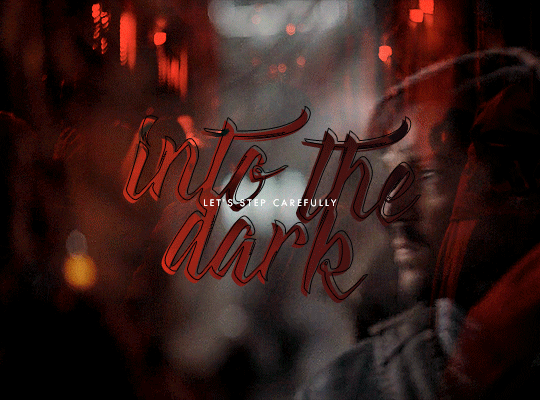
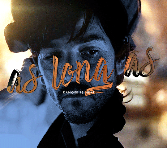
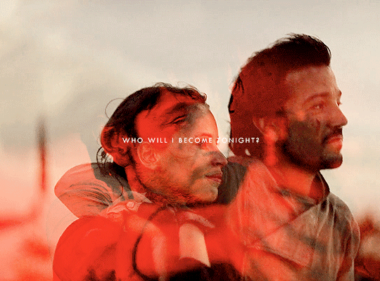
#i was too lazy to do gradient text
Text

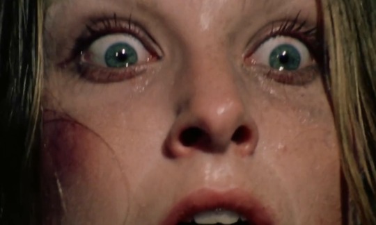

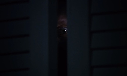
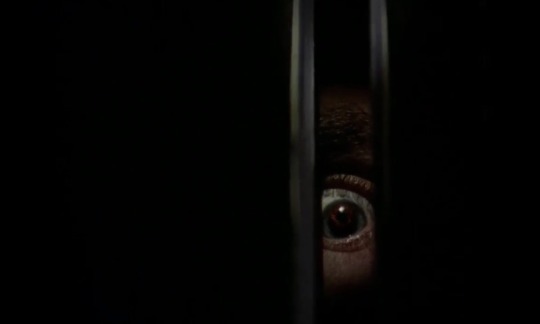
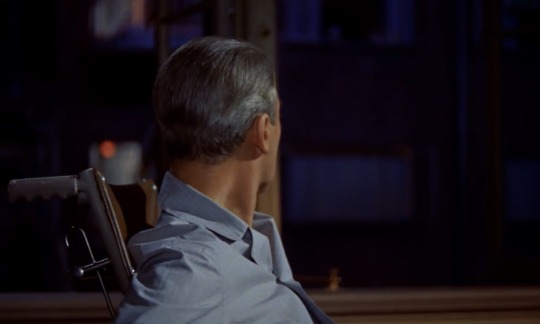
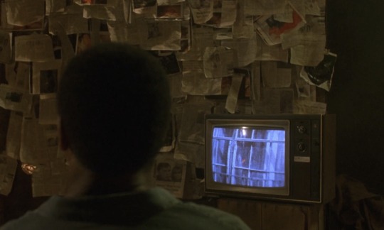
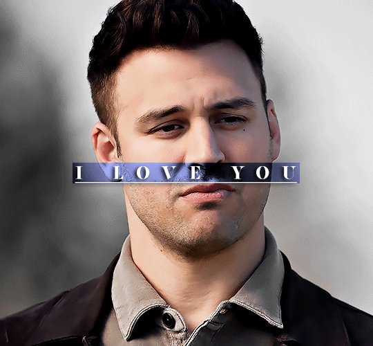
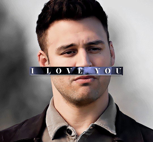
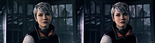
“What do voyeurs see when they look into the mirror?”
Parallels in Saw (2004) that have to do with watching, voyeurism, and the act of seeing
Psycho (1960) dir. Alfred Hitchcock
The Texas Chain Saw Massacre (1974) dir. Tobe Hooper
Black Christmas (1974) dir. Bob Clark
Rear Window (1954) dir. Alfred Hitchcock
#it really is called saw cuz they saw all that huh#I’m too lazy/not smart enough to do that cool gradient text thing so just pretend I did instead#saw franchise#saw#saw 2004#james wan
138 notes
·
View notes
Photo

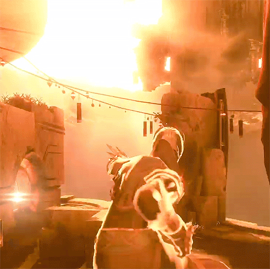
A blade appears in each outstretched hand. A pair of wings form on each Warlock's back. Two Warlocks take flight and vow to never again look down.
#destiny the game#destiny 2#destinyedit#gamingedit#destiny warlock#dawnblade#icara#edit#beloved subclass :)#i was too lazy to do the gradient text in the description but imagine it for me if you will#flashing tw
500 notes
·
View notes
Photo
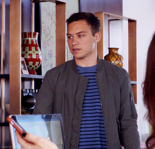

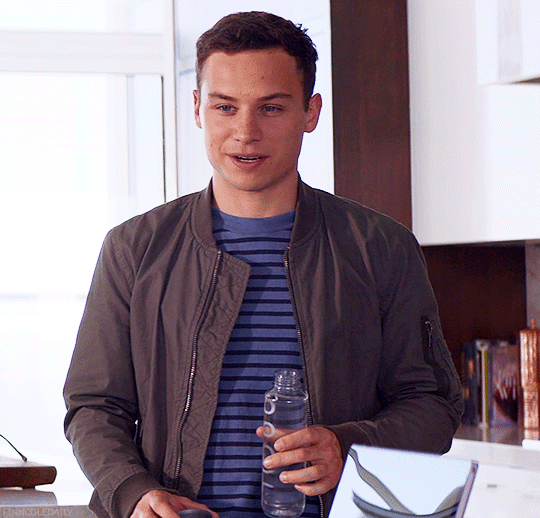
Animal Kingdom S4EP5
#fcoleedit#finncoleedit#finn cole#animal kingdom#animal kingdom tnt#tvedit#tv edit#tvgif#usershelby#michealgrayrps#ilovefinncole#celticmelody#m: gif#ak s4#was i too lazy to do gradient text? yes. yes i was
40 notes
·
View notes
Note
Hey, I love how you did the B/W strip + the text effect on your margaret atwood set, would you be willing to do a tutorial? 🙈
Hey Nonnie, thank you! Sorry this is a little late, but I did manage to hang onto this PSD for you.
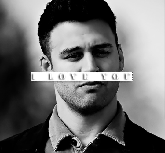
We'll be making this gif:

This tutorial assumes basic knowledge of gif-making, Photoshop, and coloring. I’ve only described the text tutorial in this, but you can reach out if you have any questions.
(This is a different version of my gradient text tutorial, but the same principle applies!)
Tutorial under the cut:
Couple things to note beforehand:
There is a lot of trial and error involved when doing any sort of effect, and this is no exception! You might have to play around with the colors and the settings before you find something that looks good and readable and that fits your set!
This text effect works better on big gifs (540px width) that have quite a bit of movement below the shape so you get that effect.
For this effect, I find that a simple font works better than a cursive one, but play around with what you like.
We're going to start with this gif:
First, I'm going to add my text and center it. For this text, I used the font, Solar vesta Serif, with these settings:
Note: when you do letter spacing + underline, sometimes, the space after the last letter can lead the underline to stretch a little too far past the letter, making it look like the underline isn't centered properly.
To get past this, I just select the last letter separately, and put the VA setting to 0-10, depending on the font/letter.
We're also going to add a drop shadow here itself, and this is fully up to preference, but I used this:

All of that should give us this (yeah, it's the simplest thing because I'm lazy and I like easy things xD nothing too fancy)

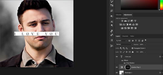
Next, we're going to draw our rectangle around the letters. I like to keep even spacing around all the letters on all sides (in this gif, it's 4px on all sides) but just eyeball it initially, and then adjust accordingly.
I changed the fill to white (this color isn't important, I just used white because it's easier to show) and moved the layer in the back so the text is on top. It should all look like this:

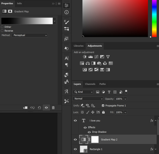
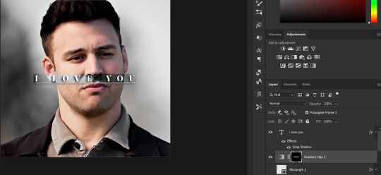
Next, we're going to add a gradient map between the rectangle and the text later. I simply used a black and white gradient, and my gif now looks like this:

Here are the settings:
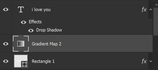
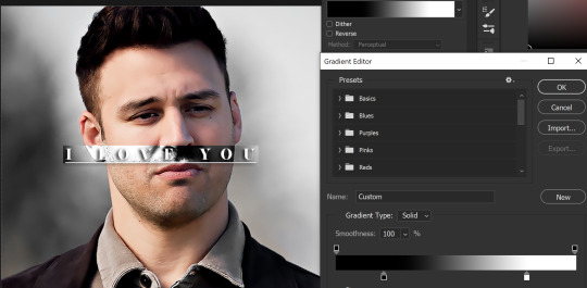
Next, we're going to delete that white box - the layer mask - next to the gradient map. Just click that and press delete (or right-click > delete layer mask). Your layers should look like this:
Now, we're going to add the rectangle as a layer mask. While pressing Ctrl, we’re going to hover our mouse over the square box next to Rectangle 1. Your cursor should show a white box with a dotted border. Click the square box with that dotted cursor and you should get a dotted selection line all around the box, like so:
Next, we're going to select our gradient map layer, and then create a new layer mask. At the bottom of the layers panel, you should see a box with a circle in it (denoted with a red arrow). Click that - make sure you have your gradient map layer selected, or you'll end up putting the mask on the wrong layer.

The black and white will disappear, leaving you with just the box again. It'll look like this:
Now, just hide the rectangle layer so it looks like this;
And you're done! This is my final gif:
Once you get this basic thing down, you can play around with it all. For example, I like to adjust my gradient sliders so they emphasize the colors:
You can also just change the colors;
Unlike my previous text effect, we're not going for inverse X-ray effect, so for this, I like to make sure the lighter shade of the gradient is on the lighter parts of the gif, and same with the dark shade.
(If that's confusing, here's a side by side comparison of what the "X-ray" effect vs normal color effect looks like)
Anyway - it's fully up to you!
Because of the effect I was going for, I didn't add a drop shadow underneath the rectangle itself, but you always can if you want to make that a little bit more 3D.
You can also do this with any other shapes, too, with the same procedure.
Hope this helps, Nonnie! Let me know if you have any questions.
#zee's tutorials#tutorials#gif tutorial#photoshop tutorial#resources#dailyresources#completeresources#itsphotoshop#allresources#dailypsd#userisha#userdahlias#alielook#userabs#tuserheidi#userelio#userjaelyn#userisaiah#usermorgan#usergert
168 notes
·
View notes
Text
okay! this took a bit to type out, but here we are!
disclaimer: my way might not work for you and that’s okay! there’s no right or wrong to make gifs, so long as you enjoy the way you make them then that’s all that counts. this is only a detailed look into my own personal process and things i’ve learned along the way. i'm also an idiot who sometimes doesn't know what he's talking about, so if something doesn't make sense let me know so i can fix it!
but these are some of the things i'll be going into a little more detail than before:
tools
importing & converting to smart object
smart filters
coloring (lighting, basic, and gradient)
exporting
tools
there are a few things i use in the process, some new and some old. whether you want to use them is entirely optional, given that it can be a lot to take in at once.
photoshop 2024
if you use an older version of photoshop, then i think the layout is similar to newer versions. though iirc some older versions don’t have the timeline function so you might have to look that up yourself since i’m not familiar with any ps version without it.
handbrake
i only use handbrake if the recorded video is super long. usually i try to record each scenery shot (4-8 seconds at a time) or an entire cutscene so i don’t have to use handbrake to trim the video. if i do, then i have the settings set to export as super hq with 60 fps, deselecting align a/v start and passthru common metadata. the rest i leave alone.
vapoursynth
this is really useful and makes coloring easier imo. you can download it from the official site, but i found a portable version (i have the 200722 one) for windows here. i’m not sure how to set it up for mac users, and, truthfully, to this day i still don’t know how to use it entirely. i just followed a tutorial i i found on youtube and only changed the amount for the denoise filter and turned off the sharpen filter since i do that in photoshop itself. so it’s trial and error, and i’m erroring a lot sometimes ajdkjasvjdas. it’s also where i crop the video to my preferred dimensions, unless you choose to crop in ps.
jsfiddle code playground
if you want to have the text in the tumblr post be a gradient, then type whatever you want in the first box on the bottom right, change the color from red to your starting color of choice, then the same of the green for the ending color. hit run, copy the code, and paste it inside the text post while in html mode. ngl, i stared at the site for like ten minutes before i figured out how to use it asjdjasdasd
nvidia shadowplay
i use shadowplay since it comes with my laptop’s gpu, set to record in 1080p60. i’ve seen other giffers use obs for recording, but i don’t have any experience with it. there are scenepacks and gameplay walkthroughs on many sites, which you can use as long as you have the uploaders permission and credit them as they ask! please don't steal their videos!
reshade
i’ve started using reshade recently to tone out the blue tint of the game and sharpen it up a bit more. it makes a big difference and helps with coloring if you start out with near neutral colors.
the effects i use are:
• deband
• clarity
• sharpcontrast
• emphasize
• amd fidelityfx contrast adaptive sharpening
• fxaa
• prod_80_04_colorisolation
• adaptivetonemapper
i'm pretty sure some of these are redundant, but i’m too lazy to go back and see which ones i don’t need lol. but it’s all personally preference with how you want the game to look, and there are many effects to choose from.
importing & converting to smart object:
my preferred method is the video frames to layers, which is: file > import > video frames to layers, and then select the video. if you use vapoursynth, then there might be duplicates frames (or at least there are for me) so when the popup window appears i check the box to limit the frames to how ever many duplicates there are of each frame. usually in my case, it’s three.
after the video has been imported, i select all frames in the timeline and change the frame delay to either 0.03-0.04 depending on how fast or slow i want the gif to be. for converting to smart object, i recorded my own action set to save time by clicking on a couple of buttons, but the process is: select all layers currently > convert frame animation > convert to smart object.
let me know if you want the action set! it saves a lot of time in the process
smart filters
i don't think sharpening before or after coloring matters, but definitely do not sharpen before cropping if you haven't done already.
vapoursynth combined with the in game reshade sharpening effects doesn’t require as much sharpening as i normally use. just note that it varies from scene to scene, and whatever you're giffing. these are just the settings i used for the pirates’ cove set.:
smart sharpen #1: 500% with a radius of 0.2 px
smart sharpen #2: 10% and 10 px radius
gaussian blur: 0.7 px at 30% opacity
add noise: 1% uniform at 30% opacity
on to the coloring, which i'm breaking this up into three sections: lighting, basic coloring, and gradient coloring, with a brief description and the result after each section.
something to note is that all coloring is personal preference, and how you want your gifs to look. if you're just starting your giffing journey, here's a site i bookmarked that explains pretty well the adjustment layers and what they do if you have questions for how they work. but i'd be more than happy to answer any that you guys have!
lighting:
brightness/contrast:
with this, i’ve found that changing the blending mode to screen brightens it up well enough without having to move any on the sliders. if it’s too bright, then lowering the opacity should do the trick.
curves:
before, i used the white and black point with the eyedropper tool, but now i’ve started using the auto function that can be found in the four horizontal bars in the top right of the adjustment properties. i choose the find dark & light colors options and check the enhance brightness and contrast box. if it’s too bright or tinted too much one color, then i fiddle with the rgb curves individually to get it as neutral as i can.
levels:
with levels there’s not much to adjust other than moving the sliders for the shadows and midtones to give it a little more contrast.
basic coloring:
selective color #1:
for the first selective color set to absolute, i use it for the white/black colors to make them as white and black as possible. increasing the black can make it too dark, so i limit the increase by two or three. sometimes i change neutral if it needs it, after all the coloring is done if it still looks too much of one color that the other adjustment layers can’t fix. i don’t know exactly what the difference is between absolute and relative is, i just remember it being part of a tutorial i read and have been doing it ever since.
color balance:
i only change this as minimally as possible, usually one for cyan, one for magenta, and one for blue for all tones. sometimes i increase it more, but it all depends on how you want it.
selective color #2:
the last selective color i use it for all the other colors, set to relative, usually for reds, yellows, and blues. if there are people in the gif, then i focus mostly on skin tones, bringing out reds and yellows to make it look as natural as possible. a hue/saturation layer can be useful to even out darker skin tones by lowering the saturation for red or yellow.
with scenery, i boost whatever dominate color pops up while lowering the other colors by adding in a lot of white if the lighting is bright, or adding black for dim scenes. again, if it needs it, adding in an optional hue/saturation layer, but this time to lower the saturation for less prominent colors.
gradient coloring:
if you’re satisfied with the coloring of your gif, then this step can be skipped!
i’ve recently fallen in love with using gradient fills. there are several preset gradients available, but if you search around online there are other gradients available to download and use. or you can make your own gradient of your colors of choice.
for me, i often use blue/pink or blue/purple gradient fills. the blue/pink preset is the one i used in this case.
gradient fill:
after adding the gradient fill and choosing the colors, i change the blending to soft light and lower the opacity anywhere from 30%-50%. with darker skin tones it might be tricky as it would involve more tweaking of the settings until it looks nice.
gradient map:
i follow it up with a gradient map to help with the sharpness (i think? i’ve forgotten exactly) set to soft light again with varying opacity given how dark the scene is.
vibrancy
this is completely optional here, but i like the colors cranked to the max, boosted to 80% or slightly lower. some minor adjustments might have to be made after this, usually with it being too red or possibly yellow.
exposure
the final adjustment layer to top it all off is exposure. i like my gifs to have a matte-ish look, so i change the offset anywhere from +0.0010 to +0.0030. if the gif is still a little on the dark side, increasing the exposure helps.
the gradient coloring takes the longest to get the colors to look good, but i love my colors so much and the end result is so worth it.
logo:
this is optional of course, but since there's quite a few people out there who love to steal gifs, it's probably a good idea to put your logo on the gif to help deter them. mine's simple and uses either the font code bold or moon. i have it saved as a png so that i can go to file > place embedded and resize it to my liking before moving it to the bottom right corner.
but for me those are too many steps to do for each gif, especially if i’ve been working on them for hours. so i open up an old psd with the same dimensions and duplicate the logo layer for each gif to save time.
exporting:
under file > save for web (legacy) the window for it should pop up. i don't usually mess around too much with the settings here, keeping it at selective diffusion and changing the matte to none.
sometimes the size will be too large for tumblr's limit since i like bright colors, and depending on how many frames are in each gif, most of them end up on the large side. i have to fight photoshop sometimes to make it work by either trimming a few frames or messing slighting with the lighting. occasionally i end up having to go back and reimport the videos to divide the frames equally if i don't want to trim any off. it’s a pain, and it’s something i should honestly try to plan out before that point lmao.
but if you're satisfied with how it looks, save, and you're good to post!
7 notes
·
View notes
Note
hii i have some questions about how you did your theme…. did you make it all yourself or use any tutorials ?? i’m trying to give a theme to my own blog but i have NOO idea where to start !!! if you have any tips i’d appreciate them so much <3 (im on anon bc my blog is soo boring looking right now… 😞)
hiii ! yes i make my own themes ! <3 and below the cut is all the apps and websites i use to make said themes ! ! so i hope this helps luv, if anything dm me! ;p 🌷
+ i mainly use pintrest for pictures/headers/dividers, or tumblr itself. and i search up keywords like, grey dividers, red headers, purple mood boards, blue themes, etc if i want something quick and easy to work around with.
other pintrest keywords: png gif, transparent gif, etc…
+ for symbols either tumblr and use keywords; cute/soft symbols, random symbols, messy bio, etc…
or MY FAV symbol website ! ! you can use the search the same way too to find certain symbols (you can also find kaomojis there as well !)
+ for more fine art i go to twitter/tumblr and look for artist that ALLOW repost.
if i want to make my own dividers or headers or pfp, i use the following:
cap cut — it's mostly free with A LOT of choices to make creative videos or gifs. super easy to use ! !
pics art — you can create a thin divider on a transparent png bg and crop it for free. search and use stickers to make it all come together ! apply and save it ! there's sooo many options with frames as well.


if you want more complex headers (if you want to use stickers or certain images and don't want to pay to remove the bg here):
remove background to images — it's free and unlimited ! just plop that image in this website and it'll remove the bg to ANYTHING then make ur goods !
here are more websites i use:
image color picker — i use this to get color palettes out of a certain picture to match the theme.
gif maker — SO EASY and free. it makes everything a gif if you don't like cap cut !
text color changer — this is to change the colors to ur text on the tumblr WEBSITE !
+ or if ur lazy like me you can use ur phone, just make sure it's set to HTML text when you paste.
here is some other yt tumblr tutorials:
how to make: glitter text and find for tumblr posts
how to do a gradient text on tumblr
[tutorial] tumblr colorful/gradient text
i hope this helps <333 NOW MAKE THAT BLOG BEAUTIFUL ! !
5 notes
·
View notes
Text
I love my Reo layout I’m totally not down bad for him like he is for Nagi, nu uh (be prepared for Isagi layout!).
I just need to do the gradient text for the intro post, but I’m too lazy to stand up from my bed and turn on my pc and to look up how to do it properly. And I’m also debating if I should change my tags again (probably not, bc it’s too much of a hassle to change everything then).
2 notes
·
View notes
Text
so a friend asked me if I could give some tips on how I blend gifs like these:
and LOL let me tell you I mainly recommend following tutorials like these (one, two, three) and honestly I owe so much of what little I know to @anya-chalotra especially the text lol I learned how to do that text line thingy from her. but I just wanted to give some pointers and maybe help explain why some scenes work and some don’t. it’s all trial and error.
setting a layer to screen in photoshop makes dark spots in the layer see through so I try to line up the parts of a scene that I want to highlight with those darker spots. I found a scene that had jyn backlit so that I could just turn up the contrast and make her silhouette darker (after I had finished the basic coloring I do for gifs). then I took the scene with cassian and put a gradient map over it, but I made sure to brighten the shit out of the scene so that it wasn’t just a dark blue blob, that there was a decent amount of contrast in his face.
now if you imagine the gif as having four quadrants, and I’m sorry I’m lazy so you’ll just have to imagine it for yourself, look at the top right quadrant. what I could have done was put a clipping mask on a new layer above the scene with cassian and drawn a bit of black with a big, diffuse brush (set to normal) in order to erase the bit of blue from cassian’s scene that is near jyn’s nose (I actually did that underneath but idk I guess I liked the look of it lol) and that is a good way to hide parts of a scene that you don’t want showing through the other scene. why black? because with a clipping mask layer it will only show up for the layer that is it is clipped to, and since black/dark shades are more transparent with a screen layer, it will allow the other scene to show more clearly.
this works best with scenes like these where the subjects aren’t moving too much.
but with this gif, the movement is the point:
it was completely unintentional, I just lined up the two scenes are noticed when the people with the helmets walked past cassian, you could see the other scene of him walking away more clearly - and the theme of the gifset was spy, so it just ~~fit the theme to me. that his face would be hidden and you’d see him in the background, walking away, in flashes.
in this case I think I literally just put the two scenes on top of each other, set the scene with the gradient map to screen, brightened that layer up significantly and called it a day. it helps that they are both from the same scene in the film, so there is a uniformity to the mess of these individual scenes that are cohesive. but usually all this movement can obscure the subjects and that’s generally not what people are looking for when making gifs. in this case, it works because of the theme.
it also helps that there is a contrast between the lighting of these scenes - the background scene has cassian silhouetted and backlit. so there are more dark spots to show the foreground scene, which has cassian’s face highlighted and bright.
conversely, when using two light scenes like in this gif
I actually darkened/added more contrast to the scene with jyn and cassian and sloppily did that clipping mask with the black brush onto the scene with the gradient map (and you can actually see it a bit lolll it was late I was very tired) in order to create more contrast between the overlapping subjects. if I felt like redoing this, which I don’t, I would make that black brush a bit more diffuse in order to blend more nicely.
I hope this helped and sorry for the laziness.
49 notes
·
View notes
Note
the rainbow text in your pinned is very pretty! how do you do that? and what does it look like on light theme because im on my phone using dark theme and im too lazy to change it

it looks like this on a white background!
also i just went to this website, put in the text i wanted, and then changed the colors to my liking (or theres user made palettes to choose from if u want)
then it'll give you an html code for the gradient text, and i just went to the post settings and changed the text editor to pure text/html, pasted it and then switched back to the rich text editor and it appears✌️i did this on my laptop tho so im not sure if u can do this from mobile ?
11 notes
·
View notes
Text
why the fuck did i spend 2 hours tracing this meme that only 2 other people are going to relate to (T_T ) i get why ppl draw anime now tho the clean lineart and cell shading w the gradients is actually pretty fun. unfortunately i am too lazy to do that regularly lmao
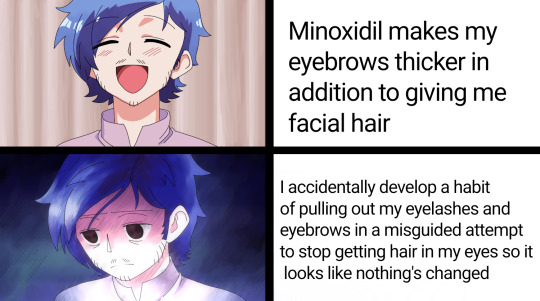
[IMAGE DESCRIPTION: A traced version of the meme of a blue haired anime character slowly becoming more distressed. It is redrawn so that the character is now masculine in appearance. In the first frame he is happy and in the second he has a tired, hollow expression. Top text reads, "Minoxidil makes my eyebrows thicker in addition to giving me facial hair." Bottom text reads, "I accidentally develop a habit of pulling out my eyelashes and eyebrows in a misguided attempt to stop getting hair in my eyes so it looks likenothing's changed. " /End of Image Description.]
#meme#trans#trans meme#hair pulling#hair pulling tw#skin picking#skin picking tw#tw skin picking#tw hair pulling#transmasc#trans man#nonbinary#genderqueer
3 notes
·
View notes
Note
i reached the character limit on the comment section so I'll just put this here <3
to do those cute gradient colors, i use this website ! (https://patorjk.com/text-color-fader/) you basically put the text and choose whatever color you want (they have color templates too if you're undecided / lazy to choose colors hehe), you copy the html code and paste it on your post ! before doing so, you have to go to post settings first (the settings icon on the upper corner when you press the text button when you want to make a post), find the 'text editor', and switch it to html ! and you can paste the code (press the preview to see the layout without the codes) and you can modify the elements of the post as you wish ! i hope this helps 💗
you're!! a lifesaver!! an angel!! this is super duper helpful, thank youuu 😽💗
1 note
·
View note
Text


Dev Log #1: GUI
Testing GUI stuff! I don't have Ren'py yet (getting a comp at the end of the week) BUT it should still look okay when I slap it all in Saturday or Sunday. If it doesn't, I don't mind remaking it, as this stuff only takes an hour or so to make. The top is the name box, the bottom is the textbox for dialogue.
The motif for the prologue is stars/dawn/dusk/that kinda thing, as shown by my cover piece when it was a manga (which I think I'll redraw/repaint soon, it already looks old and weird). I was thinking this color scheme kinda brings to mind prayer, hope, newfound motivation, moving in silence/behind closed doors, and the mc, who wears a lot of blue.
And of course, as the fae (as in, Ireland/Scotland/Britain/Wales's displaced/local gods and goddesses) appear often in the story, I went ham with Celtic knots. I worry the gradient on the knots in the main text box looks weird here, and I should've added one at the bottom too, but the we'll see if it clashes with the text too much or not-if so, I may just get lazy and add a white border to the text, because I like how it gets stronger as it reaches the bottom of the textbox, tbh.
I guess this is a dev log and not a ramble? I do want these to be searchable, so I'll go ahead and update my about with a dev log tag.
0 notes
Text
I feel so absolutely horrid at the moment. I've basically just unintentionally abandoned the fic that is my utter pride and joy for almost two months and I'm far too exhausted to write. I had a plans to finish the rest of the chapter but I just can't and I feel so bad for it. I feel like I'm just being lazy and half-hearted because all the adults around me seem to think so.
But I have so many exams to do in the span of two weeks within tiny time frames. I have 4 English paper, two for Literature and two for Language. Literature are two hour exams to do three detailed essays on An Inspector Calls, poetry based around poer and conflict, and poetry I've never seen before, as well as the second exam being 1 hour 45 minutes to do an essay on A Christmas Carol and Romeo and Juliet. And then i have to analyse two modern non-fiction texts and compare one to a 18th century text as well as write a prompted narrative and make an article and letter surrounding two different topics. And that's just for English.
Maths consists of 3 papers spanning everything from simple fractions to bloody gradients of a graphical curve using a table. Science is six papers about more than 16 topics in Biology, Chemistry, and Physics that span 2 years worth of material. My Computer Science exam has two papers are one of them is completely made up of coding. Dance sees me making a 7 minute choreography with a group (and one girl is a wheelchair user with chronic pain so it's even more difficult because she's often not able to show up). My Textiles coursework requires two full full sketchbooks plus a full neck piece garment that was supposed to be made lat year in the span of less than two months. You get the idea. I think I'm overworked and I don't get nearly enough credit for doing what I do. It's almost like examboards have normalised it by saying that they're just 'preparing us for the real world' when half the content is completely unnecessary.
1 note
·
View note
Photo
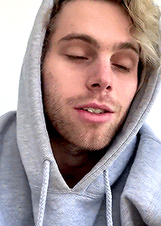
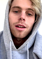

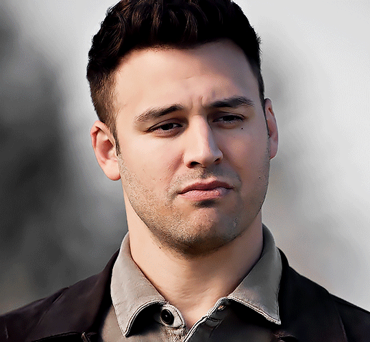
a sleepy babie (✿◠‿◠)
#5sos#5sosedit#5sosdaily#luke hemmings#michael clifford#ashton irwin#calum hood#mine*#i was too lazy to do gradient text#but look at this tiny lil angel#i love him so much
470 notes
·
View notes
Note
Hey Vincent, what would you do if Axel started crying?
" Well, I wouldn't care, obviously! Why would you ask such a foolish question? That boy means nothing to me! ...but...if I could do something about why he's crying then I'd do anything in my power to stop it, just to make him stop of course! "
#maybe two wrong do make a right... ;; floating bullets#don't stop dancin till the curtain calls! ;; Vincent#// mom gave me her old Mac so I decided to try out gradient text!#its only done on computer so don't get used to it lawls#only for times when I'm too lazy to use my phone so#hope it works lol
4 notes
·
View notes
Text
Ah, I forgot tumblrs new horrible dash doesn’t show the block quote text anymore which was a caption type I liked to use... :/
#tbd#the captions on my screens i just posed are now very underwhelimg#i wanted to do gradient text but the site i normally used was freaking out and i was too lazy to look up another one#oh well
5 notes
·
View notes
Last Seen Blogs