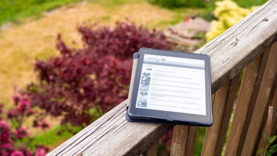
#i will not crop the image properly this isn't the time for that. i want answers.
Text
someone sent in this ask and I spent literal hours putting together this tutorial but then it wouldn't let me post it and when I went back into my inbox the ask was gone?? good thing I copy and pasted it, so here it is in its own post
I'm not sure if this will work with programs other than photoshop, but this is how I do it. I know @shinobi-bacon has a tutorial here on how they do it which is pretty different from the way I do it, so if my tutorial is confusing maybe theirs will click with you better lmao. I stole the greenscreen idea from them anyway
SO FIRST, you want your villager on a green screen background. to do this, go to harv's island and use a custom pattern to make the walls and floors bright green. If the villager you're using has green in their design, you'll have to pick a different colour that isn't in their design, but for most villagers green is fine.
if your villager has every colour on them like pietro or stiches then rip you're gonna have to do some manual editing frame by frame. try to choose a colour that doesn't touch the edges of their silhouette too much in that case because it'll make life easier for you
so once you have them in green purgatory, record them doing their emote or whatever. I just use the built-in screen record function that the switch has. press and hold this button to record the last 30 seconds that your switch displayed:

next send that video to your computer and trim off the start of the video so it starts right before a recognizable part of the animation. for this emote I cut it off right before the blink. if you have a slow computer, you'll probably want to trim the end off too so the video is only a little bit longer than one full animation loop
(you can use the video editing software of your preference, I just use quick time player Edit -> Trim)
okay time for photoshop. go File -> Import -> Video Frames to Layers
for "range to import" select "from beginning to end" (or you could skip the last step about trimming the video and select a range here, but I find it kind of finicky), and make sure "make frame animation" is checked
once imported, if it doesn't pop up on it's own, go Window -> Timeline to get your animation at the bottom

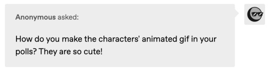
click through those frames at the bottom until you find an easily recognizable frame (I chose the first frame where her eyes are closed) and delete all the frames before it. in the layers panel, the layer from the frame you've selected should be the only one turned on. delete all the layers below it
now go through the frames to find the next identical frame. this is where the animation loops. delete that frame and all the frames after it, as well as all of their corresponding layers (note in the picture, frame 121 is selected, and it's exactly the same as the frame from the start of the animation)

hit the play button on the bottom left to double check that it loops properly
next, make sure both THE FIRST FRAME AND BOTTOM LAYER are selected, and crop and reduce the image to your desired size. you can do this step later if you want, it's just that doing it now will reduce the load on your computer and make it run a bit faster. just as long as the first frame and bottom layer are selected, you can do this at any time
SAVE HERE because if you mess up this next part it's a pain to fix, but it's easy to quit and start over if need be
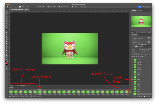
now it's time for my best friend the actions panel !! say hi actions panel !! (Window -> Actions). what the actions panel does is record your steps so you can quickly automate repetitive tasks.
in the actions panel, click the folder and name it whatever you want
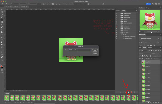
then click the little plus and name that whatever you want and hit record. You'll see the dot turn red to indicate that your actions are now being recorded
now with the BOTTOM LAYER AND FIRST FRAME selected (ignore that I have the wrong layer selected in the pictures, I fixed it after), go to Select -> Colour Range

click on a part of the canvas that would be green

shift+click on the rest of the green background and adjust the fuzziness until just the character's silhouette remains
hit OK, now the background should be selected. go Select -> Inverse so that the character is selected, and click on layer mask.
click the next frame button (you MUST click the button, not the actual frame. you need the recording to recognize "go to next frame" and not "select frame 2"),
then keyboard shortcut option + ] to select the next layer up (again, you MUST use the shortcut so it knows to move up one layer and not just "select layer 2"),
and then stop recording.
now just repeatedly click the play button and it will do all those steps we just did for each frame :)

this part is usually where it gets messed up for me. if it did something weird like duplicate the same frame or layer your animation over a static frame, just quit and reopen that save I told you to make earlier. the action recording you just made will still be there when you reopen photoshop, so just select the first frame and bottom layer and repeatedly hit play again. if it STILL doesn't work, you probably did something wrong
the recording is now saved in photoshop forever until you delete it, so you can reuse the recording for other gifs! but if they use a different colour background, you'll need to make a new recording (you can see I have separate ones for blue and purple screens). also if you were working with one of those colourful villagers and parts got masked out that shouldn't have been, you'll have to go frame by frame and manually fix them. that's why we masked out the background instead of deleting it.
now it's time to make it into a gif! go File -> Export -> Save for Web. make sure Matte is set to "none" so you don't get those weird white flecks. colours and dither you want as high as they can go, but you can lower them if you need to make the file smaller (though I'd recommend resizing the image smaller first). the bottom left shows your file size. currently as of January 2024, tumblr allows gifs of up to 10MB
and there ya go! gif! :)
61 notes
·
View notes
Note
any tips on making moodboards? I been trying & am not very good lol
*cracks knuckles* boy oh boy do I have some tips! or more like a walkthrough i guess?
The first step is to find a good app. I've found InShot to be simple to use (for photos, collages, and videos.) It's available on both android and apple, and while there is a paid version [which takes away ads, gives a few bonus filters, and removes the watermark from video files,] I've found it works just as well to use the paid version. It allows for many different layouts and canvas sizes, and up to nine images.
Next, find images! Think about what kind of moodboard you want to make, and think of some things that are iconic for it. For example, a Wonderland themed moodboard might include clocks and mushrooms and teacups, while a Rapunzel themed moodboard might include flower crowns and chalk drawings. I've found the best way to find an image to use is to google "[thing] aesthetic" or "[color] [thing] aesthetic." I've also found it can give the eye a nice break to include textures, like "[color] crochet blanket texture" or "wooden plank texture aesthetic." It gives your moodboards an almost palpable feel when put together properly.
Once you've found all the images you need, compile them into one image using the collage function on the app. Be sure to pick a layout and size you like. A basic 3 by 3 square is typical, but you can expand beyond that! Some layouts might even let you make some images cut off on the diagonal, or make one image larger than another. Also, this isn't insta; there's no law saying your moodboards have to be square- you could even make them the right size for a phone/computer wallpaper! Make sure to use the in-app crop feature to custom crop them so they're focused on exactly the part of the image you want them to be on. It also helps to rearrange images with a little symmetry (balancing similar colors, shapes, or patterns in opposite corners, thematic elements on opposite sides, ext.)
Next, edit each image. Yes, all of them. Yes, individually. No, don't just slap a filter on it. Trust me, this is so worth it! Here's a before and after of a moodboard's editing phase:


Find whatever "adjust" button your application uses (on inshot it just says "adjust)" and then tap the individual image. Play around with the sliders until you get the look you want for it. This is probably the most time-consuming part of the process, but trust me, it's worth it! The unique, custom filtering of each image will make a difference.
I recommend playing around with the sliders until you find the ones you feel most comfortable with. I tend to use sharpen, vignette (VERY sparingly!) hue, saturation, tint (usually just for green or purple moodboards) warmth (especially for red, orange, or blue moodboards,) contrast, and lightness.
Once you've edited all the images in your moodboard, tap "save" to download it.
Now, most people would be finished right now, but not us! One of my top secrets to making moodboards is, once you've made your moodboard, edit the whole entire thing together- again, using the adjust sliders instead of filters. Editing the whole thing at once adds this rich, uniform feel to it, making it one collage instead of a bunch of images. As an example, here's a moodboard I've made, before and after the bonus filtering:
Another thing I wanna say: whether you're posting on tumblr, insta, or pinterest (or all three, as I do, because I have too much free time,) you can always add alt text! Accessibility should be the standard, and when you add alt text, blind/vision impaired people who use screenreaders can know what your moodboard's about! If you don't know what to write in the alt text box, click the "alt" button on the above images, and you can read the description I used and base it off that!
Lastly, have fun! If moodboards aren't fun for you, don't feel pressured to make them! If you get a request for one you don't want to make, you're totally cool to deny it. Have a blast, babe!
#kazzy's moodboards#kazzy's guide to life#digital editing#moodboards#tutorials#tricks and tips#how to make a moodboard#aesthetic
30 notes
·
View notes
Text
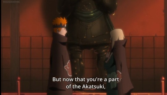
I'm going to go off about some random filler episode that's supposedly at least somewhat Deidara centric, because...????
Shippuden ep 457 "Partners"
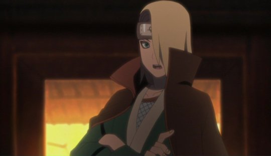
Right off the bat. Deidara's voice is....so deep. I was a little surprised because I haven't properly heard it in so long
(my timestamps are broken so...it's not exact.)
3:03 his height difference with Pein is surprising... You'd never really notice how short he is unless you looked into it. Really, Deidara has quite the aura.

4:04 Although I LOVE his half up half down hairstyle, I also loved his low ponytail. Realistically, it doesn't make sense for him to just switch up his style like that, he coulda kept it for a little longer, you know?...but they don't really care, I'd think so. (but for the fact that we see him tying his hair up, which is pretty pretty, it's forgivable you know)
(Timestamp inexact) For a few seconds in the overhead frame where they overlook the sand disc, I notice that Deidara is now wearing his socks. This is set in the past, so Dei wore beige "khakis" and sandals instead of the classic dark desaturated blue pants with matching "ninja shoes" with those.... Socks that have a stripe going OVER the shoe. So in this shot, he's supposed to be wearing his old clothes. It's not like he could just go "Hey wait here Danna, I'm going to go change my pants." (Which is weird and out of character, I should also mention that he already calls Sasori "Danna" despite having met him just today, which means Sasori has done NOTHING to earn Deidara's respect just yet. The disgrace.)
Also, Why'd they send the new kid out for the important mission of "take down the rogue member of our group"? To be fair, Dei has spark. Power. And they know that, but...? Oh, gee. It's a filler episode...

Somewhere around 5:20 Deidara opened up his cloak to reach out for clay. There are so many errors in these few frames? First of all, his nails ARE NOT supposed to be painted black yet! Why, did they just stop along the road, halting their important mission to get his nails done? Ludicrous. My attention is pointed to his clay pouch since he was reaching for that, and the chain dangling between said pouch and the belt is missing. At least they remembered that he had only one pouch on his left side at the time. He still has the bottom half of his cute kimono jacket but... It's that dark, desaturated blue like his new outfit. And he has the crop top and mesh undershirt above the belt now so HUH????? They didn't forget his new, shiny ring but they did forget the consistency of his clothing and... It's just kinda sad. Feels bad for the animators.
I should also mention that within the frame, his front hair fwips and flows, exposing his other eye sometimes. Though there isn't anything drawn there, which is fine enough, but in the next few frames when he turned to look at Sasori to his right, Deidara SUDDENLY has his eye scope even though at that point, he was fresh in and probably didn't develop it yet. (Okay but I kinda found it endearing how enthusiastic he was to perform his art.)

Somewhere in 5:30 something, Deidara's face is a lil derpy which is cute
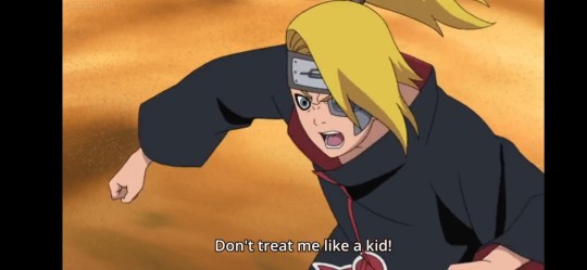
Orochimaru appears. Knows Deidara immediately, calls him a kid which Deidara's opposes to. Look...orochi is like... A grandpa compared to him, so, that's fair enough to say, isn't it?


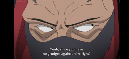
Sasori sent Deidara to go lookout, which Deidara looked annoyed about. Sasori said that Deidara, unless he had any grudges, wouldn't have any reason to fight the snake man. Which, fair. At that point, he probably held nothing against...but he looked and sounded miffed about it. Maybe just because he wants to preform his art and not because of a mysterious grudge? I don't know. This is a filler.
...well crap I ran out of image slots. Here's to hoping your imagination still works because I AM NOT DONE!
Sasori is fighting using a dead guy's corpse, Orochi summons said dead guy from the grave, Deidara looks somehow cute looking down from above. But he's also supposed to be handsome...hmmph.
Dang. Feels bad for the third Kazekage over there.
NOOO THE IRON SAND RAINED UP AT DEI AND ended up destroying the wing of his ride somehow...? He's coming crashing down.... Poor guy.
9:00 Deidara is raining explosives! Not much to comment.
In the subsequent scene, he's descending FAST into the ground. Which means you can catch his eye scope EVEN IF HES NOT SUPPOSED TO HAVE IT YET
He's...getting a nice chance to shine, even if it's futile. Go, go Dei.
"After you two die, I'll resurrect you both in the same way."
...
Well...not you though, snake.
Gee, the Kazekage really has it rough being Sasori's puppet and Orochimaru's pawn at the same time.
5:48 something Dei's flock of creations are being sent after Orochimaru www, he gets to have his scene and his signature line is said! "Art is... An explosion!" And sounds so enthusiastic too!~ so glad he's happy here, blowing up the sand disc thing....
...though there is one thing to mention. And it's that his ring, though on the correct hand and finger, is on the upper part of his finger just under the nail for some reason.
Man, that explosion was so dramatic.
Heh, everyone's having a holographic zoom meeting. No comment here... Well, one. Deidara. He's very cute there.
Oh. Second half. Hidan's there. I find it funny how he has a modern day jacket as his original fit... Either that or he hasn't got a top on. Inconsistencies. I much prefer the jacket though.
Now....many a minutes later. 18:55. Deidara's there, fleeting cherry blossoms. Deidara's doing his thing, performing his art. He blows up a castle! He looks very happy, he's in his element, he's where he's supposed to be! I don't know what art makes him feel like...but it seems to be good.
Dei... always so flashy.
There isn't Deidara anymore, so, I'm signing out.
#this is just a filler episode but still#Deidara#naruto shippuden#akatsuki#i wrote this in four something in the moening im sorry#feels bad for the animators#at the very least#Deidara's good looking#never pause naruto you might just end up with an inconsistent character design#comeon. share your weird episode nitpicks too...or not?
29 notes
·
View notes
Note
Hey! In your recent post about Noè and asexuality, you mentioned there being more evidence displaying that Vanitas finds Noè attractive than vice versa. As soon as I read it, I found myself agreeing but when I stopped to think about it I couldn't recall a panel that really suggests that, off the top of my head. This also isn't a view I have seen a lot of other vnc fans talk about so I'd really appreciate if you could expand on it / unpack it a bit more. Anyway, love your blog!

[Image Description: An anonymous tumblr ask. It reads: "Hi! I have just recently found your Tumblr blog and have been loving all your analyses. I only found out about the vnc manga a few months ago and some of your posts have been so useful in explaining some deeper themes/subtext that I was confused about. I was reading your ace Noé post and saw that you mentioned that there is more canon evidence that supports Vanitas finding Noé attractive than the other way around. I was hoping you could expand on this?" End ID.]
First of all, thank you both so much for your kind words! It makes me so genuinely happy to hear that y'all like what I post.
And for anyone curious, here's the ace Noé post that both anons mention.
Now as for your question, that's kind of a difficult one. I said that there's more evidence for Vanitas being attracted to Noé than vice versa (in terms of traditional physical attraction, not blood stuff), and I do stand by that. However, Noé has shown pretty much no physical attraction to Vanitas in non-blood contexts, and more than zero doesn't necessarily mean a lot. This whole post is going to be tiny details and subtext, because "Vanitas is attracted to Noé" is definitely not a major or certain thing.
That said, I do think you can make an argument for the idea.
For starters, let's go with the classic Vanoé bait panel: Vanitas's reaction to Noé's excitement over Paris.

Vanitas is at his most performative in the early chapters of VnC, and though he does sometimes act borderline flirtatious (like when he gets up in Noé's personal space to poke him in the chest), I'm not inclined to give those moments actual weight. It's all too much a part of Vanitas's act to be good evidence for real feelings of attraction.
However, in this particular scene, that argument doesn't hold. Vanitas will play up his flirty persona in order to change the subject when he gets uncomfortable, but there's no reason for him to do that here. There's no need for him to change the subject, and Noé's not paying him any attention. His expression here is just his genuine reaction, not part of a performance made to influence Noé, and it's such a fond reaction!
Vanitas has only just met Noé, but here he is so softly entertained by Noé's glee. It speaks to an immediate draw to and enjoyment of Noé on Vanitas's part, and that doesn't have to mean romantic attraction, but it certainly fits well with that argument. Noé is extremely cute here, and Vanitas likes that about him. Make of that what you will.
Even more than that scene, though I think the most explicit moment of Vanitas's attraction is one of his reactions in the bell tower.
In the middle of Noé's speech to Vanitas in chapter 11, he smiles at him properly for the first time. This is also when we the audience first see Noé smile for the outside of a flashback, so you know that that moment is important both for Noé and to Mochijun. And it also makes quite an impact on Vanitas.
Noé tells Vanitas that he wants to stick with him and see out his "salvation" mission, and then there's an extra beat, a panel for just Noé's smile, and only then do we see Vanitas's reaction to all this.

He's so struck! Noé has a huge effect on Vanitas in this moment, even before he's finished his whole speech. His words have a big part of it, of course they do, but the way the page is paced (with an extra, albeit cropped panel for that smile) makes me think that Noé's appearance itself is also pretty key for provoking that reaction. If the way Noé looks while smiling didn't need extra emphasis, Mochijun could've given him the smile in the panel above these where he's speaking, rather than give it its own shot.
Noé looks at Vanitas like this for the first time, and Vanitas's eyes go wide with awe. Because Noé is a goddamned vision. It's even more apparent in the animated version, because the animators weren't bound by paneling constraints and could show us Noé's whole face.

I have had irl lesbian friends tell me how attractive they find Noé in this moment lmao. He's just pretty. So I don't think it's unreasonable to say that Vanitas, in this moment, is affected by how pretty Noé is. Absolutely anyone would be.
It isn't irrefutable proof that he's in love with or generally lusting after the guy, but it is a good argument for a moment of appearance-based attraction, which is something we haven't really seen from Noé toward Vanitas. (We've had Noé staring at him in awe when he does his Book stuff, but never an "oh shit he's hot" moment like this one).
There might be other small moments as well, but these are just the two big ones that I can remember with out combing back through the manga in detail. And though there's no certainty here, these are a pair of scenes that can be read as Vanitas being very struck by Noé's appearance in a way that I don't think we've gotten in reverse.
Any positive number is still more than zero, lmao.
#the only moment I can think where Noé really gets Struck by Vanitas's appearance is that panel of him staring up in awe in Gévaudan#but that has more to do with the book and the magic than vani being pretty#and honestly Noé not showing attraction in the traditional way despite his Thing about Vanitas just feels right#it's another facet of his big aspec energy#oh and also. y'all should let me know if you think of any more oh no he's hot moments that I missed#vnc#vanitas no carte#the case study of vanitas#vanoé#the vanoé agenda#vanitas my beloved#english major hours#ask#anon#I think this is the first time I've gotten two anons asking about the exact same topic#ID in alt text
68 notes
·
View notes
Text
I'm so fucking sick of the lightbox preview.
On the app, you have to open a photo in lightbox in order to download its original size. If you don't, you get some weird, random resized version that will be shrunken and might not be clear.
However, loading the lightbox is risky. Half the time (literally), it doesn't load. Sometimes, this will go in spurts; just now, I tried to load the same photo in lightbox twenty times and only got a black screen. I had to reload the app twice to get the lightbox to work. Conversely, if the lightbox does work, there's a chance that the app won't return to normal when you exit out of it; it will instead be black, won't load anything, and won't respond at all, so you'll have to close out of the app and reload. This, of course, resets your feed (because we can't have nice things like FEEDS ONLY RESETTING ON COMMAND), which can mean scrolling through hundreds of posts (depending on how many blogs you follow, how frequently they post, and how often you check) to get to where you were.
Some photos won't load properly at all on the app. I don't know why.
On desktop, the issue is similar. If you want to download a photo, you have to open it in its own tab. However, you also have to get it to load in such a way that it isn't in Tumblr's (relatively recent) photo display tab style, which will only allow you to download a shrunken, often distorted version of the photo. It used to be that you could open the photo in a new tab without a problem.
"But art theft!" Bullshit. I have absolutely no sympathy for this. First, if you're worried about your art getting stolen, don't post it to social media that doesn't have strict protections for such. And 90% of the photos on here aren't the blogger's art. They're selfies or porn or memes or otherwise taken from other websites. More importantly, if you want to, say, throw an image into a reverse image search (Yandex, TinEye, or Google Images [using the proper exploits to the latter anymore]) to find the original, you're likely barking up the wrong tree. Yandex no longer allows you to link directly to a Tumblr photo when it's in the lightbox on desktop. The resized versions often won't get IDed properly because they're screwed up somehow, while the ones that are direct file transfers of the original upload very well might. Plenty of "artwork" (though not often called such outright, it's presented as it) on here is putting someone else's full-color photos of people into grayscale (another peeve of mine) or cropping photos, almost always without credit, neither in a way that does anything meaningful to the original itself.
You should be able to tap (on the app) or right click (on desktop) a photo as it appears in your feed and download the original uploaded version directly from Tumblr. If you're worried about people stealing your art, you should have an option to disable this for your blog's original posts.
2 notes
·
View notes
Text
I've made something like this before so I'll redo it
---------
when it comes to creating stimboards, it's a pretty easy process to do
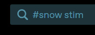
I usually research stims on tumblr, where I search it up like this
sometimes I'll write gif instead of stim if I can't find anything which unfortunately can lead you to seeing fanfics and unrelated things so it's difficult

when I need to find specific colours, I write another hashtag of said colour which helps narrow down but sometimes it doesn't work
sometimes searching up stims can lead you to finding stimboards unrelated to the search or really questionable stimboards/stimblogs which I've found a bunch of times
---------
if on pc, I would recommend opening two tabs. one for the stimboard you're working on while the other is for all the research you'll do to get the gifs
I will also recommend saving your board as a draft so you don't lose credits or even the entire board if you're on the mobile app since the app can easily send you to other posts
for getting the gifs onto the board on pc, drag the image over or you can copy paste the gif link. sometimes the gifs don't work where it either didn't register properly [link is visible, just keep adding it over until it becomes a gif] while other times it becomes something else which you can't fix
dragging around the gifs is simple, you can either choose to drag it via the top left button or by grabbing the image directly then moving it to the correct spot

---------
personally I avoid using non-official art without permission if it isn't my own art. if you do want to use fanart, I would recommend asking the user first and also properly crediting. I usually will credit the post that I found it on instead of the user so that people can see the official post
for image sizes, I put them at 500 x 500 or smaller if I need to resize them. cropping is easier since I just choose the main focus. I use ezgif which can help you recolour gifs, crop, resize and more
---------
if anyone has any questions, you're free to ask me but I can't promise I'll have a correct answer to help you in making stimboards
0 notes
Text
someone tell me what the blurred dong looking ad is on this website since i ain't clickin it

#only clicking if its sexy russian ladies in my area so jot that down fbi man thats spying on me#shut up migs#and no#i will not crop the image properly this isn't the time for that. i want answers.
2 notes
·
View notes
Text
Hey, so I want to start some pride discourse that I feel really passionate about but haven't seen anyone discussing. But I really want to talk about how messed up taking photos at pride can be.
So this came to the front of my mind because my city had a belated pride this weekend. Now while I did have fun and enjoyed supporting local queer businesses, this place had a lot of stuff that made me give it the side-eye. A rainbow covered cop car was leading the parade, and a bunch of corporations and an honest to god church had stalls there. So needless to say, it was an ill-informed event. But still, beggars can't be choosers.
However, the thing that really really peeved me was the sheer number of cameras there. Not just people taking pictures on their phones though that did irk me (I'll put some guidelines for doing that ethically later on) but honest to god professional photographers and camera operators clearly working for professional organizations that will then be posted publicly for all the world to see.
In case the issue isn't clear, these photographs are going to out a lot of people and being outed can be dangerous as shit. Now I know some people may respond to that with "well if you're at a pride parade, doesn't that mean you must be out?" To which my answer short answer is no, and my long answer is no, and I don't think you properly understand what the meaning of closeted is.
Everyone is only out relatively. Your family might know, but you might have one friend you can't quite bring yourself to tell. Your parents might know, but it might not quite be worth the mental energy to tell your grandparents. But much much more importantly, you might be out socially but not out to your fucking employer. Every time you meet a new person as a queer person, you have to come out to them. If those photos go public, everyone can fucking see you and find out you were at pride. Everyone. School, college, parents, grandparents, friends, family, acquaintances, employers past, present, and future. There are people for whom that would not be an issue, but there are people for whom it is. I would say I am now in the former category but the last time I attended this parade I was in the latter and I know there will be other people who were in that category in that parade
I also anticipated the response that by being at pride, any of those people could see you anyway so who cares, but there is a big difference between perhaps bumping into someone at pride, a thing you can then speak to them about and explain your presence there either truthfully or not depending on the context, and there being a permanent public record of your attendance for all to see that was taken without your consent or often knowledge. Those things are worlds apart.
The worst example of this I saw, was one of the present cops, in full uniform, filming the entire parade and everyone in it. He has a pretty extensive record of most of the queer people and allies in my city, including me and I hope people realise how dangerous that could be.
So that's the issue, here's what I recommend people do:
If you are attending pride and taking photos:
Unless only people you know and who have consented to you posting the image are visible in the foreground and background, do not post the image publicly. Don't put it on Facebook, don't put it on Instagram, definitely don't put it on Twitter, you could maybe risk Snapchat but I don't recommend it. Send it to friends in private messages, keep it on your phone as a personal memory but don't fucking post it.
If you absolutely must post the photos, make sure anyone who isn't someone you know and asked for consent to photograph is obscured or cropped out.
Now for people who are social media managers of companies and organisations that want to attend pride. I will tell you about the two social media accounts I ended up on after pride.
The first was a charity supporting elderly people. They had one representative, an older woman whose daughter came out and as a result, she became a really enthusiastic ally. She was lovely. She noticed my friend group didn't have many flags (it was everyone but my first pride) and gave us some of the ones her organisation had printed with their logo on. We waved them during the parade and talked with her, at the end she asked us all if we were ok having our photos taken and posted on their social media. We all consented and she did exactly that.
The second was our local university. They took several random photos of crowds without talking to a single person they photographed. I can't tell you who it was that attended pride because, despite their promotional materials being covered in my friends and my faces, I didn't speak to a single person representing them.
Guess which acted more ethically. Guess.
So your advice as someone attending pride for corporate PR is:
For the love of God either only take photos of organisation members, or ask the people whose face and identity you are using for fucking clout.
Finally, for those of you who are attending pride but don't want your photo taken, or people who want to help out others who might be in that position, I offer a skill I learnt long ago.
When I was about 15, my high school had a documentary crew in residence for about 4 months, specifically targeting my year group. I do not recommend it, it was a massive massive warping of reality to fit a "kids these days don't read" message that was blatantly false. One of the main characters of the documentary sexually assaulted my friend, a thing the school knew about but let him star anyway. But the reason I bring this up is that as an awkward 15-year-old, I didn't want to have anyone look at me, much less film me and put me on national TV. So I single-handedly ruined so much of their footage with my little trick and didn't appear in a single frame. Producers Hate Me!
Here is the trick:
Whenever you are in frame, flip off the camera.
Whenever you see a camera aimed near you, hold up a middle finger and ruin their fucking shot, until the camera goes down or you are out of frame.
If they catch it, they cant use the photo and even if they don't catch you, you will have ruined their promotional footage, showing you're frustrated with them, their lack of concern for your privacy and your general contempt for their organisation using queer people for clout while actively endangering us. Which is a small victory but a petty one. It isn't going to solve everything. But it's what I offer you.
It won't solve the cop filming issue but it will prevent them from using queer people as copaganda. The only way to stop the actual threat is to get rid of cops and pride and ideally, getting rid of cops in general.
If people have other recommendations please add them. I think this is a really underrepresented problem and I want to see more people discussing it.
#pride#lgbtq#lgbtq community#lgbtqplus#lgbt#lgbtqia#lgbtqiia+#lgbtqipa#happy pride 🌈#pride disk horse#pride discourse#privacy#queer#copaganda#TW:sexual assault mention#closeted#outing#TW:outing#corporate pride#discourse#photography#online privacy#photos at pride
219 notes
·
View notes
Note
how do you make your webs, like finding so much information that pertains to one idea? do you save every piece of media that you come across that speaks to you, or do you have a particular method of searching?
Good question! I only started this blog a couple months ago, so even though I have been trying to document media I come across now, it'll take a while for my own 'archive' to be full enough to reference - I actually use the goodreads quote function a lot (although, beware, there is a lot of rubbish there, a la Cassandra Clare and JK Rowling) as things are pretty well tagged to an extent, and I use tumblr to search the 'web weaving' tag for ideas relating to what I want - for example, I found some pieces of my most recent web on 'the watcher' aka male fantasies by searching 'web weaving the male gaze' and scrolling down to see if I saw anything I felt would fit. I'll also go manually through my own 'words' tag on my main if I vaguely remember something relevant, and I do occasionally go through other, much older (and better) web weaving blogs - here I will plug the incredible @luthienne whose incredible weaves and archive actually made me decide I wanted to make my own web weaving sideblog rather than just stick to keeping it all mixed into my main, very crowded blog - using tumblr's (incredibly temperamental) search function with relevant key words.
The majority of my webs do come from my own (dubious) memory, such as the Only Ever Yours quote from 'the watcher', which I read when I was seventeen or so and stuck with me, or the Dead Like Me screencaps in the 'grief in tv shows and film' web where Clancy talks about thinking he had more time with George. But often I'll remember a quote, but not remember where it's from, and that's where these other search functions become particularly helpful. If you want a part of a book, archive.org is a free resource full of books scanned in by libraries that you can borrow for free online for anywhere between an hour and two weeks, and it also has a search function where you can type the part you're looking for into the search bar and it'll tell you exactly which page it's on (and I'd actually recommend archive.org for reading full stop, whether its for work or leisure, it's an amazing resource and helped me get through my dissertation). Sometimes this search function doesn't work, or it's awkwardly spaced out or some other issue, which is when I enlist my good friend Paint 3D and screenshot and crop, highlight, underline and otherwise edit it until it looks how I want it to. Similarly, with song lyrics, lyrics.com (despite being one of the worst formatted sites I've ever seen) does a pretty good job of matching the lyrics you remember to a song, which can then be searched elsewhere (I'm partial to genius.com, but once you have a name and an artist, you can find lyrics in dozens of places) for a cleaner presentation.
I also use TinEye, a reverse image search extension to properly source what I use; there's nothing worse than using an image or quote without proper credit, and that allows you to look for the earliest use of an image that isn't from pinterest/weheartit. A good example is this image which I found on a grunge aesthetic board - I popped it in TinEye (google image reverse search is alright, but it doesn't give you dates and only really works for famous artists/artwork, everything else it uses from a 'most similar' basis rather than an exact match) and it came back one weheartit, one flickr favourites page, one pinterest board, and a twitter. I clicked on the twitter, and unfortunately it had been deleted; however, it gave me the twitter name ezoreno in the now broken link, which I put on the image after a quick scour to double check somebody under the same name was not on tumblr or instagram or some other social media that I could link to instead.
Lastly, I do use 'ranking' lists if I'm unfamiliar with a topic - although I used several shows from my own memory for the 'grief in tv shows and film' web, there are several I used despite never seeing the shows - Charmed, Buffy the Vampire Slayer and Wandavision were all shows I've never watched but had seen specific moments referred to in a Buzzfeed article, which itself was ripped from a reddit thread. One of the replies I got on it, funnily enough, was saying how The Walking Dead should have been included - they're probably right, but as I responded, I haven't seen The Walking Dead and in my search didn't come across any specific moment mentioned that I could've found (episode numbers and transcripts are great for locating where in the episode to cut to).
In short, I research and borrow and cut and copy; in other words, I cheat. Hopefully this demystifies the process a bit (and stops me feeling like I'm tricking people into thinking I'm smart/at all organised).
28 notes
·
View notes
Note
hi sameera! first of all: you're one of my favorite gifmakers!! i love your blog and your content. for me, you're like the queen of big gifs <3 i don't want to bother you, but how do you make your gifs (like these ones: /post/673325900931235840/natasha-romanoff-in-iron-man-2-2010) under 10mb? everytime i try to make gifs in sizes like this, they pass the limit. is there any tips on how to make it work? thank you in advance!
hey, and thank you so much! you're too kind 🥺
so there are quite a lot of things you can do in ps to get big gifs with 50-60 frames under 10 mb (under the cut):
footage quality - i've found that using 2160p/4k videos ultimately allow for more frames in a 10 mb gif compared to 1080p. as long as you use 4k footage when it's available + properly resize, crop, sharpen and export the gif, you should be able to get a decent gif that doesn't go over the limit.
gifmaking order - to get the best quality possible, you should always make a gif following this sequence: crop > change image size > sharpen > color > export
sharpening settings - this will maintain the quality of the gif and imo it does contribute to the eventual size. these are my sharpening settings:
coloring - coloring is also super important because overusing certain layers (i.e. brightness, exposure, vibrance/saturation) can make the gif size increase to the point where it goes over the limit. it's important to not make your gif too bright - use a curves layer to decrease lighting, and then use a brightness layer to slightly enhance the gif so it isn't too dark.
export settings - this will increase the gif's quality while also making it less likely to go too far over the limit. these are the settings i use:
so let's say you follow all of these steps, and the gif is at 10.1 mb or 10.5 mb or even 15 mb - this does happen from time to time and it can be super frustrating. here's what you can do to reduce a gif's size:
delete some frames - first, try to delete one or two frames and export again to see if it's under 10 mb. even if it's at 9.91 mb or something, it's good to go! if the gif is in the 15 mb range when you initially export, you may have to delete 10-20 frames to get it under the limit.
lower brightness/curves/exposure - if you don't want to delete any more frames and the gif is only at 10.1 mb (just barely over the limit), you can try lowering your brightness/curves/exposure layers; this can help get the gifs over the limit, but it's not always guaranteed to work in my experience.
that's everything i can think of atm! i really do hope this helps you, but pls feel free to reach out again if you need me to clarify or if you have any additional questions :)
6 notes
·
View notes
Text
Foleso - Scripting The Last Act
Foleso is a visual novel developer and the person who worked on the scripting for the Snowhaven visual novels My Sweet Confession and our upcoming title The Last Act.
They gave us a peek into their work and how they organize and plan scripting for such large projects.
This will also provide a bit of behind-the-scenes for the ongoing development of The Last Act!
_________________________________________________________
I'm Foleso, a scripter for two Snowhaven Studios games: My Sweet Confession, and now The Last Act!
I'm used to working with either layered characters or characters with fewer expressions, so working with the massive number of unique expressions in The Last Act was a new challenge for me. Most characters have around 28-50 expressions, so I needed to find a way to remember all of them to use them properly.
That's why I made an expression sheet to keep track of all of them!
The method I show you below only really works if you have less than ten characters and each of them have over thirty expressions, since it takes quite a bit of time per character, and isn't useful if there aren't many expressions to track at once. However, this method can be adapted to work in those situations as well.
I used Photoshop CC for this, but most graphic programs with a Contact Sheet option should be able to handle this.
Prep the images
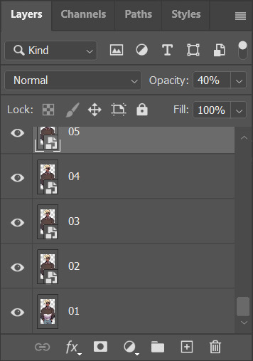
First, name all the images as numbers.
Open them all up in your graphic program of choice as layers. In Photoshop, I opened 01.PNG and drag-n-dropped the rest of the images into the Layer Panel. Photoshop automatically made them layers.
Making & Using the expression sheet
Next, crop only the face of the character. By doing this, all the layers will also be cropped automatically.
Select all the layers in the Layer Panel. Right-click and select "Quick Export as .PNG". Choose an empty folder to store all the face images. This may take some time.
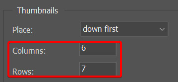
Next, go to File > Automate > Contact Sheet II
A bunch of options should pop up. Most of these can remain default, but make sure the row & column values multiply to be greater than the total number of expressions you have.
You can also change the "down first" option if you prefer to have the numbers going across than up & down.
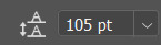
Finally, go through and add the numbers. I did this by adjusting the line height value so it took less than 10 seconds to get all the numbers in.
Here's the final result!
While scripting, I have the expression sheet on the right, pinned so I can use the arrow keys to quickly cycle through the character I need the expressions for at the moment.

Make sure you follow Foleso over on Twitter to stay up to date on all their work!
We hope you enjoyed this look into the scripting process behind The Last Act.
If you want to stay up to date on all Snowhaven Studios news, follow us on Twitter!
#visual novel#visual novel developer#scripting#indie games#indie dev#devlog#game dev blog#game dev stuff#game development
0 notes
Text
Done!
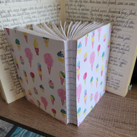
🎶Isn't she lovely🎵
I love this cover. It's so stinking cheerful, and I think the frames already inked onto the pages is a massive boost.
I'm unfortunately going to have to stop using the grid paper, that aged-looking paper, because it's not helping me get my frames the right size. Even I can't tell most of the time if a frame isn't the perfect size, but it's definitely a pain to have to resize the frames when I can tell. The program I'm working in also resizes and crops the original image if it's not perfect, and of course, I'd like to have as much control over what gets cropped or warped, as possible.
This is kind of a cool binding method, but I definitely didn't take advantage like I could have--the thread is just the quilting thread I was able to get ahold of last year to make a couple masks. Maybe next time, I could paint the edges of the signatures and use some fun color of floss. I can't wait to go back to Michael's and buy another chunk of scrapbooking paper for more covers. It's going to take time for the mood podge to cure, like I keep saying. It might also be nice to build up more layers. I really love that the furniture finish seems more waterproof than the regular mod podge, so when the cover gets dirty, I can at least try to give it a wipe.
Given that this is supposed to help me type up the script, I'm hoping I can fill this rather quickly, maybe a few frames every week or so. Writing the script definitely isn't helping me color faster, but what can you do.
Depending on how fast I manage to use this sketchbook, I do want to finish using the Walmart one, but that might help me decide how many sketchbooks I'll need to make next time. I prepared two manageable/realistic print blocks, but I'm not sewing up the second because I don't have anything to cover it in. I guess I have plenty of chipboard, and I could just use some of my pinboard paisley.........but I'm thinking about playing with the coptic bonding again. I also wanted to see, if I prepare a sheet of this scrapbooking paper with the mod podge and prepare the whole book properly, can scrapbooking paper be used instead of quilting fabric or felt. I've covered a book in cardstock. Michael's has some really cool papers--some look like doilies and wouldn't that make a crazy cool cover?
While I'm at it, I could experiment with that one book binding method, it reminds me of a modern three-ring binder..............long stitch? I wonder if I could long stitch my fifteen or twenty signature sketchbooks onto seven to ten holes of plastic aida.......... I'm not currently doing anything else with it. I did have that pixel unicorn that I found and wanted to make into a cross-stitched decoration, but I haven't bought the threads 🤷♀️ and I've got more than enough to goof around with.
0 notes
Text
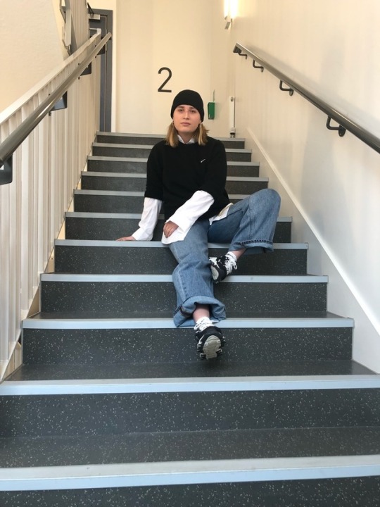
Guest Speaker: Georgia Baul - Russel & Styling Activity
Today Louise had organised for a guest speaker to come in and talk about what it’s like to be a stylist, this was a very exciting opportunity to me to properly understand what a stylist does and the process they take during every shoot. Georgia gave us some tips about styling which were very useful, I hadn't considered any of these before and she explained it’s what makes a shoot run smoothly and to your vision. For a big shoot involving lots of people she explained its key to bring visuals (how you want the hair, make-up etc) in order to fit your vision and plans, she also explained that she likes every model to bring a piece (jewellery, clothing etc) that they love. This makes the shoot more personal, rather than using any old model it creates a story for that person making the outcome more engaging to viewers. This is something I hadn't considered but I think is key, I will be making sure every model I use throughout my project has an aspect that represents them in order to tell their story better which, my project aims to do. Georgia then gave us some tips on how to approach future clients and tips on what our emails should include when emailing clients, she also mentioned loads of photographers, stylists and creative directors whose work was with looking into. This will help my research process, giving me a head start on where to look.
Georgia then set up a styling activity which I was really excited to do, this will act as a practise trial to see what works and what I need to improve on for when I start my project. She gave each group a white shirt and asked us to create three looks using just a white shirt and some fabrics and accessories provided. Georgia previously said that each shoot needs a story so I decided to make each look based on each of my friends own personal style to make the shoots more personal.
For Evie’s shoot we based it on skater style, something Evie loves and gets into. We went with layers for this look, starting with the white shirt as a base we then layered her jumper she was wearing before hand. We made the shirt loose and free to represent how skaters feel when they're on their boards, we paired it with a black beanie hat to match her jumper and a gold chain that dangled down her thighs on top of her jeans. For location we struggled to find the best lighting, we found the stairs had the best natural lighting brightening Evie and her surroundings. Although, we found that the stairs and the number 2 in the back was similar to a tower block stairs giving the image an urban inner-city vibe which I felt represented skater youth and youth in general really well. I really enjoyed this shoot and trying to get images from different angles and moving the clothing to aid this was god fun to me however, to make this shoot better I would've liked to incorporate more accessories such as bags and props such as a skateboard, cigarette packets on the floor to make the outfit come to life.
For Mani’s shoot we based it on spring/summer themes to match what her usual style is at this time. For this theme we decided to use delicate and feminine colours that would associate with floral themes and ideas which, link well to spring/summer trends. We started with the white shirt and tied it up at the bottom to expose Mani’s torso slightly, this gave it a baggy and oversized look to represent free flowing vibes S/S looks on the runway give. With the shirt being oversized the crop the tie at the bottom brought back a feminine feel to the shirt linking nicely with our theme. We then decided to make a skirt using a bit of fabric we found, with limited resources we opted for this fabric because the colour was closest to the feminine and S/S theme we had envisioned. We wrapped it around Mani and pinned it at the back and side to get the fabric to sit ruffled and layered around, we went with a warp round skirt based on the wrap round midi skirt that is on trend currently. We also incorporated a slide slit in the skirt to emphasise the summerery and feminine vibe we were going for. We also added some gold jewellery to make sure the top half of the outfit wasn't too plain. We struggled to get the skirt to sit up right on Mani, because the fabric was too heavy the clips didn't give a tight enough grip causing the skirt to become loose and hang. Overall, I’m pleased with how this look went but I feel we should photograph this kind of outfit outside to emphasise the S/S feel. Unfortunately we count do this as it was pouring with rain outside but is something I’d like to see and try next time.
For Emma’s shoot we based it on her style as well as incorporating natural cool toned colours. For this outfit we folded the shirt to make a bandeau and tied it around Emma creating a big ruffled bow at the back, we felt this went really well with Emma’s simplistic trousers she already had on. The main focus point of this outfit is the detailing at the back, we went with a simplistic theme in order to draw the immediate attention to the detailing at the back. We found that the toilets had the best aesthetic to match Emma’s outfit, the colours of the tiles matched the colours in her outfit really well. We placed her right by the mirror to make sure we wouldn't get the toilet in the shot but her reflection in the mirror made a really nice effect , we felt this drew attention to the outfit better because you can see it from two different angles. We also decided to get some shots at the bottom of the stairs to get an all white background and se how that looked, it ended up working really well. It completely gave the simplistic theme we were going for, it drew all the attention to the outfit whilst complimenting the outfit and the colours really well. Next time I would like to have more resources to ensure that the outfit isn't too simplistic although, it turned out really well and exactly how we envisioned it.

I really enjoyed the styling task set by Georgia, It was a good practise run to see what works and what doesn't in certain situations. I’m impressed with how well our group did with limited resources, It was also interesting for me to try out the photography side of this task which will be helpful during my project. I’m really grateful for the opportunity Louise provided by inviting Georgia to come and chat with us, I know feel much more confident to start my own styling project.
0 notes
Text
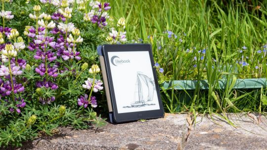
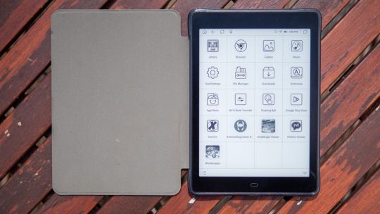
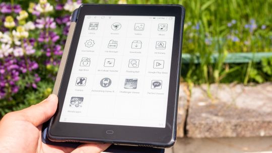
Boyue Likebook P78 Review: Huge Battery, Gorgeous Screen, and It Runs Android
Boyue Likebook P78
9.00 / 10
Read Reviews
Read More Reviews
Read More Reviews
Read More Reviews
Read More Reviews
Read More Reviews
Read More Reviews
Read More Reviews
Read More Reviews
Read More Reviews
Read More Reviews
Read More Reviews
Read More Reviews
Read More Reviews
Read More Reviews
Read More Reviews
Read More Reviews
Read More Reviews
See on amazon
If you want a high-resolution screen for crisp text and images, and demand an open Android system to read anything, the Boyue Likebook P78 is a fantastic option. Battery life and connectivity is superb, and the front-lit screen is gorgeous.
Specifications
Brand: Boyue
Screen: 7.8-inch eInk Carta panel
Resolution: 1404 x 1872 (300DPI)
Storage: 32GB, micro-SD expandable
Connectivity: USB-C, Wi-Fi, Bluetooth 5.0
Front Light: Cold and warm
OS: Customized Android 8.1
Battery: 3800mAh (5 weeks standby)
Buttons: Home, Power, Volume
Weight: 267g (9.42 oz)
Dimensions: 8mm thick
Pros
Crisp 300DPI display
Full Google Play access and open system
Incredible battery life
Cons
Interface can be sluggish, and even casual games are mostly unplayable
Speakers are of limited utility
Buy This Product
Boyue Likebook P78 amazon
Shop
// Bottom
Need an eBook reader with fantastic battery life and a high-resolution screen, but don't want to deal with a locked-down OS like the Kindle? The Boyue Likebook P78 might be exactly what you're looking for. At $260, is this the essential accessory to ride out the rest of 2021? We think so.
youtube
Who Is Boyue?
Boyue is not a household name when it comes to eReaders, not least because neither you nor I can pronounce it properly, but also because until recently, it was mostly an OEM manufacturer. That means it made the eReaders that were then branded by other companies. But why go to a middle man when you can go direct?
The Boyue Likebook P78 is its newest model, and the successor to the Likebook Mars, which we've previously recommended.
Related: Best eBook Readers of 2021
Likebook P78 Hardware
Measuring a mere 8mm thick, and weighing in at 267g, the Likebook P78 comes in any color you want, as long as that color is dark blue.
Charging and OTG features are provided by the USB-C port on the bottom edge. The power button is on the top right; while you'll also find volume controls for the built-in speakers on the right-hand side.
Why does it have speakers? The Boyue reader app features voice synthesis, for those moments when reading becomes too much effort. Simply pull up the menu, tap the read button, and it'll begin. The voice is understandable but robotic, and nowhere near the quality of Google Assistant or Alexa. I personally couldn't tolerate this for long, but the other alternative is of course to download your favorite audiobook, and just listen to it being read by a professional.
32GB of onboard storage should be plenty for a collection of even the heaviest PDFs, but if you do need more, there's a micro-SD tray on the right-hand side. However, you will need to use the included metal poker tool to remove the tray; it's not quite as easy to slot in as I'd like, but you shouldn't need to do this often.

The design is otherwise not noteworthy, but as they say: you shouldn't judge an eBook by its cover.
Optionally, you can purchase a protective case. This features a semi-rigid back, and the cover supports auto-sleep and wake feature, extending battery life even further.
Internally, the device runs a quad-core 1.4Ghz CPU, backed up by a meager 2GB RAM. You're not buying an eReader for its stunning CPU performance of course, but a reasonably good chipset does help to keep page turns snappy.
Getting Books on to The P78
Out of the box, you have quite a few options for getting books onto the Likebook P78.
The first is to use a micro-SD card. If you're upgrading from another eBook reader and already have a library of content stored there, this is probably the easiest method.
Second, if you're connected to a home Wi-Fi network, you can use the built Wi-Fi Transfer App. This only works from desktop or Android smartphones, not iOS, but seemed to be reliable during testing. Open the app, type the specified IP into your browser, then select and upload files.
Third, you can use the USB-C cable. This is by far the fastest and easiest way to get books onto the device, and the method I found myself using the most from Mac OS with the Android File Transfer utility.
Finally, with full Google Play access, you also have a store full of cloud storage providers and other file sync applications, should you already have a favorite method.
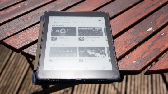
In short, you'll have no issues whatsoever getting any of your content onto the Like P78, DRM-free, and from any source.
It's All About the Screen
Perhaps one of the biggest selling points of the Likebook P78 is the high resolution on a 7.8" display, resulting in 300DPI, the highest pixel density eInk Carta panel you can get. This results in a crisper, more enjoyable, and paper-like reading experience for every type of static media you might consume on it.
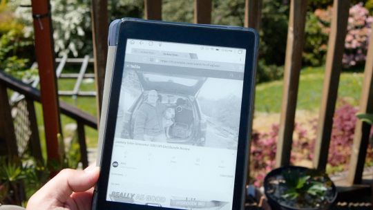
While 7.8-inches is the perfect size for novels, I did find it a little small for most PDFs. That said, the auto-crop feature ensures there's no screen wasted on margins, and the text reflow works wonders too.
For bedtime reading and other dark environments, it also features a dimmable cold and warm white LED front light. Activating the default night mode is as simple as pulling down from the top, and long holding on the bulb icon.
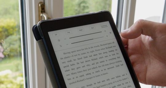
Alternatively, press once for more presets and sliders. Unlike other electronic screens, which tend to burn your eyes at night even on the lowest of brightness settings, I experienced no discomfort from the front-lit night mode.
The choice of warm or cold light is nice to have, though it's worth noting that the myth of blue light stopping you from sleeping has been thoroughly disproven.
Shockingly, there are many factors that affect your ability to sleep, none of which are the color of light your devices are emitting. Still, if you believe in that particular placebo, you'll be delighted to know you can have a very dim warm light to read by in the dark.
A2-Mode
Some apps won't run comfortably with the standard eInk display method; for those, you can enable A2-mode simply by pulling down the settings screen. This increases the refresh rate, but at the cost of resolution and contrast.
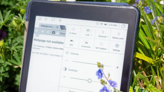
While access to the Google Play store means you can theoretically install anything, you shouldn't. Even with A2 mode active, I found a simple word game that involved dragging my finger over letters to be a little frustrating, and faster touch movements just missed letters out. It requires you to adjust your use of a touchscreen to be slow and methodical. Apps that need only single touch events should work better.
Battery Life
It's difficult to objectively evaluate the battery life of an eInk device during our standard testing period of two weeks. But suffice to say, I haven't charged it yet, despite daily use and app testing. While I could leave a YouTube video running and tell you that it lasted however many hours, I don't think that's a fair way to evaluate an eReader. The beauty of eInk is that it only uses power to update the display. The upshot is that when used as intended, battery life will not be a concern.
Featuring a 3200mAh battery, which is huge compared to similarly-sized eReaders, Boyue claims a 5-week standby time for the P78, and I've found no reason to doubt that.
Of course, you'll get the best battery life if you disable Wi-Fi, Bluetooth, and only use the Likebook P78 to read books. Games, videos, audiobooks etc will all drastically reduce the battery life.
What's Wrong With a Tablet or Phone?
You might think that in a world of ubiquitous technology at our fingertips, the market for eReaders has died out. Quite the opposite. I'm a big fan of my iPad, but for reading at night, the lowest screen brightness is still eye-wateringly bright. And for daytime use, it's pretty much useless in direct sunlight. And there's the notifications, the temptation to check Reddit, deal with those emails, or any of the other million activities that can distract you.
That's why I've been looking for an eReader: not to replace a traditional tablet, but to compliment it.
Is This The 2021 eReader for You?
Running a full Android system underneath blows the doors wide open to apps and content you simply couldn't get on other eBook readers. You won't be restricted to DRMed content, and it's incredibly easy to add your own PDFs, comics, and ePubs that you've sourced from elsewhere—as well as install your favorite reader app.
The default Boyue Reader is surprisingly competent though, so you may not even need to install other reader apps. The actual reading experience is snappy, even with image-laden PDFs. And that high-resolution screen means any media looks gorgeous.
While Google Play isn't enabled out of the box, updating then enabling the Google Framework isn't hard, but there's no guarantee this will continue to work in the future.
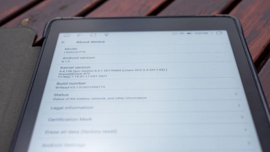
But the trade-off to that open system is a generally sluggish UI elsewhere, and an older version of Android (8.1) may open you up to security risks. Android simply isn't designed for eInk screens (though some reader apps do actually include an option to optimize for them).
Browsing the web is just about tolerable, but I'd recommend saving articles you want to read into an app like Pocket instead to remove most of the guff.
Very simple word games can be played in A2-mode, but other than that, don't buy the Likebook P78 because you want a smooth Android experience that'll run anything you throw at it. It won't. Unless it's a lightweight app that doesn't need more than a few frames a second, don't bother.
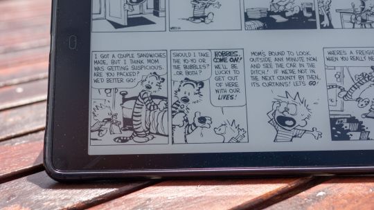
Finally, although the default reader app now natively supports CBZ/CBR format comic books, I ran into a few compatibility issues, and even when it does work, you're still trying to read a large format comic on a small black and white screen. For anything outside of comic strips like Calvin and Hobbes, the comic reading experience is subpar.
If you're looking for a bare-bones eBook reader with a stunningly good screen that won't lock you into a particular system, the Boyue Likebook P78 is definitely a top contender. With the prospect of summer holidays being canceled again, now is a great time to rediscover the lost art of reading (if you haven't already during the past year of lockdowns), and the Likebook P78 is a great way to do it.
UK readers, you might want to buy from TechInTheBasket instead, where we're reliably informed they hold local stock for faster delivery, and the price is lower at £146. This is not an endorsement though—I've never heard of that store either.
Boyue Likebook P78 Review: Huge Battery, Gorgeous Screen, and It Runs Android published first on http://droneseco.tumblr.com/
0 notes
Text
Severe Condemnation of Mediocrity

Yeah, it's a shame to have to say this, but somebody's got to do it. Not only for your own good, but also just to go on record as someone in the masses that finally said what needed to be said, concerning the pervasive permeation of rampant vapidity that has saturated the human consciousness. So, you know, the ole roll up the sleeves dirty job requirement thing.
The most shallow superficial individuals with the lowest intelligence concern themselves with people and gossip, the moderately shallow superficial ones with average intelligence concern themselves with places and events, but the truly wise conceptually deep ones with the highest intelligence concern themselves with concepts and ideas. I say this because sometimes people ask me:
“Sage, how come you never do videos about people or current events?”
And, I have to tell you, the reason is simple; because that kind of content is trite, shallow, superficial, air headed, mediocrity, that only appeals to the lowest common denominator; which means, of course, the majority; of which, I have absolutely no interest in appeasing, nor to whom, the appetite of which, I will not be catering to. I am here to wake people up from delusion, not to enable sleeping lemmings to get more comfortable in their delusion by serving up predictable cheesy junk food entertainment that telegraphs all its intentions, so as to be more easily consumed by lazy sedentary brains, that love to get banged over the head with sophomoric catchy unchallenging candy coated tripe, so as to mask the inner quiet desperation with some fake outward appearance of arrogant clever self satisfaction, which upholds a contrived self image as being one who is among those who fit in, and are accepted into some smug group, that imagines itself to be just so great, because it attracts so many others of the same type, of which, you can be sure, is a whole lotta people.
This is the essence of mediocrity, and it's not anything to applaud, condone, encourage or feed into. Mediocrity is the death knell of artistry and creativity, and is a omen of bloated decadence and the rapid decay of intelligence, wisdom, philosophy and mindfulness. We should be careful when maintaining standards of quality to not reward mediocrity, for this only gives it more motivation to repeat itself, which is what it's best at, for one of the great hallmarks of mediocrity is the constant rehash and regurgitation of anything that was previously popular; and in this regard, mediocrity knows no decency, or shame. It will beat a dead horse into a pulp, and then take the pulp and make it into a smoothie, and after you throw that up, it will take the vomit and incorporate it into an energy drink.
This is the degraded state of mainstream pop culture, which began it's gradual degenerative descent into insipid superficiality in 1980, and has gotten regressively worse and worse upon each passing decade. Things got so lame that, after 1999, we even lost our creativity in the clothing styles that usually reflects the particular flavor of bubblegum that represents the pop culture zeitgeist of a decade, which you would think would be the bread and butter. Have you noticed that? If you look at the 50's, 60's, 70's. 80's and 90's, each decade has it's own unique style, but does anything really come to mind when you think about 2000 to 2009? What about 2010 to today? Anything? I can't really think of anything, other then just a mish mash rehash of past styles. There's no more distinct style accompanying the decades anymore. Everything now is either just streamlined brand names and commercial logos, or a x-factor, hipster, socio-historical grab bag of random appropriation, or just the usual formal business attire. Not that I really care all that much, but it is a demonstration of the decline of creativity via the saturation and satiation of mediocrity on the masses, which dilutes, or dries up completely, the wellspring of primary source content and original expression.
And you know that the mediocrity has reached epic proportions, with the reality shows the way they are nowadays, along with all the various parades of side shows freaks, drama queens and attention whores. It's gotten so bad, that they even do FAKE reality shows now. That's right. TV is gonna go to great lengths to indulge your need for sniffing other people's dirty underwear, and providing you with a role model archetype you can identify with, so that you may properly vicariously indulge in all the attention whoring and drama pornography, even if it mean it has to stage events to appear real. Sound familiar? This is seems to be related to a theme we find present here in this reality. This gusto for lies and fakery. Much of the time you even know it's a lie, but you love it anyway. We love fake people and fake personalities, because we are not self accepting people. We hide our pure natures behind the superficial facades of luxury, plastic surgery and extravagant lifestyles. And we keep ourselves happily sedated in this shallow fluff by consuming large amounts of prescription drugs and mainstream popular culture. And, isn't it curious that the biological definition of culture is: the cultivation of bacteria, tissue cells, etc., in an artificial medium containing nutrients. Artificial. Got the drift? And so, who is the most popular bacterium of the day? All the sheep want to know.
Yes, sheep. As in, sheeple. It's always been kind of a cool way to refer to the adherents of mediocre conformity, but I always had my own little pejorative label that I liked much better than the sheeple, which has grown into a bit of a cliche. I have always called them, the Ones. I call them the ones because they are the ones that all agree, and they are also called the ones because they are all like little metaphorical number 1's, uniformly basic, all running around in giant packs of identical meaning and purpose. What are all the ones watching? What are all the ones listening to? What does the latest poll by all the ones reveal? Which contestant have all the ones voted off the show? Because, you must be like all the ones. All the ones agree on this. Don't find yourself in opposition to all the ones. All the ones might pass a new law to crush your individuality. Cause you must be like all the ones. You must be like all the ones and (X8)....
So, to appeal to all the ones must mean that you are successful, right? To be celebrated by the lowest common denominator has become the measure of greatness. When all the clones love you, you know you have achieved something magnificent. You are now a popular mainstream product of pop culture mediocrity. Congratulations! Obviously, your appeal must be a reflection of good taste, because all the ones approve of what you are doing. You are normal, non-threatening, and unchallenging to the ones sensibilities, and thereby fit for mass consumption, and other such facilities. Because you know how bubble gum logic works, if it's popular, then that must mean that it's the best. That it's better then all the alternatives. That it's top shelf, crème de la crème, right? Yeah. And that's why fast food cheeseburgers are so much better then filet mignon. This is why junk food is so much better then gourmet cuisine. Are we to believe this? Come now. It's not better, it's just cheaper. Easier. Flashier. It's mediocre. Which, at best, just means supremely average.
How does something like that sound to you? You are so stupendously average. Quite Ordinary. Unremarkable. Standard. Normal. Typical. Regular. Are these descriptors getting you horny yet? No. Popular doesn't mean better. It means mediocre. Which, from the perspective of the refined aesthetics of a creative discerning mind, means complete and utter artistic failure. You got that? Under most circumstances, with few exceptions, popularity means epic fail. Artistically, popularity isn't indicative of success, but of a failure that is obscured by a sort of ironic condescending mocking lionization. Behind all the applause and smiling faces is the secret desire to see your downfall. This is why so many artists who were lauded and celebrated and pushed to the heights of praise and attention are promptly kicked and dragged through the dirt the second they are down. The media and paparazzi just love that, don't they. Like buzzards and vultures circling a fresh corpse. That's why they celebrate you so hard when you're on the way up. It's fresh meat. A future meal. Another mediocre subject for them to rip apart and play in the innards.
You feel bad when you see this happen to someone like Marlon Brando, but not so bad when you see it happen to anyone in this new crop of snarky millennials, who knew or blew their way to the top because it was always their dream to have the lifestyle of an artist. You dig that? The lifestyle. Actual artistry is a glossed over afterthought. They don't have much talent, but talent doesn't matter if you have a really good looking superficial appearance! Don't worry about talent, we got teleprompters and auto tune for that. What we'll loosely call your so called body of work, is really just generic filler to justify the lifestyle of a pop star, which is more important and incidentally, the subject of a new reality TV show, where the lifestyle is the feature showcase of the show! And have you seen one of these shows? They are expositions that provoke misanthropy, which is why they are best avoided; for they inspire the desire for bloodsport. They make you root in favor of the media vultures, and even want to assist them, by sharpening their talons and feeding them cocaine. Give you some privacy? Please. You got what you signed up for, so don't sneer and push the photographers, lest you get thrown to the lions. Yeah. I'm in favor of bringing back the colosseum games wherein reality TV stars and their ilk must engage in gladiator battles to the death. Now that would be something to celebrate!
And speaking of celebrating, the crypto semantics of which brings us the word "celebrity", it's amazing how mediocrity, which works so little and contributes works of such little value, feels it needs to be praised and awarded on a regular basis. You know... The type of mediocrity that is so average and so propped up by nepotistic handicapped assistance that it just simply deserves to be showered by various awards granted from itself to itself!! There's nothing better in the whole wide world then mediocrity patting itself on the back and bestowing itself mediocrity awards. A reward for a job well done, right? And they call this professionalism, which is a real slap to the intelligence. More like professional mediocrity.
But do you know what the real kick to the kidneys is? If you look up the word mediocrity in the dictionary, it's lists as a related synonym: amateur. And this is a common misconception and misassociation, as, obviously most people don't understand the meaning of the word, as it's often wrongly used to indicate a meaning of one being green or unskilled or of lame creative abilities, as we have often heard it spoken in response to displays of buffoonery to "knock it off and stop acting so amateur"... amateur doesn't mean unskilled. It means someone who does something out of a love for doing it, as opposed to the professional, who does something out of a love of profit, which automatically means it just has to be better, right? Making an amateur mistake means that you haven't been thoroughly trained on how to produce to the cookie cutter standard. You aren't formula enough. You need to become more predictable, less thoughtful and cater to someone else's standards. That's funny, considering so many of the styles and techniques that come naturally to the amateur are often later adopted and replicated by the so called professionals. The amateur has heart. The professional wants money. And that's exactly why the quality of all these mainstream projects has gone so low. The motive of profit almost always necessarily equates into a decline in quality and substance. And this truth pervades all arenas of human achievement. Ask yourself, what kind of doctor would you like treating you, or operating on you, one that loved what he was doing, or one that was just doing it just because he loves the paycheck? And what kind of politician would you want representing you, one that loves and serves the people? Or one that will use the office to benefit himself and his corporate pimps? Profit is a recipe that poisons the well. But with art it's even more of a factor that will determine quality. When you are pushing out content for profit you have basically become a pimp who is prostituting an art form, which drastically cheapens everything, despite the million dollar budget, and that's really an unfortunate shame.
And it’s really all quite depressing; which is why I’m done talking about it now... but, uh, yeah it kinda had to be said and uh, I had to say to say it. It was really not really pleasant. But I, you know, had to really deconstruct it. Chop it up, and slice it the other way... into little cubes. Can’t have that. Too much. Too much facade; it has to be chopped. You know? It’s bad enough there’s a facade; but a facade on steroids? No, it has to be chopped, sorry.
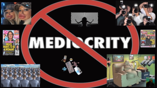
0 notes
Last Seen Blogs
idiotautopico
Idiota Utópico
ev-forever
EV
quinncysama
Lunear Palace

truckingtotokyo
Trucking to Tokyo
cloudy-peachy14
watermelon peach