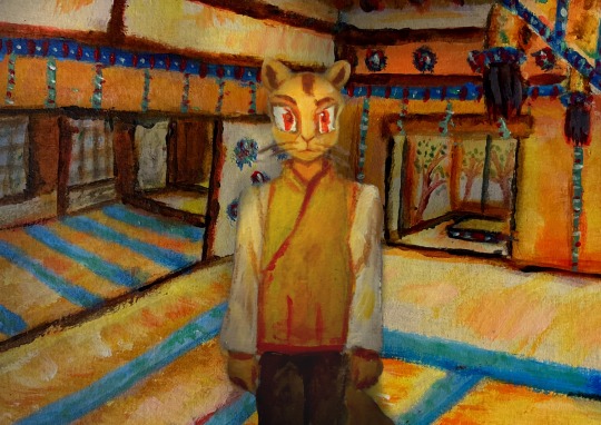
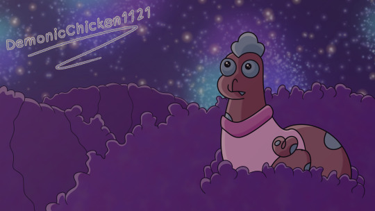
#i’m messing around with digital art for the first time
Note
OMG YOU'RE SEVENTEEN?? (I've been following you for months and I didn't once read the pinned message beyond the line about no AI and NFTs lmao) YOUR ART IS SO CRISPY I THOUGHT YOU WERE A PRO ARTIST AROUND 30 WTF
(sorry for the yelling via text)
HOW DID YOU GET SO GOOD!! (Tips on lineart please?) WE'RE THE SAME AGE, BUT HALF OF MY ART IS SHIT AND THE OTHER HALF IS FART
ALL HAIL LITTLE RED FOOL, BESTOW THY GREATNESS UPON THOU MERE MORTAL SERVANTS
But in all seriousness, any tips on, like I said, lineart or just digital art in general? (I just started digital, and... Ten hours of work and I'm just on base colors 😎🕶️🤏🥲) I love, LOVE your style and especially COLOR! How do you tie it all together? Like, I'm 17 too, but I'm not even close to your stuff?? I'm scared as fuck from ever trying color traditionally because I spend SO MUCH TIME ON A SKETCH, so I just picked up digital and HOURS LATER IT'S STILL AWFUL
Sorry for the rambling and repeating, man, it's been a long day and it's late in the Balkans... Don't let the rambling force you into answering tho
Have a good one. ->excited fellow artist
(tip of the day: did you know that in Romanian, moon and month are the same word, with the same pronunciation, spelling and plural? It's called: lună [loonuh] and I think it comes from latin, since Romanian is a heavily latin language, with bits of french and turkish (HEAVY bits), dacian, slavic, italian)
OUAHFSHD THANK YOU SO MUCH I’M REALLY HAPPY YOU LIKE MY ART!! Also I’m sure your art is better than you think it is (we generally tend to view our own creations as worse than others because we’re the ones that made them, don’t worry I’m the same as well ajdbsjd) but yeah I’ll be happy to give you some tips and stuff! (and yeah I never colour traditionally either I just leave everything in plain biro because I don’t want to mess it up lol)
(I haven’t seen your art so these will probably be more general tips but hopefully they’ll help a bit, also keep in mind that I’m not a professional so this will be more about what has worked for me but I hope it might help you a bit)
So for stuff like lineart, avoid using chicken-scratches—it might seem easier or less daunting to do shorter overlapping lines like that but it will give your sketches and drawings that overall fuzzy look, the trick is to have longer confident strokes. It might seem a bit tricky at first if you haven’t done it before so don’t worry it happens but if you keep practicing they’ll eventually look smoother and less shaky. For the longer lines it better to draw from either your elbow or shoulder, and by that I mean keeping your wrist still and letting the larger parts of your arm do most of the work—this will also help your wrist in the long run. For things like shorter lines and smaller details then absolutely use your hand to move the pen, but generally try to use your elbow and shoulder as it will help you get those longer smoother lines. Also this is just a personal preference of mine but I generally use brushes that have a bit of pressure sensitivity which helps add some line weight. If you don’t have pressure sensitivity another way you can get line weight is by taking an eraser to some of the edges and narrowing some parts.
For colours it mainly depends on the lighting—lighting is everything and will affect how the rest of the colours will look, so it’s important to have an idea of the brightness and colour of your lighting. The background also plays an important role in picking colours for me as well as it helps provide colour context and makes it easier to pick colours by eye if you want a certain mood. If you want a more dependable way on getting colours to match up then I’d recommend having a layer that’s just colour on top of the rest of your piece—you can play around with the blending modes and opacity, I mainly use either an overlay layer with a medium colour that’s slightly desaturated or a colour burn layer with a light saturated colour; most of the time I use colour burn because if you put it over your lineart then it will also tint the parts of your lineart or sketch that’s at a lower opacity too. But with figuring out colours I’d highly recommend researching some stuff about colour theory, there are a lot of good and easy to understand explanations and art tutorials on YouTube so I would recommend starting there (unfortunately I can’t link recommend specific videos because my playlists are a mess ajdbsjdbsj but some good channels to learn from are Sinix Design, Marc Brunet and Marco Bucci).
In terms of general digital art tips, ALWAYS FLIP YOUR CANVAS. You will not believe the amount of times I’ve looked at a drawing and thought it looked pretty good, flipped the canvas and found that everything’s wonky. In cases like these the liquify tool is your best friend, as well as the lasso tool and transform tools, as well as just manually fixing them by redrawing some parts. Also use as many layers as you need, and by this I mean if you’re working on your sketch, lineart or colouring or whatever and you want to do something you’re not sure you’ll like, duplicate the layers so you have a backup in case it goes wrong and you want to go back. When I say use as many layers as you need I mean use as many as you need, these are some of mine and they’re all from just one sketch because I get really anxious about messing stuff up lol, also don’t be afraid of drawing separate parts on separate layers and merging them afterwards if you want.
Also take your time, unless you have a deadline don’t feel like you have to complete a drawing within a certain timeframe, if you want to get faster at drawing then that’s great but don’t feel like you need to push yourself, especially if you’re just starting. Practice takes time and patience is your best friend, and you probably hear lots of other artists saying this but trust the process. You might get to a bit you’re struggling with and not like it and want to abandon the drawing, but I found that rather than saying “this is bad” or “this is wrong” start asking “how can I make this work” because a change in mindset can help you a lot with art. Also don’t feel like you have to reach certain milestones with your art by certain points either, like with the age thing and comparing your progress with other artists of either the same or different ages, because it can make you feel worse about your art. Trust me there are some artists younger than me who are like 14 or 15 who’s art I envy and—again with the mindset thing—instead of getting down that your art isn’t similar to their’s or worrying that you’re “behind” in your artistic development (there is no such thing btw everyone learns at different ages and speeds so don’t feel bad if you haven’t progressed as much as you would have liked to) it helps to ask what you like about their art and what you would like to incorporate into your own—this has helped me learn and improve a lot faster.
I don’t know if I have any more tips at the moment, but I hope that answered some of your questions! (also sorry it’s a bit long or some bits don’t make a lot of sense I like to ramble a bit lol) (also also thank you for the little fact as well!)
Have a nice day anon 🧡
19 notes
·
View notes
Photo
Designing an animated character means more than just creating how the character looks. As three TAG Character Designers share, it requires an understanding of physical movement, technology, and the art of collaboration.
By Kim Fay
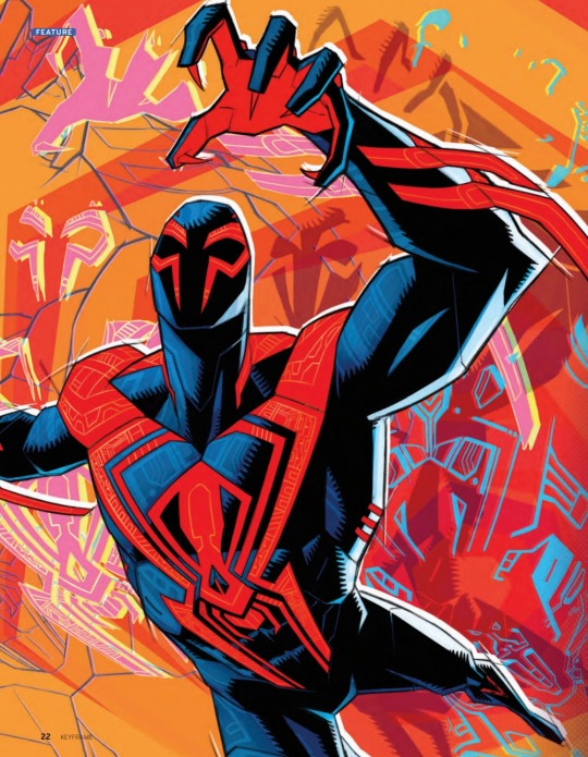
MULTI-LAYERED MAGIC SPIDER-MAN: ACROSS THE SPIDER-VERSE CHARACTER DESIGNER: KRIS ANKA
In Spider-Man: Across the Spider-Verse, Miles Morales is catapulted across a multiverse filled with Spider-People. All of them are charged with protecting its existence, and all of them have very different ideas about how to do this. Especially Miguel O’Hara, AKA Spider-Man 2099. Unlike Miles and his predecessor, Peter Parker, Miguel intentionally altered his DNA to become a Spider-Person. Because he played a role in his own transformation, he is as multi-layered as the movie he inhabits—literally.
Character Designer Kris Anka approached Miguel in stages, adding layers throughout the process to develop the complexity of this superhero. When Anka was invited to work on Across the Spider-Verse by Joaquim Dos Santos, the film’s director, he was already familiar with Miguel. A CalArts graduate, Anka had been working at Marvel comics for eight years, even designing one of Miguel’s suits. He had worked in animation before his Marvel stint and was ready to return. Little did he know that his three-month contract would extend to three years, with much of his time focused on Miguel.
While Miguel exists in comics, and screen audiences got a glimpse of him briefly in the end credits of Spider-Man: Into the Spider-Verse, Anka says the sequel’s creative team wanted to take a new approach to the character. Some early pre-concept work had been done, and “they knew the vibe they wanted,” he says. “They wanted Miguel to be someone who was very proactive. He always had to have a presence. When he walked into a room you think, oh, this guy takes things more seriously than everyone else. He had to move in that intentional way—I’m on the hunt—physically intimidating.”
The film’s Visual Development Artist Spencer Wan did physicality animation tests, giving Anka an understanding of the impact of Miguel’s weight. Miguel has claws and doesn’t stick to walls, “and he’s not lithe, he’s not an acrobat. He’ll go through a wall rather than find some artful way around it,” Anka says. Working with his musculature, he had to figure out how to make Miguel fit in with the visual language of Spider-Man while at the same time stand out among the other Spider-People from the previous movie. “We had two very separate approaches with him,” Anka explains. The first was translating the comic design into a character that would work in animation. While the strong red and blue silhouette would remain, in animation action scenes with a lot of movement, “Miguel could accidentally become a muddled mess because of all that blue,” says Anka. He added red to Miguel’s palms and soles, designed red arm bands that angled in specific directions, and created a red design for the back of his suit that looked different from the front to make sure the audience could always tell what side of his body they were looking at.
With this initial design done, Anka sent Miguel down the pipeline. Then the vis-dev team told him they were working Mesoamerican Burle Marx-influenced patterns into the backgrounds. Marx was a Brazilian landscape architect whose style had distinctive patterns. Like the other Spider-People, Miguel inhabits his own universe—Nueva York in the year 2099. Anka was asked to return to Miguel to unite the character’s look with his world. “To make everything feel that Miguel was born in this culture,” he says. Anka spent the next six months focused on working in patterns without breaking the original silhouette. The blue parts would have a faint pattern underneath the digital texturing; the red parts would have the same pattern, but it needed to be stronger.
Overall, they wanted three different layers of detailing to the suit, and the challenge, Anka knew, was to “add a sophistication to the design without it being ham-fisted and too noisy. Things can get really loud really fast.” Anka was given some loose patterns to work with, but nothing lined up. He researched everything from Marx’s designs to Mesoamerican textiles to architecture for inspiration—and set about experimenting. He tested what would happen if the pattern was curvier, straighter, softer, or more hard-edged. Then he had to ask, “Where does everything fit so it all looks intentional to the anatomy?” His method was to take all the red parts—the mask, the chest, the arm bands, and the legs—and use each to show how he could break down the pattern and still retain the silhouette. He had vis-dev choose which versions of each body part they liked best. Once he had that, he says, “I would try to holistically find commonalities between those patterns and bring it all into one unified piece.”
Now that Miguel was ready to move down the pipeline again, it was decided that Anka would translate the geometric patterns he had designed directly onto the model—not a usual role for a Character Designer. But nothing about Miguel and the rest of the Spider-People was usual. “Every design is wildly asymmetrical including Miguel’s body,” Anka says. But because he’d been thinking about the patterns for so long, “I could figure out, how does this all really sync up, [so] when it went into animation, everything lined up already,” he says.
On and off, Anka spent 16 months working on Miguel. It was a laborious process, but one he gladly undertook in service of the ultimate payoff—a design, he says, “that feels effortlessly that character by the end.”
Kris Anka interview on Spider-Man: Across the Spider-Verse with Key Frame Magazine (issue no. 22)
#spider man: across the spider verse#miguel o'hara#spider man 2099#kris anka#interview#key frame magazine#behind the scenes
111 notes
·
View notes
Text

nah, bc I feel like this would be katsuki if yall first met at the beach. 😭🙏🏼
( NOT MY ART. )
katsuki was just laying down, with his arms behind his head. grinning softly to himself as he caught girls staring at him after walking by. proud of himself, his sunglasses blocked the sunlight from messing up his eye vision. he’d soon pass out, his nephews were just running around and splashing each other with the salted water.
you’d glance around and find him in your gaze, his toned abs made you get distracted easily. one of your friends spoke to you, loudly because they were playing music. “ dude, what are you— ohhh.. check it out girls, she’s looking at some hot guy. ” your friend smirked, elbowing your side softly whilst your other friends snickered.
“ you should go talk to him! ”
“ yeah, I’m sure he’ll be hard to get thooo! ”
“ guys, leave her be. this, this is teenage love at first sight for her. ”
“ exactly! ” the two of your friends spoke to your other one, you’d sigh and stand up slowly. all of your friends squealed, one slapping your butt before you turned around towards them. your friend beside you threw a beach ball at you, cheering you on.
your face flushed red, catching the ball right on time. you inhaled deeply and started walking towards him, continuing to hear your friends cheering loudly but also muffled cause the music was still playing. once you reached over to his destination, you glanced down at his body again. “ holy.. ” you said quietly, digits covering your mouth. “ uh, hello.. uhm, ” not knowing of what else to say, you’d blink. not really knowing if he was staring at you or not, you slightly bent over. “ hey, uh.. are you alright, sir? ” a soft smile was shown upon your lips, speaking kinda loud. once he slowly lifted his glasses up, his tired crimson orbs were shown, admiring him even more as you’d awkwardly giggle.
“ are you alright? ” you spoke softly to him, his eyes quickly sparkled after seeing you. he’d blink hard, stammering on his words for once, his tired, deep voice cracking for a moment. “ yeah, I’m good. what do you need, anyway? am I bothering you? ” he said in a slight annoyed tone afterwards, sitting up before crossing his arms against his chest. “ no! uh, I was just wondering if you have.. snap? ” you’d now realize you forgot your phone, groaning to yourself in disappointment.
“ huh? do you want mine? I mean, you could type yours in. ” another proud grin was shown on katsuki’s lips, uncrossing his arms to grab his phone quickly, typing in his password before opening SnapChat. going onto the search bar, lifting his electronic up to you. you’d blush embarrassingly, grabbing his phone with your spare hand, searching your account before adding yourself and handing his phone back to him.
“ uh, bye now! ” you’d turn your body and walk towards your friends, hearing them cheer again as your face flushed red.
“ uncle has a girlfriend!! ” katsuki’s nephews yelled, laughing afterwards, leaving katsuki red as well.
( UGH, i switched up the hat with a beach ball. sorryyyy. )
60 notes
·
View notes
Note
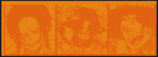
Heyy, I’ve been reading your wonderful one piece works for a while — and I couldn’t stop wondering how are you actually doing those magnificent headers?
Like… hello? The great quality, with additional 3D-alike details I could catch by my eyes? I got only Ibis Paint X on mobile, since I’m only a young man that literally two months ago went on a life-time ‘adventure’ of living alone in a small apartment.
In short — I got no money to pay for additional graphics/drawing programs, not yet at least
Hello!
Thank you! I'm glad you enjoy my writing - I'm curious to know what's your favorite piece / part? Also I'm so happy you like my headers? Makes it feel worth it to spend time on them! :D
I have excellent news for you, I used a mix of Canva and Photopea. They're both FREE!
I'll be explaining the process for making these two kinda? The full tutorial is below the cut, to be courteous to the other folks, hope you don't mind?
Though I am hearing that Canva has given people some grief. But Photopea is just *chefs kiss*
If you've ever used photoshop, Photopea is essentially a free photoshop, and it even has the automation tools! An absolute lifesaver when you have multiple layers you want to export (but that's for larger projects not this)
I'm going to assume you have basic knowledge of layers in digital drawing programs for this. If anything isn't clear: ask me, I'll clarify!
//-------------------------------------------------
My General Process is:
Search for official art / images
bring it into canva / photopea
crop / arrange images to match the dimensions
select a thematic color that is associated with the character
separate the foreground from the background
mess around and test things until they work
//--------------------------------------------------
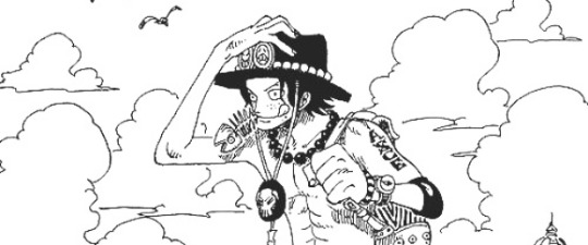
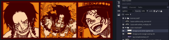
Given "Louder than Words" is the latest one I've made, I'll start with the process for it.
Dimensions: 3000 x 1055 px
dpi: 96
//-------------------------------------------
Let's Get Crackin'
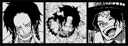
Alright let's grab some official art so we're not using any fanart without the artist's permission
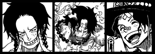
I try to pick images that feel relevant enough to what I'm trying to make.
For example: the image for the Matching banner shows the ASCE tattoo which is super important in that fic
2. Let's arrange them onto a banner where each individual image has the same/similar dimensions to the rest
That's probably part of why you like these. To a certain extent they have similar dimensions, so they have a uniformity that's pleasing to the eye! (It's not perfect because I threw perfectionism to the wind because this is tumblr not my portfolio)
Tip: if you have 3 images and only 2 that have similar dimensions, and the 3rd one can't be cropped logically: but the one that's a different aspect ratio in the middle!
3. lets arrange them in such a way that the borders all feel like they're the same/equal width/thickness
you might find that you have to shrink some images for this, that's fine.
ALTERNATIVELY: if you're going with one image crop it so it's just the relevant info and it matches the dimensions (3000 x 1055 px)
We have our base! Now let's add some color, and direct the viewer's eye together!
4. pick out a color that you think matches your character / vibe - that color is going to be your background
Given I'm making an Ace banner: orange is the color I'm going with
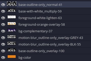
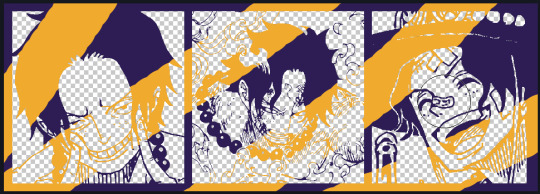
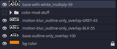
I went and named my layers for this lol. The numbers represent the opacity, and they aren't important. I just kept changing the opacity until I liked the way things looks. But here's the secret to the 3D feel:
Motionblur (+ moving it about)
Separating the foreground and background and dulling out the background.
I'm going to show you my process so you can see the effects, but first let's give you some quick skills:
//------------------------------------
SKILLS / THINGS I THINK ARE HELPFUL
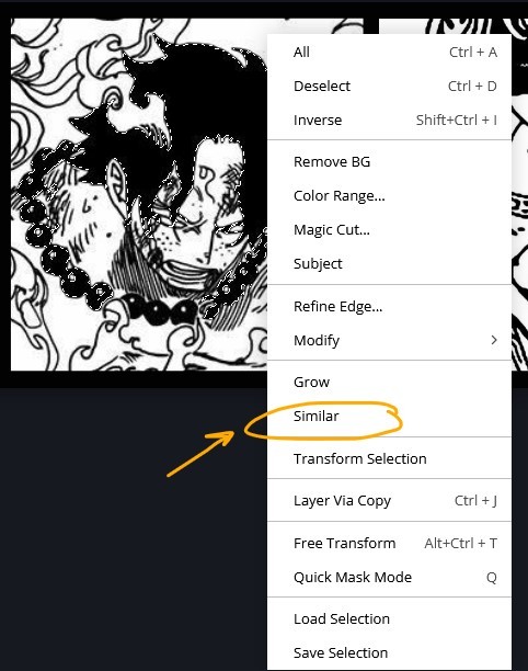
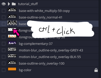
//------- Select Similar
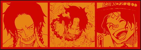
magic wand -> select something -> right-click -> select similar
This works best when you have high contrast images (like manga panels that are black and white). You can select the black or the white areas. Depending on what works better for you.
TIP!
Invert selections with ctrl + i
Say you know that you want to select everything but Ace's face in the second panel. Select his face with the magic wand then ctrl + i, and that's the only thing NOT selected


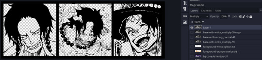
TIP!!!!!!!!!!!!!!!
Please, please, please, duplicate your original image and work on the duplicate layer. This helps you SO much. !!!!!!!!!!!!!!!!!
TIP!
Check your selection tolerance! This could be why too little, or too much is being selected.

//------- The Move Tool
Shortcut key: v
While the move tool is active, you can nudge the stuff on whatever layer with your arrow keys
Shift + arrow key = 10 px move (generally)
//------- Layer Locking
1- Layer Blending Mode (see Overlay vs Multiply vs Normal) for how this can affect results)
2- Opacity: how see through it is / isn't
3- Lock Transparency (it's the little checker board)
4- Lock Layer (looks like a lock)
5- Lock icon that appears when anything on the layer has been locked
More on 3 Lock Transparency: You can only paint on / modify what's on that layer. You CANNOT add anything to any area that is already transparent
Here's a demo of what you can do with this power:
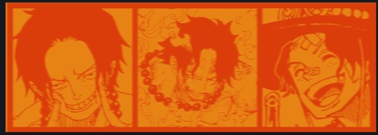
Here's the original Image - notice how it's just the lineart with a transparent background.
It's powerful: abuse it
//------- Overlay vs Multiply vs Normal
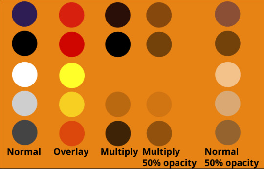
I think seeing this is the best way to visualize how different modes can affect the color.
//--------------------------------
Back to the Tutorial
!!I IMPORTANT NOTE !!
Please play around with the opacity slider to figure out what opacity works best for you on the multiple different layers we're about to make / work with. It's up to your own style to figure this out.
Next: please feel free to not follow all of it. Add more layers, add less layers, take the base principles and go wild! :D
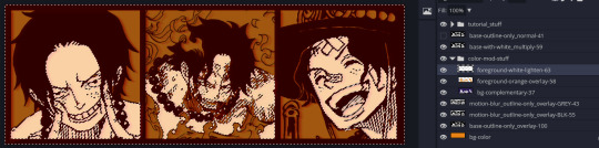
5. Separate the lineart from the background and save it as a new layer
6. Duplicate it and set it to overlay, or set it to overlay immediately
7. Duplicate that lineart layer twice and set the blending mode to overlay
8. lock transparency on the top one and change it to be a dark grey
9. Apply motion blur to both:
Main menu bar -> Filter -> Motion Blur
I made it so that the grey layer was blurrier than the black layer
10. More them around a little to give it a "3D effect" as you called it.
It creates shadows under the lines - I was aiming for an effect similar to chromatic aberration (chromatic aberration is a valid way to add punch to your stuff too!)
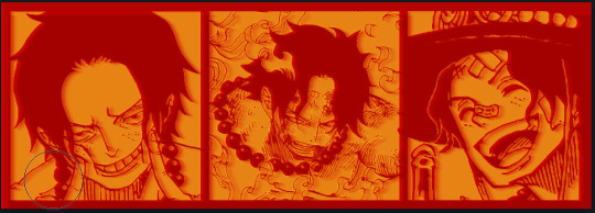
So this is what things look like now - painful, but let's keep going
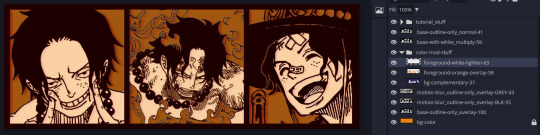
11. Duplicate the ORIGINAL / BASE lineart layer, that you DID not apply motion blur to -> set the blend mode to multiply (reduce opacity for it to actually take effect)
okay that's less painful
here's what the layers look like right now:
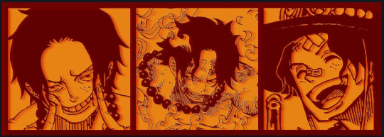
let's bring more focus to Ace's face, and push the background farther away:
12. Use the magic wand tool to quickly select large areas of the faces / focal area / foreground and the lasso tool to refine things
TIP!
Hold shift + click -> add to selection
Hold Alt + click -> subtract from selection
13. On a new layer with blending mode -> lighten, fill that selection to be white
If you look at it, you'll notice that it is ALREADY starting to draw our attention to his face, but the background is kinda aggressive, so let's dim that down
TIP!
Right-click on the gradient tool to find the paint-bucket tool

TIP!
Sample All Layers:
Turning this option off makes it so that you only work with the content on THAT specific layer. Turning it on makes it so that it is working while taking all other layers into consideration.
14. ctrl + click on the "white foreground" layer to select the contents of that specific layer (pink thing is your mouse)
15. ctrl + i to invert selection and ON A NEW LAYER (layer mode -> multiply) fill that with a complementary color
16. I did one last thing where I took the original base (before we separated the lineart) and added it to the very top and played with the opacity to get something less in your face (layer blend mode was set to NORMAL)
And that's it!
More considerations that I take:
I want the banner to be "thin" or not square, so it doesn't take up too much screen real estate on people's devices
I don't want readers having to scroll too much to get to my writing (which is the whole point of the post, let's not waste their time making them look for things)
I want the banner content to be relevant enough?
ie: with Matching: I wanted the ASCE tattoo to be visible. With matching I wanted Ace to not look too happy in some of them.
I'm also trying to avoid spoilers, I hated getting things spoiled, so I'm trying to be careful that the images I pick don't spoil anything really.
Congrats on starting life on your own! I did that whole living by myself thing too! Tip: keep the pantry stocked with lentils, beans, pastas, baking essentials, rice. They really come in a clutch when you're hungry.
#photopea resources#photopea psd#tutorial#tutorials#tumblr banner#photoshop#photoshop tutorial#digital art#fuck adobe#adobe photoshop
8 notes
·
View notes
Text

First remade background for the Super Secret Project! It’s quite different than the original digital picture. Being far more messy and impressionistic. I would rather not compare the two as each of them is doing it’s own thing. I do find it funny that even though I spent just AGES on the original, doing all these intricate patterns it looks far more clean and I guess I would say empty compared to this just splatter the paint where ever attitude.
I think I should paint on bigger canvases to force myself to do more details. A big inspiration for me are classically animated movies. Yesterday I watched Secret of Nymh which I should finish today. That movie is a master piece!!!! Kind of hard to believe it’s for kids with how dark it is, but as a child I loved dark stuff so yeah. But the backgrounds! Oh the backgrounds! I really got to step up my game. I’m like a kid in a shonen anime.
I also made a little mock up for how the project will look. Just messed around in Procreate with it. Something I want to change for my future projects is a better longer pre production period. This project did have some pre production. Such as sketches, scrapped background and character art. But nothing even nearing a professional production. I used to go to an art high school (high schools here are like roughly ages 15 to 19, I don’t remember perfectly) and there they had you repeat every step of the process like 20 times before you could move on.
I don’t plan on working for like a proper game or animation company. That being said if Disney comes knocking on the door then I’m not going to say no. But I don’t think that type of environment is for me. And with the rise of AI art. Bitch. Why would they want me around with my “special needs”? I think indie game studios are the way to go. My aesthetic would also suit them far more. So erm. Contact me. I want to buy a custom fursuit.
JUST KIDDING! I ain’t stable enough for a job. I’m barely managing doing what ever the fuck this is.
So what do you guys think?
I MIGHT finish it for Christmas but don’t take my word for it. I don’t like deadlines. There’s still like a truck load of work left to do. Exhibit one. Finishing the script. Getting sensitivity and beta readers. Would be great if I could get my friend who studies psychology to look at it. There’s a lot of trauma. I bet ya there’s going to be a whole lot of editing to do after that. Exhibit two. Backgrounds and sprites. Urg. Exhibit three. Putting it somehow together. Presumably with duct tape, paper clips and prays. Exhibit four. Releasing it. Exhibit five. Shameless self promotion. Such as bothering mid size furry YouTubers.
An absolute dream come true would be having Saber Spark look at it, as he’s the one that introduced me amongst many of you I bet to Squirrel and Hedghog. But please don’t go bothering anyone just yet. I want to do the shameless self promotion last when there’s actually something to promote. Otherwise it’s just a scam.
Am I taking this project too seriously? This is the first time I’m doing something like this so it is more of a prototype of how I will do things for later projects.
Bobby out!
#my art#fanart#procreate#squirrel and hedgehog#furry art#background art#acrilicpainting#traditional painting
11 notes
·
View notes
Text
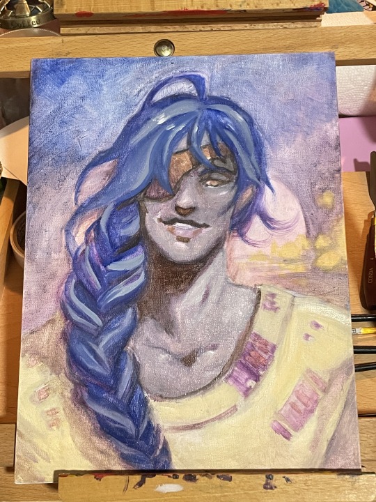
Have some Letho attempts, in oil paints(!)
Art, life and cat updates under the cut.
Art update:
I’ve opened commissions again for the next two months (October-November 2023). The last one in my queue is nearly finished, and I’m excited to share it — though I’ll have to crop the tumblr version substantially. I’ve also been working on tutorial content for digital painting. Monie’s been poking me for years to do one on sheer fabric, and I’m trying to edit that between other tasks. I’ve thought about doing one for scars as well — is there anything you struggle with that you’d be interested to see a tutorial or tip-sheet for?
In terms of personal work I’ve struggled to connect with my digital painting in the last few months, so I’ve been working more with traditional mediums. I love watercolour, I’ve been fiddling with my oil pastels since I don’t want them to go bad (they keep for about 3 years past opening, apparently) and I’ve wanted to try oil painting for years. Last week I finally took the leap and bought some water soluble oil paints: pictured above is my first attempt with them.
Oil paints are slippery little bastards — I had a teacher tell me “it’s like painting with colourful mud” over a decade ago when discussing them, and that sort of prepared me. I finally get it. They move constantly, even if it looks dry it’s likely not, I have no idea what I’m doing, disposal is a pain, I am wrong at every step, and I love them. Oil painting looks so cool! It’s so much easier to rework than acrylics! This is not always a good thing! I’m having a great time :)
Naturally, upon getting a new and notoriously difficult medium, I dispensed with looking up guides (surely things I watched or read months and years ago are sufficient for right now?) and sat down to screw around with the paints a few evenings ago. This resulted in a muddy mess even with a limited palette, but I’m a toxic goblin who doesn’t learn, so I shrugged and started working with the muddy tones to try and fix it.
@silverscalestudios was kind enough to give me a quick and dirty explanation on workflow when they found out what I was doing. Thank you again for that! I spent a while last night reading about various forms of underpainting because of you, and will give brunaille a try. I knew underpaintings were a thing but I didn’t know *why* or how important they really are — it didn’t occur to me the oil colours would be so transparent. Hopefully the next picture will be a little bit neater as a result of your intervention — thank you so much for taking the time to talk to me about it!
I found some useful videos on YouTube as well, but I’m struggling with colour temperature shifts. Some studies might be in order.
As usual I’m not satisfied with anything I do for long. My current goals are to learn more of the body’s simplified muscle groups, simplify my compositions more, and make more illustrations with character interaction as the focus. Also, I guess, to gain some competence with the mediums I’m playing with — but that’s a bonus more than a goal. Oil pastels especially are just so pleasant to work with that even if I hate the result, the process is too enjoyable to complain. And failure is how we learn.
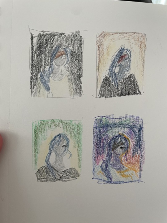
Potentially useful tip, buried for anyone who read this far: assign yourself studies for the projects you’re currently working on. This took me far too long to learn, but if you struggle with doing general studies for the sake of them, do them to prep for a specific painting instead. If you suspect something will be difficult (the hand gesture, the colour scheme, lighting, expression, whatever) grab or make some ref and doing a couple of studies, so you can fail quickly and make ugly versions. It’s a huge timesaver when it comes to the final piece. My big, detailed paintings usually take 10-20 hours, so I’d like to get any difficult elements sorted before I start whenever possible.
For an example of studies for a painting: the four roughly scribbled Letho’s in coloured pencil on this post — those were done after I had my composition sketched onto the canvas, to figure out what I wanted to do for colours. And I’m glad I did! I tried the analogous scheme on a whim, and if I hadn’t done this study, I’d have played it safe and gone with a mostly neutral palette. Next time I’ll also do some lighting studies so I have a detailed plan for those before I start painting. Traditional media in general involves a lot more concrete planning than digital, and working with it is underscoring how many bad habits I have — especially with massively reworking paintings mid-process.
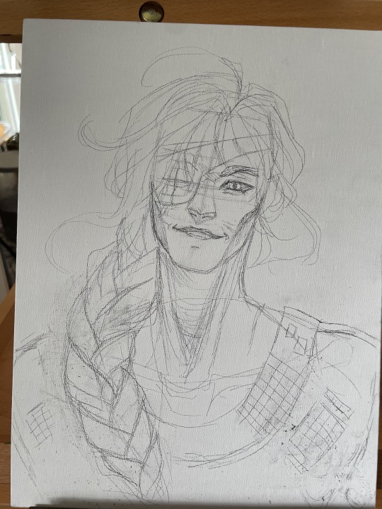
I did have a photo reference I was using for this painting (one of the images from the rogue warrior reference pack by Noah Bradley) with the lighting and hair modified to try to resemble something I’d seen another digital artist do, and by awkwardly tilting an asaro head in my kitchen to figure out how the lighting would work. There’s a relatively common lighting scheme in anime-esque art where just the tip of the nose is lit. It’s cute, but playing with the asaro head, I found that the top half of the area around the mouth should also catch at least a bit of light. The lighting ended up being repainted into something more standard for this, but you can see the triangle of light on the upper mouth area in the wips.
Life update:
Well, it was a nice run, but spouse and I finally caught corona last month >< that was horrible. I got lucky, in that I only had for a week or so and it was a mild case. Now I’ve mostly recovered except for a cough. “Mild” is still probably the sickest I’ve been in my life. Do not recommend. Will be going for the booster as soon as I’m able to, I do not want that shit ever again.
I’ve been doing a bunch of new things like sashiko (satisfying), trying to make pie crust (hard! But delicious, and the ingredients are cheap enough that I don’t cry over failure. Please give making pie crust a try, if you haven’t, it’s really not that complicated — the recipe I’m using only calls for 3-4 ingredients, and it’s so versatile. We’ve had like four quiches in the last week and a half) and trying to cook more. Adulting is hard. I’m also considering more decorative embroidery attempts, because I’m reentering my goth phase and want to customise my clothes with little mushrooms and skulls :) it would be cute.
About the cats:
Cloud is cancer-free! She has to get rechecks every three months, but the little monster made it. She celebrates by trying to sleep with her butthole on my face, which is terrible. I love her dearly. I wish she would stop with the butthole thing though.
Sheik is currently taking her turn as the cat with medical problems. She couldn’t eat for a few days and the vet rushed us in when we called. The vet came in and informed me that she wasn’t eating… because she had gas. It’s in her small intestine, which isn’t supposed to have gas in it for cats? Good job, you little weirdo. She’s getting further checks or it this month.
We also adopted an adolescent cat. He’s bonded very well with Tez, whom our other cats — well, they don’t hate him, but they’re a bit aloof. Tez is very big and a bit like a bowling ball with teeth, and most of our cats are old (or Jetta, who is full of bitter hate) and do not appreciate being tackled by said bowling ball. The kitten loves him, and Tez seems much happier for the company. He’s more gentle with kittens than adults. Not all of the cats are thrilled, but our oldest queens have accepted the kitten, so it should be smoother sailing from here. Unfortunately they like to play at 8am, so I am suddenly on an adult sleep schedule for the first time since working from home. Nothing like a teenage cat launching himself onto your abdomen to get the day started :) They were yelling at each other as I typed this, but now he’s laying beside me like a prince. … and attacking my cardigan. Nevermind.
Currently trying to find more ways to install cat climbs and enrichment, since we’re running out of corners for cat trees. Debating the merits of a cat run — we have very tall walls, which is neat but also I don’t trust these guys not to fall off. If we could spring for a modular system that would be neat.
If you’re getting two cats, pro tip: get two with similar coat patterns but different sizes. You will hate yourself. It’s very funny, and you can disorient any house guests!
13 notes
·
View notes
Text
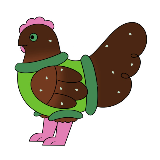
The Design Evolution of Clover Bennet
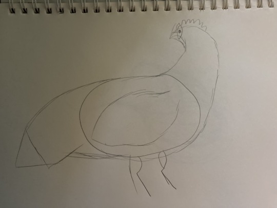
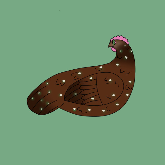
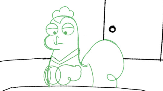
These were Clover’s very first pieces of concept art, and I believe she was the first one of the characters I ever drew digitally (tho there is a drawing of Dia that may predate this). The earliest Designs of the characters more realistically resemble actual chickens, and are much more detailed. I also didn’t know how to draw her legs so I kinda just didn’t draw them at all.

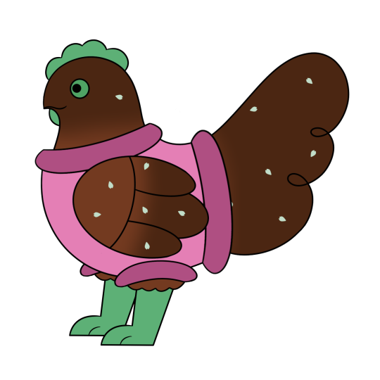
I drew a few more designs, and after making concepts for a few other characters (who will be getting their own posts), I decided on a more cartoony style. Some of these design elements seen in these early drawings are still present in the current style. For example, the more paw-like feet, because to this day, I cannot draw bird feet. I also finally gave her a sweater, which she has kept throughout all of her designs and was also inspired by Mabel Pines’ iconic sweater.

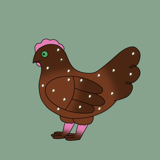
I eventually switched her accent color and sweater color, both making her name make more sense since she was now naturally green, and also leaning more into the Mabel Pines inspiration. I also got rid of the brown gradient on her wings, head, and tail around this time to make her simpler and easier to keep consistent.
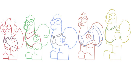
I also made these concept sheets for each of the main characters, and poor Clover probably had the most boring one. I was pretty set on these core elements, however I did soon start messing with them more.
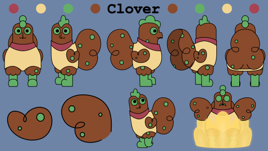
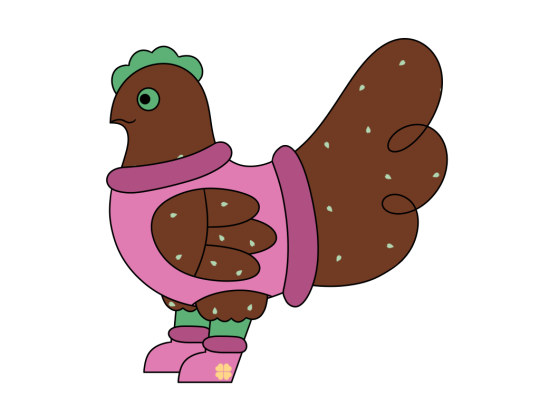
Each of the characters also got one of these turn arounds. They weren’t my best work looking back, but they were very useful because they helped me see some of the flaws in the proportions and perspective of this style. I changed Clover’s sweater colors again to yellow and pink, which I have kept as the sweater color from here on. I also changed the shape of her wings and gave her tail two floofy segments instead of the previous three.
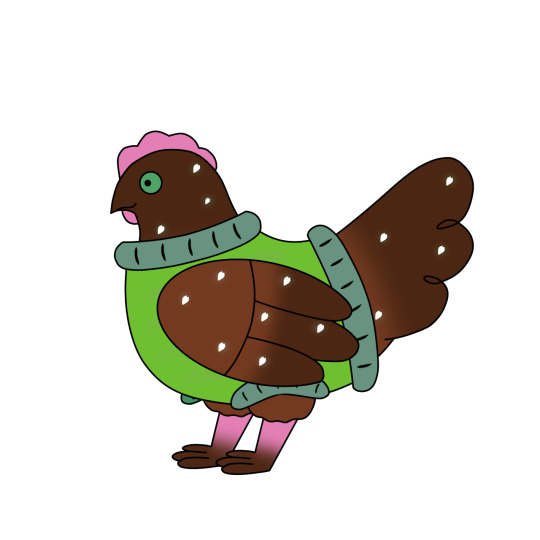
After making those ref sheets, I started adjusting the style as a whole to make it look more cohesive and easier to draw. I mainly changed the head shape and the connection between the back and the tail. They still all had the more round and almost chibi style from the reference sheets, but it was still a bit stronger.
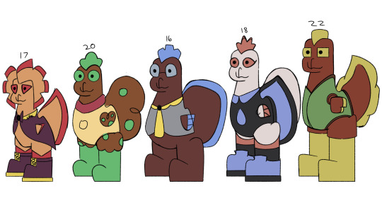
I eventually made this lineup, which I think is floating around somewhere on my main blog. I wanted to give the characters stronger silhouettes, and made this as a base for the current lineup.
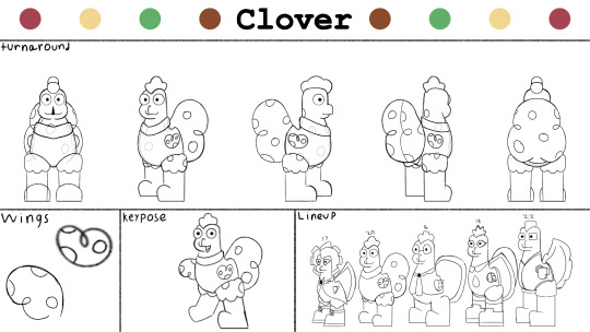
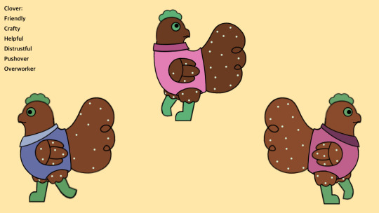
These are what I currently use as reference when I draw Clover. I gave all of the characters more diverse shape language, but Clover remained about the same. She has always been the kinda soft round one, given why she was the only one who kept the plain circular eyes.

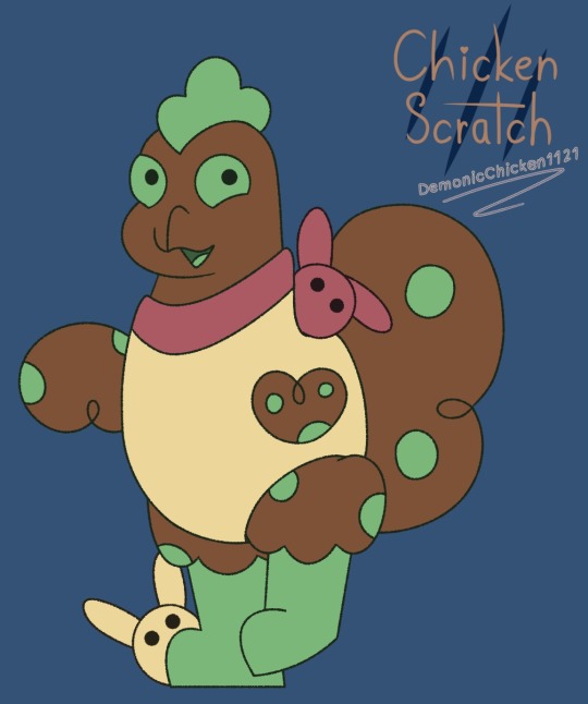
And this is how she looks now! Her design as well as the other characters might change a bit more over time, but I’m overall happy with this look.


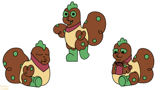
Have some Clover doodles :>
#chicken scratch#character design#concept art#cs clover#gay chicken art#gay chicken lore#chicken scratch art#chicken scratch lore
3 notes
·
View notes
Note
ai art will NEVER be real art even if its “ethically sourced” (lmao) because it lacks human touch, it lacks creativity and care and and genuine effort. you’ll never be a real artist if you’re just feeding a prompt to a robot. develop some talent or die mad, loser
ok first of all everyone get a load of this guy who thinks machine learning algorithms are actual genuine artificial intelligence
second off you just exemplified all of the worst parts of anti-ai arguments. you realize that this is like. word for word the exact shit people used to say regarding digital art ALL the fucking time? straight up i had art teachers try to fail me for doing an assignment in paint tool sai and other such shit because “the computer does it for you, that doesn’t count”. it literally all boils down to
A. a visceral disgust for things that are new and different that people aren’t willing to grapple with or confront
B. some sort of smug superiority that comes from being a “real artist” punching down on anyone whose “talent” you perceive as lesser. i’ve seen people turn around and carry this further and say shit like “you know what, photography and collage aren’t real art either!!!!!” which is SOOO STUPID. you cannot define what is and isn’t art. “talent” is subjective, skill is built and not everyone is capable of the same things, nobody is born with a magic art sparkle inside their brain that makes them inherently a good artist
C. a downright refusal to learn how these things work, even if you don’t like them or don’t plan on using them, and instead just parroting what other people say…when THEY don’t know what they’re talking about and are deriving their point from someone else…. and THAT person is purposefully misconstruing the facts in bad faith because they know that nobody on this damn website has a comprehension of nuance or the ability to think for themselves or fact check when a post sounds scary enough
by all fucking means, don’t take this to be blind support for every and all ai art generator out there. art theft is an issue! it’s a big issue!! but not all machine learning systems are created equal and you can’t make broad sweeping statements about the inherent morality of using what is literally a tool to make pictures, ESPECIALLY when you have no idea how the hell it even works. you’re actively harming the attempts of those who ARE pushing for ethical dataset use because you’re too damn stubborn to do any learning before you speak.
also, for the record, i’m not an ai artist - i don’t have the technical know-how to mess around with code, nor the free time to learn - not that it should matter. i don’t have to have personal stakes to be mad that y’all are being obtuse as hell on the subject
33 notes
·
View notes
Text
Project RBH Devlog 0002 – Start The Clock
So the Game Design Document (GDD) is done. And much sooner than I’d anticipated.
It’s not as fleshed out as it could be, but this is a project I am working on solo so that’s less of an issue.
Since I don’t have a team to foster communications with, all it really needs to be is a place to gather my thoughts and focus my design to avoid feature/scope creep. Speaking of which, I’ve figured out my primary design brief around which everything else will revolve:
RUN AND GUN.
To expand on the idea, combat will be based heavily on the player moving around the screen, and there should be plenty of projectiles flying around from both sides.
With this done, I am officially out of preproduction. The only real thing I have left to do in preproduction is concept art, but again, solo developer. Honestly figuring out the specifics of the art style is more important to me than having ideas for what everything will actually look like.
Though speaking of those placeholder sprites I have running around, now that I’m out of preproduction, I think it’s time I actually make something shareable.
That’s right, Phase 2 is making a vertical slice of this game! Something I can share and show off to people to drum up more support for the project. Something that doesn’t have a bunch of squares with skulls doodled on them for enemy sprites!
The goal here is to make the finished game in miniature. My plans for that are:
1 ‘dungeon’
7 enemies
1 boss
The basic powerups
Like I said. Miniature. All pretty simple stuff. And since I finished my GDD much earlier than I expected, I’ve actually already started. That’s right! I’ve bamboozled you all! I currently have eight powerups fully functioning (though they don’t all synergize like they will eventually) and four whole enemies done!
Let’s take a look at how they show off the Run And Gun idea!
Our first enemy is the only one with an official name so far. I’d like to introduce you all to the Bamb. Careful, they’re easily excitable.
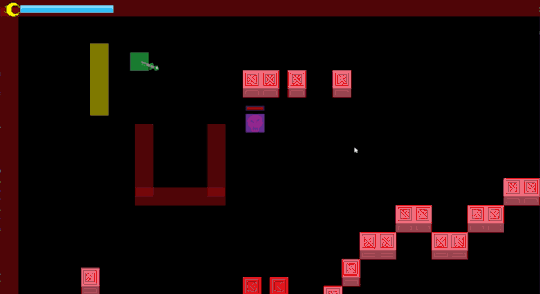
As you can see from that horrible placeholder explosion, these things go out with a bang. I’m not super satisfied with the red flashing right now, but that’s something I’m doing in code that will be better done with the final sprite later. The Bamb will slowly fade to white showing how long you have left before it explodes.
While Bambs don’t add a whole lot of bullets to the screen, their massive explosions are good incentive to keep moving. They’re not about to blow up on their own, either. These things light their fuse only when they’re close to the player. And as you can see from those crates that it takes with it, that explosion takes no prisoners.
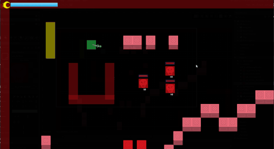
Next up we’ve got another area denial enemy, one that can help support other enemies.

This guy doesn’t move. At all. But they sure do make whole areas of the screen hostile to the player! And they add a new projectile to the screen as well! That’s some Run And Gun if ever I saw it! And since there’s no friendly-fire, other enemies can stand right beside it and fire at you from range. Of course, the player also has projectile attacks—that’s kind of the whole point—so it’s not that dangerous.
Moving on to what’s pretty much a reskin of the basic enemy you’ve already seen, but with a twist!
That’s right.
They have shotguns.
That’s it; that’s the only difference.
I have plans for two more enemies, which if we include the basic enemy I’ve had this whole time brings my total up to 6 of the planned 7, so good progress on that front!
So, what’s left to do before I can launch the demo?
Finishing the remaining three enemies
Creating the hub area that you start at and return to on death
Procedural Generation
Menus
Actual Art
Music and Sound Effects
That’s also the order it’s going to be done in, by the way.
I’m not looking forward to the music and sound effects though. I’ve messed around with sound effect creation in college and honestly I’m quite fond of fiddling with settings in a Digital Audio Workplace, but I also don’t have a sound library, so I’ll have to track one of those down somewhere. I know of some free places.
Music likewise. I’m not much of a composer (yet) so I’ll be grabbing some royalty free stuff so it’s not total silence in the background. Not quite the ambience I’m going for.
So that’s it then. Off to the races. Making an actual product that I can show off to people and get some interest. All pretty simple.
Too simple, in fact.
I am after all on something of a time limit until the bank repossesses my kneecaps. Let’s speed things up a bit.
I’m going to have this vertical slice, this miniature demo, finished and playable within a month.
I am giving myself four weeks to do this. We’re currently on Devlog 2. Devlog 6 should, if all goes well, be the launch announcement. Patrons get first grabs of course.
Deadline set.
Clock’s ticking.
Until next Devlog!
-DeusVerve
Special thanks to my Tier 3 Patron Haelerin!
Support me on Patreon
16 notes
·
View notes
Text
Introducing: Jupiter
(Archived from @sol-nebula. Also I think some of the quality bit the dust on this reupload. RIP)
hey guys how is your night going mine is going okay- OH NO *drops fanbot art*
Meet Jupiter :) Look under the cut for more info and art I’ve been working on (hopefully I do this cut thing right lol)
Beholdeth. My fanbot. Jupiter. :) Jupiter uses they/them pronouns, and their instrument of choice is the theremin! It adds a nice ambient sound to songs. Jupiter was created a few months before the weekend war, they were one of the bots made in preparation for the war. However, Peter Walter I always did hope that after the war his bots could live a peaceful life pursing music… and after all the other wars SPG canonically served in, Jupiter was finally able to pick up the theremin. They had played around with it before, but their time with it was cut short due to the need to go to war. (this picture was drawn using a reference that was a real person so it looks a little funky)
These are Peter Walter I’s first sketches of Jupiter teehee
(this is actually the first digital drawings of Jupiter I did. I took my sketches I made in class and brought them to digital. I thought it would be cool to make them look like they’re on some old paper PW1 drew on) You can see they have multicolored eyes & some neat goggles. They also wear gloves because their hands got a little messed up in the weekend war. Peter repaired them to the best of his ability. Their wig of choice is long blue with a ponytail. That red shirt they’re wearing is actually a vest, they wear a white button up undershirt that you can’t see due to their long coat.

Here is Jupiter doing one of their favorite things - reading while a thunderstorm goes on outside in Library 22 of the Walter manor.
(I totally didn’t make it library 22 to commemorate that I made Jupiter in the year 2022 hahaha)
Bonus - a drawing I did in one of my classes while we were talking about Pokémon of Jupiter feeding a Piplub. Because Piplub is my favorite starter 💙

Feel free to ask me questions about Jupiter or what not. To be quite honest, I feel like as if I’m still forming some aspects of Jupiter’s personality and backstory myself, so maybe some questions can help me figure out what I want to do lol
2 notes
·
View notes
Text
2023 Self Check
Honestly, having an overall middling year where most of my troubles were my brain’s fault was kind of a breath of fresh air. Being out of commission for most of last year with a fucked up knee at least got me thankful every morning I can get up and walk around without a brace or cane. I don’t really agree with the doctors and my Dad that I’m “young” but I’m apparently still young enough I can heal. That said, I’m kind of let down in myself for letting depression and laziness get the best of me like, worse than usual this year. It hit kind of hard when sitting back and going through old archives of content and realizing that:
Sketch-A-Day was 2015
Eishi and Dixie was before that
Revolver Knight ran from 2005-2008 or 2009
Meaning I’d basically failed to really deliver on any of the series/game/etc ideas I’d pitched from 2016 onward with the arguable exception of the dungeon crawler card game’s first version. If anyone was curious as to whether I’d touched on some of that stuff in the meantime the status of my Things right now is:
Angel Dust (The Gatty Thing)- Pretty much axed, as much as I love the character, it was kind of turning into edge for edge’s sake. The thing about Gatty Ling is I’ve had the idea of an erratic, destructive but adorable and well meaning character kicking around for ages but she’s kind of just a blank slate beyond those traits and I’ve tried to plunk her into like three completely unrelated settings with different origins. I was also attempting to kind of do a distinct art… sub…style with her stuff closer to a moe VN look, really pump up the cute to make the dark stuff pop, but well, Madoka already exists and the last iteration was basically Madoka with Robots. I probably wouldn’t rule it out forever but I’ve kind of been using some bits and pieces of the setting to flesh out the Plane Girls Thing
Revolver Knight Reload- I got like three pages into drawing a complete remake of my old webcomic, but kind of got cold feet from a combination of things. I didn’t think I was ready to take on another gigantic long form story, though I promise that the new version was *MUCH* more refined. Like Gatty, I wouldn’t say it’s *impossible* I mess with this, but I think I might look into something closer to a light novel with spot illustrations than a full on comic in the interest of like, finishing before I die.
Critical Heaven (The plane girl thing)- Still active, but having a bit of an identity crisis. It began as a ‘skirmish’ tabletop wargame then I got to thinking about it as more of a shmup-inspired duel game. The format of tabletop/print is also kind of iffy because I know people would be more likely to play it digitally and I have like, zip experience putting a substantial game project together. There’s also a more or less complete ‘campaign’ jotted half in my head and half in my notepad (putting it in a game with multiple endings would save me from deciding which ending to give it, hmmm.) But in short, yeah this is still being picked at.
Irrgarten (The Dungeon Card Thing)- I know I lead off with kind of the downer limbo thing but I’ve actually not totally abandoned this, definitely not the setting. Surprise, Radona is from this world! Really, I could probably bring this back pretty easily by revising the original game rules, the biggest issue we ran into play testing was that items didn’t ‘feel’ very valuable- characters were strong enough on their own not to need them. Maybe I can bump this up in priority.
There are probably other story ideas I’ve mentioned over the years and not followed up on, but characters from axed stuff do tend to surface in other projects if I’m attached enough to them. If there are any particular things that you enjoyed my work in or reading about in the past, do let me know. I’ve had a hard time motivating myself, so a nudge wouldn’t be a bad thing about now. Next year, I would really like to put more effort into having a regular “thing” to work on, maybe I’ll bring back some gag comics. Definitely plan to do more drawing in general because drawing one decent thing then going radio silent for two weeks leads to needing to de-rust like, every time. I’m a creature very vulnerable to inertia.
So, no promises here, but my goals going into 2024:
Put some time into practicing more ‘dynamic’ content like simple animation and game design since I have like three game making programs sitting around
Regular art posting, with a focus on improving quality and speed
Minding my health more since it’s easier to be active when there’s less of me to move
Establish a more regular streaming schedule since it helps me trim down my backlog
This kind of turned into more navel gazing than I had planned to be doing, but I thought this was a good time to touch base on some things since I’m back to posting here… well, okay, ‘regularly’ is a stretch, but there are a lot of things I’ve brought up before and not followed up on in a long time. If anyone has still been reading this- thank you, truly. I hope that with a bit more focus and less dwelling on the gnawing darkness in my gut, we can have some fun here again.
Oh, yeah, by the way- also been kicking around a top X games list I may get to posting soon, but may save for New Years Eve.
3 notes
·
View notes
Text
🌸Rottmnt oc head-cannons🌸
Part 1 : Marcy
So I’m gonna be doing hcs for sunny, Marcy, Skye and Angie but I won’t be going in order. This will just be random hcs I have for them as well as their relationships with the turtles.
Right now Im gonna start off with Marcy!
- marcy likes to go thrift shopping for old clothes she can re-vamp, somehow comes home with like a box full of clothes and fabrics. Uses as inspiration for designing new clothes and items in her sketchbook.
- has a space in her room for Donatello to come hang out and relax if he needs a little bit of peace and quiet away from his brothers. Makes sure none of the gadgets he makes over in her room are messed with or damaged.
- her and Donatellos first date took place at an 80s themed pizza restaurant. They gave each other a gift, he made her a upgraded version of a switch and she made him a purple satin jacket with his genius tech trademark and his name on the back.
- one of her favorite snacks is strawberry pop-tarts and mini waffles
- her and Donnie like to learn from one another. They listen to each other info-dump about each others interests and hyper-fixations. The both of them do enjoy and love working together, she may or may not have her own workbench in his lab and a spot in the turtle tank.
- Marcy cannot stand the feeling of cotton balls against her skin. She claims it makes her want to curl up on herself, so she goes out of her way not to to come into too much contact with them.
- marcy and Donnie like to make care packages or get gifts for each other. She personally goes out of her way and buys him a new weighted blanket after he makes her an automatic paint brush cleaner since she told him her hands are cramping.
- Marcy’s theme song would be curses by the crane wives
- Marcy has a pair of glasses Donnie made for her when he confessed to her (he accidentally broke her og ones-he thought the new ones she got were much more durable)
- always has some form of paint splatter or art related mark on her skin even if it seems small
- organizes her art supplies and sewing supplies by color and type.
- has two closets in her room to hold the clothes and items she makes and revamps
- Can’t stand when her pillow is warm. Like it physically makes her angry
- mostly has random art travel supplies and every day items in her messenger bag that she Carrie’s around. (Also an extra pair of glasses just in case they get broken)
- Seasonal allergies are her worst enemy
- good at Digital and traditional art. Loves making stuff into charms, buttons ect. Made matching genius built charms for Donnie and herself
- Enjoys the sights and sounds of thunderstorms until the wind picks up (loud wind? Not the biggest fan)
- takes incredible care of her guppies and goldfish. The koi fish she got has a separate tank from the guppies. Likes to ad natural occurring plants into the tanks and tries to make a self sustaining healthy environment for her fishes.
- Marcy wasn’t diagnosed with autism until she was in elementary school when the girls mother Adrianna, a nurse, was finally able to get a doctor to listen. Is super grateful that her moms understanding and fierce nature, plus she was the first person to teach her how to draw.
- farming and fantasy rpgs are her favorite games
Some hcs for Donnie and Marcy
- Donatello enjoys holding hands with Marcy. Giving them a gentle squeeze. Enjoying the feeling of her hand laced in his. The warmth and softness of them. A silent but affectionate gesture they share with each other.
- Donnie thought she’d be bored by all the rambling about his tech and how it works, but was surprised to see she was actively listening. She remembered a few parts he needed and actually brought them by the next time she and her sisters came over to the lair.
- his favorite thing about Marcy, other than her personality, is the way she smiles. Something about the way the corners of her eyes crinkle and the lopsided sweet smile she can have makes his emotionally unavailable bad boy heart flutter
- always fixing each others goggles and glasses. Both absentmindedly and intentionally. Donnie always keeps a spare on him for just in case hers breaks and she always makes sure to clean his goggles off for him.
- team up against the purple dragons all.the.time, their second date literally was going great and the purple dragons almost ruined it and had to be dealt with
- after several trusting moments, Donnie does allow Marcy to examine his soft shell. She is super careful and constantly asks him if he’s okay or not. Compliments his shell and his mutation, which may or may not have caused him to happy churr and have tail waggles at the same time
- physical contact gets built up over time, but there is no doubt that the both of them are cuddle bugs with each other after they take it slowly. Especially during winter and fall.
- both of them Defiantly pick up on each other when one or the other are having a sensory overload or uncomfortable in a situation. Marcy won’t hesitate to gently pull Donnie to the side somewhere quiet and lend him her noise canceling headphones. Gives him a comfort snack or drink and just tries to be there for him if he needs her.
- the same with Donnie. Keeps a literal notes of what she likes, dislikes ect. What textures, tastes, sights and sounds she is uncomfortable and makes sure to help her avoid them as much as possible.
- hating slimy textures or residue solidarity 🤝
- donnie keeps a bunch of notes and information about Marcy’s likes and dislikes alphabetically
- Marcy is honestly Not afraid to call donnie out for being in the wrong. Even if it’s small. For example in the mystic library, she pointed out the fact that he should have just written the location down. Stating that despite his genius mind, he’s got a bad habit of being a bit too overconfident
- Definitely dance with one another to 80s music. They Work on getting better at dancing all the time.
#rottmnt oc#oc : marcy#rottmnt donnie#rottmnt donatello#oc x canon#oc headcanons#save rise of the teenage mutant ninja turtles#rise of the tmnt#writing#rottmnt
2 notes
·
View notes
Text

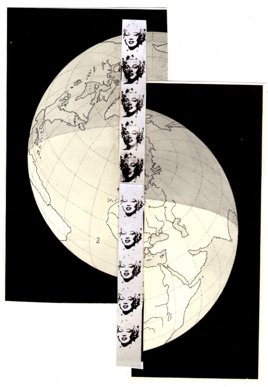
In 2018, one night, I started to make a wish. Scanning with a printer various different collages I had created and regretting not getting much started in life, Marilyn Monroe stared back from the scan with a smile.
The project title became Sylvan Mind, then Sylvan Hotel, then it became something of a black-out poetry session, then unwillingly ending the night, started again in the morning. I couldn't get my mind off that damned wish to create something worthwhile.
Was it all that worthwhile?

A time did come when I found it truly inspiring, uplifting, and something to sacrifice myself for. It became a passion of mine to scrap digital images together or cut up magazines to tape, glue; it actually might have been the only thing holding me together. I doubt that it was my saving grace - I believe now that in part, it was and still is an unhealthy obsession. However, to look beyond trying to make something of this bulk of information…I’m not sure, but it now holds a huge significance to me.
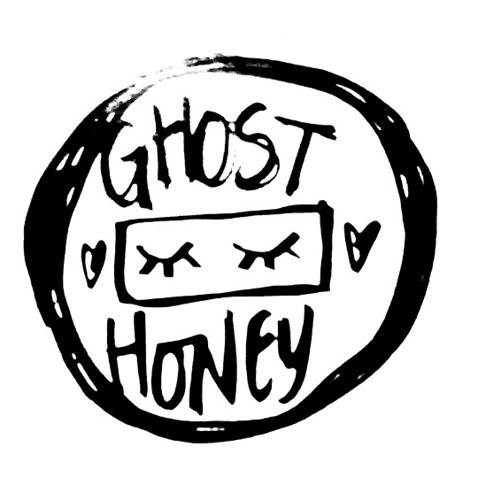
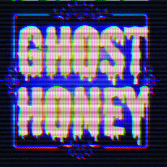
GHOST HONEY : ZINES + PUBLICATIONS + ART + POETRY
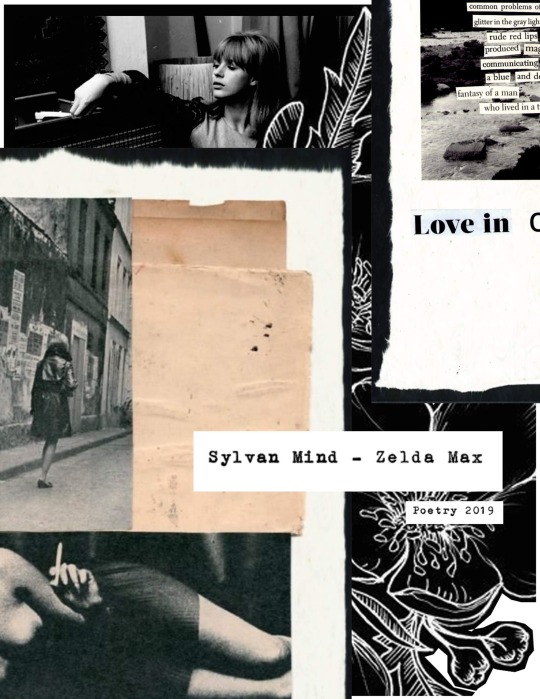
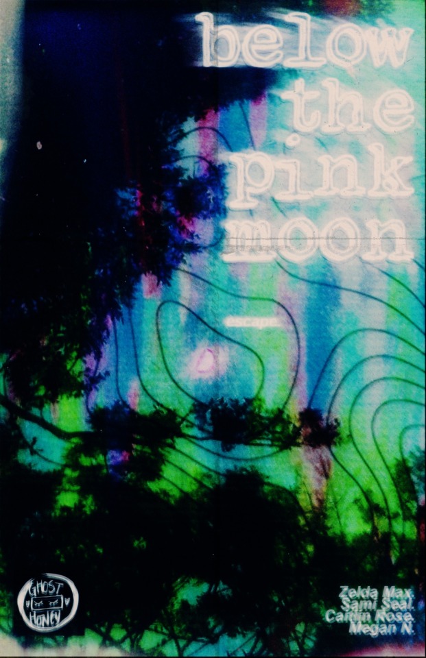
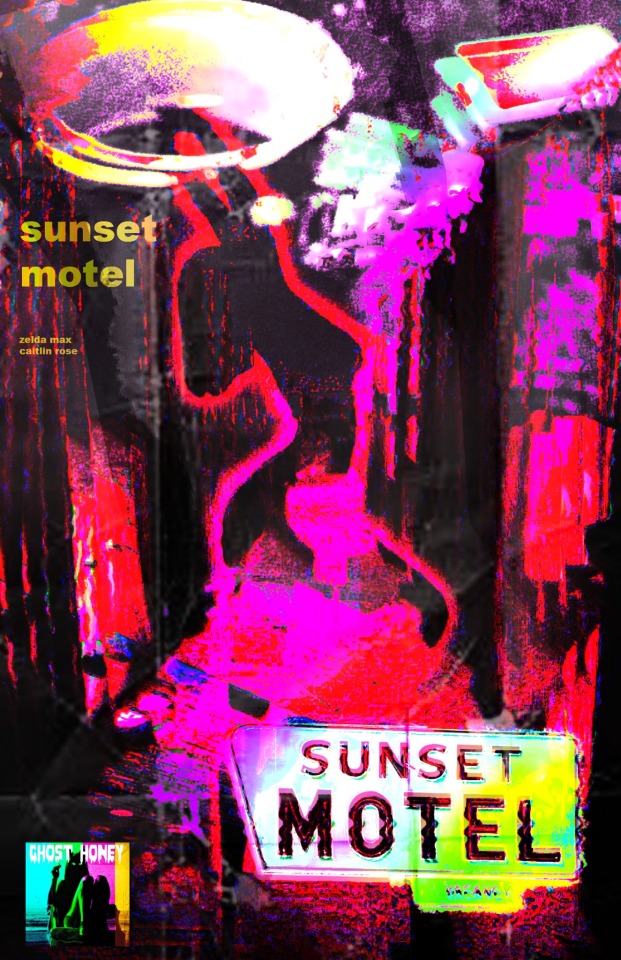
We are now a group of four women loosely held by the ties of art and creating poetry. Maybe our paths crossed by luck or coincidence, and maybe by the stars. As mentioned, the project started out by myself (Zelda Max) in 2018, growing out of my chaotic life until around 2020, when my life stabilized. I used my Samsung until around them too; then precariously got to some of my senses and bought a computer. That was around the time I met the three other women in our zine-making collective. We decided to, alongside some past work, start writing and creating about the bitterness of love and the melancholy state of loneliness. This turned out into two different publications: Below the Pink Moon and Sunset Motel.
Before we created these two projects (the first one involving all of us while the latter was just myself and Caitlin Rose), I introduced them to something called Syko-Zine, which I created years prior to meeting them.
The artworks in Syko-Zine were created in 2011, while I was still a teenager in school, learning Photoshop and having fun with it. After some years went by and my interest in zines piqued, I decided to condense my various loose digital files of art by printing and manually pasting the images into an empty sketchbook. I called it “Connect the Dots,” back then in 2018. It was a prelim to “Syko” which was printed around 2020, around the time I met the others.
I’ll get around to posting the title page.
Anyhow, I made some different logos and messed around with different ways the artwork can potentially look for [GH].
Well, that’s it for now! Be back soon with more about Ghost Honey information and stories about how we came to this point in creating more poetry, art, and stories. Catch you on the flip side.
2 notes
·
View notes
Note
Hey I followed you a bit ago (came for the gay cat comic, stayed for the nonbinary autistic dnd nerd energy bc same hat), it’s been cool getting to watch your art develop while you’re going through art school!
I can’t remember if you’ve ever posted about working in Blender, but I’ve just recently started learning how to use it and it’s my first foray into 3d modeling from exclusively 2d digital art and graphic design. I was wondering if you had any advice you’d be willing to share for a 3d newbie based on your own experiences learning to make 3d art? It’s been fun so far, but it feels like there’s so much to learn!
Aww!! This is really sweet, thank you!
Well, I guess the first thing I’ll say is I learned on Maya which I’ve heard it pretty different from Blender. I think the hardest part is really staying excited. There is SO much to learn and new technology can be frustrating. (For me I’ll usually cry over a program for a while before I really get the hang of it). I spent twelve hours one day learning all the wrong ways to unwrap a UV, but that time wasn’t wasted. It was frustrating, but I was learning how to do it a little better each time.
I highly recommend the efficacy of keeping a log- whether it’s for yourself or on social media- of the progress you make. Getting to look at the first 3D thing I made (that I really struggled with):

versus what I was able to make when I got my feet under me:
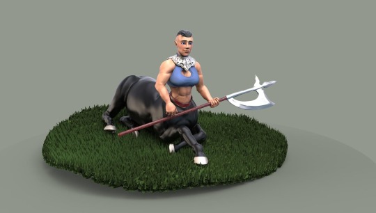
Is a pretty remarkable improvement, but if you’re only looking at the last thing you made you may not see how far you’ve come.
If you have the time just play around. Decide on a personal project and be wrong about a lot of stuff. Try to make a character you like or model some kind of vehicle you like, check out tutorials that get you excited to play with some new tool you haven’t messed with. You’ll be wrong about most of it but you’ll learn a whole lot about how not to do it and how to do it better next time.
Ultimately I’m not delving further into 3D modeling. I liked what I learned but I found my passion in a different aspect of tech art but I still love that I have the tools to make little personal things if I want to!
#3D art#3d modeling#I want to learn just a liiiittle bit more modeling so I can sculpt my own characters to rig but most folks advise against it#Jack of all trades but master of none really doesn’t land jobs in the game industry#so instead I’ll just cultivate friends who can clean up my rough models for me#ramblies#ask ffs
11 notes
·
View notes
Note
wow this was your first year doing digital art?? That's super impressive!! Your art is amazing- especially the way you use colors in your paintings.
If it isn't too much, what is your process for coloring/painting like??
Happy new year btw!
Tysm! And happy new year! 🎊
I’m so happy I finally found my medium I was in an really bad art block for yearrrrss but ever since I got an iPad last christmas I feel like I’ve been making up for lost time lol I’ve improved like crazy. Literally so grateful. What a year 😅
Took me a while to really find a painting process that I like the best but as of now my process usually goes as follows:
1. Make my sketch a very dark orange or brown
2. Do a light airbrush layer underneath it to fill in general colors and skin undertones
3. While looking at a reference I paint the skin tones and other colors with a round brush directly over the sketch. I try not to blend anything unless I absolutely must. I also keep the brush pretty large and my strokes loose. Make sure not to paint any of the highlights in this stage too
4. My fav part. I work in procreate so I use the default brush nikko rull to do any highlights and details. I love this part cause it adds so much texture and it also just pulls everything together to look all nice and painterly :)
5. You don’t really need to do this but at this part I like to mess around with all sorts of gradient layers and saturation and stuff. I usually just experiment a ton until I like the colors
So yeah that’s my best attempt to explain my process lmk if it helps! I’m always trying to experiment with new processes though so who knows maybe a year from now it’ll be completely different we will see :)
BIG MOVES happening in 2023 I can feel it 😌
#I actually changed my major thanks to that iPad believe it or not#I was originally going into graphic design but now I’m so glad I switched#commercial arts all the way baby 😎#it’s crazy I’m finally making the art I literally used to only dream of being able to make#like if you showed me from 2 years ago my art now shed think you were lying#procreate#process#original art
12 notes
·
View notes
Note
I’m starting out with digital art, do you have any tips for beginners? Your art is like amazing so
thank you so much!! I'm very flattered you'd wanna ask me. oh boy, lets see... hmm...
never be afraid to use a tool because its 'cheating.' digital art will offer you a thousand tools that make drawing easier and more fun. it doesn't even waste paper to try all of them. undo and transform are just the tip of the iceberg. I highly recommend messing around with whatever free brushes you can find for your program, as well as all of the options in the drop down menus. also, mess with the layer blending options, I promise they're not as scary as they seem at first and they will change your life.
secondly, if you can find a way to make art more fun, DO IT. you may have to branch out to learn new things, but you also have to make drawing more fun than video games or netflix in order to learn anything. I hate drawing linearts, so I just don't. I love shading and blending and rendering, so I do that a lot. now I wind up making paintings every time I sit down because I get lost in the sauce. even little things like a brush feeling nice to scribble with or bright colors making sketching more fun are worth pursuing.
also, watching speedpaints can be really helpful and fun for learning process and technique things.
that's all I got, I think. sorry for being kinda cheesy, and thank you very much for the ask, I like talking about art :D
#asks#man talking about this has got me wanting to draw again#I just really love art#you've heard of 'just draw a lot to get better'#get ready for 'make drawing as easy and fun as you can so that you hardly have to think about drawing a lot you'll just want to do it'#my secret technique is just autism hyperfocus
6 notes
·
View notes
Last Seen Blogs

watercolourist8
Untitled
peludosconcamisa
Peludos con camisa

havaianas-as-legitimas
Havaianas
ash-a-roni
#1 wholesome family blog
mebellad4
Bella(itadori's gf)