#icon tutorial
Text
PHOTOPEA TUTORIAL / PHOTO FILTER FOR SKIN TONES:
a tutorial on HOW TO BRING OUT SKIN TONES if an image is 'too gray' (faded) or has too much of one (likely over saturated) color!
this technique can easily be applied to icons that already have a border ! just put your focus on the base image / icon ! this works on relatively anything, including poc and non-poc.
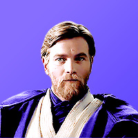
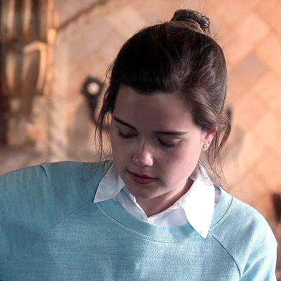
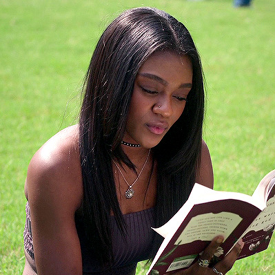
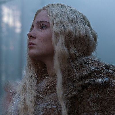
WHAT YOU WILL NEED: photopea...and your desired your base image(for example, i'll be showcasing inconsistent or otherwise dark/faded scene lighting, like twilight and saw).
DISCLAIMER: not all lighting/images are the same, nor are psd colorings. while some colorings may be designed to bring out reds/yellows(which is the filters we'll be using in this specific example), others may mute them and you may have to improvise with whatever color the psd you're using is designed to focus on. this is just a general idea, you will have to explore as you see fit. it's all going to depend on your personal taste !
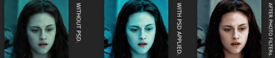
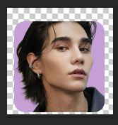
by the end of this, you should be able to manage results like this !
cool, huh?....anyway, on with the mechanics !
EXAMPLES:

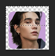
[ BEFORE PSD ] [ SYNOPSIS ]
#01 / LEFT IMAGE ABOVE: too much green, becomes muted with psd and doesn't show variety.
#02 / RIGHT IMAGE ABOVE: the colors are very faded in this scene, and the pink focused psd in question made the image seem gray. we will start with EXAMPLE #01.
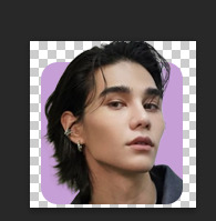
i will be using the same PSD on both, a custom psd i made and focuses on reds/pinks.

as you'll see above the PSD has now been applied...but now it's kinda boring :// (there's nothing wrong if you don't mind how it is above, everyone's got their aesthetic choice—HOWEVER, we're aiming to add skin tone...)
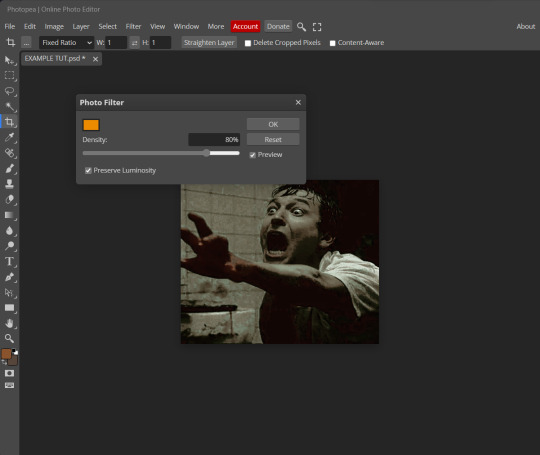
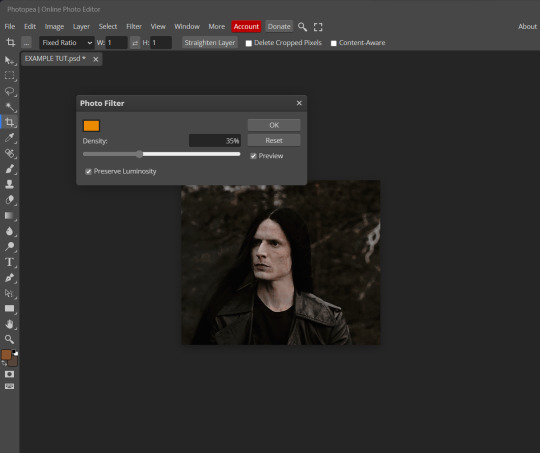
once you have your image open, you'll want to go to image>adjustments>photo filter; i went ahead highlighted it in yellow for easy finding !

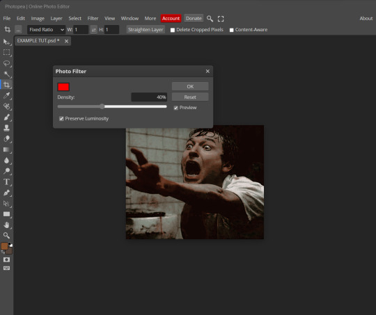
since this psd DOESN'T mute reds/yellows, (and those are usually the base of most/general skin tone combinations) i applied both a yellow and red filter. now, these colors i'll be using in this example, because they're in my default colors on the photo filter option—you can totally choose lighter or darker variants of these colors, or like i said, a different color altogether based on how the PSD you're using works. the toggle setting doesn't have to be exact to this example either—this is just what worked best on this image combined with the chosen PSD ! // RIGHT IMAGE IS THE FINAL RESULT AFTER APPLYING THE RED FILTER AFTER THE YELLOW.
repetition

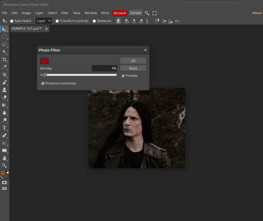
this scene in particular is very faded, and the red feels a little blotchy/over saturated here...so i'll show you an EXTRA STEP you can use ! in saying this, you don't have to do exactly this; you can even choose to go ahead with selective color to fix your image, without doing the filters, if you find that suitable. but i'll be showing you the magic of selective color to balance out the red toned overlay.
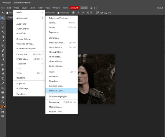
same concept as before, just a different selection: image>adjustments>selective color. think of selective colors as "balancing" the colors.
it does have a toggle selection for each color, which is super helpful, including diminishing or adding white highlights.
given the PSD colors, naturally, i'll be focusing on yellow and red.
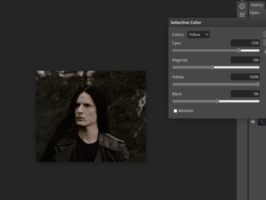

it's now got a general skin tone and red is not as blotchy !
[ FINAL RESULTS / CONSISTENCY WITH PSD APPLIED ]

this is a great hack i use quite a bit, it's great for maintaining consistency in your icons when the lighting is working against you...hope this was comprehensible and helpful, happy editing !
#FREE TO REBLOG !#leech's tutorials: photopea.#rp community#icon tutorial#rp icon tutorial#psd tutorial#roleplay coloring#roleplay help#roleplay resources#roleplay community#roleplay graphics#coloring psd#psds#icon psd#psd#roleplay psd#rp graphics#rp psd#rp resources#tutorial#editing tutorial#rpc tutorial#long post /#editing resources
173 notes
·
View notes
Text
GUIA COMPLETO DE COMO EDITAR FOTOS EM ALTA QUALIDADE (HQ)!
oiê, bem vindos(as)! à pedidos, estou trazendo um tutorial bem abrangente sobre como editar fotos no geral para icons, headers, etc., em alta qualidade. neste guia/tutorial trarei dicas, truques e informações gerais sobre o que é preciso para editar em hq. lembrando que o conteúdo deste guia é sobre como eu edito, a maneira que funciona comigo e meu progresso e aprendizado ao longo de quase 12 anos editando icons, ou seja, o que contém neste guia pode — e deve — ser adaptado à sua maneira e ao software de sua preferência. aproveitem e se divirtam!
nota: este tutorial está bem longo, então, se possível, veja este guia pelo pc/notebook!
O QUE VOCÊ VAI ENCONTRAR NESTE GUIA
softwares necessários com links para download;
onde e como baixar as fotos para as edits;
métodos de edição e passo a passo;
como melhorar a qualidade de uma foto;
como salvar a foto corretamente para postar;
dicas de actions e outros resources.
clique em “continuar lendo” para ver o tutorial.
1. SOFTWARE
photoshop
eu recomendo fortemente o uso do photoshop cc na versão mais recente, ou outra versão com camera raw ou filtros neurais suportada pelo seu pc ou notebook.
você também pode usar o photopea como alternativa (eu particularmente prefiro o photoshop pois acho que as edits ficam com mais qualidade). se você preferir o photopea, algumas dicas desse guia poderão não funcionar devido à falta de algumas funcionalidades que o photopea não oferece (ex: camera raw, galeria de filtros, filtros neurais e outros).
eu uso a última versão do photoshop (atualmente, a versão 25.5.1) e uso a versão paga (obrigada adobe pelo desconto de estudante!!!!!), mas vou deixar alguns links para você baixar o photoshop gratuitamente caso você não seja estudante e/ou não tenha condições para assinar um plano.
atualmente eu uso um mac mini 2014 para editar, mas sempre usei windows, então, as dicas e os links valem para os dois sistemas operacionais.
links
macos: 1, 2 & 3.
windows: 1, 2, 3 & 4.
2. BAIXANDO AS FOTOS
galerias de fotos
muitos artistas têm fansites com galerias de fotos e você pode achar facilmente digitando no google: “nome da pessoa + gallery”.
o artista que eu quero não tem galeria própria e agora? tranquilo, ainda temos galerias de fotos de famosos variados como hqdiesel, hqsource, hq-pictures e até mesmo o theplace.
em último caso você pode usar o gettyimages e usar um removedor de marca d’água ou um site como o gettyimages downloader.
instagram
para artistas estrangeiros que tenham apenas instagram e/ou não tenham fotos em galerias de imagens, eu recomendo o instagram pessoal da pessoa.
você poderá fazer o download das fotos com extensões de navegadores como o image downloader for instagram (para firefox e google chrome), ou sites como o saveig, o snapinsta ou o igdownloader.
eu recomendo baixar pela extensão do navegador, pois ela baixa a foto direto do site do instagram no computador, diferente dos sites que você precisará ir foto por foto, copiar o link e colar no site para fazer o download.
mas, caso a extensão esteja indisponível, com algum erro ou pare de funcionar, o site é uma excelente alternativa (só precisa ter mais paciência).
nos sites para baixar fotos do instagram, geralmente eles dão a opção para você escolher o tamanho da foto. você deve sempre selecionar a resolução maior da foto (acima de 1000px é o melhor).
pinterest
em casos extremos de artistas low profile, sem instagram, sem aparições públicas, sem galerias de fotos, nadica de nada, eu recorro ao pinterest.
porém, é preciso ter muito cuidado ao fazer download de fotos do pinterest, porque são muitas fotos repetidas e muitas com baixíssima resolução e qualidade.
se você for baixar fotos do pinterest, escolha a foto com maior resolução (imagens maiores que 500px já são ok para editar icons), e depois de baixar a foto, eu recomendo fazer um tratamento na foto para melhorar a qualidade dela, como vou ensinar.
3. EDITANDO
3.1 importando a foto no photoshop
apertando ctrl+o ou cmd+o uma guia vai abrir no programa, onde você vai até a pasta onde a foto foi salva. selecione a foto e clique duas vezes nela para abrir.
3.2 cortando a foto nas dimensões desejadas
muitos tutoriais de edições de icons sugerem que você copie a imagem e cole ela em um documento novo já do tamanho da sua edit, mas eu não recomendo essa opção, pois ao redimensionar a foto com a ferramenta de transformar (ctrl+t), ela dá poucas opções para manter a qualidade da foto e se você não souber o que cada opção faz, poderá perder a qualidade da imagem. então, eu sempre faço o recorte na própria foto para não alterar muito a qualidade dela.
aperte a letra c no teclado para abrir o atalho da ferramenta de corte. (se o seu photoshop for alguma versão do cc, eu recomendo que você marque a opção para usar o modo clássico de corte, assim fica mais fácil e você tem um controle maior sobre a ferramenta!). para fazer essa alteração é simples, vá no ícone de engrenagem, clique e marque a opção “usar modo clássico”.
para fazer icons, você deverá cortá-lo usado dimensões quadradas, ou seja, 1x1, e para headers 15x5. você pode mudar as dimensões na caixinha da ferramenta de corte.
3.3 redimensionando a foto
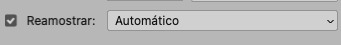
nessa parte você precisará prestar atenção, pois ao redimensionar a foto, você poderá perder ou ganhar um pouco mais de qualidade na foto, e para isso você usará uma opção chamada reamostrar (ou resample se seu photoshop estiver em inglês). deixe a opção marcada para usar as definições.
3.4 explicando as definições do reamostrar e qual definição usar de acordo com o resultado que você quer
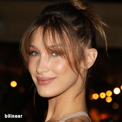


bilinear: a melhor opção para redimensionar gifs, mas para fotos não é tão bom pois dependendo da foto algumas partes ficam nítidas, outras mais suaves e se você for aplicar action de nitidez, pode ficar com um aspecto de “craquelado” com as bordas granuladas, o que eu pessoalmente acho que fica um pouco estranho.
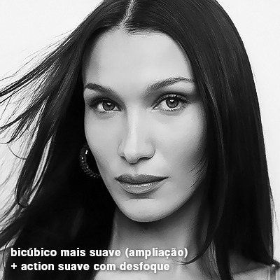
bicúbico mais suave (ampliação): como o nome já diz, ele deixa a foto mais suave, ou seja, os pixels “craquelados” e granulados da foto ficarão mais suaves. é uma ótima opção tanto se você for aplicar actions de nitidez ou actions mais desfocadas e mais suaves.
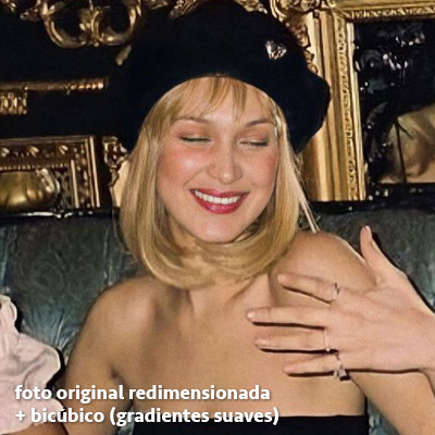
bicúbico (gradientes suaves): pode parecer a mesma coisa do bicúbico mais suave, mas esta opção além de suavizar a imagem, cria um “desfoque iluminado” nas transições das cores da foto. é a melhor opção para fotos sem muita qualidade e principalmente se você for usar actions suaves e desfocadas, sem muita nitidez.
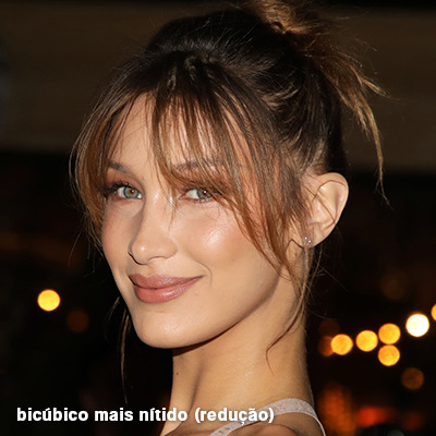
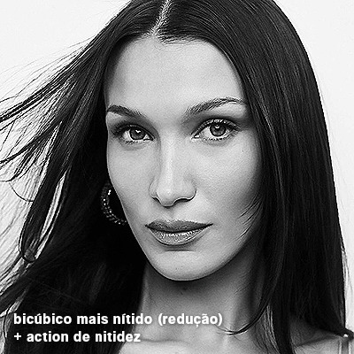
bicúbico mais nítido (redução): acentua os pixels e as arestas nítidas da foto, ou seja, essa definição redimensiona a imagem mas preserva a nitidez da foto. se você usa actions de nitidez que não tem desfoque nas configurações, essa é a melhor opção de reamostra. (mas cuidado, se sua imagem ficar muito nítida com essa definição, você precisará usar outra opção. caso contrário, quando você aplicar a action, a edit poderá ficar muito exagerada e/ou com aspecto áspero.)
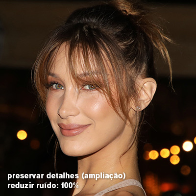
preservar detalhes (ampliação) com redução de ruído: esse em especial é ótimo para quando você precisar redimensionar uma foto para deixá-la maior sem distorcer tanto a imagem. você pode ajustar a redução de ruído para deixar a foto mais suave, sem perder muita qualidade. (obs.: essa opção não deve ser usada para redimensionar imagens muito pequenas, por exemplo de 200x200 para 400x400, ou a imagem vai ficar muito distorcida. ela deve ser usada quando a diferença de pixels não é muito grande, por exemplo, você cortou a foto e ela ficou no tamanho 370x370, aí sim você pode redimensionar para maior sem perder muito da qualidade. então você pode ir ajustando a qualidade com a porcentagem da redução de ruído).
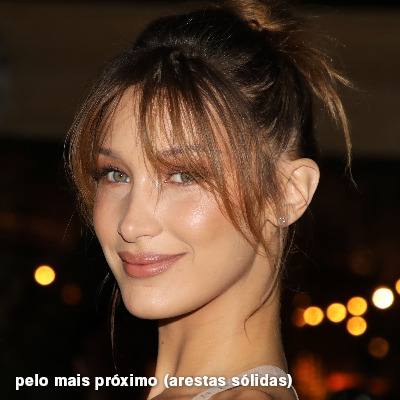
pelo mais próximo (arestas sólidas): essa é uma opção traiçoeira, pois não fica bem em quase nenhuma imagem (a menos que seja um pixel art). essa definição redimensiona a imagem e mantém os pixels nítidos, ou seja, a foto fica menor mas tudo nela que tem aspereza vai prevalecer. é muito usada para redimensionar pixel art, pois preserva as bordas ásperas. pode ocorrer de ficar boa em uma foto aleatória mas não será possível aplicar action, ou a imagem ficará exagerada.
3.5 aplicando a nitidez depois de redimensionar
depois de escolher a foto, baixar, redimensionar de acordo com o estilo da action da sua escolha, está na hora de aplicar.
eu fiz duas versões para mostrar como fica com cada tipo de action:
assim, os dois icons tem uma alta qualidade usando actions diferentes, graças a remostragem ideal para cada tipo de action :)
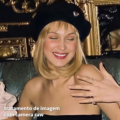
4. TRATAMENTO DE IMAGEM PARA MELHORAR A QUALIDADE
nesta parte, é muito importante que você tenha baixado uma versão do photoshop com neural filters e/ou com o camera raw, mas caso você não tenha, tudo bem também, vou ensinar como fazer uma melhoria na foto de três jeitos: com camera raw, com neural filters e com desfoques. a melhor forma vai depender de quão ruim está a qualidade da sua foto. em geral, apenas fazendo ajustes no camera raw você já tem um ótimo resultado na maioria das fotos.
camera raw
se seu photoshop tem o filtro do camera raw, ele vai estar em filtro > filtro do camera raw...
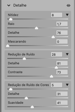
tudo que iremos fazer será na aba de “detalhe”, ali você deve dar mais atenção ao ajuste de redução de ruído, pois é ele que vai remover o ruído da imagem e melhorar a qualidade dela.
vá mexendo nas configurações de redução de ruído até que a foto fique mais suave. ajuste também o detalhe e o contraste da redução de ruído.
essa parte será mais no olhômetro mesmo, pois as configurações vão variar de foto para foto, mas eu recomendo muito você mexer também na nitidez para não deixar a foto tão desfocada, mas nada muito intenso para não interferir na action que você irá usar.
eu mexo também na redução de ruído de cores, porque dependendo da foto, algumas cores estarão saturadas ou com muito ruído. só cuidado para não colocar um número muito alto, pois esse ajuste pode tirar a saturação da sua foto e deixá-la apagada.
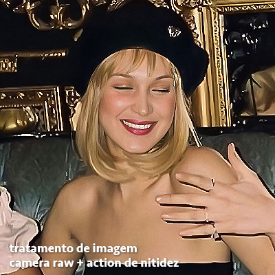
enfim, aqui está uma comparação da foto original com o tratamento feito com o filtro do camera raw e depois já com a action de nitidez aplicada:
e essas foram as configurações que usei nessa foto em específico:
como eu disse antes, as configurações irão variar de foto para foto, a depender da qualidade de cada uma e de quão ruim a foto está, mas com essa configuração básica, você já vai conseguir melhorar algumas fotos.
neural filters
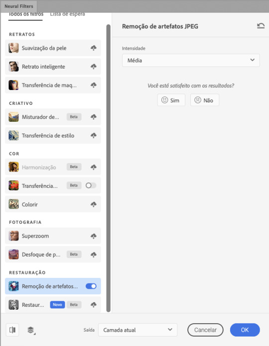
se a versão do seu photoshop vem com neural filters (ou filtros neurais), ele estará em filtro > neural filters...
irá abrir uma janela com vários filtros mas o que a gente irá usar vai estar em “restauração”, com o nome “remover artefatos jpeg”. se precisar, faça o download do filtro.
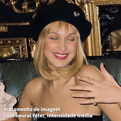
eu recomendo usar a intensidade sempre média, a menos que a foto esteja muito ruim, aí você usa a intensidade alta. mas em geral, a intensidade média ou baixa já dá conta do recado.
a saída deve sempre estar na camada atual, ou seja, na camada da foto selecionada.
assim:
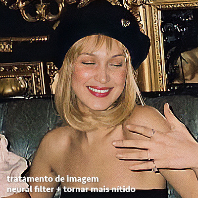
e aqui está uma comparação da foto original com o tratamento feito com o neural filter e depois já com a action suave com desfoque aplicada:


a opção do neural filter é uma ótima alternativa ao camera raw, o único contra é que ele deixa a foto com uma textura áspera, e quando você usa uma action de nitidez eles ficam muito visíveis e acaba não ficando muito legal.
porém, um bom jeito de contornar isso é adicionando ruído na foto. eu uso o efeito de granulação do camera raw para adicionar ruído no icon (você também pode adicionar o ruído em filtro > ruído > adicionar ruído..., mas eu prefiro o camera raw pois ele dá mais opções para ajustar o granulado do jeito que eu preferir).
no primeiro icon abaixo, dá para perceber a textura áspera que o neural filter deixa depois de melhorar a foto e adicionar nitidez; já no segundo icon eu mostro como eu adicionei o ruído e contornei esse defeito.

as configurações de ruído que usei no camera raw foi 12 de granulado, 35 de tamanho e 20 de aspereza.
lembrando que, se você for usar uma action de desfoque e/ou remoção de ruído, não será necessário adicionar a granulação, pois a própria action já vai suavizar a textura do neural filter (a menos que você queira adicionar o ruído, claro).
redução de ruído + desfoque
caso a sua versão do photoshop não tenha nenhuma das opções de camera raw ou neural filter, caso você use um photoshop mais antigo, photoshop portable ou prefira usar o photopea, essas alternativas podem ser úteis.
mais uma vez, irei me basear no olhômetro, de acordo com a foto e irei ajustando as configurações de acordo com o que eu quero e acho necessário.
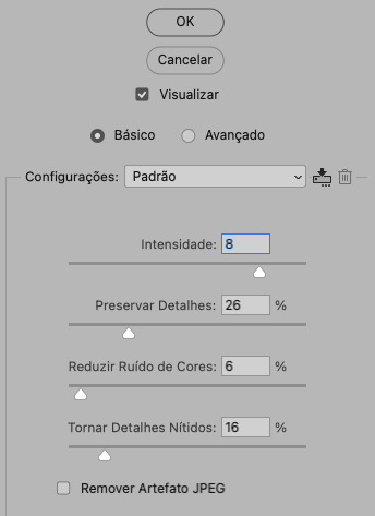
vamos começar com a redução de ruído! ele está em filtro > ruído > reduzir ruído...
na janela de redução de ruídos você verá alguns ajustes que são: intensidade, preservar detalhes, reduzir ruído de cores e tornar detalhes nítidos e vou explicar cada um para que você possa saber ajustar eles de acordo com sua foto:
intensidade: o número de 1 a 10 irá definir a intensidade da luminescência, a intensidade do filtro e o quanto da imagem você quer preservar ou extinguir, sendo 1 o mínimo da intensidade do filtro e 10 o máximo;
preservar detalhes: o número digitado irá definir a porcentagem de detalhes a serem preservados. quanto maior o número, maiores serão os detalhes mantidos na foto, como ruídos, manchas e outras aberrações da foto;
reduzir ruído de cores: o número digitado irá definir a intensidade e reduzir o ruído cromático, ou seja, vai reduzir as aberrações cromáticas, como por exemplo, fotos que distorcem as cores. preste atenção na porcentagem inserida, pois quanto maior o número, menos saturação sua foto terá e poderá ficar com aspecto de foto envelhecida;
tornar detalhes nítidos: o número digitado vai definir a porcentagem de nitidez para restaurar pequenos detalhes da foto. quanto maior a porcentagem, maior vai ser a intensidade dos detalhes da foto. preste atenção na porcentagem inserida, pois se a intensidade da nitidez for muito alto, vai afetar a sua action, seja ela de nitidez ou de desfoque.
sendo assim, para a foto usada eu fiz estes ajustes:
obs.: se você for um usuário mais avançado do photoshop, poderá explorar a opção avançado, que possui as configurações básicas para melhorar a foto e também as configurações para remover ruído das cores primárias (vermelho, amarelo e azul) individualmente. mas, mesmo se você não for um usuário expert, eu recomendo você dar uma olhada nessa opção e explorá-la, mexendo nas configurações e ir ajustando e aprendendo, pois o resultado poderá ficar ainda melhor nos ajustes avançados.
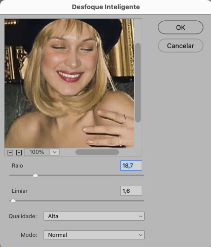
aplicado a redução de ruído, vamos partir para o desfoque! eu estarei usando o desfoque inteligente antes do desfoque de caixa. você vai achá-lo em filtro > desfoque > desfoque inteligente...
na janela que abrirá, você verá os ajustes: raio, limiar, qualidade e modo. vou explicar eles:
raio: vai determinar o tamanho da área que será considerada para o desfoque. quanto maior o número, mais detalhe serão preservados;
limiar: vai determinar a diferença dos pixels entre si antes de serem alterados pelo desfoque.quanto maior o número, maior será a área em que o desfoque será aplicado;
qualidade: vai determinar a qualidade e intensidade do desfoque. ao escolher a opção mais alta, mais partes da foto o desfoque atingirá;
modo: vai determinar o traçado das linhas de bordas que o filtro identificar. o modo normal aqui é o ideal, pois os outros modos “somente arestas” e “sobrepor arestas” irão identificar somente as bordas da imagem.
sendo assim, esses foram os ajustes:
após o desfoque inteligente, partiremos para o desfoque de caixa! ele está em filtro > desfoque > desfoque de caixa...
(você também poderá usar o desfoque gaussiano a depender da foto, mas para esta em questão, o desfoque de caixa funcionou perfeitamente)
a intensidade do desfoque de caixa, assim como do desfoque gaussiano, é medida em pixels e o mínimo é 1 pixel, e para icons é uma intensidade forte, então eu coloco o número mínimo (1, no caso) e depois de clicar em OK e aplicar o desfoque, vou em editar > atenuar desfoque de caixa... e ajusto a porcentagem de acordo com a foto. nessa foto deixei a porcentagem em 33% e ficou ótimo.
no entanto, infelizmente, por não ser o melhor método para melhorar a qualidade de uma imagem, ela ficará um pouco desfocada demais. mas podemos contornar isso usando o filtro alta frequência para devolver um pouco da nitidez e detalhes na foto. você encontrará esse filtro em filtro > outros > alta frequência...
o filtro de alta frequência, assim como os desfoques, é medido através de pixels e quanto maior o número, mais detalhes passarão despercebidos, ou seja, menos detalhes e menos nitidez sua foto terá. eu recomendo em torno de 2px se você quiser mais detalhes e em torno de 5px se você quer mais suavidade.
a primeira vista esse filtro parecerá estranho e distorcido, mas dará tudo certo, você só precisará mudar o modo de mesclagem. para isso vá em editar > atenuar alta frequência e mudar o modo de mesclagem para “sobrepor” ou “luz indireta” se você quiser que fique mais suave. se preferir, poderá também ajustar a opacidade para os detalhes ficarem mais ou menos intensos.
assim:
assim fica o resultado sem o filtro de alta frequência e com o filtro:

sendo assim, fica a seu critério usar o filtro ou não.
aqui está a comparação das fotos com o tratamento de redução de ruído + desfoque com e sem o uso das duas actions:
5. SALVANDO A EDIÇÃO
e chegou a melhor parte: salvar a edição para postar!
seja a edição um icon, uma header, ou qualquer outro gráfico estático (edições não animadas), a melhor opção é sempre, sempre, SEMPRE, salvar no formato PNG!
o formato jpg ou jpeg não preserva a qualidade original como o formato png preserva. então, sempre escolha esse formato ao salvar suas edições estáticas!
a melhor forma de salvar uma edição em alta qualidade é exportando ela. sendo assim, vá em arquivo > exportar > exportar como...
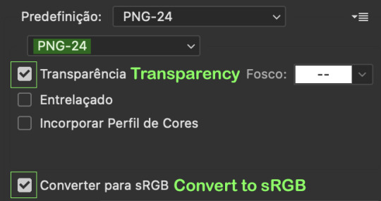
em “configuração de arquivo”, selecione o formato PNG e desmarque a opção “transparência” se sua foto não é uma imagem com fundo transparente; em “tamanho da imagem” deixe como a altura, a largura e a escola como estão, apenas mude a opção em “criar nova amostra” para BICÚBICO AUTOMÁTICO; e em “espaço da cor” marque a opção CONVERTER PARA SRGB, porque assim, independente da calibração do seu monitor, a foto ficará com as cores originais e não sofrerá alteração.
assim:
no entanto, se você tiver um pc ou notebook lento, ou apenas não tiver paciência para salvar sua edit em exportar, você pode salvar no modo normal, indo em arquivo > salvar como... OU arquivo > salvar uma cópia..., no entanto, se você for usar essa opção, não esqueça de marcar a caixinha para “incorporar o perfil de cores srbg”, essa opção geralmente fica na parte de baixo da janela que abre quando você vai salvar a edição.
6. ACTIONS & RESOURCES
para facilitar pra vocês, todos as configurações de filtros usados neste guia, estarão disponíveis para download em uma pasta de action. para fazer o download é só clicar aqui: ★. já a dupla de actions usadas (a de nitidez & a de desfoque suave) estarão disponíveis para download na lista de dicas abaixo.
dicas de actions de nitidez
– premium & gratuitas (free)
lovie potion by @loviestudio [premium]
action #26 by @harupsds [premium]
action #25 by @harupsds [free]
01 action by @harupsds [free]
cherrie by @loviestudio [free]
action #11 by @miniepsds [premium]
face action by @miniepsds [premium]
crispy by @nebulies [free]
scarlett by @l-agallerrie [free]
eight action by @peachcoloring [premium]
bubblegum by @hisources [free]
kendall by @hisources [premium]
hekate by @hisources [premium]
sharpen by @l-agallerrie [free]
#01 action by @buntterflies [free]
dicas de actions “suaves”
– premium & gratuitas (free)
teddy bear by @loviestudio [free]
action ten by @peachcoloring [premium]
caelestis by @miniepsds [premium]
fleuriste by @hisources [free]
angel by @loviestudio [free]
action #13 by @harupsds [premium]
action #12 by @harupsds [premium]
wild action by @hisources [free]
outras actions
– premium & gratuitas (free)
denoise action effect — remove o ruído das fotos sem perder muita qualidade by @loviestudio [premium]
photopea quality action — action para melhorar a qualidade da foto no photopea by @loviestudio [free]
exclusive hq actions — um conjunto com as actions que foram usadas neste tutorial by @girasois, @loviestudio [free]
denoise and sharpen actions — conjunto de actions para melhorar a qualidade da foto automativamente by heavnsent
7. BÔNUS: DICAS EXTRAS
a adobe cc learn tem muitos tutoriais que você pode dar uma olhada e aprender muito mais sobre o photoshop e outros programas da adobe!
o youtube é outra fonte incrível para você aprender edição no photoshop, lá você encontra tutorial para quase tudo de edição de fotos e muito mais! se você entende inglês, eu recomendo muito os canais piximperfect e brendan williams tutorials.
para fonte de inspirações, o tumblr é o lugar certo! se jogue nas tags para se inspirar e nos blogs de photoshop para ver muito mais tutoriais e muito mais resources.
o blog @looksgreat infelizmente não é mais atualizado, mas você ainda pode encontrar muitos tutoriais sobre quase tudo de edição, e o melhor, todos os tutoriais são em português!!
ainda recomendo outros tumblr brasileiros de resources e tutoriais: @miniepsds, @harupsds, @peachcoloring, @gmfioart, @colour-source, @l-agallerrie, @wasirauhlpsds, @hisources, @opulenceps, @sunshinepsds, e @loviestudio; e no deviantart: jungrainsoul, rockjealous, heavnsent, aureangels e rohdossantos.
8. CRÉDITOS E INFORMAÇÕES
crédito colorings
off hearts + whimsy by @miniepsds ♡
informações
antes de tudo eu gostaria de pedir desculpas pelo tamanho deste guia, mas eu quis abranger o máximo de dicas possíveis para vocês e deixar o tutorial super completinho.
em segundo lugar eu gostaria de agradecer todo o carinho de vocês, isso me motiva muito a continuar. obrigada, de coração!
enfim, é isso! minha ask estará sempre aberta para dúvidas, sugestões, pedidos e mensagens fofas (sempre com educação e respeito, claro)!
#tutorial#photoshop tutorial#tutoriais#tutorials#resources#hq tutorial#tips#useful#ptbr#adobe photoshop#photopea tutorial#tutorial tips#dicas#dicas de edição#dicas de actions#guia completo#guia#guia de edição#guia de edits#edits tutorial#edit tag#masterpost#long post#editing tips#icon tutorial#header tutorial#hq edits
62 notes
·
View notes
Note
your icons are soooooo so cute honestly!!! i wanted to ask if there's any way you can make a tutorial on how to make them? of course if you want, if you don't want to, that's okay :)
Hi! I really appreciate that you like my icons, thank you so much! 💖💖💖🥹
It's been a long time since I've done a tutorial so I hope I can explain it well haha
So I will explain how i go from the original picture and the final icon below:
I'm using Adobe Photoshop 2024 but you can use other versions too!
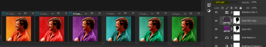
First, I create a 250x250px document and apply a random color fill layer to be the background color of the icon, you can do it by going on Layer > New Layer Fill > Solid color (the color in this moment doesn't matter because I change them later according to the picture I choose to edit).
Then I place the picture I want, adjust the size to make the subject on the center and apply some smart sharpen:
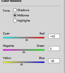
I apply some adjustments to try to color correct if the original picture using Levels, Selective Color and Color Balance to get something like this:
If you want to know the exact adjustments settings I used on this picture you can download the psd here.
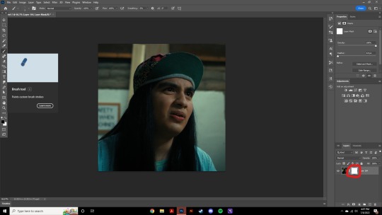
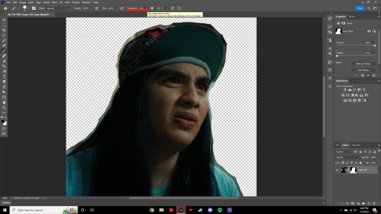
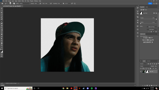
To remove the background, I do the hack where I go to the Properties panel (Window > Properties) and click on the "Remove background" option. It's not always that I will get a perfect result but I think it makes easier for me to adjust the little details such as hair and accessories, etc. And I do that using the Lasso tool (shortcut L).
Now, with the background removed I pick a color that I think will match the icon in the Color Fill layer that I created before. To make the background more "fun" I like to add a Gradient Fill layer (Layer > New Layer Fill > Gradient) with a color that might go well with the one I picked earlier to make a smooth and light gradient.
My result until now:
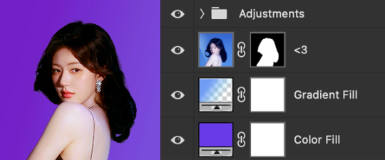
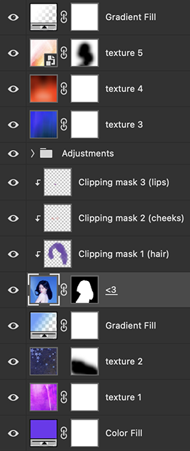
Now it comes the fun: adding textures! I like to add some textures to make the icon more lively and I usually download them on deviantart or on resources websites. You can download some cool textures here, here and here. On this part I really test a lot of textures with different Layer blending. There are a lot of different blending options so you can try as much as you want.
Other thing I like to do is add a clipping mask above the subject layer when I want to color something specific in my picture such as the hair, the clothes or even applying some "fake" blush on the cheeks. I do this adding a new layer, then using the shortcut option (or alt) + command (or ctrl) + g to make it a clipping mask and then using the Brush layer to color what I want. For the blending mode I usually use Soft Light and sometimes Color if I want the color to really stand out.
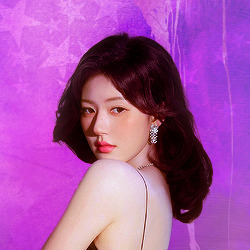
And in the end I will have something like this:
And my layer tab will be like this:
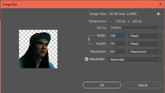
For using on the dashboard I usually resize it to 100x100 to make it look more sharper and defined but it's really a choice, you can already start making your icon using the size you want, I just prefer doing on 250x250px because i'm used to.
To save it I use the shortcut shift + option (alt) + command (ctrl) + s to save it for web with these settings:
And that's it! Sorry for not going to deep in each step but I guess you can get the feeling when you try making your own icons! Is really about trying different methods and things until you became satisfied with your result.
53 notes
·
View notes
Text
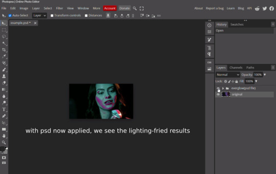
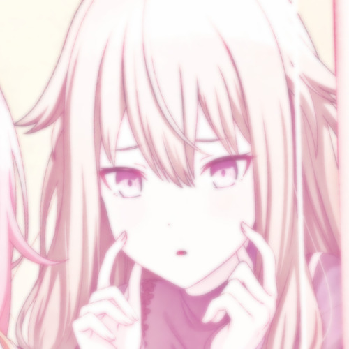
follow up to this post; these tutorials are intended to help those who buy/use my psds , so that they may end up with the best possible results, as i'm no expert in editing by all means — and in saying so , like to make sure what i do put out will be fairly easy/convenient to use ( with as minimal adjustments as possible ! ) in this tutorial , i'll be showing you how i personally use minor adjustments to balance out shadows/blacks and fix ' deep fry ' coloring.
WHAT YOU WILL NEED: photopea and your desired your base image(in this example, i will be using a screencap from the series riverdale). [ screencap credit here. ]
DISCLAIMER: not all lighting/images are the same, nor are psd colorings. you may need to use more or less of these adjustments with specific images/lighting. this is just a general idea, you will have to explore as you see fit. it's all going to depend on your personal taste !
by the end of this tutorial, your results should go from something like this...

to this! much less of an eyesore.

starting with example one(middle image/psd applied) / i'm going to apply a clipping mask(this way if you make any mistakes, it won't effect your base image and you can easily delete the error). / in the second example, i've made a video to show you how balancing adjustments out may look in real time. beginning with example one:

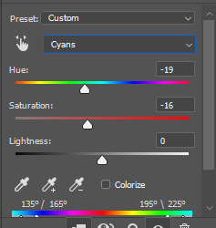
once you've applied your psd of choice, go to layer tab > new adjustment layer > hue/saturation. (the three yellow highlighted tabs)

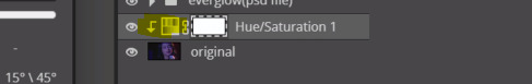
this should instigate a pop up(circled in red) and add a layer above the image layer you're working with(it will say Hue/Saturation 1)
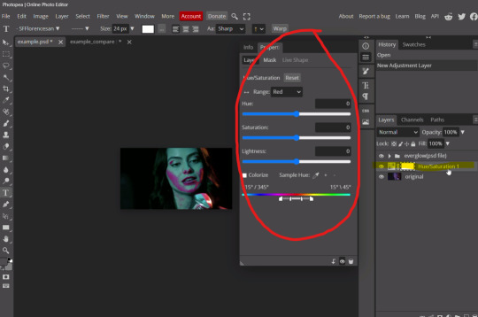
now, you're going to right click the Hue/Saturation tab, and you should be greeted with a dropdown option; click the 'clipping mask' option.

now the hue/saturation layer should be a clipping mask, and should look like the image below; the arrow indicates that it will work for the layer below the newly added adjustment. now, we can move on to the actual adjustments that will be applied within that clipping mask.
as previously mentioned, we want to focus on the base image colors(before the psd was applied); with that being said, the colors we want to balance out are magentas/blue/red, that it will match the cyan color. you can now go to the dropdown where it says 'range'(highlighted in yellow). i'm going to adjust magenta first, since its the primary color of this lighting.
and now, you may adjust the hue, saturation and lightness toggles as you see fit or until you feel like it matches, or is just generally less of an eyesore. in this case i did magenta > hue(-49); after that, i moved onto red > (hue-130) > (saturation7) > (lightness26) [ ... ] see how only adjusting the magenta left in the red highlight until we chose to edit it out.

our end result for example one. now onto the example two video.
this next example(psd applied) will be a little different but ultimately the same method. instead of hue/saturation, im going to layer tab > new adjustment layer > selective color, that i may focus on shadows/blacks as well, since the psd made them a bit lighter than i'd prefer. (note: this also comes in handy if you have grain applied to an image and feel it makes it to light!)
using these two methods are my primary saving grace for inconsistent lighting, fried images or oversaturation. i hope you find this useful!
#* MY TUTORIALS.#long post /#FREE TO REBLOG !#rp community#icon tutorial#rp icon tutorial#psd tutorial#roleplay coloring#roleplay help#roleplay resources#roleplay community#roleplay graphics#coloring psd#psds#icon psd#psd#roleplay psd#rp graphics#rp psd#rp resources#tutorial#editing tutorial#rpc tutorial#editing resources#psd coloring
18 notes
·
View notes
Note
oiee, seus icons são umas gracinhas juro!! queria saber como vc faz eles☝🏻
oláaa, primeiramente fico feliz que goste dos meus icons😭😭 e segundamente perdão pela demora!
bom, bom, separei em partes para que fique melhor de entender, vamos lá!
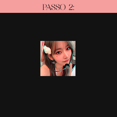
A primeira coisa que faço é criar um novo arquivo no Photoshop em 120x120, que é o tamanho do spirit fanfics e depois ajusto a fotinha.
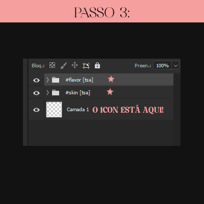
O passo 2 consiste apenas em aplicar o efeito 3D, e nitidez no icon, marquei com estrelinhas as actions que uso e que eu mesma faço. [OBS: sempre aplico nitidez DEPOIS do efeito 3D]

e tcharaam!! o resultado do passo 2 é este:
Estamos quase lá!! agora só aplico PSD´s de minha preferência. Usei estes, também feitos por mim :)
e o grand finale!!
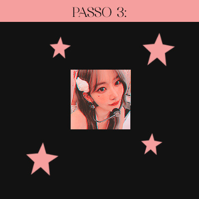
E esse é o resultado final, está um pouco saturado depois que salvei o icon e o abri no photoshop novamente, mas acontece nékkjk, enfim, espero que tenha te ajudado em algo, qualquer dúvida minha ask está aberta.💟
caso queira o icon que fiz para o tutorial, está aqui:

aah, uma dica simples mas que nem sempre lembramos, salve seus psd´s em uma pasta, nomeando todos eles para poder diferenciar mais rápido, nada de salvar como "Sem-Título 1"
12 notes
·
View notes
Note
hiii so sorry if this is a stupid question but how do you make icons that aren’t squares? the only canvas i can make Is square 🥲

how to make shaped icons!
no worries anon! things like this can be a little confusing at first, so i get you. let’s get into it!
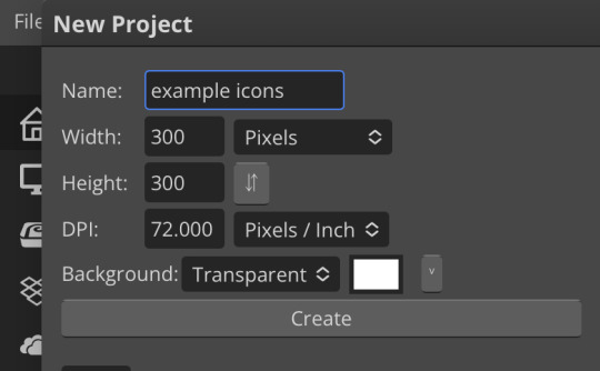
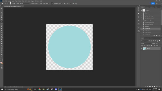
first thing’s first is creating a new project in photopea. i tend to make my icons 300x300, but it doesn’t really matter the dimensions as long as they match (so you shouldn’t do 750x700, for example.) make sure your background is set to transparent (no worries if you forgot this step—just delete the colored background layer!)
next thing is getting the shape! i tend to use photopea’s shape tool for this, since it’s easiest for me, but you can also just google “circle png” or something. (make sure your image is actually transparent, though. click and drag or click and hold and see if the dotted background lingers or goes away!)
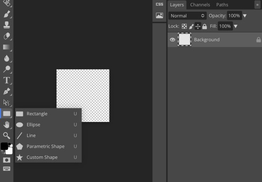
for the first icon, i’m going to use the ellipse tool. feel free to change the color of your shape—i usually set backgrounds later, but that’s up to you. the exact dimensions of this shape don’t matter, but like your canvas, they have to match so the circle is even. click and drag to make your shape
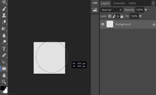
as you can see, my shape isn’t centered just yet—but i corrected that by using the click and drag tool: the one at very top of your sidebar. photopea will center and align your shape for you if you move it towards the middle
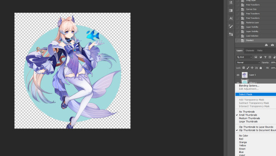
now you have your base! time to start adding backgrounds and such things. i used my usual method for the background, but you can do whatever. one thing to make sure for this step is to set all your layers to clipping mask (putting the shape below all your other layers)
to find clipping mask click the button that says layer at the top
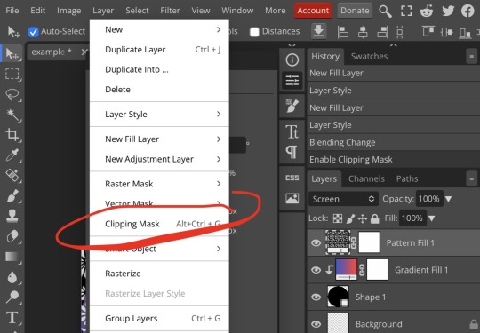
as you can see, my gradient fill is already clipped mask’ed. if for whatever reason you want your layers un-clipping mask’ed later, just go back and click the clipping mask button again. (i’ve said clipping mask too many times. it feels like a fake word.)
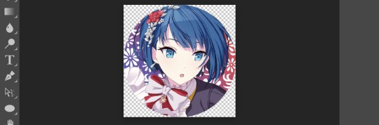
(hello, haruka!) this is how my icon looks so far! everything is clipped mask’ed to my circle. if you’d like, you can stop here, and download your image. i went ahead and added a psd. unless you’re using a color fill later or something similar in your psd, that doesn’t really need to be clipping mask’ed.
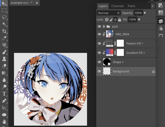
(the psd i used here is really simple and i didn’t save it, but always put your psds in folders, just to make your life easier.)
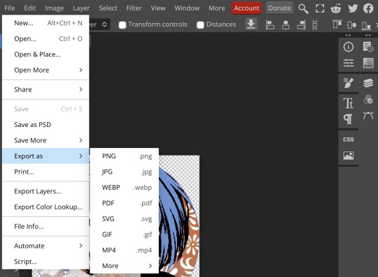
now that we’ve got that done, time to export! make sure that you export as a png. otherwise, your icon will still be square.
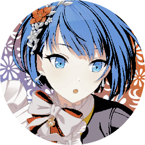
the finished product! pretty simple, right? you can use this method for all sorts of shapes. i went ahead and did two other kinds—bordered and faded.
for the border, i copied my original shape (a square in this instance) and switched the fill mode to the icon with an x through it, and switched the stroke mode to a solid color, and set the stroke to seven pixels. i think for bordered icons you can also shift the border so that there’s a space between it and your icon, but i left it where it was this time
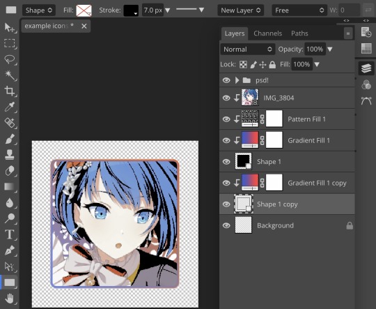
as you can see, i didn’t change any other layers, except that i duplicated my gradient fill! this is the same project i was working on before, just with a different base.

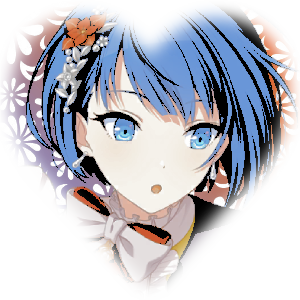
now for the faded icon! i used a heart shape for this, as that’s pretty standard, “but wait! photopea’s shape tool doesn’t have a heart option!” it does, actually! it’s just hidden. click your shape tool and go down to custom shapes. then scroll at the top until you see the little arrow with the star beneath it (which should be as far right as you can scroll.)
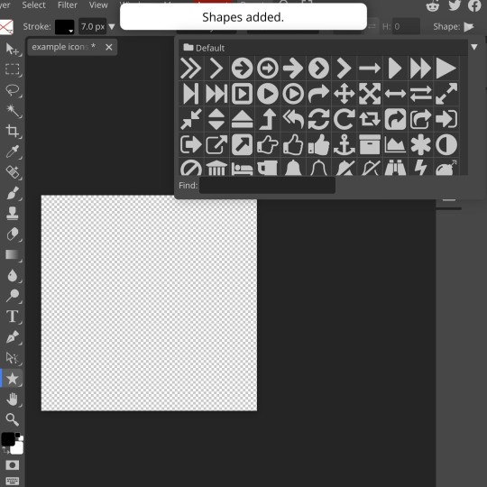
wow! so many shapes!! i scrolled down until i found the heart, and added it. the heart i didn’t worry too much about the numbers—i just adjusted it until it looked nice.
now to make our heart faded! first thing to do is to rasterize your shape layer. make sure you have your dimensions and everything set before you do this, as you won’t be able to correct them after your shape is rasterized.
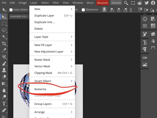
rasterize can be found in the layer drop-down menu, where you found clipping mask. click that, and now you can blur your shape! the blur tool can be found in filter > blur > gaussian blur. you can also use motion blur or radial blur, but i like gaussian blur
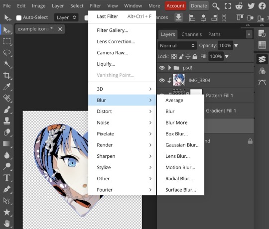
clicking gaussian blur will give you one of our old friends the sliders. just mess with that until it looks about right. click “ok” once you’ve got it set how you want it
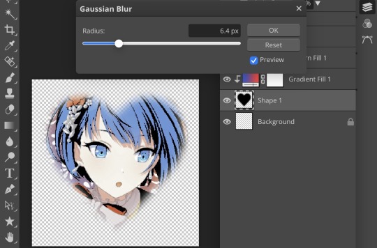
i also adjusted my heart’s sizing a bit by going to edit > free transform and making it bigger. just do what looks good to you!
and there’s your faded icon!
i hope this is helpful!! feel free to ask if you have any questions :3
sincerely, eos
41 notes
·
View notes
Note
hi hi! hope you're well. idk if you did this before but can you do a small tutorial on how to make an icon like yours where the person fits inside the frame but there are parts outside of it
im a beginner to photoshop and while i know to create clipping mask to put an element inside of the shape, i can't figure out how to do that !! thank you sm if you choose to answer this <33
Sure thing! This is a very basic tutorial, but I'll show you how to get Jeff Satur's little head popping up over this square.

First you want to create a png of your fc, or if you're not quite confident in your skills cutting out images (or if you just want to save time) deviantart as a lot of png packs available for use, just make sure you're following the creator's rules by favoriting, commenting, etc.
Then I open a new document, usually 150x150, and create the shape I'm going to want my fc contained in. Because we want them to pop out of the top, we're going to want the shape smaller than the document and lower towards the bottom.
Add a group and place your shape inside. Now, we're going to create a layer mask instead of a clipping mask. In order to do this, click on the ctrl key and click on this box on your shape layer. This will give you "marching ants" around your shape.

The layer mask should look like this. Now when you place your png in there, the top is cut off.

In order to fix that, you're going to use the selection tool, select a portion of the canvas above the square that you want to show up, then hit delete.
The layer mask should look like this after deleting that portion. And now the top of your fc should be visible!

After that, I usually throw in a gradient or image for the background, clean up the edges of the fc, and add some coloring and remember to save as png!
35 notes
·
View notes
Text

STRWRS’ ICON-MAKING TUTORIAL
Hiiiii welcome to my icon-making tutorial!! I really enjoy making icons, and I thought I’d share how I do it <3
This tutorial is not for beginners!! I don’t explain every step in detail. However, if you have a question about any concept within this tutorial, please don’t hesitate to send me an ask or a dm!! I am happy to help <3 /gen
For this tutorial, we’re going to be making the icon you see in the header.
Let’s get to it!! :)
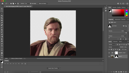
STEP ONE: Open Up the Image in Photoshop

Yay, there he is <3 I got this screencap from this site. They upload screencaps for all live action Star Wars. (They also have screencaps for loads of other movies.)
STEP TWO: Crop the Image
You can see in the image below that I added space at the top. This was a personal preference! I recommend playing around with it and finding what you like and what works best for you! It also depends on the image you’re working with.
STEP THREE: Remove the Background
After I crop, I add a brightness/contrast layer and set its blending mode to screen. I do this for all my edits now (tip courtesy of this coloring tutorial by @/spacedjarin), and I adjust the opacity if needed.
The reason I add the brightness layers is to make it so I can view Obi-Wan’s outline better. This will help me to remove the background.
Here’s what it looks like at this point:

Now i select > subject. This is what I get:

I then use the lasso tool to refine the edges. Here’s how to do that:
In the picture below, you can see that the third option is selected. I usually stick to the second and third. The second adds to your selection, and the third subtracts from your selection. It should make sense once you work with it! It won’t be perfect, but we can always fix it up in the next step.

Now I press ‘select and mask’.

This is what comes up:

He looks a little rough around the edges!! Especially on the left side of his face (our right side). I can fix that with the settings to the right. Here are the settings I used and the results:

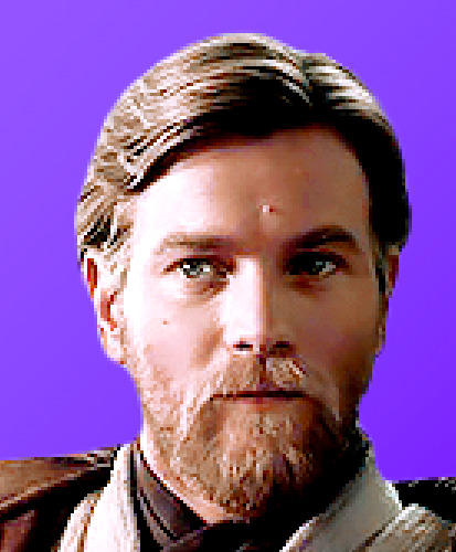
I cleaned it up a little bit! I’m still eyeing the left side of his face, but I can always fix that later because we’re about to create a layer mask in order to remove the background.
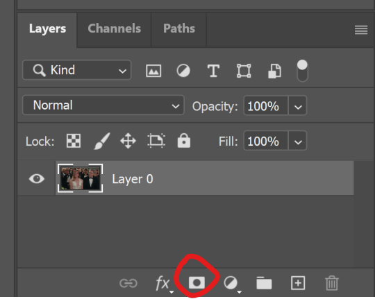
Press OK. Now, press the layer mask icon (the one after fx on the menu underneath your layers).

Voila!! We have removed the background. And we can see our layer mask!!
STEP FOUR: Sharpening
Create a group, drag the image and its layer mask inside the group, and then drag the layer mask so it applies to the entire group. It should look like this:

Right click on the image layer and duplicate it. (You don’t have to do this, but i like to just in case something happens. I don’t know what, but laksajsl)
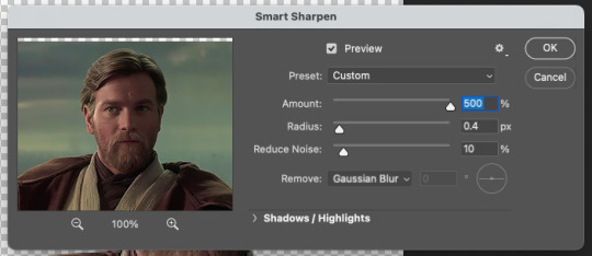
Then I convert the copy of the layer into a smart object. Then I sharpen using filter > sharpen > smart sharpen. Here are my settings:

STEP FIVE: Coloring
I move the brightness/contrast layer into the figure group and then create a group for adjustment layers (i.e., the coloring group) and drag the brightness layer inside. My layers look like this:

I usually do brightness/contrast, curves, (sometimes) channel mixer, selective color, levels and vibrance. And a lot of the time I do multiples of each type of adjustment layer. Depends on what the image calls for!! I just keep going until I’m satisfied with the outcome!!
STEP SIX: Add a Background
After I do some coloring, I want to add a background so I can make sure my coloring matches it and make sure everything looks okay before doing some of the finishing touches.
I have a gradient I previously made all set and ready to go, but I also often use gradients/textures others have made. Check out some of my texture recs here. If you have specific questions about textures or gradients, please feel free to dm me or send me an ask!! I’m happy to help /gen
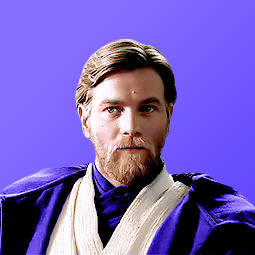
Here he is so far, and look how handsome :) <3

Also!! A good tip for gradients is to position them so the lighter side of the gradient is on the same side as the lighter side of the subject (i.e., Obi-Wan). see how the light hits the right side of his face?? I positioned the gradient so that the lighter side is on his right side. It makes everything look cohesive imo!!
STEP SEVEN: Touch-Up
Now what I’m looking for are crisp lines around the edges of Obi-Wan. i zoom in and look for anything that looks hazy.

See the white haziness around the top of his head?? I’m going to select the layer mask for the figure group and use the brush tool (with a hard brush) to carefully remove the haziness, doing my best to stay around the very outside edges. I think this step makes everything look that much more crispy.
Here’s what it looks like now:
Not a huge change with this image, but with some it makes a world of difference.
STEP EIGHT: “Painting”
Okay moving on!! Now I paint him!!!! (That’s what I call it, at least 👀) I’ll illustrate what I mean and then explain it.
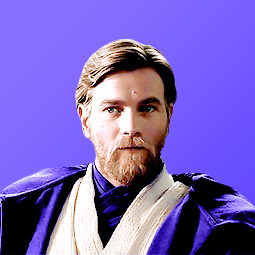
Here’s the icon after i’ve done a little bit of ‘painting’:
And here’s the ‘paint’ layers:

(And my mac’s screenshot function is being weird, so the purple color looks different from what i actually applied [which is #9179ff])
Okay, so I’ll explain how to do it with the example of coloring his robe purple. Here are the steps:
Determine what color you want the robe to be. I used this particular color because I’ve had this purpley color scheme for a while, and I used that hex code to ‘paint’ Obi-Wan’s robe in my mobile header. You can also use the eyedropper tool and select a color from your background. The great thing about using layer masks (instead of coloring on blank layers) for making icons is that you can change up the color if you want and not have to paint the robe all over again!!
Create a solid color fill adjustment layer with that color.
It’s going to turn Obi-Wan that color, so click on the color’s layer mask and remove all of it using the brush tool (using black). Then paint in white where you want the color to go (this shows up as the white spaces on the layer masks).
Once you’ve painted, change the blending mode of that individual color fill layer to whatever looks best to you. You can also change the opacity if you need to. I also used a clipping mask to add vibrance to the purple robe (seen above).
Now I’m going to continue to adjust my coloring and my painting until I’m satisfied!! I will often zoom out quite a bit to see how the icon might look on tumblr’s dashboard. I really try to go for clarity, crispness, and cohesion.
Here he is!! What a guy <3
The only thing left to do now is to image > image size and then change the width and height to 200px x 200px. (Personal preference. I know some people like to do 100 x 100!!) And then to save do file > export > quick export as png.
Here’s the final product:
I hope you enjoyed this little tutorial on how I make icons!! Again, if you have any questions at all please don’t hesitate to reach out. I’m happy to help!! And also please feel free to save and use this icon if you’d like!!
If this tutorial was helpful and/or if you save the icon, reblog this post!! Thank you for reading, and I hope it helped!! <33
#photoshop tutorial#icon tutorial#*strwrstutorials#completeresources#dailyresources#userobihoe#userlogray#usermullet#userdesy#userparker#xuserash#wynkahthu#userelio#to everyone i tagged: pls don't feel obligated to reblog if it's something you're not interested in!!!!#also pls let me know if you'd rather not be tagged in things like this. no hard feelings /gen#10 pm is probably way too late to be posting this but... without further ado#*strwrsedits
262 notes
·
View notes
Text

MATCHING ICONS TUTORIAL . . .
how you make icons line up perfectly with each other ! or at least how i do it lol
this tutorial was made in ibis paint x !
input your photo ( you can filter before or after, i just typically filter first ) . save the image after this step .

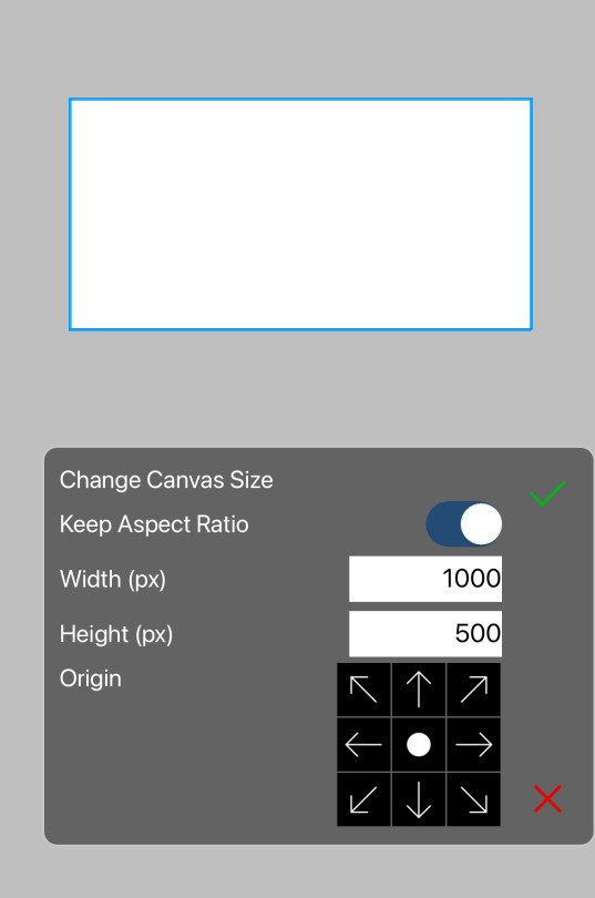
then , change your canvas width to normal ( in my case , 500 ) . make sure the origin is set to either the left or right , and not the middle . ( this way , you only have to reposition the other side )

input the image you saved earlier , and move the x / horizontal slider to where the edge of the image aligns with the edge of the canvas ( you may have to zoom in to make sure )

then simply save both icons & position them next to each other in the post editor !
#☆★ // tutorials .#also idc if you use the example icons here just rb + credit thanks#editing#edit tutorial#icon tutorial#matching icons#matching icon tutorial
40 notes
·
View notes
Note
icon tutorial?
Sorry! I’ve been so busy, I completely spaced it. Here you go!
Tutorial under the cut:
Step 1: Choose your screencap. Especially if you're a beginner, try to choose one that has good lighting and looks easy to cut out. For this tutorial, I'll be using this screencap of Alexis:

Step 2: Cut out the figure. I usually use the magnetic lasso tool because I find it the easiest. You start by clicking once, then you just drag along the figure, and it automatically makes an outline (you will have to adjust afterward though), then connect back to the first point. It should look like this:

Then, making sure your layer is unlocked, click this button in the corner to mask it:
That should give you your transparent image! Then, you just adjust the edges by using the paint tool on the masked layer (black paint gets rid of more of your layer, and white adds it back on). After that, I like to crop the image into a square (but I still keep it the same size otherwise at this point)

Step 3: Edit. First, I like to lighten her face up a bit. I start with brightness (the first icon under adjustments on the right) and curves (the third icon). You'll have to play around with these depending on your screencap.
*Make sure you to right click on these after you add them and press create clipping mask!*

Step 4: Add a background. Create a new layer by pressing the little plus mark in the bottom right corner. Move new layer below original image layer. Then, use the paint bucket tool (on left side of screen) to add color. You can also add a gradient here if you want.

Step 5: Color-fixing. Here, I like to fix some of the colors of her skin and adjust vibrancy. Again, you'll have to play around with this, but my go-to is the color balance tool (looks like an equal scale). Basically, the idea is you're adjusting the red, blue, and green tones of the image (don't forget to clip this one, too!).
I also will click on the vibrancy tool (fifth tool on the top) to add more color.
Finally, I add a soft layer of the background color overtop (usually soft light) and adjust the opacity lower. (Make sure to put this layer above all the others). You can see my settings on the side of this image:

Step 6: Fine-tuning. I like to add some extra color to hair/cheeks/lips. I do this by making extra layers for each and painting over the areas with a brush. Then, I adjust to a different setting (soft light, sometimes hard light, whatever works).
Step 7: Sizing. Next, I’m going to size the icon. I like making my icons 250x250, but that’s just my preference. Then, once I resize, I’m going to sharpen. When you sharpen, make sure you’re clicked on your layer with your person on it. For sharpening, go to filter, sharpen, smart sharpen. Here are my settings:
Step 8: Finishing up. I add some more adjustments based on what I want changed. For this icon, I used the exposure tool (fourth icon on top) to give me more contrast.
And here’s the final product!!
Hope this was somewhat helpful!!
55 notes
·
View notes
Note
hi hi first of all I wanna say that i absolutely adore your icons! thank you som much for making them! i was going to ask how you make them if you don't mind? i wish you have an amazng day! <3
Hey Nonnie, thank you so much, I'm very happy you like them! 🥰 I wish I was eloquent enough for a proper tutorial, but I'm gonna try it for you 😌
If I don't make sense, there are a lot of helpful tuts around tumblr, here are some of them: x x x x 😅
Assuming that you know your way around the basic Photoshop tools, let me sum up in a nutshell what my process is:
REMOVING THE BACKGROUND
I usually get a picture or grab a screencap with a good enough quality, open it in Photoshop, and based on its complexity I select the object with my Pen tool, brush tool (on a layer mask), or some combinations of these with other selection tools (magic wand/quick selection tool) - most of the times it is a combination of all of the above. 😅 (watch this tutorial if you want to cut out a subject that is a more difficult shape e.g. messy hair, but there is a contrast between the subject and the background)
I don't erase the background: I cut the object using the layer mask, in case I need to add/get rid of some pixels after colouring and resizing the picture, and it’s also a tremendous help when I use different tools to remove the backgrund.

2. COLOURING
When I have my subject cut out, I create a new file in 150x150px, drag and drop the subject's layer and resize it with the Ctrl+T just to have the freedom to decide which parts to be included in the icon or in case I want more versions of the same picture, just like here (also don’t forget to delete the background by double clicking on it >> Enter >> Del) :

This is when I add/remove pixels on the layer mask if needed, and use some basic colouring on the picture, the layers added as a clipping mask so it will only affect the layer of the subject.

3. ADDING THE BACKGROUND + MORE COLOURING
Then I add some gradient and texture layers below my subject's layer, and in the blending options I add some drop shadow to my subject's layer. (If you're aiming for a more complex icon, there are icon textures around the internet too, here is one.)
To make the picture blend into the background more smoothly I usually add some adjustment layers as a clipping mask to the subject's layer to adjust the colours more to the background, and/or add some more adjustment layers on the top of all the layers (not as a clipping mask) that will affect the background and the subject as well.

+1 CHANGING THE COLOURS
If I want to blend my subject's clothes more with the background, I add a Solid color layer as a clipping mask somewhere over my subject's layer, using the Eyedropper tool I choose a colour from the background (or something around it), I set the mode to Colour, with the layer mask I remove everything I don’t want to colour, and if needed, I add another layer with Soft Light or another mode that works with my picture.
That's how I changed Javi's originally orange shirt for this set:
Sometimes I add a bit of a smart sharpen on my subject's layer with some fading, so it's not that aggressive, then I save the icon in a PNG format.
Hopefully the tuts and my description could help you a bit, but let me know if you need some more help with any of these steps... if anything, I can help you find a nice tutorial 😅
39 notes
·
View notes
Text
Hi friends! A quick tutorial here I noticed someone asking about it in the SCC server. They were following this fantastic tutorial but were having some trouble getting the bottom part to not show. There is probably an easier way to do this, however, I wanted to share the way I do it on the off chance it'll even help one person! I'll be putting everything under a read more + plenty of screenshots!
I think it's generally the same way except minus a few steps. I'm going under the assumption that you already have an image with no background, so if you don't, quickly do that first! Under the read-more so I don’t have a long ass post :)
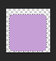
Start a new file (I went 600x600px) & make sure the background is transparent. Use the shape tool to make a circle (make sure to hold shift while doing this! this will force the circle to be a perfect shape).
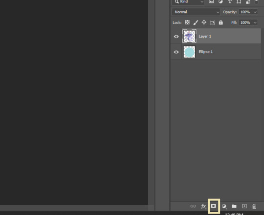
Right-click on the circle's layer and then rasterize it.

Right-click the icon of the circle and click the option that says 'select pixels'. You'll notice that the circle is now selected!
Now make sure you are on the subject layer, look to the bottom toolbar, and hit the 'layer mask' button. This will put your character into the circle (almost done!).
Select the brush
Make sure your colour is white
"Paint" the part you want to show over the circle
Below is what your layer mask should look like after!

I hope this helps and or makes even a bit of sense!
19 notes
·
View notes
Note
eu gosto muito dos seus icons mas como você não aceita pedidos, poderia fazer um tutorial de como edita eles para eu fazer para mim das séries que assisto? se não quiser postar aqui eu te chamo sem ser em anônimo
Fiz! Nunca fiz um tutorial antes e nunca fui muito boa explicando nada mas tentei. Se tiver qualquer duvida depois pode perguntar.
Meu photoshop é o cs5 mas vejo que ultimamente as pessoas costumam usar o CC então recomendo procurar esse se for baixar principalmente pq também é bem mais fácil achar link pra esse.
Ah e eu uso em inglês então o nome de tudo aqui ta em inglês mas acredito que da pra ter uma boa ideia de qual é qual quando for usar.
É bem fácil mas ainda ficou grande então ta depois do read more:
BÁSICO: (the basics)
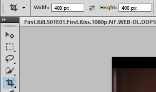
Primeiro eu corto as imagens no tamanho 400x400px
(first of all, i crop the image with a 400x400px size)
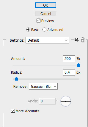
2. Vou em filtro > shapen > smart sharpen e essas são as minhas configurações
(filter>sharpen>smart sharpen and these are my settings)
3. Pra ajustar brilho e contraste AS VEZES primeiro eu uso o curves e subo só um pouquinho a linha antes, mas ultimamente eu to indo direto pro levels. Eu prefiro o levels pra fazer isso principalmente na questão do contraste pq vc tem muito mais controle do quanto da parte clara vai clarear e o quanto da parte escura vai escurecer. (for brightness and constrast sometimes first i use curves and brighten it just a little and then go to levels but lately im going straight to levels. I use levels for this mainly for the constrast because you can control it better)

Se quiser, pode tentar fazer ajuste automatico no "auto" que tem ali, dependendo fica bom mas eu ja peguei costume de fazer tudo manualmente. Com o automático ficou assim:
(if you want you can use the "auto" option. sometimes it looks good but im used to to it manually, thats how it looked here:)

4. Agora manualmente, você pode ver que a setinha branca ajusta a parte mais clara da imagem, a setinha preta ajusta a parte mais escura e a cinza o que está no meio disso:
(now manually you can see that the white adjusts the brightest part of the picture, the black the darkest and the gray everything inbetween)
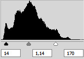
Nessa parte você vai mexendo até ficar do jeito que você preferir mesmo. Costumo primeiro mexer na setinha branca pra clarear e depois arrumo o resto. O ajuste ficou do jeito da imagem de cima e o icon ficou assim:
(here you can just mess around until it looks the way you want it. usually i mess with the white first and then adjust the rest. here is how it looks with the adjustments above:)
Observação: Eu acho importante dizer que é bom tomar cuidado com o levels pq ele pode clarear tons de pele, então é bom se atentar a isso quando estiver editando fotos de pessoas com a pele escura. Se sentir que mesmo tomando cuidado clareou mesmo assim eu costumo ir em selective color > reds e depois nos amarelos e na opção black de cada um ajustar ali escurecendo um pouco até achar bom.
(observation: i think its important to mention that its good to be careful with levels because it can brighten skin tones, so you should pay attention to it. if you feel like even being careful it looks whitewashed you can go to selective color > reds and then also in yellows and ajust the black option untill it looks better)

(Acho que não da pra ver tão bem a diferença aqui mas tem e de qualquer forma é só um exemplo mesmo)
(dont think you can see it that well here but its just an example)


E esse é o básico! Agora vou mostrar como edito algumas screencaps que precisam de “arrumar” a coloração.
(and thats the basics! now ill show you how i edit icons that need to "fix" the coloring)
AJUSTE DE COR:
As vezes a fotografia de uma cena ta muito puxada pra uma cor e eu não gosto. Os mais comuns são cenas amareladas ou azuladas, vou usar um exemplo de cada pra mostrar dois tipos de ajustes diferentes que costumo fazer.
(sometimes a scene its too yellowish, bluish, etc and i dont like it. since yellow and blue scenes are the most common ill give you two examples with these type of scenes with two different adjustments i usually use)
E eu sempre faço isso antes de mexer com a iluminação porque costuma funcionar melhor e o próprio ajuste de cores pode mexer no contraste. (Mas eu tambem ajusto depois se for preciso)
(i always "fix" it before i adjust the brightness because the color adjustment can also mess with the contrast)
Ajuste com curves:

1. Essa cena ta muito amarela/vermelha. Sempre que quero ajustar a cor a primeira coisa que faço é ir em curves > auto. Na maioria das vezes não funciona muito bem mas as vezes funciona então eu sempre tento antes.
(this scene looks yellowish/reddish. The first thing i usually do is go to curves > auto. It rarely works well but sometimes it does so i try it first)

2. Aqui funcionou ok, dificilmente já vai ficar perfeito, então como eu achei que ficou puxado demais pro azul eu selecionei a linha azul então só dei uma mexida:
(here looks ok, its hard to look perfect. so because i think it got more inclined to blue than what i wanted i adjusted the blue line:)

3. No fim eu usei color balance pra deixar um pouco mais amarelo/vermelho. Ajustei a iluminação e contraste e ficou assim:
(at the end i used a little bit of color balance to adjust the yellow/red more. also adjusted brightness and the contrast and this is how it looks:)

Você tambem pode mexer no curves manualmente mas sempre preferi o color balance pra isso.
(you can also manually use curves to "fix" the colors but i always likes to use color balance better for this)
Ajuste com color balance:
1. Pra esse peguei uma screencap azulada. Normalmente pra arrumar você vai precisar adicionar mais vermelho e amarelo. Se é nos tons claros, médios ou escuros vai depender (as vezes mais de um).
(for this im using a bluish scene. usually you will need to adjust it to more yellow and red. if its on shadows, midtones or highlights it depends (sometimes more than one of them).)

Ajustei um pouco nos tons médios mas mexi mais nos tons claros. Na maioria das vezes funciona melhor nos tons claros mas você tem que testar.
(adjusted a little bit in midtones but mostly it was in highlights. mostly it works better with highlights but you have to test it)
2. Ajustei a iluminação percebi que precisava de um pouquinho mais de vermelho e amarelo (nos tons mais claros tambem) e o icon ficou assim:
(adjusted brightness and contrast and saw that it needed a little more of red and yellow. this is how it looked:)

Acho a ferramenta intuitiva pra saber onde mexer pra corrigir qualquer cor, só tem que se acostumar.
(I think its intuitive to fix any other colors, you just have to get used to it)
Acho que é só! Acredito que já da pra ter uma ideia e depois disso é só ir mexendo e se acostumando. As vezes você vai precisar de mais de uma camada ou precisar de mais de uma ferramenta é só ir com a intuição mesmo. Raramente nem o curves ou color balance (principalmente color balance esse eh meu numero um) dá certo e tento mexer na cor em hue/saturation (atualização: agora tambem gosto do channel mixer as vezes) e vou tentando mexer em tudo ali, mas é mais raro.
Espero que ajude :)
(I think thats it! I think you can have an idea with these and then you just have to mees aroung and get used to it. sometimes you will need more than one layer or tool just go with your intuition. Rarely i need something other than curves and color balance (especially color balance, color balance is my number one girl) for it to work and need hue/saturation (update: now i also enjoy using channel mixer sometimes) so i just mess around with the options i have, but its rare.
I hope it helps!)
29 notes
·
View notes
Text
icon tutorial
got a request from an anon for this so let’s make an icon for argyle <3 this is our end goal. mind you i went kinda fast for the tutorial’s sake so yknow, play around in photoshop for as long as you like to get an output you want!
1. grab your screenshot, i tend to import frames to layers and then choose from there

2. image > canvas size > equal width & height to make it square
3. add a layer mask to the frame layer
4. make sure the layer mask specifically is selected, and use the brush tool to erase around the figure. to take away pixels, use black, to add them back, use white. don’t use any other color; i like this method because if i mess up and erase too much i can just add it back no harm no foul
5. i usually start with a large brush size to get rid of the bulk of the image. once you just have these edges leftover, change your brush size to something smaller (this is just based on your image size but somewhere around 18px works for me) and increase the smoothing to 80% or above.
6. smoothing slows down the brush strokes so you can get a nice edge of the photo, and this is where we are after erasing the excess. don’t worry if it’s not perfect!
7. image > image size. i tend to go for 150x150, but you can do what you like!
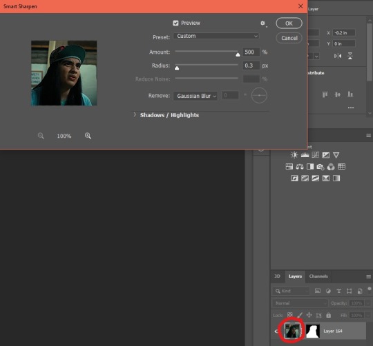
8. next we’re gonna go filter > sharpen > smart sharpen. for this, make sure the actual image — not the layer mask — is selected. these are the settings i use for icons.
9. add a layer and make sure it’s underneath our frame layer. i tend to go for gradients rather than full color underneath my icons, so pick a gradient or color you like and fill the bottom layer with it

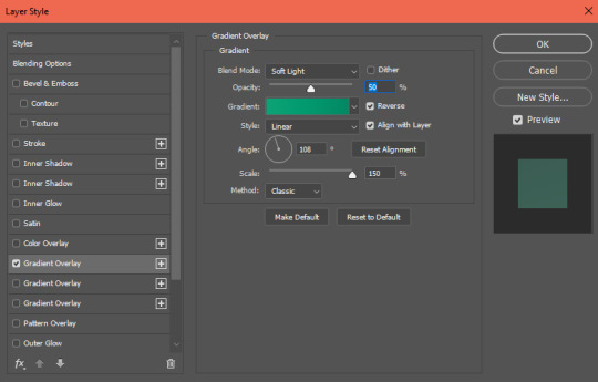
10. next we’re gonna select the frame layer again and go fx > gradient overlay. make the gradient overlay the same as the gradient/color you chose for the bottom layer. this helps add dimension to the icon so argyle doesn’t look like he’s just floating in a colorful space of nothing

adjust the settings as need be. you’ll probably be somewhere around 20-60% opacity for these gradients, as anything above tends to look unnatural. i lean lower for cool gradients and higher for warm gradients since most skin tones adhere better to warm lighting
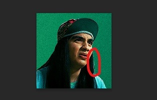
11. alright this is where our icon is at now. i just hit the bottom layer with filter > noise > add noise > around 2.8 to give the background some texture. if you notice, argyle right now is greener than i’d like, so that’ll be fixed in the next step with some coloring

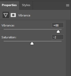
12. to make him more warm toned, I hit him with brightness, vibrance, & selective color layers. to warm his skin tone i fiddled with the ‘neutrals’ portion of selective color to add a bit of red and black. make sure this icon is selected, or else these adjustment layers will also affect our green gradient background
13. if you notice, there’s a bit of unnaturally colored background still left so real quick we’re just gonna select our layer mask again and hit it with the black paintbrush to get rid of those artifacts
14. the very last thing i did was change his shirt & hat color to match the background. i don’t always do this, but sometimes it’s nice just to make the icon more on scheme. to avoid affecting the hue of the entire frame, make sure you have specifically the color of the item selected (in this case, cyan) before you change hues
15. and ta da! here’s our finished icon
these are the basics, but make sure to play around in photoshop and figure out how to make things work best for you. if you have any questions, feel free to ask!
18 notes
·
View notes
Last Seen Blogs
gemmavalkyrie-blog
Gemma Valkyrie
itsmergb
If Sinister Had a Sound

riesotto1
Unbetitelt
ichortainted-blog
no son of mine will wander astray.
cersei-lannister-baratheon
but you killed the fire in me