#ill draw a proper one next time lmao i feel like i didnt do the cloak any justice but i had to get this out of my system smh 😤😤
Note
I love you’re little 2003 comic series and Mikey being to queer! Would you ever draw Mikey and Leo (since you did one with Mikey and don and Mikey and raph?)
Or would you do all 4 of the turtles and them taking about Star Trek while being queer?
Also author, I would like to hear you infodumps/rant about Star Trek :)
thank you! and yeah i have more plans for it dont worry haha
in terms of me info dumping or ranting, well im gonna leave my turtles to do any proper star trek takes lmao (donnie shall be my mouth piece, as i am the voyager stan)
but what i can say is star trek to me is not like a thing i ever actively watched as a kid, but something both my parents had an interest in. so i recognized ferengi and klingons before i knew what they were based on my dads graphic tees, i knew what the ships looked like cuz we had model ships. i have memories of watching star trek characters without having any idea what was going on, specifically janeway lol
and ive not finished any show, though i feel like ive seen all events in most shows? because the way star trek was intended to be watched was episodically on television, and thats how i consumed most of it.
and the other thing ill say is me and the editor (my sibling) came up with the idea based on like a silly thing i said which was simply "hey if the turtles love star trek canonically and 03 is the right age for the next gen - ds9 age, i bet they each have a different favorite, what would they be?"
we didnt have to think two seconds about mikey, mikey would love TOS its a classic it fits the vibes of mikeys classic comic book collection.
leo would love next gen because he would see picard as the best captain and want to emulate that. also think its interesting based on the fact 12 leo trys to emulate the picard parody (who is...a bad leader to emulate lmao, if 12 leo had proper star trek so many leadership issues would have been solved /j)
the real discussion came in the form of between raph and donnie whos voy and whos ds9. as im the raph and theyre the donnie, i wanted to offer up the donnie ds9 cuz thats their favorite show and voy is mine, but they said that raph would like ds9. specifically the politics and more intense war plot lines would speak to him. and that (maybe spoiler for something id wanna draw but oh well) during leos depression arc leo would like to sit and watch that with him because it would speak to him too at that time.
and as for donnie we didnt have the best reasoning for him loving voyager most, what else could we say but donnie has rizz (03 donnie is the only one who has a maybe romance in a one off episode, and i just.... yeah) but then i kind of thought about it more, and something about everyones favorite donnie episode same as it never was (and other donnie central plots) something about the crew of voyager trying like hell to get home even if they might be dead before they make it? i think it speaks to him.
but yeah! i have a lot of thoughts about it, kind of cuz of the age 03 is set in and the way that specific family unit is, that star trek speaks to them for a multitude of reasons! so im kind of making this little series thing about representation without knowing thats what youre looking for ? if that makes sense.
69 notes
·
View notes
Text
Hey, so a little bit ago someone asked me if i would do a tutorial type thing on how to achieve realistic drawings and although this would probably fair better as a video my voice is shit and i can make sure i get everything down if i type it out.
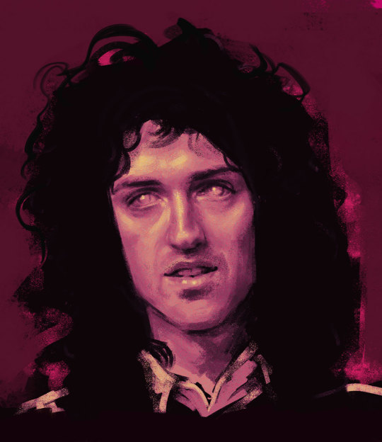
I think the best way to do this is take you through one of my drawings? My latest Brian drawing i saved a decent amount throughout it so i can kind of comment on each process of the drawing. For the this drawing i drew it on Photoshop CS5 which is important bc i do utilise a lot of the tools there so if you use smth different then im sorry but im sure there are alternatives! I’m going to talk you through this drawing:
Because i dont use natural skin colours in my drawings i start drawings in black and white because i find that easier to control the tones? and then i can colour the drawing afterwards in whatever colour and play about with it instead of sticking with a colour from the get go.
I start with painting the entire background a light ish grey because 1) its nice to work highlights and shade into a mid tone and 2) having pure white as a background can be a bit uninspiring? even with my sketchbooks i always make backgrounds before i do anything on them.
I then take a large brush, i use a mid-dark toned grey for this, i don’t like going in super dark super fast, and kind of mark out where everything goes super loosely, precision and proportions really don’t matter at this point, it will probably look bad but that’s fine! you’ll refine it as you go on! the brush i use for this stage is usually just a soft non textured brush, but i don’t think the brush you use at this point really matters. My drawing will kind of look like this at this point:

I then go in with a smaller brush with a darker colour and kind of refine the face a little bit, i really take in the shapes of the face i’m drawing and try and get a good base to then really work on the shading/highlighting. Again, although this is your base to work on the proportions aren’t super important, it may still look bad but whatever is wrong with it you can just draw right over it to correct it! This is why i try and not give up on drawings even if they aren’t going the way i’d like it to because you can always correct it! my drawings never look amazing when i start them but i like to work into them as much as i can and i usually end up with something i’m proud of! anyways lmao, this is what my drawing will look like at this point:

This is when i start the proper like working into the drawing with highlighting and shading and things. I also change my brush at this point! Honestly any brush will do but i really like the aesthetic of having a super textured brush, I do sometimes change up my brush every so often but the brush ive been using more often than not is this brush:

Also at this point i try and not use pure black or pure white, if you’re trying to go for a realistic look then i feel pure white n black really don’t factor into a face.I also think if you use more mid tone colours then there’s more of a natural gradient? which looks more realistic i feel. Of course if you like the aesthetic of having a high contrast then go for it! this is just how i personally like to do it.
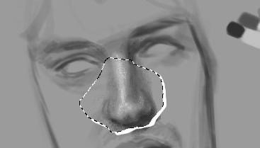
I know a lot of people work by gradually working the whole face, like do loose highlights and dark tones on the whole face and then refining it but i like to do each part of the face one by one and i usually always start with the nose, this isn’t important lmao i just enjoy drawing noses so it’s what i start with. i think the use of highlight is super important to utilise when drawing the nose because its what suggests form,, this is my drawing will look like at this point:

I do end up darkening the shadow on the right side of his nose and the bottom of his nose but i usually get to this point and then move on and then once i do more ill go back and try and bring more dimension to the drawing.
Also! one of the best tools on photoshop that you can utilise and in some of my drawings it’s my saving grace is the liquify tool. Basically if you do the drawing and get to a point it would be hard to paint over then u can use liquify, as i was doing other parts of the face i realised that the nose was supposed to be a little to the left and the eyebrows had to be lower down so you if you open up liquify you can just click and drag the nose to where you want it to be so:
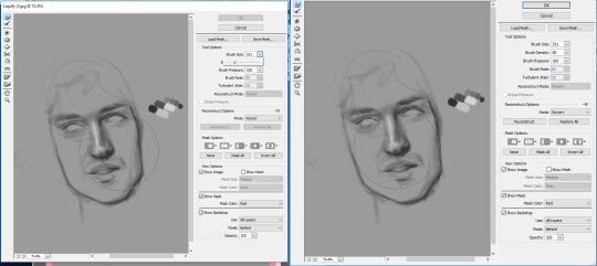
it’s a super helpful tool that really helps you get the facial features exactly where you need it, i used it a couple times throughout this drawing. I don’t think sai has it but you can use the lasso tool and rotate it or whatever and just draw over the little break it makes in the canvas:
so the next thing i do is the eyes and eyebrows. I’m usually not the greatest at getting the exact eye shape but again, liquify is your best friend. An important thing to note is the angle of the eyebrows in relation to the middle of the nose, Brian’s eyebrows are quite straight so i tried to keep them that way. I also started darkening up the drawing, i didn’t quite go full black, the darkest colour i used is like just off black. This is what i have so far:
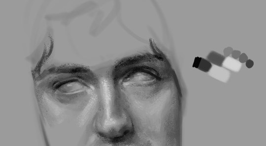
Also another important thing to remember is the lighting of the image, in the image the right side of his face is more shadowed so the shadow on the left side of his nose wont be as intense as the right side and things like the bags under his eye on the right side would be slightly more prominent. Also because of the brow bone, theres more highlight on top of the brows and usually a shadow underneath because the brows are more elevated and the eyes are sunken in a lil bit. There will be a lil bit of highlight on the inner corner of the eyes though.
In the next part of the drawing i just add a little bit to the forehead and cheeks :

I think by this time i had adjusted a couple of things like the angle his face was at was a little bit too tiled in my original draw so i just free transformed it and fixed the angle and the face i think was a little bit too wide so i just pulled it in a little bit. I think another thing to remember that places like the cheeks and forehead wont be pure highlight, especially with like men and older faces there will be more subtleties, with Brian he has highlight on the top of his cheekbones but the highlight is kind of broken up with the line that comes down under his eye and the forehead isnt a smooth bump above the eyebrows, especially with the lighting of the image the highlights get broken up a little bit.
The next drawing is a little fast forward, i forgot to save in between but ill try and talk through everything:

When finishing up I realised the left eye/eyebrow was a little too high so i liquified that baby up to bring it down just a little bit. Another thing i sometimes struggle with is getting the exact shape of the face and angle of the jaw but you can just keep on drawing on top of it until it looks vaguely right.
For the lips and mouth i think its kind of just a matter of trying to get a sense of the shape, look at the cupids bow and the length between the top lip and the bottom of the nose and how far the lips come out in relation to the nose as well, i think as well the shadow underneath the bottom lip is usually all you need to suggest the shape of the lip, it doesnt look all too natural if theres like a solid like to show the shape of the lip, the top lip though, because of the way the light is sitting on his face is almost completely shadowed, so the highlight on the cupids bow that goes down to the edge of the mouth is what helps give the mouth form. With teeth because they’re in his mouth so they’re not going to be super bright so i didnt add any highlight to them and just used a dark tone to outline the shape of them at the bottom and used a little bit of shading in between them to differentiate between them.
For the eyes i usually just leave them without the pupils because it’s my brand but it wasnt looking quite right to me so i added a little outline of the pupils, i didnt want to do the full pupil because i like adding a lil smth interesting in the eyes but i like the way they turned out!
The jaw you can usually bring out with the shadow of the neck. I didnt really feel like drawing the outfit so i kind of just did a couple of lines so show that he was wearing a shirt with a collar.
Also for brian because he has so much hair i more often than not just use flat colour for his hair and because his hair is so dark it usually works fine but with people like Roger who has lighter hair is doesnt usually work out well? especially with a more realistically drawn face. I was originally going to keep the entire background that colour but it wasnt looking quite how i wanted to. I coloured first though, and tbh my colouring process really doesnt take me that long, the longest part is just working out what colours id like to use and what looks good with the drawing I've made.
So for colouring i use the gradient tool, you have have a gradient thats two colours that will make your drawings look like this
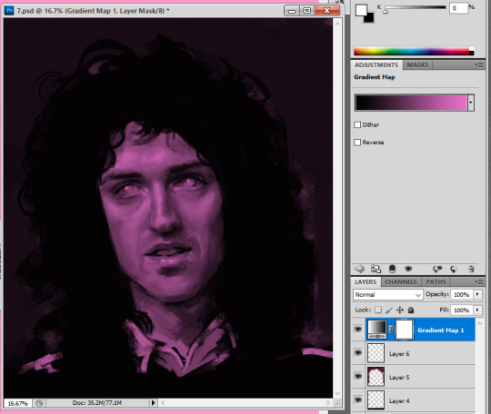
but recently ive started using the gradients with three colours so the highlighted sections will be a different colour to the base colour, i really like the way this comes out, without any other editing itll look smth like this:
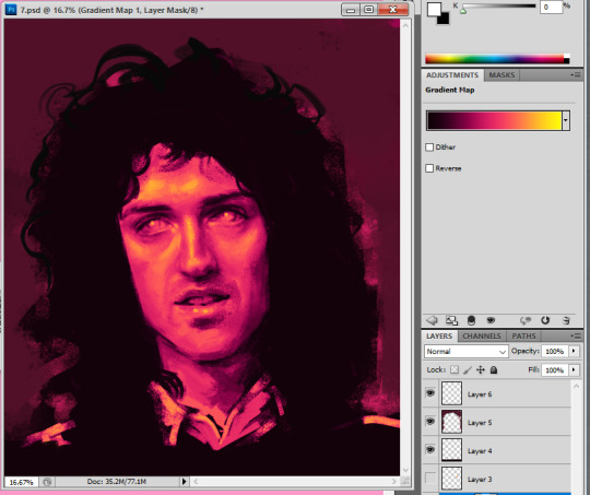
I like to play about with the settings a little bit because i do enjoy the way this looks but it’s kind of a bit overpowering and i think sometimes the details of the drawing can get lost when you overdo it a bit?
If you go through this itll give you many different versions of that gradient and i like to go through it and see which i feel compliments the drawing
heres a couple examples

The one i ended up going for was dissolve but it was a bit too intense so i turned the opacity down to 57%

which gave it a kind of static feel which i was in to, to finish it up i added a tiny bit to show some shoulders and then i wanted to add a tiny bit of a background so i used a flat pinky colour and put that around his hair and then on top of the background i added a little bit more into the hair.

and added so more vibrant pink into it as well just to spice her up a little bit.
124 notes
·
View notes
Last Seen Blogs

poisongorl
Untitled

gracelyy96
Daddy Issues, Into Everything 😏

jongkolemas
Untitled

girlboypersonthingy
✨Queer As Fuck✨
pinkfluffacttuff
PinkFluffActTuff