#illust map
Text
🌾🐾☘️ "forget-me-not"


Instagram: @mlejulie
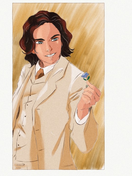
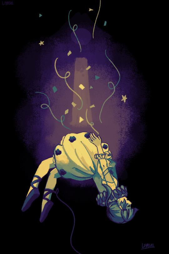
Sirius: See forget-me-not. Hold
The boys were paired up on a herbology project. Sirius is not yet aware of his feelings, he is overwhelmed with various emotions in relation to Sev.

#art#illustration#illust#hp#harry potter#severus snape#sirius black#sirius x severus#snack hp#snirius#the marauders#hp marauders#marauders era#marauders#the maraunders map#hogwarts#hogwats mystery#sirius black aesthetic#sirius black fanart#sirius orion black#severus snape fanart#young severus#harry potter art#jk rowling#digital#digital illustration#digital art#sketches#sketch#slytherin
125 notes
·
View notes
Text
Proserpina
#oc#original character#illust#drawing#illustration#ibis paint x#digital art#sketch#wanted to map out an idea#its kinda rough yea#my art
3 notes
·
View notes
Text
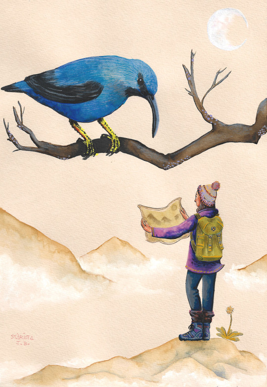
Acryla gouache and Watercolors exercise. Loving this paper!
#honeysucker#bird#pajaro#ave#map#mapa#mountains#montaña#luna#moon#illo#illust#illustration#art#arte#painting#acryla gouache#gouache#watercolors#acuarela#aquarella#aquarelle#honey sucker#blue bird#purple bird#traveller#hiking
5 notes
·
View notes
Text
Today I give you a map of Aren, a continent of Altterra, one of the homes of the Ceens, and the home of several city-states that are almost always at odds with each other. For years I had not interest in making such a map, but while it took a while to complete I ended having a lot of fun with this, easily the most fun I've had with a artwork in a while. Sorry if it's hard to see the labels on the map.

#altterra#art#artwork#artist#artists on tumblr#oc#original character#oc art#illustration#illustator#Map
0 notes
Text

John Spilsbury, a London mapmaker and engraver is credited with inventing the jigsaw in 1766. It was a map of Europe created to teach geography
#illustration#digital art#digital illustration#illust#jormation#procreate#fact of the day#did you know#the more you know#fun fact#jigsaw#map#fact
0 notes
Text
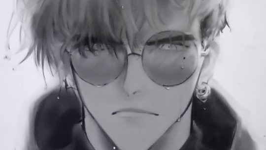
[ID: Digital fanart of Vash from Trigun Stampede in grayscale focusing on his face. He has a deep frown and is soaking wet. The photo is low-res. End ID]
grayscale practice with vash :^) its a whole shoulder-up illust and i have a version where i messed w paint tool sai to imitate gradient maps. dont rly wanna post it on the blog but you can dm me if you wanna see the full thing :D !!
11 notes
·
View notes
Note
How did you get Haruka’s idol outfit to shine Like That? I can almost feel it under my fingertips and hear the rustling. I know you posted that a long time ago (in Internet time) but its stayed with me.
It was with the love I hold for my beloved daughter 💖
But hee hee some notes on the illust :^) I may have over explained it lol
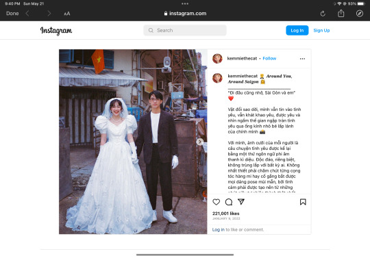
My main source of reference was from this collection of photographs by kemmiethecat on instagram!
I wanted this dress to be reminiscent of her outfit for So Much More and I combined it with 80s (?) aesthetics to match the aesthetic of film photography. I used the photographs to get an idea of how the sleeves, bodice, and gloves would fit on her. Even though her gown would be white, I wanted to add interest to it and I figured the best way to color and shade it while retaining the look of a white wedding gown was to make the fabric look iridescent/pearlescent. I kinda winged it on the color choices and placement, though…
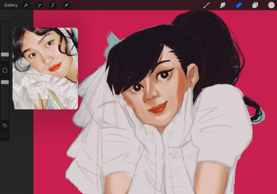
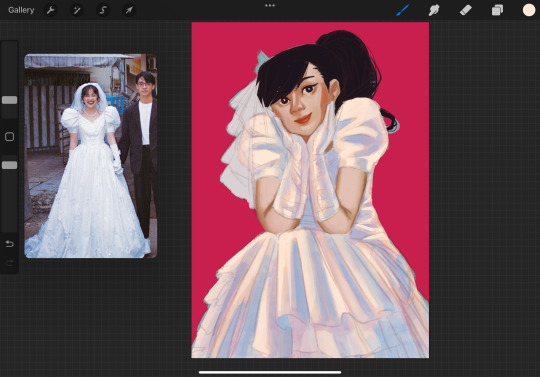
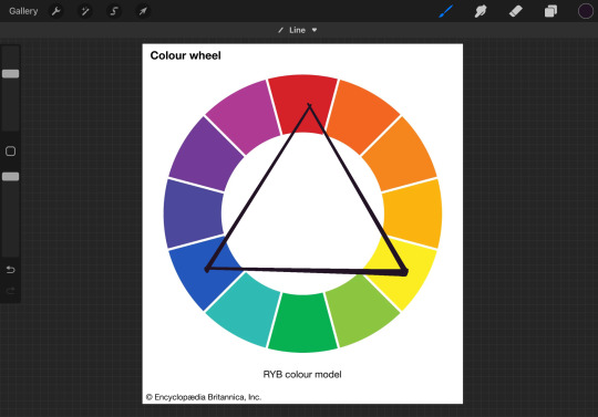
I chose a pink similar to the background (bc I was going for a teen magazine concept as well and the bright pink made her and the gown stand out), a purple-ish blue for the shadows, and some yellows to transition into the bright whites because I thought the combination would work the best. It’s mostly a vibes-based decision for me, but if we wanted to be technical about it, it’s bc of color theory!
I followed how the values of the fabric from the references and lightly mapped out where the colors would be placed, keeping in mind how it’d be affected by what was closest to it. Admittedly, I kinda wanna go back and make the colors more consistent so that fabric-fabric -> blue, skin-fabric-> pink, highlights from the “flash”-> yellows and whites. But it is what it is! After that, I just blended to what suited the fabric while using the references.
I wanted the gloves to stand out since it’s framing Haruka’s face and considering it’s satin, it’d shine and react more with light and color as opposed to her dress, which is more matte. Because of that, the gloves ended up having more shifts in color compared to the dress and the instances of the bright white appearing front and center combined with the highlights of Haruka’s face all harmonized to give off the feeling of each fabric. The same goes with her veil and the ruffles of her dress, where I added some texture to give off the look of netting you’d see in tulle.
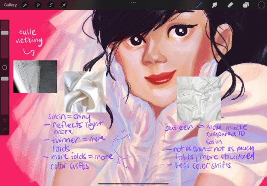
Generally, whenever I make illustrations where the outfit is an important aspect of it, I put extra care into how it’s rendered and constructed. Partly because it tends to be the focal point, but also because I liked watching Project Runway and Say Yes To The Dress in the past, so I have some interest in fashion because of that and it reflects in my art from time to time lol.
I also like to add that while I did have references, I didn’t follow each fold precisely. To me, it’s impossible and not worth copying how the fabric creases and folds exactly so long as I get the general flow of it, like where the creases focus on, how it glides, etc. Same with the color! My personal outlook on using references is that it’s a general outline, not a step by step instruction, if that makes any sense, lol!
In short:
References used -> Pose, Outfit, Values, Color Palette (Somewhat), ✨Aesthetic ✨
Vibes of color! (Color theory)
Contrast of different textures of each fabric in the outfit as well as her skin and hair
My interest in fashion makes me wanna make sure to depict fabrics as best as I can, especially when it’s the focus of the illustration.
I use references when I can, but I don’t stress about it being a perfect match, I focus on it being as best it can to me
It’s also a result of me figuring out what I like and wanna do bc sometimes reality doesn’t look as good and we have to take artistic liberty sometimes! There isn’t a fabric that exists like this in the real world, and the closest are iridescent organza or sequins. Usually there’s green present in it, but I didn’t use it here bc I didn’t feel like it since I usually don’t use greens in my art unless I have to ¯\_(ツ)_/¯ (Sorry, lovers of the color green!!)
I hope that helps? I feel like I definitely overexplained some aspects, but teehee idk I just like talking about color even tho I forgor some of the terms for it LMFAOOO I just think colors are pretty, same with clothes, and my beloved daughter, Haruka ^_^💖
#ask and answered#glamorousgamine#i hope this makes sense LOLLLL#the even shorter tl;dr is fashion and colors and drawing haruka make brain go brrrrrr#i hope i was talking about the right illust….lol…. ToT
2 notes
·
View notes
Text
Today we began the day by creating a new mind map to spark new ideas for our designs that we would make later. We got to discuss our themes in groups and share our thoughts and opinions about each others work, this is something that would happen in graphic design usually as graphic designers must communicate with thier clients.


With the key words we dicussed in our mind maps we turned these into thumbnail designs, we were told to make four different thumbnails.
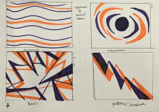
After creating these mini designs, others in my group got to chose which thumbnail was thier favourite, so as designer I chose the most popular and tried to upgrade it and make it better.
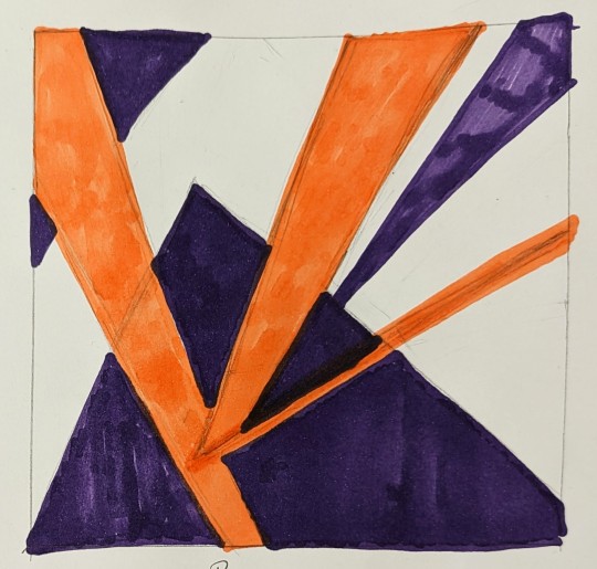
For my final design I tried to depict my key word of beats (as in music a music beat) as well as movement, I tried to make angled and sharp lines and shapes going different ways to suggest movement the sharp triangular shapes are supposed to represent beats as beating in music are sharp and consistant, that is what I feel like beats in music look like to me personally.
With this design in mind we were told we must use coloured paper to create the final piece. using a ruler and scalpel we got to work cutting and measuring out shapes. I ended up choosing the colours bright pink and orange, originally I wanted purple and orange for contrast but there was no purple so I went for the bright pink. I think these two colours suit music beats as they are bright and colourfull like the movement of beats in music.
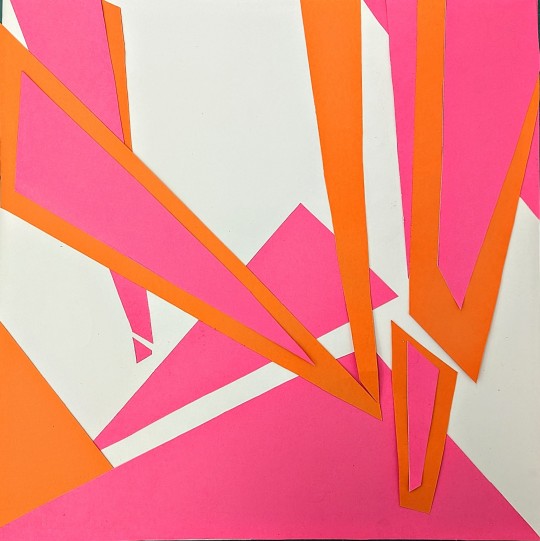
Instead of gluing it on we decided to create a stop-motion animation of the final design as this is all about movement. I tried to illustate beats in music within this animation.
1 note
·
View note
Text
DiNB update - world maps added
youtube
World maps can be accessed using the tablet on the balcony of Darek's house and the tablet at the Center(seen in the video)
Other than that, I've been also working on redrawing old illustrations. Are you interested in seeing old vs new illusts + reasons why I've redrawn them kind of posts? So far there are... technically 4? illustrations that had been changed. (But if we count sprites than there will be way more than 4 *cries*)
#dinb updates#dinb darek#Youtube#rpg maker game#rpg maker vx ace#indie game#gamedev#game development
1 note
·
View note
Text
#Crawler Drill Rigs Industry Analysis 2023#Crawler Drill Rigs Industry Analysis 2022#Crawler Drill Rigs Market 2023#Crawler Drill Rigs Market Analysis#Crawler Drill Rigs Market Data#Crawler Drill Rigs Market Demand 2023#Crawler Drill Rigs market forecast 2023#Crawler Drill Rigs Market Growth#Crawler Drill Rigs Market In Apac#Crawler Drill Rigs Market in Europe#Crawler Drill Rigs market in US 2023#Crawler Drill Rigs Market Outlook 2023#Crawler Drill Rigs Market players#Crawler Drill Rigs Market in United States#Crawler Drill Rigs Market in Spain#Crawler Drill Rigs Market in Germany#Crawler Drill Rigs Market in Saudi Arabia#Crawler Drill Rigs Market Singapore#Crawler Drill Rigs Market in Australia#Crawler Drill Rigs Market in United Kingdom
0 notes
Link
0 notes
Photo
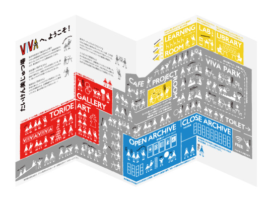

たいけん美じゅつ場VIVA ガイドマップ
6 notes
·
View notes
Photo
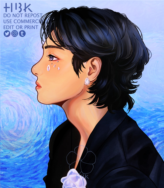
Inner Child: Kim Taehyung
˚✧₊⁎HBK🌺
Twitter & Instagram: hbk__art
#taehyung#kim taehyung#v#bts v#bts taehyung#bts#bts fanart#bts art#inner child#bts map of the soul: 7#illustration#illustrator#illust#digital art#digital arwork#digital artist#digital painting#digital#fanart#kpop fanart#kpop#art#artist#artwork
145 notes
·
View notes
Photo
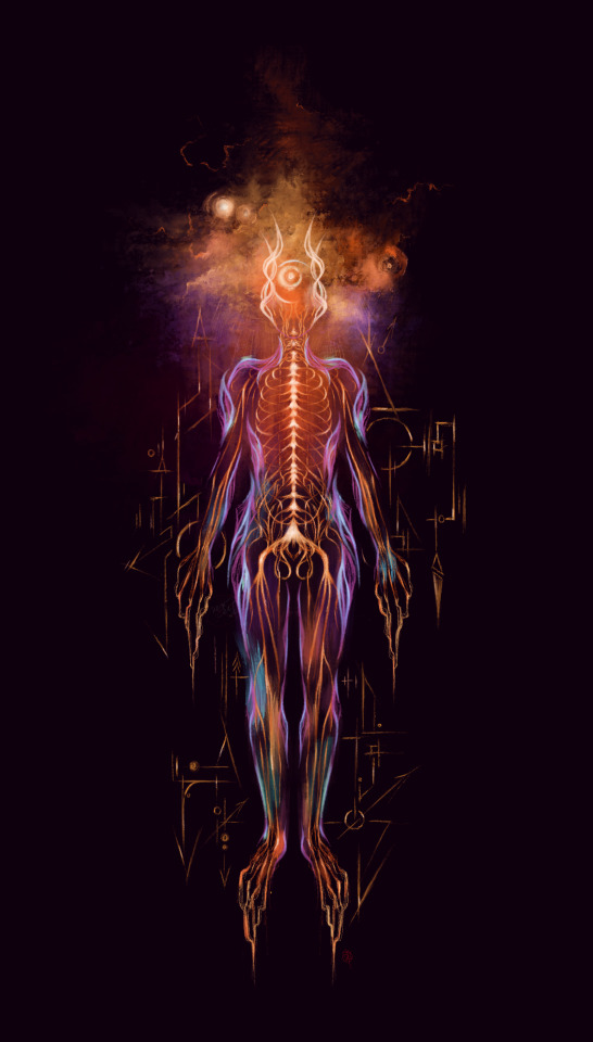
Spark of life.
#direction#connection#hypnosis#map#cycle#inflow#moon#space#shift#cns#humanbeing#digitalart#illustation#neweresth
275 notes
·
View notes
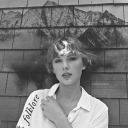
Text

fall
#illust#original#revellie#hehe gradient map go brr#this technique is pretty fun#grayscale was made first then coloured
17 notes
·
View notes
Photo
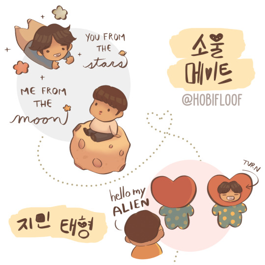

soulmate map 💜
#bts#jimin#taehyung#bts fanart#map of the soul 7#mots7#kpop art#kpop fanart#digital art#illust#procreate#artists on tumblr#dumpling
69 notes
·
View notes
Last Seen Blogs

pisboy
Soup's on, baby!
tni-felicia
Felicia/フェリシア (Darkstalkers)
danielreputation
daniel
misaverawrites
Lexxe
krajaneczka
Krajanka