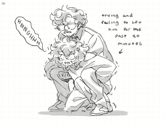
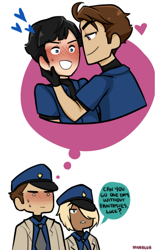
#im just picturing this and just-- imaging this as a drawing
Text
My Favorite Cheap Art Trick: Gradient Maps and Blending Modes
i get questions on occasion regarding my coloring process, so i thought i would do a bit of a write up on my "secret technique." i don't think it really is that much of a secret, but i hope it can be helpful to someone. to that end:

this is one of my favorite tags ive ever gotten on my art. i think of it often. the pieces in question are all monochrome - sort of.

the left version is the final version, the right version is technically the original. in the final version, to me, the blues are pretty stark, while the greens and magentas are less so. there is some color theory thing going on here that i dont have a good cerebral understanding of and i wont pretend otherwise. i think i watched a youtube video on it once but it went in one ear and out the other. i just pick whatever colors look nicest based on whatever vibe im going for.

this one is more subtle, i think. can you tell the difference? there's nothing wrong with 100% greyscale art, but i like the depth that adding just a hint of color can bring.
i'll note that the examples i'll be using in this post all began as purely greyscale, but this is a process i use for just about every piece of art i make, including the full color ones. i'll use the recent mithrun art i made to demonstrate. additionally, i use clip studio paint, but the general concept should be transferable to other art programs.


for fun let's just start with Making The Picture. i've been thinking of making this writeup for a while and had it in mind while drawing this piece. beyond that, i didn't really have much of a plan for this outside of "mithrun looks down and hair goes woosh." i also really like all of the vertical lines in the canary uniform so i wanted to include those too but like. gone a little hog wild. that is the extent of my "concept." i do not remember why i had the thought of integrating a shattered mirror type of theme. i think i wanted to distract a bit from the awkward pose and cover it up some LOL but anyway. this lack of planning or thought will come into play later.
note 1: the textured marker brush i specifically use is the "bordered light marker" from daub. it is one of my favorite brushes in the history of forever and the daub mega brush pack is one of the best purchases ive ever made. highly recommend!!!
note 2: "what do you mean by exclusion and difference?" they are layer blending modes and not important to the overall lesson of this post but for transparency i wanted to say how i got these "effects." anyway!
with the background figured out, this is the point at which i generally merge all of my layers, duplicate said merged layer, and Then i begin experimenting with gradient maps. what are gradient maps?
the basic gist is that gradient maps replace the colors of an image based on their value.

so, with this particular gradient map, black will be replaced with that orangey red tone, white will be replaced with the seafoamy green tone, etc. this particular gradient map i'm using as an example is very bright and saturated, but the colors can be literally anything.

these two sets are the ones i use most. they can be downloaded for free here and here if you have csp. there are many gradient map sets out there. and you can make your own!
you can apply a gradient map directly onto a specific layer in csp by going to edit>tonal correction>gradient map. to apply one indirectly, you can use a correction layer through layer>new correction layer>gradient map. honestly, correction layers are probably the better way to go, because you can adjust your gradient map whenever you want after creating the layer, whereas if you directly apply a gradient map to a layer thats like. it. it's done. if you want to make changes to the applied gradient map, you have to undo it and then reapply it. i don't use correction layers because i am old and stuck in my ways, but it's good to know what your options are.

this is what a correction layer looks like. it sits on top and applies the gradient map to the layers underneath it, so you can also change the layers beneath however and whenever you want. you can adjust the gradient map by double clicking the layer. there are also correction layers for tone curves, brightness/contrast, etc. many such useful things in this program.
let's see how mithrun looks when we apply that first gradient map we looked at.

gadzooks. apologies for eyestrain. we have turned mithrun into a neon hellscape, which might work for some pieces, but not this one. we can fix that by changing the layer blending mode, aka this laundry list of words:

some of them are self explanatory, like darken and lighten, while some of them i genuinely don't understand how they are meant to work and couldn't explain them to you, even if i do use them. i'm sure someone out there has written out an explanation for each and every one of them, but i've learned primarily by clicking on them to see what they do.
for the topic of this post, the blending mode of interest is soft light. so let's take hotline miamithrun and change the layer blending mode to soft light.

here it is at 100% opacity. this is the point at which i'd like to explain why i like using textured brushes so much - it makes it very easy to get subtle color variation when i use this Secret Technique. look at the striation in the upper right background! so tasty. however, to me, these colors are still a bit "much." so let's lower the opacity.

i think thats a lot nicer to look at, personally, but i dont really like these colors together. how about we try some other ones?

i like both of these a lot more. the palettes give the piece different vibes, at which point i have to ask myself: What Are The Vibes, Actually? well, to be honest i didn't really have a great answer because again, i didn't plan this out very much at all. however. i knew in my heart that there was too much color contrast going on and it was detracting from the two other contrasts in here: the light and dark values and the sharp and soft shapes. i wanted mithrun's head to be the main focal point. for a different illustration, colors like this might work great, but this is not that hypothetical illustration, so let's bring the opacity down again.

yippee!! that's getting closer to what my heart wants. for fun, let's see what this looks like if we change the blending mode to color.

i do like how these look but in the end they do not align with my heart. oh well. fun to experiment with though! good to keep in mind for a different piece, maybe! i often change blending modes just to see what happens, and sometimes it works, sometimes it doesn't. i very much cannot stress enough that much of my artistic process is clicking buttons i only sort of understand. for fun.
i ended up choosing the gradient map on the right because i liked that it was close to the actual canary uniform colors (sorta). it's at an even lower opacity though because there was Still too much color for my dear heart.

the actual process for this looks like me setting my merged layer to soft light at around 20% opacity and then clicking every single gradient map in my collection and seeing which one Works. sometimes i will do this multiple times and have multiple soft light and/or color layers combined.
typically at this point i merge everything again and do minor contrast adjustments using tone curves, which is another tool i find very fun to play around with. then for this piece in particular i did some finishing touches and decided that the white border was distracting so i cropped it. and then it's done!!! yay!!!!!
this process is a very simple and "fast" way to add more depth and visual interest to a piece without being overbearing. well, it's fast if you aren't indecisive like me, or if you are better at planning.

let's do another comparison. personally i feel that the hint of color on the left version makes mithrun look just a bit more unwell (this is a positive thing) and it makes the contrast on his arm a lot more pleasing to look at. someone who understands color theory better than i do might have more to say on the specifics, but that's honestly all i got.

just dont look at my layers too hard. ok?
1K notes
·
View notes
Note
Ok I know you probably already figured out alastor's role in your soul eater hazbin hotel au, but im just picturing him as like the Excalibur of the au.
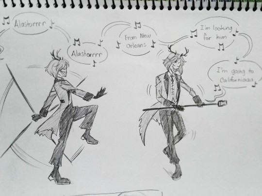
This ask is so fucking funny, I laughed for like half a minute over the mental image and had to draw it. I actually already had him planned to be like the Masamune(Tsubaki's brother) of this AU, but sure why not!
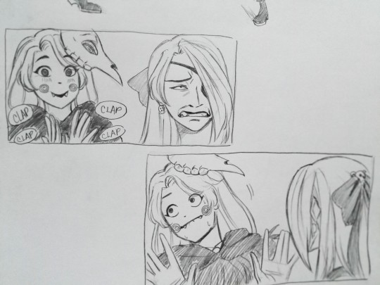
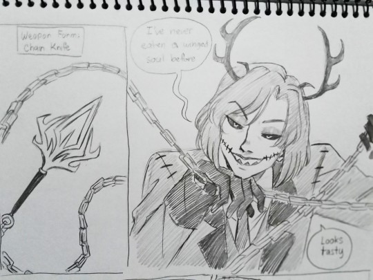
So if you're not familiar with Soul Eater, in this AU Alastor is a cursed blade that's kinda like a parasite to his meisters. He feeds on the soul of the people who use him and takes control of them. He has stitches on his clothes and mouth as a reference to the fact that he puppeteers his meisters, wrapping his strings around them, similar to how you need to have the chains of his blade wrap around you to use it.
He's generally against the academy cuz, duh, he's got a rotten soul, but he also has a personal vendetta against Lucifer and his students because his mother was a witch and it was one of the Death Scythes who ate her soul. He regularly eats witch(and human) souls to get stronger though.
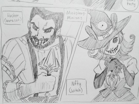
Husk and Nifty are the Free and Elka counterparts, a werewolf werecat-witch duo who are under a big bad's command. (They're a cat n mouse? Get it? Alright...) Alastor is perfectly capable of fighting by himself, but he finds a certain kind of satisfaction in having a meister under his control. A human is certain to die under prolonged partnership with him, so he has non-humans like Husk and Nifty use him when he's not in need of a snack.
353 notes
·
View notes
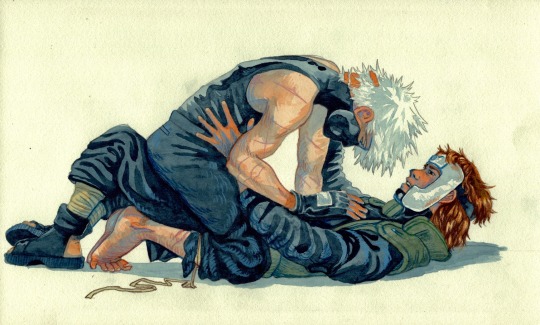
Text
[Image ID: Full-body digital illustration of Adaire Ducarte and Hella Varal circa Winter in Hieron. They are bodily facing each other but looking toward the camera. End ID.]
part 1 of my mini series of drawing hieron guys. i still have c/w art in the works but i have GOT to get these guys out of my head and onto paper before i explode
#adaire ducarte#hella varal#friends at the table#f@tt#seasons of hieron#winter in hieron#(just to be specific)#no hella isnt shirtless during wih im sure she has a cloak or something to keep warm#but whats the point of drawing that#once again i havent looked at a single image while drawing these except for that one da vinci painting#its like 55% canonical info 35% how i mentally picture them 10% im gay
584 notes
·
View notes
Text
A thing for @breakfastatmiles' dtyis challenge on instagram :)
Been a while since I drew the world's most favourite boy (like. almost a year ago???? uh woops) I wanted to draw something for Percy's birthday but alas I had no idea what to draw :'') consider this late Percy Jackson b'day art
Variants under the cut

#also stop i literally just realised one of the texture images i used has the fucking “stock photo” in it im literally gonna cry#praying to every god that yall never find it. and if you do.... exclusive pictures of dino agni :)#anyway i spent probably the whole day on this. my anatomy exam is tomorrow and i know jackshit#(convincing myself that it's okay i was using anatomy knowledge to draw percy lol haha hashtag in denial and sleep deprived)#i guess now i have to go back to finishing assignments..#percy jackson#percy jackon and the olympians#percy jackson fanart#pjo fanart#pjo#myart#artoftheagni
691 notes
·
View notes
Text


i like him
#somebody needs to keep me 8 metres away at all times or else ill start chewing on him#i just want everyone to know if i end up making a character who happens to resemble harvey in any shape or form#it probably wasnt a coincidence 😐and it will happen again#if i remember maybe ill try getting stardew when it goes on sale.. my friend showed me her farm and she named her chicken after doja cat#or maybe it was nikki minaj i cant remember. and she also said smth about monsters and passing out if you stay out after a certain hour#idk how accurate tht is all i know is the funny fucked up grandpas bed#i read somewhere that harveys supposed to be in his early to mid thirties and i dont have a problem with it but i think itd be very funny#if hes actually younger than he looks hes just a med school postgrad lmao. idk how well that headcanon would hold up since ive#never played the game and idk how often ppl talk about his age or if itsjust an implied thing. i just think its really really funny#im trying to get into the habit of drawing poses so im using reference images to try and build up muscle memory#i found some cute pictures of two ppl playing by the sea shore and it reminded me of xin and sailor so im gonna draw em like that#i havent drawn em in so long..... maybe i should update xins reference since i changed their lore quite a bit#myart#my art#doodles#stardew valley#stardew#sdv#sdv harvey#kinda wanna see him whimper a little bit. as a treat
361 notes
·
View notes
Text
the debate continues (pt 1) but kurama gets called in

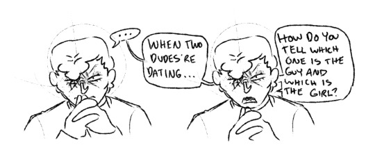

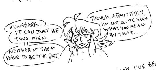
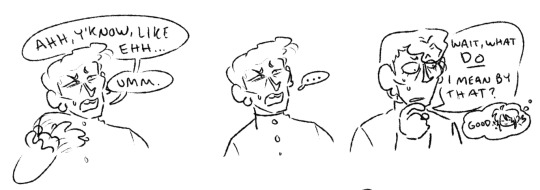
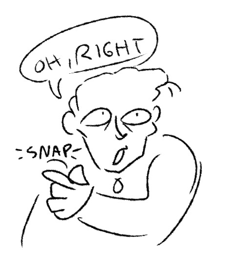

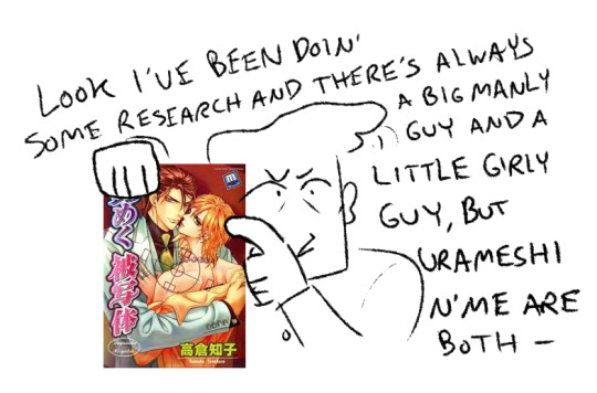
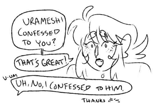
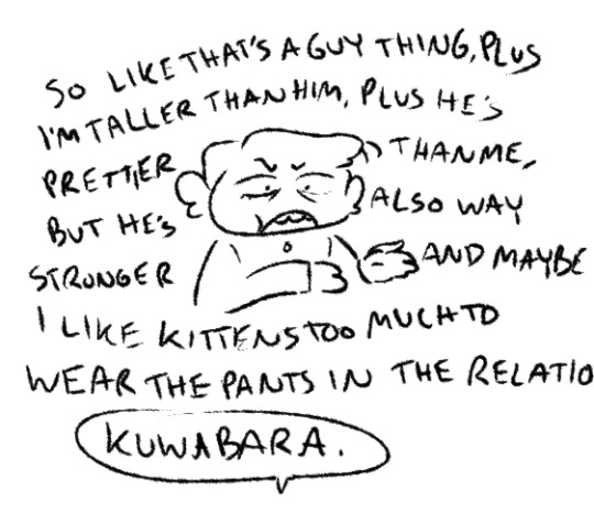
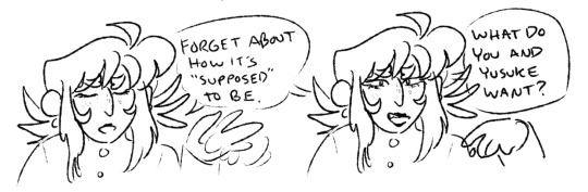


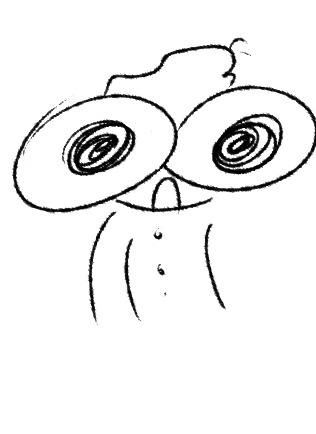
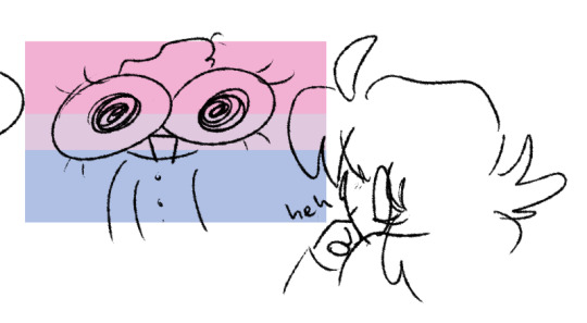
bonus under the cut (ft hiei):
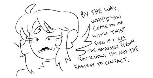
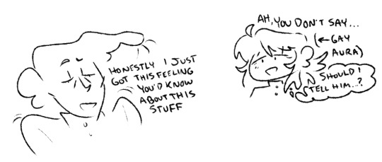
gay people
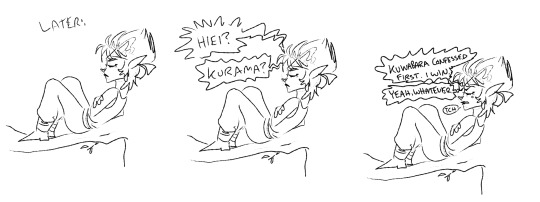
#can you tell i'm much more used to drawing hiei and kurama? lol. i just love their hair sm like.. mwah#anyway idek if this is funny but here's more of it ig#also i just typed 90s yaoi cover into google so i know nothing about that image or its source material so like. open to fun facts ig#yyh#yu yu hakusho#kuwameshi#kazuma kuwabara#kurama#shuichi minamino#hiei#anyway kuwameshi bi4bi moment and i think about the discovery of that a lot. also yusuke's nb to me so im picturing another side of this#where yusuke's like oh man... maybe i AM the girl??? but for gender reasons and not like. relationship dynamic or uke/seme reasons or whatv#also poor kuwabara. that's not going to help you very much i think. he's gonna believe in the yaoi hole :(#skrunkart#thinking about how kurama uses telepathy when he's first introduced and kind of never again after that?? anyway that's what going on in tha#hiei extra fyi#kuwabara kazuma#minamino shuichi#idkkkkk#hoorayy anyway so like. yusuke and kuwabara here like each other so much but don't know what that makes them (bi in this case) bc of the#past interest in girls. like they both have been into girls but they feel so strongly about each other they can't just ignore it. so they'r#like shit i guess we're gay now. and that doesnt fit right but what else could it be? and also they have like zero accurate knowledge of#queer people and queerness. very 'completely trusts an am i gay quiz' moment to me#they don't know where to look besides yaoi and that's Not For Them so that doesn't work. confusing times for kuwameshi i spose#plus kuwabara spirit sensitivity = gaydar in this case#a little tiny tiny kurahi in there. to me :)
296 notes
·
View notes
Text
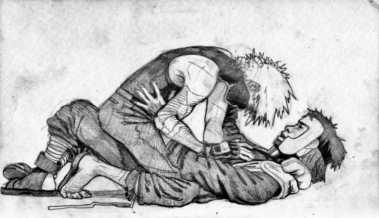
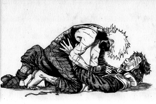
i wanted to see what a piece would look like if i finished it in my three main mediums, pencil, ink, and watercolor (+colored pencils) >:*)
#my art#naruto#yamato#yamato tenzo#tenzō#kakashi#kakayama#image desc in alt text#okay now to talk shop. SO. i did these in the order theyre presented#which means that the pencil was done first#and by the time i got to the watercolor id drawn this same picture quite a few times#so if the quality seems to improve thats more than likely a matter of repetition and the benefit of past foresight or whatever#like yamatos shin is too small in the first picture.#and i noticeably lengthened it in following pictures. i also shortened kakashis thigh a little bit#yamatos torso looks really long but thats partially because he's slid back a little bit—his flack jacket is up high and you can see#it gapping at his shoulder#but ultimately that doesnt make the anatomical weirdness completely forgiveable so if i drew this again id do it differently probably#THAT SAID IM STILL SOOOO HAPPY WITH HOW THESE TURNED OUT#drawing the same picture over and over and over again? kind of great actually. i recommend it.#if you want to try doing this and you dont have a lightbox (u dont rlly need one) just like. take one drawing you like#and a blank sheet of paper#and tape it to a window thats getting a LOT of light#and then trace ur old drawing's bare bones (the forms. u know)#and then once you have that down. draw on top of it. or use new materials#it allows you to preserve ur previous drawing also which is great#once i was doing a commission and i realized i got the room i was drawing the characters in backwards#so i just. turned the paper around. put it against the morning window. and traced the now-mirrored image onto a new sheet of paper.#saved SO MUCH TIME LMFAO#the paper on the last picture is different and more yellow in tone so thats why the color is weird there ajxjskhfjahx#anyway happy testostone tuesday to all who celebrate 💚 love you
846 notes
·
View notes
Text

Little (mostly) Cecil doodle page, cause brain images are wierd.
#wtnv cecil#wtnv fanart#wtnv#wtnv carlos#carlos the scientist#cecil palmer#honestly might go back and color this#also good news im nearly caught up which is kinda terrefing cause ive only been listening for a month? idk#cacil never looks old enough when i draw him i feel like#i also kinda wanna stray from the most common fandom interpretation (which i still dont think im the best at)#carlos is somehow much easier to draw since my brain picture of him is clearer#also i realized when i picture charakters they mostly have black hair which might just be because of how i see images in there#brains are wierd tho so who knows#i also need to get wierder with those outfits honestly
167 notes
·
View notes
Text

I'm personally blaming @starbiology and everyone who has reblogged or commented the other piece for this.
Bonus comic featuring my grundo:

#every minute i keep working on this i take psychological damage#neotag#neopets#vin memes#you'reall to blame for this monstruosity#i literally just searched “babygirl” pose and went “I... i can do that”#i didn't stop to think if i should though#Star i was gonna respond 2 the reblog with the first image only but decided it needed its own post for quarantining this... thing#again if youre seeing this with no context#you dont need context#i... i don't think there's any for that matter#just picture me writing all this tags while losing health in posion damage every turn#i am working on neo oc images i just need to render them but i.... i needed the world to see this before#my blog's already tainted anyway LMFAOO#yeah uh im dead in neo canon i drew this and inmediately got taken back by yours trully and never came back#also i'll try making a ref as well for my sona so i can draw them more im just really indecisive in what color to make him#split it is for now#i don't want to look at this anymore end me#i am making more drawings to kinda cover this thing from the light but at this point it just keeps reappearing like a mold#thats it im done see u all in kreludorian therapy#kreludorian health insurance in a farse
67 notes
·
View notes
Text
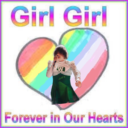
#this was actually way harder to make than it looks 😭#so please rb it i spent a long time drawing over an old web picture of a mouse#(no pressure)#kittyposting#mine#my chem#our lady of sorrows#gerard way#cheerleader gerard#cheer skirt gerard#my chemical romance#mcr#my chemical gerard#disclaimer im not one of those weird people on twitter who thinks#gerard is actually secretly a girl and is super invasive abt it#its just a sillay original image#if anyone wants teh template i made just ask#edit#edits
60 notes
·
View notes
Text
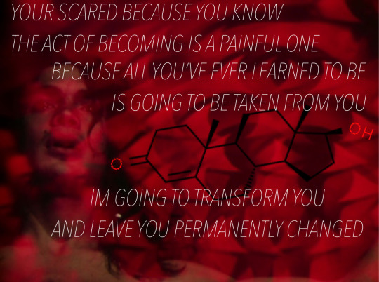
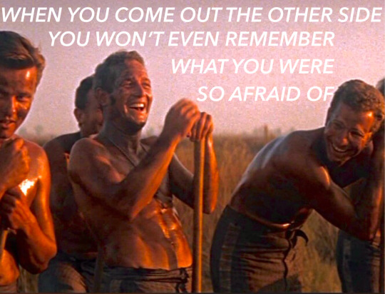
I know you’re in a world of darkness and dissatisfaction, I also know the way out
#first image is from the invocation of my demon brother by kenneth anger#second is cool hand luke!#i originally had another picture that came between these two that i think helped them connect better but i don’t like the way it looked#so some of my storytelling is missing but i’ll probably post it on it’s own it just doesn’t match well enough#but im trying to kind of draw a connection between luke and lucifer and also transition and ritual iykwim#autoandrophilia#force masc#forced masculinization#forcemasc#ftm hypno#boy hypno
48 notes
·
View notes
Text
#leologisms#leography#gintama#for a second can we all pretend like hijikata is pictured wearing tabi more often than he actually is. thanks#multiple things. one. i probably shouldve pushed this one further but unfortunately im relearning how to draw (head in hands)#two. i dont think this image is Real (as in. i dont think that this is something that would happen from what i remember of the dkbk arc.#which is honestly not a lot. but from what i can remember of the premise. combined with followkata followshirou being dedicated to#playing the role hes given. or that he thinks hes been given. i dont think this would happen) BUT i wanted to draw it so what. ever.#the haterisms. may it further embolden me to create what i want to see in the world#ALSO the sword looks like its just coming out of nowhere bwaaaahhhhhhhh <- 🎺
35 notes
·
View notes
Text


I normally don't repost my art like this but since most of these are just posted as one picture I also don't wanna reblog a lot of posts. So! Please look at my Dream Wardens. I love them so much.
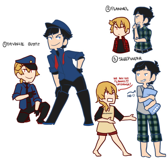
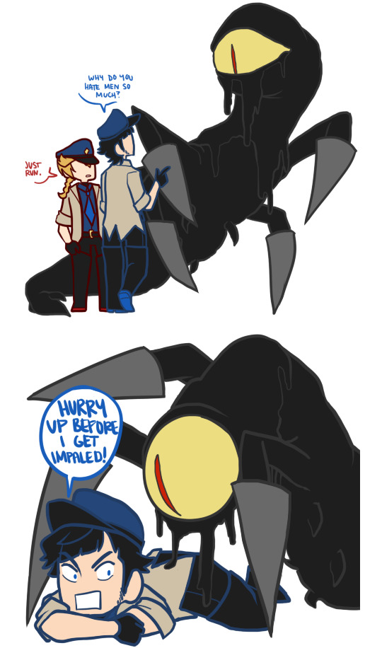
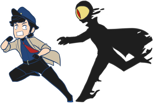
For the outfit meme thing btw, I would like to point out they don't really need sleep and they exist to work so no need for fun outfits. HOWEVER! Marcus and Colette's ties are the other's eye colors. Sil and Luce have gray ties because Luce was more recent (still a hundred years of partnership) so it's pretty much "you're being scored to make sure you can keep the job" and they eventually would get ties to match the other's eyes color.
The basic premise is! They live in a realm filled with dreams which they have to keep watch over to make sure don't escape. Whether dreams or nightmares, they must be contained. So it's kind of like a prison - each person has a cell that contains their dreams. There are.... a lot of wardens. But each "floor" has eight wardens and it's a circle where the wardens work in pairs. So Marcus and Colette are the focused pair and then they make rounds, they'll end the shift in a rest area where they either hang out with Luce and Sil or Sophia and Ruby. Those are the four they interact with while those four have another duo that they meet on their rounds.
The wardens cannot die. Literally impossble. They can get injured but it heals really quickly. So while Marcus would prefer to not be impaled (again) it wouldn't actually kill him. He'd just be sore.
They also just do not age. So they're centuries old. That said, for a while Colette had a different partner who retired and she got Marcus... and Marcus was incredibly quiet and reserved and scared of messing up for like 10 years before he started to warm up to her. (Time do be feelin' different there) And then he opens up a bit to Sil and Robert who was his partner at the time. And then hundreds of years pass and Marcus is super comfy with them (Sophia and Ruby still intimidate him a bit but that's different) and suddenly! No more Robert. Now it's Luce. And Marcus spends five years avoiding any and all conversations with him because oh no he's hot. Sil gets interrogated by Luce because "have I offended him in some way? he won't even look at me" and Sil is just "dude's shy. took him ages to warm up to me and my previous partner" and eventually Marcus laughs at something Colette says and Luce is like "ohhhhh nooooo I'm doomed he's so cute". While the entire time Marcus has been refusing to attempt conversation because "no he's handsome I'm doomed since I'm bad at conversations".
And they mention Robert sometimes (Colette, Marcus, and Sil) around Luce and Marcus seems chill about it. But then Marcus gets a serious injury that will recover but it would impact his job too much to patrol without a head so they send a temp replacement and it's Robert. And Sil is like "oh oh trade you Luce for my old partner give him" and Colette "are you kidding? you had him for sooooo long I wanna patrol with Robert now! it's only gonna be a little while!" and Robert just .... doesn't wanna be there. And when Marcus is fit to return he begs the people in charge of their routes to NOT LET ROBERT LEAVE until he can say hi and they let him. Unfortunately it involves Marcus busting into the break room saying "ROBBIE ROB!" and Robert sighing but standing up and extending his arms for a hug. Two pats on Marcus' back. and "okay bye". Luce is left in absolute despair cause he's never seen Marcus that happy oh boy.
Anyway my dream wardens mean a lot to me and I really miss them now.
#my characters#listen this isn't even all of them but holy moly i love them so much#this doesn't even show colette's gf! who has freckles!#also not pictured is robert whomst i fucking love and hes not there in plot often lmao#you really can see .... my art has changed..... very vaguely..... since i started drawing them and how it is now#there is too much under the read more and im so sorry i did try to contain it for those that arent interested#gonna draw for today now but just wanted to info dump my silly lil guys#my lil dream blorbos#it would be fun to make more image dumps thematically but maybe i will do that and shove them onto my side blog instead of here#you guys might not wanna see me dump ocs here#i mean depending on how long you've been here then lol you might have already seen it all
39 notes
·
View notes
Text


artstyle experiment with some unfinished scrawlings arrhhhhjg
I know drey probably wouldnt look THIS aged post-block but I wanted him to look little unrecognisable and to visually put more emphasis how the block fucked him up. Dreys such an interesting character wish the albatrio spoke to him more.
#jrwi#just roll with it#jrwi riptide#drey ferin#not pictured here but baby drey had short hair like jay when he first met captain rose#if you so care#jay ferin#also i dont usually write image descriptions because im not that good as describing stuff#but i did for these drawings#tell me what u guys thinkkkk#my art
96 notes
·
View notes
Text


@teruthecreator !!!!
Hi hi hi go read The Forgotten Son by teruthecreator on ao3 it's really good I promise
You have to actually click on the pictures for them to look clearer, idk why tumblr keeps killing the image quality
#HEY! HEY! I FINISHED IT!! THE BIG THING!!#HAPPY SUPER INCREDIBLY BELATED BIRTHDAY MICH!!!!!!!!!!! IM SORRY THAT ITS THIS LATE!!!!!!!!!!!!!!!!!#there is a mini comic im making of this scene and one of the others but those are taking FOREVER and i didnt want to make you wait longer#so. obviously the biggest thing does not have the right haircut#so i decided to sketch out what i would have tried to make it look like if i had had the right idea#but then i decided that i wanted to fuck around with the colors i was going to use#so hes purple and blue#oh teebus#TUMBLR KILLS THE IMAGE QUALITY EVERY TIME I SWEAR#it makes me SO MAD#my reference for the suit was a picture of zac efron in the ugliest brown suit ever#and he was just there staring at me the whole time#very unsettling#also everything else are little things i made while i was drawing the biggest thing#so theyre for you too#just for catagorizing ->#mp100#artbin#i hope you like these!!!#tfs my beloved :33
20 notes
·
View notes
Text
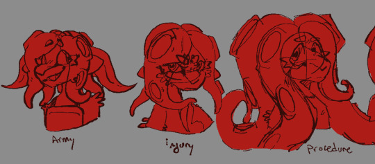

I am Increasingly normal about Zel. I am so SO normal about zel. Side order is only making me more normal
A little context for whats going on here (under the readmore)
Zel is an Ex-Octarian Soldier, who at their prime suffered a massive injury and was taken out of the attack force. Due to being such a well-off Soldier, their tentacle cuttings were valued for troop production, and they were given an experimental procedure to cause their tentacles to grow rapidly- able to produce more cuttings as a result. However after the domes started to lose power and shut down, Octarians fled the scene, and forgot Zel, who was slowly suffering a suffocating death under the weight of their own tentacles.. Until they were found and freed! After some time to readjust to society and a bit of Side Ordering, they decided to shave off all their tentacles completely and live as a new octoling!
Zel is Nonbinary and uses They/She/He <3
#side order zel is not pictured here but she does exist#like between found and thriving is side order zel#splatoon oc#splatoon#splatoon 3#i guess?#splatoon octoling#octoling#octoling oc#universal imaging#spaceship personnel#OC: Zel Repellani#please please please ask me about them please pl#xeno octoling#<- i think??? im unsure#i learned to draw splatooners from tracker and i think they draw xeno so ?? i think??#thats the right tag??#if not just lmk :) nicely ofc but just lmk
15 notes
·
View notes
Last Seen Blogs

ladakhvacations-blog
Best Deals on Ladakh Tour Packages

tokhangpelaq
Untitled
chiappettee
Curly Hair Don't Care

saltybasketballrascalathlet-blog
Sin título

gawrshdonald
Harmless Self-indulgence