#image edit blog
Text

demastered argonian
1 note
·
View note
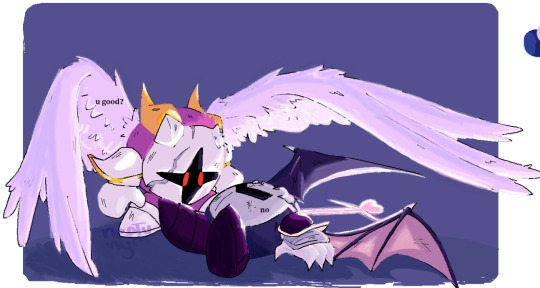
Text

important reminder ^_^
(id in alt text)
#daycare attendant#sundrop#sunnydrop#dca fandom#my art#HI EVERYONE. FIRST POST ON THIS BLOG#please be oh so niceys to me.....#edit: oh i just realized how tiny this image is. OOPS LOL
2K notes
·
View notes
Text
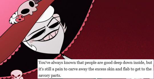
#hazbin hotel#vivziepop#the onion#spoiler#/ spoiler#spoiler /#// spoiler#spoiler //#spoilers#/ spoilers#spoilers /#// spoilers#spoilers //#rosie#hazbin hotel rosie#rosie hazbin hotel#image edit#hello rosie#lesser queue of solomon#yes this edit contradicts the blog's previous Rosie meme#that image was made before we knew anything about the character other than her cannibalism and friendship with Alastor#and her Dolly Levi influence
778 notes
·
View notes
Text
Me, holding up plushie of my new baby Blorbo like a wet kitten and presenting to all my friends: Meet Murderbot, it is a 6A-threat; Autistic Anxiety Asexual Aromantic Agender Assault Weapons
#rainy rambles#this is a murderbot stan blog now - adapt to change or get wrecked#murderbot#murderbot diaries#the murderbot diaries#tmd#after valid criticism that it doesn't like to be held or looked at I've edited post to be holding image of it
3K notes
·
View notes
Text
it's been said before and i'll say it again: image descriptions are not meant to be added later by other people. they are meant to be written by op and included within the op.
#when people add descriptions in a reblog - that's just a stopgap measure#it's not the goal to do it that way forever#the goal is for as many people as possible to write their own image descriptions#accessibility#glad we're all feeling angry about ids today together#accessibility has to be promoted by everyone - not just a tiny minority#this is also why we are constantly asking people to edit ids into the original post#if you rb my id to say thanks i assume you're unintentionally ignorant at best (i am hoping you will read my blog description)#and at worst i assume you know and you are just too ableist to edit the id in#(sorry i keep editing the tags i just keep thinking of more things i wanna say)
4K notes
·
View notes
Text
why is no one petting my head or scratching my chin like a kitty cat. its literally pride month
#might as well fucking die i guess.#edit: hi if youre viewing this through my blogs top post function id like you to know the crux of this post is in reblogs#in this case please check the notes and reblog the version of this post that has an addition by me featuring 2 images. thank you
7K notes
·
View notes
Text

matthew patel! + piercings
#edit: i am aware the image won’t show up#this was my own doing! im gonna be real this drawing is sooo old and i hated looking at it SO much so i requested it be removed#ive done the same for a bunch of other posts of mine#sorry for the inconvenience i may have caused#but i hope u all understand and respect my choice here#there’s a newer much better drawing of Matthew on my blog somewhere anyway#my art#matthew patel#scott pilgrim#spvtw#spvstw#scott polgrim vs the world#scott pilgrim takes off#sp
851 notes
·
View notes
Text
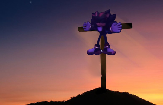
#sorry this is so badly edited but i was watching the new episode again and this immediately popped into my mind#i hope this scares away the weirdo conservative catholic blogs that were appearing in my notes a while back#sonic prime#sonic prime spoilers#tumblr users like to play with images of shadow the hedgehog like dolls
688 notes
·
View notes
Photo
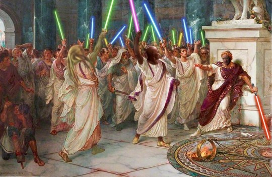
#reactorshaft images#sw edit#star wars edit#mace windu#kit fisto#palpatine#ides of march#revenge of the sith#star wars meme#star wars#look i know this is late but i didn't even have this blog on the ides of march 2022#star wars shitpost
8K notes
·
View notes
Text


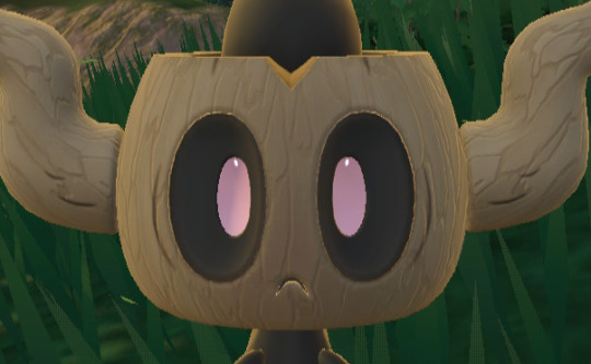
#something is very obviously different about these two compared to my normal images on this blog. i acknowledge this#also the sv model is Really good. and since they always stare straight at the camera anyway… and no one pays attention to the background…#and the only high-quality phantump model i could find was so horribly shiny that its eyes were just white voids#in my defense‚ phantump always just stare straight at you in game#the lighting is different‚ yeah. that's probably the dead giveaway. beyond the background. but like. i'm the only being on the planet who#really likes phantump anyway. i feel like it's a generally forgettable pokémon to most folks#phantump#HELLO this one is a weird one. i have some explaining to do. so when i did this one i didn't know how to edit models really at all#and when i got the models for these‚ the xy models were super shiny. shiny to the point that it made their eyes fuckin invisible#and i decided that since you could barely tell it was phantump‚ i needed a different way to get these images#i remembered that in the SV dlc‚ every time you find a wild phantump‚ it just fucking. stares. at you. and i was like. aha#i kinda remembered because of the test stream that i did. tumblr user alligayytorr (am i getting the right amount of Ys) said#“haha i am getting a sneak peek” when i zoomed the camera in on a phantump. and i remembered that. and i was like. i can utilize this#and ended up using just an in-game screenshot of SV in replacement of the regular content. later on‚ after that#once we got into gen 7 and it became less and less reliable to find models‚ i had to learn how to edit them manually to remove the shine#i am a software dev. not a 3d modeler. this ended up coming down to editing the code of the models directly (which i ended up writing a#script to automate). now‚ today‚ january 22nd (the day of me writing these tags and updating this post)‚ i remembered this post was in the#queue and was not normal. so i went back‚ ran the script on the phantump and trevenant models‚ and unshinified them#then edited these two posts to be normal. i have left the original pictures i took under the cut for reference and as bonuses#because i really enjoy phantump. so that's why those images are there‚ and that's why these tags are here#just for posterity's sake‚ the folks who come here mostly for my commentary‚ i've left the ORIGINAL tags of the post when i initially#made it with the SV pictures up at the top (i wanted to rearrange them‚ but tumblr makes that Very difficult‚ so i left them as-is)#so if these tags are confusing to read i Apologize. but i hope now that you're at the bottom you understand what happened#i'm gonna go edit the trevenant post now
113 notes
·
View notes
Text

More my cat
1 note
·
View note
Text
Friendly but firm reminder that neither image descriptions nor audio/video transcripts should be in weird fonts, colors, or small text. With audio transcripts, it's presumably obvious why readability makes or breaks a caption, and with image descriptions, I genuinely understand the source of the misconceptions, but not all people who use IDs use screen readers. Some use large text instead, and weird fonts mess with that.
This is text that I personally have to squint to read more than a few words of, because the font has such a low weight.
["Chat" text reads: "This is text that I personally have to squint to read more than a few words of, because the font has such a low weight."]
Having to read text like this might be difficult for some people, or possible but eyestrain-inducing for others.
[Italicized text reads: "Having to read text like this might be difficult for some people, or possible but eyestrain-inducing for others."]
Here, the font is fine, but the colors are too low-contrast to be read on lots of tumblr themes.
[Green text reads: "Here, the font is fine, but the colors are too low-contrast to be read on lots of tumblr themes."]
And this is just way too small to be a useful accessibility feature for anyone who reads image descriptions directly, as well as anyone who reads transcripts.
[Small text reads: "And this is just way too small to be a useful accessibility feature for anyone who reads image descriptions directly, as well as anyone who read transcripts."]
For people using desktop who can't read some of this text, XKit Rewritten's AccessKit provides options to disable special colors and fonts (not to mention a nice alt text display option). But to my knowledge, there's no workaround for mobile users. That's why it's critical to include captions that are accessible themselves!
If you're on desktop and able to copy-paste, and a post you intend to reblog has an inaccessibly formatted ID or transcript, please consider taking just a second to copy the description in plain text. (Same for IDs under read more tbh, because we all know how glitchy that function can be.)
I do this often, and have never had anyone get mad about it — only the occasional sincere question as to why. Addressing misconceptions from well-intentioned users — and trust me, I used to have misconceptions too — is the best way to make Tumblr (or any other comparable website) more accessible, one or two posts at a time.
(guide to image descriptions) / (second alternate guide)
(guide to describing tags) / (make your blog's colors readable)
#accessibility#image descriptions#like genuinely i totally understand if you didn't know this#i periodically find old posts on my blog where i did IDs in italics and go back to edit it into plaintext#but i feel like i'm seeing it a lot lately so it's important to put this out there
153 notes
·
View notes
Text
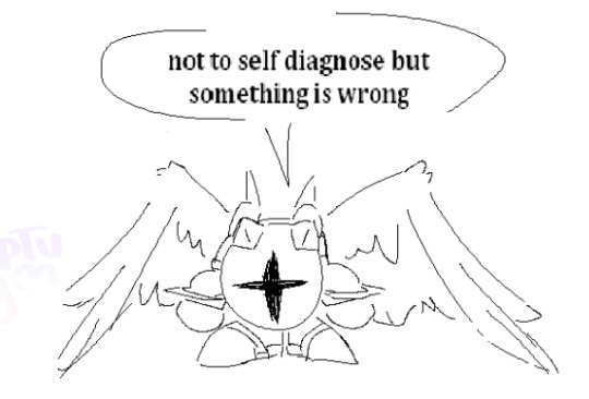
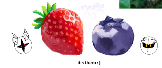

ms paint doodles for @post-it-notes7 's fic series, heart and soul. i highly recommend it to anyone that either likes the kirby anime or meta knight bc it's a delight to read :]
#kirby#meta knight#galacta knight#fanart#hoshi no kaabii#krbay#iyd spoilers#IYD#ms paint#ok most of them are doodles. the strawberry and blueberry drawings started as a ''haha its meta and galacta :)''#but at one point it turned into rendering practice#idk what happened#kirby fanart#id included#i've been wanting to show off those stupid fruits for so long. i spent an entire morning on the strawberry alone#i was literally about to post this when my blog got put in jail#one second my icon was normal. i refresh the page and boom#he's gone#anyway. go read wishful thinking and in your dreams <3333333#edit: it's almost midnight and i just realised i wrote heavily instead of highly..... this is why we don't make drafts at 3 am#uhm anyway. fun fact. i wanted to draw the thats paint asshole meme but i was tired#so i put the images og GK and MK there as placeholders#but in the end i got too lzy to like. actually draw it lol#gala doodles#gala draws
489 notes
·
View notes
Photo
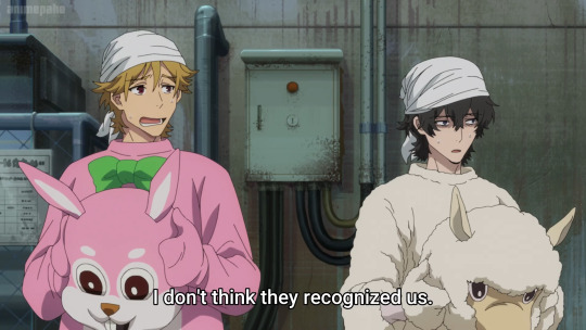
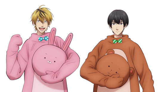
hm.
#buddy daddies#uramichi oniisan#life lessons with uramichi oniisan#i know the alpaca is not a bear yadayada but do you rlly want me to pull up paka from tow.#they rlly fit these guys well personality wise too. which makes sense cause its a good combo that works well off of eachother#the pink rabbit w the bow tie though thats almost spot on lmao. just the wrong colour. kumas colour.#anyways. gn.#tedpost#also i couldnt find a nice screenshot of those two together w the costume half off like that so you get stock image kuma n hara#which i had to edit together btw. if you even care.#EDIT; goodbye mr johnson you will be missed. you were scaring the hoes (rebloggers)#shoutout to the one blog who rbed this with him still in it
729 notes
·
View notes
Text

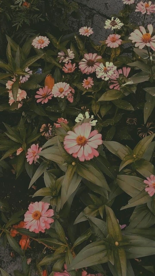

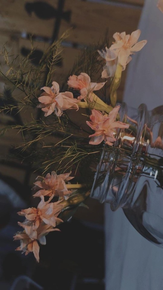

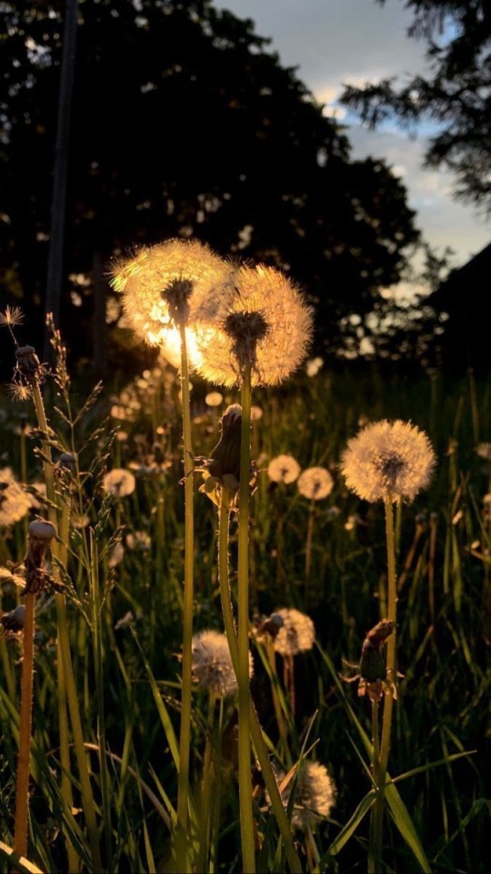

#aesthetic blog#mood aesthetic#aesthetic#moodboard#wallpaper#wallpapers#lockscreen#lockscreens#phone wallpaper#iphonewallpaper#flowers#floral#wallpaper images#vintage picture#photo edits
110 notes
·
View notes
Text
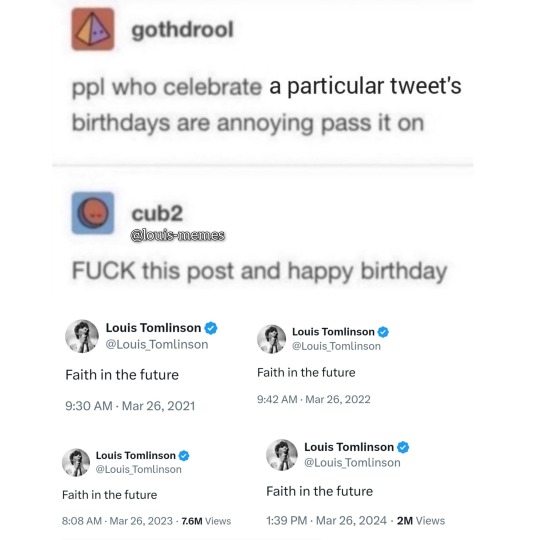
Happy Faith in the future day!!!
credit: louflrcrown
#probably nobody will see this but needs to be remember in this blog#the image is edit by me#i add it the other tweets#louis memes#fitf#louis tweets#meme inspired#louis tomlinson
72 notes
·
View notes
Last Seen Blogs
shirobarakatarina
I Can Be Your Pagan Angel
quillll
— to the stars, my sun

spitfirefansblog
Spitfire fan

physical-chemistry-en-blog
Physical chemistry