#inking tutorial
Text
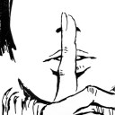
How about some inking?
I'm using a Sakura Pigma FB brushpen and taking my time.
6 notes
·
View notes
Text
I was going to do some inking technique ideas (since that’s what Inktober is actually about) but life with a full time job and kids means I haven’t gotten around to it. Maybe I’ll post them after Inktober is over or just whenever.
That being said, what inking tips would you like to hear about? What’s a technique you learned?
2 notes
·
View notes
Photo
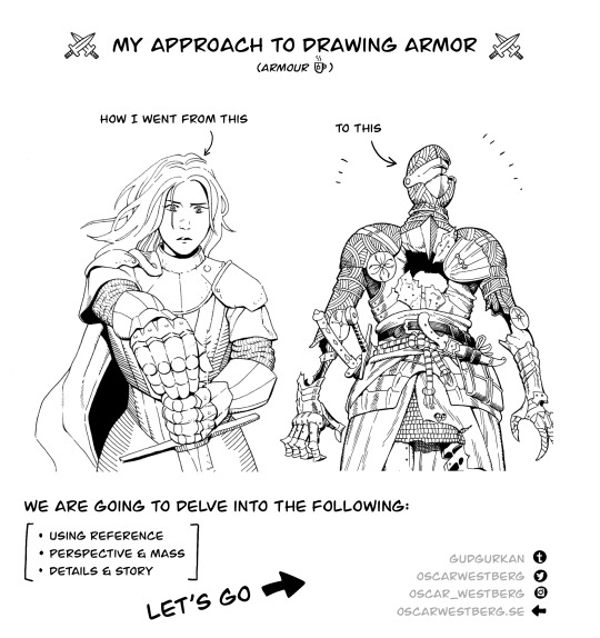

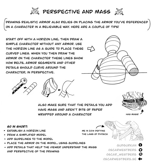
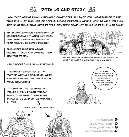
Here's a ⭐️ tutorial ⭐️ on my approach to drawing armor!
11K notes
·
View notes
Text
I've been asked a few times now, if these kinds of illustrations are traditional or digital. it's both <: The inks are traditional, made with 03 or 05 micron pen.
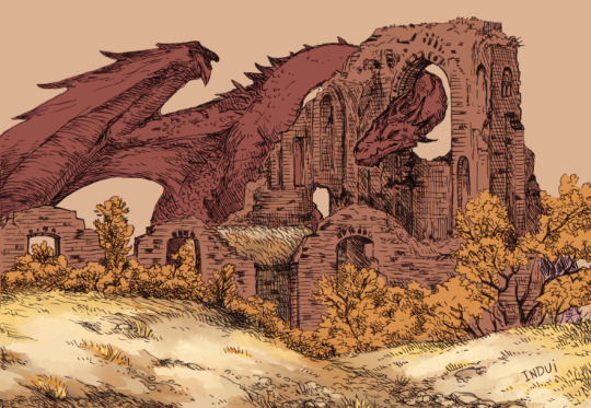
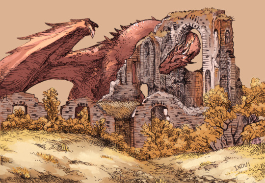
Then I take it to Clip Studio. Paint-bucket and basic brushes are used for big blocks of color and some preliminary details.
Brushes: Dense Watercolor, Transparent Watercolor, India Ink Darker Bleed, Bit Husky, G-pen, Milli Pen, Cross hatching texture brush. Blend: Running Color On Fiber
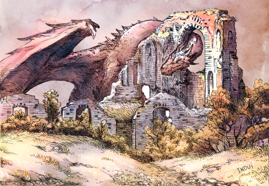
Somewhere in there, I'll pick up a free-to-use watercolor texture and set it on overlay, to see how it meshes with the values I already sketched in. I'll finish up the rest of the smaller details/values with the same above brushes. And voila.
Hope that's helpful <:
#art#art tutorial#dragon#I really enjoy this method because I find inking traditionally more fun than doing it digitally#And meanwhile#I find coloring digitally very fun and fast#Getting a pleasing result very efficiently has been super rewarding to me with this style#it's why I've been doing it so much lately#step-by-step#dragons#dragon art
1K notes
·
View notes
Text
The thing that gets me about history and humanity is that you never know what is immortalized, and the things that will be immortalized are things you would never think.
I saw a person sharing a new tattoo, and it was one of Onfim's drawings. A boy who lived so long ago he is barely a blip now, but his drawings meant so much to people that somebody is now permanently marked in their skin with one of those drawings. Do you ever look at the things you make and just sit there and wonder if this is the thing that future people look at? Do you ever look at your art, your writing, your schoolwork, or anything that is yours and just wonder who will find it, who will fall in love with a piece of your humanity and become overwhelmed with emotion over? It's not unlikely. It's not totally unlikely that somebody will find a piece of you in the distant future and devoid of any other context of who you were will still love you because you were here. You were here, and you are still here, even hundreds or thousands of years later. Treat yourself with the same love that so many have for dear Onfim.
#positivity#gentle reminders#if anybody has ancient children's drawings beside onfim let me know they melt my heart#i have always wanted a tattoo of that kind of thing too and i want ideas#see if archeologists dig me up or whomever else they won't find significant tattoos or other things. they will see i have loss.jpeg on me#and i think that's just as important. these people must know that people are silly and weird and don't make sense and that's IMPORTANT#i'm just. so obsessed with this because it's instantly humanizing#what little child hasn't drawn humans with twelve fingers per hand#or those kids drawings where it's only a torso/head conglomerate with stick legs and hands#i just really lived seeing how their tattoo turned out because i wasn't sure if it would look good in ink and skin#i feel the same way about archiving the internet. i was looking for the written crochet pattern for something#and the person who wrote and created it passed away and their blog has been scrubbed#their blog only exists on the archives. their pattern is only accessible on youtube because somebody made a video tutorial with the pattern#it's an eerie feeling. they've been gone for two years but their blog has been tethered by the wayback machine
400 notes
·
View notes
Note
I noticed when looking super close at your line art that the there's slight red green and blue on the sides of the lines like an old 80s anime and i think that's super cool! How do you do it?
oh, that's chromatic aberration! i guess you could say its a kind of colour/visual distortion.
it's pretty simple to do, but i usually just use a csp auto action to do it for me to make things go quicker, but i can teach you how to do it manually in most programs.
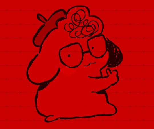
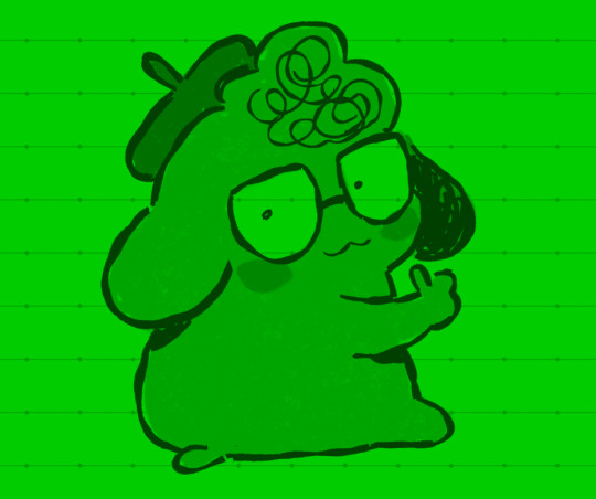
i'm going to use this silly doodle of me as pompompurin as an example lol
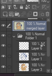
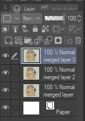
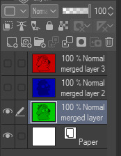
youre gonna wanna merge everything onto a single separate layer first and then we're gonna work with that merged layer. make two copies of that merged layer so you have three of them in total.
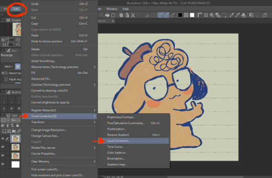
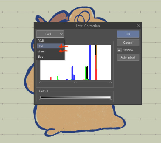
the top merged layer will be our red layer, so youre going to want to got to EDIT > Tonal Correction > Level Correction
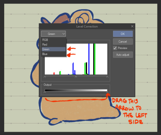
the level correction graph will pop up. since the top layer will be our red one, select the green level and drag the rightmost arrow on the Output scale all the way to the leftmost side. do the same for the blue level.
the image should be red like this afterwards.
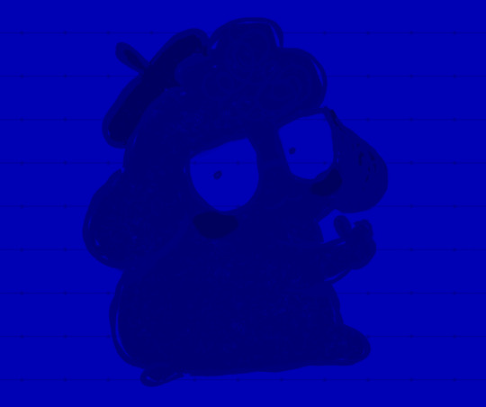
the middle layer is going to be our blue layer so do the same thing we did for the top layer except youre going to reduce the green and red levels instead, and the middle layer should be all blue like this.
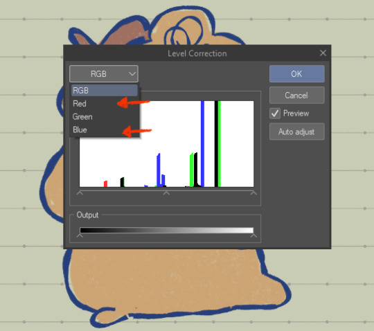
for the bottom layer, it will be our green layer. same process as before, reduce the red and blue levels so its all green.
your layers should be looking like this now
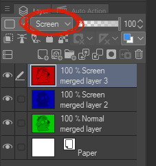
from here, you want to set the layer modes of the red and blue layers to Screen, DON'T do the same for the bottom green layer though. you'll notice once you've done that, the image will look normal again!
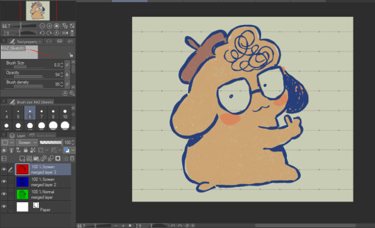
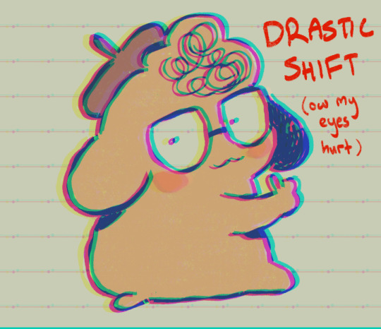
from here, all you need to do is shift the red layer in one direction, and the blue layer in another, to as much of an extent you want. the further they are from each other, the more drastic the effect will be
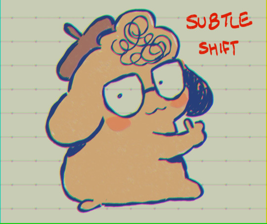
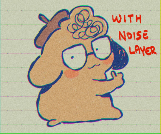
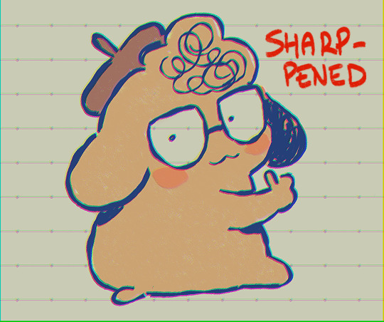
and that's how you do it! my other personal tip would be to add a layer of noise set to Overlay or Soft Light at a lowered opacity over the drawing bc it goes well with the aberration, or even sharpen the image.

if you dont want to do all that hard work though and you happen to have clip studio paint, just use an auto action, like this one!:
https://assets.clip-studio.com/en-us/detail?id=1713222
anyway i hope that helps? ^^;;;
644 notes
·
View notes
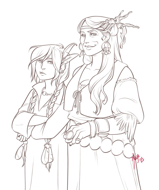
Text
✨✨Batdr ink tutorial!✨✨
I have been drawing alot of #batdr stuff for twitter and insta and thought I should post this here too.

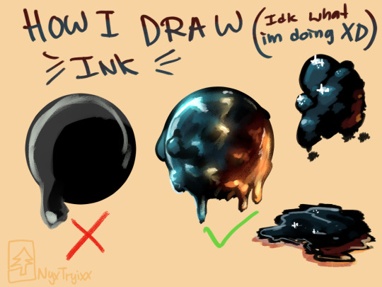

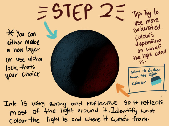
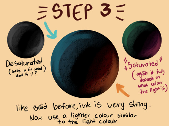
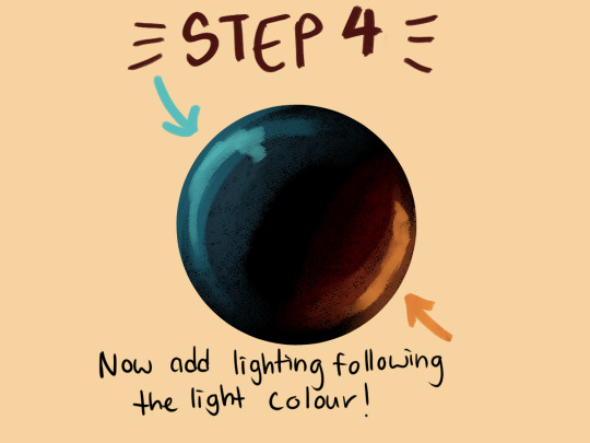


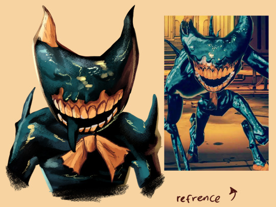
#tutorial#art#illustration#gaming#bendy and the dark revival#bendytheinkdemon#bendy and the ink machine#art tutorial#how to draw#ink#what is this#keep in mind#im not good at this#idk what im doin anymore
2K notes
·
View notes
Text
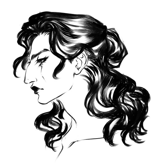
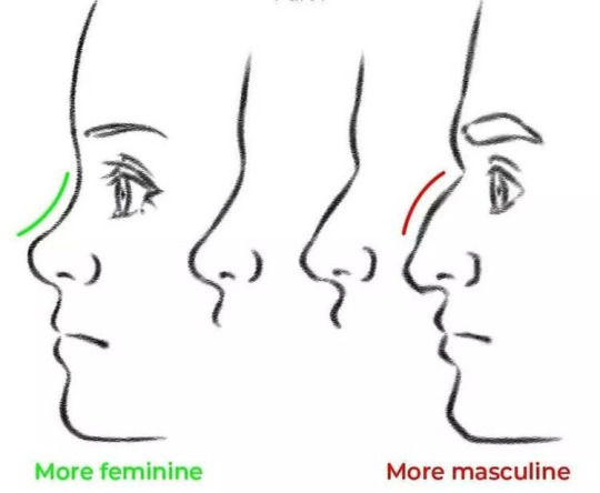
I don't even draw women that often, but I had to join in the dunking of this rancid tutorial on twitter because I don't abide aquiline nose slander. Why do people hate when women have bones in their faces? SKILL. ISSUE. 📣✨
There are so many xenophobic, bioessentialist, and just plain personally biased art tips out there, especially in academic settings. If something sounds arbitrarily gendered, it is. Find photos of real people with the feature in question. Draw gnc folks anyway, do whatever.
#art#art tutorial#art tips#aquiline nose#digital art#profile#sketch#line art#roman nose#oc#my art#ink#black & white#black and white art
424 notes
·
View notes
Photo
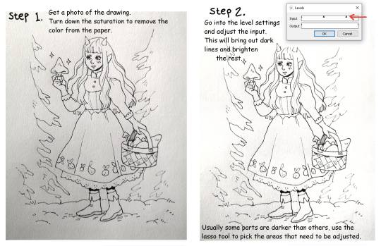

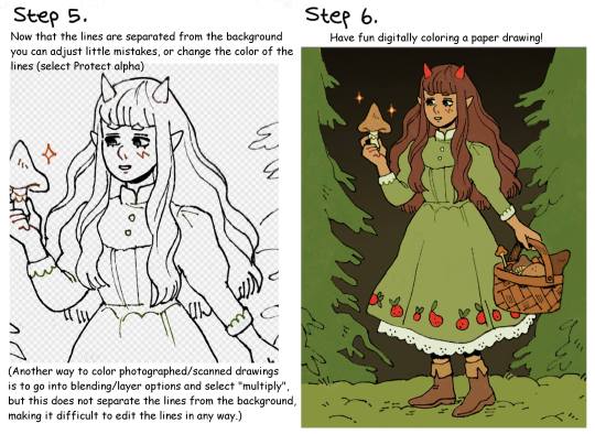
Quick lineart extraction tutorial!
The program used in this example is Firealpaca, but as far as I know these type of settings exist in most basic art programs (firealpaca is like the most basic of all anyway lmao). I dont own a scanner so a lot of the time I simply take a photo of the drawing with my phone, cleaning and extracting the lines still only takes a few minutes! Hope this is helpful :)
#The moment I learned this from a friend I pretty much stopped doing lineart digitally#because its just comfier to draw with actual pencils#but coloring digitally is fun and way faster so combining them is peak for me#art tutorial#lineart#inks
2K notes
·
View notes
Note
May I ask on how you choose your colors when you color your art pieces? It is so pretty to look at the colors of your art, and I want to color like that, but color picking is very hard q-q
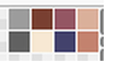
here's!! uh, the general areas in the color wheel where i try to pick depending on the vibe
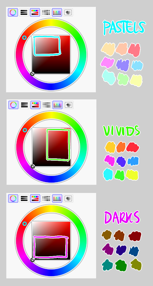
highly inaccurate because tbh i just color pick directly or try to guess the colors from my references and just adjust them to be a little bit more pastel or to the atmosphere
and if i have their colors memorized (such as ink or dream), i just pick by memory or by my modified colors LOL

color your scrunkly!
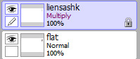
set your line work to multiply and lock opacity
i use warm tones for white ish colors so uhhh idk whatever warm color from here
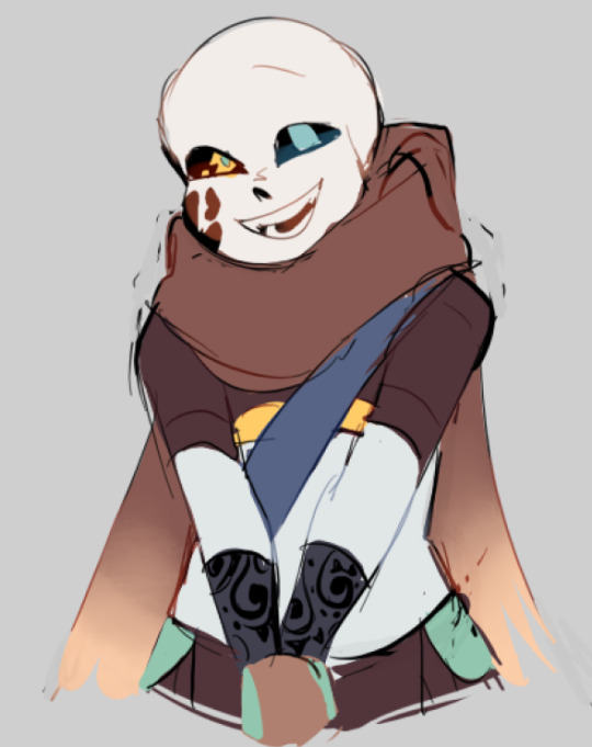

color the line work!!!!! ofc, shift the hue depending on the undertones of the surrounding colors
the skull color is a warm off-white, the undershirt is a blue-ish off-white, scarf is warm brown, so on and so on
the multiply function rly helps just blend things into the palette a little more, but if ur confident enough, you dont have to set it to multiply at all for extra variation
minimal shading by just taking the surrounding colors n adjusting the hue slightly n its value n saturation
gives it a very messy cel shaded look! been into it lately and stuff

and then i add a few overlays using the pin light layer mode!
i usually use these two colors together, it gives the right amount of pastel colors that really appeals to me
if you have access to gradient maps, i recommend using them lots!
it makes the pieces look a little more cohesive
the pin light layer mode imitates it n is very versatile if u cant use them though (like me when im just doodling on sai)
that's it!!! that's the basic rundown of how i color
i'm not very well versed in color theory so i can only do very basic color picking tips, but maybe next time i can offer ways on how to color more atmospherically!
have a nice time coloring your blorbos ✨
#Anonymous#tutorial#ref#ink sans#kia doodles shit#i hope this heeeeeeelps somewhat!!!!!#art tutorial#coloring tutorial#art help#art tips#art advice
371 notes
·
View notes
Text
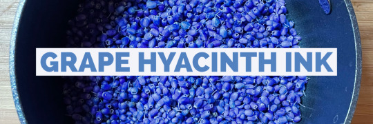
Let’s make some color-changing botanical ink using grape hyacinth (muscari) flowers!
Ingredients:
1 cup grape hyacinth flowers
1 cup water
2 tablespoons vinegar
1 teaspoon salt
2-4 drops gum arabic (not necessary but USEFUL)
2 drops wintergreen oil or 1 whole clove (also not necessary but useful)
Instructions:
Add the flowers and water to a non-reactive pot (stainless steel, ceramic, or enamel-coated). Pots that are aluminum or copper can affect your colors!
Bring to a boil, and add the vinegar and salt. Boil for about five more minutes, then turn down to a simmer, stirring occasionally (again, the spoon should be a non-reactive material like wood or stainless steel).
Simmer for 10 minutes, at which point you can test the color by dipping in a strip of paper to see if you like how it looks.
If it looks good, congrats – you’re done! If you want a more intense color, continue simmering, testing with a paper strip every 15 minutes or so until the color is to your liking (this shouldn’t take more than an hour).
Remove from heat and let the mixture cool to room temp.
Filter the flowers using a fine mesh strainer. I use a stainless steel coffee filter for this purpose and it works great.
Pour your ink into a sterilized glass jar and add 2-4 drops liquid gum arabic, which is a natural binder that will 1) keep the liquid and pigment together and 2) thicken the mixture and make it easier to work with.
Add 2 drops of wintergreen oil or 1 whole clove, which are natural preservatives that will help extend the life of your ink.
Label your jar and store it in the refrigerator if not using right away.
YOU DID IT! Now go forth and have fun with your muscari ink.
** The ink will appear very purple, but when put to paper dries in varying shades of blue. If you want to experiment with color further, add an acid (lemon juice) to produce shades of pink, and a basic (baking soda) to make shades of green.
*** Because of the changing nature of the ink, what your painting/writing looks like will change over time! I have muscari paintings that started bright blue/purple but have faded to almost entirely green. Some have stayed blue. That's the fun of it!!
#plantalones tutorials#wildcraft#botanical ink#muscari#grape hyacinth#flowers#color changing ink#ink making#ALSO only use the pot you use for making ink FOR MAKING INK#this should be obvious but I KNOW YOU GUYS
93 notes
·
View notes
Text
Ok I'm literally putting a bounty on a good lineart/inking resource/class/tutorial/book whatever. You find me a inking thing that FINALLY makes my inking better and I will give you $100 USD. I'm not kidding. I'm so tired.
I want pretty lines. I want something that looks unified. I want stuff that looks like manga. I get so upset when I'm trying to ink something, I've literally had meltdowns about it.
Anyway, please reblog. So many artists can ink, they must LEARN somehow. HOW.
179 notes
·
View notes
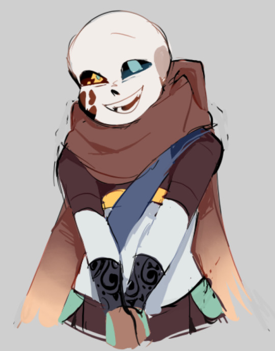
Text


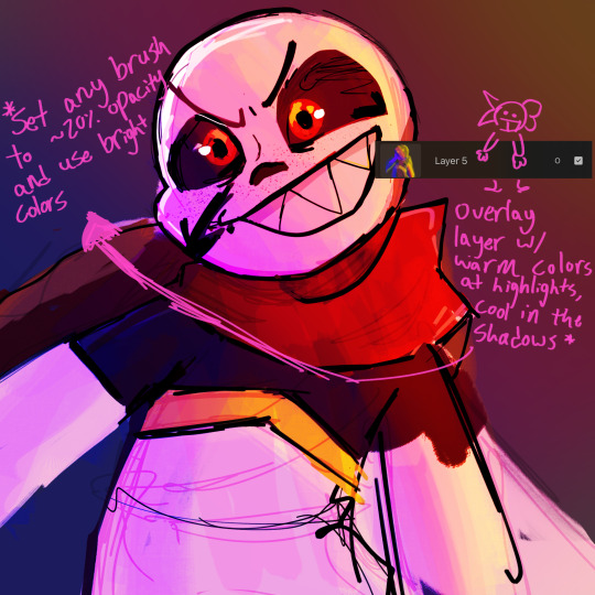

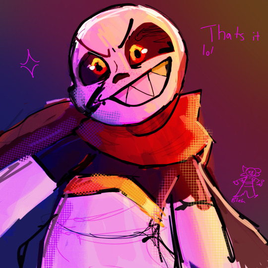
Yay the WORST tutorial youve ever seen
But yeah this is usually how i do my colors n stuff!!!! you can ask questions because i know how unclear this is LOL BUT GOOD LUCK ON YOUR COLOR CRAZYNESS GUYS!!!
Also revival of a like 2 month old WIP welcome back random fell ink
#undertale au#undertale#utmv#ink sans#hiros art#art tutorial#tutorial#art#artists on tumblr#ink!sans#um
72 notes
·
View notes
Text
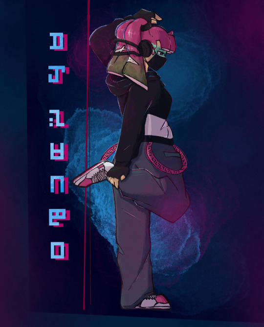
Been wanting to draw her for literal years, I hope I did her justice. 🥺
Meanwhile Eight:
#digital art#splatoon#agent 3#dj sango#i really wanted to draw her in her dj sango fit#or at least#what i think it would look like when shes older#i tried a new rendering style#hmu if you want the tutorial i followed#i didnt follow it 100% but i still like how it came out :)#agent 24#agent 8#as she tries her best to pretend she doesn’t know#it uh#really isn’t hard to figure out 🤭#but shhhhhhh#let her have this#honestly#i need more 8 gay panicking content#theres not enough 😤#agent shenanigans#also three having the sanitized ink streaks is the best decision i’ve made in a while#also i was listening to pink venom by blackpink for this drawing#seriously#go listen to it#but the way i feel 3s music style would be very similar to them lol
80 notes
·
View notes
Text
Crisp those Lines!
Or: a small collection of suggestions for a crispy, neat lineart.
SO MANY OF YOU ASKED FOR THIS (it feels absurd to say, yes), so here you go.
A premise: there's no right or wrong way of inking, and some of the following tips entirely depend on the type of inking I do. Which is neat and clean, with no blacks, and moreover: digitally. More under the cut because it's gonna be long and full of explanatory pictures. Here's an example:
SOFTWARES AND BRUSHES:
Let's address the elephant in the room: Photoshop SUCKS for inking and linework. The stabilisation of the brush there is SHIT. Good for colouring and painting and doing photobashing, but for Lineart you want it to be precise. Do yourself a favour and don't use Photoshop.
I generally use Clip Studio Paint, but i have to say that the best program for it that I've tried keeps being Paint Tool SAI 2. It has few functions, it's true, and I use CSP because it has more instruments. But if you don't want to pay much, SAI is incredible as for brush rendition and stabilisation.
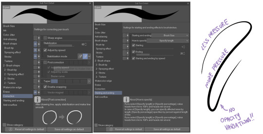
As for the brush: you don't need a fancy brush, anything in your software will go. What I use and what works best tho must have:
Tapered start and end.
High stabilisation (I go from 60 upward, lower it down for trees and grass or anything more natural that needs to be less neat and flowy)
Low tapering.
It must be set so that pressure controls only the dimension. The more you push on your pen, the bigger the line gets. No colour or opaciy variation!
On Clip Studio Paint, I use the G-Pen in the program. It's good as it is, but I think I did some variations as per here:
FILE DIMENSIONS:Better work larger and then resize down. Sizing files up digitally is possible, but it leads to unfocused images.
I generally work on files at 600dpi (300 is fine too, but don't go any lower. Particularly if that's something you want to print later on, any printing wants a minimum of 300dpi). in roughly an A3 format (bigger dimension is 43cm). Most pictures I upload here are 6000x5000 pixel.
A bigger file will give you more possibilities with brush sizes, and it'll be easier. Remember: digitally, sizing down is ok, sizing up is not something you should do.
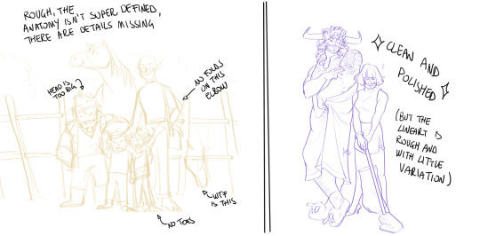
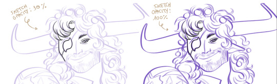
SKETCH:
This is the suggestion I should follow but never do.
Having a clean, polished sketch simplifies your life A LOT. This is because if you don't have to worry about drawing details and fixing the anatomy of your drawing during the lineart, and doing it so GOOD because it's the lineart... You'll go that much slower and your life will be more complicated (it's not impossible, my sketches usually are very rough. I am ok with it, the most I do drawing wise is during the lineart... But I'm lazy, don't do like me. A good sketch will help you out.)
Compare the two sketches below:
Another note about your sketch layer: you know those memes that complains that the sketch looks good but when you hide it the lineart is shitty? That's easily solvable.
When you're inking, lower the opacity of the sketch layer down, A LOT. I generally go for a 30 or 40% opacity (depending on the colour of the sketch. the yellow sketch will go around 40% because it's less visible, the purple one lower).
When you're inking, you MUST see clearly the lineart you're doing. If the sketch isn't contrasting enough, you won't see clearly what you're doing... It's like trying to sketch with a dim light, not seeing the paper clearly. See the difference:
BEFORE YOU START:
You probably have read it everywhere, but it bears repeating: warm up your hand.
You're using muscles and for more than five minutes. The warmer they are, the firmer your hand is, the easier it gets controlling your lines. It also prevents you from damaging your wrist. Stretching is also great, and grippers are nice to have. Keep your hand fit!
As for warming up: I usually do some calligraphy exercises, practicing on flowy cursives. You want to practice varying the pressure of your lines in a single trait, hence why calligraphy is good. But generally, what you can do is...

PRESSURE VARIATION AND LONG LINES:
So. My main tip and trick is to vary the pressure of your lines. In the same line, and between different details. This will help making the lineart more dynamic and interesting.
A note: this works for semi-realistic styles. If your goal is obtaining a Cartoon Network style: they have generally little to no variation and it works. My suggestion would be to study the kind of style and effect you want to obtain, different styles will work best with different linearts. If you're aiming at hyperrealistic painting, there's no point in spending time over a lineart, for example, I inked the same lineart, but with a brush that doesn't vary it's dimensions with pressure, and not changing the dimension of the brush.
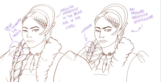
What makes my linearts look "flowy" and "neat" is the fact that I tend to draw less lines and longer, and pay attention when I stop, to start the line where I end it. This will give the impression of one continuous, single line, and make everything more fluid. See above in the french hood: on the right, I left the line rough on purpose, you can see where I stopped and started again. On the left, where I took care of it, you can't.
Generally speaking:
Thick, dark lines communicate that the object is close to the viewer (always keep the viewer in mind!) or in shadow. Lines should be thicker on the outside of your objects, to separate two planes, and in stuff closer to you.
Thin lines are delicate, they should be used in the background, for small details (see the hair, the lips, the small wrinkles around her eyes.)
As for line continuity: in both cases, the line of her face is one single line I drew. This can be obtained with a smooth result, particularly in curved lines, by getting the brush stabilisation on higher settings (80-100): sacrifice speed for accuracy.
MORE IS MORE, WHEN IT COMES TO LEVELS:
Particularly when there are two objects intersecating, or more characters interacting… Instead of inking all on the same level, I always do one level for each object, trace the WHOLE line as if there was nothing above, and then erase where it's not shown. This is a little thing, but pays off. Always in the drawing of above, the feather and the hem of the bodice were on separate layers, and then I erased the bodice under the feather. Take advantage of being inking digitally and not traditionally!

For many characters, here's an example of a vignette of a comic page before cleaning it up and erasing. Every single character and the weapons are on separate layers

For this it's very useful knowing your recurring mistakes. For example, I tend to draw heads bigger than they should. I know I do, so generally I keep the head on its own level, and the body on another, so it's easier to modify and size down just the head without getting crazy selecting only the lines you want with the lazo.
Again, you're inking digitally. It's not easier than traditionally necessarily, take full advantage of your instrument!
OTHER TIPS AND TRICKS:
High brush stabilisation sacrifices speed for accuracy. The line will lag a little from your cursor. Get used to watching the cursor and not the line, and trust that the line will follow.
GO SLOW.
Rotate and flip the canvas. Don't ask me why, but tracing long lines towards me is always easier than not the other way around.
Use the Free Transform, Warp, Distort etc etc and the Liquify to your heart's content if you notice the lineart has something wrong. The only cheating in art is using fucking AI generators (and AI pictures are not art, sorry not sorry)
References are your friends. Study how an artist you like does the lineart. Try and imitate them, and if you can and need to post them: tag them! (don't trace and sell it as your own)
Experiment with brushes, find one that you like for the effect you'd love. You do you, there's no right or wrong way of inking.
Remember to breathe when you trace those lines! (and to drink and do pauses and stretch, you don't want a tendonitis!)
Have fun. Lineart is not evil, lineart is your friend!
I hope this essay is exhaustive enough. I'm tagging ALL THE PEOPLE that requested it (and giving each of you a muffin).
@ndostairlyrium @narina-gnagno @salsedine @whimsyswastry @layalu @n7viper
If you have any questions, don't hesitate in asking!
#tutorials#lineart#inking#digital inking#digital art#tips and tricks#petrel explains#COME LO FECI (cit)#listen if we're mutuals and we chat... ask me to share my screen I don't mind the company when I work if it's not something I can't show#or if it's not too late at night for me#also I unironically like how Alyra inked without variation looks even angrier and more judgemental than normal LOL#also some spoilers for The Last Bacchae if you follow that#“Marmotta” means “Groundhog” in italian#art ref
120 notes
·
View notes
Text
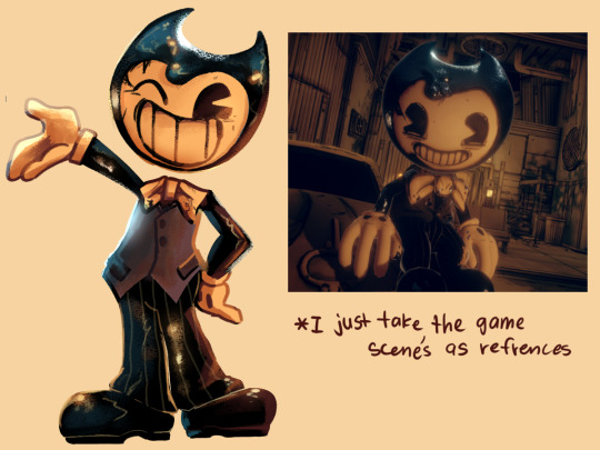
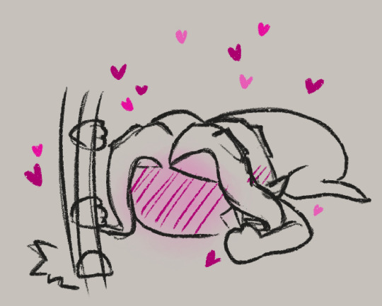
"so god forbid I'm seen just as an average human being."
#yes i used that little tutorial thing from earlier#the one i reblogged earlier#uhm#hey guys#bendy and boris in the inky mystery#babtqftim#bendy and boris the quest for the ink machine#bendy the dancing devil#bendy the dancing demon#toon bendy#bendy and the dark revival#bendy and the ink machine#batdr#batim#inky mystery#inky mystery fanart#batim fanart#bendy fanart#batdr fanart#hhahha rendering am i right
198 notes
·
View notes
Last Seen Blogs
pest-icide
何を見ていますか?
enjoypaitings
Fuck the rules ... draw what you like.
jahoctopus
Unearthly Delights
artistsoftheunknown
what's the word?
maykovdraw
Dessins Manga