#interword
Text
"The day will be what you make of it, so rise, like the Sun, and burn."
- William C. Hannan ☀
#m'leigh#quotes#interword#writersoftumblr#writers#artists#musicians#muchlove#youtube#patreon#twitter#instagram#facebook
24 notes
·
View notes
Text
the interpunct (also known as the interpoint, also known as the middle dot, middot, centered dot, or centred dot) is a point that looks like this [·]! the interpunct is used for a variety of things, it has a super interesting history as being used *before* the space was used for interword spacing
take a minute for that to sink in actually. · <- this bad boy was around before the FUCKING SPACE (things were written more·like·this in classical latin) isn't that wild⸮
but, i hear you say, "but punctuation completionist, why should that matter‽ you have never reblogged a post in classical latin!" and to which i say. uh rude. i could if i wanted to dude. but secondly, there are actual uses in english (and also other languages too :)
in english, the interpunct is sometimes used in place of a decimal place in formal writing. it's also been used instead of a full stop (basically a period) in certain documents historically! it is also in twitter screenshots o noticed. that's the main reason i was thinking of doing this lol Ɛ>
in other languages though it has more important usages! firstly, it's used for gender-neutral endings in french (say as in the word "musicien", the gender-neutral form would be "musicien·ne" which has the masculine form with the interpunct and then feminine ending) which is important to me specifically but it's also used in many other languages such as catalan as the punt volat, used between two l's to indicate that it is pronounced differently than the double l sound (that prononciation being called the "ela geminada" & being pronounced more like the english l as opposed to a y sound)
it's also used in chinese, hokkien, tibetan, ethiopic, franco-provençal, modern greek (as well as the classical greek), japanese, latin, and MUCH more that i literally cannot go over because there are so many uses... like so many languages use it for real. if i were to guess right now while i am not looking at the list i would guess ~15–20 languages use it. that's a lot
mostly i am just asking because it's in some twitter screenshots though :/
. ? ! , : ; – — - [ ] { } ( ) ' " ... / < >
21/21
bonus:
‽ & ⸮ ~
4/16
#original posts#this was such a flex of punctuation i am sorry but also >:] i am not look at that skillful punctuation usage
130 notes
·
View notes
Text


⅋⅋ㅤ𝐔𝐍𝐏𝐑𝐎𝐌𝐏𝐓𝐄𝐃 ; ㅤ( always accepting)
@kakimushire : It costs him a lot. Actually so much so that he's been contemplating for three days whether he should say it or not. In the end, he decides that it's best to just get it out of the way so that he can focus on other things. "Happy birthday." He has no gift for him, even though Urahara's birthday is the only birthday he always remembers. Urahara is also one of the only people whose birth Mayuri is actually thankful for. He knows he's days too late with saying it but, he doesn't think the other will mind that.


ㅤTheory of plausibility that Mayuri feigns numerological unawareness was a notch far-fetching than admissible. Any gift he would receive wasn't as sacrificing as the gesture and fact that in his conduct and spare time Kurotsuchi personally ( if we omit Mayuri was the one who caught Kisuke on the upper floor in one of Seireitei's outlying markets suspiciously close to Rukon borders and even more suspiciously in - reiatsu concealing cloak ) step into his sphere of activity to congratulate Kisuke with something so mundane and humdrum like his day of birth.
ㅤIn the sunset of dissolution, fragments of life are illuminated by the aura of nostalgia. Happy Birthday - conjured a prolonged stare, taking him decades back to the brazen, old days each without framed by a halo of spun flax where they used to talk on a daily basis. Until mercurial eyes snap from introspecting vision with a slow, now presently breezy squint of apparent surprise. The upper part of his cannily arranged self pivots slightly in poise at the Captain with a reticent smile.
ㅤWith shift in the air, he couldn't help but suspect that those words held one more meaning, something like: caught you. Outlined voice tucks back in deny a lilt of his nature's eloquence, whereas invisible syllables ghostly mumble somewhere in the emptiness of interword gaps.
ㅤAn impressive range of displays considering the Year only started. True was he did not expect anything nor minded delay - they would reach conformity point in that one.
It was the barest of congratulations, but it was a congratulation nonetheless. Still, Kisuke's uttering - intent on politely carrying the message of his appreciation.

ㅤ'' Quite belated but thank you, Mayuri-san, '' micro gesture of his hand reaches the front of the cloak's brim in adjusting lift and a few habitual scratches across forehead bangs, '' what a coincidence to see you here. Are you also a fan of shopaholism at dusk? ''
#kakimushire#… ㅤthe mysterious 𝐭𝐢𝐜𝐤𝐢𝐧𝐠 noise / answered#{ AHHHH thank you for this lovely surprise Toby! }#{ I can vividly imagine Mayuri's struggle is real :') }#{ not me making it look like if he caught Kisuke in the middle of some shady business }#{ but it was time for me to give you something proper aside from tro-l-onion rings }#~~Kisuke day 2022~~
2 notes
·
View notes
Text
blog 4 • ch. 3 legibility + project 1 cont.
I found this chapter really important and sort of ties to the project at the current stage I'm at. I'm surprised at the small nuances with type that can make a huge difference. For example, how even a minute change in interletter and interword spacing makes a distinct difference. Also color is something that effects legibility. Most body type will be in black and white, but when working with color we have to make sure there is enough contrast between the background color and text color. I also appreciate that the author uses examples of what to do and not do, that way we can visualize it.
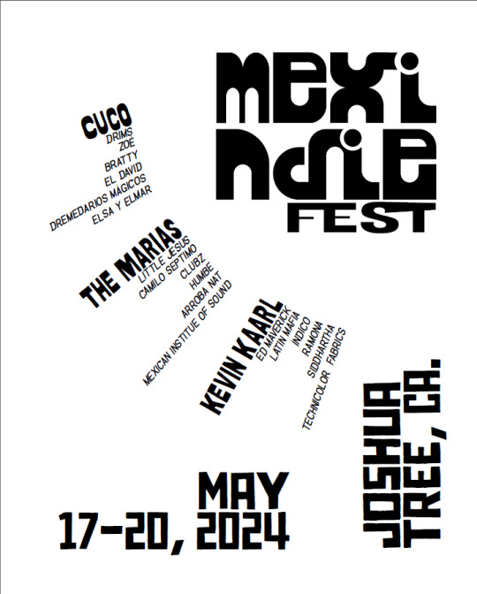
For this project, we are currently working with the calendar poster. I also updated the logo (left), which I think is more successful that the previous one (right). It still has some tweaking to do, but it's close. For the poster, I am working with an experimental radial grid. The visual hierarchy also needs some editing, and printing it out at full size made me see that the artists/bands names can be smaller. As for the image, I want to use the image as more of a texture rather than visual. I have a few ideas I want to experiment with, and will do so over the weekend.

0 notes
Text
ARTS 246 Blog 4
Chapter 2: Legibility

"Typographic legibility is widely misunderstood and often neglected by designers. Yet it is a subject that requires careful study and constant evaluation. "
Chapter 3 was this week's reading, which goes over legibility in typography. This chapter is important because it makes us think about how the viewer sees the work. This chapter goes over capital and lowercase letters, sinter-letter and interword spacing, and much more, which make the text legible

The legibility and color section in this chapter caught my attention. I like to use color in my work but sometimes the color I choose doesn't help legibility. It was also interesting to see examples of different colors with colorful text.


Reflection
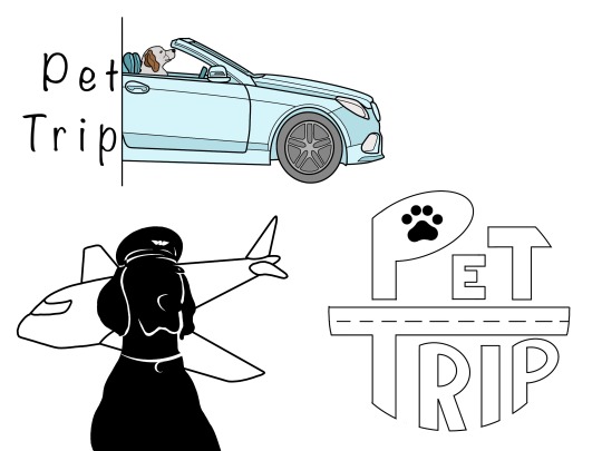
This week's work was coming up with sketches of words and concepts (from late week). My second phase words were public and lift. This made me think of a company like Uber. But at the moment I was doing this concept I was thinking of my pets (dogs) back at home. That made me think of a pet transportation company.


The company is called Pet Trip and the logo had to look cute and friendly. I have lots of sketches that played with the name in different for and styles. I then want to create a logo with my images. It was a dog with a pilot hat and a plane in the back. For the third logo, I combine text and images. This logo has a dog driving a car with the text being on the right.
0 notes
Text
Blog Post 4
I related to one particular section in this chapter, which was the segment on interletter and interword spacing. The textbook discussed how it is a skill to specify space between letters and words and determine the proper spatial relationship. I think the first exercise we did in this class helped me a lot. Having that practice to determine interletter spacing was a good first assignment going into this class because it had been a while since I looked at type but it helped solidify my understanding of spatial relationships and catching things that look off. The next segment on legibility was about hue, value, saturation, and color. Taking it back to our last project, legibility was something that I struggled with. This section would have been nice to read beforehand because it sort of gives tips on what looks best in comparison to what the eye sees. I had a specific color I wanted to work with for the poster, and one of my biggest challenges was choosing a color so that the type was legible. I had to play around with the type weight and colors multiple times before I got to a final project that was legible.
0 notes
Text
Urdu inpage pro 2011


Complete support for inserting OLE (Object Linking and Embedding) objects.
18, D:Inpage Pro 2008Inpage.exe, Title Image (Main picture) design by Taskeef, 3, 0.
Generation of more than one backup files 2, C:Program FilesInpage 2011inpage.exe, INPAGEMFC Application.
Support for Kashmiri, Pushtu and Hazargi Languages.
CMYK Color Separation by exporting the page as CMYK EPS file.
Brightness and Contrast Controls of Pictures.
Complete support for InPage Urdu as an OLE server.
Automatic lines between textbox columns.
Wrap around of text around Circular objects.
Indexing and Table of Contents of English and Urdu Text amirali0102: InPage freeload 2015, InPage freeload 2011, InPage freeload 2009, InPage freeload 2012, InPage freeload 2004, InPage freeload 2000.
Word Count/Character Count for the selected text chain.
Automatic Kashida Insertion for Arabic fonts.
Automatic Kerning in Nastaliq text so as to remove extra interword space to give a calligrapher style outlook to the text. InPage is an industry standard Page Making software for Urdu and related languages.
With InPage Urdu, you have finally found the software package that combines the power and flexibility of desktop publishing with the calligraphic beauty of Nastaliq script. Experienced candidates are encouraged to apply. Should be an expert in Urdu Inpage & MS Word latest versions and Corel Draw graphic software. Experienced Professionals will be preferred. Typing speed must be fast and must also know how to handle a computer. You may import images of most popular formats into your documents, move them around on the fly, write text and create tables in any orientation and then dress it up with built-in color and other typographic /creative features. We need a Composer who can type in English and Urdu. it is as easy to create a one page design as it is to document a 1000 page book. premiere elements tutorial 11 urdu inpage 2011 freeload full version. Running under MS Windows, InPage Urdu makes publishing not only easy but also enjoyable. freeload k lite codec pack 750 full acdsee pro v5 1 build 137 full gsd.
In our websites blogs and articles, we offer a direct link to Urdu software, and our website user can save their time by direct download link. This enables you to layout your documents accurately, aesthetically and in double quick time. The Inpage 2009 Professional is the latest version of Urdu writing software. Built on a robust proprietary state-of-the-art multilingual engine, InPage Urdu provides for complete flexibility for utilization of all these language, whether they are used separately, side-by-side or fully-integrated in your document.īased on the universally acclaimed Noorinastaliq font, InPage Urdu offer WYSIWYG display of Urdu in nastaliq script. Urdu Inpage is an extremely powerful publishing software that handles Urdu, Arabic, Persian, English and other language with level of ease and harmony never achieved before.
0 notes
Text
Posters research
Wright State University 2022, creating a research poster: example, viewed 18 August 2022, https://guides.libraries.wright.edu/celebration-of-research/example
bad example
Too much text
Background image is distracting
Text box backgrounds are dark, which makes text hard to read
Text box backgrounds are all different colours, for no reason
Text boxes are different widths
Text boxes not separated from each other by pleasing “white” space
Text box edges not aligned
Text justified, which causes bad interword spacing, making it difficult to read
Logos are distracting, useless, crowd title
Title word art distracting, hard to read, juvenile
Title is in all caps and italicized, which is harder to read
Results are presented in sentences instead of visually with charts
Section Headers have too much formatting
0 notes
Text
i found friend when i went explorping in the interword!!,! HES HERE!!! with mE!!!! so is phill. i told him to say hi :) anyway that’s super cool. :00000 HE JUST SAT ON MY LAP FRIEND JUST SAT THERE TAHTS SO COOL!!!!! :D !!!!!!
#ello - Phill#ghostbur talks#please be respectful#osdd#should k tag dream smp????#ima tag it#i need friends sksks#dream smp#please talk to me if you wanna be friends!!!!
2 notes
·
View notes
Video
youtube
Catch a glimpse of our Online Print Handwriting Improvement Course and understand how this course will help you / your child improve their handwriting, as ONLINE is the "New Normal". This is a structured, module-based 30-hour online course to be completed in 40 days. In this course, your child will learn the best practices of posture while writing, positioning of the notebook and writing habits. The course further guides the child with the basic strokes and its associated group of letter formation, both capital and small letters along with punctuation. The course also helps to recognize and understand the letters, letter spacing, interword spacing and use of Upper-case and Lower-case letter where appropriate while writing the sentences in the paragraphs, which helps the child to easily switch from Four-liner book to single line book. This course is the best guide for children to self-assess their current and improved handwriting. The course fee is slashed to INR 999/- Enroll NOW! For queries and guidance, contact us 98194 45126/ 73040 44598. Or you can drop your number in the comment box and we will call you back. Visit penkraftonline.in
1 note
·
View note
Text
Chapter 8; Image 8
Chapter 8 of the textbook discusses typography on screen. With new technological advances, digital, on screen design are becoming more and more popular. When type is designed for on screen use, the type needs to be rasterized, or converted into tiny dots called pixels in order to create it more as an ‘image’ than type to ensure that it is legible to the viewer. For on screen use, when type is small it includes fewer pixels which therefore decreases legibility. San serif typefaces are more legible and simpler to use on screen and slab serifs provide more legibility than old style, transitional, or modern typefaces. For websites, it is important to create contrast using variety of sizes (that will still appear legible), weight, and typeface. For selecting typefaces for on screen, more specifically websites, no more than two or three different typefaces should be used in order to still maintain hierarchical clarity. It was very interesting to know how the ‘rules’ for typography and legibility for print is different in some ways for the ‘rules’ of typography and legibility for on screen designs. When it comes to interletter and interword spacing, more spacing is required for on screen than prints in order to be more legible and clearer to the viewer. The most common on-screen design use are websites. Websites can be created using HTML (hypertext markup language), CSS (cascading style sheets), or JavaScript. HTML is a set of markup tags or code that describes the hierarchy, structure, or function of the content that you wish to display throughout the website. CSS are style sheets that allow the designers to have more control of the page composition and the characteristics of type such as sizes, weights, styles, interletter, interline, and interword spacings. JavaScript is used to create dynamic and interactive web pages, image rollovers, and open pop-up window. This chapter was very helpful as I do want to learn how to design website and on-screen materials in the future.
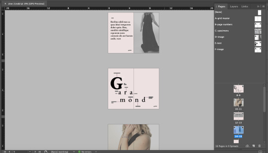
Shown above are a few screenshots of spreads from my zine on the Garamond typeface. I am still working on and finalizing my ideas for the metaphorical and experimental uses of the typefaces as well as the poem. I am still conducting some research to add some more context throughout my zine. I wanted the layout of my zine to be very elegant as the Garamond typeface is a elegant, classy, soft typeface. I decided to edit some of the photos into black and white to express that elegant, classy feeling and other photos I decided to lighten it a bit to give it a softer look. I also find Garamond very feminine like especially since it is so elegant and classy. Therefore, I decided to use these colors, however, I may end up changing them as I continue to work. I am still unsure at the moment. I am also still deciding if I want my type and context to be in the purple color or if I should change it back to black. I am really enjoying this project and am becoming more comfortable with InDesign.
1 note
·
View note
Text
I hope you enjoy the piece my friends 🌙
11 notes
·
View notes
Text
Ch. 8 Typography on Screen

This chapter reminds me of the challenges that are faced when designing on different platforms, issues with internet connection during design time, and even the legibility of your work on screen solely based off of typographic display and what it is capable of. I had pixelation challenges during my TypeHike project this semester because the generation of my ipad was older and was jot compatible with the resolution options on my updated design platforms such as Adobe InDesign or Adobe Illustrator. There always has to be typographic adjustments because of how information is read on screen. The approach should generally be legible, simple, and the size of typefaces should be a good size. The presentation of a design is important so thats kind of where grid systems come into play all over again. The grid helps determine things like line spacing, letterform sizes, white space, interletter and interword spacing, alignments, weight and width. I know there are more things to consider when designing and using a grid but I think this approach is the basis for a lot of artforms. There is so much to put into consideration.

1 note
·
View note
Text
Week 4 - “Legibility”
Legibility is the measure of how clear/easy to read a typeface is. Sometimes designers fail to realize how significant legibility is in graphic design, but it can make or break an artist’s design. Graphic designers should not only focus on making sure their images look visually aesthetically pleasing, but also that the verbal information portrayed through the image is easily comprehended by viewers.
The most legible typefaces are simple, proportional, and contrasting. To make sure that a typeface is legible, designers must focus on several elements of the type:
1. Kerning - Interletter and interword spacing that is too close or too spread out disrupts a text’s readable flow
2. Type size - Not too big and not too small
3. Line length - Lines of text that are too long will lose a reader’s attention
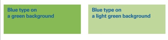
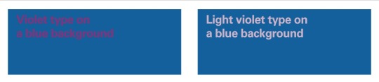
4. Color - Black text on a white background is the most legible color palette because the two colors are very contrasting; not enough contrast will cause strain to the eyes
These are just a few of the main elements that need to be taken into consideration when designing a typeface. However, these rules do not always need to be applied. For example, the textbook states that a word written in all capital letters is not as legible as a word written in all lowercase letters. This is true, but writing in all capital letters is not always bad. An exception to this rule is titles/headings in designs. In my national park poster, I plan to use all caps to write out the name of my national park in order for the type to really pop out.
0 notes
Text
Inpage Urdu Software Free Download
Inpage 2009 Free download this word processing software Inpage was first built in 1994. The main purpose behind the development of this tool was to create pages in languages which is not much popular and neglected to the world like Balochi, Punjabi, Arabic.
Inpage Urdu Windows 10 free download - PDF Reader for Windows 10, Facebook for Windows 10, Bluetooth for Windows 10, and many more programs.
Inpage Urdu software, free download 2019
Inpage 2009 Free And Full Version Free Download
Automatic Kerning in Nastaliq text so as to remove extra interword space to give a calligrapher style outlook to the text.
Automatic Kashida Insertion for Arabic fonts
Spell Check for Urdu language
Spell Check for English - UK & US
Word Count/Character Count for the selected text chain
Indexing and Table of Contents of English and Urdu Text
Wrap around of text around Circular objects
Paste Special
Rotation of text at any angle
Sorting of Urdu and English Text
Drag and Drop of Text
Inpage Urdu software, free download 2012
Download Inpage Urdu 2009 For Free Full Version. Inpage 2009 Free Download Inpage 2009 is a tool that will let you create documents in Arabic, Urdu and Persian languages. As you know that it is very hard to create documents in Urdu, Arabic or Persian languages because in documents creator software like MS words you will not find any options.
Ilmi is an education website. So, we update the Urdu Inpage Software Free to download on this page. My friend asks me the number of people in Pakistan who are in trouble to find Urdu Inpage. Therefore, I have decided to upload for all users having trouble.
However, you should stay to download the latest version to write documents in Urdu or English. Similarly, you will try to download the free Urdu Inpage (Pak Urdu Installer). With this Pak Urdu Installer, you write easily on MS office software.

Urdu Inpage software, free download Latest Version for Windows
In addition, you can access this Urdu software for Windows only. Later on, you will be able to access different Urdu software versions for Android and different platforms. So, this is an editor on desktop only for Windows operating systems.
Inpage Urdu software, free download Windows 8
In other words, Pakistani people are happy to know and download it. Because it is hard to find on google search Engines.
Tech News:
A large number of software developers use it for business purposes. So, they do not help others to download Urdu Inpage freely. But we are helping you here. So I hope you will assist others after sharing this page among friends and family.
How To Download and Use Urdu Inpage:
There are many Inpage versions online. Therefore, I shall provide you a method to download the latest Urdu software.
<<Download Urdu Inpage Latest Version >>
Inpage Urdu software, free download Windows 10
Related posts:
0 notes
Text
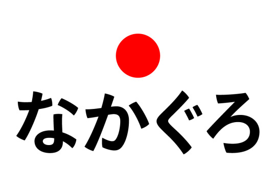
Interpunct ・中黒・なかぐろ
The interpunct ・ (中黒 nakaguro, "middle black") or "katakana middle dot" (as the Unicode consortium calls it) is a small dot used for interword separation. It is also known as nakapochi, nakapotsu and nakaten. It has a fixed width that is the same as most kana characters.
Uses include:
Separating Japanese words where the intended meaning would be unclear if the characters were written side-by-side
To separate listed items, instead of a comma: 小・中学校 (elementary and middle school) versus 小、中学校
To separate foreign words and names when written in kana: パーソナル・コンピューター (personal computer), and occasionally for Japanese names, particularly when there would otherwise be confusion as to where one name ends and another begins (in creative writing, especially manga and light novels when transcribing proper nouns, there's a fad of substituting the interpunct with an equal sign, a white star or any other "fitting" symbol)
As a substitute for a double hyphen
To separate titles, names and positions: 部長補佐・鈴木 (Assistant Department Head Suzuki)
As a decimal point when writing numbers in kanji: 三・一四 (3.14)
In place of hyphens, dashes and colons when writing vertically
1 note
·
View note
Last Seen Blogs

nuke-wizard
🐈⬛

prettybindings
Pretty Bindings

gentsclobber-blog
https://www.gentsclobber.co.uk/

tiitaniiumbolts-blog
XJ-0461

fumbledreturns
Fumbled Returns