#it just was too ugly to color but it fit with the color scheme so it's fine
Text
IM SO STUPIDLY EXCITED I JUST BOUGHT PATCHES FOR MY NEW BATTLE JACKET WITH PICTURES FROM THE MCR TOUR. THEY LOOK SO FUCKING AWESOME! SHOUTOUT TO HANDSSTAINEDRED ON ETSY
#Im so fucking happy#I always look for things to put on my jacket that truly represent parts of me#And i honestly could not think of better ways to do that than with patches of these shows#The self expression.. The love and community.. The 'the world is ugly but youre beautiful to me because i SEE you' type of vibe#Just everything about it is so perfect and these are the perfect way to incorporate it into my jacket#THEYRE GONNA FIT THE GENERAL COLOR SCHEME TOO!!!!!!!!!!!#FUCK im excited#I ordered five fkshfkshdkd#Im sooooo fucking picky about what i put on my jackets#So....... Handsstainedred: i salute you youre a genius for this#Mcr
4 notes
·
View notes
Note
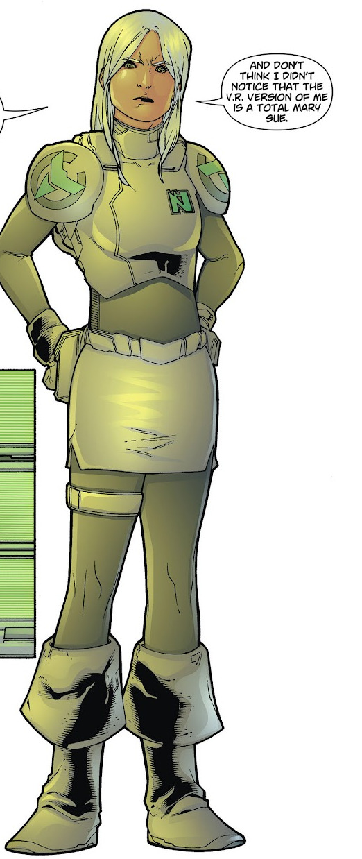
Is it me or are the new outfits simpler? Like old ones had a lot of tiny useless details all around, the new ones look "cleaner" in comparison. It's not bad I kinda like it but it definitely feels weird
Before we start I just wanna say that I kinda critically analysed the costume designs instead of you know. just talking about the details. cool here we go
Yeah aside from VBS they all feel so. Plain, I guess? MMJ’s outfits probably the worst instance, imo they felt more same-y than before and I get they’re an idol unit so they were gonna be uniform but there’s something off. It’s the blue, I get that it’s probably a nod to the blue penlights, but using green or their respective image colors would’ve been better I think. You can barely even see Haruka or Shizuku's image colors on the skirts. Honestly I don’t think the accessories are that bad, they’re pretty cute and fit the group, though the costume being so plain outside of them just makes it look like there should be more. the thing is the outfits aren't the same, they have different skirts and shirts like the original it's just the fact that they all have the same color scheme and similar-enough accessories that it makes the differences less noticable. their image colors should've been the primary or secondary color not the tertiary color.
Leo/need I can get being more uniform, it goes with their whole thing, and I liked how there’s still a lot of details to differentiate them and give them personality. Honestly their original color scheme was pretty basic but making their image colors the secondary colors instead of of the primary colors of their outfit? it just wasn't it. honestly it wouldn't be too bad if the grey wasn't such an ugly color it looks really bad. if they'd gone with black or a much darker grey for the blazers it would've looked so much better and made the accents stand out more. also, the lack of accessories... i get they're more "professional and mature" but their outfits are quite boring, especially next to Miku's. If all of them had a big star armband like Honami or even had a bigger star buckle anywhere (like on a belt) it would look a bit nicer.
WxS was an improvement from Leo/need maybe? The outfits are definitely the most detailed so far, and they had a lot of personality. I like that they kept the original theme of character types (Rui being a villain, Nene being a fairy, etc), and it's not hard to tell what role each of them are meant to be (except emu but it wasn't obvious what hers was in the first place). I think Tsukasa's fits his personality quite well; he plays hero roles so he has a prince sort of outfit, he's the leader so he's got the sash, and he usually dresses very smart. it's very plain though, definitely could've done with brighter colors on the accessories, and maybe keeping the belt charm. also the jacket and trousers being the same color without much to separate them and balance it out doesn't look great. emu and nene's are both better, the color palettes are really nice and their outfits aren't plain holy shit. Emu's fits her personality really well - just by looking you can tell she's a fun and positive person. Rui's is probably the one i'd say is best out of the bunch. I know we can't see the front but the asymmetry and use of black in the color palette makes it stand out a lot and really adds something that the others were lacking. it's a very good villain outfit as well.
N25's were simple, but managed to actually pull it off. they didn't feel really plain compared to some of the other units despite actually being pretty plain. their outfits were always dark, and that hasn't changed, but making the colors more murky adds an extra layer to it. the addition of the flower patterns really adds something to take away the plainess of the original outfits, as well as adding relevant symbolism. Mafuyu's especially stands out being the lightest color and being the most ragged. It tells you she's different, she appears bright and perfect at first, but when you look further down, she's damaged. The image colors could've done with being a bit brighter maybe but other than that these are pretty good.
VBS outfits are actually really good. There I said it. They're able to feel cohesive as a group while still managing to reflect the individuality of each members and not be plain. The outfits fit their personal styles really well, Kohane's more girly, An's more cool and mature, Akito's sporty and active and Toya's more smart but still has the street look. Despite their outfits looking totally different, you can tell they're a unit because of the reddish-pink accents on all their outfits and also using white as a unifying color. i know i complained about the white making the other outfits plain but it's far more balanced out here and isn't as in-your-face. it isn't like MMJ and WxS that have white as their main outfit color. With VBS it's just one white item of clothing: Kohane's sweater, An's cargos, Akito's hoodie and Toya's tshirt. it's incorporated in a very natural way and isn't overly prominent. their image colors and other colors are used just as much in the outfits to balance it out. they have the best balance undoubtedly. even the accessories, they aren't big and there's not a whole lot of them, but the outfits already have a lot going on so they don't need to be complex, they're just there to add something extra.
There’s too much white.
117 notes
·
View notes
Text
OH MEE GOSH I’M SO HAPPY ROTTMNT IS FINALLY GETTING THE CREDIT IT DESERVES TSKSGSK
youtube
BEHOLD MY RANT BELOW THE CUT🕺✨
⬇️
Its really my favorite cartoon series of all time and there is SO MUCH I COULD SAY ABOUT IT THAT IT FEELS OVERWHELMING
The art style is literally my favorite art style ever and even as a kid I just know that it would’ve also been my favorite. The blocky yet detailed characters are so cool and OH MY GOD THE COLOR SCHEMES GSKSHS I love them so much. I could just eat that art style UP, MAN. You have NO IDEA how drastically it has affected my current art style.
The different character designs are so different yet fit them perfectly. Even thought they don’t all look the same, none of them are actually ugly and when you think about it, thats not always the case in media (what I mean is that when a character doesn’t conform to the classic protagonist look, they’re usually pretty caricatured and usually even ugly :/)
I also love the humour and the writing jdldhdm the jokes just jeep on getting better and you can TELL that the writers are having fun with it (thats my favourite feeling in the world)
And the voice acting??? Hello??? I love it????
Animation and writing wise, you can tell that it was a passion project. Until I realised that the show was un-officially cancelled, I was seriously wondering HOW a show with such detailed HAND-ANIMATED animation could survive. Even though it has been cancelled, just knowing that it could even EXIST gives me hope in the future generations of animation (in which I will hopefully be WORKING IN)
Although i was sure the show could never last long I’m SO MAD THAT THEY COULDNT GIVE IT THE ENDING IT DESERVED AGHHHHGDKDGDJDH it’s incredibly frustrating and it had so much potential. It was supposed to be only 3 seasons too😭😭😭 with the story, they could’ve honestly gone for 5 to 6 seasons, they were just being humble istg.
Anyways, sorry for the rant but I could say SO MUCH more and I just HAD to get some out, if you’ve read this far, I genuinely hope you have a wonderful day and thank you💖
#rottmnt#unpause rottmnt#save rottmnt#GOING INSANE RN#LMAO#I’M ON AN ROTTMNT INDUCED ADRENALINE RUN AND IDK HOW LONG IT WILL LAST BUT IT FEELS AMAZING#save rise of the teenage mutant ninja turtles#rant#I wanna buy rise merch so bad rn#Youtube
29 notes
·
View notes
Note
Hi, *shuffles feet* I know you said no talking about creepy Krit…Buuut, your latest epic colour post reminded me of a thought I had when he turned up wearing that blue checkered outfit that co-ordinated with Gun’s outfit rather too well. You see, I’m thinking, what if the creep is a chameleon and that’s why he’s stealing King’s blue. He’s trying to “fit in” with the office group and match King so that people let down their guard, taking on King’s colours in order to try and attract Uea…
@thewayofsubtext, okay, alright. Sure. I'll write about that crusty s.o.b. because all roads lead to King, but let me warn the people in the room - put on the earmuffs and use the blindfolds because the language is about to get ugly.
@wen-kexing-apologist and @sliceduplife commented on my "latest epic colour post" that they both believe Krit is trying to steal King's color and blend in with the group, so they will let their guards down.
An Anon sent an ask worried that the introduction of Krit would cause Uea to spiral into self-loathing and make him believe he, himself, is the root of all his problems since all of these evil motherfuckers cling to Uea.
I’m actually worried Uea has a complex now and will think all the bad is his fault because I’m sorry poor baby was abused by his mum, SA and abused by his step dad, SA by his Ex and now being stalked and a possible SA from the new boss. The show should have been called Ueas Trauma!!!!!
As much as Uea's stepfather and his mom are hideous demons and cause Uea tremendous trauma, they haven't directly been a source of conflict for King.
Which is why we need this busted-ass-basic-bitch:
King's personal conflict is his mother's agenda to get him hitched. Uea's personal conflict is his fucked up family. But both men have yet to face an enemy together beyond how to label their feelings and relationship. So...
They need Krit.
He serves as the perfect antagonist. Not just because we already hate this bastard and he will test the now fragile bond that is beginning to crumble between Uea and King, but because he is mimicking King, through his actions and his colors.

When we first meet Krit, he is wearing black. So is King. Krit stares at Uea. So does King. Krit approaches Uea after the meeting blocking Uea from leaving. King did this as well in the first episode.

The next time we see Krit, he is trying to buy Uea coffee. King brought Uea coffee in the hallway in the first episode, and got an elbow to the stomach for it. Krit tries again to approach Uea to ask him for dinner recommendations. King tried to scheme his way into Uea's car when they had their office dinner. When King interferes with both of Krit's interactions, both are wearing black. Also, King always plants himself between Krit and Uea.
Krit then calls Uea to his office. He asks again about dinner, BUT he also touches Uea. King finessed his way into a dinner date with Uea after their tests. However, no matter how many times King bothered Uea, he NEVER touched Uea. Krit does even when he visits Uea at his desk in front of others. Krit touches Uea several times. Both Krit and King are wearing blue.
The last confrontation occurs when Krit meets Gun and Uea in front of the elevator. As you mentioned, Krit and Gun are both wearing patterns, so Krit sees his way into Uea's information and continues to question GUN.

Krit tries to figure out where Uea lives. King, before the tests, picked Uea up at a bus stop, but publicly embarrassed Uea into accepting the ride. The only reason King figured out where Uea lived was because of that ride since he took Uea back home. During this elevator scene, both are wearing blue, even though it conflicts with the office's colors.
If you're pissed about the comparison between the two, let me make up for it now. Looking at the outfits, King is always a solid color. Krit isn't. He doesn't fully commit to the color because those aren't his true colors. He is copying King's every move, but we all know a copy isn't as good as the original and his true intention to possess Uea keeps sprouting up through his touches and color.
King is a Green Flag while Krit is a Red Flag. Even though both of them have acted the same way to get Uea's attention, the power dynamic (boss/employee vs. coworkers) doesn't exist between King and Uea, and King doesn't cross lines with Uea, physically or figuratively. Krit, in his position of authority, doesn't have to stay within the lines.
Next week, we see Krit shows up to Uea's house in all black, but he matches the stepdad this time, and we all know how fucked up the stepdad is.
Krit can't match King on any level. Not through colors or actions, but he is matching the stepdad through colors and actions in this scene.
King's treatment of Uea compared to all these other trash ass men is unmatched. Uea doesn't need this reminder. We, the audience, do. Krit does "fit in" with all the other toxic men; that's the point. Krit, in his outfits would fit into the office group, easily; it's because he is trying to match King that makes his outfit off when compared to King because King always stands out. King doesn't align with the group, not at work, and not with these bullshitty men.

We need Krit and his fucked up colors to come between Uea and King.
So they can actually be together.
#Bed Friend#Uea x King#Krit is the antagonist we need#King has to step up#And Uea has to push back#But they have to do it together
62 notes
·
View notes
Note
What's your opinion on the Sonic Prime Eggmans? /gen
Do I get to talk about regular Eggman too? At first I thought this was asking about him and I really wanna gush about him again but now I realize you probably mean the council more lol
I really loved the Prime version of regular Eggman! It was literally only five minutes worth but a very beautiful five minutes at that. Deem Bristow and Mike Pollock play huge parts of why I love Eggman and find him so entertaining so I didn't know how I was gonna feel about the change but Brian Drummond doesn't do a bad job, he could easily become my next favorite voice after them if he worked on it a little more.
I enjoyed how simplistically enjoyable Eggman was. Funny and silly and getting up to evil to find and steal the paradox prism and use it in his schemes. His ambition and motivation to take over the world there strong as ever and talking about wanting a world that's more him in neon was cute, I like and am fascinated by bright colors and pretty lights and want everything to be about you too Ivo dhfisbgjsbgkdh
I love the classic bickering and scolding Orbot and Cubot. I love how he tricked Sonic and went the route of taunting him then targeting his best friend Tails to piss him off enough to bait and make him snap for his plan to work, being a real bastard and calling him "stupid as Tails is ugly" lol. I loved how happy he was for it to work and how he laughed maniacally and looked like such an adorable evil bastard doing it!
Everything I love about Eggman was intact there and I was looking forward to seeing more. I expected it was gonna have the vibe of my favorite parts of X as that's what that five minutes felt like and that's exactly what I've been wanting for years, for modern Eggman to come back in a show and be just like that. I really miss Prime Egg and I wish he would come back but they threw him out in the first ep :(
He was so beautiful and charming and entertaining 🥰
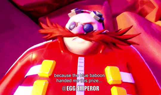

I miss hiiim but I'm gonna bet that he won't return in any form beyond the prismatic titan until the very end of the show or something
As for the Chaos Council, I unfortunately have much less to say as I'm personally not a fan of them. The concept certainly had the potential but the execution is lacking. They just don't have a lot going for them, they're kind of just generic character archetypes such as Baby, Teenager, Hipster, Old Man, Not Eggman, etc. They don't have regular Eggman's personality and charm and are just like strangers in his skin.
I really wish I could like them more but both their designs and personalities don't grab me. For that I only watched the first eight episodes and never watched the second batch besides the prismatic titan Eggman parts. I'd at least have been happier if they had kept regular Eggman with them, as depicted in the concept art as he was going to be a part of the council but they decided to rid of him completely.
The most cool and interesting part of Prime to me outside of regular Eggman to me is New Yoke City. I always love seeing a world taken over by Eggman and I'm a huge sucker for the dark controlled industrialized polluted dystopian hellscape where there's propaganda everywhere on the walls, orders and rules constantly being enforced through the robot patrol saying stuff like and over PAs blasting through speakers
It's an "Eggman" ruled and controlled place, a dark shitty oppressive place and people are just mindless zombies and slaves to the harsh system because they feel hopeless to break out with no freedom, controlled, restricted, and watched. The way it's spelled New YOKE city so it sounds like "yolk" like egg but is potentially a reference to a "yoke", a type of leash to control cattle, fits how they're oppressed and controlled was right up my alley.
Seeing the real Eggman in a place like that leading the Chaos Council would've been so cool. Then it could've looked like the concept as the version that I liked a lot more than the look of the final for all the regular Eggman designed inspired assets, it even has the beautiful neon and cool lights like he wants! And I just love how much it looks like Eggmanland hehe. I really wish they'd tapped into that potential.
17 notes
·
View notes
Note
Opinions on Rose's Ravager outfits? Personally I always feel like she gets screwed over when it comes to outfits. I thought her original outfit was bland, but I'd rather have that than the weird pirate motif DC keeps putting onto her now.
HEAD IN HANDS i just wrote a whole response to this with details of every single one of her costumes then i pressed the wrong button and accidentally deleted ALL OF IT im gonna cry. so im sorry if i forget something because this is the second time im writing this whole thing :(((((
anyways overall i agree her costumes are usually bad. they either dont really fit her vibe or theyre boring or they have way too much going on. there are only a handful that i actually consider Good and most of them are really bad or just kinda nothing
but i put under the cut what i think of all of them:
original costume: BAD
this one falls into the bland category and its just.... not good. like the boob window is so unnecessary, i dont like the mask, and the colors are so nothing, and every detail sucks. i like the boots tbh but other than that. bad.
the same costume but different: better

i like this because it takes some of the good aspects of the other one and keeps them, but then makes it all a lil brighter and gives some more orangey accents. i wish she didnt have the mask at all, i hate it. but when she does have the mask i prefer it when her hair is sticking out the bottom, i dont like it when its all tucked in like in the first pic
the same costume without the mask: <3
im counting this as its own costume just because in the middle of teen titans she goes a while just not wearing the mask at all <3 its so disappointing when she puts it back on after going a bit without it
ok. new 52 time :/
NOWHERE fits: so fucking awful

technically not even ravager outfits but still. everyone point and laugh. the white and green does NOT look good on her and both of these costumes look terrible. especially the first one bc what the fuck is going on with that skirt thing
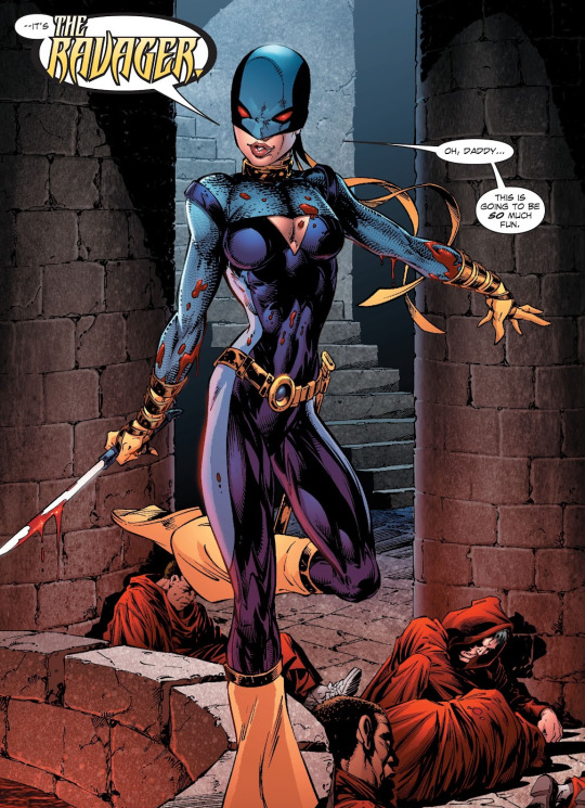
the ravagers: unfortunate serve

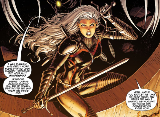
i fucking love this costume, i think this is actually one of my favorites of hers. i think it combines costume + armor really well, and i think that the color scheme really suits her. the art in this book was so fucking pretty and she looked so good every time she showed up. the unfortunate part was every other aspect of this book :/
her worst look: literally fucking terrible no redeeming qualities
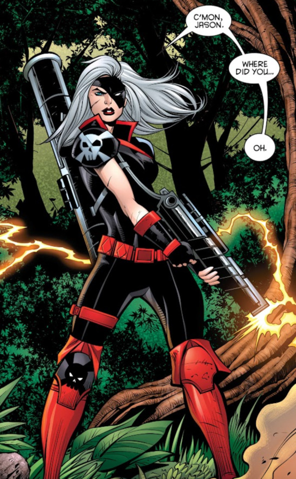
girl take that shit off right fucking now i cant be seen with you wearing this. there is not a single part of this fit that looks good. i said the color scheme looked good in the last costume bc the red was kept to accents. there is so much red going on here and thats FAR from the worst part. lets go from head to toe. that mask is literally a travesty, i dont know who thought it was a good idea. the weird collar thing she has going on is so????? then she has the skulls on her shoulder pads, which are bad enough on their own. and why does she have a bazooka on her back. and why does she only have a skull on one knee?????? this is a fucking mess. kory attacks her on sight in this book and i fully believe its because this costume is so ugly she couldnt hold herself back. um. i like the fingerless gloves though i guess
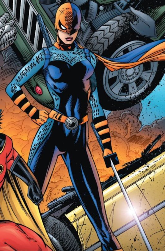
rebirth: hesitant slay...
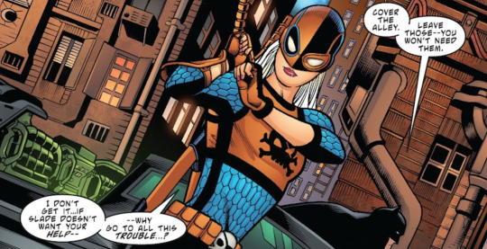
i hate the mask but other than that its?? fine???? this one used to be my favorite but i dont really like it as much anymore, idk why. i think its trying too hard to be armor and casual at the same time and ends up not looking good. i hate this mask soooo much though, i think the weird thing going on with her eyes makes this the second worst mask behind whatever was going on in the last one. and like you said i think this one relies too much on the pirate motif??? like i appreciate the reference to the eyepatch i guess but i would rather they just give her an eyepatch. like the skulls and the pirate thing seems way out of place and doesnt fit her vibe or the outfits vibe at all and it just looks weird. but other than that this look is. Fine.
defiance: eh
this one isnt technically ravager either but its still a rose costume so im rating it. its very ,,,, fine. like i dont have any problems with it but there isnt anything i particularly like about it. the whole point of the white costumes in this arc was because they were supposed to look wrong and out of place and all so i cant fault it for that, but theres just not really anything going on here its fine for what it is and thats all i can really say about it
willow: SLAY <3 <3
i love this one, probably another one of my favorites. once again the black with red accents suits her so well. and the artist draws it so it doesnt even seem that horny despite the fact that its a lace up crop top and booty shorts <3 she looks so nice and i love the fit thats my girl (gn) ❣️❣️
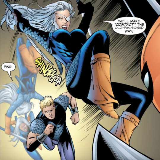
stormwatch: yeah <3

two screenshots just to point out the fact that she changes costumes halfway through this issue and i want to bully her for it. but this one is nice, its really simple but i think it works, plus shes drawn like an actual adult instead of a 15 year old so i cant complain <3 the skull imagery is very small and doesnt seem to piratey so i still dont love it but i forgive it. this costume is pretty good and i like it overall, its one of her better costumes
and yeah <3 i hope i didnt forget any but uh rose babygirl we have got to get you better costumes. i think the best color for her would be like a reddish orange bc i like the red for her but the orange is kind of Her Color (even though its only because of slade) and i think she should never wear that mask
#god i love the art in ravagers so much i wish it was just a picture book with no words in it at all#rose wilson#dc
24 notes
·
View notes
Text
Rant? I guess?? Not really, just rambling.
Something that makes the chucky subreddit mad is when I say Child's Play 2 isn't my favorite and it's rly low in my ranking, now thats not to say that I didn't like it but there are parts that I do! I just don't like how..colorful it is? And I really really hate how fast the franchise goes straight into action so fast, (this EXCLUDES the first two films)
Child's Play 2 is really bright and colorful for a horror movie, and I get it. It's supposed to be morute in a childlike sense, but I like the more gothic elements in chucky movies. Like c1, bride and curse.
Cult of chucky has got to be my very least favorite (except for the last 8 minutes of the film with nicachucky and tiffany), it's so bright and blinding. The constant white color and bright lighting of the mental hospital is almost overwhelming.
Chucky season 1 was okay-ish with maintaining darker colors and dark/timid color coded themes. Chucky season 3 definitely does the gothic-ish theme well too.
Now onto my (mostly, there are some gripes here) positive rambling
Curse of chucky is the BEST for the muted color / dark lighting theme that the Child's Play aura has, and what I mean by aura is (in my opinion) chucky films just don't necessarily feel so beamy and bright, like it almost ruins the dark and nightmarish vibe it should have. Curse of chucky however has the muted/timid colors, it's a slight gorefest (compared to other movies like terrifier for example. Hence why I said slight) and it has the gothic element especially in the house it takes place in. Only issue is that it goes straight into action in less than 10 minutes of the film.
Child's Play 1 also did well with muted colors, the night-time in late 80s chicago (mostly beautiful in this film omg especially with the subtle colorful lights in the streets) and the almost eerie silences throughout the film, and the raw aggression that chucky's character had at the time too. I almost feel like he's nicer as of late, and like yessss emotional maturity you go girl, I wish the films and the tv series would've stuck with chucky being as vicious as he was in the first 3 films, and ALSO not being so open about being alive like in c1, c2 really killed that not even a trilogy in.
Chucky season 2 was AMAZING with my preferred color scheme, not too bright but not TOO dark. I know it offended some Christians but as a devoted Christian, I loved it. No offense taken as I personally don't believe any was delivered either, my only gripes with season 2 are nica's outfits and glenda's outfits..dude..the neon colors gotta go. Glen's fashion was nice though! I liked theirs. Some of Glenda's outfits are faves of mine, especially the ribbed black crop top, and the black jeans with the red straps(?). Onto Nica's outfits, I know that was all Tiffany, however the dresses were so ugly 😭 Nica's own choice of outfits when she left with Glenda and Kyle were sooo much better. Along with her looks in season 3. My only other gripe with season 2 is G.G..ew. hair is too vibrantly dyed red, and the hairstyle doesn't even remotely suit the doll. Not only that but the denim/patterned pin jacket is gross. The rest of their outfit is nice though, it'd be better if the black dress was paired with a leather jacket AND add the pins to that instead because the pins weren't exactly ugly. G.G's makeup isn't terrible but again, doesn't fit the doll.
Bride of chucky, oh where do I even start. This movie always gives me a wave of nostalgia everytime I see it because it was my first chucky movie. And I LOVEEEE the gothic theme all throughout the movie, the usage of blue/purple/red/gold PERFECTLY and those colors don't even really go together! But I gotta say, the set nailed it. The outfitting nailed it. Ronny Yu NAILED directing this!! I love how it toned down chucky's color palette too from the bright childlike colors to fit a gothic film lighting, I also like stitched chucky better than the good guy doll, it's eerie and fits him better. I adore how tiffany made a wedding dress and leather jacket pair work too, her whole makeover and outfit worked so well and it's an iconic scene too! I love love love how this film doesn't stray away from its dark lighting and muted colors either. I wish it was more serious tho, that's my only real gripe with it. And boy I really wish the baby glen scene was extended, at least up until psyches found them in the cemetery because canonically it wasn't that long after Glen killed Detective Preston (I think that was his name). All that aside I love the colors, the outfits and the soundtrack.
Seed of chucky is definitely my all time favorite out of all 7, bride is a close second. I just wish the darker tones made up in most of the movie stayed throughout more of it. I love love LOVE glen's outfit and color scheme! Timid purple works with him so well. Glenda's imitation of Tiffany's look was also adorable...and apologies but, seed Glenda's makeup was a lot better than syfy G.G's. Now Glen and Glenda are my all time favorites (as evident to anyone who's ever met me or seen my account lol) i wish Chucky would've stayed alive and lived with Tiffany and the twins. Finally I wish that as human kids at the very end of seed, there were more scenes with them, especially with Glenda, including the scene where Fulvia gets killed by Tiffany.
I don't know what this ramble really was about or if it makes sense. It probably doesn't. Just a cluster-bunch of my opinions all slammed into one post. I guess the TLDR is
bright colors bad, gothic themes good.
Also child's play 3 isn't included because i hate it.
#salem is thinking#idk if this is a franchise ranking or just me rambling about my bright color and bright light sensitivity#chucky#childs play#rant#ramble#salem is yapping
7 notes
·
View notes
Text
WOL outfits throughout my run of the game
I've been working on this character based on Zooey from granblue fantasy, and all of her outfits so far have been based on her ^o^ or well, at least the main ones anyway (also big shout outs to @dewpriism for the help in making most of them)
Tags:
Gui plays ffxiv (every post regarding the game, including opinions and reactions and anything in between)
Daughter of Dravania (WoL specific tag, including glamor, gpose pics and lore posts)
WoLtfits (glamor posts, once again with most glamour being inspired by zooey gbf)
Original outfit (slight recreation because I can't remember which gloves or skirt I was using at the time, the skirt used to fit a lot better with the top but I've since been unable to find it on my glamour dresser)
This one was the very first one I made, when I was still playing paladin in ARR, and for how limited my knowledge of the game was (and for how ugly a lot of the pieces in ARR are), I'm still proud and found of this one, even tho it's been since retired and it's not quite as good as the later ones
Dark knight outfit
This one was after I started getting more used to the game (and realized that gatherer/crafter items could be used by any class in the game), it's a bit darker than I wanted it to be, but it still looks cute imo (and fits a dark knight :V), the only part I didn't really like were the leg guard things, but I liked the shoes too much to put on greaves or boots, and sadly this game is extremely limited when it comes to skirts 😭
this also has the distinction of being the set I used the most of since I played through HW with it and used through the vast majority of my stay in free trial, only switching to the next one when I decided to play bard

Bard/gunbreaker outfit
Now THIS is the one that I feel like has been the most quintessential outfit so far ✨ it's the closest one I've had to Zooey's actual outfit (with the only downside being the fact it has sleeves), my friend did an amazing with the boots especially, since despite the fact they're made out of leather, the colors still makes it look like they're greaves without looking super clunky and heavy like in my first outfit
It's both by far the best one I've had thus far and extremely faithful to what Zooey outfits I had in mind when I started playing, while still having its own personality
Red mage outfit
This one is by far the most out of the rails one so far lol red mage doesn't really fit Zooey's aesthetic, but it's an aesthetic I, as the player, really liked, so I asked my friend to see if they could at least make a color scheme that would fit Zooey, and they knocked it out of the park once again, and once again doing a banger job of making leather boots look metalic~
While this originally was just the pvp version of the level 70 red mage set, I ended up adding the skirt once I realized how well it went with the rest of the set.

And that's it for now ^o^ overall I'm proud of these, and really happy with the results, despite none of them being 1-1 to Zooey's outfit, I still really like them, and the small differences that detract from the likeness to gbf Zooey ends up giving the outfits a bit more personality while still being reasonably close to what I perceive as her aesthetic. This is far from finished as each new expansion opens up more possibilities and chances to try out other outfits based on the new pieces I come across
#gui plays ffxiv#also fun fact while talking to my aforementioned friend i realized i have some degree of color blindness#so that's also a huge reason I've been coming to them for help since they can help me pick up colors that feel more accurate#oc:daughter of dravania#woltfits
8 notes
·
View notes
Text
thusspoke asked:
“i’m never letting you go.” 💚 (teehee this prompt fits kirahan canon events)
@thusspoke/ "i thought you were dead" prompts / accepting.
A low hum's given in response, Kira standing in-between the artist's spread legs. Those words... did little to actually unnerve -- maybe, had things gone a little differently, they would've -- him. Rather, they only seemed to comfort him-- placate, almost.
All he's managed was a stunted roll of the shoulders, held back from completing by means of a tight, silk ribbon bounding his arms together. He doesn't remark on the feeling (of course it's uncomfortable, but that was obvious. rohan didn't need to hear that from him. that was the point, after all.) out loud, even as he's forced to keep both arms bent at their elbows and ignore the steady increase in sweat of bare forearm pressed against bare forearm. Eyes remained staring straight ahead, gazing at the painting hung above the sofa.
It wasn't much to look at, in the blond's uninformed humble opinion, but it served its initial purpose well: to host as a distraction. Admittedly, it's all Kira had going for himself currently; sleeves rolled up sloppily up to his biceps, crinkled uncomfortably in the nook where his arms bent, and a few buttons already undone of his shirt... it was a miracle, no doubt, that his pants were left alone.
However, for how long said miracle would stay in place?
That remains to be seen, and Kira knew better than to hold onto hope.
"I didn't... ah, think you'd mean it so literally," he tried to joke, voice lacking the expected humor that should've come with. Head lulled slightly in place, coming to a light shift to the left as he once again attempted to drive relief towards his bound limbs. "I'm not necessarily complaining, though."
Surprising even himself, it's taken Kira a considerable amount of strength (ironic, when taking into account the sheer lack of power kira otherwise feels right now.) to keep his voice both level and stable. A faint chatter of teeth was the only hint of his will buckling, but he's choosing to believe it's gone ignored.
A minor, trivial thing like that? Come on! It's benign in the grand scheme of things, surely. Even a hairsplitter (rohan called him that once, and it's never left him. it was such a peculiar word.) such as Kira Yoshikage knew better than to focus on something so insignificant.
He's confident, too, that that wasn't him simply coping.
"Um," he piped up after a few more seconds, blinking a few times to prevent the colors of the painting (it's just another piece of "modern art". kira doesn't get it. never has, probably never will.) from blending and morphing together within his vision. "I... I'm not going to leave, so--"
Any further dialogue's cut off, abrupt yet prompt, as a foot makes contact with his gut. It's not enough to cause him to double over (though he wishes it had.) yet more than enough to knock him out of sorts. Kira felt a sharp jerk in his shoulders, the instinct to grab onto the offending ankle (and, maybe, never let go. prove his point, drive it home... like a knife.) but reminded just as quick, if not quicker.
One, brief wheeze's (such an ugly noise. he doesn't miss the faint snarl of rohan's lips, slowly mutating into a smirk.) pushed out of him in exchange of the impact. His spine contorted against the force, causing for him to hunch and crowd the rest of his form over the foot. Even so, his gaze remained stalwart, fixed on Rohan's own.
It was the least he could do, after all.
"--ah, uh..."
Thighs rubbed together, soon pressing against one another as the elder attempted to keep himself "standing". His fingers flexed before curling back into lax fists. One, singular vein stressed itself to the surface of his neck, signaling the strain.
Yet, Kira didn't dare complain.
Instead, he's putting it to himself to learn.

"I-I mean... um, haha..."
Teeth exposed themselves shortly after in a clumsy smile, trying to stave off the need to chew at his bottom lip. Blood's rushing... somewhere, but he doesn't want to pinpoint the exact location. It shouldn't be too hard to guess. Kira's knees tremble, shuddering in place, and it suddenly feels like he's been carrying three times his body weight.
"... er, can I-- no, that's not right. I'm sorry."
Giving a shallow bow of the head (forgive me, please. forgive me... forgive me.) before stumbling closer, barely avoiding bumping his knees against the seat, he tried again. What else was there for him to do, anyway?
"M-May I," he started in a soft, quivering voice (the restraint's been chased away, like salt to a slug.) with his eyes attempting to meet the mangaka's in a final show of courage, "sit... on your lap, dear?"
#thusspoke#* 💥 持味:in character.#* 💥 返事:answered.#* 💥 𝐃𝐘𝐍,𝐊𝐈𝐑𝐀𝐇𝐀𝐍:when i trust you we can do it with the lights off…#you already know what's going ON!#(also hi kitty thank u for sending one in teehee <3)
2 notes
·
View notes
Note
As i said earlier, i'm assigning Elita and co. existing figures as kibble reference. Lancer doesn't have a canon altmode, so i don't know where to go. I was trying to find cars whose arms and legs could be (at least mostly) orange/gold without looking bad on the car.
Basically i only have these options, out of the ones with Earth altmodes (i kind of like Ruckus, Crosshairs, Hardhead, and Chromedome, but they can't also pass off as Earth vehicles. I also liked Camshaft and Downshift, but they can't have orange/gold "boots" unless you want the car's hood orange/gold which'd just look bad)
I really don't have any opinions or feelings about these options, and idk id Lancer's color scheme would actially work on any vehicle (SG Lancer in green and silver/grey would be much more normal). Thoughts?
.
Sideswipe — You can get the orange/gold as side stripes across the car. The front of the legs and inside of the arms are free real estate, and the sides of the legs are covered by the stripe.

Dead End — The same, basically.

Breakdown — The same, basically. You can even ignore the weird white shell because Lancer's torso is purple.

Wildrider — The same, basically.

Beachcomber — Simple and easy, though i don't vouch for the look in Lancee's colors. You could even say those pipes around the seat transform into a lance.

Crankcase — You can get at least the legs' fronts and sides gold by making the gold side stripe, and the arms fit right into the line.

Swerve — I guess maybe. Not sure if having the arms completely gold is possible, but at leastst gold/orange fenders and legs/that ugly-ass box.
Hoist — I guess maybe. Side stripe makes whole arms free real estate, i don't think the feet are visible in car mode so them too (though the bot mode's sides will also have gold/orange because the front fenders are there). Not sure of how that already orange apparatus works, that much extra orange could look bad.
I truly do not know, tbh
#maccadam#transformers#g1 lancer#hoist#swerve#crankcase#beachcomber#wildrider#dead end#Breakdown#sideswipe
4 notes
·
View notes
Text
“White” Christmas
It might be the new year, but it’s never too late to receive a gift! Hey @viotti-violet you’re my second giftee. It seems your gift was lost in transit so another has been sent in its place. I apologize for it being late, but I hope it was worth the wait! I heard your call for some Vithur, Lewvithur, baking, and cuddles with blankets. Let’s go the whole nine yards shall we? I hope you like it!!
Winter was in full swing, snow fluttering down from the heavens. Earthen colors were replaced with a blanket of pure white, growing thicker with each passing second. A strange contrast to the way the weather usually was around these parts, though not entirely unwelcome.
An orange glow emitted from the windows of a nearby home, nestled in between two others on a strip of road. Night hadn’t yet climbed into the sky, blue still stretching as far as the eye could see, and yet orange mixed along the sills, not that one might notice right away. The once pristine blanket disturbed by the up kick of feet, footprints accompanying the thinner patches of snow along the walkway. Three girls were bundled up, flakes decorating their jackets.
A pair of soft gazes fell on them before they continued to the door, giving a knock. The door opened, Mrs. Pepper’s usual stoic look cracking a smile, “Vivi. Arthur. Glad you could make it. Please, come in.”
A smile formed on both their faces, passing Mr. Pepper. The man was just as bundled up as their daughters, likely either coming to join them in their play, or to watch them while the other stayed inside. With how much energy the children have, it might be a while before any of them were content enough to come back inside.
That’s fine though. The core trio had plans.
The orange glow came from the same source of a gentle crackle sound. A fire danced with life, a hint of smoke filtering into the whole space. Pine and spice in with the scents, the Pepper family going the extra mile when it came to their decorations. It made sense, they ran a restaurant after all. It was in the spirit of the season to assume it was just as decorated. In the more private setting of their own home, they weren’t always burdened by their son’s secrets. Better safe than sorry. A tree stood not too far from the fireplace, lights left off until later in the day, though ornaments made it pop for the time being. Lines of lights and garland were placed with care along the walls, a few knick knacks set up on their wooden furniture.
The smell of spice came lingering from the kitchen, a gentle hum following along right behind it.
Vivi and Arthur both shed their winter coats, the latter of the two probably not needing it as much as the former. The three of them thought it a cute idea to dress up for their get together… well… perhaps ‘dress up’ was a bit incorrect. Lewis was probably the only one with the dramatic flare to pull off anything like that, especially if it were for his sisters.
So something simple.
The concept of an ‘ugly’ sweater seemed subjective depending on who you asked. For someone that wore one just about every day, and one of just one color at that, she was much more picky about the one she picked out to wear. Or perhaps it was simply something that fell under ‘dressing to impress’ in a much more casual light. The color scheme was still the same, though traded out her usual light blue for something darker. White snowflakes ran all around the garment, rows upon rows of them.
Fitting for her.
Arthur’s wasn’t too different from her own, though clearly not as picky about his own. There was only one requirement when it came to his own… technically two if you counted something to match his golden scheme. He wasn’t complete without it. No, the core detail required for his own was some kind of pun. The man was infamous for them, so it was just something that fit him better than some complex design.
Coats hung and stray fibers brushed out lead them to join Lewis in the kitchen, guided by the humming heard earlier. As to be expected, he was adorned in his own sweater, deep purple with some traces of black along the borders. Hardly proper Christmas colors, but then again the same could be said for Arthur’s. There were snowflakes along his own too, but mixed in the monotone pattern were skulls and ghosts.
His golden heart jumped at the sight of them, his ‘human’ form being the one to greet them. Were it not for the black sclera, it would be almost as if nothing ever happened.
His smile was warmer than the fire not a room away, “Vivi! Artie! Glad you both made it safely.”
“‘Course we did, big guy. That van can tough through just about anything.” There was some truth to that, given that even when being chased and crashing into the side of a building… well it could have ended up a lot worse. That van was one of, if not the, man’s pride and joy.
“Right. Still with all the ice and snow, one can never be too sure.”
“Yeah I got you. But seriously, no need to worry. I’m being careful.”
“Didn’t doubt you for a second, Artie.” Ironic coming from him.
Vivi jumped in now, “Yeah yeah, we’re safe you dork. Are we all ready to get started?”
Lewis’ eyes brightened, his arms moving out to encompass the counters in front of him. An assortment of ingredients, food dyes, and decorative tools. Anything they could have wanted for baking, he had, not that it was that much of a surprise. Upon seeing stars in their own eyes, Lewis placed a palm over a recipe book. He prepared everything. Vivi was the first to flip the book open, looking through different cookies while Lewis passed over a box to Arthur, who took it with a confused look on his face.
Work gloves?
“For your left hand. Figured you wouldn’t want to get anything in the… spaces.”
Arthur gave a light chuckle at his choice of words before taking one, carefully slipping it over the metal hand, “Thanks Lewis.”
From there, the three of them broke off, having selected a recipe each to work on. At least that was how it started… First it was just a flurry of flour releasing into the air as it fell from measuring cup to bowl. A sneeze echoed through the kitchen, both men quick to ‘bless her’. She readily gave them both thanks, glancing down at the white streak along her sweater. The bluenette peered at it longer than she should have, a mischievous grin curling wider and wider along her face.
As she grabbed the next scoop of flour, her hand reached further than it needed to, powder, white lining her hand, not that either of her boys would be able to tell with how pale she already was. Her gaze trailed over to the closest person to her, making Arthur her target. He had already finished his dough, carefully shaping his cookies before they were to go into the oven. Her hands moved up, catching his shoulders as she latched on.
A surprised gasp escaped from the blond, his head spinning to look over his shoulder, “Vivi?!”
“Those look so good Artie.”
“O-Oh… Thanks Vivi.”
“No problem. Keep up the good work!”
Arthur watched her walk away, warmth filling his chest… and maybe a bit on his face… letting a smile form on his face. It was nice to let the more genuine smiles out rather than the false ones. He watched her all the way up until she got back to her side of the counter, going back to his work. Cooking… wasn’t exactly his forte. The other two were much better than him, so it only made sense he went with something simple for his choice.
Upon finishing his tray, he joined Lewis at the oven, no surprise his’ was already baking. Looks like he was going to have to wait another round. Purple eyes peered over to his friend, eyebrow raising as he caught the sight of something, “Hey Artie?”
“Yeah Lewis?”
“Why is there a white handprint on your shoulder?”
“White hand-” That snapped him into motion real quick, hands moving up to twist the back of his sweater more into view. Sure enough, there on his shoulder was a smudged, white handprint. There was only one person who could have done that. The blond’s eyes met with Vivi, who despite realizing she had been caught, held a sly grin with her tongue sticking out at him. That heat along his cheeks came back, “Vivi!”
Her reply was simply letting her tongue stick out more.
Before he could think much on what he was doing, Arthur’s ‘noodle’ legs and long strides carried him back over to the counter, finding his own hands dipping in the flour. The bluenette began to back away from Arthur, his own assault of powdery ingredient pointed in her direction. Both of them took turns patterning each other with flour… all the while Lewis stood there watching.
Some part of him couldn’t help but smile and shake his head at their antics… but the other part of him, the professional side of him, was threatening to boil over.
It wasn’t until Mrs. Pepper poked her head in, noting the change in color that her sharp gaze focused on the two offenders. Both of them met her gaze, each raising a hand to point at the other for the blame. That gesture alone caused another shake of Lewis’ head, though a light-hearted one rather than one of disappointment.
Of course they had to clean up their mess, and of course the two troublemakers were the ones taking care of it while Lewis finished the actual baking. They’d be returning to that task once it was time to decorate. Seeing as the cookies would take time to cool before some of them could be done, it was Lewis’ suggestion they took a small break.
The ghost lingered behind for a few moments, Arthur and Vivi enjoying one another’s laughter at their ‘flour war’. Vivi pulled him down in front of the crackling fire, heat pressing against their fronts as they were embraced in the same orange glow from the windows. The bluenette found her head leaning onto Arthur’s shoulder, watching the embers dance in front of them.
The spell was broken by a ‘clink’ sound, mugs resting on coasters along the coffee table resting near them. A couple blankets found their way wrapped around their bodies, Vivi and Arthur leaning back against Lewis once he sat down behind them. A content sigh escaped from them collectively, the scent of chocolate filtering in from the mugs.
They could enjoy those soon…
For now…
It was nice to just share in the comfort of one another.
#msaholidayspirits2022#my writing#mystery skulls animated#vivi yukino#lewis pepper#arthur kingsmen#Mrs. Pepper#mr. pepper#paprika#belle#cayenne
9 notes
·
View notes
Text
P3R Thoughts below ✌️
Saw they're making p3r, at the end of the day idc not gonna buy it it doesn't affect me and I already have p3p and FES on the ps2 so like. I'm good this isn't for me obvi but like.
I was not a part of the group who wanted a remake, probably the minority then? Regardless, this remake wouldn't be 'necessary' if they had just done a good job whan they originally ported it to pc. Also, p3 is not that old of a game, comparatively to some of the older entries in the series like p1, and both of the p2 games, one of which we never got in the west. So it's not like it really needed this.
Also; maybe I just like old graphics but I personally am not a fan of the new UI graphic design and change in artstyle. While I understand the artstyle had to change because the original art probably couldn't be upscaled for a new aspect ratio and changed for a better format, it's still sad to see it go. Especially because although Kazuna Kaneko and the other og artists left long before his game, the og p3's style is just as anime as the current, however it was of its time and held that unique style because of that.
It's less saturated, with more shading and less detail. The characters feel flawless, instead of imperfect, they're too clean. The shadows (ironically) were very dynamic in cutscenes in the the way dark and light were used with flatter colors. It's rough around the edges, fitting it's atmosphere. The overworld, while colorful in some moments, largely gave me the feeling of an overcast day. Or like it had less ostentatious and bold obnoxious colors in comparison to the dark hour, Shadows, and Tartarus. It had that nice contrast between natural and supernatural.
Then, with the UI.... Honestly my biggest gripe is with that horrendous dark blue UI text boxes. What happened to that neutral grey? For a game as long as persona 3 is, I would not want to be staring at this highly saturated bight ass blue for hours. It's ugly in my opinion. Gone are the original clock in the corner with green and blues. The blues feel off now. Grey was actually a bigger part of the og color scheme along with hints of yellow. It was sleek and cool. Definitely of the Y2K era; it reminds me of when I first saw SMT 5's frankly messy and also ugly UI. It looks less cohesive.
P3 what started this trend of using a single main color and stylized UI in persona games, so it seems disrespectful to get rid of that original set up when it's the whole reason P5's UI is as praised as it is.
Then you have the camera work, which doesn't seem fixed anymore because they don't have limitations anymore because of hardware, but those original limitations are what pushed the og artists to make intentional and stylistic camera angles that drives the atmosphere of the game. To see it follow you throughout the Mall is just... Weird. But maybe that's just because I'm so used to those fixed angles.
I've been hearing rumors that they took out the neat revolver menu from the battle system which would be really sad to see go cause that's like, so iconic to 3. But I highly doubt that?
But Ig this ends as; games don't need to always be remade bc sometimes they're just, of their time, and remaking them looses the original charm. Again, a good port with some minor quality of life improvement would've been enough imo. It seems to me like Atlus is still feeling the affects of P5's success high, and trying to chase what made it so big in the first place while also not putting in any effort to put in the years of work that went into it. So like. They're pulling a Disney Live action but with persona and smt...
Pretty telling since they're obsessed with dlc and bad ports rn.
#persona#persona 3#p3r#p3 remake#p3 reload#blue speaks#this isnt perfect and a greta way tk explain what j mean but whatever#idc to make this perfect and niether does atlus#anyways just gonna ignore this and move on w my life lol#good for people who wanna plag it but like. if they just did a good job w the port this would be needed to fox that
2 notes
·
View notes
Text
youtube
Watch the American Climate Leadership Awards 2024 now: https://youtu.be/bWiW4Rp8vF0?feature=shared
The American Climate Leadership Awards 2024 broadcast recording is now available on ecoAmerica's YouTube channel for viewers to be inspired by active climate leaders. Watch to find out which finalist received the $50,000 grand prize! Hosted by Vanessa Hauc and featuring Bill McKibben and Katharine Hayhoe!
#ACLA24#ACLA24Leaders#youtube#youtube video#climate leaders#climate solutions#climate action#climate and environment#climate#climate change#climate and health#climate blog#climate justice#climate news#weather and climate#environmental news#environment#environmental awareness#environment and health#environmental#environmental issues#environmental justice#environment protection#environmental health#Youtube
4K notes
·
View notes
Note
I also made Monica a pegusus knight in my playthrough! I don't know why but in my bones that class just fits her better than her original class and also the pegusus classes kinda look like magical girl outfit in my opinion and I think she deserves it after whatever her 3 Hope's design is.
i think so too! and it's not like she can't be a magic flying unit either if it's about magic. i mean, constance is lol.
to be honest i also think the red+black color scheme looks soooooooo nice on her. It's never a bad combo but you know, looks so good on her. Her original palette is like, okay, but it's not doing her favors with that atrocious outfit. im sorry it's so ugly 😭 and the fact that she doesnt have a 3h outfit like other do to fall back on just sucks </3
#i think cav monica is also fun but i didnt rlly use her much since i only made her a cav so i could. ykno. get falcon knight#asks tag
10 notes
·
View notes
Text
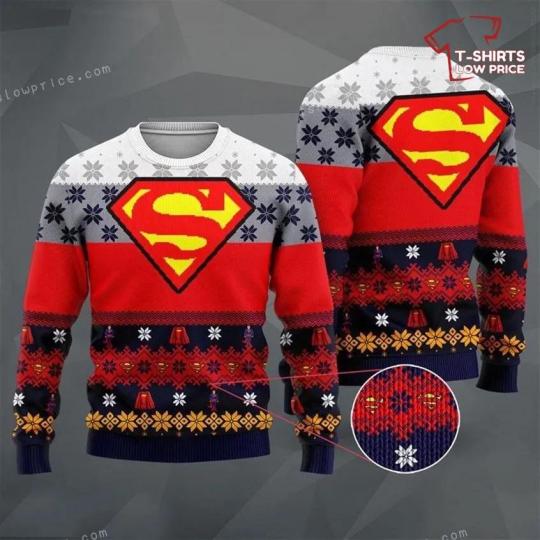
Superman Dc Christmas Ugly Sweater Party
The holiday season is upon us, and what better way to celebrate than with a Superman DC Christmas Ugly Sweater Party! This festive event is perfect for both men and women, and makes an excellent gift idea for everyone in your life.
The Superman DC Christmas Ugly Sweater Party is a unique and fun way to embrace the holiday spirit while paying homage to one of the most iconic superheroes of all time. Decked out in Superman-themed ugly sweaters, attendees can gather together to enjoy a night of festive cheer and superhero-themed activities.
For men, this party offers a chance to showcase their fandom for both Superman and the holiday season. With a wide range of Superman Christmas ugly sweaters available, they can choose from classic designs featuring the Superman logo or more intricate patterns incorporating elements such as snowflakes, candy canes, and Santa hats. These sweaters are not only stylish but are also a great conversation starter, allowing men to connect with other partygoers who share their love for this legendary superhero.
Women, too, can partake in the festivities with their own selection of Superman Christmas ugly sweaters. From trendy and fitted designs to cozy and oversized options, there are sweaters to suit every style and preference. Many of these sweaters feature unique twists on the traditional Superman logo, incorporating glitter, sequins, or even festive color schemes. The Superman DC Christmas Ugly Sweater Party provides an opportunity for women to show off their love for Superman in a fun and fashionable way during the holiday season.
In addition to being an entertaining party theme, the Superman DC Christmas Ugly Sweater Party also makes for an excellent gift idea for everyone. Whether it's for a family member, friend, or coworker, a Superman-themed ugly sweater is a fun and unexpected present that showcases your thoughtfulness and their love for the superhero.
Furthermore, these sweaters are not just limited to the party itself. They can be worn throughout the holiday season, allowing the recipient to spread some superhero cheer wherever they go. From holiday gatherings to casual outings, these Superman Christmas ugly sweaters add a touch of festive fun to any occasion.
To complement the party theme, you can also consider incorporating other Superman-themed elements into the event. This could include having Superman-themed decorations, such as ornaments and banners, or organizing superhero-themed games and activities. A costume contest could also be held, encouraging attendees to show off their best Superman-inspired looks.
Overall, the Superman DC Christmas Ugly Sweater Party is a fantastic way to celebrate the holiday season with a twist of superhero flair. Whether attending as a partygoer or gifting a sweater to a loved one, this unique event is sure to bring joy and laughter to all who participate. So, grab your Superman Christmas ugly sweater, embrace your inner superhero, and get ready to have a super-powered holiday season!
Get it here : Superman Dc Christmas Ugly Sweater Party
Home Page : tshirtslowprice.com
1 note
·
View note
Text
8 Small Kitchen Remodel Ideas to Make Your Space Feel Larger
If your kitchen is cramped, there are ways to make it look bigger. One way to do this is to use white kitchen walls and cabinets. They’ll create the appearance of a larger room and will make your space feel bigger than it actually is. For this you can prefer the best contractor for kitchen renovation Riverside CA. When it comes to small kitchen design, a great way to make your space feel bigger is to utilize optical illusions.

Here are some ideas that fit with just about any budget and kitchen space:
Widen the Space with Horizontal Stripes
We all know that wearing wide, horizontal stripes can make us look bigger than we’d like. Similarly, adding horizontal stripes to your kitchen can make it seem wider. You can add these stripes with wallpaper, tile, flooring or rugs.
Reflective Back Splashes
A back splash can give your kitchen a wider look. Using a back splash with a horizontal texture will also add visual interest to the room. Patterns are also a good option for a small kitchen. Try using patterns of various sizes on your back splash, walls, tiles, and fabrics. Patterns are a great choice in any kitchen, because they add visual interest to the space and make it seem spacious.
Open Shelving
If you have limited cabinet space, open shelving can be a wonderful solution. It offers extra storage and can be used as a decorative element, too. Unlike traditional cabinets, open shelves can be moved to different areas of the room, depending on their placement. Open shelves are also an effective way to hide ugly kitchen appliances and gadgets. To create an attractive space, choose a simple color scheme and use greenery and different textures to add interest to open shelves.
Mirrors
Mirrors add visual space to a small kitchen and can also add style to a space. They can be hung at eye level or about 60 inches from the floor. The reason why this common height is so important is because a uniform height will make a room feel larger. Mirrors can be round or rectangular, and they do not have to be expensive.
Also read about, Home Remodeling Ideas to Maximize Your Space
Striped Flooring
Striped flooring in a small kitchen is a great way to stretch the floor space. To create this effect, alternate medium and light-tone laminate floor tiles. Alternatively, paint the existing flooring and cover it with a striped rug.
Glass-Paneled Cabinetry
Small kitchens can benefit from the lightness of glass-paneled cabinetry. While lower cabinets are essential for storing the practical bits, wall cabinets are a great way to showcase your most attractive items. You can also brighten up the interiors of your cabinetry with lighting.
Sliding Doors
If you have a small kitchen, sliding doors is a great way to create more space without sacrificing functionality. Sliding doors are perfect for narrow spaces because they take up less space when they are closed, and they can even hide laundry machines. They also add a modern look to a room, and they come in many materials.
Downsized Appliances
Downsized appliances can make a small kitchen appear larger by increasing storage space. Alternatively, you can install new appliances to increase space. A good way to save space is to get high-quality combination appliances that can do multiple functions, such as an all-in-one toaster and microwave. You can also downsize appliances that take up counter space, such as a refrigerator. Another solution is to move the freezer outside the kitchen. The freezer can then be stacked next to your washer and dryer or installed in the basement or garage.
Just because you have a tight budget and a small space doesn’t mean you can’t have a beautiful kitchen. With our small kitchen remodel ideas, we can help you create a space you’ll love, one that will truly be the heart of your home. Masterwork Home Remodels will save you a lot of time, money, and frustration. We will make sure the work is done right, providing peace of mind that your kitchen renovation service is going to stay in good working order for years to come.
Original Source: https://bit.ly/3fn7xcG
#best contractor for kitchen renovation Riverside CA#kitchen renovation service#kitchen renovation service Eastvale CA#kitchen remodel services Eastvale CA
1 note
·
View note
Photo
now what?
for @momentofmemory.
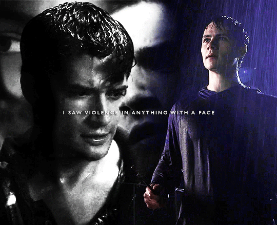
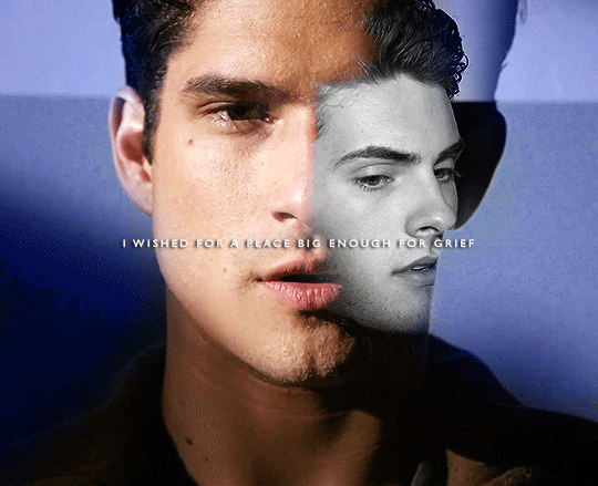
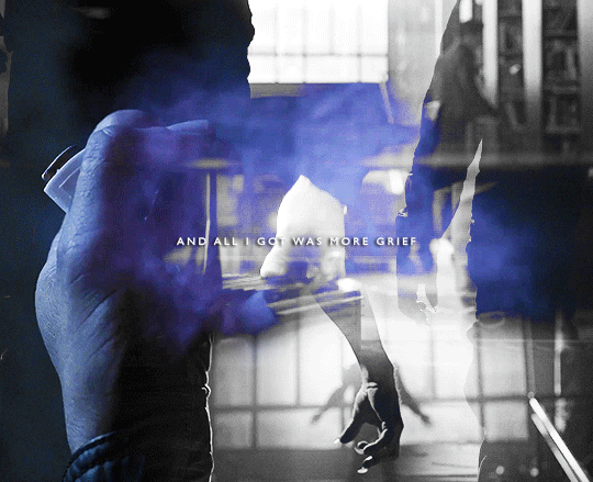
#usermem#twedit#sceoedit#sceo#scott x theo#MERRY CHRISTMAS MEM!!!!#now you might be asking. what is the significance of scott being in bnw in the first one#and there simply is none#it just was too ugly to color but it fit with the color scheme so it's fine#but ANYWAY more IMPORTANTLY here she is!! scotts d word ft stiles and theo!!#i actually agonized over a sceo set that fit the angst with a happy ending vibe but it ended up being#theo centric#so we went back to the drawing board and now we have this!! i think its fun#they make me crazy actually like scott really just. wanted a place big enough for grief#he wanted someone to look at him and see that he needed help and reach out a hand to him#which is why the last gif is#all hands!!!#tenderness is stored in the hands baby#not this time though
182 notes
·
View notes
Last Seen Blogs

toonbriel
Sin título

storieswithsandra
Bilbo’s Journal
magicaynebulosa-muwala
♡Go Muwala♡

private-carnage
must we not pay a debt to pleasure too?

indoorpeach-blog
indoor peach