#john rattray

Text
SMiLe Interviews. John Rattray
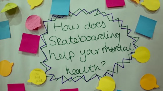
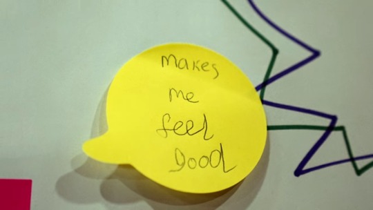
How does skateboarding help your mental health?
0 notes
Text


1 note
·
View note
Text


On March 7th 1744, the world's first golf club was founded in Edinburgh.
Originally called The Gentlemen Golfers of Leith, this is one of the world’s oldest golfing societies, founded in 1744 by a group of men who played on a five-hole course at Leith, which wasn't officially part of Edinburgh back then.
In 1795 the Club applied to the Lord Provost, the Magistrates and Council of the City of Edinburgh for a Charter. This was granted on March 26th 1800 together with a Seal of Clause under the new title of 'The Honourable Company of Edinburgh Golfers'.
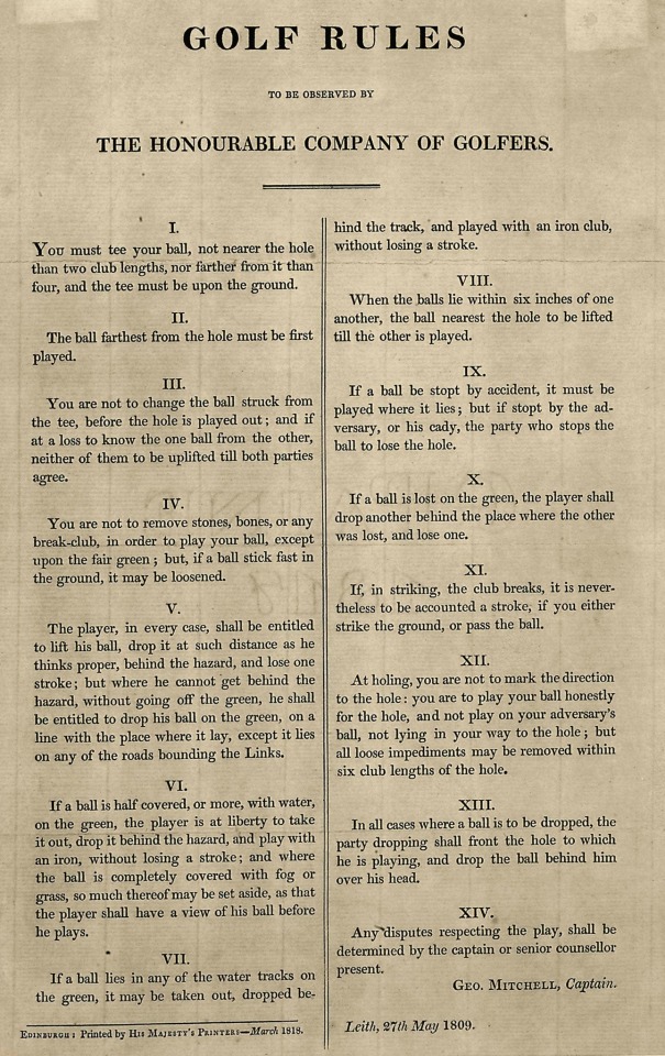
In that year the group petitioned the city officials of Edinburgh for a silver club to be awarded to the winner of a golf competition. It further established the earliest known rules of the game, a code of 13 articles recorded in its first minute book. They were adopted almost without change in 1754 by the Royal and Ancient Golf Club of St. Andrews, later to become the governing body for the sport here.
The Honourable Company later transferred its activities farther east to the town of Musselburgh and then to the Muirfield course, with which it has been associated in modern times. The club only allowed men to join until it voted to accept female members in 2017.
The original rules of the game which were;
You must Tee your Ball within a Club's length of the Hole.
Your Tee must be upon the Ground.
You are not to change the Ball which you Strike off the Tee.
You are not to remove Stones, Bones, or any Break Club for the sake of playing your Ball except upon the fair Green, and that only within a Club's length of your Ball.
If your Ball come among watter, or any wattery filth, you are at liberty to take out your Ball & bringing it behind the hazard, and Teeing it, you may play it with any Club and allow your Adversary a Stroke for so getting out your Ball.
If your Balls be found any where touching one another, You are to lift the first Ball, till you play the last.
At Holing, you are to play your Ball honestly for the Hole, and not to play upon your Adversary's Ball not lying in your way to the Hole.
If you should lose your Ball by its being taken up, or any other way, you are to go back to the Spot where you struck last, & drop another Ball and allow your Adversary a Stroke for the misfortune.
No man at Holing his Ball is to be allowed to mark his way to the Hole with his club or anything else.
If a Ball be stopp'd by any person, Horse, Dog. or anything else, The Ball so stopp'd must be play’d where it lyes.
If you draw your Club in order to StrIke, & proceed so far in the Stroke as to be bringing down your Club; if then your Club shall break, in any way, it is to be Accounted a Stroke.
He whose Ball lyes farthest from the Hole is obliged to play first.
Neither Trench, Ditch or Dyke made for the preservation of the Links, or the Scholars' Holes or the Soldiers' Lines, shall be accounted a Hazard, But the Ball is to be taken out, Teed, and played with any Iron Club.
The first competition was won by John Rattray, an Edinburgh surgeon – but only 12 people entered, all locals, and only 10 played. Open entry stopped in 1764 when it was limited to members of the Honourable Company.
When the Society of St Andrews Golfers wrote their version in 1754 only one change occurred – a ball in "watery filth" at Edinburgh must be teed and at St Andrews it was to be dropped.
Rule XIII mentions 'Scholars holes' and 'Soldiers lines'. There were "Scholars' bunkers" in St Andrews but there were no "Soldiers' lines"
If you are familiar with the game of golf you will see that the above rules are still the bones of the game. But situations arose which were not covered and modifications had to be made.
The spellings in the rules are from the original note book as seen in the second pic.
26 notes
·
View notes
Text
About skateboarding
Since I'm bored out of my skull I thought I would talk about one of my other interests: skateboarding
Deck size: 8.125
Wheel size: 52mm
Trucks: Thunder
Favorite deck brand: Either Krooked or BBS Alien Workshop. Actually any deck brand made by BBS. If we're going with strictly aesthetics and graphics, then Magenta.
Least Favorite: Any brand made with Clutch wood. Those nose and tails are way to steep
Best trick: Frontside flip or frontside 360
Trick I want to learn: Overcoming my psychological barrier of switch ollieing up curbs. Other than that I would like to learn smith grinds
Advice on tricks: For frontside 360s, the key is to use the upper part of your body to complete the first 180, and then use your legs and bottom half to force the last 180. Learning how to do late 180s are extremely helpful.
Favorite skate video: 3 way tie between Tilt Mode Army "Man Down", PJ Ladd's Wonderful Horrible Life and Girl/Chocolate "Yeah Right"
Favortie Skaters: Mark Appleyard, Heath Kirchart, Rick McCrank, John Rattray, Gustav Tonnesen, Mark Suciu
Favorite Shoe brand: Hmm that's a tough one, but New Balance has consistently lives up to my expectations. More niche, I'm a sucker for DC, Kalis models always deliver. Anyone that makes a good cupsole and not focused on vulc (*cough* Vans *cough*).
Gear you would love to own: Enjoi with the Butterfly Lite concave, Lakai Howard 2, Lakai MJ1, Tum Yeto era Zero and Foundation, OG eS Accel Plus
19 notes
·
View notes
Photo
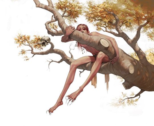

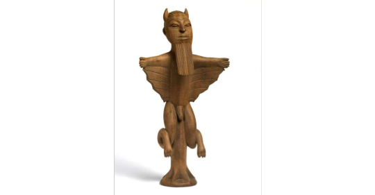
Sasabonsam [Ashanti/Ghanaian mythology; African mythology]
This monster, which originates from the mythology of the Ashanti people (in Ghana, western Africa) dwells in the dense forests of Ghana. The name is derived from ‘sasa’, a type of spirit that lives on after death, and ‘bonsam’, a kind of male witch or sorcerer. As such, they were considered the undead spirits of dead sorcerers, who took on a physical form to haunt the world of the living.
Sasabonsam is vaguely humanoid in appearance but its skin is covered in long fur and its eyes are abnormally large and blood-shot. Its unnaturally long legs end in claw-like feet with toes in both directions, which are used to grip branches. This is a skill the Sasabonsam puts to great use when navigating the dense treetops in which it lives. These creatures are also known to grasp humans with its long legs before pulling the victim upwards. When villagers enter the forests and don’t return, they are assumed to be caught by a Sasabonsam. It is said that when hunters venture into the woods at night, Sasabonsam is the greatest danger they can face.
Despite these creatures being evil and dangerous, a Sumankwafo – an Ashanti shaman or medicine man – can invoke them and draw from their power. This practice is not regarded as evil, and can be used for protection and blessings. Witches and warlocks, however, were also able to draw upon their power.
Although they were originally regarded as a species, implying that multiple individuals exist, Sasabonsam has been changed into a separate character after westerners arrived. After Christianization of the local myths, Sasabonsam was identified with the Christian idea of the devil. This is also why the creature has such a negative connotation. They were not benevolent before Christianity arrived, but they weren’t entirely evil either. Influences of the Christian devil can also be seen in more modern depictions of the creature: it has horns on its head and a beard. This version also has legs that are flexible like a snake, and usually also has bat-like wings.
Rattray (the author of the book sourced below) hypothesizes that the myth could have originated from sightings of apes.
Sources:
Rattray, R. S., Religion and Art in Ashanti, 1929.
https://www.britishmuseum.org/collection/object/E_Af1935-1212-1
(image source 1: Lizzy-John on Deviantart)
(image source 2: Liana Sposto)
(image 3: a statuette of Sasabonsam. Image source: britishmuseum.org)
57 notes
·
View notes
Text
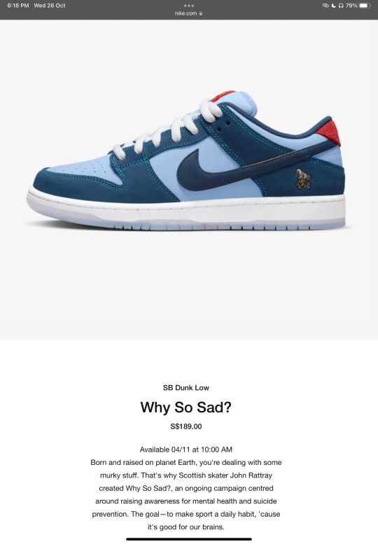
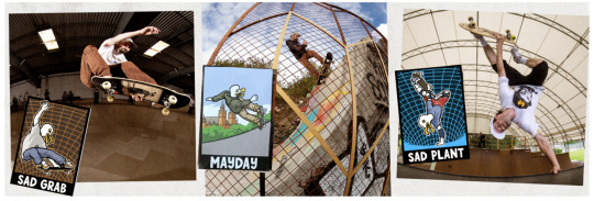
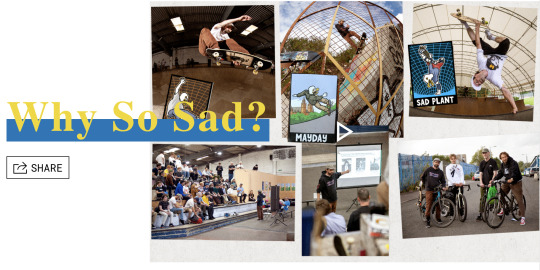
Why so sad? by John Rattray
'Why So Sad? is a cycling and skate-focused campaign founded by John Rattray with the goal of driving awareness, education, and fundraising around mental wellbeing & suicide prevention in the skate community.'
why have i chose to research into the 'why so sad campaign' ?
Once developing my research plan and steps moving forward, and looking into Gen-z, their interests and popular brands amongst this. its evident that fashion is a big thing to Gen-z, over a few years social media and Gen-z have created a whole other angel of fashion design and trends have been created from every angel, whether they're into street wear, cottage-core, thrifting or well known brands, the young community love clothing trends and fashion as a whole. i decided to use this to my advantage for creating awareness for mens mental health by creating a partnership concept with nike.
This idea is what led me to research into other campaigns similar that have partnered with big brands for mental health or suicide awareness/prevention.
In mental health awareness month lots of well know big named brands partnered with campaigns or created their own social campaigns in honour of suicide prevention and mental health awareness.
The why so sad campaign is one i really enjoyed finding out about, it has a story behind it and its done great thing for mental health within and outside for the skate community.
as this brrand is a stroy telling based campaign a comic was created along side the posters and partnership eiht nike;
The why so sad comic by John Rattray and Jon Horner
youtube

As well as looking into the why so sad campaign i also looked at other brand that took part on mental health awareness month through their own campaigns or partnerships:
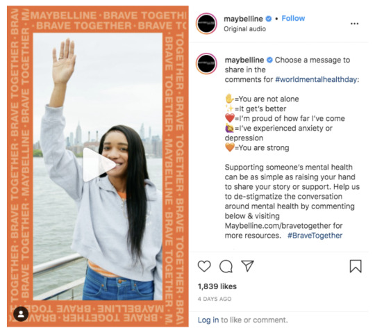
Maybelline: Brave Together
Kate Spade NY:

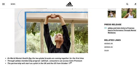
Adidas: Adiclub partnership with Calm Unite
After looking into all the positive outcomes from big brands making a difference and spreading awareness i wanted my brand to have the same concept to be successful.
i decided to do concept sketches and illustrations for what i think the partnership with nike would look like if i was to go through with it and i wanted to use a simple illustration style to then carry on into my poster designs too.
Next step's:
to research poster designs/ styles of campaigns and partner ships to the look at how i wanted to go forward with my poster designs
Look at what kinds of illustration and imagery style i wanted to go for with my posters and social media posts and appearances.
create a social media presence other than my branded one (concept mockups of nike posting about the collaboration, and a brand instagram account posting about it too)
create a mood/insp. board of the style i wanted to portray throughout my brand on the social media presence, posters, and any other visual representation of the brand.
2 notes
·
View notes
Text
EMISSION 2 | RADIO CACTUS 92.2fm | PPG du 24-11-23
Alalclair ensemble – les étapes du deuil
Dead End x Nery – Decelerate
Beat Gates – Forest Drive
Bastien Keb – Dotty
Jenna Camille – Baby
Boucherie Chevaline – JOHN STARKS
Kelpe – Lost In Pace, 1999
Kuna Maze – Samosa
Dirg Gerner – Ma Head High
Ahu – I and I
Au – To love
Fybe_one – Hydro feat. Don Rattray
Essa aka Yungun – Push
Lunice & DAGR – Winnebago
Dorian Concept – Pong Ping…

View On WordPress
0 notes
Text
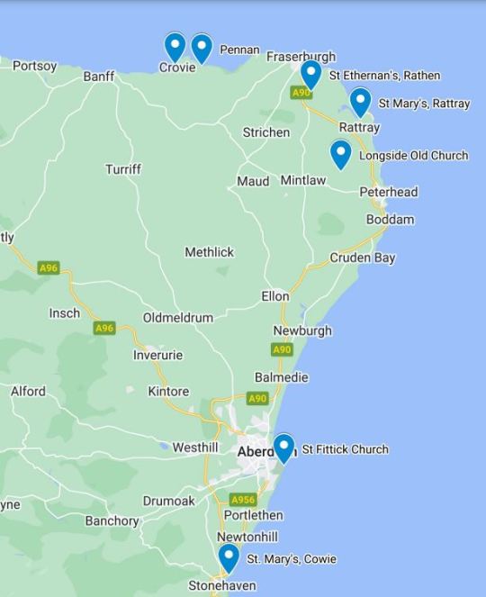
Graveyards by the sea

Abandoned churches dotted along the Aberdeenshire coast give it a pleasingly godforsaken feel.
The regional council has put out a guide to 12 of the best such ruins. Here is my short list, from south to north (map at the end of this post.)
The remains of St Mary's Church, in Cowie - pictured above and below - sit oddly between a golf course and cliffs overlooking Stonehaven Bay.

The 13th-century chapel was dedicated to "St Mary of the Storms" but fell into disuse in the 1560s. Perhaps the newly Protestant kirk objected to involving the Holy Virgin in maritime meteorology. A panel at the site only says that the church "was unroofed by the ecclesiastical authority on account of certain scandals".
Locals recycled the crumbling walls as building material, despite a rumour that the stones would "rain blood upon any house built with them".
There was an attempt to rebuild the chapel in the 19th century. The churchyard includes a memorial to a Stonehaven lifeboat crew who perished in a failed rescue in 1874. Far from bringing succour to seamen, it seems, the site was jinxed. Parishioners deserted it.
The adjacent golf clubhouse, on the other hand, is doing brisk business.
Twenty kilometres to the north is another former church in an incongruous setting. The ruins of St Fittick's Church stand next to the south shore of Aberdeen harbour.

The 12th-century chapel was named after an Irish monk who set out to evangelise the Picts in the 600s. According to legend, Fittick's boat was caught in a storm. He told the sailors that salvation lay in Christ. They threw him overboard to placate Manannán mac Lir, the god of the sea.
But the holy man had the last laugh. He managed to swim to the shore. When the villagers asked him how he had survived the wrath of Manannán mac Lir, Fittick said: "Salvation lies in belief in Christ."
The church testifies to the complex relationship between Scots and their fellow Celts across the Irish Sea.

The kirkyard features the gravestone of one William Milne, a victim of Britain's civil wars of the 17th century (my post about the Scottish part of that conflict is here).
Milne, a farmer, joined a Protestant "Covenanter" militia during a royalist offensive backed by Irish Catholics. The Latin epitaph says that he fell in 1645"for the cause of Christ... by the sword of a savage Irishman".
Fifty kilometres up the coast is Longside Old Parish Church, built in 1619-20.

The churchyard features many memento mori symbols: skulls and bones, hourglasses and the like.
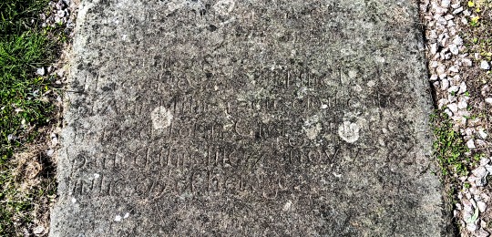
My favourite gravestone is that of William Reid, who "depairted this life" in 1702 and "rests in hops of blesed resurection". I quote this not to mock the spelling, but my own obsession with spelling.
Soon I will be gone, as will the linguistic proprieties I held so dear. For a pedant, this stone is the most poignant memento mori of all.

St Mary Chapel, Rattray, is another monument to transience.
Rising from flatlands that seem to merge into the sea, it is all that remains of the "royal burgh" of Rattray.
That status was granted by Mary Queen of Scots to encourage local clans to engage in commerce rather than feuds. Thus Rattray gained the right to hold markets and trade far and wide.
The sea had other ideas. Winds and currents filled the harbour with sand over the years. By the 1800s the village had vanished, as if engulfed by the soggy ground.
But the shell of the 13th-century chapel still stands, at the end of a single lane that seems to lead nowhere.
A few kilometres inland, on the outskirts of Fraserburgh, is St Ethernan's, Rathen.
A front gable and a side wall are all that's left of this 17th-century parish church.
The stars of the kirkyard are John Greig and Anne Milne, a couple of tenant farmers who happened to be the great-great-grandparents of Norwegian composer Edvard Greig.
One of their sons emigrated and became a successful merchant in Bergen.
Three generations later, little Edvard learned how to play the piano and the rest is musical history.
The inscription on the gravestone is quite worn but someone deciphered it: "Here lyes the remains of JOHN GRIEG, late tenant in Mostoun of Cairnbulg d 6 Jan 1774 in his 71st year. Here also was laid the body of ANN MILNE, spouse of above named John Greig d 17 Nov 1784 in 81st year. This stone is erected to his memory by his surviving children."
The survivors refrained from mentioning the couple's connection to an illustrious descendant. Another lesson in humility!
Fraserburgh is home to an informative Museum of Scottish Lighthouses. Those uninterested in nautical beacons can happily skip that town and follow the coastline to the west.
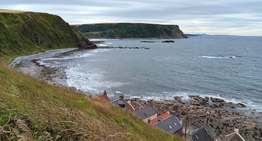
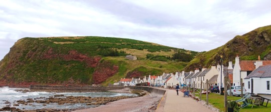
The highlights of the northern Aberdeenshire seaboard are fishing villages that are little more than strip of cottages between water and cliff.
They look cute now but were born of desperation. Farm labourers settled these unpromising shores in the 18th century, after being evicted in the Highland Clearances.
One of the most picturesque of those villages is Crovie (above). There is not even room for a road either in front or behind the cottages.
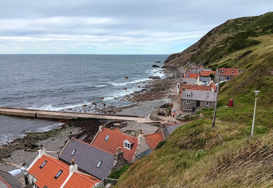
The most famous is Pennan, which was put on the map by Bill Forsyth's film Local Hero.
Its phone box plays a big part in the movie - made in the dark, pre-mobile ages.
Forty years on, the red kiosk is still there.
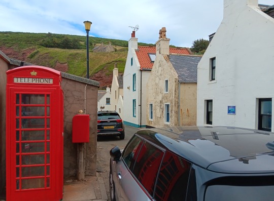
The Aberdeenshire council has apparently kept it in service as a tourist attraction.
Talking about maps, here's the one I promised (forgive its crudeness: the only cartographical tool my incompetence can handle is Google My Map.)
1 note
·
View note
Text
Multicultural Children’s Book Day
I was gifted the book Men of the 65th: The Borinqueneers of the Korean War! The book is being published by an imprint of Lerner books (www.lernerbooks.com). The book was researched by children’s author, Talia Aikens-Nunez whose previous publications include the OMG series.
Men of the 65th: The Borinqueneers of the Korean War is a nonfiction chapter book. While war history is not really my favorite subject to read about, Aikens-Nunez does a great job of capturing your attention with a great introduction. The book is filled with great facts and maps at the beginning of each chapter. I love the inclusion of a glossary as well as a bibliography. While it was a struggle for me to read because of the topic, I really appreciated learning about a facet of history I was not super-familiar with before.
Multicultural Children’s Book Day 2023 (1/26/22) is in its 10th year! This non-profit children’s literacy initiative was founded by Valarie Budayr and Mia Wenjen; two diverse book-loving moms who saw a need to shine the spotlight on all of the multicultural books and authors on the market while also working to get those books into the hands of young readers and educators.
Ten years in, MCBD’s mission is to raise awareness of the ongoing need to include kids’ books that celebrate diversity in homes and school bookshelves continues. Read about our Mission & History HERE.
MCBD 2023 is honored to be Supported by these Medallion Sponsors!
FOUNDER’S CIRCLE: Mia Wenjen (Pragmaticmom) and Valarie Budayr’s (Audreypress.com)
🏅 Super Platinum Sponsor: Author Deedee Cummings and Make A Way Media
🏅 Platinum Sponsors: Language Lizard Bilingual Books in 50+ Languages
🏅 Gold Sponsors: Interlink Books, Publisher Spotlight
🏅 Silver Sponsors: Cardinal Rule Press, Lee & Low, Barefoot Books, Kimberly Gordon Biddle
🏅 Bronze Sponsors: Vivian Kirkfield, Patrice McLaurin , Quarto Group, Carole P. Roman, Star Bright Books, Redfin.com, Redfin Canada, Bay Equity Home Loans, Rent.com, Title Forward, Brunella Costagliola Bronze Sponsor
Poster Artist: Lisa Wee
Classroom Kit Poster: Led Bradshaw
MCBD 2023 is honored to be Supported by these Author Sponsors!
Authors: Sivan Hong, Amanda Hsiung-Blodgett, Josh Funk , Stephanie M. Wildman, Gwen Jackson, Diana Huang, Afsaneh Moradian, Kathleen Burkinshaw, Eugenia Chu, Jacqueline Jules, Alejandra Domenzain, Gaia Cornwall, Ruth Spiro, Evelyn Sanchez-Toledo, Tonya Duncan Ellis, Kiyanda and Benjamin Young/Twin Powers Books, Kimberly Lee , Tameka Fryer Brown, Talia Aikens-Nuñez, Marcia Argueta Mickelson, Kerry O’Malley Cerra, Jennie Liu, Heather Murphy Capps, Diane Wilson, Sun Yung Shin, Shannon Gibney, John Coy, Irene Latham and Charles Waters, Maritza M Mejia, Lois Petren, J.C. Kato and J.C.², CultureGroove, Lindsey Rowe Parker, Red Comet Press, Shifa Saltagi Safadi, Nancy Tupper Ling, Deborah Acio, Asha Hagood, Priya Kumari, Chris Singleton, Padma Venkatraman, Teresa Robeson, Valerie Williams-Sanchez and Valorena Publishing, Martha Seif Simpson, Rochelle Melander, Alva Sachs, Moni Ritchie Hadley, Gea Meijering, Frances Díaz Evans, Michael Genhart, Angela H. Dale, Courtney Kelly, Queenbe Monyei, Jamia Wilson, Charnaie Gordon, Debbie Ridpath Ohi, Debbie Zapata, Jacquetta Nammar Feldman, Natasha Yim, Tracy T. Agnelli, Kitty Feld, Anna Maria DiDio, Ko Kim, Shachi Kaushik, Shanequa Waison-Rattray, Susan S. El Yazgi, Shirim Shamsi
MCBD 2023 is Honored to be Supported by our CoHosts and Global CoHosts!
MCBD 2023 is Honored to be Supported by these Media Partners!
Check out MCBD's Multicultural Books for Kids Pinterest Board!
📌 FREE RESOURCES from Multicultural Children’s Book Day
MCBD 2023 Poster
Mental Health Support for Stressful Times Classroom Kit
Diversity Book Lists & Activities for Teachers and Parents
Homeschool Diverse Kidlit Booklist & Activity Kit
FREE Teacher Classroom Activism and Activists Kit
FREE Teacher Classroom Empathy Kit
FREE Teacher Classroom Kindness Kit
FREE Teacher Classroom Physical and Developmental Challenges Kit
FREE Teacher Classroom Poverty Kit
Gallery of Our Free Posters
FREE Diversity Book for Classrooms Program
📌 Register for the MCBD Read Your World Virtual Party
Join us on Thursday, January 26, 2023, at 9 pm EST for the 10th annual Multicultural Children's Book Day Read Your World Virtual Party!
This epically fun and fast-paced hour includes multicultural book discussions, addressing timely issues, diverse book recommendations, & reading ideas.
We will be giving away a 10-Book Bundle during the virtual party plus Bonus Prizes as well! *** US and Global participants welcome. **
Follow the hashtag #ReadYourWorld to join the conversation, and connect with like-minded parts, authors, publishers, educators, organizations, and librarians. We look forward to seeing you all on January 26, 2023, at our virtual party!
https://docs.google.com/document/d/1c4PKSi9HTzU0QeiW1tZvbox_EAK1pwdl/edit
0 notes
Text
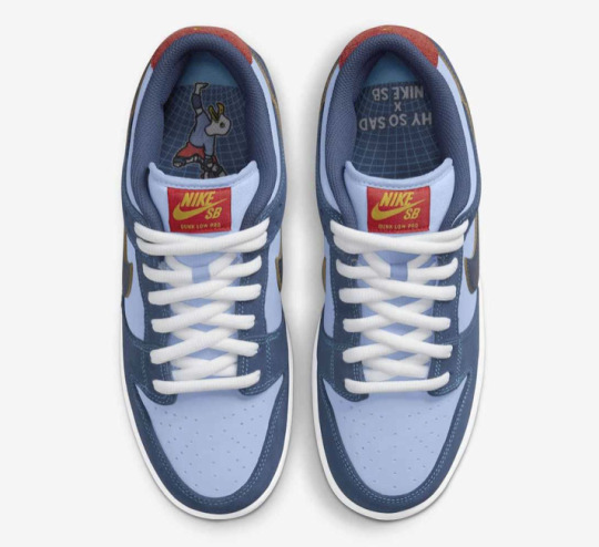
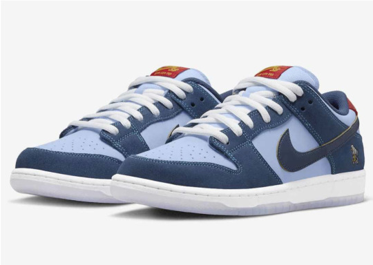
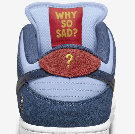
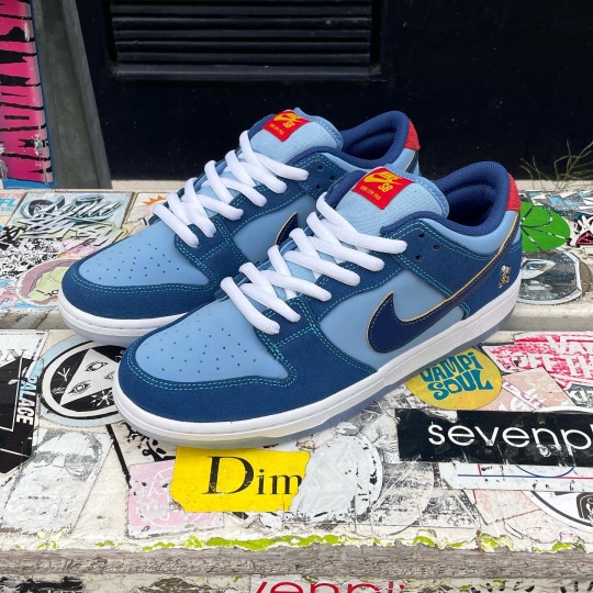
Je vous présente Why So Sad? x Nike SB Dunk Low, une paire pour laquelle j'ai eu un coup de coeur, non pas spécialement pour son design mais pour son histoire !
C'est le skater écossais, John Rattray, qui, après avoir perdu sa sœur par suicide et avoir lui-même fait face à la dépression, a développé le projet à partir de 2017.
Why So Sad est une plateforme de narration qui aborde un sujet sérieux à travers un jeu léger sur le langage du skateboard. Son objectif : «récolter des fonds pour différentes associations qui luttent contre le suicide à l’image de la Association for Mental Health ou encore de la Grassroots Suicide Prevention.»
Avec cette nouvelle Why So Sad? x Nike SB Dunk Low, John Rattray continue de nous sensibiliser sur la santé mentale.
J'ai trouvé particulièrement intéressant de vous partager cette paire car en tant que graphiste en devenir, et personne engagée je me demande souvent quel nouveau support peut-on utiliser pour faire passer un message.
Et vous, connaissez-vous une sneakers dont l'histoire vous a touché ?
Sources :
1 note
·
View note
Text
Some customers that dropped by the shop today got lucky and found the @nikesb x Why So Sad? dunk up on the wall 👀
‘Why So Sad? is a storytelling platform initiated by John Rattray that explores the nature of mental health. It approaches the subject through lighthearted play and invites conversation.
SOLD OUT
1 note
·
View note
Photo
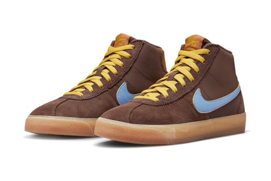
John Rattray's Why So Sad? x Nike SB Bruin Mid Is Unveiled https://sneakerscartel.com/john-rattrays-why-so-sad-x-nike-sb-bruin-mid-is-unveiled/
0 notes
Text
Final Project
-Further Research & Experimentation Planing
The answers I got back from survey were not as deep and poetic as I had hoped so Im going to speak about slightly altering my brief to make the work come from research and interviews that already exist rather than through conversations. The interviews I use to take passages from and then to visualise their words will be from skaters and it will all still be around mental health. The project will be to raise awareness using skating as a tool to twist the narrative of a slightly rebellious character suffering from something intangible. At the begin of the project while researching into the topic I did find a lot of sources and videos of famous skaters talking about the issue and being open about their experience, this would be an encouraging way to lessen the stigma and hopefully push younger adults into talking about what's going on inside them. I will use these quotes and then reference them later on either amongst the art and decks they are referring to or in a zine where the consumer would be able to get more of a back story on what they are skating.
Finding Paassages to create work from.
Blonde Mccoy says: “Anyone will tell you, skateboarding is ninety per cent falling over and that's what makes the other ten per cent worth it.” I think This relates nicely to mental health especially with the aspect of trial and error while managing moods and being yourself. A way to represent this would be to use older boards as a base design over them and then to skate them and watch the designs slowly fade and change much like this ‘too shall pass’. His collection of work in the book was made “because I know that talking about it is the only thing for me that helps.”
Another skater who openly talks about his struggles is John Rattray, A few quotes I found from him are,
“It seems to point to the understanding that depression and anxiety are very reasonable responses, reactions to the fact that we’re living in a pretty crazy world. Crazy things happen to kids all the time in their upbringing and the trauma they experience. We should stop asking what’s wrong with you and ask instead, “What happened to you?”
“I hope one day we’ll be able to talk about depression, anxiety and even suicidal thoughts the same way we talk about a swellbow. I hope that each of us will have the skills to help ourselves and each other through the storm when things get rough.” – John Rattray
“We should stop asking what’s wrong with you and ask instead, ‘What happened to you?'” – John Rattray
“To be lost in the dark is a different feeling than being lost with a map.”
Aarron Herrington also has a lot on the internet about his own beliefs and experiences.
“It's important because our parents, and previous generations, often hold the belief that going to therapy or speaking about your feelings makes you a weak minded person, or a soft person, particularly in men.”
'you've always felt this way, you've always experienced your point of view through your eyes, and your brain has just become hyper aware of it'.
John Gardner
“I can recall a lot of times just feeling very lost and very alone.”
I presented my slides and found that I need to dive deeper into the theory behind the work and how I can create some nice visual representations and connections for this I went back into my original notes to try and bring out and highlight the idea that inspired me to try and tackle this.
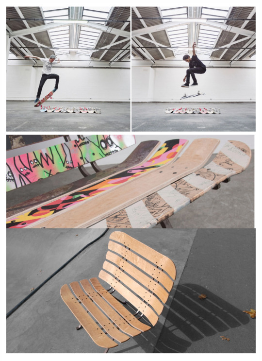
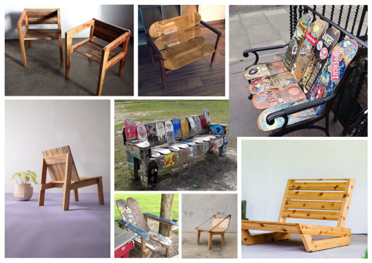
I think that creating art on decks that represents feelings or living with mental health is a great starting point and I think that skating these feelings away could be shown through the distress that goes on from skating a board, over time the deck wears and becomes less pretty using this as representation of talking as being a great healer it would make links so this would work would then get scraped away revealing more positive and beautiful work that highlights the idea of keeping hope and searching for that light in the tunnel. Using these boards I would then want to create them into something else further pressing this full circle of a breakdown leading to a breakthrough and then becoming stronger, in the tutorial we discussed using the decks to create a chair or bench to express the message of the importance of talking.
I also was given a few sources to research and look into after the tutorial to help me get a better concept that I can have clearly in mind while experimenting and creating.
https://rosieleecreative.com/work/deck-chair/
In addition I was also told to look at campaigns approaches to creating awareness and dealing with taboo uncomfortable topics.
https://www.thecalmzone.net/
https://www.thecalmzone.net/category/campaign
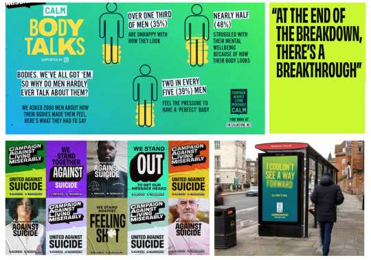
I also looked at some campaigns for movember and mens prostate, and to learn how they promote their work and create advertisements. What i found was that the campaigns and advertisements that were more in your face seemed to look better and create enough awareness. I think if I chose my work to be quite straight to the point and not tip toe around the subject then the designs and theory would be more successful.
So to go deeper into the theory I wanted to get a better understanding of the importance of a breakdown, a break through, and then why it makes us stronger and more resilient if I could then visualise this along with destroying feelings through the act of skating and releasing them I think the outcome could be quite a great.
A breakdown, ‘A nervous breakdown (also called a mental breakdown) is a term that describes a period of extreme mental or emotional stress. The stress is so great that the person is unable to perform normal day-to-day activities. The term “nervous breakdown” isn't a clinical one.’ This is important because ‘It is an attempt by one part of our minds to force the other into a process of growth, self-understanding and self-development which it has hitherto refused to undertake. If we can put it paradoxically, it is an attempt to jumpstart a process of getting well, properly well, through a stage of falling very ill.’
A breakthrough, Often breakdowns can lead to breakthroughs. They can lead us down a path to better understanding ourselves and our emotions. At first, we can feel out-of-control and overwhelmed with our feelings of despair and anxiety. It's hard to see that what we are going through is often a gift wrapped in a not-so-pretty package.
Before I finalised what emotions and quotes to visualise and begin to start designing I looked into distressed painting techniques and more expressive paintings as I would like some of my Boards art to reveal newer parts of the design as they ride, representing the emotions passing. I Think this makes the concept a really cool Idea I'm just worried about the outcome not being possible so I need to look a bit further into the idea and how I can execute it,
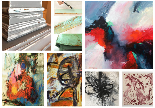
I think that the way I'm going to do my designs is by using layers of paint over one another that with time fade and and scape off revealing other parts of the work becoming more beautiful pieces even with the ‘scars’.
I want to represent one design that shows the overwhelming feelings that come with mental health. To do this I will be using the whole board. For this the quote I will use to visualise will be “To be lost in the dark is a different feeling than being lost with a map.” John Rattray.
I also want to do one board that people right their negative feelings and fears from their anxieties and then to see them fade off. Which a lot of pro skateboarders are trying to promote with the idea of talking and expressing how we feel.
Hopelessness is a feeling of despair or lack of hope that life can feel better than it does. These feelings often lead to a lack of investment or interest in life—and, at its most extreme, can lead to suicidal thoughts. But with the right support and a change in mindset, hopelessness can be overcome.
When generating ideas for designing I am going to use a lot of interviews and poems about mental health, these aren't all done by skaters but Im choosing to do it this way so the art can be moving. Only a few of these designs will come from anonymous quotes. The others will be from the research and skaters already raising awareness.
So overall I would like to have 5 boards made that would then become a way of skaters to talk and feel less stigma to do so.
I know I want my boards to feel like a collection but also work individually to do this I want to use a few colours potentially just black and white to show a nice contrast of light and dark this would look really clean and professional like proper printed decks. Also because dark represents fear, mystery and evil I think its a great colour to use when physically showing anxiety.
This style is what I will be aiming to achieve,

The first board I will be designing is the overwhelming one, for this I'm going to be looking into more work that visualise this but also looking at how that emotion feels and potential ways I could show that through art. I do want all the boards to be a bit gritty, to keep things similar to the skater lifestyle but to also encourage the idea of a board being made to be ruined. ‘Often, overwhelm is as uncomfortable as it is uncontrollable. It rears its head as anxiety, anger, or significant irritability and worry. Doubt and helplessness also make their way into a person's normal thought process. Physically, it can manifest when a person lashes out verbally, cries, or has a panic attack.’ Being overcome with a range of different emotions.
Art that shows being overwhelmed,
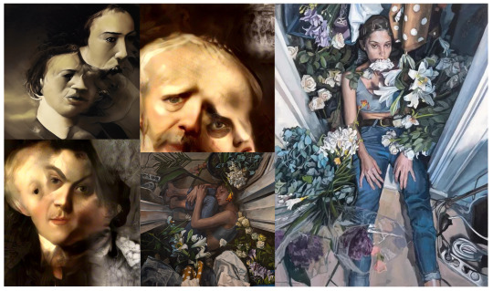
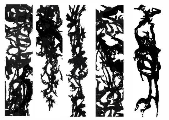
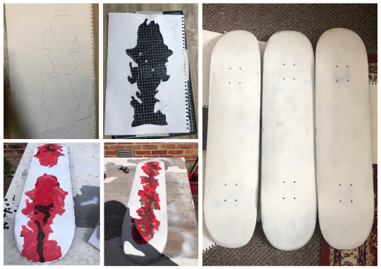
Im going to create a random selection of thick and thin dark lines in a angelic twisted way similar to a gothic style tattoo or expressive free flowing ink drawing, I think this is an interesting way to show the dominance of intrusive thoughts for this I will be doing a range of experiments before finalising my design. For this I looked at flowers and trees and just drew really quick rough mark making I tried to not think about anything too much and just went with it. After This I went over the original mark making in pen and added more detail and tried to do them a bit more neatly and in the style I wanted.
Starting to Experiment
Ink Experiment to help with mark making and Flow.
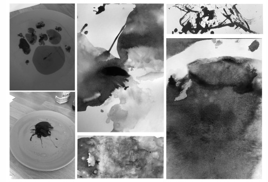
The Ink work I started with was using water and wiping paper into I did this just to help me understand the idea of expressive, free flowing work. I then also got some ink on leaves and vegetation to make marks with that I will use later on to further my compositions. Im interested in using nature as a juxtaposition to bad mental health as it represents a stillness and promotes a calmness, I want to explore the relationship between each and create something that visually represents this unperfected perfection of living with an illness unashamed and just as pretty.
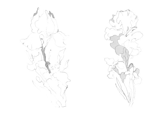
I looked at nature when trying to make these marks to use as it represents escape and positive feelings. A flower I also looked at is an iris as it represents hope which I would like to use to show that it will get better which can be extremely hard to see and remember when this darkness takes over.
‘A more plausible possibility is that natural landscapes are calming because they have positive associations with pleasant experiences. They represent escape from noise and crowding. This possibility is bolstered by the fact that natural environments are often associated with positive experiences in everyday life.’
‘The iris commonly means wisdom, hope and trust’


With these in mind I did rough sketches that I could potentially use to create my compositions. Also I used few photos of leaves, caves, and just scribbled what I saw really fast, I wanted the basic shapes and pattern parts to be quick to symbolise a racing head and racing thoughts. But before I went with a pencil I also did some ink experiments with water and I did this because I knew I wanted to visualise something flowing or alive. I used these ink experiments as reference later on when I was putting together potential composition ideas.
Further mark Making using the same theme for references but this time being more expressive and just really quick and rough as I want there to be enough marks to create a bunch of individual compositions.

I then went through these designs and selected individual parts cutting and layering them to create individual components that I can use, I used the eraser on certain parts as well to make them feel more expressive and flowing.

The next step I did was measure out a skateboard and create a photoshop document that matches that size, I then used this to begin sticking elements down all representing the intrusive overwhelmingness of darker thoughts. I am going to do this stage again with my other experiments and then see which one works the best and which one practically makes sense to do for my work.
My idea for using something that appears overpowering, flowing and alive is because I want to represent these thoughts becoming the main processing a brain during a mental episode is only using its normal 2/3 so I want to represent this illness as something dark and scary looking, to then make the process of skating it down and getting it away to release that negative energy.
Using the drawings to experiment with potential deck layouts, I wanted to a handful of these all showing and representing the idea of intrusion and takeover.
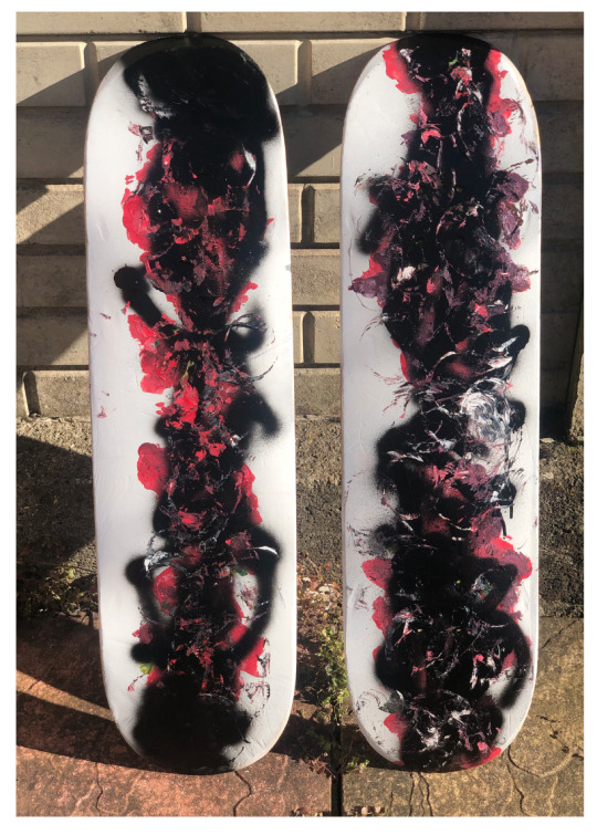
These took quite a while to complete as they are made of a bunch of the individual marks I also did these with the idea of potentially using them all so I wanted them all to be somewhat unique but also successful on there own. These are slightly different shades of black as when I was laying them up I used different parts and didn't always change the colour to the same black however when creating the final ones to use I will be using one shade of black.
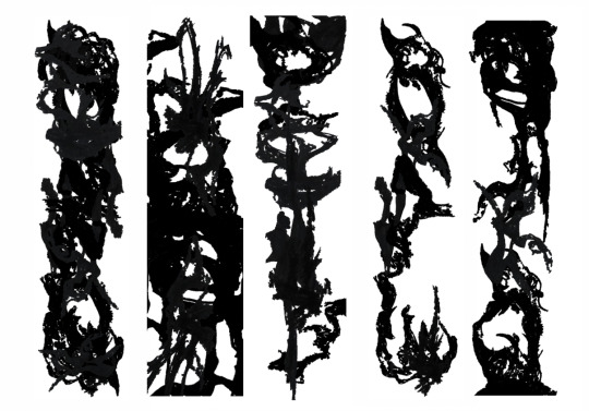
From these I then added them to a skateboard mock up to get a better idea of how they would look, this also helped me go through and eliminate the ones I didn't like. I found that the ones with more negative space worked better and look a lot more pleasing. This mockup is very clean and my boards will be second hand and all ready marked and scared so will look a lot more gritty and better fitting to the theme.
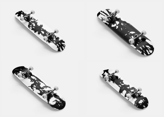
I know that these aren't complete I still need the boards to reflect hope and holding on during these times so I will look into ways I can represent this and then do more experiments before finalising the compositions and actually painting the boards. This mock up is not what my final product will look like its just to help me plan and chose my direction. After this point I went back through my work and decided that the white contrast looks nice however it doesn't connote the message of not given up and it doesn't fit into the idea of grinding away the board to reveal something better (stronger) so I am deciding to add some colour potentially which goes against the original style I had in my head however I think because of the concept and composition I have now I think that it will work really well and show the theory behind the idea.
For this I would like to add some painting and designs that represent hope similar to what I looked at before but this time in colour and not completely overpowered by my representation of mental health showing that things will get better and that there's always hope.
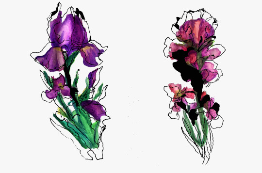
So I went back through all my references and this time decided to much more detailed and refined drawings trying to make them as accurate as I can taking my time to create real looking parts of nature.

These turned out to be rough still but I just wanted to make sure I had the shapes and understanding for how the flower looks. I then went through and did some water colour on them to see if colour would look nice on my work. I know I won't be able to use water colour but I used it to help me see how it could look and not for the median.
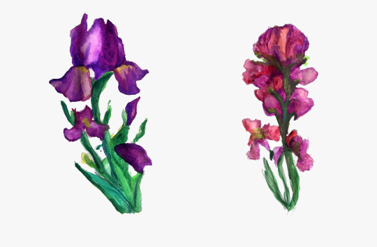
I then added this to my original pattern/mark making work I did this to get a better look at the final composition, and how my work would potentially look on a deck. I think using flowers to represent hope and something great is a good idea especially with the contrast to this icky back flowing paint. I also did a few photoshop experiments with these to see if there was any other way I could go about the work.
After adding them to my original patterns and composition ideas. I think these are really cool however as the decks I'm making physically I will have to go through and workout a way to do that, But I will definitely use these as it would be good to show how the decks would look when they are printed.

I then put these onto some mock ups that I made, I tried to use some free mock ups however they didn't show off the design so I decided to make my own. To do this I used a skateboard and then cut out the designs in the right shape adding a shadow at the bottom of the board with the pen tool, and erasing the top line to show a reflection.
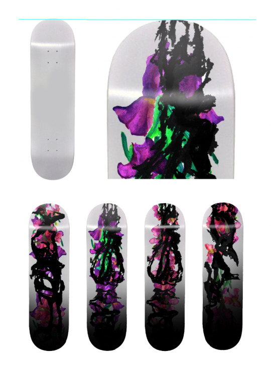
These boards would be printed and look like this,
After they have been skated,

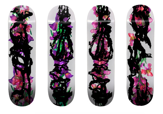
I knew I wouldn't be able to recreate these boards phyisically the way they would be digitally/printed like normal boards so I decided to make the design more basic just to create the other parts of the project. I will make clear that the digital mock ups are how I would like the board.
To do this I went back through the painted designs and image traced to get a few colours and then created some stencils to paint with and recreate these shapes and colours as best I can.

These are just rough versions of how the board would be printed, I did it this way so that I can still use something physical when creating the talking part of my project. Before making this I did a bit of visual research into chairs and skateboard chairs to inspire me, I want to create something that is still original so I will only be using these as a starting point.
These are something i really wanted to do however I decided to go against this and make a zine to go with the boards, a zine to help raise awareness through visuals and to promote wellbeing in the skating community.

For this zine I used free photos and edited and illustrated over them to keep the art style relevant to the theme I kept the zine small cause I want it to be able to be out into a pocket or easily handed out. The zine was also a chance for me to make more visuals for the installation. This is the part of the project where all the elements will be combined to make a great advocacy campaign for mental health in the skate comunity. If I had longer I would have loved to create the chair however I would rather have all the individual elements to help the exhibition. I then created a mockup using a blank art exhibition room where I manipulated and added these pieces and boards into the room this would be the exhibition that raises awareness for the topic.

https://cancermatterswessex.nhs.uk/prostate-cancer-campaign/
https://shortyawards.com/12th/oraclemocontest-movember-campaign
https://www.skateism.com/john-rattray-on-mental-health-awareness-in-skateboarding/
https://www.jenkemmag.com/home/2015/10/07/not-quite-gone-behind-the-story-of-paul-alexanders-battle-with-mental-illness/
https://www.vice.com/en/article/n7vx9x/ben-raemers-foundation-interview
https://www.bbc.co.uk/programmes/articles/1PWJ7zNpqqMNfRLkfdW9Mr7/the-skateboarder-and-model-tackling-mental-health-in-his-art
https://wearelookingsideways.com/podcasts/105-john-rattray
https://wearelookingsideways.com/podcasts/105-john-rattray
https://bigfootskatemag.com/the-skaters-brain/
https://dcshoes.com/blog/skate/This-Too-Shall-Pass-John-Gardner.html
https://press.dxd.agency/157958-dc-shoes-pro-john-gardner-helps-raise-mental-health-awareness
https://www.poetrysoup.com/poems/mental_illness/metaphor
0 notes
Text


7th March 1744 saw The Honourable Company of Edinburgh Golfers hold their first meeting on Leith Links.
It was during this meeting that the first time rules were written down for the sport of golf, and it was only at the behest of the City of Edinburgh Council,, who had presented a silver club prize for a competition but insisted that there had to be rules for the competition.
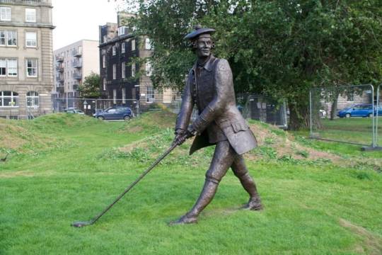
The competition was held on Leith Links, April 2nd, and was open to all golfers in the country, but only ten local “Gentlemen” competed. The Links course only had five holes at the time! The winner was Mr John Rattray Surgeon in Edinburgh, who had drafted the original ‘Articles & Laws in Playing at Golf’ a few weeks earlier. A silver ball with the winner’s name on it was attached to the club, a tradition which endures to this day.
Rattray joined the Jacobite '45 Rising after the Battle of Prestonpans, becoming “Bonnie Prince Charlie’s” personal surgeon. He avoided execution thanks to the intercession of Duncan Forbes, President of the Court of Session, a golfing friend.
Leith Rules Golf Society recently raised money and a statue of Rattray was erected on The Links in honour of his contribution to the sport.
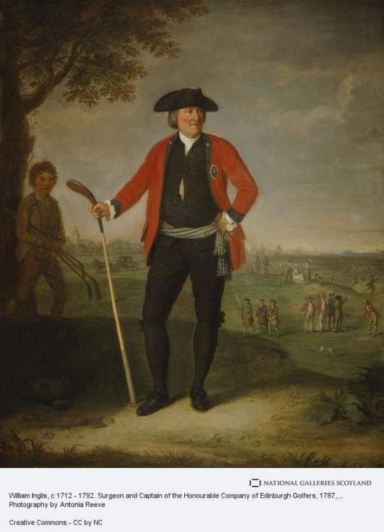
The picture of a painting by Edinburgh artist David Allan is of William Inglis, c 1712 - 1792. Surgeon and Captain of the Honourable Company of Edinburgh Golfers, the trophy is long lost, but an Edinburgh company has made replicas of how the trophy would have looked.
The honourable Gentlemen are now based at Muirfield in East Lothian
You can read the rules and more history about the Honourable Gentlemen here https://www.scottishgolfhistory.org/origin-of-golf-terms/rules-of-golf/
23 notes
·
View notes
Photo
Die Rattray Cooper Pfeife exklusiv bei John Aylesbury #rauch_lounge #rauchlounge #pfeife #pfeifen #pfeifentabak #pfeifenraucher #pipe #pipesmoking #pipelounge #pipes #pipesmoker #smokingpipes #smokingpipe #tobacco #tobaccopipes #tobaccopipe #pipetobacco #pipesmokers #pipecommunity #tobaccopipe #smoke #pipeandtobacco #pipesmokingcommunity #pipesmoke #johnaylesbury #rattray #rattrays #rattrayspipes (hier: Rauch Lounge) https://www.instagram.com/p/CdWMeHEDeIj/?igshid=NGJjMDIxMWI=
#rauch_lounge#rauchlounge#pfeife#pfeifen#pfeifentabak#pfeifenraucher#pipe#pipesmoking#pipelounge#pipes#pipesmoker#smokingpipes#smokingpipe#tobacco#tobaccopipes#tobaccopipe#pipetobacco#pipesmokers#pipecommunity#smoke#pipeandtobacco#pipesmokingcommunity#pipesmoke#johnaylesbury#rattray#rattrays#rattrayspipes
0 notes
Last Seen Blogs

everwaft
EverWaft
accentclothing
ACCENT CLOTHING

eyevoree
Eyevoree
agustpeepd
waw

ma-belle-famille-noel-et-moi-vf
VOIR~Film,, Ma belle-famille, Noël, et moi || 2020 || Streaming