#joypixels
Photo

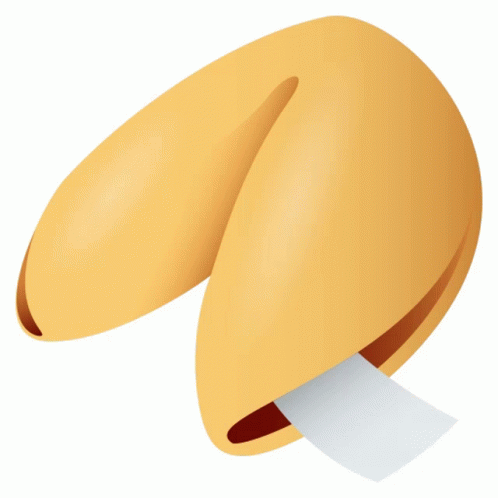
(via Fortune Cookie Food Sticker - Fortune Cookie Food Joypixels - Discover & Share GIFs)
1 note
·
View note
Text
rating shrimp emojis
based on a similar post i saw (instead with seal emojis) as it made me think about how frequently shrimp are kinda... severely messed up anatomy-wise.

starting with apple's version, it's not bad but the face could be longer and the eyes are a bit disproportionately large. my man's antennule was cut off :( 6.5/10

google. again, not bad, but my boy's antennule are still gone... who did this to him? and why are his pleopods just little nubs? how does he swim with those? also not a big fan of the weirdly circular abdomen that suddenly shortens for the tail. 6/10

samsung. what the fuck did you do to his face. you massacred him. i dont even wanna give them the benefit of the doubt and say that it was just simplified, because the rest of his body is just... fine. and much more accurate. did they give up when drawing the head?? it's just a pile of spikes... 3/10

microsoft. highly simplistic so i guess that explains the shortcuts and strange anatomy. not a fan of how the long antennae seems to be sprouting from his forehead, but they did go for the simplistic route and theres only so much you can convey there, so 7/10 (added 2 points for cuteness, i couldn't resist)

whatsapp. no. no. bad die. wheres his maxilipeds. what happened to his face. what happened to his LEGS. you cant fucking move with those little formless pin needles. its a crime to continue letting this thing suffer on earth. please put it out of its misery. 2/10
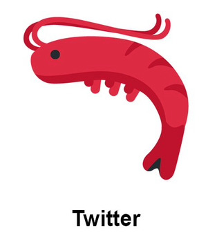
NO NO NO NO NO NO NO NO FUCK YOU TWITTER FUCK YOU WHAT DID YOU DO TO HIM HE HAS NOTHING. HE HAS NOTHING. NO FACE NO LEGS NO ANTENNULE NO DISTINCTION BETWEEN THE CARAPACE AND THE ABDOMEN BY GOD HOW DOES THIS THING MOVE??? WHAT FUCKED UP GOD DO YOU HAVE TO BE TO MAKE SUCH A MOCKERY OF A ONCE-BEAUTIFUL, INTRICATE LITTLE ANIMAL??? -100000000000/10
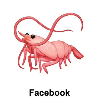
facebook.

thank fuck i was gonna lose it honestly. its not even perfect but i love it a whole lot more. finally my boy has his antennule!! a well defined face!! and he's not even in that dumb curled-up pose (that you'll typically only find from cooked shrimp), and they were daring enough to even put him in a more dynamic 3/4 perspective!! again, its not perfect, but after those two atrocities i'll embrace it with open arms. 8/10

LG. this honestly looks more like a cooked, unpeeled shrimp than a living one but it's whatever. not bad! at this point i'm just gonna accept that most shrimp emojis are just gonna forget about the antennule. i am (somewhat) at peace with that. 7/10

joypixels. kinda just feels like a wannabe of LG's version. plus the blobface, stop with the blobface, i will strangle you. it's okay but could use some more refining. 5/10
if you have any more emoji variants that you want me to review, show me thru reblogs!!!
#sas says#emoji review#shrimp#crustaceans#arthropods#shrimposting#shrimpblr#emojis#caps cw#i got really mad at twitter's lol
51 notes
·
View notes
Text
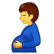
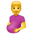
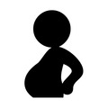
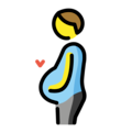
Rating Pregnant Men Emojis
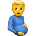
Apple - 3/10
Art feels flat somehow. He feels like a stock image. Not sensing any paternal pride in his dead eyes. This is still technically an emoji some tech-illiterate grandpa could use after having a big meal.

Google Noto Color Emoji - 7/10
This one feels like it's on the right path. He's gentle, it feels like he's connecting to the baby. I like how he's not staring at me. Anatomy still leaves a little to be desired but it's still a solid emoji imo.
Samsung - 5/10
It's like the google noto one but worse. Oddly shiny. His expression feels less like a gentle smile and more like a smirk. Anatomy is fine but a little flat. I don't feel good about this one but at least it's not staring at me.

Microsoft - 1/10
What the fuck. Why is he looking at me. Why does he look way too happy. Where is his elbow. His belly looks like a staircase. This is awful. Combines the worst traits of the previous emojis somehow. Hate it.
Whatsapp - 2/10
His baby bump looks like he's hiding a watermelon and he's staring at me again. His expression feels uncertain, possibly afraid. But I like his moustache so he gets an extra point.

Twitter - 0/10
Somehow even more flat than the previous ones. This looks like my first attempt at drawing a human posing. Just bad anatomy all around (why do his hands look like paws??). He's not looking at anything. Flat, emotionless, not communicating anything, might as well be abstract.

Facebook - 1/10
This style is reminiscent of every mobile game ad I've ever seen. Slightly more detail =/= better. I feel like he's gonna ask me to match 3 baby supplies and the ad is gonna fuck it up badly so he's out in the cold while his wife is with a generic chad and he's gonna ask me to download his app to fix his life.

JoyPixels - 0/10
I don't hate it as much as I hate the Facebook one but it definitely feels worse somehow. It feels like it tried to be the google noto color one but it didn't stick the landing. It feels like a bootleg emoji.

Toss Face - 8/10
I'm grateful for the simplicity and lack of hyper realistic details here. He's a little pregnant emoji guy. What else is there to say.
Noto Emoji Font - 9/10
"MR GAME AND WATCH PREGNANCY" -my partner when I showed him this one. Anyway besides looking like a guy with a beer belly it's straight to the point. People will see what they need to see with this one.
Openmoji - 8/10
I'm not a fan of the style here, but I love the addition of the heart. He loves his baby. Other emojis could learn from this one.

Emojipedia - 0/10
My partner thinks he's sneaking food into the theatre. I think he's taking a shit.
139 notes
·
View notes
Text
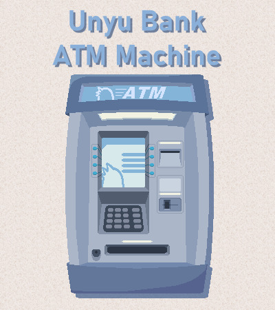
ATM Machine v2.0.0
An update to a ghost that everyone here definitely knew about, because I definitely didn't just not post the original version to Tumblr!
Do you want to work for a bank and service their ATM? No? Well now with the power of ukagaka, you can! Work your boring day job and earn a small but steady flow of cash, while listening to annoying bank advertisements. Or maybe there's another way to earn funds more quickly...?
Changelog:
Added custom artwork for the shell. The original clipart is now available as a separate shell called Joypixels.
Added a custom balloon, called Unyu Bank Notes. If you already have ATM Machine installed, you will need to install the balloon separately from here.
The balloon's 6 color options can be changed between in ATM's menu.
Added 200 dialogues.
Added 2 minigames, which can be accessed after you "log in".
Migrated to the Simplicity Template. As such, the ghost now has responses to various SSP functions, the same as Simplicity.
Updated to YAYA Tc571-8.
Added crime.
You can download the ghost from my website, or read about it more on our wiki!
(Not sure what ukagaka are? Start here!)
It also comes with...
Unyu Bank Notes v1.0.0
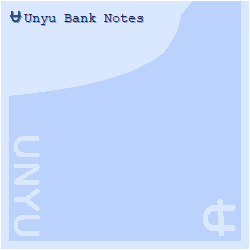
A silly money and Unyu themed balloon with 6 color options in 5 sizes each.
Download the balloon here, or read more about it on our wiki.
That's all for now! Happy April Fools' Day, yes this is a real update/release.
#Ukagaka#English Ukagaka#Ukagaka Ghost#ATM Machine#ZiArt#ZiUkagaka#ZiChrono#//Yes there is more to this than meets the eye :)#//Will anyone find it I wonder#//I guess that depends on how my marketing skills are coming along#//Buy my ghost! It's free!!#//It's got 10 hours worth of random dialogue if you leave it at the default talkrate???#//It sure is... something 😂
15 notes
·
View notes
Text
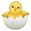
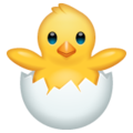
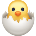
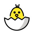
ranking every "hatching chick" emoji 🐣
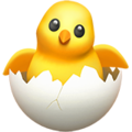
Apple: 6.5/10
A tad bald, and the rendering is (as per usual with Apple emojis) a little bit much. My friend says he looks like a Smash Bros trophy. He looks well-meaning, but a bit... hollow... Cute, but he makes me nervous. I like the little crack in his egg shell.
(More under the cut!)

Google Noto Color Emoji: 6/10
Not very chick-shaped, and I'm not loving the greyness of his egg. The position of his wings is cute, I love that he appears to be hoisting himself out of the egg, but the image as a whole is so flat, and doesn't really register in my mind as an animal. He looks like a bath toy.
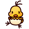
Samsung: 7/10
Looks more like a parrot than a chick, but it's a very cute parrot, so it's okay. Props to this little guy for having a cracked egg, I'll never get tired of it! He's the most animal-looking chick to me so far.

Microsoft: 6.5/10
An upgraded version of the Google Noto chick, really. He has the same flatness, the same grey egg, but a more vacant expression, which is actually pleasant here. The other stared into my soul.
Whatsapp: 5/10
Did they throttle him before taking this picture? He's shaped like a bowling pin. I'm upset. I like the rendering on the egg.

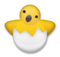
Twitter: 8/10
This is everything Google Noto and Microsoft wishes their chicks were. The artists over at Twitter have so perfectly captured the brainlessness of a newborn animal. The lights are on with this animal, but no one's home. I think it was a nice choice to omit his wings, the simplicity is charming. Shaped like a friend. I like the little feathers sticking out of his head.
Facebook: 6/10
She's cute, but she makes me anxious... Her eyes are so soulless. this is not a chick, this is something else masquerading as a chick. Unlike all of the other chicks thus far, she doesn't appear at all to have put any effort into hatching. I think someone else cracked her egg for her.; released her unto the world like a demon. She kind of looks like bread baked to look like a chick. TL;DR: Cute, but she'll steal your soul.
Skype: 1/10
... Scary. I don't like him. Stop starin at me with them big ol' eyes. He looks like that one coked-out bird from Animal Crossing. What the fuck? What were they thinking???
Twitter Emoji Stickers: 6/10
If you told me he was from a Farmville clone I'd believe you. I have no more thoughts on this one.

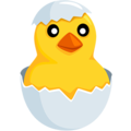
Joypixels: 6/10
He has a kind face; but that is, without a doubt, a man in the body of a chick. Get him out.

Toss Face: 9/10
asjhkgfawidjcnvdfhjbmawiofrdnfiubvmasjkcfvbndfuibjmsdjkfvbnerfiudjbmsdjkcnvsdfjkbm sdhjcfnasdiobnsdjkfnaskmbndjfkn. Cake decoration.

Sony Playstation: 8/10
So tiny!! So cute!! I want to hold him gently in my hands! He's fluffy and round, just as a chick should be; I like the thickness of his wings quite a lot. Little man I love you
Openmoji: 6.5/10
I like him!! I love how he shyly peeks out, it's his first day on Earth, so of course he's a little nervous! He definitely registers as a chick to me, I can especially picture this one pecking at the ground for bugs or whatever chicks do.
emojidex: 7.5/10
Cutie pie!! Looks like something you'd see on a low-budget but extremely charming animated children's show. They register more to me as a baby than a chick (the egg's shape being reminiscent of Vullaby Pokemon's... egg diaper thing?? is certainly the reason for this), but they're still really cute to me. Friend shaped!
Messenger: 3/10
This thing just got flashbanged. His eyes aren't even pointed in the same direction. This man is disturbed, he has seen some serious shit, he needs therapy yesterday. Please help him.
LG: 4/10
She looks like if Ming Ming from the Wonder Pets died and came back wrong. There's an eerie emptiness in this one's noggin. The smallness of the egg really isn't working for this one either; how did she ever fit in there? Upsetting. This one makes my hair stand on end.

HTC: 7/10
Very silly looking. Shaped like a friend. I love how big his forehead is, it really hammers home that this guy is a little baby. I'd like to gently stroke his head, he deserves it.

Softbank: 10/10! 🎊
Look at him!! He's just been born and he already has so much zest for life! This guy has burst from his egg and he's so excited to be here! His little smile, his raised arms, such a dynamic pose... Incredible. Softbank Chick, I love you.

Docomo / au by KDDI: 6/10
I'm personally not partial to uncolored emojis, but he's really cute. I love that he faces to the side, like he's really not sure what to do next and is looking for someone to hopefully give him some instructions.

Mozilla: 6/10
Eehhhh... This chick is a lot like Google Noto and co. He's not bad, but he's just so... flat. He looks like construction paper organized to be chick-shaped. Cute, but not bursting with life like some of the better-rated chicks on this list.

Windows 10: 7.5/10
In the words of my friend who helped me make this, this little beast is emerging from white fire, not an egg, and I welcome him. This chick is powerful. I fear what he could do, and respect him greatly for it.
61 notes
·
View notes
Text
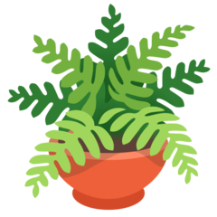
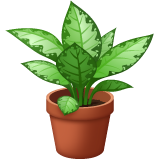
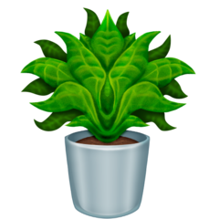
�� Potted plant emoji review 🪴

Apple: This plant grows gracefully in this beige pot made out of terracotta. The textures of the soil are harmonizing beautifully and so are the green shades of green of the leafs! 8.5/10 Maybe they are a baby.
Google: Planted in a red round pot, this emoji shows a different type of plant, which honestly is a nice breath of fresh air. 7/10

Samsung: I think the colour scheme works fairly well in this type of plant! Could use some water to grown them more and more. The pot is shaded confusingly, like it’s going back and forth, left to right. 7/10 love the amount of leafs.
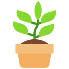
Microsoft: I won’t hate these buddies. It reminds of a Children book. Do you know the kind of books our teachers used to give for vacation? This emoji is just as nostalgic as them. I think it’s a fairly simple sprout. 5/10
WhatsApp: Curious fact: I have dumbcanes at my house. I absolutely adore this emoji. Because the details are on point and the shading is just incredible. I have heard they are slightly toxic, which creeps me a little bit. 10/10 amazing emoji.

Twitter: Frankly. I love the shades of green that are manipulated to create this emoji. The cell shading makes me feel so-so but sometimes, you got to agree that some simple emojis can look really nice. 7/10 Google’s Look-alike?

Facebook: This emoji is absolutely ADORABLE. They are shaped like hearts. I would give this plant to my SO. These are blessed and I hope they grow until they become an absolutely SHOCKING tree. 11/10 For the win.

Twitter emoji stickers: love the pot’s texture. It looks like a generic 3d model that’s been used on Nintendo switch video games. These are cute and I hope they grow amazingly. 9/10 Love the shading and the smooth feelings.

Joypixels: Sure, there were emojis with a LOT of leafs, but this one took it a little too much. Anyways what’s bad about it? I think the stem is a little gross (I don’t mean disgusting) I like the shape of the leafs as they feel smooth and classy. 7/10 Would put these on my granny’s backyard.

TossFace: A little baby sprout! This is so cute. 2/10 Everything else is a little…. Uh?
Emojipedia: I feel like I have to say a lot of Emojipedia emojis since there are so many problems about them that it sort of annoys me since a lot of them look distorted versions of apple emojis. The plant is weirdly simetrical. It’s honestly a little scary because maybe this cursed plant came from a parallel world that every plant grows differently. The details on the leaf are weird, because the lines are a bit too thick. The center bugs me A LOT. It’s disturbing and dark. It’s like a leaf monster that haunts you at your garden at midnight. The pot is looking shiny, but is weirdly placed. 4/10 the soil is ok though.

Openmoji: A tiny palm tree? 2/10 because it’s as bad as TossFace.
thank you! 💗
Save our 🌍 and 🪴🌲
#Emoji review#emoji#plant#pot#cute#emojireviews#emojis#fyp#tumblr fyp#fypシ゚viral#Love#amazing#wonderful#niche#plants#trees#flowers
40 notes
·
View notes
Text
i rate emojipedia's seal emojis
Apple: what a graceful little lady!!!! 11/10
Google: that is a shape 8) sleek and charming 9/10
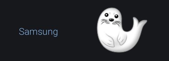
Samsung: That almost looks like...... a ghost 👀 5/10

Microsoft: utterly shaped. 8/10
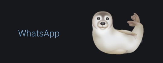
WhatsApp: they are certainly doing something with this emoji. nevertheless she seems very relaxed and content 7/10

Twitter: that is a sea lion! :)/10

Facebook: OUTSTANDING SHOWSTOPPING GORGEOUS 10/10
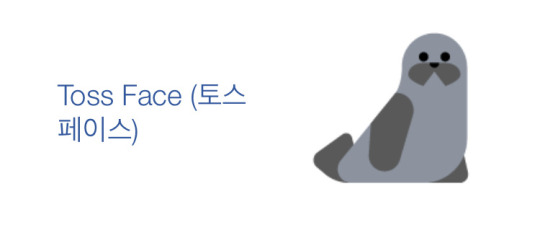
Toss Face: no notes. 12/10
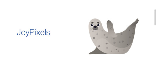
JoyPixels: what worries you, little fellow? is the raised flipper a greeting or a request for help? i have no outlet for my concern 3/10

Noto Emoji: AAAAAAH! ... oh, phew; it is a seal like the others. i thought it was a ghost! very charming 8/10
163 notes
·
View notes
Text
rating seal emojis based on accuracy and their overall vibe

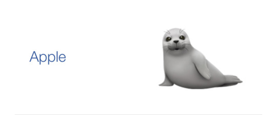
apple: a polite fellow, arms way too strong for a pup, the nose looks weird and their eyelids just dont look right but thats okay. 5/10

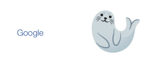
Google noto: a friendly little guy! he seems happy and relaxed, very simple fella! 8/10
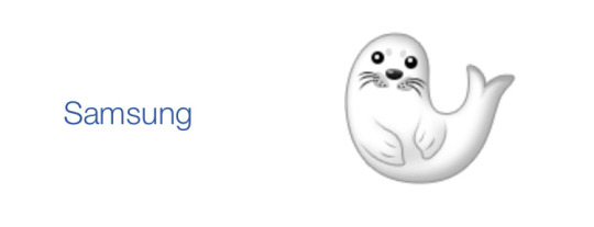
Samsung: also happy and relaxed, similar to the previous one but the more detailed front flippers contrast weirdly with the hind flippers. it looks like thats their tail and thats not accurate at all!! and the dog nose. stop giving seals a dog nose!! 4/10

Microsoft: a simple fella! and finally one that isn't a harp seal pup!! again with that nose, but its not much of a problem theyre cute enough to make up for it! front flippers a bit too long tho but its alright. 7/10
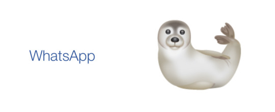
whatsapp: that is a dog face. and their spine is broken. I'm not even mad i just feel bad for them they are suffering while pretending to be happy someone help them- 2/10
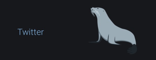
twitter: that is a sea lion. but it is a good sea lion! 1/10 on seal scale, 10/10 on sea lion scale
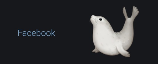
facebook: their back looks broken but other than that this is a very accurate little guy! they don't have a dog nose for once and the hind flippers aren't confused as their tail! whoever designed them knows what seals look like! 10/10
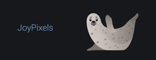
joypixels: good pose, a happy healthy little man! there again with the dog nose and the face looks strangely human it makes me a bit uncomfortable- 6.5/10

emojipedia: this thing gives me nightmares. -100/10
96 notes
·
View notes
Text
🐊Rating every crocodile emoji🐊
Fair warning, I am incredibly biased and cannot bring myself to be mean to any of these

Apple: I was going to say 10/10 for detail, but it's smooth... Why is it smooth... 6/10...
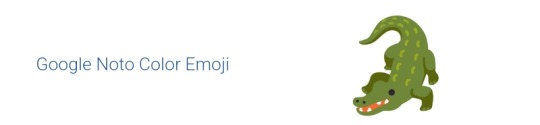
Google noto color emoji: A bit strange, but has charm. 8/10

Samsung: 9/10. I like it. Of course, I use a samsung device so idk

Microsoft: Not much to say about it. I don't hate it, though. 8/10
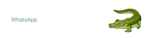
Whatsapp: ... Hehe. Hehehehehe. Funny little guy. Could use some teeth though. 8/10
Twitter: 10/10. TEN OUT OF TEN. What is UP??? Small little thing??? Oh my god... I love it so much...

Facebook: Very realistic. I do feel like you should be able to see its other legs a bit at this angle, but idk. 8/10
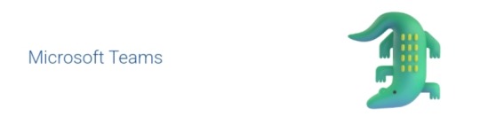
Microsoft teams: You can't tell, but it's animated. Just the microsoft one with some shading. Looks less like a crocodile and more like a normal lizard. 8/10. He's fine.
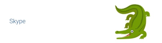
Skype: Looks a bit insane, which adds to the appeal. Legs seem a little off, but I still like it. 9/10.
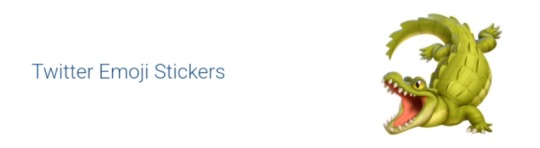
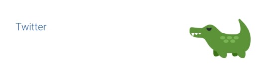
Twitter emoji stickers: 10/10 again, I love this little lad with my entire soul. They really know how to make a good gator.

Joypixels: I appreciate the stripes on the tail. They definitely looked at real picture for this one. Still a bit smooth, but the way it looks at me like a dog waiting to be pet is a plus. 9/10, seems friendly.

Toss face... (What the fuck is toss face?): Simple, but gets the point across efficiently. I appreciate it. 9/10
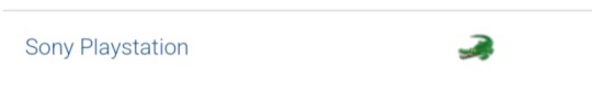
Sony playstation: FUCKING TINY??? 9/10
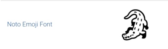
Noto emoji font: Why is he wearing boots? Looks good in them though. 9/10
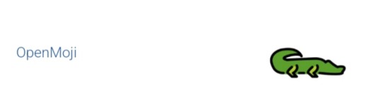
Openmoji: Well, it sure is there. 8/10, I don't hate it.

Emojidex: Idk what to say about it. Not bad though. Clearly traced off of a photo. 8/10
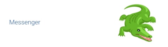
Messenger: I like its weird fnaf eyes. 10/10, it grew on me since I first saw it. Which was earlier today.

Lg: Extremely smooth. So horrendously smooth it circles back around to being likeable again. Looks like a pickle. 10/10, purely for pickle factor. I can smell the pickle juice from here.

Htc: 7/10 idk
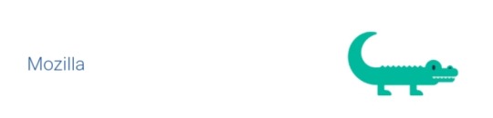
Mozilla: That is two men in a crocodile costume. 6/10, point deducted for being associated with firefox because I'm petty.
... And that's it. Thank you for reading.
19 notes
·
View notes
Text
heart hands emoji
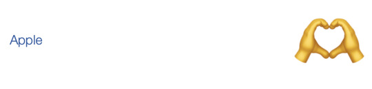
Apple
I can't tell what side of the hands the thumbs are on. Idk but this one just makes me uncomfy 3/10
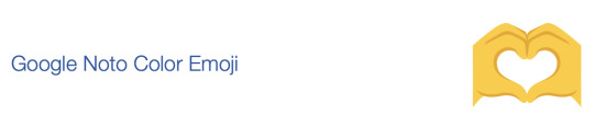
Google
I like this one! The simplicity makes it hard to find a lot to hate 7/10
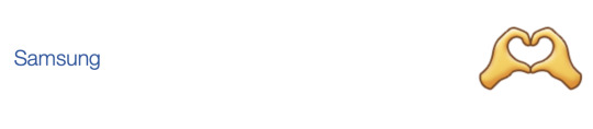
Samsung
Something about the fingers feels off 4/10
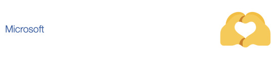
Microsoft
Wtf happened here 1/10

WhatsApp
Believe it or not I actually kinda like this one! Again, the simplicity of it compared to some others makes it bearable 6/10

Twitter
There's not much definition around this thing. I'm ok with no outline but it's kinda hard to see this thing. Also why are the wrists Like That 4.5/10
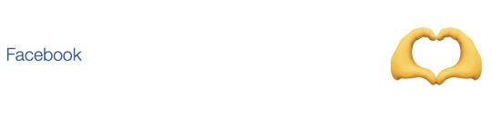
Facebook
Again, the shading makes it feel a little overcomplicated. Lower your standards, facebook 4/10
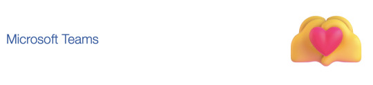
Microsoft Teams
LOVE the heart they got going on but wtf happened to those hands 5/10
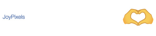
JoyPixels
This one's my fave. Simple, good outline, you can see the other fingers without it being weird. Gorgeous 10/10
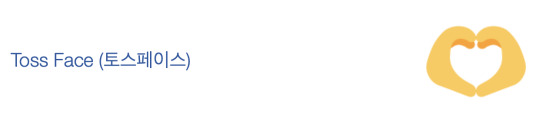
Toss Face
They actually overdid it a little with simplicity, but it worked out ok anyway 6.5/10

Noto
Y'know what? Not bad. Not bad at all. 5.5/10

OpenMoji
I fucking hate the shade of yellow openmoji uses. Also these look like lego hands 3/10
10 notes
·
View notes
Text
😀 Grinning Face 😀
Starting with the basics! This emoji was approved as part of Unicode 6.1 in 2012 and added to Emoji 1.0 in 2015
Apple

It looks so dead inside. I don't even want to know what it's gone through. This emoji doesn't fulfill their job as something joyful, it fills me with existensial terror. Solid 3/10.
Google Noto Color Emoji

Definitely better than the Apple one, I like the fact that it has some shine in its eyes and that it has a tongue. Pretty good, I'd say 6/10.
Samsung

Still better than Apple, but worse than Google. I've never been a fan of how "sharp" Samsung emojis look if that makes sense? It still does its job though, 5/10.
Microsoft

Just a little guy. Just a joyful lad. Either that or they're on something. 10/10, it's not perfect but makes me happy.
WhatsApp

This is also deeply unsettling, even though it has the features I like. Maybe it's the shiny ass forehead? 3.5/10.
Twitter

Simple, does it's purpose, kinda feels detached from the emotion that this emoji's supposed to convey and just feels like an image. 5/10.
Facebook

What the fuck is this. Why is it an actual sphere. Why are the eyes blue. 1/10.
Microsoft Teams

This is like the GrubHub ad version of the Microsoft one. 3/10.
Skype

This is an animated one, but I only have the image version. This face that the animation ends with is okay, though I don't like the weird white eye bags it has. The face it starts with is terrifying, google it if you want to. As a whole it would be like a 1/10 but just this one is like a 4.5/10. Let's say 2.5/10 as a compromise.
Twitter Emoji Stickers

This is just so much worse than the facebook one, it's so 3D and I hate how the head isn't completely round. Actual -3/10.
JoyPixels

It's just weird. I don't have anything else to say about it. 3/10.
TossFace

It looks like someone who just experienced an extremely traumatic event. Like I genuinely want to hug it and make sure it gets proper professional help. Poor guy. As an emoji though, 3/10.
Sony Playstation

I don't have a lot to say about this one, looks pretty similar to the older Microsoft one I have on my laptop. Also a 4/10.
Noto Emoji Font

Hard to say anything negative, but also anything positive. It's a very neutral emoji, conveys it's meaning well and isn't over the top. I actually really like this one, 6/10.
OpenMoji

It's so flat, and full of contrast, not very pleasant to look at. The eyes are also ever so slightly too small for my preference. 2/10
emojidex

I have many questions that I probably don't want an answer for, including but not limited to: Why is it red? Why is the mouth shaped like that? Why is the outline so thick? Why are the teeth like that? But like aside from me being extremely nitpicky, this is a pretty solid emoji. Like a 5/10 if I'm being generous.
Messenger

Okay so even though I heavily disagree with the shade of the eyes and other little things, I weirdly like it. Even though the shape is... weird..., I think it wasn't a bad decision this time. I like how it's in a 3/4 view instead of front view, which gives it character and originality. The shading is an interesting detail, and makes this a really good emoji. A surprising 8/10.
LG

Pretty basic, the style reminds me of the really old Apple emoji style in some way. This is like a definition of a middle of the ground emoji. 5/10
HTC

I don't like it, and I don't think it should have or even deserves to have separate teeth. The yellow used in this is a nice shade overall, but doesn't really fit the vibe of emojis. 2/10.
Mozilla

Kinda similar feelings like the HTC one, as in I don't think it should have ears. The extremely washed out colours make it look displeasing, and makes me want to turn my screen brightness up. 1/10.
Best ranking emoji: Microsoft, with a 10/10
Lowest ranking emoji: Twitter Emoji Stickers, with a -3/10
Average ranking: 3.75/10, rounding up to 4/10
Median: 3.25/10, rounding down to 3/10
Mode: Shared between 3/10 and 5/10
9 notes
·
View notes
Text
📉: Although the most common color for this emoji is blue, this hasn't always been as consistent as it is now! Windows and Android both originally displayed this emoji in black and white, and then Windows changed it to yellow, then red, and then blue, while Android switched to blue, then green and then back to blue! The Joypixels emoji font, used by apps such as TikTok and DropBox, started off blue and then switched to red, then blue again, then red again and then blue again! I wonder why that seems to have been such a hard decision for them to stick to? Most major modern emoji fonts have finally settled on blue, but there are still a couple of significant outliers -- WhatsApp uses red and Facebook uses orange!
🔕: This emoji was added to Unicode as part of a set of additions proposed by the governments of Ireland and Germany, as a counterpart to the bell 🔔 emoji indicating an alarm, as a way of showing an alarm being disabled. It's interesting to me now that these symbols (not necessarily in emoji form) are used now to indicate enabling and disabling all kinds of notifications, not just alarms -- I wonder how common that usage was back then in 2009? It would make sense if it's something that came along with the rise of smartphones.
3 notes
·
View notes
Text
emoji rating 29
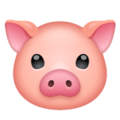
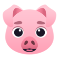
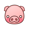
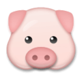
pig face
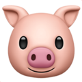
Apple- this one always made me so uncomfortable. i really really hate the face. i feel like it has a gaping jaw or something. so unsettling. i just know it smells horrible too 0/10

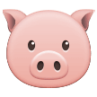
Google- this one is so much cuter and such a refresher. its not my favourite but its still very cute :) 8/10
Samsung- still better than apple, just a plain pig 6/10

Microsoft- love the little floppy ears but the shade of pink is like a sunburnt man and the lighter shades are the areas where he put sunscreen 6/10
Whatsapp- very cute very innocent 9/10

Twitter- sure. 5/10

Facebook- i am uncomofrtable with the face of this one, too. The mouth looks like it’s a puppet. I don’t know. really strange 3/10 maybe it looks better far away, but...

Skype(idk why itis big again srry)- day ruined.

Twitter Emoji Stickers- idk whether to say aww or eww to this because its on a very thin line of being creepy and unsettling and cute... so.. 5/10
Joypixels- the little tongue(think thats a tongue) is cute 7/10

Toss Face- LAWL! 8/10

Sony Playstation- Hes going like :] 8/10

Openmoji- nice to see a less round pig, 9/10
Emojidex- so cute, i want to pet him 9/10

Messenger- i think they should have changed the eyes cuz it looks like its a ghost or something. 7/10
LG- no complaints about this one pretty cute 8/10

HTC- looks like those old rubberhose cartoons or whatever but i dont really think it suits :( 5/10

Softbank- a peachy pig 10/10

Mozilla- it’s alright. most purple ish pig here
6 notes
·
View notes
Text
Rating wine glass emojis
This got. Very long. All emojis from Emojipedia.

Google: 7/10
Red-pink, nice angle, very small and cute. Functional, and works fine. Not super pretty, though.

Apple: 8/10
Red gradient (ooo!), side view. Appropriately shaped. I like the gradient, but the detail on this makes it look like it’s out of badly animated stock footage rather than being an emoji. Still, dramatic and pretty, so it’s a solid 8.

Google Noto Colour: 10/10
The wine appears to be in motion - a sign that someone has been using the wine glass for dramatic purposes. I approve.

Samsung: 9/10
Dark red wine, nice taped but still wide top. Approved.

Microsoft: 2/10
Clearly wine, but what the fuck.

Whatsapp: 9/10
Purple-red, but this is how to do a nicely rendered emoji without making it creepy, Apple.

Twitter (& Discord): 4/10
Red, side view. The dark greys do not help this emoji. Conveys the idea of a wine glass, but isn’t dramatic enough.

Facebook: 9/10
Nice, dark colour. Very pretty. The shape is slightly off, though.

Microsoft Teams: 1/10
Same issues as Microsoft but worse somehow.

Skype: 5/10
Why is it so full? Someone’s getting smashed, clearly. More pink than red. The shadow is just. There for some reason. Don’t approve.

Joypixels: 7.5/10
Shares the fullness issue that skype has; however, the colour is amazing, and the shape is fine. The gradient and lighting is keeping this one at a 7.5.

Toss Face: 9/10
Oh! Lovely! Dramatic and simple, feels like an emoji. The shape feels off-balance, but overall, very nice.

OpenMoji: 2/10
Why is it so orange? Why is it so full? The simplicity is fine, but come on.

NotoEmoji Font: 8.5/10
Lovely! Dramatic! Half a point off for the lack of red.

Sony Playstation: 8/10
Cute, simple, pretty. Functional as an emoji.

Emojidex: 7.5/10
Nice colour, nice shape. Not super pretty and a little rectangular, but overall not objectionable.

Messenger: 6/10
Too orange. Shading is pretty, but the shape is lacking.

LG: 10/10
Nice colour, nice shading, works as an emoji. I like it.

HTC: 8/10
Usually I’d take a point of for fullness, but the simplicity of this emoji has saved them.

Softbank: 9/10
Simple, cute, nicely shaped.

Dococo: 7/10
Initially rated 3/10 (why he ourple?), but upon further inspection of the Dococo emojis, the purple colour appears to instead represent the grapes that made the wine, so I will let it slide. Would be 8/10 if it was red; the shape is nice, and the emoji is balanced despite the simplicity.

au by KDDI: 0/10
Purple for the same reason as Dococo, but while Dococo has another alcohol emoji that is red, au does not. The shape of this one scares me.
3 notes
·
View notes
Text
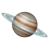
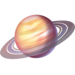
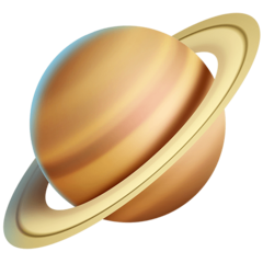
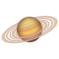
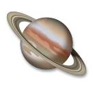
🪐 Ringed planet emoji review 🪐
(I’m not a scientist, I just like Saturn)
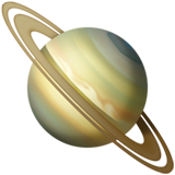
Apple: So here we have Apple’s take on a ringed planet which resembles saturn because of the hexagon. it’s tilted a little wrong. You can see the details on it’s surface and the ring is nicely distributed. 9/10 Strong.

Google: The tilt on this one is more accurate. It looks simplistic, which works fine. I see the hexagon. The color of the rings shouldn’t be that blue. 7/10 Reminds me of my first Saturn drawing.

Samsung: Again, the tilt is pleasant. it’s decently shaded. It needs more coloring as the color scheme is very repetitive and boring. The rings don’t look separated enough for me, even though I like their aesthetic. No hexagon. Pixelated 6/10 Because it’s not as bad.

Microsoft: I can see they wanted to make an adapted simple version of Saturn, which is a nice idea. The execution looks too off. Can you add more rings please? Random colors on the surface. Bad tilt. 1/10 You can see me after work.
WhatsApp: now, that’s a good ring! I love the surface although the tilt should be different. It looks shiny, like a marble. 9/10 You did a good job.

Twitter: Yikes. I can be the only one who thinks this could smell like cheese. Too saturated for my tastes. The rings are lazily done. 2/10 Ok tilt though.
Facebook: Tries too hard to make it super detailed that it looks harsh. The surface is pretty. Doesn’t look much like Saturn, but it looks nice. The rings could be more separated. The tilt is good. 7.5/10 Could be an exoplanet similar to Saturn.

Skype: See? Another simple Saturn like Twitter and Microsoft. Please. Change. The. Colors. 3/10 Good tilt and ring though.
Twitter emoji stickers: It reminds me of blender renders. I like the rings and how 3d it looks. The shading and details are good and the surface is nicely done. It reminds me of my current Saturn drawing. Off tilt. 8/10 I like the shadows

Joypixels: Cutest colors. The tilt is a little off. The rings are distributed nicely and is that the hexagon? I think it could be a good idea to erase the grey space between the rings. 7/10 doesn’t look that bad actually

TossFace: You just drew a purple circle and added a lilac ring. Do better. 0/10 sorry, but no.

PS5-4: This could look decent if not too pixelated. It’s a little sad. 3/10 the tilt looks nice but please fix the graphics.

Openmoji: Actually, the cell shading makes the colors pop. Doesn’t look like Saturn though. 2/10 Adding a red ball won’t make this emoji a masterpiece.
Emojipedia: I love how realistic the surface looks. I think the main purpose of this emoji is to make it classy and elegant. The planet itself lacks an hexagon though. It’s got a lot of rings, which is a nice idea but they are too close. I like the shading. I don’t mind the tilt in this one. 8/10 I see you tried.
LG: It looks more like Jupiter than Saturn. The rings are good but it’s a better idea to make the surface different. 5/10 Pitty points.
Thank you!
Saturn is so aesthetic 🪐
#Emojireview#emoji#emojireviews#emojiratings#emojirating#Saturn#space#science#planets#aesthetic#tumblr fyp#emojis#ringedplanet
37 notes
·
View notes
Last Seen Blogs

stillthebestrobin-blog
Spreading My Wings

heckdt
a bastard, by all accounts

coxuwugenata
Untitled
rediscoverafghanistan
AFGHANISTAN

creepypastabookclub
New episodes every other Friday